Male versus Female Designer Decorating!
On the last blog story, we visited a home in Dallas designed by an incredibly interesting MALE architect, Paul Duesing. His house was filled with things collected during his travels around the globe including Africa and South America. Just looking at his vast estate sale was fascinating.

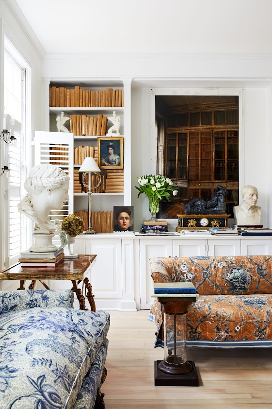
Paul Duesing’s house.
While Paul’s house was decidedly masculine, it wasn’t your typical man cave décor, filled with dark cherry faux paneling and leather recliners with built in beer can holders. Instead, his house is a lesson in sophisticated maximalist decor.
Today, we are moving up north to the Washington D.C. area where our female designer had lived for the past few years before moving to Florida.
She has a very popular Instagram presence.
Her name?
Cris Briger
Cris has been in the design business for years. She and her late husband Paul ran Briger Design LTD, a to-the-trade furniture and accessory company. Much of their business centered around producing furniture in Mexico where they had a home near San Miguel de Allende. Their aesthetic was so beloved they published a popular book: Briger + Briger in 2007.
After two plus decades in Mexico, she and Paul moved to Washington D.C., but soon after, Paul unexpectedly passed away.

As fate would have it, the widowed Cris and her son Charles Peed became design partners, and for a time, they lived in a fabulous townhouse in Washington DC. Today, it’s for sale. The two moved down to Florida where last year they opened up the fabulous shop Casa Gusto in West Palm Beach.

Cris Briger is a natural beauty – absolutely adorable beyond words!! Here, she and her son and business partner, Charles Peed, pose in their Mexican garden, recently shown in Milieu.
Yes.
Remember that story in the last issue???????
Just wait.
Relax, settle down.
This story is much more than just a look at Female Design versus Male Design.
LOL – doesn’t it always happen that way?
The townhouse for sale in Washington DC is the one where I planned to show how a single female designer decorates her own home, compared to how a male designer does.
But first, let’s take a quick look back at Cris’s aesthetic. It is so wonderful, breathtakingly so. And feminine. It is addicting. It is impossible to turn away from.
Sigh….

The book that Cris and Paul Briger published in 2007 is still available on Amazon HERE. It shows the three houses the couple owned in Mexico: in the city, the country, and lakeside.

In the book, the country house in Mexico.

The main salon – with the roundabout in the center, dividing the two seating areas.

The city house. I love this – with the high ceilings and the antiques – a mix of European pieces. Love!!!

Love the styling.

The Lake House.

My favorite room – the bedroom in the Lake House. Notice the symmetry, which is an important element in the way Cris and Paul designed.
Their book is now 15 years old, but the houses were decorated years before that. Still, it all holds up and remains vital – thanks to the use of antiques, classic accessories, and a bit of folly.
The Washington DC townhouse is now for sale and its real estate photos give us a view into the world that Cris created to live in for today. She took her varied furnishings from her homes, many antique, and many of hers and Paul’s own design, and created a world of classic sophistication with a bit of folly. It’s a vision of femininity and beauty.
I find it jaw-dropping gorgeous.
(And I found the BEFORE photos to see exactly how much was done to create this feminine world!!)

The Washington DC townhouse, seen in the center here.

To make it easy to follow the photos from the Real Estate brochure – here’s the floor plan. Five floors including the basement.
Photos also came from Instagram and Real Estate sites, along with photos from Home & Design.

BEFORE: The entry hall on the ground level. The main rooms are on the second floor. Notice the dull wood floors and the sheers at the front door – blah!!
FIRST FLOOR:

AFTER: And so it starts!!!! The foyer is a stunner.
The foyer is covered in a Canovas print. Notice the floors – these are what really set the tone. Instead of a lackluster, shiny brown wood, the planks are now bleached. They look like they came from a ancient Swedish country manse. Notice, instead of sheers at the door, Cris used portieres.
So fresh! So beautiful! So feminine!

The opposite side – showing the stairs that lead up to the second level.
Through the hall is the large dining room. The kitchen is off to the left.

That mirror! Those chairs!!! I love these pieces in the entry. Everywhere you look – there are special moments like this.

Symmetry.

Off the front hall is the kitchen, and the elevator, a necessity with five floors.

BEFORE: On the first floor – past the foyer – is the dining room with these built ins.

AFTER: The large dining room – Cris retained the built in with the pretty trim molding. It is now decorated with a collection of blue and white. The room is divided into two dining areas. The walls throughout the townhouse are painted BM Chantilly Lace.

Two tables allows for a larger number for dinner.
The chairs? A mix of French and Swedish, such a great combination.
Symmetry - the two sconces flanking the garden doors.

The second table – a wood version with French chairs and a banquette.
Oh – that clock (18th century Swedish from Marston Luce !) Those medallions!
The medallions, sconces, statues – are all a part of Briger’s aesthetic. You will see this look repeated throughout – which is probably why I am so obsessed with this house!!!

A close up. Those bows!! Gorgeousness.

A closer look at the blue and white.

The view towards the courtyard garden.

BEFORE: An neglected patio which needs landscaping.

Today: instead of stone, there is now French styled gravel which brightens up the courtyard even on a gray day.

A statue was added along with a collection of outdoor furniture.

From Instagram. The courtyard, all dressed up in pillows and garden stools and hanging plants and art work.

Before: Off the foyer and dining room on the first floor is the kitchen. Seen here – the rather plain kitchen.

AFTER: In the same footprint, with all new appliances – the kitchen is dressed up with white stone and glass lanterns.

Another photo shows the white Silestone used as a backsplash.

BEFORE: Off the kitchen is the rather large breakfast room.

AFTER: Is this Washington DC? It looks like a Swedish country house to me. That antique table! That console! The chandelier is driftwood – from Mexico.

The view out the front windows.

Wonderful styling. Just love.
SECOND FLOOR
You will find the house is fabulous on each floor.

BEFORE: There are two rooms on this floor - the smaller library and the living room.

To the left off the stairs is the library.

BEFORE: The library is filled with orange painted shelves.

AFTER: Blue and white fabrics mix with colorful books.
Seriously. Isn’t this wonderful?

The library – a mix of fabrics, another trademark of Briger’s. Notice these two tables. And the legs on the sofa. Just beautiful.

The two rooms had different mantels – BUT a matching mantel to this one was found upstairs. Briger moved the matching one downstairs to the living room. It’s all about balance and symmetry.
The photograph is of Marie Antoinette’s Library – fitting for another library.

BEFORE: The living room.

AFTER: Wow. Just wow!
A French chaise divides the room into two seating areas. Balanced.

One side with her trademark mix of fabrics.

Across the room – with the newly moved mantel. Notice that chair. Beautiful. And the mirror. Gorgeous.

Instead of a coffee table there is a velvet ottoman, tufted. Notice the bust and the gilt stand with Greek Key accents. There are always wonderful accent pieces like this – in every corner.

A closer view – of the mix of fabrics.

BEFORE: A view of the previous fireplace that was exchanged for the matching one. Good choice to move the other mantel down here.

Between the living room and library is the powder room with its trendy encaustic type tile floor.

And the wet bar is found between the two rooms, too.
THIRD FLOOR:

BEFORE: There are two bedrooms on the third floor, along with the two bathrooms. Here you can see the original mantel that went down to the living room.

AFTER: The master is a study in blue and white and it is sooooo feminine and so pretty!!!

On each side of the bed are two antique trumeaus, balancing each other. At the foot of the bed is an antique desk.

A view from Instagram with a change of lamps. Hmm. Can’t decide which lamps I like better.

I LOVE that antique sofa!!! LOVE!!!!!!
Against one window – between the two chests, is there a more feminine vignette?

A close up view of the seating area. Love the pink tea table. Notice the fireplace was removed – not replaced.

Notice the small corner French chair with the ribbon trim. Adorable! So feminine!!!

BEFORE: The original bathroom on the third floor.

And here. Rip out the old dated vanity and put this in – looks like a French hotel. Perfection. Tiny marble mosaic tiles. Marble tile wall. No storage? Get a clear acrylic shelfing unit – fill with all white towels and paper goods!!!

The second tiny bedroom on the third floor becomes the closet.

Here, the small bedroom is turned into a closet with units added on each side of the room. What’s so smart is that these units can go with you when you move.
And the best? The two antique chaises.

Perfect symmetry.

The second master bathroom on the third level is basically the same except with a bath instead of a shower.
FOURTH FLOOR

There are another two bedrooms and two bathrooms on the fourth floor

The landing to the fourth floor bedrooms. Briger’s son, her partner Charles Peed, used this floor as his own.

Even though a man lived on this floor, Briger’s feminine hand still played a role up here. Sexy French chairs and tables with curved lines add the female vibe. But, a brown sofa and bold check create a sexual ambiguity.
I have to say. Isn’t this such a fabulous floor plan? I love the layout – and for two people living here – having their own floor with two rooms each, provides such privacy and roominess.
NOTE: Think about this layout versus the typical layout of new three and four story townhomes all over Houston and other urban cities. Their layouts can not compare to this. Such a shame that builders don’t take more care when designing those monstrosities.
OK, back to perfection!

Love.

Gallery Wall: Perfection!!!

One of the two fourth floor bathrooms, using the same decorative elements as other bathrooms.

Before: the second bedroom on the fourth floor.

The second bedroom has the most masculine vibe in the house. Not going to count this one in the story of Male Designer Versus Female Designer decorating their own home. Just going to pretend this floor is not part of that theory! LOL. Notice Briger removed the built in shelves from this room for some reason. I kind of liked them. Oh well!!!

This view focuses on the gorgeous painted chest! A mix of antique and mid century modern!!!!

Before: the fourth floor second bathroom.

After: the second bath on the fourth floor.

And the lobby up from the basement to the first level, introducing all the design elements found in the upper floors.
The townhouse is now for sale. HERE.
In 2018, Cris Briger told the magazine Home & Design that designing this townhouse was a “springboard to our new business. This is where we crafted the idea to…continue our 20 year family design legacy.”
Two years later this would include their new shop “Casa Gusto.”
If you like the townhouse – you will LOVE Cris Briger and Charles Peed’s shop --- Casa Gusto!

Photo from Veranda shows inside Casa Gusto.

Part of an assortment of tole flowers – very reasonably priced too (for once! Usually tole flowers are so expensive!!)

I seriously love this!!!!!!!!!!!!!!

Check the Casa Gusto
Instagram for updates on shop pretties!!
NOW for some more fun…back to Mexico and the Briger + Briger book:

When Cris and her husband Paul wrote the book Briger + Briger – they included their house in the countryside of Mexico.
The country house was a standout – the stunner in the book. It looked ancient but back in 1988, the couple actually had it built to their specifications.
In order to celebrate the opening of the new shop Casa Gusto, my favorite magazine Milieu did a spread of the country Mexican house – featured in their last issue. The beautiful photographs were taken by the incomparable Miguel Flores-Vianna.
I loved going back to the book = seeing how Briger has changed the house over the past thirty years – something she addresses in the Milieu story.
Discussing how the Mexico house is not her main home “if you are away from your home for too long, you suddenly find yourself in grandmothers house with things that are dated. Not only have interiors evolved over the years so too do we.”
Interesting.
Looking at the photos from their book, Milieu, Pinterest, and Instagram – you can see how the house has subtly changed over the past thirty years. Some things remain the same, some are just slightly altered, but the house today as seen in Milieu, looks fresh and bright and very well loved:
From the 2007 book. Notice the stone drive!! White shutters. And notice the symmetry of the facade, along with the landscaping.
From Instagram. The door is now a light blue! Ivy climbs over the soft pink stone.


Before: There are not many changes from 2007 and today in the foyer with its stone floors. There is a staircase and the entrance to the main living room. The roundabout in the living room divided the two seating sections.

Today. From Instagram: The most amazing piece of furniture is in the foyer. At the bottom of the staircase is this wooden chest – part plant holder. And notice its perfect construction that follows the curve of the staircase. It’s a new piece to the foyer – before a round, cream painted table stood in its stead.

A view from the winding stair down to the foyer. Past the hall with the sleeping dog is the much used “formal” dining room.

Before: From the 2007 Book – the main salon. Double sided with a large area with windows that look out to the garden. Twin chandeliers hang over each side.

2007: Looking towards the other side.
Below: For Milieu, the salon was photographed showing all the subtle changes made by Briger and her son, who did the styling for the magazine story:

At first glance, it doesn’t even look like the same room – but it is. The walls were painted a bright white which changes the room dramatically. The beautiful chandeliers remain as does the upholstered furniture. The consoles now hold antique red plates which pick up the red trim around the crown molding. Symmetrically placed mirrors and statues help edit and update the decor. I really love that ottoman!!!
On the opposite side, the unusual console was moved from another room. Isn’t it beautiful? Black shades are exchanged for white shades. And a large starburst mirror was added.


From Instagram, another photo shows that perhaps the roundabout has been moved, replaced by a painted table holding glorious roses.

Be sure to contact the shop if you are interested in anything you see in either the townhouse or this country home.

At the middle of the salon, the "bay” leads out to the garden.
As always, symmetry.
Is this why I love Cris’ aesthetic so much???
Symmetry?

From Milieu: Off the before-seen foyer and the salon is the dining room with its interesting light fixtures. Another one hangs in the entrance to the room. French and Swedish chairs in blue and white check circle the table. Seen is one of two antique Victorian era Mexican armoires.

Who knew a colonial style Mexican villa could be so feminine???
Here is another view of the dining room in soft blue and white. Painted blue and white mirrors and benches.
The papier-mache medallions above the window come from Casa Gusto. Trimmed in red, they mimic the thin red line above the molding that runs throughout the villa.

From Instagram – another vignette in the dining room.

Beautiful femininity.

From Milieu: Off the dining room is a back stairway and the kitchen.

From the 2007 Book: A large table doubles as an island. Black and white tiles mimic marble. Through the years, the Mexican pie safe gets a new coat of paint. Here it is black.
From Instagram. The pie safe is white, which I really like….

And from Milieu, here the pie safe is painted a happy green.

BEFORE: From the 2007 book, the sitting room.

MILIEU: The sitting room was updated with new lighter paint. The chairs and curtains and rug were updated as was the wall behind the sofa. Today, a mirror was added and the prints were rehung in a more symmetrical way. Chests replace the smaller end tables.

Another photo of the charming sitting room.
Across from the sofa is this tufted banquette in the Rose Cumming’s fabric. Balanced perfectly is the sculpture which overlooks the bolster that symmetrically divides the banquette into two. Of course!

From the 2007 book – the guest bedroom with its vaulted beamed wood ceiling.

From Milieu: The guest bedroom was refreshed with an antique bench and other various accessories, along with a new rug and curtains.

From Instagram – here you can see the striped fabric at the windows. And as always, a spot of symmetry.
I love this photograph.
And from Milieu: More from the guest room - I love these paintings – especially the larger one at the top of the bench.

From the 2007 book: Cris planted this row of trees that lead to the swimming pool. They were already a nice size when the photo was taken.

From Milieu: Today, the trees are huge!!! Candles light the way to the pool where there is now a beautiful gate.

From Milieu: A view of the enclosed pool – with a bit of whimsy.

From Instagram: A close up of the painted blue gate that leads back up to the house.

And so we come to the end – how a female designer decorates her own house just as she wants versus how a male does. See the previous story. It’s really kind of interesting how both Duesing’s house and Briger’s house have a similar decorative vibe.
Be sure to visit the Casa Gusto Instagram and Web site
And also, check out my sidebar – I’ve updated it for the summer.
I hope you all are healthy and safe and we will be outside soon!!!
I love the before/after comparisons, to really get the idea of what Cris was working with at the beginning.
ReplyDeleteThe entry and some other rooms are too busy for my taste but still vastly better than the befores.
I'm fascinated by the change in the salon in the Mexico house--that stripe of red around the ceiling keeps all that white from looking sterile. But why does an accent stripe work brilliantly here and fail so horribly in so many of the listings I've been looking at? I guess it's like me vs. Simone Bile doing a cartwheel--mine might technically qualify as a cartwheel but it won't be anywhere near as graceful as an Olympian's.
Joni,
ReplyDeleteAnother great post. Thank you, it was a treat.
So beautiful! As I was looking at the photos, I kept thinking something was missing, and I realized hardly an area rug was to be found! The wood floors are gorgeous, but I feel like a beautiful seagrass or antique muted turkish rug would anchor the furniture? Maybe it's just me! I'd still move in tomorrow. Xx
ReplyDeleteShe said in an magazine article that she chose to roll up her rugs. I meant to add that. It was a conscious decision. I go back and forth on rugs versus rugs. Her floors are so pretty why cover it all up? So says someone who has everything covered in seagrass! lol
DeleteNo one leads us on an excursion better than you. Thank you. I am breathless from the beauty. Fabulous beyond words. Again, thank you. 💚
ReplyDeleteFabulous post! I'm going to savor this all month!
ReplyDeleteI must admit I like Duesing's collected look better. I do appreciate Briger's symmetry when it come to her design but is seem "unlived in" too steril. Thank you for the second post...us design freaks have nothing better to do than wait for Ms. Cote de Texas to brighte our day! Stay well!
ReplyDeleteI'm running my Nespresso now so I can sit down and enjoy this desperately needed eye candy during quarantine. Thank goodness for on line magazines, youtube - At Home Quintessence, Studio McGee, and YOU! I'll share my favorite martini recipe for a perfect every single time lemon drop. I use Titos or Frankly Organic (made in Austin Texas) vodka, then add San Pellegrino Lemonata! It is carbonated, tart but not bitter, not too sweet - and never add sugar to the rim! I grow my own lemons and used to put stevia in...but dang it...I found this. So I'm intermittenly fasting so I don't gain the covid 19 pounds. Maybe I'll re-read with my maratini in 14 days! Thank you for coming to the rescue. I'm ordering their book! Be safe out there Joni! xo
ReplyDeleteThank you, Eileen, for the extra perk!
DeleteThat sounds delicious!!!!!!!!!! Lemonata!!! Thanks Eileen
DeleteI really love these in depth posts. It's such pleasure to sit down and read about all the detail. It's like our own field trip. Thank you so much for doing the research. I came across this link and thought you would get great pleasure out of it. If you've seen it before, forgive me. Google has a 360 walk through of the first floor of Prince Charles' Clarence House. It opens with an educational slide show but you can "walk" through all the rooms getting a close eye view of everything. You can even get a close view of his personal effects like family photos, book titles and the china. It's fun to see everything as if you were visiting in person. Stay safe!
ReplyDeletehttps://artsandculture.google.com/exhibit/inside-clarence-house/6QLSGpeByJlLJg
Thanks for spreading the word on that tour. It's amazing isn't it? You can also visit Buckingham Plaza or you could at one time. Thanks for the link!!!
DeleteThis comment has been removed by the author.
ReplyDeleteWhen I see that you have a new post, I get a cup of coffee and savor all the details. I would have to agree with you - this was an absolutely lovely transformation. Thank you!
ReplyDeleteThank you!!!!! So much Anne.
DeleteAnother great post! IMHO, that foyer doesn't go at all with the rest of the house...totally different design styles.
ReplyDeleteThe foyer reminds me of the lobby of a building in college which was designed to be busy and irritating to keep traffic from gathering there.
Do love the rest of the home.
Thank you - one of your best ever - may be feminine, but certainly more classic than frilly!
ReplyDeleteI enjoyed this post very much. Thank you for introducing me to Cris Briger. Her style appears effortless, comfortable, in each photo I am yearning to stand in the room and take it all in. Is that Pierre Frey Petite Parc on the sofa, chair, pillow? Gorgeous. As you said there are similarities to the two designers, a collected feel, casual yet elegant at the same time. She regularly utilizes symmetry where he often does not. It is interesting to have a glimpse into what appeals to you, I always enjoy the journey. Beautiful posts.
ReplyDeletehi! Yes - it's the Petite Parc - one of Dan Carither's favorties. Beautiful house!!!! Isn't it?
Delete