COTE DE TEXAS: Lauren Ross
Showing posts with label Lauren Ross. Show all posts

A Brother and Sister Act

46 comments


den004

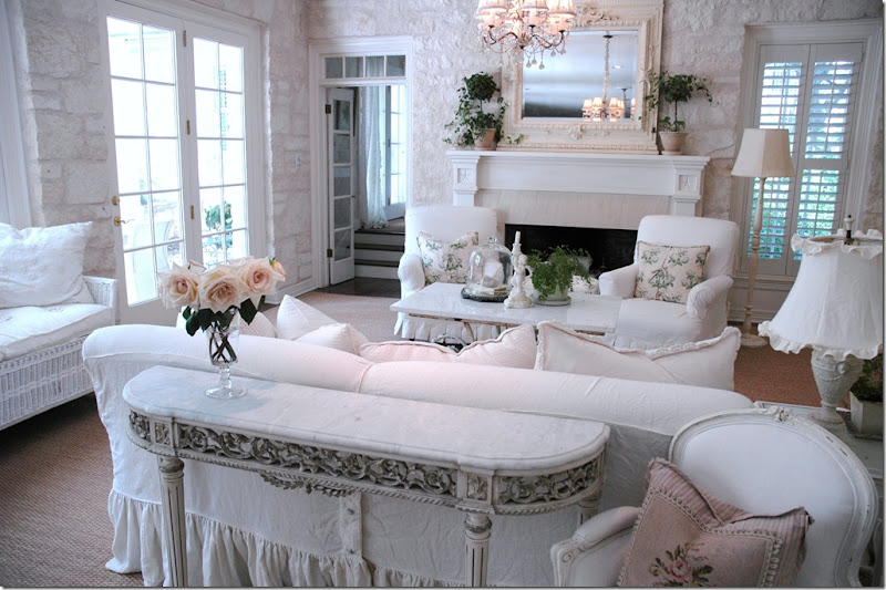
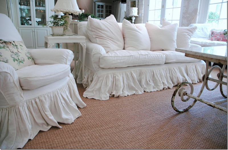
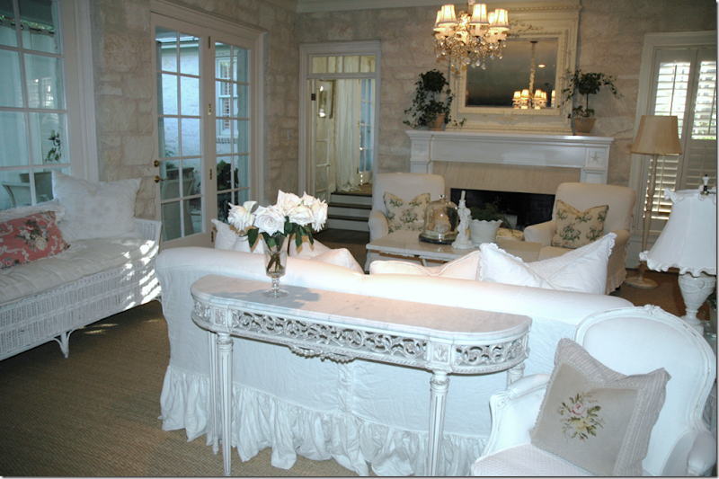
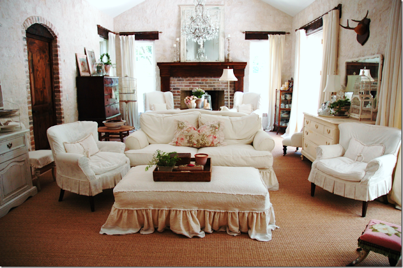
The Family Room in Lauren Ross’ Austin, Texas House 


This summer I was thrilled to show you blogger favorite Lauren Ross’ Austin house, pictured above and below.  It seems that after Country Living magazine did a photo shoot of Lauren’s slipcovered filled house – a lot of you couldn’t get enough of her style, so I was happy to oblige with even more pictures featuring Lauren’s romantic design vision.    Most exciting of all was that Lauren shared photos of her former house in Houston which showcased an earlier version of her unique aesthetic.   Although she gets inspiration from Rachel Ashwell – whose color palette ranges from whites to pinks to blues to greens – Lauren has made the style all her own:   she is a pure-white-linen kind of girl.    The only color and pattern in her house is found in pillows – everything else is a wonderful snowy white.   Judging from the comments you so kindly left – I think everyone enjoyed Lauren’s houses as much as I did!


rosspics001MA23523445-0005 Lauren Ross’  TV Room in Austin


A few weeks ago,  Lauren sent me pictures of a project her brother had just finished in Houston.   David Gunn, Lauren’s brother, is a successful home builder here who heads up his own firm, Gunn Construction and Building Co.  The pictures Lauren sent were actually a lesson in how to build a country French styled house in the middle of Texas and David seemed to get all the details absolutely correct.   Do Lauren and David share the same style?    There definitely are things about David’s French styled house that Lauren and I both love.  And while David isn’t an architect, as a builder he does choose all the finishing touches that make a house wonderful and authentic looking.     Regardless of whether David is a true Francophile or not, he certainly knows how to build a French house!


David came to building well prepared – he graduated from Texas A&M, Magna Cum Laude, (wow!) with a major in Construction Science.  He cut his teeth at Renaissance Builders, starting out as an estimator and ending up as Vice President of Operations.   Ready to strike out on his own, he founded Gunn CB in 2003 and he hasn’t slowed down since – his portfolio is full of projects – completed and ongoing.    Today on Cote de Texas, David shows us pictures of his latest house – and he provides details of all the things he added to the house to make it look like a centuries old mas that you might find on a lavender-scented plot of land in Provence.   So, if you are planning on a building your own vision of the South of France, get your pen and paper ready to jot down his tips.  


 image

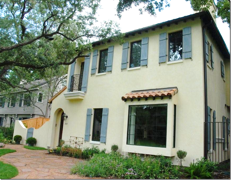
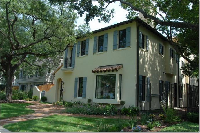
A French Styled House in Texas, built by Gunn Construction and Building Co.


David’s latest project is located in Houston’s most exclusive neighborhood – River Oaks.   He explains that while an architect drew up the plans, the owners had no interior designer or architect on hand to help with all the myriad building decisions which landed on David’s able shoulders.   The first set of decisions involved setting the stage accurately: the facade must say  Provencal France – without a doubt.   The most important aspect to get right  was the stucco.   David gave the outside walls  their aged appearance by applying a final finish coat along with a second accent color added to the mix.   The resulting color is very subtle but effective.   After much discussion – the typical stucco expansion joints on the front of the house were eliminated to again provide a more authentic, old world look.  


image

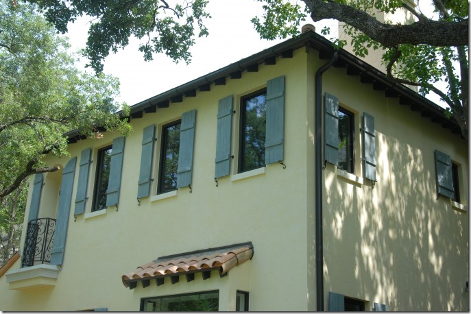
To further add to its authentic appearance – fully operable wood shutters were built and then painted a traditional shade of French blue.    Small iron s-hooks hold the shutters open, flush to the stucco.    Romantic scrolled iron work was used at the Juliet balcony along with full-length shutters that match those at the windows.    The traditional clay tiles used on the roof are a must to get the look right.  Even the bump-out has it own clay tiled roof.  


image 

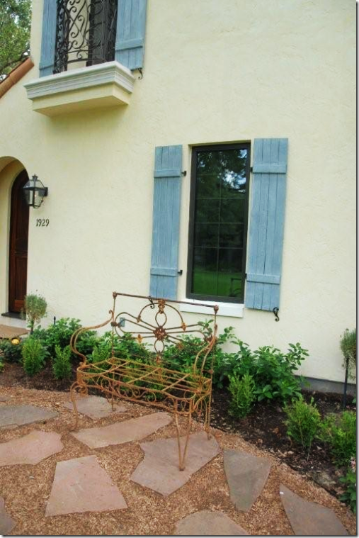
A close up of the French blue wood shutters.     Next to the arched entry way is an antique style French lantern.   All these elements help to make the house look truly French rather than a poor imitation of such.   


image

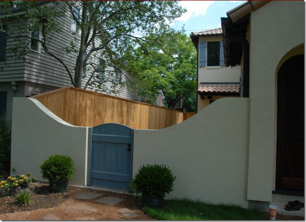
Since the garage is reached from the back of the property, this allowed for a front courtyard – where a wooden gate, that matches the shutters,  was added.  Instead of concrete, the paths were laid with crushed granite.    Obviously this picture was taken before all the landscaping was installed.  


image

The Main Living Area

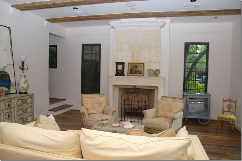
The entry leads into the main living room – which faces the front.    Here and throughout all the downstairs rooms,  antique pine beams were used to give the house additional atmosphere.    The stone French fireplace was purchased from Margaret at M. Naeve.  An antique, it was found in pieces which then had to be put back together along with adding new stones  that were needed to fill in missing areas.   The final result makes the fireplace the show stopper of the main living area.    David took all these pictures shown today – they were both right before and right after the family had moved in.  

 
Other details that add to the old world feel:  the house was very simple wooden base boards.   The window sills are also wood and the sheetrock has rounded corners leading into all the windows and doors.   Notice there is no crown molding – the simpler the better.   There is a thin picture rail that runs around the perimeter of the living room several inches down from the ceiling.    Painted the same white color as the walls, this rail resembles plaster molding. 


 image

The view of the park – there is not a street in front of this house.


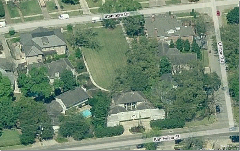
What is especially nice about this particular area – all the houses face a community park, not a street.    These houses are built in a horseshoe shape around the park  (one of the earliest version of the present-day popular suburban greenbelts.)   In order to reach the individual houses – one must park at the end of the street and walk up the park until you reach your desired house.  The garages are at the back of the houses in this area of River Oaks.  


image

Here is the actual satellite image of the park with the houses built around the horseshoe green area.  All the houses face this park – and the only way for guests to come to your front door is to walk down the sidewalk.   On this side of the street – there are about five of these parks. 


image The Wood Floors

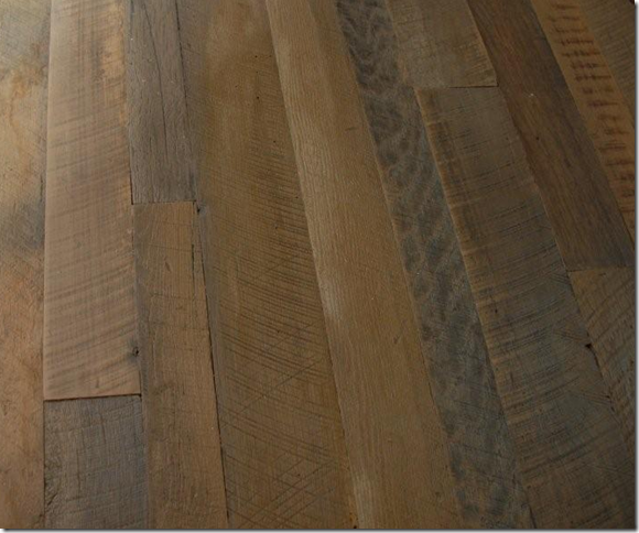
The wood floors in this house were cut from old oak beams – the boards were left in their natural state for their beautiful patina and texture and only a flat polyurethane was applied for protection – no stain was used at all.    Other flooring used downstairs is traditional French hexagonal Saltillo tiles with only a clear sealer  – again no stain was applied.   Upstairs in the bedrooms, there is wall to wall seagrass.


image

The Dining Room

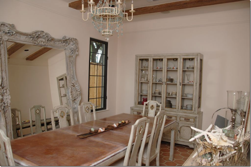
The dining room again has the antique pine beams and the Saltillo tile floor with an exaggerated grout line.   As in the living room, there is no crown molding, with only a simple picture rail used in its stead.     Doesn’t this room truly look like a country house in the South of France?


image

The Kitchen and Sitting Area Overlooking the Courtyard

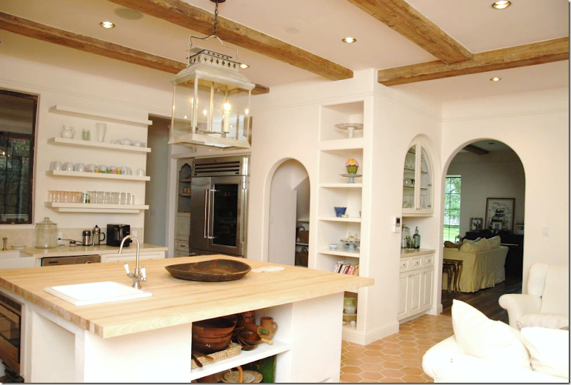
Off the living room, through the doorway is the large kitchen with an adjoining sitting area.     The kitchen is so romantic and unique with its arches and open shelving.  The island has a simple maple butcher block counter, while its cabinetry had drywall mud roughly applied to it so that it would look like old plaster – another great tip.     The lantern is a reproduction of a French street fixture.   Notice the charming tall, painted cabinet next to the refrigerator.   One the other side of the refrigerator is the pantry which is entered through an open arch.


image


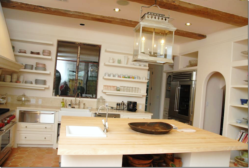
 The kitchen counters and backsplash are Creme de Marfil with an antique brushed finish plus an applied sealer for protection.   David had all the cabinets built on site.


image

The back wall in the kitchen is Austin limestone, cut thin and applied as a veneer.  An arched niche was cut out of the stone for an added charming detail.   The hood vent with its large corbels was finished with a layer of plaster to make it appear aged.    Of course there is a farm sink!


image

To make the kitchen appear as if it had evolved over time as an old country house would have,  a tall cabinet was built in the shape of an armoire with chicken wire added to its cutouts.  All these different surfaces - the maple, the marble, the plaster, the painted wood, the limestone - help to give the kitchen its unique appearance.    The kitchen and its sitting area to the left of the island looks out over the courtyard.   The dining room is located through the arch on the left and it also overlooks the courtyard.  The arch on the right leads to the back stairs and the garage.


image

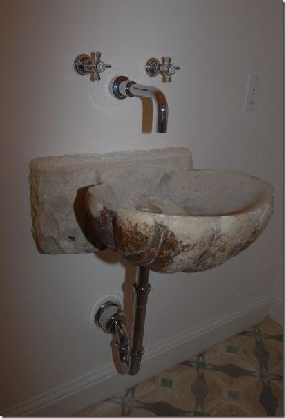
The powder room has an old stone sink that was purchased at Chateau Domingue in Houston.   Hanging the sink was a major challenge for David – the 200 pound piece of stone had to be appear as if it was just floating, yet it needed to be braced for safety – especially if the owners three little ones decided to hang off the sink!


 image

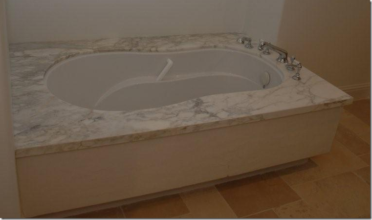
Upstairs, in the master bath, Calacutta Ora marble was used for the surrounds and countertops.   I wish I had pictures of the bedrooms, but for today, I don’t!  


image

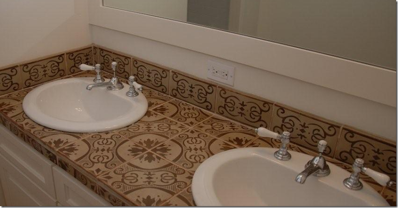
Architectural Design Resources and Dal Tile provided the unique tiles in all the secondary baths. 


image

David reports that although there are many antique and hand selected finishes here, he was able to provide the clients with a house that stayed within a reasonable budget.   Instead of a cookie-cutter house, he gave them a truly unique place to live in Houston – not in France – although it’s really hard to tell!    By using the ideas and tips that David provides today -  it would be possible to duplicate the French feel of this house. 


Backyard

David was clear in saying that Gunn Constructing and Building Co. doesn’t just build French houses – he recently completed this contemporary masterpiece and it will be on this years highly esteemed AIA Tour of Homes!   Look at that gorgeous negative edged pool!   It’s stacked stone wall is repeated inside the living area.


Entrynight

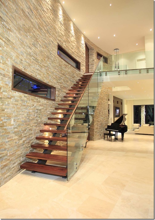
This staircase highlights David abilities as a first class builder – notice the slightly curving stacked stone wall, the open wood treads, and the glass railing and balcony!   Unreal!


 image

David also builds traditional Georgian – this house was designed by famed Houston architect Leslie Davidson and was on the AIA Home Tour last year.  Amazing that two of his houses have been on the tour!


image Inside the traditional house, David built this gorgeous wood paneled library. 
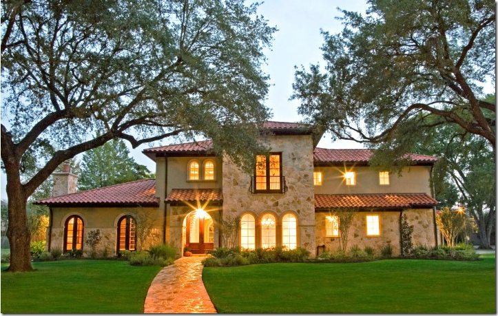


image And of course David  Gunn builds large mansions on even larger lots.


image

The stunning kitchen inside Gunn’s large French styled mansion.   I love that stained cabinet!


If you have enjoyed David Gunn’s work – be sure to check out his portfolio here.    And, if you are planning to build a house in the greater Houston area, give David a call and let him bid on the job.    I think you can tell from these houses, he is certainly talented and capable – and  any brother of Lauren Ross’ HAS to be a great guy!    To revisit Lauren’s two houses, go here and here.

Lauren Ross in Austin’s West Hills

67 comments

When Lauren Ross and her family moved to Austin, she was hoping to move into another older house with all the charm she had lived with in West University. But that was not to be. Instead she found herself drawn to a newer house filled with Hill Country ambiance. The capitol of Texas and home to the University of Texas, Austin, is famous for its native cream-colored limestone. A popular building material in this area, many houses are invariably clad in the stone. And indeed, the exterior of Lauren’s new house was limestone, along with interior walls of the creamy stone which perfectly complemented Lauren’s design style. The Austin house had been remodeled a few years earlier when a wonderful Great Room was added. The unique beauty of the Great Room was certainly a important selling point. Located in the west hills of Austin, with a view of downtown from the upstairs, Lauren’s new house, which before had been decorated all in brown leather and dark oriental rugs, was about to be introduced to the ethereal world of white linen, crystal chandeliers, and seagrass.

All these photographs, except where noted, were taken by Lauren for this story.

image

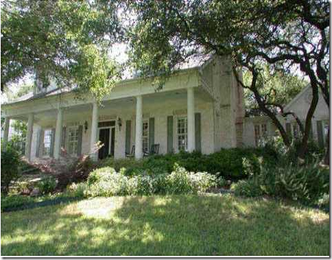
At the end of the cul de sac, the large two story limestone house sits high on a hill. Limestone steps lead to the wide front porch.

image

Lauren accessorized her front steps with old urns and sweet minature pink roses.

image The porch is decorated with iron and wicker outdoor furniture – covered in white linen, of couse! Ready to go inside?

image

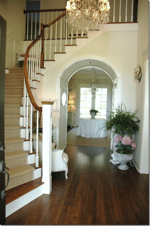
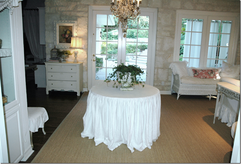
A winding staircases (there is also a back stairway) is covered in seagrass and lit by an oversized, gorgeous crystal chandelier. The Dining Room is to the left and the Living Room is to the right. Your eye is immediately drawn through the wide arches into the Family Room – with its large round skirted table standing underneath another crystal chandelier. The three elements found in Lauren’s Houston house – white linen slipcovers, seagrass, and crystal chandeliers - have been incorporated into her Austin home.

image

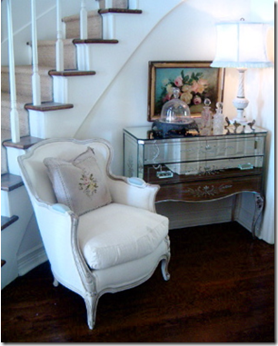
Photo taken from the Vintage Laundress, a great blog out of Austin. The Laundress toured Lauren’s house and wrote this story here– which I highly recommend. The mirrored chest is original – it came from Lauren’s beloved grandmother who had an antique store on Rodeo Drive in Los Angeles! Lauren grew up on tales of the classic Hollywood stars who would frequent the antique store. She credits her grandmother for her sense of style.

image

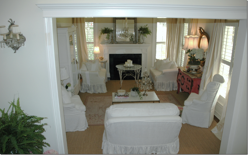
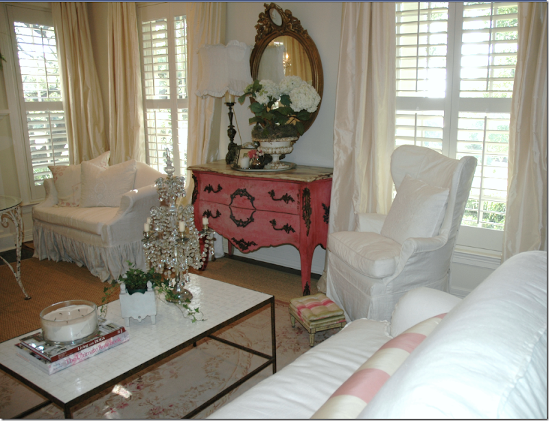
The front Living Room – the two love seats were in the Houston Living Room. The two fan chairs now have their slips on. The smaller sofa from Quatrine was in the sunroom. Lauren used simple ivory silk panels in this room for the window treatments. The seagrass was all custom cut to fit the house, just a few inches away from the wall. Upstairs, the seagrass is wall to wall.

I asked Lauren several questions about her decorating style and will feature her answers throughout this story:

You have a husband, three sons and 1 daughter - how do the men in your life feel about living surrounded by such beautiful femininity?

Lauren: My kids and husband really don’t mind how feminine everything is. I think they might object if I slipped everything in pink floral! As long as the house is comfortable and functional, that is really all that matters to them. Their friends are always commenting on how soft and comfortable everything is. You just want to plop down on everything. I love to use down fill in my pillows and couches so that adds to the comfort. The cushions usually look rumpled and sat on. I love the extra full ruffled skirts and how the feminine lines of the slipcovers play off the more masculine stone walls and dark wood flooring. Even though I like the feminine details on the couches and pillows, I tend to go much more simple on the curtains. I usually go with just straight panels that puddle on the floor a bit. I think curtains can really date a room so I try to keep that simple and not too frilly. I also have a passion for floral fabrics. It is easy for me to get carried away so I tend to use them sparingly on pillows so as not to get too feminine. I guess I am really going against all the trends right now where everything is much more tailored, straight lined and geometric. I really do what I like and try not to get caught up in the latest fad.

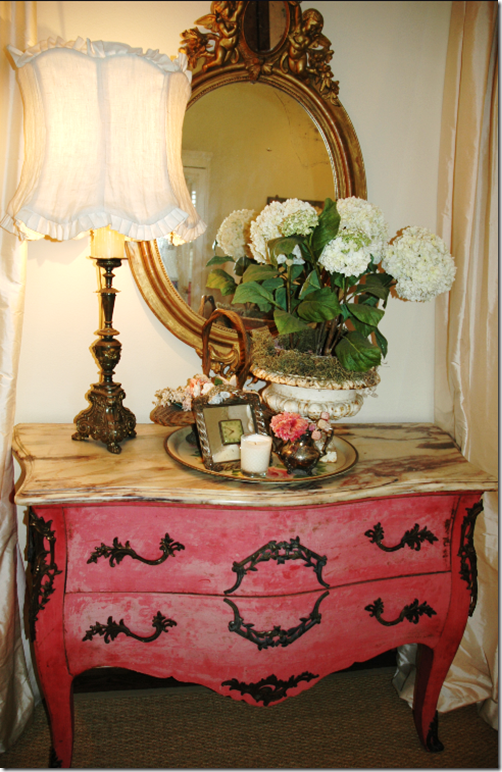
imageThe pink bombe chest. Everything in the Houston house was used in Austin – just in different rooms.

image

The coffee table is a rare new piece of furniture, from Oly Studios. Almost everything in the house is antique or vintage! In this room, Lauren used a pink and white silk stripe for pillows.

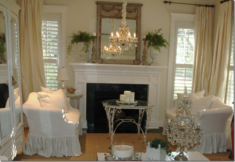
image The fireplace tiles are being replaced next week Notice how Lauren hung the chandelier over the fireplace area, instead of in the middle of the room. And also notice how all her mirrors reflect something beautiful – a great tip to remember: mirrors should reflect beauty.

image

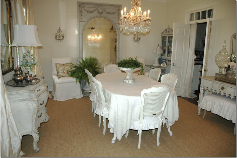
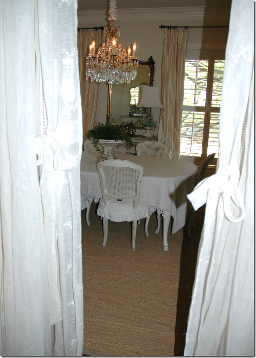
The Dining Room is located to the left of the front door - this room really shows off Lauren’s style. The table has been painted white and the chairs are from Shabby Chic. The oversized mirror, flanked by two tall slipcovered chairs, is the true focal point especially with the large crystal chandelier reflected in it. The kitchen is through the double doors which Lauren softened with white panels. Even though the Ross’ have not lived in the house but for a few years, Lauren loves to constantly tweak it and change things around. Notice how different things are in the picture below, taken from the Country Living spread:

image

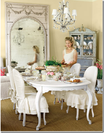
Country Living Magazine: Here, the chandelier is a much smaller version. And notice the slips on the chairs are also different. The blue cabinet is on an angle – probably just for the photo shoot. I love to see all the changes people make to their house as time goes on. A house shouldn’t be stagnant. It should evolve. Doesn’t the very beautiful Lauren look like she just belongs to this house?!!

image

A vignette from the dining room with accessories collected over the years. Lauren goes to every Round Top show – twice a year – to collect things for her house and for her clients. The ottoman is especially darling. In the dining room, there are three mirrors – something Lauren and I share is a love of mirrors over art!

image

A view from the kitchen through the curtain panels. The curtains in the dining room are the same ivory silk found in the living room.

I get tons of emails from women whose husbands won't let them decorate the way they want to. Is your husband supportive of your decorating and if so, why do you think he is?

Lauren: My husband is supportive of my decorating our home because he knows how happy it makes me. I am a home body so I really like surrounding myself with things I love. I work out of my house and take care of the kids so I am home a lot. My husband works all day and isn’t in the house as much. As long as he has a comfortable chair, a place to prop his feet, a tv with a remote, and a ceiling fan in the bedroom, everything is good. Of course he isn’t supportive of everything I want to do! I am wanting to change out some door hardware and doors in our house even though they are functioning just fine. His policy is… if it isn’t broke, why fix it. Sometimes I just want to change something because I don’t like the finish or the color. He is very practical and into the functionality of everything. I am more into the beauty so we try to meet somewhere in the middle. It’s all about compromise! We’ve been married for for 23 years so we know all about that.

image

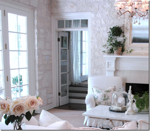
Just past the large arch in the foyer is the Family Room. To the left is the kitchen and breakfast area. This room is where the large family sits and watches television together. There is a playroom upstairs for the children, but this is the main gathering room! The walls are Austin limestone and really give the room its great character. The house is in a U shape – this room is the bottom part of the U and it overlooks the patio and swimming pool. Although there is just one urn on the table today, Lauren says many times the entire top is filled with white urns and pink roses!

image

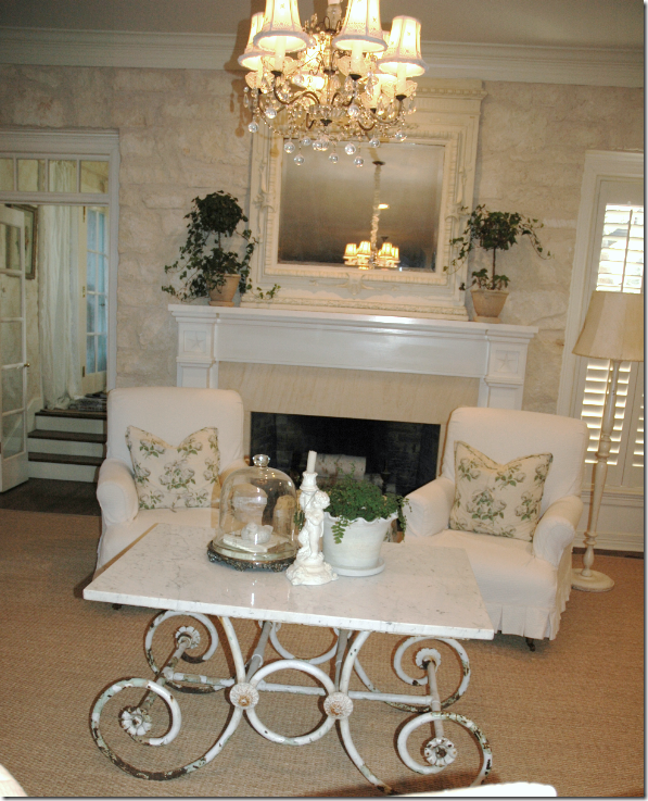
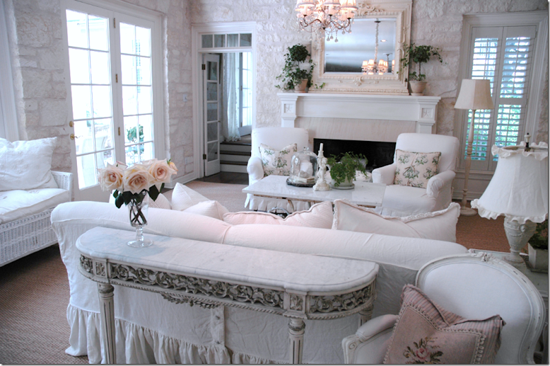
Bright and cheery – the family room is filled with the white linen Lauren so loves. There are two crystal chandelier in this room – one by the fireplace and one over the skirted table. Is there any room prettier than this? Lauren’s office is through the French door on the left and her bedroom is just past her desk, filling out the right side of the U-shaped house. I could gaze at this beautiful room forever!

image

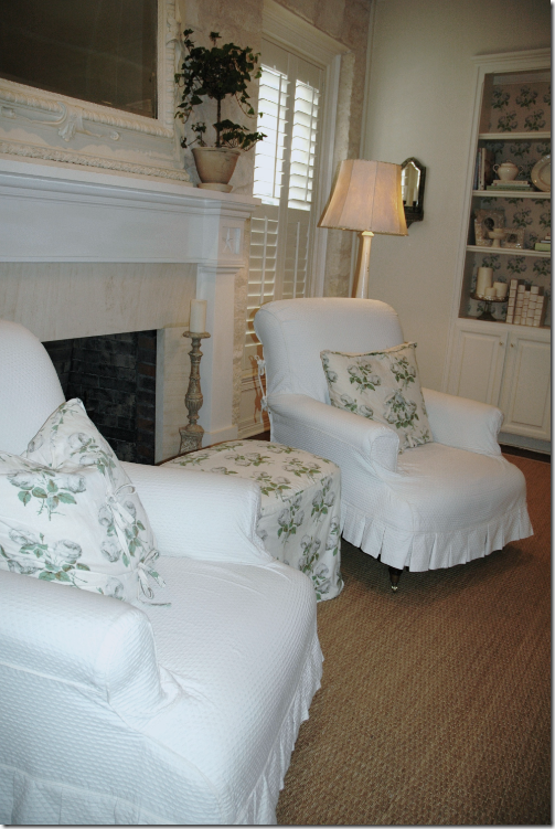
A close up of two chairs with their Colefax and Fowler Bowood pillows and the beautiful antique French pastry table used as a coffee table.

image

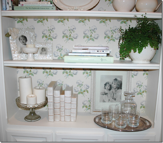
A glimpse of the built in shelves. The ottoman is covered in the Bowood print also.

image

To the right of the fireplace along the wall is the TV hidden behind cabinet doors flanked by built in shelves that are wallpapered with the Bowood print. The picture is Lauren’s stylish grandmother and Lauren as a baby!

image A close up view of the beautiful Pastry table!

image

Another close up of her double ruffle skirted furniture – just like she likes it – all downy and comfy and child friendly. Behind the sofa – is the breakfast room, and to its left is the kitchen which we don’t get to see today – it’s in the middle of a remodeling, so when it’s ready, I’ll show you the finished project. Also, notice that built in cabinet just behind the lamp, more below:

:

image

Lauren is so detailed oriented – she put a shade over the cabinet and lined the shelves with fabric! Just adorable!

image The way it was – from the real estate pictures - what the room looked like when the former owners lived there. It’s an amazing difference, isn’t it? Here the room is very attractively furnished, to be sure, but very masculine. Now, it’s all white and bright and feminine and so Lauren Ross. I thought you would enjoy seeing how interior design can utterly transform a house. It’s hard to believe it’s the same room I know!

image

Today – the same room with Lauren’s touch. The wonderful stone walls are the perfect foil to all the white linen! I’m in love!

Do you ever see yourself changing styles or evolving - in other words, do you think you will be living with white slips your entire life? (I will be!!!)

Lauren: I don’t see myself moving away from white slipcovers. They are such a perfect backdrop to all my pillows. I am obsessed with pretty pillows and love moving them around so I can do that with the neutral white background. And, I never get tired of the white. It is very calming to me and gives my eyes a place to rest. My style will always be casual and feminine. That is just what appeals to me for my own home. It isn’t for everyone but your home is about you, and casual and feminine just happens to be my style. I have always loved pink, too. When I was a little girl, my mom let me pick my wallpaper for my bedroom. Naturally, I picked a faded pink floral. I consider pink my signature color. I wear pink, have pink roses in my yard… I even wallpapered my closet in a pink Cowtan and Tout damask. I think that your home should be a reflection of you. If you like something, then go for it. The one thing that has evolved with my style is that I tend to have less clutter out. I used to have out every picture and every knick knack that anyone had ever given me sitting out on some shelf or table. Moving to Austin really forced me to edit. It was the perfect time to put things away and only have out the things that are really special to me.

image

Past the family room is the breakfast area and connected to the left of that room is the kitchen, which we won’t see today. The dining room is connected to the kitchen through the double door. This room pictured above, the breakfast room, connects to the large Great Room, which was added onto the house by the former owners. The Great Room is on the left side of the U shape of the house. Here, the Country Living photographer took this picture of the breakfast room, as it was then – looking into the Great Room. Since this picture, Lauren has added white linen portieres to divide the two spaces. The table and chairs came from Joyce Horn in Houston – and were in her Houston breakfast room.

image

The breakfast room – overlooking the Great Room, now divided by linen portieres. Yes, I know – that room is stunning!

image

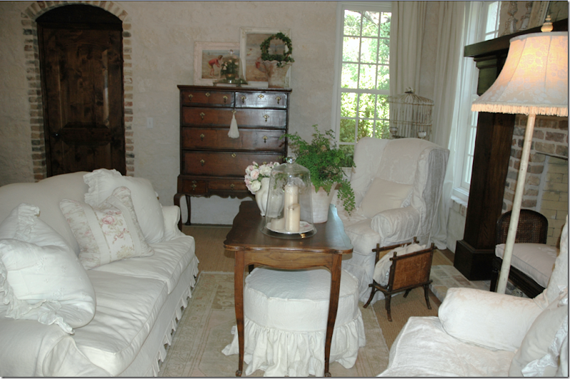
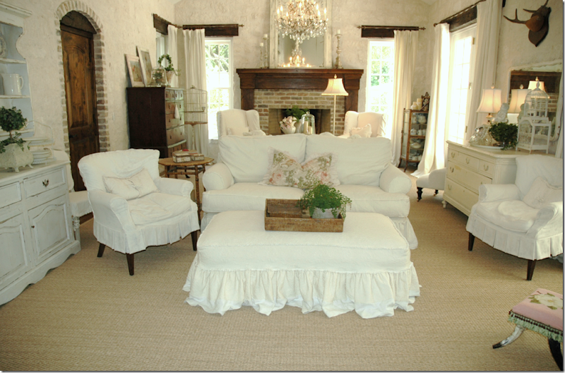
The Great Room is the newest addition to the house. It is such a beautiful space with its vaulted ceiling and limestone walls. Rough, wood beams and window headers add even more character. A wine cellar is located on the left through the bricked, arched wooden door. Again, Lauren’s trilogy: seagrass, white linen slips, and crystal chandeliers mix with all the rough surfaces in the room – providing a wonderful ying and yang. Before she moved in Lauren stained all the floors a darker shade and put in all the custom cut seagrass which hugs the walls – adding its large expanse of texture and color. This room is furnished with two back to back sofas. There is no television in here – it is strictly a place for the family to gather to talk and read. I am drawn to the dark wood, antique highboy in the back corner – what a beautiful piece! And I adore that large ottoman that doubles as a coffee table. The lumbar pillow is Bennison, of course!

image

A close up of the area in front of the fireplace – with the tall boy in view.

image

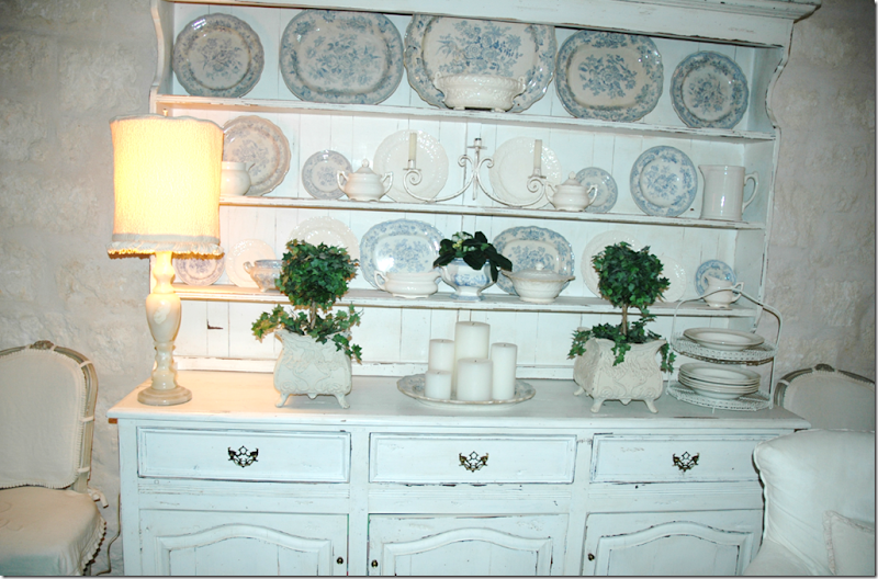
This large breakfront, filled with Asiatic Pheasant transferware platters, is on the left wall as you walk into the Great Room. .

image A vignette from the Great Room. Remember that charming chair in the Princess’ bathroom – here is it!

image

One last view of the Great Room. I hate to leave it!!!!!!!!

You are an interior designer - do you work with different styles, or mainly with white slips?

Lauren: I really don’t deviate too far from my own personal style when helping my clients. Sometimes instead of white or cream fabrics, I’ll use an oatmeal, tan or gray. It all depends on what looks best with the clients things. I always recommend slipcovers to my clients because you can wash them. I think I have sold all of them on slipcovers! They are just so great with kids and pets in the house. Many of my clients prefer a more tailored skirt on their slipcovers as opposed to a ruffled skirt. It’s really all about what is appropriate for their house and what they like best. Most of my clients love antiques and like either the English or French style or a combination of both. I like using lots of toiles and florals for pillows and draperies. I also love to mix different patterns in one room to get that eclectic look. I really like for rooms to look like they have evolved. I love it when things don’t really match and it looks like you have bought them through the years rather than in a showroom on a weekend buying trip. I have had some loyal clients for years now because we are still hunting for the perfect pieces.

image

To get to the Master Bedroom, we’ll go back to the Family Room and walk through the charming double French doors, up the steps, to Lauren’s office.

image In this picture from the Real Estate web site – you can see the walkway to the Master Bedroom in the separate wing to the right of the house. This wing looks added on, which gives the house even more charm.

imageLauren’s home office, up the steps from the Family Room in the hallway to the Master Bedroom. The walls are papered in Colefax and Fowler damask.

image

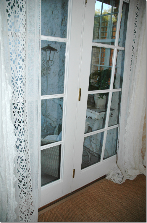
And in the walkway, across from the desk, these French door lead to the outside back patio.

s

image

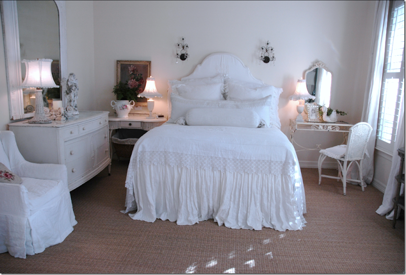
The master bedroom is all white linen, new and old. The seagrass here is wall to wall.

image

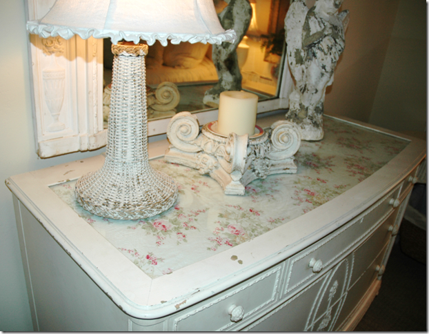
The fabric top of the vintage dresser in the bedroom is covered by glass. All over Lauren’s lampshades are slipcovered too!

image

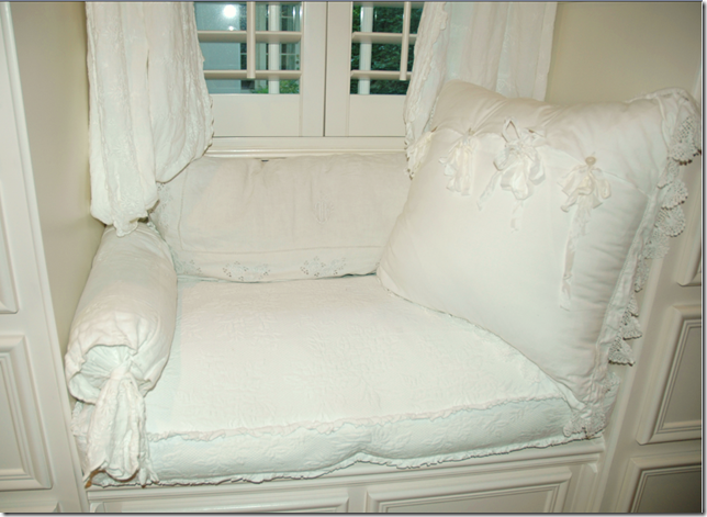
Leading from the bedroom is the dressing room, then the bathroom, with a cushy window seat along the way.

image

Close up of window seat, filled with white linen.

image

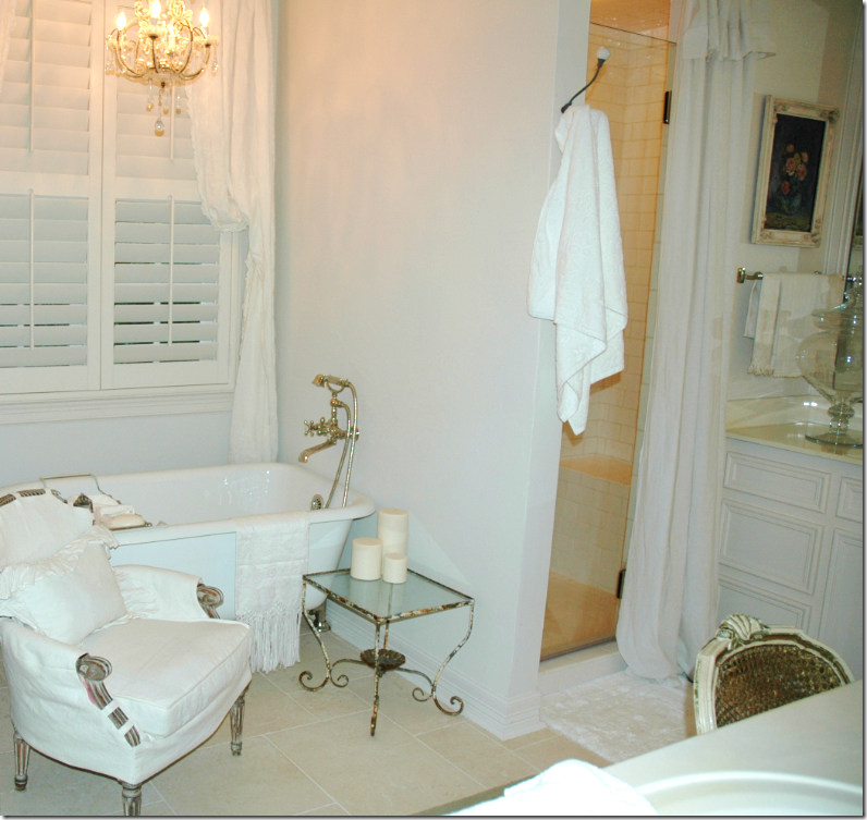
The master bathroom with limestone floor. Lauren placed curtains over the shower door. I love the French slipped chair with tabs. Notice her wall mounted faucet!

image In this picture, the white curtains have been switched to these printed ones! I love how the rooms keep changing and evolving. No space is left to its own – Lauren has accessorize everything. This really makes me want to take a second look at my house and see what details I can add to it. Ready to go upstairs?

Who were your influences when you first started decorating with white slips? Whose work did you study?

Lauren: Rachel Ashwell was my biggest influence with the white slipcovers. I remember when her first book came out 20 years ago and I thought this is so “me” and how I want my house to feel. I love her style. It is kind of that “throw away elegance” as she would say. Nothing is too precious to be enjoyed and used. She loves the tattered and rumpled and finds beauty in little things like an unmade bed or fresh flowers that are fading to that perfect shade of pink. She has a new book coming out and I can’t wait to get my hands on it! I met her when she opened her Austin store but was so star struck that I really didn’t know what to say!

image

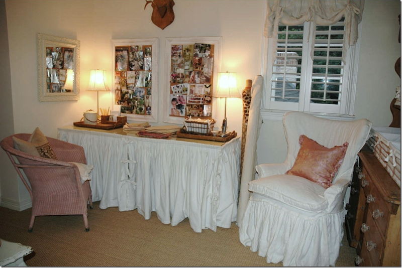
Lauren’s interior design office is upstairs, along with a large playroom for the four children. The skirted desk came from Houston. I love the pink vintage wicker chair!

image

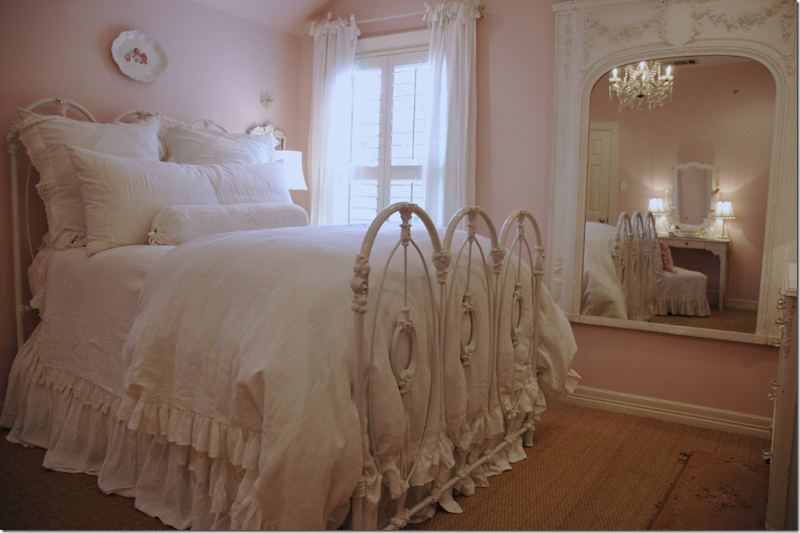
The Princess’ room in Austin is all pink now – no longer pink and blue! The large mirror is a twin to the one in the Master Bedroom.

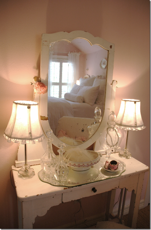
image Her sweet vanity mirror reflects the bed’s soft and comfy looking linens.

image

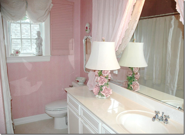
To bring romance into the Princess’ bathroom, Lauren added a pink shutter to the window and put curtains over the mirror. I want to go home and curtain everything!!!!! We’ll leave the boys rooms and the play room for another day. Time to show you my favorite space, downstairs – the laundry room. Yes, the laundry room.

image

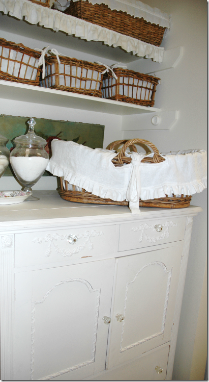
When Lauren and I first starting emailing – she sent me pictures of her laundry room to show me how she had remodeled it. I almost thought I had died and gone to heaven, what a darling laundry room she had! I mean, really, look at all those wicker baskets lined with linen! When you first enter the laundry room, this niche with its vintage white chest is located on the left hand side.

image

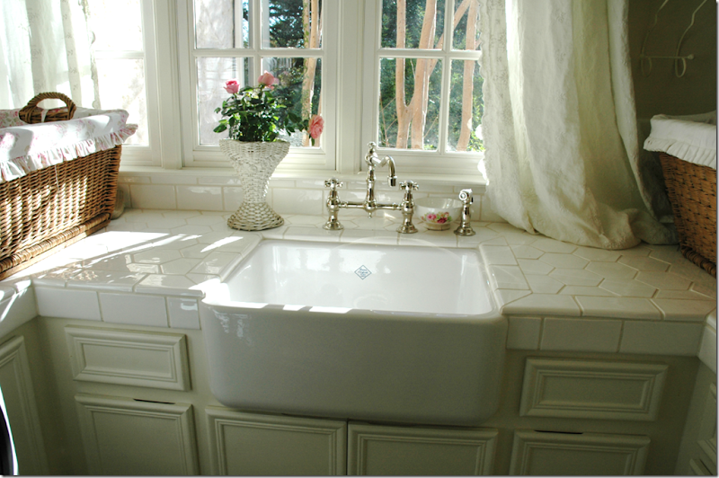
And yes, that is a chandelier in the laundry room, and limestone tile floor, and yes, that is a Shaw sink, and lovely linen curtains, draping over the countertop. Isn’t this just too cute????

image

I think I would love doing laundry in this house with its pretty casement windows overlooking the landscaped grounds! What a luxury – a Shaw sink in the laundry room! Pinch me someone, quick. Ready to see the back yard?

image

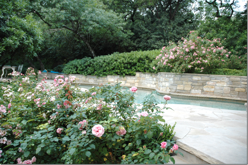
Well, yes, this sure is pretty – would you expect anything else from Lauren Ross??? I love the curved, stacked limestone wall with its cascading roses from the Antique Rose Emporium. I once wrote a story on this company here and if you have never been to the Antique Rose Emporium before, you should pay them a visit if you come to Round Top. Just beautiful!

image

This area is behind the Great Room – you can see the limestone fireplace on the right side. Slipcovered iron bench sits in front of the zinc topped iron table.

image

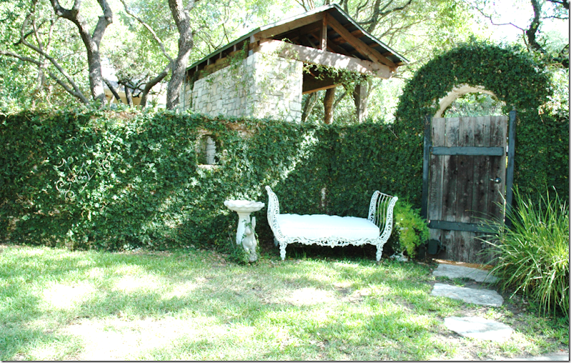
The iron day bed is from Joyce Horn in Houston. Notice the little arched window inset in the ivy covered limestone wall! The gate leads to the outside kitchen – I wish I had a picture of it! It looks so Austin to me.

image

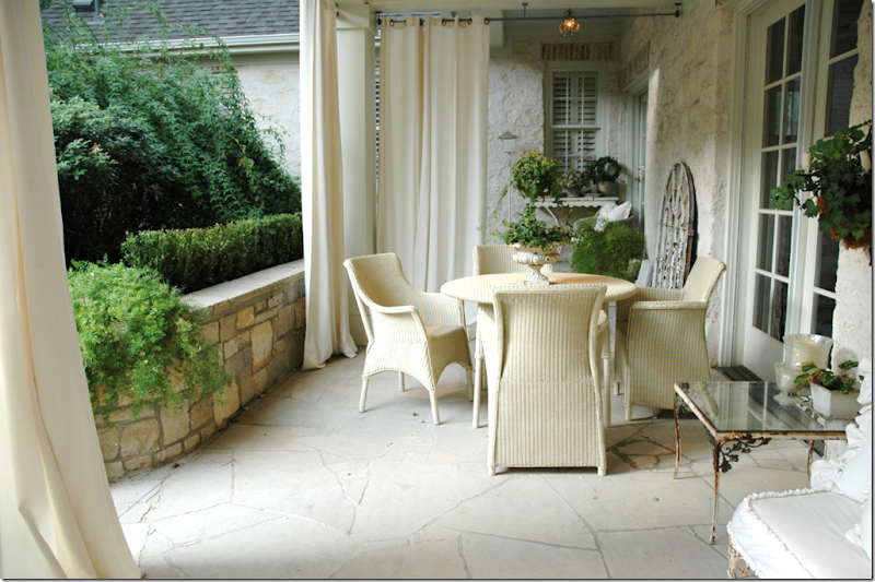
Off of the Family Room is this covered porch. Lauren put up the Pottery Barn curtains to shield the Family Room from the western sun, but it also turns the porch into a nice outdoor room. Janus et Cie wicker.

image

Outdoors on the porch, a vignette with a mirror and assorted Round Top goodies. Notice how adorable the limestone is cut on the floor!

Tell us about yourself - where you're from, your family, your hopes, your dreams!

Lauren: I was born in Long Beach, California when my dad was in the navy. My grandmother lived in Beverly Hills and owned an antique shop filled with Oriental and French antiques. She had great style! I remember being awed by the movie stars and designers that shopped in her store. She was an influence on my love of antiques and design. I grew up in Houston and have a younger brother and sister who still live there. I graduated from SMU with a BBA and was married shortly afterwards to a man that I went to elementary school through college with! We later had 4 children. My oldest started high school and youngest kindergarten this year! I have a financial background and worked many years at Rice University as the Assistant Controller. I decorated friends and neighbors homes on the weekends for fun. Later I realized it was my passion and began doing it full time as my business grew by word of mouth. My hope is that every client loves their home and that it brings them much happiness. My dream is to have my own antique store one day. I would love to have an excuse to travel and buy beautiful things!
image

Only in Texas would you find this in your yard – an armadillo – saved by one of Lauren’s three sons and relocated to a better habitat than their back yard!

imageOr you might find this – a little fawn, sleeping in your back yard – so beautiful! I hate that this story of Lauren Ross in Austin is over, so I’ll leave you with one more picture from Lauren’s Austin life, enjoy!

image

FYI: The paint color throughout is Navajo White by Martin Senour. Lauren Ross is an interior designer, living in Austin, Texas – to email her directly for inquiries: Rossfamily6@sbcglobal.net

I hope you enjoyed this story at least half as much as I did because I am in totally besotted with Lauren and her house and decorating style.
OK! I’m off the beach now!!!!