I HATE Showcase houses! Especially neighborhood Streets of Dreams types of Showcases. Builder after builder tries to out do each other by designing the most bloated Mac Mansions filled with even more horrible furniture - fake flowers everywhere and a plethora of tacky accessories. At least here in Houston, Showcases are usually like that. But, every so often, I go to a Showcase and then come home and want to take a bomb to my house and blow it to smithereens and start all over again. I’m suffering right now, truly suffering, thinking I have to live in my house for the rest of my life! I mean – I DESERVE the house I saw this weekend! I APPRECIATE it!!!!! Does anyone out there have $3 million dollars to give me – not lend – but give? I’ll pick up the remaining tab of $299,000 myself (nice of me, I know) – then I can just go and move in tonight! No problem. Just pack a small suitcase (because I would need an entire new wardrobe in this house – no Eddie Bauer black sweats anymore, not even the black sweats with the cute hot pink hoodie.) Yep, I’m ready to move there now and I think you will be too. Everyone was oohing and aahing over the house. Seriously – one woman insisted SHE was moving in – but I had to let her know that nope, I was buying it – as long as some nice Cote de Texas reader coughs up the 3 million.

Every year my neighborhood has a New Home Showcase and, in truth, it is usually pretty good. Sometimes the houses are really over the top, but for the most part, the builders and interior designers use restraint here in West University. One builder has been winning all the awards the last few years and deservedly so – Stonehenge Classic Homes. I’m sure they will win top honors this year too. My sister-in-law from Chappell Hill was in town for the rodeo BBQ cook off (hey, this IS Texas!) and she called me with a slight sound of hysteria in her voice telling me to get over to see this one house on the tour immediately. I asked her if it was the Tami Owen house and she said it was – I knew it. Owen is an incredible designer and her partnership with Stonehenge gives her the perfect vehicle to show off her talents. So, realizing the urgency of the situation, I actually got dressed on a weekend and made it there at 4:45 just ahead of closing.

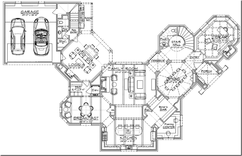
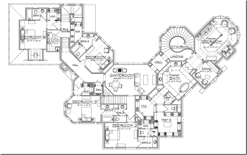
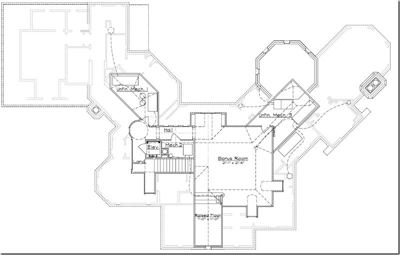
OK – the details: Vieux Antiques provided the French antiques and accessories, Custom Creations handled the upholstery and reproduction tables, along with Mortise and Tenon, Indulge did the bedding and furniture, and all the art work by Michelle Y. Williams was commissioned for the house by Owen. The rugs and seagrass came from Creative Flooring (no web site), of course. The star though was the paint job, an incredible, beautiful plaster by Segret0 - with the talented and adorable Leslie Sinclair at the helm. Leslie does faux painting for the 21st century – it’s not your mother’s faux. It’s subtle and adds such a richness to a house. If you’ve ever considered doing Venetian plaster, this house was the place to see it done right, matte, not shiny – just gorgeous! The house itself is a marvel. Most houses in West University are on postage stamp sized lots - 50 x 100. Bigger lots are only 50 x 120 or 50 x 150. This house, though, is on a curved corner, one of the few in the entire township – therefore the house is wide, not deep, a real rarity. The house was designed by Robert Dame – which lends it a certain cache from the start. The floor plan doesn’t reveal itself easily, there are not many 90 degree angles, instead the rooms have shapes. Most of the rooms are either octagons or elongated octagons. The floors set it all off - they change throughout from deep brown, wide planked, hand-scraped oak to antique brick to tile to wall-to-wall seagrass. The ceilings aren’t flat – some are domed, others are raised and others have exposed beams. And hanging from each ceiling is a wonderful light fixture – a beautiful collection of the painted wood, French candlestick chandeliers that are so “hot” today. Each room is special, yet it all flows beautifully. And helping it flow are the interiors that Tami Owen has created. The colors are cool and calming, monochromatic without a hint of a patterned fabric anywhere. Owen designed it all – the curtains, the fireplaces, the bathrooms, the cabinetry, the bedding, all the little details that come together to make this a truly beautiful home. With the help of the industry partners, Owen furnished every room – nothing was left out, it truly is ready for someone to move in today. There are full floor plans at the end of this post for your perusal. Enjoy!!!

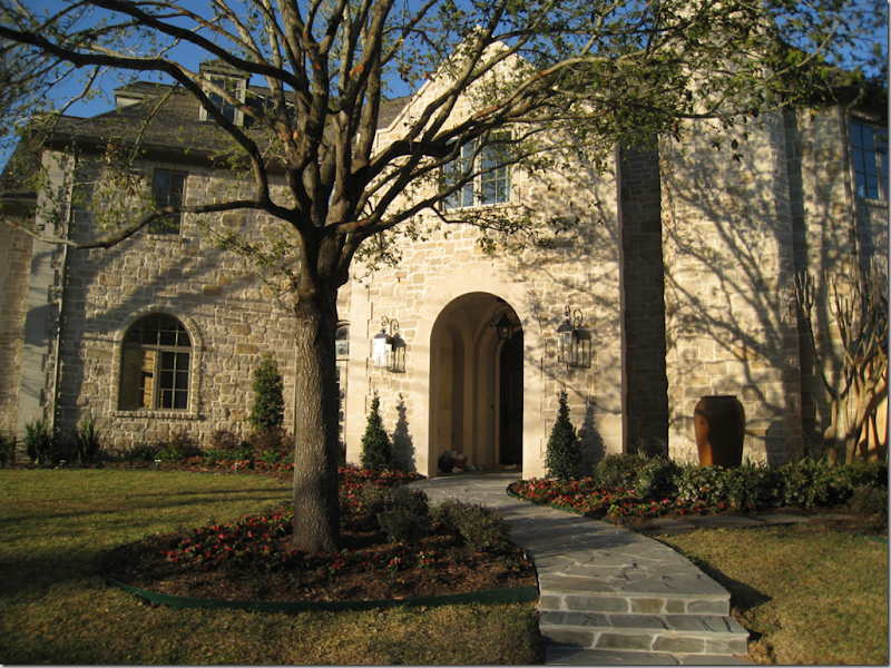
Straddling a curved corner – a rarity in West University, the limestone house is wide as opposed to long. The windows are by Pella and they add so much to the charm of the house.

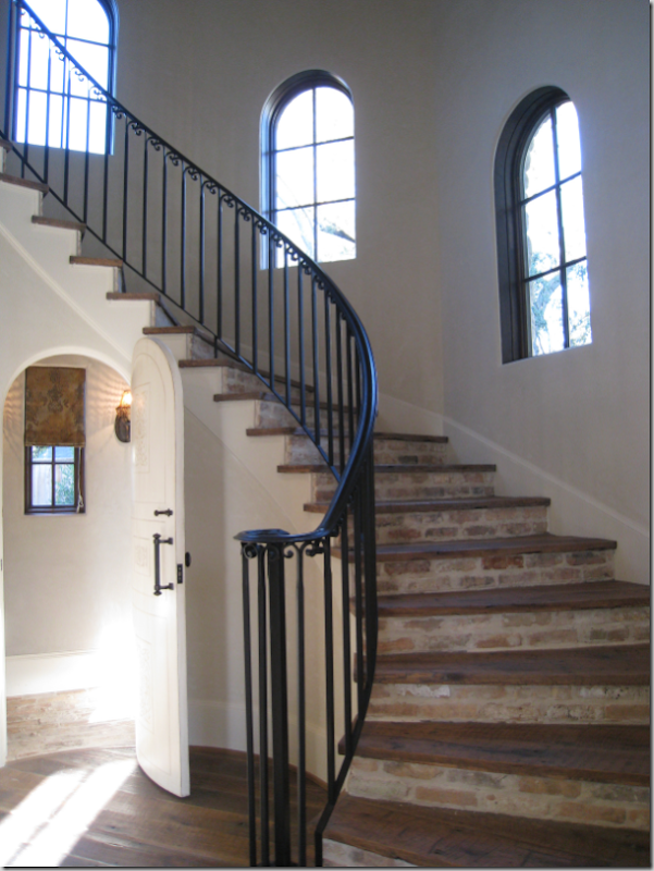
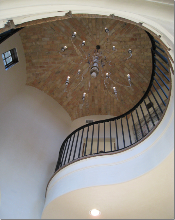
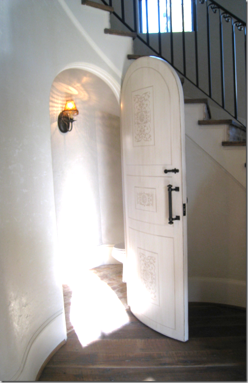
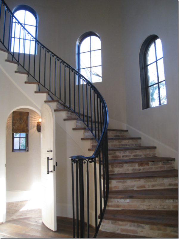
On entering the house – the dining room is to the left, the study is to the right and straight ahead is the winding staircase. The staircase is located in an octagon turret. The risers are brick, the treads are, like the floor, wide plank hand-scraped oak. Through the charming arched door is the powder room with an antique brick floor.

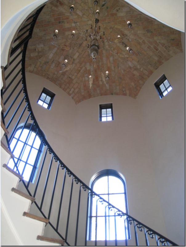
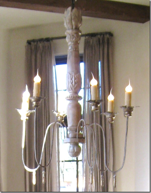
Looking up the staircase - the ceiling is brick, the lighting fixture is an oversized French painted wood candlestick chandelier that is so popular today. Notice the small windows that follow the curve of the walls at the top of the turret.

This shows the curve of the landing. The house is three stories – there is also a back staircase and the house is elevator ready.

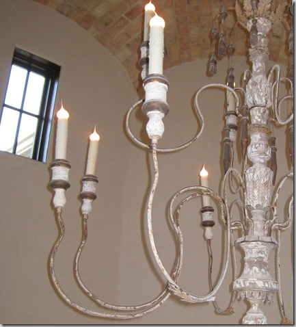
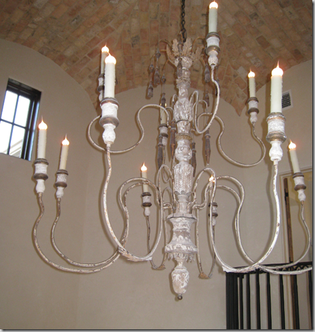
A close up of the beautiful painted chandelier.

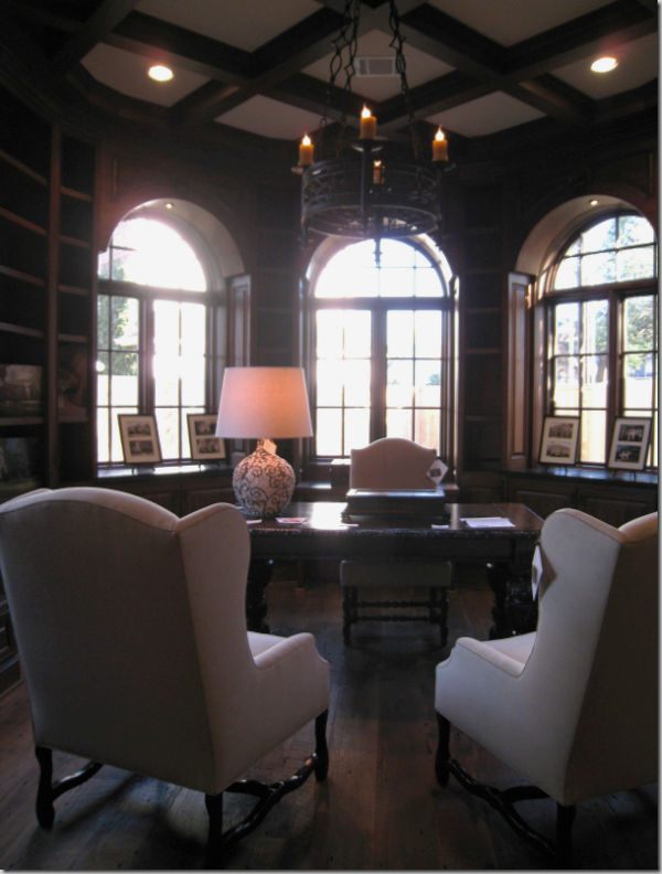
Walking in the front door – to the right is the large paneled study in an elongated octagon shape. The ceiling is box beamed and the chandelier is black wrought iron. Two Os-de-Mouton French wing chairs from Custom Creations are the main furnishings, along with the desk.

The mood of this study is definitely masculine!

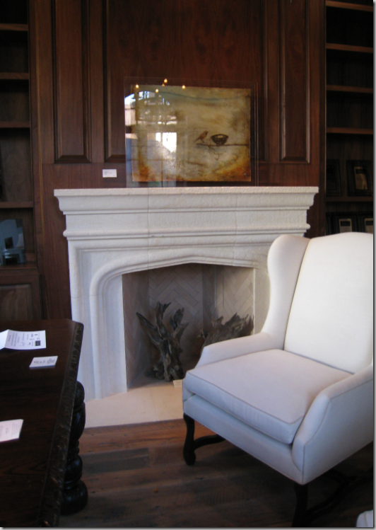
A close up of the fireplace designed by Tami Owen. The house has a total of four fireplaces.

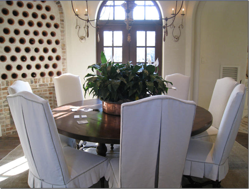
Walking into the front door, to the left, is the dining room – another octagon with a groined ceiling. On the left is a built in wine rack. Two sets of sconces ring the room. The chairs are slipped in white linen with gray ticking micro flange trim and pleats – adorable!

The table is large enough to seat eight. The rug is a muted flat weave from Creative Flooring.

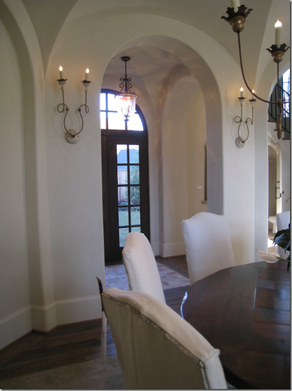
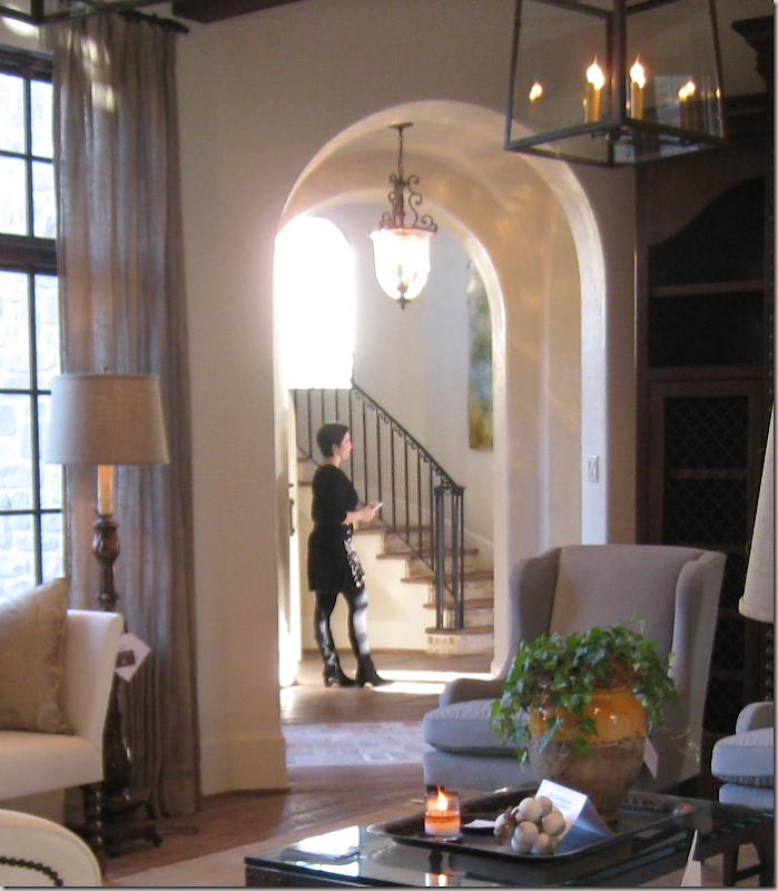
In this view – you can see the arches that separate the rooms, the hall leads from the front door to the stairs to the family room. Also notice the brick floors that delineate the path to the French door which opens to the backyard.

A close up of the dining room chandelier.

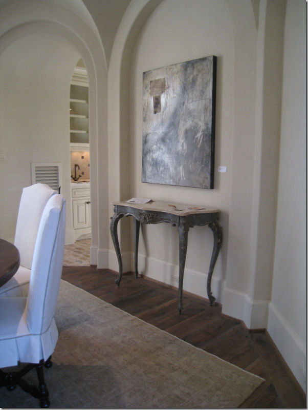
Here you can get a feel for the octagon shape – each side is highlighted by an arch. Through the doorway is the butler’s pantry that leads into the kitchen.

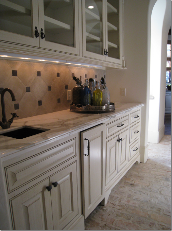
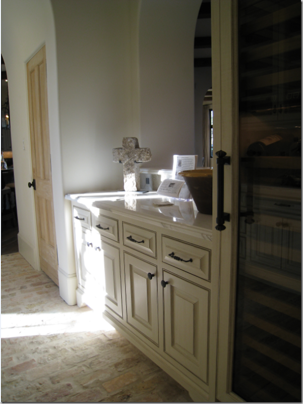
The butler’s pantry doubles as a bar. The countertop is Calacutta Ora marble. Be sure to notice the gorgeous antique brick floors.

The right side of the butler’s pantry doubles as a bar and opens up to the large family room. Notice the limed pantry door. Many doors in the house are either antique or special in some way.

Past the butler’s pantry, off in a nook to the left is the computer room, or small office.

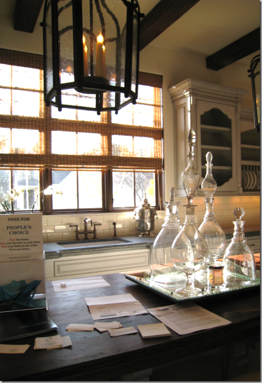
The view of the kitchen upon entering through the butler’s pantry. The kitchen is open to the large family room which is on the other side of the island.

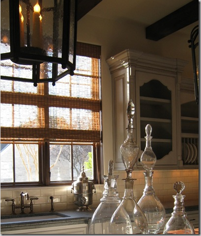
The island has a wood countertop. I love those antique apothecary jars – beautiful!

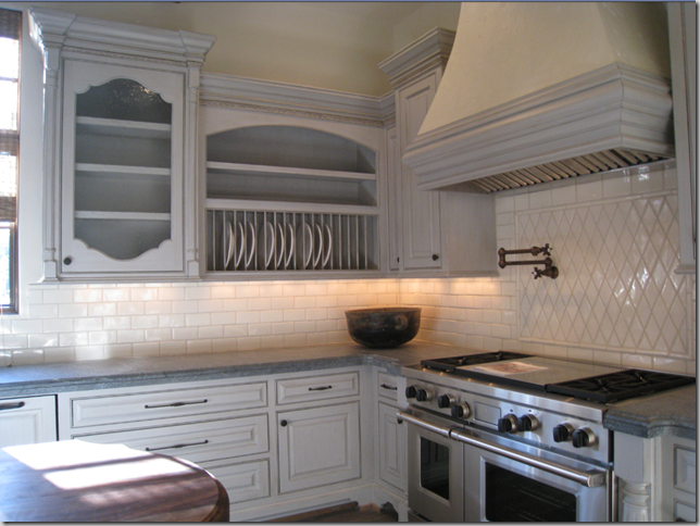
Close-up of the range and built in plate rack. Notice the wonderful choice of hardware – especially on the long drawers.

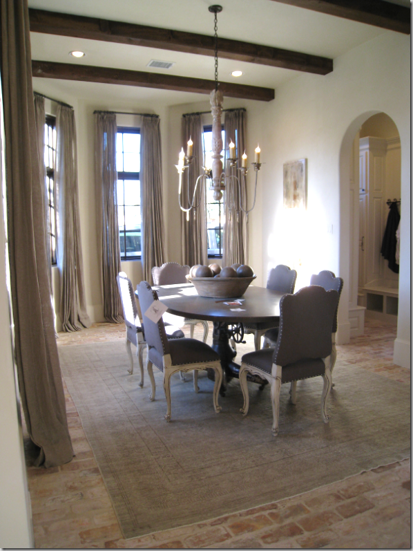
Off the kitchen is the breakfast room, another elongated oval. The brick floors continue through here and into the mud room, seen through the arch. There is another muted, flat weave rug from Creative Flooring. The curtains, designed by Owen are a loose weave unlined linen. They were stunning! The beamed ceiling here continues from the kitchen and into the adjacent family room.

A close up of the breakfast room chandelier.

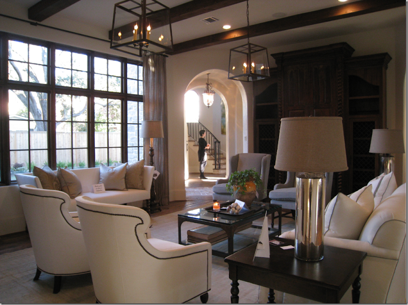
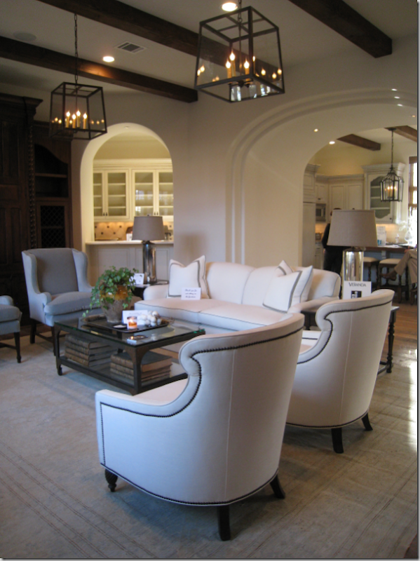
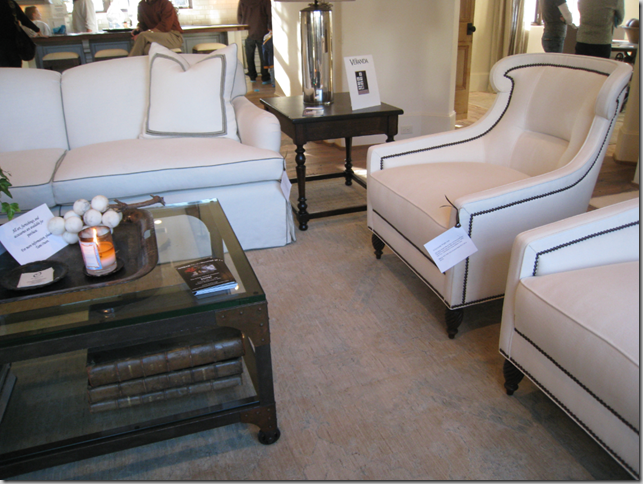
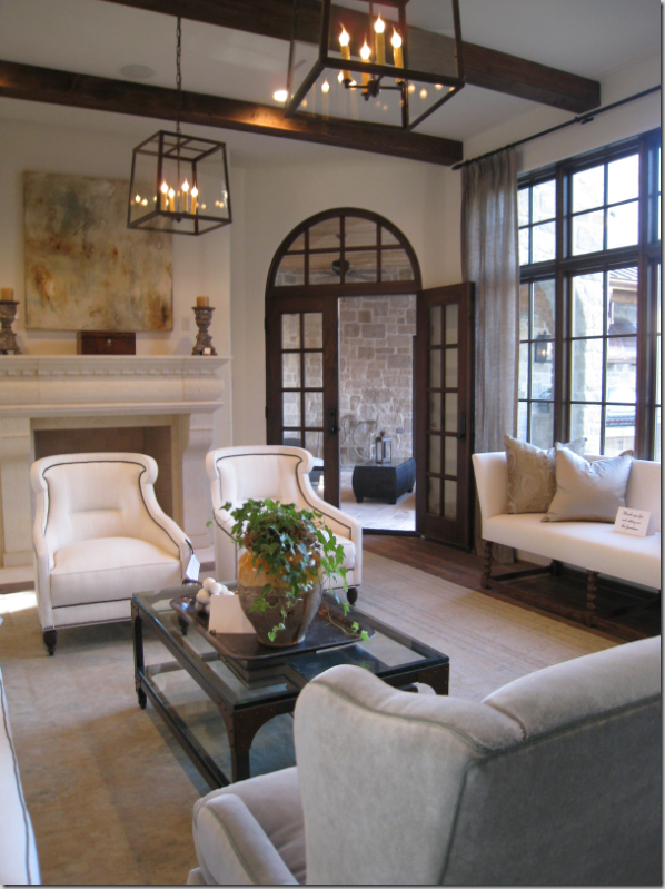
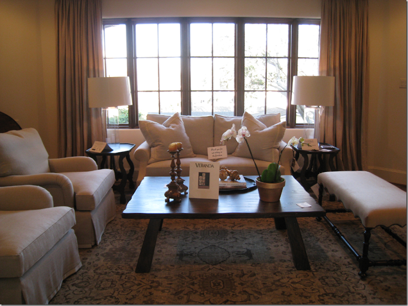
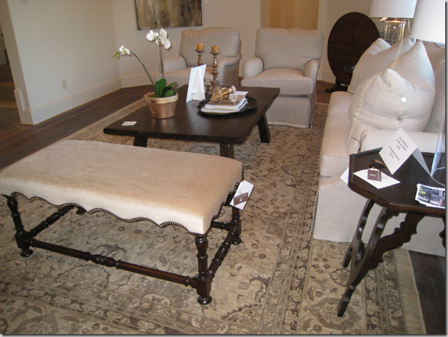
Walking from the breakfast room into the family room, you can see through the arches to the staircase. This room is another elongated octagon. The upholstered furniture here is from Custom Creations and is just gorgeous with the nail head detailing on the chairs and micro-welt trim on the sofa. Another flat weave rug from Creative Flooring covers the wood floors. The two lanterns here mimic the two lanterns in the adjacent kitchen. The media center stained dark brown has barley twist detailing.

Through the arch on the left is the butler’s pantry/bar and through the large arch on the right is the kitchen.

The kitchen is to the back of the sofa, the breakfast room is seen to the right behind the chairs.

The fireplace, designed by Tami Owen is next to the French doors leading to the patio.

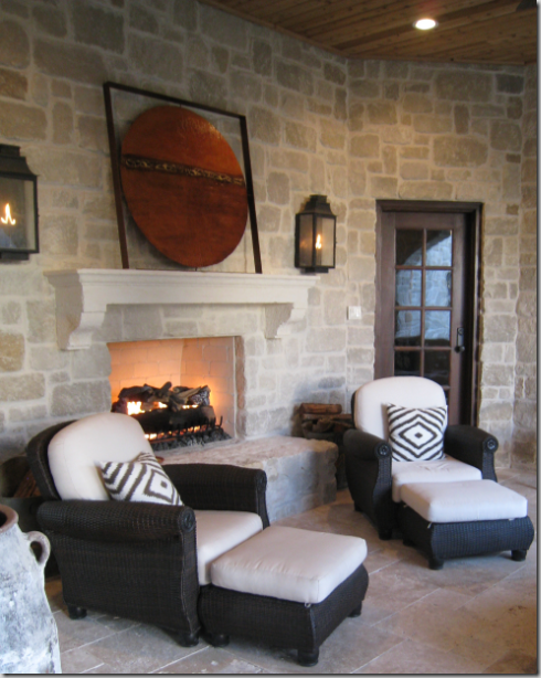
The patio with limestone walls has another fireplace! Hanging lanterns further set the mood.

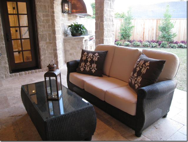
On the patio, behind the settee is the outdoor kitchen with its copper hood.

Let’s go upstairs!

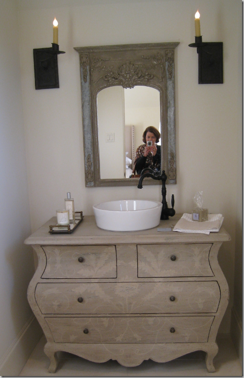
But first, I need to use the powder room – I’ll be right back. Notice the subdued stenciling on the charming door. All the stenciling and Venetian plaster treatments were done by Segreto.

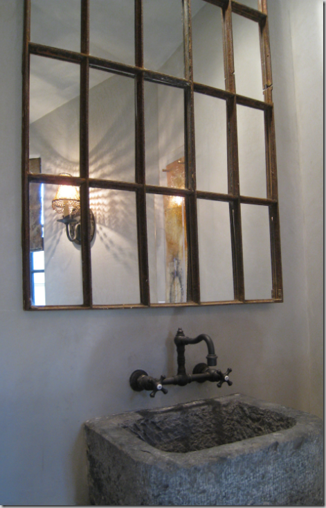
The powder room features a stone vessel with charming wall hung fixtures.

OK – let’s go up the stairway, housed in an octagon shaped turret. There are three floors, two staircases, and the house is elevator ready.

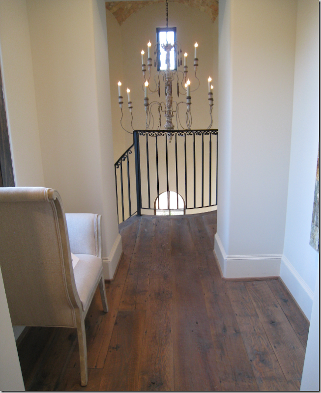
On the second floor, you walk through this corridor to reach the upstairs sitting room.

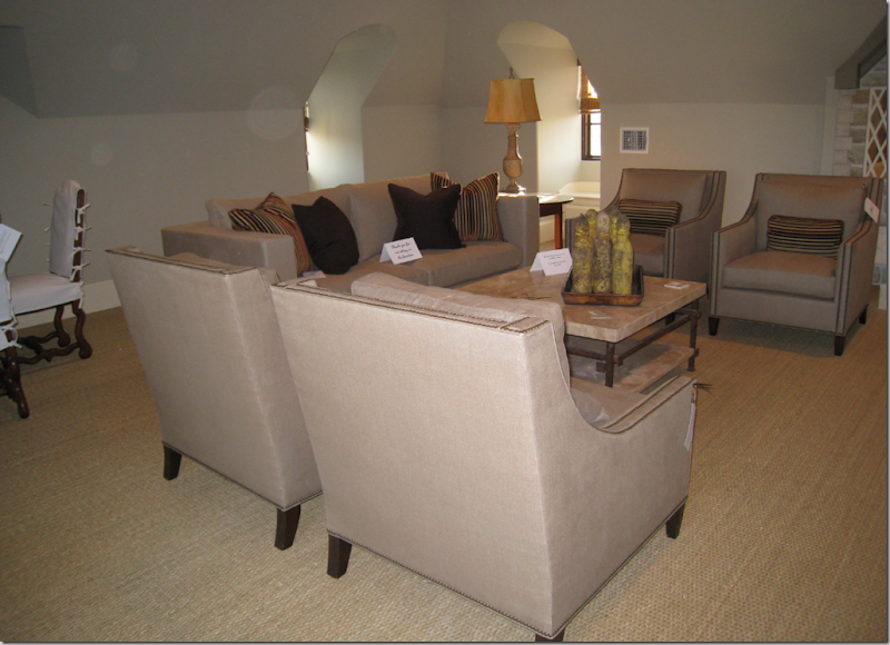
The upstairs sitting room is furnished with upholstery by Custom Creations and the assortment of tables also come from Custom Creations. The curtains were designed by Owen. The rug comes from Creative Flooring.

The sitting room is again, an elongated octagon.

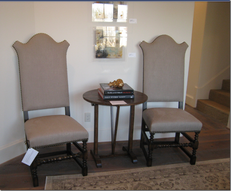
Two charming chairs with nail heads from Custom Creations flank a small reproduction wine table. Through the door you can see the staircase up to the third floor.

This bedroom is furnished by Indulge – with Blanc d’ivoire furniture and lamps. The flooring is wall to wall seagrass. There are five bedrooms on the second floor. All but one were completely furnished.

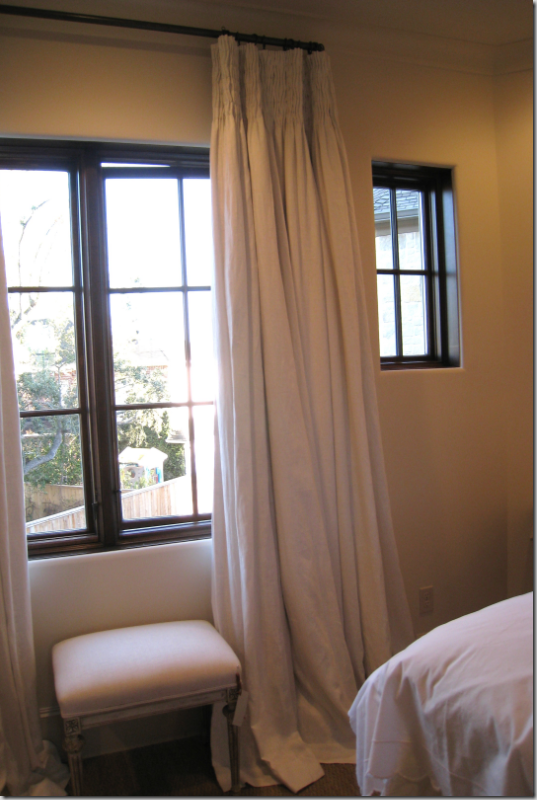
Smocked linen curtains.

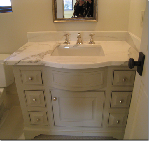
This bedroom has its own bathroom – here with a Calacutta Ora marble countertop.

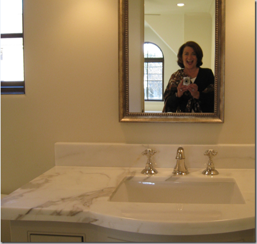
Me, in a state of hysteria over the house!

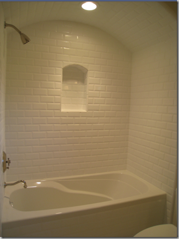
The bathtub, in an arch, with an arched niche. The walls are tiled to the ceiling in white subway.

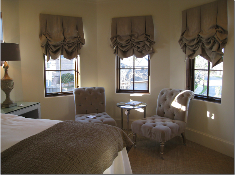
This bedroom, by Custom Creations, designed by Tami, was my favorite. The bed is framed by the two small sized windows that are found throughout the house.

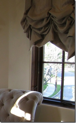
The sitting area with linen balloon shades. The shades are full length which gives them their lushness. Faux shades just do not have this fullness. The two tufted chairs in velvet with wheeled feet from Custom Creations are just darling.

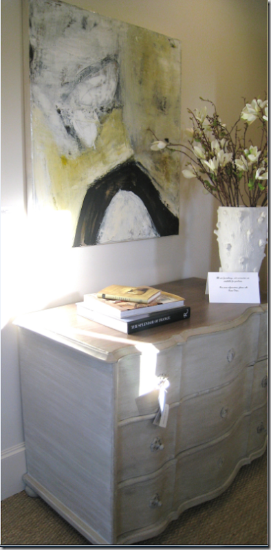
Blanc d’ivoire chest with a Michelle Y. Williams painting and faux bois vase by Oly Studios.

The bathroom. Notice the light fixtures!

The shower curtain was just too cute for words!

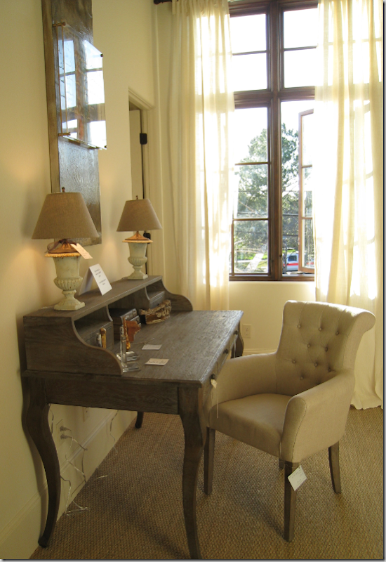
The next bedroom, again with Blanc d’ivoire furniture from Indulge. The double height casement windows were open – unusual for Houston – it was a gorgeous day. The curtains are unlined linen. A trick: at home – to hide cords like this – tape the cords to the back of table legs – it really helps to disguise them.

This ceiling is raised with wood beams. A painted wood chandelier hangs from the attractive ceiling.

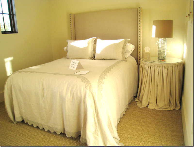
The gorgeous bedding is from Indulge – the lace is so beautiful in real life!

The bathroom. Notice the plumbing fixture! All these details – amazing!

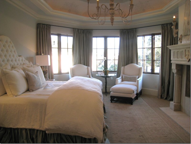
The master bedroom: the bedroom suite is entered through double antique wood doors that lead to a small lobby. There is a separate small sitting room in the suite. In the bedroom, the ceiling is coved and there is a large fireplace. Wall to wall seagrass is accented by a flat weave rug from Creative Flooring.

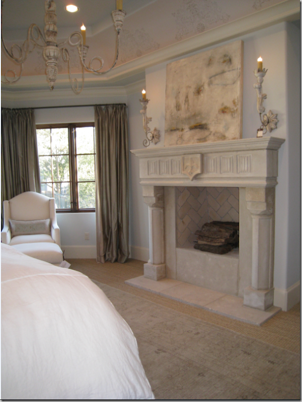
The fireplace was designed by Tami Owen. There are painted wood sconces and a chandelier for extra atmosphere. I love how the firebox is elevated for easy viewing from the bed!

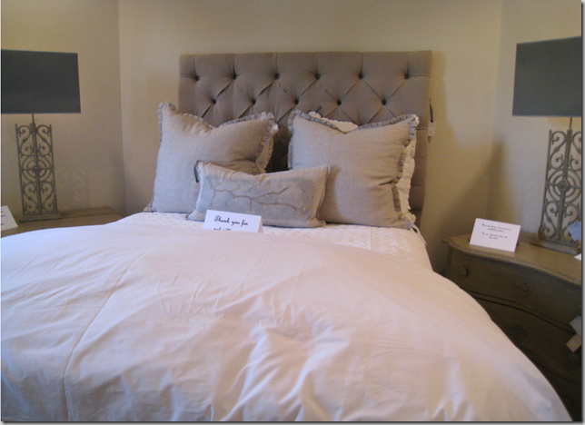
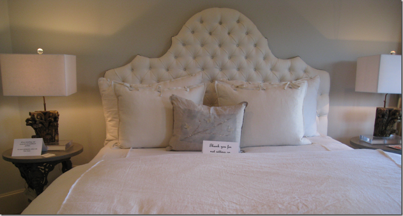
The white tufted headboard with nail heads was designed by Owen. The bedding is pure linen! Just beautiful!

Close up of the sitting area with furniture from Custom Creations.

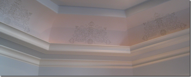
Along the ceiling there is a very subtle stenciling created by Leslie Sinclair of Segreto.

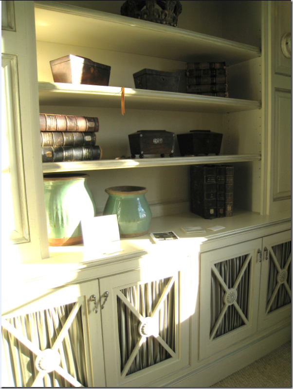
The master bedroom sitting room – notice the distinctive cabinet doors. This motif is carried into the master bathroom. I love the accessories here – antiques by Vieux!

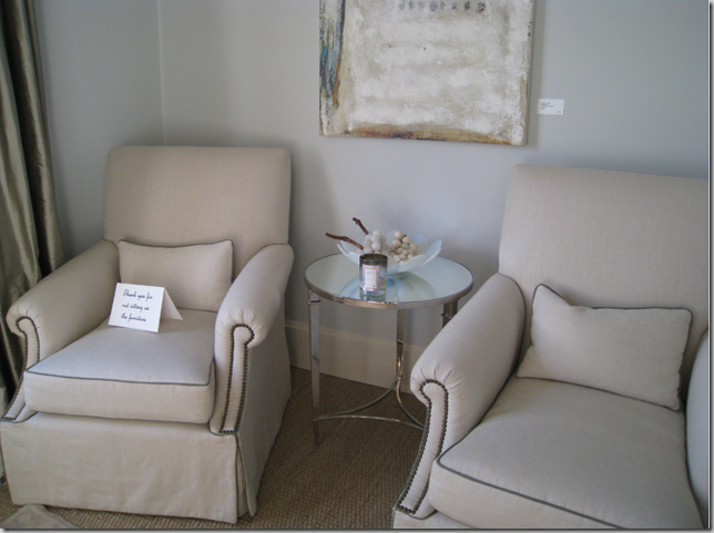
The master bedroom sitting room is just cozy enough for two club chairs by Custom Creations.

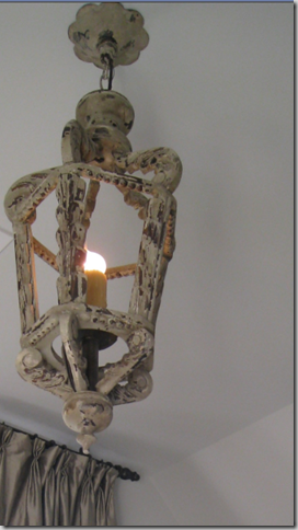
The light fixture in the master bedroom sitting room.

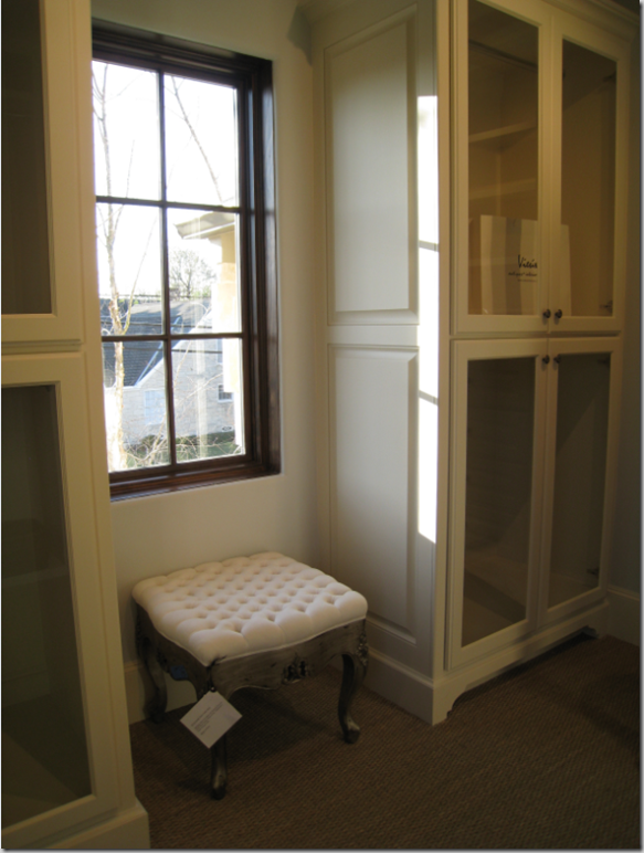
The man’s closet is all dark wood, but the lady’s closet is cream with hanging space behind glass doors – heavenly!

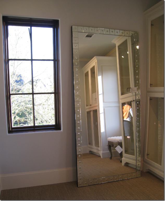
A great idea to take home – instead of a built-in full length mirror –just lean a tall one against the wall!

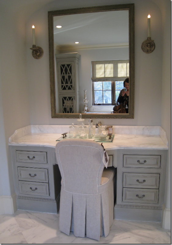
The master bedroom: marble floors and countertops. The vanity shown here is between the two sink areas.

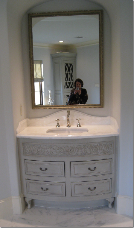
One of two sinks -the vanities are just beautiful. I love how the marble is arched in the back.

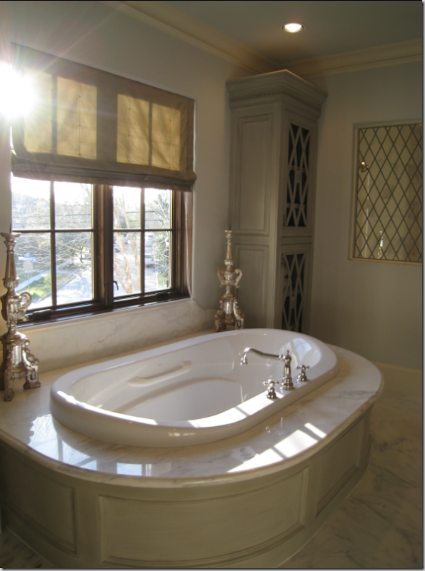
The tub is centered between two built in towers. The lead glass window is in the shower stall.

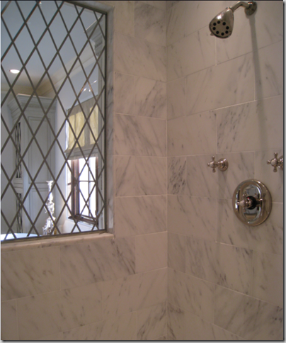
The shower stall with marble subway tiles – the leaded window lets in light.

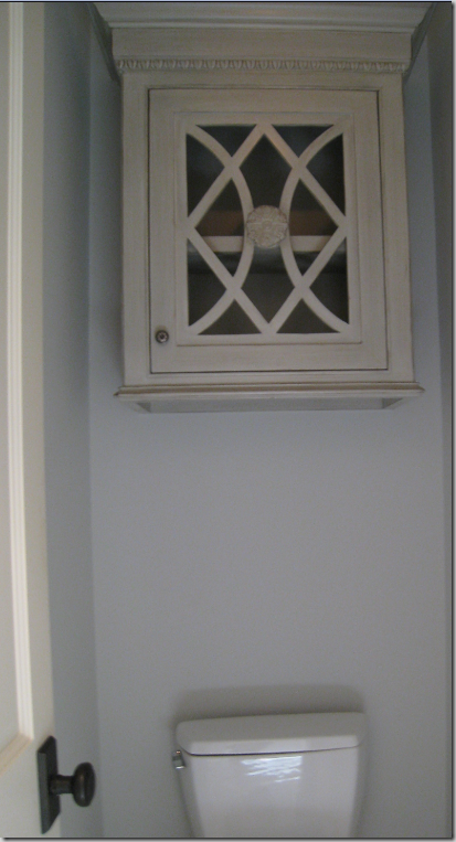
Even the water closet has the specialty cabinetry! Details – details – details!

Let’s go up to the third floor – there is only one room up here – a large media room/playroom.

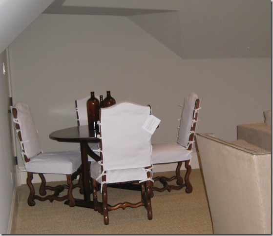
The game table with Os de Mouton chairs and wine table. I love how these chairs are slipped- of course! The large room has wall to wall seagrass.

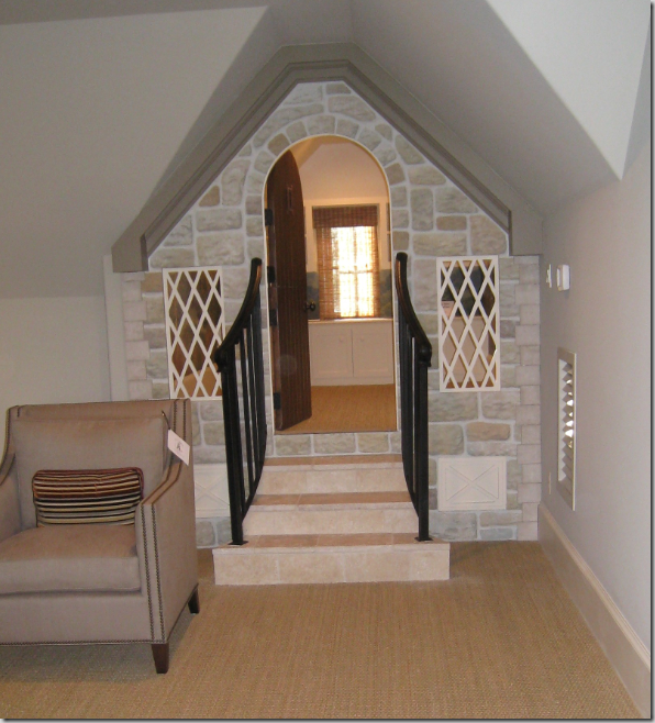
In the corner of the media room there is a small playhouse. Segreto painted the bricks – they are so realistic looking! Isn’t this just adorable?

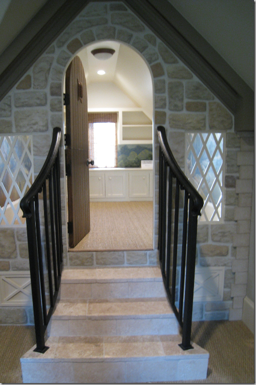
Going up the stairs into the playhouse. Notice the darling windows. The ceiling is pitched and there is a built in cabinet along the back.

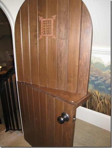
Closing off the playhouse from the media room is a dutch door.

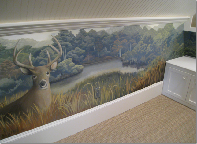
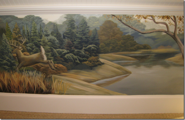
Leslie Sinclair from Segreto designed the murals to be unisex.

The other side of the wall. Leslie and I fit in the playhouse perfectly – we could stand up straight with extra room. I think I would set up a small desk and just blog away here away from everyone!!!!

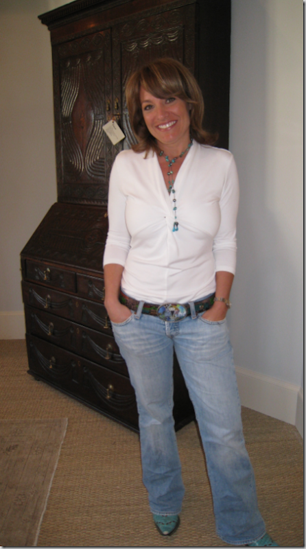
Standing in the entry hall to the master suite with its double antique doors is Leslie Sinclair, owner of Segreto. Be sure to visit her web site and see her portfolio. It is incredible!!!!! Segreto has done all the finest houses in Houston and has had extensive press coverage. Leslie is as sweet as she is pretty.

No, she isn’t a model! She is Tami Owen, the star of the show – the interior designer with the vision. Unfortunately Tami doesn’t have a web site, but here is her email: tamiowen@mac.com
I hope you enjoyed this home – next there are two that were designed by Ginger Barber – one is fabulous and one is extra special! Be sure to come back in the next few days and read those, too. Floorplans for the house showcased today are below:


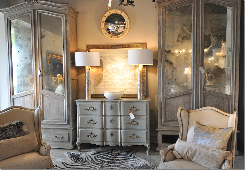 A rare pair of painted gray armoires. I loved the map and the gray chest.
 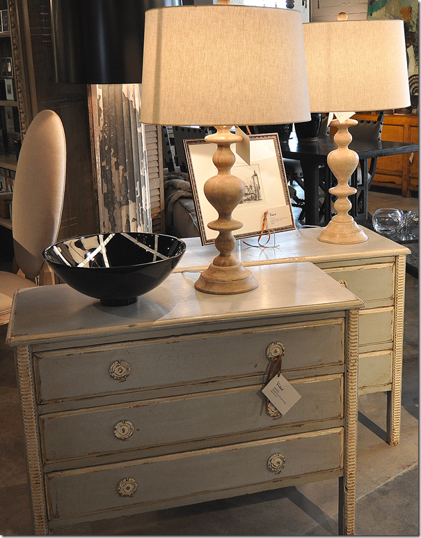 These painted chests would make great nightstands!!
 Favorites: aqua and green covered books. These would look so great in bookshelves.
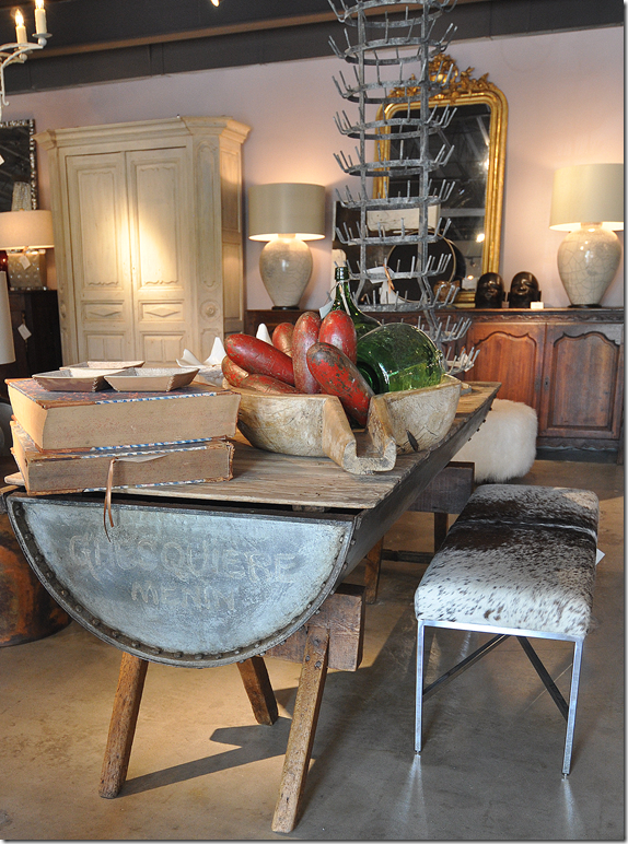 So unusual – a rustic dough table. It would make a wonderful island in a country home’s kitchen.
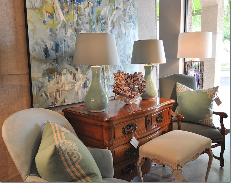 More gorgeous lamps!!! There is also a large assortment of contemporary art work.
