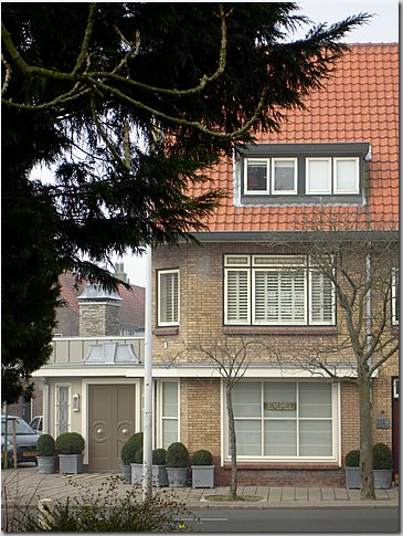
This is story of a redo. It is the story of Ron van Empel, lamp maker extraordinaire, and the creation of his new retail space. Ron and I met through emails after The Peak of Chic featured his company, Empel Collections – based in the Netherlands. We became fast friends and I featured his lamps on my blog, HERE. Then something remarkable happened that we shared – the process of his building a new showroom. It started like this: Ron bought the retail space that housed a run-down flower shop underneath his apartment. He took me along for the ride, through hundreds and hundreds of pictures and emails; a ride that lasted almost a year. The story of his redo became my story too. There was a time, when this all started – one whole week of time – that I pored over pictures of his territory, his apartments (he owns two in the same building), his swimming pool, his pool house, the upstairs terrace, the old flower shop he just bought, the new annex he was building – until I understood it all so well, I could probably walk around the vast complex blindfolded and still find my way – halfway across the globe. I don’t know why this kind of thing intrigues me, but it does. It is at the core of who I am, aesthetically. I find pleasure in floor plans, in seeing old spaces turned into new ones. I’ve always been this way – becoming aware of it at 8, when my parents built our family home – and the process of it, the architectural drawings, the space planning, the interior design all became a way of life for me from which I have never wavered. I suspect many readers of Cote de Texas are exactly the same. But, if you aren’t interested in renovations, or architecture, or interior design, or floor plans – you probably won’t be all that interested in this story. In truth, I found it all so fascinating on a number of levels that I hope you will too. To help you understand the layout – full floorplans follow the story.

The most important thing to consider in this story is the country. In Holland’s cities, where space is at a premium, you don’t just tear down property – you redo it, you add onto to it, you squeeze as much living space as you can into your four walls. You may choose to gut the interiors to your liking, yet all the while - you preserve the exterior to blend in the neighborhood. And this is exactly what Ron did. It all starts with a building: after college, the young Ron bought an apartment over a flower shop thinking he would stay there just a few years (fate has a sense of humor!) In this building, besides the flower shop, there were two other apartments in addition to Ron’s. Today, Ron owns 3/4 of the building – hopefully, the final upstairs apartment will one day be his after the owner decides to sell. Ron’s city is called Leiden and it is a quick 30 minutes away from the metropolis of Amsterdam with an international airport nearby for the convenience of his clients who fly in from all over the world. Ron’s neighborhood is called a garden area, and it was developed in the 30’s, just as Ron’s building was. The area is now middle class, but many university students are moving in. Besides there being even newer areas of town, Leiden boasts buildings still standing from the 16th century!
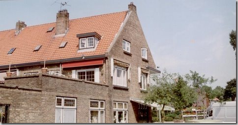
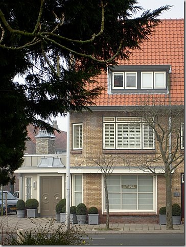
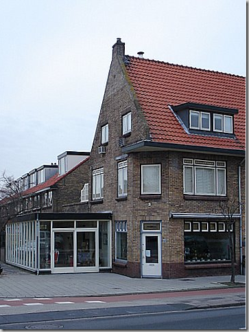
BEFORE: Ron’s building with this two apartments and the florist shop on the bottom left, just waiting to be rebuilt.
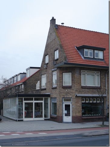
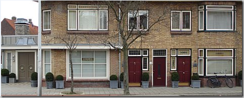
BEFORE: Ron’s building as it was: on the ground floor is the old run-down flower shop with – on the left - the white, modern annex the florist added to his shop. The two red doors on the right are to Ron’s two apartments. The red door on the left leads to his upstairs apartment over the flower shop with its bright white door. That apartment takes up the second floor and its two bedrooms are on the third floor (seen in the left attic dormer, above.) The red door on the right leads to his second apartment – another two story unit. The door in the middle leads to the last apartment – which one day Ron hopes to own. This picture was taken in spring of 1996 – notice the gorgeous bed of daffodils – where are the tulips, Ron????? As the young Ron lived in his upstairs apartment, he began toiling with lamps, designing them and then making them himself. As his business starting growing, so did his need for space. He needed room to spread out and he needed storage space. He began eyeing the next door apartment.
BEFORE: Here is a rare picture of the back of the building before the florist built the white annex. You can see Ron’s first apartment here on the second and third floor. The large window on the second floor opens up to a terrace. Let’s go look at Ron’s first apartment, above the original flower shop, that is now the home to Empel Collections.
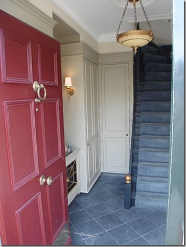
RON’S FIRST APARTMENT: You enter through the red door at the front of the building to this first floor vestibule with slate floors. Ron loves classical design and symmetry. He has chosen the X as a motif and it pops up throughout his spaces. He completely gutted this area and rebuilt it to his specifications. All the light fixtures are his, of course, hand made by Ron. Ron’s career as a lighting designer happened by accident. Now 47, he was an interior designer until 8 years ago – when he finally decided to put all his attentions into what was at first a hobby – designing lamps. Today, he still does some interior design and by chance is very involved with the total remodel and renovation of a house in Houston – of all places!
In the vestibule, Ron created the two closets flanking a niche with a mirror and sconces.
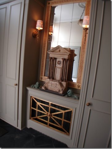
A close up of his niche: all Ron’s design – the mirror, the miniature, the sconces, the hanging light! Isn’t this just beautiful!!!!
The staircase leads to the second and third floor living spaces. Notice the X motif on the stair railing. This X shows up time and time again.
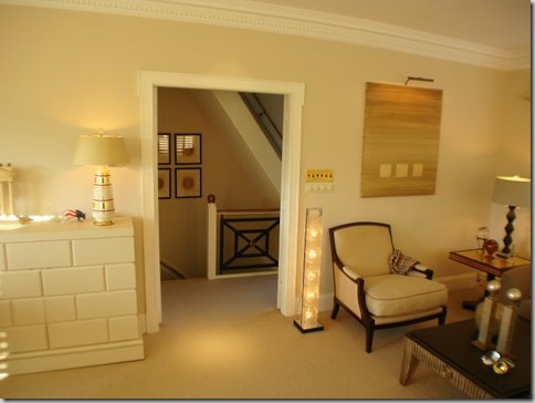
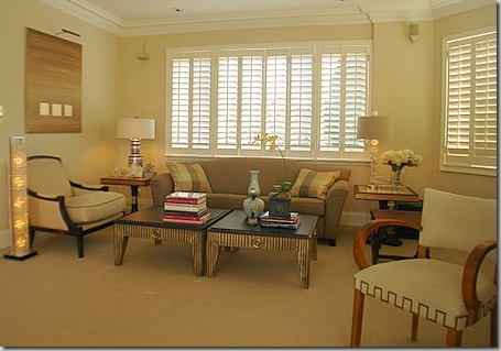
Here’s the living area today – it overlooks the front of the building. Ron has renovated and upgraded this apartment twice in all the years he has lived here.
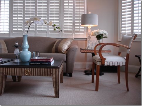
Close up - I love those coffee tables, so interesting! The crystal lamp is from his contemporary collection – isn’t it beautiful with the drum shade?
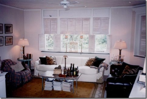
THEN: Here is how Ron lived as a young man, right out of university, all those years ago! I actually quite like this – bleached shutters, tufted leather sofa, Burberry throws, and leopard pillows.
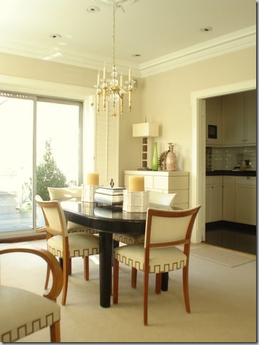
The dining area overlooking the back terrace.
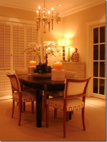
The same room at night. The kitchen is through the French doors.
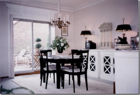
THEN: The dining room then, before the renovations many years ago. The entrance to the kitchen was in the stair hall. Ron, this looks quite nice for a young man just starting out! The table is the same one Ron uses today.
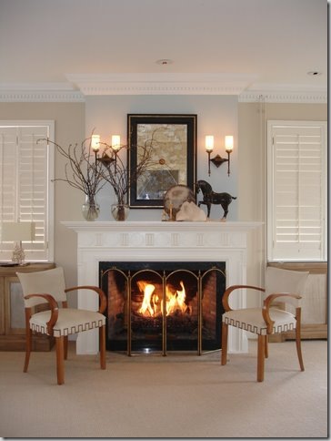
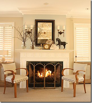
In between the living area and dining area is the fireplace – Ron recently painted the wall behind the mantel a Farrow and Ball light blue.
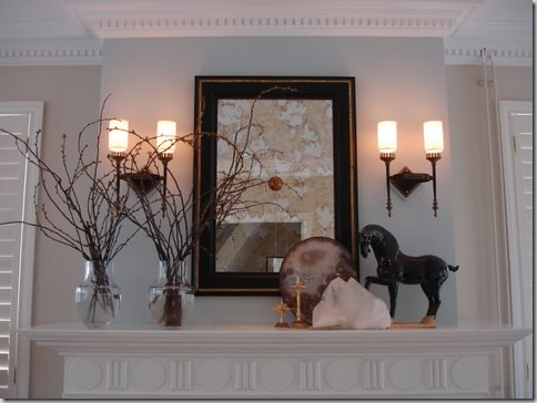
Close-up of his mantel-scape. Just beautiful. Notice the dentil crown molding and the carved mantel. These architectural details, along with the sconces and mirror are all Ron’s designs.
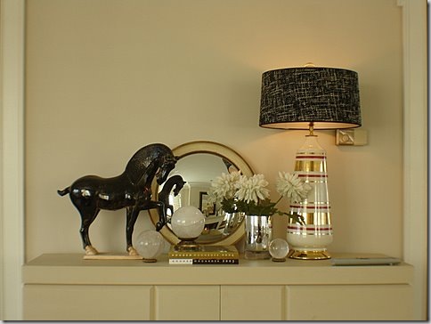
The door to the kitchen is flanked by two cabinets – providing surfaces to showcase more accessories. Ron makes lamps out of many different things – his horses will probably end up as lamps one day!
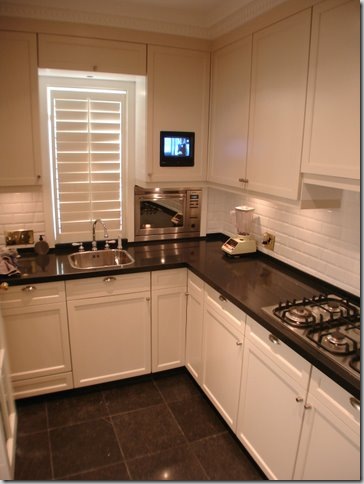
And the small kitchen – perfect for a bachelor: black granite and white subway tiles and plantation shutters. Notice how he built in his TV! And remember what I said about eeking out every inch of space – notice the built in microwave to the right of the sink.
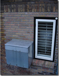
In order to conserve much needed counter space, Ron had this box built to house the microwave outside! The washing machine and dryer got a similar treatment. Ingenious!
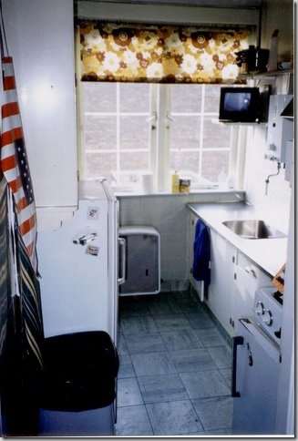
THEN: The kitchen as it was – wow! Ron – you’ve really changed this room for the better!!!!
The outside terrace, off the dining room. To the right, through the faux windows – this overlooks the pool area of Ron’s second apartment!
BEFORE: The side of the building with the white annex – Right above the annex you can see Ron’s terrace with the row of faux windows, the dining and living room windows, and on the third floor, the bedroom and bathroom windows. On the left side of the back of building is Ron’s second apartment. Today – this looks completely different!! Ron refers to the white annex as a trailer – stuck onto the building with no regard to it’s architecture or age.
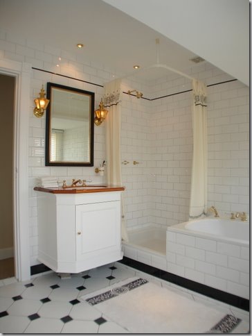
Ron’s upstairs bathroom, classic black and white tiles.
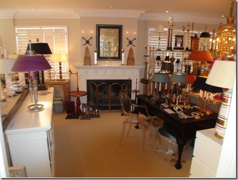
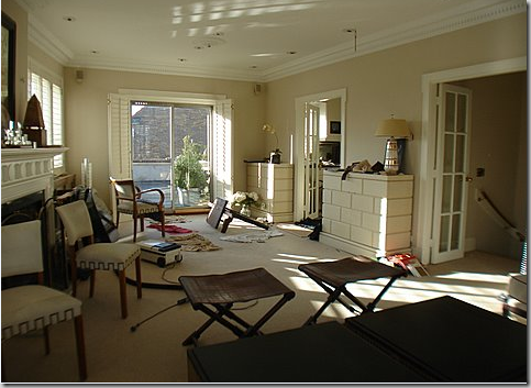
As Ron’s business grew, so did his need for space. He needed room to make his lamps, store his lamps, and sell his lamps. And so, for a few years, he turned his first apartment’s living room into the factory and the warehouse. This is how his first apartment was the last few years– see the fireplace in the middle of all this?
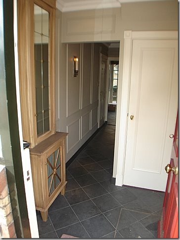
RON’S SECOND APARTMENT: Through the second red door is Ron’s newer apartment – bought to help with space problems and to have a place to entertain friends and clients. The second apartment is two stories. On the second floor, Ron connected his two apartments through a door.
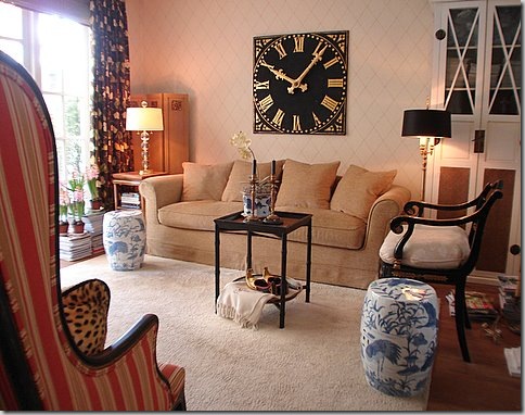
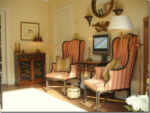
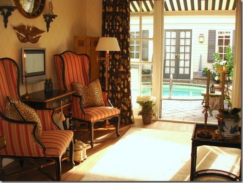
The second apartment garden room: this is where Ron greets his clients and serves them tea. First, they sit and talk and relax so that there is no heavy sales pressure and he can gauge what the client will need. After the tea and delicious (I’m sure!) pastries, Ron leads his clients to his new showroom either through the back pool area or out the front door to the new showroom entrance. I love the way Ron has decorated this room – the gorgeous clock, the antiques, the blue and white garden seats!
The other side of the garden room shows the classic symmetry that Ron loves so!
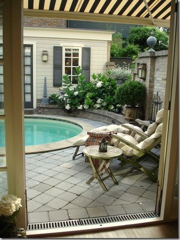
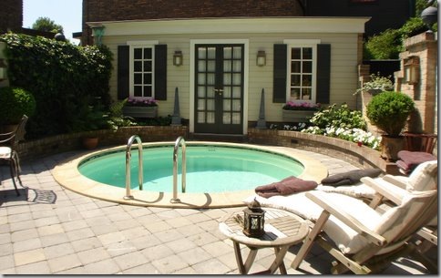
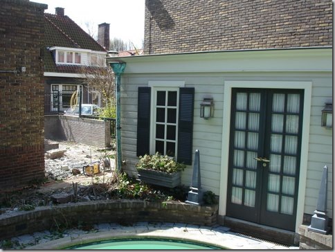
At the back of the second apartment is the pool and pool house which Ron built – quite a extravagance for a Leiden apartment. Ron installed a retractable black and white canopy for protection from the sun.
The back pool and pool house.
Today – this area has changed somewhat. On the left side where the ivy wall is, Ron built an atelier for the showroom.
BEFORE: Whoa! This is what the back yard of the second apartment looked like. What to do? How to hide the brick shed on the left? Ron came up with the idea of a pool house. The left window on the pool house is actually a facade! Quite a difference today with a charming Pool house vs. this disaster! Scroll up – this is exactly the same view before Ron built the pool and pool house.
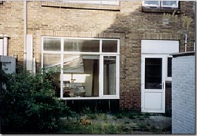
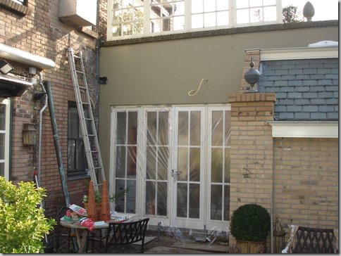
BEFORE: Before there were no French doors – just a window and a door to the kitchen.
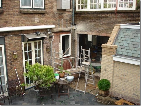
DURING: Ron installed two sets of French doors – one to the Garden Room and one to the kitchen. This picture was taken from his first apartment’s outside terrace. Scroll up to see the exact same view before the French doors and after.
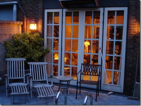
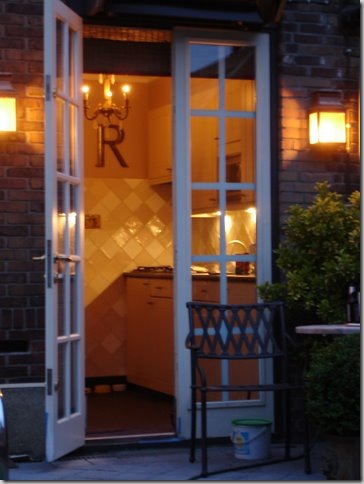
TODAY: The same view. Looking back into the garden room at dusk. These French doors replaced the plate glass window.
TODAY: And looking into the second apartment’s kitchen – these French doors replaced the kitchen door.
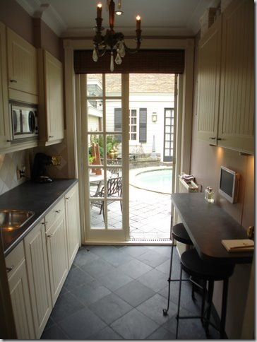
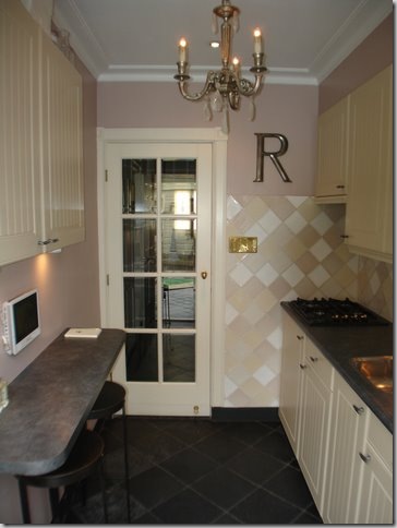
The kitchen in the second apartment – looking out at the Pool House.
And looking in, the other way. I love how he used French doors for the interior and exterior. Just charming!
And now, Ron starts his waiting game with the owner of the flower shop. He approaches him about selling and offers are made. It took over three years to finally get an agreement drawn up. All this time, Ron has been planning and drawing – thinking how he can turn the decrepit flower shop into a beautiful showroom worthy of his high end light fixtures. Finally the day comes – the florist moves out and Ron begins his renovations.
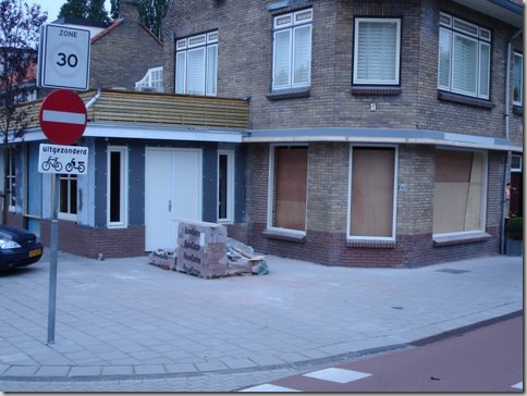
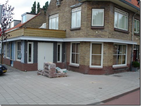
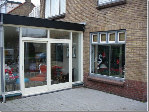
THEN: The flower shop with it’s white annex. The front door to the shop is the single white door. Ron’s first apartment is directly above the flower shop. Ron’s plan is to change out all the windows, lining them up with those above it on the second floor, raise the roof of the annex, gut it, and make the annex the front door to Empel Collections.
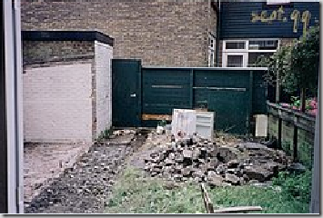
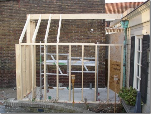
The demo works begins in the back. The wall covered in ivy that divides the pool from the flower shop comes down. The alley space between Ron’s apartment and the flower shop will be built out, connecting the space.
The building begins. This room is being built in the alley way between the apartment and the flower shop. It will connect through the brick wall into the flower shop – and will be used as a workroom.
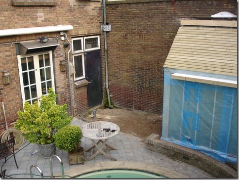
Ron’s entrance to his kitchen is through the French Door on the left. With the boundary wall torn down, Ron makes plans to break through to the flower shop - thus creating a back door entrance into his new showroom through his pool area. The black door leads directly into the flower shop.
A few weeks later, the adjoining building – the new workroom - is finally shaping up. Romantic slate tiles go on the roof. And finally – you can see here - Ron breaks through to the flower shop. This will become his backdoor to work. Above the hole in the wall – you can see the wall of faux windows which line Ron’s terrace in his first apartment. And notice – the black door to the flower shop is now a window!! Just above the window, is the metal box which houses his microwave.
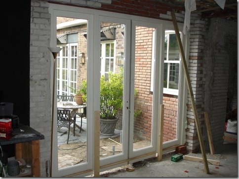
The doors go in! Looking from the flower shop out to the pool area of Ron’s second apartment. Progress is really being made.
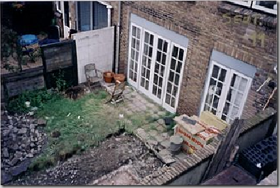
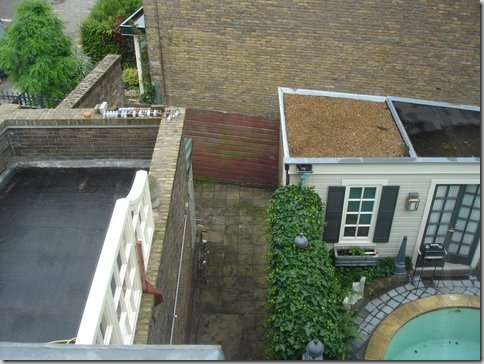
BEFORE: To help you better understand the layout – this is a before view, looking down at the pool. The ivy fence is shown here. Ron’s outside terrace with the faux window wall is on the far left. The space between his ivy wall and the building is the alleyway of the flower shop. Also from this picture, you can see the pool house roof. The left side of the roof was the original shed that Ron disguised by erecting the pool house around it. Confused yet?
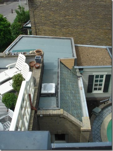
DURING: From the exact same vantage point, showing the new back storage room leading into the showroom. Scroll up to see the difference.
BEFORE: The white annex to the left and the flower shop’s front door in white. Above the shop is the living room to Ron’s first apartment.
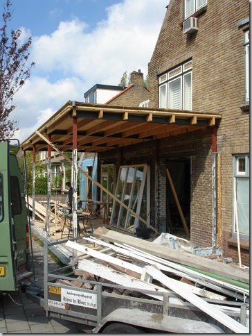
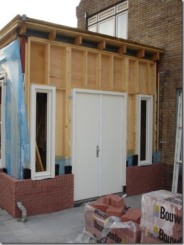
DURING: While all the work on the back is going on, the front on the building is being worked on too – here the roof of the white annex or “trailer” is raised a few feet, before the space is totally gutted.
Mission accomplished. The white annex’s roof is raised and it is totally gutted.
The gutted white annex, with it’s roof raised, will now be built out. This will become the entrance to the showroom.
The side view of the former white annex being built.
And showing the back of the white annex.
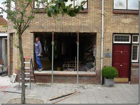
While all the work on the back side and the annex is being done, Ron prepares to work on the front facade. All the windows and the former front door of the flower shop will be completely changed. On the right is the red door to Ron’s first apartment, above the flower shop.
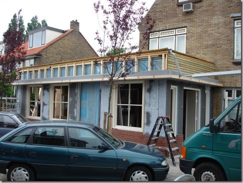
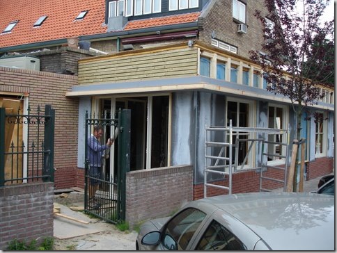
In progress: The white annex is long gone, replaced with a much more substantial building – you can now see the front entrance to the new showroom. The flower shop's windows have all been changed out to match the placement of the windows above it. The old door to the flower shop is long gone – replaced by a window instead. Ron designed an overhang to visually connect the main building to the front door annex.
The windows get paned.
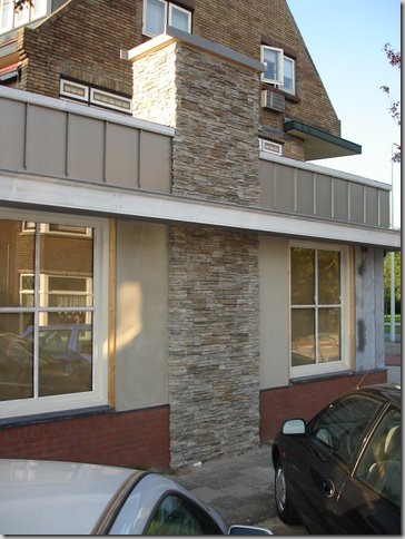
As time goes on, the former white annex is no longer recognizable as the old “trailer” as Ron called it, instead it is a beautiful building with a lovely stacked stone fireplace. Ron has put in the paned windows. The roof gets a siding of zinc, the bottom gets a skirting of brick. The fireplace will soon be getting a custom designed cap.
With the outside facade almost complete, work begins inside the former flower shop. Here looking out towards Ron’s pool area – what a mess!!!! This is where Ron broke through the brick wall. He will be taking his clients from his second apartment garden room, after tea and pastries, through the spruced up pool area into this back door – OR they will enter through the front door!
And looking from the back towards the front windows. Through this door on the left – you can see the replaced windows from the front facade. On the right, through the openings is the new annex or the former “trailer” building.
And inside the former white annex, looking towards the new front doors.
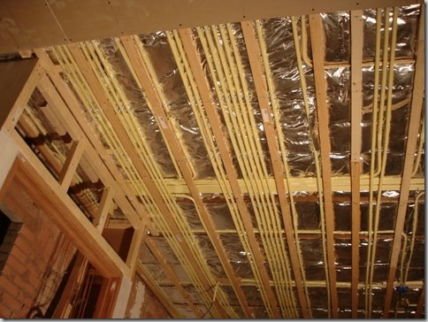
And all the state of the art wiring goes in. Don’t forget – this is a lighting showroom, there has to be good electricity!
In the backyard pool area, the brick is plastered over and painted. Ron puts decorative finials on the post. Look above to see Ron’s terrace with the faux window wall outside his first apartment.
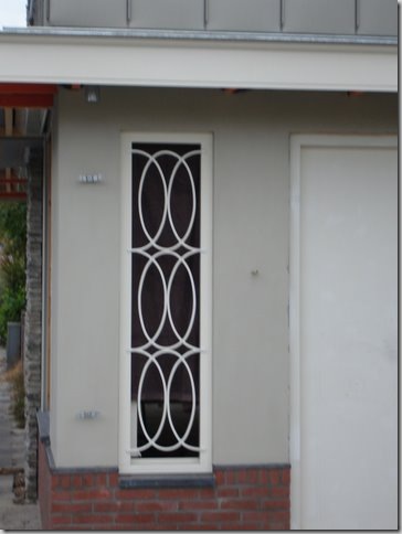
The side window grill of the backyard pool building gets installed – in his beloved X motif.
More details: the front door windows get their own grills.
And the beautiful stone chimney gets its zinc cap. Everything is finally coming together. Ready for the final reveal?
A wintry scene with icy flower beds.
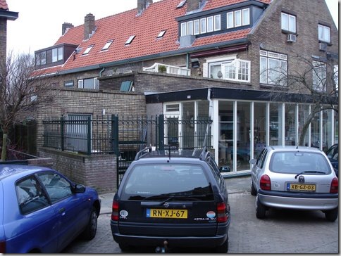
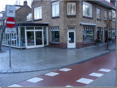
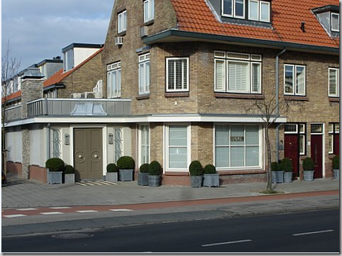
The front – with all three apartment’s doors. Ron’s apartments are the left and right red doors. One day he hopes to own all three apartments in the building.
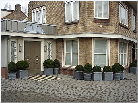
And a close up. Notice how nicely the windows are lined up now. The overhang visually connects the front door annex to the main building, as does the darker red brick skirting. Let’s go inside!
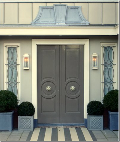
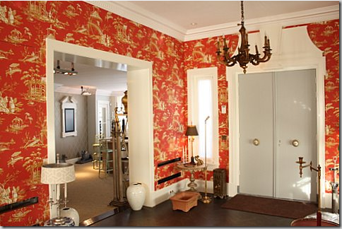
The front door – hard to believe this was once the white annex, what Ron called a trailer. Inspired by Dorothy Draper, Ron designs a double door with center knobs, flanked by hanging lanterns, and topped with a zinc pediment. The rug gives it a nice extra touch. I adore this door! What a fabulous logo to put on stationary – not that anyone asked moi!
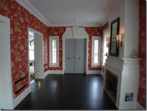
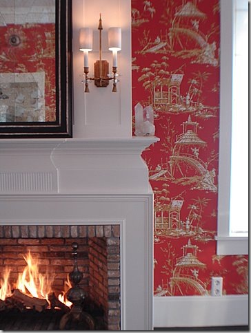
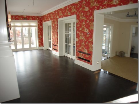
Before moving in: Inside the former white annex, Ron creates a fancy showroom, with red chinoiserie wallpaper, dark hardwood floors, and a beautiful fireplace. The front door is painted gray, and notice how the pediment matches the zinc one outside.
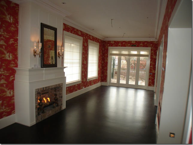
Looking towards the back of the former white annex. The windows at the rear lead to a back courtyard off the parking area. Ron has not finished the landscaping there yet.
And the same view at night – showing all the dramatic lighting.
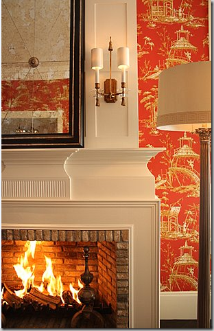
Looking at the brick fireplace with its antique andirons and Ron’s own designed sconces and mirror.
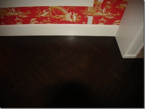
The floor in the annex is a beautiful dark herringbone pattern.
A close up of the fireplace details.
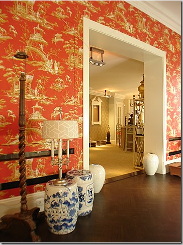
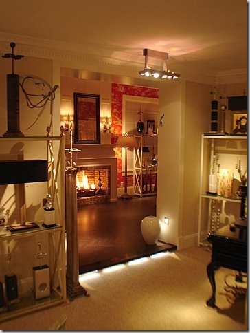
Looking from the Chinoiserie room to the main showroom on the right. Time to move everything in the shop!!
Everything from Ron’s first apartment, which has been his temporary showroom all these years, has to first be packed up before it can all be brought downstairs to the new showroom. OY!!!
Leaving it looking like this! But don’t worry – remember how beautiful he fixed it up:
Much better! Now that this is no longer his workroom, Ron has moved back into his first apartment, leaving the poolside second apartment for friends and guests.
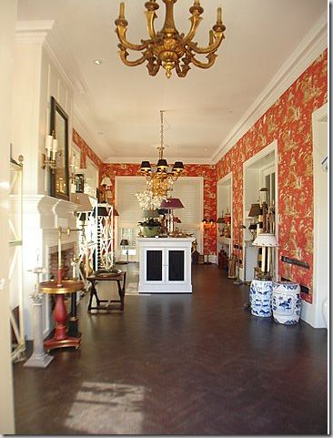
All moved in!!!! Finally – four years after negotiations to buy the old flower shop began, Empel Collections has a proper showroom. From the front door in the Chinoiserie Showroom, you can enter the main showroom, in what was formerly the flower shop.

Facing the back of the Chinoiserie Showroom, with the main showroom on the right.
The view from the front door looking into the Chinoiserie Showroom.
Looking from the Chinoiserie Showroom into the main showroom – the former decrepit flower shop! Beautiful photo.
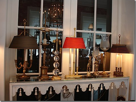
Close up of Empel Collections product displayed on a console table.
Another shot of the lit fireplace with Ron’s designs. I love that fire! So romantic. Honestly, when was the last time you were in a lighting shop with a roaring fire and chinoiserie wallpaper? Never? I didn’t think so!
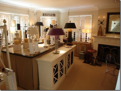
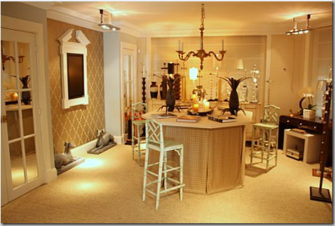
Leaving the Chinoiserie Showroom, and entering the main showroom. The wood floor is replaced with a natural fiber wall to wall carpeting.
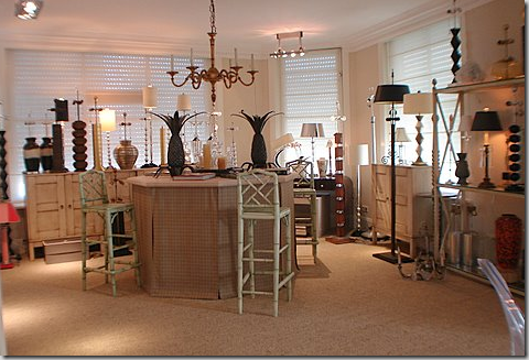
Facing the street. Notice the large pediment on the left wall. Inside it is a TV monitor. When Ron and his clients sit at the skirted table and Ron shows product from his computer – the image is displayed on the large wall monitor. No more peering at a small computer screen for Ron’s clients. He has thought of every detail – he should have! He had four years to plan his showroom!!!! Through the French doors on the left is a powder room and a storage closet. The niche where the computer monitor is hanging is accented with wallpaper while the rest of the walls are painted.
The same view – looking to the right. The windows face the street. The old flower shop door used to be at the curved corner. No longer. The front door is now in the Chinoiserie Showroom.
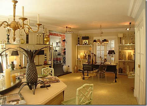
Looking from the skirted table to the rear of the main showroom. To the right is the powder room.
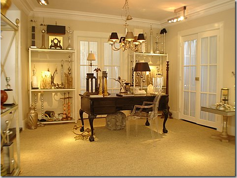
The main showroom – looking towards the back.
The French door behind the desk leads to the workroom which connects to Ron’s pool yard. The door to the right of the desk leads to the kitchen, which is not yet completed.
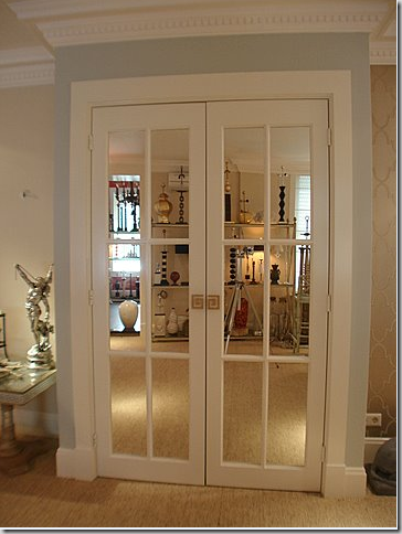
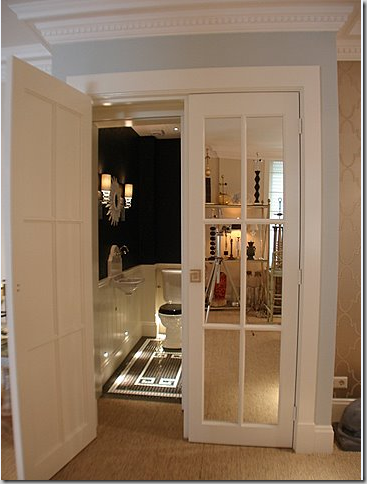
I love how Ron chose to use mirrored French doors throughout the interior of his shop. They just add so much sparkle and atmosphere. The powder room is behind these doors. Look at the Greek Key door handles he designed. Always the classical choice for Ron.
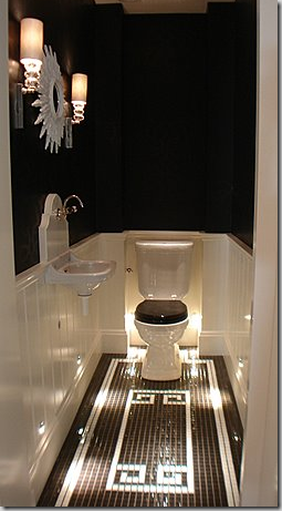
The powder room is stunning in black and white. What a surprise!
Notice how the floor repeats the motif of the door handles. And I love the small spot lights pointing to the tiled floor. Just stunning!
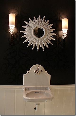
A close up of the black on black wallpaper and hanging sink! The mirror and light fixtures that Ron designed add just the right touch!
FROM THIS
TO THIS
FROM THIS
TO THIS
FROM THIS
TO THIS.
I hope you’ve enjoyed my story of Ron van Empel’s redo. I know it was long and if you stayed with it - thanks!!!! He is so proud of it and I am of him, too! Ron is one of the nicest guys I’ve met on the blogs and he’s got a quick wit to match. Ron, I wish you much success and good health and happiness in your beautiful new showroom!
For all the architects and designers out there – here are the hand drawn plans Ron emailed me one night last summer when I was trying to put it all together in my mind. After that, are his plans to one day turn the showroom into his house when he retires – yes, you heard that right. And following that are the proper architectural drawings!

This shows the floor plan of his second apartment, the pool area, and the new showroom with the Chinoiserie addition.

Ron’s plans to turn the showroom into his home after he retires!

He even has his furniture placed in his future home. Anal? You decide!
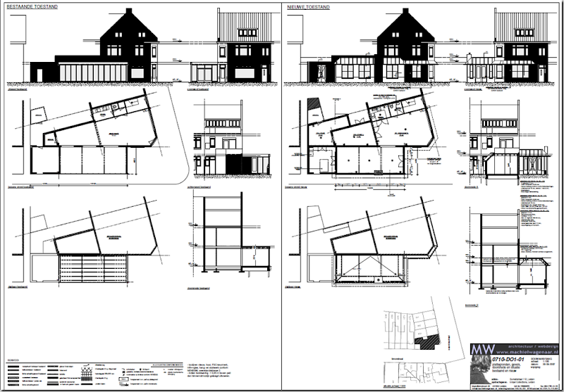
The architectural drawings for the showroom.


