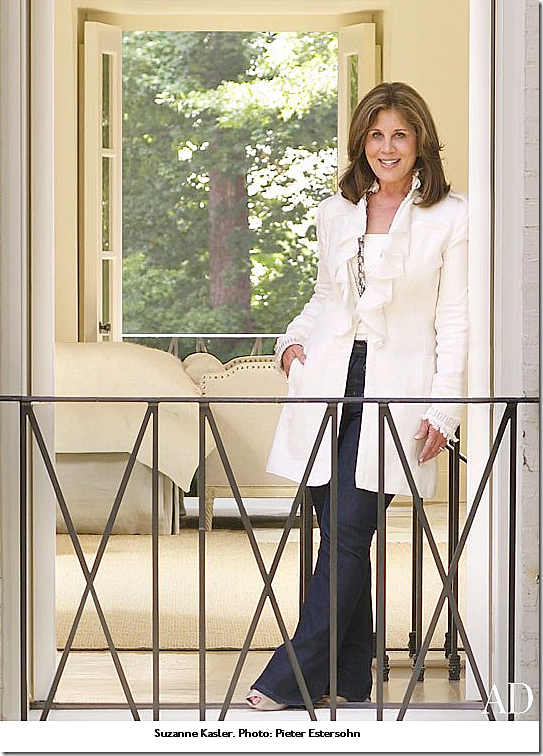
Hooked on Houses recently got a hot tip about a house for sale in Atlanta’s tony Buckhead neighborhood. A Sotheby’s listing, the house is notable for being designed by the much respected Suzanne Kasler. Kasler is at the top of her game these days, with a design book out:
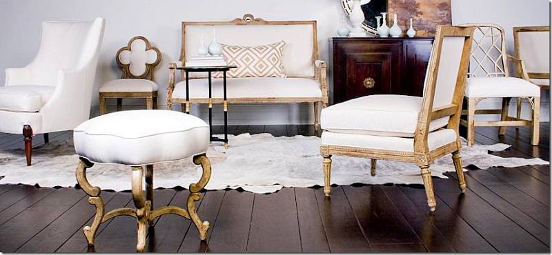
And her furniture line at Hickory Chair:
Her new fabric line at Lee Jofa:
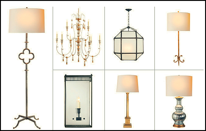
And, her lighting designs at Visual Comfort:
Then, there is her art work at Soicher-Marin:
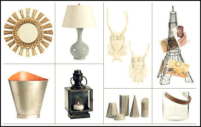
And her cute designs for Ballards:
And finally, there are her rug designs for Safavieh:
Whew. Kasler, if you couldn’t tell is an extremely talented Type A personality. She is also somewhat shy and quiet, as we discovered on the Skirted Roundtable HERE. She had an interesting childhood. Her father was a captured Prisoner of War during the Vietnam War, and he, along with Senator John McCain, was held captive at the Hanoi Hilton, tortured there for over seven years. Her father Colonel James Kasler is a true American hero.
I love this picture of Kasler running to greet her newly released father after all those long years. At the time we interviewed Suzanne, we had no idea about this part of her history – and she didn’t speak of it to us. Still, the experience surely shaped her personality.
Kasler obviously inherited many qualities from her father – you don’t reach her level without being tenacious and determined and singularly focused on your tasks. She is based in Atlanta, and earlier in her career, she was featured in southern magazines such as Veranda and Southern Accents. But as her career took off, so did her exposure, with features in House Beautiful, Architectural Digest, and Elle Décor, amongst others.
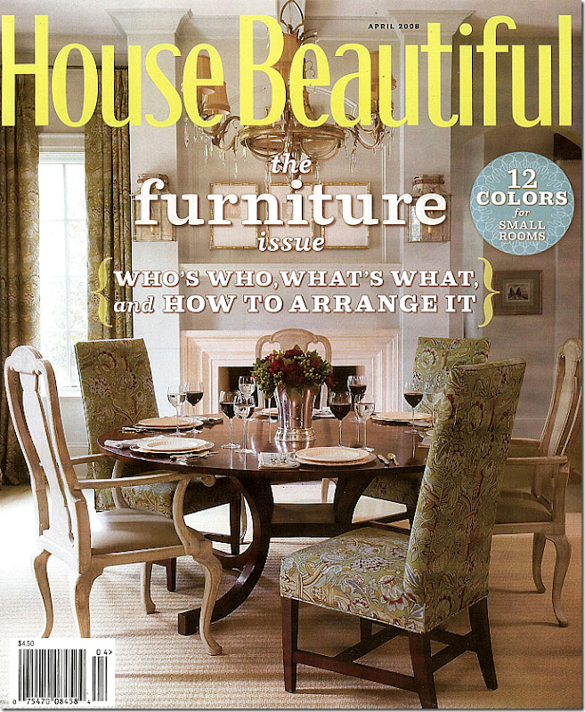
It was her cover story in House Beautiful in 2008 that caused a lot of chatter on the design blogs. The house she designed was beautiful – a mix of traditional and Swedish furniture, with youthful accents such as sunburst mirrors and linen fabrics. When Hooked on Houses showed the real estate pictures – I was thrilled to finally get a chance to see more of the house because the cover story was so limited in its scope.
When it first came out, Holly from Things That Inspired and I tried to figure out the layout of the house from the pictures. In fact, Holly wrote a story about the house, trying to piece together the floorplan – armed with then new photographs from the architect’s web site. Read her story HERE. Now, with all these real estate pictures, the guesswork is over.
And, as with the recent Reese Witherspoon real estate photographs, it is fun (for me, that is, and I hope for you too!) to see the key differences the stylists made to the actual house. Again, it is a real lesson to see how talented the magazine photographers truly are. Frances Janisch took the beautiful photographs for House Beautiful. Additionally, it is interesting to see how much of the house Kasler decorated, and how much of the large house that she didn’t.
Spitzmiller and Norris were the architects. It has six fireplaces, an elevator, 6 bedrooms, 8 baths and 2 half baths, a full basement with a recreation room and a wine cellar. There is also a full kitchen, exercise room, and teen suite down there (must be nice.) The house is about 9500 sq. ft. and was built in 2005.
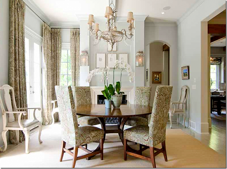
The dining room, one of the prettiest rooms in the house, made the cover. Not sure if this was Kasler’s first national cover – but it was certainly a huge honor.
The house, a Normandy inspired brick beauty sits behind wooden gates. Notice how cute the gateposts are with their own roofs!
A close up of the façade. On Hooked on Houses, the commenters had an issue with the shutters being only on one side. Gravel drive. House Beautiful said the owners also were the builders of the house. While the house looks like a two story – there is a huge surprise out back.
It is actually three stories – with a huge basement. This really is strange to me in flat Houston. We don’t have this style of house here, though it does appear normal for hilly Buckhead. The master and 3 other bedrooms are on the top floor, while a large guest suite is on the main floor, right off the balcony and a teen suite is on the basement level. All three rooms are on top of each other – on the left side of the picture where the bay windows are.
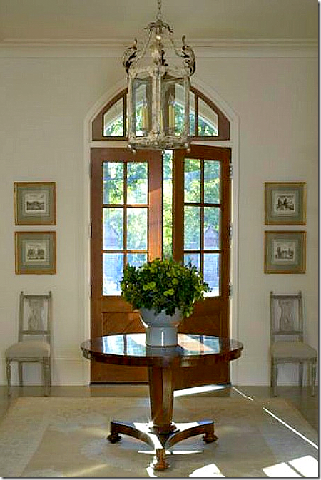
This image of the front entry didn’t make the magazine, but you can see how Kasler styled it. She pulled the beautiful Swedish chairs next to the door and added a series of prints.
And today. The major change throughout the house is the art work. Obviously the owners collect modern art – and Suzanne didn’t display that. OR the owners have just added onto their collection throughout the past four years. Still, I miss the four prints next to the door – and the two Swedish chairs, which have now been moved across the hall. To the left is the library and staircase hall, and to the right is the dining room.
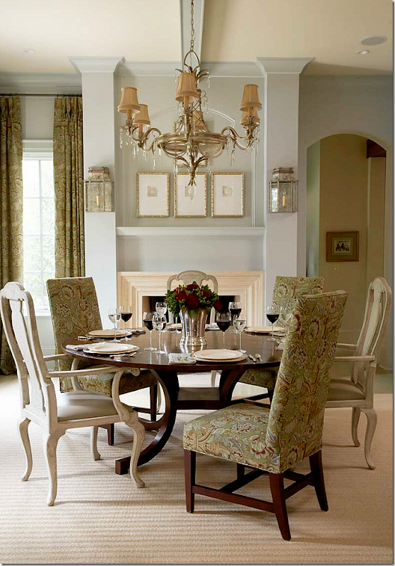
For the magazine, a tight shot of the dining room which is a beautiful room with a fireplace and tin sconces. The story that Suzanne told the magazine is that they found only three Swedish antique chairs so they added three others. Yet you will see that really isn’t how it is now. The chairs and curtains are in Clarence House – “Arts and Crafts” in the green colorway. The Swedish chairs are in leather.
And today – this is really a pretty real estate picture. It is a wider shot and shows the front window and the hall to the kitchen on the right. Everything appears almost exactly as it was back then – except there are now four chairs instead of three. Do you like the mix of chairs or not? I do – now, the three Swedish chairs seem kind of lost hanging around the perimeter of the room. Plus, it was quirky and unexpected with the mixture of chairs. Still, it is a very beautiful room.
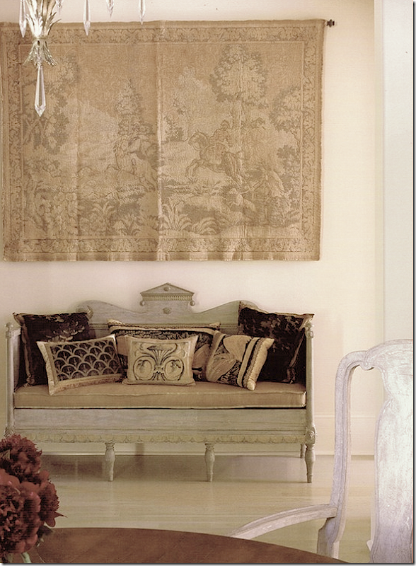
This photograph also didn’t make the magazine - only House Beautiful’s web site – but it shows the cross hall with a gorgeous antique Swedish sofa sitting underneath a tapestry.
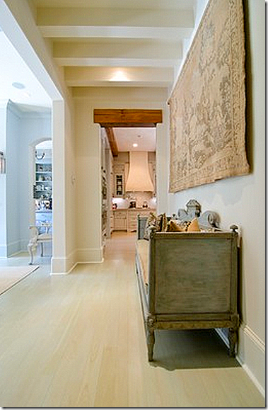
And today, it remains the same. I love how the cross hall has the beams on the ceiling. The butler’s pantry is to the left and the kitchen is straight ahead.
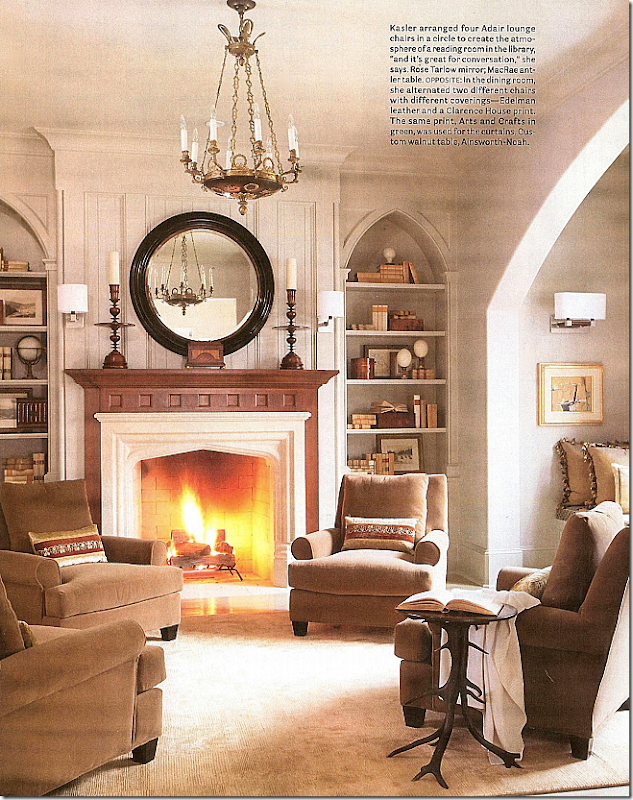
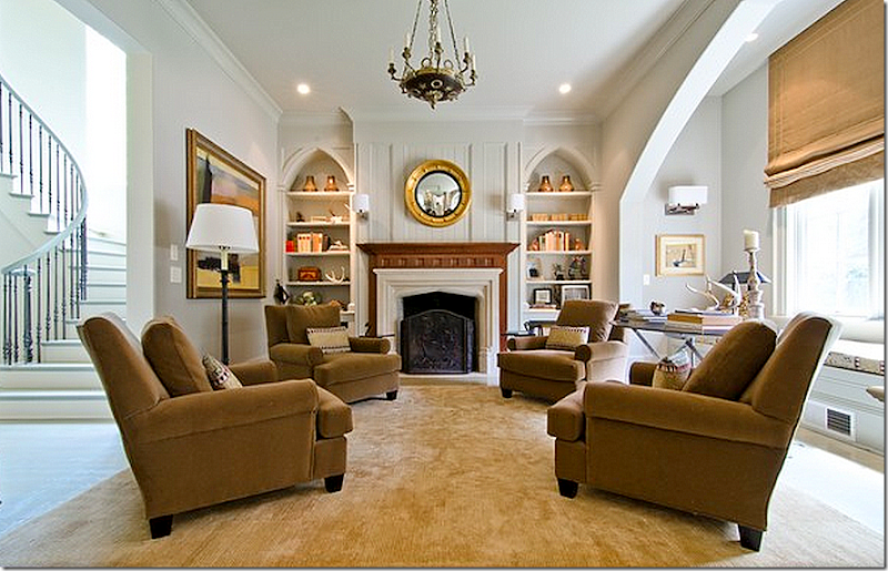
For House Beautiful, the library was shot with a roaring fire, and an open book and throw. Another beautiful room. In this picture, it is so closely cropped – you miss the window seat and the staircase. Gorgeous light fixture, BViz pillows, and Rose Tarlow mirror. And notice how beautifully Kasler filled the gothic styled shelves.
A wider shot shows the graceful staircase and the window seat – in the front window. Notice the black Rose Tarlow mirror is now gone, as is the antler table. Notice how the scale of the mirror was better before. The interesting candlesticks are missing too, along with the beautiful BViz pillows. Sad, the BViz pillows looked wonderful on the chairs. All the shelves are different, too. Kasler probably bought the pillows and mirror and table to the photoshoot and then styled the shelves purely for the magazine shoot. Not to be obnoxious, but I will bet that the standing lamp didn’t come from Kasler either. I must say here, that if I was paying Kasler to decorate, I would let her do the shelves in such an important room as this – the first room you see when entering the house. Her shelves are masterfully designed – why hire a designer and not have her do your shelves? And no one makes pillows like BViz – they are always the perfect accent, it’s a shame they are all gone. And that fire screen – again! I guess that magazines don’t’ like to shoot a room with a fireplace screen. The real estate photographer should have lit the fireplace, but it was probably too hot outside! Despite all the changes, the room is still very pretty and well designed.
A never been seen before photograph of the main staircase. The railing is graceful, simple and elegant. And I love the wood floor.
The cross hall – that leads off the entry way – runs from the staircase on one side to the kitchen and family room at the other end. This central hall is marked by the beamed ceilings – I love that detail. Here, Kasler brought in a Mora clock for the pictures, and she borrowed a chair from the living room. I miss the clock. Notice how wonderful the stained, solid wood doors look – a detail that only the finest houses have these days.
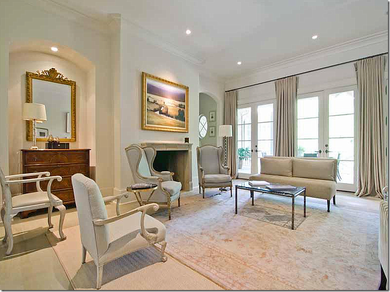
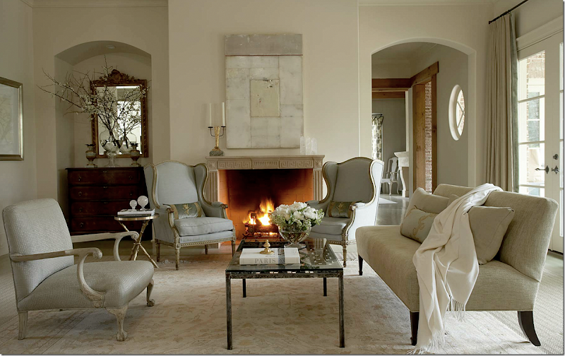
The living room is at the end of the entry hall – it leads to the terrace that overlooks the swimming pool. The room is quiet in soft neutrals and a mix of antiques and reproductions. Kasler and the stylist worked magic here: the softly lit fire, the barely blue 19th century French bergeres, the branches in a beautiful glass vase that are reflected in the mirror, and – that painting by Dusty Griffith. I love his work, Kasler has used his paintings many times before, with good reason. I think the painting makes the room! Notice how the smaller Oushak rug is layered over a textured sisal rug – the same sisal rug is found in the dining room. And notice the pretty blue velvet BViz pillows with just a touch of gold that look perfect in the blue linen chairs. Finally, notice how simply, yet elegantly, the fireplace mantel is accessorized with a sculptural candelabra and crystal obelisks – again, a mark of a good designer. To the right of the photograph you can see the family room off the kitchen. Note: the family room looks completely different here than it does now as seen in pictures below.
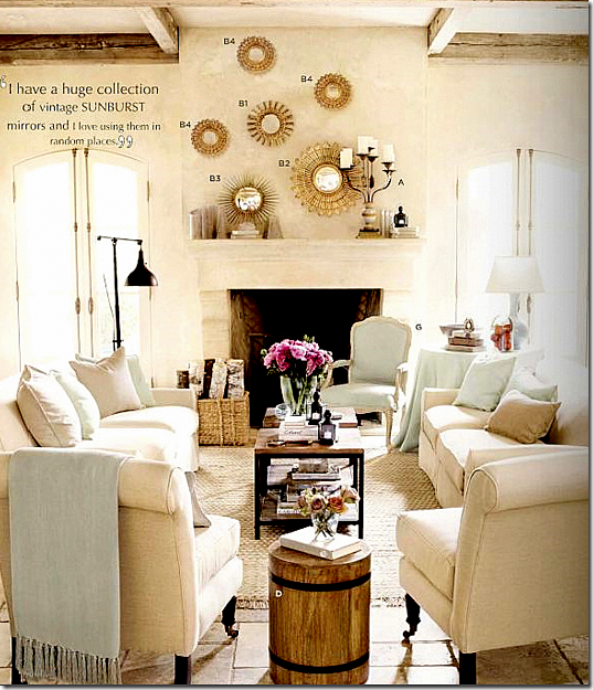
And across the room is a second seating area, with an interesting black coffee table and side tables all by Dessin Fournir, a Rose Tarlow chair, black lamps, another BViz pillow – and a collection of sunburst mirrors. To their left is a row of framed prints to balance out the mirrors. Now, I like symmetry – and I remember how much these mirrors bothered me because they weren’t hung symmetrically! Still – the mirrors were a huge hit with the design blogs. The vintage sunbursts were just coming into full trend back then and they really caught so many people’s eyes. And, the addition of the mirrors gave the room a fun vibe – as if the owners were a young, vibrant couple.
And here is how the room looks today. It is mostly the same, except for Kasler’s and the stylist’s touches. The Griffith painting is long gone – and boy, do I miss it! I loved how the painting was neutral like the room that Kasler designed. And all the gorgeous BViz pillows are sorely missed too. I loved how the light blue velvet of the pillows picked up the soft blue linen on the bergeres. The armless sofa is also missing its accent pillow. Can you see how important those accent pillows can be? And, on the chest, all new styling, along with the fireplace mantel. The owners also added another lamp.
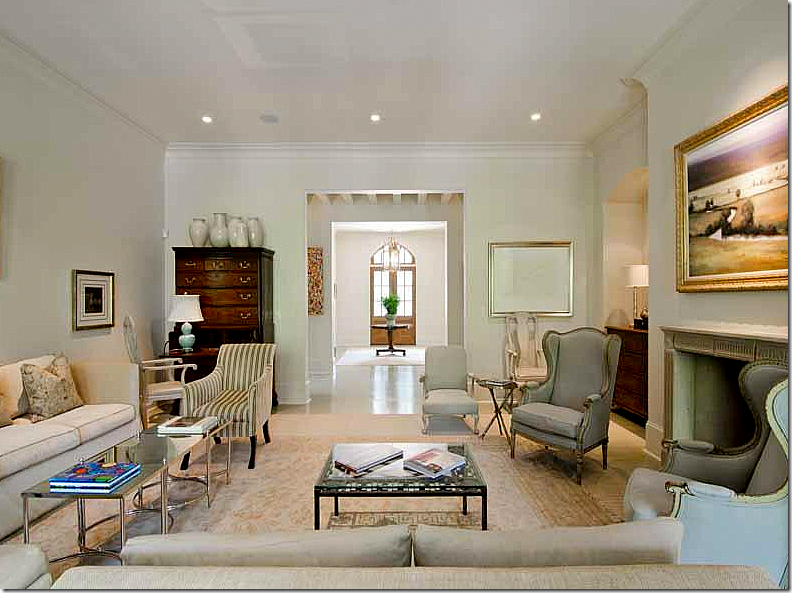
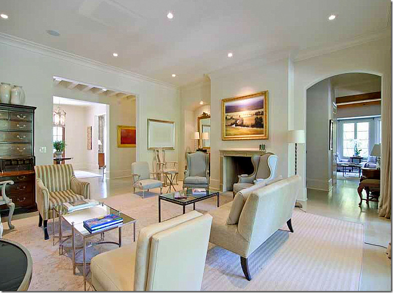
And here you can see how the living room leads off the entry hall – and the cross hall where the beamed ceiling runs left to right. At the cross hall – the staircase is one side and the kitchen/family room is at the opposite end. Well, the interesting black coffee table is gone, as are the black lamps. You can see the highboy – with a collection that Kasler placed on top to raise its profile and another work of pale contemporary art that did stay. It looks so different now, than in the magazine. And all the sunburst mirrors are gone too. I believe those are from Kasler’s personal collection. The room is still elegant as shown here, but I do realize that everything Kasler added – all the accessories, etc. - looked great and it’s made more obvious by their absence. But then again, if hiring a talent like Kasler – use her taste to tackle all the accessories, not just the furniture and curtains.
And one other view with the new glass table. I do miss the black one. Again, you can see how talented the photographer for House Beautiful was. It’s not that the room is so different – minus the furniture, pillows, and painting – but the lighting and staging is so important when taking pictures. And why do real estate photographers always add the huge expanse of ceilings in their photographs? Still, the house is gorgeous. I love the layout of it – the way the rooms flow together off the cross hall. Just beautiful! Whomever buys it will be very lucky to have such a beautifully designed house.
A point to consider: It is said that you shouldn’t buy art to match the décor. You should buy what you love or what speaks to you – without consideration of the furnishings. Do you agree? I know that my view isn’t popular, but I do love when paintings relate to the décor. For example, I miss the muted Griffith which was replaced with a bright landscape that is probably beautiful and quite valuable.
An ad for Ballard Design
Detour: The year after the house was photographed, Kasler became a designer for Ballard Designs – and she included a collection of sunburst mirrors in her line. Looking at this ad, they seem so similar to the collection in the living room – you can definitely see where she got her inspiration for the collection from. And, notice they are hung asymmetrically here too! The reason why I think those sunburst mirrors came from her personal collection is from the quote included in the ad!

And in one more detour: In Kasler’s new, fabulous house featured in Architectural Digest – notice the painting. It appears to be the same Griffith, but it may be a different one. Love her orange leather chair – and those lamps? Whoa. Love them!
Back to the house:
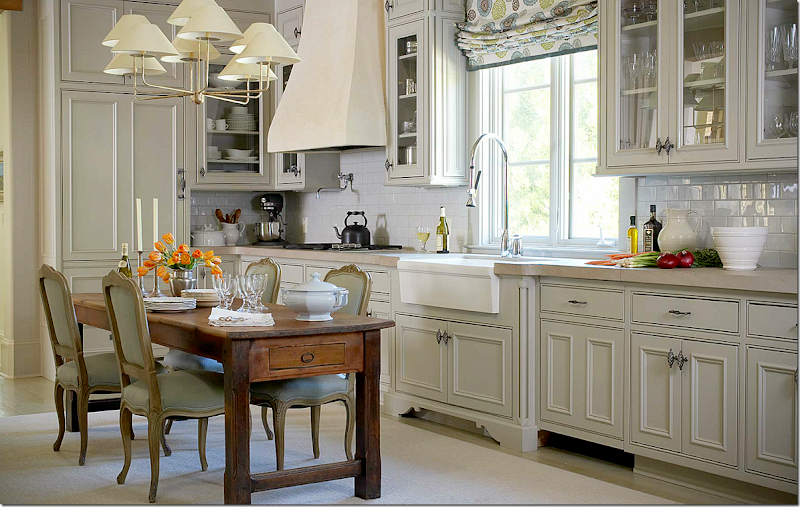
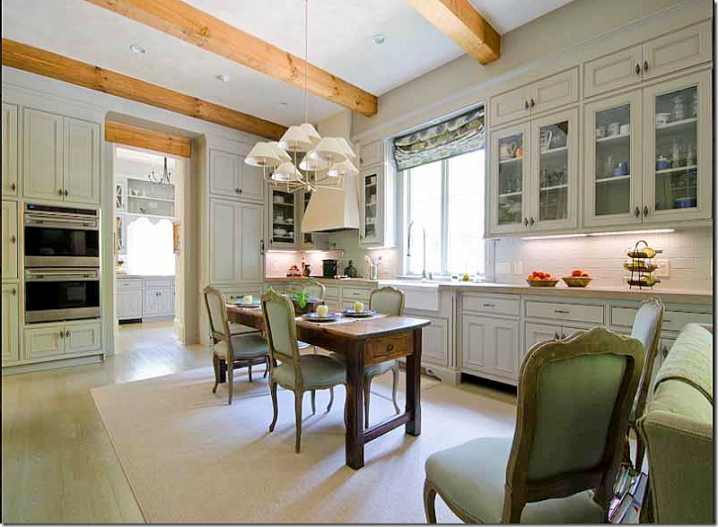
The kitchen,as seen in House Beautiful, is a large room that includes a wonderful walk in pantry and a family room at the opposite end. Of course, this picture is perfectly styled. The table has an assortment of dishes, not too much, not too little. The light fixture is from Niermann Weeks and the fabric found here and in the family room is by Galbraith and Paul. Both the light fixture and fabric add a youthful vibe to the room.
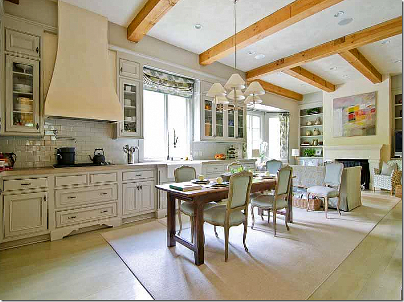
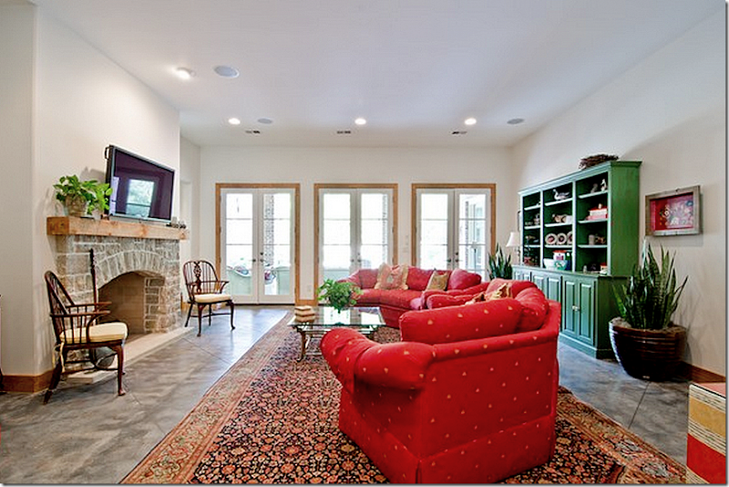
Here you can see the family room which wasn’t visible in the magazine. Such a great room – but it is a little odd that with such a large house that there isn’t a dedicated breakfast room.
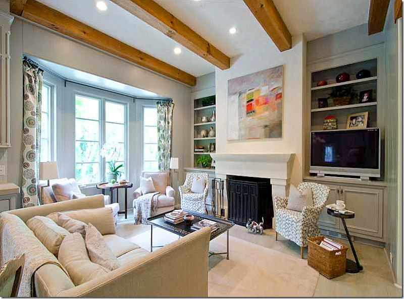
Kasler designed the family room with a pair of club chairs in the bay window, and another pair that flank the fireplace. I’ll be that TV has gotten larger over the years. I would guess this is a popular room in the house.
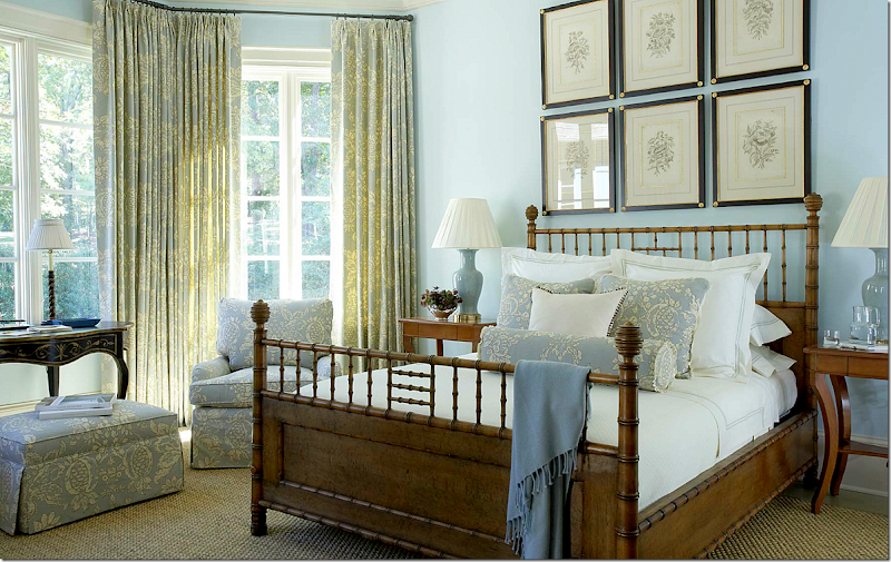
In the magazine, the guest room on the main floor looked like this. Kasler said she mixed the owners furniture – their chairs and desk with items bought for the house, like the envy inspiring Michael Smith bamboo bed. The fabric is by Hinson. Seagrass carpeting, finally! haha! Notice how pretty the set of prints are framed. Such a pretty bay window which overlooks the back yard swimming pool.
And in this shot from the magazine, a close up of the chinoiserie styled desk – overlooking the backyard.
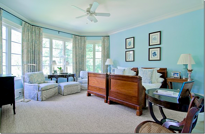
Well, knowing how much that Michael Smith bed costs, I can relate to why its gone! The prints didn’t make the cut either. Still, a pretty room. I think I would make this the master bedroom – on the main floor. The real master bedroom is on the top floor with the kids bedrooms, which is probably why it’s there.
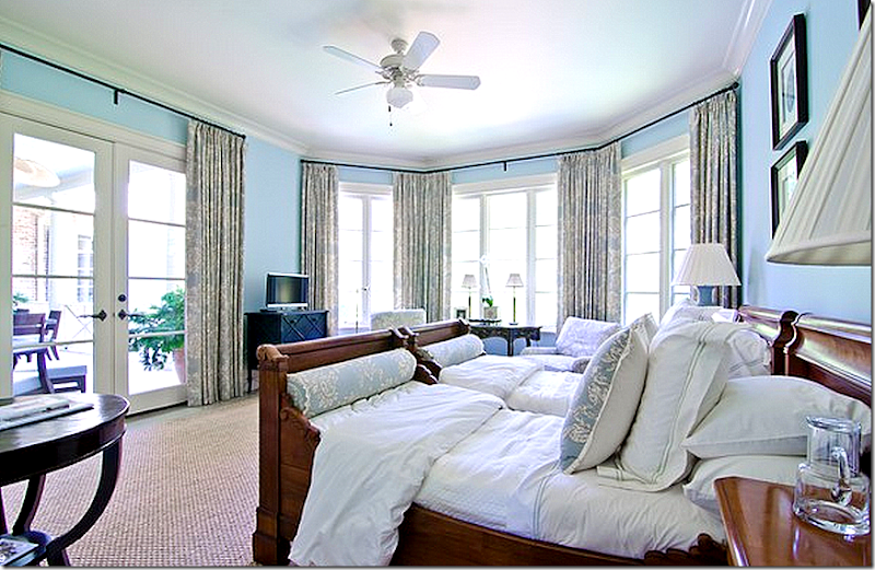
Another view, showing how the room connects to the back balcony.
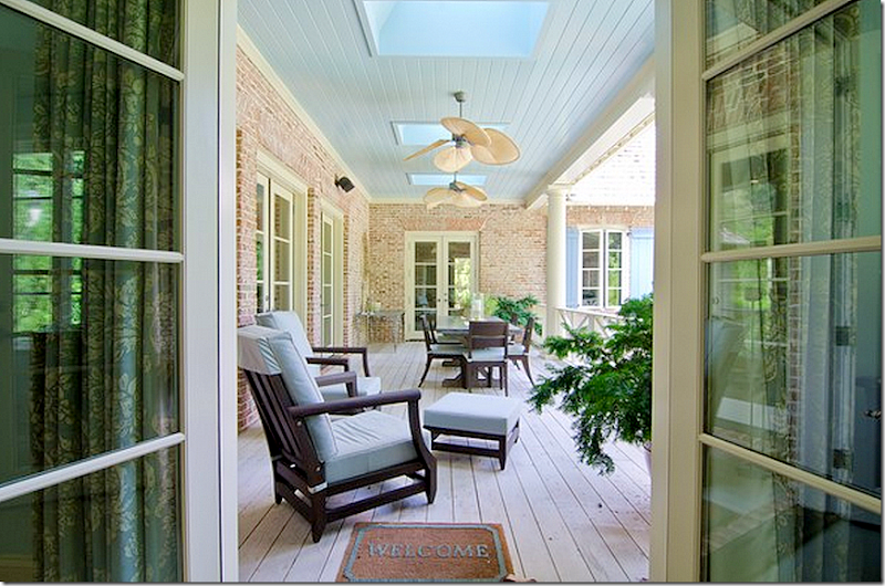
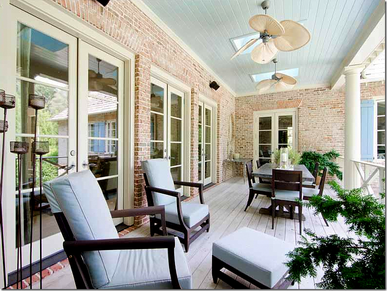
The back balcony that leads off the guest room, the living room and the family room. This would be a great place for morning coffee if the guest room was the master suite. The door at the far end leads into the family room/kitchen.
And another view of the balcony – with the table right off the family room. I would suspect that Kasler did decorate the balcony for the owners. The light blue plays off the light blues found in the adjoining living room through the French doors on the left. And the blue fabric picks up the color of the shutters and the balcony’s ceiling.
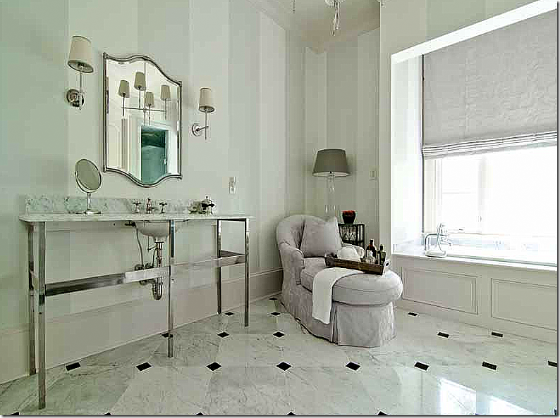
Not sure if this is the guest room’s bathroom or the master’s, but I will guess that it’s the guest room’s, decorated by Kasler in lilacs and painted, striped green walls.
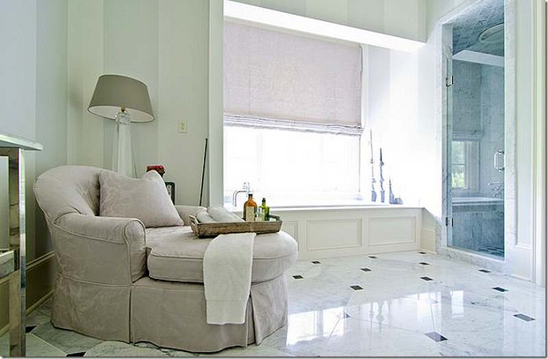
And another view – love having a chaise in the bathroom, especially one in lilacd.
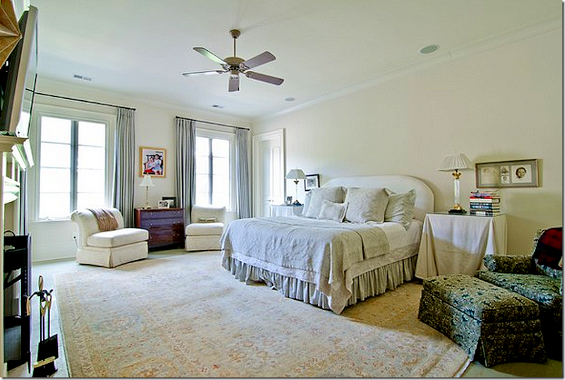
This is the master bedroom – with its own fireplace, nice! I would kill to have a fireplace in mine. I will guess that Kasler didn’t decorate this room.
And yet another large bedroom. This bedroom is located on the basement level. The bedrooms are all really spacey. Someone is going to be getting a great house. Again, Kasler didn’t decorate this.
On the basement level, the family office – it looks like maybe Kasler designed the space with the colorful pillows.
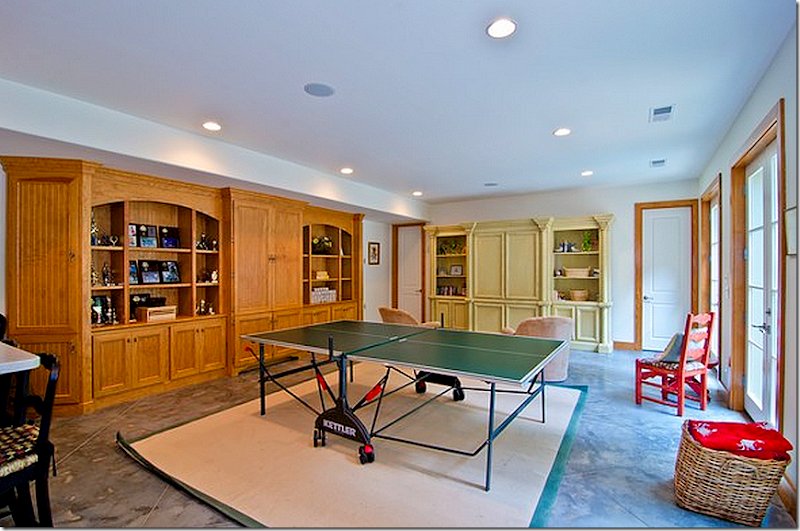
The basement is a teen’s paradise with a media room, a rec room, a full kitchen, an exercise room and a teen bedroom suite. Someone was a very happy teen here. Plus there is a wine room for the adults. Again, no - Kasler didn’t decorate this. The doors lead out to the back terrace.
The rec room.
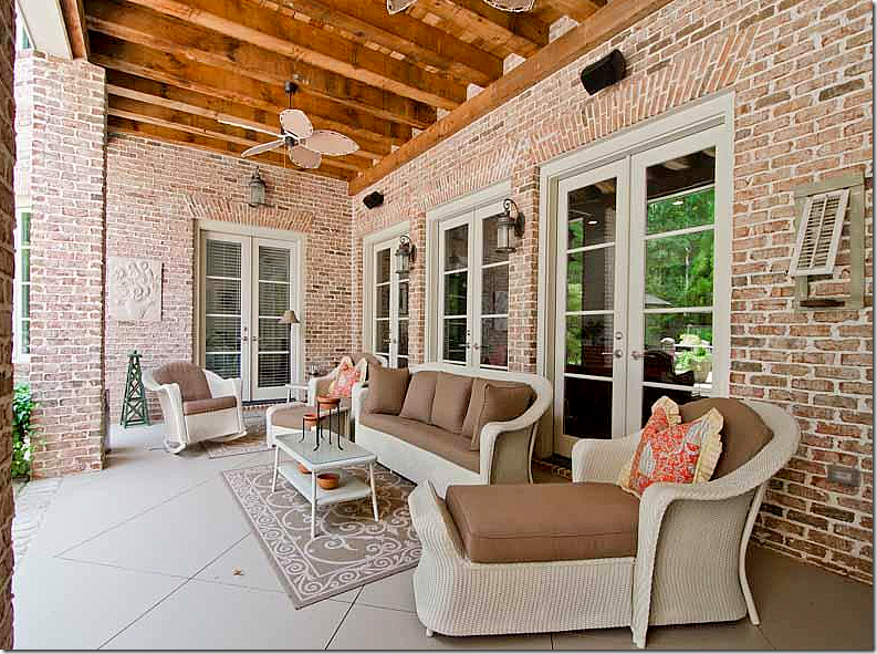
The terrace off the basement.
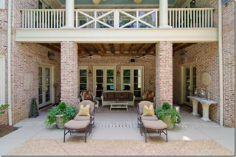
The again back terrace with the pretty main floor balcony above it.
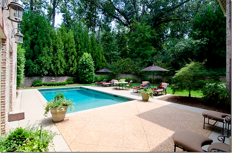
The pool – I would guess Kasler coordinated this area with the cushions and furniture. The area is so woody!
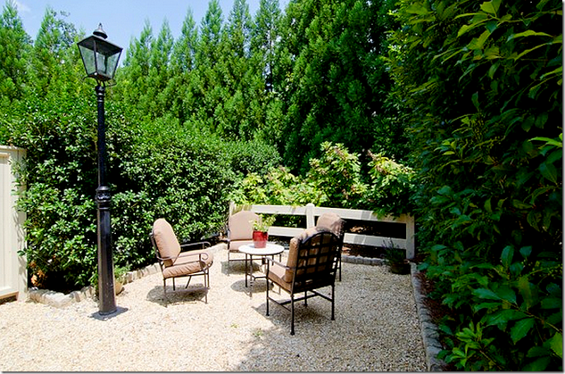
A hidden garden.
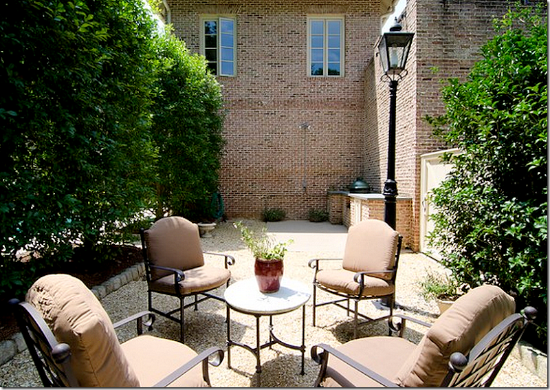
And from the other side!
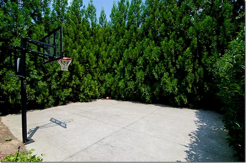
And the bball court – hidden by large hedges. Of course!
Wow! What a great family home. It’s like having two homes in one. The main floor, all sophistically decorated by one the best in the biz, and the basement – room after room – decorated probably by the owners. The whole huge basement is so strange to me because we don’t have them in Houston. But it really is like having a second house. What do people do with all that space? Seems like such a huge expense to heat and cool what is essentially a second house! Not sure how anyone could actually use all those rooms, but I suppose if you have a lot of kids like the Duggars, it would be heaven sent.
Ahhhh. After looking at all those basement rooms, I needed to be reminded of what Kasler created! AND, what the photographer and stylist did too. These past two stories – first Reese’s and now this house – have been such lessons in the art of styling and the art of interior photography. I would love to do an internship with a photographer with this kind of talent to learn how it is all done - the lighting tricks and the cropping choices. But, I am not sure you can learn it, it might just be a God given talent.
To contact the realtor, go HERE.
To read Hooked on Houses story about the house, go HERE.
To order Suzanne Kasler’s beautiful design book, click on the picture below. This house is included in the book:
And, to order the biography of Suzanne’s father, Tempered Steel, click below:

