This client came to me after reading the blog. We live near each other in West University, so the logistics were wonderful and made the work commute a snap. The homeowner had just gutted her kitchen, totally updating it, and - as the story goes – the new kitchen now made everything else look a little dated. They had been in their house for quite a while and it was definitely decorated, coordinated and all in good taste. Except, the homeowner no longer wanted to live with greens and reds and yellows and blues. She wanted more neutral and quiet colors, slipcovers, and seagrass – right up my alley. The interior designer who had transformed the kitchen wanted to take a break from working, so I took up the job from her. At the first meeting, I asked the homeowner to gather up some photos of her favorite designs from magazines, but at the second meeting she didn’t really have any and just said she liked what she saw on my blog – the “Houston Look.” She wanted to update her living room, dining room, foyer, family room and powder room – with just one stipulation. She wanted to use all her furniture – she didn’t want to buy any new pieces at all. And after a few months, it was all transformed with just new fabrics, seagrass, paint, two side tables and a few key accessories.
Let’s start with the foyer – the house is on a double lot in West U - which makes it wider than most here. There is a long central hall with a staircase; the living room is on the left with the dining room on the right. The family room is at the back of the house, overlooking the wide swimming pool. Before pics from homeowners I-phone:
Before:
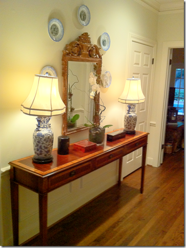
In the foyer, before, there was a wood console with a mirror and blue and white lamps.
After:
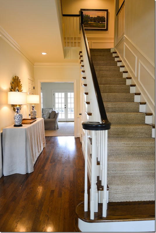
Here is the staircase with the new seagrass runner and painted black bannister. The English styled console now wears a linen slipcover.
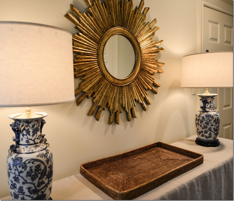
To update the foyer, we changed out the mirror for a sunburst one and I bought new round shades for the blue and white lamps. The mirror that was here was moved to the living room.
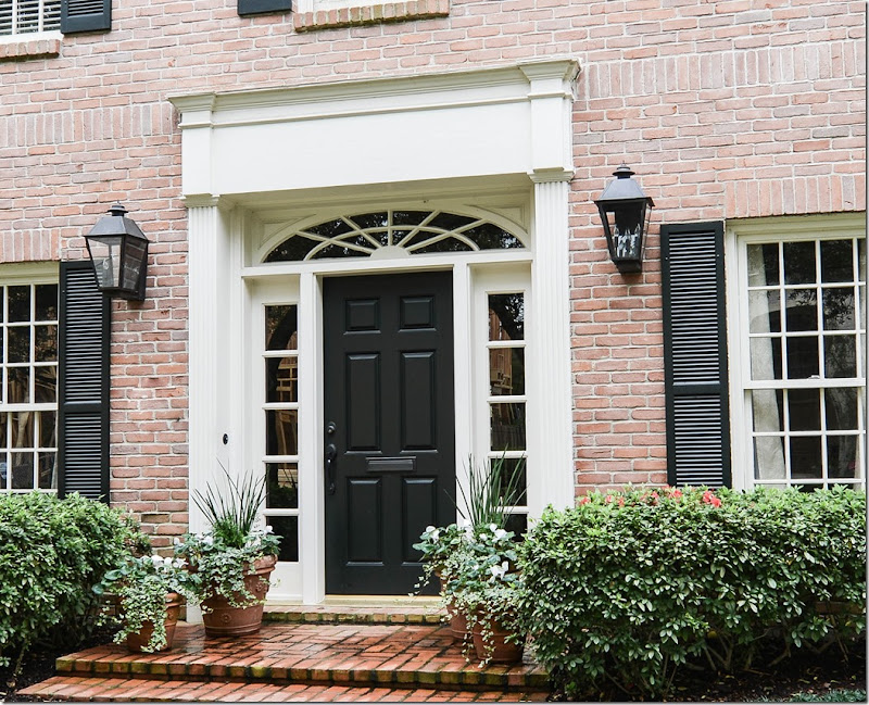
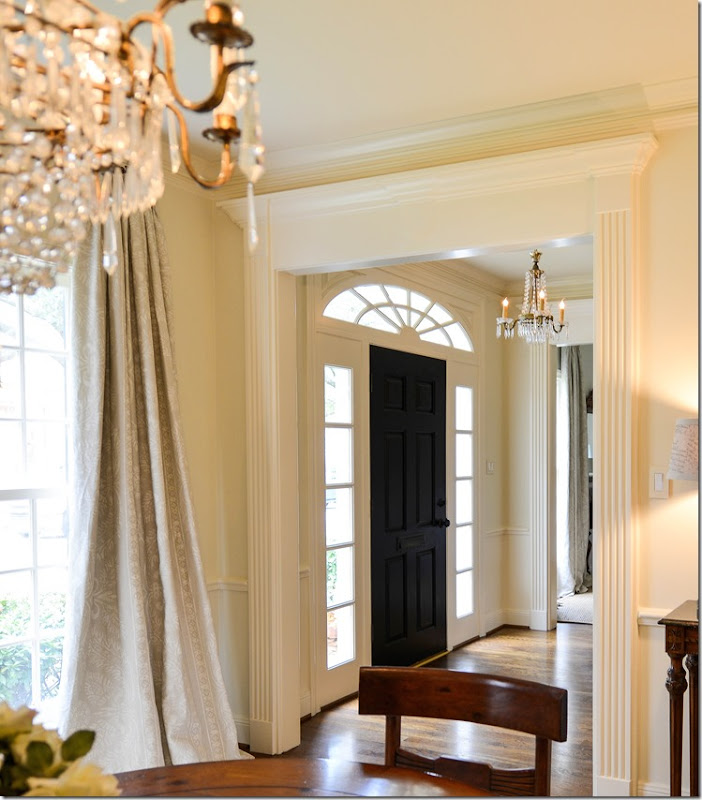
Looking from the dining room into the entry hall, you can see the darling crystal chandelier that hangs there. The front door was also painted black to match the bannister.
Before:
Before, the dining room had no curtains or rug. There was a dark wood table and chairs which had to stay along with a pine cupboard. And, there was a beautiful chandelier that came from Brown. The homeowner didn’t want to restain the table or chairs, but I was able to talk her into painting the pine piece.
AFTER:
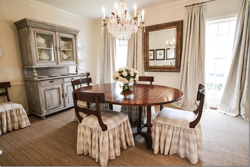
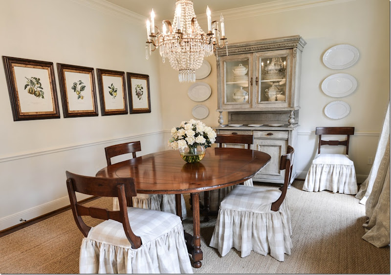
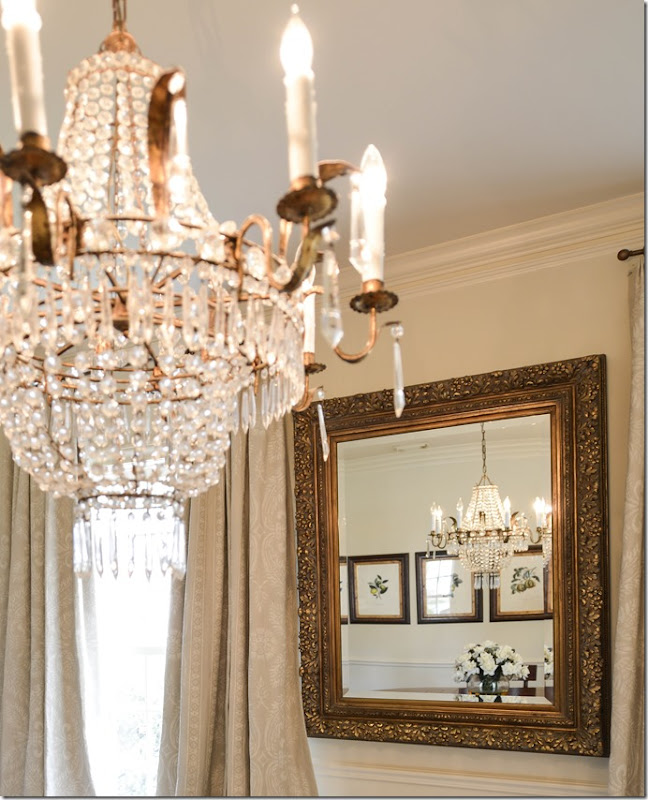
In order to soften the room, we first added a seagrass rug – custom cut to about 4” from the walls. Next, we picked a checked cotton and made slips to reach the floor. I left the backs exposed because they lend a pretty, sculptural effect. I moved the mirror from the opposite wall to between the two windows. At the windows, we picked a signature fabric that was used at the windows in both the dining room and living room. A very subtle pattern in a gray linen, it came from Vervaine. And – the biggest change - was I had James Farmer paint the pine piece a soft gray, which really helped update the dining room.
The four botanicals were moved to the opposite wall and after a long search for reasonably priced crystal sconces, we decided to hang ironstone platters. I also bought some more ironstone pieces for the cupboard – all found on EBay.
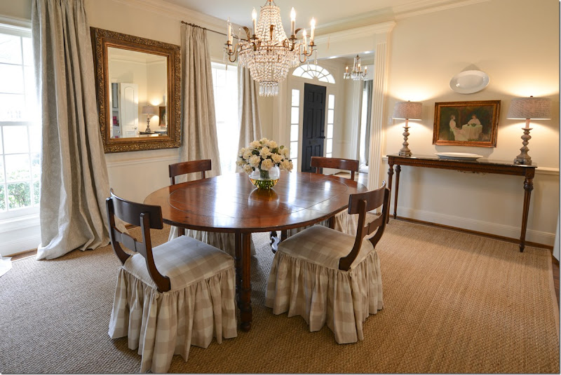
And looking toward the foyer, I added two Aidan Gray lamps for the console, along with the homeowner’s art work.
The chandelier is such a pretty piece – from BROWN in Houston and on 1st Dibs.
Before:
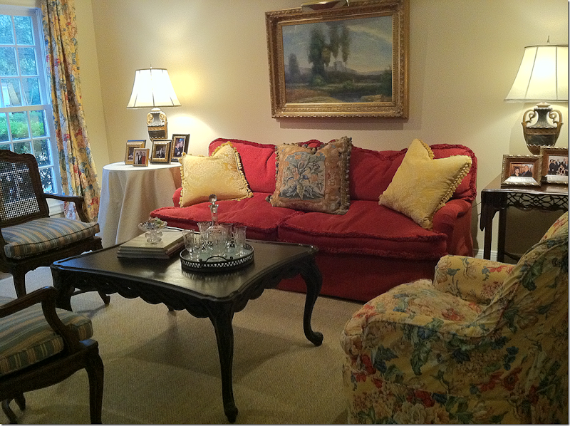
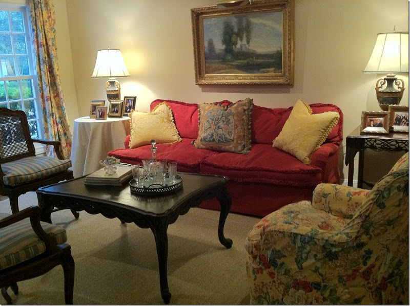
The living room was yellow, red, green, and blue.
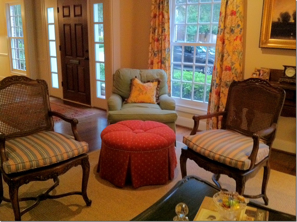
The original furniture placement was asymmetrical with a chair in the corner and no chair on the other side of the sofa.
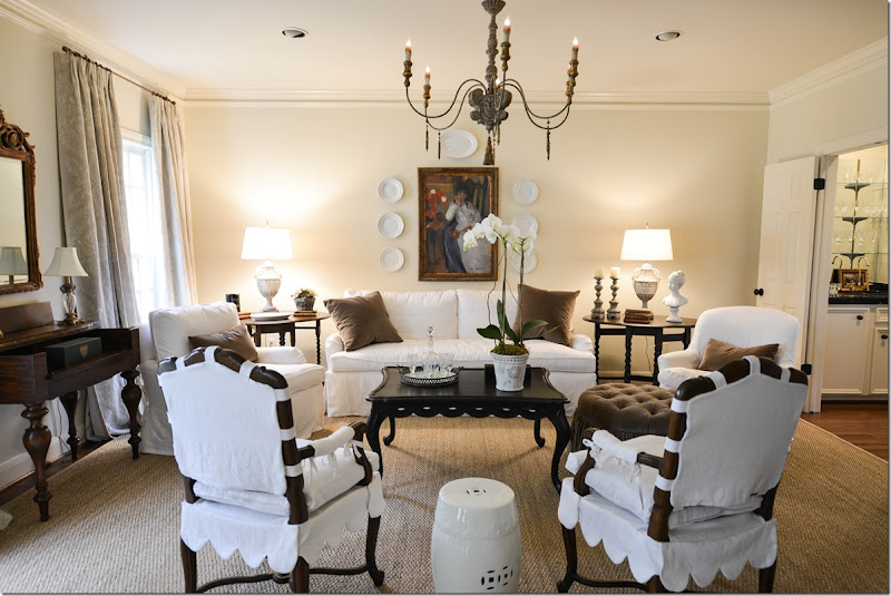
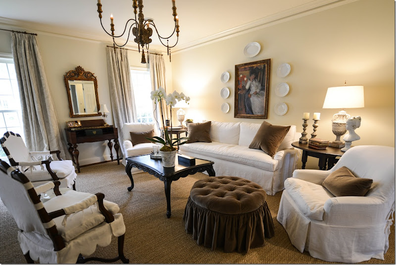
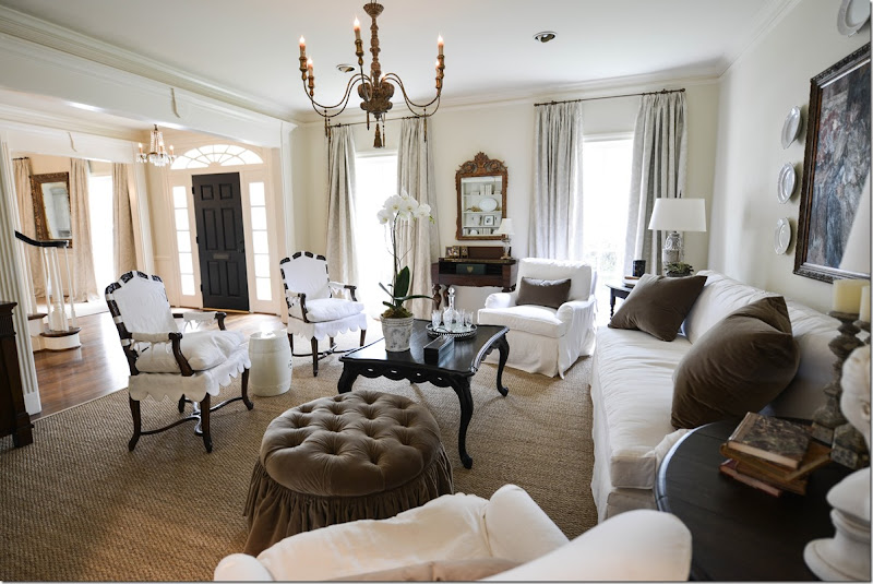
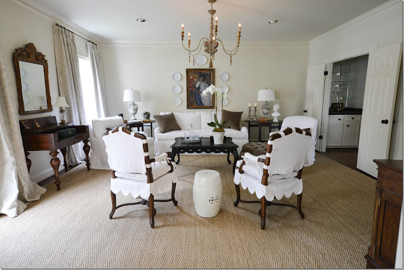
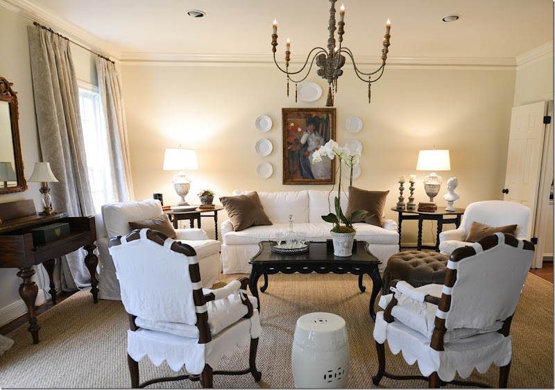
Using almost only what the homeowner already had, I rearranged the furniture in a more symmetrical design. She wanted white linen slips, so everything was recovered first in muslin and then slipped in white linen – after new cushions were made for the sofa and chairs. The smaller textured rug was exchanged for a new custom cut seagrass. And we added an Italian styled chandelier over the coffee table. The only new furniture bought was two almost-matching vintage barley twist end tables bought on EBay and restained very dark. The barley twist tables help add to the symmetry of the room.
The ottoman was redesigned, with tufting and a ruffled skirt and reupholstered in brown velvet, which matches the pillows. The sofa was also redesigned with a single bottom cushion and two back ones. Simple pillows with plain seams were added. The mirror from the entry was moved here, and the art work over the sofa was exchanged for a larger piece that came from the landing.
Here you can see into the dining room – which explains the importance of using the same curtain fabrics in both rooms since they are open to each other.
Along the side was a built in bookcase that was filled with a set of very colorful old books. We moved those into the family room and added a set of creamy books, ironstone, and a pair of urns the homeowner had.
The homeowner had invested a lot in her two lamps seen here, so she was hesitate to part with them. But they really don’t work with the new scheme. Enter James Farmer who painted the lamps a chalky grey. Along with new shades, the lamps seem like they were bought for the job. I also added a few accessories to the end tables, along with the white garden seat.
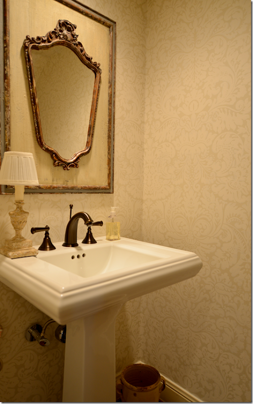
Hidden under the staircase is a small powder room. We changed the wallpaper to this creamy damask pattern from Farrow and Ball from Boxwoods. We bought the antique mirror at MAI in Houston.
Before:
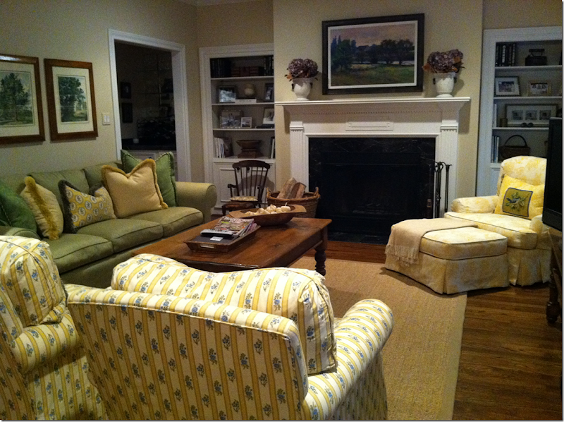
The family room was green, yellow and blue. When you walked in, the two arm chairs acted like a wall that you had to walk around – so I changed up the furniture arrangement. Another issue was the wall the sofa is on is somewhat short – not wide enough for two end tables with lamps.
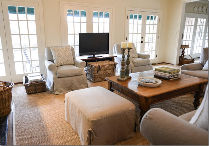
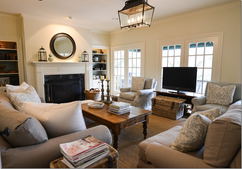
The family room was redone in taupe and aqua blue linens – to match the adjoining kitchen. First, we laid down a new custom cut seagrass to fit the room. Next, I moved the two club chairs, slipped in a light aqua linen, to flank the TV and face the sofa. Then, I moved the lone chair from the corner to next to the sofa and the ottoman went on the other side. Next, we added a lantern from Pottery Barn. James Farmer repainted the pine mirror a dark brown-black.
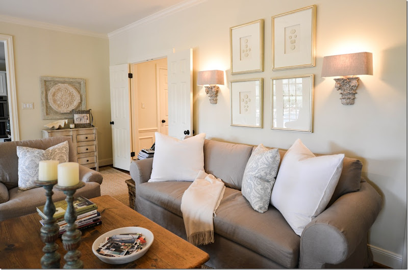
To solve the problem of there not being enough room for side tables and lamps, I added two sconces from Aidan Gray, along with a set of intaglios from Things That Inspire’s Quatrefoil Design Store. Pillows were made in white and a blue and white damask from Vervaine.
What????!!! No curtains????!!! I know, I know! After begging and pleading and begging, the homeowner agreed she would add curtains in a few months, maybe. She knows her life depends on it! We already have it narrowed down to two fabrics – the damask on the pillows in the aqua and white, or a cream and aqua stripe. The curtains will be put in both the family and the adjoining kitchen. Hopefully, she’ll be calling me to add them soon.
Along this short wall leading into the kitchen was a pine chest. James Farmer painted it a distressed cream with a stripe of the aqua blue trim. I found the plaque over the chest at Lam Bespoke and added the clam shell.
To contact James Farmer, call him at 713-398-7657.
Finally, I added a few baskets to hide clickers, etc, and to hold books and magazines.
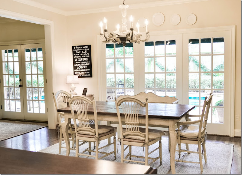
The breakfast room/kitchen was taken down to the studs and renovated by Leslie Davies of LD Designs. James Farmer painted the chairs, the bench and table a cream color, adding a slight aqua-blue line detail.
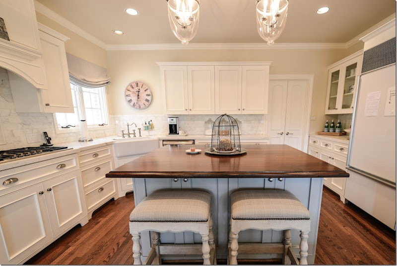
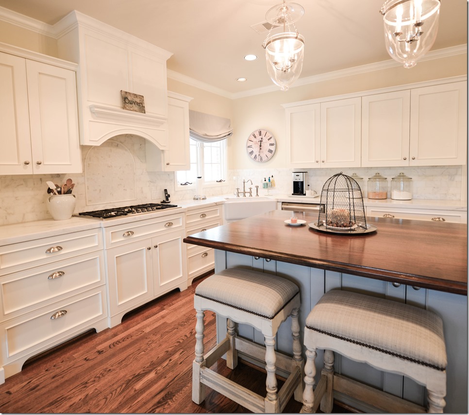
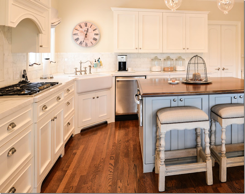
The kitchen is all creamy white with aqua blue accents on the island and the stools and shade.
In the corner is a farm sink with a nickel faucet. The counters are white marble and the island is a stained wood.
The back splash is also marble – but in a subway tile.
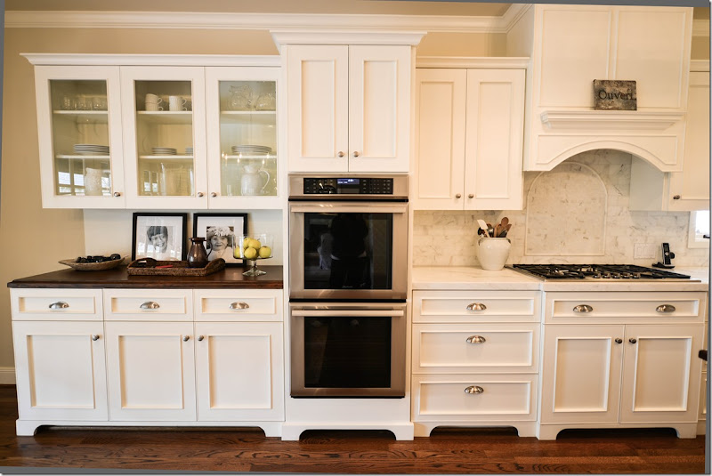
The cabinetry in the breakfast room side also has a wood countertop and the doors are glass to distinguish this area from the rest of the kitchen.
And leading from the dining room is this area that acts as a butler’s pantry.
And finally,
The house on a double wide West U lot is beautiful – classical and symmetrically designed – the rooms all connect through a central hall and a series of doors – so that you can enter on one side and travel through all the rooms to end up back where you started. This kind of plan is perfect for entertaining large crowds. The interior design was pretty and well done – everything was coordinated and it was obvious an interior designer had created it. But, after a number of years and an extensive kitchen design, the bright colors no longer felt in sync with the new muted colors found in the kitchen.
With a few new linen fabrics in taupe, white, and aqua, we were able to use all their furniture and just update them with slipcovers. Only a few new pieces were purchased for the project which helped keep costs down. By painting all the walls one shade, and by using seagrass in all the rooms – there’s a continuity to the design that was lacking before.

