This client came to me after reading the blog. We live near each other in West University, so the logistics were wonderful and made the work commute a snap. The homeowner had just gutted her kitchen, totally updating it, and - as the story goes – the new kitchen now made everything else look a little dated. They had been in their house for quite a while and it was definitely decorated, coordinated and all in good taste. Except, the homeowner no longer wanted to live with greens and reds and yellows and blues. She wanted more neutral and quiet colors, slipcovers, and seagrass – right up my alley. The interior designer who had transformed the kitchen wanted to take a break from working, so I took up the job from her. At the first meeting, I asked the homeowner to gather up some photos of her favorite designs from magazines, but at the second meeting she didn’t really have any and just said she liked what she saw on my blog – the “Houston Look.” She wanted to update her living room, dining room, foyer, family room and powder room – with just one stipulation. She wanted to use all her furniture – she didn’t want to buy any new pieces at all. And after a few months, it was all transformed with just new fabrics, seagrass, paint, two side tables and a few key accessories.
Let’s start with the foyer – the house is on a double lot in West U - which makes it wider than most here. There is a long central hall with a staircase; the living room is on the left with the dining room on the right. The family room is at the back of the house, overlooking the wide swimming pool. Before pics from homeowners I-phone:
Before:
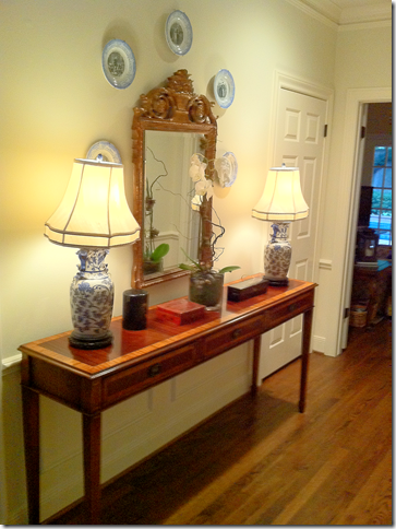
In the foyer, before, there was a wood console with a mirror and blue and white lamps.
After:
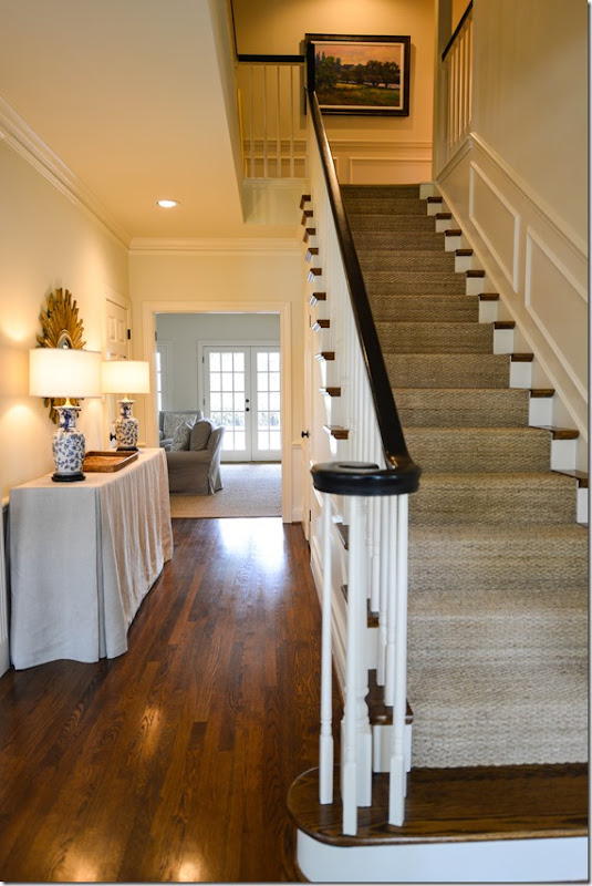
Here is the staircase with the new seagrass runner and painted black bannister. The English styled console now wears a linen slipcover.
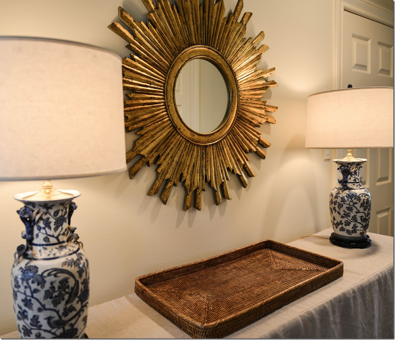
To update the foyer, we changed out the mirror for a sunburst one and I bought new round shades for the blue and white lamps. The mirror that was here was moved to the living room.
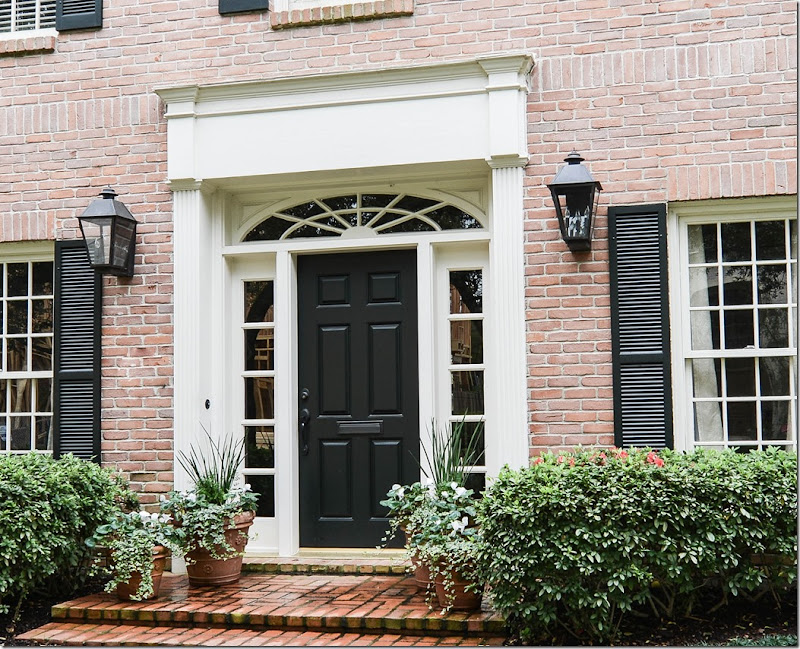
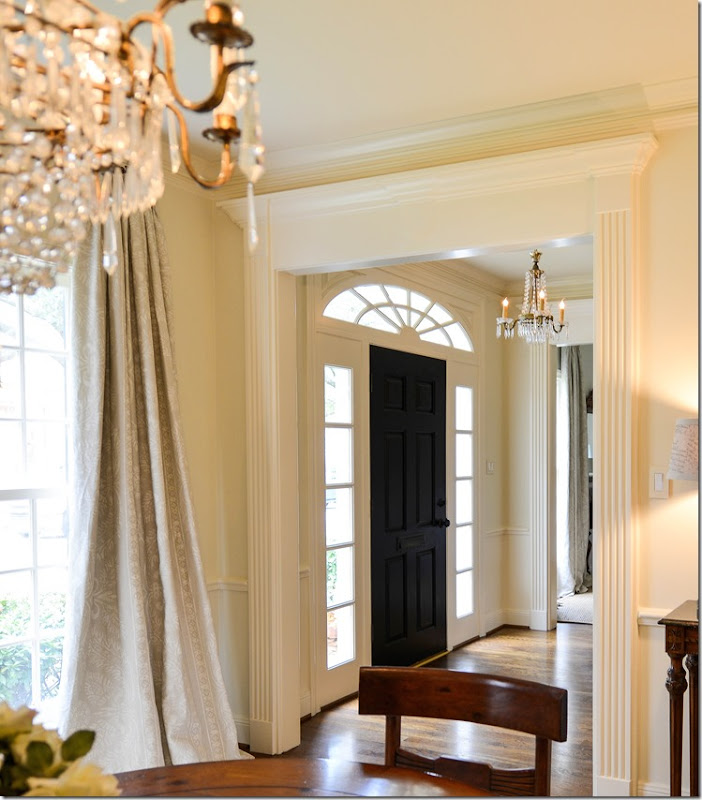
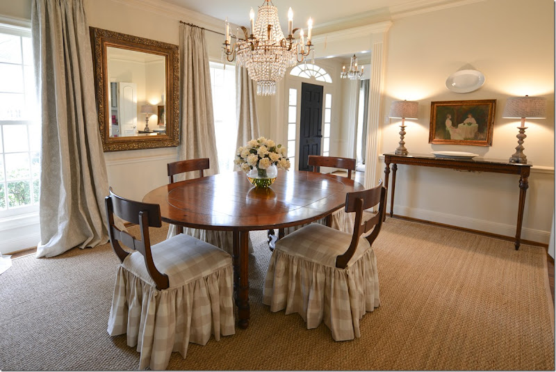
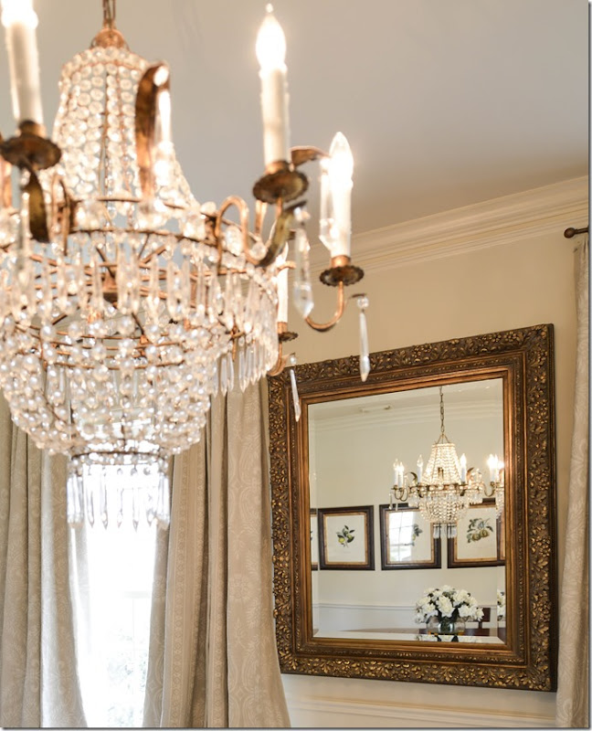
Looking from the dining room into the entry hall, you can see the darling crystal chandelier that hangs there. The front door was also painted black to match the bannister.
Before:
Before, the dining room had no curtains or rug. There was a dark wood table and chairs which had to stay along with a pine cupboard. And, there was a beautiful chandelier that came from Brown. The homeowner didn’t want to restain the table or chairs, but I was able to talk her into painting the pine piece.
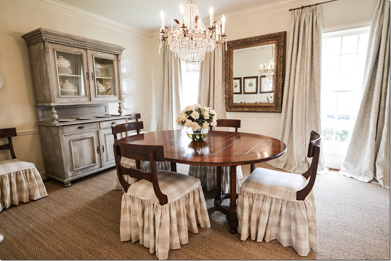
AFTER:
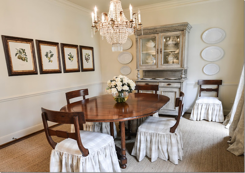
In order to soften the room, we first added a seagrass rug – custom cut to about 4” from the walls. Next, we picked a checked cotton and made slips to reach the floor. I left the backs exposed because they lend a pretty, sculptural effect. I moved the mirror from the opposite wall to between the two windows. At the windows, we picked a signature fabric that was used at the windows in both the dining room and living room. A very subtle pattern in a gray linen, it came from Vervaine. And – the biggest change - was I had James Farmer paint the pine piece a soft gray, which really helped update the dining room.
The four botanicals were moved to the opposite wall and after a long search for reasonably priced crystal sconces, we decided to hang ironstone platters. I also bought some more ironstone pieces for the cupboard – all found on EBay.
And looking toward the foyer, I added two Aidan Gray lamps for the console, along with the homeowner’s art work.
The chandelier is such a pretty piece – from BROWN in Houston and on 1st Dibs.
Before:
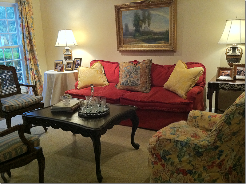
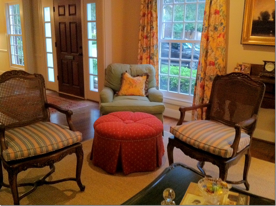
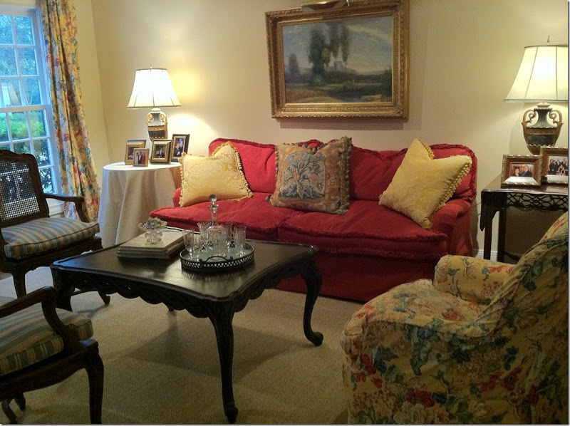
The living room was yellow, red, green, and blue.
The original furniture placement was asymmetrical with a chair in the corner and no chair on the other side of the sofa.
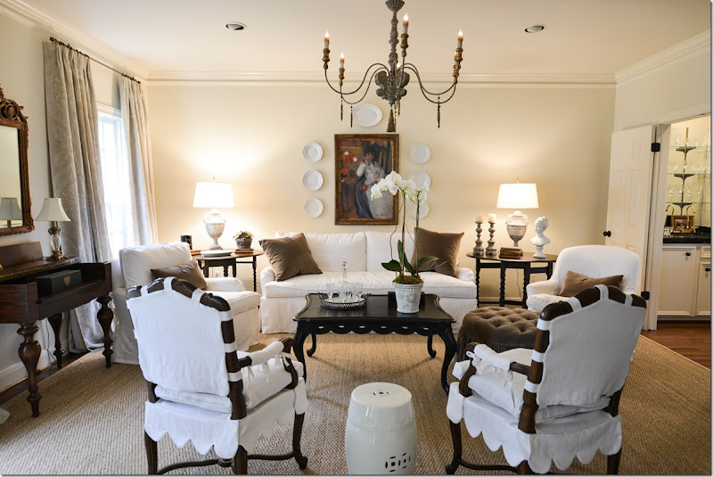
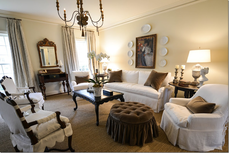
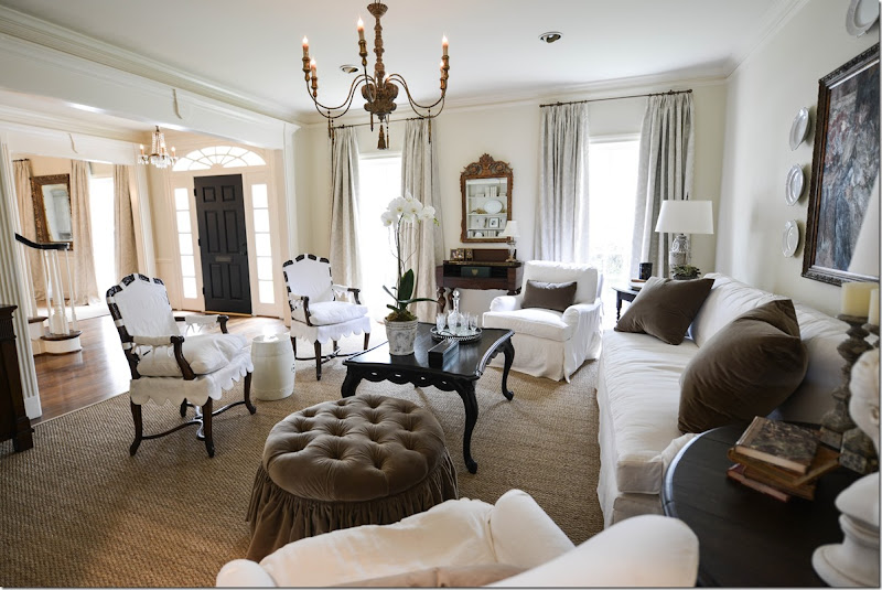
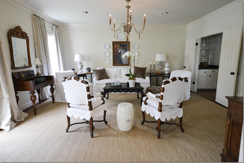
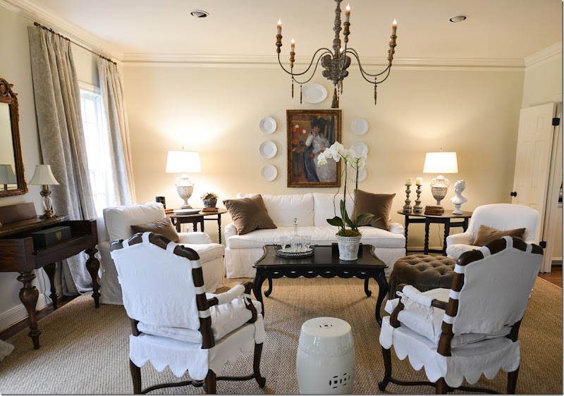
Using almost only what the homeowner already had, I rearranged the furniture in a more symmetrical design. She wanted white linen slips, so everything was recovered first in muslin and then slipped in white linen – after new cushions were made for the sofa and chairs. The smaller textured rug was exchanged for a new custom cut seagrass. And we added an Italian styled chandelier over the coffee table. The only new furniture bought was two almost-matching vintage barley twist end tables bought on EBay and restained very dark. The barley twist tables help add to the symmetry of the room.
The ottoman was redesigned, with tufting and a ruffled skirt and reupholstered in brown velvet, which matches the pillows. The sofa was also redesigned with a single bottom cushion and two back ones. Simple pillows with plain seams were added. The mirror from the entry was moved here, and the art work over the sofa was exchanged for a larger piece that came from the landing.
Here you can see into the dining room – which explains the importance of using the same curtain fabrics in both rooms since they are open to each other.
Along the side was a built in bookcase that was filled with a set of very colorful old books. We moved those into the family room and added a set of creamy books, ironstone, and a pair of urns the homeowner had.
The homeowner had invested a lot in her two lamps seen here, so she was hesitate to part with them. But they really don’t work with the new scheme. Enter James Farmer who painted the lamps a chalky grey. Along with new shades, the lamps seem like they were bought for the job. I also added a few accessories to the end tables, along with the white garden seat.
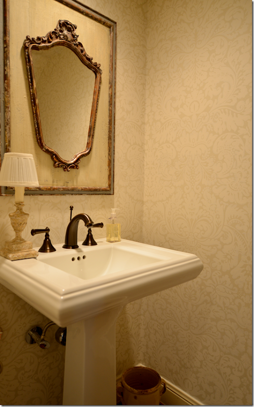
Hidden under the staircase is a small powder room. We changed the wallpaper to this creamy damask pattern from Farrow and Ball from Boxwoods. We bought the antique mirror at MAI in Houston.
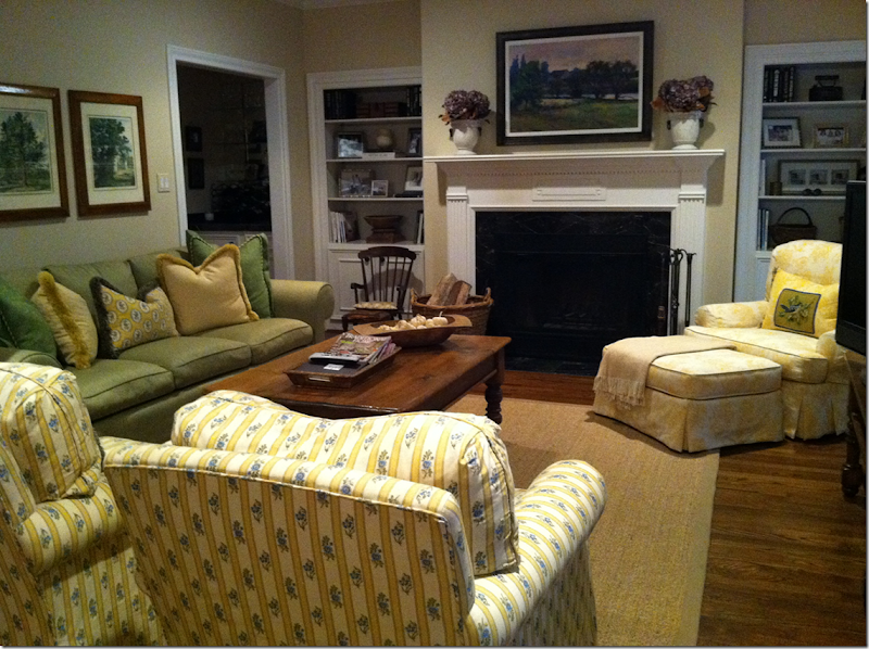
Before:
The family room was green, yellow and blue. When you walked in, the two arm chairs acted like a wall that you had to walk around – so I changed up the furniture arrangement. Another issue was the wall the sofa is on is somewhat short – not wide enough for two end tables with lamps.
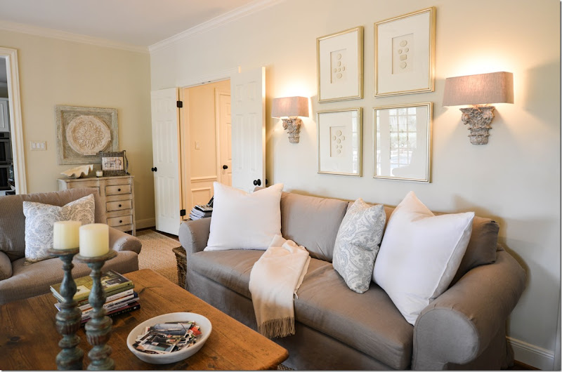
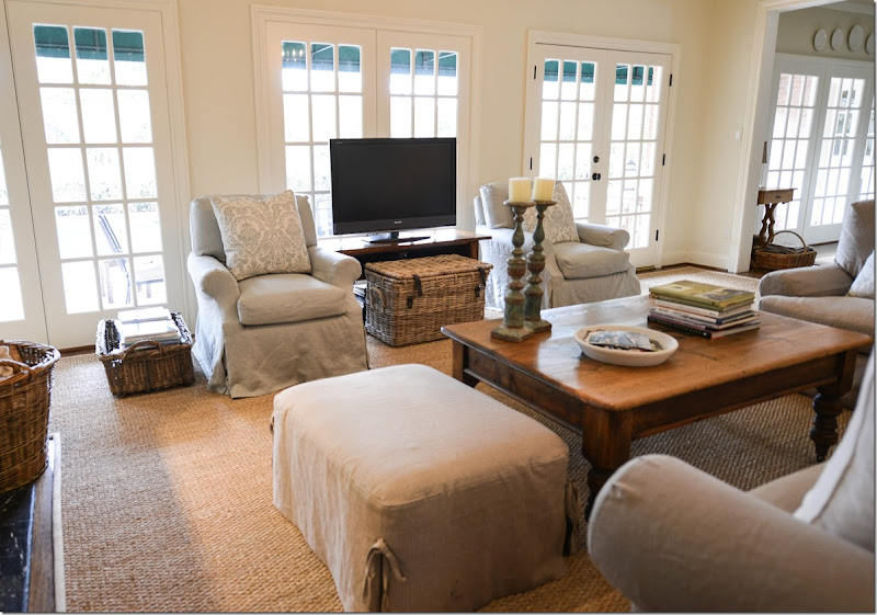
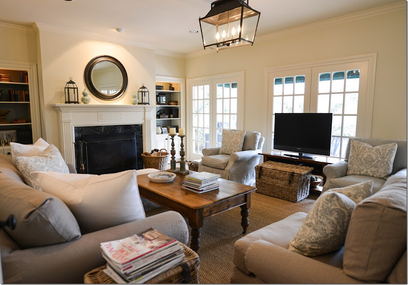
The family room was redone in taupe and aqua blue linens – to match the adjoining kitchen. First, we laid down a new custom cut seagrass to fit the room. Next, I moved the two club chairs, slipped in a light aqua linen, to flank the TV and face the sofa. Then, I moved the lone chair from the corner to next to the sofa and the ottoman went on the other side. Next, we added a lantern from Pottery Barn. James Farmer repainted the pine mirror a dark brown-black.
To solve the problem of there not being enough room for side tables and lamps, I added two sconces from Aidan Gray, along with a set of intaglios from Things That Inspire’s Quatrefoil Design Store. Pillows were made in white and a blue and white damask from Vervaine.
What????!!! No curtains????!!! I know, I know! After begging and pleading and begging, the homeowner agreed she would add curtains in a few months, maybe. She knows her life depends on it! We already have it narrowed down to two fabrics – the damask on the pillows in the aqua and white, or a cream and aqua stripe. The curtains will be put in both the family and the adjoining kitchen. Hopefully, she’ll be calling me to add them soon.
Along this short wall leading into the kitchen was a pine chest. James Farmer painted it a distressed cream with a stripe of the aqua blue trim. I found the plaque over the chest at Lam Bespoke and added the clam shell.
To contact James Farmer, call him at 713-398-7657.
Finally, I added a few baskets to hide clickers, etc, and to hold books and magazines.
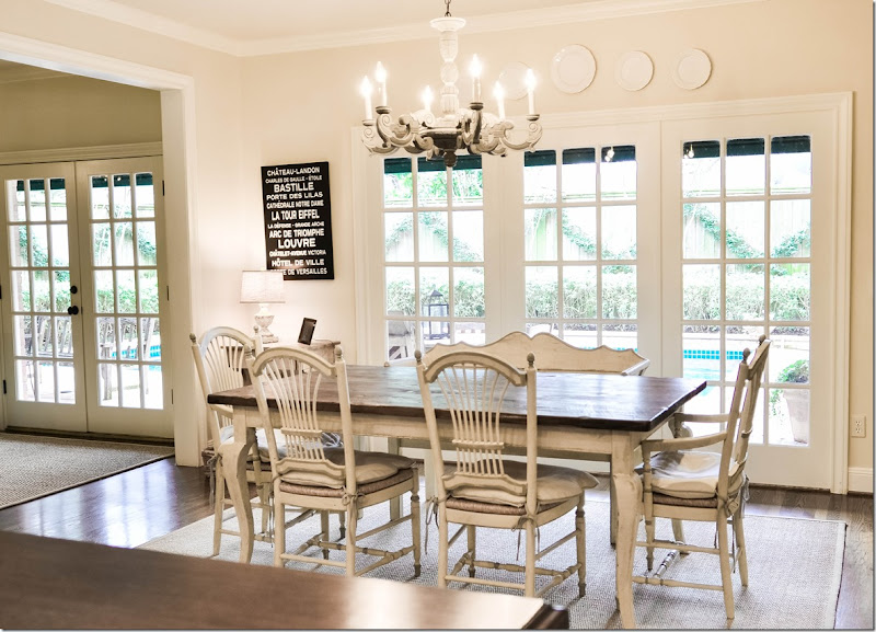
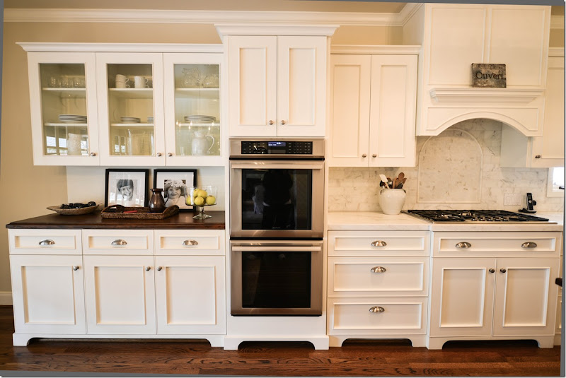
The breakfast room/kitchen was taken down to the studs and renovated by Leslie Davies of LD Designs. James Farmer painted the chairs, the bench and table a cream color, adding a slight aqua-blue line detail.
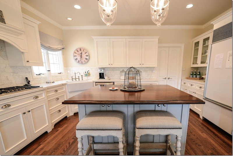
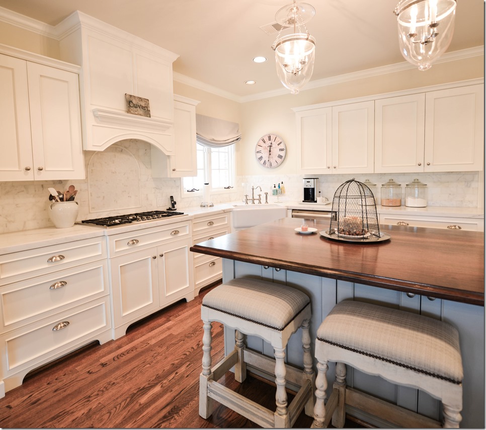
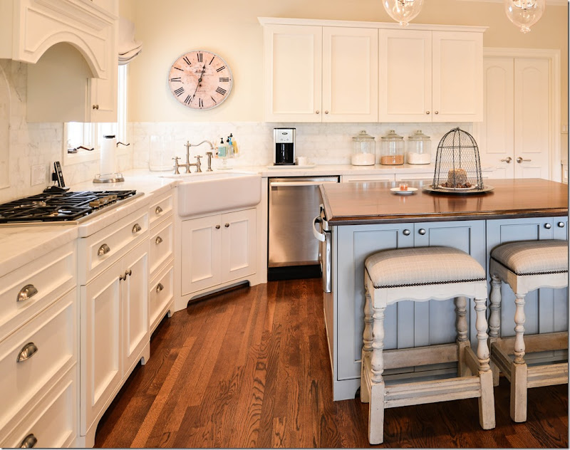
The kitchen is all creamy white with aqua blue accents on the island and the stools and shade.
In the corner is a farm sink with a nickel faucet. The counters are white marble and the island is a stained wood.
The back splash is also marble – but in a subway tile.
The cabinetry in the breakfast room side also has a wood countertop and the doors are glass to distinguish this area from the rest of the kitchen.
And leading from the dining room is this area that acts as a butler’s pantry.
And finally,
The house on a double wide West U lot is beautiful – classical and symmetrically designed – the rooms all connect through a central hall and a series of doors – so that you can enter on one side and travel through all the rooms to end up back where you started. This kind of plan is perfect for entertaining large crowds. The interior design was pretty and well done – everything was coordinated and it was obvious an interior designer had created it. But, after a number of years and an extensive kitchen design, the bright colors no longer felt in sync with the new muted colors found in the kitchen.
With a few new linen fabrics in taupe, white, and aqua, we were able to use all their furniture and just update them with slipcovers. Only a few new pieces were purchased for the project which helped keep costs down. By painting all the walls one shade, and by using seagrass in all the rooms – there’s a continuity to the design that was lacking before.






Gosh - i do so love before and after shots!
ReplyDeleteFabulous redos.
You are a genius Joni!!! That sitting room is to die for now! What a change you made! And yes indeed you were so right to hang the same curtains in both- dining and sitting- rooms because they are open to each other.
ReplyDeleteGood to know that the homeowner agreed to use curtains in the family room! The atmosphere will be so much more intimate and cozier!
xx
Greet
Beautiful, livable redecoration, Joni. The owners must be so happy.
ReplyDeleteWOW. This is an amazing transformation.love love love it. What a lucky family!!!
ReplyDelete-linda,ny
FABULOUS JOB JONI! made it feel fresh and soothing and homeowner got to keep their furniture. Love the before and after. Thanks once again for a brilliant post.
ReplyDeleteJoni you have done it again! Beautiful transformation. Amazing what slip covers can do!
ReplyDeleteJoni...this is beautiful. Your decorating style is unmistakable. We are in the middle of our kitchen remodel, so I have two questions, hopefully either you or the homeowner can answer. Where did the barstools come from and can she identify the marble subway tiles for me? Thanks so much. Always enjoy your new posts!
ReplyDeleteBeautiful as always and what a transformation in all areas! Warm, comfortable, and stunning!! xo Leslie
ReplyDeleteYou did an amazing job! When I first read the homeowner didn't want to buy any new furniture I thought the updates would be minor. You completely transformed that home. I love it! It goes perfectly with the new kitchen, too. Oh, and the china cabinet in the dining room looks amazing painted.
ReplyDeleteYour client must be THRILLED! Such a transformation , genius!
ReplyDeleteIt is FABULOUS! Do you mind telling what paint color you used thru out? It works perfectly.
ReplyDeletei will! i'm just blanking on the color - it's a benjamin moore. i'll post it when it comes to me!
DeleteHello Joni-
ReplyDeletePerfection as only you can create!!!
Two questions: First, did you paint the dining room the same color as the living room since they are visualized/flow together? Is this what needs to be done when two rooms flow so openly together?
Second, who made the gorgeous relaxed roman blind in the kitchen?
Thank you and thanks again for the best design blog on the web!
Nancy
North Carolina
PS- the rover.... :-)
yes - all rooms were painted the same color. actually, the kitchen was painted a more yellowish color but i talked her into repainting it too, which was a stretch because it had just been painted! but it really needed to be more white to go with the family room.
Deletethe blind? i'm not sure - the other designer had that custom made, not sure who she uses.
yes, the ROVER!!!!!!!!!!!! haha!!!!
Beautiful!! What is the paint color?
ReplyDeleteJoni, This is so beautiful. I know the homeowners feel they are living in a new home. You are amazing. I love your home and wish you lived nearby. This is what I want done in my home. Everything looks soo beautiful. Wow ! It is amazing how the painted pieces just transform the rooms.
ReplyDeleteI too, love the before and aafter pictures with the details. Thank you. :)
this was a real treat to see joni. amazing how much larger the rooms look with the custom cut/sized seagrass rugs. I am a believer now. I think the most impressive change is the dining room; the gray painted piece made ALL the difference. I know that is one happy homeowner and that she is glad you were able to re-use so many of her things.
ReplyDeleteOnce again I have to say - there is nothing better than seeing a post from you in my email.....what a wonderful treat on a gloomy Monday morning ! Thanks so much for the pictures showing the lovely home - the homeowners must be so pleased. It truly does look like a beautiful new home......thanks again for sharing.
ReplyDeleteJoni.....Joni.....Joni.....home flipping run girl! I am sure that your clients are absolutely thrilled with how you transformed their dated spaces and gave them such a fresh classic look. You were right...the kitchen would have looked like it belonged in a different home before you worked your magic. Don't make it sound easy....to comply with the homeowners wishes and use what they had took much thought and planning. That takes talent......so congratulations to you. AND to them for hiring the right designer for the job :)
ReplyDeleteWhat a change! It looks beautiful, Joni. I hope she does the curtains in the family room soon. I know I will be working on mine.
ReplyDeleteBest...Victoria
I just looked back thru the pictures. Another great look in the foyer would have been to paint that console in the gray tones and adding crystal sconces above it , like you have in your home. :) The sunburst looks beautiful. I purchased a large sunburst from Ballard Designs but returned it because I couldn't find the right place for it. :( But , I love them.
ReplyDeleteWell, I didn't like the open leg underneath it. It seemed kind of skimpy to me. and i love a rectangular skirted table. we went back and forth on that, whether to paint it or not or to put a bench there, etc. but in the end, this just went with the design of the other rooms.
DeleteYou created such a serene house here. I love the way you use and show neutral large checks. Would you mind sharing the manufacturer of the taupe check you used in this house?
ReplyDeleteIt's from Fabricut.
Deletethank you Joni!
DeleteJust goes to show what a knowing eye can do with a few individual changes, like slipcovers and the judicious use of paint and rearrangement that add up to a successful total makeover.
ReplyDeleteBTW, where did the sunburst mirror in the foyer come from?
I got it from Lam Bespoke in Houston.
DeleteAbsolute perfection once again. You are one very talented lady (with the prettiest pictures and most informative blog out there. Thanks for all the work that goes into putting it together.) Could you please let me know what the paint color is? Thanks.
ReplyDeleteJoni,
ReplyDeleteThe before and after of the dining room looks like absolute magic! I was stunned. I haven't even finished reading the whole post; but I had to comment. (I love to linger over all the details in your photos; so I'll be getting more coffee and coming back!) I just HAVE to ask for a close-up of the finish on the pine cupboard. I live across the country from you; so there is no way I would hire the same artisan to do work. However, I'm hoping that with a close-up of the finish, I might be able to find someone who can do a good job of duplicating it! One last question: Is the check in the fabric a tan color or is it gray? Hard to tell on my monitor. Thank you!!!
email me and i'll send you a picture of it close up!
DeleteHi again Joni,
ReplyDeleteMy morning becomes candy!!! viewing these gorgeous transformation pictures. This is such an important avenue in design right now I really believe. Transforming and working with what you have. Please please please the paint color????? All the best...
Great new look Joni! I am wondering how many in the family? Did you have a difficult time convincing the homeowner to put two chairs on either side of the TV? was she concerned about the TV watching aspect of that placement? I frequently have clients that are very concerned about who can see the TV from where, whenever I suggest a move for better balance etc....I imagine that it is a similar discussion for you as to painting lamps or adding window treatments...but I am curious how you approach it! Also, wondering your source for the baskets, I think you mentioned before where you got a couple of the trunk style baskets before, but I couldn't readily find the post. Also wondering about the paint colors as several others have....I think you are really wonderful to share your work and sources on projects, as well as your clients...Brava!!
ReplyDeleteCheers,
Meredith
ACTUALLY, I wanted to move the sofa in front of the window and put the TV where the sofa was, but that was a no-go. The way it was before, the two chairs really blocked the eye and the body, bad karma! so that was easy to convince them. They only have two children and one is now in college so that wasn't an issue at all. I think they watch a lot of tv upstairs in their playroom anyway. the baskets - i get them from Artesia in Florida. http://www.artesiacollections.com
DeleteI'll ask about the paint color - it's benjamin moore, just forgetting which white it is. the painting of the lamps was an easy discussion because she had spent a lot of money on them so it was better than getting rid of them. the drapes in the family room - were over budget, but i'm hoping it will be done soon!
thanks EVERYONE!!!!! soooo nice of y'all to be so sweet!!!!
Great transformation and refreshing change!
ReplyDeleteWould you please share who makes the brown velvet you use? Thanks.
Pindler. But I sometimes use Duralee. But this was Pindler. They have several shades of brown. This was a more taupey brown, not really dark.
DeleteBeautiful and instructive post! In my experience one of the most difficult challenges is to persuade the client to paint wood. Of course, you were right. Amazing difference in the dining room.
ReplyDeleteMarion
yes, it was. that piece just looked like the 80s left w/ the pine finish. but in gray, it looked like it was something bought for the new decor! James did a great job on it.
DeleteWow,Joni, what an incredible makeover! Your client must be thrilled- it is just stunning!
ReplyDeleteWow! Just so restful! Would love to know the paint color used throughout!
ReplyDeleteBravo on a fabulous job!!!
ReplyDeleteYou really pulled it all together and gave them a brand new cohesive look.
I love that you worked with what they had too making it even more impressive!!!
Perfection!
ReplyDeleteStunning transformation, Joni! Everything looks so fresh and crisp-beautifully done!
ReplyDeleteTruly amazing transformation! I hope the homeowner calls you soon about the window treatments, they will look stunning!
ReplyDeleteThis home has a lovely floor plan and you did a great job of creating smooth transitions from one space to another. When I saw the picture of
ReplyDeletethe transformed living room I thought you were showing yours. The rooms are so much alike. I love the curtains in the LR and DR. Can you
share the fabric with us. The kitchen designer also did a great job. I thought the farm sink slightly off center of the corner was a bit
odd, but the more you study it, the more it seems to work, particularly having the windows on the upper left and the large railroad clock to
anchor the space.
Doucette in pewter by Vervain/Fabricut!
DeleteThank you, it was really beautiful and luxurious looking on the windows.
DeleteJoni:
ReplyDelete!Congrats, for an excellent re-design! I liked all te details that you put together. I have a question: Were there two similar chandeliers, one in the foyer and another one in the dining room?
I am moving to McKinney, TX and want to know where can I buy seagrass rugs custom cut to my new house? What is the color of that sea grass?
I also wait every Monday for your post. I loved it!
Thanks,
Well, they are both crystal chandeliers but not the same. one is small = in the entry. the other is old, vintage.
Deletenot sure where you can get seagrass = but in Dallas for sure. just ask a rug company in the design center there. they should know who does it.
seagrass is only one color. it comes more green, but then as it ages, it gets more brown.
I love this even more with re-using what they had. The bones were there, but you really made the most of them! Amazing and inspiring!
DeleteAlthough I still love old English pine pieces, I know that they are not popular now. But this post really shows how you can transform furniture with the right paint. Amazing! Love the makeover.
ReplyDeleteBeautiful! I cringe at company and parties on those white slips! But really nice, I had to do a double take, it could be your house!
ReplyDeleteFresh and crisp new look for your client.
white slips - you just wash them like you would a pair of pants = what's to be scared of? not sure what you mean!!! that's the beauty of slipcovers.
Deleteand yes, my family room and living room are both in white linen. but that's why she called me, she was very specific about wanting white slips in her living room. in her family room, they are khaki and light blue-green linens. the problem is this - if the client wants white slipcovers w/brown, should i say no because it's what i have? I'm doing a bedroom right now and the client wanted white w/brown. I TRIED to show her other colors, but she wasn't interested in it. I think people call me wanting this specific look, even though i really do every kind of design. right now i am doing a study in the high rise for a woman who is 83. no slips. no white linen. at all!!!
Holy cow! This is one of the most beautiful transformations ever! I have a very expensive Henredon dining room table and chairs, that I'd love to paint! Its almost like I need permission! I love all of the changes you've made! Great work!
ReplyDeleteDo it! i've painted dining room tables and they come out sooo beautiful. you would not believe it. here's the story about a house where i painted their dining table and buffet and chairs. i can't tell you the difference it made!
Deletehttp://cotedetexas.blogspot.com/2010/03/webb-design-albans-house.html
http://cotedetexas.blogspot.com/2010/03/webb-design-albans-house-part-ii.html
You did a really wonderful job - the rooms in the before picture had a very Pierre Deux look, they were very nice. But the transformation; using all the same furniture, just amazing! I, too need 'permission'; I have a late 18th c. wedding armoire from Normandy. It is so beautifully carved, but I think painted in the lightest of grays will make it more beautiful. Seeing the transformation of the existing furniture has completely covinced me. And if some of your work cries out 'Joni Webb' is that a bad thing? After all, we can see the signature on many designers'work. Thanks for sharing the pictures. Really quite a breath of fresh air into that home.
Deletego for it. i mean you could always strip the paint away one day and restain it, i guess???? i would do it in a heartbeat. unless the patina is so gorgeous and the piece is a serious antique, that is. it makes such a difference. esp. with pine furniture. i wish we had painted the coffee table too!!
DeleteJust fabulous, Joni! What a truly lovely and livable update. Congrats.
ReplyDeleteFYI, I don't know if you know but you have the word verification too in place now. I hope it was an accident!
ReplyDeleteno, no accident. i hate it - but i was getting 1,000s of spam comments - 1,000s of them and this is the only way to stop it. i wouldn't care, but the comments take over some of the stories. it's just awful what they do, so sorry! i wish i didn't have to add it.
DeleteBeautiful transformation. The house looks crisp and fresh. I've said it once and I'll say it again - Joni, you are SOOOOOOO talented! Thanks for sourcing the fabric - it's beautiful! Yes, I read ALL the comments! ;)
ReplyDeleteI cannot get over the transformation!!
ReplyDeleteYou took a house from OK to WOW!!
Do you do work in Fort Worth??!!
No! I barely do work outside of West U these days. I just don't have the time for a long commute right now. Sorry!!
DeleteEverything looks great! It's nice that so many things were repurposed...especially those lamps!
ReplyDeleteWOW! So very nice! Love how you took the challenge of their current furniture remaining but created a whole, new, wonderful space. We have similar colors in our home and I would love to change them to the cooler, softer pallet. We also have beautiful rugs that I am not sure what I would do with as they have the same bright colors. Do you have any suggestions? It took us over 25 years to collect them and I am not sure how I would feel about putting them in storage.
ReplyDeleteThis post was so much fun and informative. Thank you for sharing.
blue and red oriental rugs? i should do a post on that. you could layer them over seagrass, i've seen that = especially if they aren't too large. without seeing them makes it hard to say. send in a picture!
DeleteWhat an outstanding redo-everything is beautiful! Where did you find the clamshell you used on the chest leading from the family room to the kitchen? I have been looking for one of these. I found your blog from French Garden House and I really like it. Diana
ReplyDeleteat craftex in houston! http://www.yelp.com/biz/craftex-wholesale-distributor-houston
Delete
ReplyDeleteJoni:
Stunning transformation, especially the pine cupboard. It just sat there looking so out of place and you gave it life. Beautiful - you did an amazing job! The homeowners must be thrilled!
Janice
You have a definite look & that is the key! Great Job. xxpeggybraswelldesign.com
ReplyDeleteReally lovely, as always Joni!! They must be thrilled!
ReplyDeleteJoni, What a gorgeous transformation and I bet the homeowners are thrilled!! My favorite is the hutch in the dining room you had painted gray....beautiful. I hope the homeowner will let you install drapes, the turquoise stripe fabric sounds wonderful. Joni, You did an amazing job with this home. xx, Sherry
ReplyDeleteAll I can say is that I'm astounded. It is absolutely phenomenal! I especially couldn't get over the transformation of that dining room hutch! I do have a question for you - what has your experience been with seagrass runners on stairs? I was interested in going that for my own home but everyone I talked to said it would be too slippery and a big no-no. We have two kids so can risk any slipping on the stairs but I love the look!
ReplyDeleteI don't have it but Ive never heard any complaints or never had to take it out. it is so rough, i can't imagine it's slippery. maybe it's sisal that is slippery. huge difference in the two products.
DeleteKris...I am so glad you asked that. I am on the verge of putting seagrass on my stairs, but was hesitating for the same reason. We'd love to have your input, Joni...and that of anyone out there who has first-hand experience with seagrass on stairs.
DeleteJoni may be right about the difference between seagrass vs. sisal. Many of my friends have seagrass on their stairs as do I and like Joni, I've never heard anyone comment on that. In fact, I also have back stairs that are carpeted and have slipped on those a few times, but never on the seagrass. Don't forget to evaluate the depth of your stair treads, not just for kiddos who may be inconsistent in foot placement in their rush up or down, but also for elderly relatives. We once owned a house that had box steps with no lip and had the treads replaced so we would have a lip "sticking out". That made a difference of 1 1/2" in length!
DeleteThanks for the information! It was definitely seagrass that I was told was slippery (not sisal) but the carpet/rug dealers in the area where I live don't have a lot of experience with using seagrass so they may be just be misinformed. Glad to hear some personal experiences!
DeleteWOW Joni, your best ever. The post gave me a delightful morning break from work (I work for myself so no employer was harmed) and it also encouraged me to declutter a bit! Thanks for making homes all over the country prettier!!
ReplyDeleteJoni, your genius is twofold: seeing the VISION of a house united by coherent design and then persuading your client, gently and professionally, that your guidance will create what she really wants. That's a gift, and you can be proud of it! I like everything you did except for the granny skirts on the DR chairs. Why so long? Best wishes and a big BRAVA for a fabulous outcome!
ReplyDeleteprofessionally? hahah!!! not really!!! hmmmm. i did them to the ground since i didn't have any fabric on the backs - but i love skirts to the ground. i think they came out so cute!!!!
DeleteI love color. I love quirky. I'm more of a WOI kind of girl vs the Houston look. I am allergic to grey and ghost paleness. And every time I say that, you take that kind of house I might have thought I liked better in the before and turn in it better in the after! DAMN!!!!
ReplyDeletemaybe you got an allergy shot!!!
DeleteLove Color? Me, too. However, it can get out of control. I think that is what bothers most people who are trying to acheive a French look. If you love color, elegance does not rquire a sea of whites and grays. Many of us are accustomed to the colorful English palette that was popular for so long - yellows, reds, greens and blues all mixed together. The English need all these colors because their gardens bloom for such a short time.
DeleteHowever, the French have gardens that bloom much longer. They don't need so many contrasting colors, consequently the French palette is typically monochromatic - that is, mostly one color. Had the homeowner wished to retain her colorful look (which I understand, she did not), she could have kept her mostly yellow fabrics. Then she could have removed or significantly reduced the number of other colors - greens, red and blues. Pam Pierce, Charles Faudree and Betty Lou Phillips all do this very successfully. These designers use quite a bit of color but manage to keep things sophisticated by keeping the palette monocrhomatic.
No criticism of Joni intended because I LOVE her work!
you can use white slips and add color with curtains and pillows - we did that, the color is brown! and in the family room we used khaki and aqua, it's kind or hard to see that color because of the sun. but we could have used aqua in the living room too. she just did not want a lot of bright color, she was tired of it.
DeleteI know the family is loving waking up every morning to such beautiful spaces. I love the Joni Webb look because you have figured out how to achieve a very elegant, yet very casual vibe in your designs. Well done, Joni, I love it! So much for amateurs to take from this project.
ReplyDeleteokay Joni,...no pressure on paint...but have pulled out my BMoore wheel, hmmm, Linen White, ?? China White???have already called my painter! OMG Best redo ever! (aside from yours!) You are killing me with ideas.
ReplyDeleteBone White!!!!!!
DeleteOMGosh, beautifully done Joni!! You definitely have an amazing talent for transforming and updating a home. I am sure the homeowner just feels calm and relaxed in such a beautifully appointed home. I love the way you gave new life to some of her existing pieces. Great job!!
ReplyDeleteKathysue
Perfection! I couldn't even pick a favorite thing! I do have a question for you about seagrass. Would you use it in a house with a golden retriever or would the hair get stuck in in?
ReplyDeleteThanks! - Shelley
we have three dogs, 2 with long hair. seagrass is almost indestructible. it will certainly last just as long as any carpet will. go for it!
DeleteJoni, this is wonderful! The homeowners must be thrilled to have such a beautifully decorated home. You are amazing! And above posts are right: you have the BEST blog!
ReplyDelete(I'm looking for a store that can do custom seagrass that looks like the ones is your pictures in Dallas, too.)
Lauren
Dallas
Beautiful done! What an outstanding transformation! You are the best!
ReplyDeleteJoni, I love it as always. Really peaceful and beautiful. Creams, taupes, and aqua are my favorite color combinations with a little chartreuse green for fun.
ReplyDeleteLove, love, love the family room. She absolutely needs to add the drapes!!! Even a soft white linen drape from Ikea on simple rods would look great & costs hardly anything. I have them in my house which has windows just like hers and they made the room.
love these kinds of projects! you rocked it. xo xo
ReplyDeleteJoni, I read every word of this post and am so very impressed with your work. Of course, I love your work already & was not at all surprised with the outcome. I wish you could drive over here this afternoon and turn our dated look into something equally fabulous. Sending love, precious.
ReplyDeleteJoni,
ReplyDeleteIt's stunning, as all of your rooms always are. I love everything - but I have to tell you, as far as before and afters go, that dining room is, WOW!! I can't believe what a transformation there! And using the same stuff! The finish on that cabinet is gorgeous, and the slipcovers on the chairs make that dining room table look like a million bucks! It took that dining room to new heights - and it's absolutely magazine worthy!
I also love the living room, and the symmetry there. A house that style lends itself to that arrangement, and it just makes those rooms feel so much larger and inviting.
It's funny to watch you take that house from all that color to the white and calm. It makes me second guess all of my decisions to go back to color from all of my neutral. But I live in a MUCH different type of house, and I think the woodwork in my house calls for color. What I wouldn't give to live in this house! What a lucky client!
Bravo, Joni! Bravo!
This might be your most delicious post ever!! I could barely wait to go from the before to the after and WOW - the afters are stunning! It's amazing that you made such a change to this space even with incorporating all the existing furniture! This post has me re-thinking what I already own.
ReplyDeleteWOW You are incredible Joni. It is lovely.
ReplyDeleteThe AFTER pics are just wonderful. BEFORE and AFTER pics are one of my favorite things!!!
ReplyDeletewhat a beautiful transformation. i love how the whole house flows now. would you mind sharing your source for the new sofa cushions? thanks and blessings...nancy
ReplyDeleteHien Lam, as always. http://www.hienlamupholstery.com/about_us.htm
DeleteYou did a fantastique job! I cannot help to say how similar this transformation looks to your own home. Love it.
ReplyDeleteThe whites are very similar and then I have the dark brown pillows. We discussed all this and I told her more than a few times that she could do anything she wanted, something different. the thing was we found that curtain fabric first and it really dictated the color scheme. then she also wanted some contrast of dark and light. brown is the perfect color for that - not nearly as harsh as black
DeleteI could not believe this post! The exterior of her home is almost identical to mine (I am in Atlanta) I too did a kitchen remodel that looks very similar and I am also updating the rest of my house to get rid of the yellows, reds and greeens! Beautiful job.
ReplyDeleteExcellent redesign, it is classic and understated. Especially that you reused all of their existing furniture by reuphostering, sliping or painting instead of buying a bunch of new things. This is so inspiring for those of us that just can't afford to buy everything new to redecorate. I love the look of seagrass rugs but how is it with bare feet or on knees?
ReplyDeleteBravo,
Sarah
I have seagrass on my stairs, breakfast room and utility room. I will say that when I first wake up in the morning, it is a little ouchy underfoot, but as my body wakes up, I stop noticing. However, if you are on your knees, you're probably not going to like the sensation after a couple of minutes - it will press into your skin.
Deleteyea. you need houseshoes. for sure. it's not like carpet my daughter will lie on the floor and even sleep on it, but at my age, i'm well, no. but i do wrap xmas presents while sitting on it and it's not that bad. but it's not soft carpet. and if you hate houseshoes, it might not be for you. just depends.
DeleteRemarkable, gorgeous, sublime! You are a genius! Two questions: 1) you chose to hang the drapery panels more to puddle, rather than a slight break. Is there a rule of thumb as to when to do either length? 2) on the cane-back chairs in the living room you did a slip on the backs. Was there any discussion about leaving the cane backs exposed? Thank you for your blog. I have learned so much! Beth C.
ReplyDeleteok, i usually do my curtains 3 inches on the floor, it's not a huge puddle but i don't put ironed in pleats either - because i like the fullness. i like to pull the curtains out by holding onto the hem and just let them flow to the floor. it's a totally different look than curtains that hang right to the floor, straight with pleats. i'm just not a huge fan of those. and it's such a small puddle i think it doesn't look totally outdated though many might not agree with me. as for the backs - they were really dark and i just wanted to cover that up with the white linen. it would have been too much, imo.
DeleteWAY TO GO JONI!!!! The before pics remind me so much of my decor. With so much that I don't care for anymore, it was just overwhelming! Your blog is my favorite and I always seem to be admiring your family room. Boy oh boy do I have lots of inspiration now!!! Please let us know the wall and trim colors. Do you know what color the cabinets are painted? KEEP UP THE AWE INSPIRING WORK.
ReplyDeletethe walls are bone white benjamin moore. not sure about the kitchen - i didn't design that! but i can ask.
DeleteJoni, love the make over, I think my favorite is the room, so beautiful,...keep on the homeowner on thos fore drapes, they will bring it in for the home run shes looking for...If I had to pick my least favorite thing it would be the table in the hallway with the tablecloth, it reminds me of a sign up table in a banquet room, with the whole skirted thing...wish we could fix that it gives of a kind of staged look...love your work and wouldn't miss a thing you do...
ReplyDeleteahaha. you know what? one of my favorite rooms is the entry hall w/that table. isn't that funny? different strokes. it looks so pretty in there - you can see into the living room and dining room and then straight into the family room. and i love that table like it is now. really, i wouldn't change it for anything. almost. and i love the sunburst mirror. she was hesitant about that mirror but i think it makes the vignette. usually there are flowers on the table and it looks so pretty, but i forgot to bring them when i took the pics!
DeleteHi Joni, I like your use of the table cover in the entry hall. With all the staircase spindles in the same room, covering the table allows the staircase with its new seagrass runner to be the star AND keeps the space from looking too "leggy". In addition, exposed wood may come back into fashion one of these days. It is a shame to paint every wooden piece.
DeleteHowever, I have to agree with Phyllis, the slip cover for the table does have a "banquet room" look. Perhaps a decorative frog with tassels on each corner (in a color to match the slip cover) would give it a more finished, intentional and permanent look?
Dying to know the paint color used on the walls. I keep checking back, but no pressure ;)
ReplyDeleteBone WHITE! thank you! I just picked this color for my kitchen, but was being wishy-washy about it, but no more. I'm buying the paint tomorrow!
Deleteoh joni it is my dream home! what a true talent you are! and a gem for sharing it with the masses--merci for this.
ReplyDeletehappy monday, sunshine.
michele
Amazing!!
ReplyDeleteJoni what white linen do you use for slips, and is it a pre-washed linen?
pindler white linen. i send it to a cleaner who washes and dries and irons it for me before they cut it for slips. always wash and dry it first!
DeletePindler has a zillion whites. Which white do you use. By the way, the curtain fabric looks like the same fabric you put on a
Deleteclient's bobbin chairs. Am I correct?
ok, i wrote about this further down at the end, but try SHANNON in SNOW color. GHENT is another good one if you need a white white or ivory. SHANNON has more colors of white though. SNOW is a good white - white, but not too bright. and no!!!! those two fabrics are totally different. the bobbin chair fabric is the one by Carlton V - Oxus. It's a very vivid, high contrast fabric. http://cotedetexas.blogspot.com/2012/09/webb-design-redesigned-family-room.html here's the story of that room. the one from this project is a soft taupe/gray - very very muted and very very soft. totally different looks.
DeleteOh my gosh! I am drooling! Gorgeous! Can I ask - how did you choose the Seagrass? I thought, based upon your guest post a few weeks ago, that Seagrass was not neutral. I would love to get some of those rugs, but I have a greeny grey paint (revere pewter by BM) and am afraid of Seagrass turning gold and not coordinating!
ReplyDeleteseagrass is a neutral. it starts out more green then turns brownish gold. it goes with everything i've found. maybe try one first before investing in a custom cut one. see what you think.
DeleteWOW! A new house without moving and kept the furniture too! You are not just a decorator but a magician! I have been looking for a trunk just like the one under the tv--please tell me where I can find one!
ReplyDeleteartesia collections. http://www.artesiacollections.com/
DeleteJoni, it's beautiful what you did! I suddenly wish I had stairs so I could install seagrass on them :)
ReplyDeletex
Maria
Again, another fabulous job Joni. Would you mind sharing the paint colors you used for the walls for the different rooms. My apologies if I missed it.
ReplyDeleteSam
benjamin moore bone white!
DeleteThank you so much. Really appreciate it.
DeleteDo you have the trim and cabinet color, AMAZING job !! Just stunning Im sure she comes home everyday and smiles ;)
DeleteIt is so beautiful. I have to go back and study it all. Can you tell me who makes the kitchen stools? I also have a thousand other questions which I will post once I have digested the beauty!
ReplyDeleteJoni, (may I call you that? Seems like we know you from reading your blogs), I am so inspired by this makeover. We live in California, and just bought a generic ranch from the 50's. I am teeming with ideas, I was pretty sure I wanted white/neutral thourhout the house, but now I know. And I am so impressed with the re-use; as a designer, I know that isn't fun, you used all that she had, already the crispiness, and the restfulness, the way the rooms now flow. Oh, for those of you who want soft underfoot - I have used a wool carpet that is woven like jute. It looks like jute and there are some that are woven more like sisal, seagrass...so you get the look, but are able to walk barefooted. (Like me). Thanks, Joni!
ReplyDelete"Extraordinary job." she said, drooling! What fabric do you use for the white slipcovers?
ReplyDeletepindler white linen - they have all different price points. i usually go for a thicker rather than thinner linen.
DeleteJoni, beautiful transformation. I was pleasantly surprised to see the placement of the mirror between the two windows in the dining room. I was just reading decorating tips from "Top Designers" in House Beautiful magazine. One of the Designers said "you should never place a mirror between two windows because the spatial void will distract from the view". I studied the picture of the dining room in your post and really saw nothing wrong with it. I guess it is worth repeating that design rules are highly subjective and should probably be broken in most cases.
ReplyDeleteCheers!
mirrors between windows is a classic placement. who said not to do that? i'm really, really surprised. never heard that before!!! ever!!! which issue was that in????
DeleteIt was in the May, 2012 issue and the Designer is Carey Maloney.
Deletethanks. maloney is just baloney on this subject!
DeleteJoni! Unbelievable that these are the same spaces! Beautiful!
ReplyDeleteBut seriously... are you condoning a TV in front of french doors?? If so, I have a solution to my family room furniture arrangement!! Do I have your blessing??
NO!! haha. not really. this is how they had it and really didn't want to move it. ideally it would have been better when the sofa was and move the sofa to the other wall. but the homeowner wanted to keep the room basically the same way. it wouldn't fit in the bookcases, they are really small. once we get the curtains up, it will be better. sometimes you just have to live in the house the way you want to and it really looks fine the way it is now, but like i said, if i could have i would have traded places with the sofa and the tv.
DeleteAs peaceful as the beach in the early a.m....soft powdery sand, misty bluegreen surf, white fluffy clouds...
ReplyDeletejust perfect!!
Just beautiful! Can you tell me where you found the cream color bound books? I also have lots of the jewel tone books I would like to exchange for lighter ones. Thanks!
ReplyDeletefrom Tara Shaw. but sometimes i see some like it for sale on One Kings Lane. There are a companies that make faux white books now.
DeleteNice snapshots of home decoration !! log furniture
ReplyDeleteThis is a stunning makeover. The homeowners must be ecstatic with this transformation. I love everything, especially the white slips with the brown pillows. I'm about to start a makeover of my living & dining room. I read your comment about not liking long commutes so I'm guessing a trip to Atlanta would be out of the question. Darn it! I might be able to pull this off though, thanks to your generosity in sharing pictures, sources, ideas, etc. Did you purchase the Pottery Barn lantern recently? I didn't see it on their website. Thanks again for sharing this beautiful makeover with us.
ReplyDeletethe lantern has been discontinued. but sometimes they bring them back. http://cotedetexas.blogspot.com/2012/11/dear-miss-cote-de-texas.html check out this story to see some lanterns that i like!
DeleteVery nice! It looks so authentic and elegant. Me and my custom Scottsdale web design team likes the after photos so much. I hope you can visit our office in Scottsdale because we also want to redesign the same. :)
ReplyDeleteIt is a lovely makeover. Would the T.V.fit into the built-in bookshelves? This would allow a chair either side of the fireplace and the couch facing the fireplace. This would leave the french doors unobstructed.I'm sure the home owner was thrilled.
ReplyDeletethe room isn't really wide enough for that - plus it won't fit in there - i addressed the arrangement in a reply up a few comments. the best would be to switch the tv with the sofa. but, the homeowner didn't want to make that drastic a change. it's a tv, we all have them. it's not perfect, but the sofa looks so pretty now with the prints and the sconces.
DeleteYes, I think you made the best lay out you could. It is always important to take into account the homeowners wishes!!!Thanks Joni, always like a little Cote De Texas to brighten my week. Libby Australia.
DeleteJoni!!!!! You are amazing! What a transformation-and basically, all with her existing furniture!!! This is so exciting and inspiring for me to see! I am still exhausted from our move, but am beginning to "catch the vision" again and this just fuels the fire. Congrats to the homeowner! It's just beautiful! And Joni-you are so talented! Thanks for sharing!!
ReplyDeletethank you everyone!!! i am overwhelmed by your comments. it makes me feel sooo good!!! thanks!!!!
ReplyDeleteSO gorgeous, Joni! They must be thrilled; it's all lovely! What an inpiration. Beth
ReplyDeletewow.. those kitchen stools are perfect.. where are those from?
ReplyDeleteJan
The French Tangerine
http://www.ballarddesigns.com/marlow-nailhead-counter-stool/stools/counter-stools/13150?defattrib=&defattribvalue=&listIndex=17\ these are the stools, but hers are custom painted by james farmer. but these are wonderful as is from ballard.
DeleteDarn you Joni Webb. For years (and that's the problem) I have lived with and loved the English look. But lately I've been feeling something was not right. Gradually I came to the realization that I was longing for a paler, calmer, quieter palette. I guess from years of reading your blog you have done your work and I have come around to the Webb side! I'm in the midst of repainting my living room and considering what to recover the furniture with. I think I can get seagrass up here in the frozen north (Canada). Thank you for taking my hand and leading me to this fabulous place. Cathy
ReplyDeleteCathy - why not call Maria Killam from Colour My World - she's in Vancouver, I believe. But she could help you source things in Canada. And I hear you. For years I lived with a very English palette and then moved to whites and more contrast too. So i hear your pain.
DeleteThe transformation is amazing, as usual! in the bathroom, what type of lamp is it? I did not see any cords. Also, I would love to know the Benjamin Moore paint that was used throughout as well. Again, so beautiful!!
ReplyDeletethat lamp is from Aidan Gray. It's tiny. and yes there is a cord, of course, it kind of hangs under the sink. Um. usually in bathrooms I use sconces so there aren't cords to deal with. and yes, we used that color throughout the downstairs. the kitchen was painted a darker color and we repainted it to match the BM.
DeleteJoni, after all these years you must have a favorite linen choice by Pindler. Knowing which one you prefer could help us choose the right weight, not too heavy and not too thin.
ReplyDeleteWould you share the white linen Pindler choice you use.
Hope so.... Thanks!
ok, honestly pindler hsa many whites. but a lot of times they are out of stock, so that is a factor. their thickest linens are belgian and are very expensive, around 60 and 70 wholesale, so i don't order those. i usually order the ones that are around 30 wholesale. and it depends if it is so be white white or creamy white or ivory. i usually don't order white white. honestly, i wish i could be more specific. hold on, let me choose a good all around linen. OK
DeleteSHANNON in Snow is one I use a lot. It's around $30 wholesale. GHENT is another one I use if they don't have Shannon and I need a white white or a creamy white, but the Shannon in Snow is the perfect white.
Thank you so much!!!!!
DeleteGreat job..you really pulled it all together! :)
ReplyDeleteJoni: INCREDIBLE transformation!! How is it that Kathryn (sp?) Ireland is on Million Dollar Decorators and not you?? Oh, because you're doing only what LOOKS like a million dollars on a realistic budget and not the other way around. haha Best to you, Lori (aka Hello Gorgeous - too lazy to sign in)
ReplyDeleteWow! Great renovation and transformation! I love how this all turned out. Simply elegant
ReplyDeleteI scanned to try to be sure this question hasn't been asked already. How does one care for sea grass? Do you vacuum it?
ReplyDeleteyes, you just vacuum it like you would carpet.
DeleteI would love to know what hardware was used in the living and dining rooms. Also, were the curtains pleated, or were clips on the rings used to make them look that way? Any information provided would be greatly appreciated!
ReplyDeleteBest,
Leah
Mobile, AL
http://www.antiquedraperyrod.com/cdt-collection.asp these are the rods i use, in oil rubbed bronze the top of the curtains are usually pleated - but there are no ironed in pleats! that's an important detail - don't iron in the pleats to get that full look!!! other wise the curtains are two stiff columns of fabric
DeleteI don't understand what you mean by ironed in pleats. Do you mean ironing in a pleat that goes all the way from the top of the curtain to the bottom?
DeleteThanks.
Girlfriend!
ReplyDeleteThat should go in Webster's under Transformation. A thing of beauty.
xoxo
Cindy
REALLY beautiful job, I hardly ever comment on any blog but just had to on this post. I could not get over how amazing the befores and afters were....and the befores weren't bad! But the afters....SOOOOO gorgeous Joni!! Thanks for sharing your beautiful work with us!
ReplyDeleteThis was a really fun transformation and I think it's terrific that you have replied to so many comments with sources.
ReplyDeleteYou are so talented and I am really glad you shared this gorgeous home!
Joni, It was like receiving a gift, finding your post today. I have read every comment and enjoyed them too. I thought the dining chairs with the long skirt accentuated the curved backs. They came out so gorgeous. The turquoise linen in the family room must be very muted because it is hard to see on the computer. Same with the small stripes you mentioned were on some of the painted furniture. If someone were going to attempt a do it yourself they should probably first buy the Segreto Finishes by Leslie Sinclair to help them achieve a more professional look. Thank you for being so gracious, Liz
ReplyDeleteAmazing! I think I am in love with James Farmer, the pine piece in the dining room is beautiful! Your talent is endless! Thanks for all you do to educate while you create. I look forward to your updates.
ReplyDeleteOh, Joni! Joni! Joni! I absolutely adore what you did here. What a stunning transformation, and it so comfortable and stylish. I am in love with the drapes and also with the paper in the bathroom. And all the little details with the slipcovers. And of course, the sea grass rugs pull it together so well. You saved that hutch with the new color, too. I love it. Kudos, my friend!
ReplyDeleteXO,
Sheila
Good, yours information is very effective. the information about swimming pool manufacturers IS TOO GOOD.
DeleteLOOK AT THIS WEBSITE :
http://www.potentwatercare.in/inflattables.html
Joni, this is spectacular. I recognized that Vervain drapery fabric immediately; it's one of my favorites and I have memos in every colorway in my office. :-). I love how you used decorative painting and slipcovers to update what this client was already invested in-- the pine piece in the dining room and the lamps especially. I also love how you always remember to credit the artisans, recources, and other designers whose work you feature here. You're so gracious that way; not only are you a talented and resourcefulprofessional with a great eye for design, but you're also a down-to-earth, sweetnperson, and that comes through on your blog. I'm sure you're a pleasure to work with. Congratulations on another succesful project wrapped up!
ReplyDeleteJoni - one of my favorites of yours! This is really beautiful!! And yes, James is totally amazing also!
ReplyDeletePerfection as always!!! About the Seagrass.....how wide does it come? I wanted to use it wall to wall in a few rooms in my home, but concerned about seams.
ReplyDeleteI am sure this home owner is very pleased - great job, Joni! I adore the brown velvet ottoman - that piece turned out great. I also like the black bannister and door - so simple and inexpensive to do yet so very elegant. I thought about the ceilings here - I have done a very sheer, very,very light muted blue/grayish(glass slipper BM) with this wall color - it just lifts the whole room. I know though that most people are very wary about painting ceilings anything other than white. Anyway, this house looks smashing now, everything flows so well.
ReplyDeleteit looks beautiful….,I loved this post.........Architects in Bangalore
ReplyDeleteJoni, you indicate that you prewash your linen to allow for shrinkage. How much additional yardage do you purchase to accommodate the shrinking?
ReplyDeleteDharma Trading Company sells bleached linen in 3 weights. The 8oz weight is probably what most people would use for slip covers. Their website states that linen shrinks 8% in length and 3% in width. Roughly that means that for every 10 yards you need, you should order one yard extra to account for shinkage in both directions.
DeleteTheir prices are very reasonable, too. $8.73 per yard. If you order 10 yards or more the prices goes down. AND, if you want to dye your linen, they carry top quality fabric dyes in almost every color imaginable.
Numerous people on other decorating blogs use painters' drop cloths for their slip covers. To me that seems penny wise and pound foolish. If one is planning to do a neat, professional job, why not invest in a good grade of fabric to honor the time and effort you put into the sewing.
www.dharmatrading.com
Love everything you do! Especially like the introduction of some soft colors in the family room.
ReplyDeleteFYI, I was checking out some of your blog links yesterday---pls. see the Essence of the Good Life: re: Blog Thiefs: http://theessenceofthegoodlife.blogspot.com/
Awhile back, I was searching for a previous blog of yours and came across your blog under another blog title (My Early Granny Like Tendencies): http://myearlygrannyliketendencies.blogspot.com/2011/09/la-bastide-french-beauty-california.html This appears to be the case of someone stealing your blog! After a few minutes I got a Possible Web Threat message...
Absolutely F A B U L O U S !!!
ReplyDeleteThank you for sharing, educating and inspiring us.
Joni,
ReplyDeleteAbsolutely love what you've done with this home! It looks amazing! You are by far my favorite blogger and I so appreciate the eye candy and wisdom that you give us everyday through your fantastic blog! Your blog was my first - so it'll always have a special place in my heart : )
Angela
Joni-
ReplyDeleteI love how cohesive the rooms are now and textural (is that a word?) :)
You mange to effortlessly combine elegant and casual.
I believe my favorite item (and there are quite a few) just might be that chocolate-truffle velvet skirted ottoman-she is absolutely darling!
Thank you for sharing!
This is absolutely beautiful. My favorite is the dining room. I love the slipcovered chairs and how you made the furniture look
ReplyDeletefresh and new. Just stunning!!
Stunning I wish you could help me with my home!!
ReplyDeleteIts amazing pics. I am here looking for the green kitchen remodeling. Could you suggest me something or help me in that. I really liked your work and wish you will help me in remodeling a ECO friendly kitchen.
ReplyDeleteAlways looking for these kinds of great content and information over the internet. Really very appreciating. Keep it up Thanks
ReplyDeleteWonderful transformation, Joni and I am sure your client is thrilled with the outcome. Regarding the possibility of window coverings for her Family Room; as your client is apprehensive about having any I am wondering if something in a lightweight gauze would meet with her approval. IMHO, they would still allow lots of light to filter into the room yet stil dress the windows and certainly go beautifully with the other fabrics and textures in the room. GORGEOUS HOME! -Brenda-
ReplyDeleteBRAVO!!! BRAVO!!! Joni! You handled the much dreaded "I want to use what I have" to perfection!!!! It just goes to show you with a little fabric & paint and good quality furniture you can do just about anything!! LOVE-IT-ALL
ReplyDeleteNo doubt about it - this is the most dramatic re-do I've seen. I was appalled by the jangling disharmony of the yellow-green-red-blue pallet in the before pix. I too have a question about the puddled drapes - don't they tend to get dirty more easily and a pain to vacuum beneath with all that fabric in the way? Question #2 - why wasn't the chandy in the living room painted a lighter color to complement the other gorgeous changes you made? My Ft Worth sister Helen repainted her chandy that way and it was a dramatic change. If she sees this, maybe she'll send you a before and after pic; she also added acanthus leaves. We are both huge fans, not only for the work you do but for the generosity of time you devote to your superlative blog. You rock!
ReplyDeleteIt's gorgeous and even more a testament to your talent. To use what the owner had (and I commend her for "recycling") and still get a beautiful result is the difference between a designer and well, just someone who can buy stuff!
ReplyDeleteAgain, so beautiful! I am looking at doing a similar update to a blue/white lamp I have. Would you do Restoration's white linen shades or white silk? I loved that. Totally transformed the lamps!
ReplyDeleteI'm speechless. This was such a great ride! And of course I'm looking for matches and want to blow up my house right now...
ReplyDeleteHOMERUN!!!!
xoxo
Always looking for these kinds of great content and information over the internet. Really very appreciating. Keep it up Thanks
ReplyDeleteTook me time to read all the comments, but I truly loved the article. It proved to be really useful to me and I am sure to all of the commenters here! It is usually good when you cannot only be informed, but additionally engaged! I am sure you had joy writing this article. Custom Home Builder Brisbane
ReplyDelete