When I got this submission for the Aidan Gray catalogue contest, I was thrilled! I had been following the homeowner’s blog, Nubury Lane, and even years before that, when she was a big star on HGTV’s Rate My Space, where she was known as HPJ185. If you used to visit Rate My Space, I’m sure you’ve seen the pictures of her former house(s) here.
Recently, she and husband bought a new house in the Virginia, close to Washington D. C. They have been busy remodeling it and making it their own. I love seeing the before and afters as they change things up. One of the prettiest things about the house is the setting. The slate roofed, stucco house sits high atop a hill that overlooks a pond. Their yard is so large and expansive! There’s a pool with lots of wrought iron and lanterns. There’s even a basement with Saltillo tile and a second kitchen that leads out to the swimming pool.
Right now the stucco house is painted a soft pink and the brick is a light red – which will all change when it is repainted the same color. But, as you know, there’s always lot to do and the fun is taking your time to avoid making mistakes, and prioritizing.
The house is airy and bright with lots of pretty windows. I really love her style – she mixes French and Belgian looks together in a soft, muted palette that looks so soothing.
I hope you enjoy seeing these pictures of her beautiful house. I went on her blog to get a few “before” shots so you can appreciate all the changes that have happened these past few months.
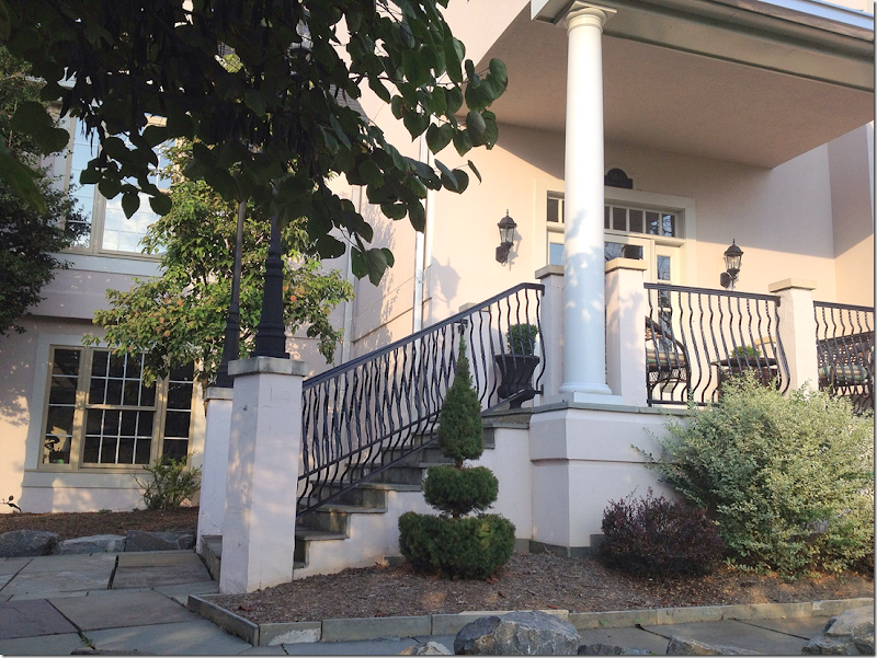
The slate roofed house with its stucco façade. The homeowners plan to paint the exterior along with the wood trim and the brick so that it will all blend together.
There is a slate walkway that leads to the stairs and front porch.
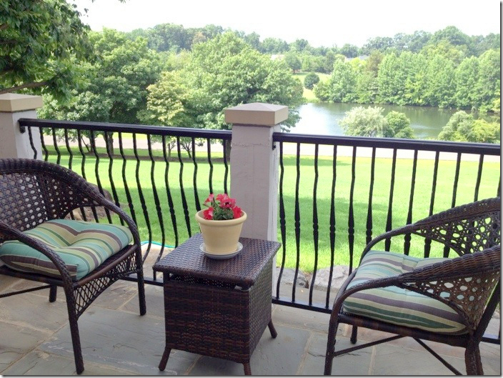
The front porch overlook the expansive lawn and the pond. Isn’t this view gorgeous?!! I can’t imagine having a view like this!
At the back of the house, there are covered porches and decks.
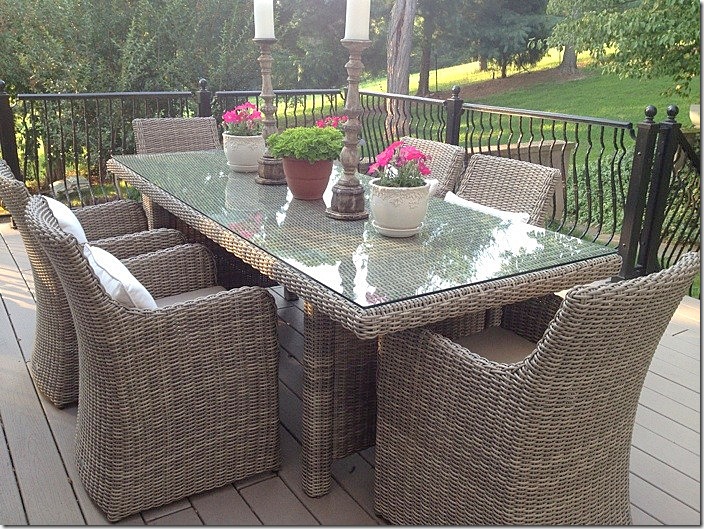
The wicker dining table and chairs on the back deck. Love the hilly landscape! What is it like to have hills in your yard????
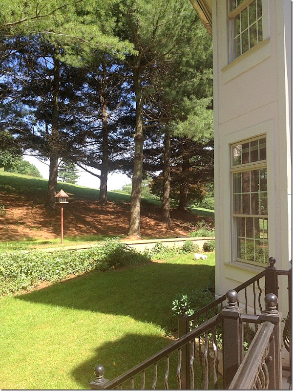
The view of the hill off the dining deck.
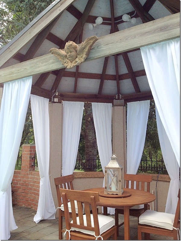
In order to catch the best sun, the swimming pool was installed to the right of the house. The owner chose white cushions and taupe and white striped pillows and towels. Love the curtains in the gazebo!
The gazebo. So cute!!!
I love those pillows (maybe it’s because I have them in blue!!)
The view towards the back yard.
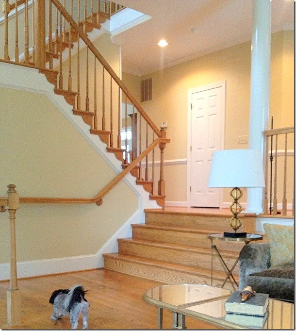
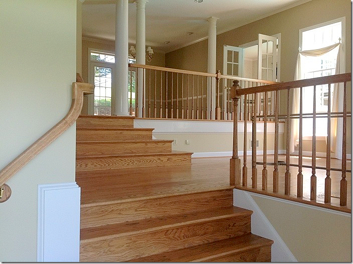
BEFORE: The walls were painted a yellowish taupe and the stairs treads were wood.
BEFORE: And also, the balusters were wood. This all changed!
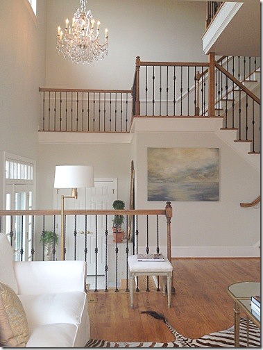
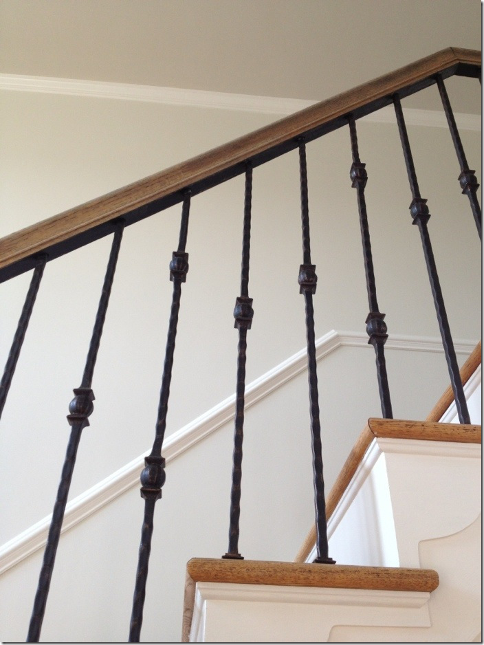
AFTER: Today, the walls are a soft gray and the balusters are beautiful black iron. What a difference! Also, the home owner added that gorgeous chandelier in the foyer.
Another view of the new railings. Notice the huge difference the white treads make.
And, again, the foyer.
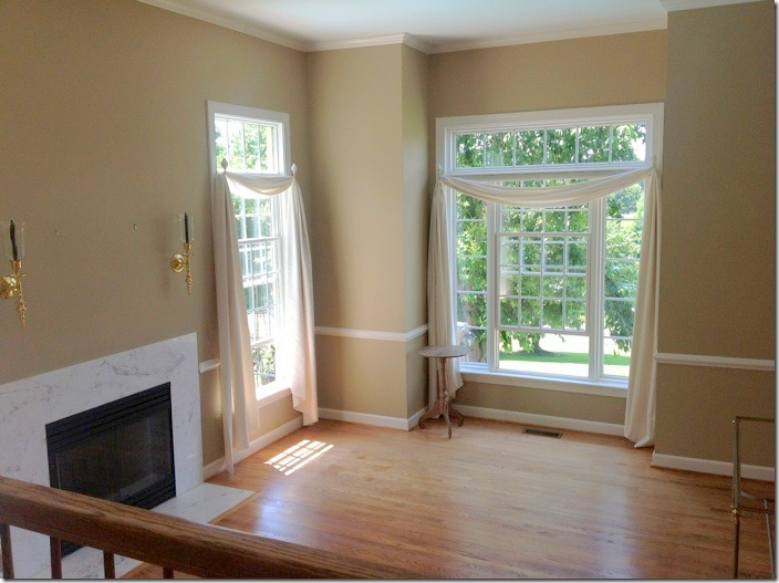
BEFORE: The living room with the marble fireplace, dark walls and curtains. The windows are really pretty in this room – the front ones overlook the pond, while the side ones overlook the swimming pool.
DURING: The living room has been a work in the progress. Once they painted the walls, this is how the room looked.
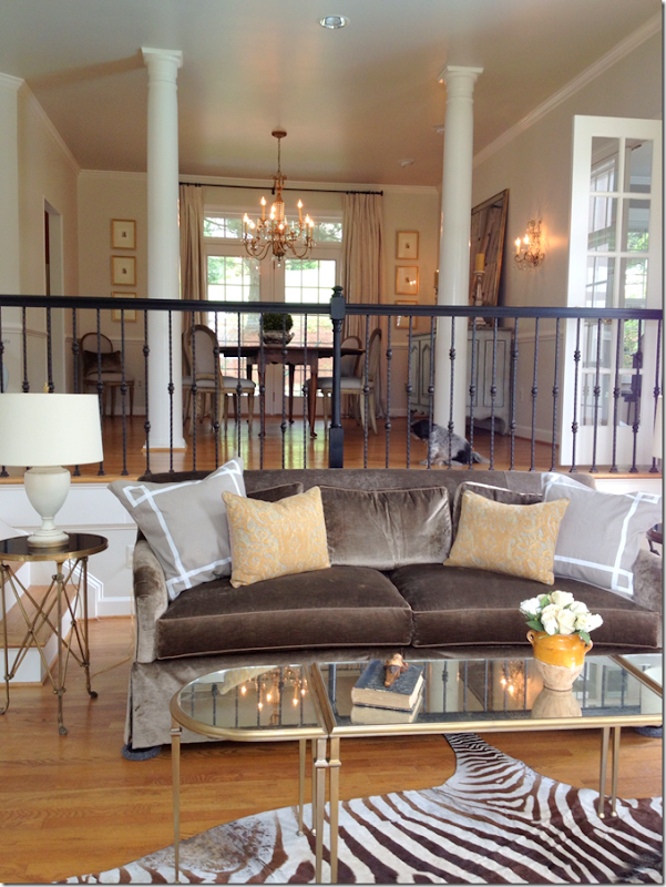
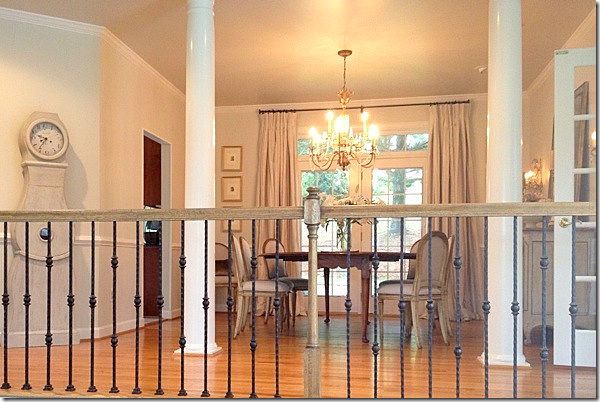
And looking up at the dining room. But, things have changed. First, the marble fireplace was redone. And new sofas were ordered. And returned. And curtains were added. Now, notice the stair bannister is painted black? That lasted a day! After they were all painted, the homeowner hated it and had them stripped back. But, the upside of the mistake? After they were stripped, there was still black paint in the crevices of the wood which made them look even prettier than before. Look:
The bannisters after the black paint was removed, a mistake that happened to turn out for the better!
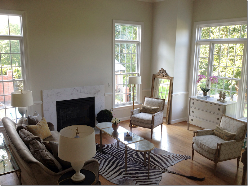
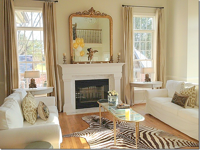
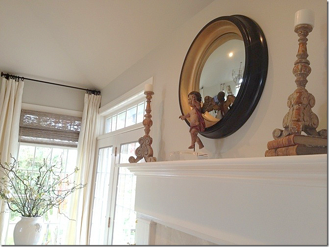
AFTER: Today, the living room looks like this! Notice the new mantel which her husband built! Amazing! What a difference. And I love the curtains. The homeowner had two IKEA slipcovered sofas so she moved them in here until her new sofas arrive. I actually love these here!! In the windows there are two Swedish demilunes with cute lamps. She bought the demilunes on One Kings Lane which means they are probably from The Lone Ranger (where mine came from too! Great minds….) And the antique mirror is perfect here.
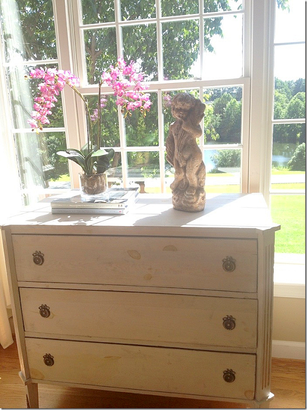
In the front window, there is a Swedish chest. See the pond from the window? What a difference this room is now from when they first bought the house – so beautiful!
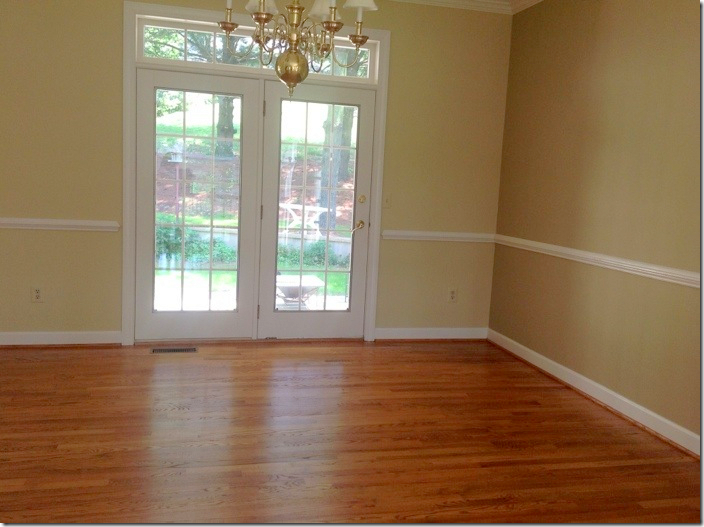
BEFORE: the dining room.
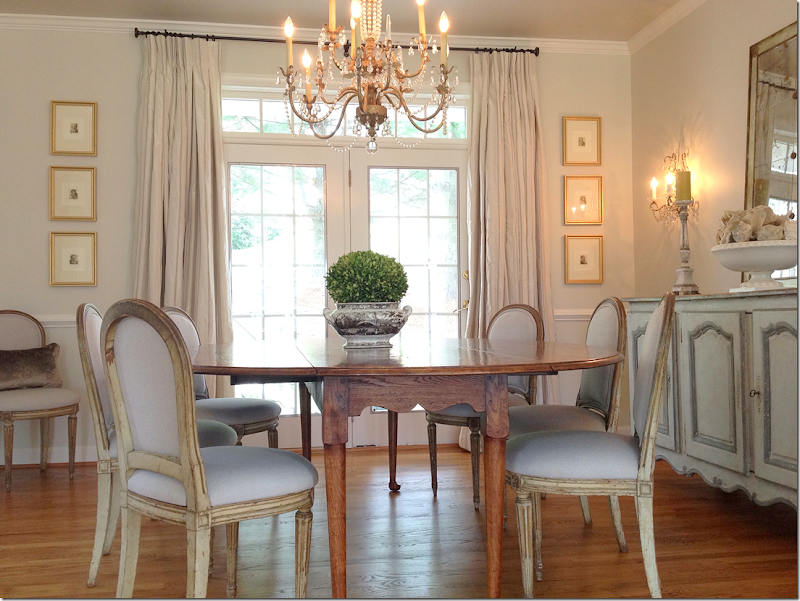
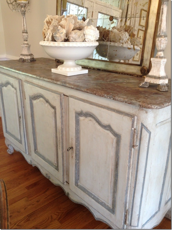
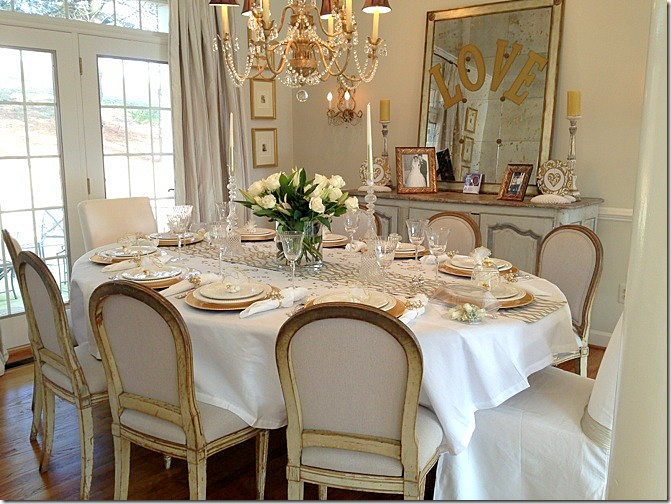
AFTER: The dining room is so gorgeous! She has painted antique French chairs and an antique enfilade, painted in cream with blue accents. I love the sconces and the chandelier and the mirror, too! Striped silk curtains.
So beautiful!
Close up the beautiful enfilade.
Decorated for a recent party – with a white tablecloth.
And on the wall leading from the dining room, she has this pretty Swedish Mora clock.
BEFORE: The family room. Notice the fireplace.
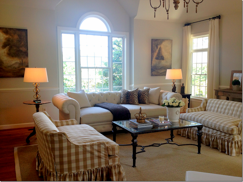
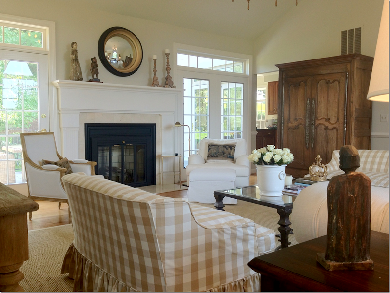
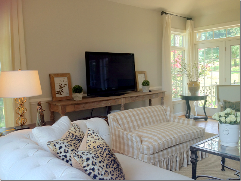
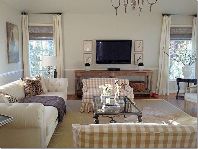
AFTER: The family room is my favorite room! I just love it – especially her twin slip covered settees in the checked fabric. And I love her white tufted sofa in front of the beautiful window.
Here is the new fireplace – quite a difference! I love her pillows made with tapestries.
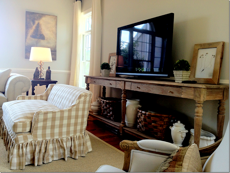
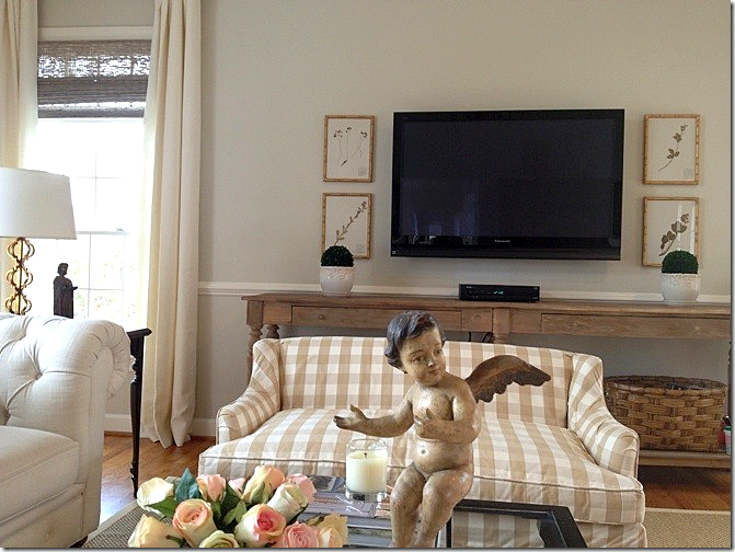
Along the back wall. Today, she has hung the herbiers.
Great console – I love the length of it and the color of the wood. Plus, she has a great assortment of baskets and ironstone below.
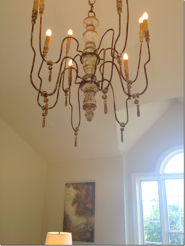
In the vaulted ceiling is this wooden chandelier.
A newer picture with the hanging herbiers and her new putti on the coffee table. Plus, she hung textured shades in the windows.
Close up of this putti.
And the other!
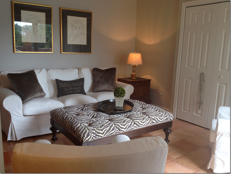
The basement has Saltillo tiles and leads out to the swimming pool. She’s used white slipcovered furniture and a zebra print ottoman down here.
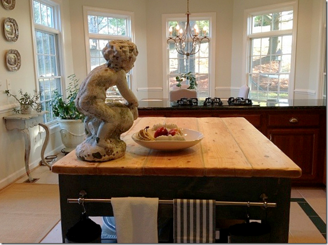
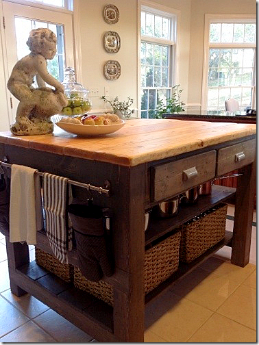
And finally, the homeowner’s kitchen is waiting for its remodel. In the mean time, her husband built her this amazing island!! Once the kitchen is redone, the island will go down in the basement kitchen. I’m impressed!!
And here’s another view!
A huge thank you to the homeowner for opening her house to us! I love her style so much. To see how her aesthetic has changed over the years, go HERE to see pictures of her former house on My Sweet Savannah. That house is just as beautiful!!
And to visit Nubury Lane blog, please go HERE.

