First, I hope everyone is enjoying a wonderful, long Fourth of July Holiday!
Today, a reader has graciously submitted the before and after photographs of her house’s renovation. Seriously, I couldn’t even tell where the before pictures started and ended with this house – it made no sense to me at all. I had to study all the photographs for a long while just to understand where and how the old met the new. I finally figured it out and I hope I can explain it to you!!! The original rooms – the kitchen, dining, living, and man cave(!) are all so – well – so normal, and the renovated rooms are all so fabulous. Just wait! This is a renovation for the magazines and I expect a scout or two will want to submit this house for publication.
First things first: the house is located in the Virginia Piedmont (as if I know where that is ?) – but I’m told it’s in the countryside of northern Virginia. I barely even know where Virginia is!!! Ok, enough geography. So, the owners found this fabulous piece of property but the house that came with the land was just – so – normal – there’s that word again. The wife hated the house and had trouble taken their visit seriously. While the setting was breathtaking with incredible views and scenery, the house was a disappointing “farmer’s brick ranchburger.”
While she was plotting the next visit to see a different piece of land, her husband quickly bought the property with the ranchburger, barely giving his wife time to think. She became truly worried about how she could turn the house into the one of her dreams. He told her simply, “you’ll figure it out.”
She wanted an Italian villa with a wine tower and a vineyard, but instead she got the boring farmer’s brick ranchburger. So, what to do? She went googling – and promptly found my post on Kelly Harmon’s house in Malibu. This lead to other blogs and then more blogs until it all clicked in her head and she began to transform her ranchburger.
Now, she loves her house – and is thrilled her husband decided to buy it even when she balked. And I agree – it’s wonderful!! There are so many ideas here – especially if you are thinking about a renovation. The owner shows us how to take a perfectly plain space and
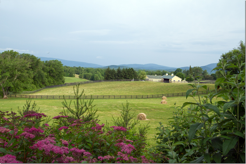
Northern Virginia – their property with views of the Blue Ridge Mountains. No wonder her husband said – SOLD – while she was still pondering how to fix up the farmer’s brick ranchburger that came with the land.
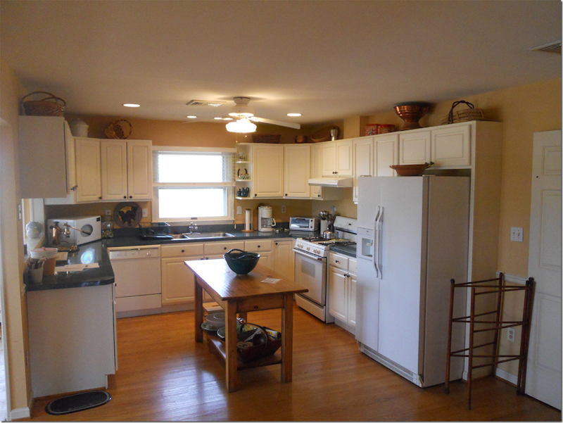
Before: the kitchen. To the right behind the wall is the living room.
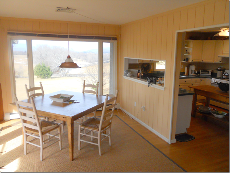
The kitchen – and the dining room to the left.
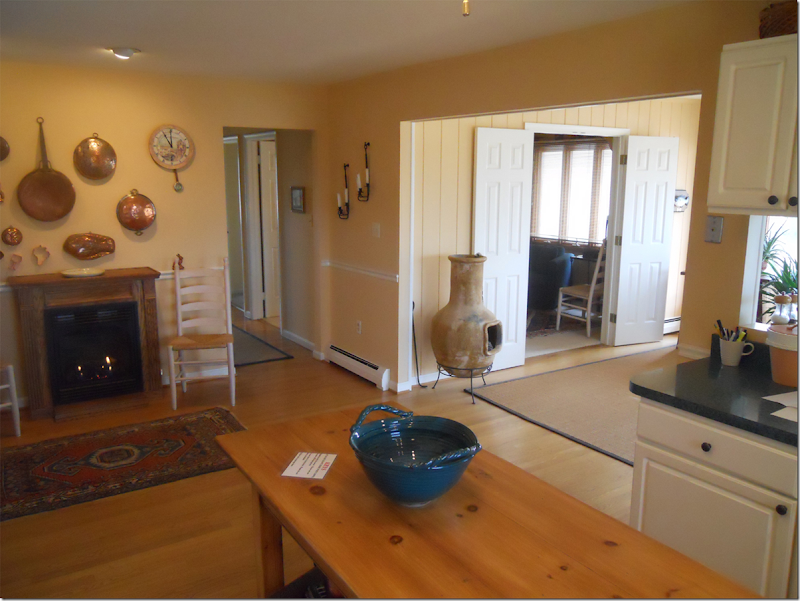
Looking towards the back of the kitchen wall – and into the dining room through the double doors is the man cave.
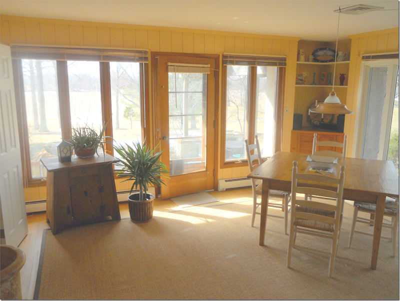
The dining room has incredible views.
There’s a porch off the side wall of the dining room.
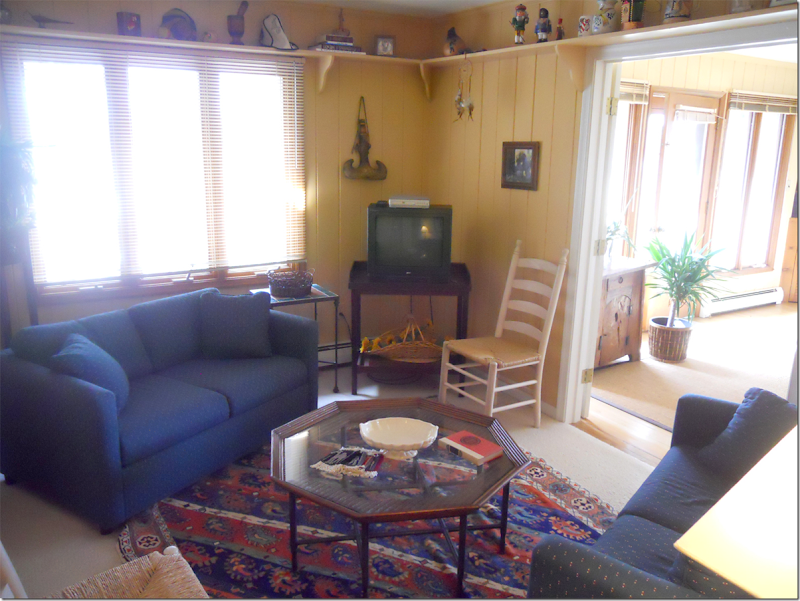
The small man cave off the dining room.
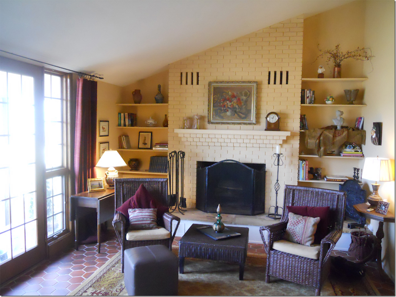
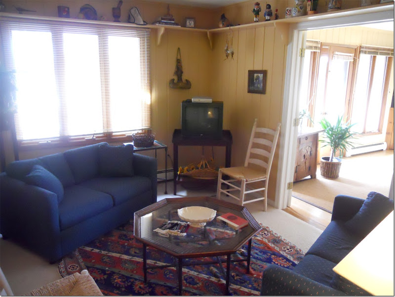
And finally, with its octagon tiled floor is the living room. Now….let’s see how these rooms look today!
The house today – white with a red roof and tower – no longer a farmer’s brick ranchburger.
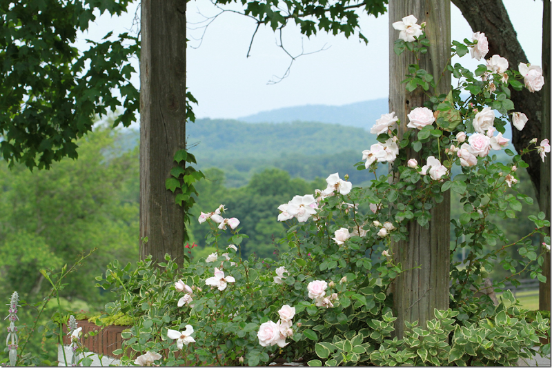
Roses growing on posts around the house.
Now stucco and stone and surrounded by wildflowers.
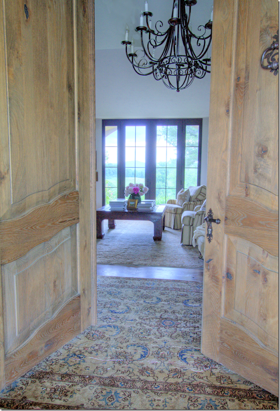
At the flagstone porch, double wood doors open to the entry and living room.
The floors are now all hardwood – instead of a combination of tile and wood. Throughout – an assortment of antique rugs define living areas.
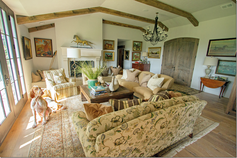
The double wood doors open to the large living/dining/kitchen area/man cave – an area that was once divided up into four rooms – is now one. Here in the living area – the wall between the entry room and the living room was removed. Remember how it looked before?
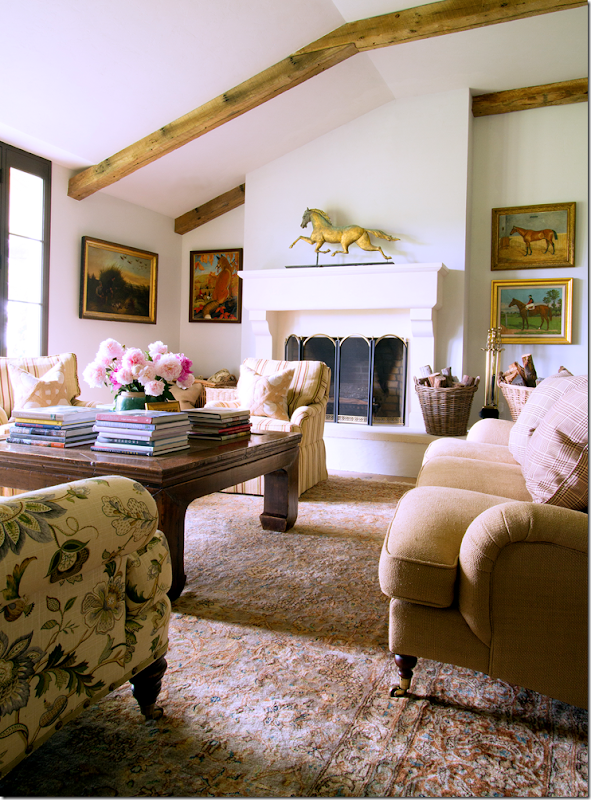
The living room before – the wall to the right of the fireplace was removed and beams were placed on the ceiling. There are now hardwood floors, new window/doors and a new mantel.
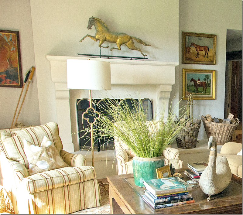
Here’s a view of the new stone mantel – looks so different now!!! While the raised hearth remains, the thin, dated shelves were removed and now baskets and horse paintings flank the mantel. Love the weathervane!
Closeup of the fireplace.
A mixture of casual fabrics – striped, twill, and linen prints – cover the furniture. A large wood coffee table anchors the arrangement.
Looking back towards the front door and the entry area behind the sofa. The iron chandelier hangs over the entry space – which was once behind a wall that has since been removed.
Close up shows the various plaid pillow fabrics used. On the left is a chest that sits in the entry area.
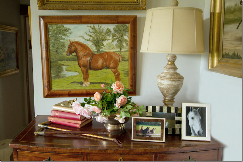
Close of the chest in the entry – shows more horses – in oils and photographs.
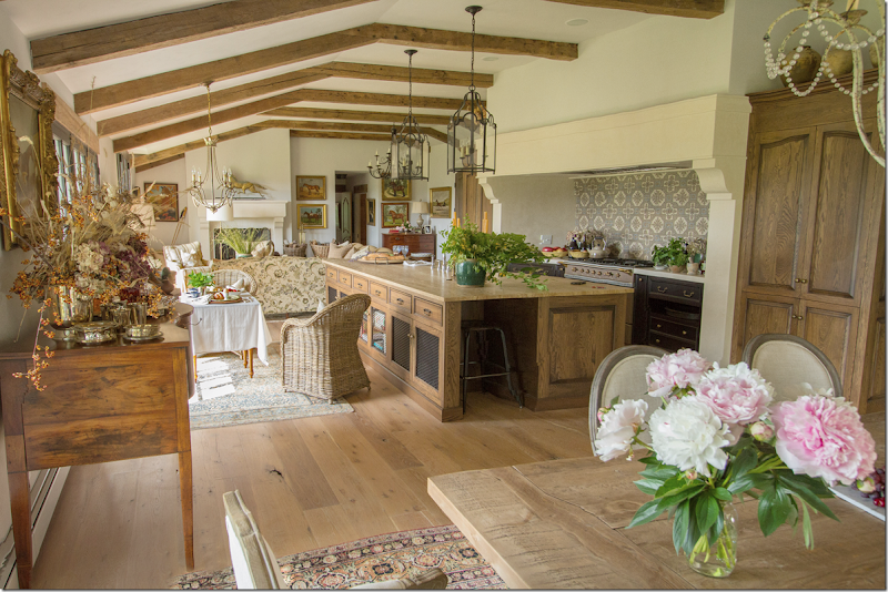
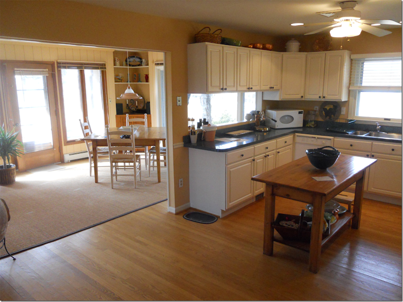
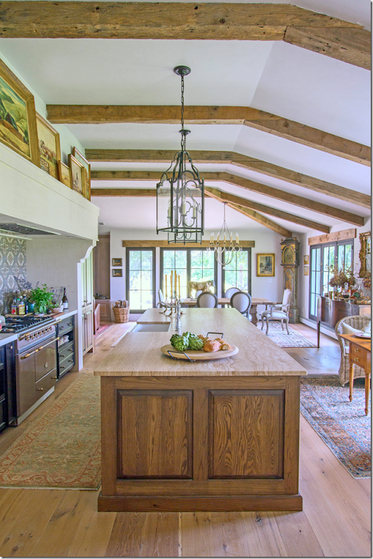
And here you can see where the living room wall between the kitchen was removed – as was the wall between the kitchen and dining room. Where the kitchen once faced the windows – it was moved to the back wall and the breakfast area is now where the kitchen was before. A large island separates those two spaces. To help you remember, here is how the kitchen was before:
The wall to the right of the kitchen was removed to open it up to the living room – then the wall between the kitchen and the dining room was also removed. New window/doors were placed along the back wall to open the house to the views.
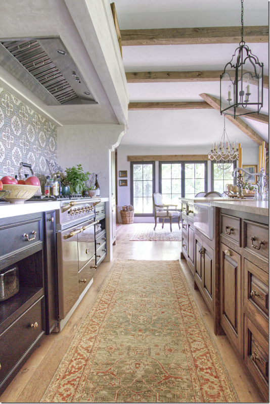
Looking at the other direction – where the fireplace was – is now where the large range is. To the right is the man cave – which is where it is today – without the walls.
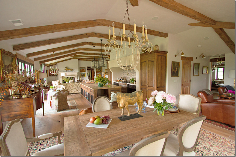
And here - you can see the dining area, now opened up to the kitchen, along with the man cave – without the walls surrounding it anymore.
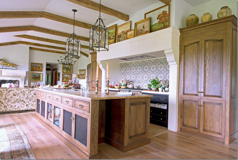
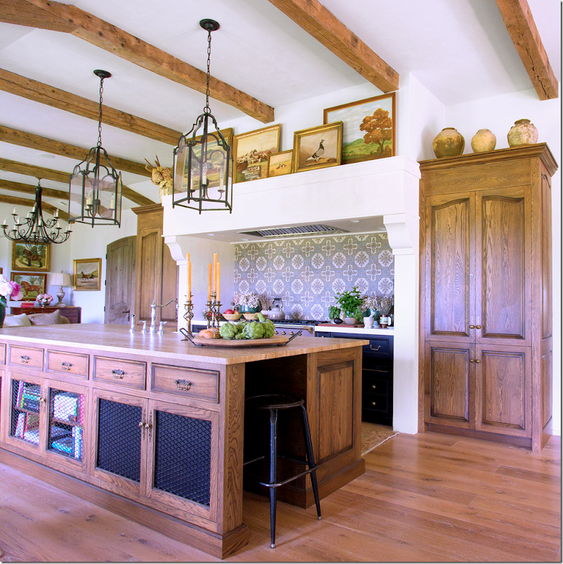
The range is the focal point of the kitchen – it’s hood is a larger size of the living room mantel – which is a great idea, adds to the cohesiveness of the overall design. Backsplash is a tile pattern. The range is flanked by identical cabinets – hiding the refrigerator – designed to look like armoires. The farm sink is on the island and overlooks the breakfast area and view. Notice the cabinets are open w/mesh screen. Two lanterns sit over the large island.
Looking towards the dining room.
The cabinets on both sides of the range are painted black for contrast.
Above the range is a collection of oil paintings – while pots sit above the armoire styled tall cabinets.
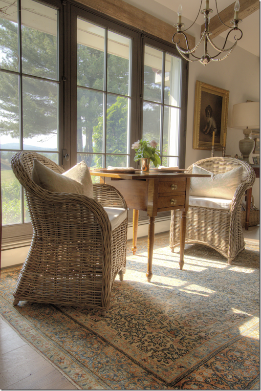
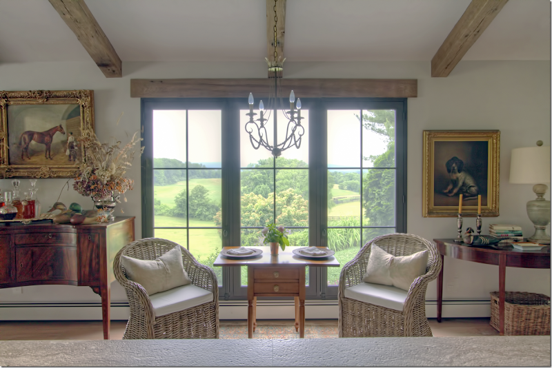
Across from the island, where the kitchen used to be, is the breakfast area – two Kooboo chairs sit between an antique tea table. An iron chandelier with a brass crown hangs over the setting.
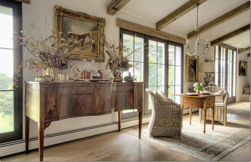
The view of the breakfast area looking from the stone countertop of the island. At the right is a demi lune table and dog portrait – and to the left is the buffet from the dining room area. The view is amazing!!
Once the kitchen was moved to the back wall - and the breakfast room was placed where the kitchen once were – the wall between the kitchen and dining room was removed – making it all one big room.
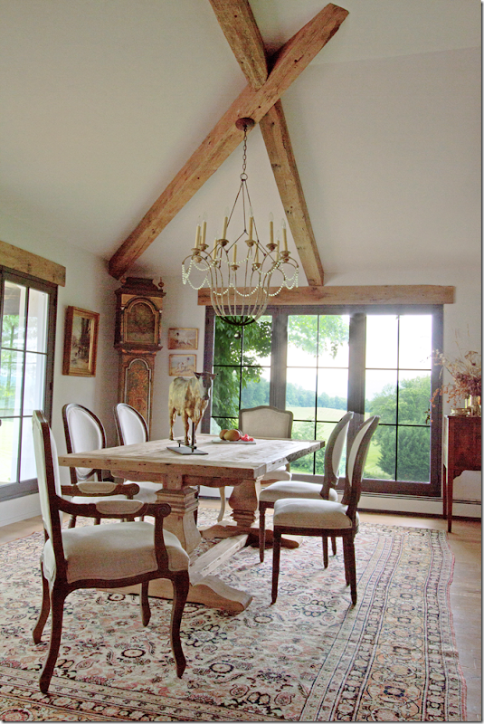
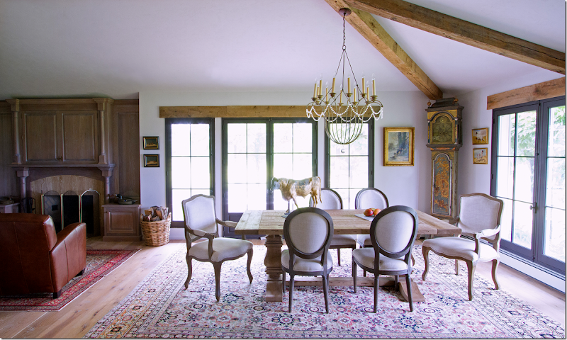
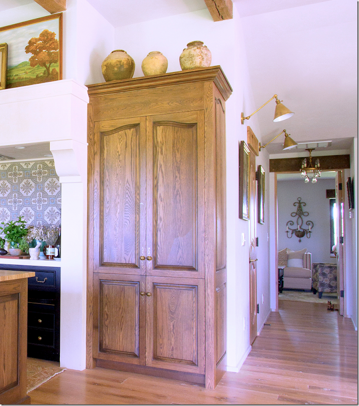
The dining room table– with French chairs, covered in linen – sits under a painted iron chandelier. To the right is the man cave – with the walls now removed. Also – here you can see the hall behind the kitchen with the two wall sconces. The pine door leads to the pantry.
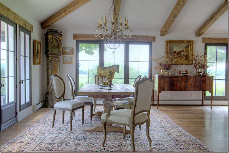
The dining room – with the Belgian styled rough luxe table. In the corner is a tall clock. I love all the rugs used – all different, they blend together so well. I am always so stuck on seagrass and this makes me think how much subdued color these rugs add to the décor – really looks nice.
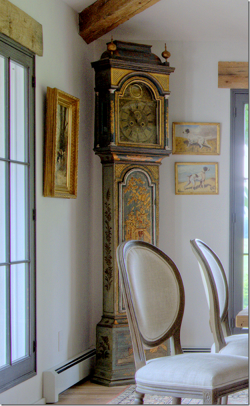
Close up of the beautiful painted clock.
Another view showing the buffet between the breakfast area and the dining area. Love this weathervane too!!!
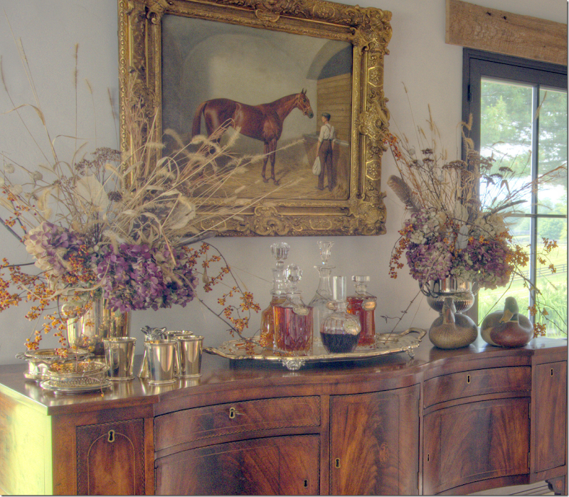
Close up of the buffet.
Close up of the styling on the buffet.
How the man cave was before – double doors closed off the man cave from the dining room. Now the entire wall is removed and the ceiling was raised, and a fireplace was added.
The dining room and the man cave to the left – with all the walls around that room now removed.
The same view as above – before. There was a porch off this side of the dining room.
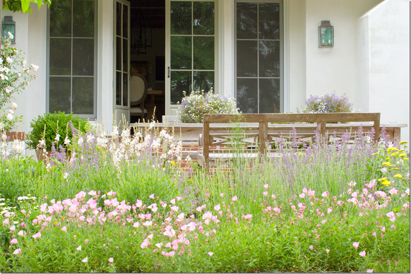
And here is how the porch looks today – wildflowers and lanterns and stone and stucco walls.
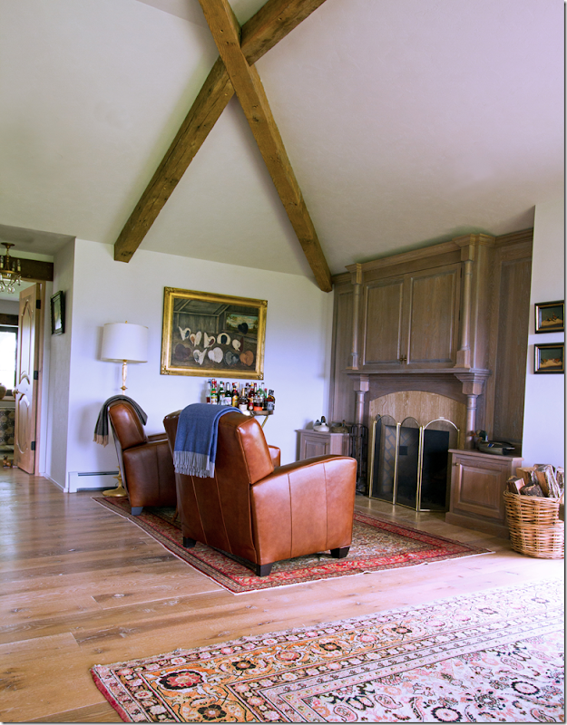
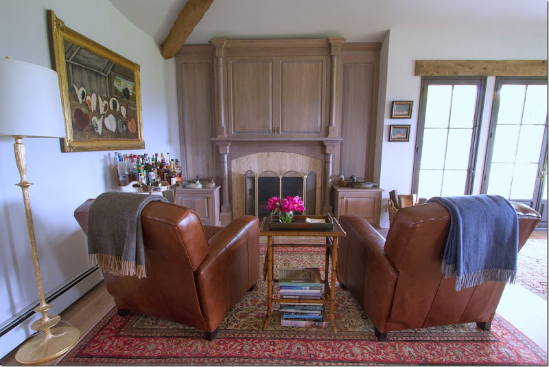
The man cave – with two leather recliners.
Above the fireplace is a cabinet that hides the flatscreen. There is a bar set up in this room, under the painting.
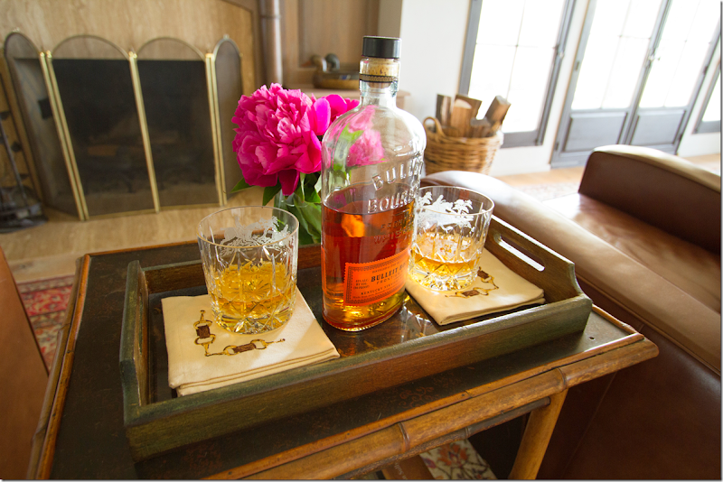
Bourbon in the man cave. The owner really styled her pictures like a professional! Love it!
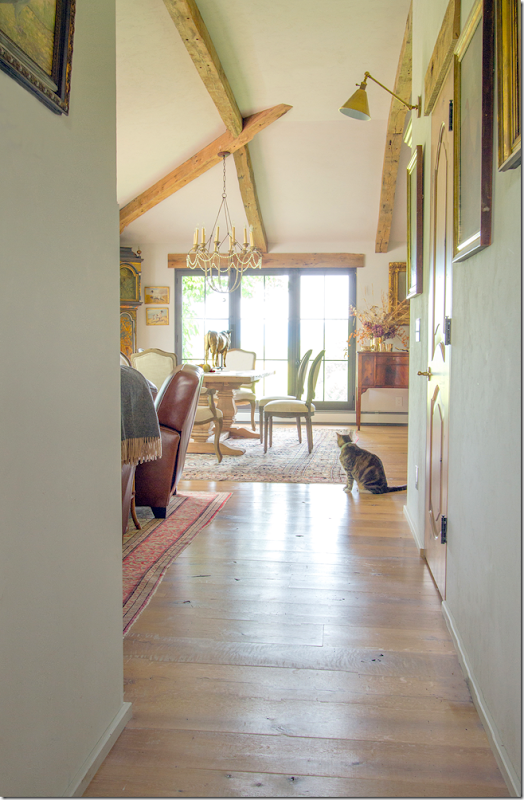
Looking from the back hall where the guest bedrooms are – past the man cave to the dining room. I wish we could see into the bedrooms! Maybe next time????
Looking past the man cave towards the guest bedrooms, there looks like there is another sitting room – wish we could see that!!!
Between the two sconces – through the pine door is a fabulous pantry/storage closet.
Past the door – is the large walk in pantry/storage closet. Darling light fixtures!
WOW!!!!!!!! I would do anything for a space like this!!!!!!!! Anything!!!!
And so – for views like this, the husband bought the property – leaving the renovation of the house up to his wife.
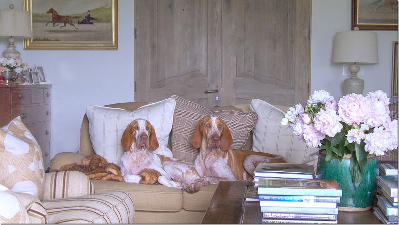
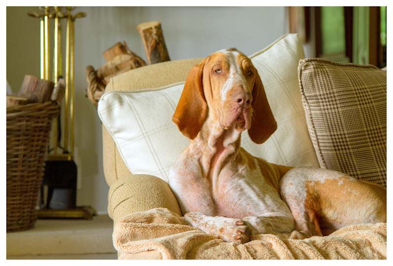
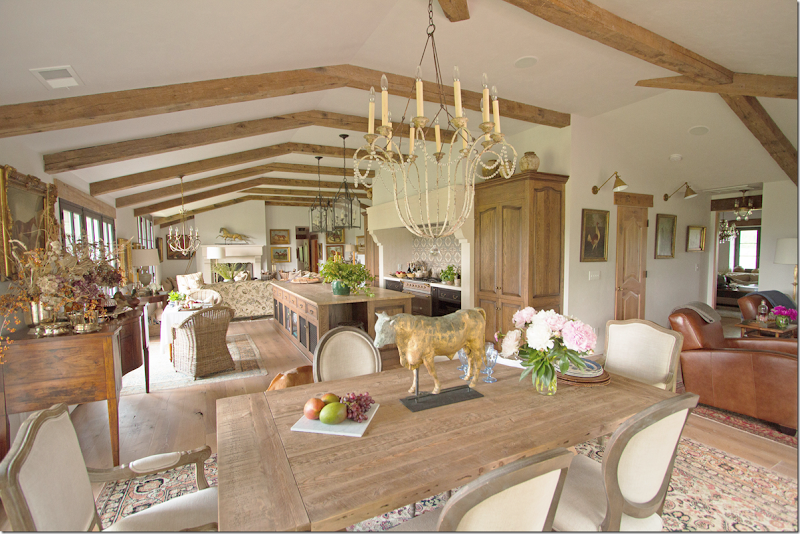 She took 4 small rooms and knocked down all the walls between them – making one large room. She raised the ceiling, added beams and wood floors along with beautiful new windows and French doors and stone mantels. She decorated the house with large rugs and casual fabrics in soothing shades of creams, beiges and touches of warm rusts. Even her dogs blend in with the décor.
A truly beautiful renovation and inspiring – showing us that working with so little can end up so fabulous!
Can you name the breed?


