First, I hope everyone is enjoying a wonderful, long Fourth of July Holiday!
Today, a reader has graciously submitted the before and after photographs of her house’s renovation. Seriously, I couldn’t even tell where the before pictures started and ended with this house – it made no sense to me at all. I had to study all the photographs for a long while just to understand where and how the old met the new. I finally figured it out and I hope I can explain it to you!!! The original rooms – the kitchen, dining, living, and man cave(!) are all so – well – so normal, and the renovated rooms are all so fabulous. Just wait! This is a renovation for the magazines and I expect a scout or two will want to submit this house for publication.
First things first: the house is located in the Virginia Piedmont (as if I know where that is ?) – but I’m told it’s in the countryside of northern Virginia. I barely even know where Virginia is!!! Ok, enough geography. So, the owners found this fabulous piece of property but the house that came with the land was just – so – normal – there’s that word again. The wife hated the house and had trouble taken their visit seriously. While the setting was breathtaking with incredible views and scenery, the house was a disappointing “farmer’s brick ranchburger.”
While she was plotting the next visit to see a different piece of land, her husband quickly bought the property with the ranchburger, barely giving his wife time to think. She became truly worried about how she could turn the house into the one of her dreams. He told her simply, “you’ll figure it out.”
She wanted an Italian villa with a wine tower and a vineyard, but instead she got the boring farmer’s brick ranchburger. So, what to do? She went googling – and promptly found my post on Kelly Harmon’s house in Malibu. This lead to other blogs and then more blogs until it all clicked in her head and she began to transform her ranchburger.
Now, she loves her house – and is thrilled her husband decided to buy it even when she balked. And I agree – it’s wonderful!! There are so many ideas here – especially if you are thinking about a renovation. The owner shows us how to take a perfectly plain space and
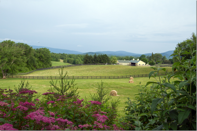
Northern Virginia – their property with views of the Blue Ridge Mountains. No wonder her husband said – SOLD – while she was still pondering how to fix up the farmer’s brick ranchburger that came with the land.
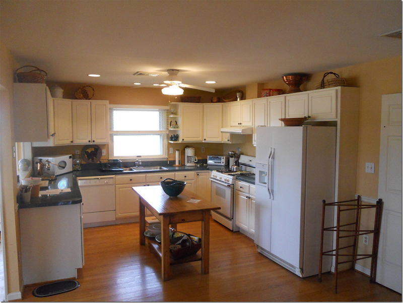
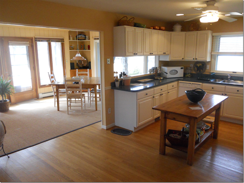
Before: the kitchen. To the right behind the wall is the living room.
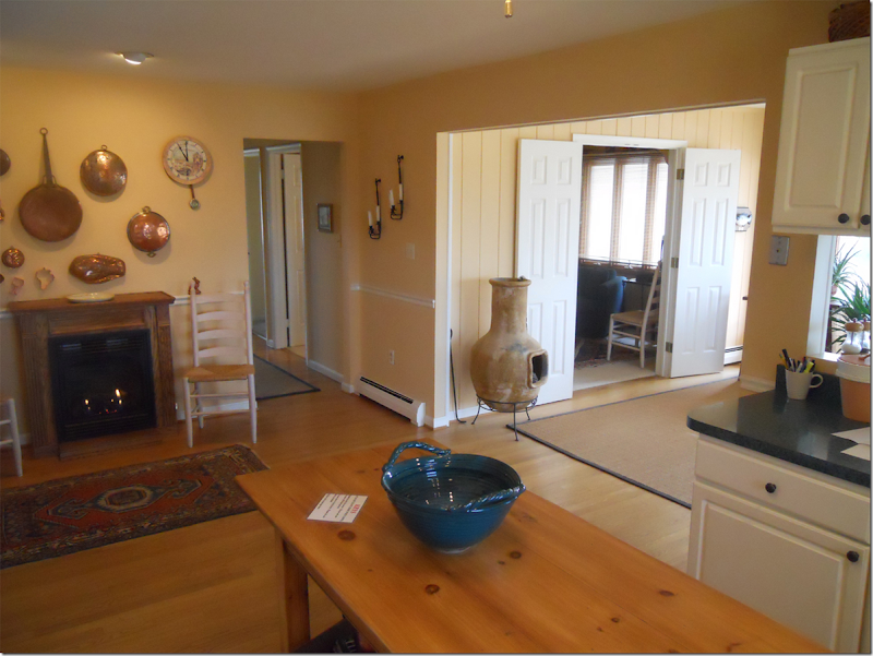
The kitchen – and the dining room to the left.
Looking towards the back of the kitchen wall – and into the dining room through the double doors is the man cave.
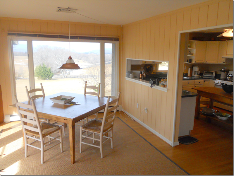
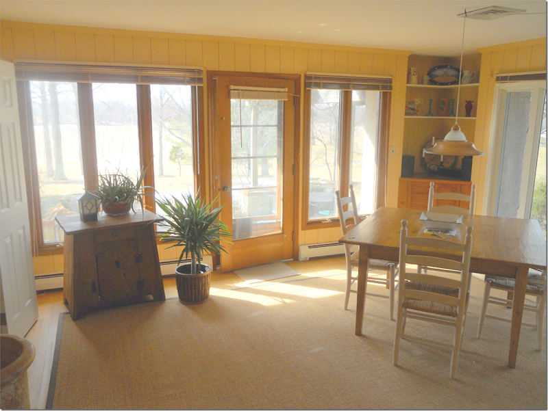
The dining room has incredible views.
There’s a porch off the side wall of the dining room.
The small man cave off the dining room.
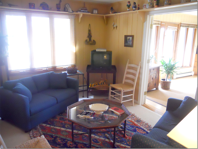
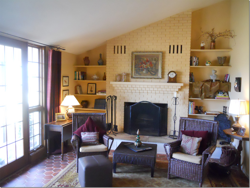
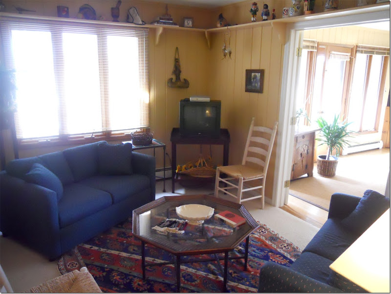
And finally, with its octagon tiled floor is the living room. Now….let’s see how these rooms look today!
The house today – white with a red roof and tower – no longer a farmer’s brick ranchburger.
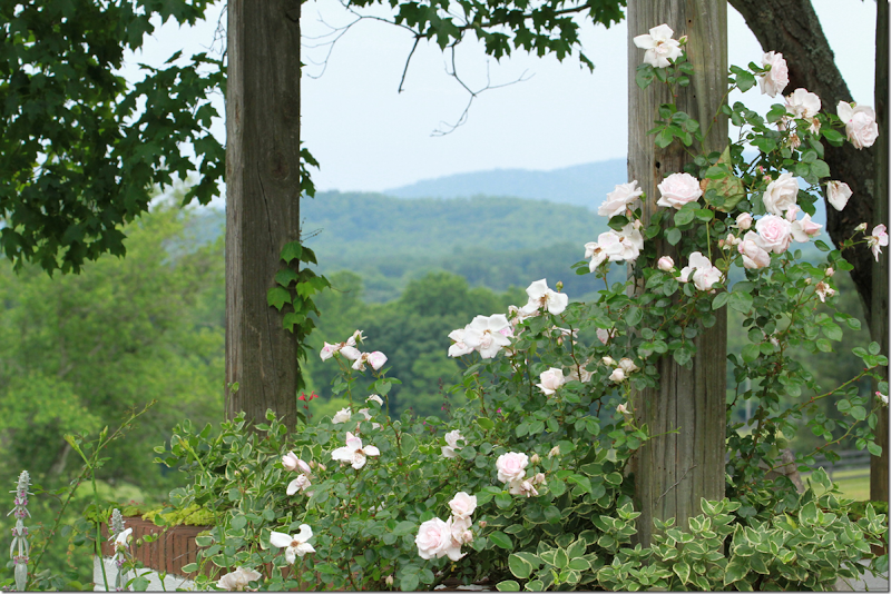
Roses growing on posts around the house.
Now stucco and stone and surrounded by wildflowers.
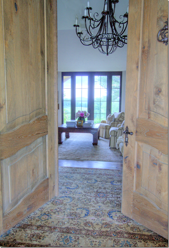
At the flagstone porch, double wood doors open to the entry and living room.
The floors are now all hardwood – instead of a combination of tile and wood. Throughout – an assortment of antique rugs define living areas.
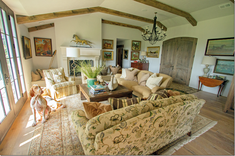
The double wood doors open to the large living/dining/kitchen area/man cave – an area that was once divided up into four rooms – is now one. Here in the living area – the wall between the entry room and the living room was removed. Remember how it looked before?
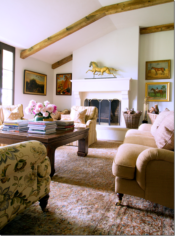
The living room before – the wall to the right of the fireplace was removed and beams were placed on the ceiling. There are now hardwood floors, new window/doors and a new mantel.
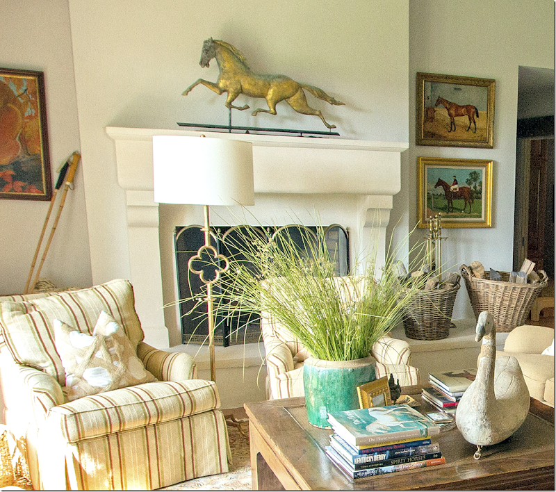
Here’s a view of the new stone mantel – looks so different now!!! While the raised hearth remains, the thin, dated shelves were removed and now baskets and horse paintings flank the mantel. Love the weathervane!
Closeup of the fireplace.
A mixture of casual fabrics – striped, twill, and linen prints – cover the furniture. A large wood coffee table anchors the arrangement.
Looking back towards the front door and the entry area behind the sofa. The iron chandelier hangs over the entry space – which was once behind a wall that has since been removed.
Close up shows the various plaid pillow fabrics used. On the left is a chest that sits in the entry area.
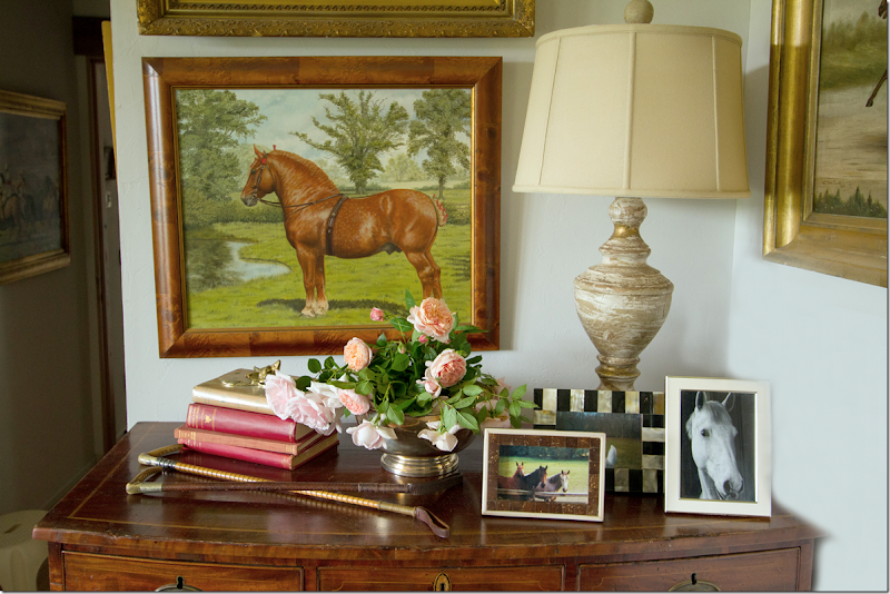
Close of the chest in the entry – shows more horses – in oils and photographs.
And here you can see where the living room wall between the kitchen was removed – as was the wall between the kitchen and dining room. Where the kitchen once faced the windows – it was moved to the back wall and the breakfast area is now where the kitchen was before. A large island separates those two spaces. To help you remember, here is how the kitchen was before:
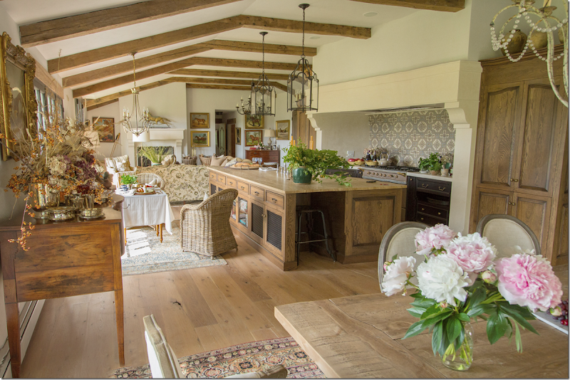
The wall to the right of the kitchen was removed to open it up to the living room – then the wall between the kitchen and the dining room was also removed. New window/doors were placed along the back wall to open the house to the views.
Looking at the other direction – where the fireplace was – is now where the large range is. To the right is the man cave – which is where it is today – without the walls.
And here - you can see the dining area, now opened up to the kitchen, along with the man cave – without the walls surrounding it anymore.
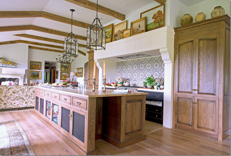
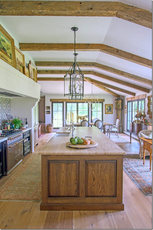
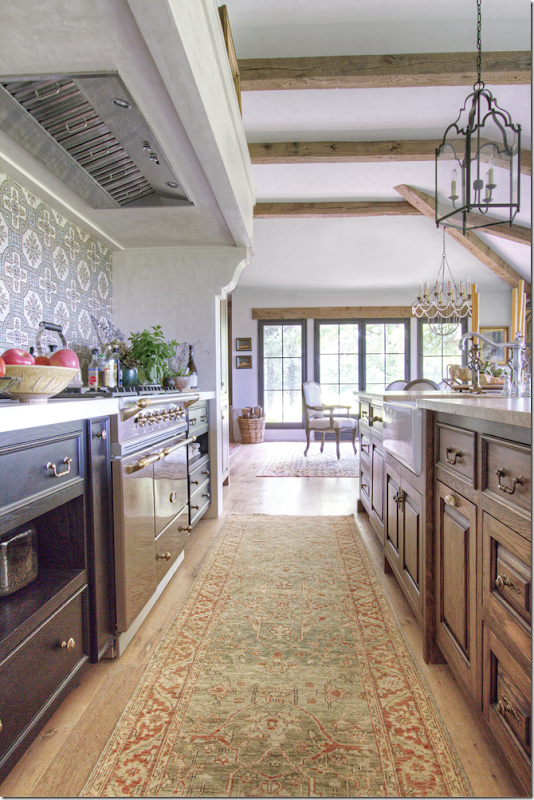
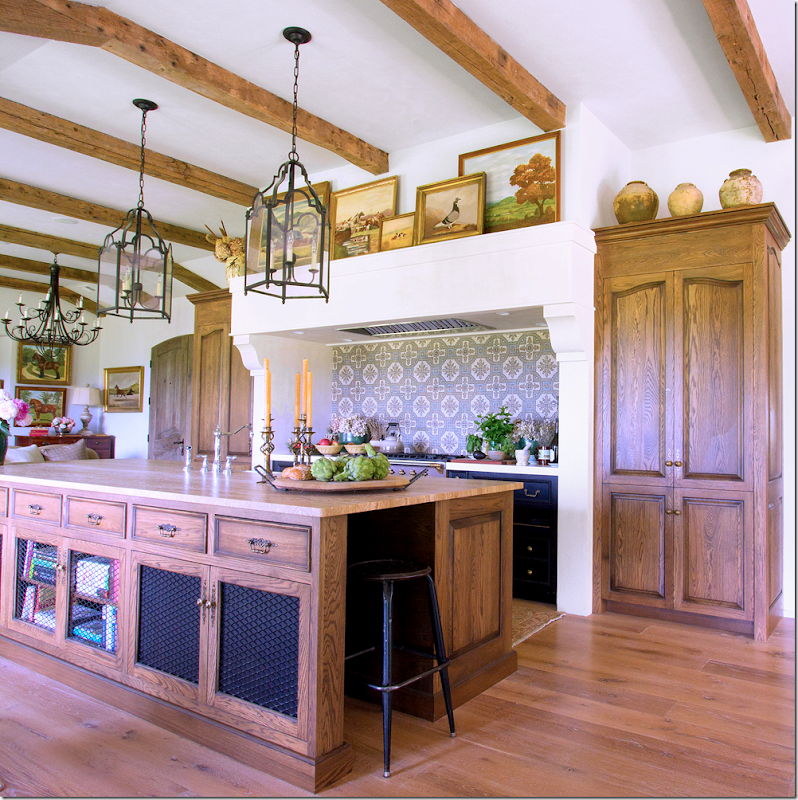
The range is the focal point of the kitchen – it’s hood is a larger size of the living room mantel – which is a great idea, adds to the cohesiveness of the overall design. Backsplash is a tile pattern. The range is flanked by identical cabinets – hiding the refrigerator – designed to look like armoires. The farm sink is on the island and overlooks the breakfast area and view. Notice the cabinets are open w/mesh screen. Two lanterns sit over the large island.
Looking towards the dining room.
The cabinets on both sides of the range are painted black for contrast.
Above the range is a collection of oil paintings – while pots sit above the armoire styled tall cabinets.
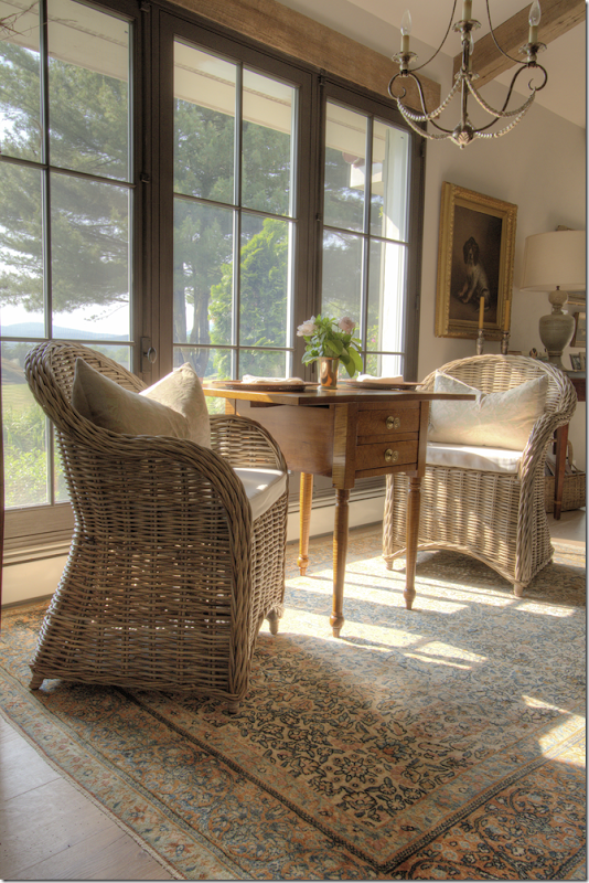
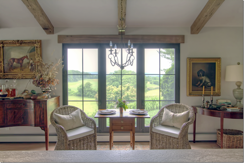
Across from the island, where the kitchen used to be, is the breakfast area – two Kooboo chairs sit between an antique tea table. An iron chandelier with a brass crown hangs over the setting.
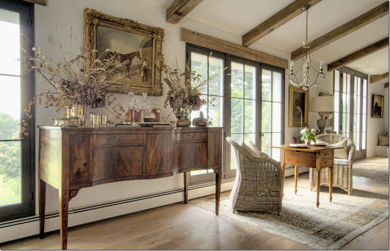
The view of the breakfast area looking from the stone countertop of the island. At the right is a demi lune table and dog portrait – and to the left is the buffet from the dining room area. The view is amazing!!
Once the kitchen was moved to the back wall - and the breakfast room was placed where the kitchen once were – the wall between the kitchen and dining room was removed – making it all one big room.
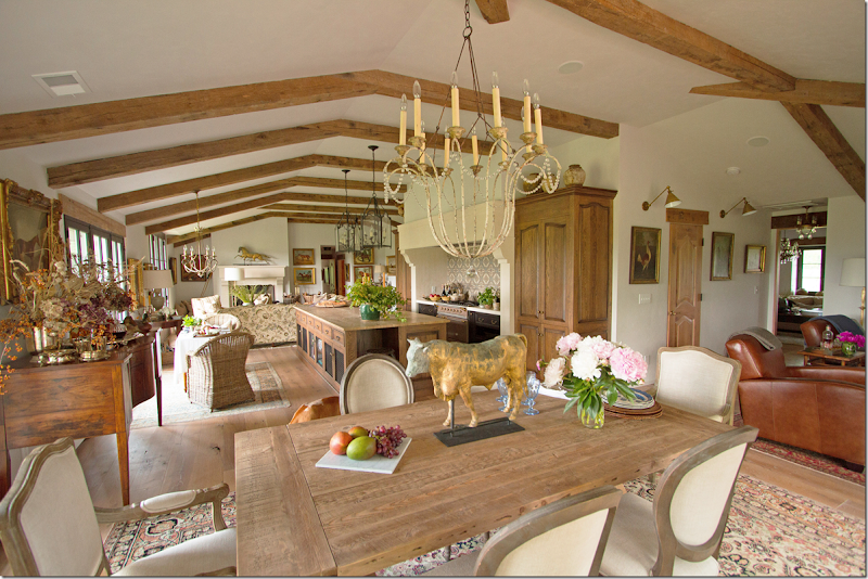
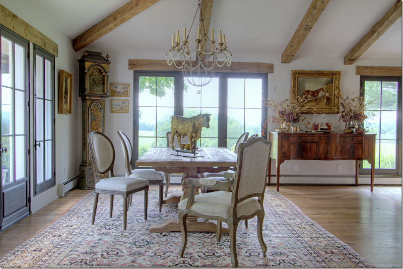
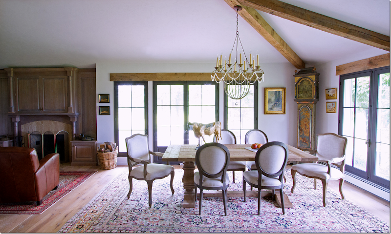
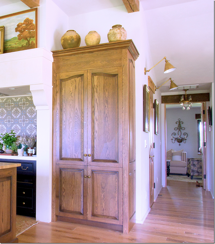
The dining room table– with French chairs, covered in linen – sits under a painted iron chandelier. To the right is the man cave – with the walls now removed. Also – here you can see the hall behind the kitchen with the two wall sconces. The pine door leads to the pantry.
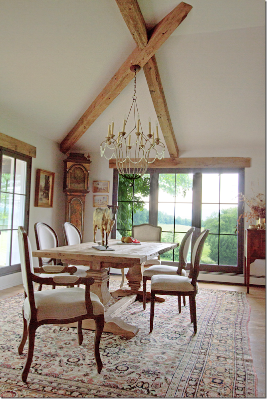
The dining room – with the Belgian styled rough luxe table. In the corner is a tall clock. I love all the rugs used – all different, they blend together so well. I am always so stuck on seagrass and this makes me think how much subdued color these rugs add to the décor – really looks nice.
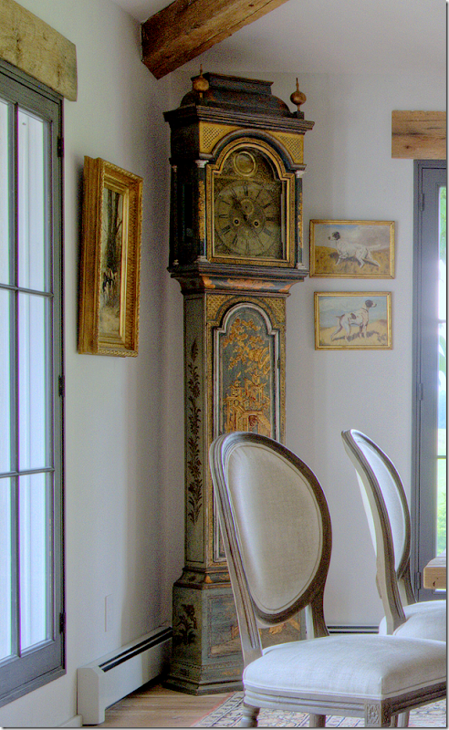
Close up of the beautiful painted clock.
Another view showing the buffet between the breakfast area and the dining area. Love this weathervane too!!!
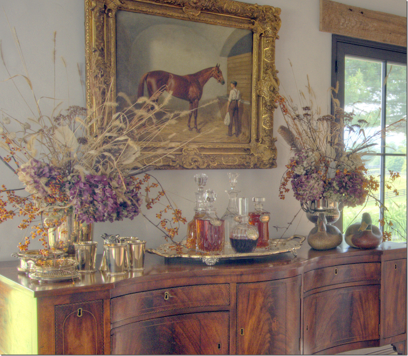
Close up of the buffet.
Close up of the styling on the buffet.
How the man cave was before – double doors closed off the man cave from the dining room. Now the entire wall is removed and the ceiling was raised, and a fireplace was added.
The dining room and the man cave to the left – with all the walls around that room now removed.
The same view as above – before. There was a porch off this side of the dining room.
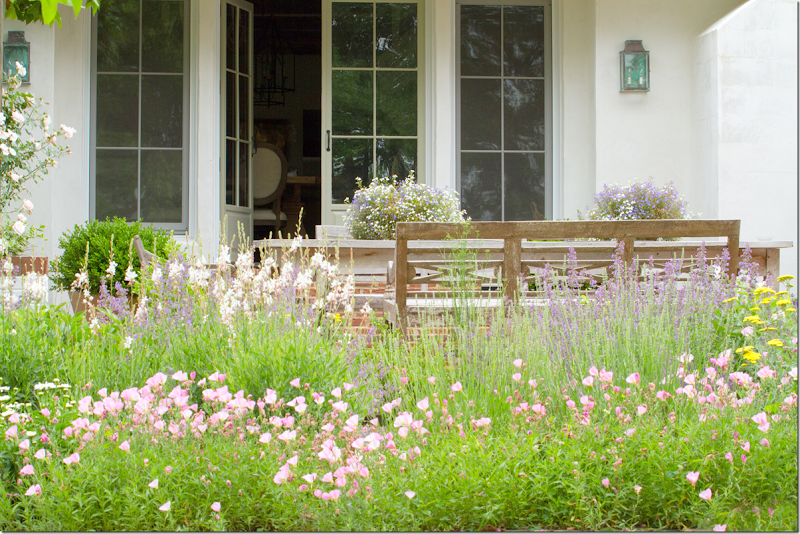
And here is how the porch looks today – wildflowers and lanterns and stone and stucco walls.
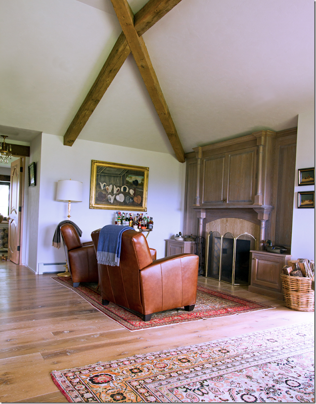
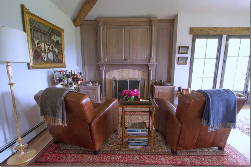
The man cave – with two leather recliners.
Above the fireplace is a cabinet that hides the flatscreen. There is a bar set up in this room, under the painting.
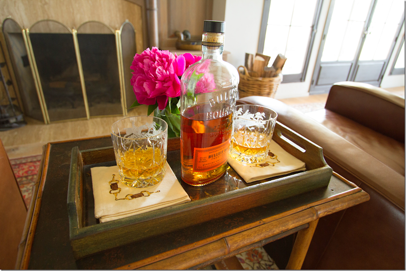
Bourbon in the man cave. The owner really styled her pictures like a professional! Love it!
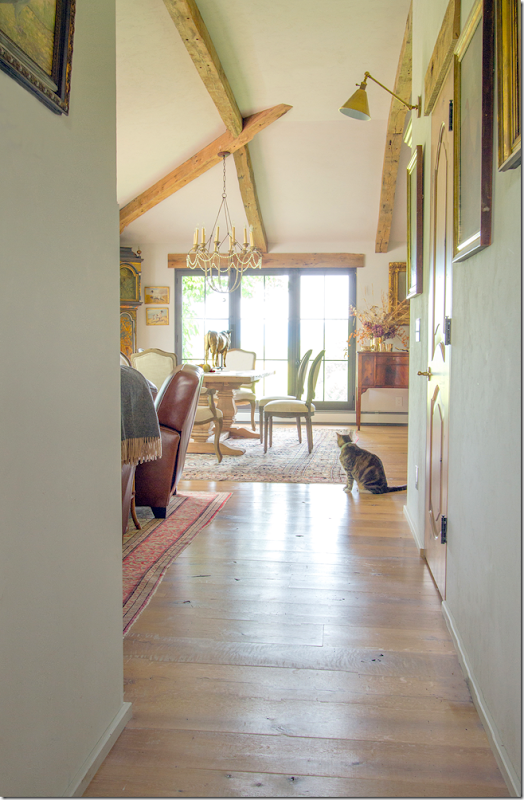
Looking from the back hall where the guest bedrooms are – past the man cave to the dining room. I wish we could see into the bedrooms! Maybe next time????
Looking past the man cave towards the guest bedrooms, there looks like there is another sitting room – wish we could see that!!!
Between the two sconces – through the pine door is a fabulous pantry/storage closet.
Past the door – is the large walk in pantry/storage closet. Darling light fixtures!
WOW!!!!!!!! I would do anything for a space like this!!!!!!!! Anything!!!!
And so – for views like this, the husband bought the property – leaving the renovation of the house up to his wife.
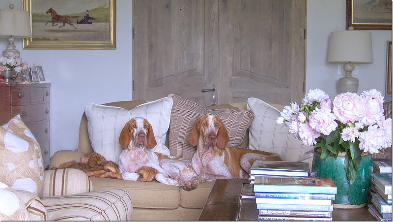
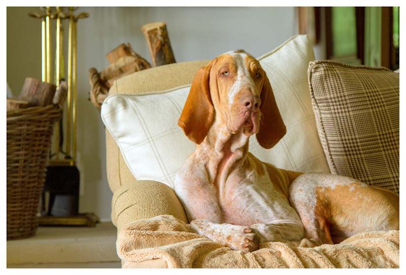
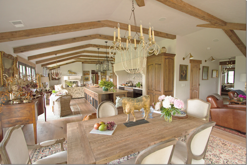 She took 4 small rooms and knocked down all the walls between them – making one large room. She raised the ceiling, added beams and wood floors along with beautiful new windows and French doors and stone mantels. She decorated the house with large rugs and casual fabrics in soothing shades of creams, beiges and touches of warm rusts. Even her dogs blend in with the décor.
A truly beautiful renovation and inspiring – showing us that working with so little can end up so fabulous!
Can you name the breed?















Beautiful home! American English Coonhounds?
ReplyDeleteWow! Truly a wonderful transformation. I especially love the new flow of the house and who wouldn't die for the fabulous storage area. Thanks to you and the homeowner for sharing.
ReplyDeleteProjects like these show us how see the potential in houses!
Lovely corner of the world in horse country! Smashing job, love all of the horse tributes. I would dare say those are pointers....maybe even German shorthaired pointers???
ReplyDeleteStunning!! What a comfortable home they've made for themselves. Thanks to the owners for sharing!
ReplyDeletebracco italiano?
ReplyDeletejust looked this breed up and I bet you're right!
DeleteWhat an absolutely stunning job! fondly ~lynne~
ReplyDeleteI love her unique and very warm style. I can't name the breed of the dog, but he matches the house. He is comfortable like the house too.
ReplyDeleteOne word, S.T.U.N.N.I.N.G! The whole house exudes casual beauty and elegance. The feature I noticed the most was the beams in the ceilings, they add a fitting rustic warmth to the house.
ReplyDeleteDonna.
are you sure this homeowner is not a professional designer/decorator??!! WOWOWOSA! Such a beautiful, inviting home. Every inch of it shown here! I also wish we could see more! It is refreshing to see the artwork and the hidden flat screen...very clever as I can't stand to see a flat screen hanging over a fire place out in the open... and the views... double WOWOWOSA!
ReplyDeleteThanks for sharing this lovely, inspiring home!
The dogs look more like bloodhounds....look at the long, sagging faces.....so regal and comfortable on her furniture and rugs! Very nice renovation.
ReplyDeleteThank You, Thank you ! This post is wonderful.
ReplyDeletePlease do your very best to get the homeowner to show us more of this fantastic home!
The view was worth the price of the home. Do you have any idea how many acres come with the house? I am assuming the owners were going for the Belgian look which is probably the reason for the abundance of oak everywhere.
ReplyDeleteThe open floor plan lends itself well to the style of the renovation although when seen through photographs the areas look cluttered and overly accessorized. Perhaps the owner just went a bit over board for styling purposes. There is certainly a lot going on. Love the cooking area, but not crazy about the large chunky island. The pantry is great which eliminated the need for cabinetry in the kitchen. The buffet is lovely as is the tea table. Much of the rest of the furniture looks like RH. An overall great renovation which needs some serious editing to be magazine worthy. Love, love the setting.
funny, but i thought the size of the island was appropriate - it balanced two large sections of the house on each side. yes, it is over -accessorized which means it is the cluttered look vs the edited look. neither is wrong - it's just personal. i love the cluttered look which is y i probably loved this house so much!!!
DeleteThere is a wall directly behind the "man cave" area with a door which is probably a closet. Would there have been sufficient space in that wall to have built a wet bar so that a metal tray table didn't have to be used to display all of the alcohol? The name "man cave" in this instance would be better described as TV area since the only furniture there is two chairs, the tv and the fireplace below it. I don't know whether or not an architect or track builder introduced the concept of a tv mounted above a fireplace, but they should lose their license for having done so.
ReplyDeletei hate tvs over the mantel too! but everyone does them now. to me - they are too high and become the focal point instead of the fireplace. but this was hidden - so you didn't see it - !!
DeleteHidden only when no one is watching. I often wonder if the heat from the fireplace affects the components of the flatscreen? Any experience with that?
DeleteWe have a TV over the fireplace in our great room but our fireplace has a "low" firebox and no mantel, just stone straight up so our TV actually hangs at the correct height. No problems with the heat. And I don't have a problem with it being "out" as we use it every day. I also don't see the need to hide my fridge, faucets or toilets either, LOL. We have a "formal" fireplace in the living room with traditional mantel and no TV.
DeleteLove the house and I love the dogs! I bet she is warm and inviting and fun....just like her house. Lighting fixtures are all very good choices. Her home is personal with her accessories and artwork. She is not copying any "style" she is her own style! I love how she has her fridge hidden. The island is great. I too have a Texas sized island and it is so wonderful for crafts, wrapping gifts and party buffets. A beautiful stylish home that would be lovely to live in. Can't wait to see the rest of the house!
ReplyDeleteMonica
Right on Monica!
DeleteThis comment has been removed by the author.
ReplyDeleteJoni,
ReplyDeleteThis is one of the most inspiring before and after homes I have seen. I love the attention to detail (as always!).
Thanks for sharing.
Jamie
Wow! What vision this woman has! I can barely see beyond what's in front of me! Thank you for sharing
ReplyDeleteWhat a fabulous transformation! This house must be a joy to live in now. Great color pallette. Thank you for sharing it with us. Meg A.
ReplyDeleteStunning home and stunning location. I am so glad the homeowner shared it with us all. But, honestly, the two dogs on the sofa sealed the deal for me. Don't know the breed but they were so poised I wondered if they were professional models?
ReplyDeleteWhat a warm and inviting home. So typical of older farm style houses - it had lots of smaller rooms, opening it up brought the vista into the house. I'm sure they get some snow in the region and the cozy setting would make it so enjoyable sitting inside looking out to the snow covered hills. The pantry is a dream.
ReplyDeleteI love the tile behind the stove and the lanterns over the island.
Actually I think the dog is a designer! How cool is that face! Love the house and the heart it shows.
ReplyDeleteAmazing transformation and the property is just incredible! What a phenomenal art collection, great job of mixing traditional with rough luxe. I LOVE the dogs, not sure of the breed but the last pictured does have more of a blood hound face versus the other 2 breed mentioned but I am preplexed, he definitely looks like an old soul! Off subject but I recently ordered a lovely necklace from an equally lovely up and coming designer (smile). Thanks for another great post and for the homeowner for sharing.
ReplyDeletefrom the lizard??? really??????????? so sweet and thank you!!!!!!!!!!!!!!!!!!!!!!!!!!!!
DeleteJ
What she did for the 'flow' of the home is amazing.
ReplyDeleteWould be fun to see the dogs/cat chasing each other playing and sliding into things.
Several of my clients are on acreage with these views. They amaze during a snowstorm, spring, fall, thunderstorms..... Her husband was quite wise.
Wonder if the previous owner has seen the changes!
Garden & Be Well, XO Tara
"Wonder if the previous owner has seen the changes"
DeleteAnd what difference would this make, Tara? I actually wonder why there is no foyer in this house. It seems odd to open the front door directly into the living room.
Incredible vision and outstanding talent to execute it! Did she say how long it took this project to completion? And I think there is a new blog buzzword born here! #ranchburger lol
ReplyDeletexo xo
Amazing transformation!!! One of the best "open" living areas I have seen, as the kitchen blends so beautifully with the other areas.
ReplyDeleteThanks for this post. Ruth
Love this Joni! So soothing, so bucolic, and yet urbane too. Many homes in Virginia are surprisingly sophisticated- like this one, and I think they did a fantastic job of it. It's like Ralph Lauren meets Hollywood, meets FFV aristocracy...it also reminded me of one of my fave childhood television programmes, called "Green Acres" -where the Park Avenue wife has to move out to the country, and brings her city pieces with her...just loved that show! Am sure it had a huge influence on such an impressionable young man...! :)
ReplyDeleteLovely transformation! It looks like the changes really made the most of that spectacular view, and the space looks really inviting now. I am wondering about the storage situation though. From the photos, it looks to me like there are several places (the island and pantry especially) that used a lot of square footage but maybe also aren't as user-friendly/efficient as they could have been? While I LOVE the idea of a big pantry, it just seems like there's a big dead space in the center of the room, and that big island looks like a lot of surface area but comparatively little drawer/cabinet space. Also, there doesn't seem to be a spot for coats, etc. near the entrance. I can't imagine that they stuff them in that bureau, so is there some sort of closet around the corner, or do they normally use a different entrance, or maybe that second fridge cabinet really a coat closet? Am I totally off the mark here?
ReplyDelete-Eliza
A friend of mine who recently did a complete renovation of her kitchen put in a beautiful pantry and actually designed it to become part of the useable kitchen space. Shelving was designed to house the coffee/snack bar, lighting was installed on the under side of the shelves to create ambient lighting and a door with true divided glass was installed so that it became part of the kitchen design rather than a closet like space that was strictly utilitarian. It is my favorite element of the kitchen because it was so carefully planned. There is even a beautiful pottery style lamp on one of the shelves that makes this room so beautiful to look at. In addition, the kitchen is a beautiful moss green with a stone fireplace and brick flooring - so beautiful!!!
DeleteWhat I love about the end product here is it is ... American! It has whispers of different styles, such as Italian, Belgian
Deleteand French, but it suits its Virginia countryside perfectly. And I love the "over-styling"! Bring on the dried flowers,
beautiful oils, silver julep cups and bourbon! Thanks for sharing this, Joni.
Can't say much for the oils as they appear rather redundant unless of course the owners enjoy collecting paintings of horses. I love silver julep cups and bourbon, but you have to admit, the dried flowers have to go. Agree that the different styles are working here and nothing is more beautiful than Orange Cty, Va. where this house may be located. A lot of the accessories are distracting and keep you from taking in what is the most important element here and that's the design.
DeleteCongratulations to the owner on a job well done! I also love the weathervanes. Thank you for sharing. Jill Oliver
ReplyDeleteWow- what a inspiring transformation!! I have always wanted to do something similar to a ranch- as this owner has done so beautifully. I especially love the dining room and the porch- and who wouldn't love those darling dogs??!!
ReplyDeletexo
Mimi
The redo is opulent and beautiful, of course. But there is a warmth and charm in the Shaker-like original, also.
ReplyDeleteYes, I love the before as well - Shaker is more my style. But this redo is amazing. I literally gasped when I saw the pantry!!
DeleteI think the dogs are a coonhound variety. Beautiful house with amazing views!
ReplyDeleteMichelle
While the new furnishings are lovely, their scale is completely wrong for this house. The ceiling isn't high enough and there isn't sufficient square footage to carry off such large fixtures and furniture. Example: the lack of a foyer makes the living area seem more like a furniture store than a home.
ReplyDeleteThe home owner has good taste but lacks a designer's eye for scale.
Pretty impressive result for an individual who is not a designer/decorator!!
ReplyDeleteThis is a gorgeous remodel! I don't think I'd change a thing and I love all the great accessories, lovely paintings/prints/frames, chandeliers - beautiful! Adore those great dogs - what a regal bunch they are - I don't know...,my grandpa had coon dogs - they kind of resemble them but I doubt that is what they are!
ReplyDeleteOh, my Lord! This is gorgeous! I could live in that kitchen. Well, maybe it someone would cook for me. Cute doggies. Are those blood hounds?
ReplyDeleteBe a sweetie,
Shelia ;)
Love the updates.
ReplyDeleteWe are in out third home. When I spoke with the new owner of our previous home, she told me that she laid down hard wood floor. I was so happy to have someone love that place enough to make beautiful changes. These people appear to have done the same : )
I appreciate the woods, lamps and pantry area. I would be tempted to leave that door open 24/7!
You know those dogs run the place! They are adorable.
Dee
Wowwee! another gorgeous reno- I am totally blown away
ReplyDeleteWOW! What a beautiful re-design! This woman has some real talent. The house looks so warm and inviting! Even mixing the sterling silver and fabulous buffet with kooboo chairs and linens. And the dogs on the furniture! And the gloriously hidden refrigerator! Then you showed the pics of the pantry!! I DIED!!! I'm am typing this in purgatory due to abundance of ENVY! Truly beautiful. More pics please homeowner! Can't get enough :)
ReplyDelete~texassky
So pretty. Its hard to believe its the same house. She had such vision to take it from what it was to what it is...and those vistas. LOVE the kitchen, the island huge stone hood, the lanterns, such an inviting and warm space. They have done a spectacular job and the vistas outside the windows aren't too shabby either! Fun post.
ReplyDeleteThose views are to DIE for! I'd live in a tent to wake up to that every day. And, the remodel is stunning! Those beautiful and regal dogs looks like Italian Pointers (Bracco Italiano). Definitely not a breed you see every day! Thank you for sharing!
ReplyDelete...i love it...blessings laney
ReplyDeleteThis is just SO SO beautiful. The views, the kitchen, the different sitting areas. Can I come stay for the weekend?
ReplyDeleteShe did an excellent job with the home Joni! When you think of what she had to work with, amazing!
ReplyDeleteThe views are so pastoral so soothing.
xoxo
Karena
Art by Karena
Is it necessary to denigrate the prior owners home in order to make this one shine. I am not so certain that the before pictures do not belong to the current owners before the remodel.
DeleteI agree, that's in poor taste. Maybe it helps others feel like design-saavy insiders when they do that. The "before" shots were dated - perhaps the "boring farmers" who resided there were not as educated/cultured as "we" are (wink wink). After all, farmers are only interesting when they bring their wares to the market, so "we" can cook up something delish that we pinned last month. Something to go with our favourite vintage, waiting to be enjoyed in the wine tower.
DeleteOh come on. Lighten up.
DeleteOOO, it looks like some of the anonymous commenters are at it again :) Lovely home and thank you for sharing! It is amazing!
ReplyDeleteOOO, we are not blind!!!, adrienne
DeleteAbsolutely beautiful home!!! So warm and inviting....not at all prententious or austere, like so many of the homes you see in today's design magazines. LOVE it! Thanks for sharing, Joni.
ReplyDeleteKat
Meant to ask if the dogs are Bracco Italianos? Meg A.
ReplyDeleteJoni, that is stunning. What a vision she had. I don't know how you would ever figure out all those great beams where they cross. I disagree with a previous commentor that thought the scale is wrong. I think the scale is right on. I do think there are some camera angles that make it appear as if some things are off-scale, but if you look at them in other photos you'll see that they aren't. Perhaps it was the length of the lens she was using. And I loved seeing the Restoration Hardware furniture used so beautifully after previous discussions about RH. Like you, I would love to see the before/after of the Master bedroom. Good for her for creating the home of her dreams on such beautiful land.
ReplyDeleteAll I can say is NICE, okay and WOW! Remarkable change. Love how truly open it is! The hood and pantry are tremendous. Well done. T
ReplyDeleteI am waiting to hear from the owner what kind of dogs they are. i thought german pointers, but their faces look more like they have a lot of bloodhound in them. i'll post it when she tells me!
ReplyDeleteWOW - what a remarkable transformation! Love the owner's sense of style and those views are incredible!! Having said that, I must be the only one in the world who does NOT like the "open concept" look. I just don't get it....why would anyone want to have their kitchen in their living or dining or family room?? Do people no longer cook? Nothing like sitting in the living room and having the garbage disposal blocking out your conversation. Gina from the Midwest
ReplyDeleteI must add that,in light of mean-spirited comments of late that this blog has experienced, my comment above is just an observation and not meant as a criticism of this home. This home is beautifully designed. It's just that I honestly think this "open concept" look has been taken too far. I suspect that very soon the design trend will be back to having actual rooms with walls. My dream!
DeleteI am not a fan of the open concept either particularly as you stated above when the kitchen is in full view of where guests are being entertained. In looking at this house carefully, it looks like it was renovated for a retired couple. Everything is within immediate reach, no steps wasted as evidenced by the missing foyer. It would be interesting to know what the total square footage is and how many bedrooms and baths are in the house and where they put the laundry room. I can see that an older couple may like this open concept, but my personal preference would be that each room is given a bit more importance in the floorplan.
DeleteDitto on the open concept. Whether it works depends entirely on the homeowners and their lifestyles.
DeleteEach time I get a preview, whether personally or through a blog or magazine, of another's house, I remind myself that if the homeowner were to tour my home, they may not agree with my design and decor choices. In the infamous words of my former realtor, "You can't zone taste."
I also prefer a "closed concept" house! It just works better for our family. Maybe trends will change before I try to sell this one....
DeleteAs a Mother who cooks meals for her family two or three times a day, I prefer an open concept house. I don’t currently have one as my kitchen is walled off. I love and enjoy my family and want to be able to interact with them while I’m cooking. It is not that hard to keep a clean kitchen and I find when I entertain people gravitate toward the kitchen anyway.
DeleteI agree that guests gravitate toward the kitchen, if that is where the hosts are...and we don't have an open floor plan. But I don't want one, never did. I thought I was the only one who doesn't like them! I have not been in an open floor plan home yet that doesn't seem cluttery and sort of uninviting, oddly enough - even a bit cheap-looking. My MIL's home is a prime example...she cleans house constantly, but has to much "stuff" in her open kitchen, that it is just distracting and sort of takes over the entire living space. I don't want to see your various unpretty things like just-dirtied dishes, etc, when I'm sitting on your sofa talking to you...and I sure don't want you to see mine! It makes me less stressed to have my kitchen closed off (it could be that I'm embarassed that my husband is in there several times a day making messes he refuses to clean up, ha). And I have always found a home that is sectioned into rooms, to be more mysterious - I've always loved that about old Victorian homes, you go around a corner and never know quite what you'll find. On the other hand, I really enjoy most of the updates to this featured home, bravo!
DeleteI agree with you that I personally don't want my guests in my kitchen. It of course depends on the dinner party and the style of the party. My interaction with guests tends to make me less attentive to what I am cooking and more likely to make some mistake which could ruin a dish or an entire meal. I prefer to cook alone and let my guests mingle among themselves until serving time. There is no right or wrong way, it's clearly the cooks preference. I also clean the kitchen as I cook where possible so that if my buffet starts on a wet bar and progresses to the dining room, my guests don't see dirty dishes and pots and pans. It's the way my mother cooked and even my own children have noticed that on holidays they don't exactly know where all the food came from, but it's there and that's all that matters. For this reason alone, I could not function in an open floor plan.
DeleteShe did such a beautiful job designing her new home! That property is GORGEOUS!!! Those dogs are good looking and match the decor, lol. I also love how they posed for the camera
ReplyDeleteLove everything about this renovation. The colors and patterns in the furniture and rugs really make for a warm feel without being too busy. The light fixtures really seem to work nicely together. This is a very inviting home. I must say I can't get the dogs out of my mind. They have to be some type of hound and I agree with another commenter that they must rule the house. This post was very inspiring. Thanks so much.
ReplyDeleteI think this is a stunning transformation.......after all it's personal. It's for these particular homeowners and their lifestyle and their tastes.
ReplyDeleteI personally love homes with separate cozy rooms, always have. I do agree that in just about every design show that you see that every homeowner
always says that they're looking for an "open floor plan".
I think it's harder to make a home flow correctly without an open floor plan but I've seen it done and I personally prefer it. But this home is so gorgeous,
and I adore their property and views, just stunning! Thanks so much for sharing it with us..........
I suppose there are degrees to an open floor plan. This one is the extreme while others do attempt at defining spaces either with over sized entry ways, columns or steps to a different level. This house has a literal ranch feel where the living space is just one big room. I think with a good architect you can make a home flow correctly without an open floor plan. We are not at all certain how this house flows from the pictures since we only see three living spaces. I am sure there were reasons for doing it this way, but I would not have put my kitchen between the dining and living room. I would have put the kitchen on the far side of the space. Perhaps these owners thought the kitchen should be the focal point and perhaps that okay as long as it's not time to prepare meals and then it's not a great sight.
ReplyDeleteI agree. This is "nice" but it's not stunning, though I do really like the rugs and some of the changes she's made, the gardens etc. I think this issue is the open floor plan. People don't seem to know when it's appropriate and when not and how to achieve "flow" (HGTV word if there ever was one) without it. Not for me.
DeleteI laughed when I ready the post - the wife wanted an Italianate villa with a tower? Don't all discriminating Americans these days, lol. In Italy they giggle and cringe at the thought in equal measure.
Nice house.
I have to disagree about the kitchen, in most homes it tends to be the pulse, it becomes a great sight and site. I can see people being a part of the cooking/kitchen yet not being in the way. I don't know how old these home owners but maybe the open concept was a consideration for them or else they just liked it. To me this is the same as an old warehouse space converted into a living loft, nice and open. I know I am being redundant but I love her classical antiques and art mixed with the other pieces and I wish I could wake up every morning and drink coffee sitting in those kooboo chairs and enjoying that view. Thanks again for the share and hope everyone has a lovely and blessed Sunday.
DeleteThe owners did a wonderful job considering what they had to work with. I don't know why it is assumed that people who have an open concept don't cook. I do a lot of cooking and that is the reason why I like an open kitchen living area. I don't want to be walled off from everyone else.
DeleteReally love this!! It's honestly an incredible redo and I ADORE the new floor plan. She did amazing things!!
ReplyDeleteXoxo,
Lauren
I think this a is a great transformation! I truly love it. Kudos to her husband for the views. Do you know how long this transformation took?
ReplyDeleteWhat an incredible transformation. The kitchen with it's once tiny window is now so bright and open. The styling is impeccable.
ReplyDeleteThe anonymous people have gotten their point across that they are not open concept people they forget one thing, this is not their home and the owner obviously likes the open concept plan. I would like to see the anonymous people have the vision that this homeowner did while trying to come up with a plan when faced with small ill-conceived rooms. The homeowner did a wonderful job taking advantage of all the views from everywhere in her home. Forgot those amazing views didn’t you anonymous people? And those doggies, love them, and how handsome and regal are they? Excellent job to the homeowner I think she achieved exactly what she was after!
ReplyDeleteXXX
Debra~
Debra, of course this is not our home. What a ridiculous statement to suggest that we don't know or understand that. The floor plan whether open or not is the foundation of this entire design - but of course you knew that already, right?
DeleteI do believe that one has a right to say they either like it or not. It was chosen for a purpose which was not stated in the post. I don't necessarily believe that the view was necessarily the reason because the owner never had to lose the view even if she put up walls.
There is virtually no space between the living room, kitchen, dining room and the two seater tv room. It looks like one gigantic room with multiple purposes. If this works for this couple, so be it. You can have an open floor plan and have the room not laid out "shotgun" style. Creating definition does not mean losing views and no Debra, we didn't forget that, but how kind of you to share your infinite wisdom.
I adore this house! I love a house that shows the personality of owner, and this one does. You just know you would like this woman! I think this floor plan is brilliant, perfect for entertaining a big family. We don't know who lives here but I agree with the above post that guesses it is a retired couple (2 seats in front of the TV). If I had grown kids and grand kids I would want to have a place everyone could be together. As I was getting my second cup of coffee I thought "I can trust a homeowner this thoughtful and stylish to build the right house for her."
ReplyDeleteA discussion of the pros and cons of an open floor plan is useful. I thought I wanted one too, with small children, but now we are all looking for our own nook and cranny to watch a little TV on our own devises. I couldn't have imagined this 4 years ago.
As with so many readers, I would love more details and more pictures of the rest of the house (which I am guessing is not done to this degree, and I wouldn't share it here either.) As a reader I am curious about her process, her old house, what is new and what is old, how she made the decisions she did, the conversations she had with husband. For now I thank her for sharing a glimpse into house and her life, especially in my neck of the woods.
Gorgeous home! It's beautiful, comfortable, and inviting! I love the open floor plan and commend the homeowner for her decor choices. I love the open concept, she gets great light and takes advantage of the beautiful views.
ReplyDelete- Fiorella.
This house is beautiful! I love the changes she made. Do you know what is in the tower? Thanks for another beautiful post.
ReplyDeleteWow and double Wow ! 5 stars all the way. I think the dogs are Coon Hounds.
ReplyDeleteSimply fabulous! And styled to perfection. Thanks so much for sharing. a real treat.
ReplyDeleteJust stunning! Thanks for sharing!
ReplyDeleteOnce again, my favorite kind of post - a beautiful before and after! Love the style, the paintings, the rugs, even the "fake" flowers as someone said!
ReplyDeleteWonderful job and, as a Virginian, I am pleased to see a home that reflects its setting so well!
ReplyDeleteThank you for ANOTHER wonderful post!
Amazing Transformation. I love this home~so elegant yet casual and warm. The views are incredible too! Please homeowner can we see how you style your bedrooms?
ReplyDeleteHave a great day.
Sarah
Joni, thanks for sharing pictures of this beautiful home. An amazing transformation. Would love to see the rest of the house. I continue to be amazed how critical people are!
ReplyDeleteHeather
I think this home is absolutely beautiful - one of my favorite renovation/transformations that I have seen. Thank you and the owner for sharing this lovely home with us....I am a dog lover from way back and those 2 stole my heart ! Are they Bracco Italianos ?
ReplyDeleteJoni,
ReplyDeleteAmazing, stunning layout for these spaces...the homeowner put such thought into this home. As a designer, I would like to compliment all involved in the wonderful transformation. Love the art, the antiques, the doggies...look like some kind of hound to me! Whatever the dogs are, love that they have a place on the sofa...real family members!
Linda Floyd
www.lindafloyd.com
I love the open concept! I have a wonderful home, with so many rooms that never see a human, except on cleaning day. If I had my way, the walls would be gone! This is an amazing transformation. (I was surprised that with all the renovations, that they maintained the less efficient floor heaters. Were the before shots of the former homeowner's furnishings? It doesn't look like the same person's tastes at all). Anyway, stunning taste, vision and a great place to call home!
ReplyDeleteThe before shots were from the real estate pictures - not theirs!
DeleteCongratulations to the homeowner on a job well done. I live in northern California in an area of lots of Tuscan architecture done wrong (think Mc Mansions) and have to say I was worried reading your post before I saw the pictures. I love the flow of the rooms, the mix of color and texture and her mix of antiques and newer pieces. As a Mom of growing kids I've been threw many stages and many homes. As the children get older, I've determined I like the open floor plan best. I get to cook in the midst of all the action and my kids and their friends are at the island keeping me company and entertaining me! When we entertain adults, I do the bulk of my cooking ahead of time, but on the occasion of the last minute get together when everyone is hovering and enjoying a cocktail while I chop a salad or prep the meal - I love having the option of friends enjoying different spaces. In the winter the men usually congregate around the fireplace in the living room while the women are in the kitchen and adjoining sitting area around another fireplace. All the spaces are connected so you feel apart of all the action. A more casual floor plan lends to a more casual entertaining style which is most enjoyable to me and I think most comfortable for my friends and guests. Everyone seems to stay a little longer and the touch of casualness lends to that welcoming feeling. I bet this homeowner loves to enjoy a cup of coffee in the morning looking at all her beautiful spaces and lovely decor!
ReplyDeleteI completely agree with you....you took the words out of my mouth. I love this house plan for the same reasons you state....the informal get togethers that we have more often these days with older kids. In this home, everyone would be able to enjoy each other's company, rolling out pizza dough, tossing a last minute salad, grabbing snacks and drinks, talking and laughing together. At the same time, there are spaces where you could go if you were sitting alone with your computer or book as someone mentioned before and enjoy the same views as the rest of the family.
DeleteI think the home owner did a great job of designing exactly what she wanted and what worked for her family and entertaining style.
Thanks for sharing these photos and try not to pay attention to the negative comments the anonymous have left. It makes no difference what these people think of your lovely home. It's gorgeous, comfortable, and it works!
Oh, and the dogs are scene stealers! (as I sit on my couch with my 2 pups right next to me)
Thanks Joni for yet another fabulous home with great ideas we can enjoy!
Kara
I agree with Maura and Kara, beautiful home. Great design and well executes. Thank you Joni and this lovely homeowner who so graciously allowed us to see her home. Here is what I don't understand ( and I have been called naive ) ..... Why do these anonymous people continue to write rude and cruel comments? Do they honestly believe their own self importance to the point of inflicting their ugly thoughts on the rest of us? It really only show poor upbringing, a lack of self control and very little class.
DeleteKeep up the good work Joni. And I hope all the nice comments will negate the negativity by some thoughtless people. This homeowner has every right to feel good about a home so beautifully planned and executed.
Sandy
Great post! Yes please pursue getting pictures of the rest of the house/tower and some background on the renovation timeline. I used ctrl+ keys to zoom in and you can see a great chandelier and sconce in that front sitting(?)room.
ReplyDeleteI think she did do a great job with the rugs, color and sizing. Those folks like their liquor LOL.
You had me at the views! Jaw still hanging. I just adore this home. The odd ceiling lines and beams are so quirky, which only adds to the charm. If I had views like that to stare at while at the kitchen island I think I'd cook all day. The home is chalk full of warmth and charm.
ReplyDeleteRegarding the lack of an entry/foyer: one of my all time favorite show houses was a Southern Accents house in McLean, VA. The entire house was decorated by David Mitchell, one of my design hero's. It was brand new construction, inspired by a rambling farm house. It had no formal entry, just three sets of french doors off the farmer's porch. You entered the house from the set farthest to the right, directly into the living room. I love every inch of that house and still have the catalog. So, while it may not be everyone's cup of tea, it is a legitimate design choice, and not a faux pas. Congratulations to this talented and lucky homeowner! Best, Beth C.
Joni I see a post in the future of lack of entry/foyers! Beth C I would love to know which issue the show house was featured, I unfortunately didn't hoard my magazines when it was published, a huge regret but sometimes I find them at antique stores or online.
DeleteOh boy, sjr, it had to be around 8 or so years ago because it was before we moved to our present home. I know I saved both the SA issue and the catalog, but dang! if I can remember where they are! Funny story: seven years ago when I met with a decorator to help with our current home I showed her that catalog as my inspiration. I kept going on and on about how much I loved the whole house. Thinking back, she must have been wondering why I hadn't just contacted David Mitchell! But I equally loved her work, having seen several D. C. show houses with rooms she had done. Best, Beth C.
DeleteNot every home needs a foyer. I recall the home in Ojai featured last summer. One walked directly into the house. However, if you are going to have a foyer or entryhall, it needs to be big enough to "do" something with or it is a waste of money and space. Personally, I like a foyer as a transition from outdoor to indoors so that the rooms unfold as you walk into the house. It is nice to have a chest or nice table with a mirror above and one or two sconces or buffet lamps. The mirror gives you the opportunity to check your face and clothes before exiting. The chest or table give a spot for flowers and/or a place for your keys.
DeleteIt all depends on how you wish to live. So many people enter and exit through the garage these days, a front entry may no longer be de rigueur.
Most guests enter and exit through the front door unless they are repairmen.
DeleteUnbelievable - what a vision!
ReplyDeleteThis is a fabulous transformation. They did a beautiful job. And, yes, what I'd give for a pantry like that. But I would like to have an 'away' space other than my bedroom, where I could read and write and not be bombarded with TV or noises from other activities going on in the open living space. In the tower, perhaps? Did I miss seeing that? But the open space would be great for entertaining and mingling with a group of family and friends. And the location and views trumps everything. Would love to see the other parts of the house.
ReplyDeleteThank you for this post and to the homeowner for the visit! I am guessing this is a retired couple like us. Needs change. Love how the rooms are tied together, TV and refrigerator hidden. I bet there is a bedroom close by and a bath with a tall commode, grab bars and open shower. Wheel chair and walker friendly. If so, I could move right in! And from the looks of her range she is a cook, probably to far from town to eat out all the time. Would love to see more! Thanks.
ReplyDeleteGreat post, Joni! As a NOVA resident I can sympathize--often the most breathtaking land is crowned by a ranchburger!!
ReplyDeleteAs for the dogs, can't see the tail but they look like Bracco Italianos. I showed dogs for many years and saw them in Europe.
I like this house and with that view wouldn't think twice about buying it before or after renovation! The new space feels like a loft space to me and I don't mind how open it is because the light is soooo beautiful! The pantry is to die for!!!! As is that regal dog ;)
ReplyDeletebracco italiano!
ReplyDeletelove this place, it's so fun to have people share their dreams, it's so inspirational and THANK YOU SO MUCH for creating this wonderful bridge into other people's homes.
Love this renovation! Thanks for sharing. I would have bought the property for the view too. Stunning!
ReplyDeleteWhat an amazing transformation! And I love the way she's styled the space - it looks very warm and inviting. I always find it more interesting when people have their collections on display - it's nice when a home is a reflection of one's interests and personality. I can admire the design and aesthetic of the more austere spaces shown in magazines, but I never feel as if I'd want to live there or visit as they always seem rather cold and uncomfortable. There's nothing about a spartan space that draws you in for a closer look. This home, however, is beautiful and looks like a lovely space with an open flow for entertaining family and friends. Thanks for sharing! - Ginger
ReplyDeleteI love the windows. I do not think the open plan works and I think it will appear dated in the next few years. I would have tried to incorporate more "openness" in more subtle ways with an architect (this seems to be a builder's design - just take down all of the walls). I love the rugs.
ReplyDeleteShelly
Dear Joni,
ReplyDeleteBeing invited into someone's home is the tip-top travel experience. Thanks for continuing to let us peek into transformed homes. Virginia is one of my favorite places on earth and the owner's husband was smart.
I particularly appreciated the sense that this is where life is/was lived, Virginia style, in both before and after photos. In the present iteration, the two chairs with a breakfast view of the Blue Ridge, deep comfy chairs to admire the fire and/or tv, and the smashing buffet top (yes, I find dried grasses and flowers charming in a house surrounded by wildflowers, roses and fields) with silver and vintage decoys, point to people who love and enjoy their home.
Well done. Thanks a million!
Joni, this is all surely terrific, but it's hard for an average person without unlimited funds to get so much out of this or the homes that are almost castles. I appreciate that you now work with high end folks, and I compliment your design knowledge so much, but as for the blog, it was your fabulous tutorials on small things that was the drawing card for me. I learned from them and wish you would do that a whole lot more. This stuff is sort of Lifestyles of the Rich and Famous for a whole lot of us. Thanks.
ReplyDeleteFunny I made this comment to my husband because it does surely look like it cost a pretty penny! He reminded me that we have no idea how much they paid for the property, etc. When first looking at all their changes it seems all very expensive but the fact is we just don't know where or how they cut corners.......plus I've seen some horribly garish and over-the-top renovations by people with more money than taste......:).
DeleteThis, however, isn't one of them, in my humble opinion.
Anon - the woman is not a designer- and she said she learned about a lot of things from this blog - like the kooboo chairs and seagrass, which she wants but hubby doesn't. also = RH she said. she wouldn't have thought to go there! haha!! not sure what to say. I do try to show it all, I'll try harder.
DeleteThe dining chairs and table look like Restoration Hardware. While I like kooboo chairs, I would not pair them with an antique tea table.
DeleteI love this kind of before and after. Very nicely done. I especially love the floors. Are they limed oak? They look so soft and rustic. Not crazy about the cabinet color with them. However, how would it have looked to have the cabinets that weathered oak as well? I'm curious what the professionals here think about cabinet finishes next to floor finishes.
ReplyDeleteWhile I certainly can't say for sure, the floors may in fact be bleached pine. If not, they are not white oak because of the heavy graining and the abundance of knots. If I planned on using some of the beautiful antiques the owners have, I would have chosen a more refined wood with less grain and still kept the cabinets light. Some of the tones in the floor look flesh or pink toned, while the cabinets are taking on a yellow tone. This may be clearly a photograph issue and may not be at all as they appear on site.
DeleteI grew up in the Piedmont of Northern VA on land exactly like the pictures in this post in a priveleged milieu of historic 18th and 19th Century houses, mostly on significant acreage that supported equestrian and other sport. Clearly this property, with its setting and views as its primary value. Given what she started with, I think the woman in the post she did a pretty good job. But for me, the best houses and other structures relate to their setting - historically, environmentally, culturally - all of which provide numerous design options for any site. I'm don't necessarily mean in a New Old House way which can be wonderful if done well (Russell Versaci's practice is in Middleburg where I grew up), or a period purist Williamsburg wannabe approach. But I do think that at least some kind of local vernacular reference or interpretation is desirable - be it early frontier, 18th, 19th or early 20th century country manor or town house, farmhouse, etc (pre-1940s which is when the now-ubiquitous brick ranchburgers appeared). And I think building materials should be locally sourced. Even modern interpretations can work if designed well. The Tuscan-inspired house this woman wanted does none of this. These Tuscan-like houses dot the countryside and towns of northern California where I live now and despite their often tacky design and sub-par materials at least they relate to some aspects of California history,culturally and environmentally - the land and climate here are Mediterranean and the summer grasses dry to a golden brown, unlike the lush green rolling hills and woods of northern Virginia.
ReplyDeleteI probably sound horribly elitist, and I know many folks don't have the budget to build or remodel in the optimal ways I suggest, but this woman obviously has the means to do whatever she wanted with her new house, which she clearly did. And she should, if this is what makes her happy. I just find it very incongruous. And the most jarring aspect is the overkill of equestrian and hunting paintings, which are lovely, but there are too many and they do not relate to anything about the house, except as a cliche gesture to the region and a part of its history. One or two amongst an eclectic variety of art would have been plenty and far more interesting. I do not intend to sound mean-spirited or disrespectful and surely I am biased, but I just don't like it. Love the dogs, though. I agree that American English Coonhound is the breed, descended from Virginic fouxhounds, in turn descended from English foxhounds.
I don't think you sound 'elitist' at all, you're just voicing your personal opinion which I happen to share. When remodeling I feel it's best to stay within the character and history of the area of the country that you live in. To plop down an adobe style house (which this clearly isn't) in the middle of Kansas or some other incongruous area has never made sense to me at all.
DeleteWhile I do like some of the interior areas in this home the outside architecture doesn't make sense for where it's located......but again, not my home so it's not my decision.
As long as the homeowner's are happy that's all that matters.
The best comment of the post and so well thought out. I love this part of the country and yes there are some magnificent homes dotting the landscape such as the Mellon estate and the Kluge estate. There are also homes that are more modest but do reflect this lush and beautiful landscape. Something tells me that the owners did not consult with an architect. Maybe I am wrong but I thought the advent of the ranch homes happened after WWII when veterans were given GI loans and suburban neighborhoods were springing up all over the country. Frankly, there is something appealing to me about the before. Yes, it needed updating, but a Tuscan tower is a bit much unless one is running a vineyard.
DeleteI meant that the ranchers began to appear in the 40s...my sentence was poorly structured, sorry :)
DeleteBloodhound?
ReplyDeleteI have a very similar story too..........I saw house.Hated it.Husband bought it!I was still in ITALY.He calls Easter Sunday to tell me it had all three qualifications!Ceilings tall enough for antique doors,room in frontyard for Oxen drawn cart I bought from a farmer in Tuscany who delivered by horse,and to be honest I cannot remember the third but I know there were three!!Anyhow, here we are 19 years later..........and you see I did not want to leave ITALY so I too made it into my own TUSCAN VILLA.I too live in a "RANCHBURGER", 1940's..................She did a FANTASTIC JOB!CONGRATULATIONS..................you had vision as they say!Enjoyed every photo!
I have no known "taste" or design expertise. I just groaned at the before pix and sighed happily with the after pix. Not every element - so many horse pix, etc, resonated with me, but the open, inviting transition from the old to the new was just inspiring. Lovely! Many thanks to the homeowners and to you, Joni, for a truly inspirational post. XXXOOO, Jeany
ReplyDeleteWonderful home!!! Hopefully she will share more with you so we can all enjoy! I would love to see the outside too.
ReplyDeleteI just have to say that I've never visited a blog with so many 'anonymous' comments before. What's that about? Why don't people put their names on their comments?
ReplyDeleteSorry, just really curious about this phenomenon........hopefully someone can enlighten me? Are they people who just "happened by" the blog and haven't registered in some way?
Over the years, many of us commentors have been attacked by the hostile anons, and now choose not to leave our names.
DeleteOh, o.k., thanks for that explanation. Guess I wouldn't give a fig if someone didn't like my comment..........:).
DeleteThe kitchen is my favorite part of the renovation. Moving the main work space to the interior wall so that the walk way and breakfast table were facing the view was very well done. I do a lot of remodeling and I try to be creative about rearranging the floor plat, but I am not sure I would have thought of doing that, but it is the strongest part of the project in my opinion. I also love the way the kitchen is predominately the cooking hearth and having the storage in the island and pantry and the flanking armoires with the Frig in one is very fitting to the open floor plan. It seems pretty obvious from the breakfast table for two that there are no children, and this open floor plan is ideal for a couple who likes to entertain, and it maximizes the view, which is also a very strong and important part of the redesign. The homeowner did a good job!
ReplyDeleteI LOVE This house and think she did an amazing job. Thanks for sharing! I am more informal and love open concepts. sarah
ReplyDeleteI love this house too, and the bucolic setting is stunning. Love also her paintings...very Virginia. Thanks, Joni; as usual, a great post.
ReplyDeleteMarilyn in Mt. Vernon, VA
Hi Joni! I'm BACK to posting again! However, I've never stopped reading your posts during my 2 year hiatus! (In fact, I gave you a little shout-out today!) :o)
ReplyDeleteThis is a beautiful home. I'm jealous! I wish I could tear out everything in my home and start all over again, as these people did. Ah, to have a budget like that!
Glad to be back in the mix again and I hope you are doing well!
Becky
I am wondering about the hardware on the refrigerator. The pulls look awfully small to pull open a door on a refrigerator given that there is a lot of resistance because of their tight seal. It seems that a beefy handle would have looked more logical.
ReplyDeleteNice post
ReplyDeleteLike all your posts
MoBEL D’ffine is the largest home furnishing store with the finest collection of furnishings and interior decor solutions. It is the largest Wallpaper Dealers in Kolkata, Textured wall paper dealers, Wooden Flooring Dealers in Kolkata, Solid Wood Floors dealers, laminated flooring dealers, deck flooring dealers, vinyl flooring dealers, pvc floors dealers, UPVC Windows Dealers, Glass Window Dealers, Furnishing Dealers - Ddecor, curtain dealers, upholstery fabric dealers, Furnishing Dealers – Portico, Furnishing Dealers - GM Homes, Furnishing Dealers – Pure and many more.
For more details log on to www.dffine.com
Fine suppliers of SPAM as well.
DeleteLove it, especially the pantry. The runner in there is my favorite rug in the house. Beautiful peonies and cute dogs too!
ReplyDeleteWhat an amazing transformation! I'll never look at a "ranchburger" the same way again ;) The property would have sold me too. I'm ready to downsize and want a single story but acreage is a must so this post is just the inspiration I needed.
ReplyDeleteThank you to the home owner for sharing the beautiful property and stunning home. Amazing reno!!! Just loved seeing the beautiful pictures!! Would it be possible to find out the company that makes the lanterns over the kitchen island?
ReplyDeleteP.S. My Mother has an old adage "If you can't say anything nice do not say anything at all" What good does it do??
Joni,
ReplyDeleteAs usual, I love your post! You go to amazing lengths to reasearch and provide photos for all of your posts. Then GIVE it to us for FREE!!! Thank you so much.
I am continously appalled by the folks who leave nasty comments about the homes you feature; their taste, their decor and YOUR taste and decor! Perhaps the anonymity gives them the nerve to be so nasty and critical. The house may not be everyones taste to be so critical is unnecessary and mean. This has to be discouraging to bloggers. My only complaint is that you don't post every day! (But I understand the time involved!)
I love what the owners have done with this house and especially their doggies! Gotta love a good hound dog! I think they are Bracco Italianos and I love that they let them on the furniture. Again, this home is their taste and seems comfortable, welcoming and warm to me.
I love what she did. The addition of the beams and the fun mouldings around the door to the pantry, the light fixtures and the repetition of certain design elements, like the fireplace mantel and the hood vent help to bring a large open space like this one together. I think she's done a fabulous job, and I can see sitting in any one of these many "rooms among a room" with a glass of bourbon, asking questions about their collections, and why equine are so close to their heart.
ReplyDeleteI agree, this will likely be in a magazine shortly ... I'm sure Bonnie has already mailed her card! And the vision from what was to what is, is exactly what magazines like Renovation Style are all about. So, bravo homeowner with great taste and vision, and husband with the good sense to snatch up a great piece of property and let your wife make it so!
I'm definitely saving a few of these photos for future reference.
Great post Joni!
xo
A
Perhaps you are right that a renovation focused magazine will pick up this space, but I doubt it is HB ready. That said, however, expect to see multiple changes if it makes it to Renovation Style. Fun molding around the pantry? I checked and it looks like it is devoid of molding, but it does have a 2x4 style slab of wood mounted above the door. Perhaps that now passes for beautiful molding.
DeleteThanks for this post, Joni. I like to see a home with a lot of art. It's random, unique, completely personal and I dig it. My mom collects cow paintings not because we live in Texas but because her father, my grandfather, spent his life in the cattle business. It's personal, it's real, it's kind of an obsession but I like that.
ReplyDeleteThe beams against the white walls are beautiful to me. So is the view. I like how someone cooking can appreciate the view as well.
I currently live in an open concept home and it has it's pros and cons. I can cook and watch my small children. And then I watch them drag their toys all over my open concept home....My husband cranks up the volume on our TV so we can hear it over the dishwasher. But we're all together!
Thanks, Tara
Ahem canine-o-philes, there is a noble cat in the photos too!
ReplyDeleteWhat some people think is clutter I find make this home look homey and real rather than a staged photo shoot (even if it is). I think that it is interesting to have no window coverings, they must have enough acreage to not need the privacy.
Virginia IS for lovers and that "home" is love at first site! Beautifully done! franki (from VA)
ReplyDeleteI find this house very inspirational for the following reason: she not only had a strong vision of what she wanted, but she executed that vision to the smallest detail. I may not love every single choice, but I definitely admire how all her choices appear to considered and intentional and cohesive. Of course we haven't seen the whole house, but at least in this living/kitchen/dining space I don't see any compromises or where her she let go of her vision for the sake of expediency, etc. Kudos to her ability to conjure her dream house from something that began as something else. My favorite elements: the new windows and doors and the muted trim paint colors. LOVE the dusty/slate blue on the interior and the barely grey/green on the exterior door shown opening onto the porch. In addition to the other rooms of the home I would love to see more exterior shots of the home and the surrounding gardens/landscaping. I'm guessing this lady does everything well and to a T....
ReplyDeleteLisa
Not only did I enjoy looking at this lovely home, but I also very much enjoyed reading the comments. Even the "Anonymous" comments that seem to anger some are full of interesting observations that have me scrolling back to look at the photos again. I really love the different opinions and find that it is in the lively debates that I learn the most.
ReplyDeleteBeautiful transformation, loved what she did. I think it takes a lot of vision to go from the before to the after. Thank you so much for posting this gorgeous redo!!
ReplyDeleteLively debate = OK
Inappropriate criticism = not OK
The Dogs. LOVE, love love them! Most certainly not GSPs, the ears are longer and the facial skin is too loose. I hope the owners, and their gorgeous dogs (okay, and the cat too) live many happy years in the house. Always admire people who know what they want and then make it happen.
ReplyDeleteJoni I truly enjoyed this post- my husband and I also completed a 1940's ranchburger. The house featured had a layout where it was easy to collapse the 4 rooms into one - we had a center staircase to the basement but boy we were tempted to move it if we could to do this concept! Wonderful job they did Hubby and I spent a year and $400K to do our transformation so we appreciate what they did. Remarkable! Please bring the rest of the house I am keeping some of these photos for next time around :) Kris in Seattle
ReplyDeleteranchburger
ReplyDeleten. A traditional, one-story ranch-style house, particularly one in a suburban development where the surrounding houses have a similar design. Also: ranch-burger, ranch burger.
Next on the list: Related Words:
big hair house
conservation subdivision
earthship
Garage Mahal
mansionization
McMansion
monster home
starter castle
yuppie slum
I can't name the breed of dog.
ReplyDeleteBut I can applaud the woman who had such marvelous vision to transform a drab and choppy house into such an incredibly lovely welcoming splendid space.
Bravo! Job done not just well, but brilliantly!
Glad to have found your blog. Enjoyed the first few posts, and looking forward to reading more. I'm beginning a renovation myself:)
Beautiful home doesn't do it justice. And beautiful Bracco!
ReplyDeleteWhat a difference between before and after! I love the panelling/chair rails on the walls. Adds a touch of class to everything. ~Electrical service heath tx
ReplyDeleteThe house is lovely
ReplyDeleteThis is the type of information I’ve long been trying to find. Thank you for writing this information.
ReplyDeletehome remodeling lancaster pa
I just saw this house for the first time today. Call me foolish, but I think the original design was much more charming and warm. The new design looks like every new design, boring. The charm is gone.
ReplyDeletethe 1920s ann arbor home10 lessons that everyone should know do you ever wonder what makes a home visually appealing there are certain lessons that we can all use when it comes to our homes complete bathroom remodel
ReplyDeleteCatering Jakarta
ReplyDeleteCatering Jakarta
Catering Jakarta
Catering Jakarta