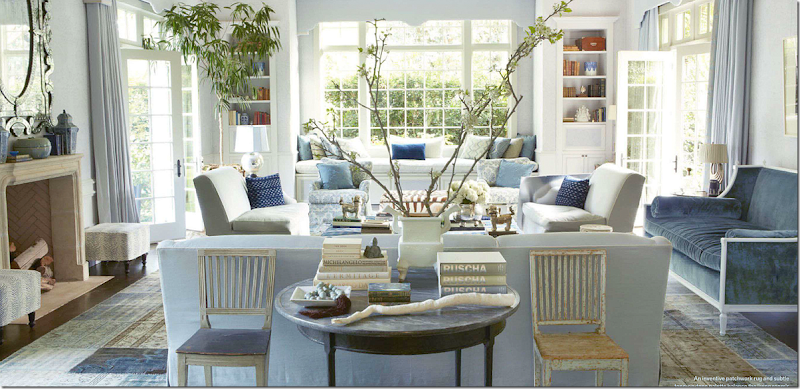
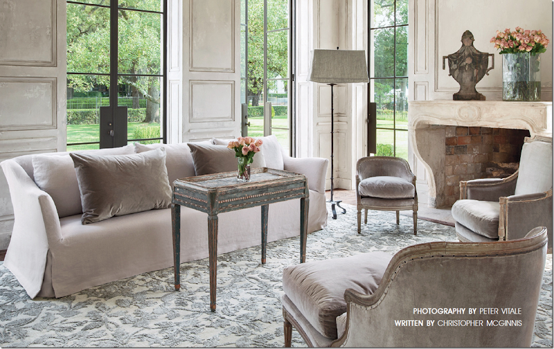
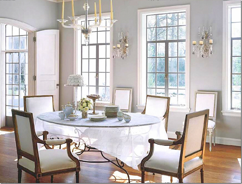
First, a huge thank you to a sweet Cote de Texas reader who saw this house for sale and thought I would like to write about it! I can’t tell you how much I appreciate all the tips you readers send in. Please, please, continue to do so!!! I’m always looking for new stories and new houses to show here!
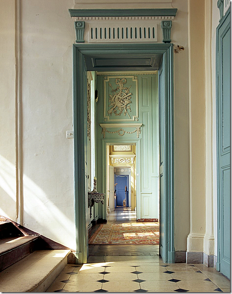
An Enfilade: rooms that open up – one after another
Several years ago I wrote about enfilades and Lanternes HERE. Enfilades are houses where rooms connect through doors set up in a straight line. Houses called a French Lanterne are houses that are one room deep with windows on the front and back that are lined up – making the house virtually see through. Imagine the romance of the Lanterne - approaching the house at dusk, perhaps as a party is just beginning, and peering into the dining room with its candles glowing and then looking further out to the backyard, where tables are set up and fairy lights are twinkling. It doesn’t get any better than that.
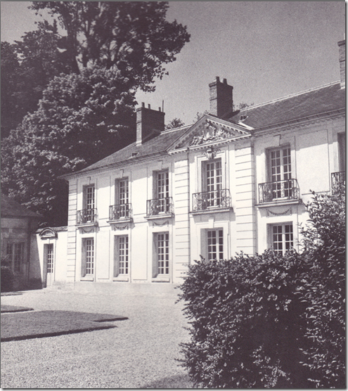
The Lanterne gets it name from the famous 18th century hunting lodge found in Versailles Park in France – called the Pavillon de la Lanterne. La Lanterne is considered a most beautiful house and it has been copied through the years by various architects. The house is owned by the French government and its presidents use it as a country house. The former president Nicolas Sarkozy particularly loved the house and he and wife Carla Bruni stayed there quite a bit – they even spent their honeymoon there.
Pavillon de la Lanterne at Versailles
One of the most famous copies of La Lanterne is the David Adler house built in the ritzy Lake Bluff area of Illinois, on a bluff above the shore of Lake Michigan. This house is on the National Register of Historic Houses and is now listed for sale. Before we look at the house as it is today, let’s step back to its beginnings.
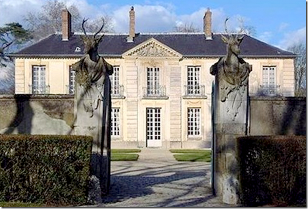
The French house - “Pavillon de La Lanterne” sits behind gates topped with huge deer heads.
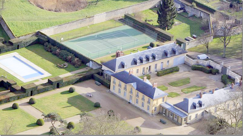
An aerial view shows the center house with wings on each side. Adler’s design was not quite as symmetrical – his wings were different, with one side having a tower. Notice how awful the tennis court is – and how it has ruined such a beautiful house which was totally restored in 1994! They should remove it and turn that area into a formal French garden! I’m surprised no one has suggested that!
And Today:
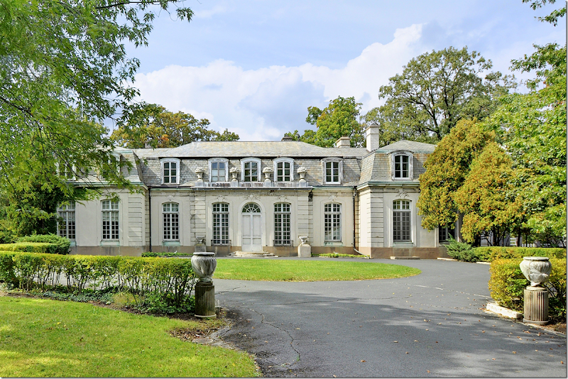
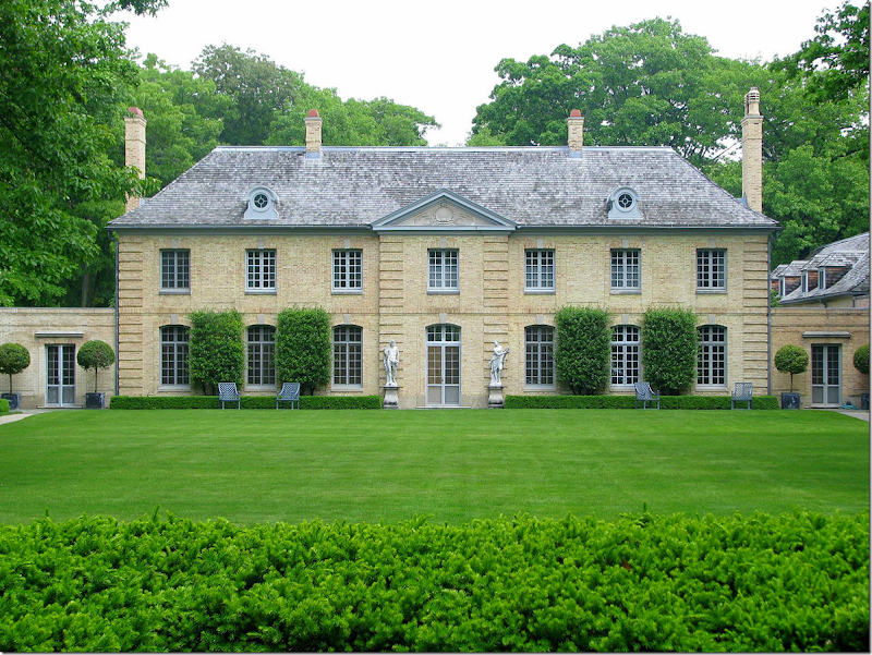
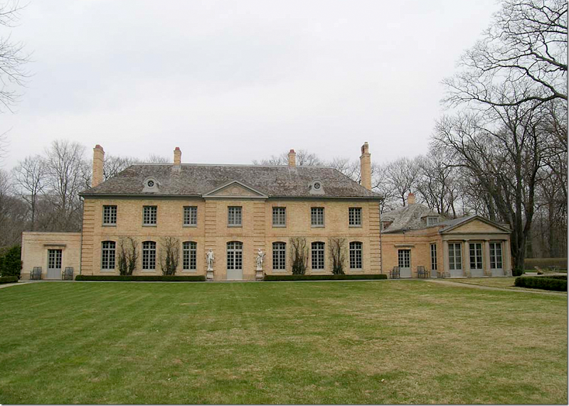
The Carolyn Morse Ely estate has a central entrance with pediment, and six windows on each side of that entrance – all just like the French Pavillon de la Lanterne. Most of the statuary around the estate is original.
The American La Lanterne house which the famous architect David Adler designed in the early 1920s for Mrs. Carolyn Morse Ely. The house was based on the Pavillon de La Lanterne of Versailles. The above picture shows the garden side of the house with its one remaining wing on the right side – with its Greek Temple facade. The opposite wing – on the left side - was removed in the 1950s during renovations. The wing was actually sold to the owner’s friend and was moved to the other side of the lawn where it now faces the main house! The moved wing was extensively added on to during the years and is now a large house.
The Garden Side of the house, again. At the very right is the South Porch which is an enclosed family room. At the very left – the corresponding North Porch is now gone – since that wing was removed in the 50s.
The story of the American La Lanterne is rather interesting. It was built for an elusive well to do divorcee, Mrs. Carolyn Morse Ely, in the Lake Bluff neighborhood of Illinois – where the upper class built mansions used as summer homes. Ely fit in very well as she was born to one of the richest men in the world. The Ely house was meant to be a large country estate, which would house the many servants who would be needed in order that the house would run smoothly. Adler was hired in 1914 to design the estate and he spent 10 years working on it. The estate was located on 17 acres and at that time it fronted Lake Michigan. After all the many years spent designing the estate, Mrs. Ely only lived there for a short while, moving out in 1928 to an Adler designed apartment. Once she moved – portions of the large estate were slowly sold off and today, it measures only six acres, while the house is a large 7,200 square feet.
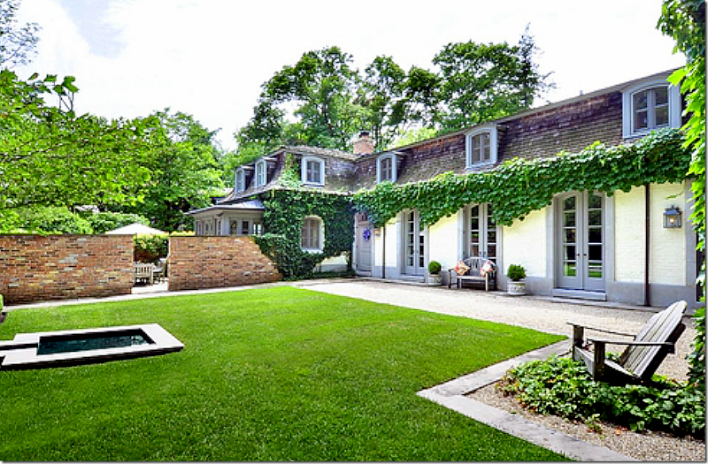
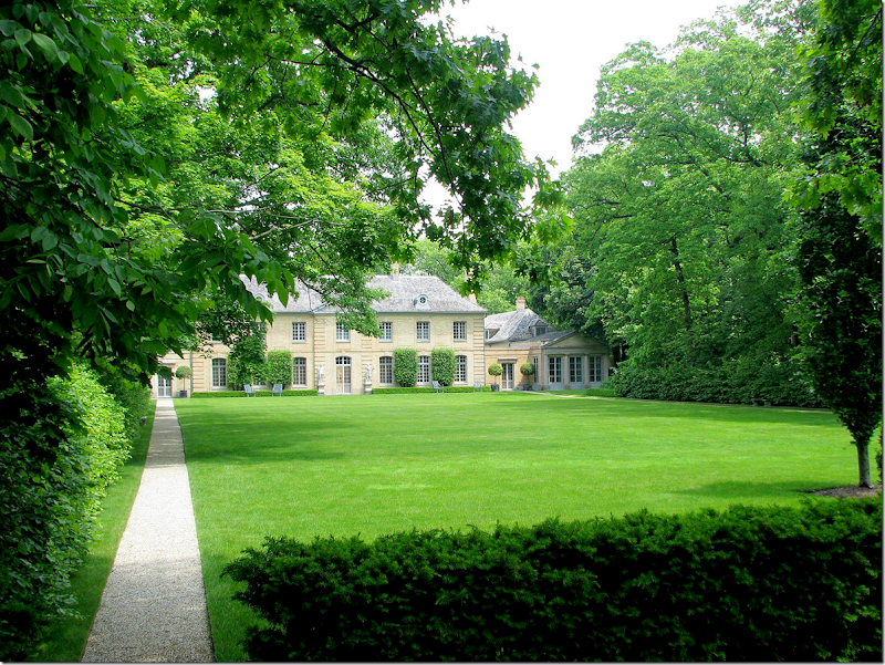
The garden façade. To the left of the house the current owners added an outdoor room, hidden here behind hedges, to balance the missing wing.
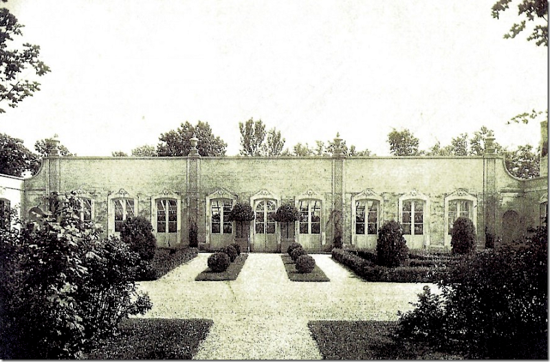
The first part of the country estate that Adler designed for Mrs. Ely was the orangery. Next, he designed a pair of gatehouses, called cottages, that faced each other on each side of the street leading into the as-yet-to-be built main house. Mrs. Ely lived in one of the tiny gatehouses for years until the manor was finally finished. Adler’s first design for the main house was rejected, but his second presentation – the copy of Pavillon de la Lanterne was met with Mrs. Ely’s approval and was ultimately built.
When designing the house, Adler went on European shopping trips where he bought French boiserie for the living room, limestone mantels, and crystal chandeliers and sconces. Also, the house was filled with handpainted wallpaper – that remains to this day.
One of the most fabulous features of the house is that it is filled with light since it is only one room deep. There are windows on at least two sides of the main rooms. The South Porch has windows on three sides as do the upstairs bedrooms.
The house was designed for a single woman, who entertained women and who needed many women servants. To meet this need, the upstairs in the main section of the house consists of the master bedroom and sitting area, a small maid’s room, and a guest bedroom. Over the one remaining wing – there are five bedrooms built for staff, although today, only three are used as bedrooms. The house has a total of seven bathrooms and 5 bedrooms. There is a gracious powder room for the ladies, but the men’s room is rather Spartan, hidden beneath the staircase. There are also rooms designed for ladies – a card room and a flower arranging room – but rooms designed for gentlemen of that era are glaringly absent. Mrs. Ely was definitely not planning on having any gentlemen callers!
One problem with the house today – is the set up of the bedrooms. There are only two bedrooms in the main house while there are three to five bedrooms in the wing. This might be fine if the new owners have lots of visitors and grown children – but for a family with small children – this house wouldn’t work unless there was a nanny sleeping in the wing! It will be interesting to see if the bedroom setup hinders the sale of the house.
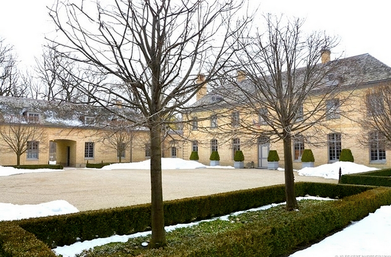
The main entrance court – shown in winter when the trees are bare. Quite a different look than the leafy green of summer! Notice the “dog trot” that Adler placed in the wing to allow traffic through it. The garage is to the left of that arched opening. This is the side of the house that faces Lake Michigan.
Not a great picture – but here you can see how long the wing actually is. The garage is on the left side of the wing – its doors face the opposite direction. The kitchen is located on the other side of the wing. The five staff bedrooms are above this wing. On the other side – the wing that was moved was only half as long as the remaining wing – it stopped almost where the opening is – right in the middle.
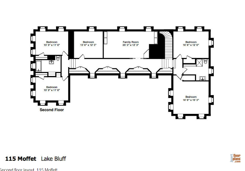
Adler’s floor plans. On the left, past the card room (today called the Library), that entire wing including the North Porch is no longer there. This is the wing that was moved to the main lawn across from the house. The current owners, who have lived in the house for 15 years and did a total renovation of it, created an outdoor room to replace the missing wing.
The current owners built this outdoor room on the space where the wing once stood.
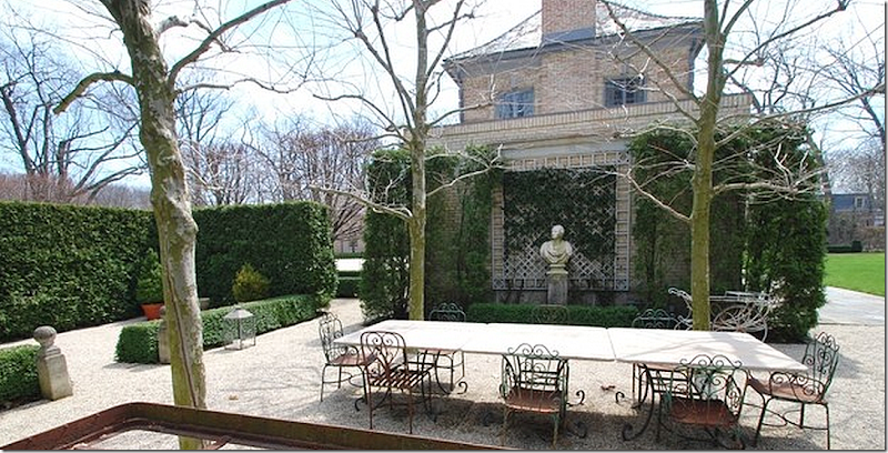
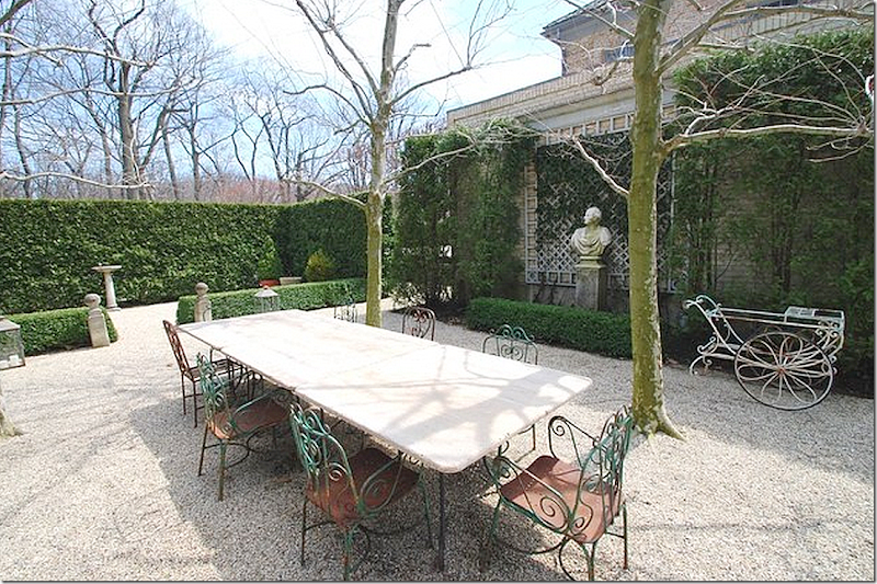
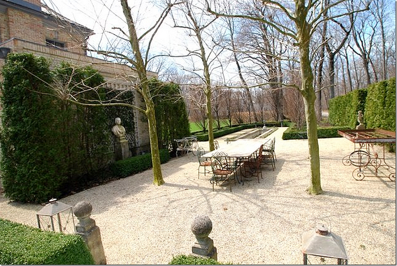
Another view of the outdoor garden room. The area was planted with plane trees (as they would be in France,) high hedges, and box – mixed with a gravel floor, again, just like it would be in France! This is the winter view of the outdoor room.
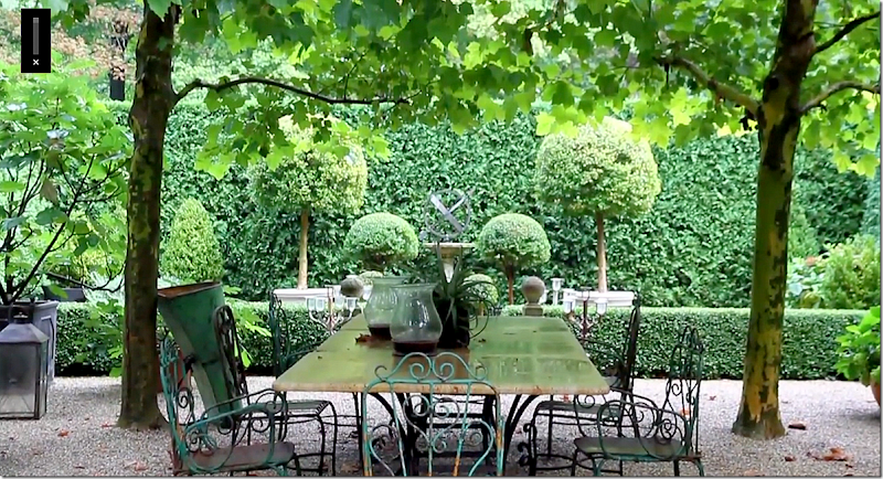
Here is the outdoor room in summer – which makes such a difference.
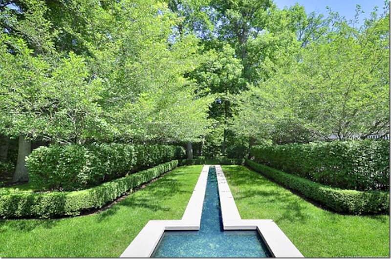
Past the outdoor room is a long, water fountain, that sits alongside the garden. During the summer months – this area becomes a dense forest.
And here it is – the water feature in summer.
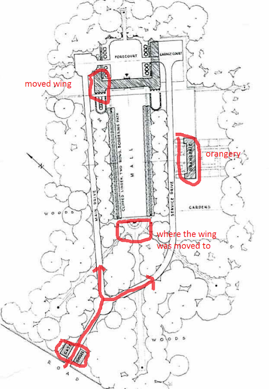
Let’s take a look at the site plan that Adler drew for the estate:
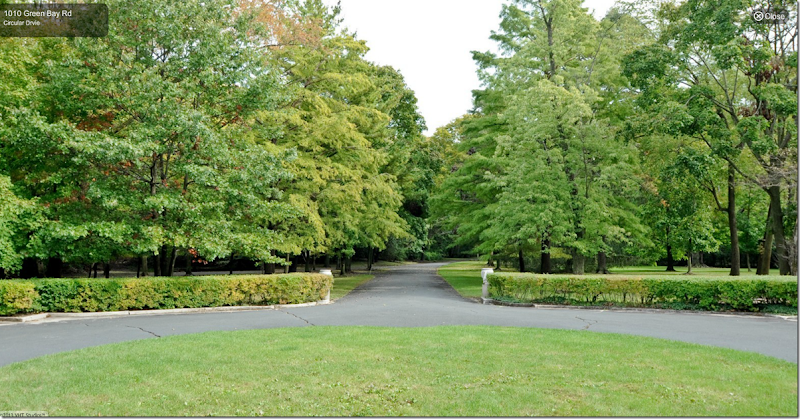
You reach the property by entering a street that is flanked by the two matching gatehouses. The road forks. To the left, you drive through an allee of trees, past the lawn, to the front of the house – which faces Lake Michigan. There, you can drive through the dog-trot in the wing to the back where the garages are, and then, later, take the opposite road back to the front of the property – passing the orangery along the way.
Here’s an aerial Googlemap view taken in the dead of winter – you can see how bare it all is. Here you can also see how the large estate was reduced over the years. Gatehouse #1 and #2 are privately owned (and#1 is now also for sale!) The orangery is also now a private house and includes a pool house. And across the lawn from the main house is the removed wing which has been greatly added on to over the years. This is also privately owned.
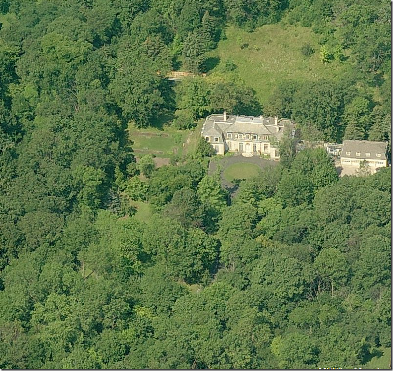
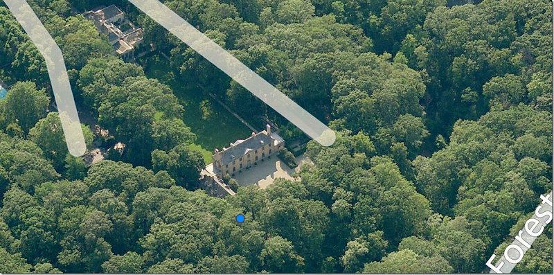
And a Bingmap view taken during the summer where you can see how different the forest is when green! Here is the main house and at the end of the lawn, you can the removed wing with its tower intact. At the left you can just barely see the orangery and its pool through the trees.
And looking the other direction facing Lake Michigan. Here you can really see the house and the remaining wing and the motor court. At the end of the mowed lawn is the moved wing, which now faces the main house. To the right is the orangery and the pool/pool house.
Moving A Wing?????
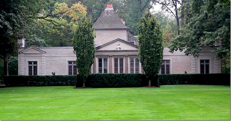
A rare view of the removed wing. Notice the center section with the Greek Pediment is what was once the North Porch. The tower behind it was over the wing. The house has been added onto with wings on the left and right of the center Greek Pediment room. The couple who bought the house in the late 20s from Carolyn Morse Ely lived there until the 50s. They were the ones who sold the wing to a friend who moved it across the lawn. Lucky friend. But, moving wings wasn’t all that uncommon in this area – it helped keep the enormous heating bills down.
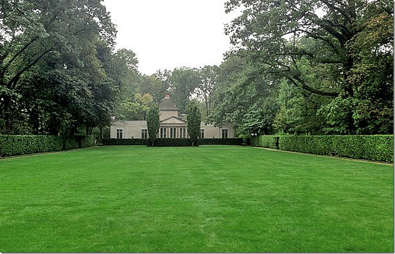
Here is how the moved wing looks when looking at it from the main house – at the end of the lawn. I suppose it doesn’t look bad at all - but it must have been so much nicer without the wing there.
On the left of the lawn – between the moved wing and the main house is this gate which leads to the orangery – now a privately owned house.
The Orangery:
Here is the orangery – as designed by Adler. The garden is so pretty the way it is landscaped. Total, that is all gone – a parking lot takes its place.
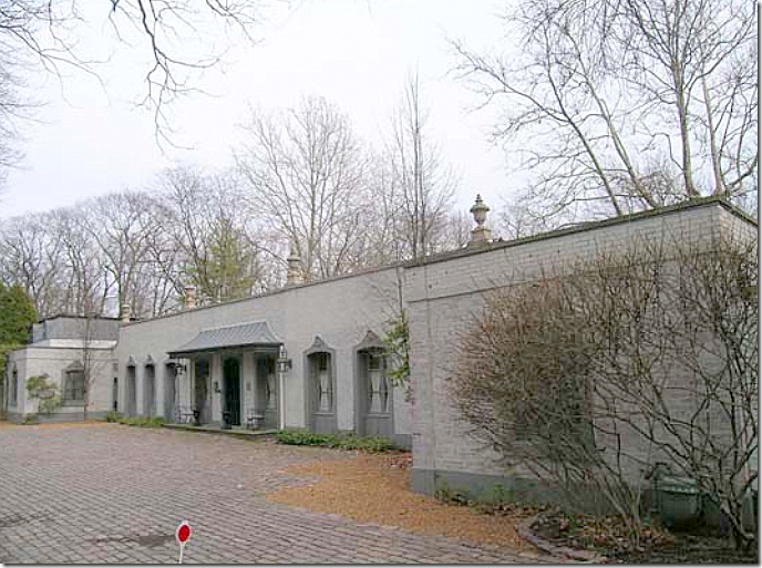
The orangery today – turned into a house. An owner added the metal awning and painted it gray. And the pretty landscaped garden is now gone.
Across from the orangery is this pool and pool house – so cute! Not sure if the pool was built by the owners of the main house or by the owners of the orangery.
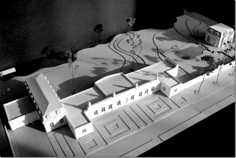
There are plans to turn the orangery into a large, million dollar house – here is the model. There will be 5 bedrooms when it is totally restored. You can see the standing pool house at the very right. And see – the gardens will be totally restored to as they once were.
The Gatehouses:
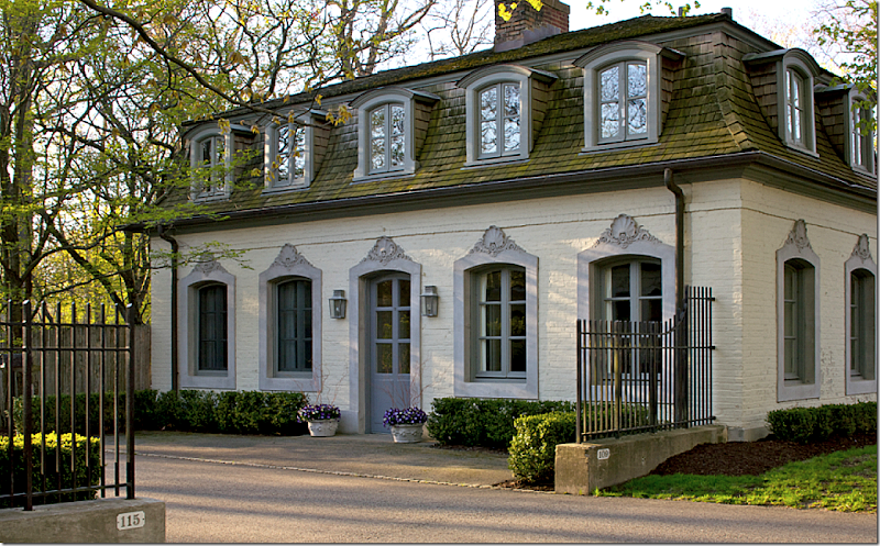
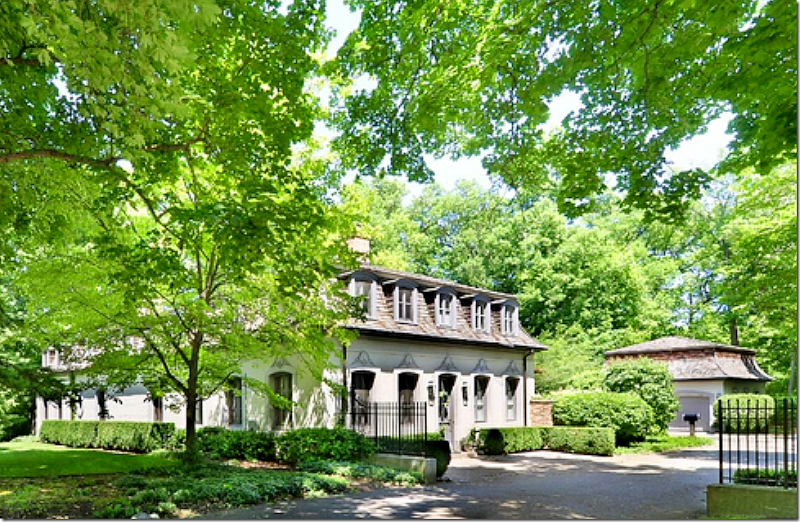
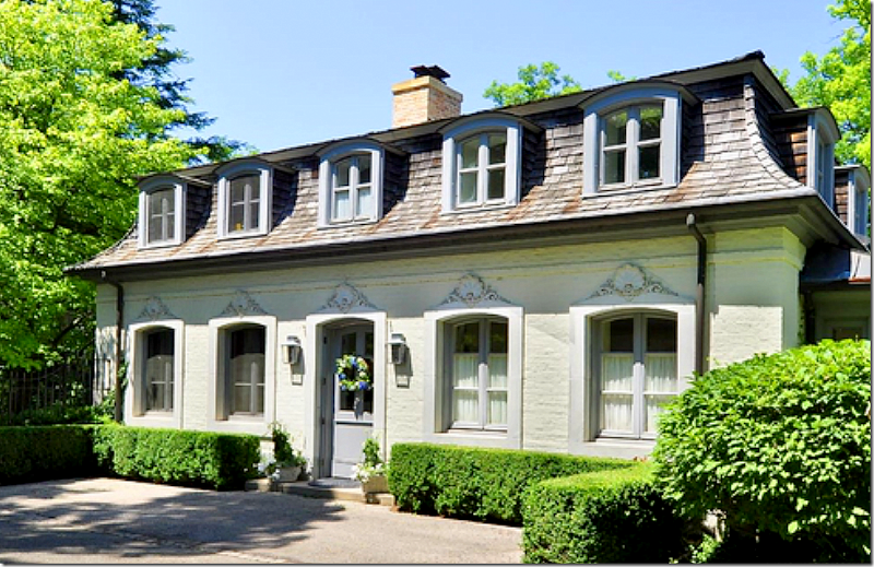
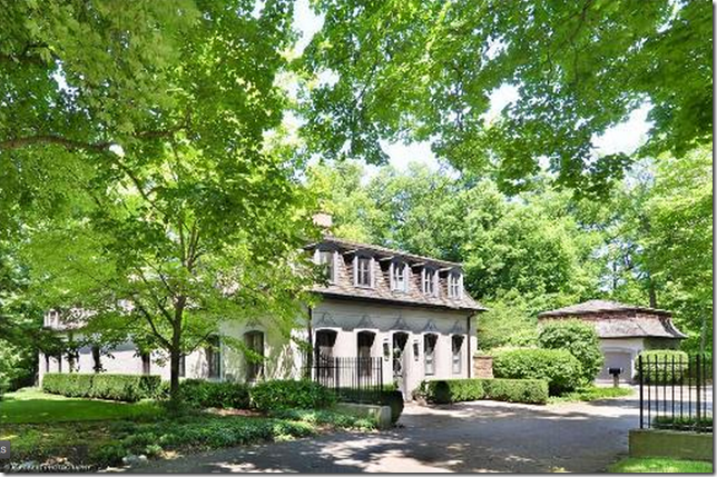
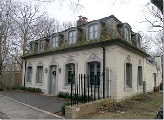
One of the two gatehouses that stand at the entrance to the property – designated by the iron fence. The second gatehouse is right across the street. These houses were once mirror images, but now that they are privately owned, they have been added on to and are very different. This house shown above is now for sale, as is the main house.
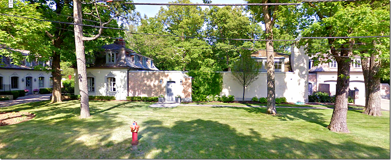
The second gate house. This house has been totally renovated by the same company that is now renovating the orangery. I’ll show the photos further below.
I like how all these buildings are painted a matching gray. The moved wing, the gate houses, and the orangery all look similar – with a decidedly French flair – but the main house is yellow brick. If I bought the main house – I would paint it a similar gray.
The Main House:
To understand the rooms – to the very left is the card room – or library as it is called today, then the living room, then a small hallway, and next there is the entry hall. Past the entry hall is the powder room, the dining room, the pantry, and then the south porch – or the family room. Above are, from the left, the master bedroom and sitting room, with the guest room on the right of the stairway. The remaining 3 bedrooms are above the wing on the right side of the house. There are another two bedrooms which are not being used as such. There are seven bathrooms. The house is 7200 sq. ft. and the asking price is $5,995,000. HERE.
In this picture you can see the right wing with the Greek façade and see how much the moved wing still resembles this section of the house.
In this rare photo – you can see the wonderful South Porch or family room – with the windows on all three sides. Past this room is the kitchen, the huge pantry, and you can see the dog trot. Past that – you can see the garage doors. There is also a large BBQ grill set up here, outside the kitchen. Seeing this room and how beautiful it is – it just kills me that they removed the North Porch and the left wing!! That has to be the craziest decision every made!! The new owners should rebuild the wing. I would – if only I had the funds!!!
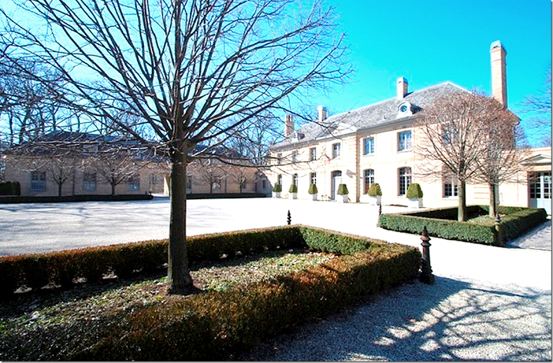
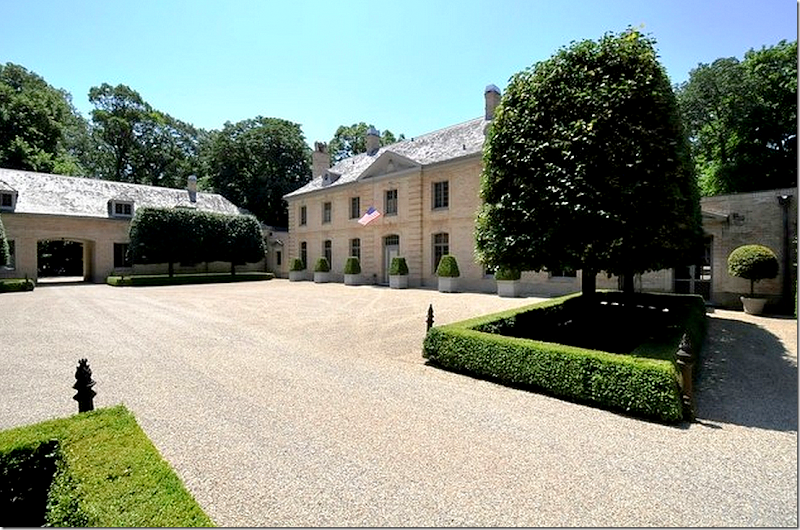
The other side of the house which faces the lake is actually where the front door is. I love all the gravel. So French. Ready to go inside????
The Entry Hall:
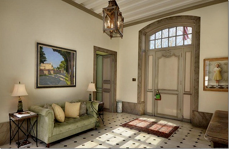
The entrance hall has two front doors – one on each side of the house. The marble floors are original. Notice the very wide baseboards.
In this picture – you can see the beamed ceiling – and get a feel for how large the room truly is!
Now – just a word about the house. It was bought by these owners 15 years ago. And, it was decorated at that time in a French/English style with antiques from both countries. The décor is very nice – but like most designs, after 10 years, it is starting to look a bit dated. Actually, with just a new coat of paint and some new fabrics on chairs and sofas – and the house could look totally up to date for today. So – when looking at the room – imagine what you might do if you were to buy this house and decorate it yourself.
I would paint it all – instead of having the molding painted a much darker shade – I would paint it all one color, or two colors that almost match.
My Vision:
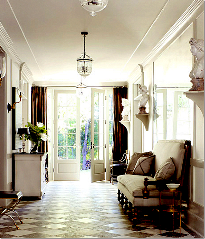
Here – in this Windsor Smith designed entry hall – is how I would love to decorate the Ely house. I love the portieres at the door and all the busts on the walls.
The Hall:
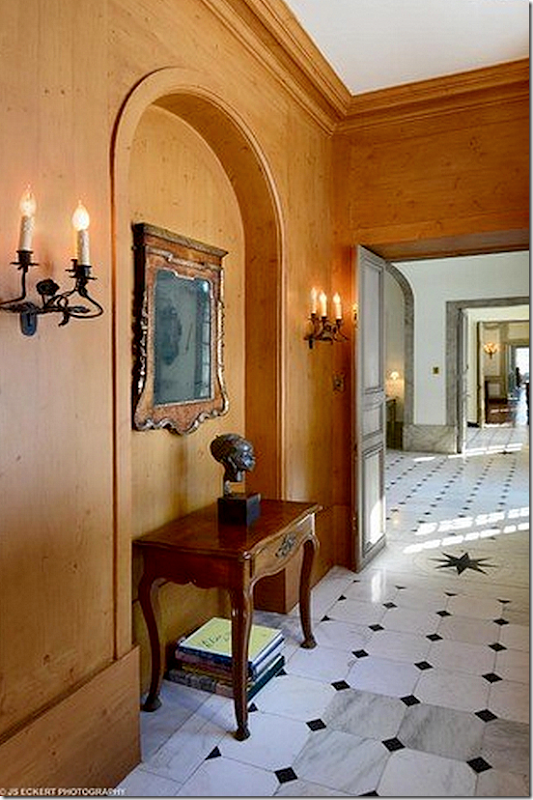
Behind the staircase is this small hall. It really isn’t wood – but the owners had it faux painted. I would remove this – and just let it be painted with real paint. The stars in the marble are an Adler trademark. You can really see the enfilade of the rooms in this photograph.
The Ladies Powder Room:
The ladies powder room – very fancy with original mirror and moldings. The men’s room is very plain, hidden under the staircase.
The Living Room:
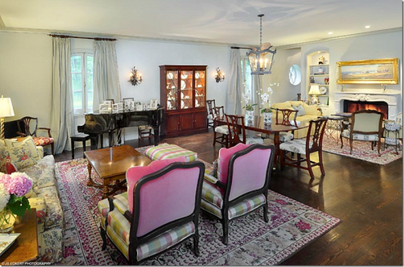
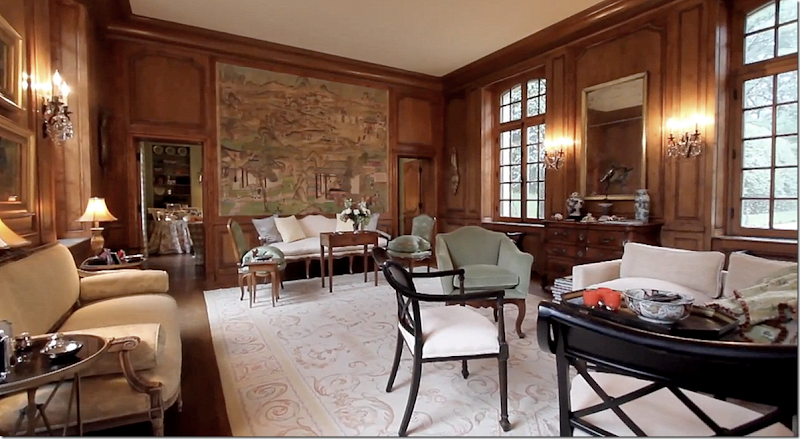
The living room with the original boiserie that Adler found in Europe. The current owners waxed it four times to restore it. The handpainted wallpaper is also original but totally restored.
A larger view of the living room. Through the two doors is the card room or library as it is known today. Adler bought these crystal sconces in Europe.
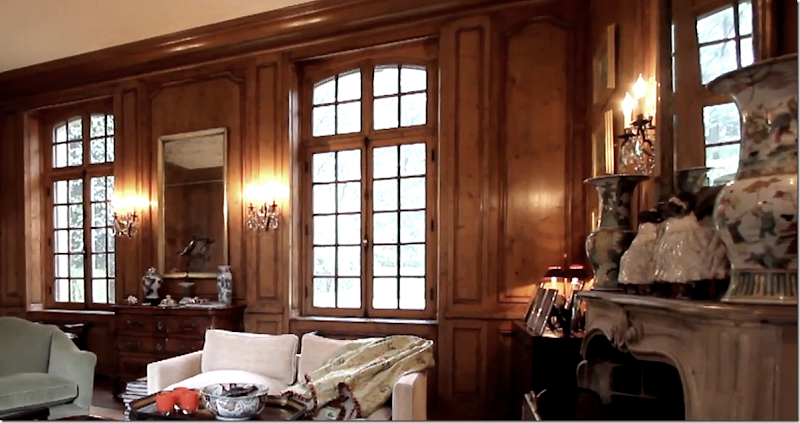
The mantel is original – also bought by Adler in Europe.
My Vision: Now if I bought this house – I would probably decorate it like this:
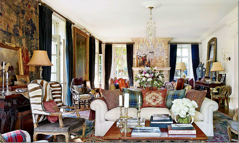
This is Ralph Lauren’s country house and I love the way he decorated it! The Ely living room would look so fabulous like this – with the wood painted cream and dark velvet curtains and layered rugs. Love this!!!!! Would you keep the paneling stained dark? I think I wouldn’t.
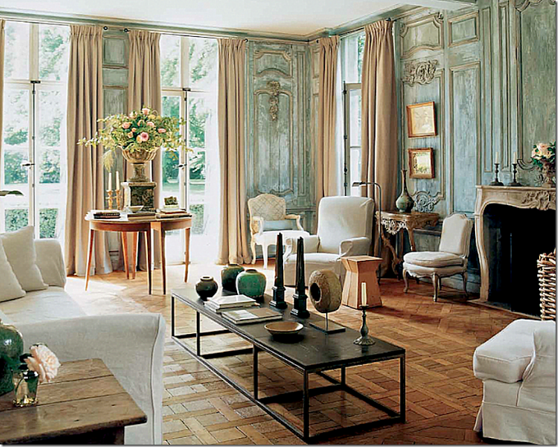
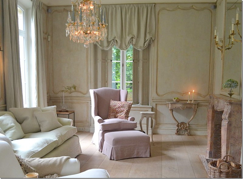
Or, would I paint the molding to look like this and furnish the room more sparsely, as in Belgium? Gorgeous room and woodwork by Lefevre HERE.
Or, would the living room look best with an assortment of French antiques? So hard to decide!
The Card Room/Library:
I love the card room/library – and how it is decorated. The wing used to be reached from this room – there was the large living area and the North Porch. Now, the outdoor garden room is located just beyond this room.
And the view towards the living room – with the limestone mantel. Notice how beautiful the doors are!
I love this house so much. Imagine you live here – you would walk through the kitchen – through the dining room, entry, and living room just to get to the library. That’s the beauty of a enfilade – you use the entire house. Here you can see the rooms lined up on the right side.
My Vision:
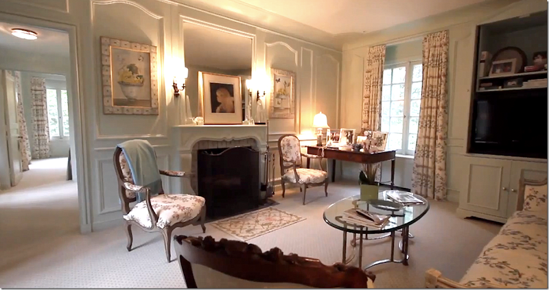
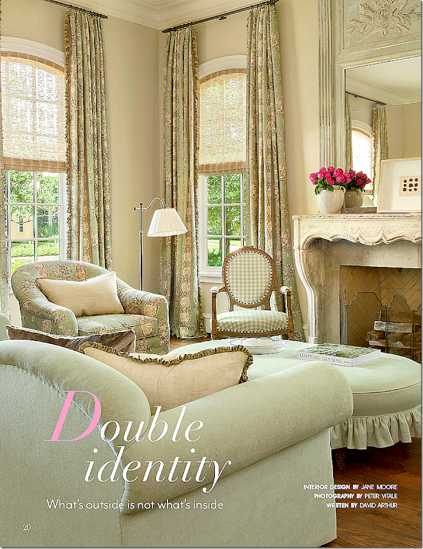
This room by Jane Moore would bring the library just a bit more up to date with fresh fabrics and lighter colors.
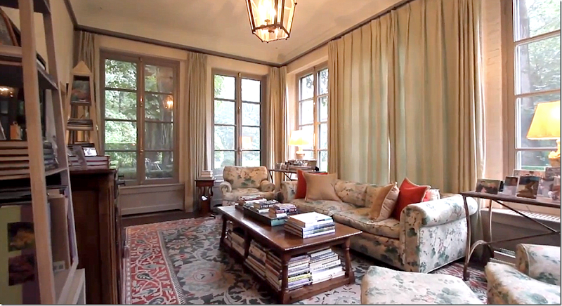
Or would the library look better like this – with a mix of antiques and chintz?
The Dining Room:
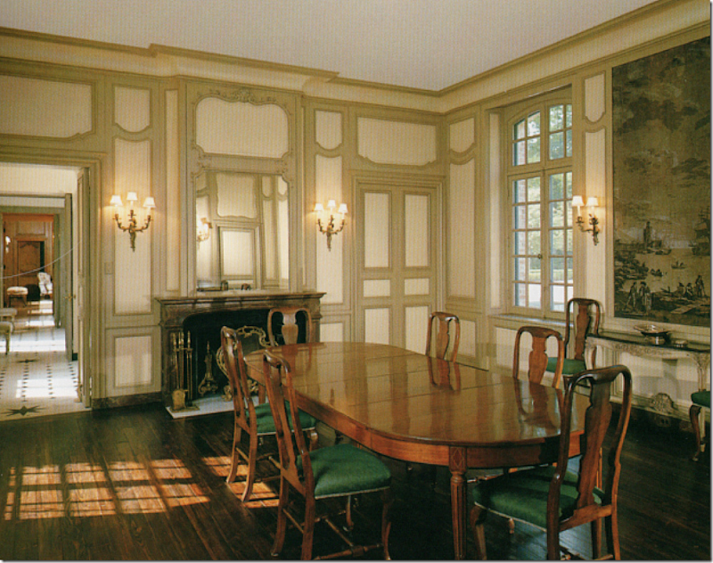
Here’s an early view of how the owners furnished the dining room – taken right after they moved in.
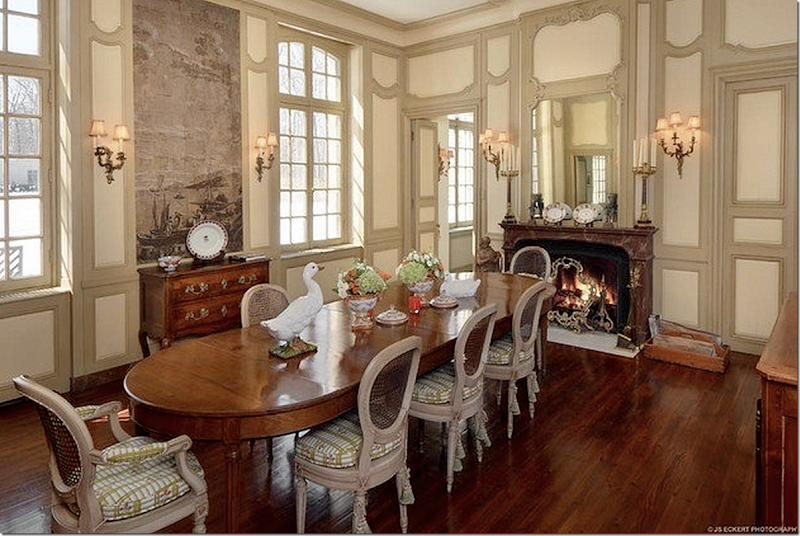
And today, the room is furnished like this – with French caned chairs. Notice the grisaille wallpaper that was restored. Now, I don’t care for the way they painted the molding here – and feel like it should be painted one shade to avoid this busy look. I do miss wonderful taffeta curtains in the room – and knowing me, I would have a skirted table for a softer effect. But what a space!!! Windows on both sides of the room – create the lanterne effect and a fireplace!!! Wow. Just love this house. The floor plan is fabulous.
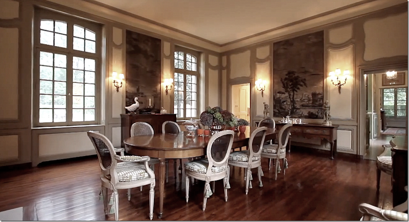
Looking at the other direction – showing another wall section with the grisaille paper. Through the door on the right you can see to the South Porch or family room. On the left is the butlers pantry.
My Vision:
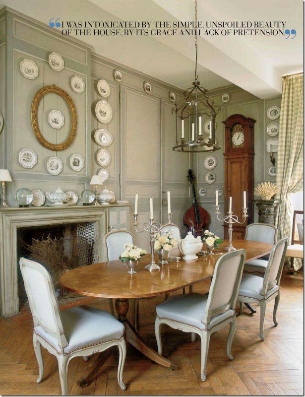
Beautiful dining room found in France - I love this room!
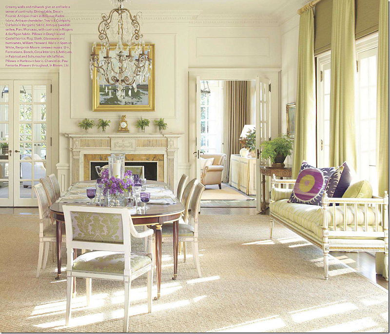
Or, the dining room would be lovely decorated like this.
The Butlers Pantry and Kitchen:
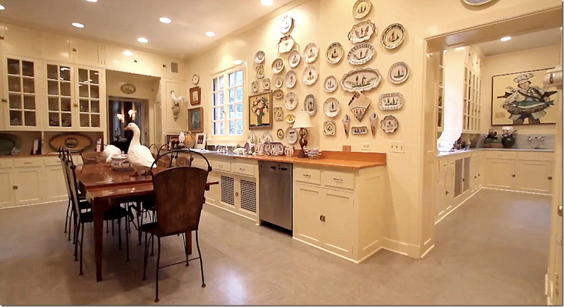
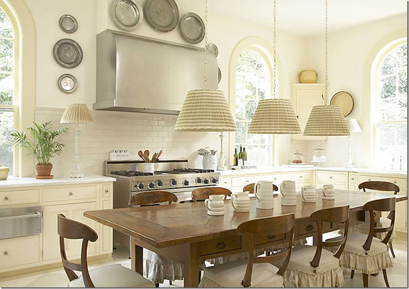
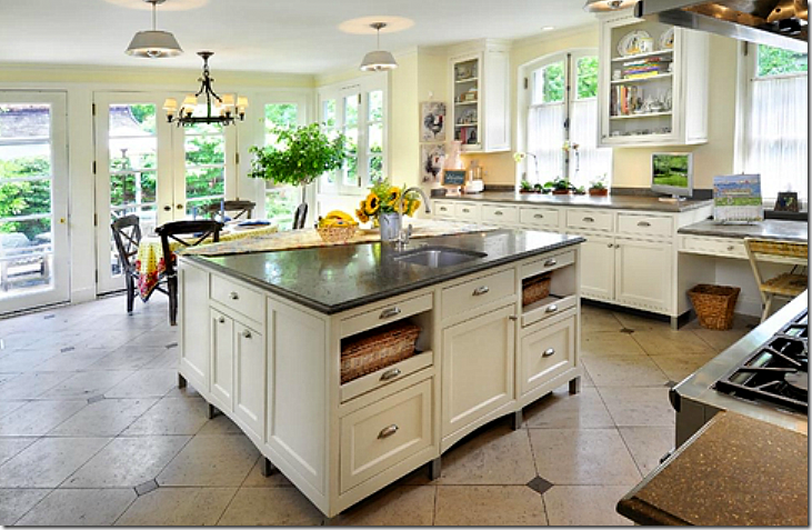
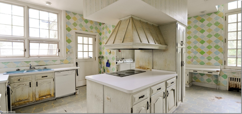
Here is the butler’s pantry – and through the door is the kitchen. Well, this is beyond huge. It was designed for the servants – Mrs. Ely never stepped foot in this space. Behind the kitchen is another large dining room – for all the servants to use. The new owners updated these rooms somewhat – but kept the cabinetry it looks like. Maybe not – it’s hard to tell. Still, this room needs updating – painting, new countertops, lanterns, etc. I would find a fabulous antique store counter to use as an island instead of a dining table. Also, the flooring needs updating. This room is actually called the Serving Pantry on the floor plans.
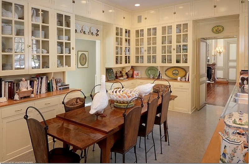
And looking toward the dining room – the butler’s pantry. What a great space to get organized in!!! Unreal.
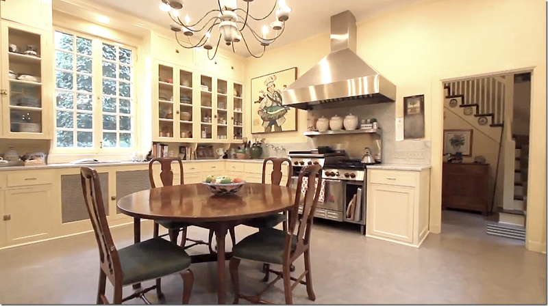
And the kitchen – very similar in design to the butler’s pantry. Through the door are the stairs that lead to the bedrooms above the wing. Behind here is another large space that was once the servant’s dining room. Not sure what it is used as today. On the original floorplans – behind the painting there was once another door that lead to a room called the Servant’s Pantry. I suppose their dinnerware was kept there?
Look at the fabulous marble sink. That has to be original!!
My Vision:
Suzanne Rheinstein updated her same vintage kitchen with a painted floor and a wonderful island.
I love this kitchen – updating it like this would keep the vintage feel, yet seem more today.
Another vintage kitchen, updated for today – love this!
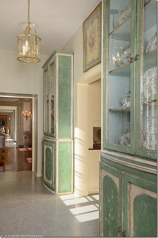
Here – leading from the enfilade to the butlers pantry on the right and onto the South Porch/family room, are two painted cabinets.
The South Porch/Family Room:
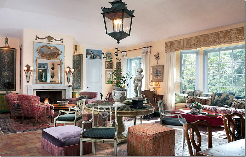
The South Porch – was once used by the servants. Original windows and beautiful hardware. Think about how you would decorate this room for today?
In this picture of the family room – you can see the walls are brick.
My Vision:
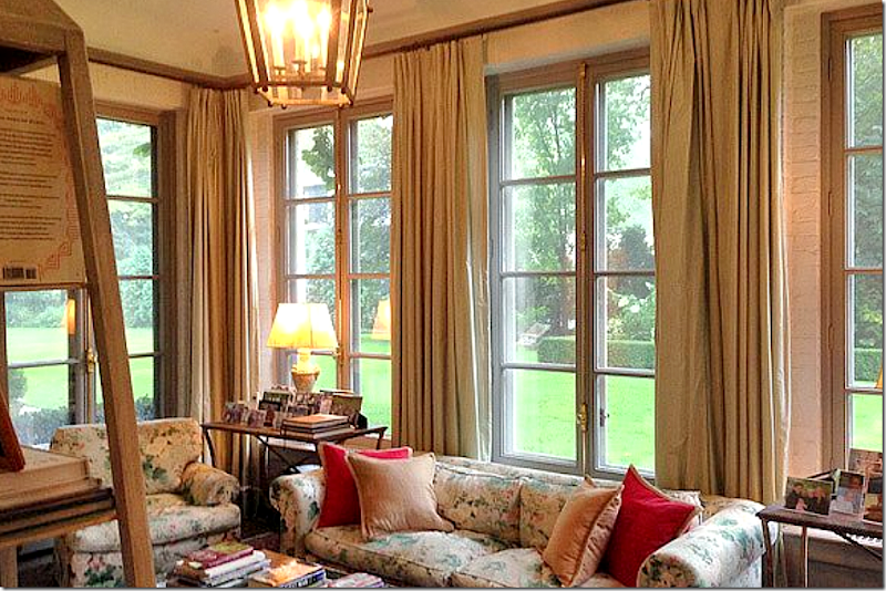
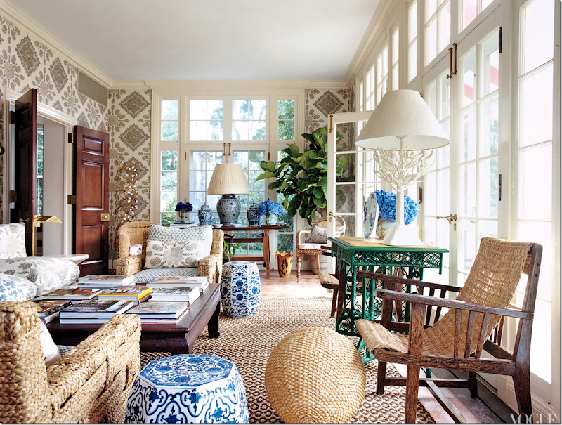
You could use a quiet palette mixed with stripes and prints.
Or you could go with color and pattern – fabulous!!!
Upstairs: Master Bedroom Suite
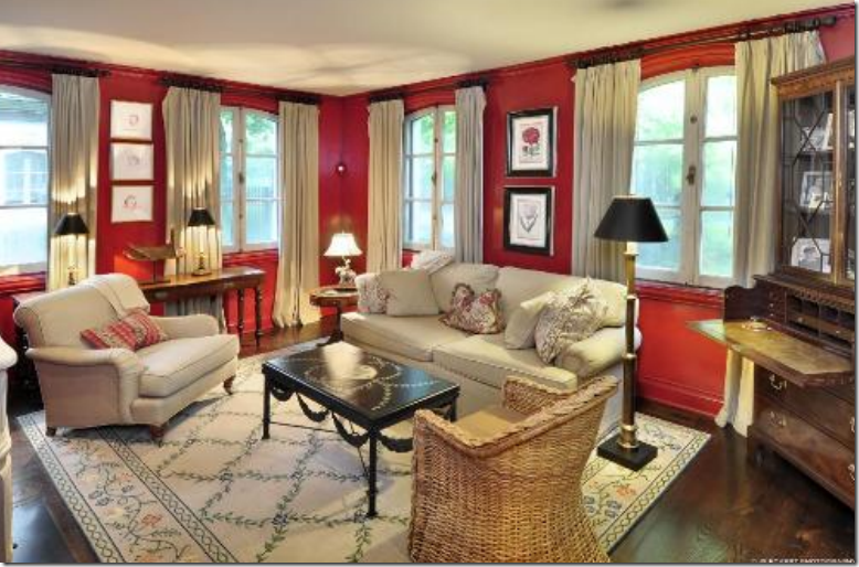
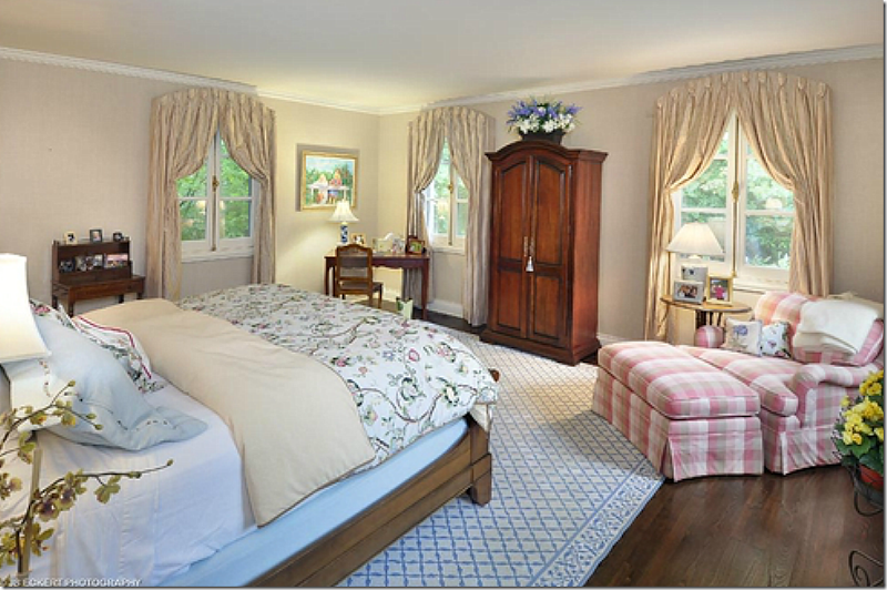
The master bedroom – with windows on three sides – is done in chintz. I love the alcove the bed fits in. The bathroom is on the left, while you can see the hallway on the right that leads to the other rooms.
Another view of the room. Beautiful molding and windows.
My Vision:
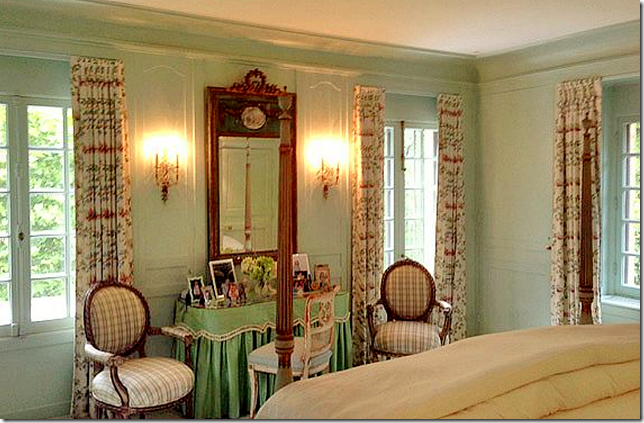
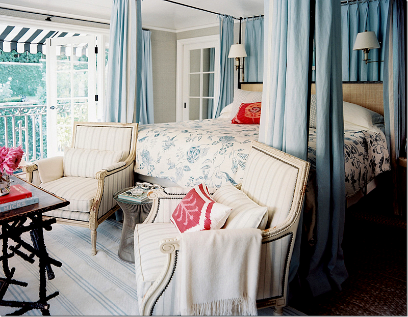
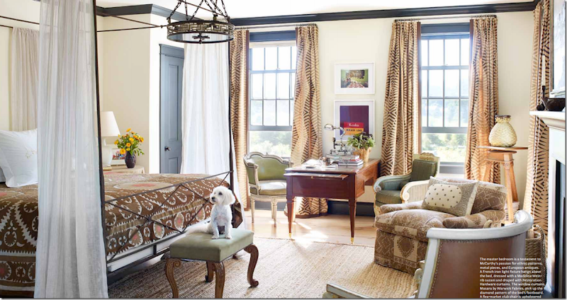
I love Mark Sikes master bedroom – and can see how wonderful this would work in the Ely house.
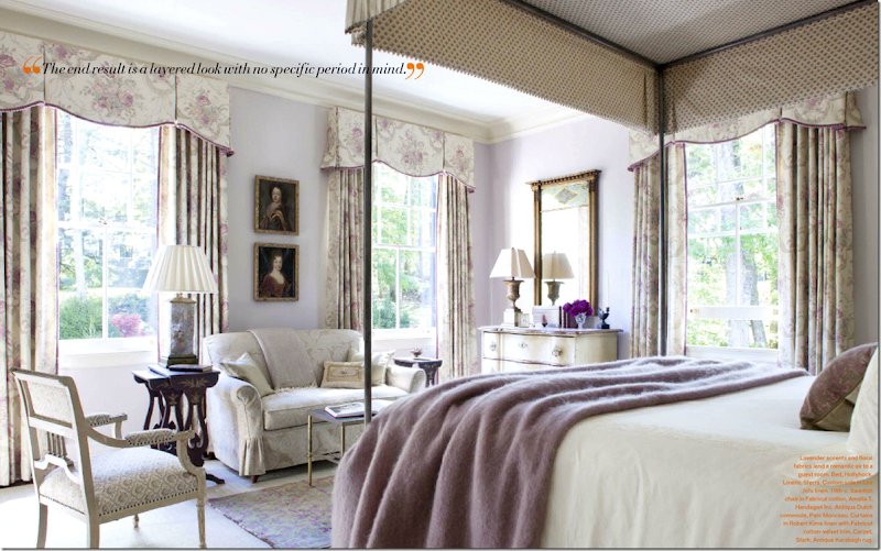
Or this lovely, classic room in lilac.
Or for a younger couple – a more fun mix of fabrics.
Past the closets and bath is the sitting room – with its own fireplace. I would probably never leave this room in the winter! Notice the mantel and two paintings that flank it.
Notice the tile on the fireplace – and notice the frames are made out of similar tile.
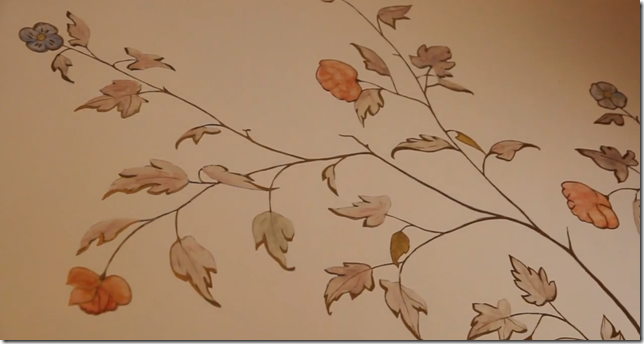
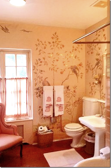
In the master bathroom – the owner discovered handpainted wallpaper hiding under vinyl paper!! She restored the paper, above.
And here is a view of the handpainted wallpaper – hard to believe they covered this up!!!!
The Guest Room:
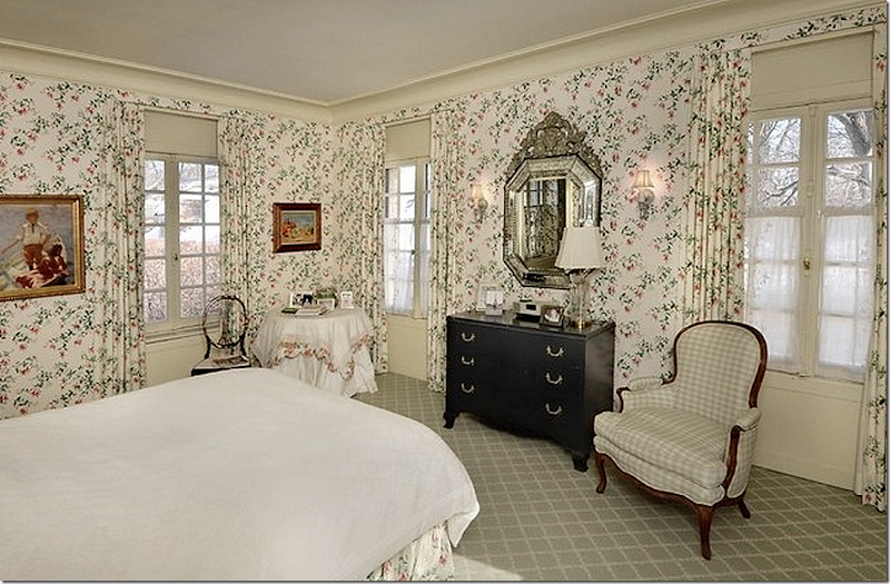
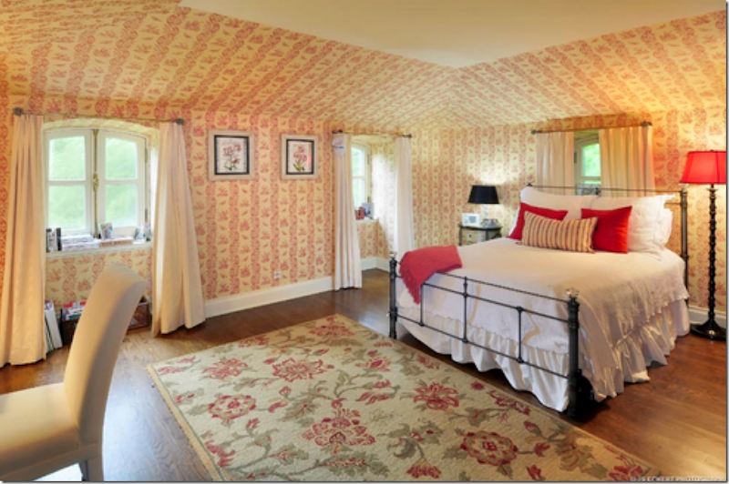
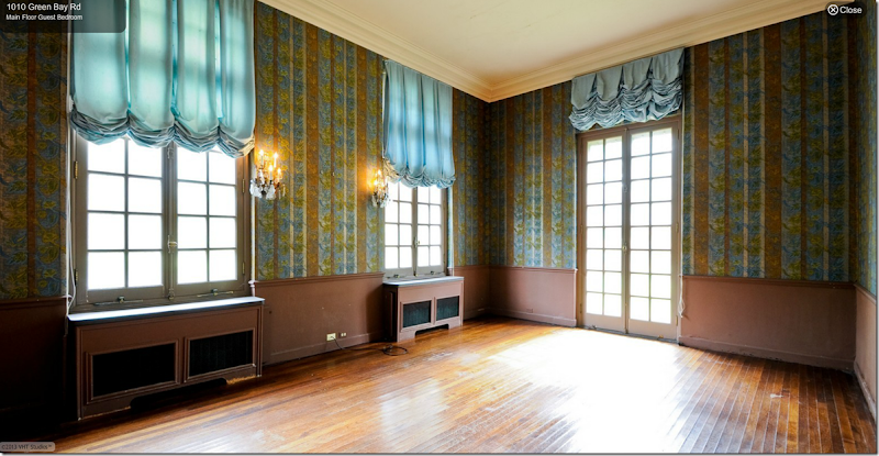
At the other end of the upstairs – is the guest suite, totally wallpapered. These rooms must be quite large – after all, this room is above the dining room.
My Vision:
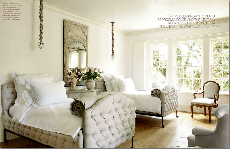
Instead of a chintz wallpaper – use a handpainted paper with a leopard rug to really bring the house into today.
The Five Rooms Above the Wing:
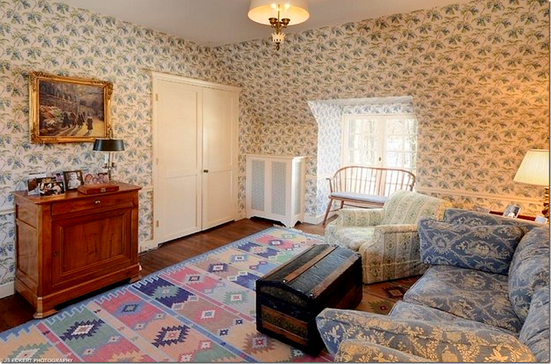
Once a bedroom, this is now a sitting room for guests. All these room have charming dormer windows – on both sides - just like the main house because the wing is one room deep, too.
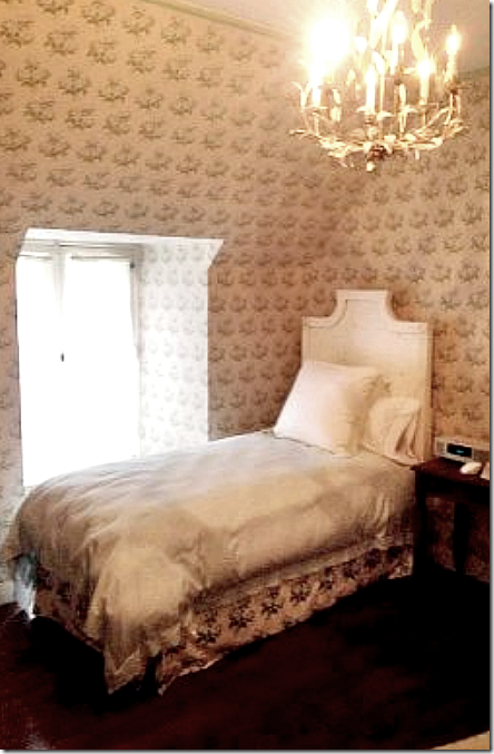
One bedroom.
This looks like it might be decorated in Bowood wallpaper.
And the third bedroom.
My Vision:
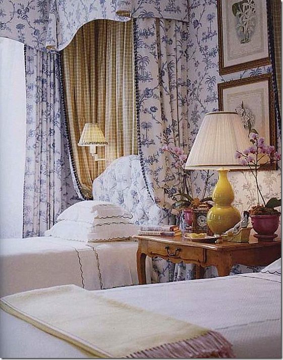
It would be so much fun to decorate all these bedrooms. Here is a room with one fabric pattern used. Beautiful antique table and lamp! You could go classic like this.
Or use antiques in a more modern way, like Pam Pierce did here. Love this.
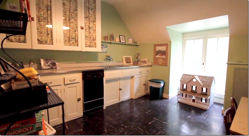
The fifth bedroom is now a kitchen/playroom.
Wow. I just love this house. I would love to decorate it!!! I can’t imagine how much fun the current owner must have had designing the rooms – it’s beautiful and like I said, it really just needs a little updating for today – but not much.
$5,995,000 is the asking price for six acres and the house. Any takers? Here is the real estate portfolio.
There is a fabulous video on the Carolyn Morse Ely La Lanterne house if you want to watch it – HERE. It shows the current owners- I think you will love it!
The Gatehouses:
Both gatehouses have been updated – one is currently for sale. Built in 1916, the elusive and mysterious heiress Mrs. Carolyn Morse Ely lived in one of the gatehouses during the years the manor house was being built. Today they are both privately owned. Both gatehouses are much larger today than they were when built and while their exteriors are similar, their interiors are totally different.
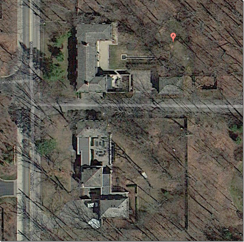
Aerial winter view of the two gatehouses. You can see their footprints are mow totally different.
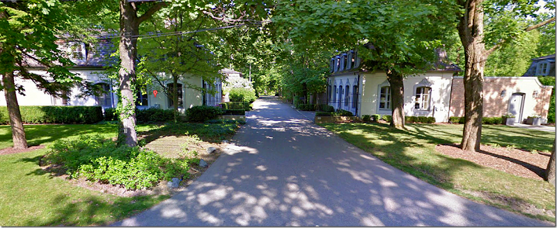
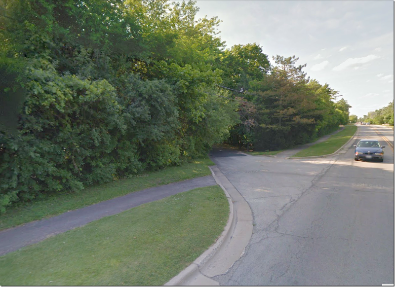
The street that leads to the main estate, the orangery house, and the moved wing house – along with several other houses that were built on the former 17 acre estate.
Gatehouse #1
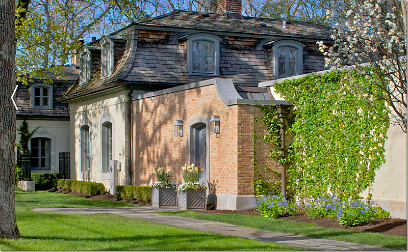
From the side – you can see how much larger this gatehouse is now. The original house stopped at the brick wall. Now the house extends all the way to the garage – by a series of pavilions that are connected. Hard to imagine Mrs. Ely living in such a tiny space compared to how big her house was when eventually built. She probably lived with one servant in this house – and the other servants lived in the second gatehouse.
The front façade of this gatehouse (both actually) hasn’t changed over the years. Notice how this house blends with the orangery, and the moved wing house. All are painted in shades of gray. But – the manor is still yellow. The new owners should paint the yellow brick gray so that all the buildings blend together!
The street side view. You can see how close the other gatehouse is – just across a narrow lane! Neither gatehouse has a front lawn. The same company that is renovating the orangery renovated this guest house too.
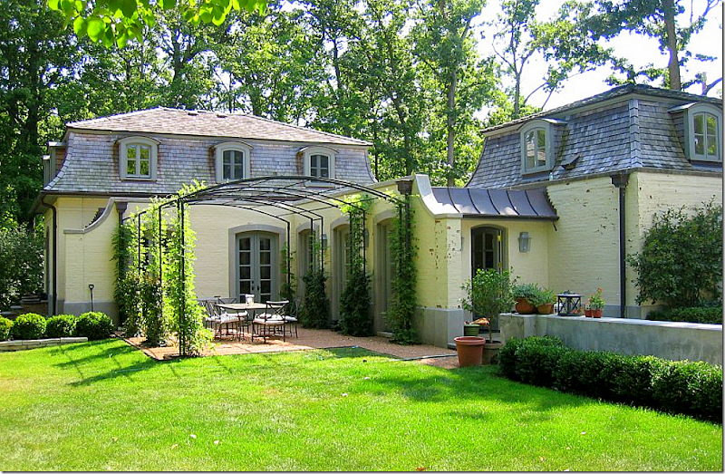
The back part is the garage – which connects to the middle section by this enclosed walkway, with a side terrace under an iron pergola. So charming! Originally there was just one bedroom and a tiny second bedroom (which was probably where Ely’s maid slept.) The new owners tripled the size – adding on 3500 sq. ft. to the gatehouse. A master bedroom suite was placed over the garage. There was no garage before!
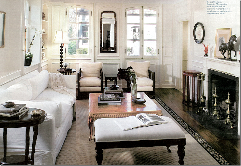
The main living room is located in the original building. Great pains were taken to use correct design elements in the new section – such as the same windows were used, along with the same hardware. These windows and hardware look very similar to those used in the manor house. The front door is located through the open area next to the fireplace. Notice the second gatehouse through the windows! The inside is painted throughout in Benjamin Moore’s Linen White – the molding is painted in oil base, while the plaster walls are flat paint.
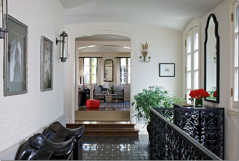
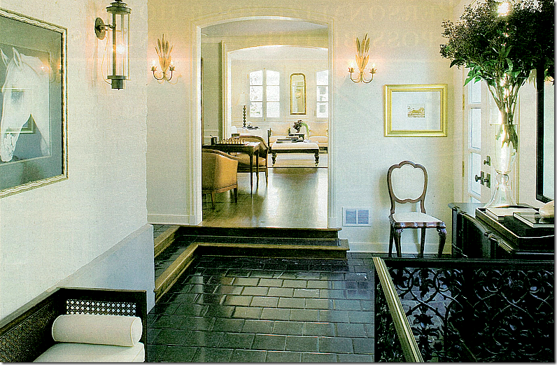
This enclosed walkway leads to the second pavilion. Stairs to the basement level are behind the iron gate. Original brick walls remain. The floor is black stone to replicate the once-garden walkway. The owner rides horses – which is why she has displayed her saddles.
In a similar picture – you can see there is a room between the walkway and the living room – in the original house.
The dining room and kitchen.
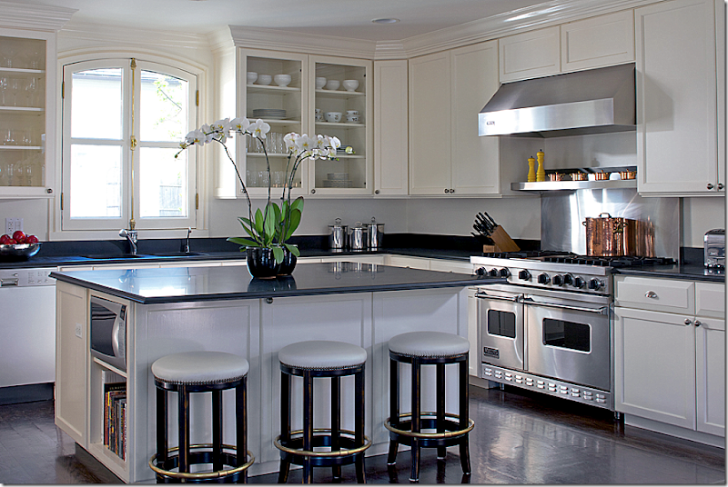
Beautiful kitchen – love the windows and dark hardwood floors!
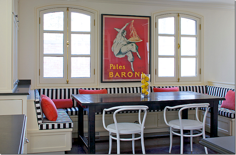
The breakfast room with a wrap around banquette.
Gatehouse #2
This gatehouse is currently for sale for $2,295,000. It has 5 bedrooms and 3 1/2 bathrooms and is almost 5,000 sq. ft. This house, like the other gatehouse, was greatly extended – but these architects took a much different approach to the addition. I think I prefer this house to gatehouse #1. Like the manor house, these house needs a little decorating updating – new paint colors and fabrics – but the furniture is very pretty! Not much needs to be done to this house at all!
The exterior of gatehouse #2 remains exactly as it was when built. The garage is off to the right, and it too resembles the French style of the gatehouses.
The two gatehouses are painted the same to keep continuity.
The original gatehouse now holds the kitchen and the study. The living room and master bedroom are part of the new addition.
Upstairs, the two front bedrooms are located it the original house, while the family room and back bedrooms are new.
Facing the new living room is a water rill which resembles the water feature in the Manor house.
The old house holds the kitchen, which is behind the brick wall in a secluded garden. Like the previous gatehouse, the windows were built to be the same as the old ones.
The arrangement of the house takes in the wonderful, green wooded view. The lot size is 1 acre. All the major rooms overlook this area of the yard.
The new living room/dining room overlooks the backyard and water rill. They have placed the dining room in the middle of the room. Not sure I would do that. In fact, this set up reminds of blogger/designer Penelope Bianchi’s fabulous living room. I would try to emulate her aesthetic in this room if I decorated this house:
Penelope Bianchi’s living room:
Center table and dining table on one side. Love her house so much!
The red study is in the original part of the gatehouse.
And so is the kitchen. They added on the breakfast room, though.
The master bedroom.
A charming upstairs bedroom.
Which gatehouse did you prefer? The more modern one, or this one that is for sale? I think I like this one best.
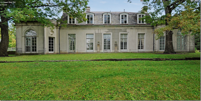
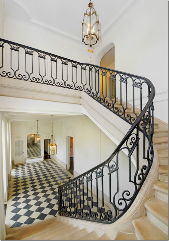
And finally – care to own and totally renovate your own David Adler mansion? Adler’s Ralph Poole estate is now for sale. Built in 1913, the French styled house once was located on a much larger plot of land, but today – it measures 8.26 acres and the house is over 9,000 sq. ft. The house has a slate roof, 13 ft ceilings, terrazzo floors, boiserie and stucco walls and a gorgeous stone staircase. The problem? It needs a massive renovation!!! The house is just under $2 million HERE.
Adler modeled the symmetrically designed house after a mansion in France and a hotel. The similarities in the design elements between this house and the Carolyn Morse Ely house are striking.
To enter the estate – there is a hidden road. The road leads only to this house and no neighbor’s houses.
Aerial view - in summer the house is totally surrounded by forest land. The 3 car garage with quarters is to the right. The swimming pool and house is off to the left, not seen. The landscaping has to be put in – there is no landscaping at all.
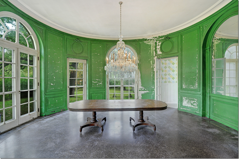
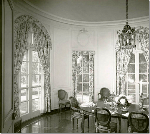
The house is symmetrically designed with two round shaped rooms on each side – the dining room and the porch which is now enclosed. The rooms are on an enfilade – but note, the house is NOT a Lanterne like the Ely house because the house is not one room wide and the windows aren’t set up so you can see from the front side through to the backyard.
The view from the front door of the lawn and the private driveway.
The house has a French styled mansard roof with slate tiles. The windows and hardware are all original. This is really a beauty. With s lot of TLC and paint – this house would be stunning.
The view of the back yard. Again, it is totally symmetrically designed. At each end are the round shaped rooms.
The double front door opens to a beautiful gallery – with a stone staircase, original iron railings and windows. Amazing!
The view from upstairs. Through the center door is the living room.
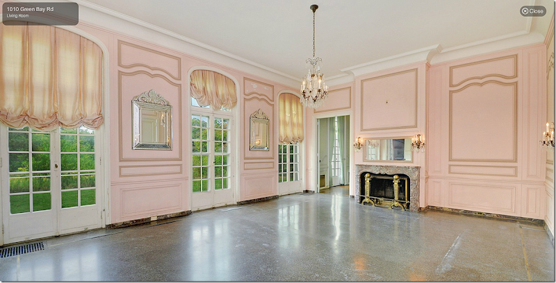
The living room is now painted pink – but imagine this repainted. The crystal chandeliers and sconces might be original. The floor is terrazzo. The ceilings downstairs are 13’ high. How would you decorate this house? Cluttered or sparse? French only – or a mix of different countries? Antiques or more contemporary furniture?
The dining room – this could be so beautiful. The crystal chandelier is not original, but still it is beautiful.
Here’s an early view. I would bring all the curtains up to the same height. But this shows how pretty this house could be with the right owner and designer.
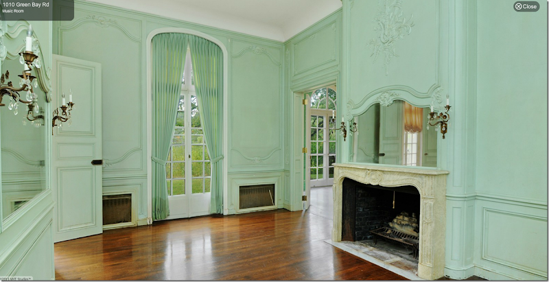
The rooms were designed for men and women. There is a music room for women and a gun room for men! Totally different than how the Carolyn Morse Ely house was designed – just for women.
Boy - they REALLY tried to ruin this house! The music room – again, this beautiful room is just crying out for a good decorator.
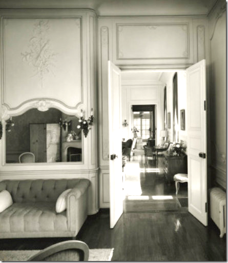
The enfilade from the music room to the living room through the library to the enclosed porch.
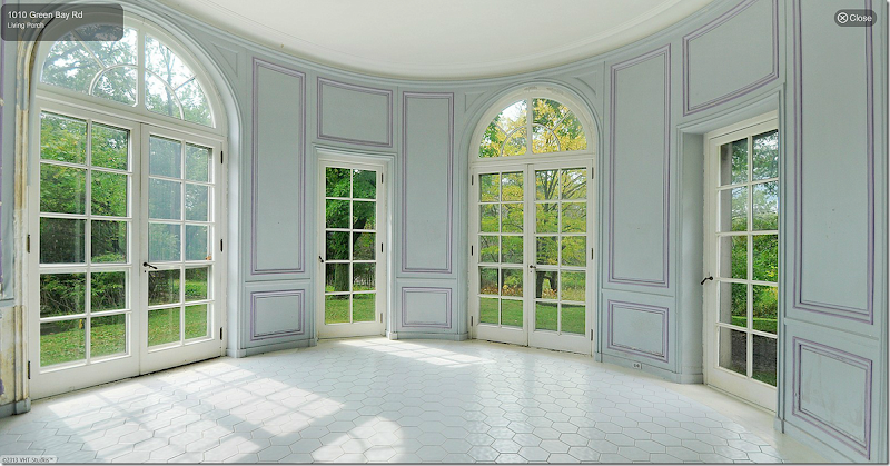
The oval porch. The guest room on the first floor could be turned into the master bedroom, while the gun room could be the bathroom and closet. AND, this room could be the master bedroom sitting room. Upstairs would be the children’s rooms.
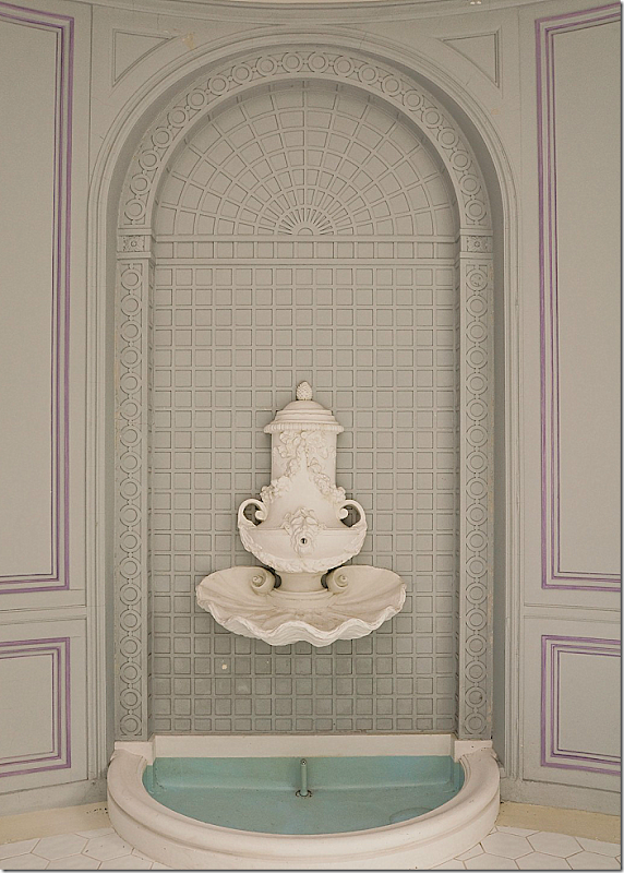
A fountain in the living porch.
The kitchen with its servants dining room – is a total redo.
The guest room that could become the master bedroom.
My Vision for This House:
I would probably decorate this house with a European feel – like this house in Belgium.
Or maybe a more American feel – like this room designed by Windsor Smith. I would definitely use cool colors in the house.
Or this quiet look – with glorious antiques – by Pamela Pierce.
The dining room could be ethereal looking like this room.
This would be a good look for the dining room – cool grays, French antiques.
How would you decorate this house? Does this make you want an old house as opposed to a new house? Or would it be just too much work to restore a house like this? At 2 million it looks like a bargain compared to the Ely house – but the renovations would probably be at least another million? Which house do you like better, this one or the Lanterne house – or do you prefer the smaller gatehouses?
SO many questions!!!















![[image_thumb167%255B2%255D.png]](http://lh3.ggpht.com/-DlErQ9NujJA/UZFo9xkm_mI/AAAAAAAB0wY/1aGEHfFzTmY/s1600/image_thumb167%25255B2%25255D.png)
