I am obsessed with before and after pictures where small, dated and unattractive beach condominiums are turned into chic, beautiful vacation spots. For years Ben and I rented the ugliest condos at the beach and the entire time we were there I would think of what I would do to update it if we owned it. I would try to make our rentals more attractive for our stay – I would pack loose slipcovers and bright, trendy pillows. As soon as we arrived – I would go around the condo and put all the accessories and tacky wall hangings in a back closet. A few years ago, I wrote a story about my feeble attempts at making a rental unit look more homey. HERE.
This is the reason why when I spotted a blog story about a vacation condo makeover I was completely obsessed! The condo was similar in size and style to what Ben and I rent at the beach – but, the After photographs were incredible. I loved what the designer did and when I looked at her portfolio, I found that I loved her aesthetic. I was in awe of her abilities to completely update her condo – and to be honest, I was a little jealous too! I saw her choices and knew I would probably have never thought to do what she had done.
At the time I asked her if I could feature her condo and we decided to wait until her new web site went online, etc, etc. Cut to some time later – and here we finally are! A new website to go along with this story about Jennifer Schoenberger of Jennifer Schoenberger Design. Jennifer lives outside of Atlanta, Georgia and she writes the charming blog – Vreeland Road HERE.
Today, I am so excited to show her condo along with some of her own home!
Enjoy!
BEACH HOUSE
First, let’s look at the beach condo in Florida that caught my attention a few years ago. At first, Jennifer kept the identity of the client a secret, but later, she admitted that she and her husband actually owned it themselves. It is a small, one bedroom unit, with bunk beds that provide additional sleeping arrangements.
The unit came with an ocean view – and was a great price – which made it all the more attractive. The problem of one bedroom was solved with the bunk beds, and so Jennifer embarked on the total redo.
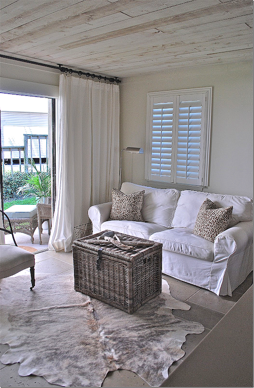
She made two design decisions that became the focal point of the unit and really turned the ugly into chic. First, on the floors she laid Peacock Pavers stone flooring – it’s a creamy tile that is beach friendly and beautiful. Next, she put rough hewn cedar planks on the ceiling, replacing the popcorn that was previously there. The ceilings are stunning. They look like driftwood and are a perfect choice for the beach – plus they add so much atmosphere and décor. They are just fabulous.
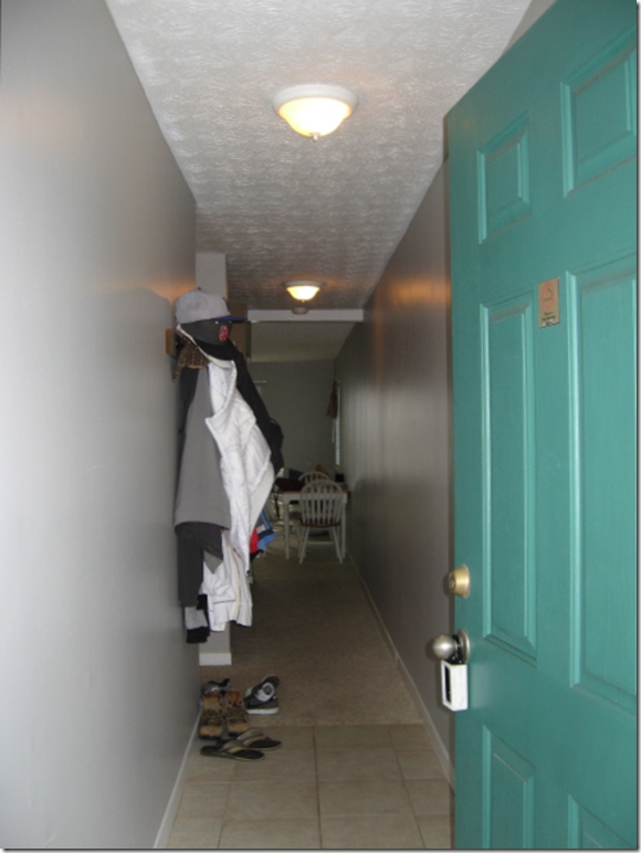
BEFORE: When you enter the unit, you go down a long hall – the bunks are on the left, past the hanging jackets. At the end of the hall is the living room/kitchen. Notice the dingy, once-was-white carpet past the tiled foyer and the popcorn ceiling. Now, look at this same space today:
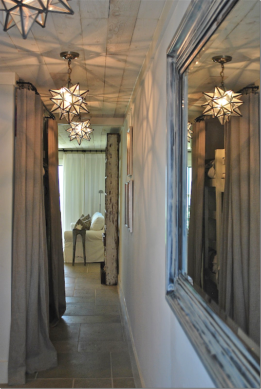
Wow. The star lanterns make a huge statement – available HERE. Notice the pavers – how they flow from the hall to the living area. At the left are the bunk beds – hiding behind a linen curtain (from Ikea!) unlined and breezy. She repainted the black mirror on the right to look more beachy. And – notice the planked ceiling! What a huge difference!!! I love the row of lanterns and the shadows they make are so lively in this enclosed space - another great choice Jennifer made.
Here is the living/dining area.
The other side of the room.
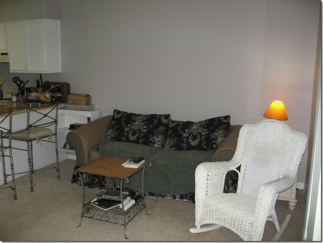
And a before picture of the kitchen, which was completely gutted.
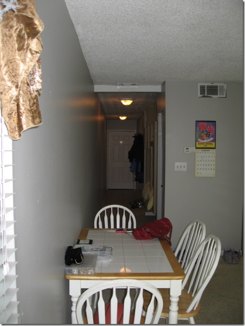
This is the view looking down the hall to the front door – the bunks are on the right.
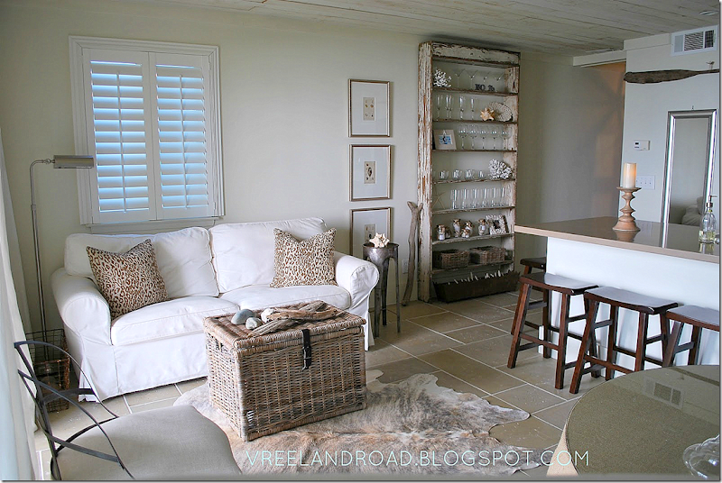
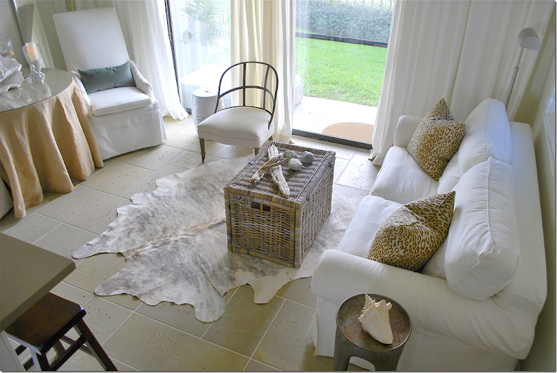
And after: Jennifer used a white slipcover sofa along one wall with a skirted table and two taller slipped chairs along the other side wall. The Kubu basket doubles as a coffee table and adds a beachy vibe. After splurging on the basics – the tiled floor and cedar ceiling, she was thrifty with the décor, though it doesn’t show. The sofa, hide rug, baskets and curtains all came from Ikea!! Doesn’t it look wonderful? The two chairs are from Lee Industries while the burlap skirted table is from Ballard Designs. The custom pillows in a cheetah print and velvet add just a touch of luxe.
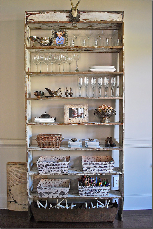
Another view – this shows the antique piece that divides the living room from the hall. It’s a wonderful piece. And like I always say – one antique piece of furniture in a room is so important to the décor. The shelf adds so much and it makes all the other furniture look that much nicer – it is a stunner.
The chippy shelf has just enough paint left on it – it looks like a piece of driftwood. The shelf is very functional and holds the Ikea glasses and plates.
An earlier view – with different styling. I love the wood stick next to it and the shell prints.
This picture gives you a nice view of the planked ceilings. Aren’t the Ikea curtains perfect??
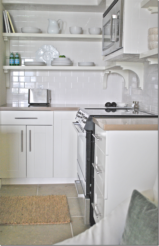
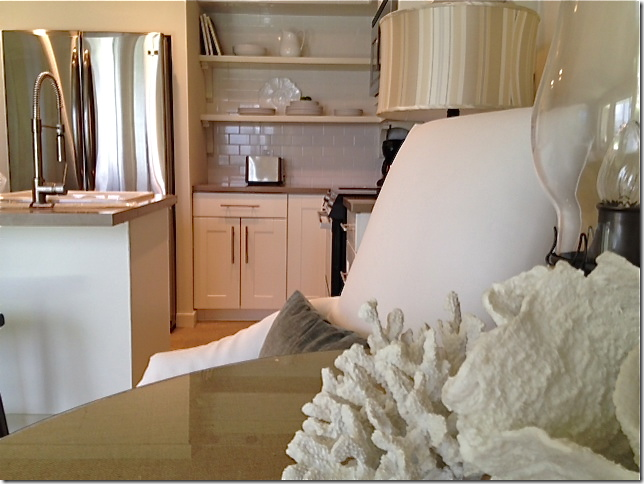
And here’s a look at the kitchen. The footprint remained basically the same – but it was completely gutted. The wall that separated the two areas was removed – instead there is an island that allows traffic to move easier. And the island is much more open than the bar wall that was there before. Upper cabinets were removed and the refrigerator was given a built in look.
The subway tile was continued up the wall for a more finished look. Something to remember: run backsplashes up as high as you can. Again – it really is a great look.
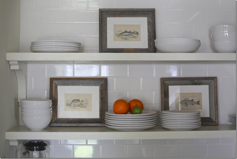
A look at the more recent styling job. Jennifer added fish prints to break up the expanse of white.
And here- you can see how she enclosed the refrigerator in the cabinetry, giving it the look of a built in. I did this in my kitchen too – it’s much cheaper than buying a Sub-Zero!
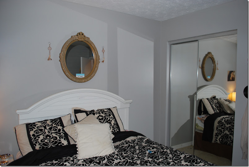
Before: the bedroom had a wall of sliding glass doors.
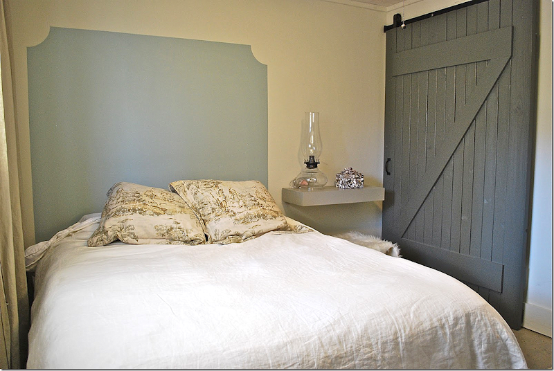
And after – Jennifer installed a rolling barn door with a z-motif. This opens up the closet – makes it much easier to get inside it. She painted on a headboard and installed a shelf, instead of a nightstand. Along the window are floor to ceiling linen curtains.
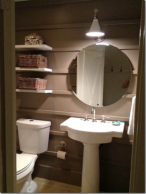
Before: The bathroom was also gutted – she added a shower door and new sink.
The bathroom today - Jennifer painted it dark to make it more dramatic and added molding strips along the walls. a simple vanity sink was added, along with a new pendant light and hanging shelves.
And, on the door – she added molding strips – in an X shape.
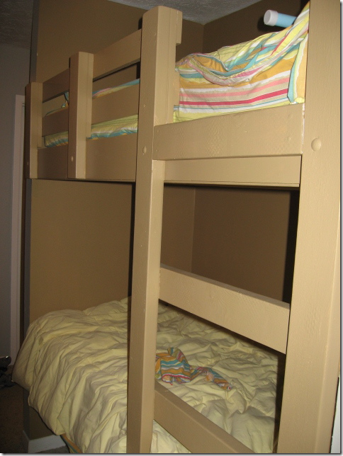
Here is a look at the bunk beds, before.
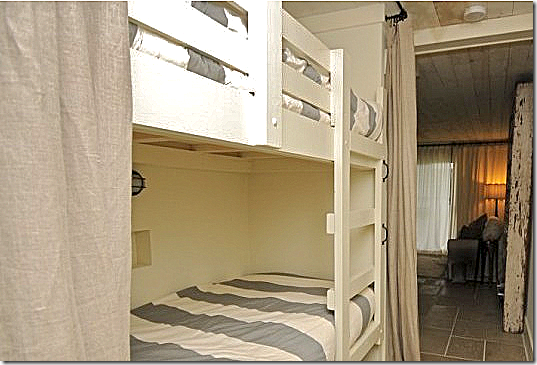
And today - behind the Ikea linen curtains, she added a light at each bunk and West Elm sheets, along with a new paint job.
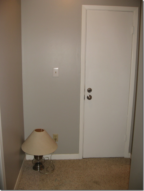
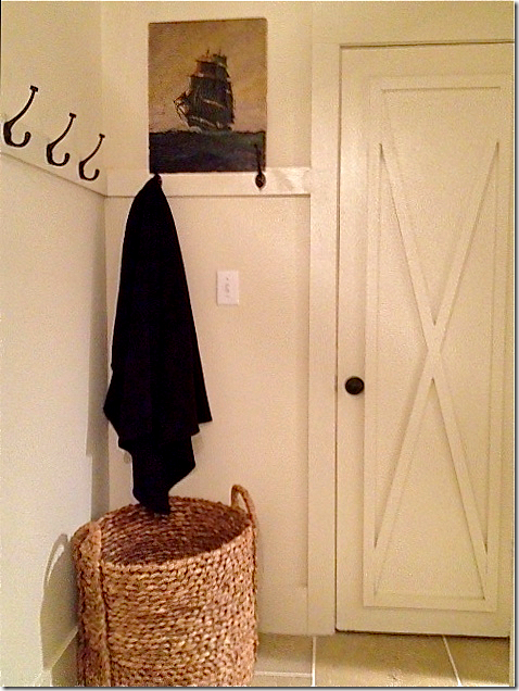
This before and after says it all. The laundry room door, at the end of the hall, was truly nothing to look at.
But with paint and the x molding on the door, along with a strip of molding with hooks on it – and a large wicker basket, the space is styled for a magazine. The X on all the doors was created by using 1 x 2 trim molding.
It is all these touches – like the x motif, the wood planked ceiling, the redesigned kitchen, the barn door on the closet – that really shows Jennifer’s abilities.
By the way – if you would like to rent this condo – in Seagrove Beach, Florida, go HERE for more information.
Jennifer’s House
After living in their house for 10 years, Jennifer and her husband are moving to a new place! Renovating and styling a new house will provide lots of material for her blog (lucky!!) and I can’t wait to see what she does with her new home. She sent me some pictures of the house they are selling – and again, these pictures show off her great style.
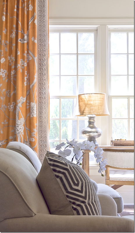
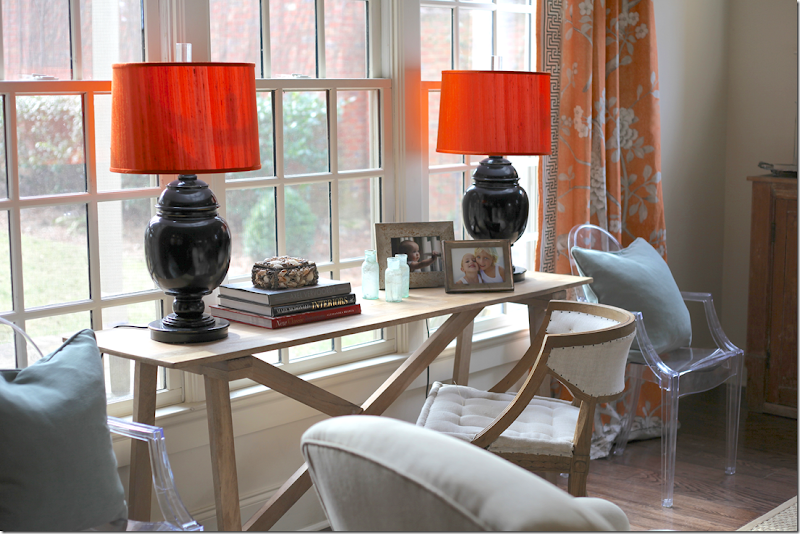
In the family room, the curtains and trim are by Mary McDonald’s fabric line for F. Schumacher. Love!!! Also, the pillow is another McDonald fabric.
Against the large window, light blue pillows against the deep apricot of the fabric.
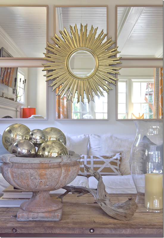
The couch sits under a mass of mirrors with a sunburst mirror layered over them. Another great idea for filling up a large expanse of wall.
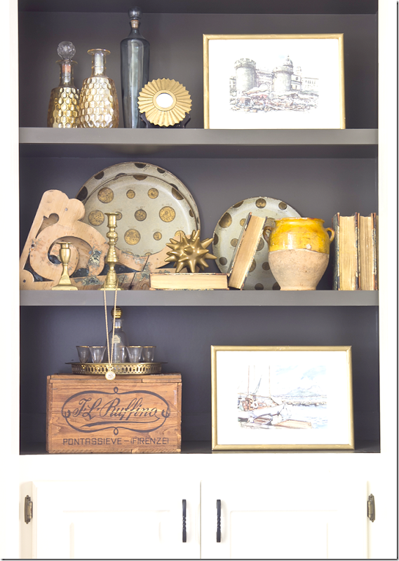
An example of Jennifer’s styling. She painted the shelves dark which shows off her accessories much better than plain white walls.
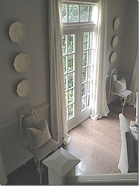
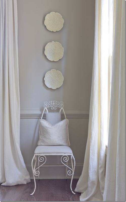
The dining room is a study in gray. An oversized fixture is the focal point.
Jennifer and I share a love of symmetry. I feel better when a design is symmetrically balanced.
Flanking the front window is a pair of French vintage chairs. I love this touch of fun!
And flanking the door that leads to the kitchen are a pair of skirted rectangular tables.
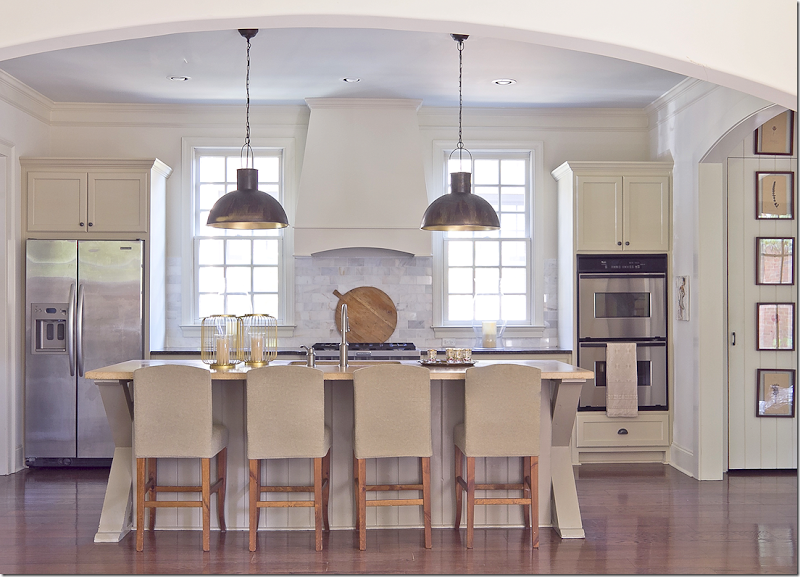
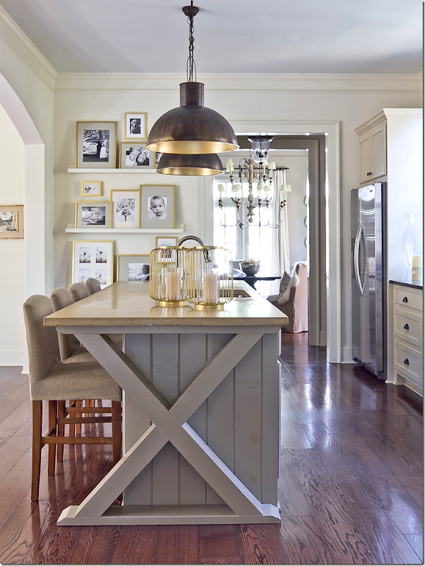
Jennifer’s kitchen is stunning. Again – a study in symmetry. I love the way the windows flank the stove hood and the appliances are on either side of them. The pendants are perfectly placed in front of each picture. The kitchen opens to the family room through an enlarged arch.
And, at the end of the island is Jennifer’s favorite X motif! Love it!!
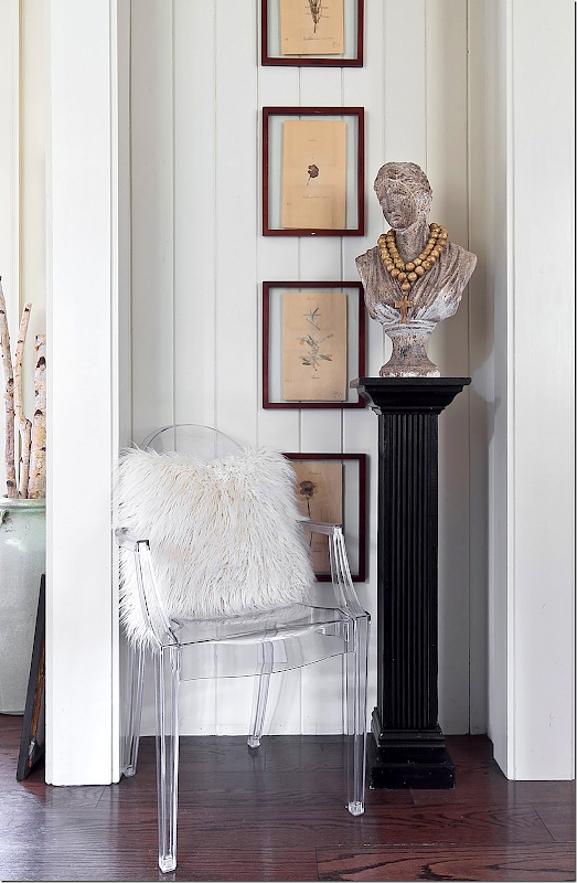
Jennifer had beadboard installed in small hallways to add interest.
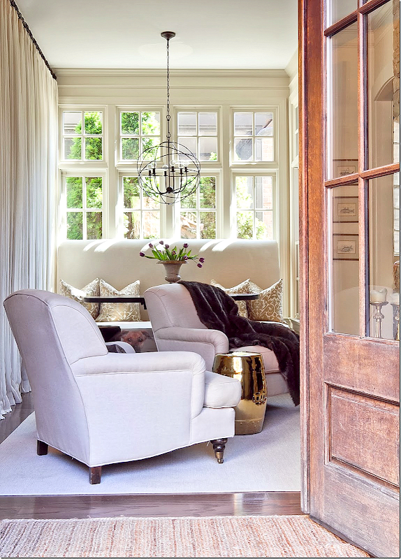
The Keeping Room has a large banquette that sits in front of the window. A wall of sheer curtains is on the left.
In front of the banquette is two chairs that sit by the fireplace.
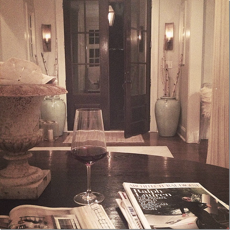
And, a night view of the keeping room – looking towards the back French door.
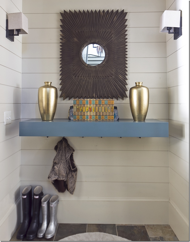
Jennifer recently updated the mud room, making it a bit more contemporary with new sconces and a hanging shelf.
Jennifer’s office – I love the two stools instead of chairs. And the crystal chandelier is a good juxtaposition to all the rough luxe.
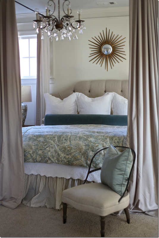
In Jennifer’s bedroom – she added a canopy by attaching hardware to the ceiling. This is a simple way to get a canopy bed and such a great idea.
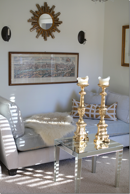
And the sitting area in her bedroom with symmetrical wall hangings.
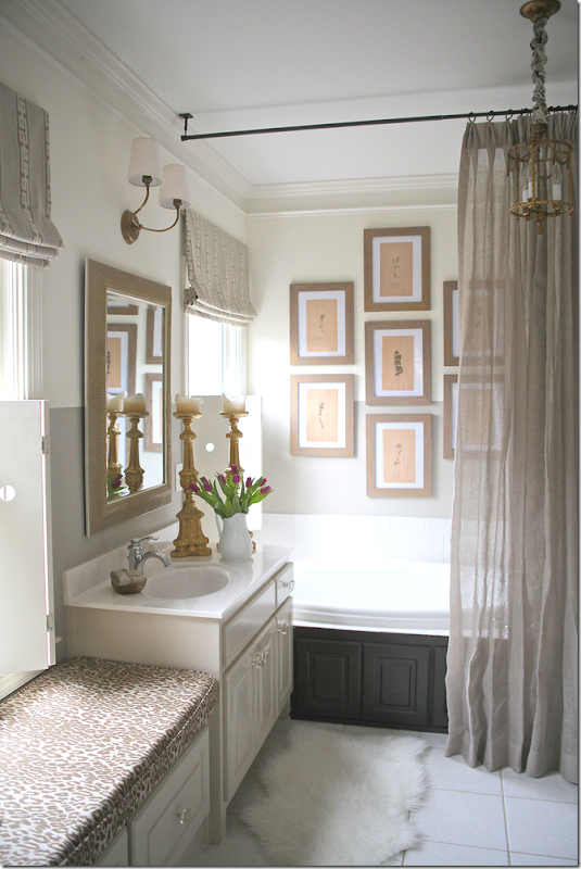
Finally, her bathroom with a set of Ikea framed prints and a linen curtain. Love the light over the mirror.
This photograph is from Jennifer’s portfolio. To see more of her work, be sure to visit her Web site – HERE. From there, you can access her blog.
A HUGE thank you to Jennifer Schoenberger for letting us peruse her portfolio. I hope you got a few ideas for your own house!! I know I did!

