I am obsessed with before and after pictures where small, dated and unattractive beach condominiums are turned into chic, beautiful vacation spots. For years Ben and I rented the ugliest condos at the beach and the entire time we were there I would think of what I would do to update it if we owned it. I would try to make our rentals more attractive for our stay – I would pack loose slipcovers and bright, trendy pillows. As soon as we arrived – I would go around the condo and put all the accessories and tacky wall hangings in a back closet. A few years ago, I wrote a story about my feeble attempts at making a rental unit look more homey. HERE.
This is the reason why when I spotted a blog story about a vacation condo makeover I was completely obsessed! The condo was similar in size and style to what Ben and I rent at the beach – but, the After photographs were incredible. I loved what the designer did and when I looked at her portfolio, I found that I loved her aesthetic. I was in awe of her abilities to completely update her condo – and to be honest, I was a little jealous too! I saw her choices and knew I would probably have never thought to do what she had done.
At the time I asked her if I could feature her condo and we decided to wait until her new web site went online, etc, etc. Cut to some time later – and here we finally are! A new website to go along with this story about Jennifer Schoenberger of Jennifer Schoenberger Design. Jennifer lives outside of Atlanta, Georgia and she writes the charming blog – Vreeland Road HERE.
Today, I am so excited to show her condo along with some of her own home!
Enjoy!
BEACH HOUSE
First, let’s look at the beach condo in Florida that caught my attention a few years ago. At first, Jennifer kept the identity of the client a secret, but later, she admitted that she and her husband actually owned it themselves. It is a small, one bedroom unit, with bunk beds that provide additional sleeping arrangements.
The unit came with an ocean view – and was a great price – which made it all the more attractive. The problem of one bedroom was solved with the bunk beds, and so Jennifer embarked on the total redo.
She made two design decisions that became the focal point of the unit and really turned the ugly into chic. First, on the floors she laid Peacock Pavers stone flooring – it’s a creamy tile that is beach friendly and beautiful. Next, she put rough hewn cedar planks on the ceiling, replacing the popcorn that was previously there. The ceilings are stunning. They look like driftwood and are a perfect choice for the beach – plus they add so much atmosphere and décor. They are just fabulous.
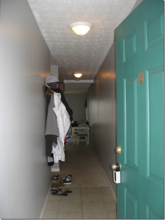
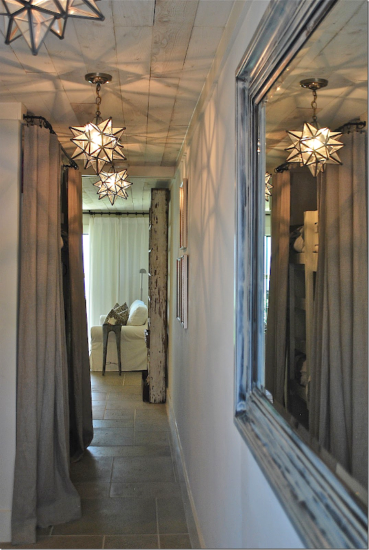
BEFORE: When you enter the unit, you go down a long hall – the bunks are on the left, past the hanging jackets. At the end of the hall is the living room/kitchen. Notice the dingy, once-was-white carpet past the tiled foyer and the popcorn ceiling. Now, look at this same space today:
Wow. The star lanterns make a huge statement – available HERE. Notice the pavers – how they flow from the hall to the living area. At the left are the bunk beds – hiding behind a linen curtain (from Ikea!) unlined and breezy. She repainted the black mirror on the right to look more beachy. And – notice the planked ceiling! What a huge difference!!! I love the row of lanterns and the shadows they make are so lively in this enclosed space - another great choice Jennifer made.
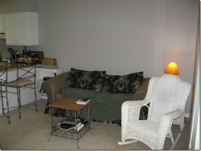
Here is the living/dining area.
The other side of the room.
And a before picture of the kitchen, which was completely gutted.
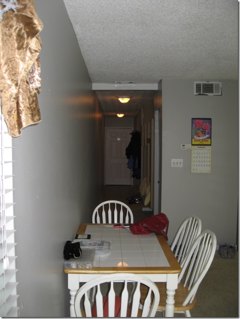
This is the view looking down the hall to the front door – the bunks are on the right.
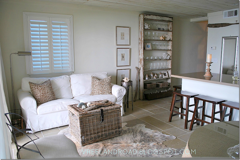
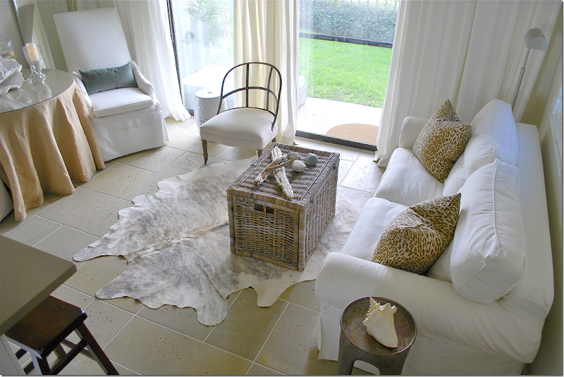
And after: Jennifer used a white slipcover sofa along one wall with a skirted table and two taller slipped chairs along the other side wall. The Kubu basket doubles as a coffee table and adds a beachy vibe. After splurging on the basics – the tiled floor and cedar ceiling, she was thrifty with the décor, though it doesn’t show. The sofa, hide rug, baskets and curtains all came from Ikea!! Doesn’t it look wonderful? The two chairs are from Lee Industries while the burlap skirted table is from Ballard Designs. The custom pillows in a cheetah print and velvet add just a touch of luxe.
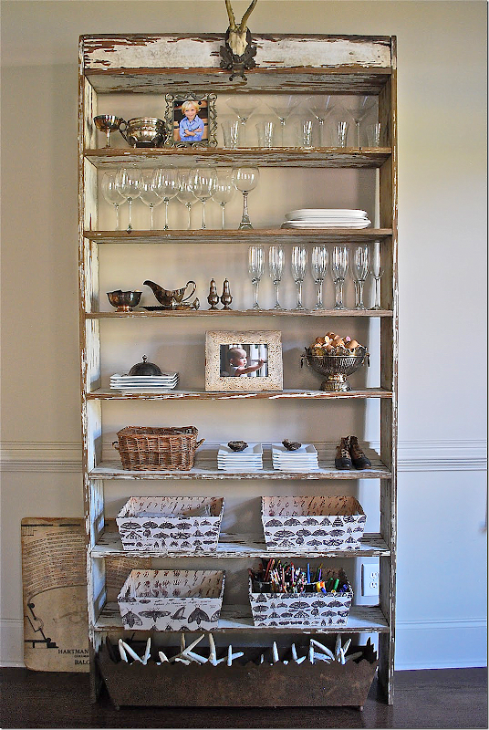
Another view – this shows the antique piece that divides the living room from the hall. It’s a wonderful piece. And like I always say – one antique piece of furniture in a room is so important to the décor. The shelf adds so much and it makes all the other furniture look that much nicer – it is a stunner.
The chippy shelf has just enough paint left on it – it looks like a piece of driftwood. The shelf is very functional and holds the Ikea glasses and plates.
An earlier view – with different styling. I love the wood stick next to it and the shell prints.
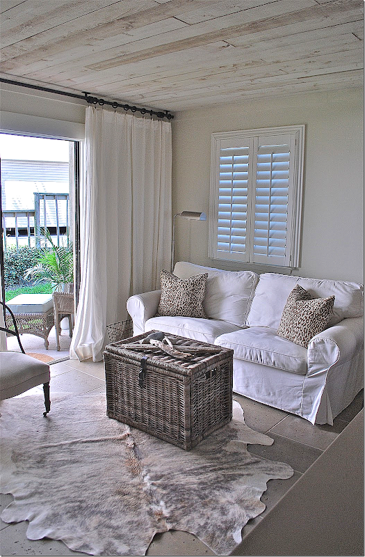
This picture gives you a nice view of the planked ceilings. Aren’t the Ikea curtains perfect??
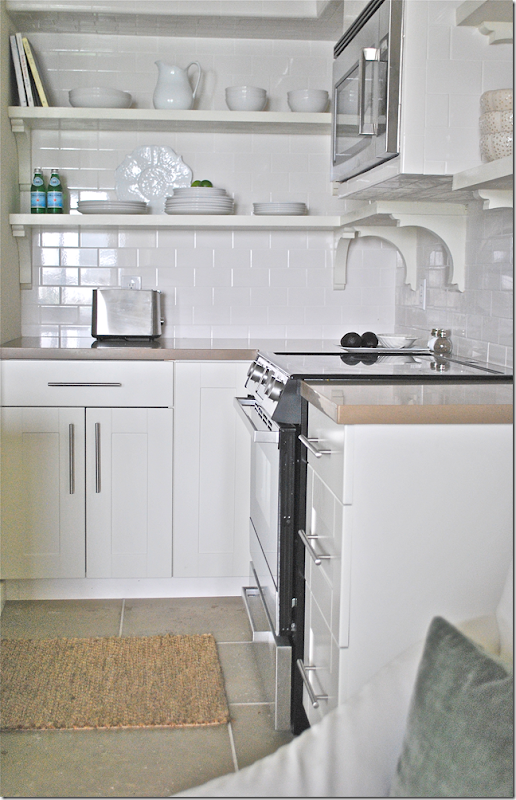
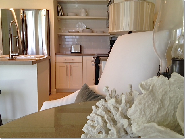
And here’s a look at the kitchen. The footprint remained basically the same – but it was completely gutted. The wall that separated the two areas was removed – instead there is an island that allows traffic to move easier. And the island is much more open than the bar wall that was there before. Upper cabinets were removed and the refrigerator was given a built in look.
The subway tile was continued up the wall for a more finished look. Something to remember: run backsplashes up as high as you can. Again – it really is a great look.
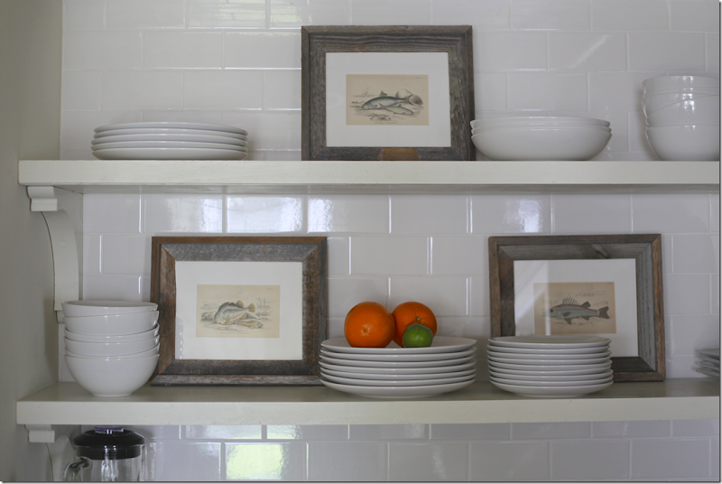
A look at the more recent styling job. Jennifer added fish prints to break up the expanse of white.
And here- you can see how she enclosed the refrigerator in the cabinetry, giving it the look of a built in. I did this in my kitchen too – it’s much cheaper than buying a Sub-Zero!
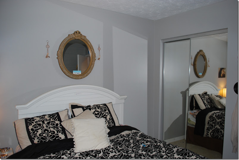
Before: the bedroom had a wall of sliding glass doors.
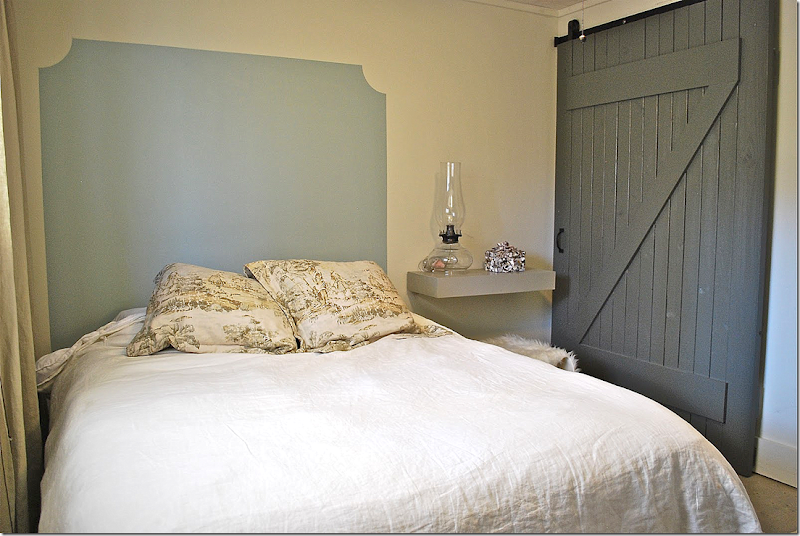
And after – Jennifer installed a rolling barn door with a z-motif. This opens up the closet – makes it much easier to get inside it. She painted on a headboard and installed a shelf, instead of a nightstand. Along the window are floor to ceiling linen curtains.
Before: The bathroom was also gutted – she added a shower door and new sink.
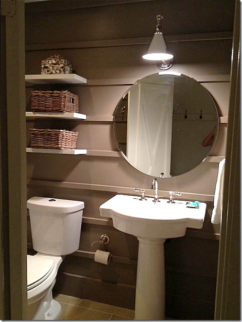
The bathroom today - Jennifer painted it dark to make it more dramatic and added molding strips along the walls. a simple vanity sink was added, along with a new pendant light and hanging shelves.
And, on the door – she added molding strips – in an X shape.
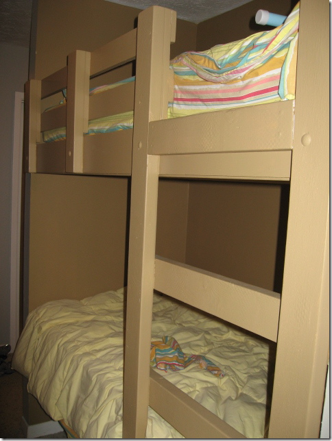
Here is a look at the bunk beds, before.
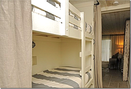
And today - behind the Ikea linen curtains, she added a light at each bunk and West Elm sheets, along with a new paint job.
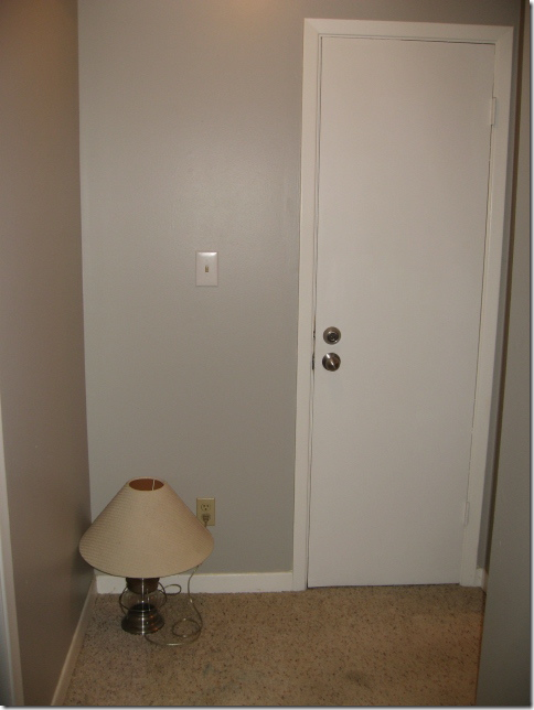
This before and after says it all. The laundry room door, at the end of the hall, was truly nothing to look at.
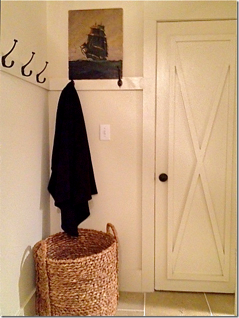
But with paint and the x molding on the door, along with a strip of molding with hooks on it – and a large wicker basket, the space is styled for a magazine. The X on all the doors was created by using 1 x 2 trim molding.
It is all these touches – like the x motif, the wood planked ceiling, the redesigned kitchen, the barn door on the closet – that really shows Jennifer’s abilities.
By the way – if you would like to rent this condo – in Seagrove Beach, Florida, go HERE for more information.
Jennifer’s House
After living in their house for 10 years, Jennifer and her husband are moving to a new place! Renovating and styling a new house will provide lots of material for her blog (lucky!!) and I can’t wait to see what she does with her new home. She sent me some pictures of the house they are selling – and again, these pictures show off her great style.
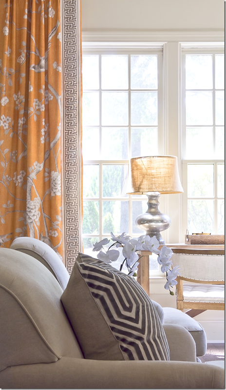
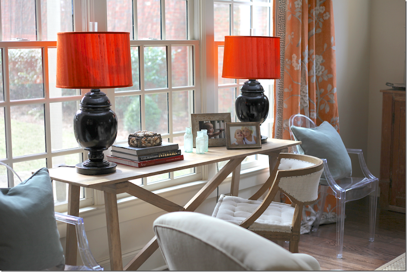
In the family room, the curtains and trim are by Mary McDonald’s fabric line for F. Schumacher. Love!!! Also, the pillow is another McDonald fabric.
Against the large window, light blue pillows against the deep apricot of the fabric.
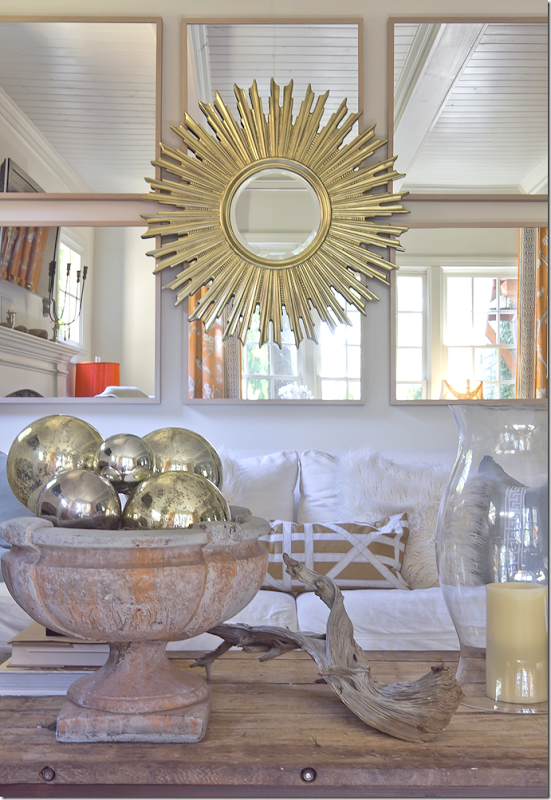
The couch sits under a mass of mirrors with a sunburst mirror layered over them. Another great idea for filling up a large expanse of wall.
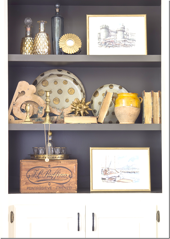
An example of Jennifer’s styling. She painted the shelves dark which shows off her accessories much better than plain white walls.
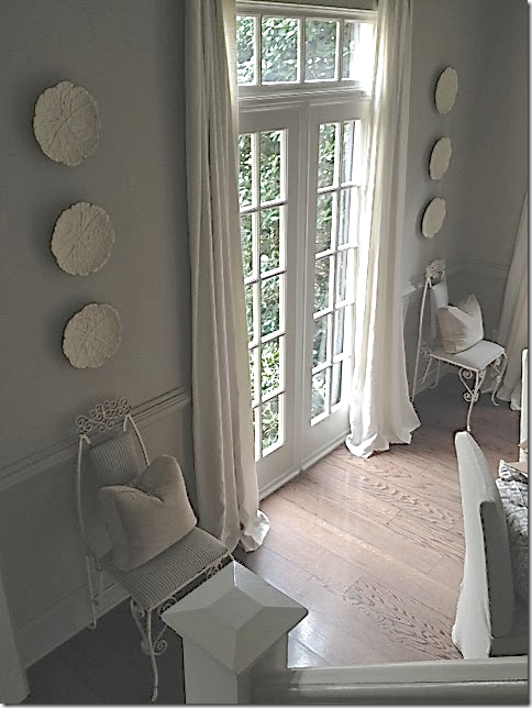
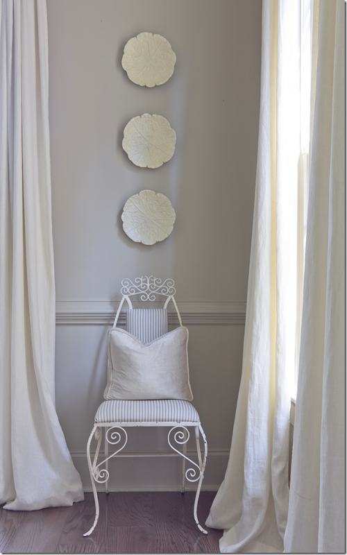
The dining room is a study in gray. An oversized fixture is the focal point.
Jennifer and I share a love of symmetry. I feel better when a design is symmetrically balanced.
Flanking the front window is a pair of French vintage chairs. I love this touch of fun!
And flanking the door that leads to the kitchen are a pair of skirted rectangular tables.
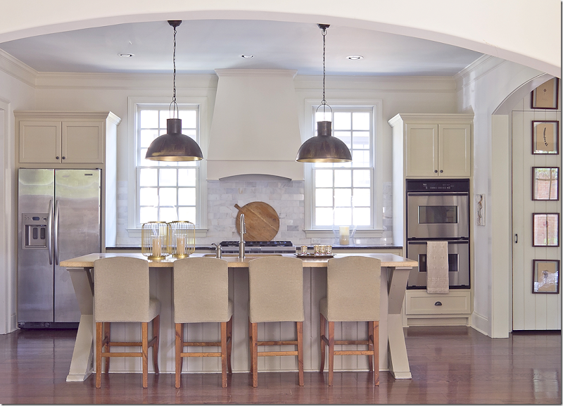
Jennifer’s kitchen is stunning. Again – a study in symmetry. I love the way the windows flank the stove hood and the appliances are on either side of them. The pendants are perfectly placed in front of each picture. The kitchen opens to the family room through an enlarged arch.
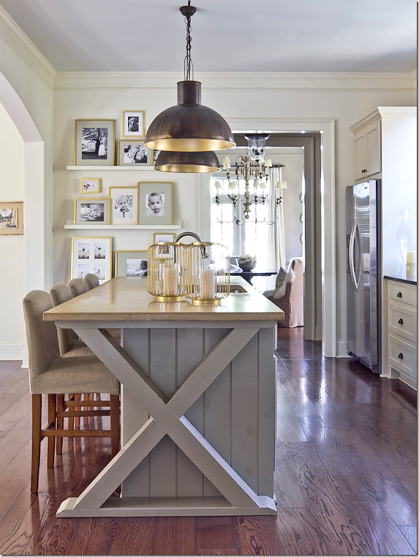
And, at the end of the island is Jennifer’s favorite X motif! Love it!!
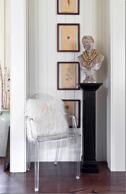
Jennifer had beadboard installed in small hallways to add interest.
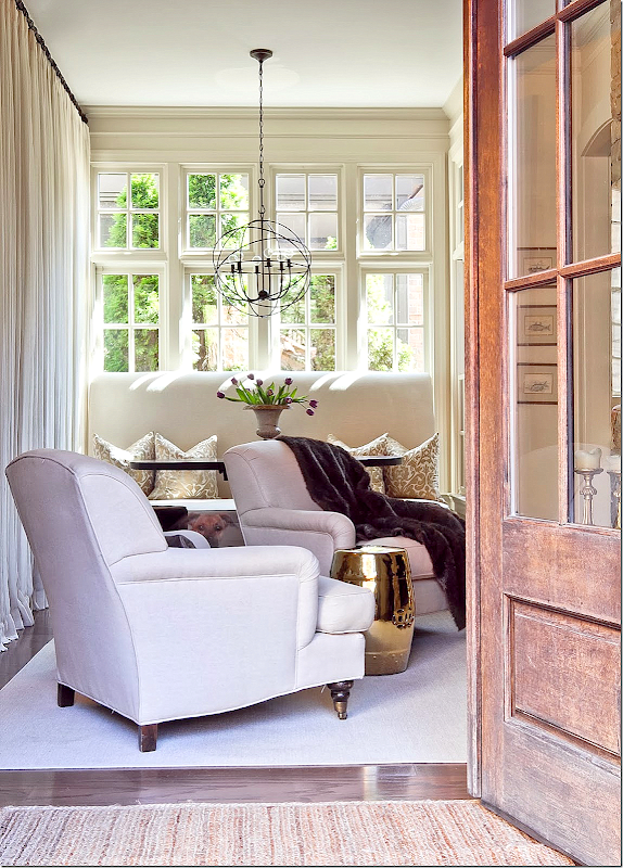
The Keeping Room has a large banquette that sits in front of the window. A wall of sheer curtains is on the left.
In front of the banquette is two chairs that sit by the fireplace.
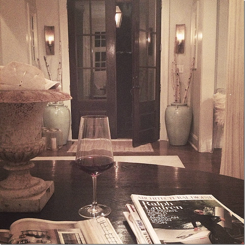
And, a night view of the keeping room – looking towards the back French door.
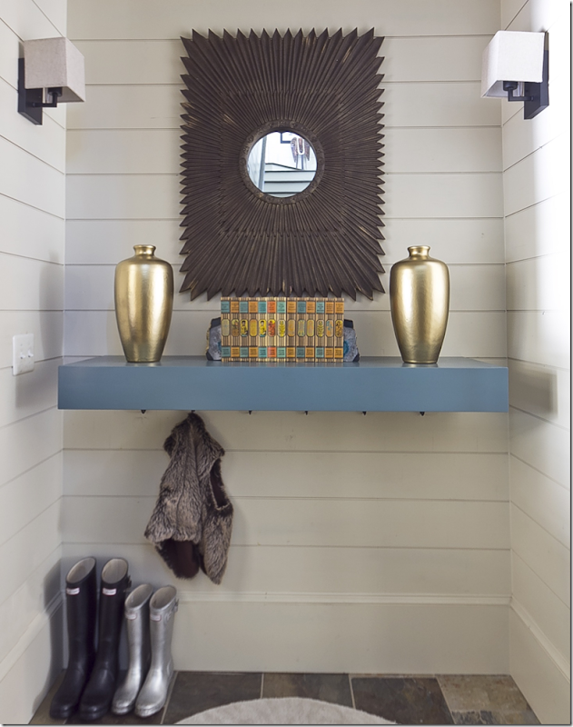
Jennifer recently updated the mud room, making it a bit more contemporary with new sconces and a hanging shelf.
Jennifer’s office – I love the two stools instead of chairs. And the crystal chandelier is a good juxtaposition to all the rough luxe.
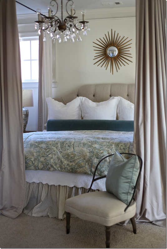
In Jennifer’s bedroom – she added a canopy by attaching hardware to the ceiling. This is a simple way to get a canopy bed and such a great idea.
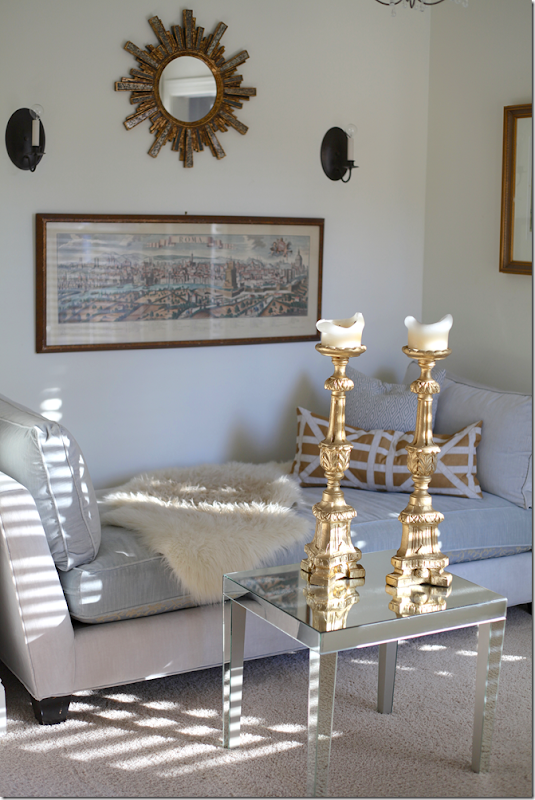
And the sitting area in her bedroom with symmetrical wall hangings.
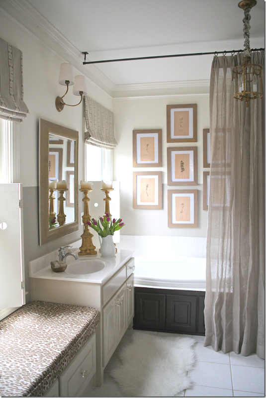
Finally, her bathroom with a set of Ikea framed prints and a linen curtain. Love the light over the mirror.
This photograph is from Jennifer’s portfolio. To see more of her work, be sure to visit her Web site – HERE. From there, you can access her blog.
A HUGE thank you to Jennifer Schoenberger for letting us peruse her portfolio. I hope you got a few ideas for your own house!! I know I did!
Ideas From A Talented Interior Designer
Subscribe to:
Post Comments
(
Atom
)













I love Jennifer's sense of style. What she did to that condo is amazing, and I can only imagine her new home will be as stunning as the current one. (Love that Mary McDonald drapery fabric!).
ReplyDeleteThis type of message always inspiring and I prefer to read quality content, so happy to find good place to many here in the post, the writing is just great, thanks for the post.AutoCAD drawings
DeleteA very creative person with lots of style. Thanks for sharing! Love the condo kitchen makeover and her own home's kitchen.
ReplyDeleteGreat vision and creativity. Loved this!
ReplyDeleteWonderful ceiling planking in the beach house!
ReplyDeleteObat Vimax Asli
DeleteFarmasi Obat Herbal
Thanks for sharing Jonie! I got A LOT of ideas for my own house!
ReplyDeleteI love almost every house that you show, but this one is an immediate favorite! It is very kid-friendly. It doesn't look breakable or staged. It looks comfortable! I love that! I'm going to go check out her blog!
Thanks for the great inspiration!
Have a great day!
Candi
Great beach condo. Thanks for sharing!
ReplyDeleteI've been following Jennifer for a while - she really is super talented! Her style is so fresh. And, I love her unexpected mix of organic, modern and feminine elements. xo
ReplyDeleteYes she took the saddest little condo I think I have ever seen to a great level.
ReplyDeleteMy favorite is the entry redo, super lighting choice. The bunks look so much better, I would have shot that with the curtain pulled back. Nice post!
Saddest little condo is right. I certainly believe she used some serious imagination, but it's still tiny and cramped. I would not want to be there with a family, even small children.
DeleteI agree, it is beautiful but still tiny and I would be afraid I would break something
DeleteGreat post! I will definitely start following her....very talented! Is there anyway she might share her paint colors? I am looking to do something similar, and I am having a hard time deciding. Thanks so much!
ReplyDeleteOh, those Florida condos...I haul rugs, folding screens, move all the (plastic) plants out to the sun-porch, hang my swing, Moroccan fabric over the (plastic) headboard...well...you get the picture. Fab job...the gal's GOT IT!! franki
ReplyDeleteshe is certainly talented + thanks for the introduction. xxpeggybraswelldesign.com.
ReplyDeleteJoni, this is my favorite post in a very long time! Love all of it, every single photo! Pinning away now!!!
ReplyDeleteThe beach condo is really impressive - I think a lot of her ideas could be adapted to a ski condo (many of the ones I've looked at are of similar vintage and craftsmanship). I love the way she's blended her sense of style with less expensive accessories and the way she has spent her decorating budget strategically.
ReplyDeleteJennifer is my girl....she is so talented and so REAL!!! I have seen her house in person and it is stunning!
ReplyDeleteStayed in similar condo reno in Destin, designer used color too.....
ReplyDeleteOff topic, did you notice in new Traditional Home they airbrushed all the window views?????? Have been emailing them photography complaints for months about the horrendous garden views. Zero response. Yet, obvious they read my every note. FINALLY!
GARDEN & BE WELL, XO TARA
Such a wonderful post! My family will be very happy to learn that I am not the only one to hide some of the decor in the beach condo we frequent. There is a dauphin statue that just annoys me and he goes promptly into a cabinet so I don't have to look at him. Also, so happy to know that I am not the only one dreaming of ways to make the condo look better if it were mine. It's like therapy!
ReplyDeleteLove the redo on this condo. The ceiling is such a smart idea and truly takes it from a 70's look to a very current, hip and happy place. The door decor is fabulous and truly makes the condo look like it was not built just like every other condo. The antique shelf is not only pretty, but so functional for the small space. Love the bathroom wall...it just screams beach. I would love to stay in this condo. It just makes me happy.
What an incredible transformation of the beach condo! LOVE the configuration, the white, and the kitchen looks much more roomier. Some comments on 2 things: I have that exact same IKEA white loveseat in my master bedroom. Luckily, it's hardly used because the seat pillows are terribly uncomfortable and really low. Can't imagine using that in a place where it gets regular use. Also, is anyone else tired of the subway tiles as kitchen backsplash? In a few years, that look will be really outdated. Gina from The Midwest
ReplyDeletesee- I think the Ikea sofa is really comforatble. my daughter has it and we love it. and subway is a classic. it will be around forever.
DeleteJennifer has done an outstanding job and put a lot of thought and creativity into this project. There is an upstart business I ran across on line that seeks to put buyers and creators together. It's dedicated to the people who want luxury items at a price they can afford. Perhaps your readers might enjoy taking a looks:
Deletehttp://www.theknockapp.com/
I really like what she did with the condo and her house - love the kitchen!
ReplyDeleteOK, I loved this post. I too enjoy her aesthetic. More than anything, I enjoyed her blog, he is funny and sassy.. We love spending spending time in Watersound along 30A, We've stayed in all of the little towns along there and finally found Watersound to be our favorite...it is like the Hamptons meets 30A and much more private and quiet. We do enjoy that outdoor theater in Seaside too. I have incorporated a lot of that 30 a (Tracery and Beau Interiors) aesthetic into my coastal homes. Thank you Joni. Also for turning me onto your cyber friends in Atlanta/Paris/Provence! I read these things to my hubby and he always laughs and says "She sounds like she could be your sister or bff." These blogs are fun for like-minded peeps to gather.
ReplyDeletexo
E
Great post Joni! We rented a condo in Seagrove Beach for years when our children were younger and I always wanted to decorate it too! Seems like I read in one of your much earlier blogs that you went to South Padre every summer. If you want to see some of the most beautiful beaches in America, I would urge you to head west on I 10 to the Florida panhandle. It's not that much of a longer drive but so worth with it. Most of the newer areas like Watersound and Rosemary beach have beautifully decorated homes and condos for rent.
ReplyDeleteActually, you should go east on I 10.
DeleteIt is refreshing to see a home styled with objets that truly reflect the taste of the owner and showcase items that might have some real meaning to that individual and/or family and NOT what happens to the current trend! Yet she manages to keep the feeling fresh, comfortable, and livable. I am so anxious to go to her website and blog. Think I found my new favorite designer! Thank you Joni for a thoroughly wonderful post. I hope to see more of Jennifer's talent here!
ReplyDeleteI love before and after pics too! Fun post! Thanks!
ReplyDeleteHi Joni, She did a beautiful job transforming the condo and her home is gorgeous! Many owners of beach condos don't update the units because they know they will be trashed by the tenants. We owned a beach house in Destin and we had so many things stolen, including the pictures right off the wall! After one year on the rental market it cost us $25,000 in repairs.
ReplyDeletexx,
Sherry
Very nice and attainable design! I love the mix of kid friendly and some adult influence, like the beautiful fabric and faux fur throws. I wish this designer gem was here in Texas!! Thanks for showing down to earth designs :) It's greatly appreciated.
ReplyDeleteAbsolutely love Jennifer * the place looks SO good!!! It doesn't even look like the same house!!
ReplyDeletexoxo,
lauren
This is so interesting to me. This beach condo really reminds me of the layout of our beach condo in NC. We bought a totally gross, oceanfront, 1 br condo with bunkbeds like hers (for a great price) and totally redid it ourselves. Our style is different, but I love Jennifer's.
ReplyDeleteI, too, love "before and afters" although some of the ones in AD are quite contrived because they only show the space after it was gutted. Back on topic, Betsy Speert has a current post on her blog, Betsy Speert, about what she did with her beach "shack" AND I DO MEAN SHACK in New England. Wait until you see what she did to turn it into a REALLY fab place. Cannot imagine why she ever let it go. But, it seems that Designers enjoy the project and then, once completed, want to move on to the next challenge. Anyway, an utterly fabulous renovation!
ReplyDeleteCharlotte Des Fleurs.
I love to rent places with a design aesthetic like this one. I wish there was a website or a convenient way to search for well-designed spaces-- you've inspired me!! I love that you do this, Joni. Thank you!
ReplyDeleteClip boards behind baskets on open shelving in the office! How clever!
ReplyDeleteI like the idea that you share here and I hope there is a fresh idea that can be shared in the future
ReplyDeleteIf later there was a chance I would like to exchange thoughts with you
Thank you very much for sharing interesting things here
obat kuat
Thank you Joni! These are my very favorite posts! Love her taste-just gorgeous!
ReplyDelete-linda, ny
AMAZING! What a talent!! Pinned away!! Thank you for introducing me to Jennifer.
ReplyDeleteone of my favorites has always been the keeping room in Jennifer's house which was designed by the fabulous Susan Ferrier, a well-known Atlanta designer....
ReplyDeleteHi, I saw the last picture on Pinterest. I think the kitchen with the blue barn door was designed by Lisa Gabrielson-Russo a designer in Atlanta? I've been following her for ages and it's also in her portfolio, and Pinterest page. I wondered who actually did that kitchen? Just trying to clear up a mystery. I think in fact it may have been Lisa and not Jennifer Shownenbeger..P.S. I love your blog one of my very favorites. I think I spend too much time on Pinterest because I start to recognize the work of different designers :), and I swear that kitchen was the work of Lisa Gabrielson.
ReplyDeleteThank you for sharing
ReplyDeleteI've been looking for, and it can be an idea from here
I hope to be useful also for other people
Vimax Asli Vimax Asli Obat Kuat Vmenplus
Cheng Chos
ReplyDeleteThank you for sharing in this article
I can learn a lot and could also be a reference
I am happy to find your website and can join to comment
I think is very valuable to be able to read your writing, and on this occasion will
I use for my reference source
Thank you so much for sharing, I hope you continue to write spirit next topic
Vimax Asli Vimax Asli Vimax Asli Vimax Asli Vimax Asli Vimax Asli Vimax Asli Vimax Asli Vimax Asli Vimax Asli Vimax Asli Vimax Asli Vimax Asli Vimax Asli Vimax Asli
Thank you for sharing
ReplyDeleteI've been looking for, and it can be an idea from here
I hope to be useful also for other people
The evolution of each room were so great! The ideas are incredible. Thanks for sharing.
ReplyDeleteAmazing! I like the star lanterns, I'm sure it will fit in my cubao condo cieling. Maybe I will make a DIY of star lantern, though it looks really hard to do. LOL. I will try.
ReplyDelete⇛ lida dali daidaihua
ReplyDelete⇛ abc acai berry
⇛ meizitang
⇛ fruit plant
⇛ vagina tabung
⇛ vagina senter
⇛ vagina elektrik
⇛ boneka full body
⇛ vagina bulu
⇛ vagina getar goyang
⇛ vagina pinggul
⇛ penis 2 kepala
⇛ penis ikat pinggang
⇛ penis getar
⇛ penis naga
⇛ penis mutiara
⇛ alat penggeli vagina
⇛ penis maju mundur
⇛ penis tempel
⇛ vimax pro extender
⇛ perangsang potenzol
⇛ obat vimax asli
⇛ vimax pembesar
aneka Kosmetik aman
ReplyDeletecream pemutih badan
cara memutihkan badan
cream pemerah bibir
obat gemuk badan
cara menggemukkan badan
cream pemutih wajah
Obat perontok bulu
cream perontok bulu permanen
Obat peninggi badan
cream pemutih selangkangan
pemutih ketiak
obat kantung mata
penghilang kantung mata
obat penghilang tatto
penghapus tatto permanen
Obat bekas luka
**************
obat hernia alami
celana hernia
*********
obat pembesar alat vital
obat vimax asli
obat Vigrx Asli
Alat pembesar penis
vakum pembesar alat vital
minyak pembesar penis
minyak cobra oil asli
celana vakoou asli
celana pembesar alat vital
obat Penyubur sperma
obat semenax
trims
ReplyDeleteLiked the ceiling and the couch area..rest everything on the post.
ReplyDeleteWonderful article about bedroom, living room designs. All the interior designs are perfect and completely change the look of your old House Design.
ReplyDeletehttp://www.vimaxgallery.com/agen-vimax-asli-canada-di-jambi/
ReplyDeleteThank you for sharing in this article
ReplyDeleteI can learn a lot and could also be a reference
I hope to read the next your article updates
✔ jual vimax asli di surabaya
✔ jual vimax asli di jakarta
✔ jual vimax asli di bali
KATEGORI PRODUK
ReplyDeleteKapsul Penggeli Vagina
Vibrator Microphone
Penis Tekuk Manual
Penis Getar Shaky
Penis Getar
Penis Getar Goyang
Penis Mutiara Getar Putar
Penis Getar Maju Mundur
Penis Ikat Pinggang Getar
Penis Tempel Getar Jumbo
Vagina Getar
ReplyDeleteVagina Getar Goyang Suara
Vagina Senter 7 Getaran
Vagina Pantat Nungging
Vagina Pantat Bertatto Sexy
Boneka Full Body Electric
Ring Warna
ReplyDeleteRing Matahari
Ring Mutiara
Ring Getar Potenzol Cair
Sex Drops Cair
Fly Serbuk
Perangsang Gel
Fruit Plant
Fatloss JapanButtooks Cream
Piaohong Shuang
Tensung Japan Cream
Keizo Hand Body Lotion
Whitening C
Meilibahenling Cream
Yofume Cream
Hair Tonicum
Kianpi Pil Herbal
Grow Up USA
✔ Obat Bius Cair
ReplyDelete✔ Liquid Sex Asli
✔ Obat Bius Murah
✔ Obat Perangsang wanita
✔ Obat Perangsang Pria
✔ Obat Perangsang Pria wanita
✔ Cara Merangsangkan Wanita
✔ Pelangsing Badan Terlaris
✔ Penggemuk Badan Ginseng
✔ Peninggi Badan Grow-Up
✔ Pemerah Bibir dan Puting
✔ Penghilang bekas luka
✔ Obat Penumbuh Rambut
✔ Obat Perontok bulu
✔ Obat Pemutih Gigi
✔ Cream pemutih Wajah
✔ Obat Pemutih Wajah/Badan
✔ Alat Pembesar Payudara
✔ Obat Pembesar Penis
✔ Cara Membesarkan Alat Vital
✔ Obat Pembesar Zakar
✔ Alat pembesar vital
✔ NeoSize Xl Asli
✔ Boneka full body
✔ Alat Bantu Sex Wanita
✔ Alat Bantu Sex Pria
✔ Alat Sex Lesbian
✔ ALat Vibrator Unik
✔ Kondom Unik Berduri
Vimax Surabaya
ReplyDeleteVimax Semarang
Vimax Sidoarjo
Vimax Banda Aceh
Vimax Medan
Vimax Padang
Vimax Pekanbaru
Vimax Yogyakarta
Vimax Bengkulu
Vimax Palembang
Vimax Jakarta
ReplyDeleteVimax Bandung
Vimax Mataram
Vimax Pangkal Pinang
Vimax Tanjung Pinang
Vimax Bandar Lampung
Vimax Serang Banten
Vimax Denpasar Bali
Vimax Kupang
Vimax Pontianak
Vimax Palangkaraya
ReplyDeleteVimax Banjarmasin
Vimax Samarinda
Vimax Manado
Vimax Mamuju
Vimax Palu
Vimax Kendari
Vimax Makassar
Vimax Gorontalo
Vimax Ambon
Vimax Ternate
Vimax Manokwari
Vimax Jayapura
Vimax Jambi
Vimax Jawa Timur
Vimax Indonesia
Boneka full body
ReplyDeleteVakum pembesar penis
Viagra asli
Vimax asli
KLG
Opium spray
Vigrx plus
Vimax Asli Di Bandung
ReplyDeleteThank you for sharing in this article
ReplyDeleteI can learn a lot and could also be a reference
I hope to read the next your article updates
VIMAX ASLI DI MEDAN
VIMAX ASLI DI BALI
VIMAX ASLI DI ACEH
VIMAX ASLI DI TANGERANG
VIMAX ASLI DI JAKARTA
VIMAX ASLI DI BANTEN
VIMAX ASLI DI SURABAYA
VIMAX ASLI DI SEMARANG
VIMAX ASLI DI RIAU
VIMAX ASLI DI JAMBI
VIMAX ASLI DI BATAM
VIMAX ASLI DI PEKANBARU
VIMAX ASLI DI NTB
VIMAX ASLI DI NTT
VIMAX ASLI DI GRESIK
VIMAX ASLI DI CIREBON
VIMAX ASLI DI MAGELANG
VIMAX ASLI DI SERPONG
VIMAX ASLI DI SIDOARJO
VIMAX ASLI DI BALIKPAPAN
VIMAX ASLI DI KUDUS
VIMAX ASLI DI BENGKULU
VIMAX ASLI DI LAMPUNG
VIMAX ASLI DI PONTIANAK
VIMAX ASLI DI SAMARINDA
VIMAX ASLI DI MANADO
VIMAX ASLI DI AMBON
VIMAX ASLI DI SLEMAN
VIMAX ASLI DI KEDIRI
VIMAX ASLI DI TERNATE
VIMAX ASLI DI GORONTALO
OBAT PEMBESAR PENIS DI TANGERANG
ok
ReplyDeleteViagra Asli |
ReplyDeleteJual Viagra Asli |
Viagra Original |
Viagra Usa |
Obat Kuat Viagra |
Jual Viagra |
Viagra Asli |
Obat Kuat Viagra |
Jual Viagra Asli |
Viagra Original |
Viagra Usa |
Obat Kuat Viagra |
Viagra Asli |
Obat Kuat Viagra |
Jual Viagra Asli |
Viagra Original |
Viagra Usa |
Viagra Asli |
Viagra Asli |
Klg |
Klg Asli |
Klg Herbal |
MAKASIH GAN INFONYA
Berbicara tentang vitalitas erat kaitannya dengan pria, baik itu dari hubungan yang kurang greget dalam urusan ranjang dan meranjangkan Istri di kasur Anda. Maka sebagai alternatifnya para pria suka mencari tambahan supplement guna untuk hasil / explore dalam hubungan intim. Seperti Penis-nya kurang besar dan atau pun tidak kuat alias udah ejakulasi dini.
ReplyDeletevitalitas pria
harga viagra
viagra asli
cialis jakarta
TOKO VIMAX
VIMAX
Vimax
ReplyDeleteVimax Asli
Vimax
Vimax Asli
Ciri Vimax Asli
saya senang sekali bisa membaca apa yang telah anda utarakan.
ReplyDeletesalam kenal dan sukses selalu buat aku dan anda. Jangan lupa lihat juga
harga viagra
Cara Pesan Obat KLG Asli ini (Pesan Cepat)
ReplyDeleteHp. 08 222 62 644 22 – Pin BB. 5D05 2552
http://pembesarpenistop.com/klg/
klg asli
ReplyDeleteVimax Asli Canada,Vimax Izon
useful information thank you .. I wait for the next update.
ReplyDeleteVisit alat bantu sex toys pria wanita termurah dan terlengkap
Agen Vimax Asli Canada
Vimax Asli Canada
Your website is full of useful content. Thanks for sharing it with us. Polo Beach Condos Makena
ReplyDeleteObat Kuat Viagra USA Banjarmasin
ReplyDeleteJual Obat Kuat Pria Di Banjarmasin
Jual Obat Kuat Pria Viagra USA Di Banjarmasin
Jual Obat Kuat Sex Di Banjarmasin
Jual Obat Viagra Di Banjarmasin
Jual Obat Viagra USA Di Banjarmasin
Jual Viagra Di Banjarmasin
Jual Viagra Obat Kuat Sex Di Banjarmasin
Obat Kuat Viagra USA Banjarmasin
Obat Kuat Pria Cialis 80mg Bogor
ReplyDeleteJual Cialis 80mg Obat Kuat Sex Di Bogor
Jual Cialis 80mg Obat Kuat Tahan Lama Di Bogor
Jual Obat Kuat Sex Cialis Di Bogor
Jual Obat Kuat Tahan Lama Cialis 80mg Bogor
Jual Obat Kuat Tahan Lama Cialis 80mg Di Bogor
dildowanitasextoyspria.blogspot.co.id
ReplyDeleteI can learn a lot and could also be a reference
ReplyDeleteMỗi một đôi giày cao cổ lại có tiếng nói riêng và sức ảnh hưởng lớn đến con người, trang phục hay hoàn cảnh dành cho nó. Là một người thông minh ắt hẳn bạn phải biết cách chọn giày cao cổ phù hợp với trang phục, phù hợp với mình và mục đích sử dụng.
ReplyDelete>>Xem thêm: Mẹo trị hôi chân khi mang giày
Sau đây chúng tôi xin chia sẽ cùng bạn 3 nguyên tắc về cách đi giày nam cao cổ mà bạn cần phải tuân thủ:
Đi giày cao cổ nam hợp với dáng người
Một điều quan trọng cần thiết đầu tiên là bạn cần chọn cho mình cách đi giày cao cổ nam phù hợp với dáng người.Ví dụ như :
>>Xem thêm: Những bí ẩn tình yêu của người đàn ông qua đôi giày
Bạn là người thấp và béo: thì bạn nên chọn cho mình những mẫu giày với thiết kế cổ lửng.
Bạn là người gầy và cao: thì bạn nên chọn Trench boot là lựa chọn hang đầu. Bởi thiết kế ôm chân và phần cổ cao quá mắt cá chân sẽ giúp chân của bạn được ôm sát và nhìn ngắn lại giúp cân đối hơn.
Cách đi giày tây nam phù hợp với hoàn cảnh
Đã bao giờ chúng ta đi gặp đối tác hay khác hàng mà mặc quần short, áo thun hay diện những đồ vest sang trọng, lịch lãm trong những chuyến du xuân, du lịch, píc níc cùng bạn bè. Việc đi giày cao cổ nam cũng vậy, cần có sự phù hợp với từng hoàn cảnh. Đa phần thời gian chúng ta sử dụng là cho công viêc, với môi trường công sở là chính.
This is a nice place you can also visit condo in Makati
ReplyDeleteNow this is the ideas from talented interior designer. Great Ideas! I really love the star lanterns. Thanks for the ideas!
ReplyDeleteFor the furniture check my article Ideal Furniture You Should Have in Your Unit
This comment has been removed by the author.
ReplyDeleteLooking for more high quality of residential spaces ? visit Philippines condo for sale.
ReplyDeleteThis comment has been removed by the author.
ReplyDeleteQua hơn 15 năm thành lập và phát triển đến nay công ty Hưng Phát - Hotline: 0933.450.825 đã và đang là nhà cung cấp dịch vụ thong cong nghet quan 10 giá rẻ, uy tín chất lượng nhất cho tất cả các quý khách hàng tại quận
ReplyDeletetrung tam day bong da duong minh
ReplyDeletetrung tam bong da tre em
lop hoc bong da tre em
This comment has been removed by the author.
ReplyDeleteI would very much like to agree with the previous commenter! I find this blog really useful for my uni project. I hope to add more useful posts later.
ReplyDeletepaver repair Florida
http://sinhly18.com/san-pham/nuoc-hoa-kich-duc-nu-cuc-manh-lylou.html
ReplyDeletehttp://sinhly18.com/tin-tuc/317-huong-dan-cach-su-dung-nuoc-hoa-kich-duc-nu-hieu-qua.html
http://sinhly18.com/tin-tuc/322-nuoc-hoa-kich-duc-chinh-hang-kich-thich-nu-trao-than-cuc-manh.html
Dịch vụ thong cong nghet quan 11 Hưng Phát - LH: 0933.450.825 chuyên cung cấp các dịch vụ môi trường như hút hầm cầu, thông cầu nghẹt, thông cống nghẹt Quận 11 với giá rẻ nhất
ReplyDeleteDịch vụ thong cong nghet quan Bình Thạnh (LH: 0933.450.825) của công ty Hưng Phát luôn có mặt kịp thời và nhanh chóng nhất để xử lý các sự cố nghẹt cầu cống, hầm nhà vệ sinh hay hố ga đầy cho tất cả các khách hàng
ReplyDeleteBạn muốn sử dịch vụ rút hầm cầu, hút hầm cầu giá rẻ nhưng bạn không biết giá bao nhiêu hãy gọi ngay cho cong ty rut ham cau Hung Phat qua Hotline 0933 450 825, công ty chúng tôi có nhiều trang thiết bị, máy móc hiện đại nên có thể đáp ứng mọi nhu cầu của khách hàng
ReplyDeleteAwesome Blog it is Much obliged for sharing.
ReplyDeleterunning shoes
Dịch vụ cho Vay tiền nóng trả góp tỉnh Long An sẽ đáp ứng các nhu cầu mà khách hàng muốn, khi đến với dịch vụ vay vốn tại chúng tôi bạn không phải thế chấp một tài sản nào, chỉ cần CMND bạn sẽ vay được một số tiền từ 10tr đến 100tr ngay trong ngày
ReplyDeleteAfter I read and try to understand this article in conclusion amazingwe are all around thankful for the closeness of this article can merge stunningly all the all the all the more learning for every last one of us. grateful to you.
ReplyDeleteAccountants Brighton
Very nice Blog!! Thank You for sharing this post About us Kids bedroom furniture in Mississauga
ReplyDeleteThis comment has been removed by the author.
ReplyDeleteLà một trong những trung tâm day bong da trẻ em hàng đầu tại tphcm hiện nay, trung tâm chúng tôi ngày càng nâng cao chất lượng giáo dục và cơ sở vật chất để phục vụ quý khách hàng tốt hơn.
ReplyDeleteBạn đang tìm mua nhà quận Bình Thạnh còn chần chờ gì nữa hãy đến với chúng tôi.Mỗi ngày ở BDS Nhà Việt luôn có hàng ngàn giao dịch mua ban nha dat quan binh thanh. Nhanh tay đến và chọn cho mình căn nhà ưng ý nào.
ReplyDeleteNhà đẹp đang hot: bán nhà phong thủy đẹp phường 13 quận bình thạnh
I am very happy to be here because this is a very good site that provides lots of information about the topics covered in depth. Im glad to see that people are actually writing about this issue in such a smart way, showing us all different sides to it. Please keep it up. Boynton Beach PaversI cant wait to read whats next.
ReplyDeleteAstoundingly incomprehensible post. I in a general sense found your blog and anticipated that would express that I have really restoring surveying your blog segments. Any way I'll be purchasing in to your feed and I trust you post again soon. Huge a devotion of gratefulness is all together for the major information
ReplyDeleteSelf Employed Tax Return Accountants
Hey very nice web site!! Man .. Beautiful .. Amazing .. I’ll
ReplyDeletebookmark your site and take the feeds also¡KI’m satisfied to
search out a lot of helpful information right here in the submit,
we need work out more techniques in this regard, thanks for
sharingSelf Employed Tax Return Accountants Crawley
I was very pleased to find this site.I wanted to thank you for this
ReplyDeletegreat read!! I definitely enjoying every little bit of it and I have
you bookmarked to check out new stuff you post.
Self Employed Tax Return
Accountants East Grinstead
I am very glad to visit this website. Thanks for sharing thisamazing posts with us . All post are very interesting and useful. I like them all. Web content are also good
ReplyDeleteSelf Employed Tax Return Advice
Beguiling on the web diary! Is your subject inquisitively arranged or did you download it from some place? A subject like yours with two or three central adjustements would really make my blog flicker. You should uncovered to me where you got your point. You're to an incredible degree awesome
ReplyDeleteSelf Employed Tax Return Advice
Bewildering on the web journal! Is your subject curiously orchestrated or did you download it from some place? A subject like yours with a few focal adjustements would truly make my blog glimmer. You should revealed to me where you got your point. You're to a staggering degree wonderful
ReplyDeleteSelf Assessment Return for Self Employed
Really great post. I just unearthed your blog and needed to state that I have truly appreciated perusing your blog entries. Any way I'll be buying in to your feed and I trust you post again soon. Enormous a debt of gratitude is in order for the valuable information.
ReplyDeleteSelf Assessment Return for Self Employed
Awesome write-up. I’m a regular visitor of your blog and appreciate you taking the time to maintain the excellent site. I’ll be a regular visitor for a long time
ReplyDeleteTax Accountants for Self Employed Tax Return
it's incredibly decent and meanful. it's enormously cool blog. Partner is incredibly noteworthy thing.you have truly helped heaps of individuals who visit blog and give them usefull data.
ReplyDeleteSelf Assessment Return for Self Employed
This article is an associating with wealth of informational information that is enrapturing and deliberately shaped. I compliment your relentless work on this and thank you for this data. You have what it takes to get thought.
ReplyDeleteSelf Employed Tax Return Accountants Crawley
The examples below is definetly for instance glimmer brilliant. Each one of these insignificant issues are built utilizing wide variety of cornerstone knowledge
ReplyDeleteSelf Employed Tax Return Accountants Brighton
This is my first time visit here. From the enormous measures of comments on your articles,I infer I am not only one having all the pleasure ideal here!
ReplyDeleteZonwering
This is an unfathomable energizing article.I am in every way that really matters content with your inconceivable work.You put to an incredible degree remarkably consistent data. Keep it up. Continue blogging. Wanting to investigating your next post
ReplyDeleteHoreca pergola
Staggering dispatch! I am to make certain preparing to over this information, is amazingly neighborly my mate. Additionally staggering online journal here among goliath amounts of the outrageous information you get. Hold up the gainful procedure you are doing here.
ReplyDeleteZonwering
Phòng hội nghị là đơn vị khai thác & đầu tư địa ốc, bất động sản cho thuê tại TP.HCM. Chúng tôi chuyên cho thuê phòng hội nghị, phòng hội thảo, cho thuê phòng học, cho thuê phòng họp, phòng đào tạo, phòng training, cho thuê hội trường, địa điểm tổ chức sự kiện, địa điểm tổ chức sinh nhật.
ReplyDeletephòng hội nghị là đơn vị khai thác & đầu tư địa ốc, bất động sản cho thuê tại TP.HCM. Chúng tôi chuyên cho thuê phòng hội nghị, phòng hội thảo, cho thuê phòng học, cho thuê phòng họp, phòng đào tạo, phòng training, cho thuê hội trường , địa điểm tổ chức sự kiện, địa điểm tổ chức sinh nhật.
ReplyDeletePhòng hội nghị là đơn vị khai thác & đầu tư địa ốc, bất động sản cho thuê tại TP.HCM. Chúng tôi chuyên cho thuê phòng hội nghị, phòng hội thảo, cho thuê phòng học, cho thuê phòng họp, phòng đào tạo, phòng training, cho thuê hội trường, địa điểm tổ chức sự kiện, địa điểm tổ chức sinh nhật.
ReplyDeleteHiểu được khó khăn đó các đơn vị cung ứng dịch vụ cho thuê phòng họp ra đời với mục đích mang đến cho các bạn những không gian phòng họp chuyên nghiệp, hiện đại và bắt mắt với giá cả vô cùng phải chăng.
ReplyDeleteLà một công ty đi đầu trong lĩnh khai thác địa ốc cho thuê, chúng tôi chuyên cho thuê phòng họp với nhiều không gian khác nhau, mang đến sự đa dạng lựa chọn cho khách hàng. Chúng tôi cho thuê phòng họp quận 1, cho thuê phòng họp quận 3 và cho thuê phòng họp tại tphcm, đây là những quận trung tâm của Sài Gòn thuận tiện cho việc đi lại của khách mời, những phòng họp ở đây cũng mang dáng dấp phong cách hiện đại, sang trọng với nhiều tiện nghi mang đến sự hài lòng cho khách hàng.
Tìm kiếm một địa chỉ cho thuê phòng hội thảo uy tín cũng như chính bạn đang góp phần làm cho buổi hội thảo thêm thành công. Tùy vào mục đích và nội dung của buổi hội thảo bạn có thể chọn 1 địa điểm tổ chức hội thảo tại tphcm theo dạng hội trường khách sạn hay hội trường thuộc tòa nhà văn phòng phù hợp nhất theo nhu cầu của từng doanh nghiệp.
ReplyDeleteHiện nay trên thị trường hà đông có rất nhiều đơn vị thông tắc vệ sinh khác nhau. Cùng với đó mỗi đơn vị lại có cách thức làm việc và loại hình dịch vụ khác nhau. Vậy nên khi bạn có nhu cầu thuê thợ để thông tắc cống, thông hút bể phốt, bồn cầu và thông tắc vệ sinh giá rẻ bạn cần liên hệ với chúng tôi qua website: Hút bể phốt hà đông
ReplyDeleteTrải qua nhiều năm thành lập, phát triển và xây dựng hình ảnh công ty với phương châm “giữ uy tín để tồn tại và phát triển”. Công ty chúng tôi luôn được khách hàng và nhiều doanh nghiệp đánh giá cao về năng lực và sự tín nhiệm, nên quý khách cũng yên tâm về chất lượng phục vụ, phong cách phục vụ nói chung.Công ty xí nghiệp môi trường đô thị Hà Nội
ReplyDeleteTên Công Ty: Công Ty Xí Nghiệp Môi Trường Đô Thị Hà Nội
Thông cống nghẹt Thành Công
ReplyDeleteXin gửi tới toàn thể quý khách hàng lời chào và sự hợp tác góp phần giữ gìn vệ sinh chung toàn thành phố. Cảm ơn quý khách đã tin tưởng và sử dụng dịch vụ vệ sinh môi trường thông cầu cống nghẹt của Tổng công ty xây dựng vệ sinh môi trường Thành Công của chúng tôi.
xem thêm: http://thongcongnghetcucre.com/
Thông cống Thành Công
ReplyDeletehttp://thongcongnghetcucre.com/
Công ty xây dựng vệ sinh môi trường Thành Công Chuyên thông cống nghẹt tại Quận 1
ReplyDeleteCông ty xây dựng vệ sinh môi trường Thành Công chúng tôi cung cấp dịch vụ thông cống nghẹt quận 1 tốt nhất cho quý khách hàng, nhanh, sạch sẽ gọn gàng. Thông cống nghẹt Thành Công luôn luôn được khách hàng tin tưởng và đánh giá rất cao trong lĩnh vực thông cống nghẹt, rút hầm cầu giá rẻ tại Quận 1 cũng nghư các Quận Huyện khác. Xem thêm: Thông cống quận 1
Với mong muốn tạo ra những sân chơi thể thao bổ ích nhất cho các em thiếu nhi, đồng thời muốn tăng chất lượng và góp phần phát triển nền bóng đá Việt Nam. Trung tâm day bong da Tuổi Trẻ đã và đang cố gắng mở rộng quy mô đào tạo bóng đá cho các em từ 5-16 tuổi. Giúp các em phát triển toàn diện và có sức khỏe tốt nhất
ReplyDeleteVới mong muốn tạo ra những sân chơi thể thao bổ ích nhất cho các em thiếu nhi, đồng thời muốn tăng chất lượng và góp phần phát triển nền bóng đá Việt Nam. Trung tâm day bong da Tuổi Trẻ đã và đang cố gắng mở rộng quy mô đào tạo bóng đá cho các em từ 5-16 tuổi. Giúp các em phát triển toàn diện và có sức khỏe tốt nhất
ReplyDelete