I wasn’t really a Laura Ashley kind of girl. With a head of unruly curls and a Semitic face, the English Rose look didn’t fare well on me. But, in the 1990s, when the United States was flooded with Laura Ashley boutiques in every mall and Princess Diana was “all that” my friends were having babies and many had nurseries decorated with their beautiful pink and lilac chintz, mixed with their famous Sprigs and striped fabrics.
My own guest room for a time was decorated with Laura Ashley’s Sprig and Stripe fabrics and my baby wore some of the cutest little dresses I would buy there, on sale, off season.
But all those Laura Ashley boutiques closed in bankruptcy and that was the end of that trend although the company did eventually make a comeback.
After Laura Ashley, if you wanted the pastel hued English decor, you had to go to the decorative center and order very expensive, overpriced cotton from companies like Jane Churchill or Colefax, which - had they been a company in the states - their prices would have been more like Waverly. Remember Waverly?
Cabbages & Roses
And then came the romantic and affordable Cabbages and Roses and the fun Cath Kidston and the even more romantic, if possible, Kate Forman Designs.
While Cabbages & Roses and Cath Kidston have a higher profile thanks to the Internet, the third English company, Kate Forman, is not as well known even though they have been producing the prettiest fabrics since 2004. They have the most gorgeous web site, and I love to visit and just drool over Kate’s photographs, many of which are taken at her own country home.
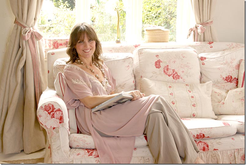
Kate Forman at home in 2005.
Kate grew up in a house she describes as “shabby chic.” Her mother, Pixie Weir, designed costumes for film and the family home was filled with mannequins and fabrics, which is, Kate thinks, the genesis of her love of textiles. After studying fashion at art school, she joined a friend to share an antique shop on London’s Lillie Road. Besides selling antiques, she did a bit of interior design using vintage fabrics she sourced at auctions in London and France.
She had a special love for these fabrics that were faded and pale but she couldn’t find enough yardage for her clients who wanted the English Country Manor decor. Kate took her collection of remnants, recolored to suit today’s interiors, and then found a textile printer on the Internet who created her first line. Market research consisted of groups of friends who offered opinions on colorways and prices. Her company Kate Forman Designs launched in 2004. She still uses the same textile printer and keeps her crew low at just six people.
Kate moved her family to Hampshire to an 200 year old house that friends had once lived in and were renting out. Her shop is five minutes away in a block of renovated stables. Kate’s husband Jake serves as the financial director.
Christophe Gollut
Kate Forman was influenced by the Swiss designer, Christophe Gollut. She especially loved his use of colour and sense of style which she found “utterly beautiful.” Me too.
Just look at this living room by Gollut. So gorgeous, so English! It’s no surprise he influenced Kate’s designs.
And here, from Kate Forman Designs beautiful web site – many of the photographs are prettier than a magazine. I mean, look at this! Gorgeous!!!
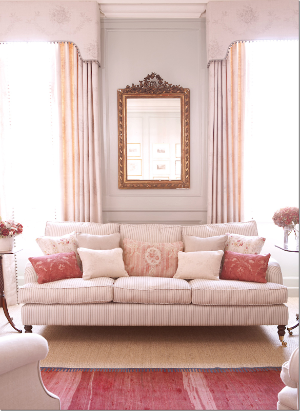
And my favorite! A stripe on the sofa with a mix of patterns for the pillows. Notice the tiny bobble trim on the valance. LOVE!!!!!
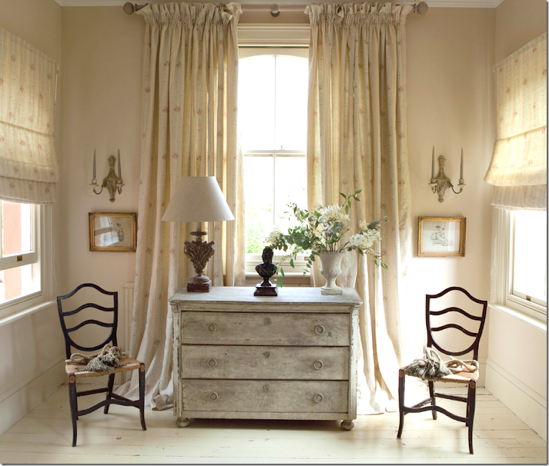
An hall with an antique chest and curtains.
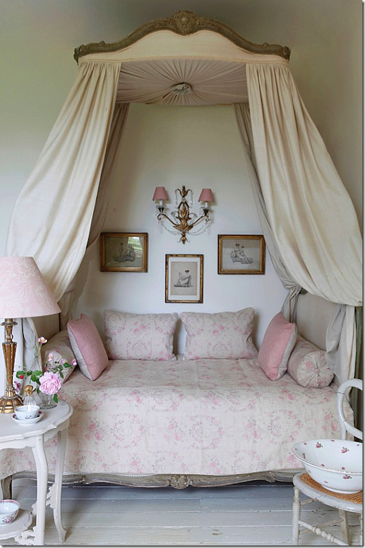
A beautiful bedroom with an antique bed, in her pink fabrics.
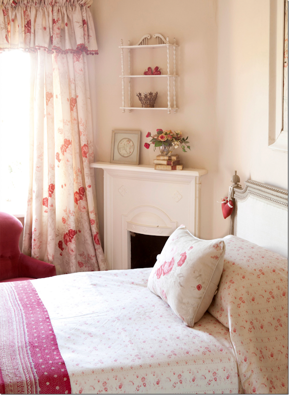
Another bedroom finished in the pink fabrics.
Swedish blues in Check and Cameo Ribbons fabrics.
Kate Forman has a line of beautiful velvets – here in red, with a touch of pink.
Just beautiful walls and mantel!
A bedroom, with her pink Delilah curtains.
A subtle stripe in charcoal for the curtains.
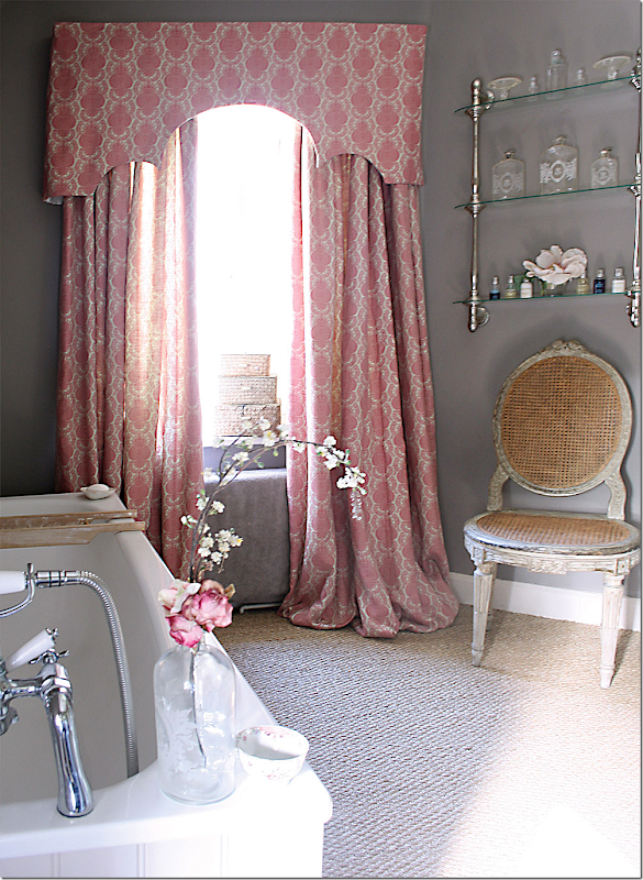
Beautiful – Sophia in gray. This is a very popular fabric and wallpaper.
Here is the Sophia wallpaper in gray and Bella in pink on the bed.
Here, is Josephine in yellow. Kate’s favorite fabric is Josephine in the yellow and in the red colorway.
Brighter, in yellows.
Pearl Lowe’s new book featured curtains made of Kate’s Guinevere.
The newest line – Boho: Elodie in pink. Today, Kate is favoring brighter fabrics.
And the headboard in an ikat – Jag, in pink.
Red Agnes curtains. Candy Stripe in red on the bed.
Kate Forman at her Decortex Booth. I love the caftan made with her new ikat fabric!!
The Hampshire country house. The back side facing the street is stone, while this side is stucco. Built around 1750, the house was extended in 1800 with a new wing and the addition of the Gothik porch with its extravagant frieze.
And, a romantic shot at night.
In 2006, with two of her children – the frieze is painted blue, later it is white.
Kate at the front door. A close up of the frieze around the front door and window.
2006. Inside, the living room is to the right of the front door, with windows on three sides of the room. Above this – is the master bedroom. To the left of the front door is the second drawing room, which leads to the kitchen in the extension.
The back of the house shows the garden outside the kitchen. The mud room on the left is so charming!! You can see the stone facade that faces the street on the left.
The furniture is in Kate’s fabrics, of course.
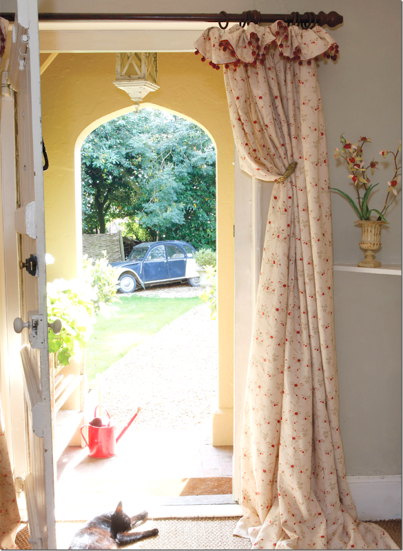
Here, the front entry with portieres, and her bobble trim at the top. Kate uses her house for some of the catalogues. Twice a year she updates a room or two with new wallpaper or fabrics and then photographs it for the web site. Must be nice!
Here, in 2011, the front hall, with the living room to the left.
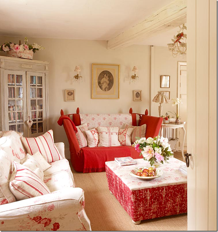
The first photoshoot, from 2006, shows the drawing room on the left of the front door in reds and creams. Everything is so English! This living room to the left of the foyer leads to the kitchen, through the door shown.When Kate first rented the house, there was brown carpet everywhere, beige walls and yellow trim, with black beams. She redid the floors and painted everything – including the beams, making it bright and light.
There are several sofas and lots of antiques, along with furniture from Kate Forman’s line which is now discontinued. Lots of roses and little accessories.
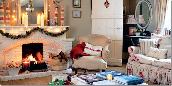
And the view of the fireplace. The original paneled door leads back to the entry.
Kate, with two of her four children, sits on the floral slipcovered sofa – looking like a magazine cover for Englishness!
Years later, the same room looked like this, with Kate’s velvet on the sofa and a slipcover stripe on the other one.
The paint is now Farrow and Ball’s Smoked Trout.
Across from the sofa is the white brick fireplace.
Still later, the velvet sofa and ottoman were photographed for the catalogue.
To the right of the foyer is the second drawing room, as it was in the early 2005. Chintz and stripes mixed with very faded chintz. So pretty! I still like this room as it was.
Across the room is another Knole sofa next to an antique chair. This room has three sides of windows with a northern exposure, The master bedroom is upstairs over this room, with the same three window walls.
The same room in 2011, warmed up with a velvet sofa and red curtains and an area rug.
Across from the sofa is the fireplace photographed during Christmas.
This drawing room was used many times for the web site. Here, a pink sofa was placed in front of the red curtains.
And a different sofa for this photograph.
This tufted pink sofa against the back window with new curtains looks so pretty!
Here, the same sofa is now in a plain linen, with different curtains and velvet pillows.
And yet another photoshoot with different fabrics and the original curtains. This is a pretty version of the drawing room.
Last – a huge change when the walls were painted indigo to showcase Kate Forman’s newest fabrics! Such a difference from the original look of 2006!!! Much more casual, but the antique French trumeau remains.Kate blogged that for now she is liking brighter, stronger colors and this living room reflects this change.
Against the fireplace, a new blue Ikat fabric on the chair that before was covered in Guinevere.
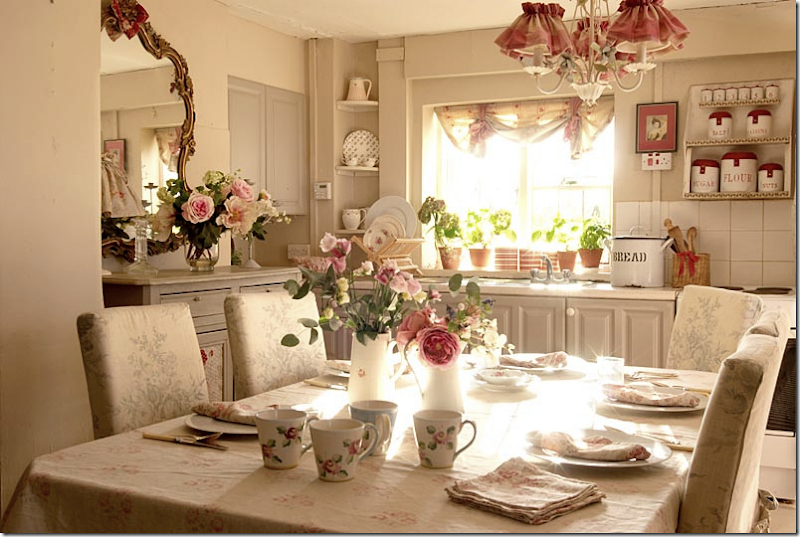
From the early 90s, the kitchen was very romantic with the original Roses fabric in gray on the chairs. Kate later removed a wall to make more room for the dining area.
So sweet – were we all THIS sweet in the 2005s????
Originally, the floor had a cork floor which Kate painted gray and white.
Later the kitchen was remodeled and new white stone floor was added.
An even later view for the catalogue.
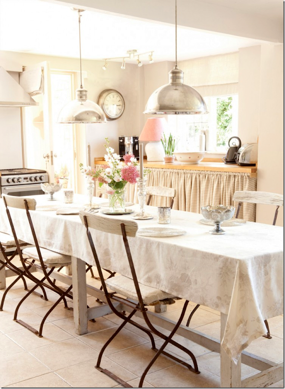
Recently, new updated polished nickle pendants were added, along with a French door that leads to the garden. New butcher block countertops.
For a completely different look, the kitchen was done in stone washed linen – in Mauve. Quite a long way from the sweetness of 2006!!!!
From 2006, the charming mud room that leads to the garden.
Today, the mud room looks like this, though I must admit I miss the cute way it look in 2006! This photograph highlights how different interior styling for magazines is today.
Upstairs are four bedrooms. This bedroom in 2011 has a small wooden mantel on the fireplace, along with an iron bed.
This bedroom was photographed for the web site with a French headboard.
And this gorgeous photograph in the same bedroom – the crystal chandelier was borrowed from the master bedroom.
Here, the small room was painted blue, and an antique chair of Kate’s was newly covered in Roses, her most popular fabric.
One more decor for this tiny bedroom! This time it was done in Kitty wallpaper.
The bathroom as it was in 2006. This family bath was later enlarged – from two rooms into one. Today, the check fabric is different, but I prefer this original one. I wonder why it was changed? Big buffalo checks are really in now. Puzzling.
Here is the check today – you can see it isn’t as bold or crisp as it was before.
And later, the family bath, enlarged, looked like this.
And across from the bath, was this vanity.
For the catalogue, new curtains in this bathroom – Margot in pink.
Upstairs, a long hall leads to the master bedroom, the room that sits above the drawing room, with three walls of windows. It was photographed here in 2006.
Here, the beautiful Kate sits in her master bedroom looking at fabrics.
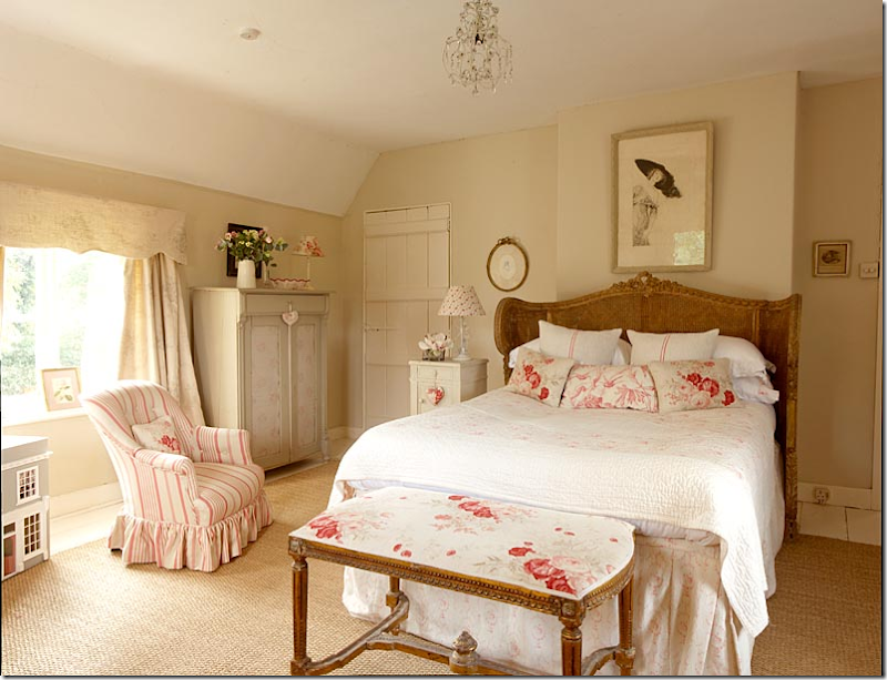
Originally, in 2006, her bedroom looked like this – in creams and roses, matching the rooms downstairs. A fireplace is hidden behind the bed, probably to make room for the headboard since all the other walls are windows! A small crystal chandelier will be replaced later with a larger one. The cane antique bed is French – one of the first French antiques Kate bought – 30 years ago - and something she says she will never part with. Don’t blame her!
Later the room was wallpapered in the most popular paper, Gray Sophia. You can see the paneled door to the side of the bed is now gone. And the new chandelier is now hanging.
In 2011, the room looked like this.
For the web site, new curtains.
And later, the walls were painted for the catalogue. This version of the master bedroom is so pretty! Love it!
This tiny room was carved out of a space on the landing. When Kate first rented the house, it was just a three bedroom.
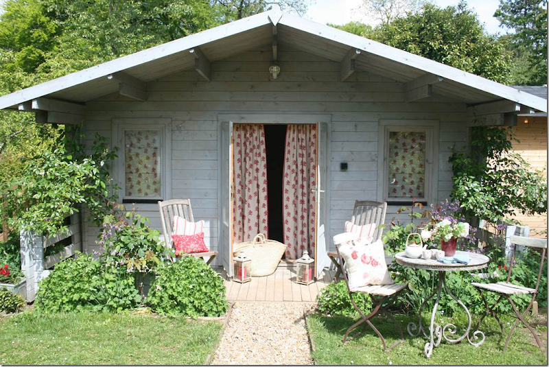
The summer house decorated with new fabrics.
And Kate made a scalloped umbrella for the sun – out of one of her fabrics.
The outside, decorated with piles of blue fabric.
Interestingly, the house was offered for rent earlier this year with a newly painted dark blue frieze. It will be exciting to see where the family has moved. I wonder if the other photographs from the web site were shot at their new house? Many of those photographs show a limed wood floor, higher ceilings, and architectural elements, totally different than the Hampshire house with its low ceilings and casual charm.
Kate Forman Designs is a short hop from her house in Hampshire. Location: Long Barn North, Sutton Manor Farm, Bishops Sutton, Alresford, SO24 0AA
To order fabrics or accessories – go to the Kate Forman web site - HERE.


