Here is a Houston house – before and after and then, after again. It’s a study in designing in a way for the younger set and the more traditional set and it shows us where interior design was 15 years ago and where it is going today. Get ready for a fun ride. Enjoy!!!
2005:
Our first view of the custom designed house is a beautiful, Federal styled, reddish brick house with sage green trim. Lots of curb appeal for sure, not much to change. Right?
It’s large, 6 bedrooms, 6 1/2 baths, around 6,000 sq. ft. located in the woodsy Memorial village Hunter’s Creek. It was built in 1996 and by 2005, it was on the market – looking for new owners.
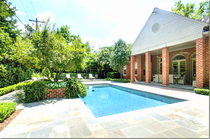
2005: The back yard has a large rectangle swimming pool with herringbone pattern brick. Typical Houston wood fence.
2014:
In 2014, the house was back on the market - it had been completely renovated and expanded. Here, the exterior now has a more sophisticated taupe trim. There is new landscaping, edited, along with a curved driveway. The price tag in the few years was raised 1,200.00 more. Of course, that increase had been added back into the house and yard.
2014: The view straight on shows the new landscaping and taupe trim.
2014: The backyard was extensively updated – with stone pavers and brick. A large raised sundeck was added to the back of the yard. New landscaping hides the Houston fence – the back now has a spa-like look.
2014: The view of the raised sundeck that overlooks the pool and the two conversation areas – one of each side of the new brick planter/fountain.
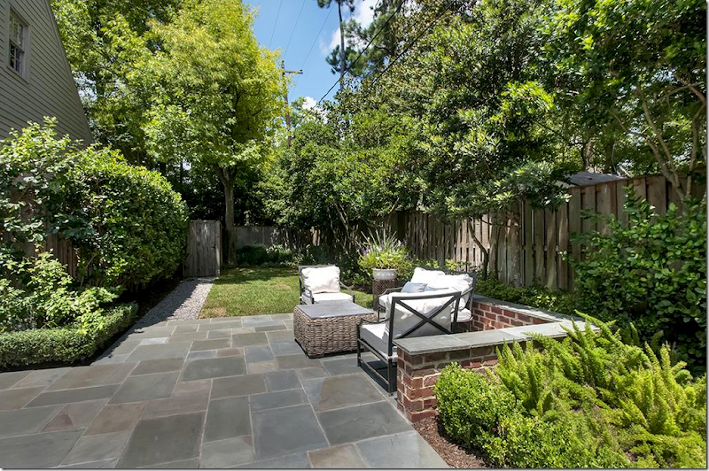
2014: One of the new conversation areas added to the back yard. You can see the new wood fence that was installed.
2014: Looking the other direction, at the back of the house. At the right of the pool is a new planter. Notice at the right of the house – the barn door that leads to the garage.
2014: The barn doors open to the garage – you can see to the driveway. I’ll guess this door was added on during the remodeling.
2014: Another view of the back of the house.
2014: Off the family room is the outdoor dining room, sheltered under the porch.
2014: Hidden off to the side of the house is the firepit.
2016:
And today, 2016, the house has been listed again, after another extensive remodeling.
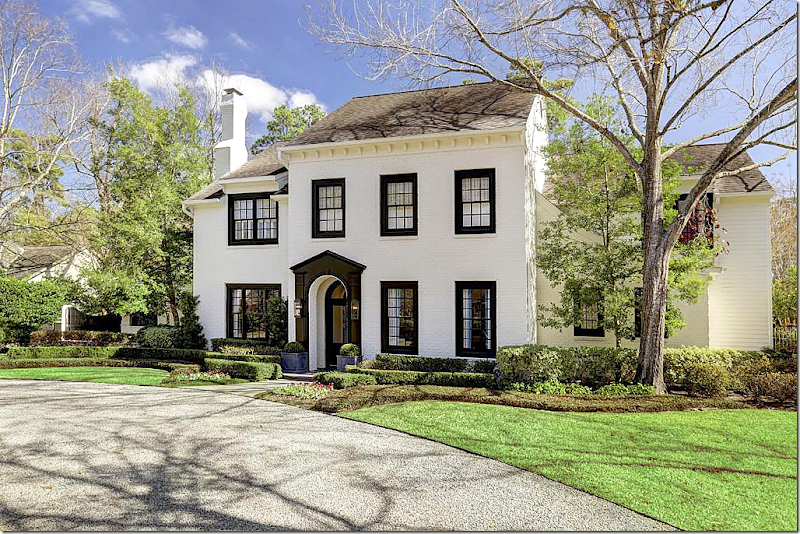
The facade gives a hint to the changes: all the reddish brick is now a modern stark white with a dramatic contrast in black trim. It looks like the landscaping remains the same.
A straight on view of the house with the beautiful front door and exaggerated trim.
And a view of the driveway with the wood gate.
2016: The backyard was changed again, to match the more modern interior and exterior. The brick pavers were bleached to create a more unified look. The brick planter/fountain is now white – with its plants edited - again, a more contemporary look.
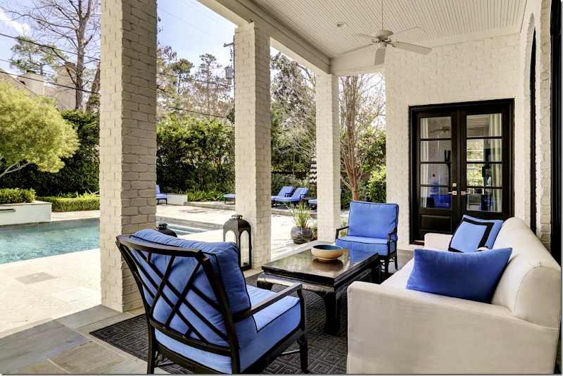
All the brick planters are now white, matching the house. The barn door is black, to match the trim. The furniture cushions are bright orchid blue.
2016: Off the side of the garage is the new outdoor eating area.
The back of the house, notice the vent is ringed in the bright blue. The umbrellas are white and black stripes which contrast with the blue cushions.
2016: Black, white, and blue – to blend in with the new modern interiors. Indoor outdoor rug was added. Since the outdoor eating area is now moved to the side of the garage, this area becomes a seating area.
2016: The view towards the pool.Ready to go inside?
2005:
2005: There aren’t a lot of pictures of the house from this sale, but here is the living room. The house had heart pine floors. The living room had faux stone walls, which was on-trend back then. The decor looks a little bland, not too exciting.
2005: Across from the living room is the dining room, wallpapered. The pine floors are stained a dark brown. There is a fireplace with a black mantel, silk curtains. Pretty room!
2014:
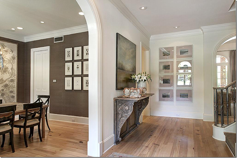
2014: The new owners totally remodeled the house. Here is the entry hall with the study, formerly the living room, to the right, now painted a muddy green-gray. Ahead is the family room, which overlooks the pool. To the left is the dining room. Arches lead to all the rooms. The square footage was increased by around 1,000 ft. from 5000 to 6000.
2014: The floors were stained – from dark to now a light look. At the left is the dining room.
2014: The study with the newly painted walls and newly installed bookcases. The gray envelopes the room, all the trim, including the ceiling. Beautiful area rug, antique desk and chairs with two yellow chairs. Silk curtains with an antique mirror.
The owner was obviously a Texas hunter, several trophies were displayed in his office. I love this room – love the decor! It’s sophisticated, traditional with a twist of the modern.
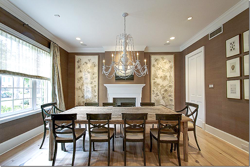
2014: The dining room has a totally new mantel in white wood. The walls are lined in a chocolate brown grasscloth. At the window is a shade with silk curtains. The antique wood table is bleached like the floors and a set of antique chairs surrounds it, while a white chandelier hangs. Framed wallpaper remnants flank the fireplace.
2016:
2016: Today, the house has been completely redecorated – with a younger, more contemporary look – for the 2020s. The floors were stained a white, while the walls are painted a bright white.
The doors leading to the study are glossy black and a skin runner is on the stairs. The railing was also painted black. Past the arched mirror is the master bedroom suite.
2016: The study sets the tone of the new decor: The built ins are now painted glossy white with trendy gold hardware. The back of the shelves is black. A green antique desk is paired with a blue velvet wingchair and two modern chairs (you can get these chairs at Huff-Harrington HERE.)
Behind the desk is a large piece of art featuring Marilyn Monroe. Green curtains with blue trim. Notice the blue and green are picked up in the accessories in the shelves.
2016: Across from the study is the dining room – now a lacquered Yves Klein blue. Wow! What a huge transformation. But, if you look – it was done with paint only which was put on top of the grasscloth. The white mantel was painted blue, and a crystal chandelier was added. A round black table is flanked by white leather chairs.
Two mirrors and lamps on Oriental demilunes flank the fireplace. Simple white curtains hang at the window. The area rug is a contemporary Greek key design in blue and black.
Another view. The tiles on the fireplace were either replaced in black or painted. The art work above the mantel brings in the green, from the study.
Notice how antiques were mixed in with all the contemporary pieces – like the blue and white vase, the Oriental demilunes, the crystal chandelier, the green desk and wing chair – I love this and it makes an interesting mix!
2005:
2005: The original family room with the wall of arched French doors that open to the pool. There is a stone mantel.
2005: The original kitchen. The door leads to the pool. The breakfast room was extended with the next owner and a new, large den was added to the left of the breakfast room.
2014:
2014: The remodeled family room with the bleached pine floors and new shelves instead of closed cabinets that flank the fireplace, which has a new mantel. The old stone was replaced for this more sophisticated version.
Above, the ceiling and beams are painted white. Notice the matching lanterns. Slipcovered furniture in solid linen and printed fabrics. Such a beautiful room!
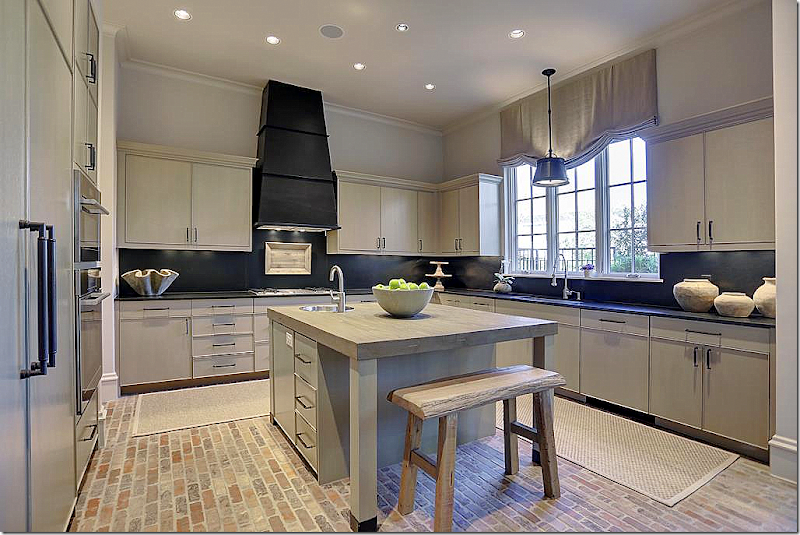
2014: The kitchen was completed renovated. Wood floors were added in here. New cabinets, new island, new appliances and blue stone countertops.
The look here is the limed, bleached wood, which is very on trend even now. There is no crown molding which is modern and the open shelving is also a more contemporary look. Love how the freezer and refrigerator flank the stove.
2014: The view into the family room – with the pantries that flank the doorway. All the doors and island have planked wood faces.
2014: Antique table, wicker chairs, antique light fixture. Again – I love the decor; it’s sophisticated but warm and cozy. Perfect for a young family who likes antiques mixed with soft upholstery.
2014: At the end of the kitchen is the wet bar, which opens to the dining room and the foyer. White tile and cabinets mix with wood mirror.
2016:
2016: And today – behind the dining room is the wet bar, now painted glossy black with open shelves and mirrored backs.
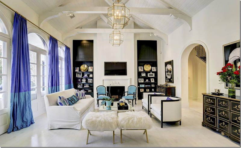
2016: The family room with white floors and walls and ceiling. The wood cabinets and shelves were painted a glossy black. The lanterns remained. Here, the decor of blue, black, and white continues with the new addition of turquoise and lilac.
Love the black chest. Again – it is amazing how the white washed floors and black trim can make such a HUGE difference in the look of the house! It’s a lesson for sure – the power of paint.
2016: Looking towards the kitchen. The room looks really pretty from this view! Black sconces were added between the two rooms.
2016: The kitchen – the backsplash was replaced with very on trend tiles. The shelves were painted lilac to match the barstools. Otherwise, it remains the same. You can see where the new den was added in 2014, off the breakfast room.
2016: A view of the kitchen with the newly installed tiled backsplash and white painted cabinets which completely changes the look of the kitchen.
2016: The view back into the family room.
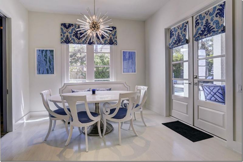
2017: The breakfast room has a leather banquette, marble topped table, and that beautiful crystal sputnik!! That is my favorite Sputnik fixture – it’s a beauty, based on an original design of Murano crystal. To order, click the photos below:
Small Size – click on photo for more information.
Large Size – click on photo for more information.
Next are pictures of the den which was added on after the house was purchased in 2005:
2014: Off the newly widened breakfast room is the added on den. A large room, there are cabinets along one side of the room. Furnished in the warm taupe like the rest of the house, it is a mix of new and old.
2014: At the back corner, a new walk-in wet bar was added. Beautiful striped rug.
2014: The new wet bar, with weathered wood paneling! Love this – with all the open shelves.
2016:
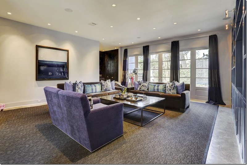
2016: And – off the breakfast room – seen through the opening - is the large, added on family room, done in the blues and lilacs found in the kitchen and family room. Velvet sofas and chairs with Ikat pillows. To the right is the new wet bar.
2016: view from the other side, showing the windows with curtains. Large contemporary area rug. The bar is in the corner. Again, the only physical change in this room was the paint on the cabinets is now a glossy lilac shade.
2016: The bar is now a distressed glossy black and again paint makes it look completely and totally different.
2016: The powder room, updated with a graphic black and white wallpaper.
2005:
2005: The master bedroom is located off to the right of the entry hall. There is a door that leads to the covered porch off the swimming pool. Originally, the carpeted room was sweet, with a canopy bed and fabric valances.
2014:
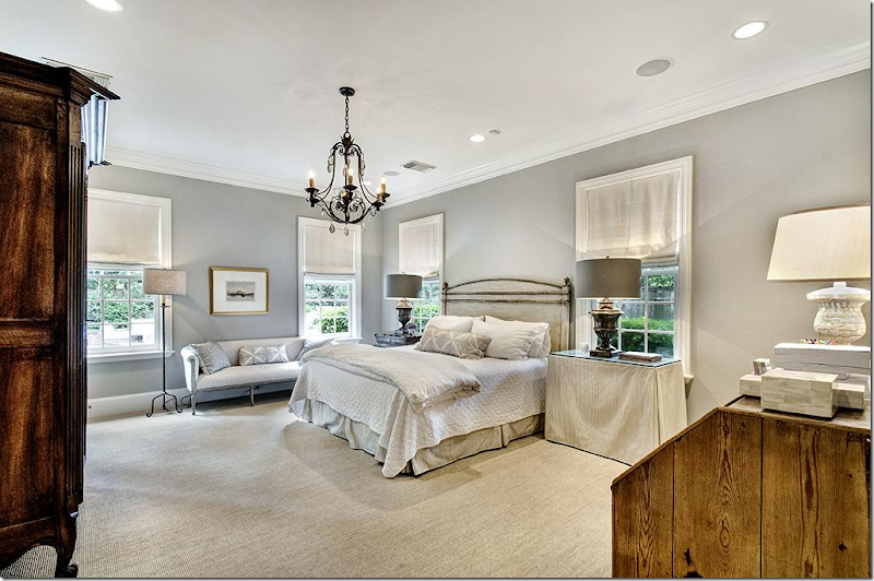
2014: The bedroom was painted gray with seagrass. The furniture is a mix of French antiques with skirted tables. White fabric shades cover the windows and there is a new black iron chandelier. Love the painted French settee.
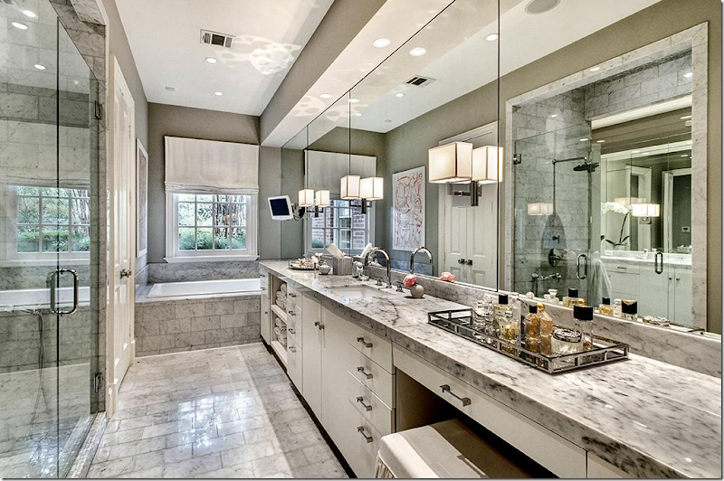
2014: Gray marble in the lady’s master bathroom reflects the look of the gray and taupe decor found throughout the house. This bathroom was updated after it was bought in 2005.
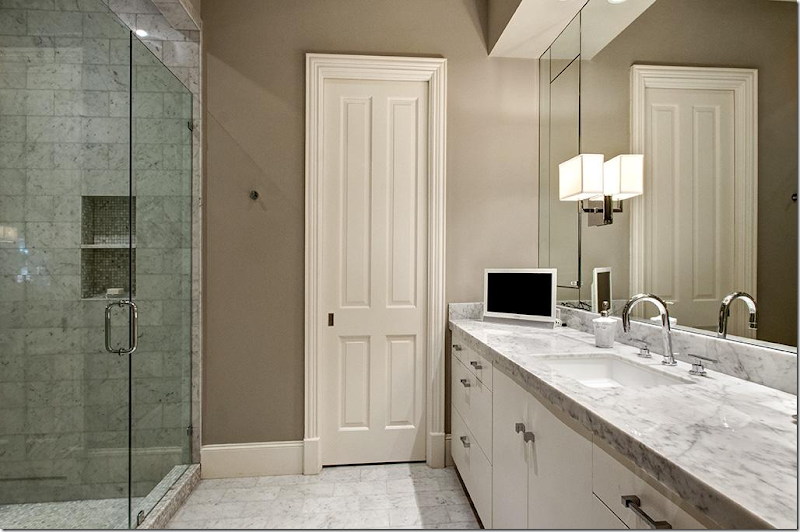
2014: His master bathroom.
2016:
2016: WOW! Total glam! Black walls, blue and white accents. The carpet is stunning.
2016: Another view – shows the black and white striped chairs with blue pillows. Mirrored end tables. White upholstered bed. Love the gilt sunburst accent.
2016: The new lady’s master bath now has white walls, the only change.
2016: The man’s master bath again, with new white walls.
2014:
2014: There are two staircases. The main one, here, was carpeted in a faux seagrass. An antique post office cubby is charming! Love that!! It’s a great idea for large families with bedrooms upstairs.
2005:
2005: Upstairs are several guest room including another family room and computer room. Here is Guest Room #1 in 1990s toile.
2005: Guest Room #2. Nice, but plain.
2014:
2014: Guest room #1 in navy and white with a faux type seagrass carpet. The shutters remain from the original owner.
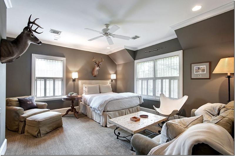
2014: Guest room #2 in dark taupe/gray and white with hunting trophies and the original built ins now painted a bright white.
2014: Guest Room #3 in dark taupe/gray with slipcovered sofa and chairs. This family must have had all boys?
2014: Guest Room #4 – with vaulted ceilings in a warm persimmon with black beds. It’s not easy decorating five bedrooms that blend yet, still stand out. By changing wall colors, they have found a way to distinguish the rooms from each other.
2016:
2016: Guest Room #1 – now has cobalt blue walls with black and white accents, just like the downstairs decor. Interesting that the original shutters still remain in place, the carpet remains from the 2014 decor.
2016: Guest Room #2 now in navy and red stripes, with the original built ins.
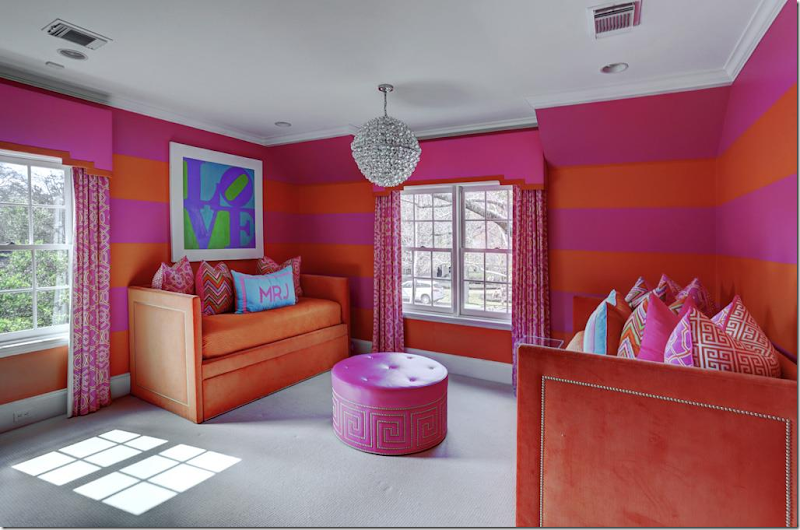
2016: Guest Room #3 is totally different in bright orange and pink – perfect for a little girl, with new curtains with cornice boards, and new gray carpet. These twin beds are made like sofas, perfect for sleepovers!! Cute Sputnik.
2005:
2005: The upstairs playroom with computer room. This room is off the back, second set of stairs and can act as a separate apartment.
2014:
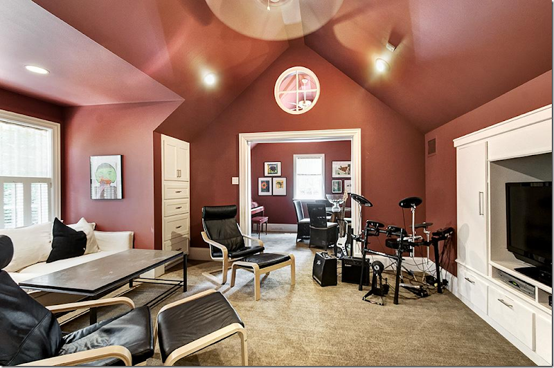
2014: The playroom with the persimmon walls – turned into a media room. The “computer” room is now a kitchen/dining area.
2016:
2016: The playroom – is now more younger kid friendly in lime green and blue, continuing the decor them from downstairs.
I really enjoyed looking at this house change dramatically in just over a decade. It reflects where interior design has been and where it is going. From sedate traditional decor to light woods with taupe and gray schemes to ultra glamorous in bright colors, with black accents and cooler tones.
To go from this:
in 2005 to this:
In 2014, to this – a few short years later:
The bright modern, glamorous look of 2016.
I’m curious – which is your favorite decor: 2005, 2014, or 2016? I’m going with 2014, but I’m crazy over the 2016 master bedroom and the dining room!!
To see more of this house, go HERE. It’s for sale!!
NEXT, a Houston broker, Facebook friend alerted me to a new listing of his – a chic townhouse in the Galleria area.
Here’s a look at this beauty:
Next to Uptown Park, with pedestrian access to it via a private gate, this small private community is located on Rue De La Paix Way.
Private gardens and a protected reserve which backs up to the townhouse.
The townhouse has a metal roof and brick and stucco facade. An elevator gives easy access to the three levels, especially useful for transporting luggage and packages.
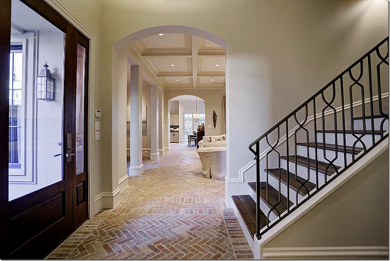
Inside, the front door opens to the three level staircase with metal rails and hardwood risers. The main floor is a beautiful herringbone brick, which I LOVE!!!
To the left of the foyer, the public rooms open to the center hall, which ends at the kitchen.
The living room is off to the right with the dining room on the left through columns.
Coffered ceiling, with lighted shelves and stone mantel.
The view towards the front door and the dining room, across from the living room.
Antiques mix with French chairs and double chandeliers.
The view from the dining room into the living room and the kitchen.
The breakfast room is at the end of the hall and off the kitchen. I love how open the house is. And I love how the kitchen and living room are on the ground floor instead of the second floor like it is in so many Houston townhouses today.
The kitchen with limed wood cabinets and black countertops. Very sophisticated and pretty.
Off the breakfast room is a patio with an outdoor grill – a must in Houston!
Antique trumeau with sink on a stand, the must-have look in powder rooms.
Upstairs, the light look with limed wood floors continues, as does the beamed ceiling. Off the master room is the study.
The study is next to the three story staircase. Looks very cozy with the fireplace and big screen!
The master bedroom is right through these double doors. Lots of shelves make this room the perfect library. Instead of a recliner – think about a comfy chair and ottoman, with down filled cushions, slipcovered. Indestructible!!!!
The master bedroom with a small seating area.
Master bathroom with standing tub. Love the bench!
The 2nd bedroom on the same floor is used as an office. It has a charming Juliet balcony.
At the top of the stairs is the media room with its own drink refrigerator. Huge leather sectional – great for a media room!
Another view of the media room, perfect for families with teens and college kids.
Off the media room is the third floor outdoors room with a fireplace! Incredible!!!!! Love this!
Guest Room #3 with wood floors.
Guest bath – notice the tile backsplash and sconces.
The guest room #4 – my favorite bedroom, of course! So cute!!!
For more information on this house for sale, go HERE.


