I tuned into HGTV the other day and saw an episode that has probably been repeated a zillion times, but it was my first viewing. It was on House Hunters – Renovation, that mashup between their older and very popular show House Hunters and then, later, we get to see the homeowners as they renovate their newly purchased house. Heaven!!!
I have loved House Hunters for years and this new version with the 30 minute look at the remodeling process just makes the show that much better. Although some of the renos they show would be better left on the cutting room floor – some are fabulous, as this one I just saw was.
This episode’s homeowners are young, ultra hip millenniums who are living in Los Angeles with their baby. They want to buy a house in Beachwood Canyon where they now rent.
OK, OK. You watch these shows and you think these homeowners are going to be just another slacker couple, but then with just a few clicks on the internet, it turns out that the husband actually just won an EMMY for God’s sakes and the wife has tons of really cool music on You Tube, etc. Hmmm.
No wonder they look so hip and chic – and no wonder their house turned out so great. Helping them was their realtor/brother-in-law, who then turned into their renovation specialist with his own construction business. What a brother-in-law – everything you could possibly need all tied up in one neat package!! My own brother-in-law is handy with the BBQ grill. (He’s the best BBQer!)
As the show reveals, the husband Steve, wants a Spanish style house and his wife Sam wants a Craftsman. In the end, they got neither, but instead picked a house that is loaded with charm and architectural features.

Before: The house is 1 1/2 stories with the main living areas on the top floor. It’s right under the Hollywood Sign in the trendy Hollywood Hills area near the Griffith Observatory. The back yard is a private canyon and is truly beautiful!
It’s not large – with three bedrooms and 2 baths – there is 1400 sq. ft. But, the views and terrace increase the indoor/outdoor living space. The light taupe house blends in with the background – making it look organic, as if it sprung up in the shady canyon just as a mushroom would.

BEFORE: Inside the front door is a door to the kitchen which also opens to the living room.

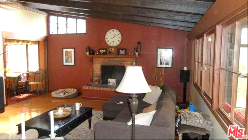
BEFORE: There are dark beams with dark wood planks between them. There is also a large fireplace. Instead of being light and bright, the red walls makes the house look so dark.

BEFORE: Without the furniture, you can see the large living room. There are two conservatories off this room – one which the new owners want to remove. Also, the owners want to take out the living room windows and put in French doors.

Here is the conservatory off the living room that will be removed.

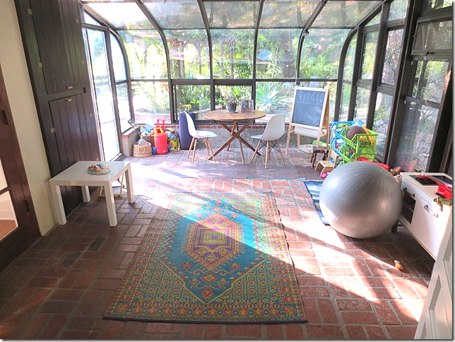
And connected to the first conservatory is the larger, second one that will become the baby’s playroom.

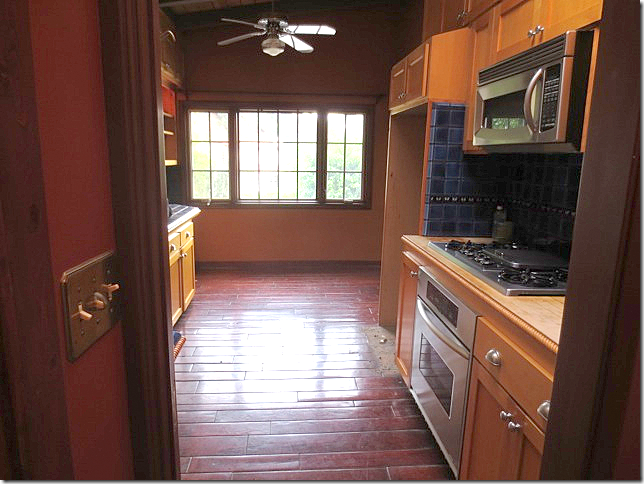
BEFORE: Off the foyer is the kitchen – that opens to the living room. It’s been updated and is very Spanish styled, but the new owners don’t like it.

BEFORE: The kitchen has blue and yellow tiles.

The designer’s plan for the kitchen: All new cabinets with white countertops. The door to the foyer will be closed off. The ceiling and floors will be painted white.

The homeowner isn’t sure she likes the new kitchen design – she is worried it won’t be bright enough with the dark cabinets, so the designer gives her other ideas to think about. In the end, she goes with the designer’s original design. Smart choice, as you will see.

BEFORE: Demo starts and the wall between the kitchen and living room is partially removed to open it up. In the kitchen – all the cabinets are now removed.

Extra large subway tile is chosen for the backsplash. The door to the foyer is now closed up.

AFTER: The new French doors are installed in the living room and the conservatory is removed. The ceiling planks are painted white, as are the walls. The new mantel is being made for the fireplace.

BEFORE: At the front door, a floor of yellow tiles is laid to create an interesting foyer.

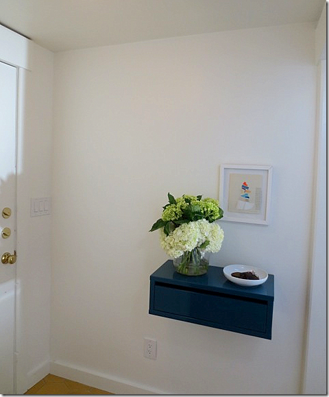
AFTER: At the front door – where the opening to the kitchen once was, there is now a wall with a built-in shelf for keys.

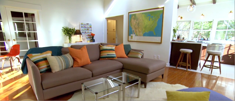
AFTER: The living room, which is filled with mid century modern furniture, and the view to the foyer with the yellow tiled floor.

After: The living room with the kitchen to the right.

And the view towards the new French doors. The first conservatory is now gone and the second one is reached through the two closed French doors in the corner.

Before & After – The mantel was painted a gray and a new piece of wood was added.

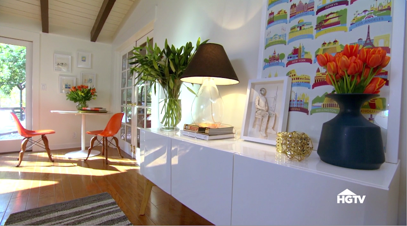
The back of the living room. Love this console. In the corner is a small dining table and chairs.

After: The second conservatory with the brick floor is set up as a playroom for their son.

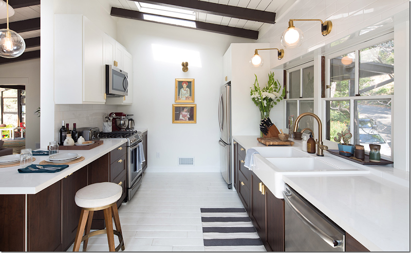
The kitchen is a stunner. Where the wall was removed, there is now an eating bar.

The back wall is extra large subway tile that reaches up to the ceiling. The three windows remain, now painted white. The countertops are white quartz.

Above the counters are three bronze lights with glass globes. Beautiful! The doorway to the foyer now closed off is decorated with two gold framed paintings.

Before & After. Love the gold handles! The sink is from Ikea – I wonder if the cabinets are too?

Before & After

Before & After: Love how they built a cabinet around the refrigerator which makes it look built-in. Notice the wood floor was painted white.

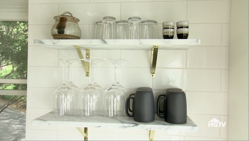
Marble shelves replace upper cabinets.

Love, love love!!!! This look is really in now. Black and white with subway tiles and gold/brass hardware/lighting and light wood accents.

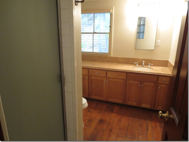
Before: The family bathroom was completely gutted so that a bathtub could be added for the baby.

After: Trendy black & white concrete tiles were laid in the bathroom. The new apron front tub is at the left.
I love the concrete tile look in black & white, again – this is look is so trendy now.
Remember: Black and white, subway, marble, gold/brass, and light wood accents!!!

Another view. The toilet is hidden from view by a pony wall of subway tile.

Before: The baby’s room is small, but nice with hardwood floors and built ins.
 After: The changing table fits in between the cabinets. Cute blue and white rug.
Before: The master bedroom is large with a beamed vaulted ceiling.

After: Simple white bedding and a Moroccan rug.

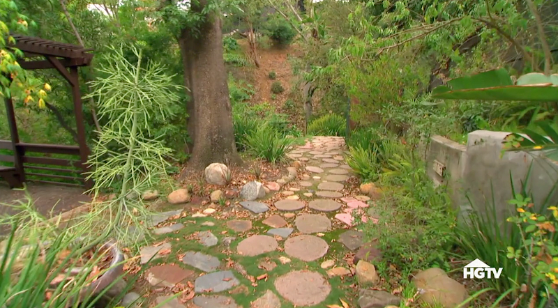
Out back, stairs lead down to the private canyon.

BEFORE: Off the back deck, the stones were moved to make a greenspace for the baby.

AFTER: There is a nice level yard now, closed off with a picket fence for safety.
>
I’ll show the designer soon! She has done some great work in L.A.I loved what they did with the house – the kitchen and bathroom, painting the walls and ceiling, putting in the French doors, taking out the old fashioned conservatory – the total cost of the reno was around $70,000.
This look with the graphic black and white – black walls, concrete tiles, brass metals – it has really taken off and is becoming the look now. Was it a coincidence that One King’s Lane did an entire story on this look in bathrooms today? They showed how this graphic look, with high contrast.One Kings Lane showed some graphic bathrooms today that have the same look:

This bathroom from Instagram has the graphic concrete tiles that are so hot right now. Even the stools are the same as the hip HGTV couple. Like the look? mix black, wood, marble and subway to get it.

More black and white floor tiles with black bathtub and subway tile with wood accents.

Love this one! The gold brass, the black and white tile, wood accents. These are the primary elements to have in order to get this look.

OK OK OK ! I am dying to redo my bathrooms now!!!

Blue instead of black for a change. Nice!!!
For the kitchen – follow the same formula.

Love the graphic look? I hope you are getting ideas on how to update YOUR house or your children’s house!!!!
To see more of these great looking bathrooms and to shop the rooms, go HERE!!!!
After: The changing table fits in between the cabinets. Cute blue and white rug.


