COTE DE TEXAS

Mystery of the Nude Painting

77 comments


image

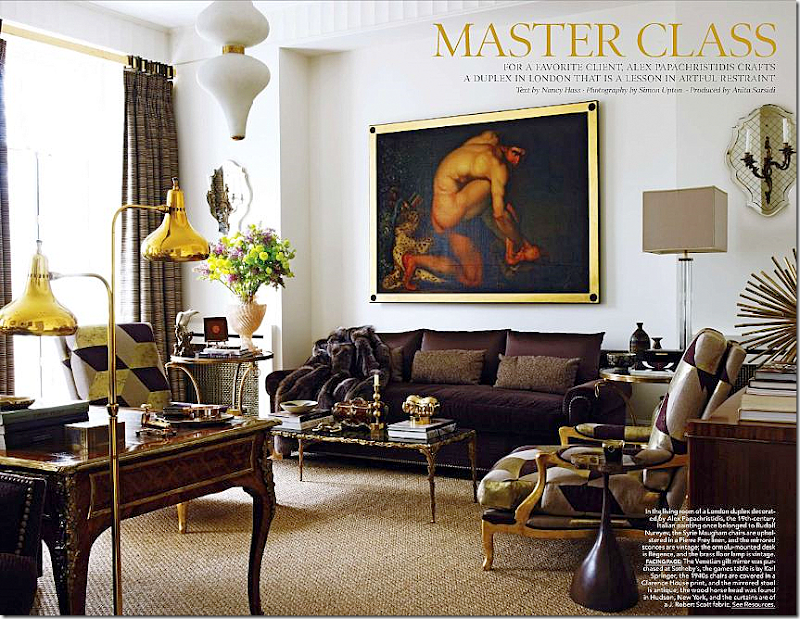
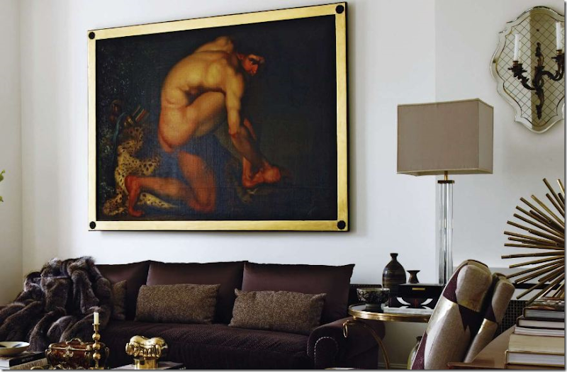
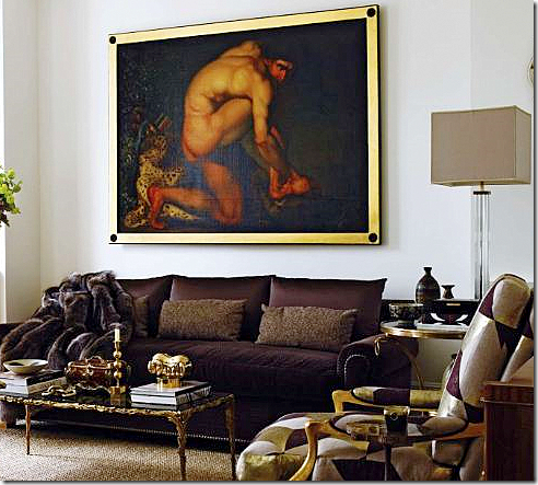
In the latest Elle Décor magazine, this apartment caught my eye.   I mean, who could miss seeing the huge painting of a nude male’s rather prominent backside?   Why does it look somehow familiar?  Certainly Mr. Slippersocks Man doesn’t look like THIS!    I adore the interior designer, Alex Papachristidis.   Alex P. is probably best known for his own apartment – a wonderful mix of patterns and colors:


image

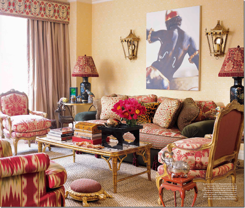
Here is Alex P.’s apartment that I love so much.   A mix of Fortuny, Ikat, and Suzani – what could be better?   And look – another male’s backside!!!!  Hmmm. Must be a new trend here.


    image

Now, I’m no expert on art, but this painting looked familiar.  Who could forget something like this?   According to Elle Décor’s story, this large 19th century Italian painting was bought at Christie’s auction of the late Rudolf Nureyev’s Paris apartment.  Nureyev was famous for this collection of nude male art, which lined the walls of his Parisian home.  The owner of this London apartment is a 30s something woman who recently suffered a devastating divorce.   Is this painting of a perfect male specimen the ultimate revenge?


P1180429_thumb[1]

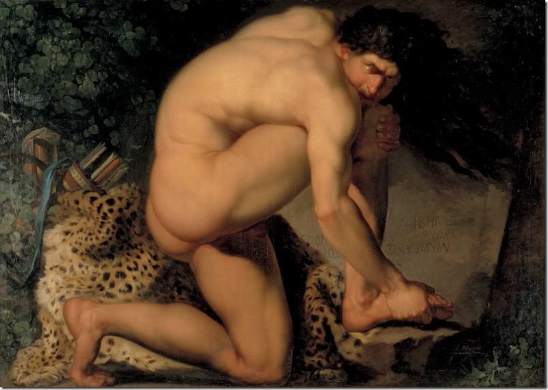
A-Ha!   David Easton’s apartment:   here the painting pops up again.  In his new book, Easton writes:  “A copy of Philoctetes Bitten by a Snake hangs in the niche. (The actual name of the painting is The Wounded Philoctetes.)  Easton continues, “I saw the original by Abildgaard in a Danish museum and fell in love with it.  While traveling in Russia, I commissioned a restoration artist at the Hermitage to reproduce it.”   This explains why there are two of this most famous painting hanging in two different apartments.  One is a copy, painted expressly for David Easton.   The other is an original, or is it?????


image

If the painting hanging in the English apartment featured in Elle Décor is original, why is it also hanging in the Statens Museum in Denmark?  Hmmm????


image

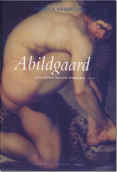
That exact question was asked in this book on the artist of The Wounded Philoctetes, Nikolaj Abildgaard.   Abildgaard’s widow owned the copy of the painting after his death.  After she died, the painting went to the gardener of family friends.   Apparently, the Forbes Collection once owned this mysterious copy (or is it?) and it was sold in an auction at Christie’s to the ballet star Rudolf Nureyev.   When Christie’s was approached about this being a possible fake, the attribute was changed to say the painting was “a version of the picture in the Statens Museum.”   The author of this book tells about contacting Christie’s and informing them how “precarious” the provenance was, leading to it being called a “student copy.”  (For more information about student art and copies of works – see the end of this story.)   The book is written in Danish, so it is hard to truly understand what is being said about this copy of The Wounded Philoctetes.  The issue may be that Abildgaard was a famous art teacher and there is some question whether a student painted the American version or did Abildgaard paint both?  The answer seems murky at best.  At one point in time, even the United States planned to exhibit the American Philoctetes – saying it was an original.    I used  the Google translator to read these passages, but Google translations are sketchy at best.   Still, I would love to read the book in English to truly understand how this “copy” landed on the market and if the Forbes Collection and Nureyev truly believed they owned an original Abildgaard.  The painting in question is important to the art world as it is the first from Denmark to be internationally recognized.


image

A portion of the painting was used on the cover of Mary Shelley’s Frankenstein for the Penguin Classics printing.  


image

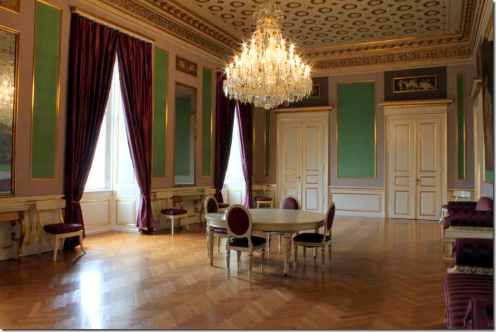
The artist, Nikolaj Abraham Abildgaard (September 11, 1743 – June 4, 1809),  was born in Copenhagen and studied art under the masters of his time.   He was awarded medals that allowed him the funds to travel to Europe to study and paint.   He chose to go to Rome and it is there that he painted his masterpiece, The Wounded Philoctetes, after being influenced by the works of Rafael, Titian and Michelangelo, amongst others.    It was in Rome when he moved away from classical romantic painting to mythology.    Back in Denmark, he taught painting, mythology and anatomy.   Besides painting, he was also known as an architect and sculptor.  The Royal family hired him to modernize a palace after their own was burned.   Many of his interiors remain today at Christian VIII’s Palace in Denmark.    The fire was also unkind to the painter – eight of his large canvases burned along with palace.


image

Abildgaard was interested in Shakespeare and here he painted Hamlet.  Yes, his interest in male anatomy is rather pronounced in this painting. 


image

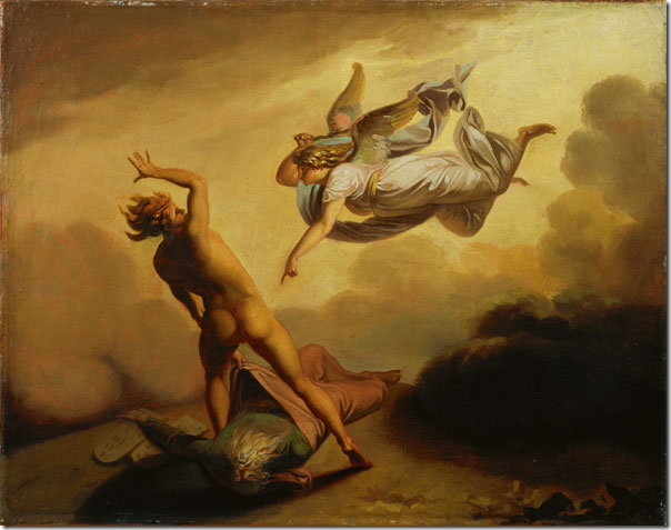
He was also fascinated with the bible, here painting the Archangel Michael and Satan over the body of Moses.  Satan also has well rounded buttocks – who knew????


image

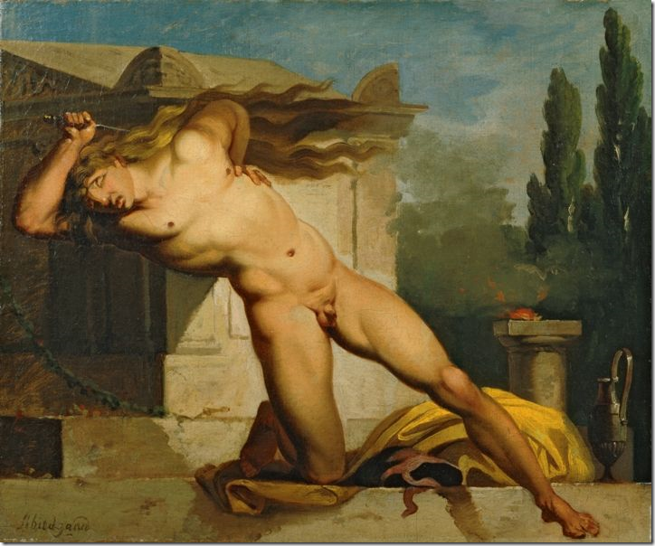
Adrastus Slaying Himself at the Tomb of Atys.    This was painted in Rome at the same time as The Wounded Philoctetes.  Here, his attention was finally directed to the front of the male.   And this was before health clubs and weight machines!!!

image

“Jupiter Weighs The Fate of Mankind”

Abildgaard was highly intelligent and was learned in many different subjects.   He was considered a free thinker who was repulsed by the idea of slavery and excited by the politics of the day and the French revolution.  The Royal Family was not pleased with his ideas.   He had been commissioned to paint many large canvases for the Royals, but when presented  Jupiter Weighs The Fate of Mankind, the Royals had had enough and he was isolated, censored and never received another official commission.  I am not exactly sure why this painting so insulted the Royal Family, though it is an awfully ugly painting, IMHO!!


image

  After he was censored for his political and religious views, he began work as an architect and furniture maker.   His interiors are still in use in Christian VIII’s Palace in Copenhagen.   Here, he designed the furniture, the ceiling and the overdoors.  


image

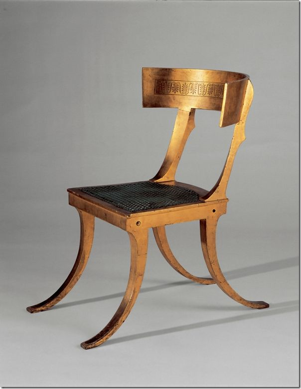
A beautiful Klismos chair that Abildgaard made – it is in the Statens Museum.


image

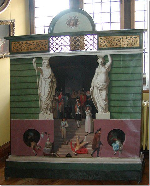
The artist constructed and painted this cabinet for the Royal Family.

At the turn of the century, the artist returned to painting and was even again received by the Royal family.  He married a second time and had several children before his death in 1809.    It all seems somewhat strange that a rather obscure painter’s most important work of art would turn up in Elle Décor this month and also in Timeless Elegance, David Easton’s book released last month.   Small world, as they say.

image

So, who, you might ask, exactly is this famous Philoctetes?   He was an mythical archer who was sent off to the battle of Troy where he was bitten by a snake.    The wound on his foot became infected and developed a terrible stench.    Without medicine, all he could do was scream in agony, causing the other soldiers to abandon him on an island and sail off without him.  Although he appears in Abildgaard’s painting to be a Hercules, he actually depicts the power of physical pain, not physical power.  Art critics note that with this painting, Abildgaard overcame the difficulties of illustrating “pain.”   Here, the artist does not bring attention to the hurt, putrid and bandaged foot.  In fact, there are no bandages painted.   Instead, he paints pain as shown through the convulsion of his body.   Philocetes is bent over – his spine makes a quarter circle, while the “right thigh, buttock, torso, shoulder and arm look like a clenched fist.”  His body is portrayed as if he is wracked in pain, tightly painted into the confines of the canvas.  Painted while in Rome, Abildgaard’s style changed once he returned home.   The artist is not considered the father of Danish painting, that title goes to C.W. Eckersberg.   Yet, Abildgaard was Eckersberg’s professor and is sometimes called the Grandfather of Danish painting. 

image

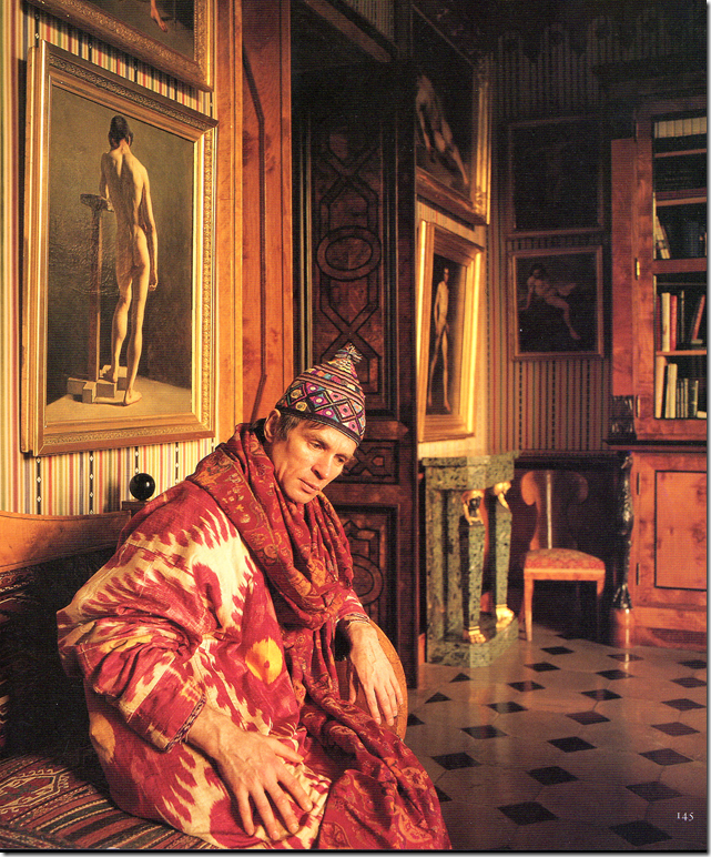
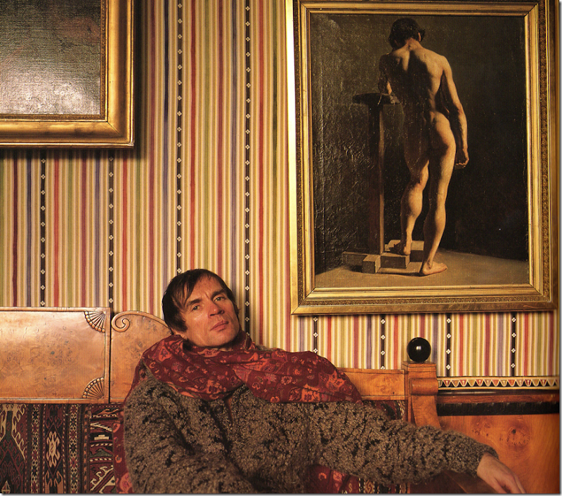
Rudolf Nureyev in his Paris Apartment – surrounded by the textiles and paintings he so loved.  (Balustrade and Bitters HERE.)

The painting The Wounded Philoctetes shown in this month’s Elle Décor was purchased at  Christie’s Nureyev estate sale.  On Christie’s web site, there is no mention of the painting by name, but most likely it is one listed as a “study of…”  since the provenance can’t be authenticated.  The original painting hangs in the Statens Museum in Denmark.   Christie’s held several sales, one of Nureyev’s New York Dakota apartment and another in London of his Paris apartment.  His NYC apartment was not considered a home and was used more like a hotel, but the Paris apartment was a much beloved place in Nureyev’s heart.  The walls were filled with paintings – mostly of male nudes.   One can imagine how well the Philoctetes fit in.   Nureyev was born into abject poverty on a train in Siberia.  He lived with his family and two sisters and two other families in a one room house.   From such humble beginnings, he became the most celebrated and talented male ballet dancer.   He was cautious about his wealth, preferring to put his money into goods instead of banks.   Thus his apartments were filled with art, antiques, and fine furniture.  He was considered a genius and was well read – his library was stacked with books about his art, his rugs, and his textiles.  His closets were filled with oriental robes, obis, costumes, and shawls.  The Paris apartment was decorated with his many accessories and artifacts.  His cabinets held numerous dinner services and cutlery.  And everywhere, there was art.  The nudes were too numerous to hang – some were stacked behind sofas and under the beds.   Not all the paintings were fine – many were amateurish – called student’s work.   Some say the nudes reflect his love of the male physique, since his own body was a well honed machine.  Others contend the nudes were purchased for their homo eroticism.  Yet, the Philoctetes is a study of a man in utter pain –  not erotic pleasure.    Nureyev’s indiscriminate sexual appetite was well known.  He had multiple partners and only a very few long lasting affairs.    Regardless of how he led his private life, he was such an elegant man, swathed in his robes and shawls, his head often wrapped in scarves, his appearance was every bit as visually stimulating as his art work.


image

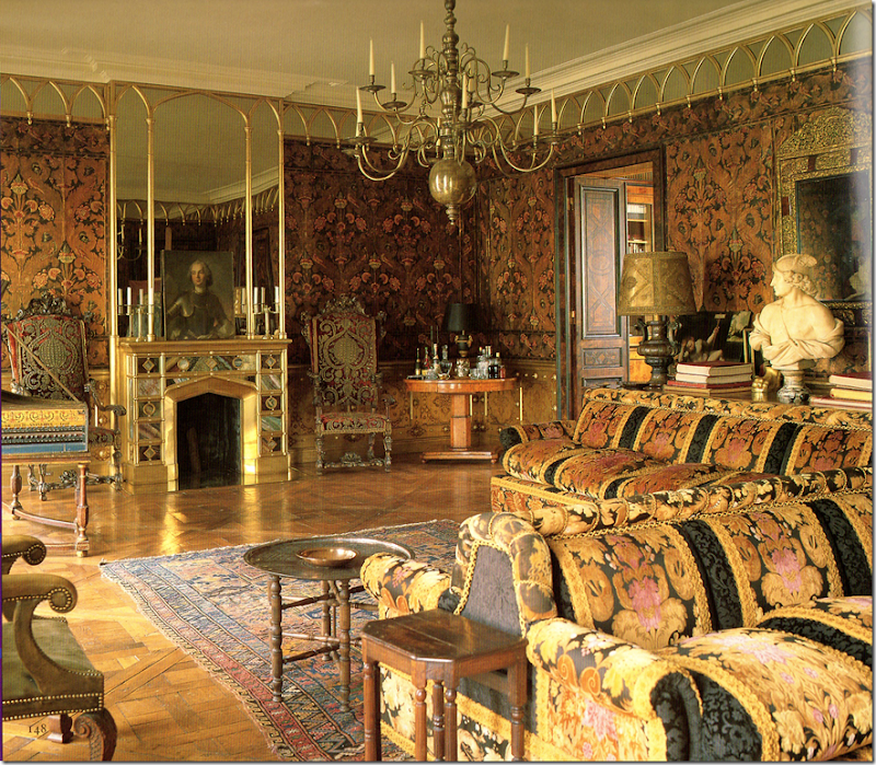
Here in pictures taken by Derry Moore for his book, Rooms, the dancer is shown in his beautiful Paris apartment.  The nudes line the walls, sometimes reaching up three to the ceiling.   How gorgeous is this robe he wears here?  It looks like a silk ikat.   Emilio Carcano helped Nureyev decorate the apartment, which was photographed by Moore for Architectural Digest in 1985. 

image

In the book, Rooms, Moore implies that Nureyev was sick and sweaty with a cold or maybe AIDS when this picture was taken, yet this was ten years before his death.   Nureyev hid his disease and denied he was ill until the very end.  He spent most of that time in his Paris apartment and at his hideaway island on the Italian Amalfi coast. 


image

In the living room, the walls are covered in a tooled Spanish leather.   Notice the harpsichord on the very left.  Unfortunately, the painting in question is not visible in any of these pictures.  This room has two fireplaces facing each other and a large double sided sofa sits in the center of the room.


image

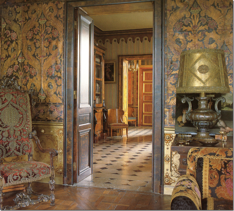
Looking from the living room into the study/library.   Here you can see the leather walls up close.


image

A view from the living room towards the second fireplace.  Those doors!  Those floors! 

image

The bathroom with its copper tub.   The room is lit by a faux skylight.   Now THAT’s a faucet!!!!  What an amazing piece of hardware.  The marble floors found in the library flow here into the bathroom – the height of luxury. 


image

It’s only fair!!!!  After showing off so many bums, it’s only fair we get to see Nureyev’s own backside – proudly displayed on vacation at his Italian island.   There are a series of nude photographs taken by Avedon in 1961 during Nureyev’s youth, when he was at his peak physically.  A simple google search reveals all, leaving nothing to the imagination.  

image

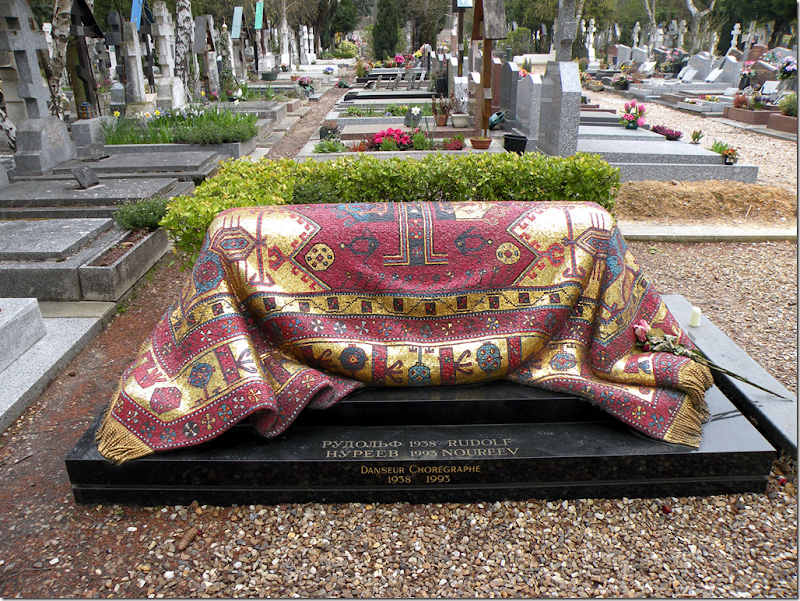
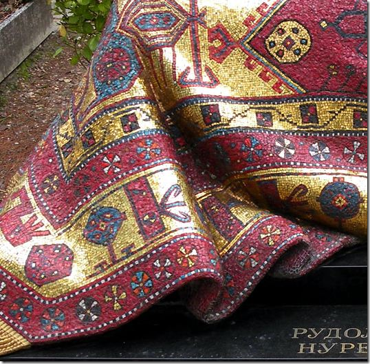
Nureyev was buried in Paris.  His grave is quite unusual and beautiful – just as the man himself was.   Covered in a mosaic rug, it symbolizes his great love of art, textiles and rugs in particular.   How amazing is this????   When I first saw pictures of his grave, I thought perhaps someone had temporarily thrown a rug over it.  I wonder what it looks like in person, if it is easy to tell it is not a real rug?  In pictures, it absolutely looks like a rug.


image

A close up of the mosaic rug – here you can see the actual tiny pieces that create the illusion.  Rudolf Nureyev died in 1995.  

For those interested:

In this short part of a longer article, HERE, the author explains teaching school art and why it is so hard to attribute some paintings to the true artist.

The term academies was first applied in the 17th century to drawings and paintings made from live models - male, of course. But it was the 19th century that saw the real flowering of the genre. At the beginning of the 18th century there were only 19 art schools or academies in all Europe; by the beginning of the 19th there were 200, and by its end some 2,000.

Every pupil, in every academy, was required to make figure studies. Vast numbers of them were made. Though many were destroyed or painted over, there are still very large numbers around. Until about 10 years ago, they were considered unsaleable; it was then that dealers, noting an expanding interest in the 19th century generally, started cleaning them off and putting them back in their shops.

It was the French, with their love of method and order, who formalised the 19th-century system of teaching art; imitated all over the world, it has come to be dismissed in our century as "academic". But the students at the Paris Academie des Beaux-Arts, through long and wearisome hours of drawing casts of classical sculpture and live models (often their teachers), achieved a technical mastery that is never likely to be repeated. It can be admired in all its glory in the Nureyev collection, which concentrates largely on this school and period.

A nude by Theodore Gericault, the short-lived genius of French romanticism, is the earliest example in Nureyev's collection. "He loved Gericault," says Francois, "and bought his first one in Paris from a dealer called Lebel - he was not even thinking of collecting academies at the time." Gericault, who died at the age of 35, left only one major painting, The Raft of the Medusa (now in the Louvre) but his many admirers ardently collect his sketches and studies. The Nureyev sale contains four, plus one "attributed to Gericault" and two more catalogued as by "followers of" Gericault.

*********************************************************************************************************************************

Finally,

image

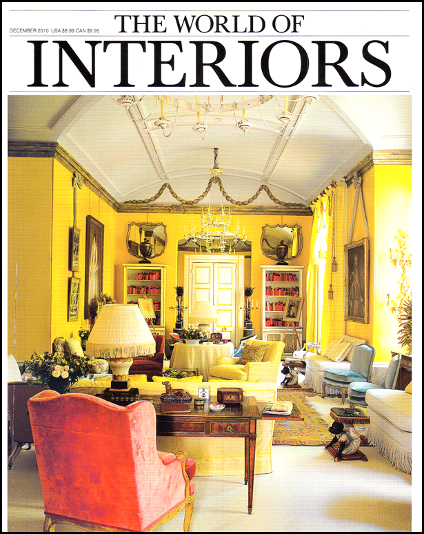
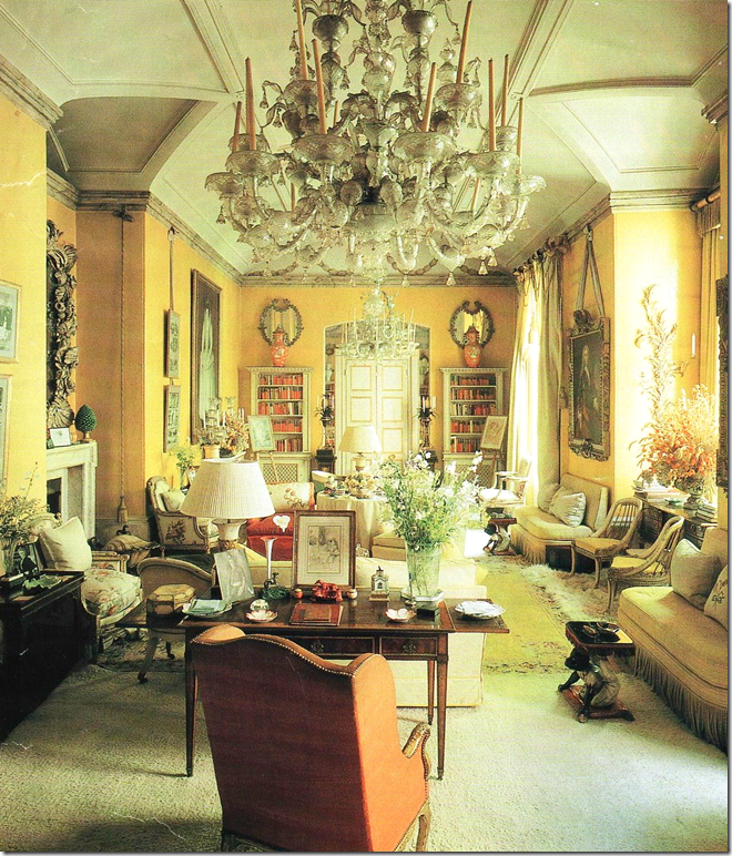
In other magazine news, this month’s The World of Interiors has an article on Nancy Lancaster’s famous buttah-yellow drawing room.  Celebrating the room’s 50th anniversary, Colefax and Fowler has recreated the room, using some original elements and some major new elements.   At first glance, I was stumped at the cover.  I knew what it was, but it wasn’t what I knew!  The chandeliers leap out as a major difference in the new version.  So do the back mirrors.  The article is a fascinating and fun read if you are into Lancaster and her most well known room – in fact, some think of this as one of the most famous rooms in interior design.   Before you read the article – try to guess how many elements are different and how many are the same.  That is, if you have all the time in the world.  


image

The original room – spot the differences?

And don’t forget the new Skirted Roundtable is up with Belgian Pearls’ Greet, HERE.

The Julie Neill Chandelier Giveaway Winner

54 comments

for_web_049

The Elizabeth Chandelier by Julie Neill – The Giveaway.

The Julie Neill Designs chandelier giveaway was extremely popular!   I had a funny feeling it would be.   Almost 1,000 readers entered, making it one of the biggest Cote de Texas giveaways ever, along with the lantern giveaway from BROWN this past July.  I only wish I had more chandeliers to give away.  These giveaways serve two purposes – first, they are a way for me to give back and thank you for supporting the blog.  And, second, for the donor, it’s a way to advertise their company.  In addition, the owner learns something about their merchandise with these giveaways.   I always require that in order to enter, you must first visit the company’s web site and look at their product.  Then, in the entry comment, tell what you liked best and why.   Your responses go a long way in helping the donors understand what particular product in their line is liked and why.  Giveaways on blogs are secret pleasures.  Even in a popular giveaway, the odds are great that you might win.   When entering a contest, odds of 1 in 1,000 are much better than 1 in 50,000 odds you might find in a magazine contest.    But on smaller blogs or less popular giveaways, your odds might be 1 in 35 or 1 in 100!!!

image

The Ingrid – the contemporary choice in the giveaway.

Today, I am happy to announce the winner in the Julie Neill Designs chandelier giveaway!  The winner is also a blogger – THE CLUTTER DIVA.  She is a real estate agent turned home stager who hails from San Antonio, Texas, home of the Alamo.   Congratulations to The Clutter Diva!  Hopefully, we will soon see pictures of her new chandelier hanging in her home.   Some people have asked how I choose the winner.  First, I go to the web site www.Random.org HERE and enter the number of the total entrants.  The web site then generates one number which is the winner.  I go back and pick out the comment with the same number.  This time, The Clutter Diva was the lucky one!!

image

The Mollie Chandelier by Julie Neill Designs

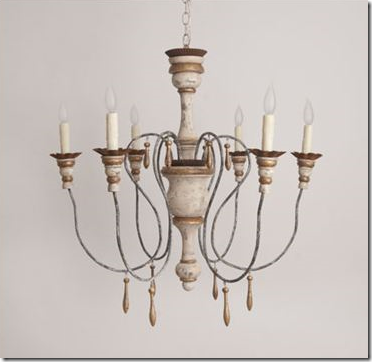
As the giveaway rules state, The Clutter Diva left her winning comment on my blog after first visiting the Julie Neill Designs web site.  There, the Clutter Diva said one of her favorite designs is the Mollie Chandelier – pictured above.   This Italian styled chandelier has become the trendiest look in hanging fixtures, after lanterns, so I am not surprised this was her pick.


As for the giveaway chandelier, I wonder which design she will chose – The Elizabeth or the Ingrid, the more contemporary fixture.  I have a feeling The Clutter Diva will be choosing the Elizabeth. 

image

I want to thank the beautiful and talented Julie Neill once again for her wonderful generosity in hosting this Cote de Texas giveaway!  Thank  you Julie, so very much!!!!

And, in other giveaway news:

The last giveaway before Julie Neill Designs was the Harrison Howard print.   Harrison, an artist, has a wonderful web site HERE filled with all his creations.   The giveaway was one print of the winner’s choosing.   The winner of the Harrison Howard print was Kwana Jackson, the very popular blogger of Kwana Writes fame HERE.  Below is the  print that Kwana chose for her giveaway.

“Afternoon Watering” by Harrison Howard

Kwana told Harrison that she picked this particular print, Afternoon Watering, because it reminds her of her and her husband.  As soon as the print has been framed and hung, Kwana promises us a picture of it, in situ!  Congratulations Kwana. 

image

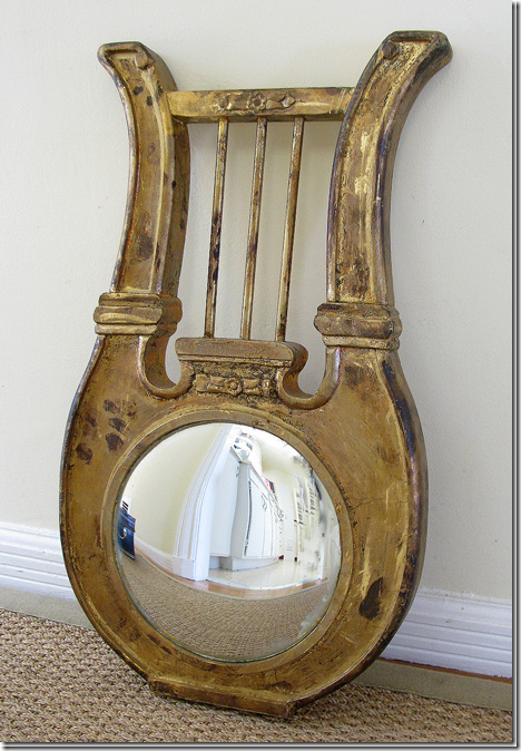
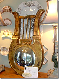
inally, in the Paris Hotel Boutique HERE giveaway, Lynn Goldfinger Abrams most generously donated this beautiful antique convex mirror!!!   Much to my surprise, the winner lives about 1 mile from me in Bellaire, Texas, which is right next door to my own hometown West University Place.   Yes, we both technically live in Houston – just a few miles from downtown Houston in fact – but our addresses are in these two incorporated cities within the boundaries of Houston.  Both of our cities, West University Place and Bellaire, have their own mayor, police and fire departments, but we share school districts with Houston, amongst other things.   The winner of the Paris Hotel Boutique giveaway who goes by the name “Camplkidz” emailed me today to say her mirror has arrived and will be up shortly.  In the meantime, she sent me a picture of it awaiting its final placement.

image

The giveaway mirror waiting to be placed at its Bellaire, Texas home.

I want to take this time to tell all of you who have entered these giveaways - thank you for your support.  I started writing Cote de Texas in 2007 – and it has turned out to be so much more than I ever envisioned or hoped for.  As must bloggers say, I only expected my friends and husband to read it, but truthfully, my husband rarely if ever reads it, and only a few of my friends do.  Yet, somehow, over 70,000 people a month do read it, a figure that staggers and profoundly humbles me.   The vast majority of readers are people I have never met – most are from Texas and the United States, but there are many from Australia and other parts of the world I will never have the privilege of visiting.   Writing the blog has been a lot of fun and a lot of hard work too.   It’s not easy to come up with something worthwhile to say every week, but I do try to be original and interesting.   Sometimes it is, sometime it’s not.   Your positive, and even those not so positive comments, are what keeps me motivated to continue.   When I first started, I tried to answer each and every comment – which back then was a manageable feat.  Today, the comments are numerous and I have spent many hours feeling guilty about not being able to personally respond to all of you.  For that I can only offer my apologies and hope that you understand.   I wish I could still answer each and every comment, but know that I do read and digest them all.  

As for personal emails, I get an amazing number of emails a day – most are spam or cookies driven, but sometimes personal emails get lost in the shuffle.    If you have emailed me and I haven’t responded within a week, please email me again.   It’s probable I never saw the original message.  It’s hard to believe it’s already November and the holidays are quickly approaching.   I have a few more smaller giveaways planned for the end of the year.  I wish I could have one each week!

image

The interior design of Greet Lefèvre, the woman behind the Belgian Pearls blog.

On another topic, there is a new Skirted Roundtable interview now available with Greet, the talented interior designer and cabinet maker from Belgian, who writes the only blog from that wonderful design conscious country:  Belgian Pearls.   To listen to this interview, please go HERE

And finally, speaking of lost emails,  will the person who sent me this picture below please email me again!  I don’t know who sent these pictures!!!  

Bar

COTE DE TEXAS: MY BIGGEST GIVEAWAY EVER!!!!!!

943 comments


image

I am wild crazy over chandeliers.   One of the happiest days in my own home design history was when this chandelier was installed in my living room.   I love this style of chandelier – it’s one of my favorites.


image

Another good day was when I bought this chandelier from a friend who was redesigning her house – taking it from English to totally Swedish.   This was in her bedroom and this Italian style light fixture didn’t mix with her new Swedish design.  Good thing for me!   This style is another favorite of mine and has gained greatly in popularity these past few years.


image

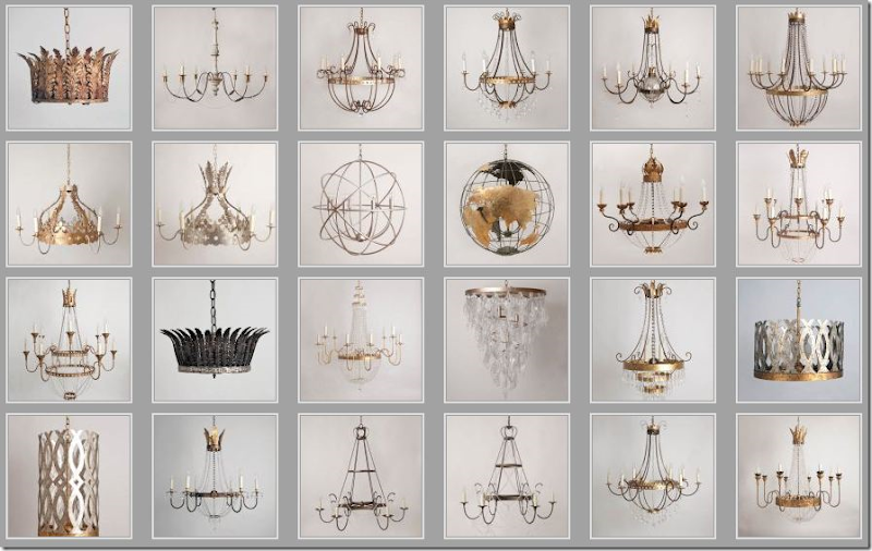
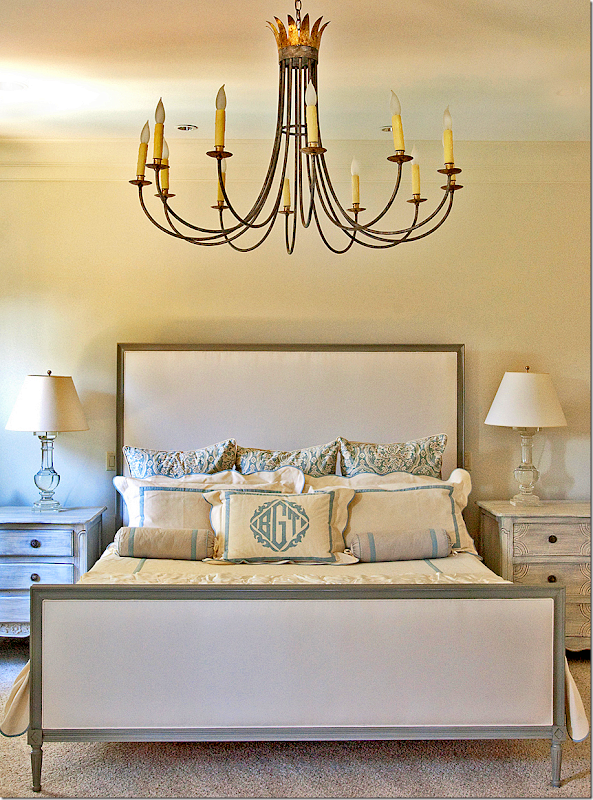
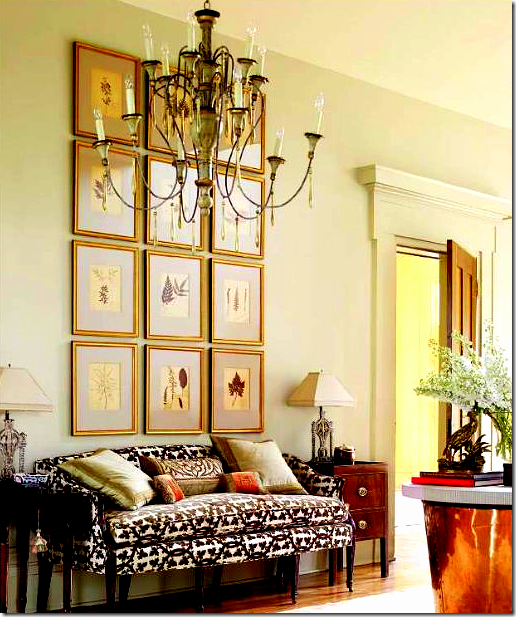
There are few makers of chandeliers who get it right – consistently - and Julie Neill is one of them.   Her designs are based on the classics, yet she adds a youthful twist to each fixture.   I would have trouble picking one favorite – I love so many of her chandeliers!   She designs and crafts all her light fixtures from start to finish in her own New Orleans workshop.   Everything is customized to the job.   In fact, all the designs in her portfolio started life as a custom commission.    Julie is so creative – she began her career as a painter, then moved on to painting things for the home instead of canvases, next she tried interior design which lead her to this very successful career in 2000.   Her retail shop is on Magazine Street – one of America’s best streets for antiquing.  If you’ve never gone antiquing on Magazine Street – you should include it on your Bucket List.  

Besides designing chandeliers, Julie also creates sconces, furniture, and accessories.   New Orleans heavily influences her designs – a crown is an oft used element in her romantic and decidedly feminine creations.    Julie’s stamina and creativity is boundless.  Not only does she run her own successful retail store and workshop, she has employees and two children to watch over, and she maintains a charming 1800s shotgun house.    I first met Julie on the blogs – of course – where she writes The Bayou Contessa, a beautiful glimpse into New Orleans design.  If you are planning a trip to NOLA, a stop at Julie Neill is a must.  If you are in the market for a chandelier, give Julie a call.   She works with each client to create the exact fixture they desire. 


image

Julie has just redesigned her web site and it’s gorgeous!  Here is a small sampling of her product.   Each fixture can be customized to any specification.  Her range is from traditional to contemporary.   All the finishes are hand applied and painted.


image

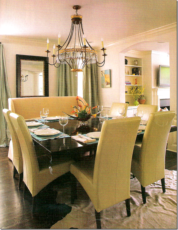
Here is the glamorous Cinderella chandelier in a dining room. 


image

This bedroom’s chandelier is a more contemporary design mixed with traditional elements.  Leontine Linens.


image

Julie designed this lantern with matching sconces for Tobi Fairley’s Richmond Symphony Designer House.   I love this room!!!!  The red of the chandelier is picked up in the trim of the table.


image

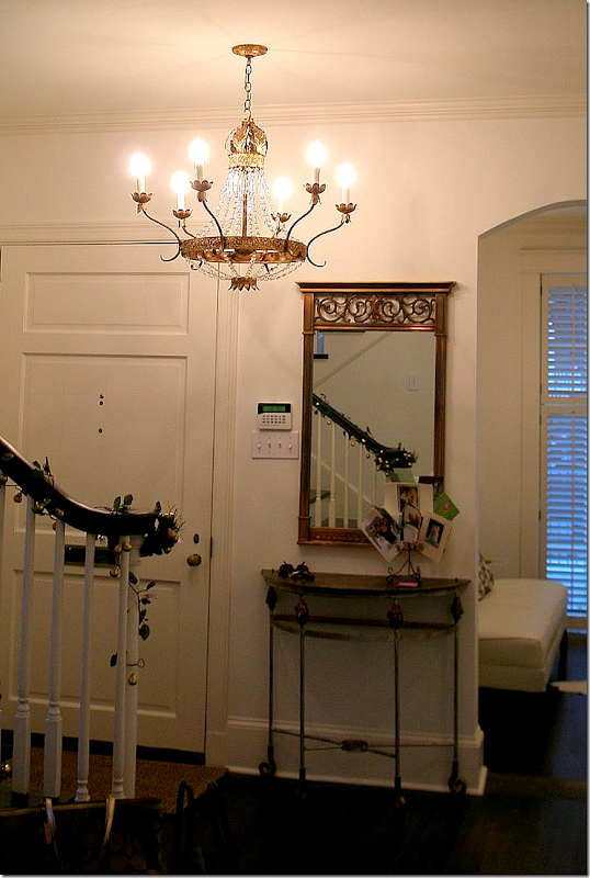
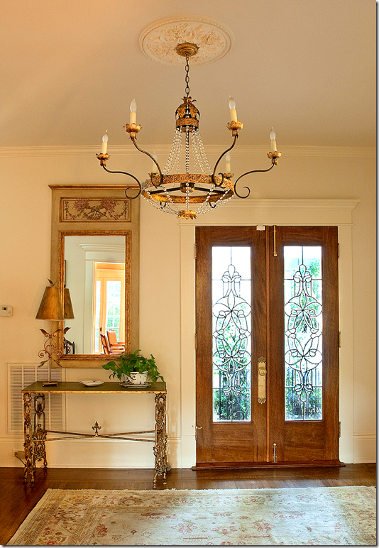
Seen in this month’s Elle Décor magazine – this fixture is one of the many Italian styled chandeliers that Julie makes.  Shown is the entry hall of Jane Scott Hodges’ house in Kentucky. Jane Scott is the founder of the fabulous Leontine Linens   Note:  the pillows are by BVIZ.    Just beautiful!


image

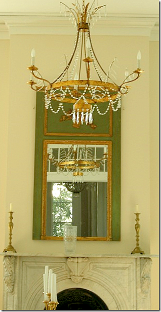
The Sheldon Chandelier is reflected in this trumeau.  


image

One of her most popular designs is the graceful and romantic Elizabeth chandelier.  Named after this client, the chandelier is great for lower ceilings – as it is more horizontal than vertical.   This couple commissioned several chandeliers from Julie and an article on their house appeared in the New Orleans Home magazine.   Shown here.


image

For their dining room, Julie created the Denise chandelier.  I love the combination of the chairs and the bench around the square table.


image

The Ingrid fixture is another popular design – more contemporary than Julie’s crystal chandeliers.  Room designed by Jeffery McCollough for the Acadiana Symphony Decorator Showhouse.   


image

These charming Beatrice hanging fixtures and Beatrice sconces designed by Julie made the cover of House and Home.


image

Julie Neill’s shop on Magazine Street is filled with her creations – chandeliers and sconces - along with the pieces of furniture from her line. 


image

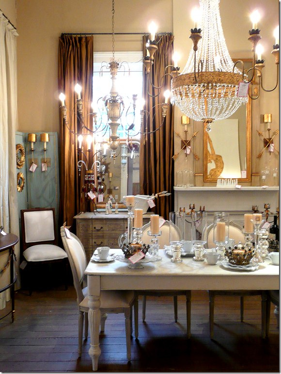
Here’s a close up of two chandeliers from the shop, one French and one Italian!   The trumeau and the cabinet under it are also in Julie’s line.


image

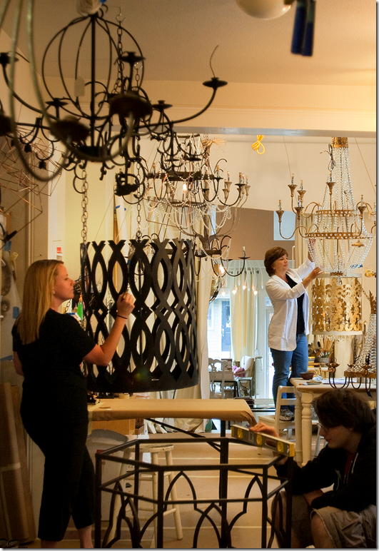
Julie’s team hard at work – the chandeliers have to first be constructed, then hand finished, before they are able to be installed on the sales floor.   Each fixture goes through a long and laborious process to be ready for sale. 

OK.  OK.  OK.

ON TO THE GIVEAWAY!!!!!!!!!!!!

o, you ask – what is the giveaway?!??!?!?    I have been bursting at the seams keeping this a secret for the past month or two.   One day Julie emailed me asking if I would like to host a giveaway of her product.   What a silly question – of course I would love to!!!!   I thought maybe she would be donating a sconce, or a small accessory from her shop.   You can imagine how my mouth dropped to the floor when she so generously offered a CHANDELIER for a giveaway!!!!!!!!!!!!!!!!!!!!!!!!!!!!!!!!!!!!!  

Yes!!!   An original, Julie Neill Chandelier will be given away to one lucky winner!!!   Oh My Gosh!!!!!   Unreal.   Seriously, y’all, I am SO excited about this.  It’s the biggest giveaway ever here on Cote de Texas and we’ve had some great giveaways in the past.   Read on for the deets (details to those of you over 30.)
 

image

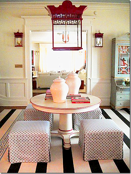
The winner will have their choice of either a traditional or contemporary fixture.   The ELIZABETH Chandelier is the traditional choice.   I was so excited about this choice because this fixture is one of my all time favorites of Julie’s.   Can you believe this giveaway?    Seriously!!!!!!   You can win this!!!!!  Retail value is $3,800.00


image

Or, if you are a more contemporary person, the Ingrid Chandelier will be the second choice for the winner.   The mirror and table are also from Julie Neill.   Retail value for this chandelier is $3,495.00

Are you an Elizabeth or an Ingrid Person????

OK – HOW TO ENTER AND WIN EITHER THE ELIZABETH OR INGRID CHANDELIER:

Go right now to the Julie Neill Design web site  www.julieneill.com and look under the Chandelier, Sconces, or Lanterns sections.   Pick out your favorite item that is for sale.  Come back here and leave me a comment on what your favorite item is and explain why you like it so much.    That’s it!!!!

You have until Saturday night at 11:59 p.m.   The contest closes at that time.   One person will win either the Elizabeth or Ingrid chandelier – their choice.  BE SURE TO LEAVE YOUR EMAIL ADDRESS IF YOU POST ANONYMOUSLY!!  And please, only one comment per person!!! 


image

Your choice:  The Elizabeth


image

Or the Ingrid!!!   Good luck to everyone!!!

And finally -  a huge, huge thank you, kiss and hug to Julie Neill for her generous giveaway.   From the bottom of my heart, thank you Julie!!!!!

*********************************************************************************************************************************


image

Becky Vizard and Ann Connelly at Watkins Culver this Thursday and Friday!!

NOTE:  Houstonians – I wanted to let you know that BVIZ and Ann Connelly Fine Art are back in town at Watkins Culver this Thursday and Friday.  Becky Vizard has the most wonderful pillows – many of which have been featured on the pages of the best design magazines (including the Elle Décor picture previously shown!!)   Her good friend, Ann, has a wonderful art gallery in New Orleans.     To read all about these two talented ladies from Louisiana, go HERE.  For details on when and where, call 713-529-0597.

What an idiot! At least I Admit It.

87 comments


image


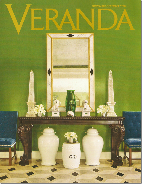
The other night I was breezing through the grocery store and stopped at the magazine section, which is a rare occurrence for me these days.  Ever since www.Zinio.com – the digital magazine company – started selling issues online, I subscribe to as many design magazines that are available via the computer.  It’s so easy!   The magazine comes directly to your laptop and stays there – no more mailing in subscriptions or schlepping across town to a book store.   And best of all – there are no longer enormous piles of old issues staring  at you while taking up precious storage space.  But it’s not all great in Zinioland.   You would think that the digital Zinio issue would arrive to your computer faster than the supermarket racks, right?   But there it was – the new December issues of House Beautiful and Veranda sitting on the grocery shelves, while Zinio still hasn’t updated my computer.  I must say that I was so proud of myself when I resisted the overwhelming temptation to buy those two issues anyway instead of waiting for Zinio to update.  But, I digress.  

What really caught my eye that night was the new Architectural Digest.   The cover looked so fresh and so, how do you say…un-Architectural Digest-ish.  I eagerly flipped through it and got all giddy!   Finally!!!!  Architectural Digest is back!!!  There were so many features that looked interesting I could hardly wait to run home and read it.  Wow.  I haven’t said that about an AD issue in years.  In fact, everyone has been so down on the magazine lately, including all three of us on the Skirted Roundtable, that I was eager to spread the word that AD’s new editor Margaret Russell’s touch is really evident.  So many of the houses in this issue look like they could have been in Elle Décor – the magazine that Margaret had headed up during its entirety. 


image

Former Elle Décor Editor Margaret Russell now on tap to head up Architectural Digest.


In case you were out of the country earlier this year, the magazine world was rocked when it was announced that Margaret was leaving Elle Décor for AD.  More shakeups was news that domino’s Dana Caponigro was coming to Veranda and Stephen Drucker was leaving House Beautiful for Town & Country.   Dara and Stephen’s influence on their new magazines has been subtle so far, changes haven’t seemed all that dramatic at either magazine – yet.  But, it’s all perception.  Still, Margaret at AD – wow, now that’s some change.  Looking at December’s issue, the differences are sooo obvious!  I just couldn’t wait to spread the good news.  Like I said - what an idiot!

Luckily before I printed this, I checked the Editor’s Page at Architectural Digest to discover that Margaret Russell hasn’t even taken over yet!  Her first AD issue won’t be until January!!!!   The egg on my face was dripping all over my computer.  All I could think was THANK GOD I checked that Editor’s Page!!!  I had totally forgotten that Margaret wouldn’t be at AD until January – the announcement had been made so many months ago.  I would have blabbed on and on about how WONDERFUL the new AD is because of Margaret Russell.   What a complete idiot!!!   Still, my assumption DOES tell me that the January issue is probably going to be fabulous, because the December is pretty damn good itself. 


image

First, there is this house by Stephen Sills that really got me blood pressure up.  Look at those WALLS!!!!  They are burlap!  Pattern painted on burlap!!!!   Can you believe that?!?!   Gorgeous.  And look – wall to wall carpet.   Over stairs – when was the last time you saw that – and how fresh is it?  It looks so warm and inviting.  And those two globes.  The lantern.  The mushroom family.   This is a library for this decade, young and sophisticated.   It’s hard to see but there is a banquette against the shelves on the right.   Notice the fabulous library table – just waiting to be opened and piled up on.    But, those WALLS!!!!!!  Gah!!!


image

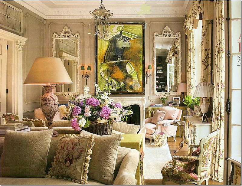
Next, over in London, is this little townhouse by the incomparable Nicholas Haslam.   Owned by two art collectors, they wanted a home, not a cold contemporary museum.   I mean – is that just any painting over the mantel?   It’s a PICASSO!!!!!!!!!!!   I have never seen such a large Picasso handled so casually before.   And I love the color of the paneling – it looks like Iced Coffee.   Notice the chartreuse skirted table next to the fireplace.   The back to back sofas are divided by a console table that also picks up the chartreuse in the painting.  Light pink French chairs.   Total eye candy.   YUMMMMM.  


image

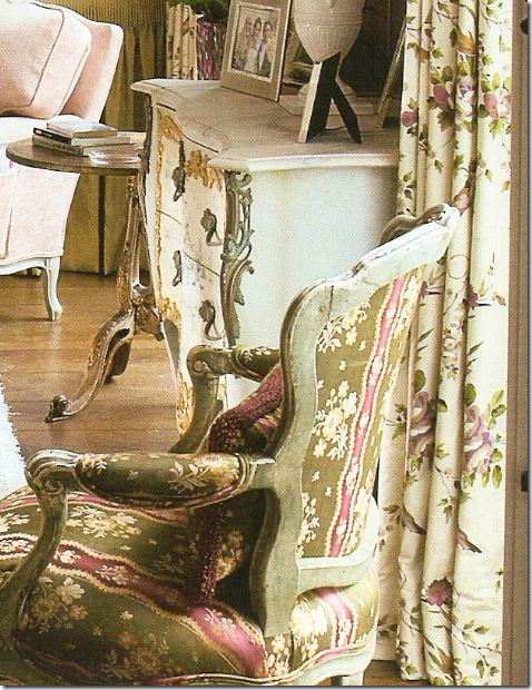
A closeup view of the fabrics:  I love how Haslam still unashamedly still uses those blowsy English chintz fabrics.  I adore the curtain fabric.  He says this room is in the spirit of Nancy Lancaster and he is so right.   That chair!!!!!


image

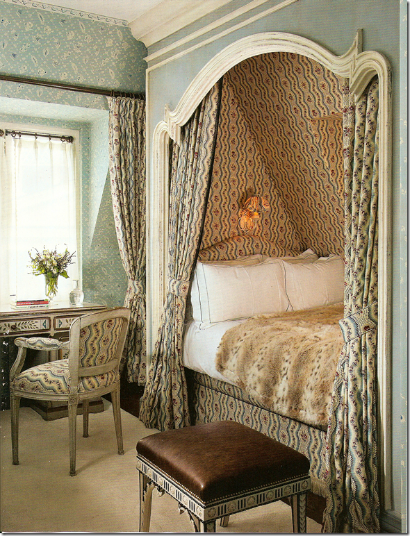
Then, there is this little guest room in London by Haslam.   Notice the French curve on the alcove.  Is there anything in life prettier than a Louis XV inspired curve?    I love his mix of the two fabrics.   He is wonderful. 


image

The next beauty is a beach house by Alexa Hampton in Bridgehampton NY.   Another view of what a library for a young family should look like.  Loving the striped rug and pillows.  So casual for a beach house, yet still sophisticated.  Not an easy mix to do right. 


image

Alexa Hampton:  Great kitchen.   But something about this kitchen seemed familiar?   Those chairs with their plaid half slips, the two lanterns.  Seem familiar?


image

Remember this blog famous kitchen in a showhouse?   The same exact chairs – with the same plaid half slips, similar double lanterns.   But it’s not the same house.   I wonder if the owners were influenced by this picture – or vice versa?

I thoroughly enjoyed this Architectural Digest even though it wasn’t edited by Margaret.  Now,  I can’t wait for her first issue next month.  I am so anxious to see her changes – I wonder what they will be?


image

And for more idiocy from moi!   Last month, I blasted the new Veranda.  I think I spoke too soon.   The new December/January issue to TO DIE FOR.   The cover story is a house in Houston designed by the incomparable MILES REDD!!!!  YES!!!  This must be the first house in Houston that Miles has done and it’s a stunner.  Look at those rich green walls, with tufted sapphire blue velvet.   That floor!!!   Veranda always has the best photographers and this Miles Redd story was snapped by the world’s best Fritz Von Der Schulenburg.   For once, we can finally see big, huge pictures of Miles’ interiors – bright and clear, every tiny detail visible.   What a rare treat.  


image

The Miles Redd Houston living room with stripes, icy blues, persimmon accents, chintzes, and a fabulous center table by John Rosselli Antiques.   Is there anyone out there that would or could do a fancy living room like this?   Every room Miles does is so different, so completely original and unique.   What a genius.   And what a coup that Veranda got this house.  


image

A peek at the Saladino house shown this month in Veranda.   The Master.


Also in this issue is a new project by John Saladino – worth the price of the issue alone, and another one by Vicente Wolf.   Stellar issue!  A keeper.   The only ho-hum is the house by Veere Greeney seen a few times before, but it’s such a fabulous project it’s worth the second glance.   Dara – you outdid yourself!!!   I could have cried over this issue!!! Fabulous!!

And a note to Cote de Texas readers:


image

Harrison Howard print – last week’s giveaway.


The Harrison Howard print giveaway is now history.   It was a great success – so many people entered it.  Be sure to visit his web site www.harrisonhoward.com if you are interested in purchasing one of his prints.

And – this week, I am having a NEW giveaway that will be the biggest ever.  EVER.   Think crystal, think lighting, think gilt.   

Look for it in the next few days.   You will be sooooo excited!!! I PROMISE you!  I can’t wait!!!!