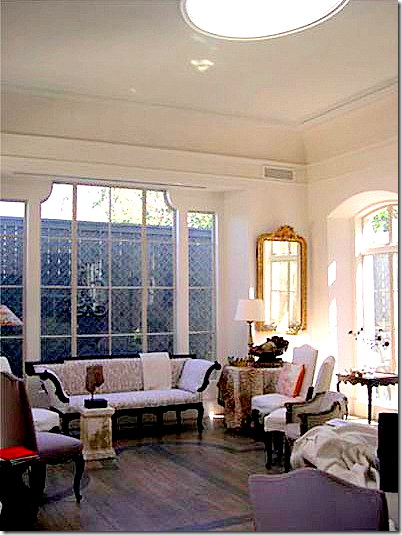
 Kay O’Toole’s house as seen in the March Veranda, pictures by Tria Giovan. What roses!!! I just adore the soft lavender color of the chair fabric. Notice how thick the walls are, easy to see this where the windows are placed.
 The enfilade view from the bedroom past the entry hall into the living room. Notice the gorgeous doors! The front of the house is on the left.
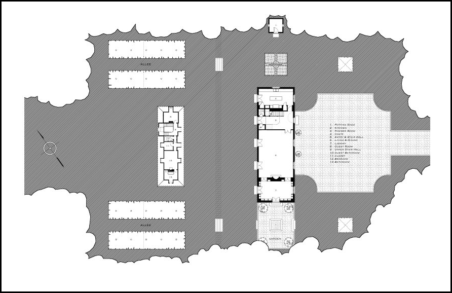
 This picture of Kay O’Toole’s house taken from the architect’s web site shows the skylight and the design on the wooden floors – both elements that are found on the above floor plan.
 A collection of antique oil paintings hang over a settee. The chinoiserie tea table is so beautiful!
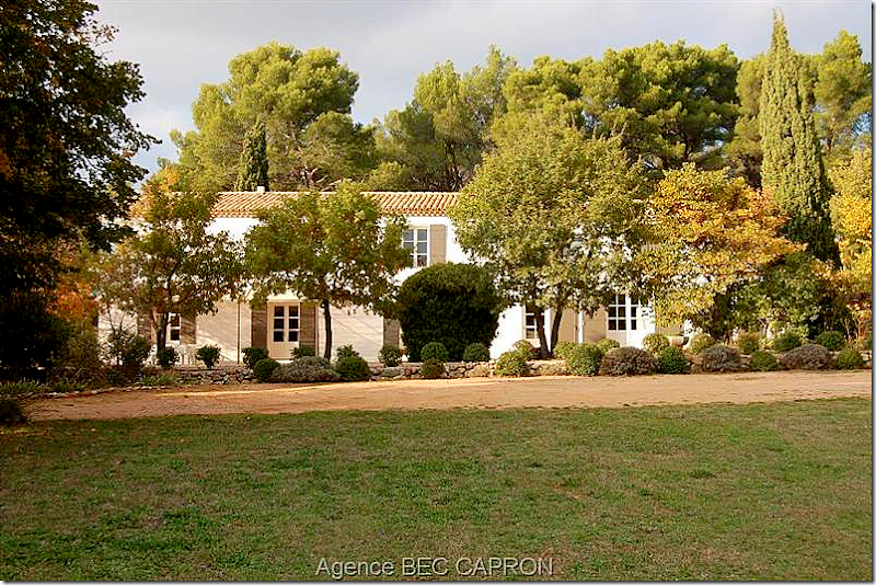
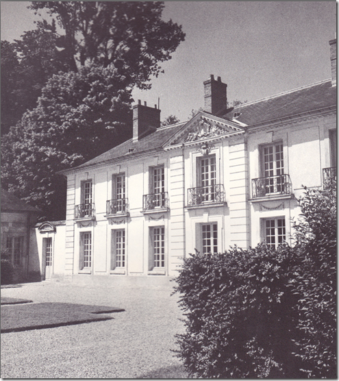
A charming French house found in Provence.
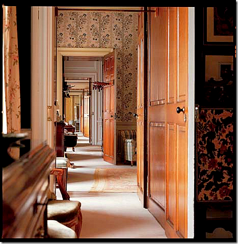
I have long been obsessed with enfilades – especially French ones found in the southern region of that country. What exactly does enfilade mean when used in architecture? Simply, an enfilade is a building where the interior doors are aligned with connecting rooms along a single axis. When the doors are all lined up – you can see from one end of the house to the other. The history of the enfilade is a long one. From the Baroque period on, royal palaces incorporated enfilades - state rooms would be lined up on one axis while private apartments would be on another. Great houses in England used this floor plan – Chatsworth House and Blenheim Palace are two famous examples.
.
Chatsworth House’s state rooms are lined up on an enfilade, one room flows into the next with their doors placed in a long line. Here you can see from one end of Chatsworth all the way down to its other end.
Blenheim Palace: a long enfilade on the upstairs private bedroom wing.

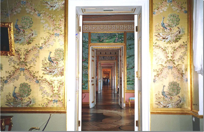
The 17th century Tsarkoe Selo, an imperial palace in Russia, has a particularly beautiful enfilade due the lavish wall treatments. The Tsarkoe Selo is home to the famous Amber Room.
Maison de George Sand, home of the French author, has an enfilade of rooms.
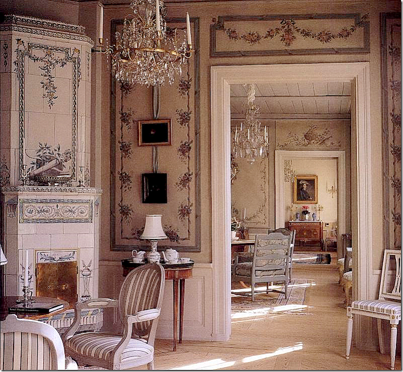
 Here, in this Swedish house, the enfilade is short, just three rooms deep. So pretty!
Palaces traditionally have enfilades on their state floors.
Juan Pablo Molyneux’s house has a gorgeous enfilade of rooms.
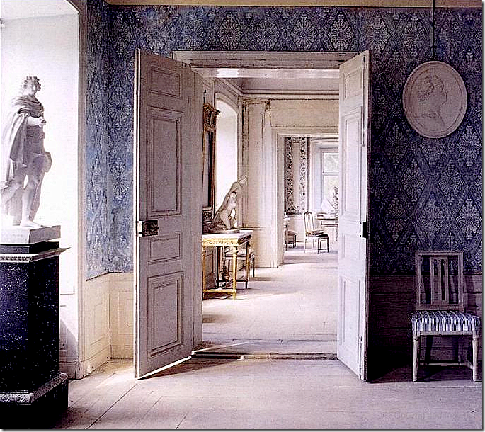
 Another Swedish enfilade.
A country French house with beautifully carved doors between its rooms.
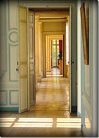
 The window at the end of this long enfilade is especially pretty.
 A modern interpretation of the enfilade by Thad Hayes who used beautiful doors to separate these rooms.

Another new version of the building style in Rosemary Beach – here arches separate the rooms, not doors.
`

David Adler, the famous architect, used enfilades in many of his designs. This lineup of rooms is found in the 1925 Lasker house on Chicago’s North Shore. Again, arches not doors separate the spaces.
Limed wood doors and parquet floors update this house, giving it a more contemporary look.
c

Not France, but America by William T. Baker, thanks to Things That Inspire. I would love to see the plans of this house to see if it is one room deep.
Traditional enfilades are not always fancy or large. The New Orleans “shotgun house” is such an example. Here, in the French Quarter, is a rare but charming shotgun house, so called because a bullet would travel from the front door out to the back.
The shotgun house floor plan is a enfilade – all its doors are lined up. The view at the front door would end at the back yard.

Enfilade is also another name for a buffet with cabinet doors. This 19th century French painted enfilade with original hardware is from M. Naeve in Houston and 1st Dibs HERE.

Kay O’Toole’s Floor Plans: Enfilade AND a Lanterne
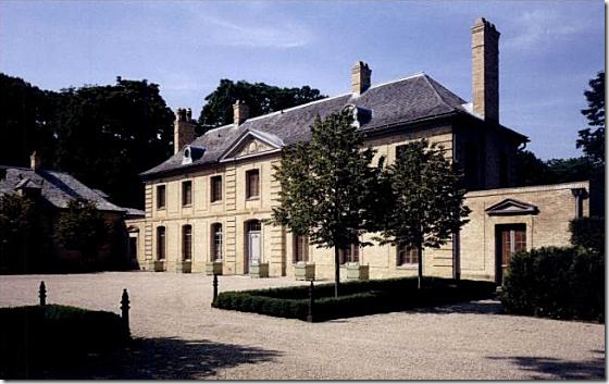
Looking again at Kay O’Toole’s floor plans, they reveal that besides being an enfilade, the house is also an example of a French Lanterne - meaning, the house is one room deep and the front and back windows are lined up – making the house see-through. This style of house is named after the famous 18th century hunting lodge, the Pavillion de la Lanterne, located in the Versailles Park in France. La Lanterne is considered a most beautiful house and it has been widely copied throughout the years by different architects.
 An earlier picture of La Lanterne. The house is used as a country vacation spot by French President Sarkozy. He spent his honeymoon there with Carla Bruni. The romance of a Lanterne design is the ability to approach the house, look into it and out past it, onto the back yard. Imagine at a dinner party, arriving at the house and seeing through it, straight to the back all decorated with candle lit tables.
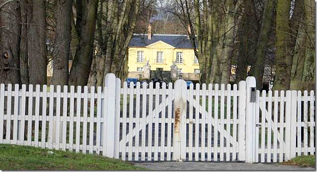
 The gates to La Lanterne are topped by large deer heads.
  A rare floor plan of La Lanterne shows the courtyard its the two wings surround. Here you can see the center part of the building with the windows that line up, making the building see through.
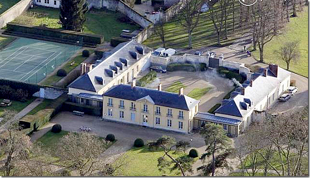
  The layout of La Lanterne. The famous blogger Aesthete’s Lament commented HERE that this view shows the “dreary landscaping, vulgarly sized tennis court, motel-blue pool.” It does seem a shame that the grounds are not prettier.
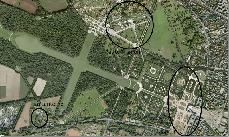
  Here is a larger satellite picture of La Lanterne in Versailles. You can see how close it is to the palace and the Petite and Gran Trianons.
  Security is very tight at La Lanterne now. There is now a metal gate between the deer head posts. Another fence encircles the outer perimeter of the property.
 Rare pictures of La Lanterne. You can really see the essence of the see-through aspect of the house from these pictures.
 The tennis court does seem horribly oversized – couldn’t it be moved to a more discrete part of the estate? The pool, though, is not as offensive in this picture.
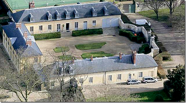
 A closer view of the two wings.
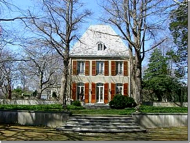
Many grand houses were built modeled on the original Pavillion de La Lanterne. Here, in Lake Bluff, the Carolyn Morse Ely house was built by David Adler in 1923. Notice how the screens have marred the beautiful windows! The facade is a faithful adaption of the original Pavillion de la Lanterne with its six windows and center pediment.
 The Adler Ely house showing the opposite side of the house as above.

The floor plans of the Carolyn Morse Ely house, plainly showing the house to be a Lanterne design with its windows lined up with each other. The center portion of the house is also an enfilade, all the rooms have doors lined up on an axis.
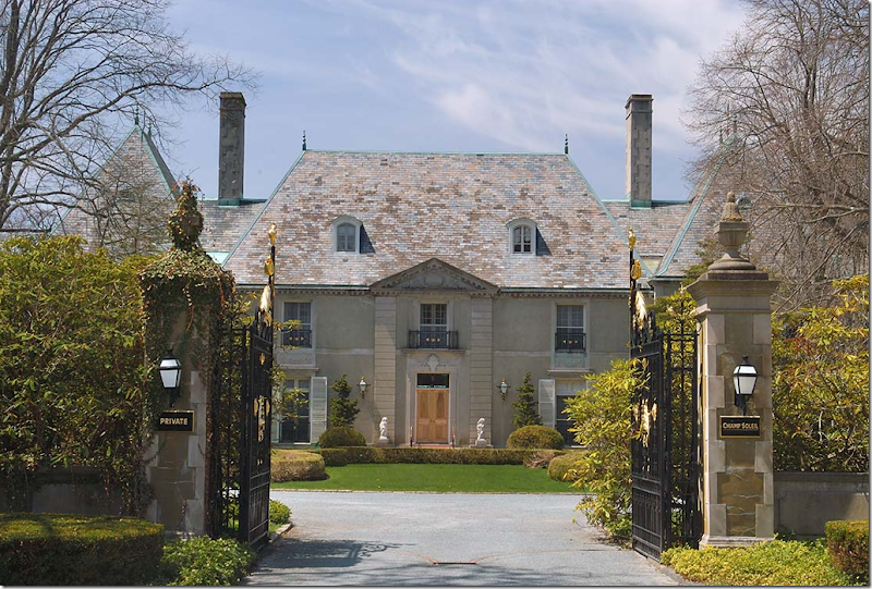
In Newport, Champ Soleil was built, again based on La Lanterne. Things That Inspire took this picture on a tour of the neighborhood. Again, the main section of the house is one room deep, with windows lined up from the front to the back, making the house see through. The gates were recently refurbished at great cost to the homeowners.
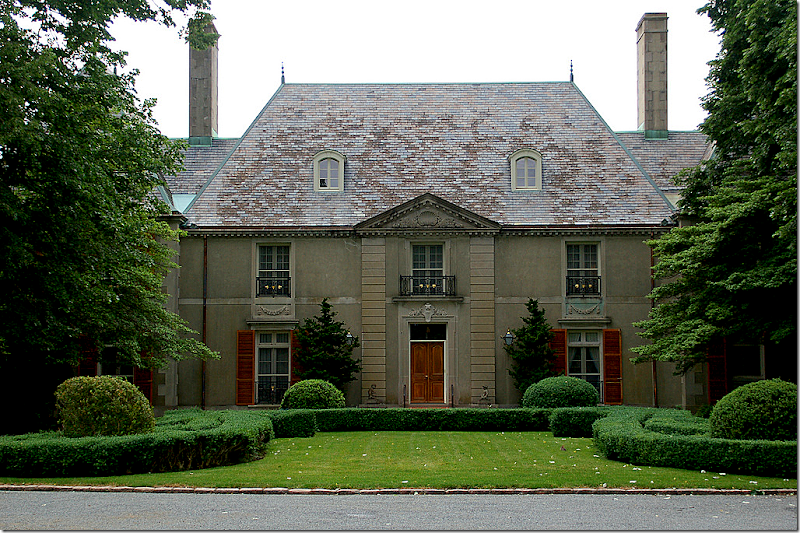
An earlier photograph, taken inside the gates show the shutters and front door stained. Champ Soleil is not as faithful a reproduction as the Ely house. The Ely house has six windows flanking the front entrance, exactly like the Pavillion de la Lanterne. Champ Soleil has only one window flanking the front door, instead of three.
This side elevation picture of Champ Soleil dramatically illustrates the one room deep aspect of the Lanterne design.
 In 1929, Horace Trumbauer designed another La Lanterne inspired house on Long Island for James B. Clews. In 1952 the “Lanterne” center part of the house was demolished leaving the two wings to be converted into separate houses. This facade is a faithful adaption of the original design – there are three windows on each side of the front door, exactly like the Pavillion de la Lanterne in Versailles.
The architects Bories and Shearron HERE designed a wonderful house based on the ‘see through’ style. Sadly, this house has not yet been built. This plan is not a copy of the Pavillion de la Lanterne, rather it is an interpretation of the style. Notice the front door is not symmetrically placed, instead three windows are to one side of the door, while one is to its right.
And finally, a plat showing the layout of the house and gardens.
Reminder: the new Skirted Roundtable is now online HERE. This week we have as a guest, Jackie Von Tobel, author, interior and fabric designer. Jackie is very inspiring to listen to – I think you will really enjoy hearing how she manages to do it all! We are having a giveaway this week – two people will win one of Jackie’s reference books on bedding and window treatments! Hurry to enter!
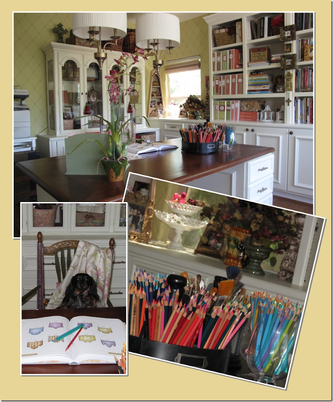 I love these pictures of Jackie’s home studio, where she writes, draws the illustrations for her books, and creates her fabric line. What a neat and organized artist!


