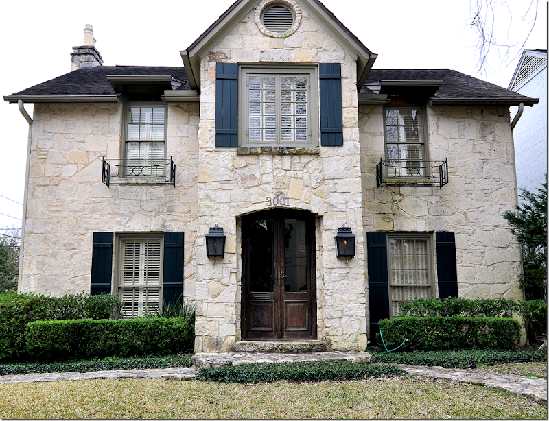
Some years back when the West University Elementary School was still having their Annual Spring Home Tour (why did they ever quit – those were the best shows?!?!) – there was one tour that was particularly memorable: on Albans, you first toured interior designer Ginger Barber’s house, and then further up the street you went through another beauty: The Stone House. Built in 1939, this West U house is a rarity. It might just have the cutest facade of all the original houses, as it was built with Austin limestone over 60 years before that stone became hip and cool and in high demand.
 Massive curb appeal: Austin limestone circa 1939. Today, almost every other new house in Houston, San Antonio, and Austin uses this limestone either inside or out. Notice the front doors – inside shutter close off the panes of glass.
I remember going on this particular house tour very well. It was a tortuous one, the kind that leaves you wishing you could just move and start all over in a new place. It was depressing enough to tour Ginger Barber’s house. Not only was her zen-like back yard to die for, but the inside, as expected, was just so Ginger: casual, warm, friendly, cozy. And then – to have to tour the Stone House right up the street - well, it was just all too much. You know the feeling, you want to go home, scream, and then bomb it to the ground. When I toured the Stone House back then, I left there thinking, why can’t my house look like this? The owner had decorated it herself, though at the time I thought perhaps Ginger had or maybe Carol Glasser. It just had “that look” about it: seagrass, slipcovers, chinoiserie tray tables, antique bamboo and pine furniture, rattan baskets filled with Kenneth Turner candles – that English Country Manor look that Houston does so well. Room after room was prettier than the next. Through the years it has, of course, been added on to – the space between the house and garage was enclosed and became a much needed family room with a master bedroom suite above. I was mad for it. So, recently, when Sally Wheat called me to come photograph The Stone House – I leapt at the chance to revisit the house that had so tortured me. The owner was very welcoming – she is a doll, just as cute as her house is. The mother of two daughters and a baby son, she loves her home and proudly showed it off – who can blame her? But, as they say, all good things must end, and they are now looking to move on. Yes, The Stone House is up for sale. I have a funny feeling it won’t be on the market for too long.
 The foyer: stunning double front doors with interior wood shutters.
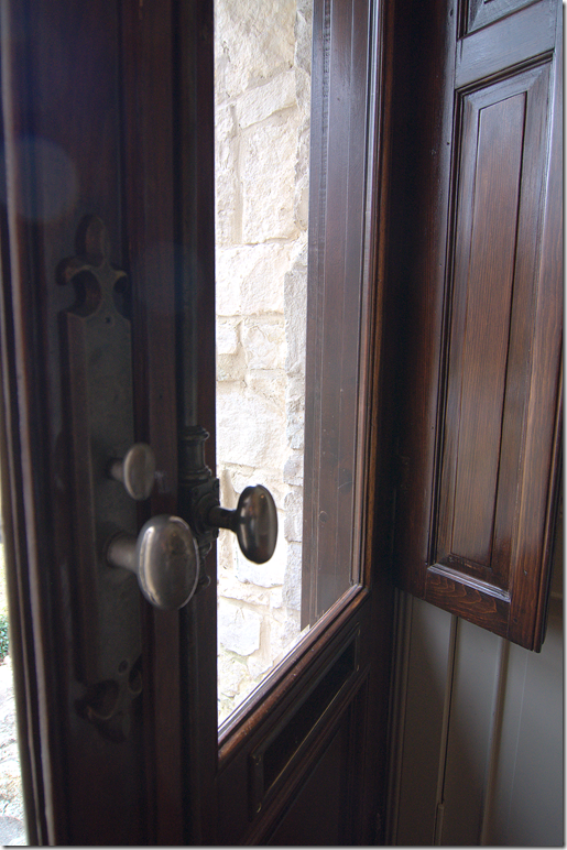
The double front door is quite beautiful with it’s pewter hardware and wood panels that close off the glass panes. To the left is an antique bamboo cabinet and a Louis Philippe mirror. The owner quipped that I should name this The Bamboo House, after all her antique bamboo furniture. While walking through it, I had actually thought of that title, but the beautiful original stone exterior was too defining. Everyone in West U knows this as the stone house on Albans.
 Close up of the wood panels that close for privacy and security. The hardware is so beautiful, and so French!
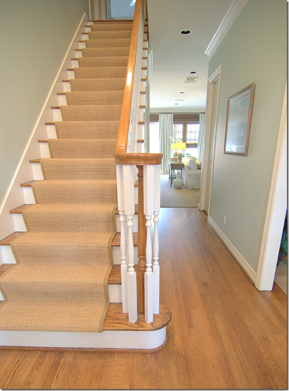
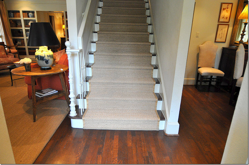
 Walking in through the front door, the living room is to the left, the dining room to the right, and the seagrass covered stairs are straight ahead. There is another set of stairs at the back of the house.
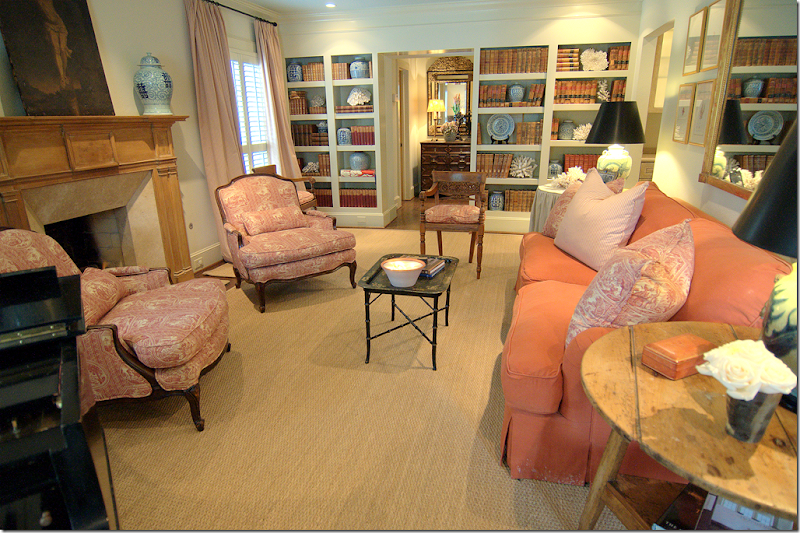
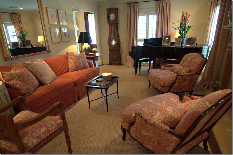
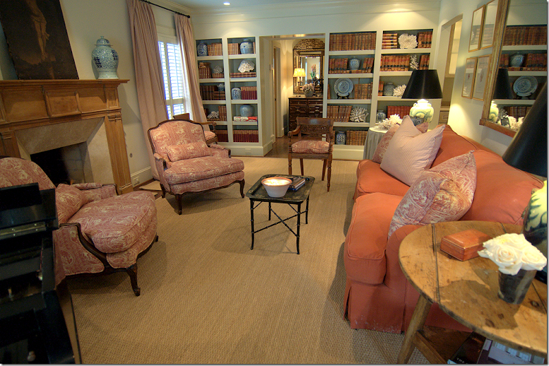
 Walking into the living room, I immediately loved the dusty salmon pinks and creams found in the ticking curtains and the toile. It’s all so warm and cozy, especially with the custom cut seagrass. This color palette is found throughout the house.

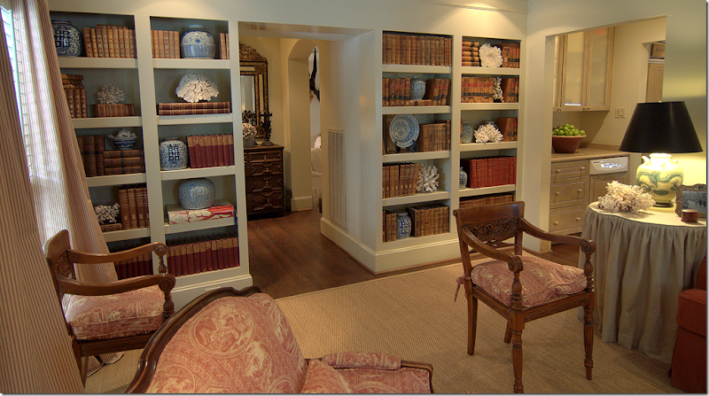
A large built in bookcase is at the back of the living room. Wonderfully accessorized with old leather books, coral and blue and white porcelains – the bookcases are the focal point.

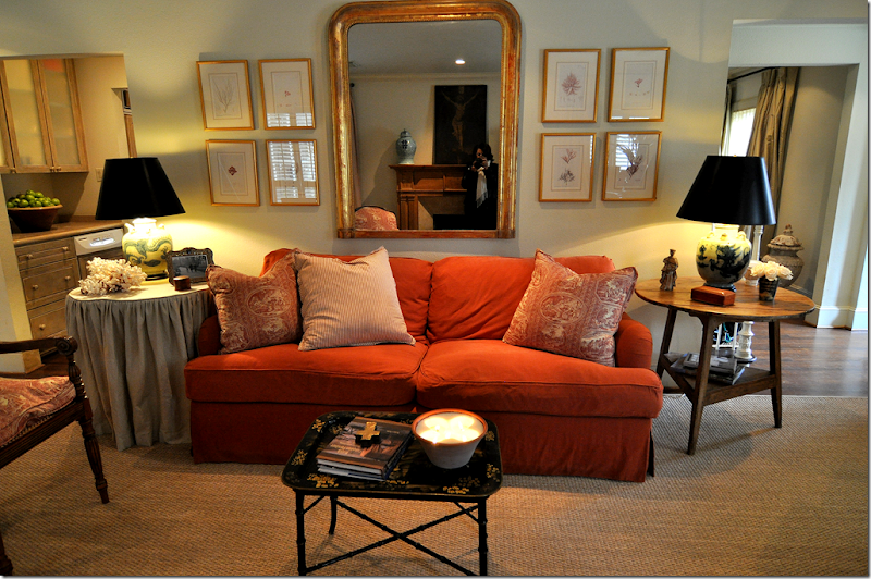
This house is English Country Manor inspired – artfully cluttered and layered. An antique Louis Philippe mirror is flanked by a collection of prints while a skirted table is on one side of the sofa with a cricket table on the other. A chinoiserie tray doubles as the coffee table.

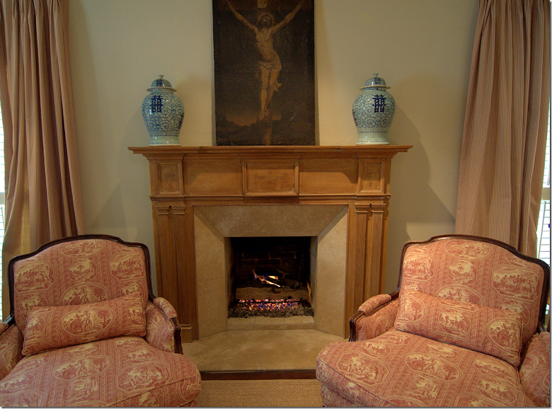
A pine mantel, blue and porcelains, toile and religious art: The English countryside comes to West U!

The view towards the front door. The tall clock is a French antique.
 Between the two bookcases is the hall to the family room, and to the right is the bar, which leads to the kitchen.

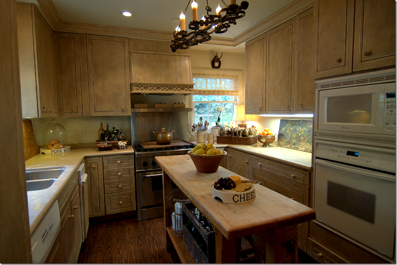
Right past the bar is the charming kitchen.

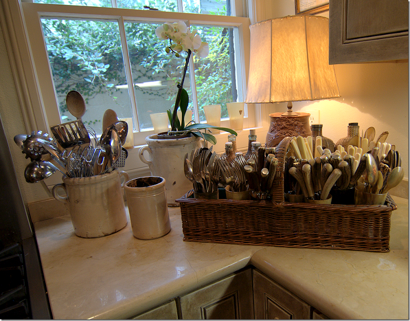
The kitchen is filled with antique accessories. Here – a large collection of antique cutlery sits in another collection of horned cups.

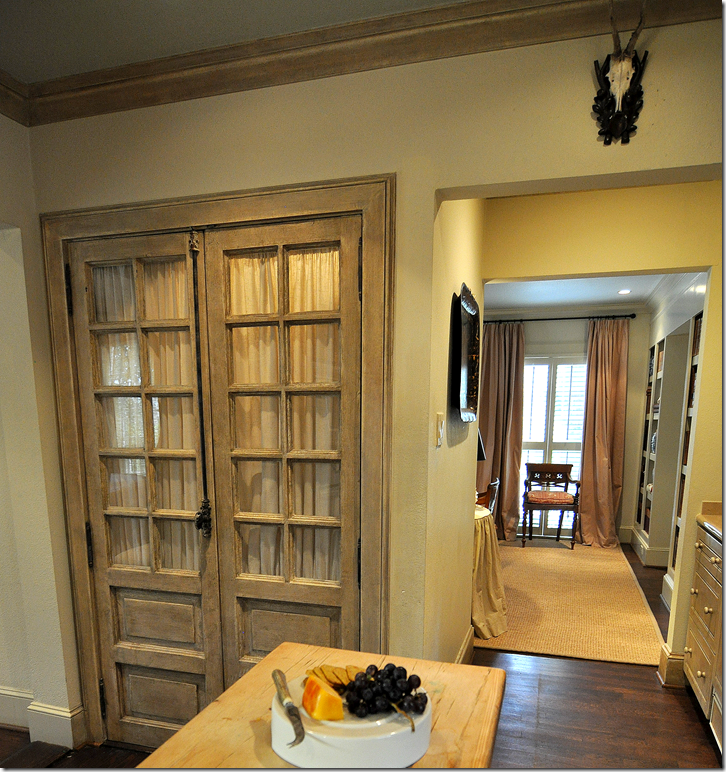
Looking back through the bar which leads to the living room, or to the left, which leads to the dining room and the front door. The pantry is hidden behind French doors that are draped to hide the grocery boxes. Notice the hardware on the pantry doors.

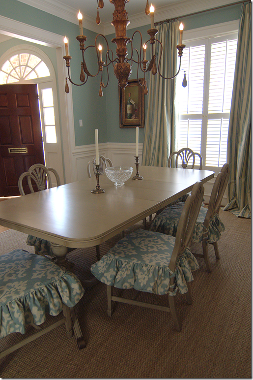
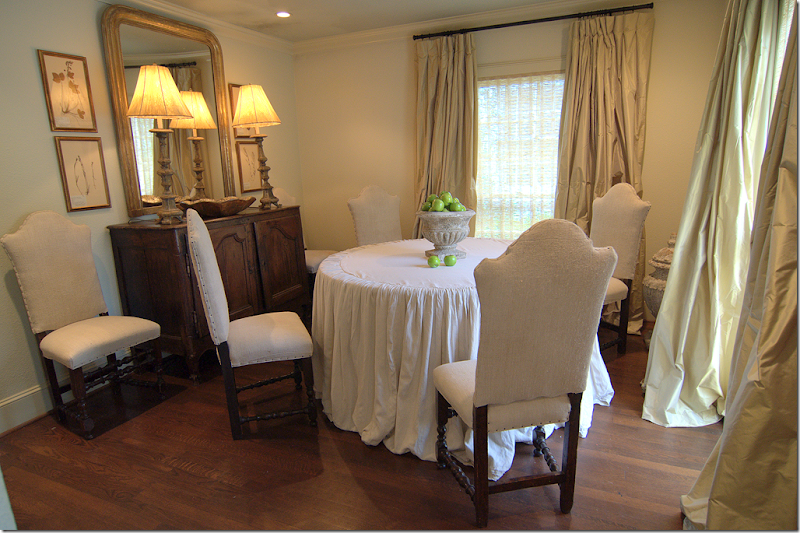
Adjoining the kitchen, the dining room is located at the front of the house, to the right of the foyer. Silk curtains and a linen skirted table share the space with a large antique French buffet and a Louis Philippe mirror.

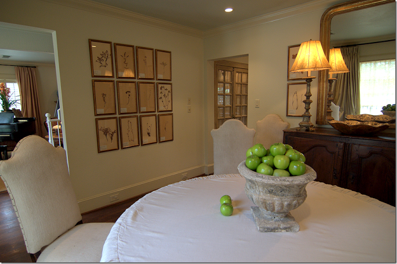
Here you can see the living room and the kitchen which both lead off from the dining room.

Back in the living room, the hall leads to the powder room on the left and the family room on the right.

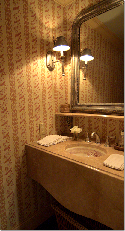
The powder room continues the salmon pink and cream color scheme. Another Louis Philippe mirror rests above the marble vanity.

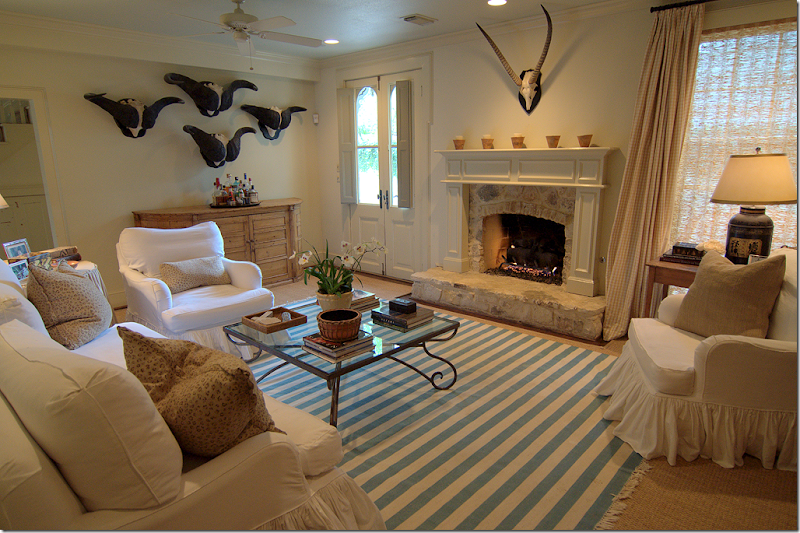
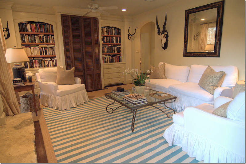
The family room is all white slips and a custom cut seagrass rug with a blue and white striped dhurrie layered over it. The backyard is through the door, again with panels that close off the glass panes. Above the chest is a collection of horns, memories from the many African safaris which the homeowner has gone on.

The view of the family room, looking back towards the arched doorway that connects the family room to the living room. The TV is hidden behind the shutters.

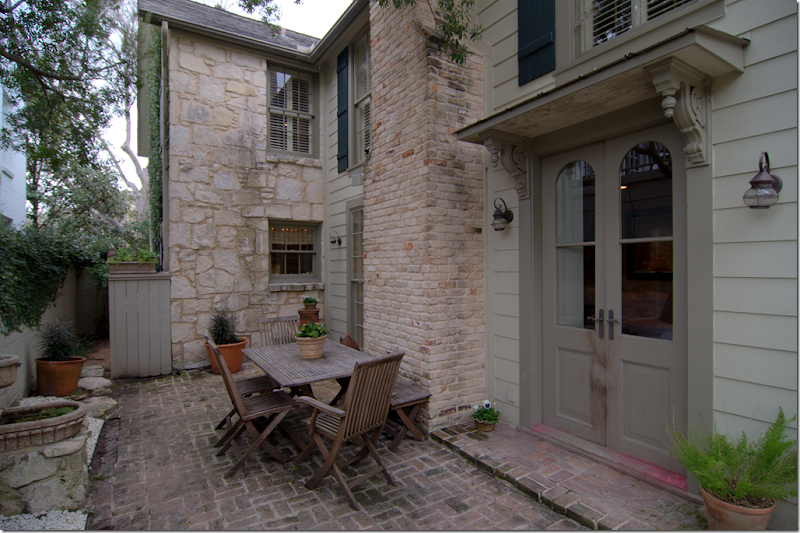
Outside the family room is the side yard with its stone fountain on the left wall. The kitchen can be seen through the small window. The family room is located in the section that was added onto the original stone house. This section connects the house to the garage with its large apartment above it.

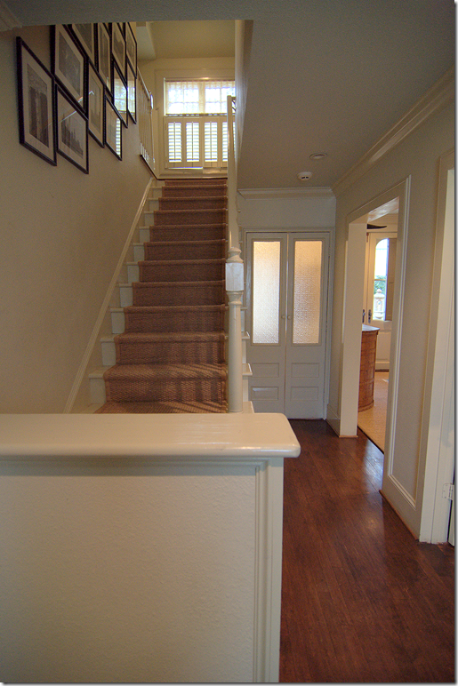
The back stairs are connected to the family room. On the left is the garage. The laundry room is located behind the frosted double doors.

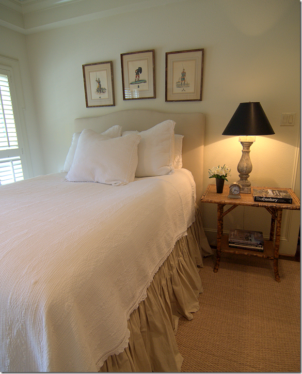
The guest bedroom is found off the back stair hall and next to the family room. An antique bamboo night stand holds a baluster lamp.
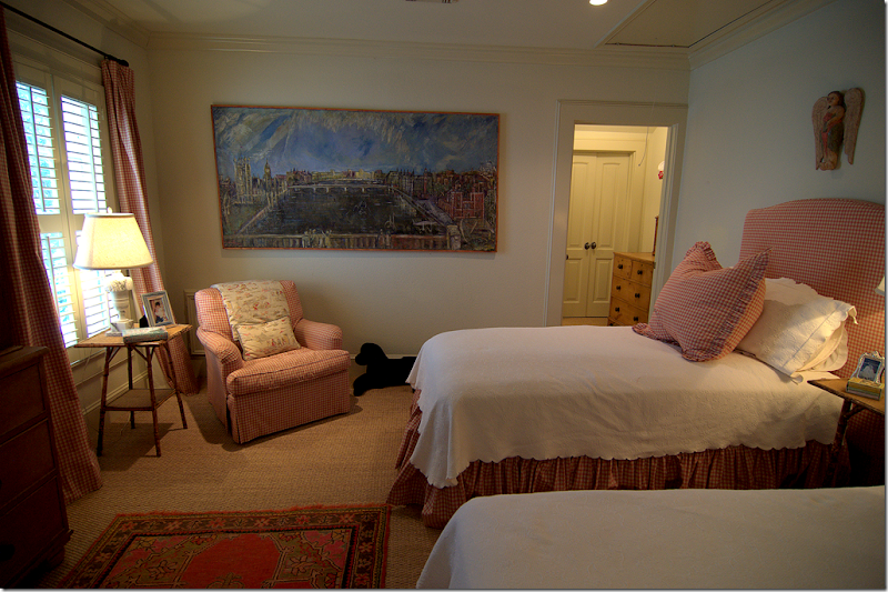
 Upstairs are three bedrooms – here the two daughters share a room and bathroom. The checked fabric continues the soft salmon pink and cream theme. Wall to wall seagrass is found throughout the upstairs.

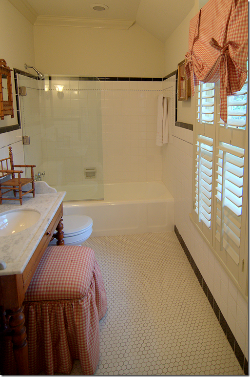
The girls bathroom has a wonderful tiled floor. Notice the sink inset into a wood vanity. I love the European styled glass half shower door.

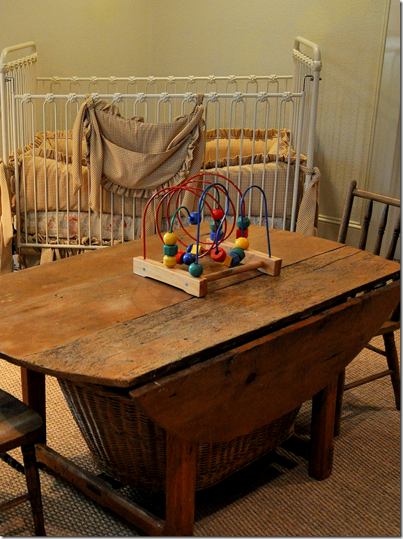
The baby boy’s nursery is furnished with grown up antique pine furniture.

The crib is white iron. Notice the table is actually an antique cut down to child sized height.
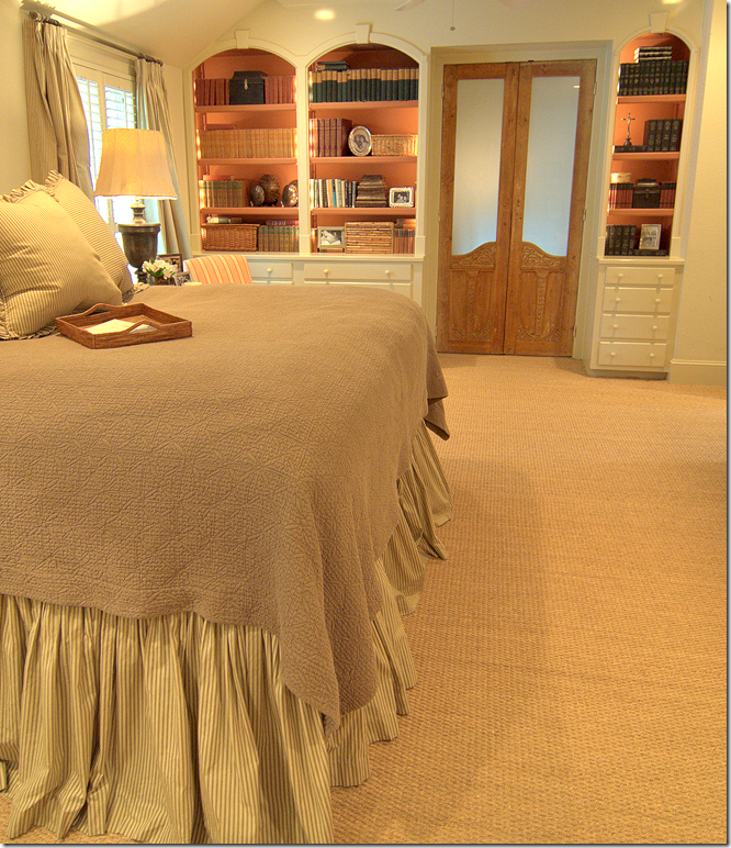
 The master bedroom with its vaulted ceiling is located behind frosted glass double doors and is in the new section over the family room. The salmon pink shows up in the paint behind the arched built in shelves.
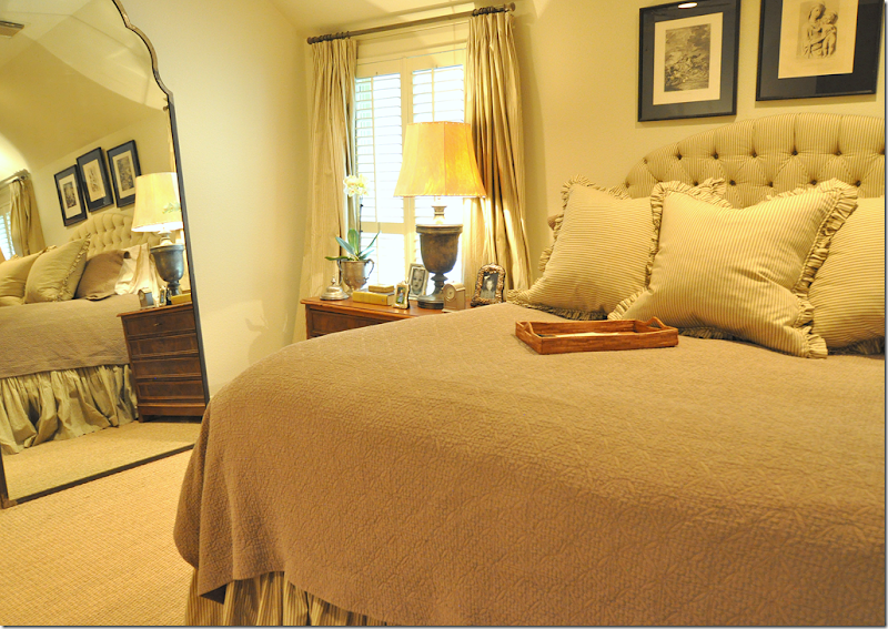
 Simple brown and cream ticking striped fabric is used for the tufted headboard, dust ruffle and curtains. The lamps are made from metal urns and are topped with cowhide lampshades.
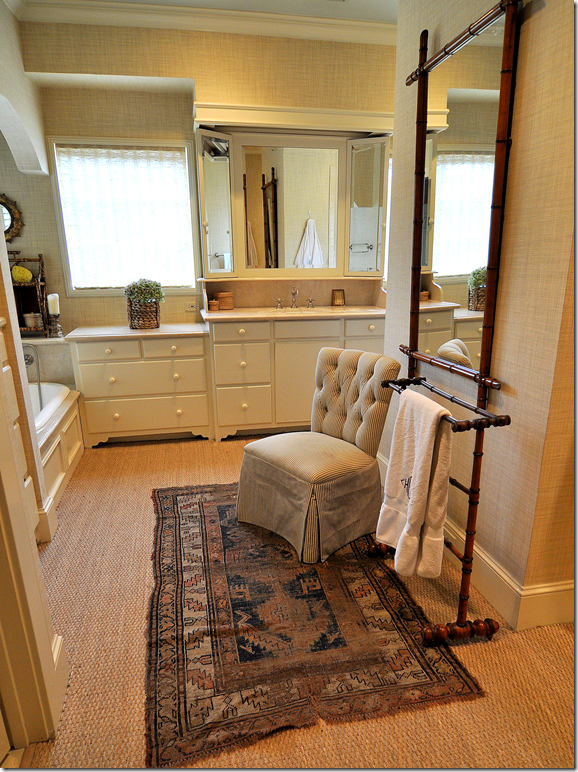
 Adjoining the bedroom is the large master bathroom and closets. The walls are papered in a creamy texture. Notice the cabinet’s carved feet – so charming! A large bamboo mirror is part of a vignette along with an antique rug and a tufted slipper chair upholstered in the brown and white ticking.
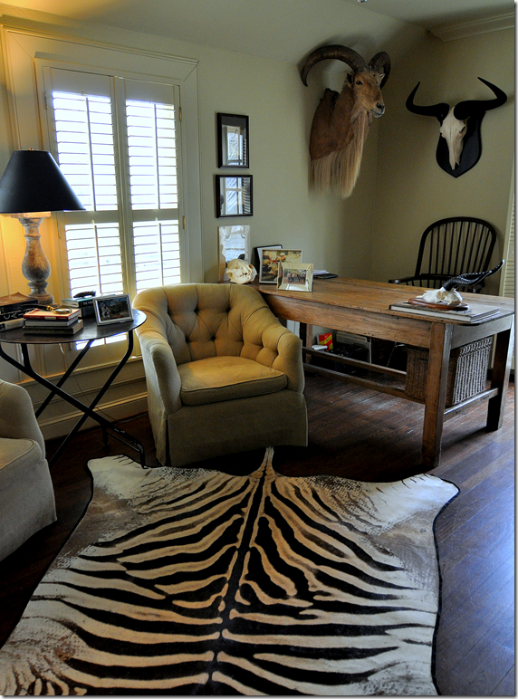
 Past the master bedroom is the back stair hall which connects the upstairs with the garage apartment. The apartment has a bathroom and kitchen and is now used as offices for both the homeowners. The larger office is furnished with more African memories including the zebra rug.
 The smaller office is dominated by a large antique bamboo bookshelf which holds a collection of decor magazines. Again, the check is in the same salmon pinks and creams – seen throughout the house. The shade is a Bennison toile.
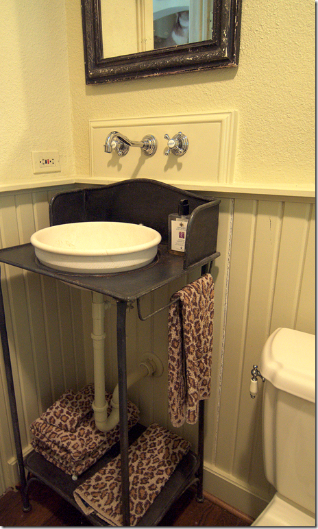
 The bathroom in the garage apartment features this iron stand turned into a sink. Due to the tight space, the faucet is attached to the wall.
 The Stone House, located on a corner, is currently for sale - to see the listing go HERE. In this picture of the house from the real estate listing, you can see how the new addition is visible from the back side of the house. The stone on the addition is found on the ground floor, while the second story is clad in clapboard. The clapboard area is actually the master bathroom while the first floor guest room is directly below it.
 I hope you have enjoyed this tour. A huge thank-you to the homeowners for opening their house to Cote de Texas readers!
In other news:
 A special note – the new Skirted Roundtable is now online HERE. This week we discuss jealousy in blogging! It’s a good one!!!
 Photography by Lecia Wolf Phinney
And, Lecia from A Day That Is Dessert blog has recently opened up an Etsy store HERE featuring her fabulous photography. Good luck Lecia on your new endeavor!!!!!
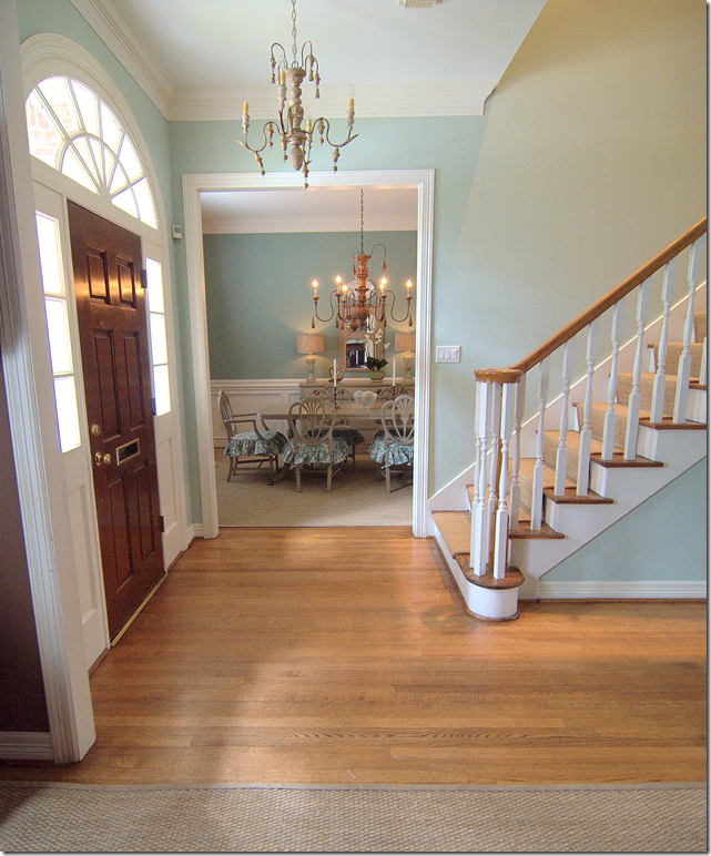 The dining room is to the left of the front door and the study is to the right. In the entry hall, besides painting, we switched out the light fixture.
 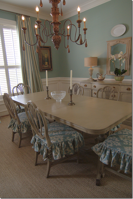 The dining room was formerly painted a deep red - typical of most West U homes decorated in the 90s. We repainted the upper half a deeper aqua found in the family room, leaving the wainscot painted white. The owner waited to use her table, chairs and buffet – which were a dated dark reddish brown stained wood. We had these pieces painted a distressed gray to be more in keeping with the lighter wall color.
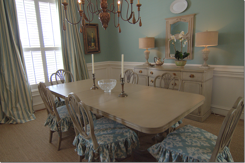 I had slipcovers made for the chair seats to make them more youthful. The curtains are a silk stripe. Both fabrics are from Robert Allen.
 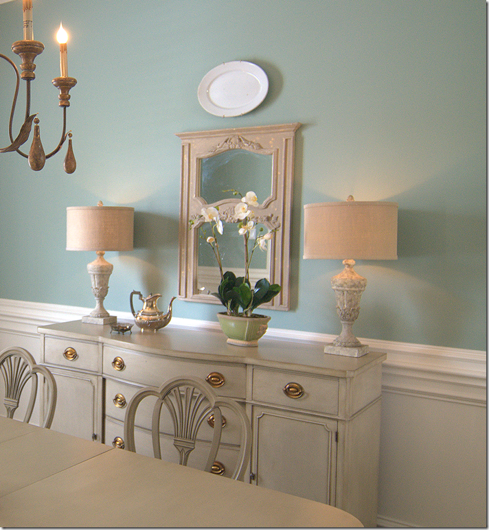 And finally, above the buffet, we added the painted trumeau from Indulge and lamps from Aidan Gray. Everything else used in the room was the clients.


