COTE DE TEXAS

COTE DE TEXAS: MY BIGGEST GIVEAWAY EVER!!!!!!

943 comments


image

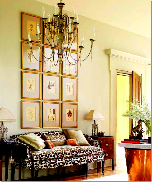
I am wild crazy over chandeliers.   One of the happiest days in my own home design history was when this chandelier was installed in my living room.   I love this style of chandelier – it’s one of my favorites.


image

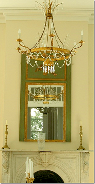
Another good day was when I bought this chandelier from a friend who was redesigning her house – taking it from English to totally Swedish.   This was in her bedroom and this Italian style light fixture didn’t mix with her new Swedish design.  Good thing for me!   This style is another favorite of mine and has gained greatly in popularity these past few years.


image

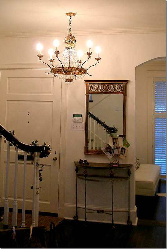
There are few makers of chandeliers who get it right – consistently - and Julie Neill is one of them.   Her designs are based on the classics, yet she adds a youthful twist to each fixture.   I would have trouble picking one favorite – I love so many of her chandeliers!   She designs and crafts all her light fixtures from start to finish in her own New Orleans workshop.   Everything is customized to the job.   In fact, all the designs in her portfolio started life as a custom commission.    Julie is so creative – she began her career as a painter, then moved on to painting things for the home instead of canvases, next she tried interior design which lead her to this very successful career in 2000.   Her retail shop is on Magazine Street – one of America’s best streets for antiquing.  If you’ve never gone antiquing on Magazine Street – you should include it on your Bucket List.  

Besides designing chandeliers, Julie also creates sconces, furniture, and accessories.   New Orleans heavily influences her designs – a crown is an oft used element in her romantic and decidedly feminine creations.    Julie’s stamina and creativity is boundless.  Not only does she run her own successful retail store and workshop, she has employees and two children to watch over, and she maintains a charming 1800s shotgun house.    I first met Julie on the blogs – of course – where she writes The Bayou Contessa, a beautiful glimpse into New Orleans design.  If you are planning a trip to NOLA, a stop at Julie Neill is a must.  If you are in the market for a chandelier, give Julie a call.   She works with each client to create the exact fixture they desire. 


image

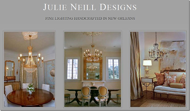
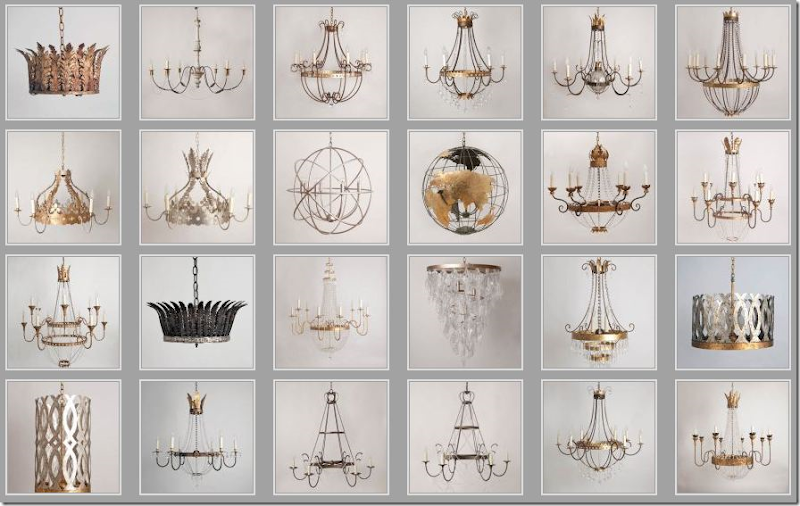
Julie has just redesigned her web site and it’s gorgeous!  Here is a small sampling of her product.   Each fixture can be customized to any specification.  Her range is from traditional to contemporary.   All the finishes are hand applied and painted.


image

Here is the glamorous Cinderella chandelier in a dining room. 


image

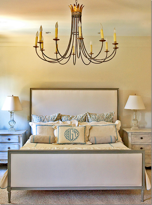
This bedroom’s chandelier is a more contemporary design mixed with traditional elements.  Leontine Linens.


image

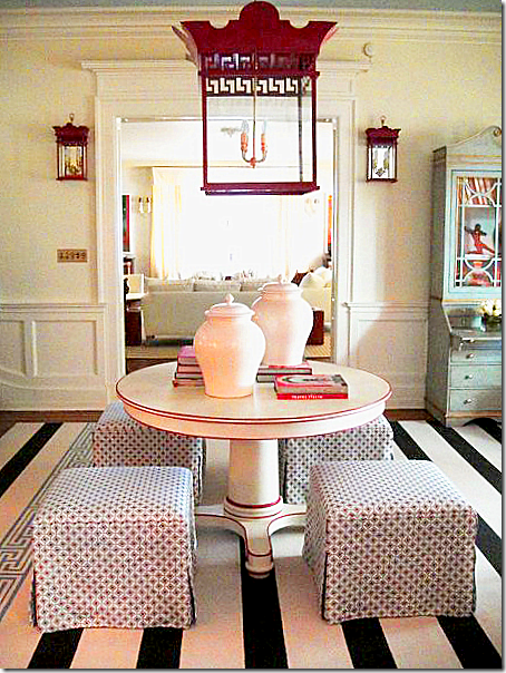
Julie designed this lantern with matching sconces for Tobi Fairley’s Richmond Symphony Designer House.   I love this room!!!!  The red of the chandelier is picked up in the trim of the table.


image

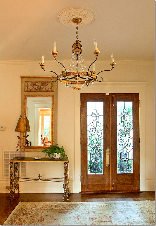
Seen in this month’s Elle Décor magazine – this fixture is one of the many Italian styled chandeliers that Julie makes.  Shown is the entry hall of Jane Scott Hodges’ house in Kentucky. Jane Scott is the founder of the fabulous Leontine Linens   Note:  the pillows are by BVIZ.    Just beautiful!


image

The Sheldon Chandelier is reflected in this trumeau.  


image

One of her most popular designs is the graceful and romantic Elizabeth chandelier.  Named after this client, the chandelier is great for lower ceilings – as it is more horizontal than vertical.   This couple commissioned several chandeliers from Julie and an article on their house appeared in the New Orleans Home magazine.   Shown here.


image

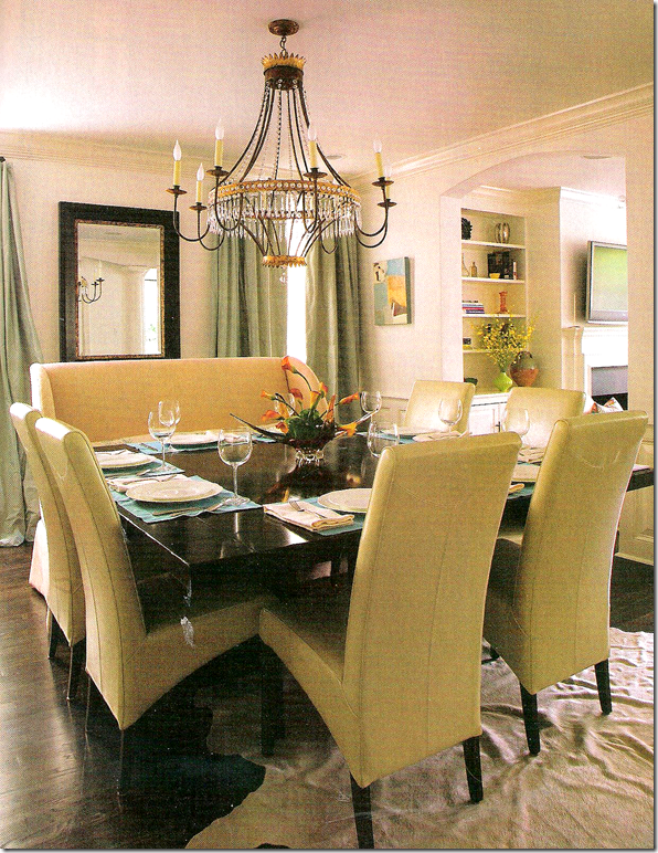
For their dining room, Julie created the Denise chandelier.  I love the combination of the chairs and the bench around the square table.


image

The Ingrid fixture is another popular design – more contemporary than Julie’s crystal chandeliers.  Room designed by Jeffery McCollough for the Acadiana Symphony Decorator Showhouse.   


image

These charming Beatrice hanging fixtures and Beatrice sconces designed by Julie made the cover of House and Home.


image

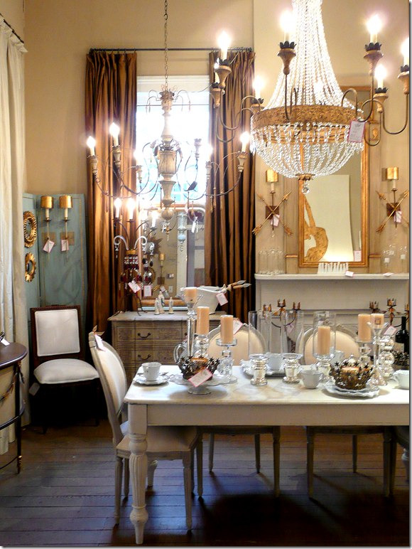
Julie Neill’s shop on Magazine Street is filled with her creations – chandeliers and sconces - along with the pieces of furniture from her line. 


image

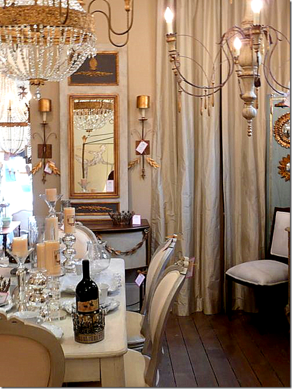
Here’s a close up of two chandeliers from the shop, one French and one Italian!   The trumeau and the cabinet under it are also in Julie’s line.


image

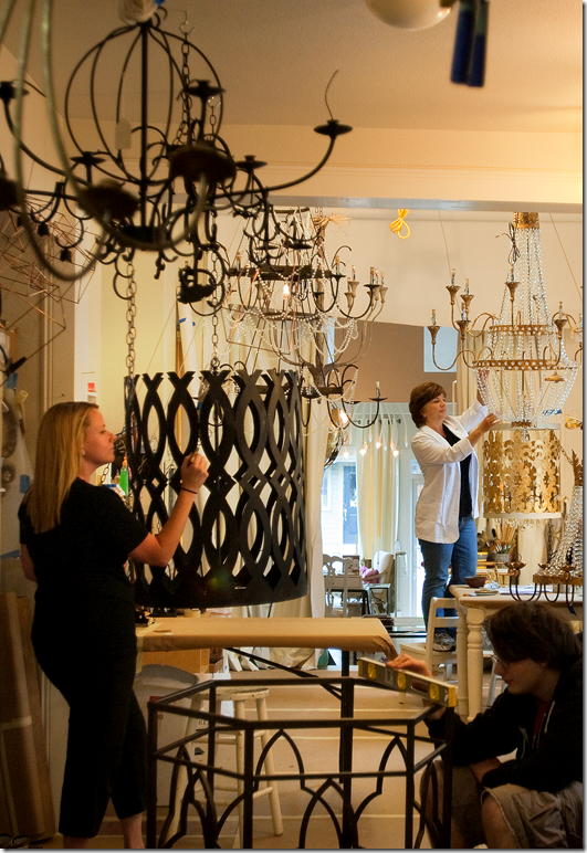
Julie’s team hard at work – the chandeliers have to first be constructed, then hand finished, before they are able to be installed on the sales floor.   Each fixture goes through a long and laborious process to be ready for sale. 

OK.  OK.  OK.

ON TO THE GIVEAWAY!!!!!!!!!!!!

o, you ask – what is the giveaway?!??!?!?    I have been bursting at the seams keeping this a secret for the past month or two.   One day Julie emailed me asking if I would like to host a giveaway of her product.   What a silly question – of course I would love to!!!!   I thought maybe she would be donating a sconce, or a small accessory from her shop.   You can imagine how my mouth dropped to the floor when she so generously offered a CHANDELIER for a giveaway!!!!!!!!!!!!!!!!!!!!!!!!!!!!!!!!!!!!!  

Yes!!!   An original, Julie Neill Chandelier will be given away to one lucky winner!!!   Oh My Gosh!!!!!   Unreal.   Seriously, y’all, I am SO excited about this.  It’s the biggest giveaway ever here on Cote de Texas and we’ve had some great giveaways in the past.   Read on for the deets (details to those of you over 30.)


image

The winner will have their choice of either a traditional or contemporary fixture.   The ELIZABETH Chandelier is the traditional choice.   I was so excited about this choice because this fixture is one of my all time favorites of Julie’s.   Can you believe this giveaway?    Seriously!!!!!!   You can win this!!!!!  Retail value is $3,800.00


image

Or, if you are a more contemporary person, the Ingrid Chandelier will be the second choice for the winner.   The mirror and table are also from Julie Neill.   Retail value for this chandelier is $3,495.00

Are you an Elizabeth or an Ingrid Person????

OK – HOW TO ENTER AND WIN EITHER THE ELIZABETH OR INGRID CHANDELIER:

Go right now to the Julie Neill Design web site  www.julieneill.com and look under the Chandelier, Sconces, or Lanterns sections.   Pick out your favorite item that is for sale.  Come back here and leave me a comment on what your favorite item is and explain why you like it so much.    That’s it!!!!

You have until Saturday night at 11:59 p.m.   The contest closes at that time.   One person will win either the Elizabeth or Ingrid chandelier – their choice.  BE SURE TO LEAVE YOUR EMAIL ADDRESS IF YOU POST ANONYMOUSLY!!  And please, only one comment per person!!! 


image

Your choice:  The Elizabeth


image

Or the Ingrid!!!   Good luck to everyone!!!

And finally -  a huge, huge thank you, kiss and hug to Julie Neill for her generous giveaway.   From the bottom of my heart, thank you Julie!!!!!

*********************************************************************************************************************************


image

Becky Vizard and Ann Connelly at Watkins Culver this Thursday and Friday!!

NOTE:  Houstonians – I wanted to let you know that BVIZ and Ann Connelly Fine Art are back in town at Watkins Culver this Thursday and Friday.  Becky Vizard has the most wonderful pillows – many of which have been featured on the pages of the best design magazines (including the Elle Décor picture previously shown!!)   Her good friend, Ann, has a wonderful art gallery in New Orleans.     To read all about these two talented ladies from Louisiana, go HERE.  For details on when and where, call 713-529-0597.

What an idiot! At least I Admit It.

87 comments


image


The other night I was breezing through the grocery store and stopped at the magazine section, which is a rare occurrence for me these days.  Ever since www.Zinio.com – the digital magazine company – started selling issues online, I subscribe to as many design magazines that are available via the computer.  It’s so easy!   The magazine comes directly to your laptop and stays there – no more mailing in subscriptions or schlepping across town to a book store.   And best of all – there are no longer enormous piles of old issues staring  at you while taking up precious storage space.  But it’s not all great in Zinioland.   You would think that the digital Zinio issue would arrive to your computer faster than the supermarket racks, right?   But there it was – the new December issues of House Beautiful and Veranda sitting on the grocery shelves, while Zinio still hasn’t updated my computer.  I must say that I was so proud of myself when I resisted the overwhelming temptation to buy those two issues anyway instead of waiting for Zinio to update.  But, I digress.  

What really caught my eye that night was the new Architectural Digest.   The cover looked so fresh and so, how do you say…un-Architectural Digest-ish.  I eagerly flipped through it and got all giddy!   Finally!!!!  Architectural Digest is back!!!  There were so many features that looked interesting I could hardly wait to run home and read it.  Wow.  I haven’t said that about an AD issue in years.  In fact, everyone has been so down on the magazine lately, including all three of us on the Skirted Roundtable, that I was eager to spread the word that AD’s new editor Margaret Russell’s touch is really evident.  So many of the houses in this issue look like they could have been in Elle Décor – the magazine that Margaret had headed up during its entirety. 


image

Former Elle Décor Editor Margaret Russell now on tap to head up Architectural Digest.


In case you were out of the country earlier this year, the magazine world was rocked when it was announced that Margaret was leaving Elle Décor for AD.  More shakeups was news that domino’s Dana Caponigro was coming to Veranda and Stephen Drucker was leaving House Beautiful for Town & Country.   Dara and Stephen’s influence on their new magazines has been subtle so far, changes haven’t seemed all that dramatic at either magazine – yet.  But, it’s all perception.  Still, Margaret at AD – wow, now that’s some change.  Looking at December’s issue, the differences are sooo obvious!  I just couldn’t wait to spread the good news.  Like I said - what an idiot!

Luckily before I printed this, I checked the Editor’s Page at Architectural Digest to discover that Margaret Russell hasn’t even taken over yet!  Her first AD issue won’t be until January!!!!   The egg on my face was dripping all over my computer.  All I could think was THANK GOD I checked that Editor’s Page!!!  I had totally forgotten that Margaret wouldn’t be at AD until January – the announcement had been made so many months ago.  I would have blabbed on and on about how WONDERFUL the new AD is because of Margaret Russell.   What a complete idiot!!!   Still, my assumption DOES tell me that the January issue is probably going to be fabulous, because the December is pretty damn good itself. 


image

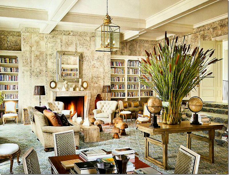
First, there is this house by Stephen Sills that really got me blood pressure up.  Look at those WALLS!!!!  They are burlap!  Pattern painted on burlap!!!!   Can you believe that?!?!   Gorgeous.  And look – wall to wall carpet.   Over stairs – when was the last time you saw that – and how fresh is it?  It looks so warm and inviting.  And those two globes.  The lantern.  The mushroom family.   This is a library for this decade, young and sophisticated.   It’s hard to see but there is a banquette against the shelves on the right.   Notice the fabulous library table – just waiting to be opened and piled up on.    But, those WALLS!!!!!!  Gah!!!


image

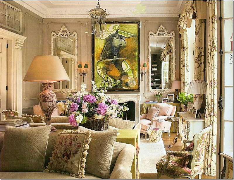
Next, over in London, is this little townhouse by the incomparable Nicholas Haslam.   Owned by two art collectors, they wanted a home, not a cold contemporary museum.   I mean – is that just any painting over the mantel?   It’s a PICASSO!!!!!!!!!!!   I have never seen such a large Picasso handled so casually before.   And I love the color of the paneling – it looks like Iced Coffee.   Notice the chartreuse skirted table next to the fireplace.   The back to back sofas are divided by a console table that also picks up the chartreuse in the painting.  Light pink French chairs.   Total eye candy.   YUMMMMM.  


image

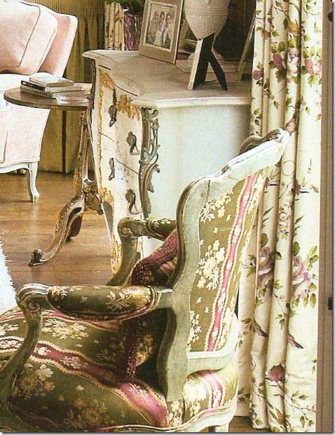
A closeup view of the fabrics:  I love how Haslam still unashamedly still uses those blowsy English chintz fabrics.  I adore the curtain fabric.  He says this room is in the spirit of Nancy Lancaster and he is so right.   That chair!!!!!


image

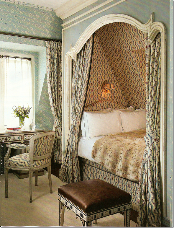
Then, there is this little guest room in London by Haslam.   Notice the French curve on the alcove.  Is there anything in life prettier than a Louis XV inspired curve?    I love his mix of the two fabrics.   He is wonderful. 


image

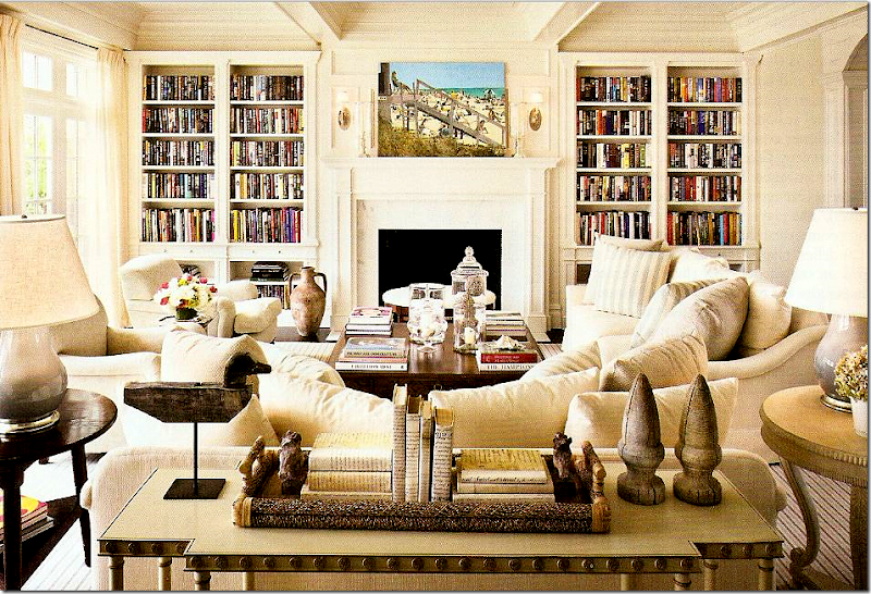
The next beauty is a beach house by Alexa Hampton in Bridgehampton NY.   Another view of what a library for a young family should look like.  Loving the striped rug and pillows.  So casual for a beach house, yet still sophisticated.  Not an easy mix to do right. 


image

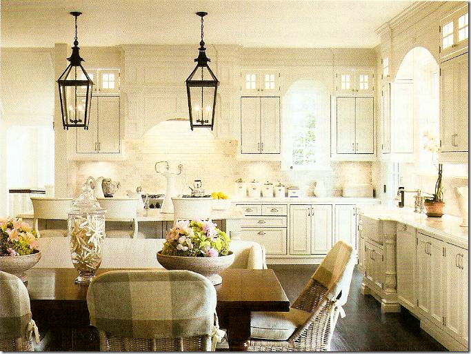
Alexa Hampton:  Great kitchen.   But something about this kitchen seemed familiar?   Those chairs with their plaid half slips, the two lanterns.  Seem familiar?


image

Remember this blog famous kitchen in a showhouse?   The same exact chairs – with the same plaid half slips, similar double lanterns.   But it’s not the same house.   I wonder if the owners were influenced by this picture – or vice versa?

I thoroughly enjoyed this Architectural Digest even though it wasn’t edited by Margaret.  Now,  I can’t wait for her first issue next month.  I am so anxious to see her changes – I wonder what they will be?


image

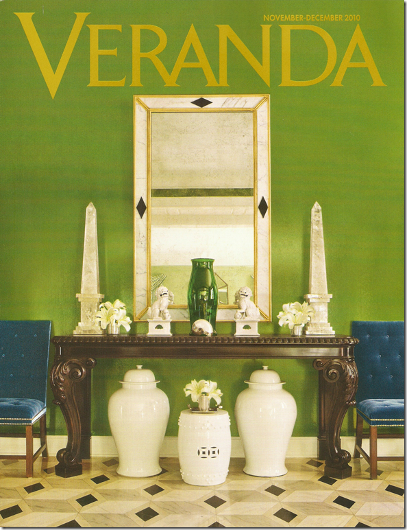
And for more idiocy from moi!   Last month, I blasted the new Veranda.  I think I spoke too soon.   The new December/January issue to TO DIE FOR.   The cover story is a house in Houston designed by the incomparable MILES REDD!!!!  YES!!!  This must be the first house in Houston that Miles has done and it’s a stunner.  Look at those rich green walls, with tufted sapphire blue velvet.   That floor!!!   Veranda always has the best photographers and this Miles Redd story was snapped by the world’s best Fritz Von Der Schulenburg.   For once, we can finally see big, huge pictures of Miles’ interiors – bright and clear, every tiny detail visible.   What a rare treat.  


image

The Miles Redd Houston living room with stripes, icy blues, persimmon accents, chintzes, and a fabulous center table by John Rosselli Antiques.   Is there anyone out there that would or could do a fancy living room like this?   Every room Miles does is so different, so completely original and unique.   What a genius.   And what a coup that Veranda got this house.  


image

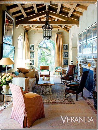
A peek at the Saladino house shown this month in Veranda.   The Master.


Also in this issue is a new project by John Saladino – worth the price of the issue alone, and another one by Vicente Wolf.   Stellar issue!  A keeper.   The only ho-hum is the house by Veere Greeney seen a few times before, but it’s such a fabulous project it’s worth the second glance.   Dara – you outdid yourself!!!   I could have cried over this issue!!! Fabulous!!

And a note to Cote de Texas readers:


image

Harrison Howard print – last week’s giveaway.


The Harrison Howard print giveaway is now history.   It was a great success – so many people entered it.  Be sure to visit his web site www.harrisonhoward.com if you are interested in purchasing one of his prints.

And – this week, I am having a NEW giveaway that will be the biggest ever.  EVER.   Think crystal, think lighting, think gilt.   

Look for it in the next few days.   You will be sooooo excited!!! I PROMISE you!  I can’t wait!!!!