COTE DE TEXAS

Getting Inspiration

67 comments


image

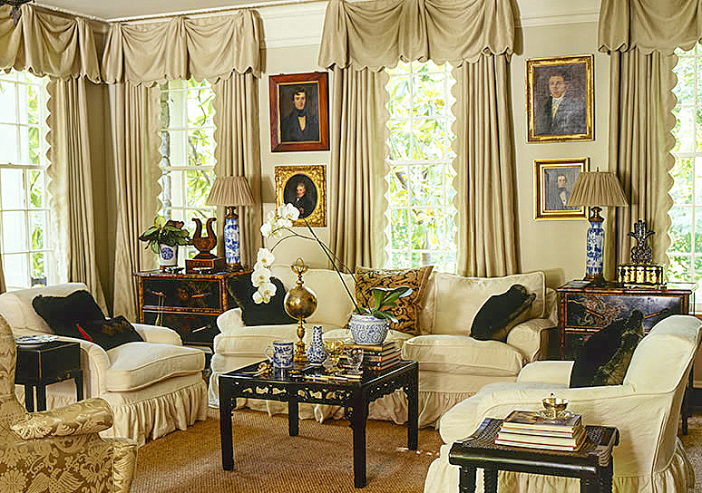
From Jackye Lanham’s web site:  This living room has long been a favorite of mine.   Those curtains with their scalloped edges influenced me to add scallops to my slipcovers.   This room is timeless – it looks as “today” as it did years ago when it was first designed.


Things that Inspire wrote a wonderful story about the launching of Jackye Lanham’s web site HERE.  WOW!  What a gorgeous web site it is indeed.  The pictures are large and luscious – something that other interior designers should take note off.   Too many times web site portfolio pictures are so small – what’s the point?   The bigger the better I always say (unless of course, it is my weight that keeps enlarging with age!   Yuck!)   There is only one thing I wish Jackye had included in her site.  There are no detailed press pages – and she has quite a lot of press under her belt.  Personally, I love when there are PDF files of old magazine stories, but I’m sure it’s a lot of work to produce that.  What is most exciting is there are so many pictures I have never seen before.  And while there are new pictures, many of her more famous images aren’t shown at all.    This web site serves as an introduction to Jackye’s work and it is definitely worth the time to peruse her portfolio.   She is an incredibly talented designer and the launch of her web site thrilled me!   I’ve probably already looked at it over fifty times.  But best of all, it got me thinking in new ways about design.   When you look at a body of work, it’s easy to pick out elements an accomplished designer uses over and over again.  The best designers influence all of us.


image

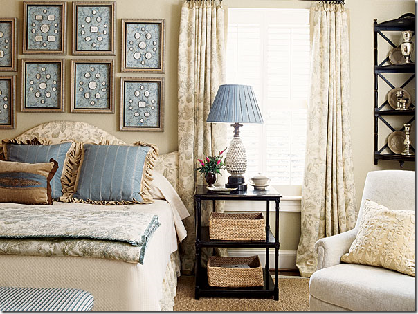
Not included in her web site, this cover story is one of Jackye’s more popular rooms.   The gorgeous intaglios are framed in blue – a color which she picks up again in the pillows and lampshade.  What caught my eye though were the curtains.  I loved this fabric and used a similar one in a client’s house.


      image           

This bedroom, which I have never seen before, has me drooling.  I love how she placed the day bed floating in the room.  And notice the darling table next to it.  As usual, Jackye adds hanging plates.   This picture has me thinking about the floating bed.   Nice time I have the opportunity, I want to try this set up.


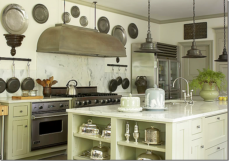
image But it is the kitchen photos that really caught my eye.  First – notice the hood.  It has a matte finish and it almost looks like an antique.  Then she uses pewter plates to surround it.   Somehow, these centuries old plates look  fresh.   The dark metal is picked up again in the pendant lights and the hanging pots.  But notice then – how she adds a collection of gleaming silver.    I know we all do white ironstone in our white marble kitchens, but seeing this kitchen makes me rethink that direction.  The silver looks so gorgeous and it ties in with the polished nickel faucet.   The two cake plates are the final touch.  


image

In this kitchen, Jackye again uses old pewter plates.  The hood here is less dark, but it is still matte.  Notice how the range is floating, not flush up against the cabinets.   The checked fabric shades are repeated in the pendants and the two lamps.  I love lamps in a kitchen – it brings a room-like touch to the space.  Finally, the creamy linen slips on the chairs match the color of the cabinets and add a soft touch to the room.  


image

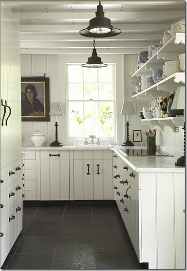
                         Here, Jackye again uses matching lamps.   The painting adds more to the room-like feel of the kitchen.   And, she uses the dark metal lights which she repeats in the iron hardware. 


How can you take some of Jackye’s choices to use in your own kitchen:


image

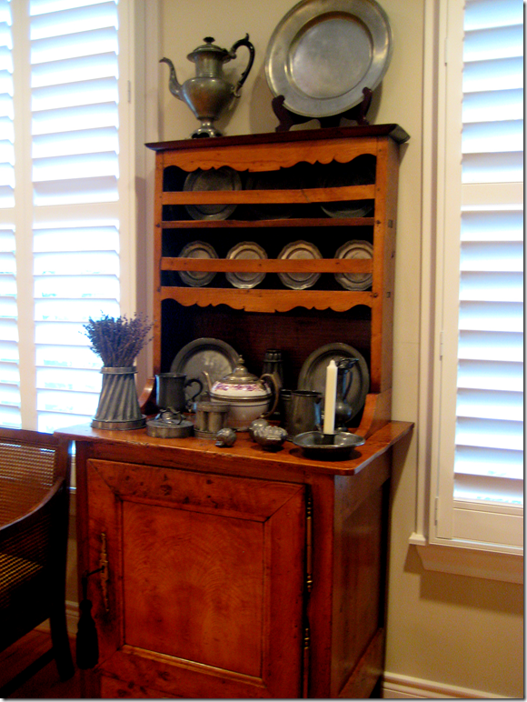
My sister owns this collection of antique pewter plates.  If she ever moved, I could see her reusing these plates in a kitchen.  Or, if there was room, the chest would be great in a kitchen. 


downloading...

On 1st Dibs, this collection of antique pewter plates HERE goes for $1250.   I’m sure you can find cheaper plates on ebay.  But, I am really loving the look of mixing pewter in a gleaming kitchen with white marble.


image

I checked.  Ebay is loaded with antique and new pewter plates.  For instance, this 18th century plate is only $24.99 .  HERE.


Prismatic Glass Copper Pendant

This new fixture from Restoration Hardware would look great against white marble.


Barnard Pendant, Antique Bronze finish

This too would be a great fixture – at Pottery Barn, only $199.00 HERE.


image

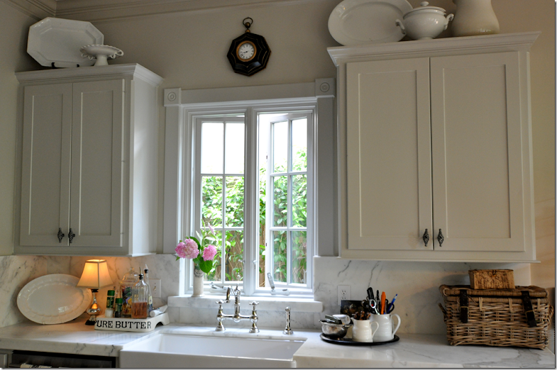
In my own kitchen, I used to have two of those mercury glass lamps.  One broke.  I wish I still had two, I would put one on each side of the sink with new shades.  I love how Jackye uses pairs of lamps in her kitchen.   I did recently add a pair of lamps on my bar.


image

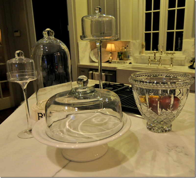
Ben aka Mr. Slipper Socks Man, is addicted to home shopping networks.   For our anniversary he bought me this large crystal bowl.  ????  I really don’t care for crystal, but thought I would use it for fruit for awhile.  Actually, it’s kind of grown on me – in the daytime, it’s really sparkly and adds a new element to the kitchen.  Ben is so pleased with himself!!!   But still, seeing all that silver in Jackye’s kitchen, got me thinking:


image

Again, this kitchen by Jackye Lanham – I love the polished silver in here!!!  I just noticed the wood pedestals that the pewter is on.   And notice the great, thick chains coming from the pendant lights.  I just really love this kitchen!!!  It’s got me thinking about my silver.


image

I have two of these antique silver domes, should I move those into my kitchen too? 


image

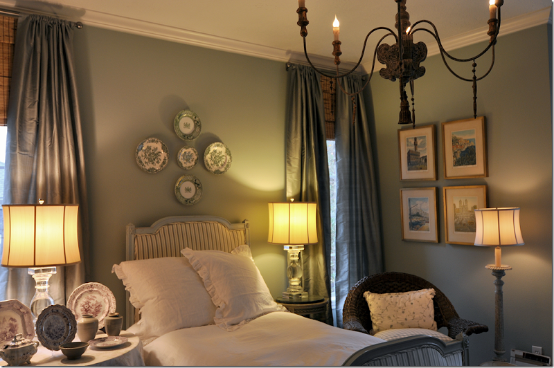
This picture of a bedroom by Jackye influenced me to bring out my transferware that I had put away. 


image

In my guest room, I hung some of the transferware on the walls, here and across from the desk, and the rest I put on the side table.  Not as pretty or dramatic as Jackye’s though.  Looking at this picture again, I wonder should I add more to the walls to make it more dramatic?


image

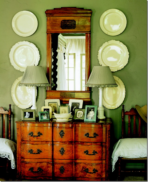
I’ve always loved the way Jackye uses plates instead of art work.   It’s made me more confident to do the same.  Here, she used large creamware platters.  Dan Carithers, another designer from Atlanta, uses lots of creamware.  I wonder if Dan influenced Jackye?


The point is -  there is so much to learn from great interior designers.   Just looking at a few of Jackye’s kitchens makes me think of ideas to update a white marble kitchen in ways I had never really thought about before.    I keep looking at her web site and seeing things that look new to my eye and get ideas from it.   There’s another web site from a wonderful interior designer that hasn’t gone “online” yet – but you can still see the pictures.  I am dying to spread the word about it.  Talk about inspiration!!!!!    One of the pictures on that web site has already inspired me.  I think of all of the Houston designers that have inspired a whole generation to use seagrass and slipcovers.   Think about Rachel Ashwell and how many designers she inspired with her pink and blue and white interiors.   Mario Buatta, by getting inspiration from English designers, created a new American version of the English Country Manor look that has in turn inspired hundreds and hundreds.    The cycle never ends. 

Jackye Lanham’s web site HERE.  Enjoy!


AND:

image


For those who live in or near Memphis, this coming Thursday, Mignon Topping will be having one of her antique sales!!!  For more information, please call 404-271-6362.   To see another show of Mignons, go HERE.   Don’t worry, Mignon will be back in Houston this spring.


Pink/Repink: Dishing on House Beautiful

147 comments


windsor

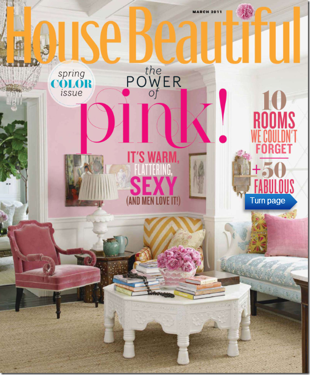
Did the cover of the new House Beautiful look familiar to you? 


hb

Maybe it’s because just one year ago, the House Beautiful cover story was the same – Windsor Smith’s new house?


5346239

The 2009 story of Windsor Smith’s new house featured her gorgeous pink sitting room with its collection of wonderful chairs.  Who could ever forget a room like this?        Almost everyone in the design blogosphere was head over heels in love with Windsor’s house, and especially this pink room.  I can’t tell you the number of blogs that talked about that cover story of Windsor’s house. So, why in heaven’s name would House Beautiful repeat that room on their latest cover?   What is going on over at House Beautiful with its new editor in chief?  

To tell you the truth, I was confused  when I first saw the magazine this month.  I thought, are they featuring Windsor’s house again?   Or, wait, maybe another magazine featured it last year, maybe I’m mistaken???   This cover certainly had me doubting my recall.  Surely, one magazine wouldn’t repeat the same cover story twice in one year?     Who at House Beautiful thought it was a good idea to confuse their readers?   If you carefully read the cover, you notice it does proclaim:  “ten rooms we couldn’t forget” – well, neither could we.


HB

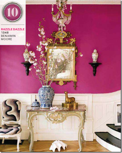
As it turns out House Beautiful’s new issue is all about the color pink, since Pantone has named Honeysuckle Pink as the color of the year.  In the Pink cover story, page after page of previously run photographs were shown again (yawn) to illustrate the color pink (double yawn.)   For instance, this picture above is repeated from a previously run story.  Remember how the blogs oohed and awed over this stairway?   Until someone noticed what a terrible paint job the stairs got.   So, here we go again – staring at the awful paint job. 


KASLER

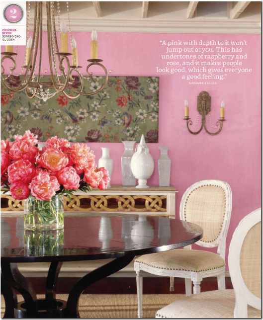
And House Beautiful runs this picture of a Suzanne Kasler dining room- yes, again.   Jeez.   How many blogs have shown this picture on Pink Breast Cancer Awareness Month?   Hundreds?    Thanks House Beautiful for running it one more time.  


cotedsud

If House Beautiful wants to talk about the color pink – give us something new and fresh, like this photograph from this month’s Cote Sud.   Now, THIS gorgeous photograph made me stop and stare.  I certainly didn’t have to wonder where I had seen this photo before – because I hadn’t!   It’s totally original and fabulous.  


bettylou1

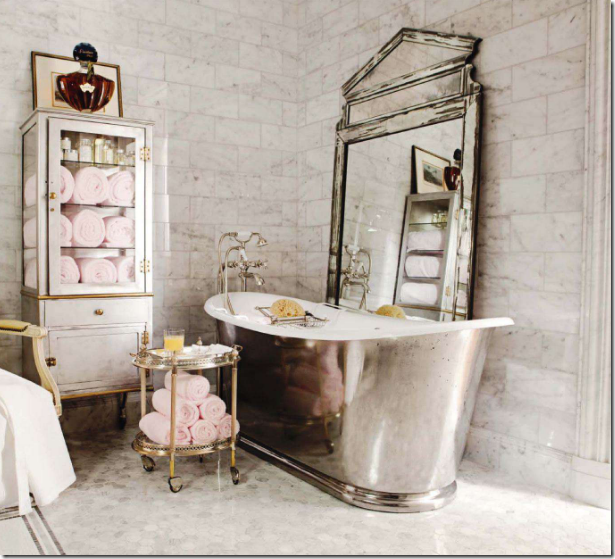
 Even House Beautiful’s Bathroom of the Month has been seen before – its Betty Lou Phillips master bath, straight off the pages of her latest book.    God forbid, they go photograph a bathroom we haven’t seen before.  


TRACERY

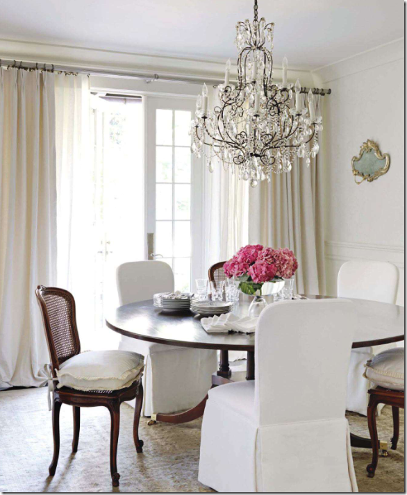
            Let’s make nice.   I did love that House Beautiful showed this gorgeous all gray and white house by Tracery Interiors.    To tie this all gray and white house in with the Pink theme, they added pink flowers everywhere.  Poof!   Now, it’s a pink house!    OK, this house is gorgeous, as were the others shown this month.


hb3

To be fair, the houses featured this month in House Beautiful are beautiful.  The Tracery house above, is, spectacular.  And this one with the pink curtains by Ruthie Sommers is fab too.   Gorgeous entrance hall.


hb1

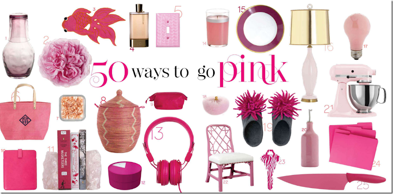
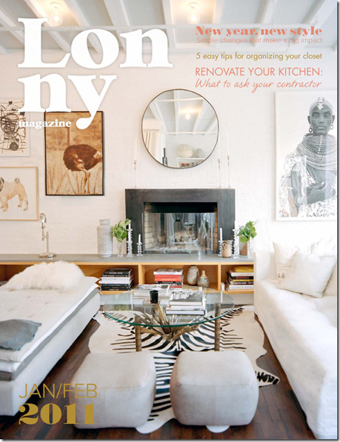
Why all this talk about House Beautiful?    Because on the newest Skirted Roundtable, we discussed all of this and more.  One topic we talk about is the Picks Section found in most magazines, online and at the newsstand.  Does anyone read these types of stories?   Seriously – does ANYONE read these pages filled with all kinds of little things to buy?    Picks have become a large and must-have  part of the  new online magazines, Rue, High Gloss, and Lonny.  Why?????   Is it even possible to publish a design magazine without a Picks page?  Someone should try.


VERANDA 

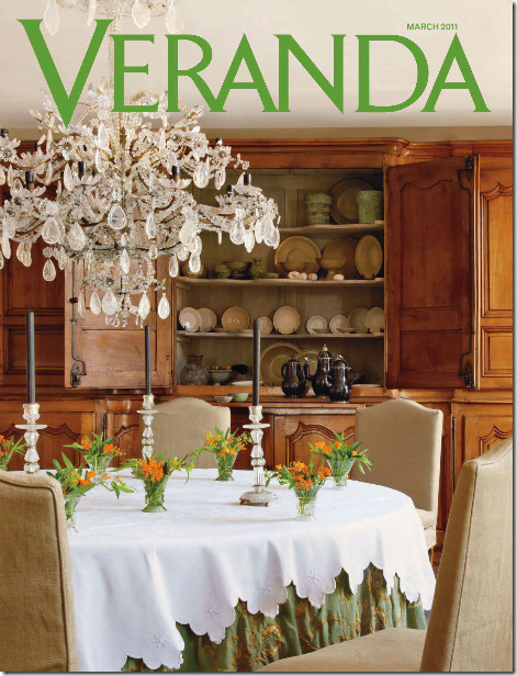
On the Skirted Roundtable, we don’t just crucify House Beautiful.    Veranda was back at it again, recycling a house we’ve all seen before, ad nauseum.  The gorgeous Belgian house owned by antiquarians Brigitte and Alain Garnier that has been seen in countless international magazines and all over the blogosphere,  is this month’s cover story.  People, PLEASE, give us something new for our money.    I will say this,  if you have never seen the above house before, it’s worth the issue price – it’s gorgeous.  But, if you’ve seen it before and before and before, you’re out of luck.  Of course, the current Veranda does have many other houses worth seeing.   If Veranda could ever just give us all new content, we would be on the band wagon, shouting it from the rooftops.    Despite all the unfortunate repeats, I am loving the direction of the new Veranda.    The magazine is evolving and growing.   It’s leaving its southern roots behind and is looking more and more Elle Décor edgy each month.    Whether you like that or not is personal preference.    All I want is to be surprised each month by something new and original.


country;ovomg

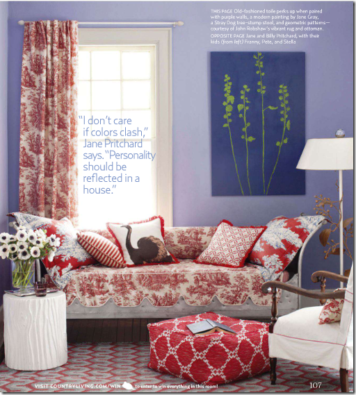
Country Living gets it right.  Never have I seen a recycled house or story in this magazine.  For years Country Living was the Cinderella to the better produced Country Home.    Today, I can barely remember Country Home.   Each month, Country Living consistently give us what we didn’t we wanted.   March’s issue has columns on both Dave Matthews AND Lucinda Williams.  WOW.  Someone at Country Living has good taste in music.   This month, they give us new houses, new stories, new features and none have been seen before in the magazine or the blogosphere.  It can be done.


lonny

Lonny – the premier online magazine – FREE. 


While we are dishing out lots of money for magazines each month –  more and more fabulous FREE online magazines with fresh, original content are vying for our attention.   It makes you wonder - who’s going to win this battle.  Is it even a battle?   Can the FREE Rue, Lonny, High Gloss and all the other online magazines take over the business, stealing the paying readership?    The content of these online magazines certainly rivals the paper versions.   Do you think Hearst, et al, has discussed Lonny at a board meeting?  Do they care?  Are they worried?  Do you think that IBM discussed those snarky teenagers who started a little business in their garage called Microsoft and Apple?   Are High Gloss and Rue the Microsoft and Apple of the magazine world?

Join us for this week’s Skirted Roundtable HERE where Linda, Megan and I discuss all this – House Beautiful’s Pink issue with all the repeats, Veranda’s status, Town and Country tidbits, along with online magazine gossip. 


And now, for something totally different:   Budget Buying News:

target

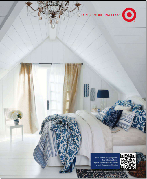
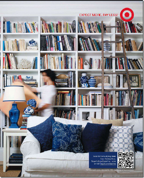
Target must have hired a new photostylist.  I can’t remember ever seeing such a beautiful ad from them!  This new line looks so cute!!!


target1

And another new ad from Target.  Too bad they don’t sell that sofa!  They could make a million on that item.


Listen to The Skirted Roundtable vs. Pink/Repink HERE.