Since I got behind on writing about the Skirted Roundtable, I am trying to catch up, first last week with Jamie Drake, The King of Color – our first “live” interview, and now, this week with Joe Ruggiero, The King of All Trades! If you are like me, you first became acquainted with the warm and very friendly Ruggiero through HGTV. He had numerous shows that ran on the channel, but the most popular was probably Homes Across America where he presented some of the most beautiful houses that ever were seen on that channel. Each week, with a sweater on his shoulder, he gave his viewers a history lesson and a design lesson, all tied into one.
`
Remember his trademark sweater? I must have liked it because for years I never left the house without one slung over my shoulders!
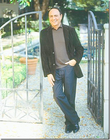
Joe, today, sans the sweater!
Talking with Joe about his start in the design business could take hours. He’s done so many different things – worn so many different hats, it’s remarkable. He was in advertising and then ended up at Ethan Allen for 15 years which he followed up with a stint as editor-in-chief of Home Magazine. He was also a national spokesman for Glidden and Kohler. After working on This Old House, he landed on HGTV where his national profile skyrocketed. Now he has his own company The Joe Ruggiero collection where he designs furniture, fabric, lighting, and even art work.
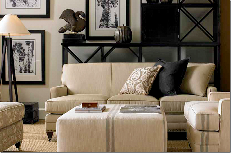
Joe’s upholstery line is all covered in his own sunbrella fabrics. I really like that fabric on the ottoman – reminds me of the trendy feedbag look!
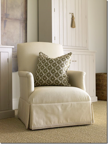
The Barrymore – I love this chair in Joe’s line. This one fabric amazed me that it was sunbrella. It looks like a silk.
This is such an elegant chair – it looks much more than it costs.
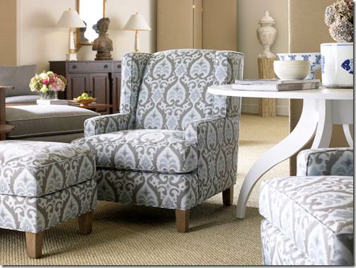
Love these Carrington chairs and especially the ikat sunbrella fabric.
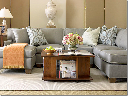
The Tribeca sofa is really nice. But, the price points are even better. Everything is so reasonable!!
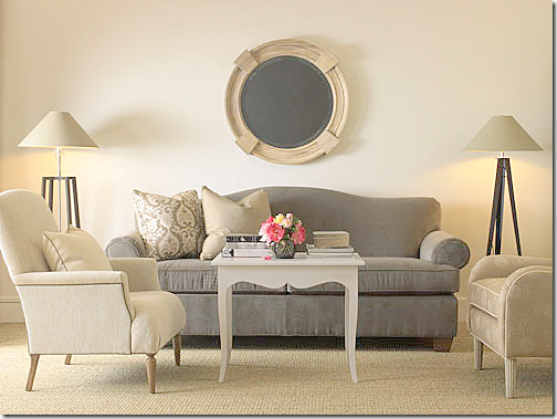
This picture featuring the sofa, the Litchfield, reminds me of an interior Alessandra Branca once did. I really like the table – this is his design too, as well as the lamps.
I really love that striped sunbrella. His sunbrella damask fabric also covers the screen.
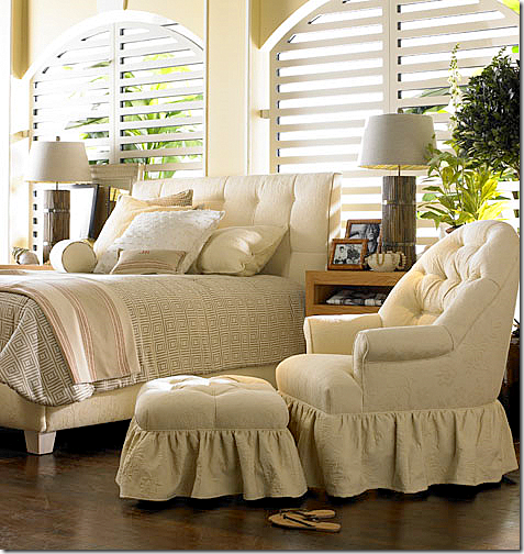
But without a doubt, the chair and ottoman was my personal favorite! Love love love it!!!!! Soo cute.
If you haven’t already listened, please do. Joe was really inspiring, plus he was so very, very nice, very encouraging and extra warm!
After talking with him, it’s understandable why he’s been so successful. He just has that “it” factor.
To listen to Joe Ruggiero on The Skirted Roundtable, go HERE.
To visit Joe Ruggiero’s web site, go HERE.
THE SKIRTED ROUNDTABLE WITH JOE RUGGIERO
American Antiques, Folk Art, and Interiors
I know this blog usually shows Texan houses with French antiques or houses in France with French antiques, or sometimes Belgian houses with French antiques. But there are other designers I admire besides Charlotte Moss and Suzanne Rheinstein. One such designer I’ve liked for years and years is Karin Blake. As most who also like Blake, I first noticed her when she designed Candice Bergen’s house over a decade ago. The Bergen house really put Blake on the map and introduced her to a wide audience. Her interiors are very stark; Blake is a true minimalist. “There’s not a lot of clutter,” she says. “Each piece stands out, even if it’s a table. You don’t see me with drapes. I even avoid lamps whenever possible.” Her walls all almost always white and the contrast between light and dark becomes a design element. Born in Pennsylvania, she attended a Quaker school and spent much time visiting Amish communities – an influence still seen today. Her accessories are large and spare. Mostly, she uses American folk art and signs instead of delicate porcelains and plates.
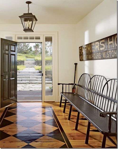
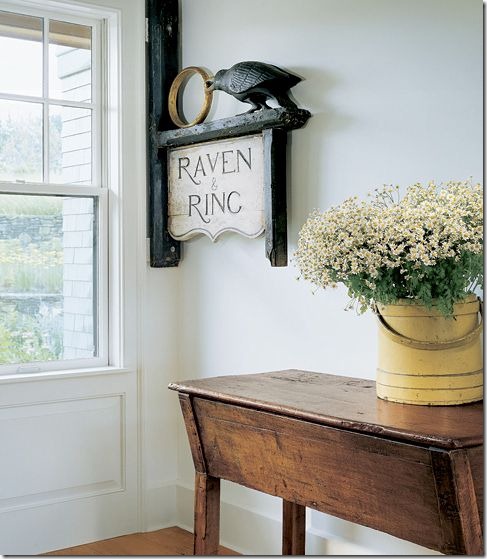
An entry hall by Karin Blake features an antique sign and painted floors. Blake uses large signs in many of her projects. This one is from the 19th century once graced a hotel.
This sign is fabulous! An antique dough table mixes with an early American firkin.
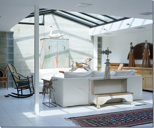
In her own house, Karin mixes modern architecture with lots of American folk art.
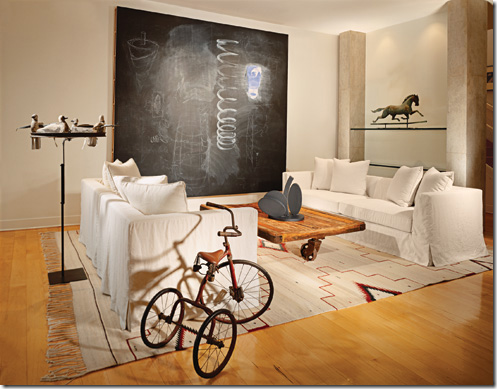
This living room combines modern architecture and American folk art. Notice the coffee table – so trendy today, yet Blake designed this house almost 15 years ago!!!
The weather vane is 19th century. Here Blake combines French antiques with American folk art. She also typically uses floral fabrics in her designs.
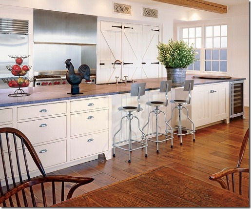
Great kitchen – love the barn doors on the refrigerator and the modern bar stools.
Why American??? American antiques and folk art are experiencing something of a resurgence. Auctions have been extremely profitable for collectors of American folk art, paintings and furniture. Is it because of the popularity of the rather sparse Belgian look that Americans are now looking to their homeland for furnishings? Or is the current trend a reaction against all the mass produced furniture and accessories coming from eastern countries? On cable TV, there are over 11 new reality shows about antique pickers – people who crawl around attics and warehouses looking for American treasures to resell. My husband Ben loves to watch one in particular – “American Pickers” on the History Channel. Even the NY Times has caught the bug – recently writing several stories about American antiques.
American Pickers, one of Ben’s favorite TV shows. Yeah. Not quite sure why?
The popular auction house Skinner Auctions deals with American antiques and they recently listed the most popular items at auction:
1. Marine paintings are at the top of the list of popular items. Paintings of ships and seascapes spurred bidding frenzies at recent auctions. Favorite artists include Antonio Jacobsen, James Butterworth and William Bradford.
2. Painted Antique American Furniture. It doesn’t matter whether the furniture is fancy or country, or painted in bright or dull colors, these pieces attracted a wide range of bidders.
3. American Folk Art. Folk art remains quite popular: the board games, naïve portraits like above, and advertising signs. Just one large piece of folk art can set the entire atmosphere in a room.
Last year, I showed a house in Seattle, Washington designed by interior decorator Jane Wood. The owners had a collection of American portraits, so I named the story, “The Portrait House.” Comments about this house were many – and most remarked on these haughtily beautiful paintings. To see the story, go HERE.
The beautiful stair hall features a lantern and four portraits – from one family.
Two more portraits are found in the living room.
Jane Wood who designed the Portrait House, above, once lived in Houston and now lives in Ann Arbor, Michigan. She recently teamed up with a veteran antique dealer who specializes in American country antiques. Jane wanted me to see the dealer’s house because it is really unique and a treasure trove of American folk art.
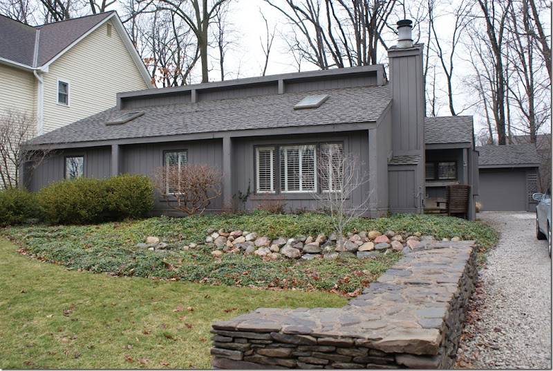
The dealer, Gloria Oviatt, is one of the premier American country antiques sellers. For the past 30 years, she has been doing two to three shows a month, mostly in the midwest. Gloria lives her work. Her house is filled with authentic American antiques. There are few signs of modern life – save for a flatscreen and a laptop. Most interesting is her house is contemporary!
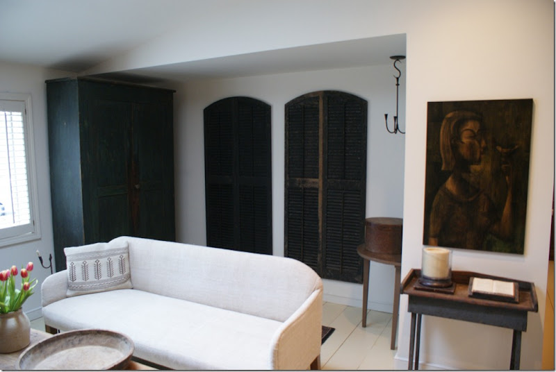
Gloria Oviatt’s house in Ann Arbor. The contemporary house hides what is inside – an incredible collection of American country antiques. Gloria calls her aesthetic - New Modern Country. Inside the house there are high ceilings and skylights. Her walls are white and all the fabrics are an off white plain linen, creating a monochromatic look. Gloria moved in her house in 1986. At that time it was only 900 sq ft. Since then, she has added on a kitchen and a large family room. She ripped out all the carpets and replaced them with plain pine boards which she painted….white, of course! The juxtaposition between the antiques and the contemporary setting is quite unique and I think you will really enjoy this glimpse into the life of a true original!
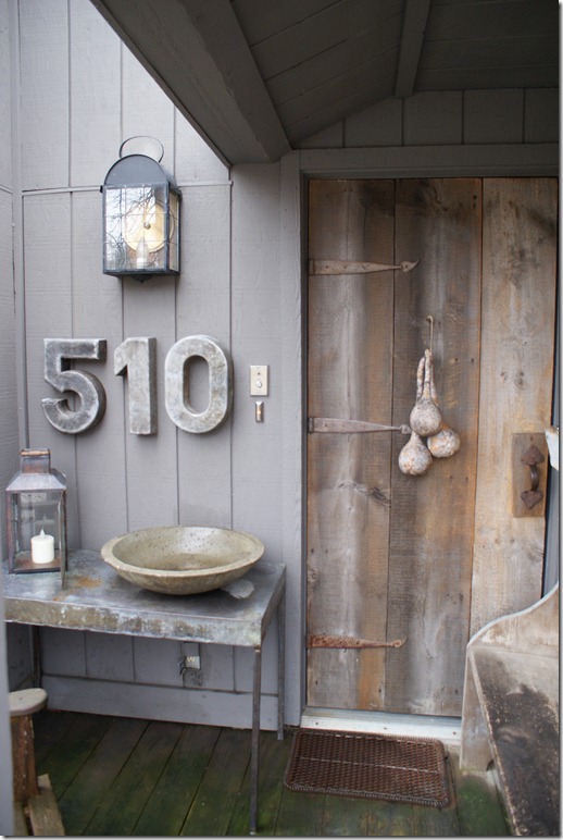
You know at the front door that this is no ordinary house. The address numbers came from an old Levi’s 501 store. The old door covers the ‘real” front door.
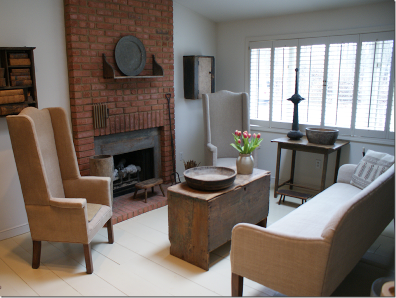
The floors are pine, painted white. The coffee table is an old blanket box with original paint. These chairs remind me of the ones from Restoration Hardware, see HERE.
This green armoire was one of the first purchases Gloria made.
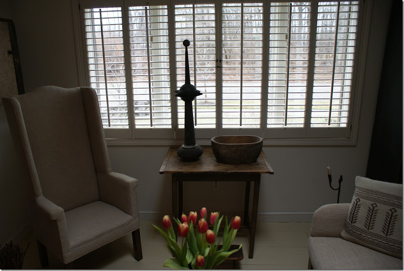
I wonder where that finial came from? It’s amazing.
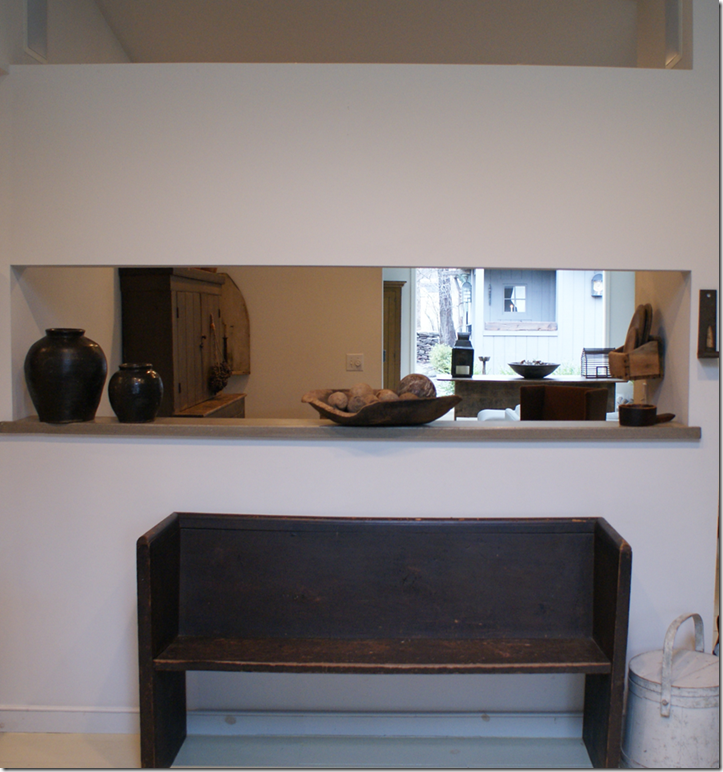
Looking through the breakfast room out towards the newly added family room.
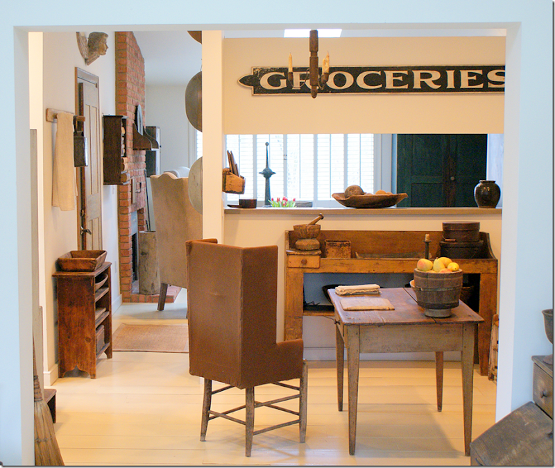
The breakfast room used to be the kitchen before the additions. I really love the floor! Notice the dry sink on the left.
Looking through the breakfast room to the living room. I love all her antique signs. But the upholstered chairs are great – I think they are so amazing.
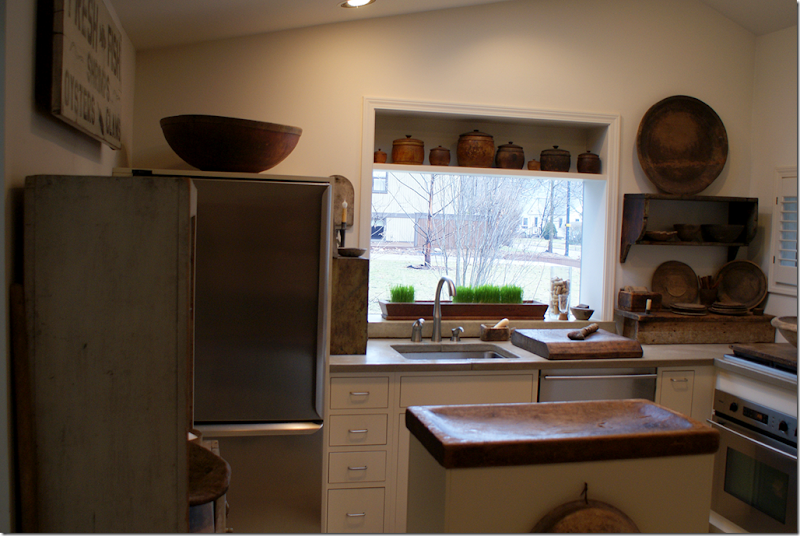
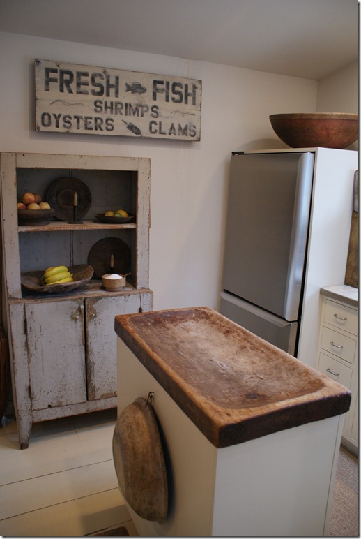
The modern kitchen was once an outside storage room that Gloria enclosed. There are concrete countertops and modern stainless appliances. She made the island out of an antique cutting board.
The island is incredible. Love the sign.
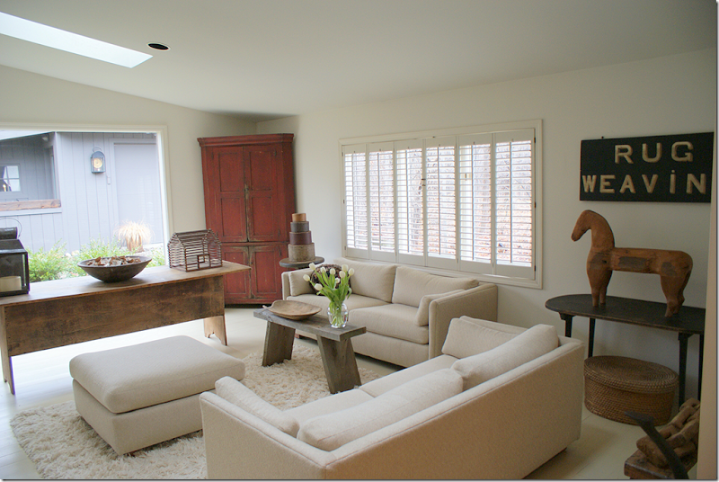
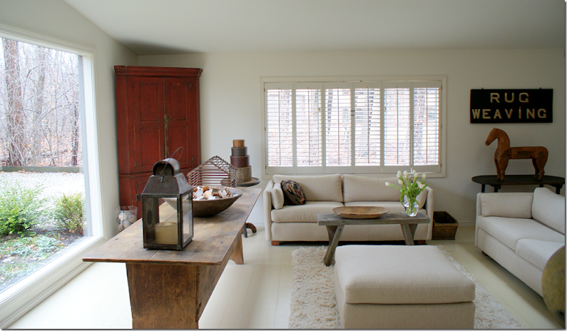
The family room has modern upholstery mixed with all the antique tables and accessories. The table under the sign is Amish.
Another view. A great touch of red in the all white room.
This dining room table looks remarkably like all the faux new tables that are so in vogue right now!
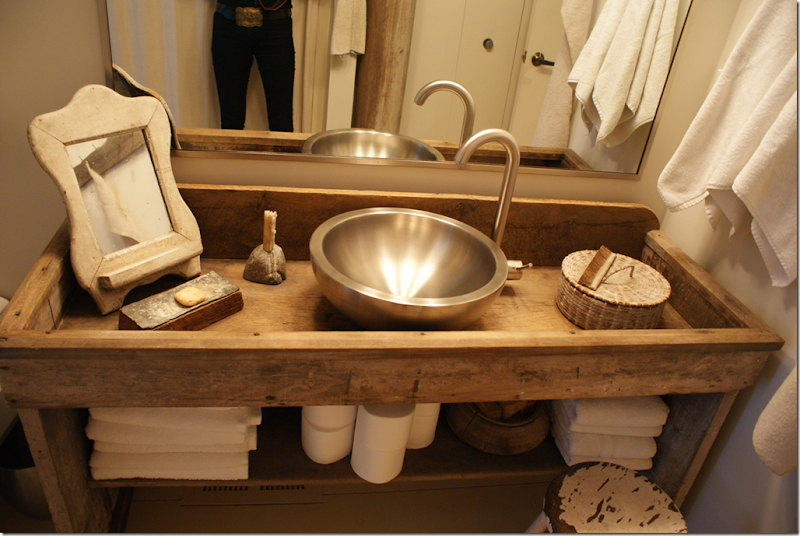
In the bathroom, Gloria converted a dry sink into a wet one. Stainless looks so good against all the antique woods.
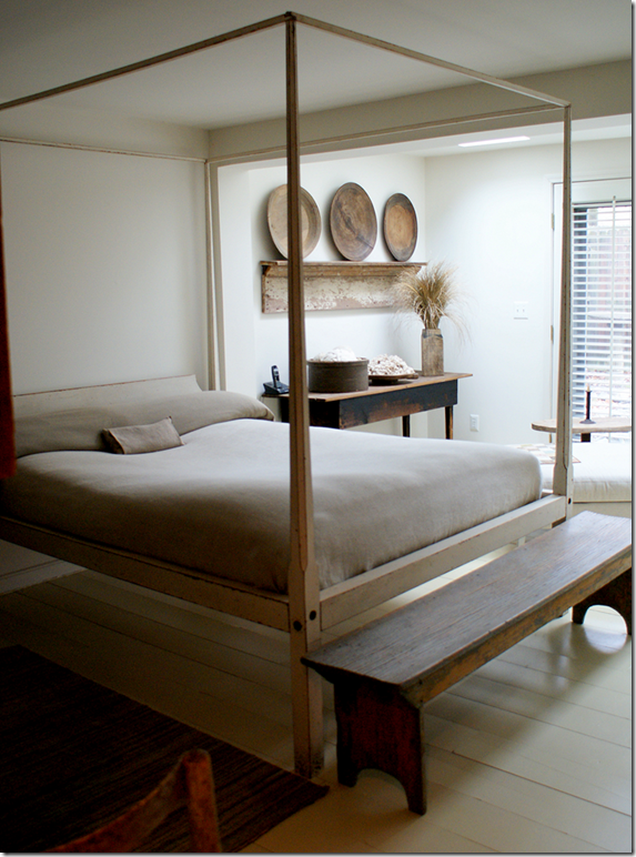
The master bedroom is large enough for two seating areas.
My favorite vignette in the house – those large treen plates on a shelf – look likes a work of art. Cute baby quilt.
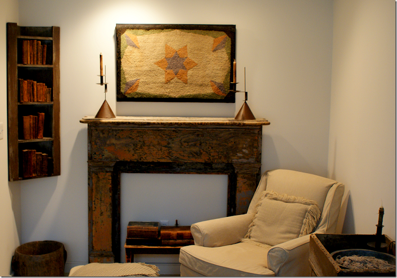
She installed this painted mantel in the bedroom even though there is no fireplace.
The guest room is the TV room – one sign of modern life, a flatscreen.
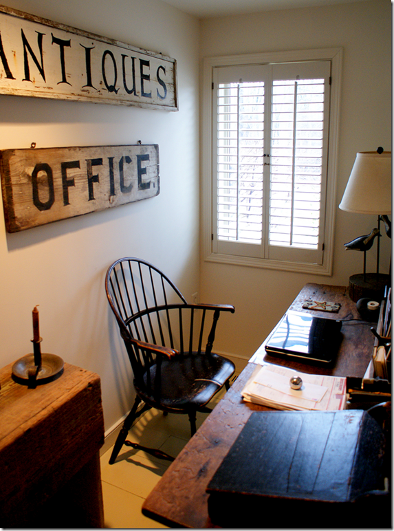
Her office is small in a space taken from the living room. The signs say it all!
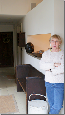
The gracious homeowner – Gloria Oviatt. Thank you so VERY much for allowing us this peek into your house!
Contact Information: Gloria Oviatt, 734-663-2523, email: gloriaoviatt@yahoo.com
Jane Wood and Gloria teamed up at an antique show last week. This is what their booth looked liked. I’m loving the trumeau and the bakers table along the right wall. They’ll be teaming up again at booth, c-18, at the Ann Arbor Antiques Fair, once a month - 3rd weekend of each month thru October
Here’s a list of Gloria Oviatt’s Upcoming Shows:
Simple Goods, April 23, 9-3pm, 160 Howard St, MtVernon OH 43050, 740/848/4005
Pure and Simple, May 7, 9-3pm, 1500 North Reed Road on US 31, Kokomo, Indiana
Ann Arbor Antiques Market, May 14-15, 10-4, 5055 Ann Arbor-Saline Road, Ann Arbor, MI 48106
Heartland, June 4, 9-4pm, 861 Salisbury Rd. North, Richmond, IN 47374
Are you a fan of American antiques and folk art? Do you like it all, or just a few pieces of folk art here and there? Has this article opened your mind up to bringing more American into your home? I really love the antique signs and would love one for my kitchen. If American antiques aren’t your favorite, what is? Myself, I’m partial to French antiques first, then English or Italian second.
Do you shop at One Kings Lane? I’m really hooked on this place. They have the best sales – it’s all online, and the merchandise changes daily. For each sale, someone different is featured. This weekend Kathryn Ireland will be selling wares from her shop and private collection. Even if you aren’t a fan of Kathryn’s – there’s lots and lots of other sales going on at the same time. I just happen to like Kathryn!
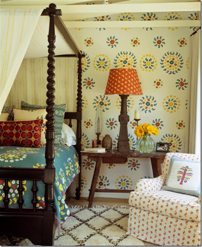
Remember this picture of Kathryn’s private retreat on her property? Well, it looks like some of these items or similar ones are going to be in the sale:
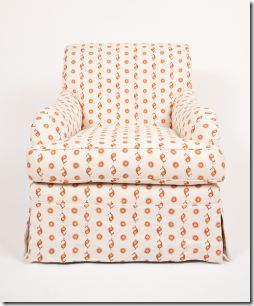
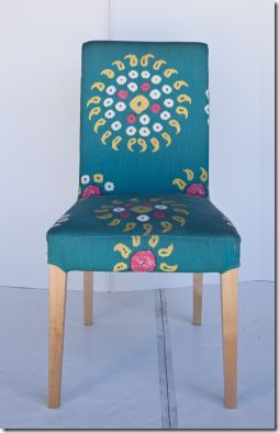
This chair is in the sale.
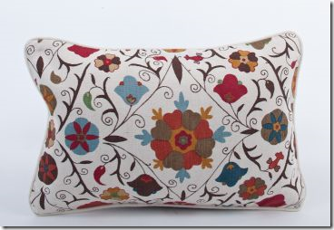
Lots of pillows in her own fabrics, like this Suzani are for sale.
And this chair too.
The Kathryn Ireland sale runs this Saturday, 4/23 – Tuesday, 4/26. You have to register to enter the website, but it’s painless and totally worth it! If you do buy something, send me a picture!
To visit the sale, go HERE.
And Now For Something Personal:
A movie review!!!! I just went to see the movie Water For Elephants. If you read the book, then you know how good it is. If you haven’t read the book, you should – it’s really an easy, good read. AND, the movie was even better! I cried like a baby in the first and last scenes – just like I did in the book. Reese Witherspoon was better than I imagined and Christoph Waltz was as scary as ever. But, ok, I HAVE to say it, the star, Rob Pattinson of the Twilight Saga movies, was beyond great. He looks so gorgeous in the movie, it’s almost sinful. He is going to be a huge star. OK, OK, back to the movie. The cinematography was wonderful - and the sets were so realistic. You really felt like you were on a circus train traveling through America during the depression. And Rosie the elephant is adorable. Go see it! You will not be disappointed.
What? What’s wrong with one more picture from the movie?????? Do you blame me? What a shayna punim! OK, that’s Yiddish for beautiful face. Robert Douglas Thomas Pattinson. It’s worth the price of the admission just to stare at this man’s face!!!!


