I got an email from a reader who wanted me to show her kitchen in the Readers Kitchens series. But after seeing pictures of her entire house, there was no way I could only show her kitchen! The house is located in a gated community, Chatham Park, in Fulton County, Georgia. When the owners first saw the house, it had been left unfinished for over three years. For the past year the owners completed building the house and decorating it. After living in it for just a short while, they decided to sell their dream house and move to the beach – which is where their hearts really are! Currently the house is for sale through Beacham and Company Realtors HERE. All these beautiful pictures were taken by Blayne Beacham and were also shown on her own blog, The Photographer’s Life HERE. While I usually don’t like to show houses that have already been featured on a blog, this house was just too beautiful to pass up and I knew you would all like to see it. So, let’s go past the gates to the neighborhood, where the house sits on a slightly hilly lot….enjoy!
The house is two stories with a fully finished basement. It has 7 bedrooms, 7 bathrooms and 3 half baths along with six fireplaces. The ceilings inside are 10 ft tall. To the right of the house is a 4 car garage. The lot sits on over 1/2 acres of land.
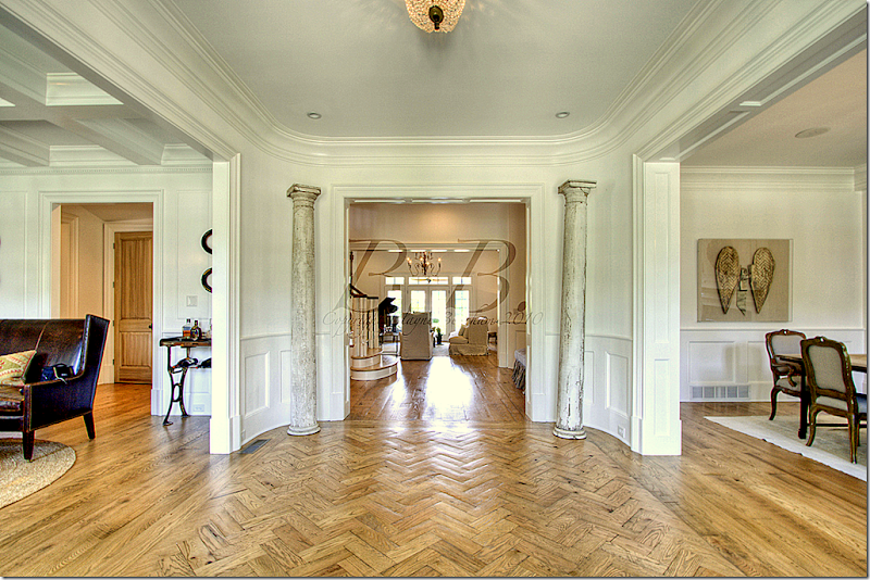
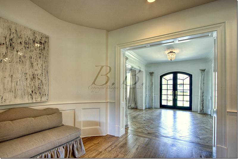
Walking in the front door, you step into a wide center hall with herringbone patterned wood floors. To the left is the study and to the right is the dining room. Straight ahead, past the staircase foyer, is the living room. In the four corners of the entry hall, the owner placed 4 aged columns.
Looking from the staircase lobby back towards the front door. NOTE: All these photographs bear the watermark of the photographer. I wish they didn’t because the marks are so distracting, but just try to pretend they aren’t there!
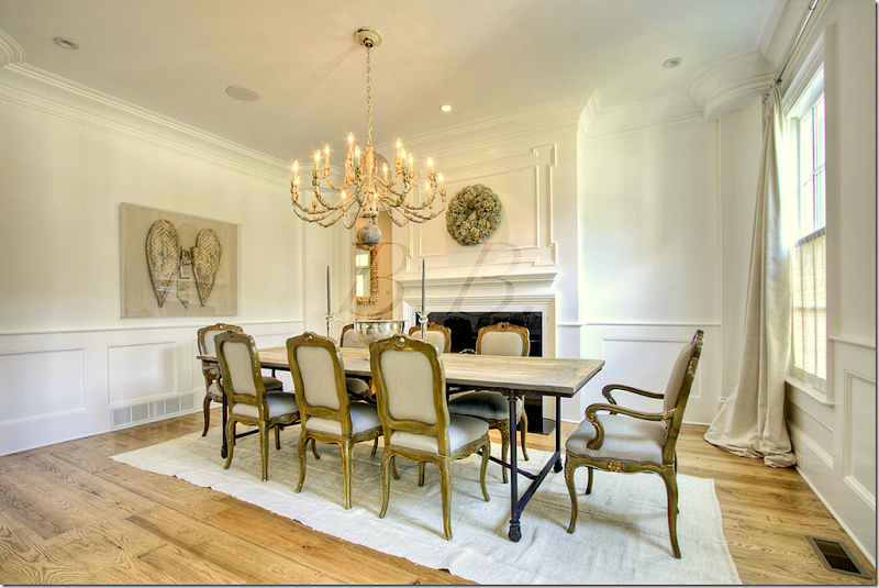
Facing the dining room.
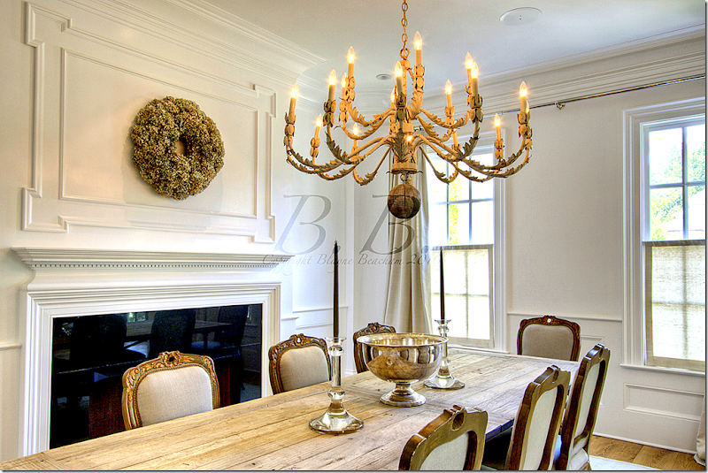
The dining room has a fireplace and a set of gilt French chairs. The table is Belgian inspired Rough Luxe.
I love the silver mixed with rough wood. Great chandelier.
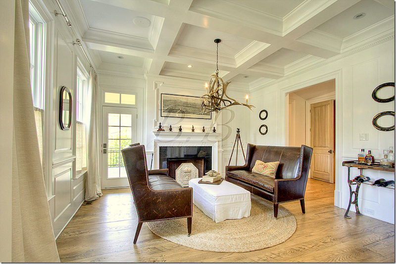
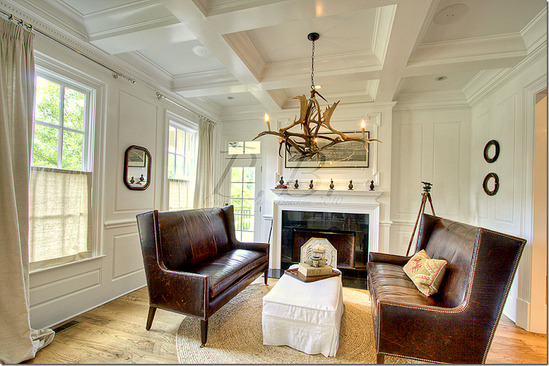
Across from the living room is the study with its charming antler chandelier. A pair of leather love seats face a white slipcovered ottoman.
A view towards the front of the house. Notice the linen shades that cover just the bottom half of the windows for privacy, yet they still allow the light to come through.
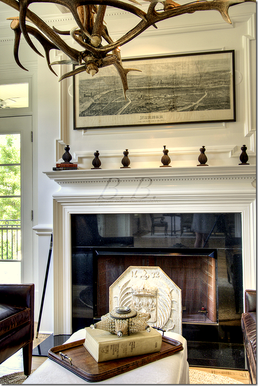
A close up of the mantel with an antique map.
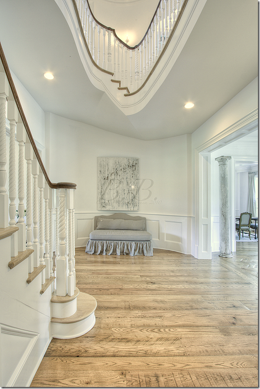
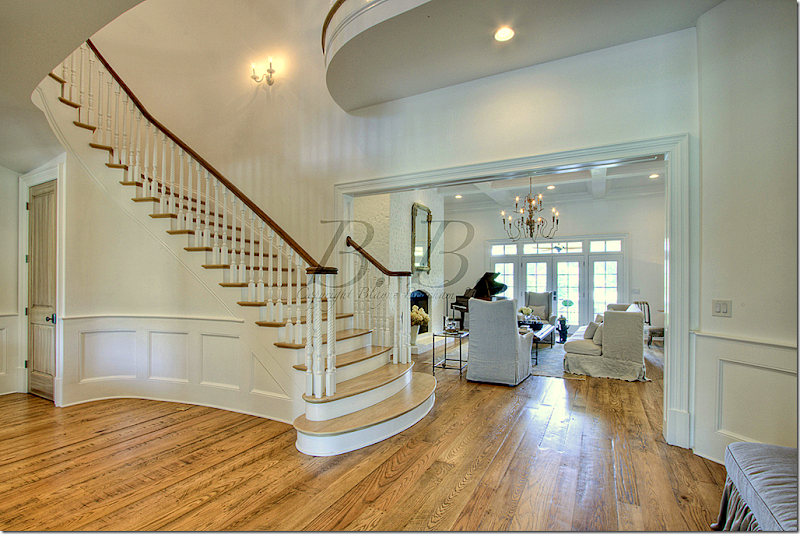
The staircase lobby is beautiful with the curving lines.
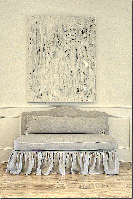
I love this slipped settee with its long lumbar pillow in the staircase lobby. So, so pretty!
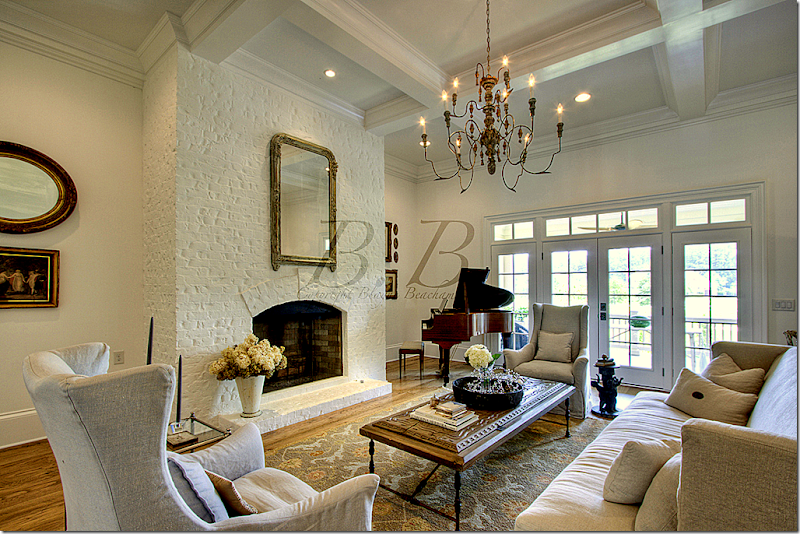
Past the staircase is the living room which overlooks the backyard.
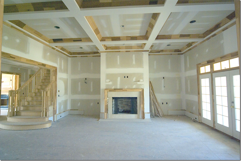
The house sat in this state, unfinished, for three years before the owners “saved it.”
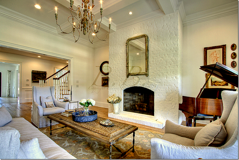
And today…the fireplace is painted brick with slipcovered covered furniture and a piano in the corner. Beautiful Italian wood light fixture.
The view towards the back porch and yard.
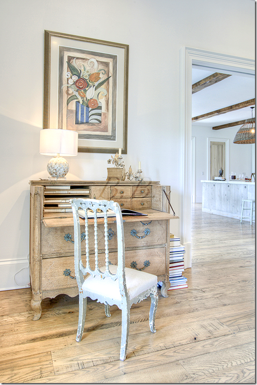
An antique desk sits on the wall that connects the living room to the kitchen.
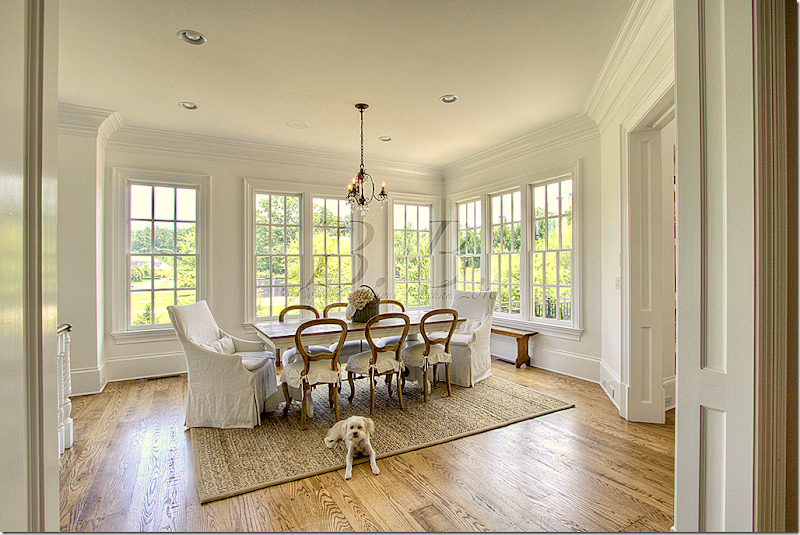
The breakfast room has a charming mix of slipcovered chairs.
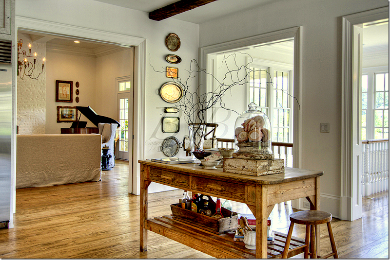
Looking at the living room from the kitchen which is next to the backstairs that lead to the basement.
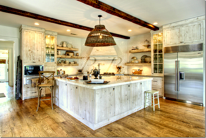
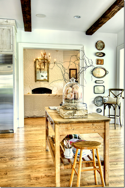
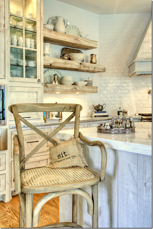
The kitchen is an amazing mix of textures and surfaces. The counters are Calacutta Ora marble and zinc. The backsplash is subway tiles. The open shelves are the same rough wood as the island. I love the wicker light fixture!
The view back towards the living room.
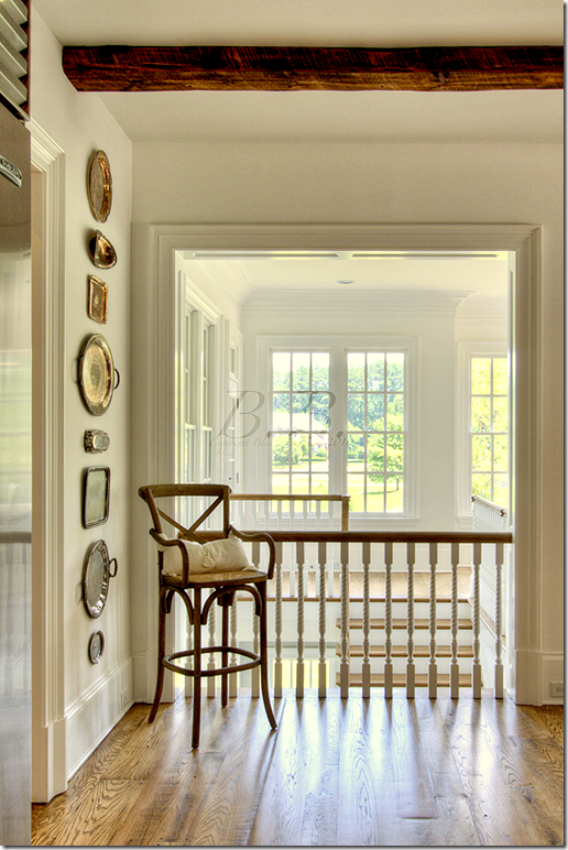
The view towards the back stairs overlooking the yard.
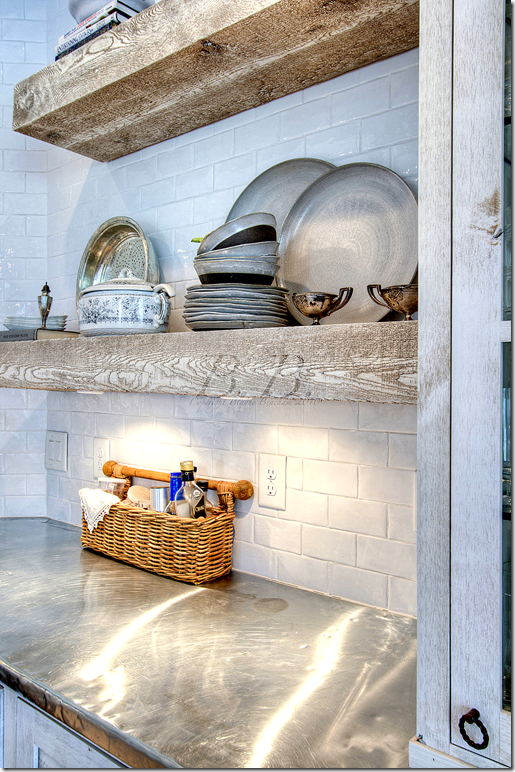
A close up of the rough wood shelves and zinc counters and shiny subway tiles. Such a great mix!
Close up view of the kitchen.
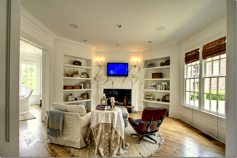
Past the kitchen and breakfast room is the “keeping room” for quiet TV watching. Another fireplace is located in this cozy room.
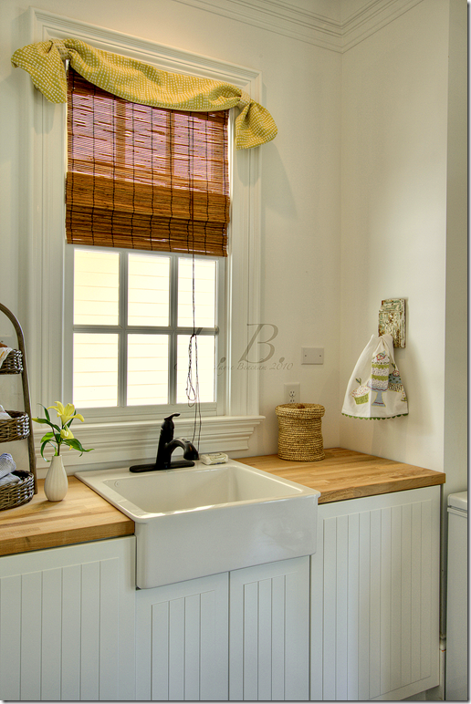
The laundry room has a farm sink and beadboard cabinets.
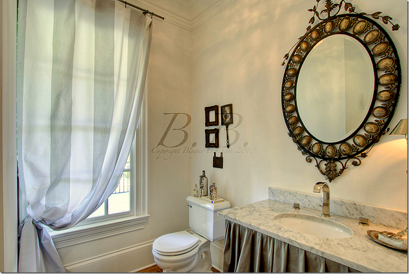
This powder room has a marble countertop with a skirt.
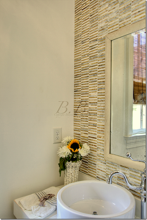
This powder room is more contemporary with its tiny tiles and hardware.
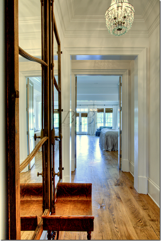
The hall leading into the master bedroom, located on the first floor.
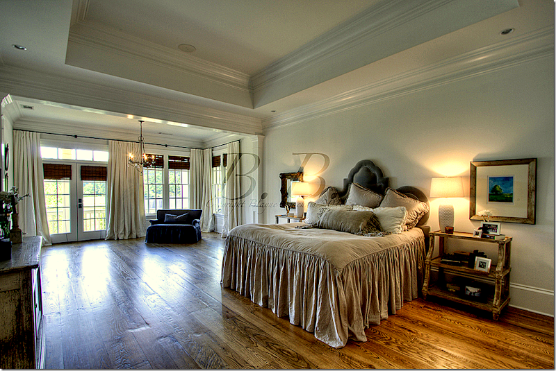
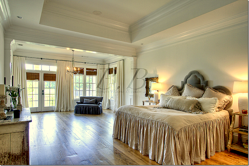
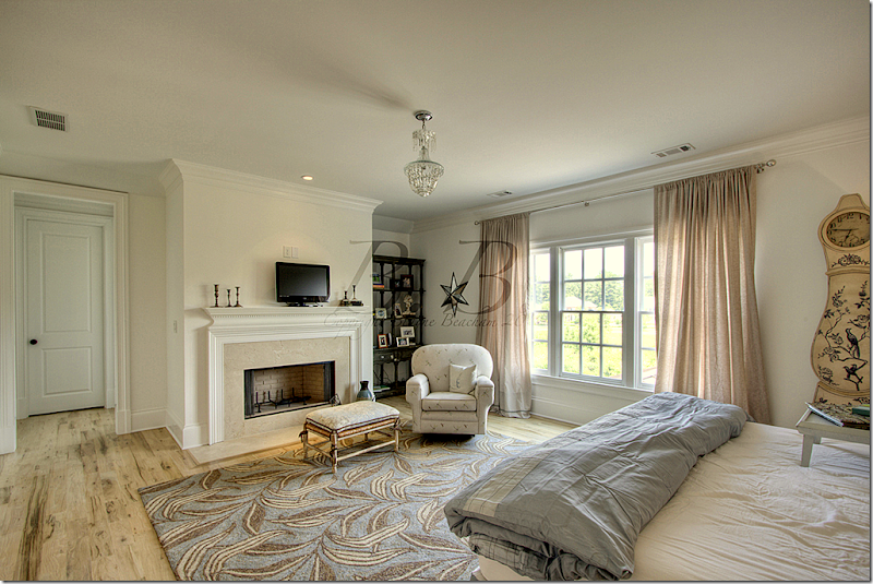
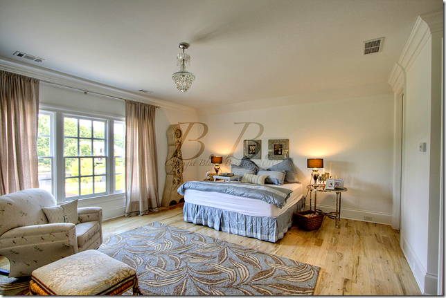
The master bedroom has its own sitting room and porch. Such a pretty bed!
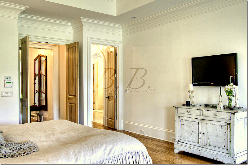
Here you can see the door that leads to the bedroom foyer and the other leads to the bathroom.
Another view of the bedroom and its siting room.
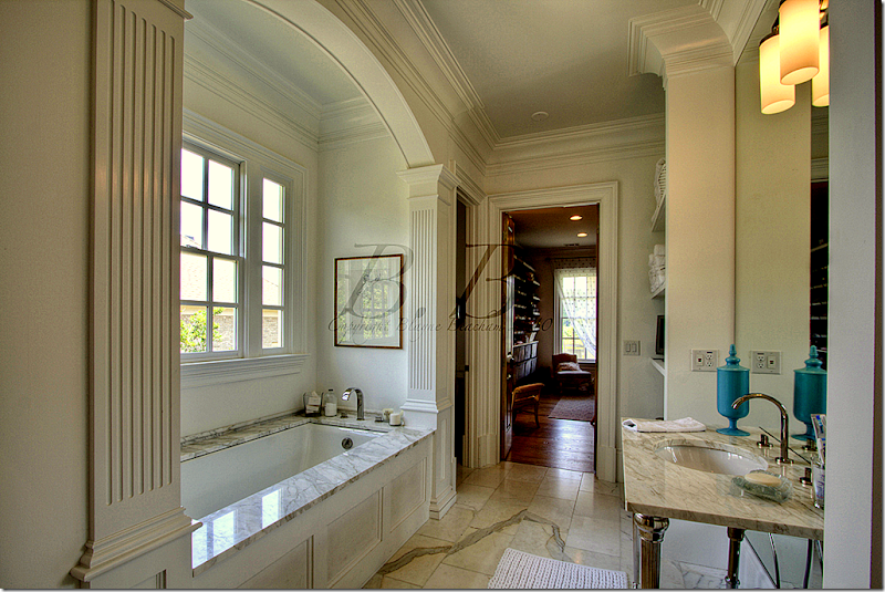
The bathroom is white marble. This side is the lady’s and it leads to her closet.
On the man’s side there is a large walk in shower with glass windows. Beautiful!
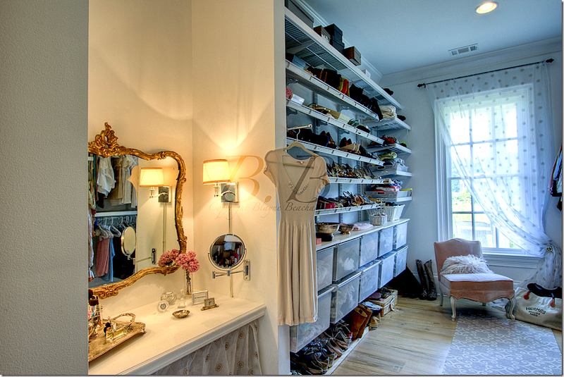
The lady’s walk in closet has its own vanity area. What a closet!
A closeup of the purses and shoes section and the vanity.
The porch off the master bedroom connects to the back porch that runs the width of the house.
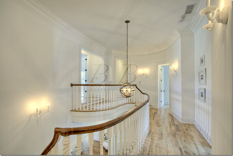
Upstairs, there are five bedrooms.
This is called the InLaws suite. It has its own fireplace.
Another view of the InLaw suite.
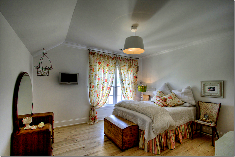
This is called the pink and green bedroom.
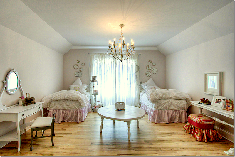
And this is called the pink bedroom.
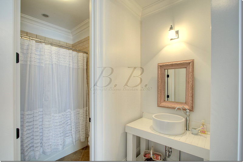
This bathroom connects to the pink bedroom. Each bedroom has its own bathroom.
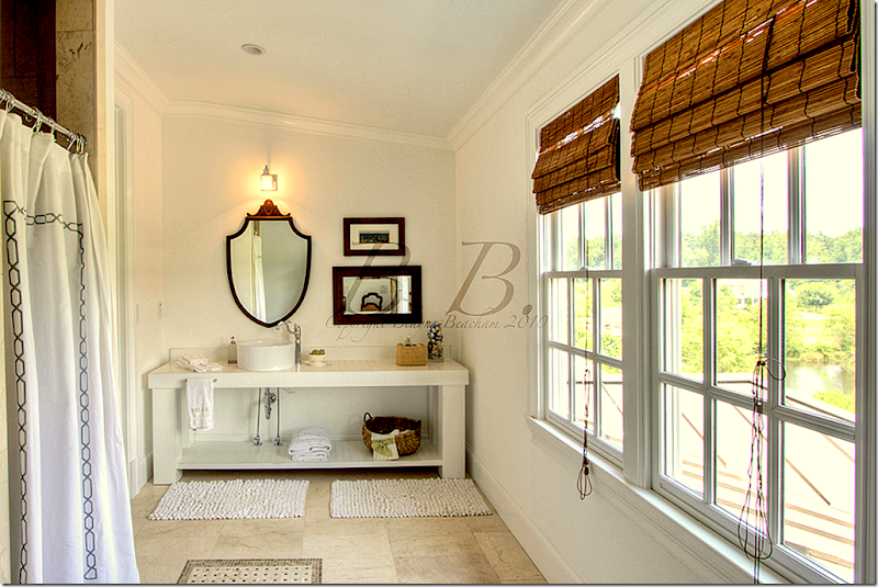
This bathroom has great views out the windows. I love the vanities with their open shelf space.
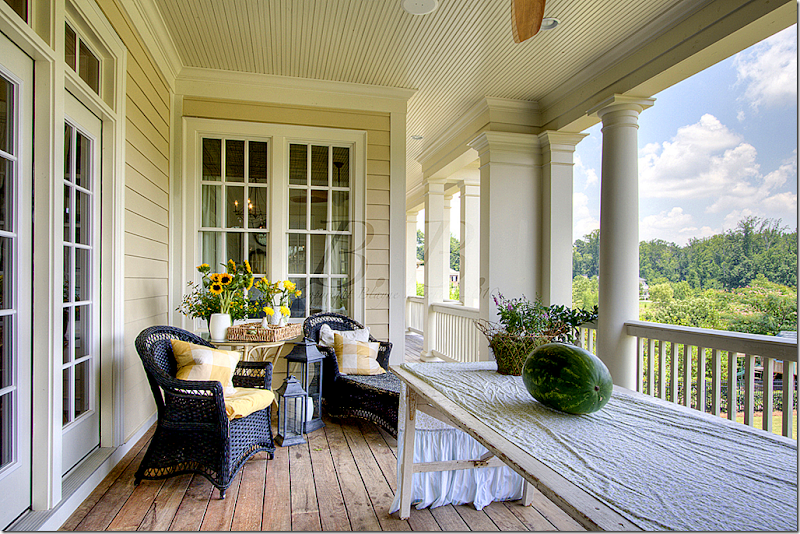
The large back porch that overlooks the yard.
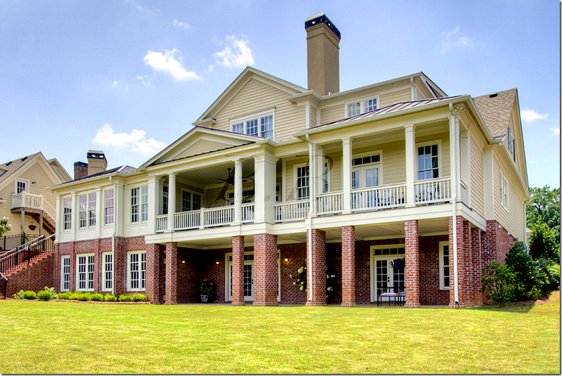
This picture of the back of the house shows the basement level and the first floor with its large porch off the living room and master bedroom. The garage is on the left.
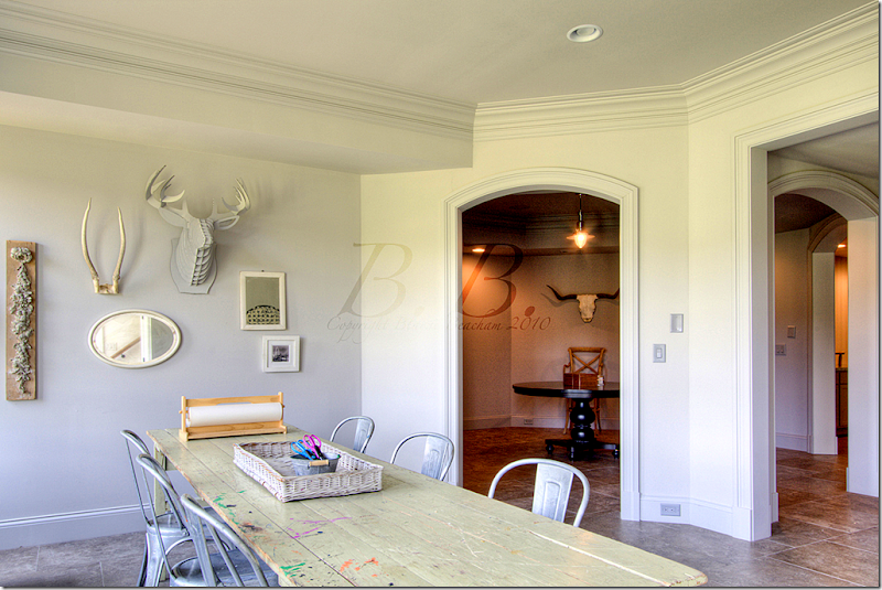
The hobby room in the basement. I can’t imagine how nice it must be to have a finished basement! We don’t have basements in Houston – it must be such a luxury of space.
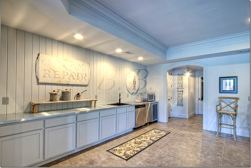
The basement has its own kitchen! Wow!!
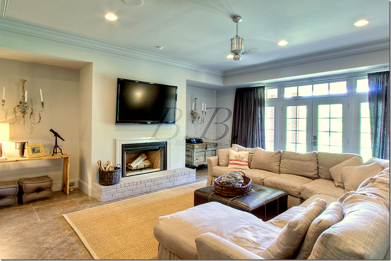
And its own media room, with another fireplace.
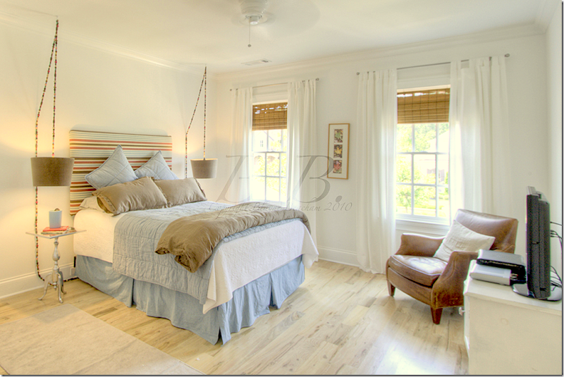
The son’s bedroom is in the basement, the only bedroom down there.
I hope you’ve enjoyed seeing this Georgian house in Georgia! Not shown is an exercise room and a recreation room. Be sure to contact Beacham Realty HERE if you want to see the house in person. And, visit Blayne’s beautiful blog HERE to read her take on the house and other houses she has taken photographs of. Thanks a million Blayne for sharing your beautiful pictures!!!!!
A Georgian in Georgia
Readers Kitchens–Part One
For the past few months, I’ve been collecting pictures of kitchens from readers. Some are new kitchens and some are total redos. I originally wanted to start the series with the Nantucket kitchen shown a few weeks ago, but that became more of a story on the architectural designer Nancy Fishelson HERE than on the reader’s kitchen. So, we will start today with a kitchen renovation – in Paris France.
Sally Wheat’s gray kitchen which started the kitchen craze.
Why show just kitchens, you may ask? The truth is, readers have been sending me pictures of their kitchens ever since I showed Sally Wheat’s now famous gray kitchen. For some reason (maybe because it is so pretty,) her kitchen really spoke to a lot of people. I can’t tell you how many emails I have gotten over the years with questions like “what color did Sally use?” Benjamin Moore Fieldstone. “Where did Sally get her pendant lights from?” BROWN in Houston. I’ve even shown readers kitchens that were remodeled using Sally’s kitchen as their inspiration. And then there was my own kitchen remodeling that I talked about for far too many times. It just seems like readers love to talk about kitchens and see pictures of kitchens. One day I’d like to do a series on living rooms and bedrooms too. Maybe later this year!! Finally, don’t worry if you have a kitchen you want to show but haven’t sent in your pictures just yet – you still have time. I have a lot of kitchens to show, so the series will last for quite a while. Sooooo, without any further ado, let’s start with the first kitchen!
Today’s kitchen is in Paris, France. The apartment was recently purchased and redone by an American couple who had been looking for a few years for a second home in the City of Lights. After a long search, this apartment, with a beautiful view of the Eiffel tower, was found. There was only one major problem with the place – the kitchen.
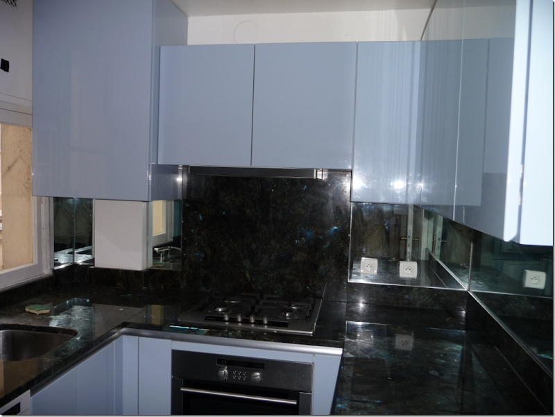
The original kitchen, as it looked on closing day, was located in the back of the apartment – far from the dining room. Though the kitchen was almost new, the style was far too modern for the owners. There was a view of the courtyard from the kitchen window – but why have a view of the courtyard, when you can have a view of the Eiffel Tower instead? The new owners decided to move the kitchen – into the dining room.
This is the courtyard view of the original kitchen. While charming, it’s not the Eiffel Tower.
Here is the dining room, which the former owners used as a study.
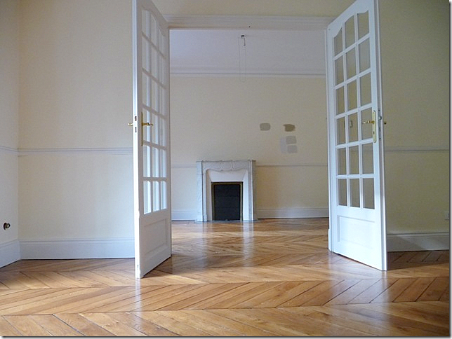
And, here is what the dining room looked like when the new owners took over the apartment. The fireplace is the focal point – as is the view outside the Juliet balcony. The herringbone wood floors are so gorgeous and were a major selling point for the owners.
Here is a view through tall French doors from the living room into the dining room.
Since the modern kitchen had actually been recently installed, the contractor was able to give it another person so it wouldn’t be wasted. The old kitchen space was then turned into an extra bathroom. Here, is an early sketch of the new kitchen which was enlarged to start in the corner and continue through to the other side of the fireplace.
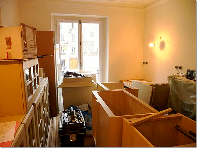
After many many months, the owner was told the kitchen was in. She immediately flew to Paris to discover it was in, but not in-stalled. Here’s the kitchen in boxes, just as it was left!
And then, after unpacking, it looked like this.
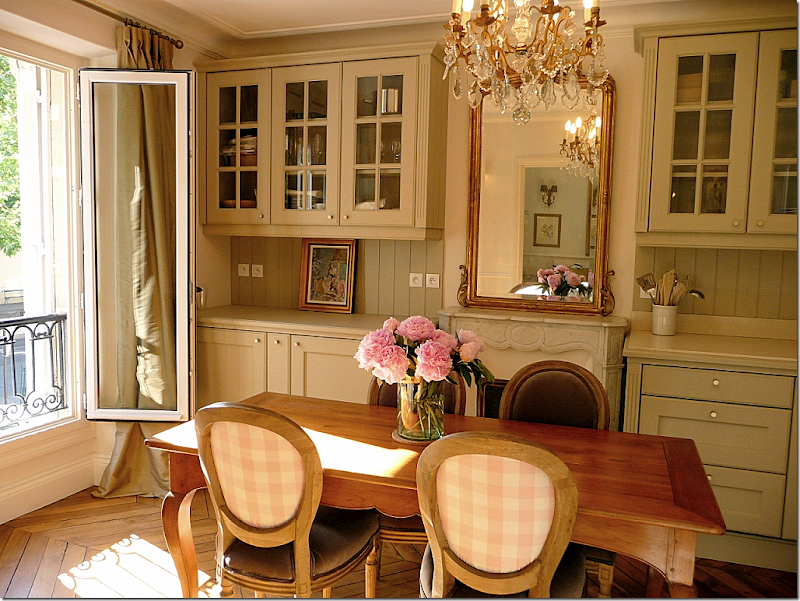
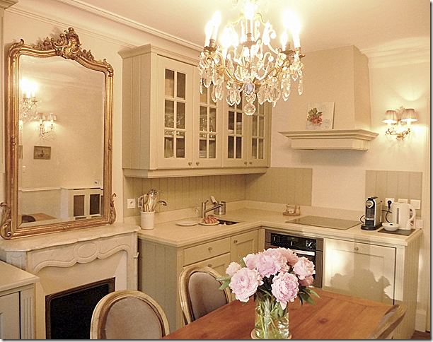
Today, the new kitchen installed in the dining room. At first it is hard to really see the kitchen, it blends in so well and looks like bookshelves. The chandelier and mirror further the illusion that this is just a dining room. Notice how the mirror reflects the living room’s mirror and chandelier. Also remember when hanging mirrors to reflect something worth seeing.
The view towards the street and the Eiffel Tower. The antique table, chairs, chandelier, sconces and mirror were all bought in France. On the back of the French chairs is a pink and white checked taffeta. So charming! Isn’t this just beautiful?!!! I would love a kitchen like this in my own second home in Paris!!!
Here is a view towards the cooktop and hood.
Looking from the dining room into the beautiful living room.
Looking from the living room into the dining room.
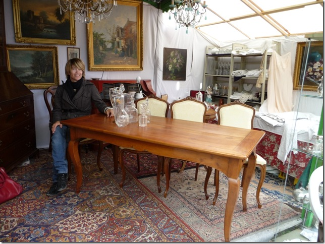
Here is a picture of the dining room table right before it was purchased in a Paris market. She is testing out the apron, being sure there is enough leg room under the table – there was.
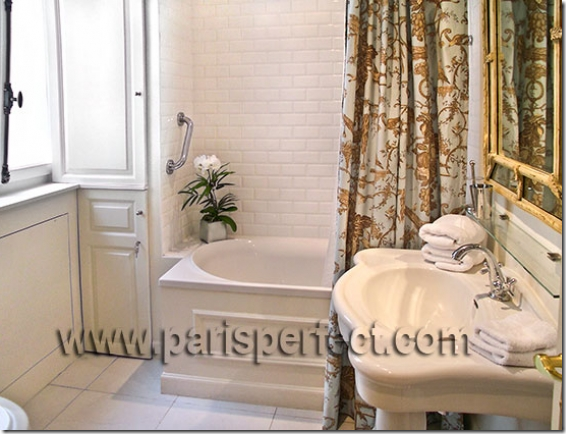
The new bathroom that was once the kitchen.
The owners of this beautiful French apartment are also partners in Huff Harrington Fine Art, Ltd, an art gallery in Atlanta, Georgia. The name may sound familiar to long-time Cote de Texas readers. Last year they photoshopped pictures of the art work they sell onto a picture of a family room I had recently designed. You can read the story on their blog – The Artful Lifestyle HERE and the story on my blog HERE.
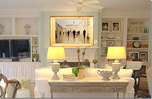
Here is one of Huff Harrington’s photoshopped pictures of one of the paintings on the mantel of my client’s house.
I hope you have enjoyed the first installment of readers kitchen. I think it’s a special one, being in France and owned by Americans! To read more about this apartment – articles are sprinkled throughout Huff Harrington’s blog HERE.
Remember, there is still time to send in your own kitchen.
This message is to those of you who subscribe to Cote de Texas by email. I get a question about this several times a week and thought I would discuss it here so that everyone will understand. I like to show big pictures on the blog. I think it looks better and you can see much more detail. Unfortunately, all that size does NOT fit on emails. If you get the blog in an email, the only way to really read it is to click over to the actual blog site on the internet. Do NOT attempt to read the blog on your email.
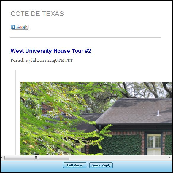
The easiest way to get to the blog from the email is to double click on the title. So, above, is a picture your email. When you got this email, you should have double clicked on the title “West University House Tour #2. This would have taken you directly to the internet blog Cote de Texas, which is where you should read the blog! Instead of reading it directly from the email, it will be much more enjoyable and much easier to read this way. You know you are at the internet blog site when you see the header below:
One other often asked question is about the pictures. Since the images are so large, they do take long to download. I realize this, but I would rather have the bigger, prettier images that take longer to load than the smaller pictures. So, I ask your patience in this. When you come to the blog, just give it 30 seconds to a minute to load – all the pictures should be up by then.
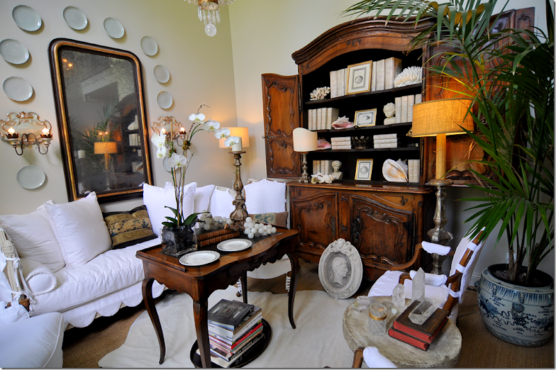
Finally, a HUGE thank you to all who commented on my newly redecorated living room. I got so many comments – mostly positive - that I was shocked. Even all the negative comments are welcomed because they came with good suggestions. Some suggested I should trade out the cow hide rug for a zebra one. I love that idea and may do it one day soon. Another repeated comment was to trade out the high tea table for a low ottoman. Well – my ceiling is so high, that I think the high tea table connects the floor to the ceiling – while a low ottoman would accentuate the height disparity. That’s my reasoning behind the table. Others liked my masonware better than my books and shells (my mother is included in this one!) I didn’t get rid of my masonware and it will probably be dragged out again in some other room. Right now it’s on vacation with all my blue and white transferware. More negative comments were from people who hate white slipcovers, especially white slipcovers with scallops. Well, like they say, that’s what makes horse racing. You either love the look or you positively hate it. I can’t change that. Still, the discussion is great because you learn something – from both the positive and the negative comments.
This past May, I started my fifth year of blogging, which is so hard for me to believe. What started out as a fun exercise for me and possibly, my best friend, has turned into something I never in a million years imagined or expected. I can’t tell you how much your reading this blog means to me. Without you, there would be no Cote de Texas. While I try to answer comments, I never seem to be able to answer all of them and it makes me feel so guilty. So, please, accept my sincere thank you here, for the time you take to read and to comment. From the bottom of my heart, I can never thank you enough.


