This next kitchen in our series comes from reader Susie Bohnsack, who has an interior design service – Pearhouse Designs - HERE. Although Susie lives in New Jersey, her town, Delran, is actually a suburb of Philadelphia. The kitchen shown today was completely gutted and expanded – it originally was 25 x 10, but an additional 19 x 6 was added on. It’s a stunning redo that I think you will really enjoy!
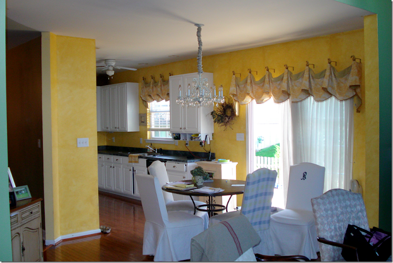
Here is the original kitchen – all bright yellow. Where the chairs are located, in back of the table, is the family room, which has a very high ceiling.
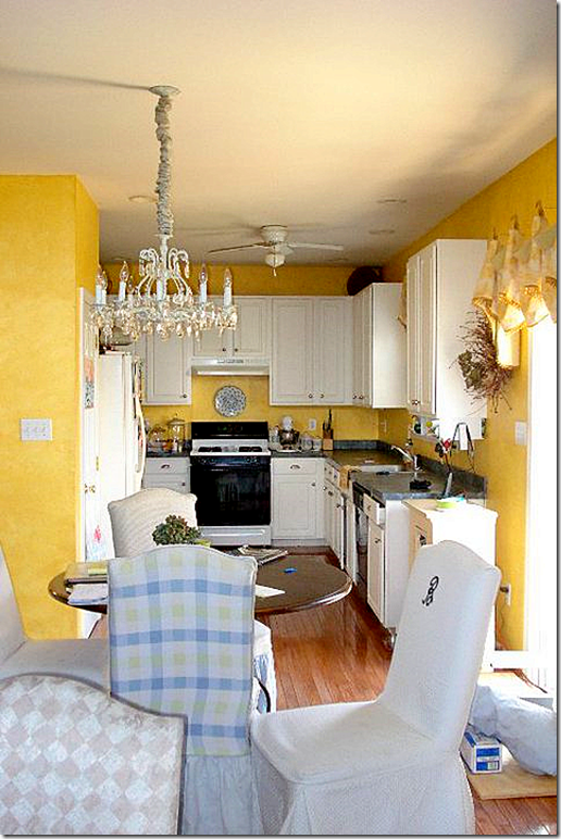
The kitchen was originally U-shaped. The counter on the right is where the kitchen was bumped out 6 ft. Here is what it looks like today. Are you ready?
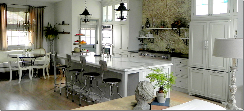
Yes, this is the same kitchen – with an extra 6 ft on the right and 19 ft long. Wow. I told you it’s an amazing difference!!
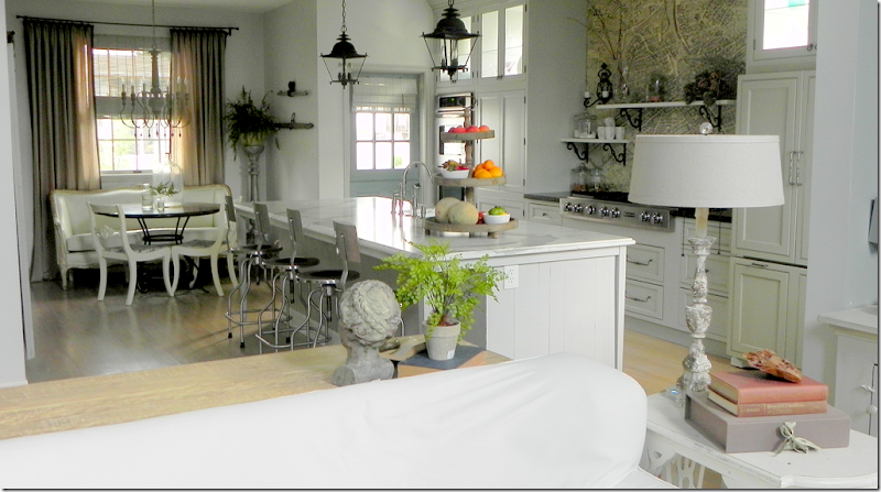
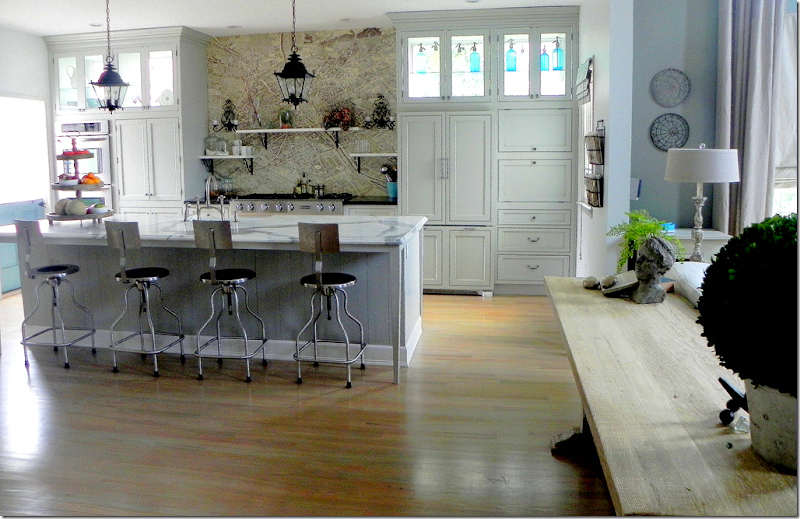
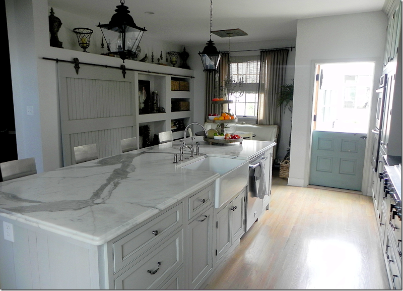
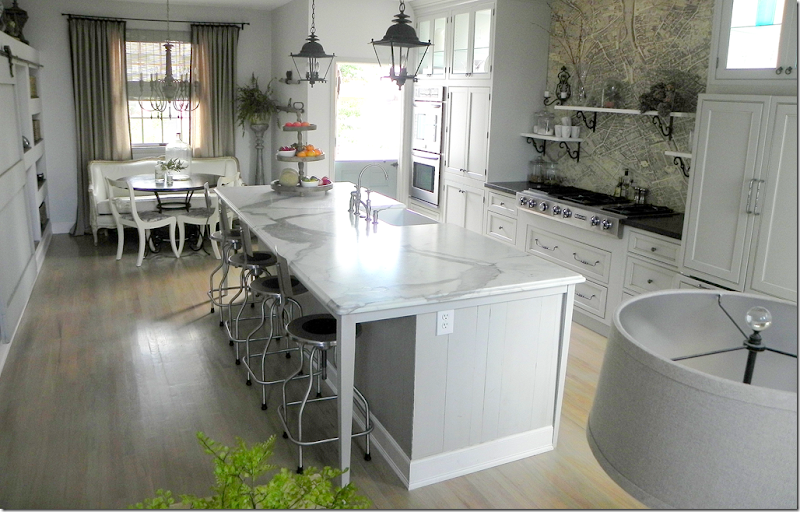
Backing up a bit, this picture was taken in the family room looking into the kitchen. The island is a very large 10’ x 4’. Susie searched a long time to find a Calacutta Ora slab, but gave up when instead, she fell in love with this honed Statuary marble slab with its striking veining. The pieces of slab left over were cut to make the shelves over the cooktop. The island is clad in old barn wood flooring that was leftover from one of Susie’s job. She saw the bar stools on the blog, Velvet and Linen, and its writer Brooke Giannetti provided the source – a medical supply company! The entire kitchen flooring is hardwood, stained a much lighter color than it was before.
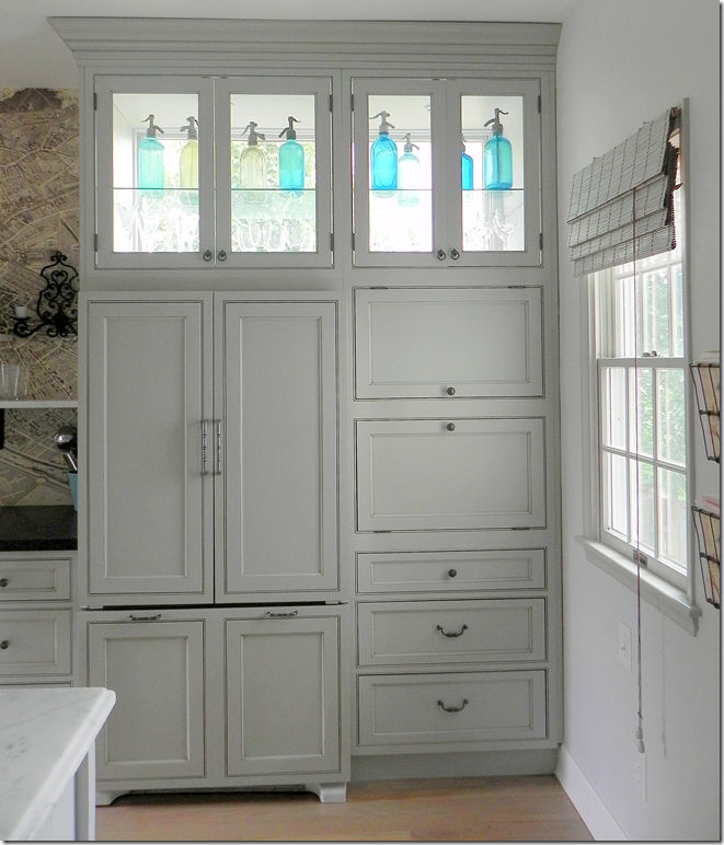
Susie wanted the kitchen flooded in light, but the neighbors are close by. The solution was to install windows behind the custom cabinets on the back wall. Light now streams in from three sides and their privacy is preserved. The turquoise found in the antique seltzer bottles is repeated in the Dutch door at the left, which is also painted turquoise.
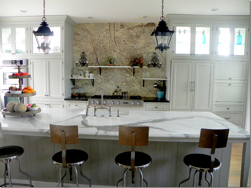
One of the more unusual details in the kitchen is the Turgot plan de Paris map found above the cooktop. Susie says she had first seen the map on a blog and ordered it – all 24 sections of it. It was installed with wallpaper paste and several coats of poly. If Susie ever tires of the map, it can easily be replaced and tiled instead. In this picture you can see close up the medical supply bar stools and the beautiful veining of the marble. Also, you can see the wood flooring that was used to clad the island. For information on obtaining the map, see Pigtown Design’s story on it, HERE.
The refrigerator is hiding behind these custom cabinets. To the right of the refrigerator are more hidden things…
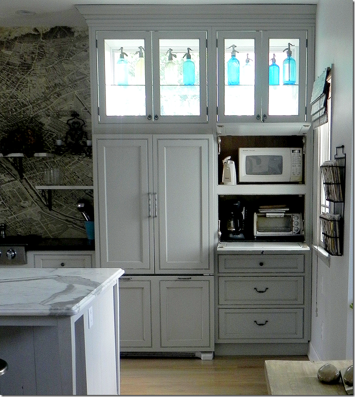
Here, behind doors that swing up, are the microwave, toaster and coffee pot. The door when pulled down actually provides the work surface for the appliances. Hiding all of these frees up the countertop of space and clutter.
A closeup of the Paris map and the marble shelves. The sconces are vintage French and the brackets came from E-Bay.
Looking towards the side door is Susie’s Italian Greyhound, Luna. Since growing up with a Dutch door, Susie really wanted one and found this old one which she refinished – painting it Turquoise to match the seltzer bottles. Susie says the only problem with Dutch doors is there is no screen.
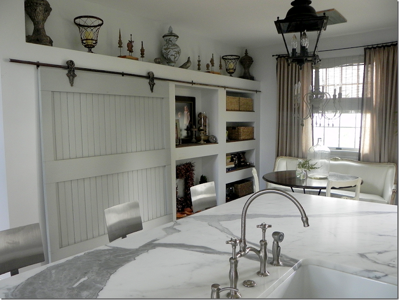
Looking across the island is the pantry – hiding behind an old barn door with its original track and hardware. Susie says she loves the sound it makes when the door rolls open and she can always tell when the children are sneaking a snack! From this view, you can see there is a farm sink and two lanterns from Troy Lighting which brighten up the island. The lanterns are actually for the outside – which is a great way to go when buying lanterns. For some reason, most made for the outdoors are less pricey than those made for the inside.
A closer view of the pantry with the built in shelves to its right. That marble slab is sooo gorgeous!!!
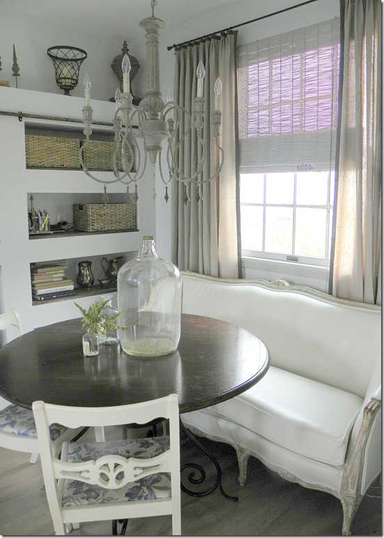
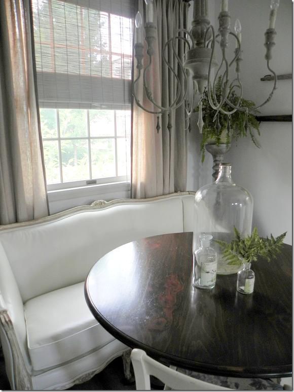
Next to the pantry is the breakfast area with an Aidan Gray light fixture.
Susie found the antique French settee upholstered in a “hideous pink damask that looked like it had spent many nights in a frat house.” Besides the fabric, it was painted tan. She sanded it down to the original gilt and natural wood. Next it was upholstered in white leather – a great alternative to slipcovers and a great idea for kids! Susie says she wants to replace the table with a more industrial one. The chairs, her grandmother’s, will be replaced with Kooboo ones to bring more texture into the kitchen.
The view looking from the breakfast area into the family room with its tall ceiling. I love the limed wood console table that divides the two spaces.
This picture, taken with the lights on, shows up the colors better – especially the Dutch door and the linen curtains.
Susie, thank you so very much for sharing your beautiful kitchen with us!!!
To contact Susie Bohnsack, see her web site Pearhouse Designs HERE.
Readers Kitchens Series #4
West U Home Tour–One More!
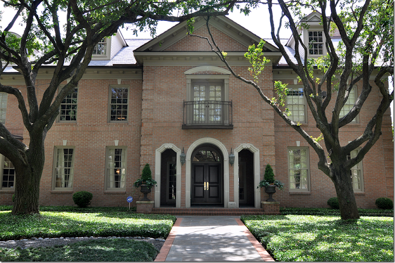
After previously showing a few of the homes on this year’s West University Home Tour – I am so excited to show you one more! I had to wait a while on this one because the house was published in a magazine. But, I have more photographs than they do – maybe not as GOOD as their photographs, but I have MORE!!! As you can see, this is a large house – especially so for West University. The L shaped house sits on a double lot therefore, it is wide and very spacious, another rarity in this neighborhood. The owners moved here from New Orleans after Katrina devastated their town. Their first house in Houston was on a much smaller lot, but even then, it wasn’t a typical West U floor plan – it was very original and also very beautiful. After a few years there, the family wanted more room to spread out – so they moved here, just a few blocks away. The homeowner, Laurie Pearson, is an interior designer and she remodeled many areas – the kitchen was completely redone under her hand. The Georgian house is very sophisticated, yet warm and family friendly. Contemporary art work is found throughout, providing a nice mix to all the French antiques. I hope you enjoy this latest installment from the W.U. Homes Tour!
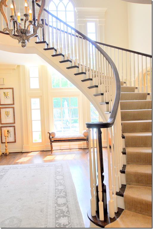
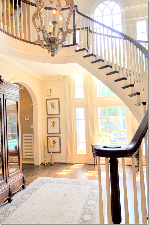
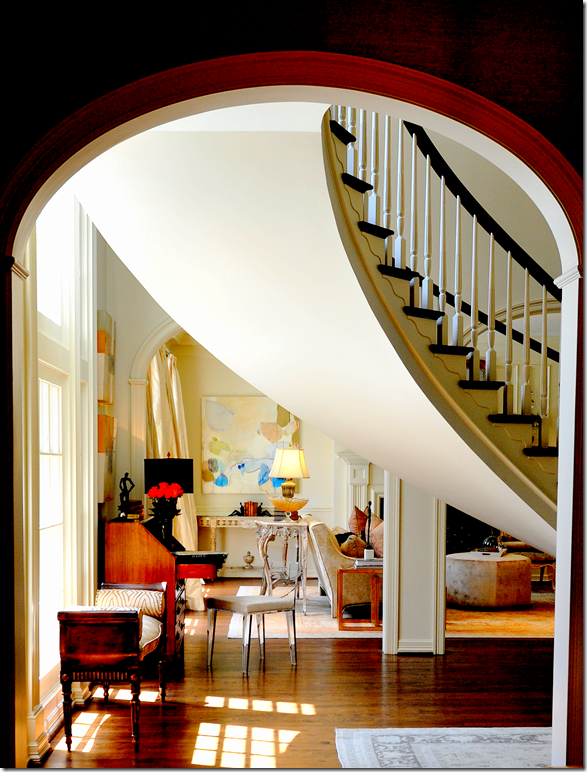
The striking double height entry hall with its floating staircase sets the tone of the house, filled with antiques mixed with contemporary art, it overlooks the backyard pool.
Through graceful arches, the living room is to the right, while the dining room and the family room are to the left.
This picture, taken from the family room’s hall, looks into the living room. You can partly see the dividing wall between the entry and the living room with its three graceful arches. I love the way the curve of the stairway looks from this angle. The stairs are so gorgeous, they are truly the focal point of the entire house.
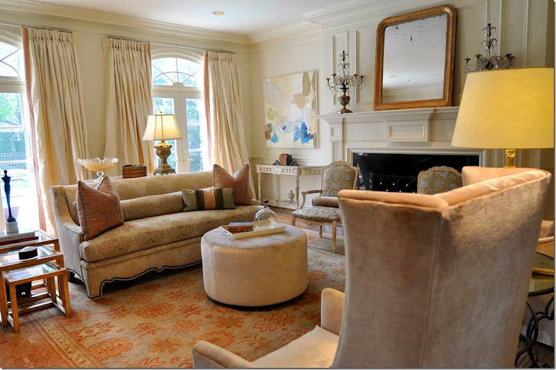
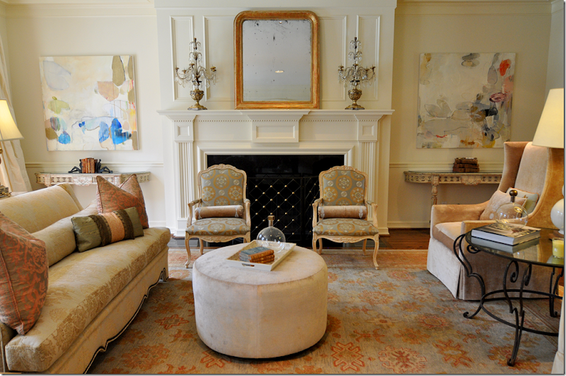
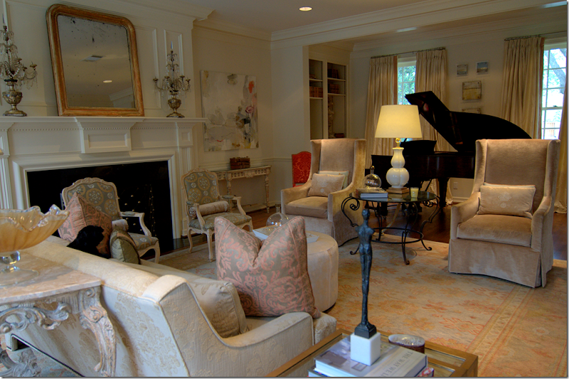
The living room is filled with soft colors taken from the Oushak rug. Fortuny pillows mix with luscious silk curtains and velvet clad chairs.
Flanking the gracious mantel are painted antique consoles topped by contemporary artwork. A velvet ottoman takes the place of a coffee table.
There is an alcove, with a piano and bookshelves, that faces the front street.
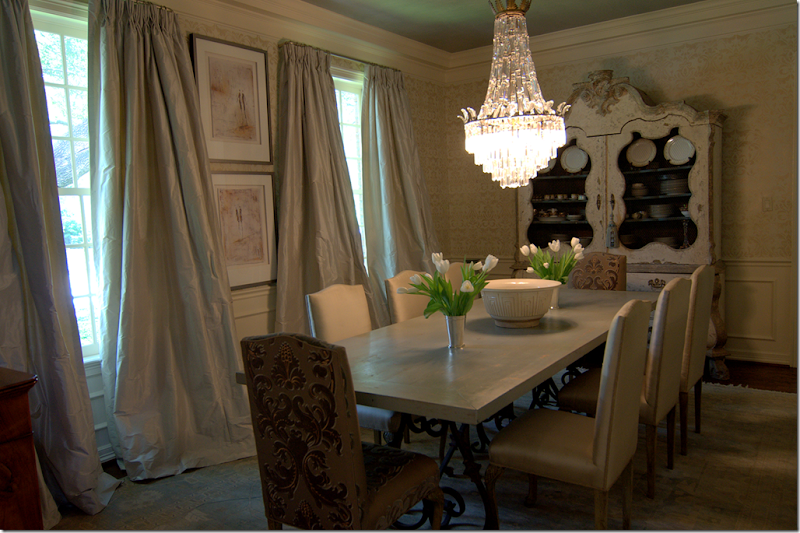
Across the entry hall is the large dining room. This is one of my favorite rooms in the house. The silk curtains are fabulous – I love the way they drape and fall, just slightly, very slightly in a short puddle on the floor. The wood topped table has a French scrolled iron base. Again, there is a muted rug underfoot.
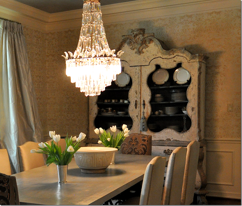
Here’s a closeup of the most gorgeous painted armoire! I absolutely LOVE this piece with its screened doors and curvy lines and just a hint of blue paint. I want to steal it!
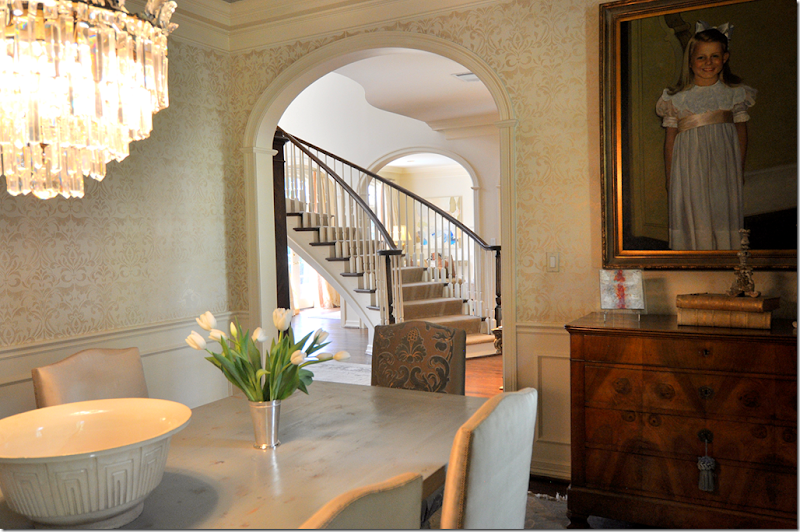
The view back towards the entry hall and into the living room. A daughter’s portrait sits over the chest.
Another view showing the icy blue curtains.
Here is a close up of the wall treatment. Not wallpaper, the walls were handpainted in a damask pattern by Segreto Finishes HERE, the ceiling was done by Imago Dei, HERE.
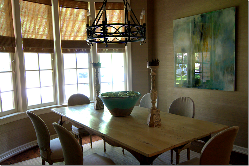
Past the dining room is another eating area off the kitchen. This room faces the front street, you can actually see my car in the glare of the painting! Sorry there is such a glare (I guess that’s why you need a professional photographer!)
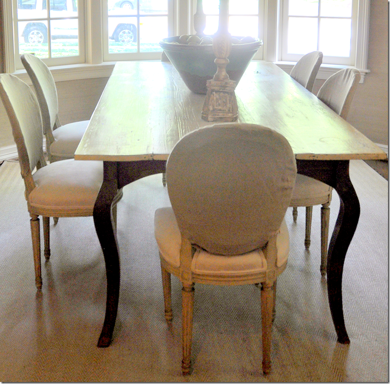
Notice the way Laurie slipcovered her chairs, just the back is covered in a linen. It’s subtle, soft, and pretty! The walls are a grasscloth paper and underneath is a textured, herringbone patterned rug.
The kitchen was completely redone by Laurie. The cabinets are stained a light color and the glass in the upper cabinets opens the kitchen to the family room.
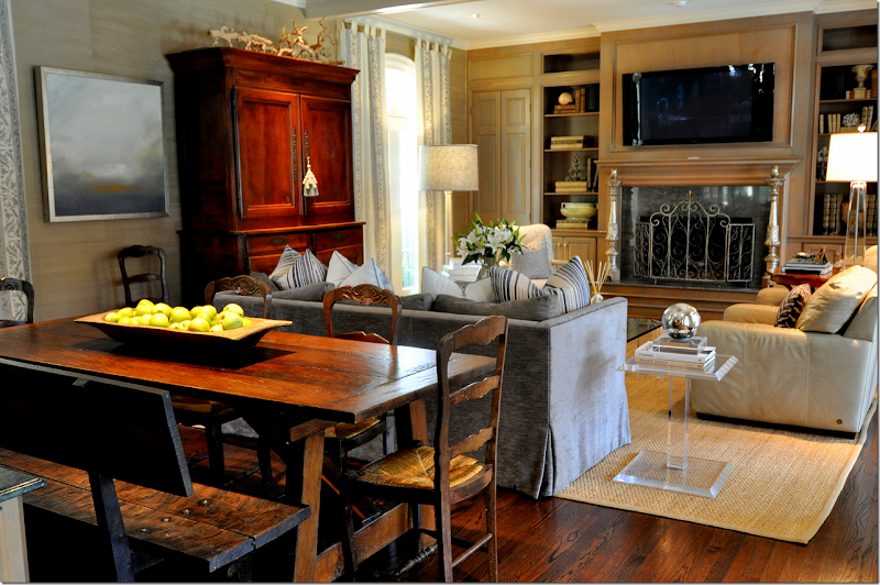
The family room is done in a soft gray blue with touches of cream, a color scheme that flows throughout the house. There’s another eating area behind the sofa. The focal point is the gorgeous antique Buffet a deux corps.
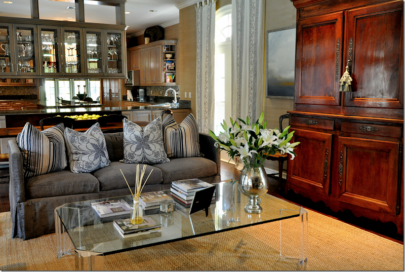
The sofa is filled with a mass of patterned pillows.
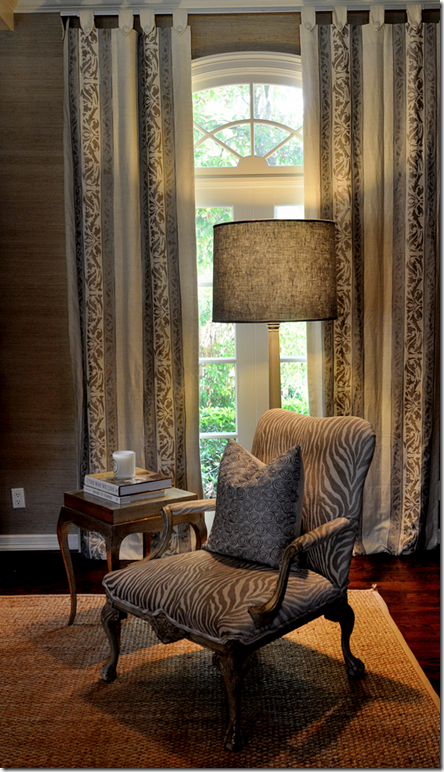
Here is a closeup of the linen curtain fabric.
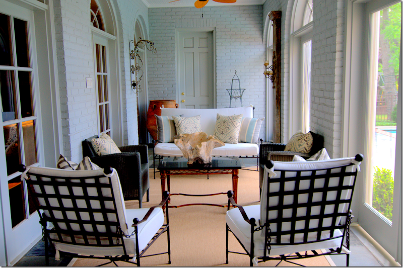
Off the family room is this large screened porch which overlooks the pool.
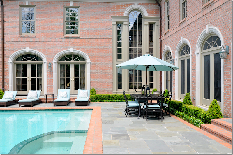
The back yard has a slate terrace along with a large swimming pool. Box surrounds the windows. In this picture, you can see the distinct L shape of the house. The living room is at the far left, then the two story entry hall is at the corner. To the right is the screened in porch which is parallel to the family room. All main bedrooms are upstairs.
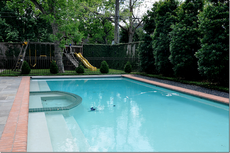
Behind the swimming pool is a large play area, nice!
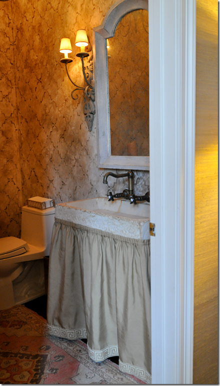
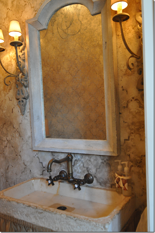
Off the family room wing is the powder room with its concrete sink. The skirt is trimmed with a Greek trim pattern.
Close up of the hand painted wall treatment by Imago Dei. Love the wall hung fixtures.
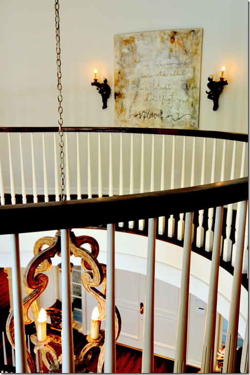
Going up the stairs, you can see part of the wall to the living room with its three graceful arches.
The curved landing overlooks both the back and front yard.
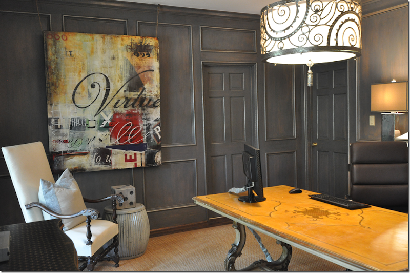
Upstairs, the man’s office is done in the same gray blue found throughout the house, but the shade is much deeper here. The Italian styled desk mixes with the contemporary art work and light fixture.
The art work, Virtue, is perfect for a man’s office. Now, if only all executives had those words in their office! Love the oversized die on the garden stool.
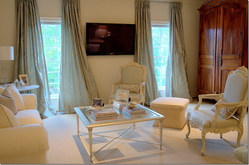
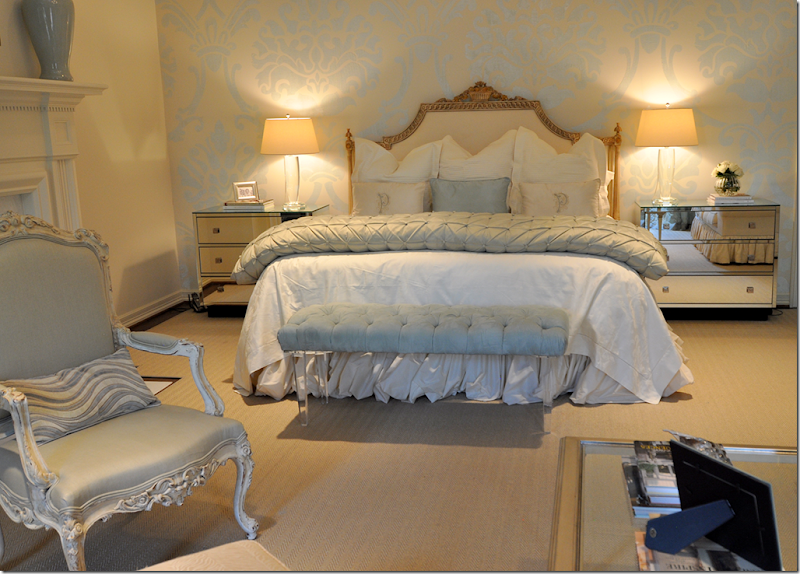
The master bedroom with its sitting area is another favorite space of mine. The antique French armoire mixes with contemporary furniture – a marble topped Saarinen table, mirrored nightstands and an acrylic bench. The light blues and creams are so soft and restful – perfect for a bedroom. The cream sofa is trimmed in the same blue as the silk curtains.
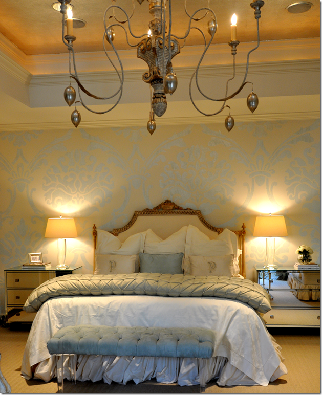
Beautiful! The walls are hand painted in a large damask pattern by Imago Dei. Love the bench!
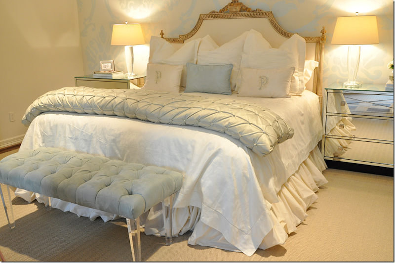
Closeup of the gilt headboard and linens. The headboard is so gorgeous. Just gorgeous!!!
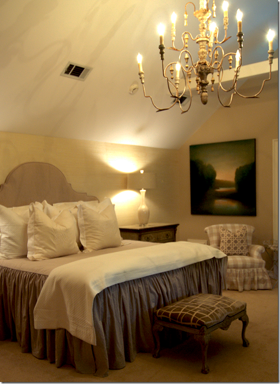
A glimpse of the Italian wood chandelier hanging from the vaulted ceiling.
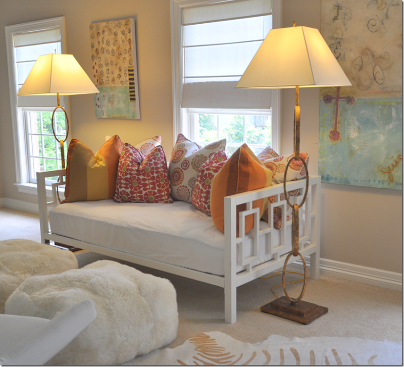
Off the children’s rooms is their playroom – with its day bed filled with colorful pillows. Great lamps!
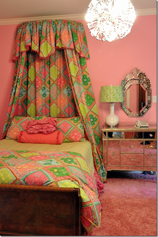
This deep pink bedroom with shag carpet mixes an antique bed with mirrored chests.
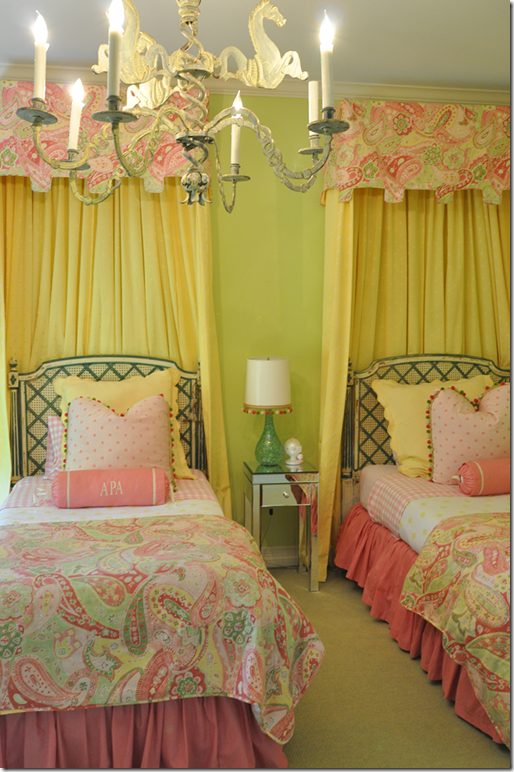
This bedroom has a matching color scheme, with the lime green on the walls.
Classic caned beds are mixed with bright contemporary colors. Cute bobble trim.
Of course there’s a guest room with a wood chandelier hanging from the vaulted ceiling over a slipped covered headboard and bedspread.
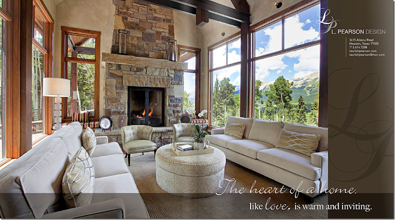
Finally, an ad featuring a mountain house designed by L. Pearson Design, Laurie’s company. To see her web site, go HERE.I hope you enjoyed touring this beautiful house in West University, a tiny town inside the city of Houston. Laurie’s house is certainly different than the typical slipcovered/seagrass look of many Houston houses. Hers is gracious and sophisticated and shows how beautifully antiques mix with contemporary art and furniture. Notice how almost each room has one large antique piece, an armoire, a console, a buffet a deux corps – showing that a lifetime of slowly collecting antiques will provide a great backdrop that will move from house to house. I thoroughly enjoyed visiting with Laurie in her house. She is a friendly host and a warm personality, with an obvious love of family. Thanks again so much Laurie!
AND….The new book by Leslie Sinclair – arrived today at my house, brought by an elf!
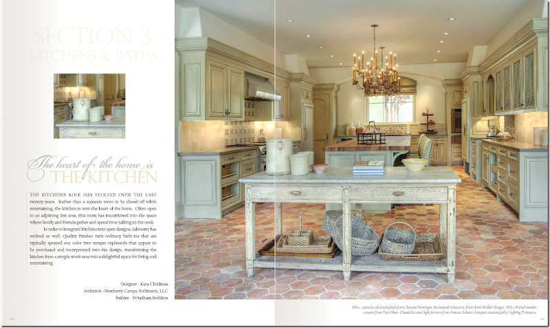
A page from Sinclair’s new book, here featuring a kitchen by Cara Childress. Gorgeous!!!!!!OMG, OMG – Leslie Sinclair surprised me today with a copy of her new book and I was floored. It is without a doubt the prettiest design book I’ve seen in ages!!! Prettier than any other design book I could name. I HIGHLY, HIGHLY recommend it. Get a small taste of the book to whet your appetite HERE. To order the book, go HERE. Check out the preview for yourself, you will love this!

