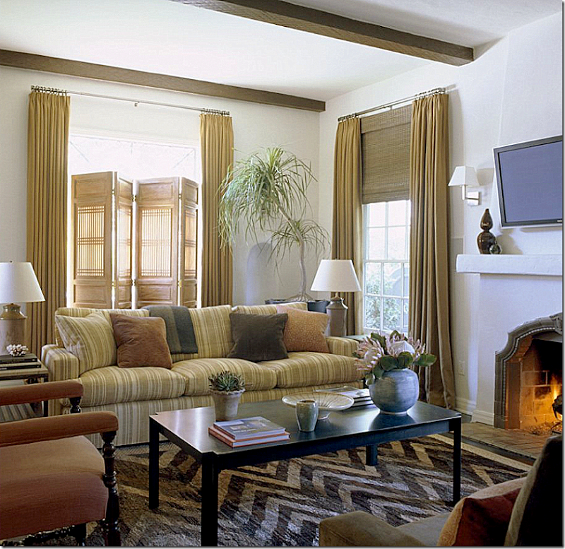
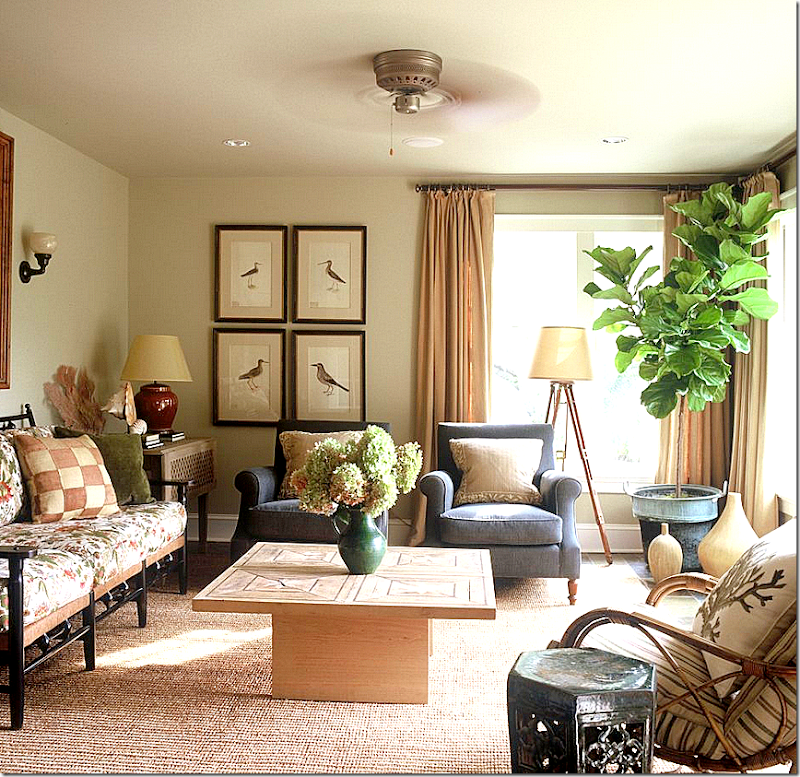
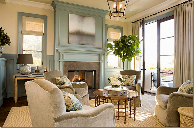
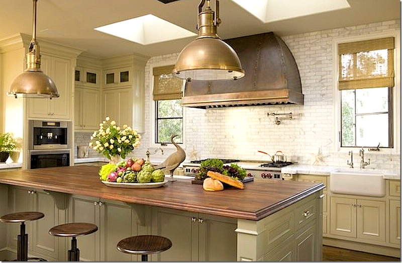
We are thrilled to welcome Joe Lucas and Parrish Chilcoat to this week’s Skirted Roundtable. These two Californian interior designers bring a unique combination to their clients – they are male and female – a rare partnership first made popular by Sibyl Colefax and John Fowler. Together, Lucas and Chilcoat bridge all the masculine/feminine issues when designing interiors, their rooms are a beautiful mix of the two. Lucas and Chilcoat joined forces in 2005 with their firm, Lucas Studio, Inc. and in 2008 opened up Harbinger, their retail showroom, now located on the trendy design street La Cienega in Los Angeles. Both hail from the East Coast, but now have a definite Californian vibe which can be seen in their elegant, yet casual designs.
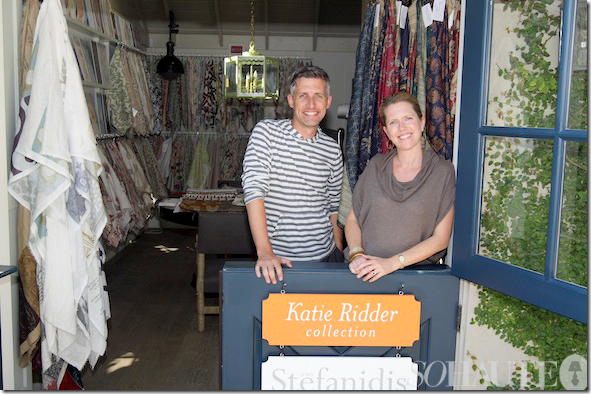
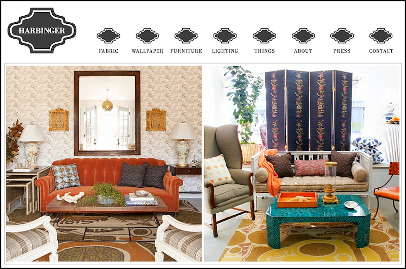
Lucas Studio at Harbinger, their retail showroom.
How Joe and Parrish started in the business is a fascinating tale. They ended up working with the greats Michael S. Smith and Suzanne Rheinstein – both having no design experience to speak of. How can that be? They spill the beans on The Skirted Roundtable – giving it up to all of us who have ever dreamed of working for a top interior design firm.
Since teaming up, Lucas Studios has won all kinds of awards – including those from magazines such as Traditional Home and House Beautiful. The two are effusive and warm – we can only imagine the witty bantering that goes on their offices!!! Below is a look at their stellar portfolio. The link to the Skirted Roundtable is HERE.
House Beautiful recently ran a large spread on Lucas Studio’s California house designed for a 29 year old hockey player: Party Central.
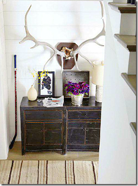
The entry hall – love the oversized horns.
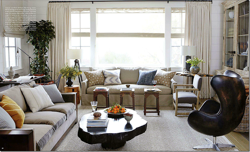
Designing for a man doesn’t have to mean recliners and leather sofas. Lucas Studio prefer to design casual living rooms – for how people really live today. They use natural fabrics – cottons, linens, silks and velvets. But, they state, they start almost every design with a textured rug, such as sisal or seagrass. Here, the leather chair from Restoration Hardware is so sexy looking – it almost becomes the focal point of the room.
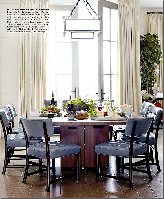
Throughout the house, Lucas Studio used painted white paneled walls – with yards and yards of matching white curtains. The curtains were a tough sell for the 29 year old hockey player. But, Parrish doesn’t feel like rooms are finished without curtains (I agree!)
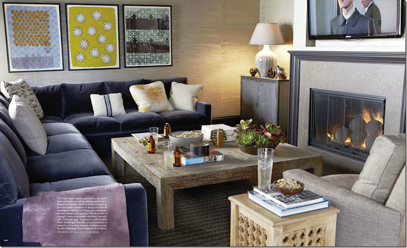
The hockey player plans on entertaining a lot – hence the ‘Man Cave’ with a plum colored velvet covered sofa.
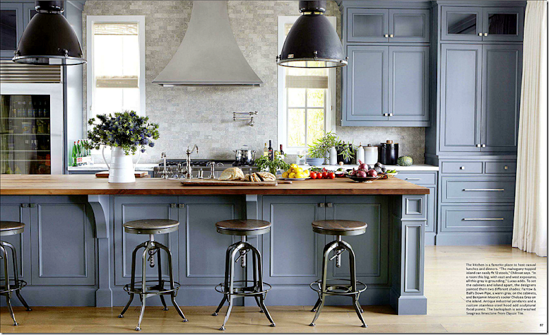
The kitchen is fabulous – painted in two different shades of gray – the island topped with mahogany seats 12. It’s such a beautiful kitchen – and it’s not even white!!
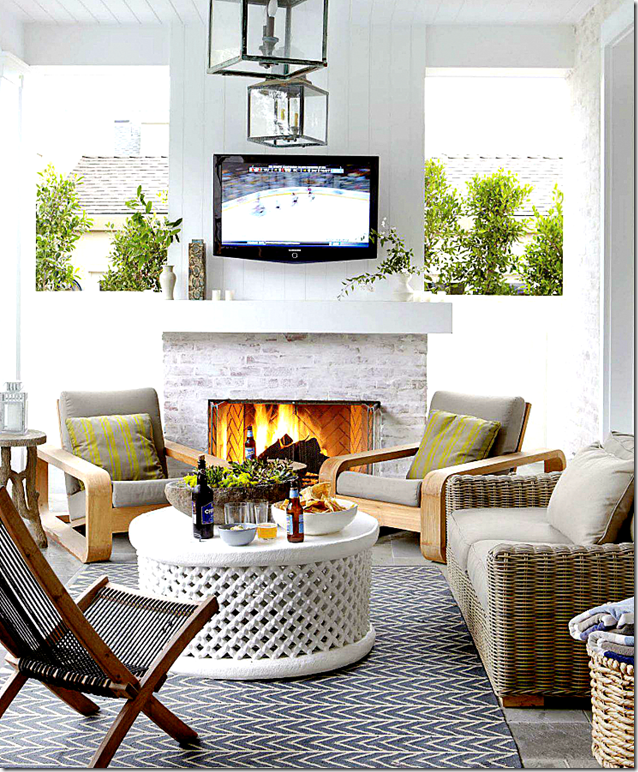
His terrace is designed as another entertaining place – note the outdoors flatscreen.
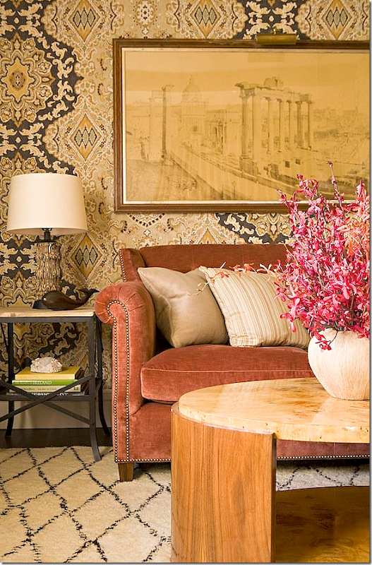
Other interiors from Lucas Studio – this wallpaper!! That art work!! Love it. Lucas Studio use this salmon color in a lot of their interiors. They also use blues and greens a lot.
In this living room, I’m loving the brown and white rug, wondering if this is a dyed skin? Again, the salmon colored velvet – mixed with sage greens.
Love, love, love this! This room shows that mix of masculine and feminine elements. Lucas says to enlarge a room – paint the ceiling and walls the same color. Notice the greens and salmons and blues – how wonderful they look together.
Four chairs instead of a sofa. The patterned pillows are the color pop.
Another beautiful kitchen with the wood topped island and industrial styled antique pendants. The slightly oversized pendants are so much more effective than the just-right size.
This family room caught my eye because of the large cork board used as a gallery wall of the children’s artwork.
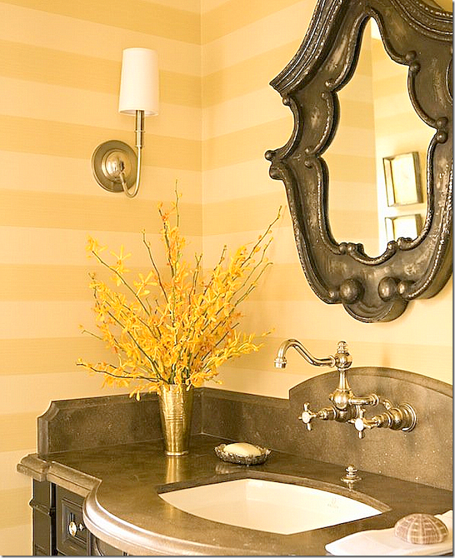
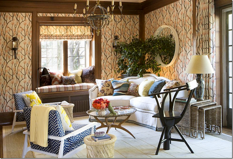
This might be my favorite of all their living rooms. I love the mix of the rug and seagrass, the textured chairs, the navy sofas with a mix of pillows. The tree stump table brings in a bit of folly. And I love the symmetry of the two lanterns and two sconces. The entire room is a study in symmetry – a decorative element Lucas Studio excels in. Beautiful!!A Lucas Studio powder room – great faucet mounted on the arched stone backsplash!!
At Veranda’s Greystone showcase – Lucas Studio created this room – with fabulous fabric from Ferrick Mason used for wallcovering.
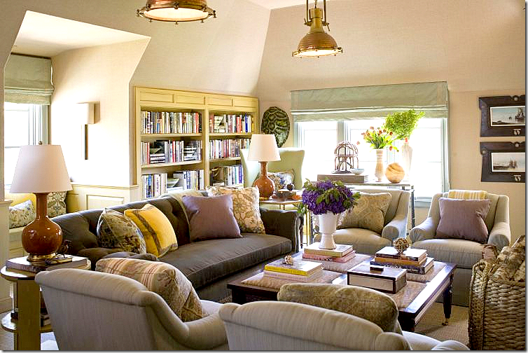
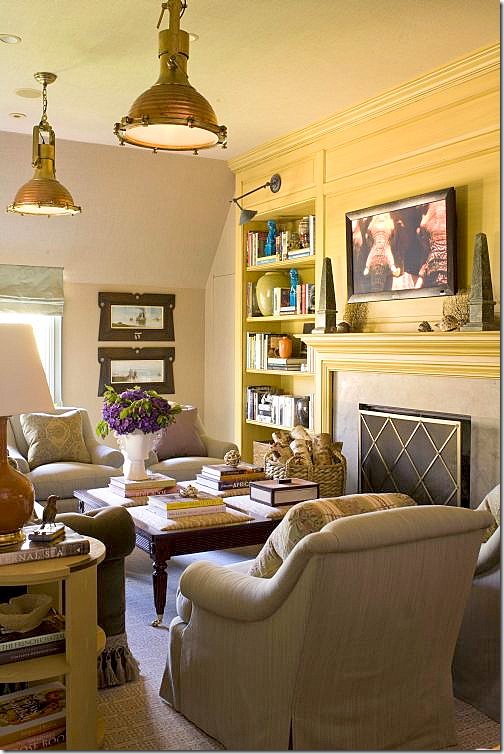
For the Stately Homes by the Sea, Lucas Studio designed these two rooms. The first – a living room – with two industrial styled pendants.
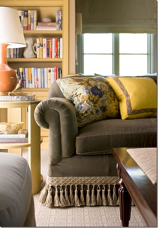
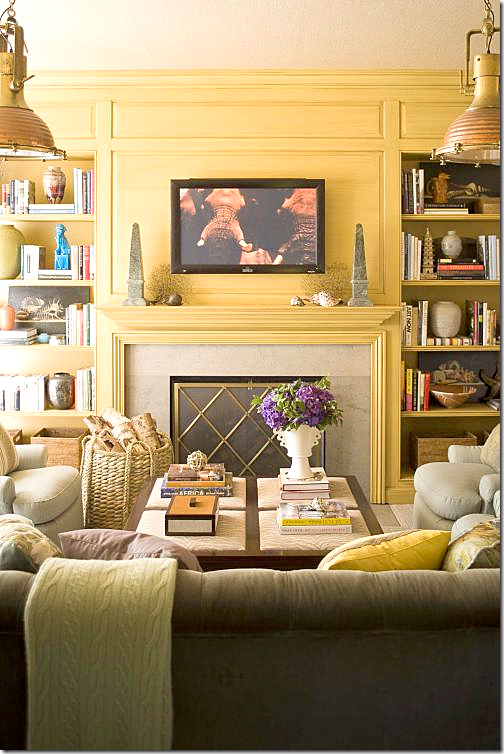
A detail of the sofa trim and pillows.
The fireplace wall is highlighted in yellow, while the rest of the space is wallpapered in a neutral grasscloth.
Notice the coffee table – a cross between an ottoman and a table.
Behind the sofa is a window seat, beautiful shades.
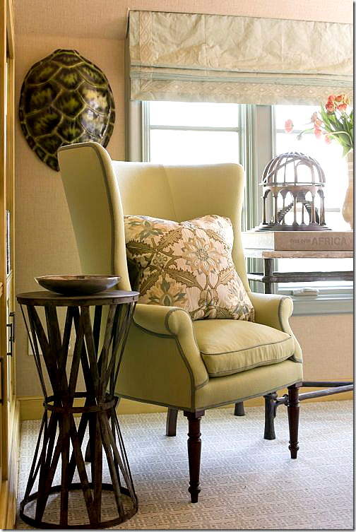
Next to the sofa – a modern take on the wingchair.
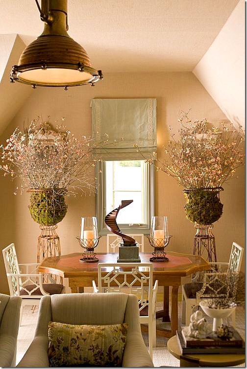
And off to the side – the dining area. Lucas Studio really likes symmetry – which is played up in this area. Beautiful urns and chairs!!!
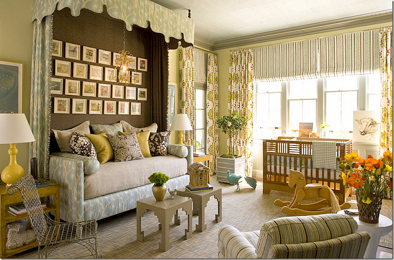
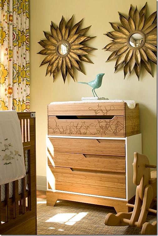
The second room they designed for the showcase is the …?? Can you see what kind of room this is? That’s right – a nursery!!!! Gender neutral, of course. I love the daybed and the canopy. The dark fabric behind the bed makes it look like an alcove or built in bed – great idea to borrow.
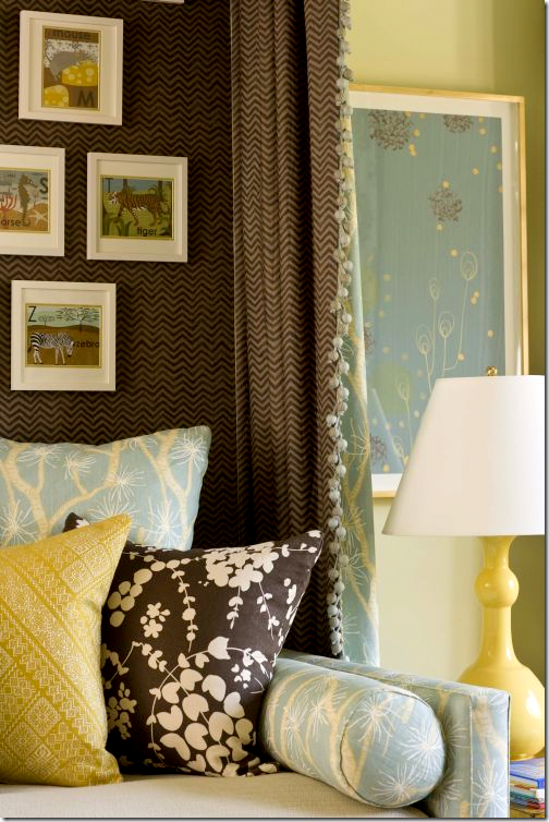
Close up of the bed’s fabrics.
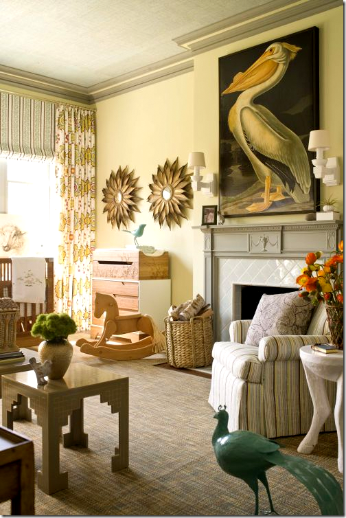
Don’t you wish all nurseries had fireplaces in them? Of course you would never light them for fear the baby would get in the fire somehow. Love the stork with it’s double entendre.
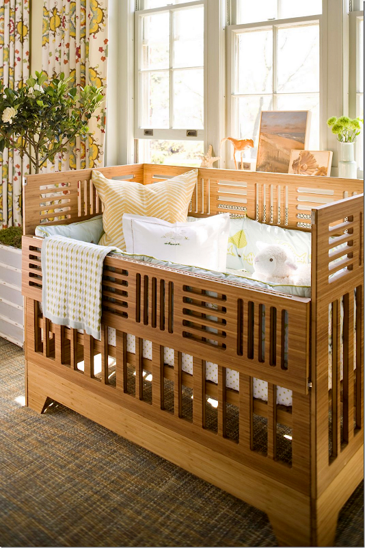
The crib has an Arts and Crafts Movement look to it. Notice the beautiful suzani fabric by Martin Lawrence Bullard used as curtains.
Above the changing table, symmetrical sunburst mirrors.
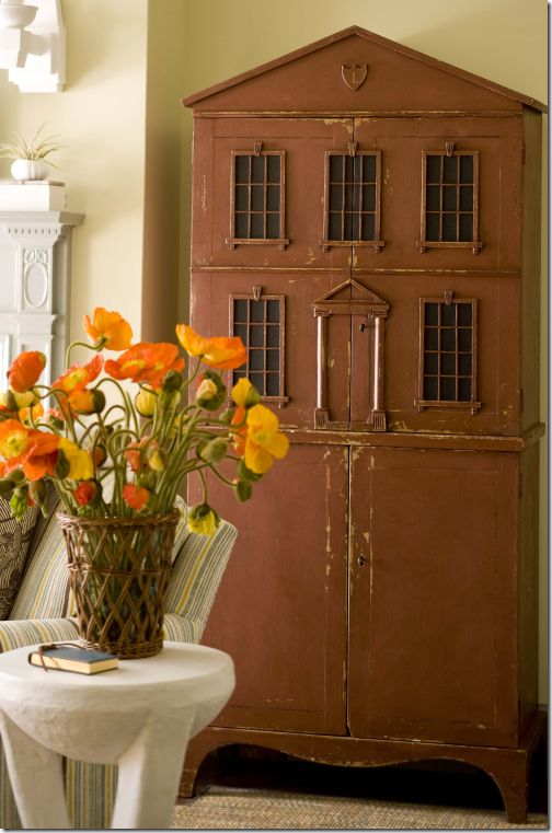
And, an antique doll house sits next to the fireplace. Pictures of the showhouse come from Style Beat’s Blog HERE. Photographs by John Bessler.
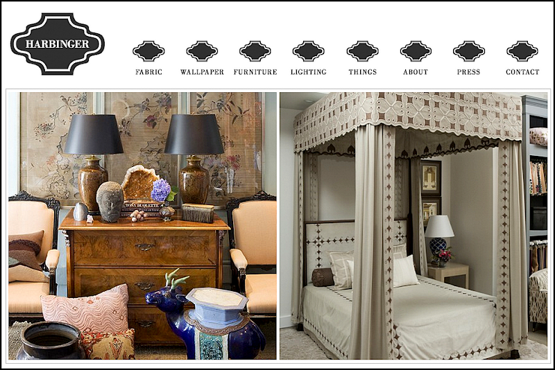
Be sure to visit Lucas Studio and Harbinger’s web site HERE – images from the Harbinger shop are shown. Also, there are many, many more portfolio pictures to peruse.
I hope you have enjoyed a look at Lucas Studio’s beautiful portfolio. And a huge thank you to Joe Lucas and Parrish Chilcoat for stopping by the Skirted Roundtable. To listen to their recording, go HERE.
LUCAS STUDIO STOPS BY THE SKIRTED ROUNDTABLE
READERS HOUSES SERIES #1/Part 2
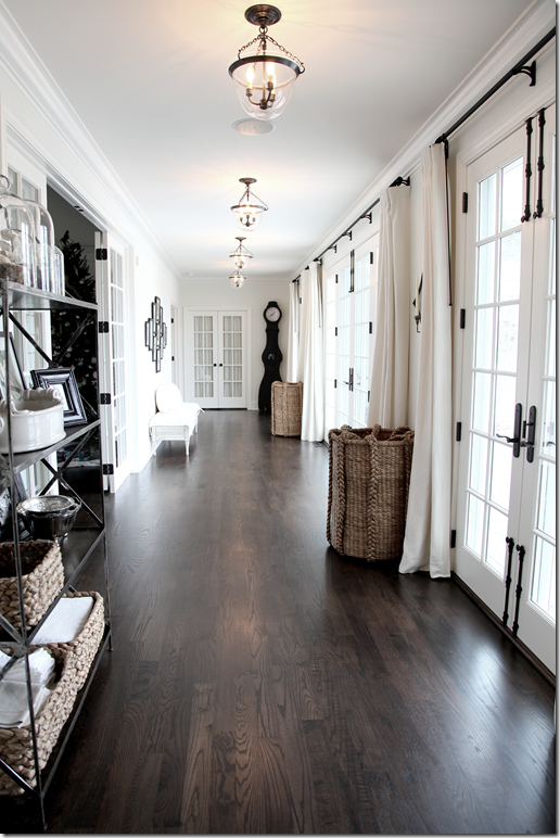
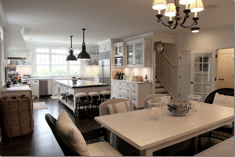
Remember this Readers House that started the series? Located in Michigan, near the Great Lake, the owner decorated it in white walls, dark hardwoods and white slipcovered furniture.
The house received almost all positive comments – which might be a first! This is the long back hall that runs from the kitchen to the master bedroom.
Angie Gren, the owner, is a gourmet chef who wanted a big kitchen to cook in.
Why am I showing her house again? Well, there are two reasons. First, in addition to this country house in Michigan, the Grens also have an apartment in New York! Must be so much fun!! The family just finished moving into the apartment and Angie agreed to let me show it to you. Judging by your reaction to her Michigan house, I thought you would love to see the NYC apartment too.
The second reason for showing this again today is that many people asked about the swimming pool and the the backyard of the Michigan house. AND, Angie mentioned in a comment that in the living room she has a black armoire – which was not visible in the original photos. So, after looking at the NYC apartment, we’ll see her new pictures of the country house. Enjoy!!
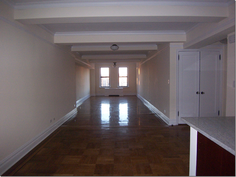
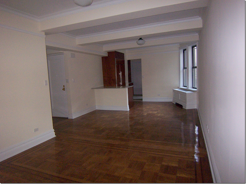
BEFORE: The living room/dining room of the New York City apartment
Angie told me that originally the apartment was a one bedroom and two bedroom unit that were joined together before they moved in. Both the kitchen and the bathrooms were already remolded. The apartment had just been painted Benjamin Moore’s Linen White, which wasn’t really Angie’s first choice, but she kept it and decided it warmed up all the putty and gray colors of the interiors. She wanted to give the apartment a “French Meets Gustavian” look (who doesn’t?) with whites, metallics, plums, platinum and putty accent colors. She tried to avoid the casual Shabby Chic look, opting to make it more sophisticated. Since, the family just moved in, some decorative items are missing: chandeliers in the master and daughter’s bedroom, bell jar lights in the halls and the dining area (just like in Michigan) and some key pieces of art. Maybe after she gets it all in place, she’ll send updates with the finishing touches. Actually, to me, the apartment looks complete.
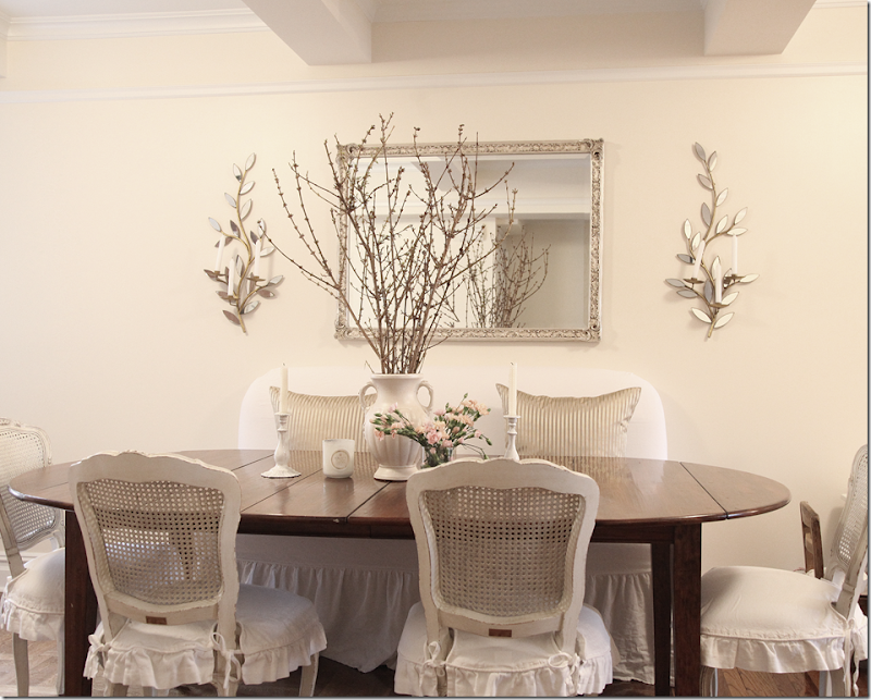
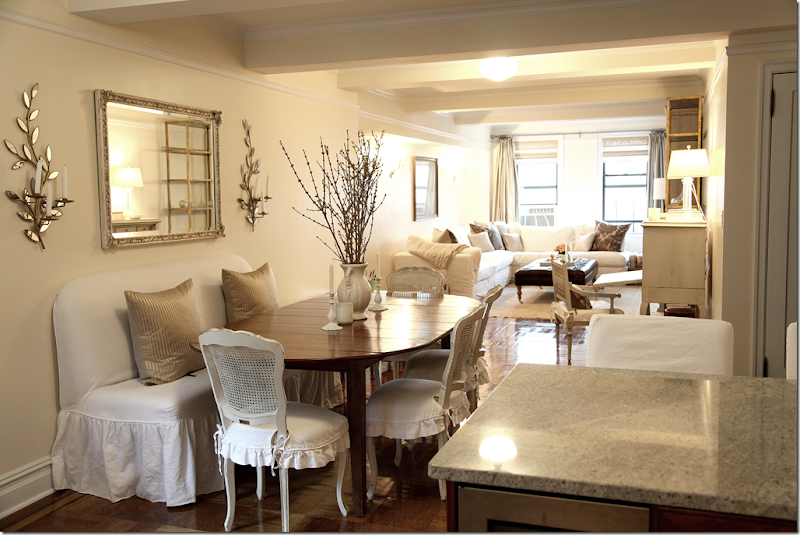
 AFTER: Looking from the bar area, the long room is divided into the dining room and living area.
BEFORE: And looking the opposite direction, the front door opens to the long room. Past the dining area is a bar area, then the kitchen.
After: The dining area leads into the bar area, then the kitchen.
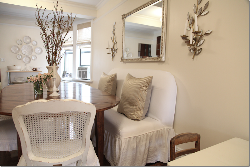
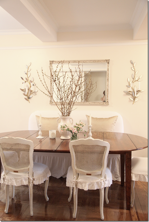
Close up of the dining area. The banquette is slipped in oyster linen. Chairs are Shabby Chic, slipcovered Darcy. The pillows are by Michele Varian. Sconces by Oly. The table is from ABC Home – when company comes, the leaves are put in making it bigger than the way it usually is.
Closer view of the banquette.
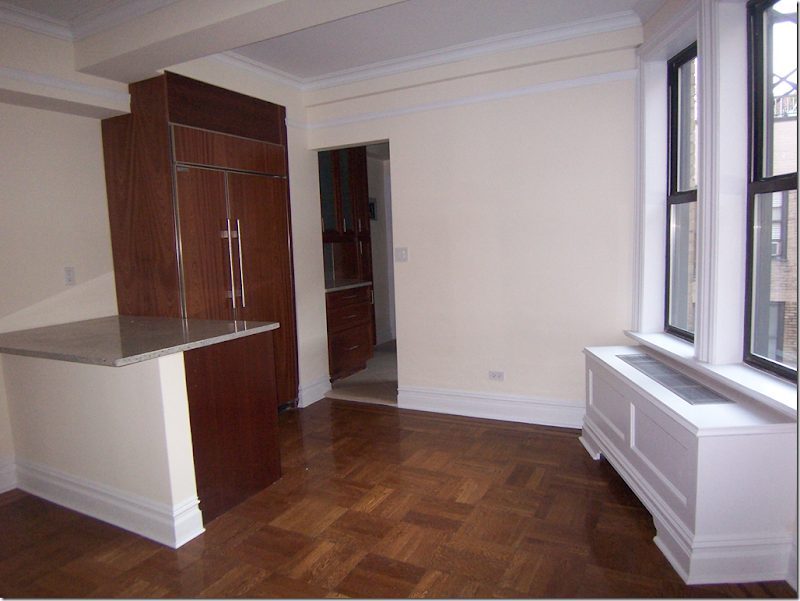
BEFORE: The bar area has a wine refrigerator and the Sub Zero which also serves the kitchen behind it.
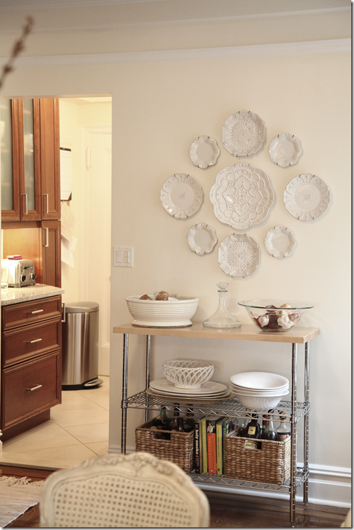
AFTER: In the bar area, a collection of Juliska plates hangs above a Metro shelving rack.
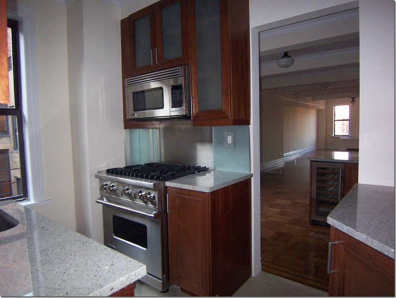
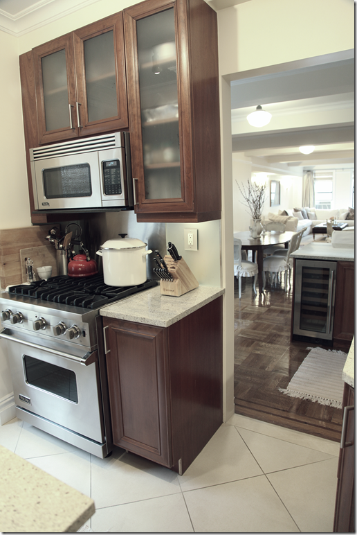
BEFORE: The kitchen is tiny compared to the Michigan house. Angie calls it her kitchen closet.
Although small, the appliances are luxe – Wolf range and microwave.
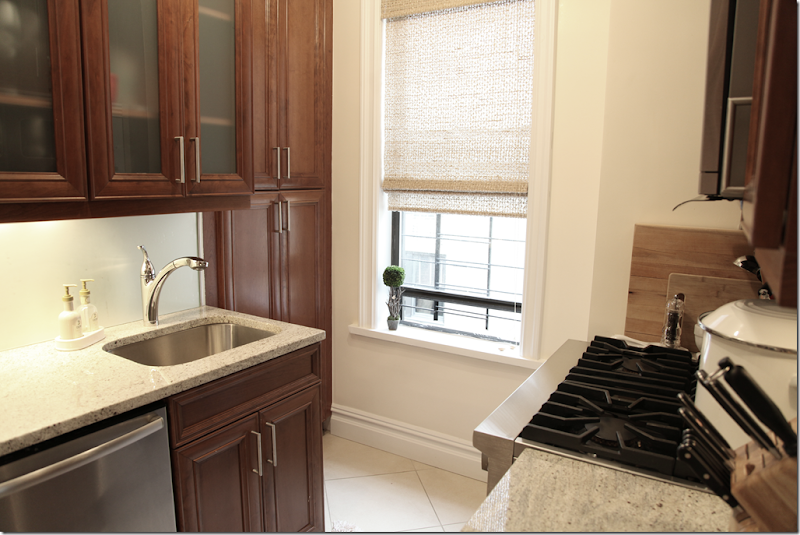
The opposite side of the kitchen - Graber woven shades.
Back in the living area, Angie says there is usually her son’s large high chair at the left of this table. Once he outgrows it, she will probably have a potted moss tree from ZeZe in that area.
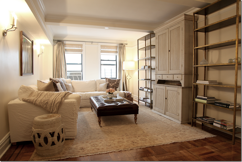
AFTER: The living area. Above the sofa is a vintage map of Sweden, which is temporary. Angie has commissioned a large abstract oil painting for this spot. The pillows are all from either Michele Varian and ABC Home. The curtains are custom platinum silk and the blinds are from Graber. The ottoman and slipped sofa are custom.
One interesting note from Angie about the “God awful” a/c units found throughout the apartment: Most buildings in Historic Districts in NYC do not allow a/c units to be punched through the walls, so you have to have window units in the pre-war apartment buildings. Additionally, if you have children under 12, you must have black window guards on any windows without a/c units. She says in magazines that show NYC prewar apartments without the a/c units or window guards showing, these are photoshopped out. Wow. Sorry I am lacking those skills to photoshop these out.
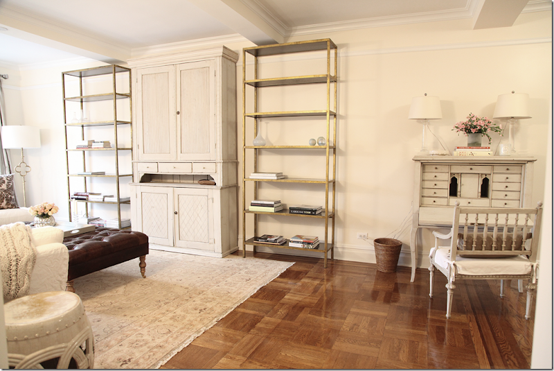
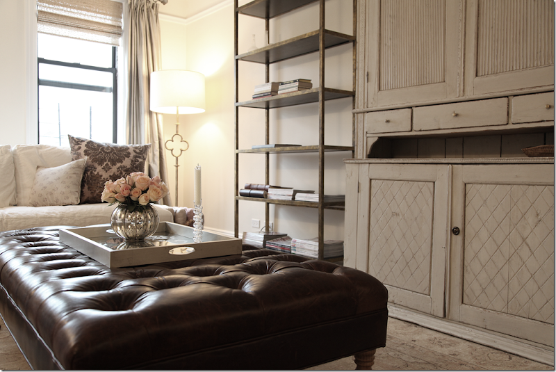
Across from the sofa are the Stella shelves by Oly and the antique Swedish armoire where the flatscreen is. The Oushak rug is from the Midtown rug district.
The floor lamp in the corner is by Visual Comfort. The shelves are still being filled with magazines and books and a collection of botanicals which are on order. The silver leaf tray is from Ankasa and the candle sticks are from ABC home
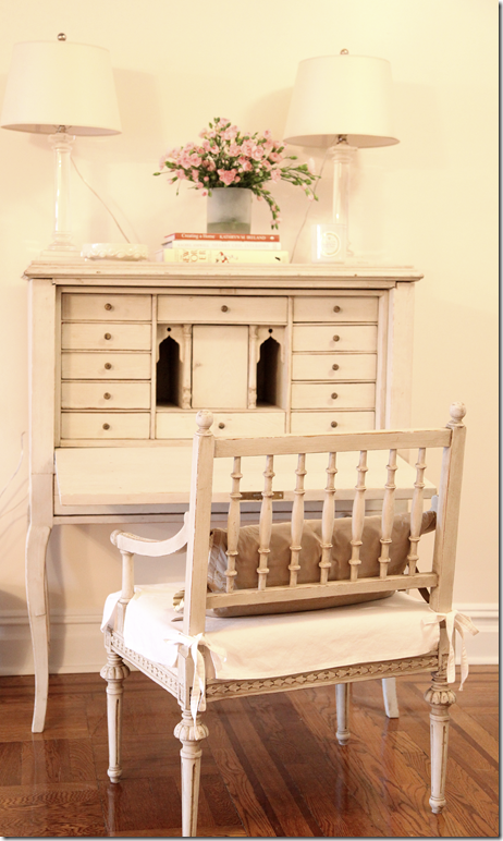
Across from the dining table is this antique Swedish desk and chair. The lamps are from Visual Comfort.
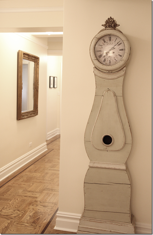
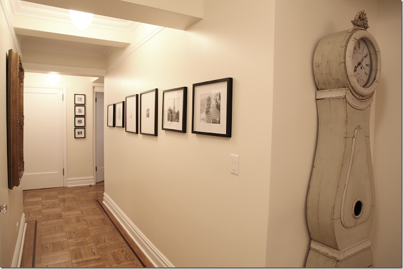
By the bedrooms, there is a light painted antique Swedish clock. In Michigan, the same type of clock is painted black.
The hall leading to the bedrooms is filled with family portraits in black frames, similar to the Michigan house.
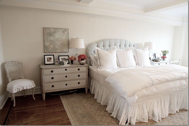
In the master bedroom, the headboard is from Rachel Ashwell in her floppy damask fabric. The lamps are from Visual Comfort. Above the Swedish sidetable is an oil by Laurence Amelie. Rug is from the Midtown rug district.
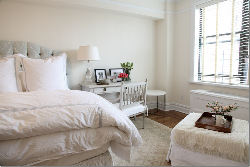
On this side of the bed is a small Swedish desk and chair. The wood blinds are from Hunter Douglas. The custom curtains have yet to arrive.
Slipcovered chair and ottoman sit in the corner of the bedroom next to the dresser.
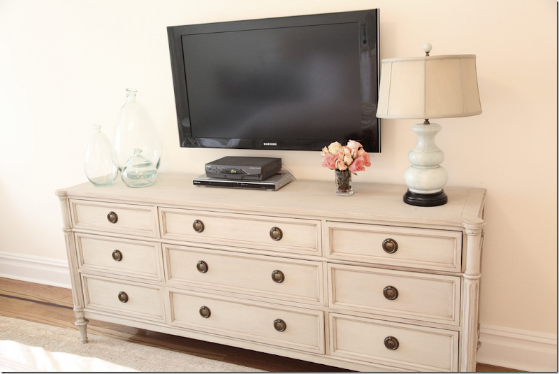
The dresser is a Swedish antique from The Lone Ranger. The jade lamp is from William Wayne.
A large silver leaf mirror reflects the bed. Through the door is the master bathroom.
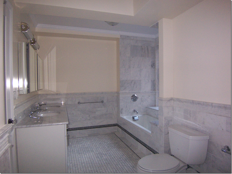
BEFORE: The marble bathrooms had all been updated when Angie moved in.
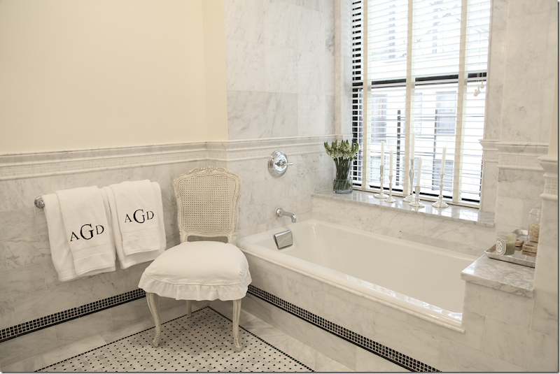
AFTER: all it needed was a few touches. Extra Darcy chairs from Shabby Chic were purchased and placed around the apartment. When needed for company, they are easily moved into the living room/dining room.
Just a few accessories and monogrammed towels go a long way!! So pretty!
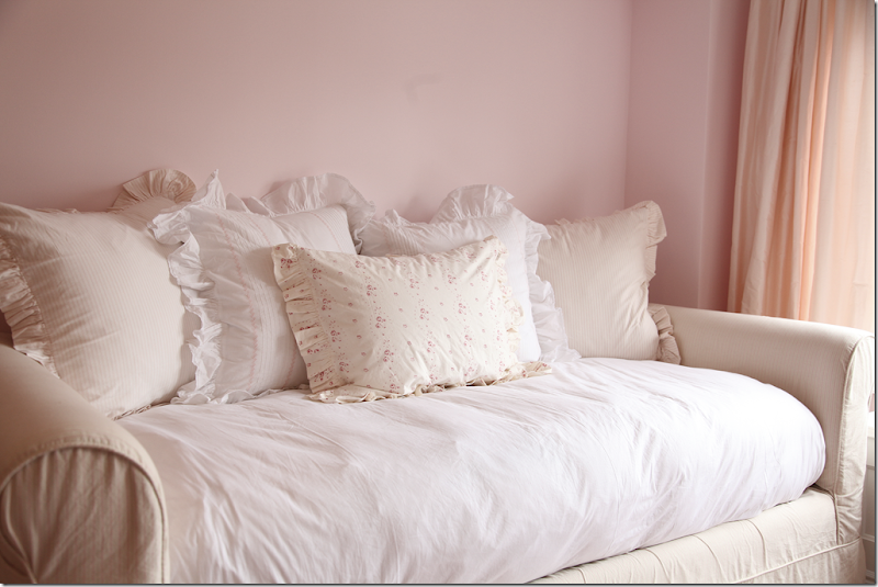
The daughter has the pink cupcake room she asked for. Custom trundle daybed is slipped. Taylor linens are on the bed. The curtains are custom peachy silk. The table is from PB Kids and the shelving unit is from IKEA.
The paint color is Benjamin Moore’s Pink Elephant.
The fabulous tutu oil painting is also by Laurence Amelie.
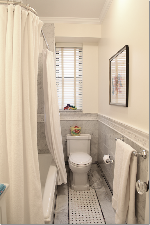
The children’s bathroom has the same classic black and white basketweave tiles and Carrara marble.
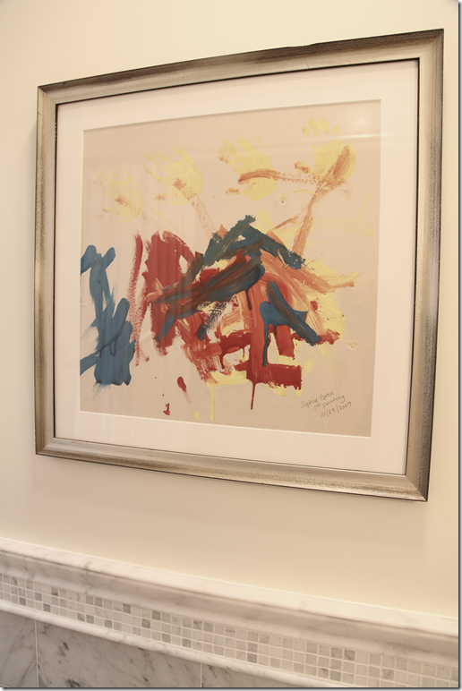
Angie’s daughter’s framed art work in her bathroom!!
Angie says her son’s room and the guest room are not ready yet – hopefully, we’ll get to see them when they are finished one day. The NYC apartment has such a different look than the Michigan country house. The apartment is a bit more contemporary, yet both homes do share some common elements. For instance, both use light slipcovered upholstery. Here in NYC, the fabric is oyster linen, while in Michigan it is white linen. The floors in NYC are not nearly as dark as in Michigan. Both homes seem very comfortable for both adults and children. All I can say is it must be great to have such a large, beautiful apartment in NYC and also have a place in the country with a large kitchen and great pool and backyard!!
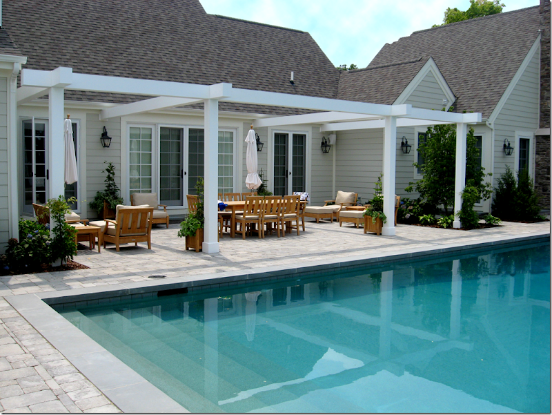
As promised, here a few new views of the Michigan country house. The pictures of the house we saw were taken in the dead of winter. Here is how it looks in the summer when it’s all green and flowering.
And from the back. Although there property extends much further out, they chose to fence in the swimming area. Remember, the pool sits just outside the long back hall between the kitchen and the master bedroom. You can see the master bedroom at the right – where the fireplace is. The kitchen is at the left and the garage is at the far left.
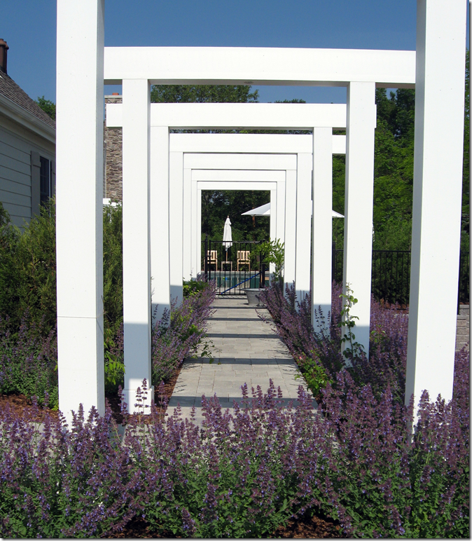
To reach the pool area from the kitchen and garage, there is a large design element – a free standing series of gazebos that lead to the swimming pool.
The area behind the back hall is set underneath another gazebo structure. The windows here are off the back hall. The master bedroom is to the right.
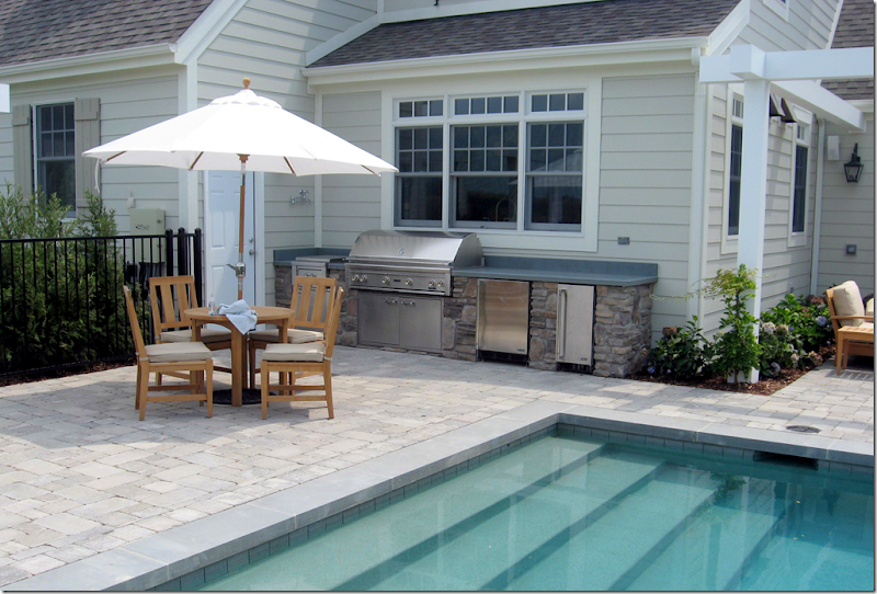
Underneath the kitchen window where the sink is, there is a built in outdoor kitchen. I’m so glad Angie sent in these pictures because they really complete the story of her house!
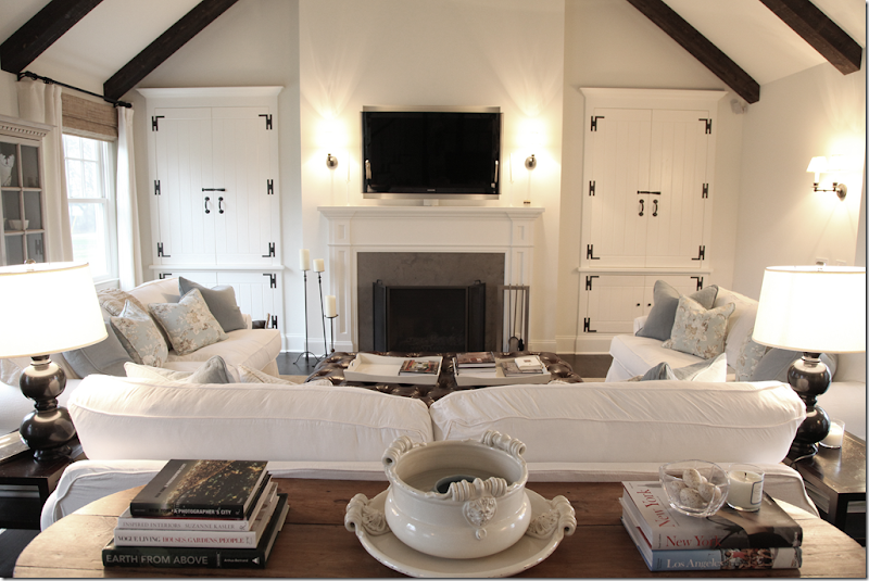
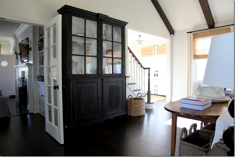
And finally, responding to questions about the layout of the house and questions about how people reached the kitchen from the entry hall, Angie mentioned she had a large dark armoire in the living room. When asked about it, she promised to send in the picture. The armoire sits right behind this console table and sofa.
And behind the sofa is the dark armoire. This one picture really illustrates the layout of the house that was hard to understand before. Here, you can see the entry hall and the stairs on the right and on the left, the kitchen and breakfast room with its fireplace.
A huge thank you to Angie Gren for sharing the pictures of her new apartment today!!! To read the original story about her Michigan house, go HERE.
To contact Angie for interior design work, email her: angi231700@aol.com
To contact Angie’s landscape architect, Richard Haas of Stewart Hass & Associates, email: info@stewarthass.net
Remember, send in your houses and kitchens for the blog to me at: mrballbox329@aol.com

