Last year’s January issue of House Beautiful remains one of my favorites. It’s cover story was Jill Sharp Brinson’s house in Atlanta – a wonderful example of Rough Luxe as seen through the eyes of its owner, a highly talented designer. Jill holds the quite impressive title of Creative Director at Ballard Designs- one of the better home décor catalogues available. I immediately feel in love with her unique house – the quirky architecture, the interiors, the steel windows, the green gardens – it remains at the top of my all time favorites!
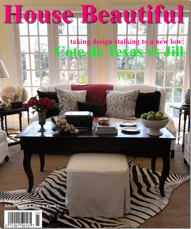
In fact, much of blogland went crazy for the house too. Valorie of Visual Vamp created a faux magazine cover copying Jill’s cover which spurred me on to create my own faux cover of House Beautiful ala Cote de Texas. Well? Do you think my cover looks like Jill’s? ha!
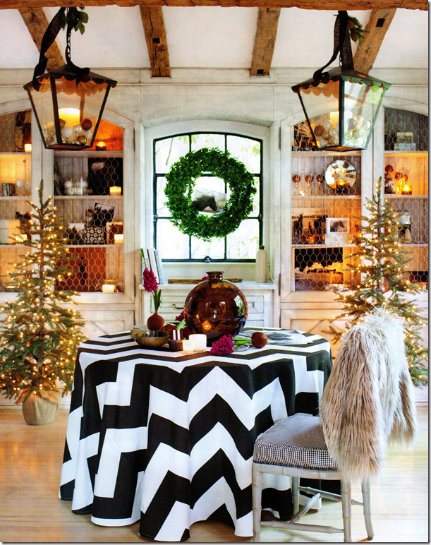
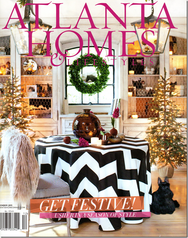
Over these past two years – Jill and I have exchanged emails – she is really so sweet and giving. Today, I was shocked to get a Fed Ex envelope from Jill with the new Atlanta Homes & Lifestyles magazine in it. The cover is of Jill’s dining room, styled for Christmas.
I thought I was share the pictures with you since most of you won’t be seeing this local Atlanta magazine, which is a shame because it is a great one.
Jill Sharp Brinson’s dining room made the cover of this month’s Atlanta Homes & Lifestyles. No, I don’t think I’ll be styling my dining room for a faux cover again – but I do have a skirted table too – in all white! Jill husband Rob Brinson took all the photographs for this story.
Is it fair that someone so talented should also be so gorgeous? Jill, with the blonde hair, is pictured with another beauty, Suzanne Kasler, an interior designer from Atlanta who worked on the styling with Jill. Kasler has a developed a line of furniture and accessories for Ballard Designs. Here Jill and Suzanne pose in front of the fireplace in the main living space.
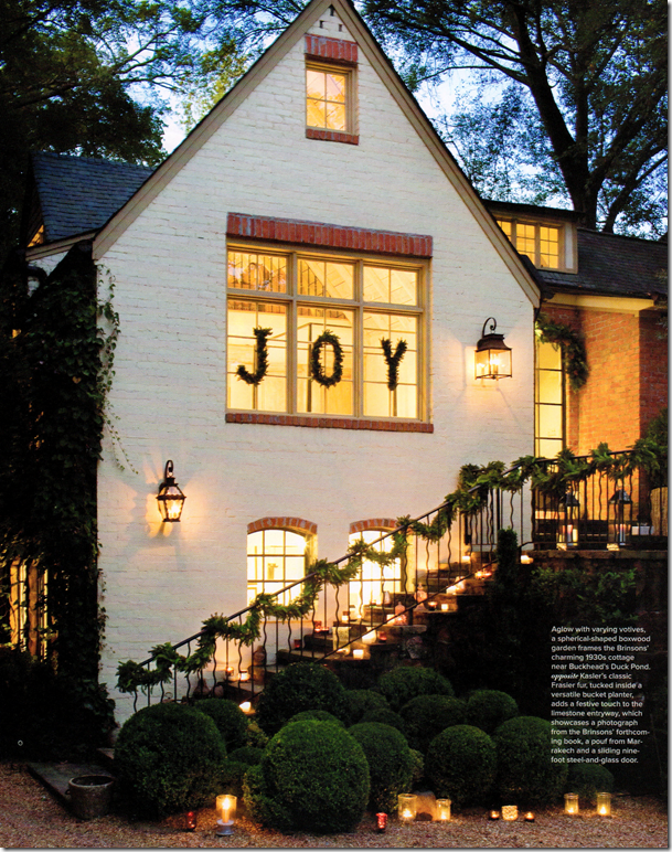
The front entry is decorated for the season with greenery and candles. I love how she lined her steps with the votives. But, the “Joy” is what really makes it all so special! Jill and Rob’s house was built in the 1930s – inside, ceilings reach up 20 feet.
The entry door is glass and steel, as are the windows throughout. Here a small Frasier Christmas tree designed by Kasler for Ballard sits in a bucket planter. On the wall is a large photograph that is from Jill and Rob’s upcoming book. Can’t wait for that one!
Steel doors and windows are so gorgeous! I wish they weren’t so pricey because they really make a house special.
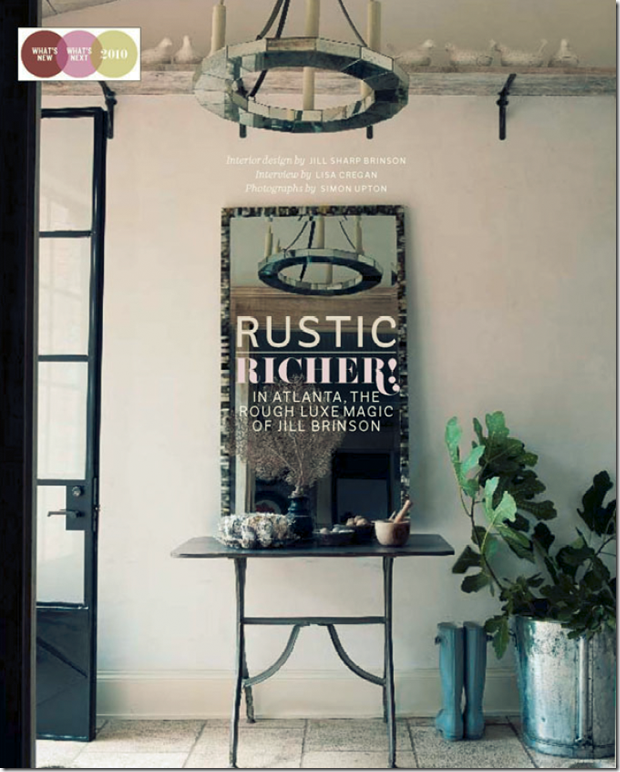
Here, is the entry hall as shown last year in House Beautiful. Notice the collection of white birds sitting on the high shelf.
The main living room with garland around the sconces and paper whites. I am loving the new all muted white and khaki colors.
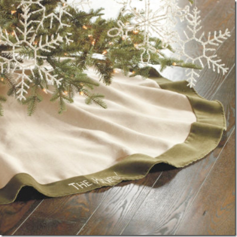
Throughout, Jill and Suzanne used Christmas decorations that Suzanne designed for Ballard, such as linen tree skirts with velvet trim, glass ornaments, and others.
Across from the sofa, votives lead up to the library loft. Notice the glass ornaments in the tree – these ornaments come from Suzanne’s collection for Ballard Designs.
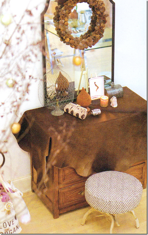
And, at the bottom of the stairs, a brown cowhide covers an antique chest, while a pinecone wreath hangs from the contemporary mirror.
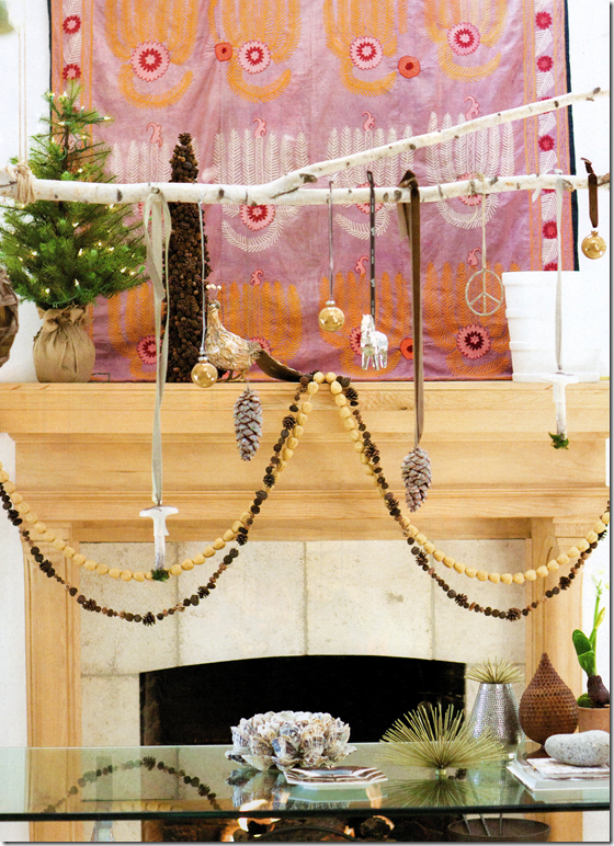
Above the fireplace, a pink suzani hangs – adding just a touch of pink to the room. Notice the branch over the dining room table – Jill says she hangs different things from the branch – depending on whatever catches her eye.
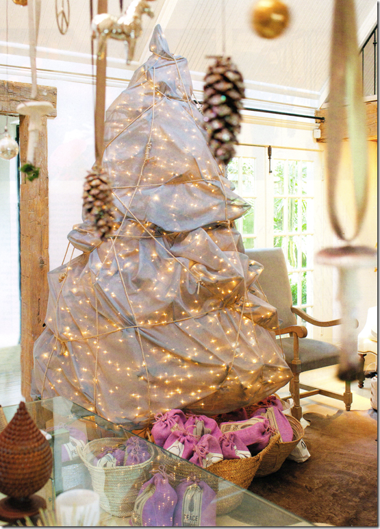
The focal point of the Christmas decorations is this tree. Jill, inspired by the artist Christo, wrapped it in 8 yards of gray matte silk. Jill says the tree is “modern, pretty, and a little bit of wow.” Just as she likes to live, she elaborates. In the background, you can see another cowhide that sits under the sofa and chairs.
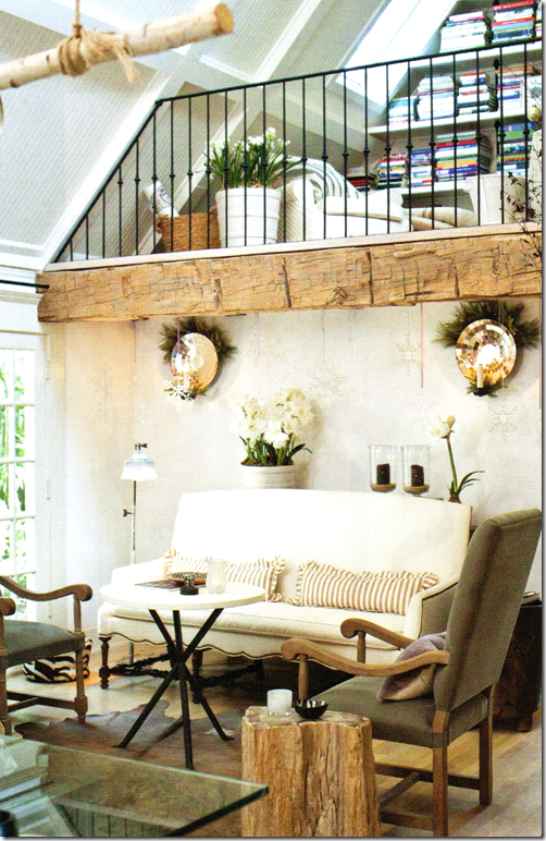
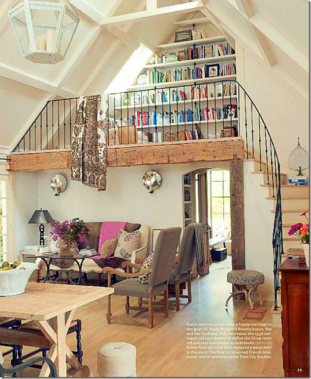
Here’s a glance back at the living room as seen in the House Beautiful spread. I still love the textile hanging from the loft and those covering the sofa! Maybe this is the “summer” décor. It looks like she got a new dining room table with a glass top – here the table is more of the Belgian look so popular today. The room past the living area is the master bedroom.
In the dining room – two more Kasler trees flank the window with its hanging wreath. Notice the photograph of the horse inside it. Kasler ornaments were added to the lanterns. And, the biggest change is the skirted table with its bold chevron black and white pattern. To create an instant change of tables like Jill did, check out the party tablecloths available at Ballard Designs HERE.
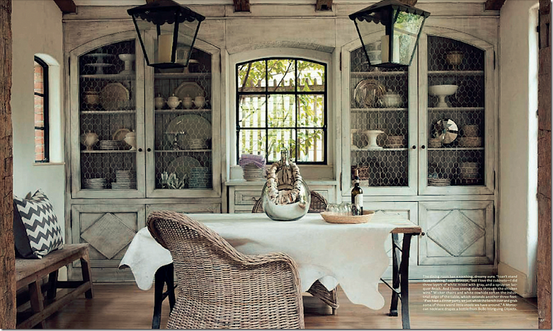
The Dining Room as seen last year in House Beautiful.
Probably my favorite room in Jill’s house is this one with the fabulous double lanterns and gorgeous shelves with chicken wire. I swear – one day soon I am going to have a carpenter build me doors like this to cover my own family room book shelves. And, notice the Kooboo chairs and white cowhide – two things I did copy straight from Jill! Is there a prettier room anywhere?
In Jill’s beautiful kitchen, she put 3 of Suzanne’s mirrors for Ballard Designs in the windows, then garland was added to the vignette. Jill says the mirrors look like jewelry. Notice her adorable farm sink and the sconces above it. Love, love love this!
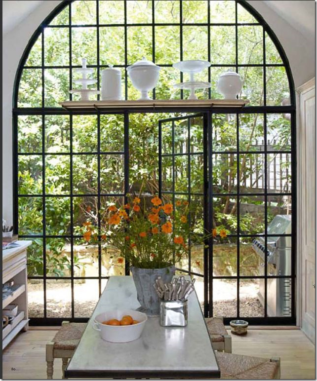
From the House Beautiful story – look at this arched steel door leading from the kitchen – it is phenomenal, it takes a utilitarian space and turns it into an art gallery- like space.
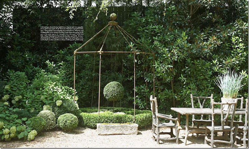
And, from House Beautiful, Jill’s yard – all greenery and gravel – it looks like it a garden in Provence.
Suzanne Kasler’s Collection for Ballard Designs includes an assortment of Christmas merchandise. Besides several trees, there are linen skirts with velvet trim in different colors that can be monogrammed.
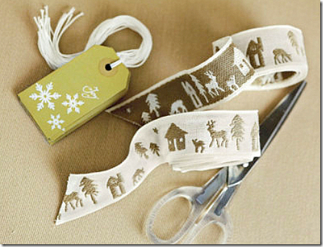
There are gift tags and ribbon.
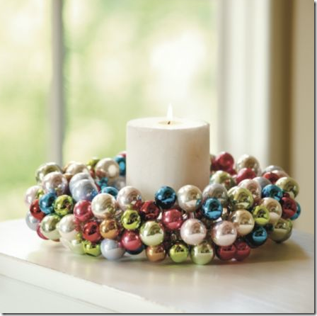
And, there are glass ornaments and wreaths, among other items. See the Suzanne Kasler Collection for Ballard Designs HERE. If you visit the web site – check out Suzanne’s gourd lamps – I’m going to order a few for a client of mine. They look wonderful, especially for the price.
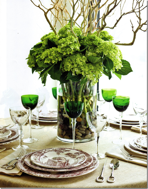
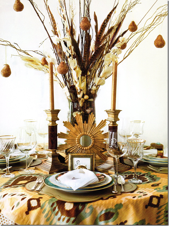
The entire December issue of Atlanta Home & Lifestyles is pretty. I loved this story on tablescapes created by different chic shops in Atlanta. My eye went to this table – I have green glasses I bought at Pottery Barn a decade ago that I could use to try to recreate this tablescape. Brown and white transferware could be substituted too. What I like about this is it’s not too over the top that you couldn’t actually set a table just like it.
Sunny ikats, feathers, and beaded pears, along with gilt mirrors were used to create this table. Love it!
I think this would be a great Hanukkah tablescape with the blues and the whites of the rock quartz. If you had different colored Foo dogs, you could use those instead of the blue – the main idea would be to match the vase and the dogs. Now, where are the dreidles?
The magazine’s web site is HERE – digital issues are available although the current issue isn’t loaded yet – so you may have to wait a few weeks if you want to view it online.
And finally, a huge thank you to Jill and Rob for sharing this latest photoshoot of their wonderful home. A very Merry Christmas and Happy and Healthy New Years to you both!!
Christmas at Jill’s- Fabulous!
READERS KITCHENS SERIES #8–Two French Inspired Designs
Today, I have two different kitchens to show in our Readers Kitchens Series. They are both inspired by French design, so I thought they looked good together in one post!
Kitchen #1
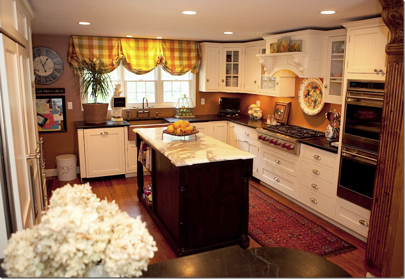
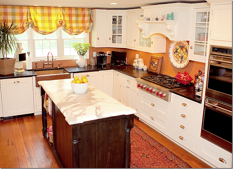
The first kitchen is by interior designer Kim Macumber who lives in New England, though she grew up in the south. When looking for a new house – Kim wanted to buy an 18th century farmhouse, but unfortunately, none were available. Although she loves old houses, she settled for one built in 1968 – a typical Colonial. In order to create some architectural interest, Kim gutted the living area and kitchen to make room for her family of six and three dogs. She calls her kitchen her own version of French Country in New ‘England:
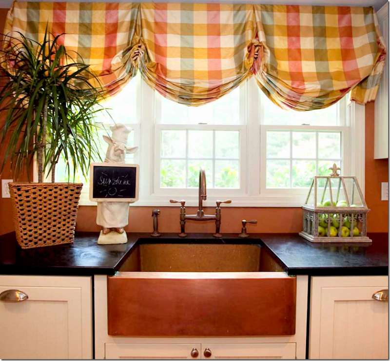
Kim mixed two countertops – black stone and white marble which is on the counter. The appliances are stainless, but the refrigerator is hidden behind beadboard doors, as is the dishwasher. The walls are painted a warm copper, which matched the silk plaid at the windows.
The copper farm sink is the focal point in the kitchen. What a unique choice!!! It matches the walls – not sure which came first, the paint color or the sink.
In this view, you can see the wood hood over the stove. Notice the island is stained dark to contrast with the white beadboard cabinets and the white marble.
Looking from the breakfast room into the kitchen, a dining bar was created out of counter space – which ends with a set of glass fronted cabinets. Here, you can see the refrigerator on the left with its white beadboard doors.
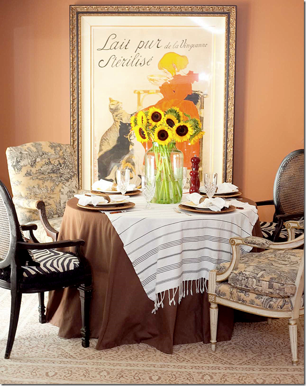
The breakfast table is skirted with different chairs surrounding it. Two have zebra skin fabric and the other two mismatched chairs have a French toile fabric. A large vintage French poster hangs in the space.
Kim Macumber Interiors provides “New England styling with Southern panache!” Here is a sampling of her portfolio. To reach her web site and blog, go HERE.
Kitchen #2
This kitchen was designed by Dallas interior designer Melissa Woody. Melissa has been practicing interior design for over 20 years and she is also known around Dallas for her fine antiques which she shows at several locations including Lovers Lane Antique Market and The Mews. The kitchen shown today is a charming French inspired space that I think you will enjoy!
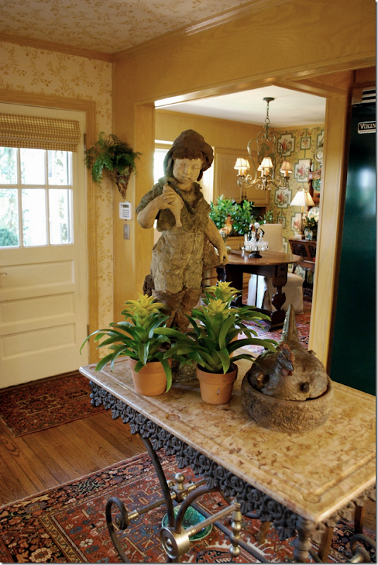
The focal point of the kitchen is the bakers rack island with a large statue on it! Notice the rug it sits atop. Be sure to take a peek into the breakfast room – which is wallpapered in a different design.
I love bakers racks and even have one myself. Mine is an antique that I was lucky enough to inherit. It was my mom’s which she had had forever and used as a bar. Then, my sister used it as a media center. Next, she passed it on to my aunt who later passed it on to me when Ben and I moved into our first house – the one on concrete blocks! Now, it sits in my kitchen and hopefully, I will pass it on to someone else in the family when we move on.
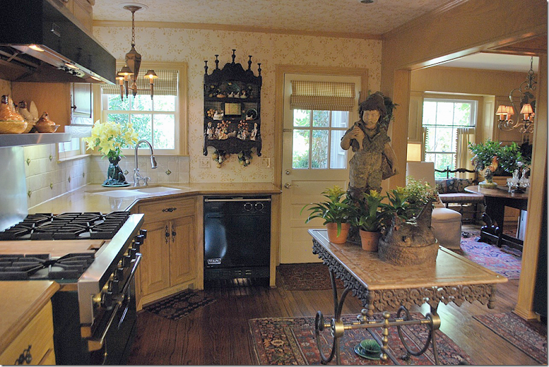
The walls are wallpapered in a yellow and white pattern. The floors are hardwood – with scattered rugs around. Notice the adorable tole light fixture over the sink and the tiled backsplash. This kitchen is so warm and inviting. Oh! I just noticed the dog bowl underneath the bakers rack! It looks like majolica!!!! Too cute!
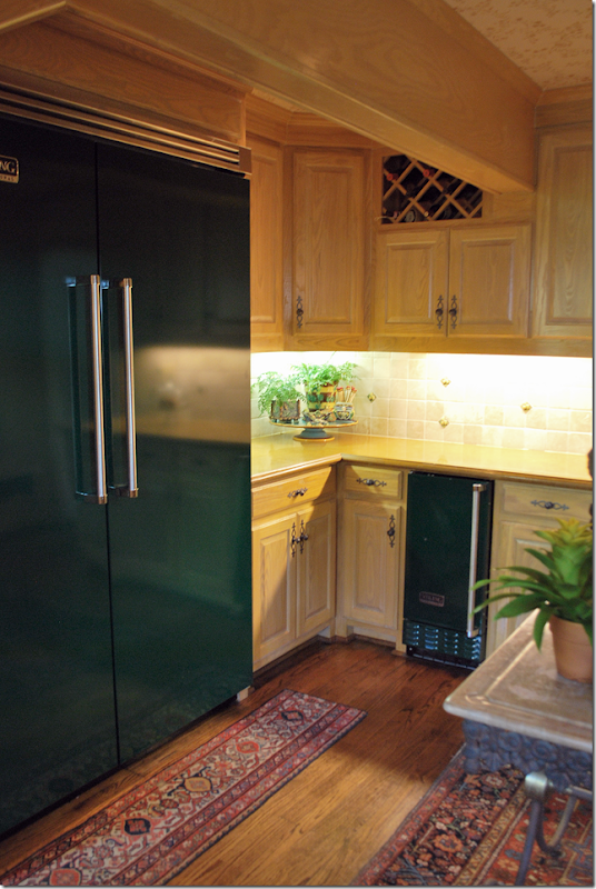
Check out that range! Viking. Wow. That is gorgeous. It is the dark green color. The dishwasher looks like it is Viking also. Nice. Notice the collection of antique hen baskets over the stove.
Here you can the tole fixture over the sink and another large hen in a basket on the bakers rack. Also, notice the hanging shelf - an antique French piece filled with more antiques!
Notice the ceiling is wallpapered too – which is a great way to envelope a room in warmth and coziness – two words to describe this kitchen! Here you can see the border of the breakfast room wallpaper above the beams.
And finally - check out the Viking refrigerator and ice maker – two appliances you don’t see too often! These are gorgeous. I love the small runner in front of the refrigerator. It’s obvious this kitchen was decorated by someone who loved French design and antiques!
The ceiling and rafters make the room look so cozy – that word again! And I love the antique fabric used for the coverlet and pillows. Sooo cute!!!!
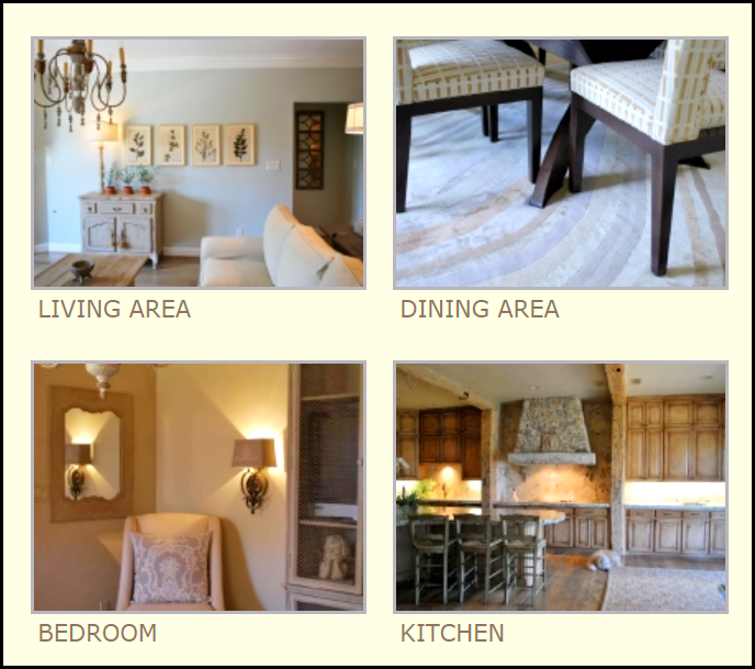
These pictures taken from Melissa Woody’s web site show the range of her designs – from Contemporary and Traditional to French inspired. Be sure to stop by and visit her booths at The Mews or on Lovers Lane in Dallas if you are into antiques. Dallas has the best antique shops. To learn more about Melissa Woody 0r to contact her, be sure to peruse her web site HERE.
A huge thank you to our two designers today – Kim Macumber and Melissa Woody who graciously shared their French inspired kitchens.
Looking at all things French today, I would like to introduce you to a new Cote de Texas sponsor – Hull Historical Architectural Molding.
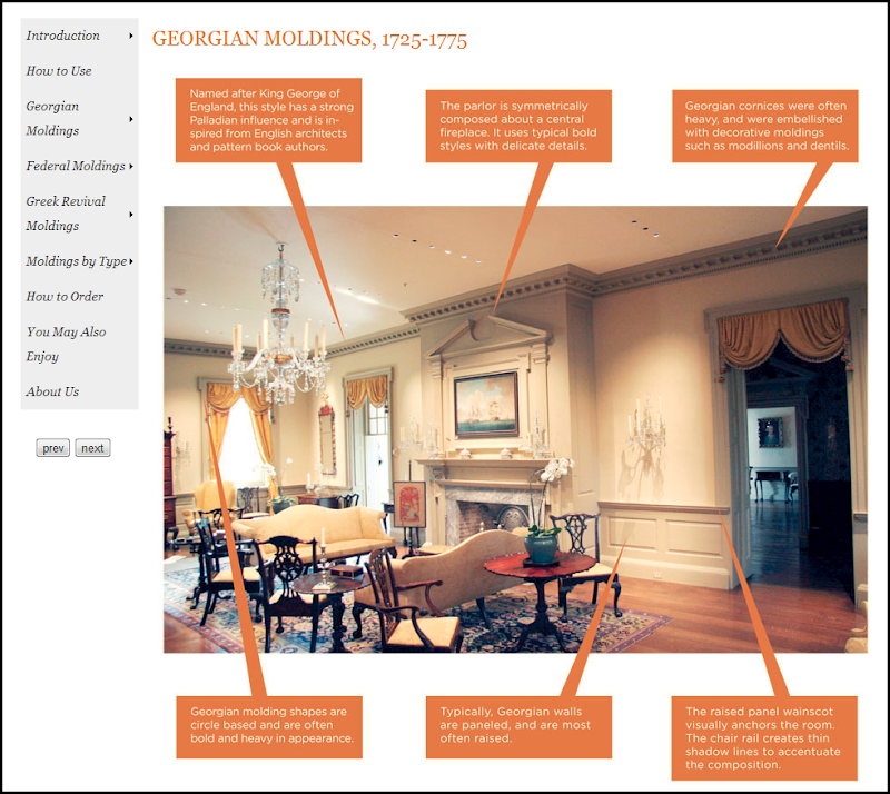
The Brent Hull Companies are three companies in one: homebuilding, historic millwork, and consulting. Hull Historical produces architecturally and historically correct moldings – everything from wall paneling to doors, staircases, cabinetry and more. Their web site is an intellectual feast, showing all different types of moldings and how to use them correctly and in what context. There are several online catalogues to browse through.
Hull Historical has a library of over 2000 historic books and catalogs that they use in their research and for inspiration in creating new product. Every piece they create is architecturally correct and historically accurate. Recently, Hull Historical contacted me to say that they are coming out with a French Millwork catalogue. This will be a comprehensive endeavor, highlighting different styles by showing the woodwork in situ.
“No one built and designed architectural interiors and furnishings like the French. As the accepted leaders of European style for centuries, French designers left a legacy instantly recognizable and unique in complexity and craftsmanship. It often takes up to five sets of knives to reproduce an individual French molding; so intricate is the woodwork. Using historic pattern books and designs for inspiration, we are proud to continue in this passionate tradition of unparalleled skill and dedication to quality.”
I think we all agree that the French are the leaders of European style – and have been for centuries. So, I am excited to see the new catalogue. Here are a few pictures of a house recently built – using the moldings from the French collection:
Leading into the master suite – showing the French collection of historically accurate moldings. Notice the scalloping along the archway.
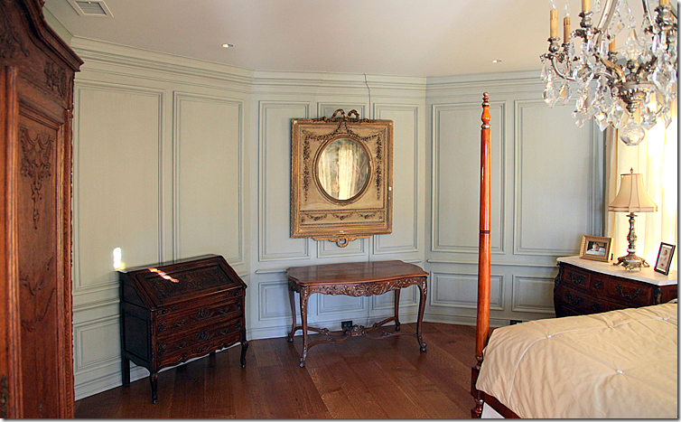
Inside the bedroom, an octagon shaped room. The paneling continues around all sides.
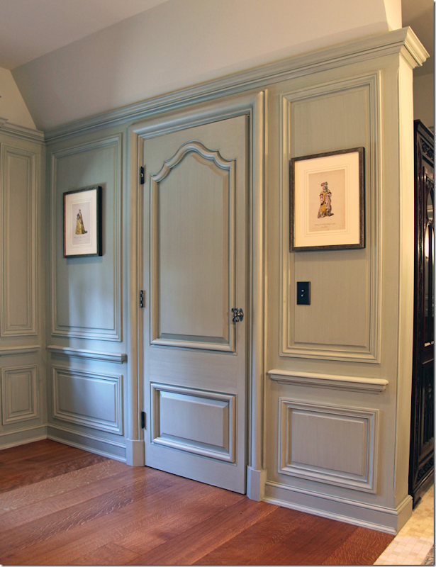
The doorway leading into the bathroom. I love the color the wood was painted. Subtle, and so pretty!
The collection includes cabinets, staircases, moldings, paneling – and more!
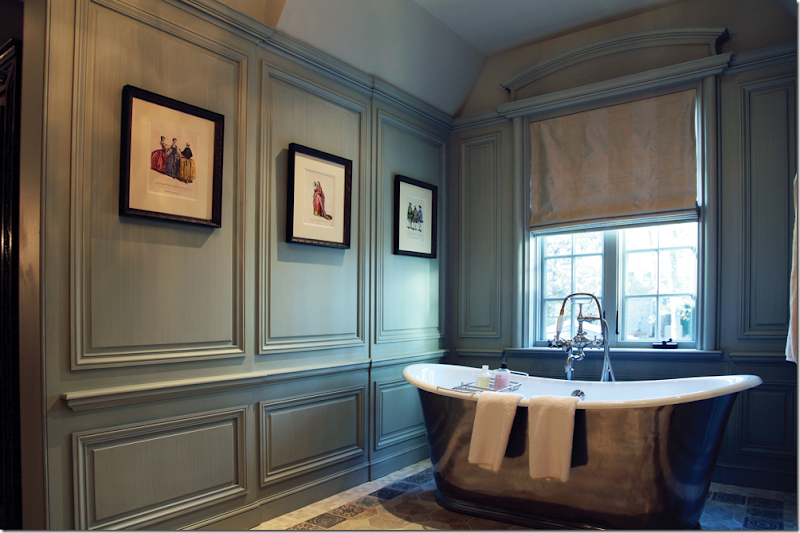
The paneling continues into the bath area. That tub!
Hull Historical’s catalogues are like textbooks! Everything you need to know about moldings is right here, online.
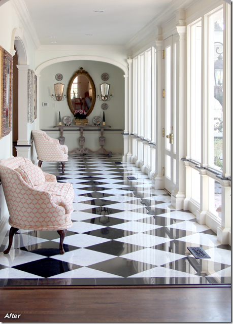
I especially loved seeing the befores and afters on their web site – here, a modern edition with terrazzo floors and plate glass windows needed to be more in keeping with the original style of the house. (This reminds me of my house in Meyerland growing up – we had the same exact floors and windows!)
AFTER: AMAZING!!!!!!!!!!!!!!!! Black and white marble replaces the terrazzo, creating a classic look. The opening to the dining room is made much smaller – with an arch and moldings. An additional arch and moldings is added to the end of the hallway - making it appear shorter. The plate glass wall was replaced with doors and windows surrounded by molding. This is so beautiful!!
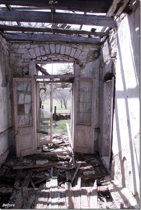
BEFORE: A stone house built in the 1800s had fallen to ruin.
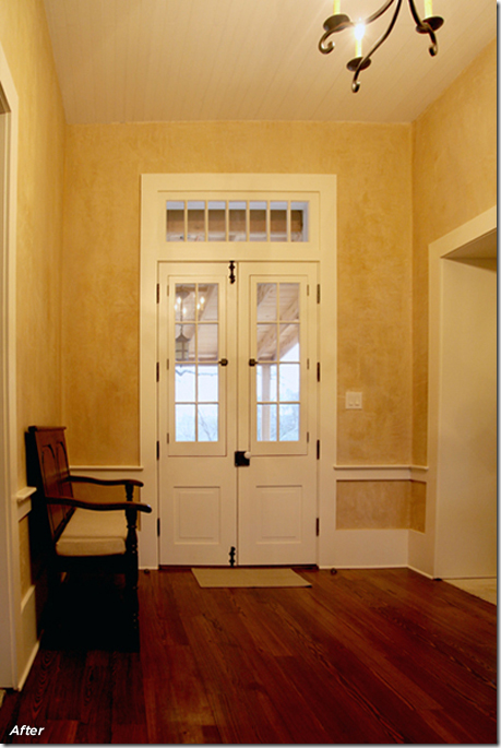
AFTER: Using historically correct woodwork and doors – the house was renovated and added onto. Again, an amazing transformation.
Be sure to take the time to look at the Hull Historical web site. It’s a treat and a lesson at the same time! To see the web site, go HERE.


