COTE DE TEXAS

A Tuscan Dream in Mississippi

212 comments


image

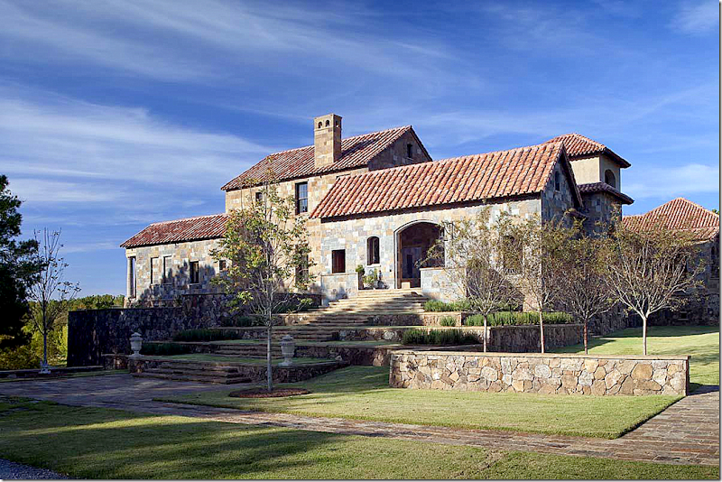
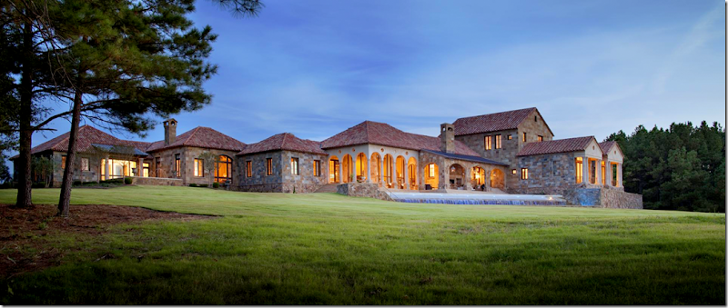
In America, it isn’t too often that a house has a name, but then again, this isn’t just any house.  The estate, Lynnstone, located outside of Jackson, Mississippi near Flora, has an impressive 27,000 sq. ft main house.  Inspired by a Tuscan villa, Baton Rouge architect Kevin Harris worked on the project for over five years – and judging by the fine attention to detail – it shows.   Though majestic, the house is remarkably accessible.  Each space is filled with antique architectural elements which lends a sense of patina. 

I don’t often get to show these types of houses – so this was a real thrill for me when I was sent all these gorgeous photographs – extra large to see all the details.    The house was featured late last year in the Robb Report and once that article came out, I was free to show all the photos that the Robb Report hadn’t.  Ah, the beauty of blogging!   The photography by Chipper Hatter is wonderful and I spent hours studying each picture, trying to put it all together.   I only wished I had a floor plan to show – but I hope that you will come to understand how the house flows from the descriptions. 

This story is about a dream home – something to look at and learn from.   The interiors are surprisingly warm and inviting, not precious or dressy.   Some rooms are large and expansive, others are smaller and cozy.  There are hundreds of ideas to take from this.   Despite its large size, there are only 4 bedrooms, along with guest quarters over the barn.  I hope you enjoy studying Lynnstone as much I did – and I hope you find inspiration from it!


image

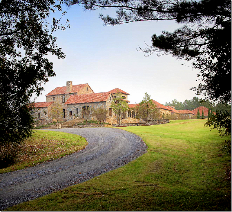
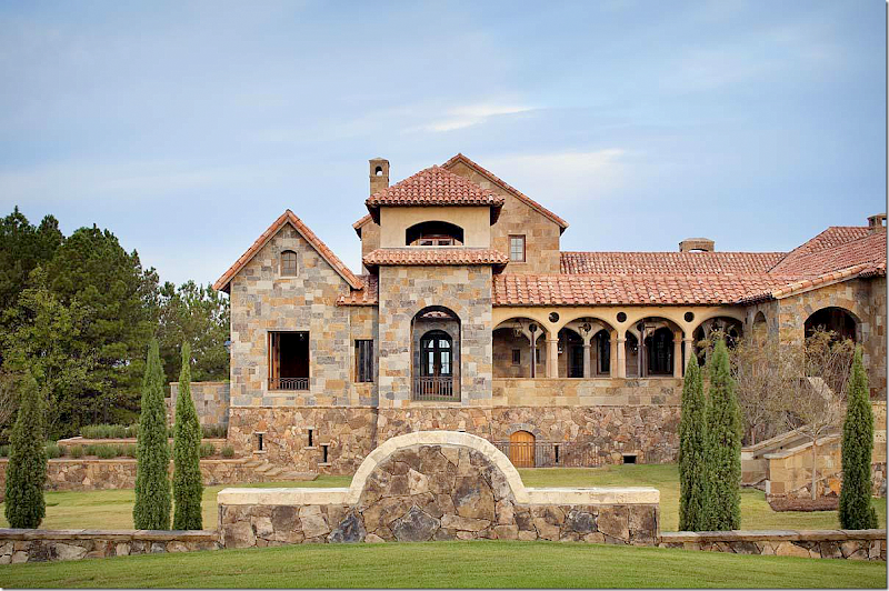
Lynnstone is approached from a long, winding gravel driveway.  The house sits on 160 rolling acres with views of the treetops that surround the estate.  Kevin Harris, the architect, said the landscape reminds one of Tuscany with the hills and trees.  From this angle, the house looks like a small village – with all its different rooftop heights and bell tower.


image

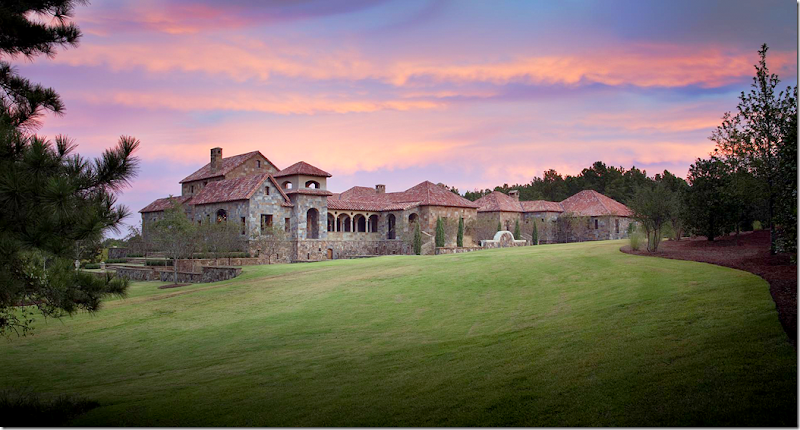
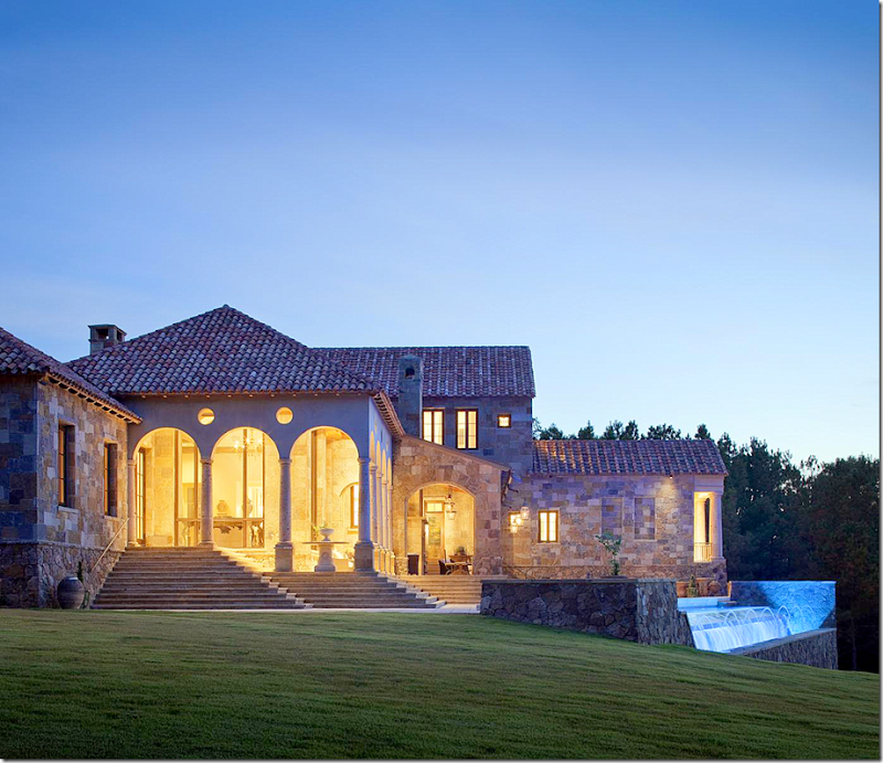
Lynnstone at dusk.   The entrance to the house is at the far left.  To enter, you first go through a front courtyard and a bell tower – seen here. 


image

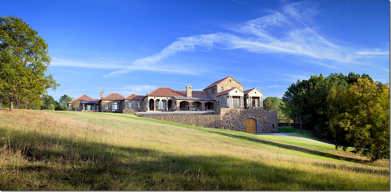
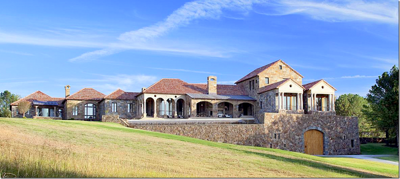
The view of the back side of the estate.  Notice on the far right the two Roman temple facades.  These house the two guest rooms.   Underneath, through large wood doors, is the basement garage (I think!)


image

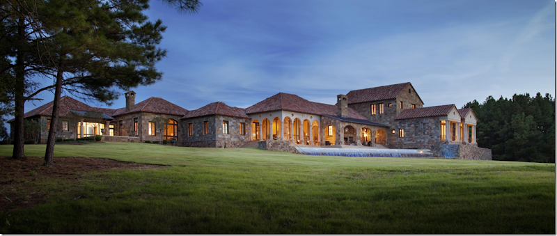
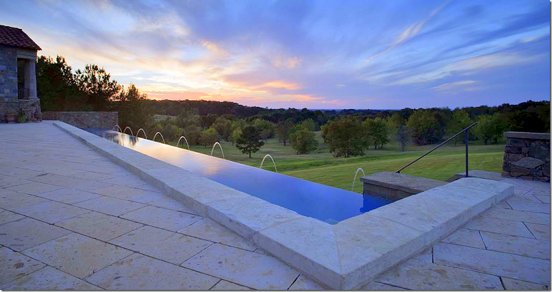
Again, the back side – showing the infinity pool.  The two story structure above the Roman temples is the guest suite. 

Lynnstone was competed in 2010, after a five year collaboration between the architect and the homeowner.  The interior designer on the project was Annelle Primos from Jackson, Mississippi.  Harris said the house was designed to match the slopes of the landscape.   The exterior is rustic – a combination of three layers of Arkansas fieldstones, some of which are covered in lichen to make the rock appear aged.  The roof is reclaimed 17th century clay tiles.  

`

image

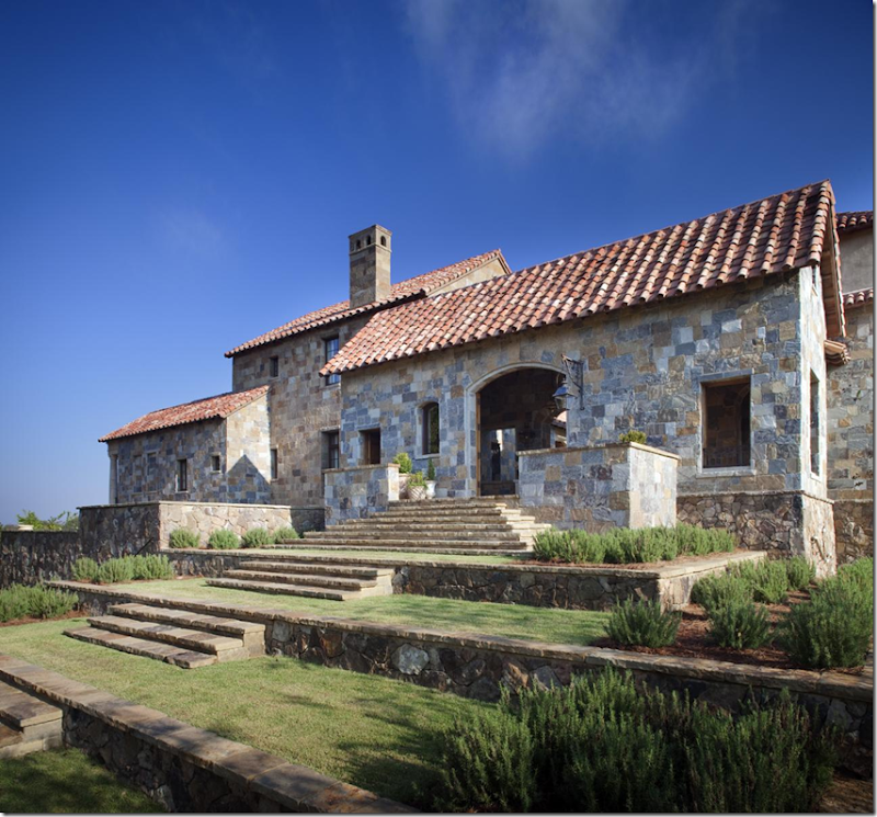
The stone steps lead up to wooden doors that open to the entrance. 

(Notice here – on the far left is one of the Roman temples that houses the guest room.  Under the temples is the garage.)

(ok, I’m dreaming here – but if I lived here – I would leave my car here, and have the butler go park it in the garage.  Then I would enter the house here EACH time!  I would walk up the stairs, walk through the entrance – walk down the colonnade by the courtyard and then into the house itself.  Such a beautiful front entrance – I would want to experience it every time.  ok, back to reality.)


image

A closer view of the stone steps set within the terraced lawn that lead up to the courtyard entrance.


image

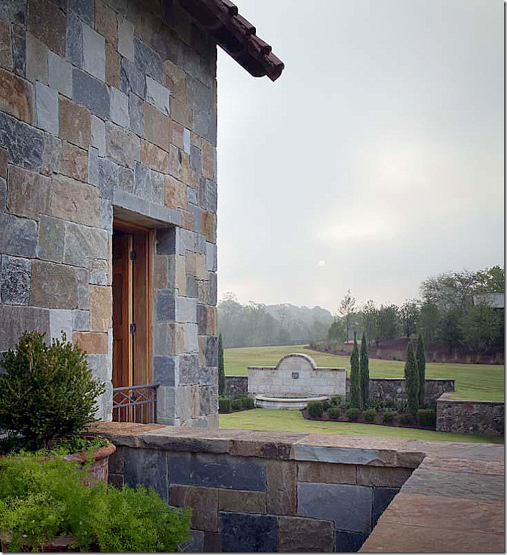
A view of the side of the front entrance.  This room is open to the elements – there is no glass in the windows, only wood shutters to keep out the rain.   Notice the charming window near the roof.   Notice also how the foundation stone is darker and randomly placed compared stone on the walls.


image

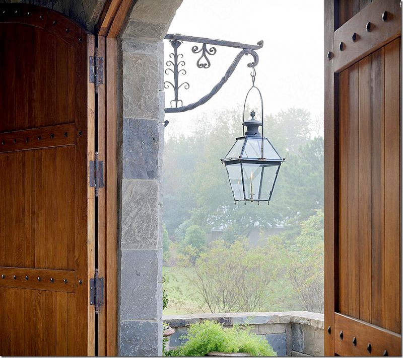
Two large wood doors open to the entrance courtyard building.  Dozens of gorgeous lanterns like this are found throughout the property. 


image

The entrance to the courtyard.  Wood shutters take the place of glass panes. 


image

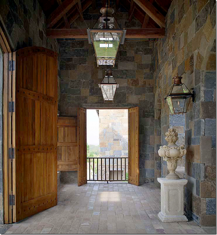
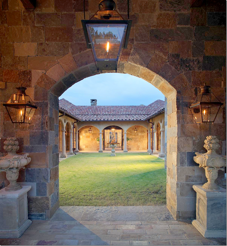
The view once you enter the double wood doors – your eyes goes past the courtyard to the front foyer inside the house.   


image

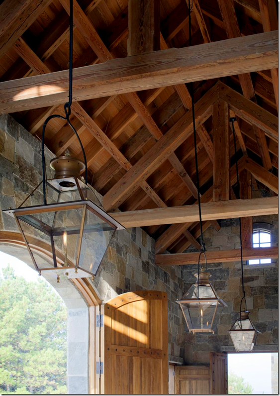
The ceiling of the front entrance, a double height room, with more lanterns hanging from the rafters.


image

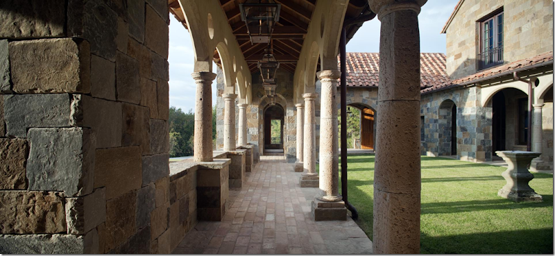
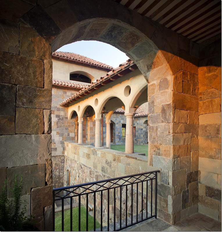
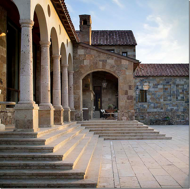
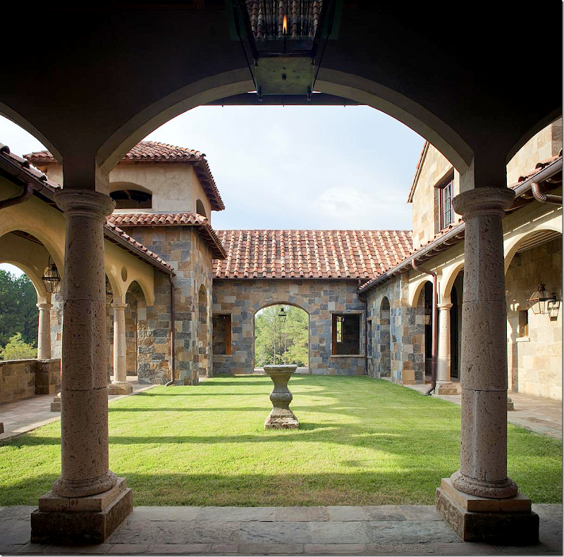
To enter the house, you walk through the entrance building, then walk under the bell tower and on down the colonnade with its arched columns.


image

Looking back towards the entrance building – the courtyard is on the right.  This colonnade leads to the interior.  Notice the row of lanterns that light the way.


Estate located in Flora, Mississippi designed by Kevin Harris AIA Architect.

The view from the outside of the colonnade and the courtyard.


image

Here, in a side view, you can see the entrance room at the left, the bell tower, then the colonnade that runs alongside the courtyard.  On the right, stone steps lead down from the house to the grounds.   The large arch in the wall is behind a fountain – see below:


image 

Here is the fountain, as seen by the front entrance.  Notice how large the property is from this view.


image

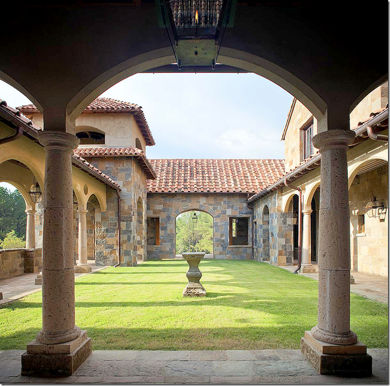
The view from the lobby in the house, looking back at the front entrance building.  The bell tower is at the corner, the colonnade is at the left.   In the center of the front courtyard is a sun dial.   To the right – is the family room.  Above it, are the guest quarters.


image

At the end of the courtyard and the colonnade is the entrance into the house.   Inside the lobby, the rooms surround a fountain in a atrium.   You can just see the atrium behind the windows.  


image

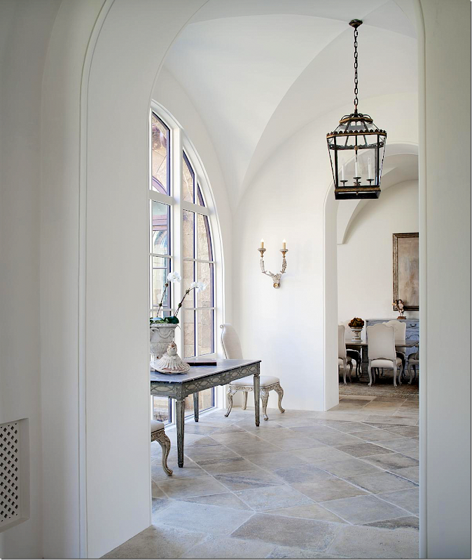
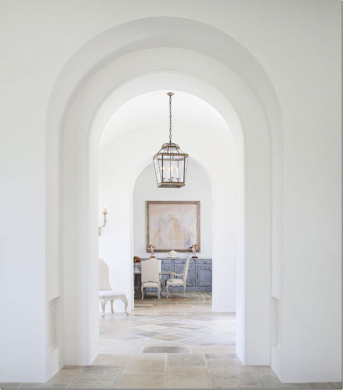
The lobby with its gorgeous stone floors and vaulted ceiling.   The atrium is behind the window.   The dining room is to the right.  Such a beautiful space!


image

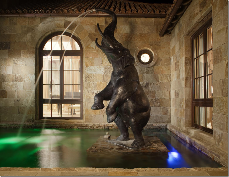
The atrium with its elephant fountain.  Harris says the homeowner found the elephant in Santa Fe, but the architect was concerned that the “elephant would compromise the integrity of the home."  Both the interior designer and the architect had never heard of elephants in Italy.   It was researched and discovered that Hannibal had brought over 37 elephants to Italy during the Second Punic War.  So…the elephant was allowed to stay!!  

Several rooms surround this atrium including the living room and dining room.  You can see into the living room here where the piano is.


image

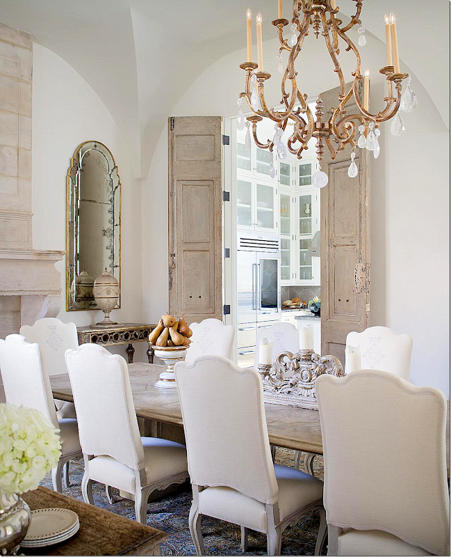
The dining room is to the right of the main entrance.  The table is from Hendrix Allardyce and the chairs are Belgian, with the owner’s monograms on their seat back.  Through the door is the catering kitchen which serves for parties and as a butler’s pantry. 


image

There is a beautiful antique stone mantel flanked by matching mirrors and consoles.  To the left, the dining room looks out to the fountain with the elephant.  Notice the ceiling treatment in this room – each room has a different treatment.


image

A close up of the antique double doors that lead into the catering kitchen.


image

The Catering Kitchen:  Quite a kitchen for a secondary one! 


image

At the front entrance to the house – to the right is the dining room and to the left is the living room. 


image

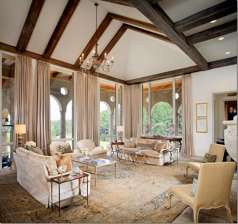
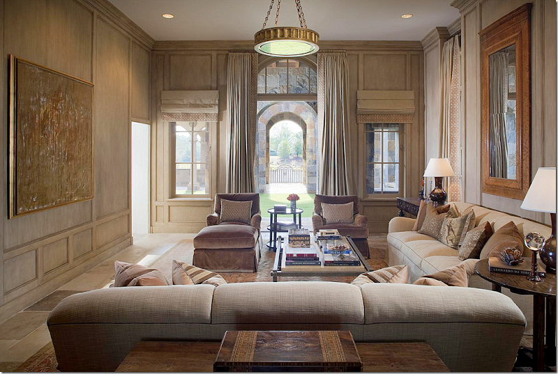
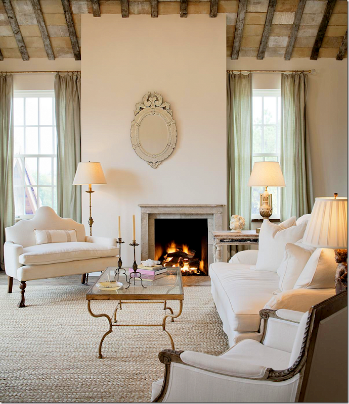
The living room is decorated in creams and off whites.  A wood Italian chandelier hangs over this space.  On the far right is a door that leads to the library, which leads to the master bedroom suite.   The architect designed the house so that you would need to walk through all the rooms to get around – he purposely left out hallways.   The living room over looks a portico which leads to an outdoor eating area terrace and the infinity pool.


image

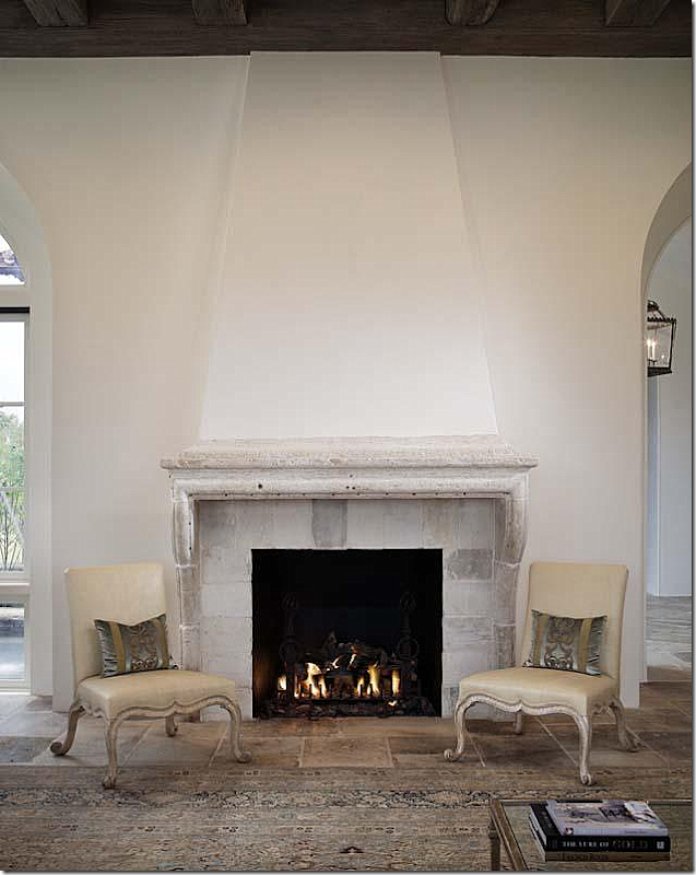
In the living room – another antique stone mantel.  The antique tapestry pillows in the living room are from BViz HERE.


image

Here is the outside view of the living room – behind the arched colonnade.  The steps lead down to terrace and the infinity swimming pool. 


image

The living room is up the steps on the left, the outdoor eating area and fireplace is straight ahead. 


image

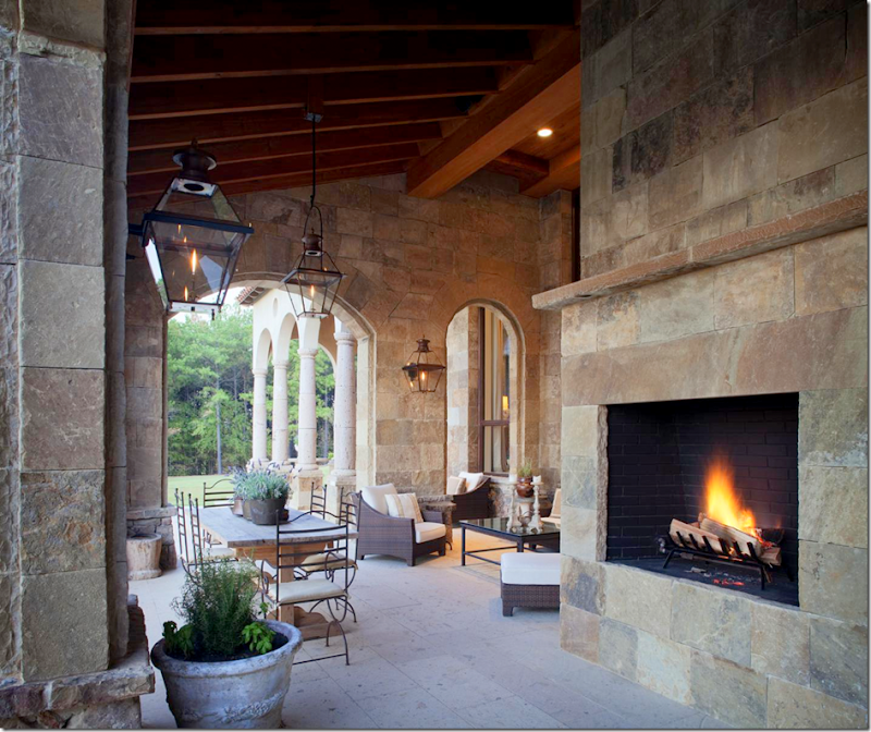
Off the living room terrace is the outdoor eating area and fireplace.  The main kitchen leads to this space.


image

The view off the terrace shows just how expansive the estate is. 


image

To understand the layout – the living room is behind the white columns in the middle of the house.  To the left of the living room is the library, then the master suite.  To the right of the living room is the kitchen and the guest rooms in the two Roman temples – above on the second floor is another guest suite.

The house was designed around the outdoor living areas, which follow the slope of the property.


image

The family/TV room faces the front of the house.  It is located off the front courtyard – on its left side – shown here in a nighttime view. The kitchen is connected to the family room and above it is the guest apartment.


image

The family room.  The door to this room lines up with the bell tower and the arched fountain on the side yard.   The flat screen hides behind the large painting on the left.  Through the door is the main kitchen and breakfast room. 


image

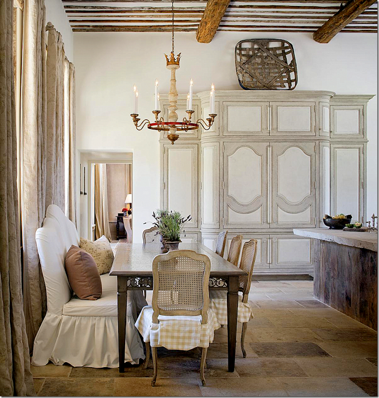
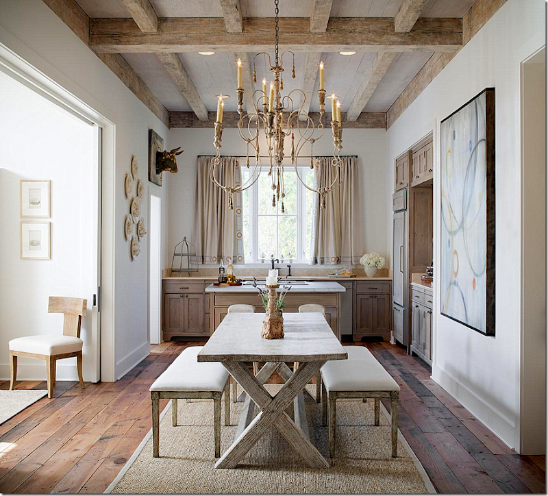
Next to the family room is the main kitchen and breakfast room.   Along with the dining room, this area is another personal favorite.   The banquette is just gorgeous with its white slipcover and the scalloped back.  And I love how the cabinet was made to look like an armoire – notice its perfect proportion to the room and ceiling height.  Notice the chandelier and the wood beamed ceiling.  AND, the floors!  It’s all just so beautiful.


image

On one side, the kitchen overlooks the outdoor eating area and the swimming pool.   On the breakfast room side, it overlooks the entrance courtyard.  I wish I had a floor plan for you!!!!   I’m trying to explain the layout so that you can understand how it all fits together. 

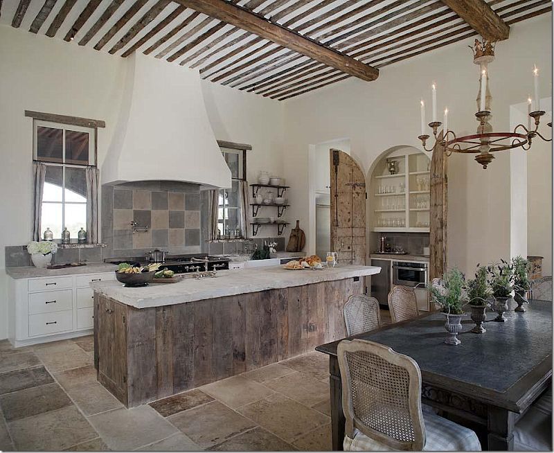
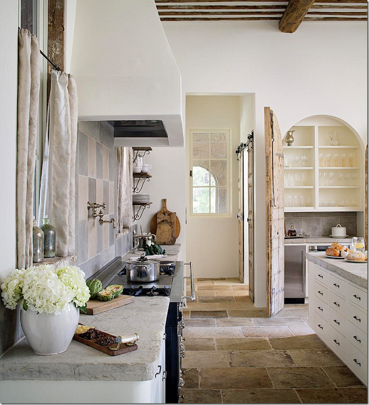
The kitchen  features Venetian plaster walls, reclaimed wood, and rustic stone countertops, backsplashes, and flooring. There is also La Cornue range.    No overhead cabinets give it a European feel.   Notice the old wood doors that open up the bar area.  They add so much texture and authenticity to the kitchen.   Now, a house this majestic would usually have a slick kitchen with granite countertops and tons of cabinetry.  I LOVE how the architect and designer nixed this for a true country kitchen that would be found in Italy.  


image

Another view – notice the pantry doors that hang on barn door hardware.


image

Above the family room are private guest quarters.   The Juliet balcony overlooks the entrance courtyard.   Notice again the gorgeous, rustic ceiling.  This really looks like a renovated Tuscany farmhouse.


image

Close up view of the fireplace and seating area. 


image

The bedroom in the guest suite.  Notice the wood floors – how gorgeous they are!  The casement windows are another wonderful choice.    Just beautiful.  I could live quite happily in the guest quarters and not ask for more.


image

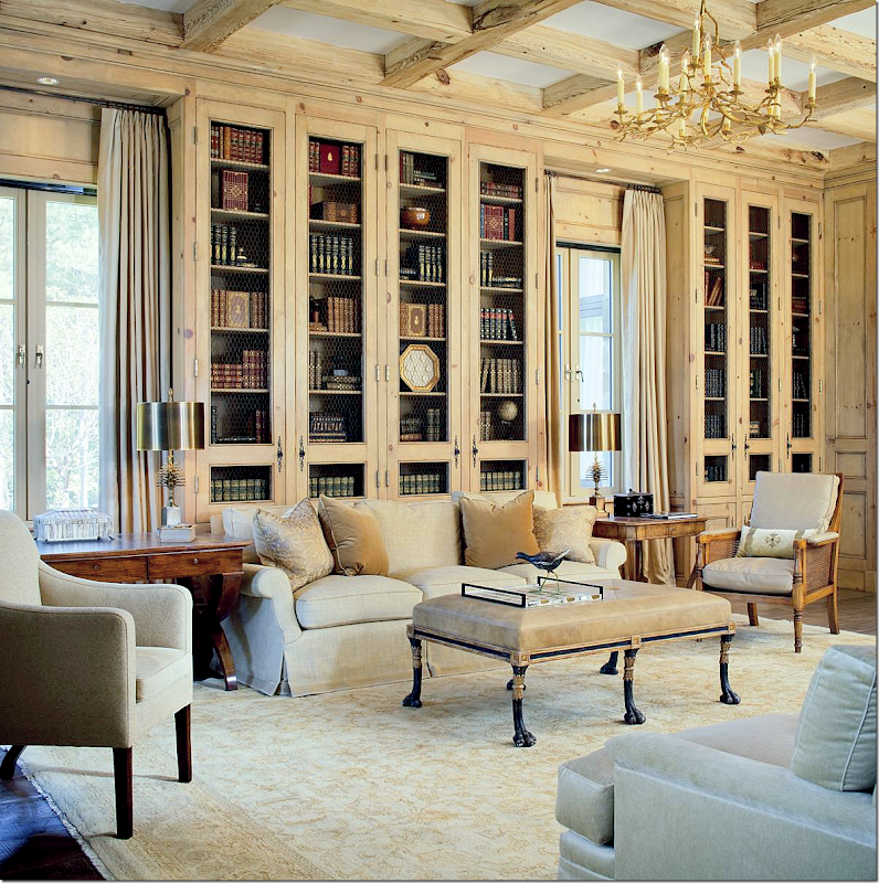
The library is the room the connects the living room to the master bedroom suite.   The wood cabinets were bleached and then chicken wire was added to give it an aged look.  The creams and ivories pick up the color scheme of the living room. 


image

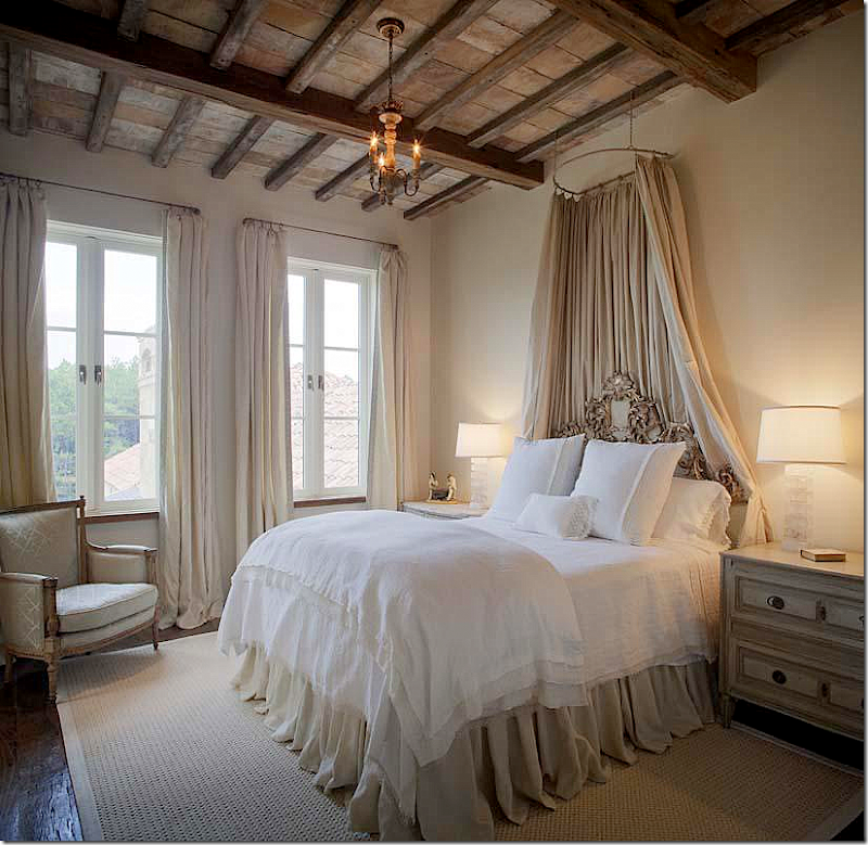
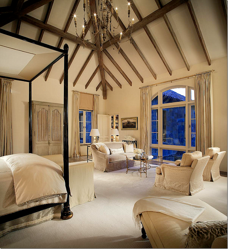
Off the library is the master bedroom suite which overlooks the backyard infinity pool and the acreage beyond.  The ceiling is phenomenal – the beams, as in other parts of the house, are reclaimed.  The Rose Tarlow Melrose House bed creates a room within a room.  Upholstery pieces here and throughout are from the Cameron Collection.  The color scheme of creams, ivories and hints of gold repeats that found in the living room and library. 


image

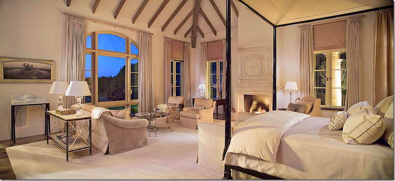
The fireplace features yet another antique stone mantel bought in France.  Notice how the window treatments were designed to bring the casements up to the ceiling line by utilizing shades placed under the rod instead of the window.


image

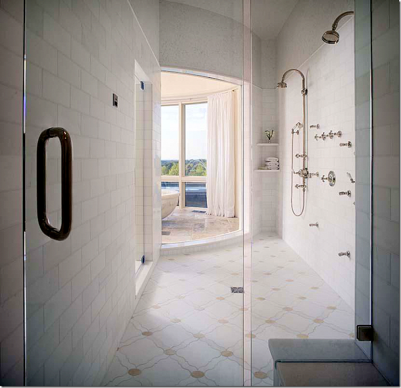
The bathroom features a large his and hers marble tiled shower that opens off the bathtub.


image

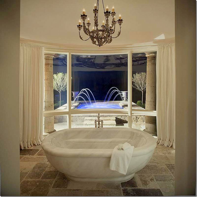
The MARBLE tub!  Amazing.   The bathroom has its own garden and fountain.


image

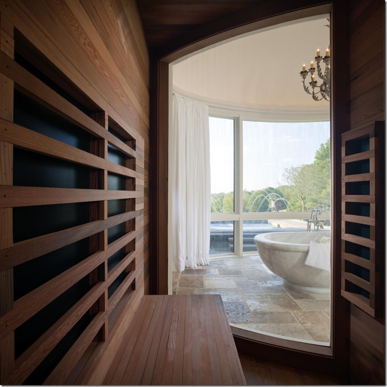
There is also a wood sauna (natch!) 


image

Her closet is filled with French antiques, including the mirrored doors. 


image

His closet with wood floors and cabinets resembles a fine men’s shop. 


image

Showing the back of the house again – on the far left, the master bath with its fountain, the master bedroom, the library – then the living room behind the white columns, the outside sitting area with swimming pool and fireplace, the kitchen, the private guest quarters above the family room – and the two guest suites in the Roman temple buildings at the very right.  Underneath, I think, is probably the garage and the basement area.


image

The two guest rooms are housed in their own Roman temple styled buildings.


image

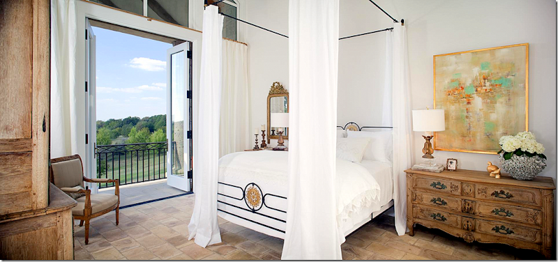
Both guest rooms’ ceilings are raised to the roof line.  They both have stone floors and balconies that over look the countryside. 


image

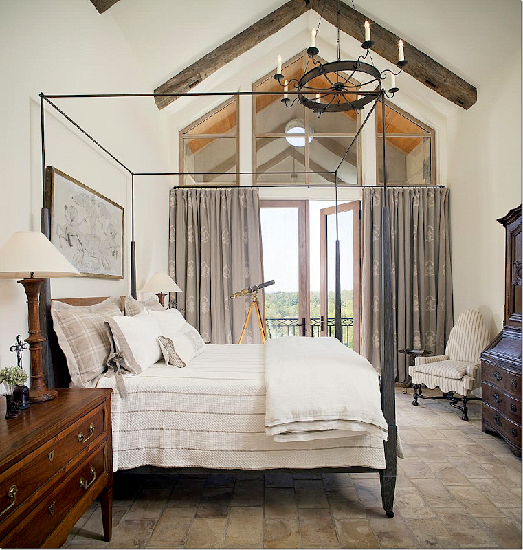
The second guest room is slightly more feminine in feel with its draped bed.  


image

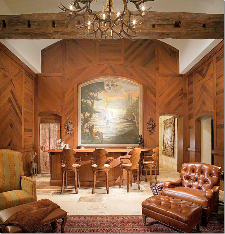
Of course there is a man cave with a bar!   I’ve studied the pictures for days now and can only conclude this must be in the basement area around where the garage is.  Not sure, but if you have a better idea – let me know.


image

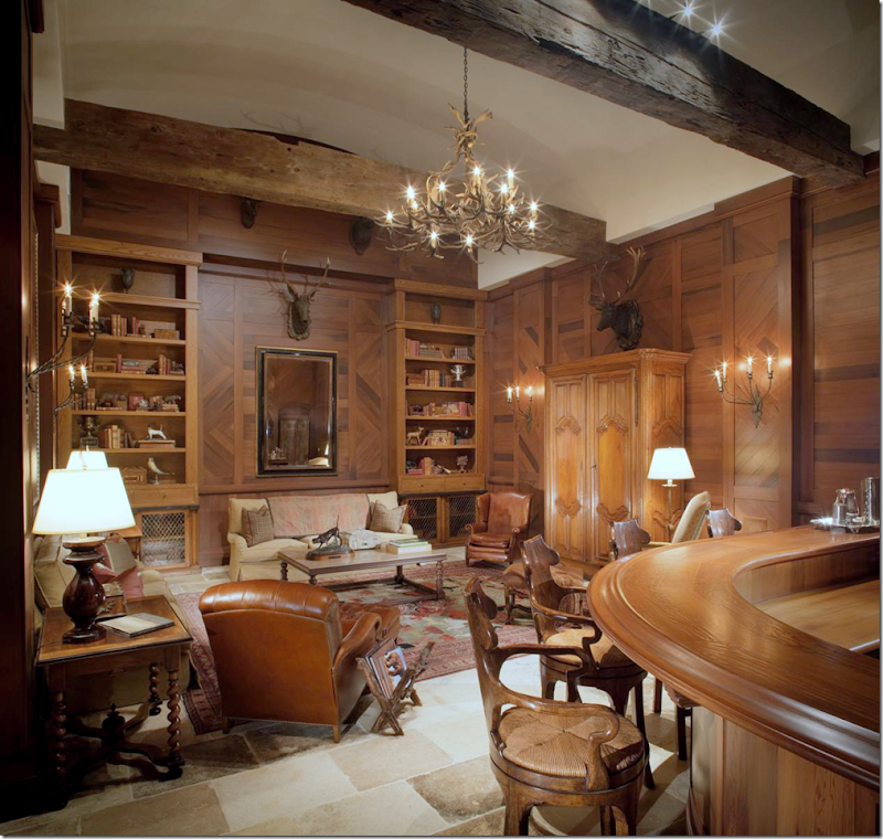
The sitting area in the man cave. 


image

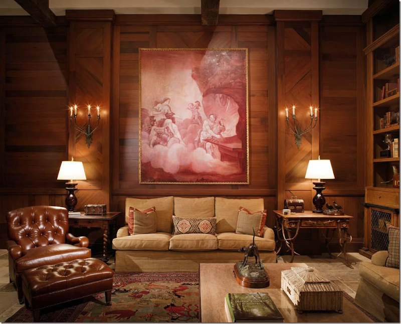
The leather chairs and wood paneling give the room its masculine feel.  I love the painting over the sofa!!


image

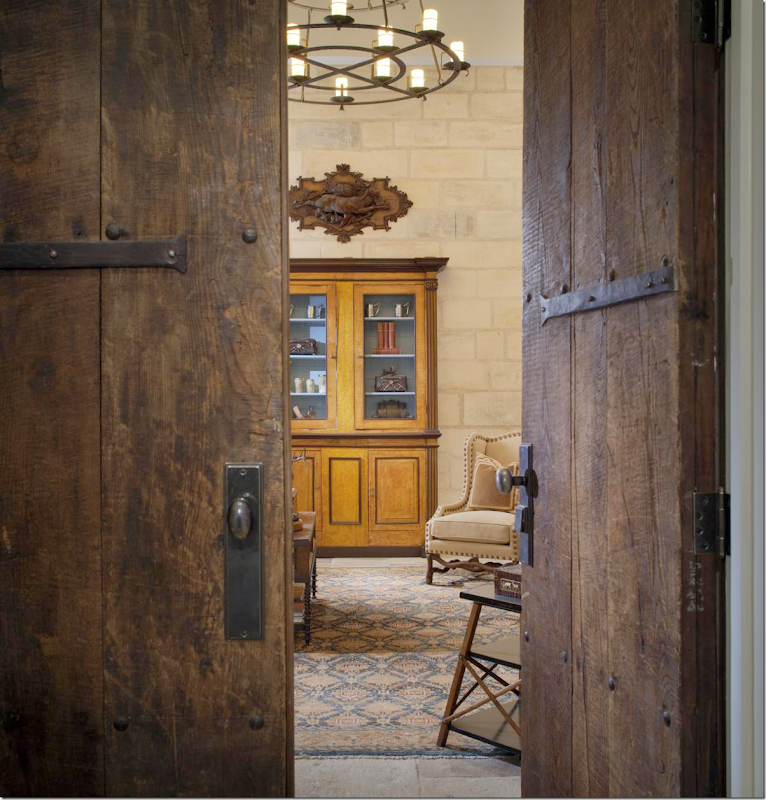
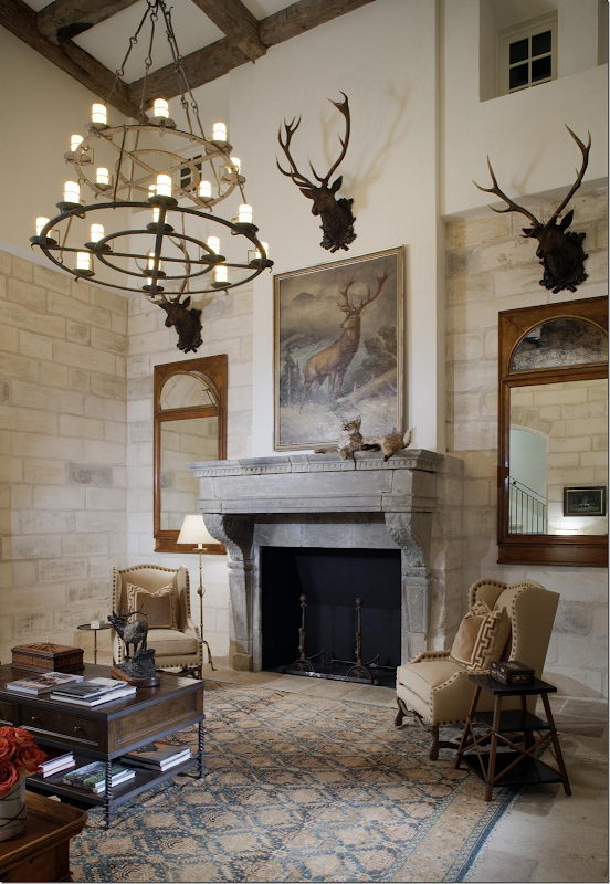
Behind antique wood doors is an office/sitting room that for the life of me I can’t figure out where in the house this is!   I’m going to guess this is near the garage where you enter the house.


image

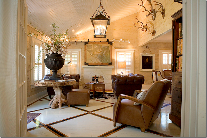
The room has a definite masculine feel to it – with the deer heads and other hunting memorabilia.


image

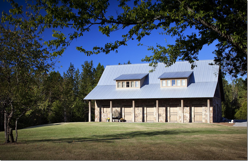
The stables with its metal roof is quite beautiful!


image

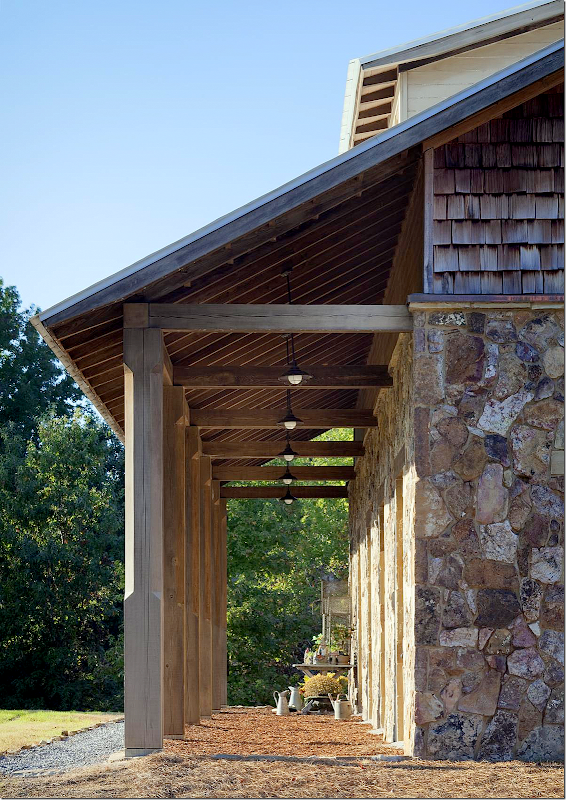
A side view of the columns and roof line – along with its stone walls.  Even the barn has fabulous architectural features – nothing was left untouched, no detail was left out.


image

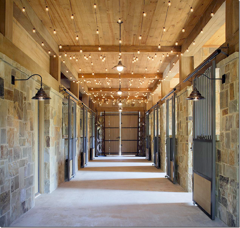
Inside, charming lighting gives the stables a festive vibe.


image

Upstairs – over the stables is a guest house (can I just live here?)  Yet, another beautiful space.  Notice the ceiling and the kitchen cabinetry. 


image 

And finally, the living area in the stables.  There is also a bedroom and bath.  I like the blue trim on the curtains that picks up the blue of the armoire. 


image

I hope you have enjoyed this visit to Lynnstone!   Are you exhausted?  I am!  I worked on this for four days!!!

A huge thank you to the esteemed architect Mr. Kevin Harris.  For more information on Harris, go HERE.

Please visit interior designer Annelee Primos HERE.

All photographs by Chipper Hatter, used with permission. For more information on Chipper’s photography HERE.

 

A Holiday Weekend Giveaway!

206 comments


image

The Cotton Eye Joe at the Sayles Ranch Guesthouses

You may remember about two years ago, Cote de Texas had a giveaway for a weekend at the Sayles Ranch Guesthouses in Abilene, Texas. The owners, The Browders, had just completed their newest addition to their guest houses, the “Cotton Eye Joe” and wanted to celebrate it with the giveaway.  Terry Browder did much of the renovation himself – and judging by the comments, everyone loved it.  Since that time, Terry has been hard at work on two new guest houses – The Dance Hall and the Cottage Clare.   He has generously donated another free weekend to the winner of this latest giveaway.

Located in Abilene, Texas, the Sayles Ranch Guesthouses offers a luxurious alternative to travelers.  Instead of staying at a local hotel or motel, visitors stay at one of their private houses – each restored by Terry.  All of their properties are located about five minutes from downtown in the National Register of Historic Places neighborhood called Sayles Boulevard.  The guest houses come in all different sizes, and each is uniquely decorated, no two are alike.   

The idea for the Sayles Ranch Guesthouses was born 8 years ago when the Browders realized there were only a few chain hotels such as Hampton Inn and Holiday Inn in Abilene – a moderately sized city of 120,000.   Terry felt there was a need for something “more” for travelers to his city.  He and his wife began by buying their neighbor’s house – which they remodeled and furnished and rented out on a nightly basis.  They now have 10 furnished guest rentals (with one new one currently being restored) – all within a 2 to 3 block area!  Amazing!! 


image

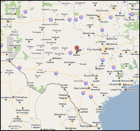
 Abilene, a gateway to the west, is located in the middle of Texas, between Ft. Worth and Midland.    Last year, one of my besties stayed at the Sayles Ranch Guesthouse when she drove home from Aspen to Houston.   It was the perfect place to break up the long drive from Colorado.   Abilene has many guest attractions, including a zoo and the world famous Frontier Texas museum.   And there are lots of antiques stores for those who like to shop!

Here is a look at the two newest guest houses.  The winner will have her pick of either one for the weekend stay.

I.  Cottage Clare

IMG_0645

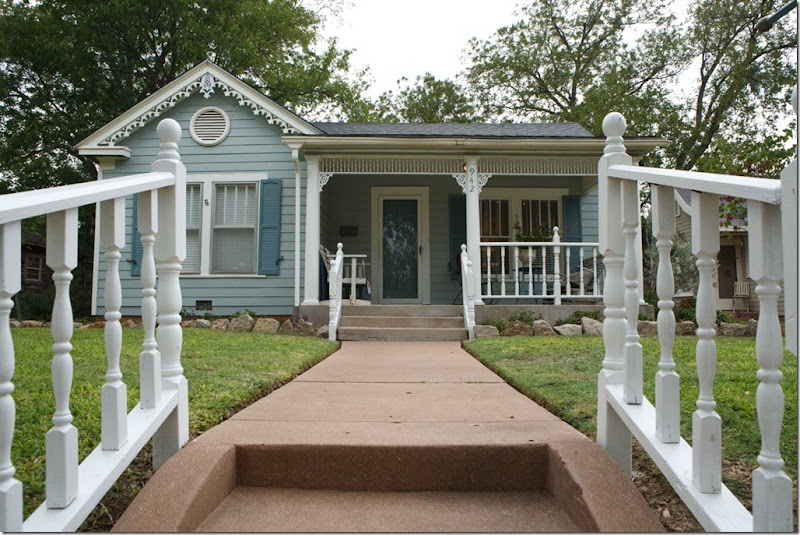
The newest edition to the Sayles Ranch Guesthouses is the charming Cottage Clare.  The turquoise and aqua colors hint at what is inside.


IMG_0646

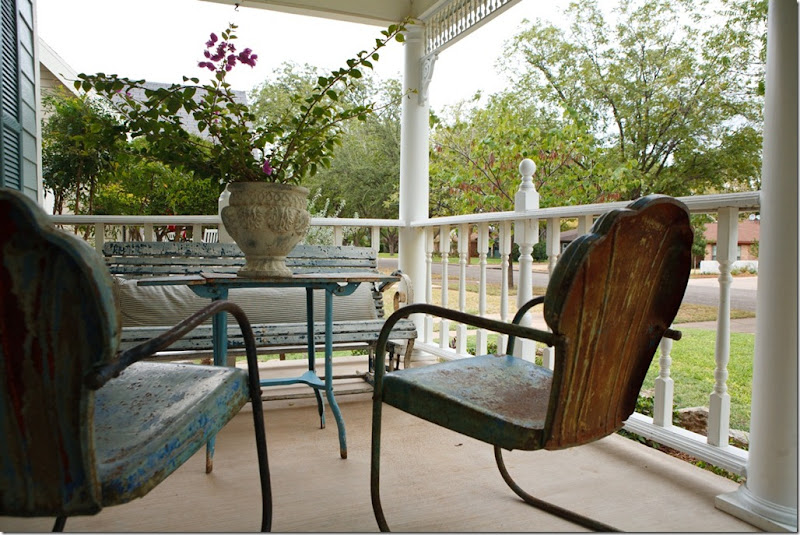
The front porch has vintage furniture which overlooks the quiet, historic neighborhood.


photo1

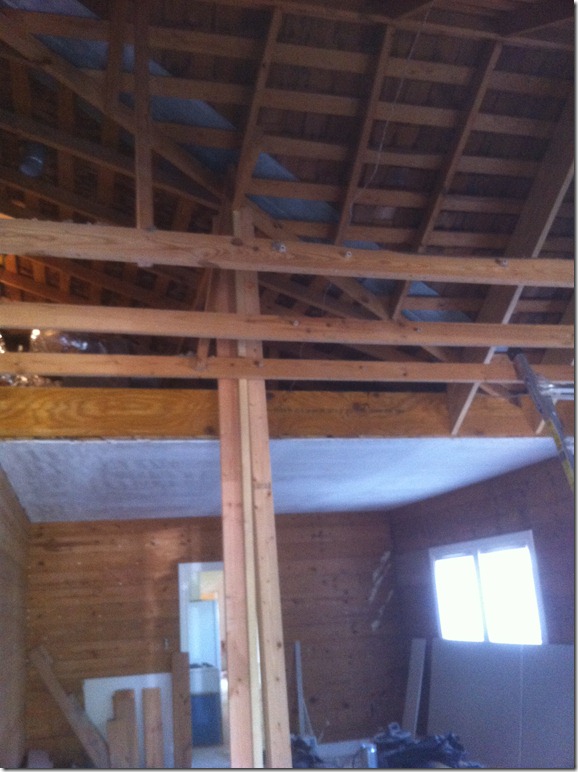
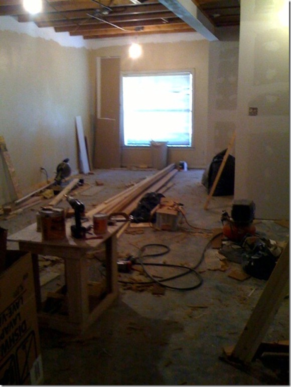
BEFORE:   Of course, like all the properties, the cottage started out like this!  The roof in the living room was raised to the rafters.


IMG_0330

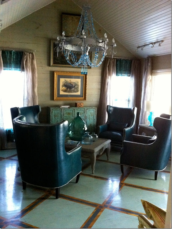
Today, the cottage is a homage to turquoise!  At 1800 sq. ft., the 1938 cottage was named after the Browder’s daughter Clare.   It has 3 bedrooms, 2 baths, a living room, family room, dining room and a kitchen.  The ceilings were raised in this room to make the area appear larger.  Terry found the chandelier and added the turquoise beads to it.  The wood floors were painted on a diagonal to visually expand the space.  The teal leather chairs came from Z Gallerie.


IMG_0534

The bench came from a railway station.  So cute!  Love the tiled art work above it.


IMG_0539

Past the living room is the dining area with its Victorian settee.  The toile print was used throughout the ouse for continuity.   The 19th century dresser was limed gray.


IMG_0544

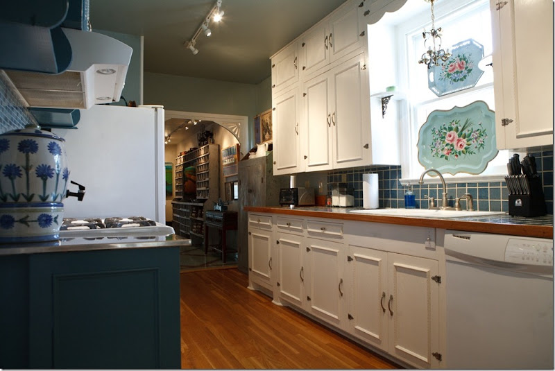
In the kitchen, Terry chose to keep the original cabinets because they still look good and fit right in with the décor. 


IMG_0553

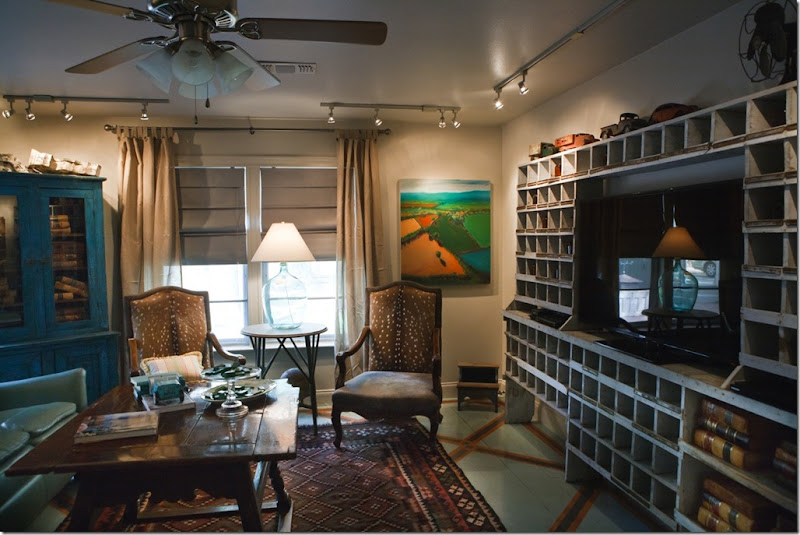
Through the kitchen is the family room, a newer addition, where the painted floor is continued. The large piece is a vintage post office cubby!! Wow. What a statement!


image

Love the high coffee table too. Terry told me this piece is 17th century. No wonder my eye went right to it. It’s an old Jacobean pub table, pegged and mortised – there are no nails. It’s beautiful and really adds character to this room. I also love the sign above the sofa. The wicker chair is an old Ethan Allen piece that Terry painted gray. I swear – I bought this same exact chair for a client (maybe we should paint hers too! hmmm.)


IMG_0569

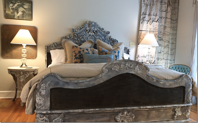
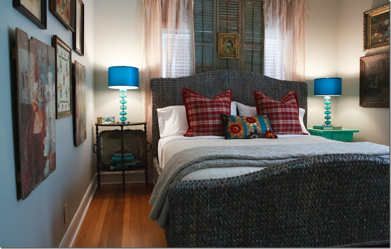
In the master bedroom, the new reproduction bed was painted gray. 


IMG_0590

The second guestroom has a comfy bed, again it was painted with a gray wash to soften its color.  There are 3 bedrooms in the Cottage Clare.


IMG_0610

The guest bath got a darling new, painted console for the sink.  Cute chandelier too!


#2  “Dance Hall”

The second guesthouse, The Dance Hall, is quite different than the other guesthouses – it began life as a 1950s two story ballet studio.  The Dance Hall takes up the lower level of the building and is just 750 sq. ft.  This guest house is perfect for a smaller group – although it does have two bedrooms and a kitchen.  The upstairs space is The Hay Loft, which is also a part of Sayles Ranch Guesthouses.  A large group that wants privacy could rent out the downstairs and upstairs unit.


photo-40

The dropped acoustical tiled roof was removed and the ceiling now reaches 10” – a great luxury.


IMG_9667

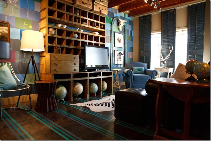
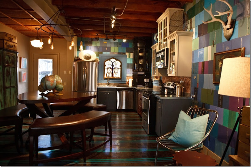
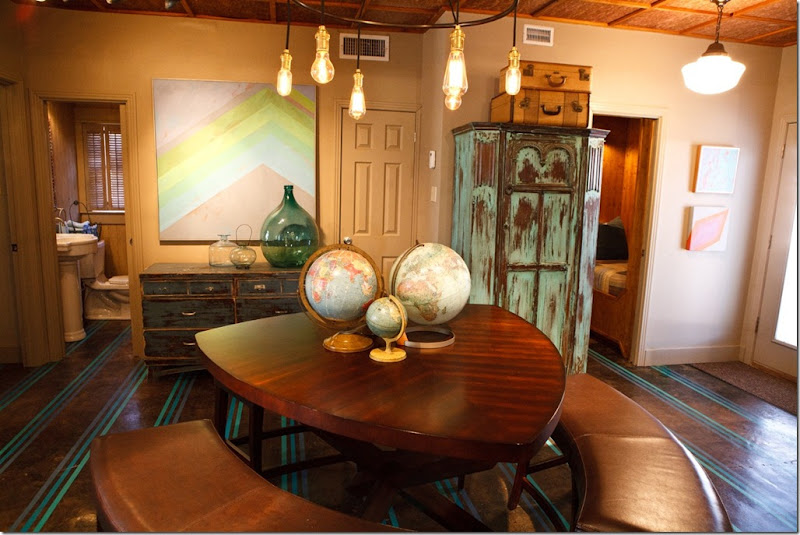
Today, the space has a “loft” like appearance.  The tiled floor was removed, exposing the concrete foundation which was painted with stripes.   Doesn’t it resemble a rug?   The cubbie entertainment center came from a turn of the century hardware store.  Love the globe collection – it gives a great vibe to the guesthouse.  Notice the walls – they are book covers!  Terry used this same idea in the Cotton Eye Joe guesthouse, but here he color coordinated the covers. 


IMG_9671

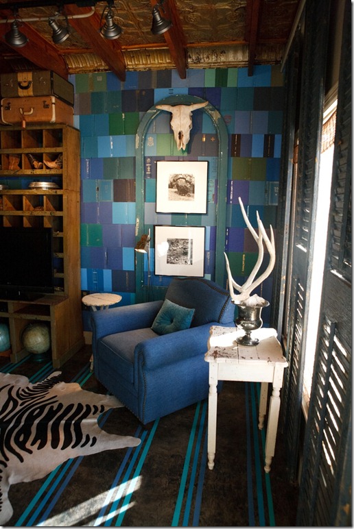
Here you can see the book covers on the wall.  What happened to the pages of the books?   I’ll show that later!


IMG_9674

And looking the other way – towards the dining area and the kitchen.  On the right – before the kitchen, you can make out a jib door that leads into the utility room.  It is hidden in the book covers!!


IMG_9682

The table and benches are in the middle of the living/kitchen area.   The table is shaped like a guitar pick.  Notice the chandelier has Edison bulbs to give it a high tech look.  You can see one of the bedrooms and the bathroom in this picture.


IMG_9680

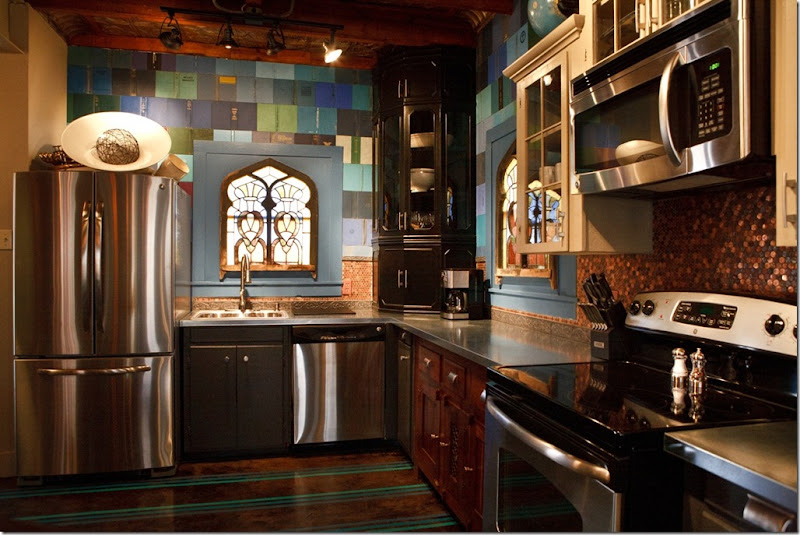
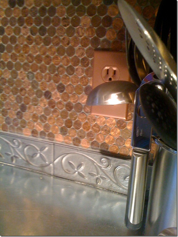
The stainless steel appliances and metal countertops are also high tech looking.  Notice the backsplash – it’s pennies!!!  Terry used 2,700 pennies for the job – costing only $27.00.  Stained glass windows are used for privacy from the nearby street.


photo (2)

Here’s a closeup of the pennies backsplash.


photo-23

Where in the world would Terry use these doors from a 1957 Chevy pick up truck? 

IMG_9685

Headboards in the master bedroom!!!


IMG_9687

Since the truck is the same age as the ballet studio – and they were turquoise – Terry said he had to use them somewhere.  Too cute!!!


IMG_9676

This 8 x 10 area serves as the guest bedroom – perfect for kids.


image

In case you were wondering what happened to the pages from all the book covers used on the wall – well, here they are!  Terry put all the pages in this bookcase found in the upstairs unit – The Hayloft.

So, now that you have had time to look at the two newest properties, be sure to check out the Sayles Ranch Guesthouses website – to look at ALL the properties.  Be sure to check out the The City Slickers.  That one is huge and really pretty!   There is one more new guesthouse coming soon – the original Sayles home built for the original Sayles family.  Built in 1889, it’s a Queen Anne Victorian and has six bedrooms.  I can’t wait to see that one!

The Browders much have so much fun – running a “hotel” in their neighborhood.  It’s an interior designer’s dream come true to own so many houses that you can decorate in all different styles.  I would love to do this!   This would be a great idea for someone who lives in the Heights in Houston, or in Galveston – in one of their historic neighborhoods.

GIVEAWAY:

To enter the giveaway – One Free Weekend at either location – The Cottage Clare or The Dance Hall - please visit the Sayles web site and let me know which one of their 10 guest houses is your favorite.  Then, come back here and leave me a comment telling me your favorite guest house.  That’s it!

The winner will get to pick the weekend stay at either the Cottage Clare or the Dance Hall.

The Sayles Ranch Guesthouses web site is at:  http://www.saylesranch.com/our-homes/

Be sure to look at both page 1 AND page 2 of all the different guest houses.

The contest ends Friday night at 11:59 p.m.


A huge thank you Terry for your generous giveaway!!!

A Material Girl Before & After in Dallas

75 comments


image

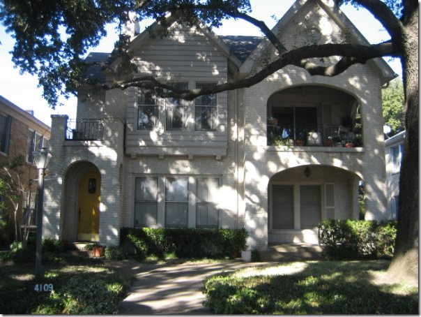
Before and After:  Exterior of the duplex located in Dallas.

Through the blog, I get a few emails requesting design work.  Unfortunately, many requests are for houses not located in Houston.  Since the blog takes up so much of my time, I no longer am able to travel far from Houston for design work.   When a reader doesn’t live here, I try to recommend a local designer, if I know of one.  If not, I’ll recommend a designer who does online decorating.   Such was the case with this one reader who wrote that she was moving from Houston into an 80 year old duplex in Dallas. 


image

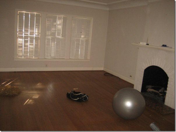
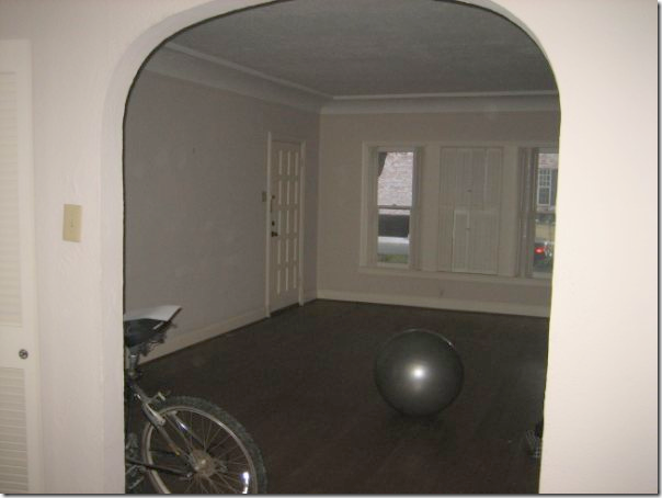
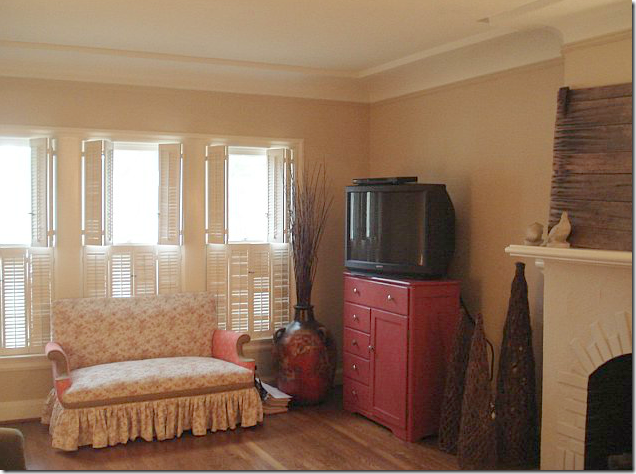
The homeowner sent me these pictures before she moved in to show me what she had to work with.  The duplex had a lot of character - there were hardwood floors and a painted white brick fireplace.


image

Additionally, there were lots of windows and arched doorways, along with a health addicted former tenant.   Despite the exciting challenge, I didn’t think it would be in her best interest to work with me – she needed someone in Dallas that could take her out shopping and then return to the duplex to bring it all together.

I referred her to fellow designer Emily Johnston Larkin of the very popular Material Girls blog HERE.  Emily and her friend Lauren started Material Girls around the same time as Cote de Texas.  Emily wrote about Dallas, while Lauren wrote about Houston.  Today the blog has grown - there are now six Material Girls who write for it from all over the country.   Emily and I had a special bond – both our spouses are named Ben and both are rabid University of Texas fans.   We would email each other with tales of our respective Ben screaming into the TV over some football loss or win.   So, when thinking of a designer to recommend in Dallas,  I knew the homeowner would be a perfect fit with the beautiful Emily.   A positive was that Sarah, the homeowner, and Emily are closer in age and probably closer in design aesthetics.  After I made the referral, I didn’t think of it very often.  I didn’t even know if they ever connected until a few weeks ago when Emily emailed me with photographs of the finished living areas!  I was very pleasantly stunned – to say the least.   Emily said she wanted to keep it all on the q-t until the job was over so that she could surprise me - and surprise me, she did. 
 

image

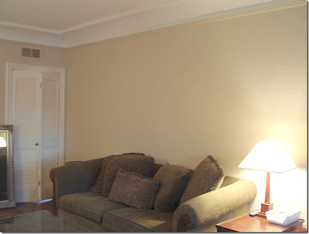
Here are the before shots of what the duplex looked like after Sarah had moved in and before Emily was hired.  She owned a cute settee, along with a persimmon painted chest.


image

There was a green sofa in the living area.


image

After moving in, the one change Sarah made was to paint the walls a soft khaki color.  Notice the pretty cove ceiling.


AFTER:


image

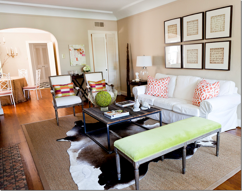
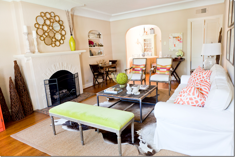
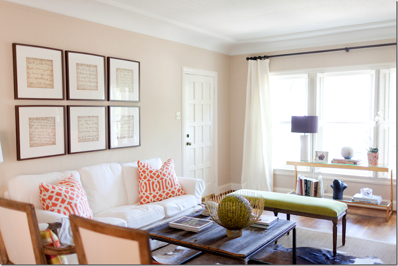
And here is what it looks likes today – thanks to Emily!  What a transformation!!!!   Wow. 


image

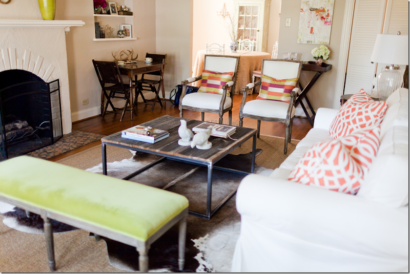
Another view of the living area and into the dining room.  I love the color scheme – the white upholstery mixed in with pops of chartreuse and bright orange.  The color choices makes the room look youthful and hip.


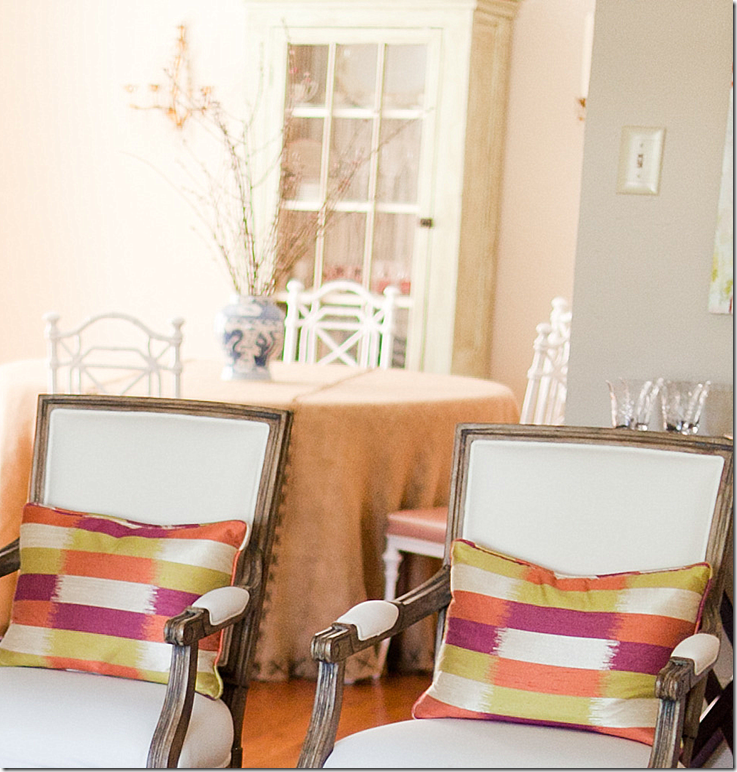
Here’s what Emily had to say about the design scheme.  The homeowner, Sarah, didn’t have a huge budget, so Emily mixed high and low elements to get as big of a bang as possible.  The cowhide rug was Sarah’s, so that was a plus.  It was layered over a new sisal rug.  Emily says that Sarah said she liked a “Cote de Texas” look – so she knew Sarah would love the sisal and cowhide mixed with a new white slipcovered sofa from….IKEA!   Yes!!!  The famous IKEA sofa.  Look how good it looks here – at first glance, I didn’t even realize it was from IKEA, I thought they had slipcovered her existing sofa.  But as Emily knows, slipcovering an existing sofa is twice the price of a new $389 IKEA sofa.  Great choice.   She added two new French inspired chairs from Palacek, along with off white curtains from Restoration Hardware.   The French bench also came from Restoration Hardware which was recovered in a chartreuse velvet from Pindler and Pindler.  


IMG_0345

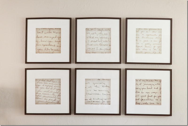
The artwork above the sofa are old handwritten notes from Sarah’s grandmother, mother, and teachers that she has kept all these years.   First, she enlarged the notes on a copier, then she placed them in frames bought from IKEA.  The notes are a wonderful idea – they add a personal touch to the space, plus they look like a big piece of art when framed and hung like this.  Great idea!!!


image

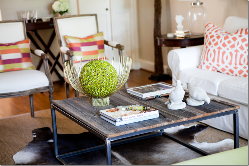
Sarah really wanted a bricklayer’s table but didn’t want to pay a fortune for what is essentially a rustic piece. Her father came to the rescue and made it himself with the help of a welder.


image

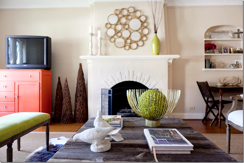
The modern gold bowl came from Stephanie Anne – a favorite store of Sarah’s in Dallas.  This was one high priced accessory – most all other accessories came from Anthropologie and Home Goods. 


image

Emily added glass knobs to the orange chest to dress it up a bit.  Notice how all the greens tie in together.  The orange of the chest is repeated in the pillow fabrics.


image

Restoration Hardware curtains soften the window side of the room. 


image

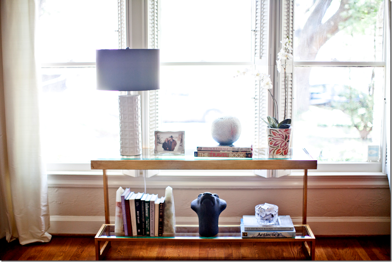
The gold and glass console adds a contemporary touch, as does the white lamp.  I love the touch of lilac found in the shade.


image

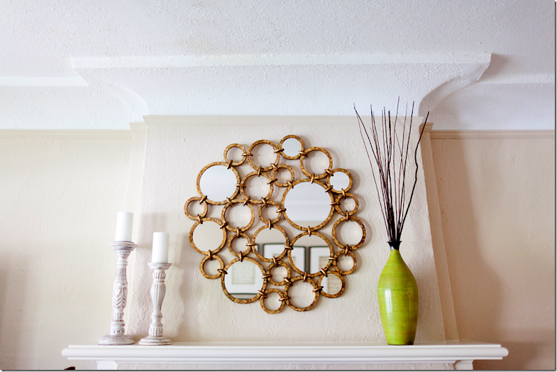
More contemporary touches is the gold mirror from Horchow.  The vase brings in another touch of bright chartreuse. 


image

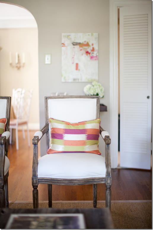
The bright pillow fabric ties in with the other pops of color.  Behind the chair is a commissioned work of art.


IMG_0699

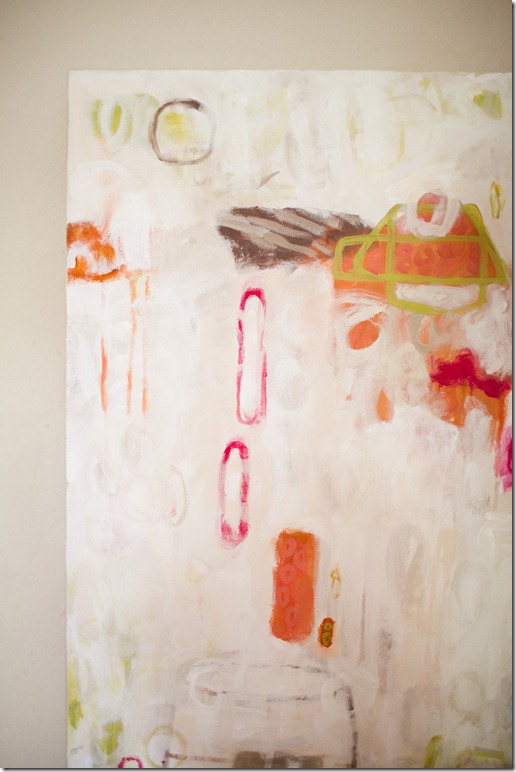
One special touch is the commissioned canvas by Dallas artist Lindsey Meyer HERE.   The art work brings in all the colors used in the duplex.


image

Sarah collects antiques at Round Top and had inherited some from her beloved grandmother – these were used to give the room patina and character.


IMG_0823

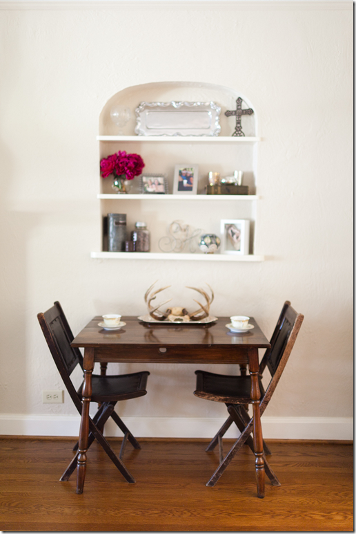
More personal touches are the antlers resting in an old silver tray.  I love this juxtaposition between fine and rustic.


image

I really love monograms – a bowl of matches like this is handy for lighting candles and is a great guest gift.  Other items to monogram are paper napkins, soaps and guest towels.  Pottery Barn has a great selection of gift items that can be personalized with your monogram.


image

A glimpse into the dining area shows a skirted table with a painted white case, sconces and an unseen chandelier.


image

The burlap skirt is dressed up with X stitchery and white painted Chinoiserie style chairs.  Cute black and white tiled floors lead into the kitchen.


image

Emily added this following story about the homeowner:  

Sarah was very close to her 101 year old landlord, Katie, who passed away this past summer while we were working on her living room (Katie had lived in the unit above Sarah since the 1960’s!) At the urging of Katie’s friends, Sarah took ownership of both duplexes. The décor in Katie’s unit hadn’t changed since the 60’s so Sarah and her dad (through blood, sweat and tears J) renovated it. Once they were done, Sarah buried a letter that she wrote, under the floorboards of Katie’s former duplex that told Katie’s story. Her hope was that fifty years from now, another landlord would find it and know how special the duplex was to both Katie and Sarah.


To contact Emily Johnston Larkin, please visit her web site for all the details HERE.   A huge thank you to Emily and Sarah for sharing the story of their before & after!