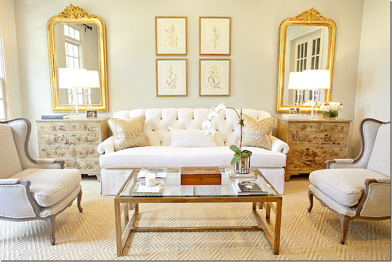
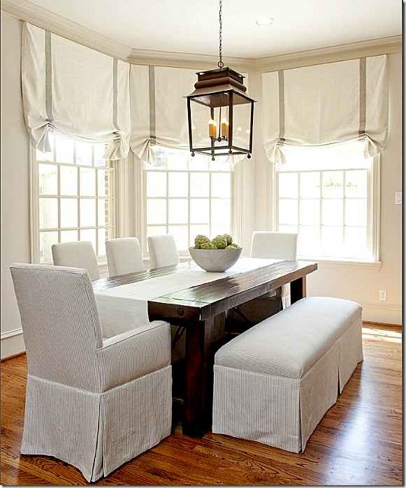
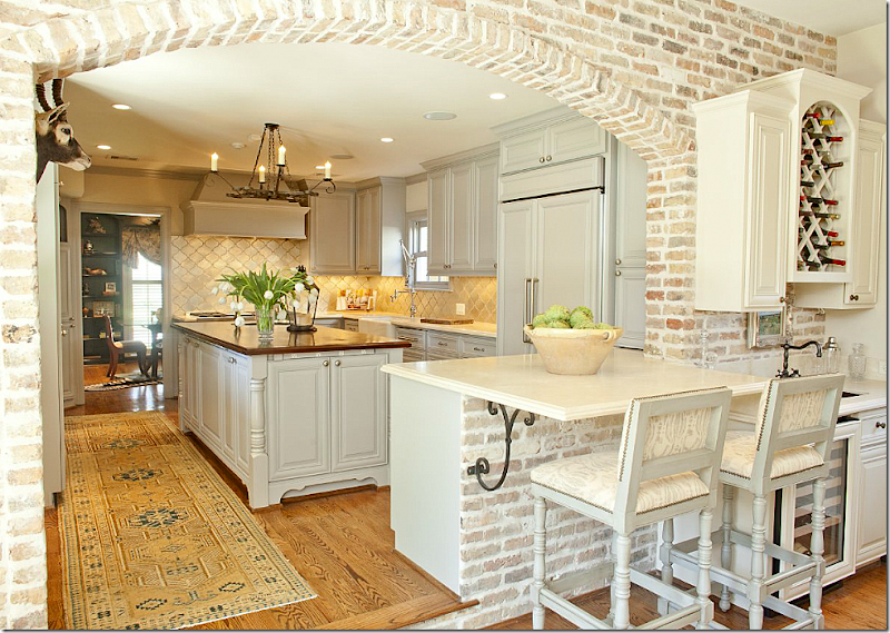
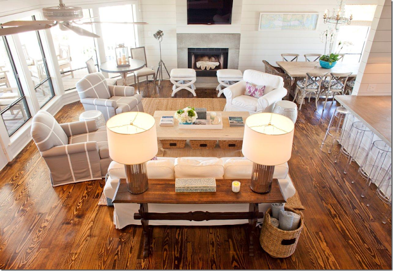
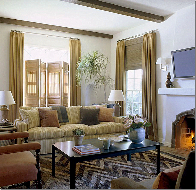
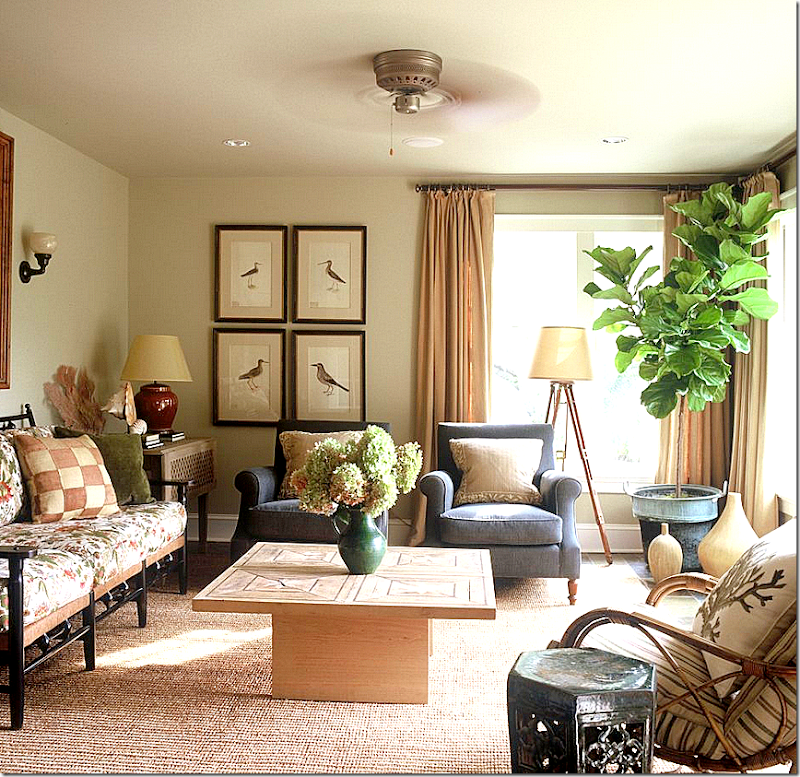
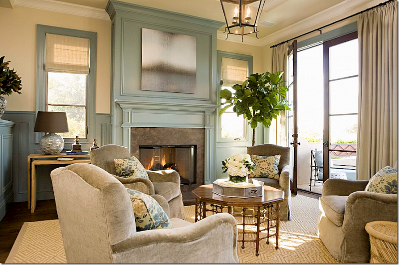
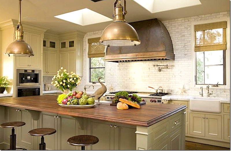
As you can tell, I’m trying to organize different types of stories into “Series,” so from now on, when I show work of an interior designer, it will be under its own “Interior Designers Series.” I’m going to be overhauling the blog in the near future – making it a little more user friendly, amongst other changes, hopefully for the better.
You might recall this beautiful living room shown above. A few months ago, I presented an extensive look into the portfolio of Munger Interiors, a Houston based interior design firm, run by two sisters, Amy and Elizabeth. This particular living room is one of my favorite interiors in their portfolio – an elegant living room updated for a young family. The symmetry is what is particularly inviting, along with the gorgeous tufted sofa.
A number of readers commented on this breakfast room – it was widely received. I particularly love the shades with the gray tape – and the lantern, of course!
This beautiful kitchen was an amazing, total renovation done by Munger.
And this beach house in Galveston, which was a total gut job, was completed in record time. Recently, the Mungers sent me photographs of the latest house they designed and I thought you would you like see it. Enjoy!!!
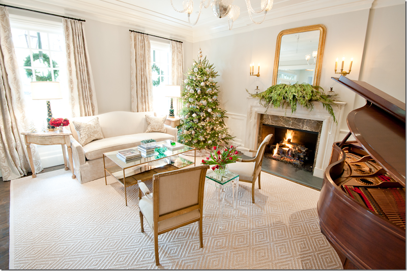
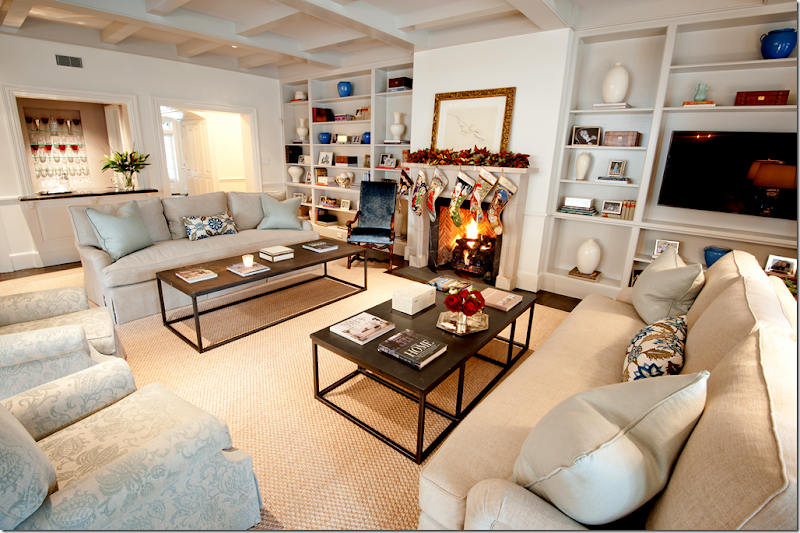
The traditional house is located in Memorial. The Mungers like to create soft, quiet interiors as you can see here. I love the patterned, textured rug that has such a creamy tone to it. The glass tables add a contemporary look to the room. As you can see, the house was photographed during this past Christmas.
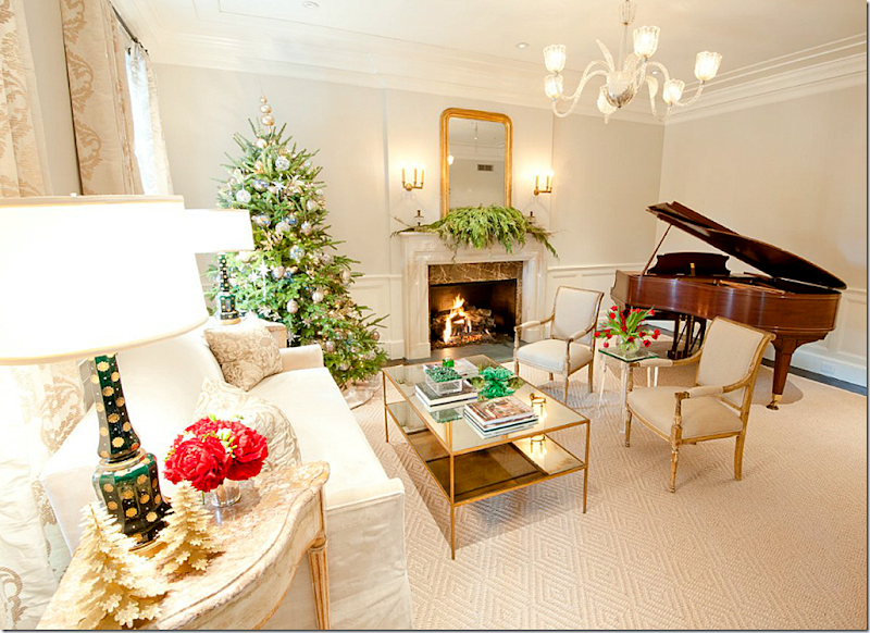
In this view, you can see the contemporary light fixture. The gilded chairs, tables, sconces, mirror and lamps all lend a dressy touch to the room.
A close up of the damask curtains and pillows. I love these matching painted, 3 legged end tables! The pair of green and gilt lamps are the one bright pop of color in the room.
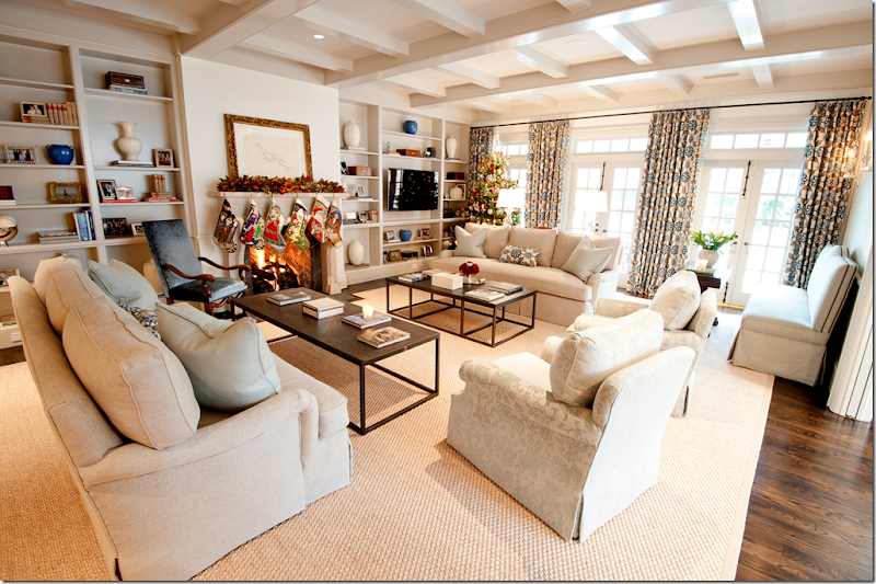
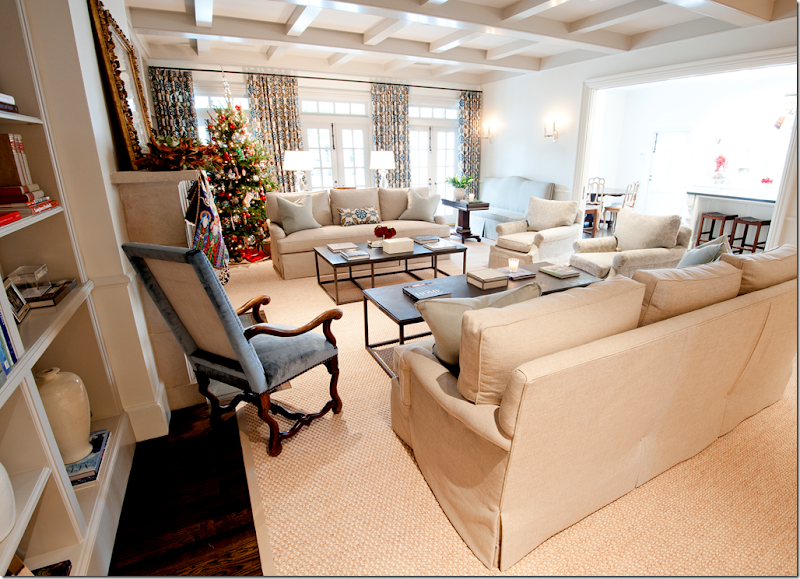
The large family room is located off the kitchen. Again, the room is done in soothing tones of creams and ivories. But here, the curtains add a burst of color in deep blue and caramel.
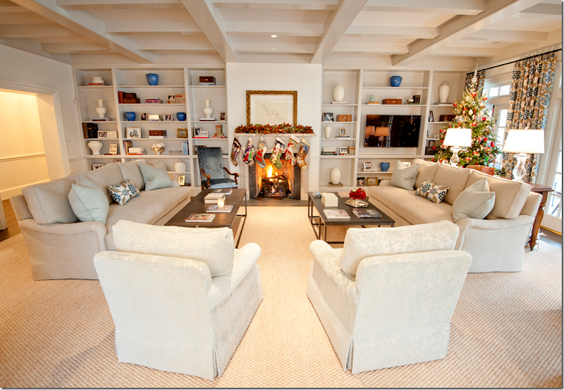
I love the way the Mungers designed this layout with two sofas, each with their own similar, yet different, brick layer styled coffee table.
Here you can see the arm chairs have a tone on tone damask pattern with a hint of blue. Notice the pillows are also a pale light blue. And, here you can see the wet bar behind the sofa.
And here is the view into the connecting kitchen and breakfast room. Notice the antique styled chair next the fireplace, covered in the deeper shade of blue that is found in the curtains. Munger Interiors designs remind me of Phoebe Howard’s aesthetic, both have the same love of quiet, feminine interiors with lots of creams and ivories.
A closeup of the corner showing the custom banquette placed under a set of sconces. Also – here you can see the detail of the curtain fabric.
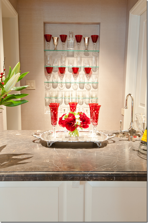
Off the family room is the wet bar – with the homeowner’s collection of colored crystal.
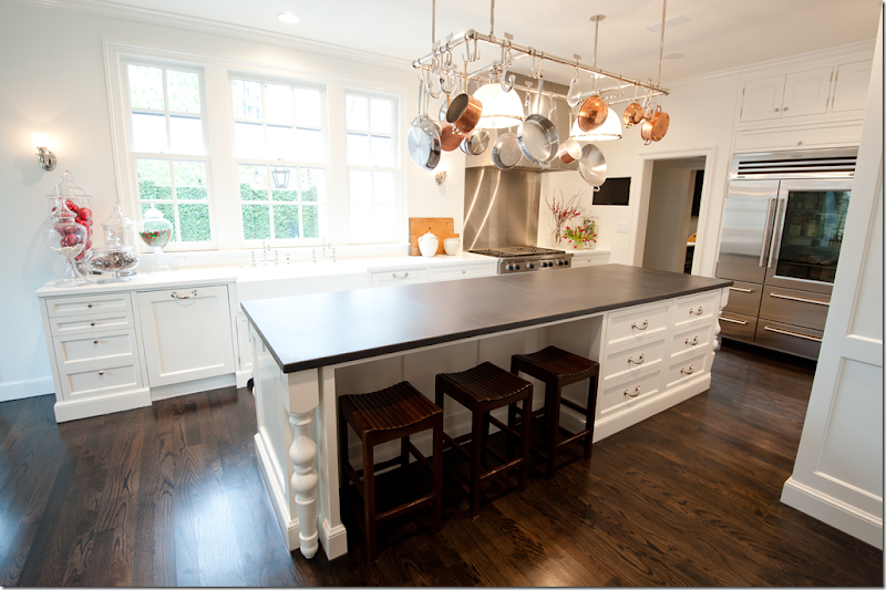
The kitchen is a mix of white marble countertops and black honed granite. I love the bank of windows and the large, industrial styled refrigerator.
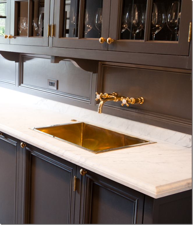
The butler’s pantry is gorgeous – with dark brown painted cabinetry and white marble countertops.
Notice the brass sink and faucet! I wish I had a pantry like this – what a luxury!!
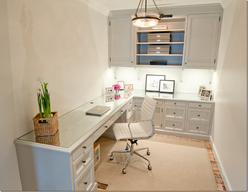
The homeowner’s office off the back end of the house – pretty brick floors.
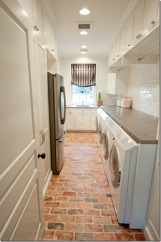
And continuing off the office with its brick floors is the laundry room with 2 washers and 2 dryers! Another great luxury when the kids come home from camp or the family returns from a vacation. Notice the clothes rods for wet or hanging clothes – the backsplash is made of white subway tiles.
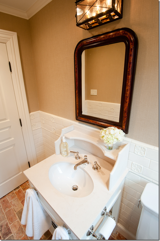
This bathroom, off the back area of the house with the brick floors, has walls of subway tiles along with a charming old fashioned vanity.
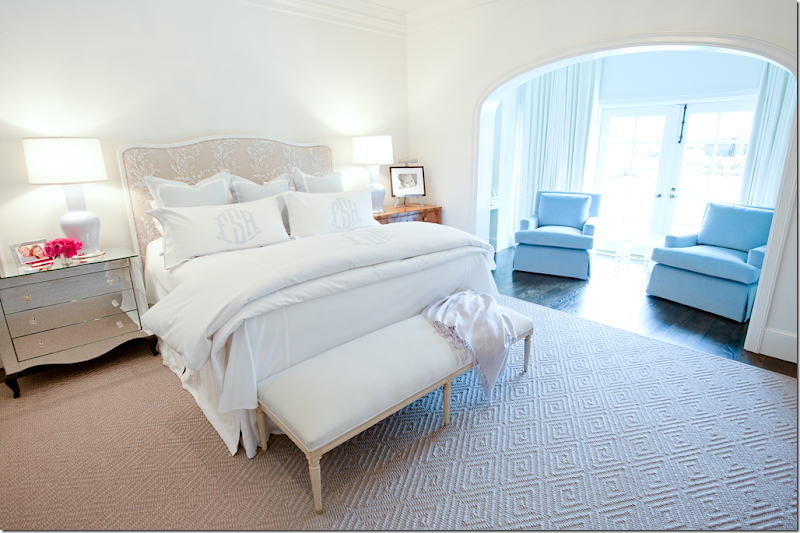
The color scheme found in the public rooms is carried into the master bedroom with its soft ivories, creams and hints of light blues.
A close up of the beautiful monogrammed sheets in pale blue. The lamps also have just a hint of blue in them.
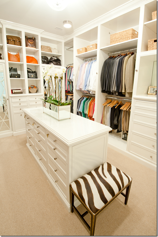
And a glimpse into the master closet with its built in cabinetry. It seems like closets with plain rods are so passé these days!!
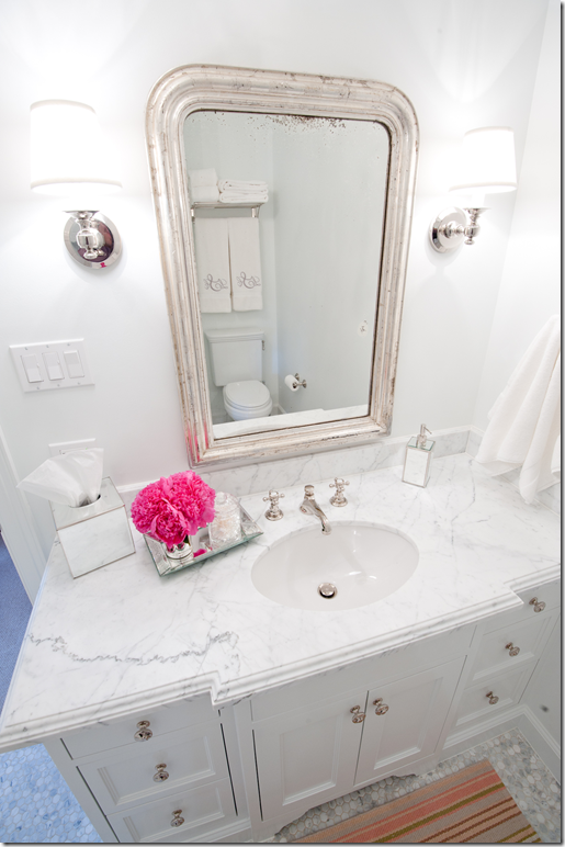
The daughters bathrooms are similar with white marble countertop and tiled marble floors. This one has a silver Louis Philippe antique mirror mixed with sconces.
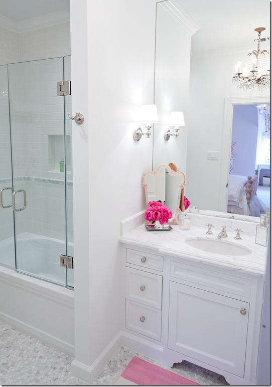
While this one has a crystal chandelier! So pretty!
And finally, in this bath with more white marble, the vanity has wire baskets to hold the monogrammed towels. Again, as in another house recently shown – the bathrooms, the kitchen, and the butler’s pantry all used white marble which ties them together aesthetically. Less decorative choice seems to show a more cohesive design scheme.
I hope you have enjoyed this look at Munger Interiors latest project. Be sure to visit their web site for more photographs HERE, and to read the original Cote de Texas story on Munger Interiors, go HERE.
Next week, we’ll take a look at another designer recently featured here. She, too, has a new project she wants to share. And to all the other designers who have been previously featured, please send in your latest photographs. I think it’s interesting to keep up to date with all your current projects. AND, to designers not yet shown, please consider submitting your portfolio. Many of the houses seen here have been approached by magazine scouts looking for work to publish and hopefully, that would include yours!
INTERIOR DESIGNERS SERIES: Munger Interiors
LUCAS STUDIO STOPS BY THE SKIRTED ROUNDTABLE
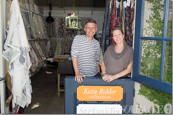
We are thrilled to welcome Joe Lucas and Parrish Chilcoat to this week’s Skirted Roundtable. These two Californian interior designers bring a unique combination to their clients – they are male and female – a rare partnership first made popular by Sibyl Colefax and John Fowler. Together, Lucas and Chilcoat bridge all the masculine/feminine issues when designing interiors, their rooms are a beautiful mix of the two. Lucas and Chilcoat joined forces in 2005 with their firm, Lucas Studio, Inc. and in 2008 opened up Harbinger, their retail showroom, now located on the trendy design street La Cienega in Los Angeles. Both hail from the East Coast, but now have a definite Californian vibe which can be seen in their elegant, yet casual designs.
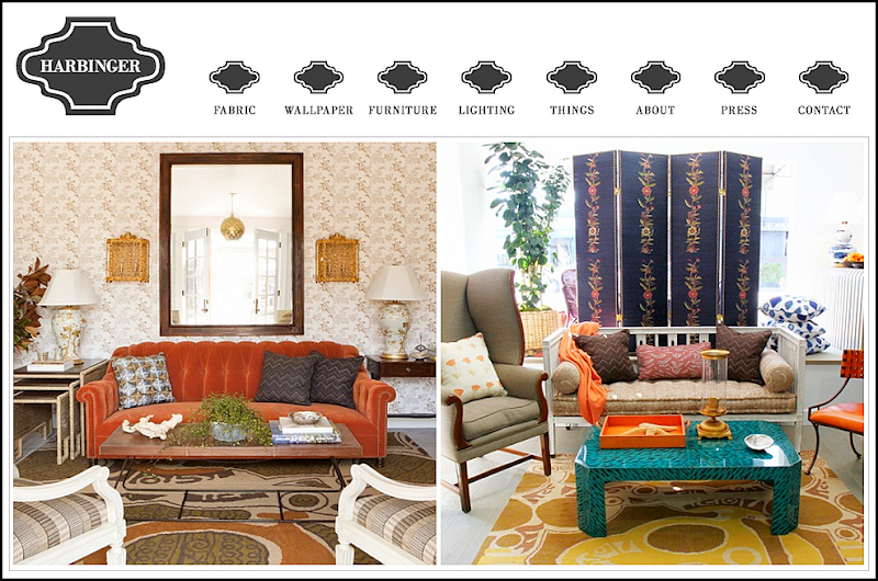
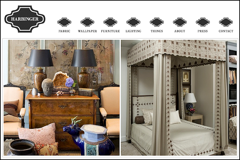
Lucas Studio at Harbinger, their retail showroom.
How Joe and Parrish started in the business is a fascinating tale. They ended up working with the greats Michael S. Smith and Suzanne Rheinstein – both having no design experience to speak of. How can that be? They spill the beans on The Skirted Roundtable – giving it up to all of us who have ever dreamed of working for a top interior design firm.
Since teaming up, Lucas Studios has won all kinds of awards – including those from magazines such as Traditional Home and House Beautiful. The two are effusive and warm – we can only imagine the witty bantering that goes on their offices!!! Below is a look at their stellar portfolio. The link to the Skirted Roundtable is HERE.
House Beautiful recently ran a large spread on Lucas Studio’s California house designed for a 29 year old hockey player: Party Central.
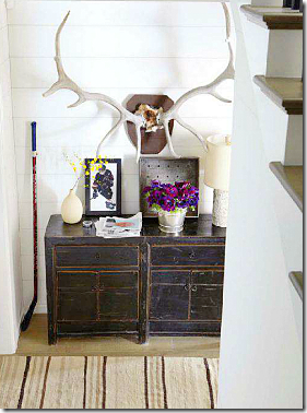
The entry hall – love the oversized horns.
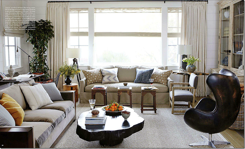
Designing for a man doesn’t have to mean recliners and leather sofas. Lucas Studio prefer to design casual living rooms – for how people really live today. They use natural fabrics – cottons, linens, silks and velvets. But, they state, they start almost every design with a textured rug, such as sisal or seagrass. Here, the leather chair from Restoration Hardware is so sexy looking – it almost becomes the focal point of the room.
Throughout the house, Lucas Studio used painted white paneled walls – with yards and yards of matching white curtains. The curtains were a tough sell for the 29 year old hockey player. But, Parrish doesn’t feel like rooms are finished without curtains (I agree!)
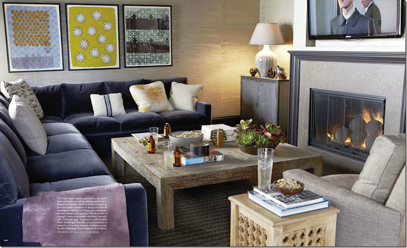
The hockey player plans on entertaining a lot – hence the ‘Man Cave’ with a plum colored velvet covered sofa.
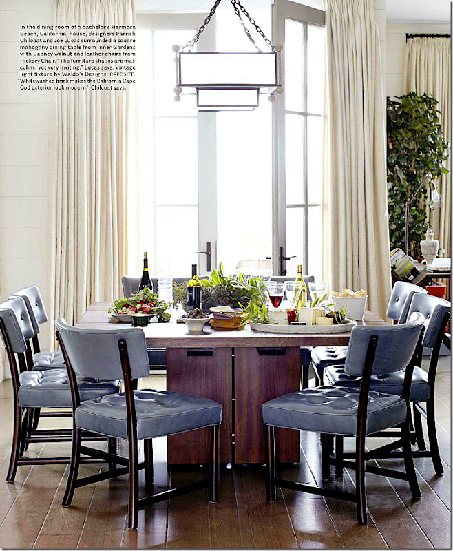
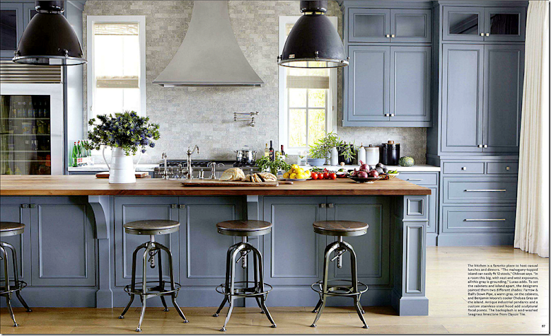
The kitchen is fabulous – painted in two different shades of gray – the island topped with mahogany seats 12. It’s such a beautiful kitchen – and it’s not even white!!
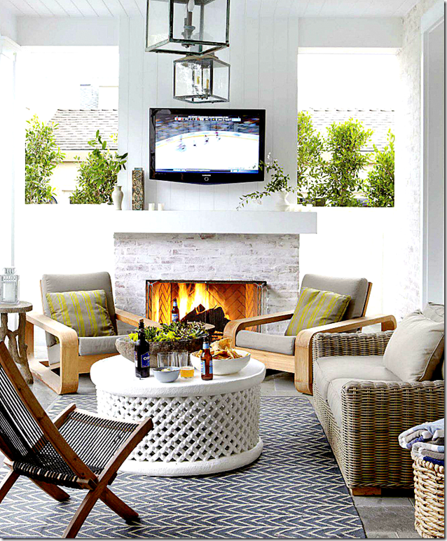
His terrace is designed as another entertaining place – note the outdoors flatscreen.
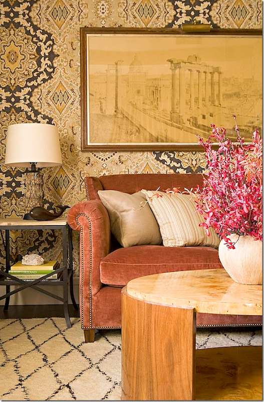
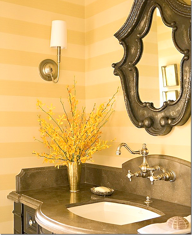
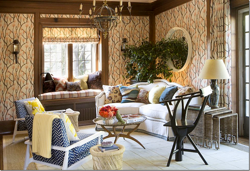
Other interiors from Lucas Studio – this wallpaper!! That art work!! Love it. Lucas Studio use this salmon color in a lot of their interiors. They also use blues and greens a lot.
In this living room, I’m loving the brown and white rug, wondering if this is a dyed skin? Again, the salmon colored velvet – mixed with sage greens.
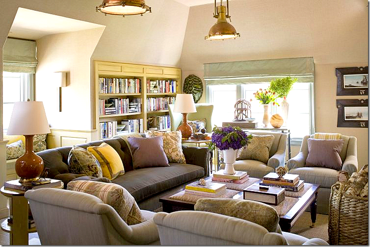
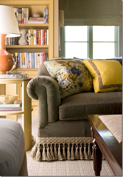
Love, love, love this! This room shows that mix of masculine and feminine elements. Lucas says to enlarge a room – paint the ceiling and walls the same color. Notice the greens and salmons and blues – how wonderful they look together.
Four chairs instead of a sofa. The patterned pillows are the color pop.
Another beautiful kitchen with the wood topped island and industrial styled antique pendants. The slightly oversized pendants are so much more effective than the just-right size.
This family room caught my eye because of the large cork board used as a gallery wall of the children’s artwork.
This might be my favorite of all their living rooms. I love the mix of the rug and seagrass, the textured chairs, the navy sofas with a mix of pillows. The tree stump table brings in a bit of folly. And I love the symmetry of the two lanterns and two sconces. The entire room is a study in symmetry – a decorative element Lucas Studio excels in. Beautiful!!A Lucas Studio powder room – great faucet mounted on the arched stone backsplash!!
At Veranda’s Greystone showcase – Lucas Studio created this room – with fabulous fabric from Ferrick Mason used for wallcovering.
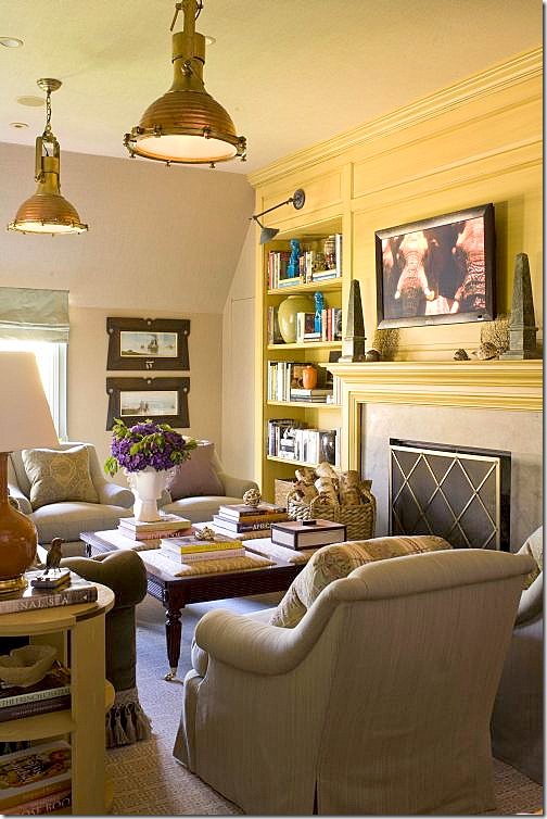
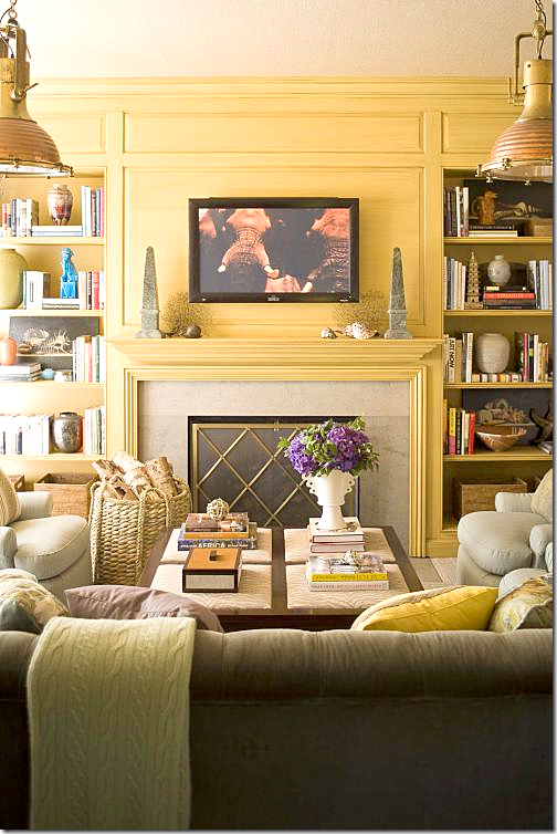
For the Stately Homes by the Sea, Lucas Studio designed these two rooms. The first – a living room – with two industrial styled pendants.
A detail of the sofa trim and pillows.
The fireplace wall is highlighted in yellow, while the rest of the space is wallpapered in a neutral grasscloth.
Notice the coffee table – a cross between an ottoman and a table.
Behind the sofa is a window seat, beautiful shades.
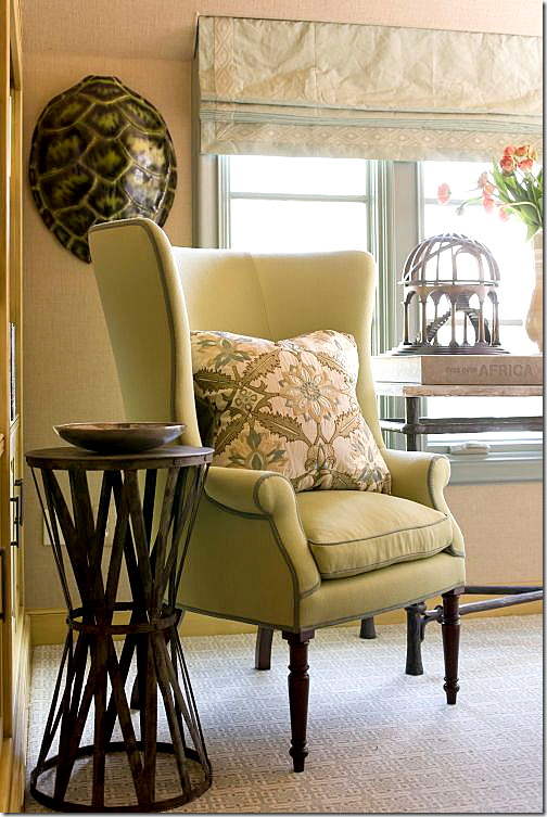
Next to the sofa – a modern take on the wingchair.
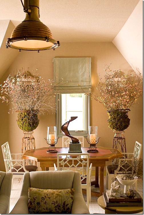
And off to the side – the dining area. Lucas Studio really likes symmetry – which is played up in this area. Beautiful urns and chairs!!!
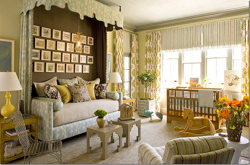
The second room they designed for the showcase is the …?? Can you see what kind of room this is? That’s right – a nursery!!!! Gender neutral, of course. I love the daybed and the canopy. The dark fabric behind the bed makes it look like an alcove or built in bed – great idea to borrow.
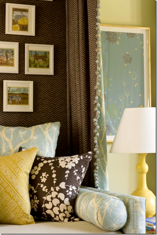
Close up of the bed’s fabrics.
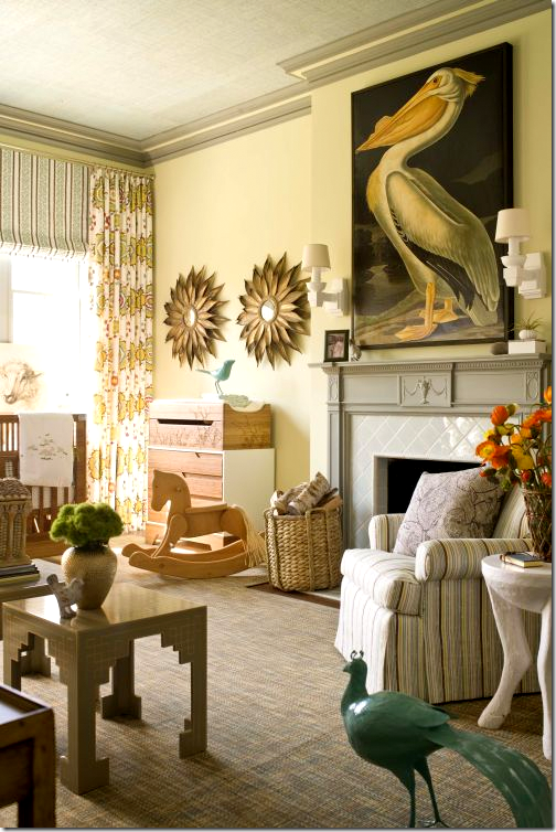
Don’t you wish all nurseries had fireplaces in them? Of course you would never light them for fear the baby would get in the fire somehow. Love the stork with it’s double entendre.
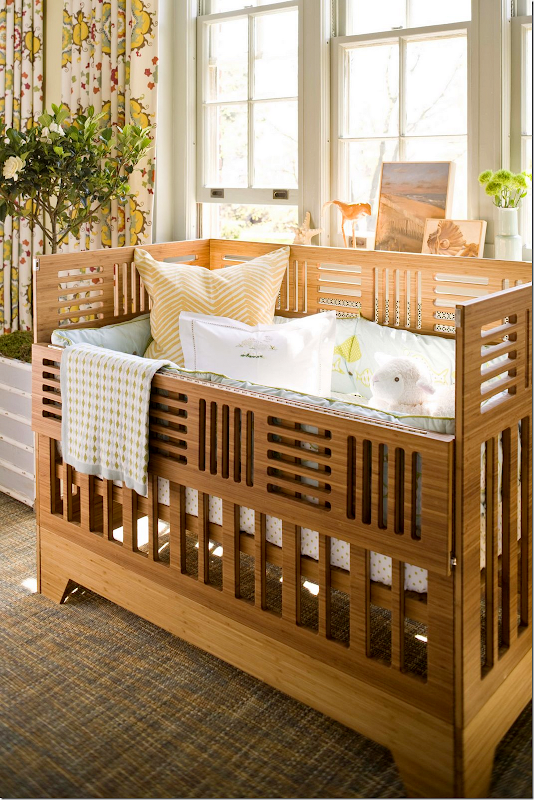
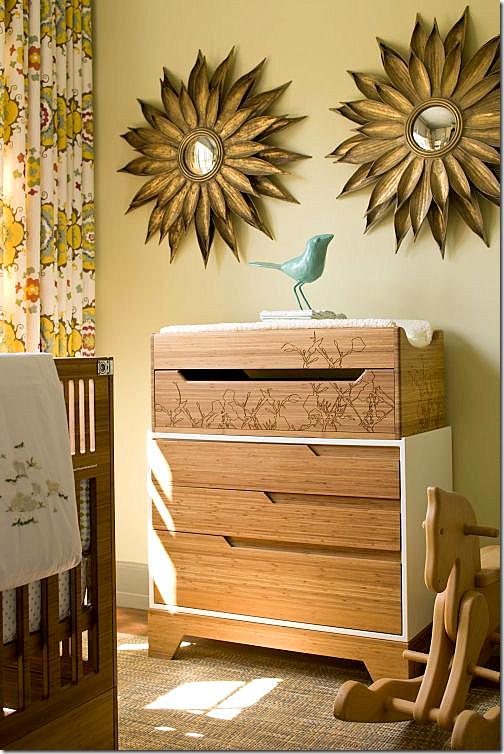
The crib has an Arts and Crafts Movement look to it. Notice the beautiful suzani fabric by Martin Lawrence Bullard used as curtains.
Above the changing table, symmetrical sunburst mirrors.
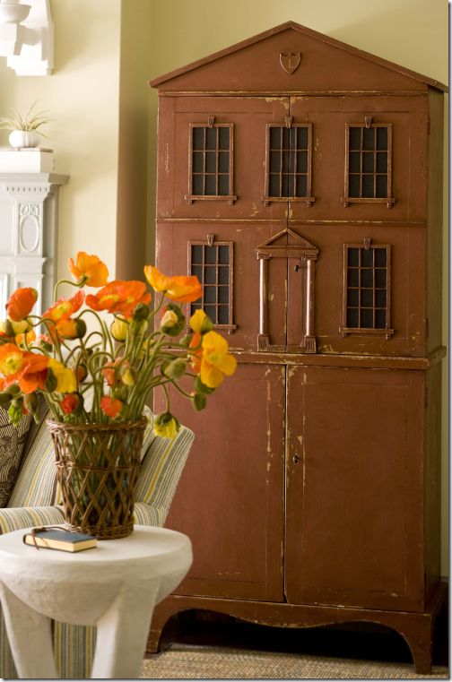
And, an antique doll house sits next to the fireplace. Pictures of the showhouse come from Style Beat’s Blog HERE. Photographs by John Bessler.
Be sure to visit Lucas Studio and Harbinger’s web site HERE – images from the Harbinger shop are shown. Also, there are many, many more portfolio pictures to peruse.
I hope you have enjoyed a look at Lucas Studio’s beautiful portfolio. And a huge thank you to Joe Lucas and Parrish Chilcoat for stopping by the Skirted Roundtable. To listen to their recording, go HERE.

