A few months ago I was contacted by the décor company, Aidan Gray, about becoming a sponsor on Cote de Texas. Usually I don’t bother Ben about the blog (which he never even reads anyway), but this time, I went running in front of the TV, surely interrupting some UT athletic game, screaming – “WOW! Aidan Gray wants to advertise on the blog!!!” Ben looks at me funny and says, “Why would an actor want to be on the blog?” Well, that’s a clueless husband for you. BTW, the name Aidan came from one of owner’s three sons!
I’m sure I don’t need to tell you who Aidan Gray is. I’m willing to bet that the majority of readers have at least one piece from AG in their house. I know I do:
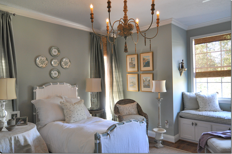
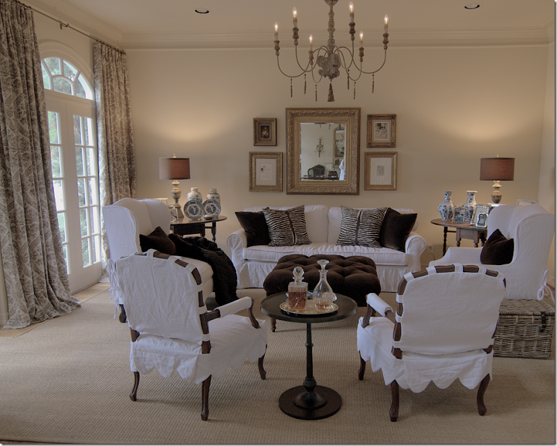
This chandelier by Aidan Gray is in my guest room. This might be my favorite piece from their collection. I’ve used it more times than I care to admit! The price point is so reasonable and it’s so pretty and large, there’s just nothing on the market that beats it.
For this client I used the chandelier AND two AG lamps. I love their lamps and find that for many jobs, I will use AG.
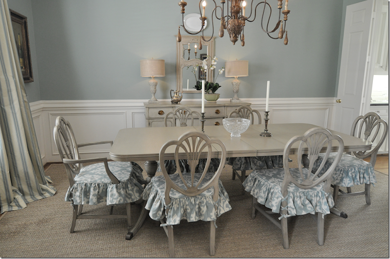
I used two AG lamps, The Fluted Urn, here, in this dining room.
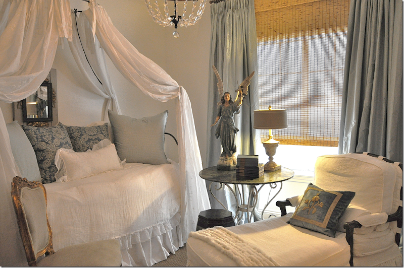
And in Elisabeth’s room, I used this small Aidan Gray lamp that I bought at Olivine. A lot of times when I’m in a rush, I’ll just run over to Olivine and pick up one of the AG lamps that they sell HERE.
Although it seems like Aidan Gray has been in business forever, it is still quite young – founded in just 2003 by Randal Weeks. Armed with an MBA, Weeks had toiled for 15 years in the business world before he decided to branch out on his own, following his passion for design. While his MBA was a huge help in starting the company, Weeks is quick to give his wife Sally credit for making AG the success that it is. It wasn’t until 2007 before Sally could quit her job as a medical representative and work full time as a partner at AG. Prior to that she was the family’s primary breadwinner while AG was taking off.
For this client, we used a pair of AG lamps and their round table, which is now discontinued. (Mimi! You need to come meet Lucy and Riley!)
Randal and Sally were both heavily influenced by Europe when they began designing their line. Striving for authenticity, they wanted their products to rise above the ordinary found in parts of the décor market. They wanted their products to reflect the craftsmanship of handmade items, using wood, rustic metals and painted finishes. Quality was a very important goal.
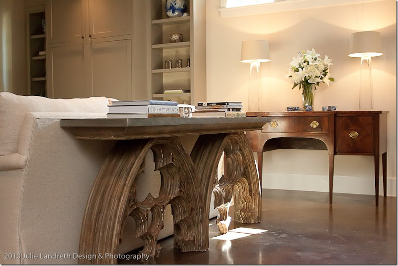
In this house I showed two years ago, this Aidan Gray console generated a lot of comments. I think this might be their most famous piece. Every loves it!
Aidan Gray started small, but over the past decade, the AG line has grown to be quite large. Where before lighting and garden products were the mainstay, today there is a furniture line and now an upholstery line. Recently at the High Point market, AG launched a new chair line, which Randal has been so kind to let me show you today! They photographed the chairs at the Week’s beautiful home. You can guess that their house is filled with AG product. Can you imagine just going to the warehouse and picking out what you want to take home?! I think I’m in the wrong business!! Randal tells me that the new line is very competitively priced – something we can all use in this economy.
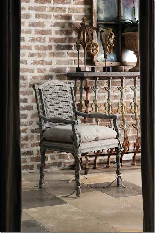
First off, is this new chair – the Ferrell dining chair. I am so in love with the ballet ties! And I love that they are referred to on the web site as “ballet ties!” Little things like that make me happy. Notice how long the ties are – they gracefully slide down to the floor. No skimping here! The ultra deep cushion is loose, another detail I love. Behind the chairs are some new items from the accessory line:
Here’s a close up of the carved architectural element pieces – the five pieces come as a set.
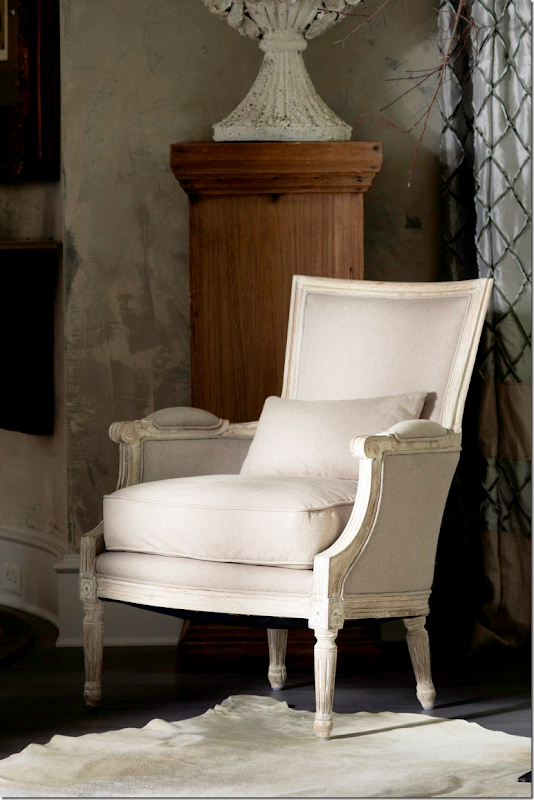
The Isla chair comes in bleached wood or dark. I love the bleached wood! The cushion is down/foam for extra softness.
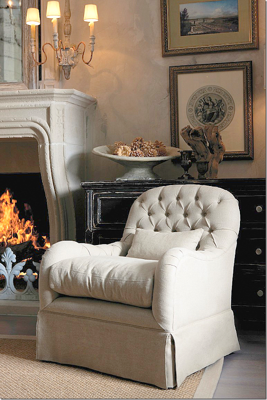
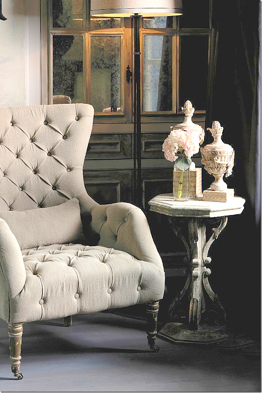
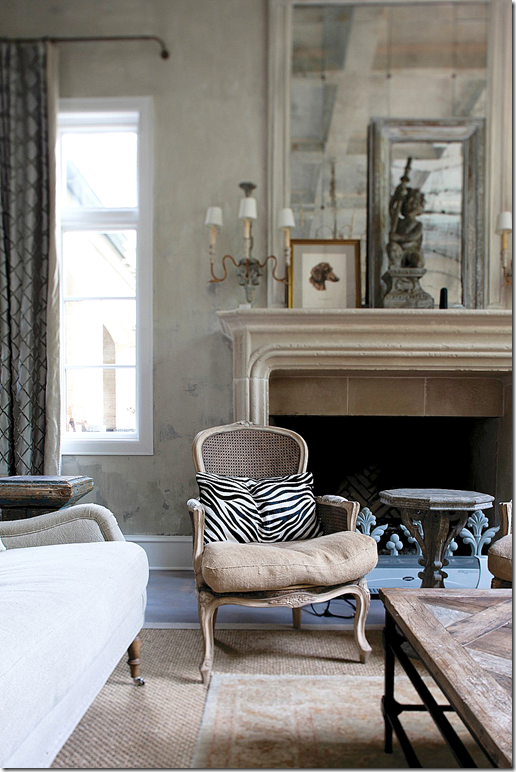
Taken at the Weeks home, notice their beautiful fireplace. This tufted chair is called the Quinn. Its proportions are decidedly oversized for extra comfort.
This tufted chair has grand proportions. I love the casters – such an authentic touch. The carved side table and urns are also from AG.
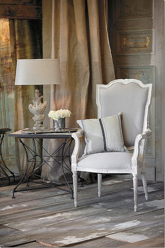
The Josie chair has a tall back with bleached wood frame. Pretty lamp!
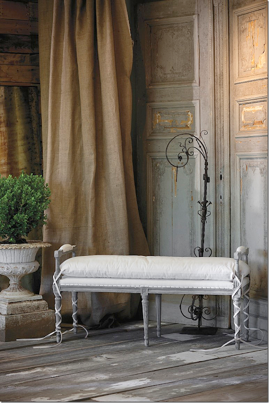
The diminutive Blue chair – has a gray chalk finish, with French nail heads, caned back and a nice deep cushion. DARLING!
The Andrew beach has French nail heads and those great, long ballet ties. This would be so cute at the end of the bed.
This is the Ethan arm bench. I’m really loving the caned back. It’s so French. Notice the sconce – I’ll tell you about it at the end of the story!
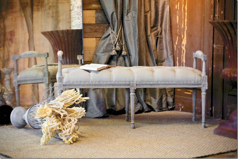
And, the tufted Andrew bench – also great for at the end of the bed!
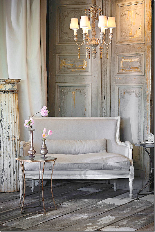
The Isla settee in bleached wood, upholstered in linen. Notice the charming AG chandelier overhead.
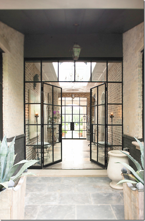
As a special treat, the Weeks sent along pictures of their house. The entry hall is especially grand with steel doors at each end.
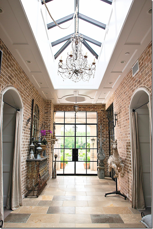
Notice the raised roof with the large skylight. Amazing. And, notice the arched brick doorways, closed off with linen curtains.
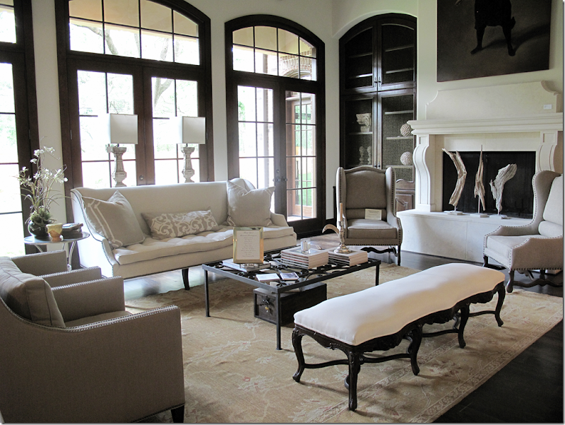
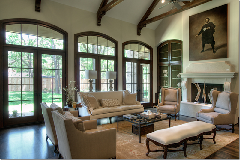
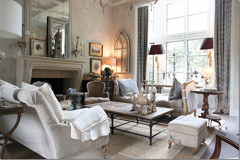
The living room is especially beautiful and grand. Notice the charming double tall bay window. The house is, naturally, filled with furniture from the Aidan Gray line.
An antique rug is layered on top of a seagrass area rug. And notice the drapery rods – no finials. I love that!
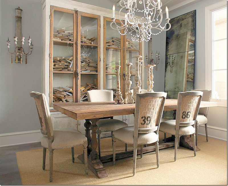
The dining room as styled for the catalogue. These chairs, the Milton, with French nail heads are numbered, with burlap backs.
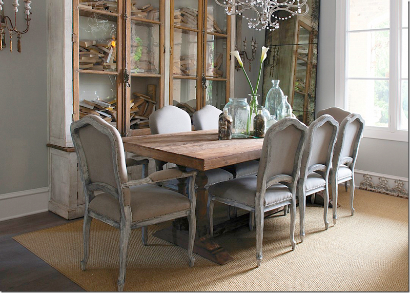
And the dining room, styled with another chair, again with French nail heads and a painted frame and curved legs.
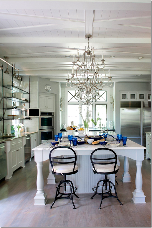
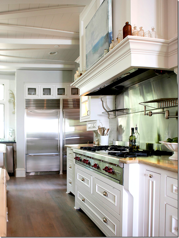
The kitchen is so large – what an island! Notice the ceiling – X beams over planks. The X mimics the windows.
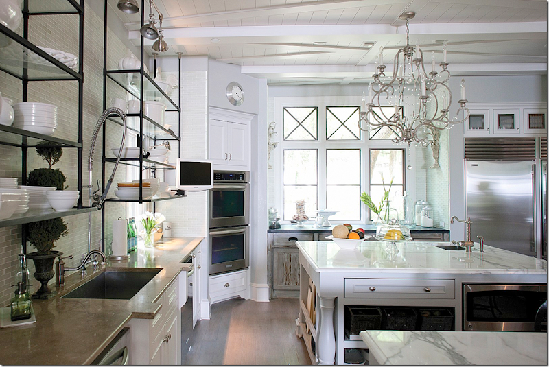
Here, you can see there are actually two islands, topped with white marble. Each has a chandelier over it. And there are two dishwashers – with three young sons, I would imagine that is a necessity. Unless, Randal, you aren’t Kosher are you?
The cooktop is on the right side of the room, by the double refrigerator/freezer.
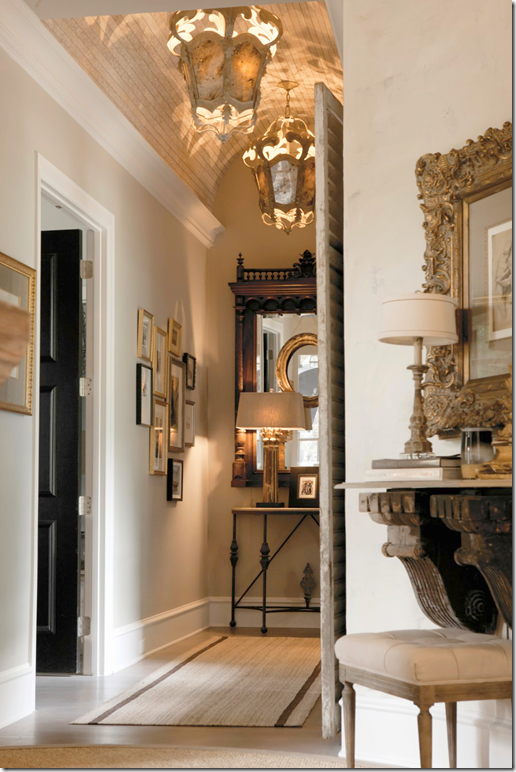
Notice this ceiling in this hallway with the bricked barrel roof.
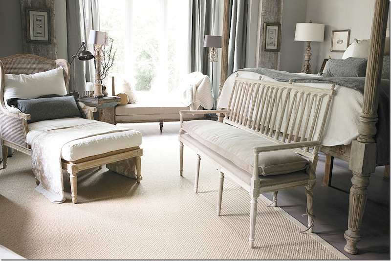
In the serene master room, a collection of daybeds, chairs and benches. The bench at the end of the bed is from the new collection – the Coyle. This style also comes in dining room chairs.
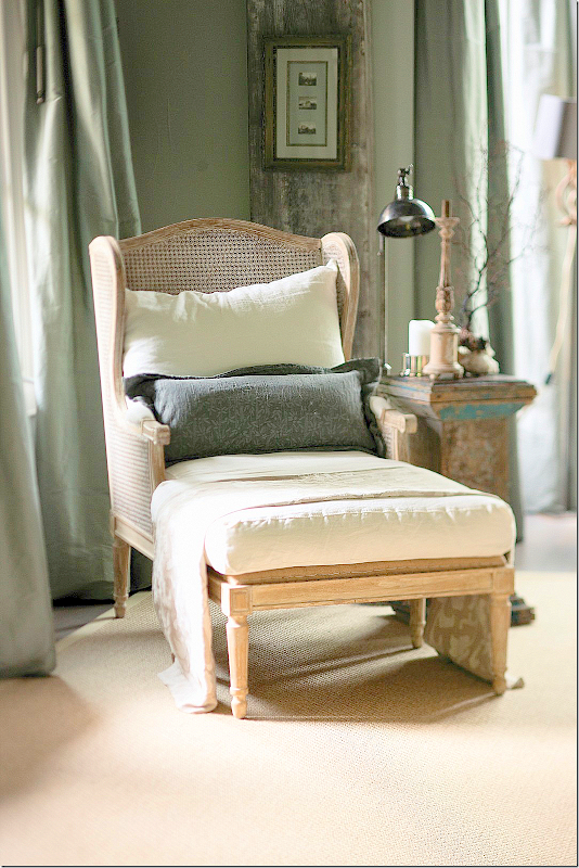
In the master bedroom – is the Havana Lounger. The drapes are so pretty!!
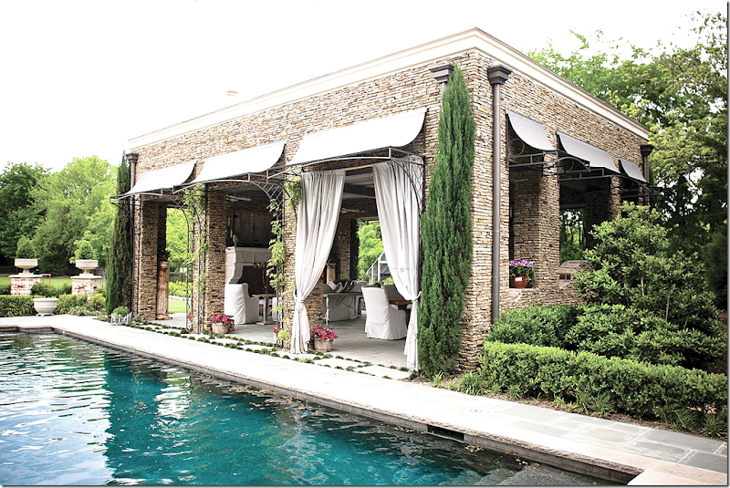
The pool cabana is made of stacked stone with columns. Notice the gutters and awnings.
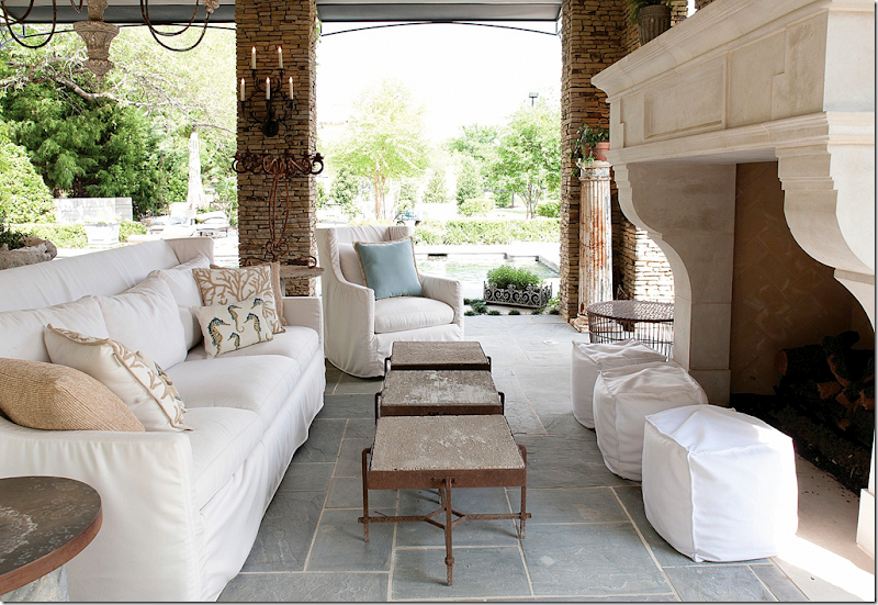
Inside is a wonderful fireplace. The slipcovered furniture is from Aidan Gray’s slipcovered line.
Must be a dream to have a pool house like this! I can’t imagine. I would LIVE out here!!
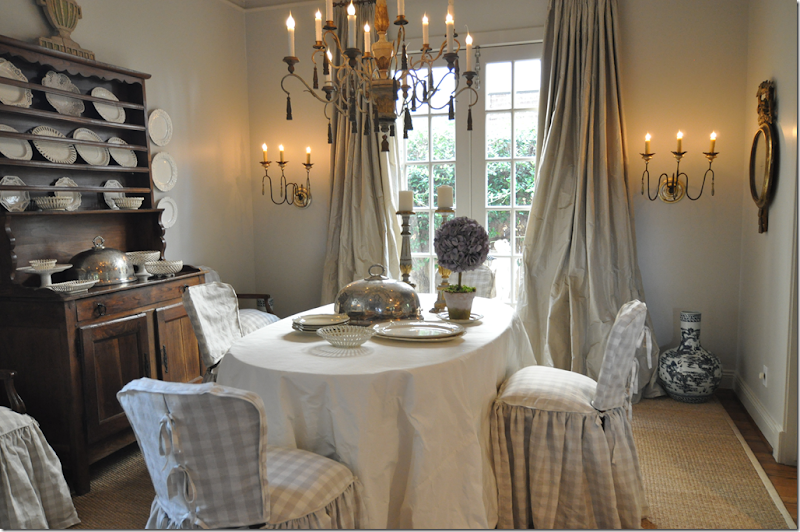
Remember these Aidan Gray sconces?
Randal Weeks told me that he was inspired to create the sconces after seeing these in my dining room. Seriously. I was floored – I was so excited! I actually was acting like I had designed them myself, when all I did was buy them! Like, I was taking credit for them! Too funny.
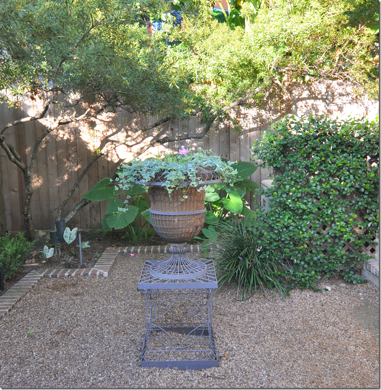
And finally, Aidan Gray sells all kinds of wonderful things for the garden – inside and out! This is from the Weeks’ back yard.
And MY Aidan Gray planter from last fall. I TOLD you I had tons of AG!!! Randal’s urn looks prettier than mine, I need to replant it and I like the way he put pots of flowers around it.
To visit the Aidan Gray web site – go HERE.
A HUGE thank you to Randal Weeks for all the beautiful photographs!
ME AND AIDAN GRAY
Messes and More Messes
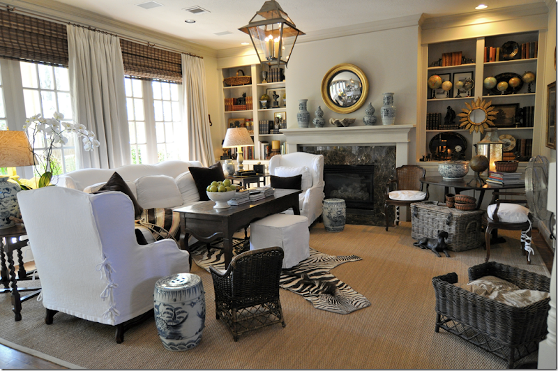
This is the usual view of my family room, when it’s all cleaned up.
This week, this is the view. EEK!!!!!! I just hate this! The curtains have been sent out for a major cleaning. More major than Nature’s Miracle could take care of.
Now, I ask you, does anything about these curtains look like grass to you? I wonder why puppies think curtains are grass?
We’re not sure who the culprit is who mistook the curtains for grass. We do know it’s not these two, Sammie Jo or Georgie. They know the way to the doggie door in their sleep.
The guilty one could be this devil, my granddog, Miss Lucy-Lu, who came home for Passover Seder two weeks ago.
Or, it could be this devil, Mr. Riley or Mr. Popeye as we call him (notice his crooked mouth on the left side). Riley is my nephew-puppy who comes to stay when his parents go out of town.
Neither of the King Charles Cavalier puppies are the most house trained dogs in the world, although both their parents claim they are!!! Actually, the soiled curtains are probably a combination of these two stinkers. Whatever. I always say, if Queen Elizabeth is comfortable with seven Corgis living in her palaces, I can surely have a few dogs of my own.
Here are the cousins meeting for the first time. Lulu and Riley give each other a little kiss. Awww.
And of course, Riley being all male, demands more from Lula, like a little Hello sniff. Lulu, being the hussy, obliges.
So, now until Friday, this is what I’m living with. Things like this make me really nervous. I can’t stand to have my house all torn up. I can’t even LOOK at the back windows now. I’m pretending this doesn’t exist. Those blinds are driving me crazy. I wanted the man to just take down the blinds too so I wouldn’t have to look at them. He thought I was a little deranged when I asked him to that.
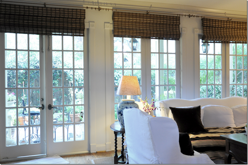
The blinds are really only for show under the curtain panels. If I was just using the blinds without the curtains, I wouldn’t have hung them this way. Instead they would be hanging inside the doorframe. But, hung like this, they hide that dead space between the ceiling and the window – making it look more clean lined.
In short, notice how these blinds fit inside the window. See that dead space between the ceiling and the windows? That’s what I think, in most cases, should be avoided. If those blinds were installed at the curtain rod, the look would be so much better.
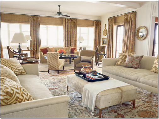
Here, Suzanne Kasler did the correct thing with the blinds in this living room. The blinds are raised up to the curtain rod. There are panels between each window – instead of only at each end. This way, you have a simpler, much cleaner line.
Again, this is so fussy. If this was my window, I would have installed only one blind raised to the curtain rod. And I would probably have four panels of fabric instead of two.
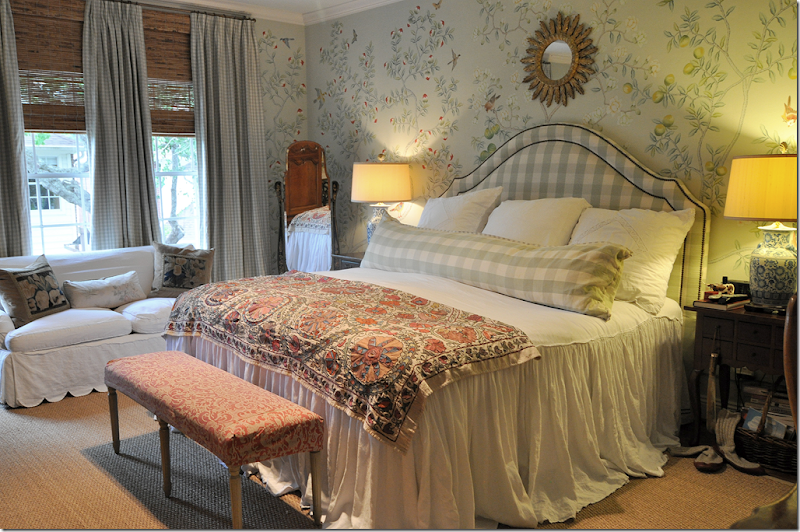
In my bedroom, there is really only one window. By placing one long shade under the rod, and adding four panels of fabric (one is out of view on the left) - the eye is fooled into thinking there are three windows, instead of one, ugly, very long, short one. It’s a much more elegant look done this way.
I wrote a LONG blog post about curtains and blinds a few years ago – HERE – which details my formula for curtains and blinds, if you have more questions.
In other Cote de Texas news, I recently got a new lens for my Nikon D90 camera. I am totally excited about it. Here is a picture taken with my old Tokino ultra wide lens.
And here is my new Nikkor lens 14-24. Whoa. (Disregard my purse and the non staging. I took this photo for my own purposes, not knowing it was going on the blog!) I can’t get over the difference in clarity and sharpness between the Tokino and the new Nikkor lens. So, I was pretty thrilled with my purchase. For a while. I was hoping to gain added width to my photos, but after doing test shots, I realized the width was pretty much the same. Which, totally bummed me out. I’m really aiming to get that huge wide shot that professionals get.
A nice wide shot just like this of Mick Jagger’s Paris apartment (which is gorgeous by the way – see the slideshow on Vogue.com. Their new web site is drool worthy.) So, after buying the new Nikkor ultra wide lens, I’m still denied these ultra wide shots. Why?
After spending hours studying the problem on the internet, I finally, after five years, have figured it all out. Seriously, this issue has vexed me for five years and now I finally know the answer. To put it simply, the Canon and Nikon digital cameras shoot through a cropped sensor. Huh?
To understand the crop factor, look at this picture above. The large picture is what a camera shooting with 35 mm film looks like. The picture is that wide and big. Now, where the green line – is how much smaller a photograph using a Canon 1.3x camera looks like, and the red line is the Nikon DX (mine.) The blue line is the Canon 1.6x. Notice how much smaller those images in the boxes are compared to the total image outside the boxes.
In other words, no matter how ultra wide my lens is, my pictures will always be cropped where the red line is. This is NOT acceptable for taking interior photos!!! No wonder my images are always less wide than the professionals take!!! And, how stupid of me. It’s taken me YEARS to figure this out.
This image is taken from Ken Rockwell’s web site who does on line reviews of cameras and lenses. It’s all free, but he does ask for donations, which I did send him for using this tutorial. If you ever have any questions – check out his web site Kenrockwell.com. He’s incredible.
Look at these two photos to further see the difference in width. This shot, taken with a Canon Sureshot is much smaller compared with this below:
Taken by a professional – you can see how much more image you get with a camera that doesn’t have the cropped sensor. Picture of a showhouse by Maria Tracy, furnished by Custom Creations.
So, what to do now? I’m not going to use 35 mm film. I love digital and I love the automatic cameras. Which leaves me this choice – the Nikon FX or Canon Full Frame – both do not have a cropped sensor. The images from these two camera series is the same size as the 35 mm film. Got that?
So, of course, now I want the Nikon D800, the newest FX version. Sshhh – don’t tell Ben, please. He’s still having heart palpitations over the cost of my new ultra wide Nikkor lens. But, if I’m going to take interior pictures for the blog, I need to be able to take them properly. For you, of course! It’s all decided and ordered – the only problem is everyone and their brother wants the Nikon D800. The camera is backordered for months and months. Unfortunately. But, at least this will give Ben time to recover from the lens expenditure. All this isn’t cheap. The lens and the camera (body only) are both ridiculously expensive compared to the D90.
Does anyone have the Nikon D800? I’m wondering if it’s hard to learn how to use. Let me know if you do.
This is how my week is going – messed up curtains and messed up photos. How’s it in your world today?











![552837_10101334773829441_10003959_65035114_410598916_n[1] 552837_10101334773829441_10003959_65035114_410598916_n[1]](http://lh5.ggpht.com/-aUoc-2TBO1o/T5fII6zeyOI/AAAAAAABXYQ/yVP3mzZwmuY/552837_10101334773829441_10003959_65035114_410598916_n%25255B1%25255D_thumb%25255B1%25255D.jpg?imgmax=800)


