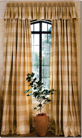
Number four on the list of the Top Ten Design Elements that I love in a house are curtains. After linen, slipcovers, and seagrass – curtains bring so much to a room that they should always be considered when designing a house. Curtains add romance, texture and softness. They can also add jolts of needed color. They bring coziness and warmth to a room or sometimes they add a beachy breeziness. Curtains are tricky though – they need to be done right, executed perfectly, or it’s better to not bother with them at all. Nothing takes away more from a beautifully decorated room than cheaply constructed curtains – limp, skimpy, too short, too long, over embellished – you name it – it can be a disaster. A lot of people don’t care for curtains at all – they call them dust collectors, outdated, an unnecessary expense, or something “my granny had.” One of the harder parts of my job is talking clients into putting up curtains – the list of excuses can be endless: I have beautiful windows, I don’t want to cover them up, or I love my view – I don’t want to block it. Another popular excuse is this: I don’t need curtains, I already have plantation shutters (or horrors) mini blinds.
For all the reasons not to get curtains, I can argue against each point – curtains do not need to block beautiful windows or views - they can frame them. They don’t need to look like your granny’s curtains, we can update the look. And as I often have to argue - curtains can look beautiful layered against shutters or blinds. In the end, what curtains bring to a finished project is sometimes hard to elucidate. Oft times I can only say – trust me, you will love them – against strong skepticism. I really never worry too much about the outcome though, because it’s usually well received and clients are mostly surprised how much they do love them.
After years of ordering curtains for clients, I have a formula that I usually follow and it works well for me. To illustrate which window coverings look great, I’ve collected pictures of curtains that I like and don’t like which show the difference between the good and the not so good. My absolute love of curtains is actually relatively new – it came rather late in my life. I didn’t realize the importance of curtains in decorating or what a difference they truly made until I started designing houses for other people. Even in my own house, I lived without any curtains for years, and still have yet to hang them in my family room, though that is just a laziness on my part which one day I will rectify. When our long awaited curtains in the living and dining room were hung, my husband who is usually quite silent on matters of the house (except for ceiling fans, of course) remarked what a difference they made: “It’s so much cozier in here.” And I had to agree, it was – much more so. And sophisticated too. I have no idea why I waited so long to finally hang my own curtains, after all, I had ordered dozens and dozens of panels for perfect strangers, why not for myself? But living without them for years and then finally getting to enjoy their beauty only made my resolve stronger to be more assertive and convincing when broaching the subject with clients. After all, I know too well the difference between having curtains and not having curtains – and I will never go back to bare windows again.

CURTAIN PANELS – PLAIN FABRIC:

I consider Gerrie Bremermann to be the Queen of Panels – her own curtain formula was once printed in a magazine which I promptly confiscated for my own. Bremermann prefers to use three widths of fabric for each panel, a luxury few can afford. But three widths is so stunning, so full, so luscious – I would rather use more of a lesser quality of fabric than less of more expensive one. These taffeta silk panels are so perfect! Billowy, with a trimmed leading edge, the curtains are oft copied by homeowners – and who can blame them? They are stunning and perfect for a living room, dining room or master bedroom.
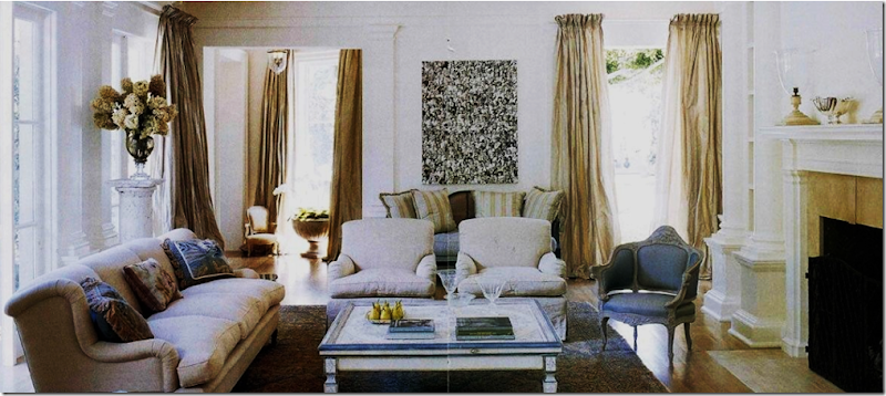 Lars Bolander is another designer whose adroitness with panels I have long admired. Here, he uses taffeta on rods with no rings. The attention is meant to be wholly focused on the draping alone – not the hardware. Bolander lines his curtains with either bump or blackout – notice the sunlight does not come through the silk – washing out the color. I always line and interline my curtains, always, unless of course I am using a sheer, see-through fabric.
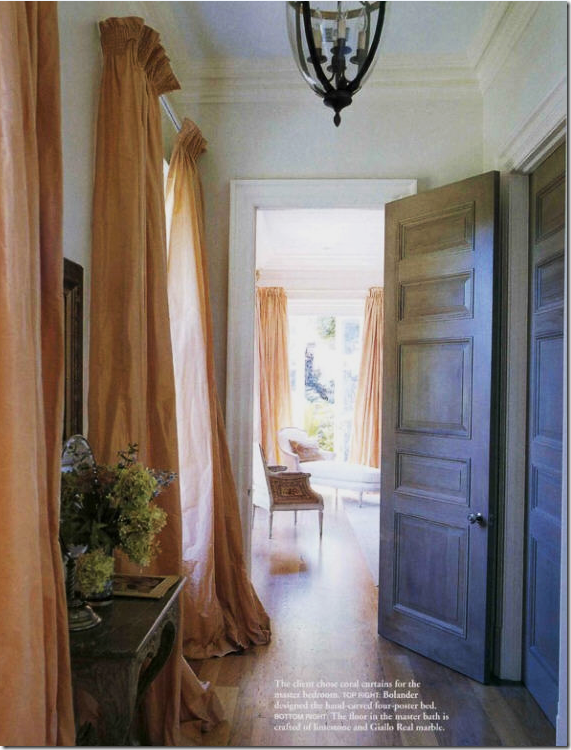
Here Bolander again used silk taffeta with no rings. It appears he used a smocked rod pocket with heading. Huge puddling of curtains has gone out of favor in past years, but I still prefer a 3 to 4” slight puddle to my panels. Bolander’s appear to be about 8 inches.

I love curtains that are free flowing without ironed in pleats which is how I always order mine. These panels are pinch pleated at the bottom. I usually pinch pleat mine at the top. And, I’m not a cornice person usually either – I prefer plain panels but sometimes a cornice is necessary. To understand what curtains bring to a decor – imagine this vignette without the material behind it. Wouldn’t it be rather cold looking and seem that something was “missing” without the curtains?
Suzanne Kasler dressed up these silk panels with trim on the leading edge and brass rods.
Houston designer Lisa Epley used panels with her arched French doors – sometimes the perfect solution to deal with arches is just to ignore them.

Houston interior designer Renea Abbott handles a similar window in the same fashion, here with gray and cream striped silk fabric.

Simple panels, but full and unstructured, in a fabric that matches the darker stripe in the wallpaper. Very elegant with a masculine feel.

Bay windows are hard to work with – here the designer chose to mount the curtains outside the window seat – framing the view. The leading edge is taped in a darker color. These panels have pleats ironed in, a look I usually don’t care for, but notice how the pleats mimic the stripes in the chair fabric. In this instance, ironed in pleats was the absolute correct choice. Just beautiful.

Another bay window, handled in a similar manner. Since there is no window seat, I think I would have placed panels between each window, treating the area as three separate windows instead of one. By doing so, there would not have been such a wide white space stuck in the middle of a gold room.
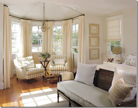 I prefer to handle bay windows like this – with a panel between each window. It makes for less of a large expanse of windows, especially when the trim is painted a different color than the walls.
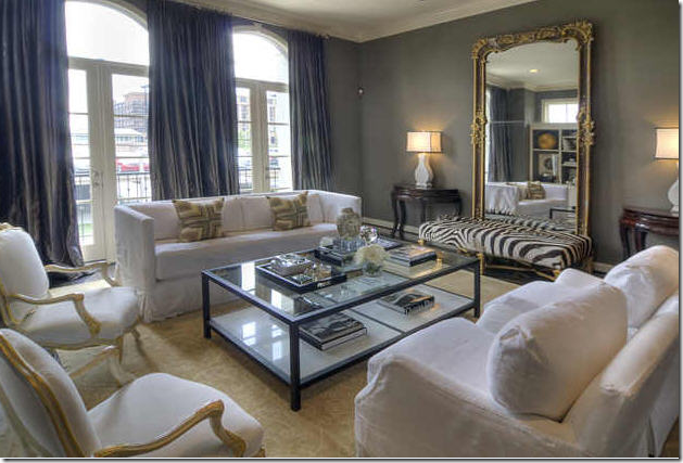
In this gorgeous NY apartment, Vicente Wolf chose to drape the windows – something that is often omitted in highrises. By using the wonderful light blue silk fabric, the apartment appears cozy and homey – not sleek and contemporary. It is possible that this wall had “problem windows” – which was solved by the length of the fabric. The curtains actually act as a wall here – notice the painting appears to be hanging on the curtains itself. Beautiful interior design.

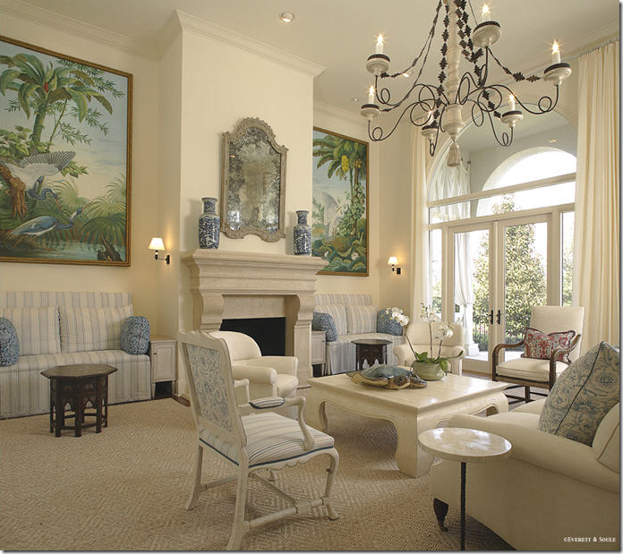
How to tackle a double height room, with double windows? Full panels are hung straight down from the molding accentuating the glorious height of the room. Yet, notice the designer used a plain linen in the same color as the wall – a printed fabric would have overpowered the room. From Southern Accents – this living room is one of my favorites this year. And, so far it has all four of the elements: linen, slipcovers, seagrass, and curtains. I wonder how many it will end up with – all 10? Stay tuned to find out!
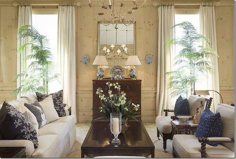
Atlanta interior designer Phoebe Howard also used plain panels hanging down from the molding in this high ceilinged room. Her fabric though plain, is lighter than the limed pine paneling. A beautiful room from Mrs. Howard.

In her NY getaway apartment with high ceilings, Chicago interior designer Alessandra Branca used goblet pleats on an semi circle rod which gives the curtains their canopy effect. Branca repeatedly uses Italian Stringing, a method of holding back curtains without any obvious visual means.
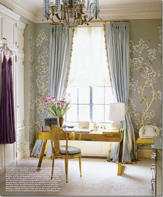
In a NY dressing room, delicate hand painted silk wallcovering is paired with even prettier silk curtains – trimmed from the leading edge down to the hem. A plain unobtrusive shade blocks the sun’s glare. These curtains are held open with tie-backs.

Tone On Tone owner, owner Loi Thai uses a simple rod pocket treatment and no rings for his curtains. Notice how the rod is placed a foot past the window trim which allows the panels to actually cover the walls, not the window, thus preserving all the view and the sunlight. Clients that insist they don’t want curtains because they will block the view need to be reassured the panels can be hung clearing the windows.

When the ceiling is low, hang the rod directly under the molding thus elongating the line and giving a more vertical feel to the room. These rods were also placed to clear the window and save the view. A trim placed on the leading edge dresses up the panels just a touch.

Golden walls in a cluttered room – just my style! Though the curtains are simple, muted, and blend with the wall color, the room would actually feel so bare without them. I ADORE this room!

Gray silk taffeta with sheer shades – so French and so pretty.

In her own home Suzanne Kasler used taffeta, and added a deep taupe band the bottom of the panels. This is a good technique when reusing curtains if they are too short – just add a coordinating fabric band to the hem to make them longer.

Gerrie Bremermann used white taffeta to blend with the white linen on the slips and the walls.
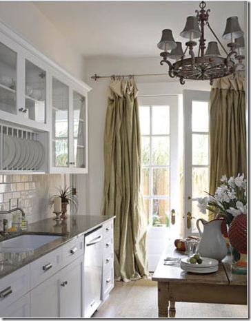
In New Orleans, silk panels hang in the kitchen!!! Why keep silk panels only in the dressier parts of the house?

DON’T: Don’t EVER accept curtains that are too short. You should NOT be able to see the sun coming through the floor and the panels. This usually can be adjusted during installation by lowering the pins. If not, they need to be returned to the workroom and corrected.
SHOTS OF COLOR:

Martyn Lawrence Ballard’s living room has red drapes that add all the drama in the room. Impossible to imagine the room without these curtains that provide the shots of color.
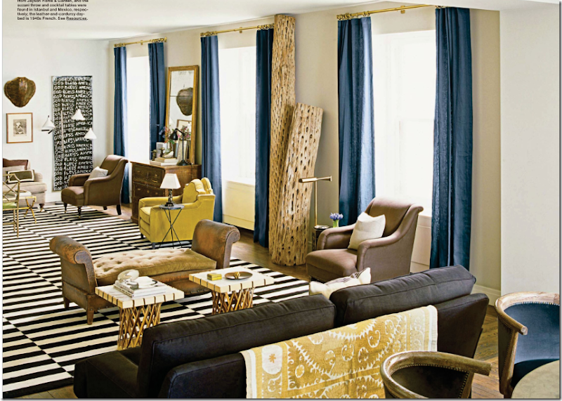 ‘Nate Berkus’ Chicago apartment – imagine this room without the blue panels – wouldn’t quite have the same punch as it does now.
This New Orleans dining room used taffeta panels in a beautiful apricot shade, reminding me of Gerrie Bremermann’s room with the same colored curtains.
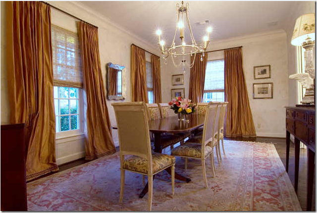
This dining room in Houston was also inspired by Gerrie Bremermann’s dining room. The panels were dressed up with tape on the hem – perfect length, imho.
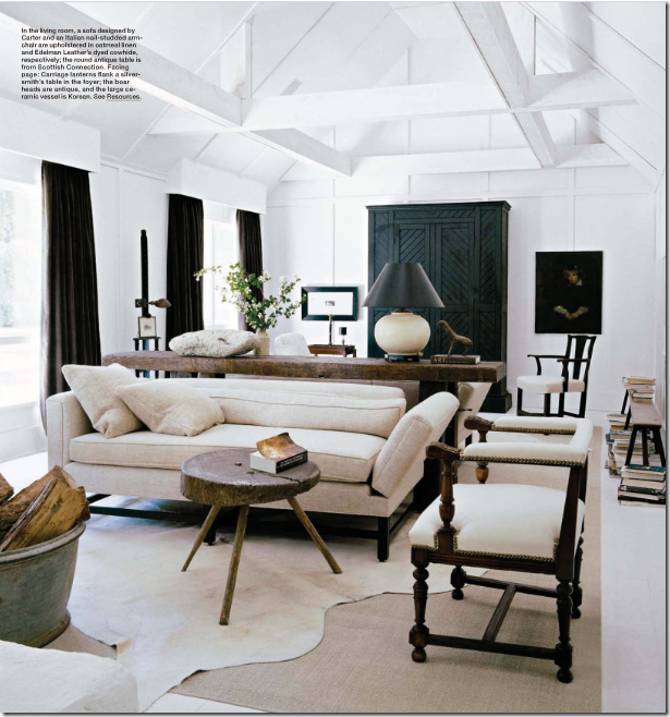 Washington DC interior designer Darryl Carter used deep chocolate panels to contrast with his signature white fabrics and dark woods. The contrast of the curtains truly gives the room its punch.
Uber talented Miles Redd paired exquisite De Gournay wallpaper with a trendy suzani and luscious green silk panels with a Greek key trim. This shade of spring green is the new, hot color!
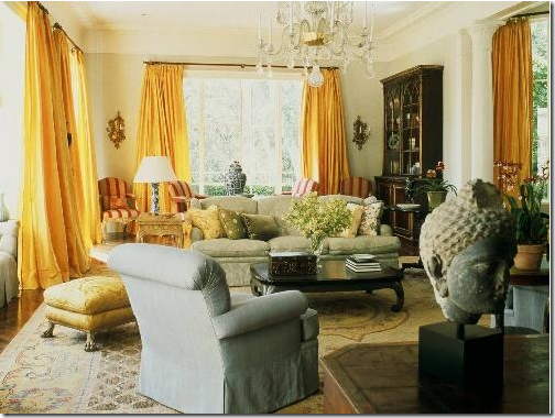 One of Michael Smith’s first national splashes was with this living room and the gorgeous saffron curtains. Let me repeat, gorgeous!
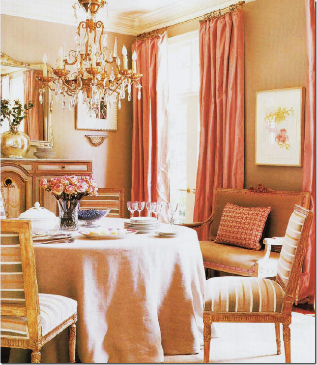 Suzanne Kasler’s dining room is beige with warm pink silk taffeta panels. The unusual color scheme came from the stripes in the chair fabric.
Michael Smith paired green silk with blue silk lining in this living room. Many designers use two fabrics when making curtains – the lining will usually be a less expensive fabric, but here Smith used the same blue silk found in his design scheme. Using a fabric, like a small check, as a lining is nice when there is a large of expanse of curtains showing through the windows. This will let house stalkers see pretty fabric instead of white lining!

DON’T: Do you understand now why I like plain panels? Whoa. Less is definitely more. First I will say this – using swags and jabots should be left for very tall elegant windows, not rooms with 8’ tall ceilings. Second, the construction of swags and jabots is a very learned skill, not something for a beginner to try out. It takes a true craftsman to effectively work with all the folds and pleats. In this picture you can see how amateurish the final product is.
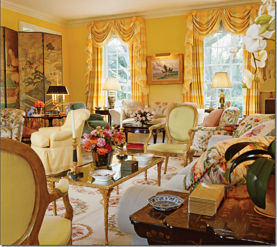
Much better – swags and jabots in a tall ceilinged room somewhere in Houston, done by the King of Swags and Jabots of this generation – Mario Buatta. Even still, only the dressiest and most elegant of rooms should get this treatment.

DON’T: In this high ceilinged the room, the designer wasn’t sure how to add curtains. It is a problem wall of windows with small upper windows – do you ignore them? The first issue here is the fabric with the dark colors, the heaviness against the cool white walls. The second issue is the fussiness of the treatment, the valance, the trim, the gathered panels. Thirdly, – the “no rod” rod look really draws the eye to all the problems here! What to do? In this room, I would have put a rod all the way to the ceiling, just under the rafters – one long rod that went from the left to the right. Then, I would have done plain long panels in a soft fabric, flowing freely to the floor. The fabric would be a match in color to the walls – which would mean I would lighten up all the other fabrics in the room while I was at it! What a beautiful room – totally ruined by a misguided window treatment.
DO: How to handle high ceilinged white rooms, simple panels hung from the ceiling, ignoring the arches. Notice the difference between this room and the room above – here the curtains add just a texture, a breeziness – they do not command all the attention.
CURTAINS MADE OF PRINTED FABRIC:

I love curtains made of printed fabrics – toiles included. This oriental toile from Colefax and Fowler covers the walls and the windows. You might think this is too busy, but for a sitting room or morning room, it looks wonderful to me! This is actually one of my favorite toiles.

In this high ceilinged living room - the arched transom is left bare which tends to cut the window wall in half – I think the curtains are prettier when they hang from the top molding. Working with plaid can be tricky. I once used a large pattern like this but the fabric was defective, causing the lines to not be straight. Of course, the entire job had to be redone at a great personal expense.
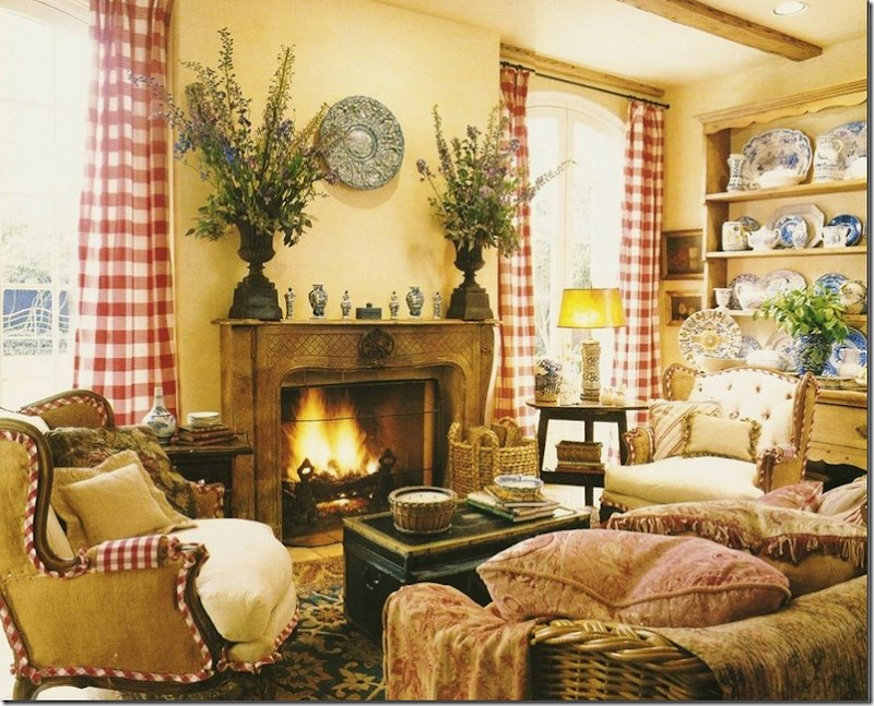
Red and white curtains done by Houston interior designer Carol Glasser in her former family room. This picture, over a decade old, shows burlap chairs long before the current trend!!

The English Country Manor look – done to perfection by David Easton in his former bedroom. In the more exclusive country houses throughout the British Isles, printed fabrics for curtains are the norm.
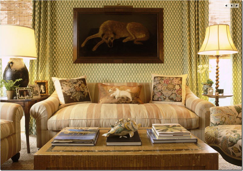
Curtains that match the wallpaper is a nice designer touch. When ordering wallpaper, always check to see if there is a matching fabric, it makes such a nice finished look to use both in the same room.

Phoebe Howard used two panels hung from the top molding. Her formula calls for softly ironed in pleats and no puddle – her curtains just barely touch the floor with no break. Myself, I prefer a 3 inch puddle so that you can actually pick up the hem of the panel, step back, and let it fall softly into place. Ms. Howard of course doesn’t agree which is probably why she is so successful!

Striped panels frame the view. If a client doesn’t want to block the view or the window – when hanging the panels, place the end brackets about a foot past the window instead of closer in. This way, the fabric actually rests on the wall and not the window, thus saving the view! This needs to be figured in before the curtains are ordered so that there is enough material to cover the windows if the curtains are to be closed. If the panels are actually stationary, no extra yardage will be needed.
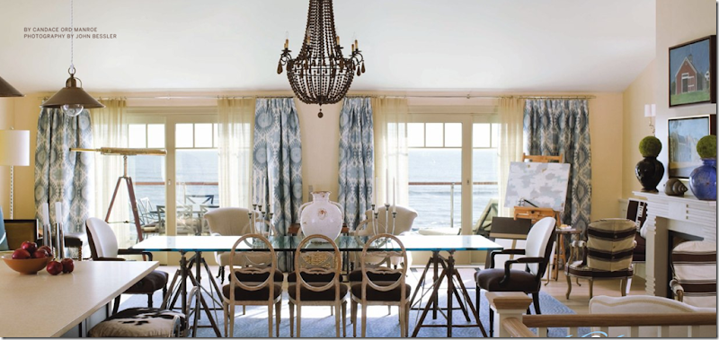
Eric Cohler used a wonderful cotton ikat fabric in this living room/dining room. I love the blue paired with the dark browns. The ikat panels are purely decorative, the sheers actually pull across the window to cut the glare. Again, I am not sure why the curtains were not pulled up the ceiling, instead there is about 3 inches of wall space showing, why? Perhaps the curtains were not tall enough, or a mistake happened in measuring. This is a showhouse, not a personal home.
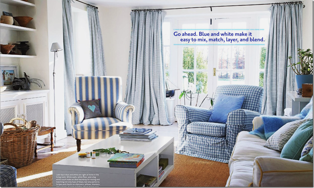
I love these simple cotton checked curtains used in a family room. So fresh and pretty! There are no ironed in pleats which give the curtains movement and fluidity instead of looking like two stone columns of fabric.
 A great looking kitchen is softened with toile panels. I love patterned fabric curtains in the kitchen.
A pink Carlton V ikat is used everywhere – love it!
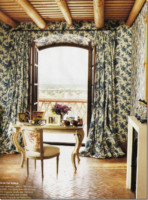
Toile walls and curtains in Spain. This is what I call very romantic looking curtains! Beautiful!

DON’T: This month’s Traditional Home showed a home with an owner who can’t quite decide what fabric she likes better. Curtains should be one fabric. Two is just too much. This looks positively silly. Notice even on the quilt a second fabric is sewn onto its body. Oy.
CURTAIN PANELS PAIRED WITH BLINDS:
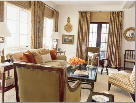 I love to use blinds, especially woven ones, with drapery panels. This is a good example of that. Here Suzanne Kasler handles this room beautifully – the blinds add a texture to the room that is especially visually pleasing and even necessary. Kasler takes the major colors from the curtain fabric and makes pillows out of them for extra color pop. One chair wears an accent fabric, the rest are neutrals. The sisal rug calms the room. I love this – it’s elegant yet friendly and inviting and not stuffy. See more of the room below:
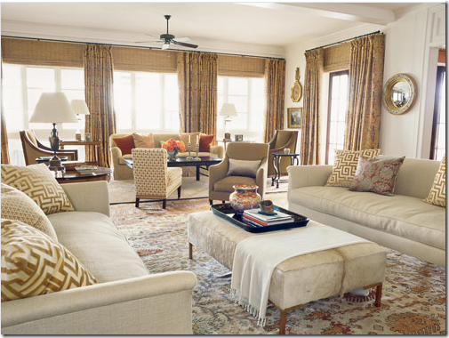 The other side of the above room. In this section a rug replaces the sisal, providing extra pattern to the area where the curtains are absent. Look how pretty that wall of windows is with the four panels instead of just two, and the addition of the textured blinds finishes it all off. Beautiful!
A word about this curtain installation job. What looks like an easy job of hanging curtains was actually quite difficult. Suzanne Kasler’s thought process: The windows are short in this room. In order to camouflage the problem windows – Kasler places the rods as close to the molding as possible – yet the beam prohibits her from bringing them to the very top. The tops of curtains should always, if possible, all be at the same height. Therefore, all the rods are placed about 6 inches from the ceiling to be uniform. Then in order to make the windows appear taller, she brings the blinds to the top of the rods – hiding the wall space between the short windows and the curtain rod – making it appear the windows are taller and more elegant. Kasler thus creates a vertical line to the room by raising the eye up to the higher rods. Perfection! Hanging curtains is never an easy job and a good installer is worth his weight in gold. He is as important as the workroom.

Here, perfectly done – panels hung from the ceiling with tortoise shell blinds.

Perfection again- the panels meet the molding. The blinds hide the wall space between the top of the window and the curtain rod. This is called an outside mount.
Another beautiful window treatment with curtains and outside mounted blinds attached at a good height.
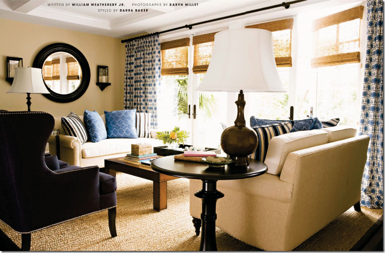
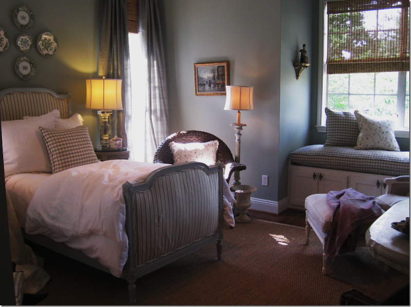
These shades were mounted inside the frame (inside mount) probably because they are doors instead of windows. You don’t get as clean a line with an inside mount. Very pretty room. I love to mix printed fabric curtains with textured shades in rooms where all the upholstery is solid fabrics – just like here. The shades and patterned fabric add warmth, coziness, visual interest, and texture.
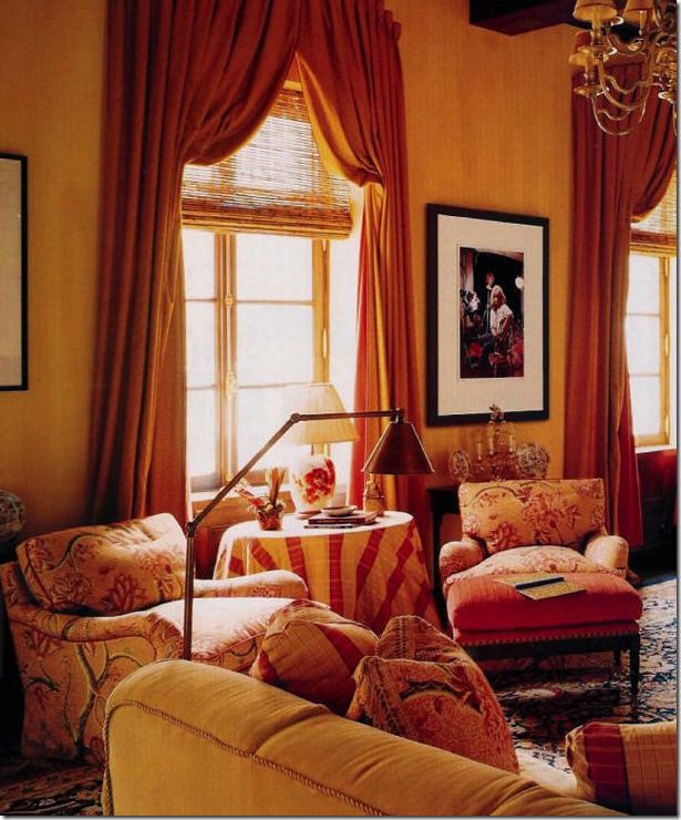 In this Italian styled apartment, Alessandra Branca again uses Italian Stringing to great effect, adding the tortoise shell blinds for extra texture.
Love this! An older photograph – looking remarkably fresh.

Very pretty window treatments by Suzanne Rheinstein.
In the Bennison House, the curtains are of course, Bennison – paired with tortoise shell blinds.

The linen striped Bennison panels are hung from very simple rods with tiny rings.

DON’T: In an actual house found on the internet: notice the differences – first, this owner should have used a bronze rod for less contrast. Second, the rod should have been placed at the ceiling. Third, there should be just one blind, outside mounted, placed right under the rod – for a more cohesive, smoother look. The way this treatment is installed – you have the contrast of the trim color vs the wall color fighting with each other. One outside mounted shade placed at the ceiling line would have been so much prettier and simpler.
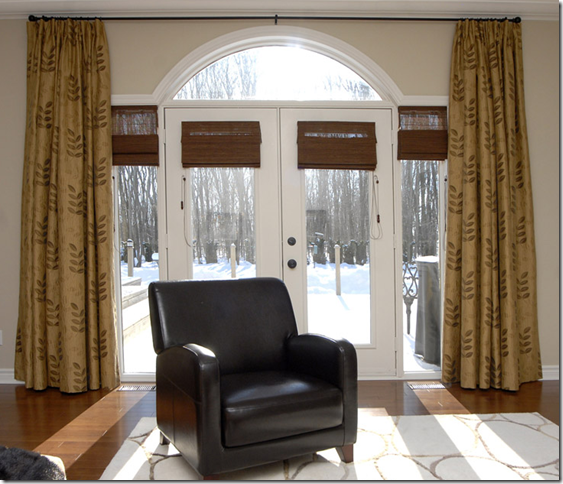
DON’T: Real house: this is a problem window – the arched transom really adds nothing to the design of the window – I would have ordered just one long blind and put it right under the ceiling rod – and raised it just to the top of the door for access in and out. Instead, there is too much going on in this window. Too many different window sizes, too many little shades, and the curtains are just a tad too short – this should have been fixed during the installation – the drapery pins could have been moved up just a bit. It’s not easy folks!
An open question to mass builders of Mac Mansions: Why do you install lots of little windows like these? What’s with the arched windows everywhere? I understand Palladian windows, but these sir, are no Palladian windows. Why bother pretending they are? Wouldn’t just a taller French door been so much prettier here than the short door given the Palladian treatment? Just a question.

DON’T: Real house: the same designer as above almost gets it right this time. The blinds and drapes are placed perfectly – but, but, but – if you are going to lower your textured shades – add a lining to them so you don’t get the invisible shade look from the glare! And don’t put the shades down at all different heights. The designer could have bought just one long shade with a blackout lining – why buy three, unless it was to save the money of a custom shade. If possible – one shade is better than three little ones. And one more detail that should drive a good interior designer to distraction – notice how the two middle panels “break” at the floor – yet the right panel just barely meets the floor. Which was the intended length – the breaking length or the just barely touching length? A good installer might have been able to correct this. If not – it should have gone back to the workroom for correcting. I wonder, did the designer not notice this? And just one other detail – notice that the panel widths are not uniform – the width of the middle panels are doubled, yet the right and left are single. Why? The panels really should be the same width if at all possible otherwise it might look unbalanced.
DONT: Why wasn’t the blind brought up the curtain rod? Why leave six inches of wall space showing? For what? And notice how tightly the curtain pleats were tacked or ironed in. These look immobile, like two columns made of concrete. The panels should be looser so you can almost make out the fabric’s pattern. Quite unattractive and I’m sure it cost a fortune.

DO: From the internet: a real house – notice how nicely they mounted the blind – all the way to the top and then they used an outside mount. Chelsea Editions embroidered panels – this designer got it right, exactly.
CORNICES AND VALANCES:

One of my favorite trendy and cluttered NY apartments, Alex Papachrisitidis used a valance made of Pierre Frey fabric. Cornices and valances are great to use where there is a large expanse of window – the cornice acts a bridge to the panels.
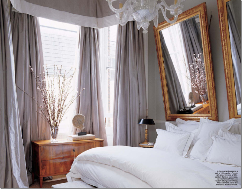 A soft valance with a wide white band and luscious, full, blowsy taffeta panels. The two mirrors for headboards are to die for. Notice how the Biedermeier chest picks up the same warm tones of the mirror – and how beautiful it looks against the cool tones of the icy blue silk. Absolutely romantic AND gorgeous!!!!!!!!!!!! NOTE: to hang mirrors to reflect downward, instead of upward – use a chain. You can see the chain used here that causes the mirror to lean forward. This is a perfect way to hang a mirror above a mantel. If the mirror is hung normally, you will get a reflection of the ceiling. This way, you get the reflection of the room itself.
This living room/dining room by Beverly Jacomini, from Houston, has Bennison fabric curtains with scalloped valances. I adore this room!
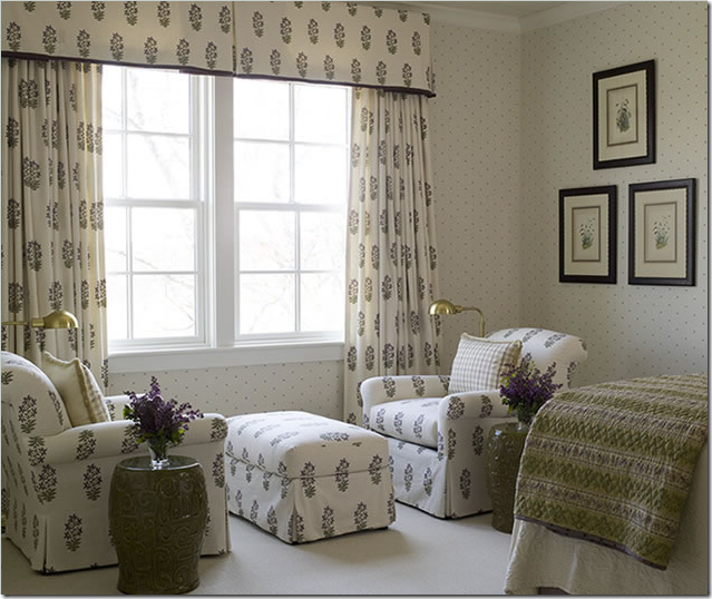 Indienne hand blocked fabric is made into panels with a valance and was also used for the upholstery. Phoebe Howard
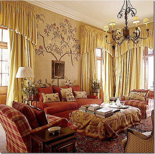 Soft smocked valances are aired with full panels in this beautiful room. I love the mural and the rug made into an ottoman. These curtains really make a statement and add so much to the room – exactly what curtains should do!
In a soft muted bedroom, ruffled valances are made of fabric that matches the walls – Phoebe Howard, of course!

Alessandra Branca used a gathered valance for the window and a smooth tailored valance over the bed.
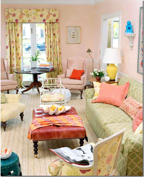 A beautiful, colorful, fun living room for a young family with curtains made out of my favorite Raoul Textiles fabric in yellow. Timothy Whealon.
A warm pink printed fabric is paired with a shaped cornice – love this!
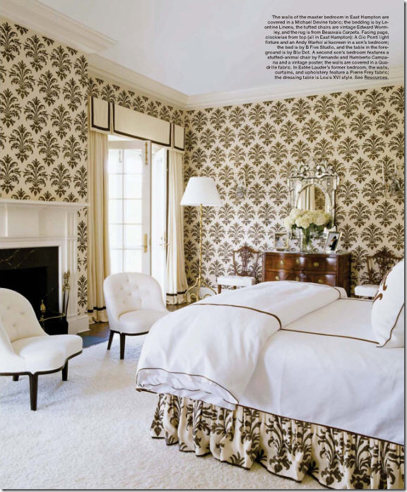 Blog favorite, Michael Devine’s fabric was matched with a valance crisply piped in black trim. So pretty!
Miles Redd used a shaped valance outlined in blue in this Farrow and Ball wallpaper bedroom. The antique clock and bench are so beautiful.

In France, antique styled cornices in scalloped wood is used with white linen panels. The scallop motif is picked up in the bedcover too.

DON’T: Don’t forget the panels! I really think cornices and valances without the curtain panel are silly looking, what’s the point? Taking a second look – I see now that there actually are sheer cafe curtains which would explain the valances. But, using sheer, white cafe curtains still looks unbalanced against the bold, striped valance. The designer should have used one of the gold fabrics instead, imho!! I love the lantern though!
SHEER FABRIC:

Sally Wheat’s house. Sally used tie top sheer linen panels throughout her house, none are lined, of course! Available at Indulge Decor here. Love this room!!!

Cynthia Davis who owns Indulge Decor in Houston uses similar sheer, tie top panels in her bedroom. She also designs and sells the highly scalloped upholstered headboard at her store here.
Beautiful sheer curtains divide the bed from the room and the wall in this picture from the gorgeous book, Santa Barbara Living, by new blogger Diane Dorrans Saeks here.

When not to line fabrics – when using sheer, see through linens – as is used here in a French mas.
PORTIERES:

Panels of Bennison fabric hang between the bedroom and sitting room – I love using fabric instead of doors.
Brooke from Velvet and Linen added portieres to her bathroom after she took down the wall between it and her bedroom. This room first made me fall in love with Brooke!
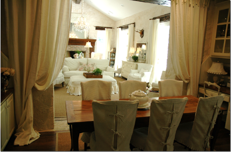
Blog favorite Lauren Ross added heavy linen portieres between her breakfast room and great room.

Plum pink silk is paired with khaki in this portiere that adds just a touch of romance. Truly, not much is more romantic than fabric doors!

Houston interior designer Pam Pierce used portieres to cover her bookshelves, what is a great idea if you want to soften a book laden room.

Renea Abbott uses curtains to soften an outdoor room in California.
Sheer portieres divide this French bedroom from the bath area. John Saladino used this technique in a Villa di Lemma guestroom.
CANOPIES: A ROOM WITHIN A ROOM

Draped canopies are wonderful when used in large, cavernous bedrooms – they create a smaller room within a room. Here Phoebe Howard used a beautifully shaped canopy in all white – gorgeous!
Canopies are not for women only: Michael Smith used his own fabric for his bed’s canopy.

Sheer fabric used without a top treatment in Phoebe Howard’s famous pink bedroom.

Michael Smith used a subtle striped fabric with this canopy in a room wallpapered in De Gournay.

Charlotte Moss created one of the most beautiful Kips Bay rooms ever! A nod to Pauline de Rothschild, the bed floated in the room with three different blue and white fabrics, all designed by Moss.

For her daughter, Katie Ridder designed a half canopy over the window. So cute!
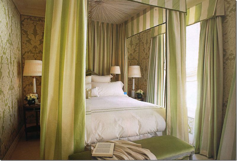
In a very small room, Alessandra Branca went large – a canopy and curtains made of bold chartreuse and cream stripes.

What if you don’t have a four poster bed? No problem! This canopy was created by hanging brass rods from the ceiling. BUT: beware – panels on canopies should be the right length, just as on windows. These are just too short.
SHADES:

Slouch or London Roman shades – heavy linen is gathered in folds in this bay window. Notice how wonderfully thick the bottom cushion was made – perfection!

More tailored Roman shades flank the bed, while panels are used in the other windows. Tailored and lovely.

Alessandra Branca uses Roman shades made out of striped taffeta silk. The chandelier and chairs are so beautiful – the entire dining nook is!

In New Orleans, these silk taffeta shades are so luxurious – they are sexy!!!

DON’T: when using a material that is see through, it’s always better to line the fabric, imo – otherwise you get this effect which takes away from the gorgeous folds and fabrics.
BURLAP AND DROP CLOTHS:
Attractive curtains don’t have to cost a fortune – using the ultra trendy burlap or lowly painters drop cloths will save you a bundle, but you will still have a very chic looking room. Here antiques are mixed with burlap portieres.
Here, burlap was used at the windows and as portieres between the living room and dining room, below:
The dining room with the burlap panels – since burlap is so inexpensive, use three widths instead of one – it will look so much fuller!

The very beautiful AND talented Layla Palmer from the famous (and soon to be more famous) The Lettered Cottage designed her breakfast room first using burlap curtains. That didn’t last long – things do change quickly around the cottage. Here she changed to drop cloths paired with tortoise shell blinds. As always, everything Layla does is darling.

And blogger Judy at Gracious Southern Living went a step further with her drop cloths – she added a black band at the hem which dresses them up. Drop cloths are really inexpensive – so why not double up when making panels, that way you will have very full looking curtains. Great job Judy!
COTE DE TEXAS CURTAINS:

In my bedroom, I have one long, short, cheap, ugly, horrible looking metal window! Mr. Slippers Socks Man PROMISED me when we moved in this house that we slowly replace all our windows with beautiful wood ones. To date, 15 years later, only two windows have been replaced – and this isn’t one of them. So, in order to make my lowly window look a little more impressive, I was lucky enough to inherit a true tortoise shell shade from friend that happened to fit my window exactly. I pulled it up to the ceiling and added four panels to give the illusion that my window is actually three separate units. It does look somewhat better this way, I think.
In my guest room, I used silk panels from Restoration Hardware and paired them with blinds from Target, which is a great place to get inexpensive blinds, but order them online, the choices are much greater.

It’s hard to see exactly – but at The Tanglewood House – there were French doors with two smaller flanking windows – I bought three blinds – raised them above the door and added panels of a heavy patterned linen fabric – nice because all the room is upholstered in solids!
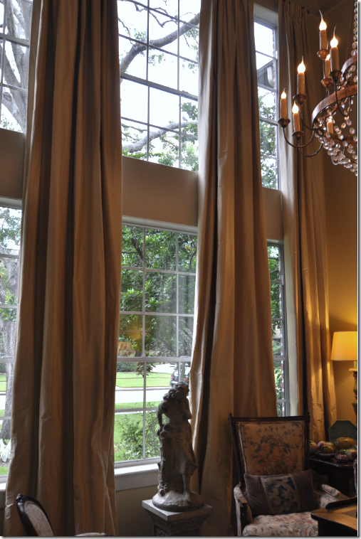 In my living room – I have six windows – it’s not quite double height, but the room is still very tall. To disguise all the cheap windows I put four long panels of a silk ticking fabric in pale gold. The curtains drastically changed the look of the room – warming it up, making it feel cozy, and still adding an air of sophistication, forever convincing me that it’s almost always better to have curtains than not.
For this client, I used tiny pinstriped silk panels, double width, with simple bronzed rods.

In the Tanglewood House, the client already had plantation shutters, so I layered the heavy linen toile over them. The only window in the room – it is quite small, so we pulled the rod out past the regular 6” allowing the fabric to sit on the wall, making the window seem wider and taller. The actual window ends just about where the panel starts. MIMI – come visit me!!!
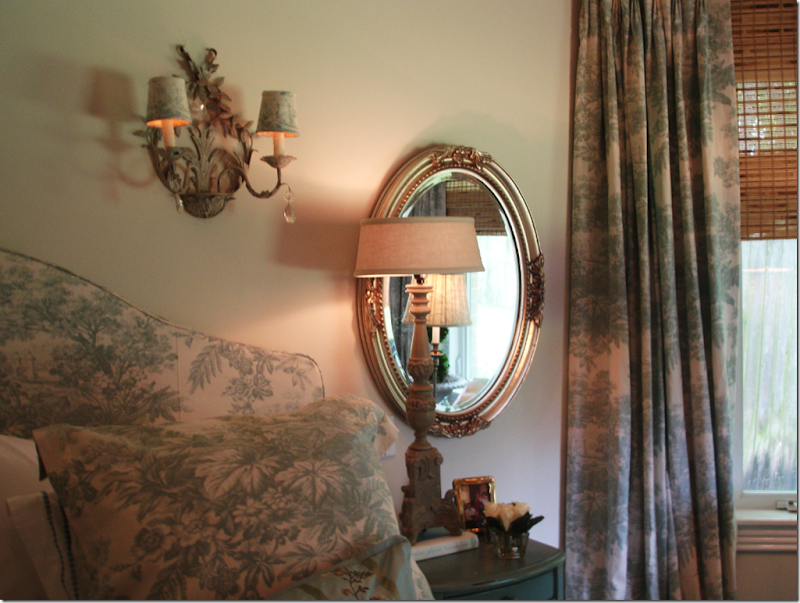
In this bedroom, done a budget with everything from Pottery Barn – I bought fabric by the yard from PB to make the curtains, then paired them with Target shades.

For this client I used seafoam silk taffeta and added a scalloped trim down the edges for an extra detailing. Farrow and Ball wallpaper and Chelsea Editions fabrics.
Cote de Texas Curtain Formula:
This is the formula I mostly use. If you take this to your seamstress and she follows it exactly, you should have a set of curtains you will be proud of and love!
1. Use either two or three widths of fabric depending on the size of the window. Always err on the wider amount. A small window will probably take two widths just fine. Do NOT go by standard measurements – or else you will end up with one width of fabric panels, which will look skimpy and cheap. It’s better to use an inexpensive linen than to skimp on an expensive silk! Consider using the more expensive fabric on a pillow instead – curtains require a lot of fabric!!!! Double width on a regular height room is approximately 12 yards of fabric.
2. Have the seamstress add wide hems on the leading edges and at the bottom. This way, the lining on the side will be sure not to show.
3. Be sure to order NO IRONED OR TACKED IN pleats!!! Very important – or else you will end up with two stone concrete columns of fabric.
4. Always use lining and interlining unless you are using a sheer. I use either bump or blackout linings. If the fabric is dense, bump may be all that is required, but the blackout lining adds so much. First it creates a heavy weight which makes the curtains drape better and second, the sun doesn’t come through blackout lining – especially important when using silk and see through fabrics. Tip: I also ALWAYS use blackout lining when making skirted tables and bedskirts for the same reasons: weight, draping, and sun rays coming through. I like to see the fabric, I don’t like to see through the fabric!
5. Measure the curtains from the top molding or ceiling to elongate the line.
6. If adding blinds – use outside mount and place the blinds right under the rod.
7. You don’t need to splurge on expensive rods – the thinner the better is fine in most cases. If you don’t like finials get a rod that attaches directly to the wall.
8. Go easy on the embellishments: contrasting tape is great on valances and in transitional settings. Trim is nice down the edges or the hem, but use a light touch – too much becomes goopy fast!
9. Don’t make your drapes too short. If you want them just “kissing” the floor, be sure you have a great workroom , measurer, and installer, this is very difficult to get exactly right. I usually order a 3” puddle which allows me to grab the hem, step back, and let the curtain fall gracefully in place. You might prefer just a slight ‘break” in your hem. Be sure to discuss the proper length with the measurer so there are no surprises. It’s always easier to fix a too long hem - a too short hem can be a disaster!
In Houston, I use Monica Hancock to measure and work with the workroom on all my curtains, bedding and softgoods. She also sells textured blinds at a great price. We use Bennie Davis to install everything – he is truly the best in the business!!!! To contact Monica call 832-443-1931. She will schedule Bennie for you too.
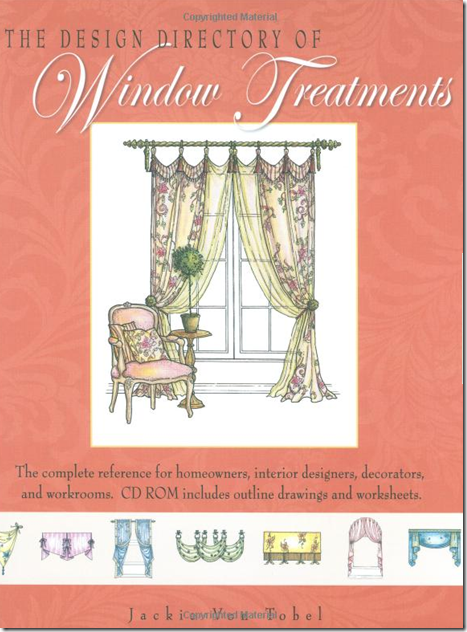
A great source for window treatment information is the book by blogger Jackie von Tobel. Jackie wrote and illustrated the definitive book on window treatments – order it here. And fyi: Jackie has a new book on bedding coming out soon (available for preorder here) along with a fabric line she designed! OMG – that girl is a dynamo.
Watch for the next installment of Top Ten Design Elements – Five coming soon to a blog near you!

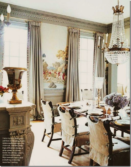

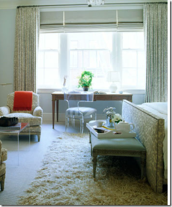
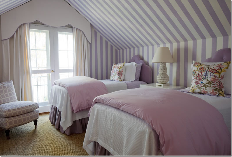
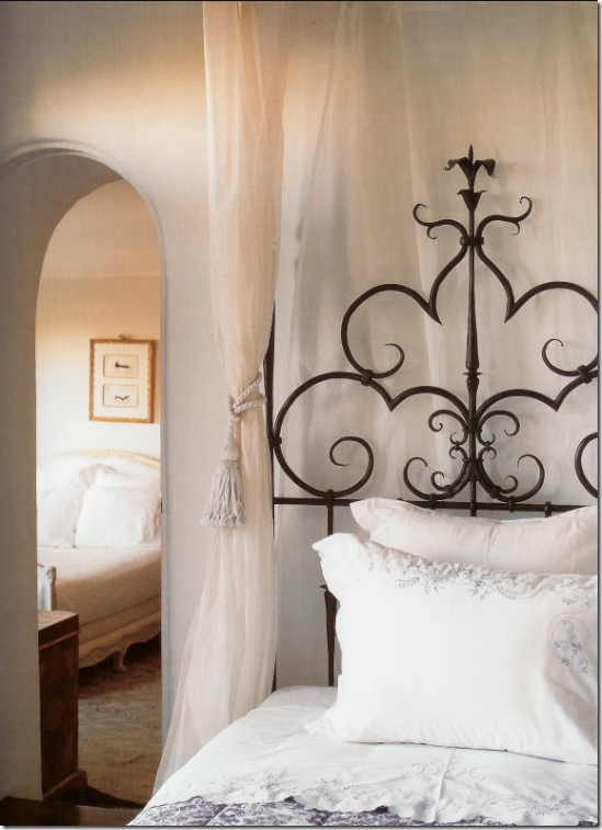
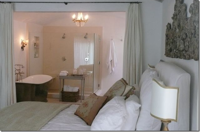
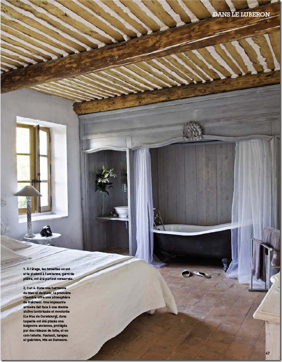
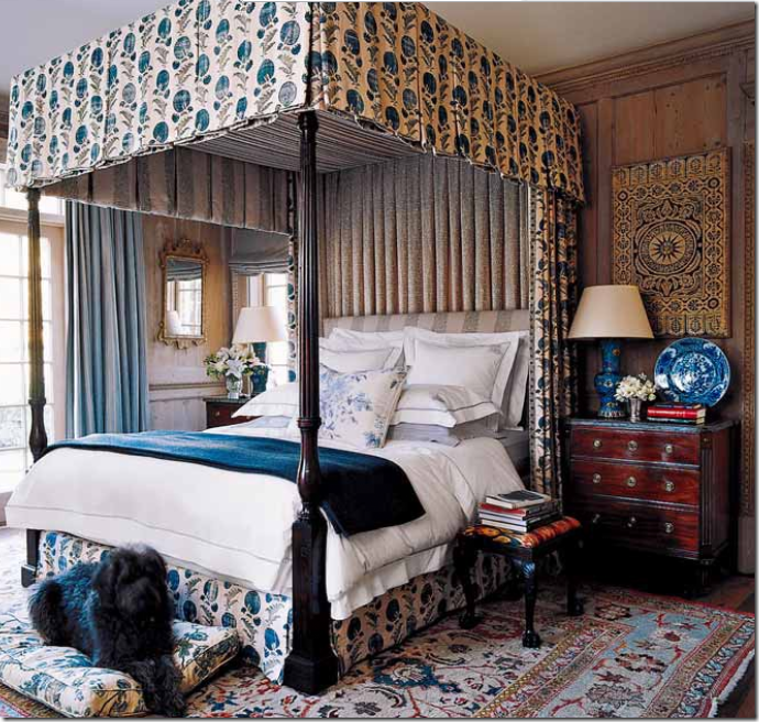

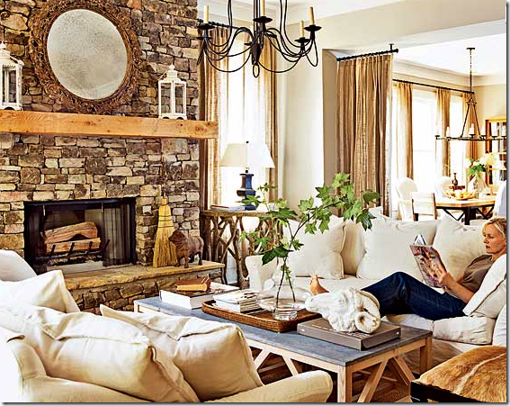
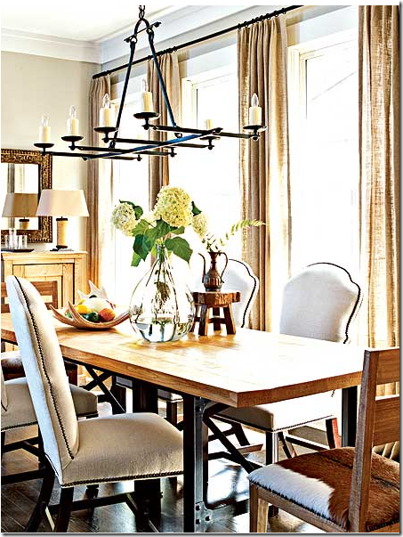
Awesome blog! Love the Do's and Don'ts
ReplyDeleteHi Joni,
ReplyDeleteAnother great and informative post. There is so much to remember and think about, it's making me nervous. My dining room at the moment is looking very unloved as I've taken down the heavy green velvet curtains. I need to get my paint colours sorted first and am having more trouble with this than I'd anticipated!! Thanks again for all your great advice. I will keep this in my favourites file for future reference. Hope you are well.
Take Care
Love Janine
XXOO
Tasmania, Australia
Hi Joanie, Outstanding post! I loved all the examples you provided and learned sooo much. Joanie, thank you so much for sharing your wealth of knowledge. I've always known the look I was attracted to but wasn't sure how to get it. Your "formula" list is excellent and I will use it! I am drapery poor in my house and have been feally wanting to correct that. Now I REALLY want to. :-) You are a treasure to all who visit...thank you for so generously sharing of your time and design expertise! Can't wait to read the next installment!
ReplyDeleteSusan
* My check really I*S "in the mail", Joni (I figured you'd want to start charging me "rent" for staying sooooo lonnnnng!)~~~
ReplyDeleteAt the risk of sounding "goopy" (as you like to say), this was one of THE "BEST BLOGS EVER"!!! ~~~ It's INCREDIBLY INFORMATIVE, sooooo FUN to see all the beautiful rooms n' draperies/curtains ANNNND of course, your letting us in on all your DESIGNER SECRETS is TRULY GENEROUS, KIND, THOUGHTFUL and a DEFINITE T*R*E*A*T!!!
Can't even BEGIN to IMAGINE how much T*I*M*E this entire posting must have taken, but I've learned that when YOU "DO something", you certainly "DO IT RIGHT"... and I personally THANK YOU for just EVERYTHING!!!
"Yer the ma'am", Joni! Many, many thankful hugs!!!
Linda in AZ *
* P.S. May I ask, I*S there a "difference" between "curtains" and "draperies"????? (I've ALWAYS wondered & wanted to know!) THANKS, Sweets! Linda *
ReplyDeleteAbsolutely fantastic. Thank you so much, Joni, I've really learnt a lot today and I just know that your comments are going to be a huge help when I finally sort out the bedroom curtains that I've been putting off for the last four years! Now all I have to do is to figure out what on earth I'm going to choose for the colour/pattern.....it's a nightmare :)
ReplyDeleteTake one tiny (and I mean tiny) rented flat in London, add a small window that isn't full height, then add in a beautiful souleiado duvet cover in white/raspberry and embroidered French white pillowcases. Oh, and a couple of pieces of 19th century mahogany furniture. Sounds lovely but after four years I still can't figure out what's going to look good with that lot. A dark colour would totally overpower the room, toile wouldn't work as the window is so close to the bed - the patterns would clash. White would be beyond boring as the rest of the room is so plain. Oh, and I have to use the existing curtain rail as I can't fix anything to the walls. Just thinking about it leaves me in desperate need of a cup of tea!
Thanks for all the great photos. As a designer it was great to see some situations that I have not dealt with in a while. Great reminders on the Dos and Donts.
ReplyDeleteOooooo, is that a Cortes hanging in your guest room? I'm a fan of both of you! Thanks for a very informative blog post. The pictures are so helpful. Love your blog.
ReplyDeleteJoni, this is an amazing tutorial--thanks so much. I love the French window treatment as I am a minimalist, but your formula is superb! Only one comment: I have two big dogs and two cats and puddling drapes just aren't practical with animals, can't the triple width and double lining compensate for "no pudddling"?
ReplyDeleteThanks so much(again)!
Dr. Webb, Thank you so much for your tutorial. Both informative and entertaining,the lesson provided us all with the correct way of doing it right. Again,thank you for your generosity and hard work! And where do you get your energy? Your love of design shows through.You truly are the Best!
ReplyDeleteThank you so much for this wonderful post. I was smiling to see that you included a lot a rooms that have made my favorites list too over the years. Great to see so many good ideas in one place. A must re-read in my opinion!
ReplyDeleteA wonderful post Joni!
ReplyDeleteA real lesson in decorating with curtains!
I might think that in the US the stores and "bouillonnées" are not so much used as here in Belgium.
Greet
I am so with you on this one! Simple window treatments are a MUST in my rooms. I loved this post.
ReplyDeleteWell you sure didn't disappoint my "Sunday mornings with Joni". I am now on my 3rd cup of coffee, reading and looking at each photo, scrolling up and down many times.
ReplyDeleteYou showed some great solutions to the problem windows, Your living room for one. No one will notice the windows, they just see the fabulous treatment you applied and every thing else in that wonderful room. This post is a keeper for sure.
Oh, how timely. I guess I could've saved you a lot of time emailing back and forth with me if I would've just waited for this post! I love all the pictures and details and have saved plenty in my design file. Now I am anxious to have my dining room drapes made and hung!
ReplyDeleteThanks again for all the the time and effort you put in your posts!
LOVED this post as I have all your posts in this series. Have just one question. We have Top Up/Bottom Down blinds for much needed privacy in our city condo -- this allows us to have light coming in through the top of our windows without exposing ourselves to the street and it also allows us to open the blinds to open the windows (from the bottom)for days when we need a breeze. Anyway, just wondering what you thought about these blinds and how you would accessorize them.
ReplyDeletejoan k.
Loved all the photos. Thanks for showing what's right, and what's obviously wrong. One question... Why is Layla's window "darling" when her bamboo blind is mounted inside the window frame? Wouldn't you advise her to bring it up and outside the window?
ReplyDeleteThank you.
ReplyDeletePreachin' to the choir.
Thank you, thank you, thank you.
Phenomenal post Joni! I will share on Twitter, this is a must have on window treatments! I am in agreement with all of your tips. Especially 2 1/2 width and the length...so important. Also, what a treat to see your own home and work you have done.
ReplyDeleteWow, I have really learned a lot and will be reviewing all the info again.
ReplyDeleteI will be replacing my living room window treatments and might finally have the courage to tackle the bay window in my bedroom!
Wow, great post! That must have taken some time to put together, but was much worth it & appreciated. Great examples of 'do's' & 'don'ts', it always helps to have a visual when you're talking about window treatments. Thanks!
ReplyDeleteI love all of the beautiful images you have shared, especially the clean and crisp curtains. What helpful advice you provided as well.
ReplyDeleteThis is marvelous. Love that Michael Smith room with the yellow curtains and those blue and white ikat curtains too! (And a lot of the rest!) Downloading this post was slowing down my husband's work on his laptop but Joni always comes first. Ha. I wish I could afford some luscious fabric for these great tall windows we have in our old, old European apt!
ReplyDeletep.s. I know your niece-in-law, Allison and used to see her and Phillip at the Houstonian...they're such a cute and fun couple... and their Laine is dang cute!
ReplyDeleteJoni I still have that Carol Glasser family room page from ages ago. A Houston Post magazine I think...
ReplyDeleteJoni,
ReplyDeleteAs always, well done.
Thank you for such a comprehensive fest for my eyes.
I do believe that dressing windows is an integral part of a room plan.
I personally insist on lovely fabrics and dressmaker details in execution of drapery, tablecloths,
custom bedding and upholstery jobs.
I, in my own home use drapery panels in front of my entryway arch and in covering up a book shelf used as extra pantry storage.
I noticed a lovely Biedermeier chest in one of the room. Swoon.
Some lamps, furniture and flooring
to salivate over, as well.
I must also publicly thank you for such a lovely compliment. You responded to my comments in regards to your July 7th posting.
I'm more than flattered.
No, I'm not the legendary Charles Faudree.
I would be pleased and honored to collaborate with you.
I will send you an email, late this week.
Kind regards,
CJF
wow... this post is definitely a keeper. .. a million thank yous.
ReplyDeleteGreat post, Joni. I wish more people would use outdoor curtains; they seem to be the only architect-approved treatment! However, I think I may take the plunge and do some interior installations now.
ReplyDeletehttp://www.shigerubanarchitects.com/SBA_WORKS/SBA_HOUSES/SBA_HOUSES_15/SBA_Houses_15.html
+Spencer
www.ArchitecturalAntiqueReview.com
Cara Joni,
ReplyDeletethis post is fantastic !
I have learned so much !
I always look for window draperies as I have to do one in my home (in Germany). But it is difficult to see anything in magazines. The photos always end before the rod. And also all the interior design blogs never had this subject!
So THANK YOU SO MUCH !
(although some more modern examples are missing)
GRAZIE mille
suzie
Regardless if you have energy efficient windows, many Northerners like myself have the tendency to use 'draperies'. (Cdn. vocab.) For those who may be first timers, something else I feel they shud consider is the aesthetics from the outside. As there is nothing worse than seeing a string of mismatched window coverings; I have found 'a common element' works best.
ReplyDeleteLove the majority of examples you gave. (Thank you.)
GREAT POST!!!! -Brenda-
thank you for such a comprehensive post! It was very timely for me as I'm about to buy fabric for our master bedroom curtains and bedskirt.
ReplyDeleteWOW! This post is fabulous, thanks for all of the great info & advice!! I do love window treatments, but I am not a designer, so appreciate all of the tips.
ReplyDeleteI too wondered at your praise of Layla's window when she broke one of your rules. Isn't this a bit like H&G praising a Bunny Williams room just because she was Bunny Williams?
ReplyDeleteWhat an incredibly awesome post full of (obviously) wonderful pictures for tons of ideas and how to create sanctuary. Loved it....awesome. Thanks again!
ReplyDeleteLylah
La Maison et le Jardin
I love the detail about a subject when you do a posting. I just ordered drapery panels and had them installed this week so I was holding my breath reading the post to be sure I hadn't committed a major blunder. Sigh of relief, I think I passed the test.
ReplyDeleteYou have such a distinctive writing style and I love when you insert a bit about Mr. Slipper Socks Man!
No stone unturned! Thank you, this was fun + fabulous! I always use blackout lining... will now have to consider adding interlining as well. Especially loved all the "portieres"... so Saladino! Thank you... this will be a great resource for all. I see a book coming along nicely!!!
ReplyDeleteSeriously Joni! Where do you keep all of these picture resources girl! You astound me with the "research" photos behind your posts. I don't know how you do it! You must have a separate hard drive to keep all of these pictures filed so orderly that you can find the right picture for the right post! Anyway, great post as usual! BTW... did you stop by and enter my giveaway? I have a fun contest going on right now with a great book giveaway... stop on over if you get a chance! Becky
ReplyDeleteI like the simplicity of the curtail design, It’s not too much but it look so elegant.
ReplyDeleteThese images are stunning. It all possesses style and elegance. The curtain really plays an important thing inside the house. It’ll make a house looks beautiful and colorful. We can always play with the curtain colors create new theme interior design out of it, the curtain is the easiest way to matched and achieve our desired interior design.
ReplyDeleteFabulous! Fabulous! Fabulous!! You are so wonderful and forthcoming with your information! This is a keeper - I saved it and I printed it out!! It covers it all - A very helpful resource!! You are the best!!
ReplyDeletexx-Gina
This post was extremely helpful. When you explain everything the way you do, it all seems so logical and obvious. Thank you!~
ReplyDeleteGreat post - it took me two days to read it properly! I must admit, I do not like valances at all, but that is the streamlined side of me; even when a valance is nice and tailored, I think it detracts from the window/door and the curtains. However, in some situations, I can see how the window and the architecture of the room might call for a valance to cover something up.
ReplyDeleteI do love big billowing silk curtains - part of why I love Gerrie and Lars. I kept the rich orange silk curtains in my dining room even when I changed the wall color, because they reminded me of Gerrie. I had them made 10 years ago, and when they were installed they met the floor; 10 years later, and they seemed to have shrunk a bit. I am not replacing them at this point, they will go with the house, and I am not in the mood to raise or lower anything.
This could have been 5 posts, Joni! A great resource for all of us.
P.S. - is the Lettered Cottage about to break out into something bigger and better?
Miss Joni you are just amazing! Always on the pulse of what is perfect! Hats off to your curtain formula and I too love the Window Fashions book.
ReplyDeleteMy daughter recently moved out and I am in the midst of creating a guest room out of her old room. I am seeking plain white linen curtains (off the rack~ to keep cost low). Sheesh! Looks like I will be breaking out the sewing machine. :)
Joanie...thanks for the drapery roll!!! great photos...I learned something about myself. Unless they are sheer and billow in the wind, I don't like them. They make me feel confined and heavy. Keep up the good work, fun discoverying what I REALLY am drawn too...xoxo~Kathy~ Sweet Up-North Mornings...
ReplyDeleteFor any other blogger, that would have been a 10-part series. You are amazing. I learned so much and am now committed to adding curtains to my somewhat spare home. Thank you for your hard work and inspiration.
ReplyDeleteI just have to comment about the 55th picture "Perfection Again". I noticed the drapery pattern lined up with the wallpaper almost perfectly (a detail that most would overlook). The banding is beautiful. This is a great looking window. I noticed it was designed by Mary Randelman, so I had to do an internet search on her. It appears that she passed away last November. There is a very nice obituary about her here: http://www.legacy.com/obituaries/herald/obituary.aspx?page=notice&pid=120099171 . I wish I could see more of her designs.
ReplyDeleteJoni,
ReplyDeleteWonderful post...thank you for the time and effort you put into this blog. My house needs curtains!
Like many other dedicated followers, I am trying to learn from this and use it in my own home. So some detailed questions if you have the time to respond...
1) The picture of Layla's room has the blinds mounted on the inside as others have noted as well. It seems to work here. Would you agree? The earlier "don't" picture showed side by side windows and the look was definitely more cluttered there.
2) Any sources you could share for simple thin drapery rods (like the one in the Layla room)? Most of the catalogs (Pottery Barn etc) seem to have more of the thicker rods with fancy finials.
3) Drop cloths - an interesting idea but it seems that although you save on the fabric the labor etc would still be quite costly. Or is there a way that folks "cheat" by almost hanging them as they are? Can't imagine that could be pretty but I could be wrong.
Please post your response in the comment section so all can benefit! I know I am always curious at how you respond to the questions posed by others.
Thank you!
Karen in CT
What a wonderful comprehensive post on window treatments. I savored every bit of it and feel like I've been to a workshop on window treatments 101. Thank you!
ReplyDeleteVery imformative! I love curtains and the softness /coziness they add :0)
ReplyDeleteI love the way long curtains look. But they are just a PITA. They collect dead flies and spider webs, lots of pet hair, and dust and dirt from the floor and blown through the windows. Also water stains, mold, and mildew if you live in a damp region. You have to vacuum them every week to keep them half-way clean, and fight the vacuum, which wants to suck the curtain down the tube!
ReplyDeleteSending them out to be cleaned is another hassle, along with taking them down and putting them up again. Never mind the lingering smell of dry cleaning fluid, which is not good for the environment or your lungs. And if you have a fabric valance, which can't be sent out, the curtains will eventually be a different color. And then there's the problem of fabric fading along the edges which are in the sun, and silk rotting in the sun.
And all this "luxury" costs a very, very pretty penny. Honestly, the only way I would have long curtains ever again is if they were made in an inexpensive, machine-washable, machine-dryable fabric. Otherwise it's just an ongoing nightmare. Of course, if you're rich and have a "staff," YMMV.
Thank you so much for posting this. You seriously made me question every single window treatment in my house - my husband will not be happy. :) I love the volume of the drapes you showed here. I would really love to do 3 widths per panel, but I'm sure that's not in the budget. Thanks again for the pointers!
ReplyDeleteAnd one more thing-- cats love to use long curtains as a climbing post, leaving obvious pocked holes that show through in the sun, and can't be repaired. (Voice of sad experience).
ReplyDeleteI am a fabric wingnut. Loved this post!
ReplyDeleteWow Joni. Another post I'll come back to when I need to be reminded why the rules are the rules. Great examples and love your creative fix for your own bedroom window(s)!
ReplyDeleteSo many lovely rooms. I've already bought sheer linen drapes as I was inspired by some of your previous posts.
ReplyDeleteWondering if perhaps you could tell me the source of image #10, titled Quiet Color?
Thanks,
Jill
Dean Fountain - I know!!! I googled her too and it made me sad - I was hoping to see such a gorgeous portfolio, not a obit. wasn't that gorgeous?!!! that banding. and yes - the wallpaper. what a great i.d. and craftsman she used. thank you!!!!!!
ReplyDeleteJoni
karen in CT :
ReplyDelete1. there are always exceptions. Layla likes inside mount - she did it in her living room too. sometimes it does look better esp. if the panels are very simple. sometimes you have to do it - there isn't space etc. and if the molding is not contrasted with the wall, then it really isn't so bad.
2. i use calico corner for rods a lot. just real cheapies. and discount fabric houses are good places to look. the thinner the better imo.
3. they do hang them as is - you can use stitchwitchery on the hems or just cut them and fold them over. and you can just clip them on the rings too. no, it's not perfect, or beautiful, but put two or three panels up and it def. is a good casual look!!!!! for sure!!! esp. for a cottage or beach house or bungalow. not a palace!!
Whew! I was worried that I'd see a photo from my house as one of the "don't" pictures!! I am sooo glad you mentioned that photo from the current Traditional Homes. When I saw it I was afraid it would be the new trend, and I knew I wasn't going to be able to do that! Beautiful and educational post, as always. Thank you Joni. laurie
ReplyDeleteA sui generis blog!Like it very much!Already linked!
ReplyDeleteBest regards from
Corfu
Greece
My blog are:
ReplyDeletewww.pharaona1.blogspot.com
(arts and crafts.Gallery)
www.pharaona.blogspot.com
(TO IFADI)
so much great info Joni!! (bookmarking this one!!) So many beautiful images too... You know how I feel about my unlined linen but I just can't get over how gorgeous the full lined taffetas are!!!!! GREAT one and really will be referring back to get "the rules" straight!!!
ReplyDeletexoxoxo
If this comment repeats, sorry, I thought I left a comment yesterday, but I've been having issues. Anyway, I've been waiting for this post for some time, and boy was it worth waiting for. Just beautiful, beautiful. I was having curtain challenges myself on a client's job I'm working on right now. According to your post, I made all the right decisions, thank the Lord! I am waiting for the WWJD (what would Joni Do) design test. Where you present us with decorating challenges (curtains, furniture layouts, etc.) and we fix. Then the next post you give us the correct answers!
ReplyDeleteAngela in WA
I always feel like I'm late to the party, but it takes me a long time to take in all of the information (and there is a lot of great information here!) before I comment.
ReplyDeleteThank you for being so generous with your knowledge, Joni. You are the best!
I love Jackie's book. It has been a wonderful resource. I have taken it with me to client meetings. One of Jackie's drawings is worth a thousand words!
xo
Brooke
What a grand tutorial! Phew!
ReplyDeleteI am SO curtain challenged...then never want to pony up...sigh.
I have walls of (ugly) sliders in the kitchen, library and one of the rooms...could I treat them like the french doors? With tortoise shell blinds at the top and panels?
Oh I dunno.
See? Challenged.
I have always been a huge fan of curtains. I especially love the full, solid color drapes. Thanks for your formula!
ReplyDeleteI looked through all the pictures thinking you might have resolved my dilemma! Every window and french door in my home has 4 1/2 in. moldings with 3 1/2 in crown on top of that. There is about 2 inches between the top of the windown crown molding and the bottom of the ceiling crown molding. Where do I put the rod? Above the crown with a 4" bracket so that it clears the molding or beneath the crown on the 4 1/2" molding? Stumped and ready to move forward
ReplyDeletei love your posts
ReplyDeletei learn so much
thank you for taking
the time
(i know it is a lot)
to impart your knowledge
i live in san marcos tx
but grew up in houston
my favorite place
is High Fashion Fabrics (home)
i remember when they were
occupying an old piggly wiggly
the kitchen post
was also very helpful
diane
Thank you, thank you, thank you..... I am about to purchase some fairly expensive fabric to make curtains for my master bedroom. You have saved me from making some huge mistakes. This post was VERY helpful. Love your blog!!!
ReplyDeleteBravo Joni! What an amazing post full of all the dos/donts and pretty pictures one could ask for!
ReplyDeleteI adore curtains and this post came just as I was debating what to do in my own house.
P.S. I've always meant to tell yo that I love the scalloped edge on your slipcover in your own house. Charming!
ReplyDeleteI learned alot from this post! Thank you so much! I dont have Any curtains at my home..I better get on the stick! Thanks for giving me the extra "kick" I needed!
ReplyDeleteYou make me paranoid, Joni. I am in the process of picking the curtains for my living room and can't decide on a color.
ReplyDeleteI can say one rule of yours I WILL break is putting the hardware up on the wall. I have plaster walls, super high ceiling, and wood windows with all the original trimwork. Drilling into plaster is a pain, and even a bigger pain to repair should you change your mind later. I put my hardware on the woodwork as the architect intended. Saves the walls. :)
Hi Joni! I loved this post! I agree that draperies are the finishing touch to a room. You've shown some beauties!
ReplyDeleteHave a great week.
Be a sweetie,
Shelia :)
My 2 cents. :)
ReplyDeleteAmerican distinction between curtains/drapes. Curtains are unlined, Drapes are lined. Europeans don't particularly distinguish and typically call them Curtains.
Try lining sheers. The effect is truly amazing and beautiful.
Also? Go custom. I know many people utilize catalogs/online sources however there is truly a difference between custom and off the rack when it comes to draperies.
Hardware is important. Too skinny or too big are obvious traps people can fall into. It's all dependent on proportion and scale.
I've worked with clients who state at the very beginning they will not be doing windows in certain rooms. However, in the end they love the results from the first room that we end up dressing every window!
Thank you, thank you, thank you for making this post. Will refer back to it when clients get unsure and confused about window treatments!
ReplyDeleteJoni,
ReplyDeleteGreat post about interior design in my country!
The cover on the Veranda Magazine is an image of the house of Eduard Vermeulen, a well-known couturier in our country. His houselabel : "Natan".
In my blogpost of the 3th of August (http://belgianpearls.blogspot.com/2009/08/inspiring-belgian-homes-and-castles.html) I wrote about Eduard and his inspiring house.
As you can see ,not only good interior designers but even very good fashion designers can be found in our little country, called Belgium.
Greet
Just to say THANK YOU! I'm a design-handicapped person and your posts teach me a lot. It beats taking Design 101 at school :-)
ReplyDeleteYou are awesome, I just read your fantastic post and was dumbstruck at the end to see my book! You are such a sweetheart referencing it! I loved all of the Do's and Dont's and you are absolutely right about all of your observations. You're a pro and I love you!
ReplyDeleteYour landscape shots nailed VANISHING THRESHOLD.
ReplyDeleteCan't wait for more time to really study each of your pics. Reread your words.
Garden & Be Well, XO Tara
Wow Joni, you really found some fabulous images to illustrate your lesson here! Thank you for all the lingo and the do's and don'ts. This is a post to be saved to re-read again! Thanks!
ReplyDeleteIs there going to be some sort of diploma at the end of this top 10 series? 'cause I feel like I'm back in school I'm learning so much!
ReplyDeleteA terrific post Joni! Full of eye candy and useful information. I wondered from which french magazine issue came Luberon house photos? I have to track that one down. Also nice to see the drop cloth curtains.
ReplyDeleteI love love love curtains. I am grateful for the lesson in blinds. I wouldn't have thought to hang them up under the curtain rods. Thanks for the insight. I can't wait to try out some of your tips.
ReplyDeleteThank you for this post. I love these educational, meaty type posts where I can really learn something. If I could I'd like to ask your opinion on something, bamboo shades layered with curtains is acceptable, what about a simple cotton roller shade layered with curtains?
ReplyDeleteHello. What a beautiful packet of ideas.
ReplyDeleteI wonder if you could recommend a color choice for my living room curtains.
The walls are a lovely sunshine yellow with white mouldings.
I have 2 seafoam green/blue loveseats in ultra suede. The ceiling height is not great... 7'6" (with a 2 1/2 inch crown moulding)
Everything is negotiable in terms of color and window treatment. I'm looking for an elegant, subdued, rich look. I just don't know how to bring it all together.
I do love puddled curtains but we have lots of dogs (dog hair) so it is a challenge.
Any recommendations in terms of color and style?
hello...i love your blog! i am wondering if you do any work in charlotte, nc? or if you know any designers (who are as creative as you...is that possible?) in charlotte? i also just had drapes made and installed in all of the rooms in my house. i am very disappointed in the outcome and i spent tons of money on them. one issue is that the seamstress definitely ironed/sewed in pleats. is there anyway to remove them? any advice you could give would be much appreciated! thanks so much!
ReplyDeleteI love custom shades, even though they take a while and the anticipation is great, they are WORTH all the effort!
ReplyDeleteWow! This post was incredibly comprehensive and educational. Thank you for sharing. I have been working on a solution to a bay window and this post helped! I agree, less is more when it comes to trim and swags are definitely not my thing. I am with Phoebe on the curtain length. Unless it is a formal room, I Iike curtains to the floor or with a 1" break, no more. GREAT POST!!
ReplyDeleteI appreciated the frank "DON'Ts," which are important to point out. And I'm particularly glad you clarified what was wrong with the bedroom in the latest Traditional Home (which I detested on sight, but couldn't say why) in which multiple drapery and quilt fabrics were mixed. Boy, that bedroom upset me when I first saw it.
ReplyDeleteGreat Post, Joni! And congrats on it getting mentioned in the Washington Post's Blog Watch of Aug 27 -- very well deserved!
ReplyDeleteJoni,
ReplyDeleteAs always your posts are wonderful, chock full of helpful information. Hopefully w/ your help you will prevent more design disasters from happening. The details provided were awesome. Two of the biggest impacts that one can make to change the feel of a room are (in my opinion) paint and window treatments.
Thanks for all your hard work, dedication and devotion to the blog world, everything that you do is greatly appreciated. I still don't know how you do it though, you are a miracle woman. I started blog post in Live Writer on window treatments (and a few others ;)) two months ago and still haven't finished it up. You are an inspiration. Thank you. hugs, Laura
I was in Restoration Hardware yesterday picking up some cabinet pulls for a client and spotted a couple of new Fall 2009 pieces on the showroom floor. Wow! The bed especially knocked me out... And if I were knocked out, I'd love to wake up on that!
ReplyDeleteWhat an amazingly informative post!! Thank you so much for taking the time to put all this together!!
ReplyDeleteAmazing, as always!
Jenny
Windows are the source of life for a house. The decor is great because it seems to invite the light in. The setup is also great.
ReplyDeleteNicolette
http://www.furnitureanddesignideas.com/
All hail the queen! You are truly the diva of blogland. Thank you so much for such a wonderful window extravaganza. So many beautiful pictures. I've long speculated about your drapery formula and feel like I've just recv'd a present or am privy to a fabulous secret....ssshh..
ReplyDeleteabout ironed in pleats - you can try to have them steamed out!
ReplyDeleteRita: why not try soft yellow/creamy colored curtains to blend in with the walls.
Cotton shades do work great with curtains too.
Anon with the molding questions - email me a picture - hard to imagine what you are saying exactly!
Joni,
ReplyDeleteI adore your blog! Do you have a set rule for how many rings to use on panels of drapery? I have a 104" wide window that I want to use 3xwidth panels. How many rings should I use? Thank you!
Laura
Love the pics you posted!!! Great ideas! Beautiful rooms! Thanks!
ReplyDeleteIt was very interesting for me to read that blog. Thank you for it. I like such themes and everything connected to this matter. I would like to read more soon.
ReplyDeleteIt is very interesting for me to read that article. Thanx for it. I like such themes and everything connected to them. I would like to read more soon.
ReplyDeleteHi Joni
ReplyDeleteThis really is an extraordinary post. I just installed 60 yards of silk drapery in a living and dining room, extra long and had them 'kiss' the floor. I am sending my clients the link to this post to read because they are not liking how the panels get 'kinks' in them because they are just breaking at the floor.
Right now we are in the process of getting them hemmed so that they don't hit the floor but I thought they should see that there is lots of silk out there that looks just like theirs!
Many thanks for this amazing post!!
xo
Maria
What incredible photos and content. So many great ideas. Thank you!
ReplyDeleteKeep on posting such articles. I love to read stories like that. By the way add some pics :)
ReplyDeleteThe information here is great. I will invite my friends here.
ReplyDeleteThanks
This is incredible!!! THANK YOU!!! For taking the time to do this. For showing "Don't" as well as "Do". For caring enough to spend the time!
ReplyDeleteI don't know how I missed this post, thanks Maria for bringing it to my attention. I have been making custom draperies for 20 years and Joni you have a great eye and have really put A LOT into this post. Your pics are just gorgeous !
ReplyDeleteDon't stop posting such themes. I like to read blogs like this. BTW add more pics :)
ReplyDeletePretty cool site you've got here. Thanks for it. I like such themes and everything that is connected to this matter. I definitely want to read more on that blog soon.
ReplyDeleteJulia Smith
escorts belfast
Damn, pretty nice information. Where will I find your subscription?
ReplyDeleteKatherine Flouee
camera scramblers
1
ReplyDeleteAmazing!
ReplyDeleteHi Joni-
ReplyDeleteDo you use 100 % cotton blackout lining? On the occasion when you don't use blackout, do you use 100% cotton or cotton/poly blend? Poly adds a little extra uv protection? I have read pros for both types.
This is incredible info! I finally feel like I understand curtains and can actually add them to my home. Your blog is fantastic.
ReplyDeleteThis post is fabulous, thanks for all of the great info & advice!!
ReplyDeleteThose are fabulous curtains. A proper care of our house involves a lot of steps. The selection of curtains is also one of those steps. Curtains are necessary for a room to give a complete look.
ReplyDeleteSheer shades should be one option to be added in this blog as other curtains mentioned in this blog are similar in functionality.
ReplyDeleteFantastic. But only in my dreams. (But agreed, I'd never hang any drape/curtain without interfacing & lining if I can afford it.) Now lets admit the puddling translates to getting filthy, dusty and an easy solution to lack of precision required to just skim the floor. The average homeowner cannot replicate this without a decorator doing custom and certainly won't do the cleaning maintenance required to remove things like DOG HAIR! Which also risks sucking up the expensive drape into the vacuum. The same reason all you can find for bedding is "comforters" and not bedspreads. Spend more money on having to buy several components instead of 1-2. (pet peeve) In fact, same reason they sell cap sleeves in women's blouses, which only save the manufacturer money, not because they flatter ANYONE!
ReplyDeleteI faked valances once with yards of olive-ish green taffeta from Walmart, velcro'd to the wall freeform, stuffed with crinoline and got more compliments on them than my super expensive custom roman shades and other window coverings LOL. I'm going to do the same thing now. Hang/tieback $10.00 63"curtains on sale, on the WALL with blackout and poof behind them to add the weight and luxury and forgo function over form. Of course, learning to sew would help. (sigh)
ReplyDeletecoach outlet handbags You can not just save your cash but also your time inside a convenient way to obtain the exact same bags product and do not be concerned the shippment of one's products.coach outlet store online with fashion style and top quality succeed. In any occasions they are very suitable and appropriate for its precise and rich design.
ReplyDeleteI'm pretty sure I just spent a solid hour looking at this post alone. Love love love curtains. This post was wonderful! http://adventuresofdutchandme.blogspot.com/
ReplyDeleteWhat an awesome post. thank you. In Florida we have a lot of the same from builders. Windows are not framed with wood..plain..plain...plain. I was looking for the entire blog and could not find a sample of a problem window I have. The ceiling is 18' high and the sliding doors are 10". Do you do panels that are 18' to go all the way up to the ceiling? How do you do a grass blind. The slider is 12' with a gorgeous pool view but curtains are a must. Please help.
ReplyDeleteJoni, how do I go about hiring you for some design work? Please email me at christyejohnston at gmail.com. Thank you!!
ReplyDeleteI am typically to blogging and i actually appreciate your content. The article has actually peaks my interest. I’m going to bookmark your web site and hold checking for new information.
ReplyDeleteHow beautiful curtains.....it look so beautiful in different colours...like the way it looks and co ordination to the entire beauty..
ReplyDeletewindow shutters clayton, ca
I like the curtains and also the design of the curtains are very nice. The main thing is that the curtains are very nicely matched with the rooms.
ReplyDeleteI disagree with many of your don't comments. Some of them are strictly based on looks to achieve a cohesive streamlined look and not function. Remember good design needs to function and window treatments offer more uses than beauty. Hanging one wide and heavy blind to cover an entire wall of windows instead of individual ones is ridiculous unless you plan on leaving it up all day and never adjusting it to filter light at different intervals in the day as light changes. My two cents...
ReplyDeleteLove this post! I am desperately looking for ways to decorate the windows in my daughters' rooms. I love silk taffeta and Im not into the "girl" little girl theme, but having trouble finding fabric that meets in the middle. Would you do a post on children's window decor?
ReplyDeleteA best discussion on design elements topic according to me, better content, informative post and effective planning to post are something I noticed about it
ReplyDeleteA best discussion on design elements topic according to me, better content, informative post and effective planning to post are something I noticed about it
ReplyDeleteGood detailed work. Very informative. Thank you for posting. door curtains designs looks good.Post is wonderful.
ReplyDeleteFascinating! It's amazing how curtains add interesting details to any part of your home. You can also check http://blazefiretechnology.co.uk/
ReplyDeleteThis comment has been removed by the author.
ReplyDeleteCurtains are a great way to add a bit more decoration to a room. In your example with the cream living room, the design would have not been the same without the curtains. Nowadays not too many people put curtains in their homes or if they put, they are light ones. As if blinds are more popular and a preferred choice rather than the heavy curtains, but again it all depends on the taste of the person.
ReplyDeleteA little late on the in-take, but this is an amazing post with swoon-worthy examples. Thanks!
ReplyDeleteI'm currently furnishing my first apartment, on a very tight budget. I love reading your blog for inspiration and a little eye-candy R&R! I'm also learning a lot, like that what I want to do in my living room to hide an ugly banister is a "portiere". Does the fabric I use for this dividing "wall" need to be the same as the curtains I'm using for my sliding-door "window"?
This is a truckload of info, but I appreciate all your detail! However, I've always been kind of against the school of thought that says hang rods right at the ceiling if your windows aren't that tall—I hate the big awkward gap at the top of the window. (And we don't like the look of blinds to cover the gap or valances/cornices in our space; it's all too fussy given the size and vibe.) Then it gets further complicated by the fact that our living/dining room has a coved ceiling, with 1/2 round molding just under the curve—so the ceiling is standard but the molding lands much lower than standard ceiling height. We feel like we can't hang curtain rods too close to that molding without it being busy/competitive. Sigh. :) I'm in the process of figuring out how to work everything together now, but it's confusing!
ReplyDeleteWe're also going to be using semi-sheer top-down bottom-up honeycomb blinds on the windows, because that's what we need for light and view management. I know those aren't as elegant as the tortoiseshell or matchstick blinds you've shown off, but we have a much more modern space and they're just what makes sense usage wise. Do you have any guidelines for those types of treatments with panels?
Joni,
ReplyDeleteThis was the best post for window coverings 101 that I've ever seen.As an owner of a custom workroom for over 38 years, I can't tell you how many profesional interior designers missed the class on window treatments and appropriate heights! This was spot on and should be required reading for all interior designers! Thank you for all the time you obviously spent with fabulous images and most importantly your wonderful writing.
Thanks,
Patty
A&R Box Packaging provides many types of packing tape. Packing tape is most commonly used when sealing up boxes for storage and transit. A&R Box Packaging sells packing tape at very competitive price
ReplyDeleteI am so happy I came across your site, I have a dilemma, dinning room: window-door-window all in one, timber (not painted white) but not that fabulous looking either or perhaps I just cant see it, my thoughts were possibly to use a double track with the blackout behind and the sheer at the front, fabric I was thinking was possibly gasa sheer by Wilson(?)I believe in an off white colour (matching the walls) and the std blackout at the back. My concern is that you have not brought this up, do you think it might look strange perhaps or its not the done thing i.e. sheer at front blackout at the back? this way the room has a softness during the day when the blackouts are pulled not exposing the double white steel track and the sunlight still comes through the sheers but also keeps the nosy neighbours out. I would love to commission you however I live in Australia, with a champagne taste and beer budget:) Any ideas or suggestions would be greatly appreciated.
ReplyDeleteKindest regards,
DM
A lot of the curtains you've featured have quite an old feel to them. They are indeed nice, but a lot of people are going more contemporary these days. DM, in answer to your question, I too am located in Melbourne and provide sheer blinds. I just did an install of sheer blinds at Tiffany and Co in the city.
ReplyDeleteWhen our long awaited curtains in the living and dining room were hung, my ... longcurtainrods.blogspot.com
ReplyDeleteWow, this is excellent! People don't give Texans enough credit as decorators. We're getting some curtains put in next week. I kind of wish they were from Texas now, just so I could say so. Thanks for putting this together, it's wonderful! Thiago | http://www.sebastiansinteriors.com.au
ReplyDeleteTo illustrate which window coverings look great, I've collected pictures of ... kitchentreatments.blogspot.com
ReplyDeleteHome decor is not merely arranging furniture or sofa set in your living room but decor your home in manners and elegant look also boost home value and beauty . there are some great home decor ideas for increase home or living room beauty.
ReplyDeleteOnsite Mobile Curtain Cleaner
home cleaning company
ReplyDeleteWonderful job in making the best blog ever, thanks for the good work.
great post. Is it ok if I link to this on my site?
ReplyDeleteThis article is very informative and cool. Thanks for share this beautiful article.
ReplyDeleteWindow Blinds
Thanks for sharing different curtain style and designs.
ReplyDeleteV&A Curtains
Houston designer Lisa Epley used panels with her arched French doors – sometimes the perfect solution to deal with arches is just to ignore ... cfrenchdoors.blogspot.com
ReplyDeleteThis comment has been removed by the author.
ReplyDeleteVery nice post, impressive. its quite different from other posts. Thanks for sharing.
ReplyDeleteShopclues coupon
Good post....thanks for sharing.. very useful for me i will bookmark this for my future needs. Thanks.
ReplyDeleteShopclues Coupon
Your work is really influential. Your information in this blog is very helpful for every visitor of this page. Thank you very much for share such a great information with us.
ReplyDeleteFaux Wood Arches
Good Blog about Curtains. Buy Different design and colors Curtain for Window,doors Online visit myiconichome. They offer upto 12% for shoe rack. Additional 5% offer for first time purchase.
ReplyDeletehttp://www.myiconichome.com/337-curtains
I have these elements at home, but not all. Thanks for listing all of them in one place. You might also want to consider Double Glazed Sash Windows.
ReplyDeleteThose are so adorable I love them! I wish I could have 1 in your list. haberdashery cord
ReplyDeleteHi Joni, I've just read his post again. And I do everytme I start a new window project, just as a refresher. Thanks for all this research, you re the best!
ReplyDeleteafter I saw some pictures in this article, this picture is really amazing, especially for bedroom curtains I love it ... thank you this article has given me new inspiration :)
ReplyDeleteAmong those posts I've seen, this is the most particular one, and I think the blogger must have spent lots of time on it, thank you so much!
ReplyDeletewindows blinds suppliers in india
Among those posts I've seen, this is the most particular one, and I think the blogger must have spent lots of time on it, thank you so much!
windows blinds suppliers in india
This comment has been removed by the author.
ReplyDeleteHow much do Top Designers charge for custom window treatments?
ReplyDeletecustom curtains
This blog is very beautiful and full of ideas.. I really enjoyed visiting this blog. Thank you so much for sharing this blog. It really worth sharing.velvet pillow covers
ReplyDeleteشركة غسيل كنب بالرياض
ReplyDeleteشركة تنظيف بالبخار بالرياض
شركة تنظيف كنب بالرياض
Impressive design looks awesome. Thanks.
ReplyDeletewindow shutters london
blinds north london
Rất mong quý bạn có thể xem thêm các mẫu rèm cửa của chúng tôi rèm cửa và cùng với mẫu khác nhau rèm cửa đẹp hà nội
ReplyDeleteInteresting article and very nice information about the Texas thank you for sharing this.
ReplyDeleteDisaster Victims Recover
Since these blinds are obviously made of wood, here’s a friendly reminder: Never leave it to soak for too long to prevent it from warping and discoloring.
ReplyDeletewindow blinds houston
its very beautiful! Thanks for sharing..
ReplyDeleteHome decor
I love this shutter also. Would be great for back side of my townhouse which gets extreme afternoon sun in the summer. But I probably would never be allowed to install. Also, it would prevent my watching all the bird activity on my patio, and I don't want to miss that!
ReplyDeletehouston blinds
good blog Blinds in Kunnamkulam
ReplyDeletePlease keep sharing more and more information about this.This is a good information of the fashion licensing articles and really like your site.
ReplyDeleteWindow Cleaning Gateshead &INDUSTRIAL WINDOW CLEANING SERVICES Gateshead
Thank you so much for this wonderful article really! Please Visit:
ReplyDeletesouth london decorators
office decorators london
spray painters london
Thank You for sharing this blog. i feel very good know about curtain in delhi and other things about shopping. Please suggest me something for my home decoration http://www.mofurnishings.com/fabrics/curtain-fabrics this website is good or not for buying curtains in delhi ncr
ReplyDeleteThank You for sharing this blog. i feel very good know about curtain in dubai and other things about shopping. Please suggest me something for my home decoration http://kanzinteriors.ae/curtains-in-dubai.html this website is good or not for buying curtains in dubai, uae
ReplyDeleteIt’s an awesome pictures and paragraph in favor of all the home decor and internet viewers and lover; they will get benefit from it I am sure..
ReplyDeleteThanks for sharing it. if you need more details for curtains visit here....
It is super blog, I would like to be like you. Please Visit:
ReplyDeletesouth london decorators
office decorators london
commercial paint sprayers
this is a good but When the ceiling is low, hang the rod directly under the molding thus elongating the line and giving a more vertical feel to the room. These rods were also placed to clear the window and save the view. A trim placed on the leading edge dresses up the panels just a touch.
ReplyDeleteOutdoor Bamboo Blind
In the event that you are seeking Dragon store covers in Dubai then you are the perfect place for that .Carpet Supplier Dubai have a most broad arrangement of plans to investigate; you can in like manner check through other floor surface things, for instance, vinyl mats, Custom sisal cover, custom sisal mats, Dragon shop rugs , wooden deck, Office Carpet Tiles Dubai, Vinyl Flooring Abu Dhabi, cover edge restricting tape and parquet flooring.For more data please click our site http://www.carpetsdubai.com/
ReplyDeleteIn the event that you are seeking Dragon store covers in Dubai then you are the perfect place for that .Carpet Supplier Dubai have a most broad arrangement of plans to investigate; you can in like manner check through other floor surface things, for instance, vinyl mats, Custom sisal cover, custom sisal mats, Dragon shop rugs , wooden deck, Office Carpet Tiles Dubai, Vinyl Flooring Abu Dhabi, cover edge restricting tape and parquet flooring.For more data please click our site http://www.carpetsdubai.com/
ReplyDeleteIf you are looking Parquet Fooring Suppliers in Dubai then you are the perfect place for that .parquetflooring.ae in like manner have various distinctive classes for ground surface arrangements.furthermore mail in info@parquetflooring.ae visit our website:http://parquetflooring.ae/
ReplyDeleteWe have achieved more than 712 errands till now, every one of the endeavors we have done are master adequately. We have a far reaching number of satisfied customers; we work for the satisfaction of the customers. Home internal parts UAE is an organization outfitting association that outfits the customers with staggering cleaning, sewing and settling organizations of various sorts. We have the most amazing wrap Blinds and Curtains Dubai , we do all what the customers' solicitations from us concerning settling.
ReplyDeleteVisit here: http://curtaindubai.ae/curtains-dubai/
If you are looking for Dragon store covers in Dubai then you are the ideal place for that .Wall to Wall Carpet Dubaihave a most expansive game plan of plans to research; you can in like way check through other floor surface things, for example, vinyl mats, Custom sisal cover, custom sisal mats, Dragon shop mats , wooden deck, Office Carpet Tiles Dubai, Vinyl Flooring Abu Dhabi, cover edge limiting tape and parquet flooring.For more information please click our site http://www.carpetsdubai.com/
ReplyDeleteIf you are looking for Dragon store covers in Dubai then you are the ideal place for that .Where to Buy Rugs in Dubaihave a most expansive game plan of plans to research; you can in like way check through other floor surface things, for example, vinyl mats, Custom sisal cover, custom sisal mats, Dragon shop mats , wooden deck, Office Carpet Tiles Dubai, Vinyl Flooring Abu Dhabi, cover edge limiting tape and parquet flooring.For more information please click our site http://www.carpetsdubai.com/
ReplyDeleteNice blog, thanks for sharing this blog.
ReplyDeletecurtains and blinds Dubai
I always curious to know more about how we can enhance our skill, how we can improve our portfolio to add some attractive certificate. I got some valuable points through this blog. blackout curtains
ReplyDeleteNice Blog...Thanks for sharing your this blog.
ReplyDeletecurtains and blinds Dubai
Thank you for the wonderful blog. It is indeed informative and useful. We are into the same business.
ReplyDeleteFlooring Houston
Thank you for the wonderful blog. It is indeed informative and useful
ReplyDeleteBlinds Abu Dhabi
Curtains Dubai
I really like the article like this very simple but meaningful.
ReplyDeleteCurtains Dubai
Curtains in Dubai
Thanks for sharing this content with us
ReplyDeleteBest Quality Home Curtains
Do make a call on to Onto blinds and get your hands on their best Venetian Blinds. You will find their best services at the most affordable price. They are not costly. Their wide range of Customized Blinds is intended for your different requirement. You will definitely like the advance designed product. I like them very much. You can share the link with your family, friends and loved ones and educate them about the awesome services.
ReplyDeleteGood post and good images regarding curtains. I saw online that we can use tracks or poles to hang them. There are so many different methods used to make window curtains look beautiful and easy to use.
ReplyDeleteNice blog.
ReplyDeleteThanks for sharing.Best quality hotel curtains
Thats a good post and hope it helps other peoples.
ReplyDeleteBest quality hotel curtains
Great info thanks for sharing this blog.
ReplyDeleteBest quality hotel curtains in Dubai
Thanks for sharing this content It helps me a lot.
ReplyDeleteBest quality hotel curtains
This blog is nice an provide me good information. Thanks for sharing it
ReplyDeleteBest quality cotton curtains in dubai
That’s nice blog, I really appreciate it! Thanks for sharing it.
ReplyDeleteBest quality linen curtains in dubai
Hi,
ReplyDeleteThis is awesome and best blog, Thanks for sharing. keep it up.
Best quality outdoor blinds in dubai
thank you for sharing this amazing blog this blog is very informative and good design sof curtains and want to see again this type of blog so keep continue Office Curtains and Blinds
ReplyDeleteThis is awesome and best blog. Thanks for sharing. keep it up.
ReplyDeleteBest quality shutter in dubai