Just a quick, fun post for a Sunday morning! I hope everyone is enjoying their holiday weekend.
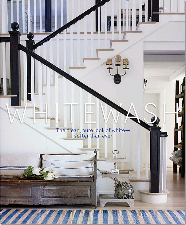
Remember this Californian beach house – featured in House Beautiful two years ago? So pretty, with its white walls and black bannister – Swedish bench and blue and white rug – all in the foyer alone!!
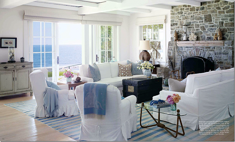
Designed by and the home of Carolyn Epsley-Miller – the living room overlooks the Pacific. White slipcovers and another blue and white dhurri mix with the dark stone fireplace.
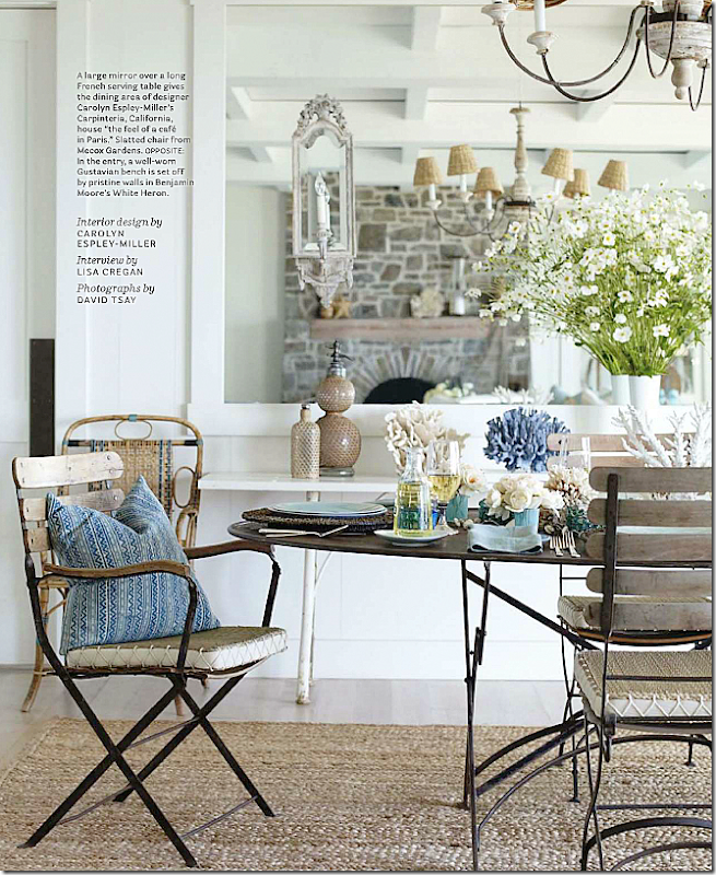
At the other side of the living room, the dining room has a thick textured rug and classic French garden furniture, along with a huge mirror that reflects the fireplace.
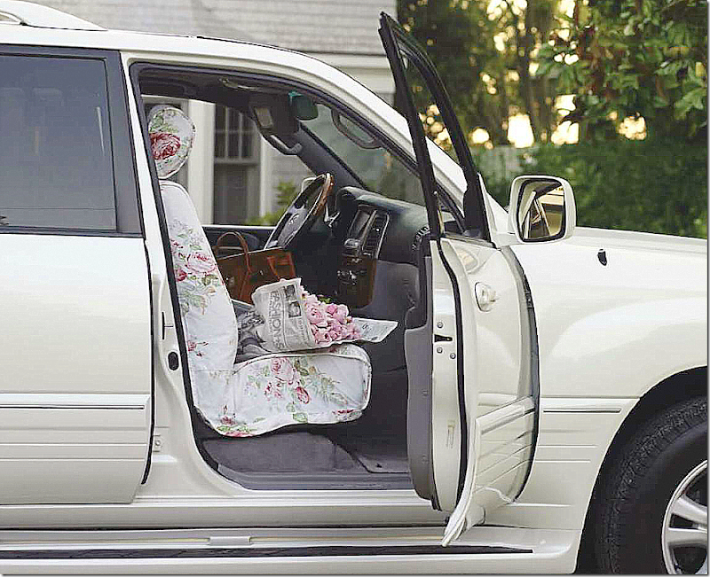
But, it was Carolyn’s white SUV, with its chintz slipcovered seats, that caught all the attention. So many blogs showed this picture – and Pinterest is filled with this exact image. I was so jealous when I saw this! I immediately wanted to do this to my own white SUV. Of course, I never got around to it. The fabric is Country Rose in Russet by Jane Churchill. Another good fabric to use would be a Rachel Ashwell Shabby Chic one.
I drive an old Jeep Commander. I’m due for a new car, but Jeep quit making this model, so I’ve been holding onto it. I wonder why Jeep always discontinues their best cars? I’m a square car person. The boxier the better. But, there aren’t that many out there because boxy cars aren’t aerodynamic. I love my car, I think it’s so cute.
What I REALLY want is a Jeep Wagoneer – just like this. But again, they don’t make these anymore. This used to be a really popular car in Houston and it’s a much sought out vintage model. I would love a refurbished one.
We’re a Jeep family for some reason. Elisabeth’s first car was a Jeep Compass and now she has a Jeep Cherokee. All three of our cars are white – not sure when we started that car statement, but it looks nicer when all three cars are parked outside – all in white. It would be nicer if we could park a car in the garage, but that's never going to happen because our garage is our biggest storage closet.
So, Elisabeth is home for the summer and is working as an intern for a Personal Shopper. Yes, she gets paid to go shopping all day which is a dream come true for my daughter. At least she’s using someone else’s money for a change. Her first day on the job, she came home to tell me all about the car mats in her boss’s car.
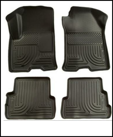
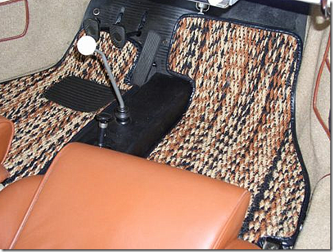
Car mats? You mean those ugly plastic things you put over your car’s carpet? Yep. She was talking about those car mats. Apparently, you can order this wonderful, colorful coco mats – made out of the coconut fiber. Once, all the foreign cars had cocomats – Mercedes, Jaguar, etc. And, now, this company www.Cocomats.com has brought these fun mats back to the market:
For just a few hundred dollars, you can get these cocomats in colors to match your interior – whether you have a vintage sports car or not.
So cute!
Here is the mat in blue and white coco.
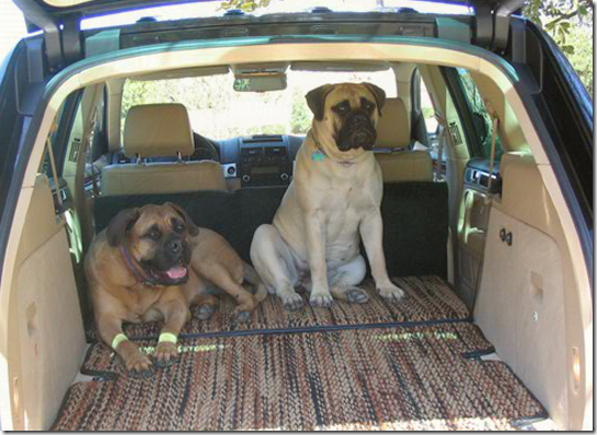
They even make mats for the back area of SUVS. You just order which mat you want, online, and give them the make, model, and year of your car – and a few weeks later, the mats are delivered to your home.
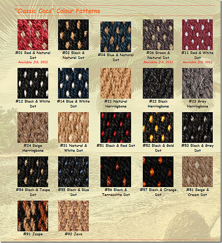
Here are the colors the cocomats come in.
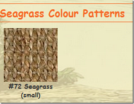
But look – they recently came out with SEAGRASS mats!! Yes, SEAGRASS!! OMG!! Wait, I might have a heart attack.
Actually, the mats Elisabeth’s boss has are seagrass. That’s why she was so excited to tell me – “Mom, her car mats are made out seagrass!” I was thinking, sure they are, haha. Tonight we google searched them and there they were.
Seagrass mats for your car. There are also mats in sisal and wool that look just like the seagrass – but we all know that seagrass is cleanable and sisal isn’t. Don’t we?
Of course, there are seagrass mats for the back of the SUV.
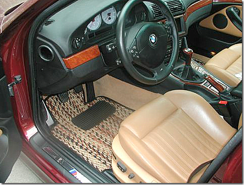
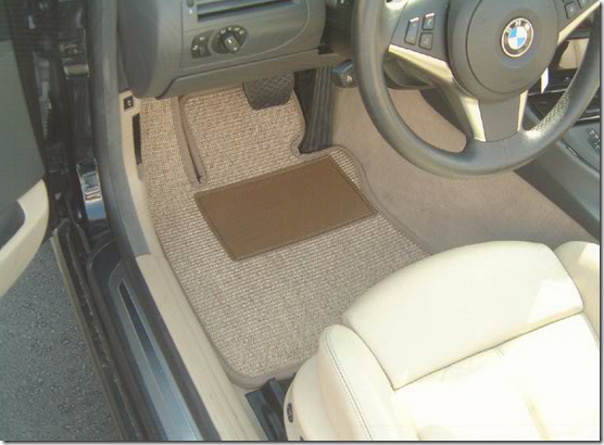
Here’s a BMW outfitted with the custom mats. So, do you think I ordered me a set? Well, of course I did. I can’t wait to get them, either. If anyone should have seagrass car mats, it’s me. With a white car, it’s just screaming for seagrass – right? Talk about being consistent with my design philosophy.
I wonder if Carolyn knows about the seagrass mats. She surely needs them too. Should I tell her? And the more I think about it – if I were going to slipcover my seats – it would have to be in plain white linen, of course. I think I’ll wait until I get a new car and then make that decision.
THE HOUSE STYLE CAR
The Skirted Roundtable with Annie Kelly
We have a new Skirted Roundtable discussion up – with guest Annie Kelly. Kelly who writes books with her husband, photographer Tim Street-Porter talks about their latest collaboration, Rooms To Inspire By the Sea. This book is the latest in a series that includes Rooms To Inspire in the City, the Country, and just plain Rooms to Inspire.
For this newest book, they have picked a variety of houses near the ocean to show here – some fancy like Richard Shapiro’s gorgeous place in Malibu and some not so fancy like Chris Mead’s house in the Hamptons. Other houses shown are Joe Francis’ in Mexico and India Hicks in the Bahamas. As always, the photography is stellar and the choice of houses shown is a most interesting mix.
Annie Kelly and husband Tim Street-Porter
The latest in the series.
I love the cover of this book and keep it out on my coffee table.
Love this fireplace – the color green mixed with blue and white.
And the original series of “Rooms to Inspire”
The couple also have two books on Mexican interior design and one on Litchfield style homes. To order their books, Amazon has a special Annie Kelly Books page HERE.
To listen to Annie Kelly, please go to The Skirted Roundtable at www.skirtedroundtable.blogspot.com
ANTIQUE SHOPS AND DESIGNERS
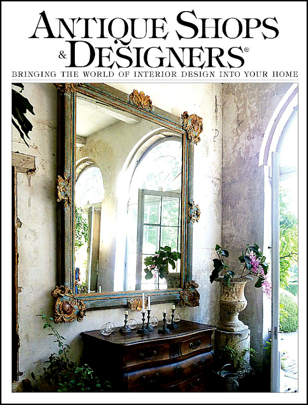
The new issue of one of my favorite magazines – Antique Shops and Designers – is out and is now available online HERE. I like to show this magazine’s highlights on the blog because it’s printed here in Houston and many of you might not get a chance to read it otherwise. The magazine keeps getting better and better and this issue kept me happily engaged for a few hours. Two articles in particular stood out – Barbara Carlton’s townhouse and Megan Megas’s house. Both have close ties to two of Houston’s great designers, as you will see:
Barbara Carlton is the mother of Renea Abbott, owner of Shabby Slips in Houston. I always talk about the designers I think are instrumental in starting the “Houston Look” but somehow I don’t mention Renea enough. Her store is now 20 years old – amazing – and when it opened, it was a very casual place to go get your furniture slipcovered in loose linen. That didn’t last long though. Shabby Slips quickly became one of the better antiques and decor stores in Houston who just happened to slipcover custom furniture in tight, tight slips – some were impossible to even tell that they were slipcovers. Renea has a special mix she uses – White linen, black accents, modern tables and lamps, gilt mirrors, and fancy antique chandeliers. It’s a look where the antiques are covered in white, casual fabric and mixed with contemporary art work. Lots of zebra and leopards are mixed in to create her look. Her mother, Barbara, also has excellent taste and it’s easy to see where Renea inherited her own aesthetic from. Barbara’s style is more casual than Renea’s glamorous look. She’s more into white interiors than Renea.
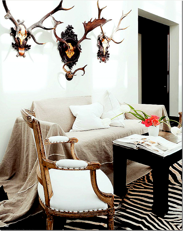
Pictured in this issue is Carlton’s new townhouse. I’m loving this first picture – the sofa was “too white” so she had this loose slipcover made for it out of linen. Wow! I LOVE this and want to copy it!! What a great idea to have a second set of slips made like this for a quick change out. Walls are white, there’s a zebra rug and a black table. The French chair, one of a pair, is dressy in its gilt frame but made accessible in its friendly white fabric. The antlers are antique. And notice the pillows - two centered in the middle. That’s a great idea, you never have to move them when you sit down. Shabby Slips makes the BEST pillows in town. They are soooo overstuffed with down, it’s insane.
Photography by Jack Thompson
Dark floors, white walls and seagrass – mixed with white chairs, ottomans, and a linen sofa – all slipcovered. Again, loving the two pillows. As always – there are antiques mixed in to create that friction – here a dressy black coffee table – sits up high. An antique chair is angled off to the side. I love the sofa’s scalloped back AND arms. It’s unusual to see scalloped arms. Old floor lamps take the place of side tables. And – a huge horse painting gives motion to the room.
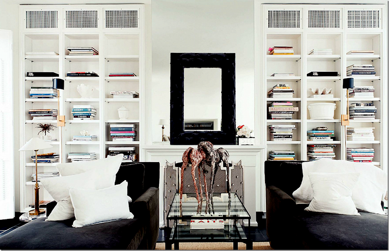
Matching chaises in deep brown velvet with pops of white linen pillows sit opposite the linen sofa and white chairs seen above. Notice the fab sconces on the bookcases. And on the mantel – it looks like an empty frame is placed on top of a mirror. There are no captions, so I’m winging it here!
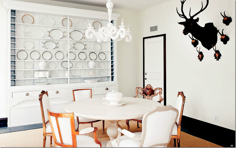
A mix of chairs around a fabulous limed washed table. The large piece was probably stained dark and repainted white. The light fixture – look familiar? It’s the same plaster fixture from France that was seen in Sally Wheat’s dining room. Notice the black painted trim around the white door. The floors are black – and the walls are dead white. It looks like the floors are some kind of stone or tile – maybe marble? Hard to tell with no captions.
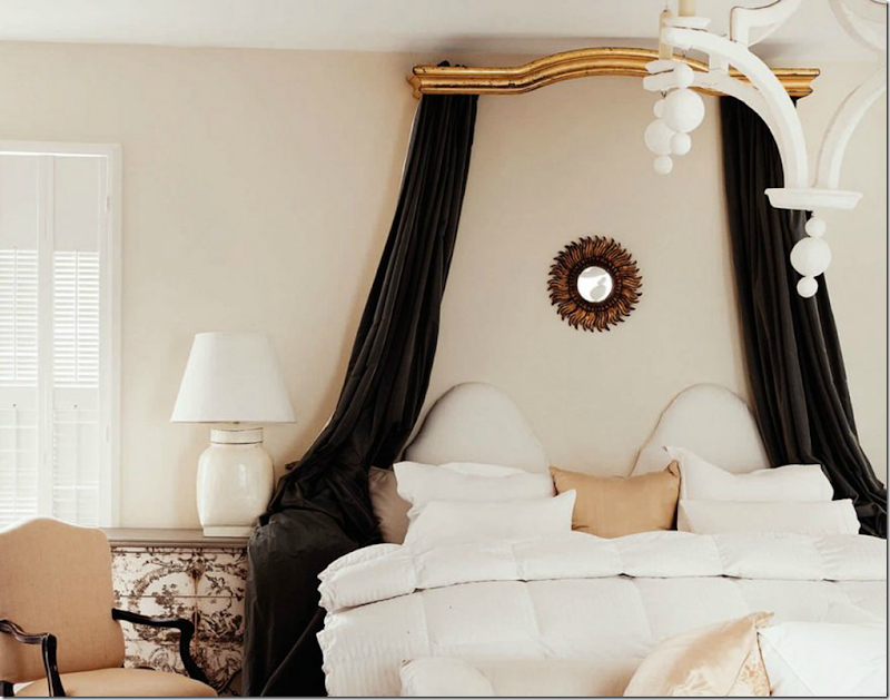
The master bedroom – has a romantic antique curtain valance now used as a canopy. As always, there’s a touch of gilt. Painted chest and French chair mix with a white painted light fixture and a fun sunburst mirror.
A close up of the headboard – I love this – the dual ovals. And all that white mixed with a brown swath of dreamy velvet.
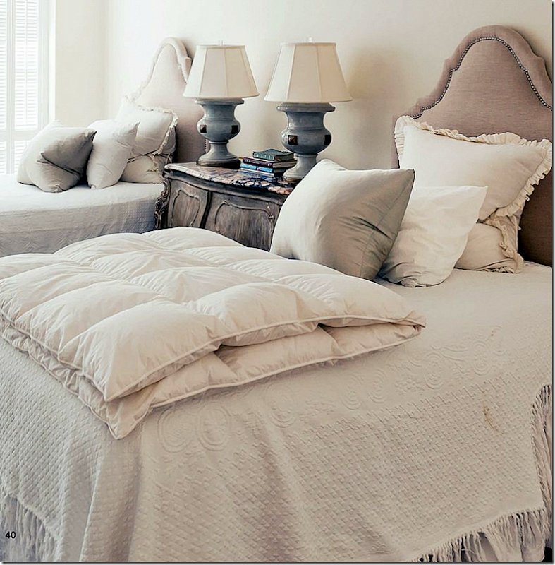
And finally, the guest ro0m has two headboards – with nailheads, lots of overstuffed pillows and a pair of wonderful blue lamps that provide a hint of color in the room. The duvets are European styled.
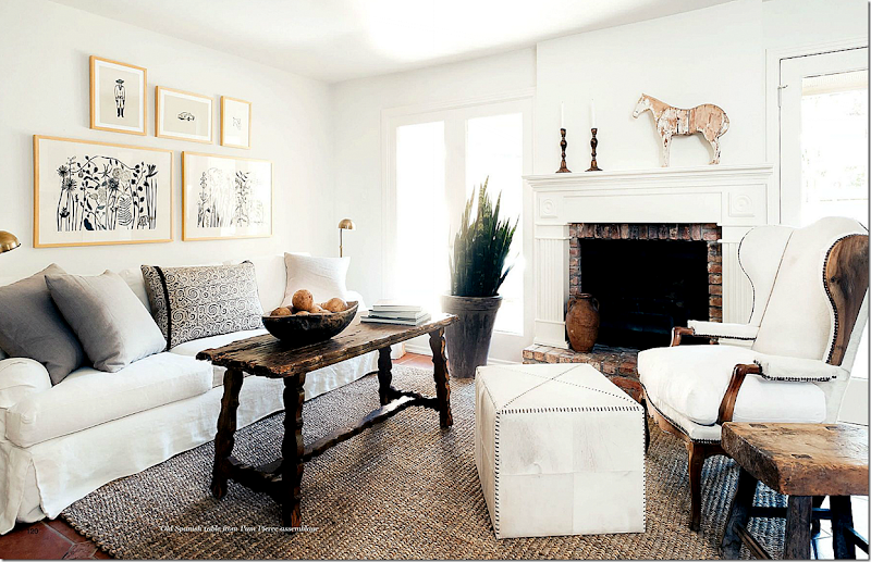
While Barbara Carlton is the matriarch of Shabby Slips – another story in this issue shows the house of Megan Megas. Megas has spent the past decade working for Houston great Pamela Pierce (maybe one week will go by when I won’t mention Pam???) Megas is just now branching out on her own, with Pam’s blessings and encouragement. Megas says Pierce is her mentor and looking at her house, I can see the connection. But Megas has a definite style of her own. In her living room, she mixes a white slip sofa with a dark Spanish style table. A fabulous wing chair is paired with a contemporary ottoman and an organic wood side table. Her accessories are large and few. To see the rest of her house – read the magazine online!
Then there’s the spread on another Houston interior designer pioneer – Beverly Jacomini’s Round Top area farmhouse. Look at this fabulous screened porch! More pics are online.
Another great article this month is on Axel Vervoordt’s house. The man behind the Belgian look – it’s a good tie in with the “Houston Look” that this month’s issue is full of.
As always, the advertisements are just as good as the articles.
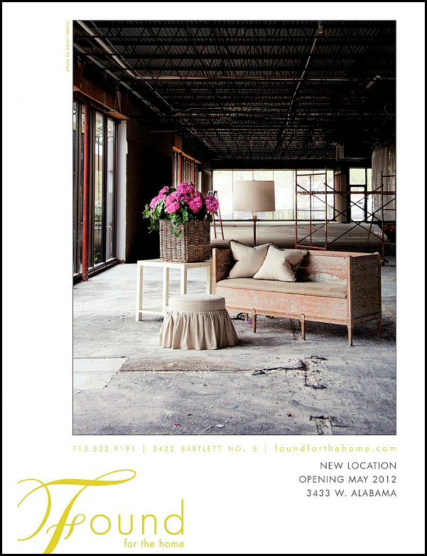
Oh wow! Look at this advertisement! Now, I would really hire this designer!!! She looks so fabulous! Who IS she????
This ad for Found For The Home announces their new location in the West Alabama design corridor. It’s amazing how many design stores are in this area now! You could spend one day just visiting them all – it’s a real destination. Be sure to check in with Found For the Home in their new store now open at 3433 W. Alabama.
And this ad announces the new web site for Shabby Slips at www.myshabbyslips.com. Additionally, Shabby Slips is remodeling their main store. There’s also the store out back and the house behind the store!
To read this latest issue of Antique Shops and Designers, go HERE.
I thought I’d show a few of Renea Abbot’s designs that I’ve loved over the years:
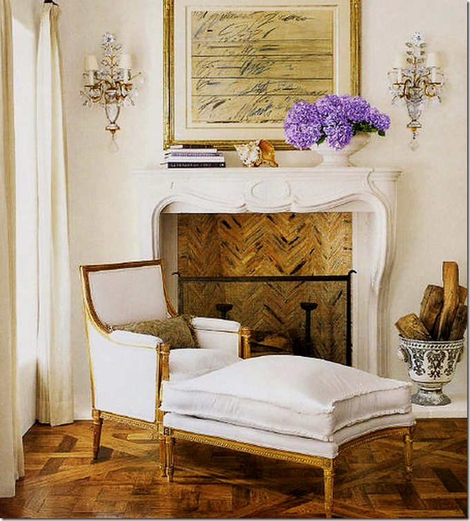
One of my favorite houses Renea ever did was this one featured in Veranda a few years ago. The house is in California and is so stunning. This image was on the cover – and I’ve always loved it. It’s so Renea – the white slips, the gilt antique chaises mixed with the contemporary art work and antique sconces. It’s just perfection.
A vignette from the same house – again perfection. The antique chair and bust mixed with the contemporary pedestal – all under a gorgeous chandelier! Those floors!
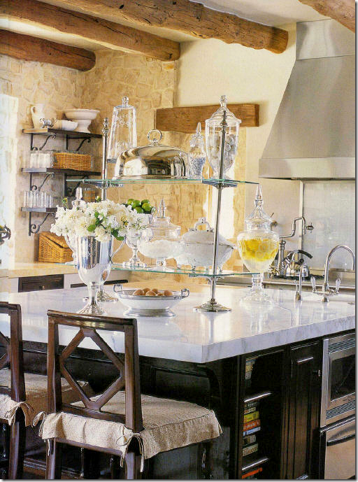
The kitchen has this beautiful white marble island mixed with the French pastry stand.
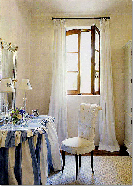
A killer blue and white striped vanity table! So adorable – especially with the glam chair.
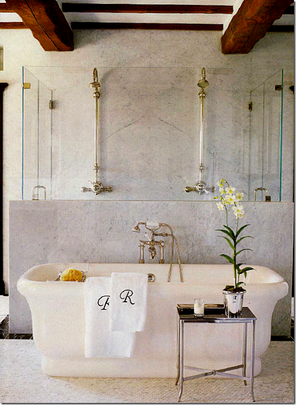
This picture of the bathroom from that house is all over the internet. That’s a marble and glass enclosed shower behind the tub.
The property is incredible. This area shows how trend forward Renea was – years ago - with the antique station clock and row of lanterns. Wisteria is selling a pair of those antique metal urns right now. I wish I had all the pictures from this article – but this is all I have!
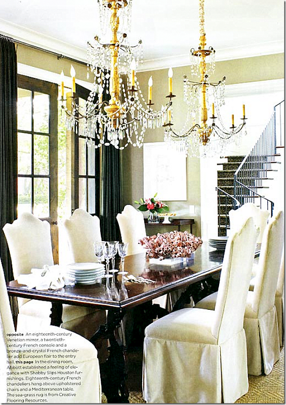
This house Renea designed is in Houston. I’m crazy over its dining room – so wonderful because of this gorgeous pair of chandeliers!! 18th century French. Stunning!!
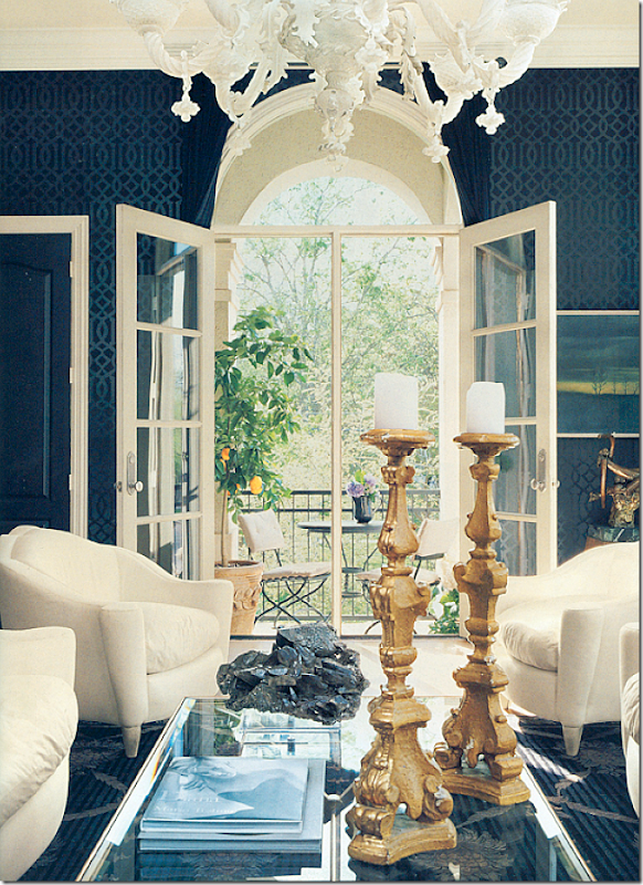
Her own townhouse which she shares with her husband who just happens to own the best carpet/rug store in Houston: Creative Flooring. The walls used to be white – and then one day she hung the Kelly Weartsler paper in black! And in a stroke of genius – she adds the chair in the same pattern. The light fixture is to die for
Another view – out the balcony.
This view shows one of the pair of mirrors and the mirror chest.

Today, this room is a dining room – but back then, it was a family room. The mirrored wall is made to look antiqued.
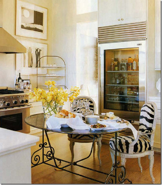
Her kitchen is all white marble. I still love that table and would kill for it!! And those chairs!
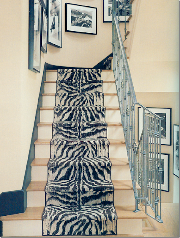
The runner is just beautiful.
Her bedroom – another stunning chandelier. There are 100s of photos of her portfolio on the Shabby Slips Facebook page. Many show her townhouse in views not seen before. If you are a fan – don’t miss it! HERE.
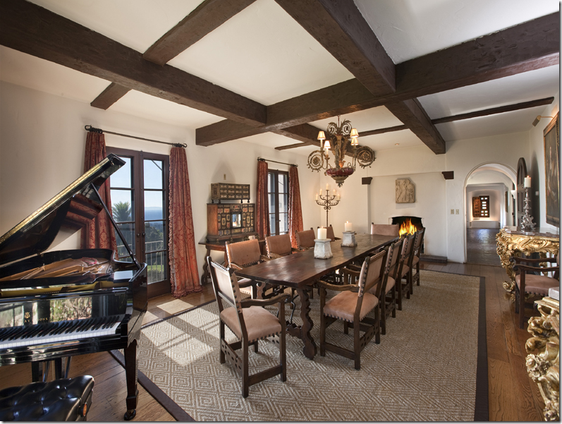
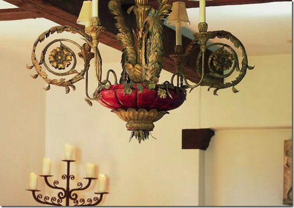
And, remember the story I did on Diandra Douglas’ estate HERE? Well, if you ever admired her light fixture and wanted it – here’s your chance!
Close up of the chandelier.
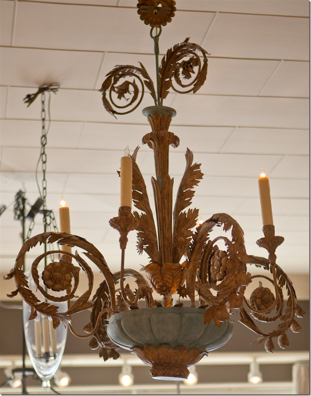
I noticed the same fixture is now for sale on Shabby Slips web site! This one is in green which I like so much better than the red. To visit Shabby Slips new web site – go HERE.
To read the latest issue of Antique Shops and Designers online – go HERE.
and Houstonians – it’s that time again!!! The Urban Market Houston is this weekend:

