On the last blog, we had a Dear Miss Cote de Texas question from a new homeowner wanting to know if she should replace the wood and iron railings with either just new iron railings OR new iron and wood railings. As is often the case, the question of the railings was quickly forgotten while most comments were concerned with whether the homeowner should paint the red brick or leave it as is, or lime the brick. I’m not really familiar with liming brick – but the way it was described, it does sound like a nice alternative to just painting the brick.
Here a homeowner describes the liming process: “This is an ancient process where agricultural lime is mixed with water, then applied to the brick. Instead of sealing in moisture like paint will, the lime allows the brick to breathe. Eventually it does wear away, but I like that “old” look. It is also totally eco friendly and cheap! A bag of lime is around $10 and it took about 8 to do our house.”
The thing I love most about the Ask Miss Cote de Texas series is the involvement of the readers. So many great ideas were given to this homeowner that she can take with her. She did have a meeting with an architect this week who suggested they use just one material – preferably the wood! He gave them a lot of ideas and she said the money spent on the meeting was well worth it.
After I had written that story, I noticed that the owner, Jen, had a blog – a combination mommy/décor blog – and one night I settled in to read it. What I learned from her blog is that Jen is rather young and happily married to her high school sweetheart (“The Engineer”) – they have three very young children, whom she homeschools. Religion is a very big part of their lives and her blog is a testament to her faith. While she writes a lot about her family, her blog also tells the story of her house’s renovation. Except it’s not the red brick house – but their old house they have just moved from!

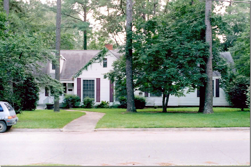
Here is the precious house she just very recently moved from when her husband was transferred to another city. She told me that they lived her for 8 years and thought this was their “forever” house – they had no plans to ever move from here, but fate stepped in and her husband got an offer for his dream job in another city.

Here is what the house looked like when the bought it! They were 21 years old at the time. The house has 5 bedrooms and three baths – and is 3800 sq. ft. The master bedroom is downstairs – and the children’s bedrooms and a playroom are upstairs which make it a perfect family home and in later years – a great empty nester house. As you can see, the house had been totally neglected. The floors were rotten in three sections and the area in front of the kitchen sink actually collapsed when she was washing dishes! You can see the plants growing in the gutters. The house was covered in old vinyl siding – but there were shingles underneath. The renovations took time – and lasted all 8 years they lived here. They did what they could when they could – money and time being factors. Everything was paid in cash, as opposed to borrowing money or using credit. During the 8 years they lived here, they had 3 babies – who are now all homeschooled.
NOW LISTEN: All the work was done by her and her husband. All of it. She worked while babies were napping and later, long into the nights when they were sleeping. She was pregnant with her son when she painted the entire exterior and reglazed and painted every single window. Whew! When he was a baby, she put him in a sling and dug up all the landscaping and planted boxwoods. (I can barely find the energy to water my pots!) They even replaced some of the support beams under the house. Family and friends helped out with a few projects and they did hire someone to do some plumbing work, also under the house (thank God!!!) – but otherwise, they did all the renovations themselves. I’m exhausted just thinking about it! I’m actually laughing that she even wrote in to ask a question. She probably knows more about houses than I do!!

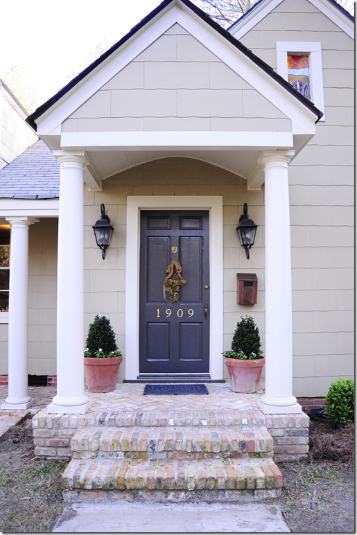
Here – you can see the front door that was moved from its old side entrance - they also added the porch and the gable over the front door to make a covered entrance.

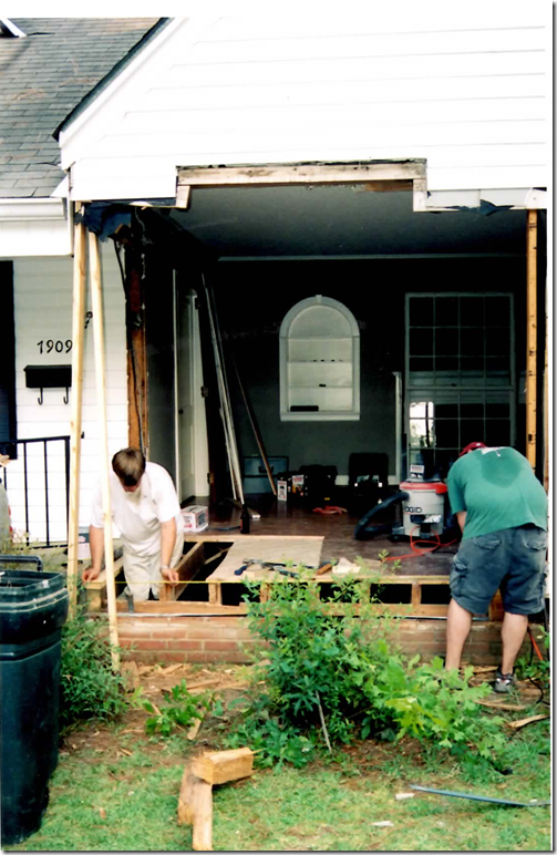
Here the living room is exposed while the front door is installed.
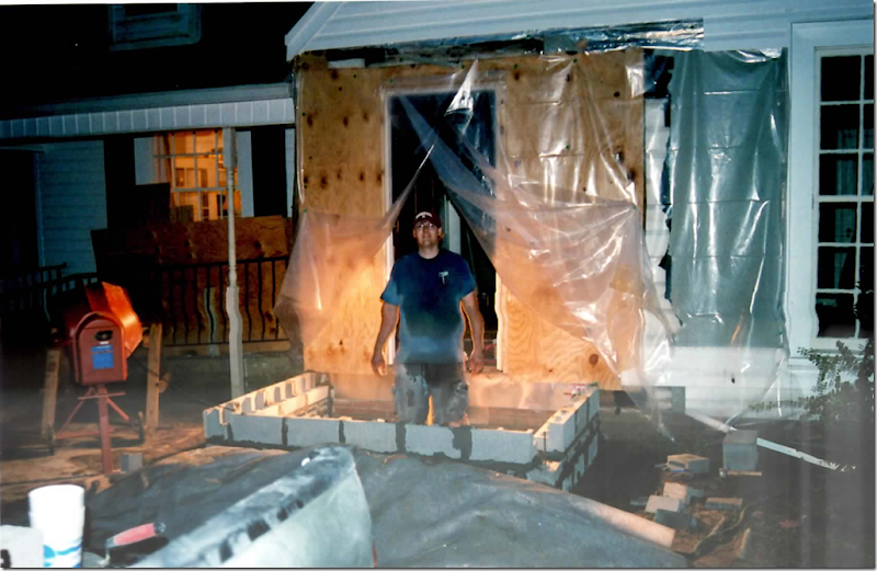
 The door takes shape while the steps are being readied.
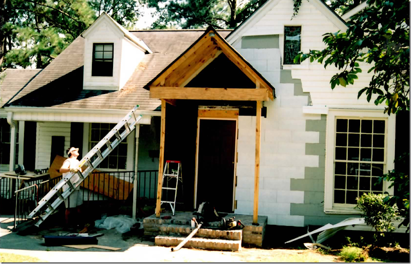
 The new gable goes up and the vinyl siding starts coming down.

And the new door is completed. The siding is all removed and the shingles are freshly painted. Lanterns were added along with white columns. The ceiling on the porch is softly arched.

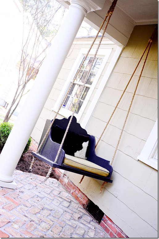
They also made the porch swing and tied it up with thick rope.

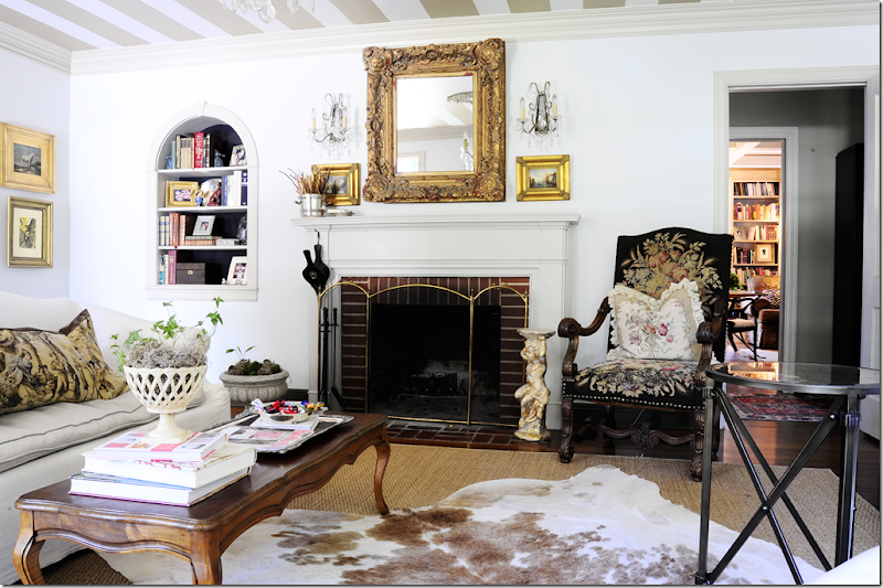
Inside the house – there aren’t any before pictures of the living room, but here are some afters! The walls were painted a soft white – but the ceiling was striped. A beautiful gilt French settee was slipcovered, as was the ottoman. A white skin was laid over the seagrass rug.

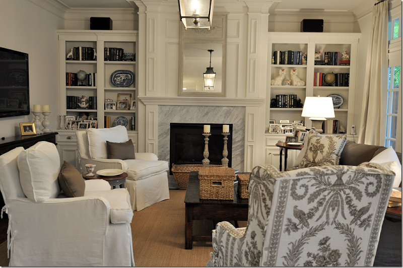
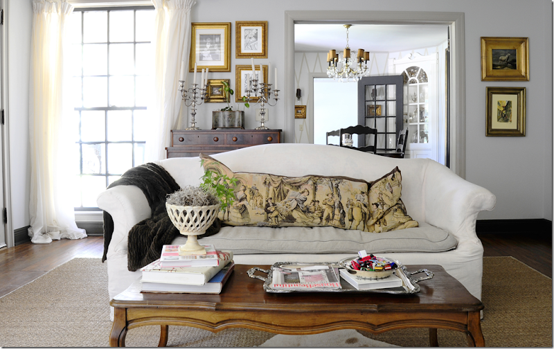
Across from the settee is a slipcovered white sofa. The fireplace is so beautiful and I love the arched nook to the left of it. Down the hall is the library.

Crystal chandelier and sconces add a touch of formality to the room – though the family used this space every day – it’s wasn’t a “do not touch” living room.

The new front door is to the left of the window. Past the living room is the dining room.

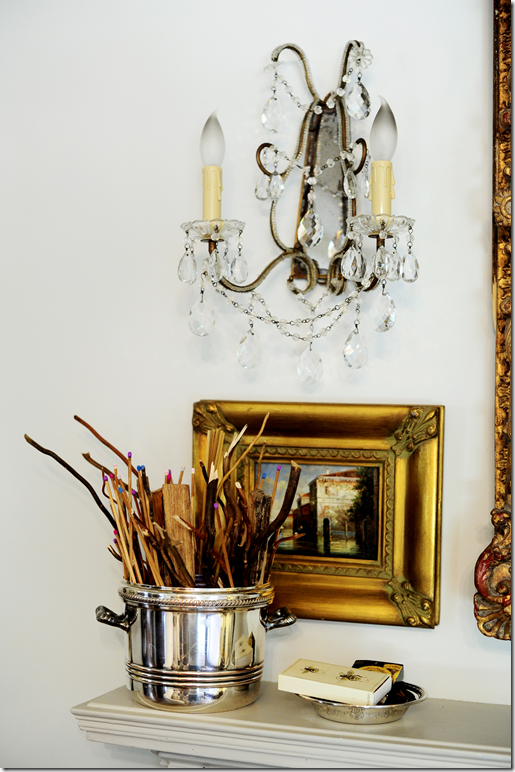
Matches and kindling for the fireplace are kept in a silver ice bucket. I love the sconces with their macaroni beading!

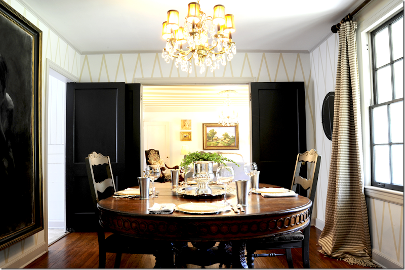
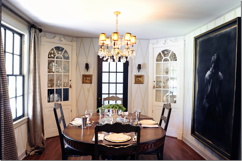
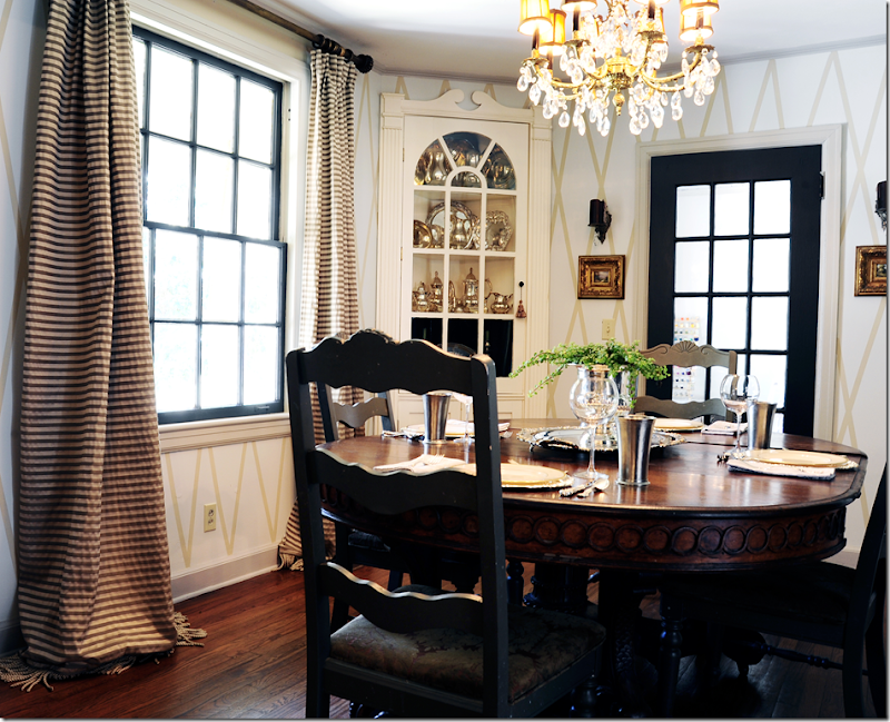
Off the living room is the dining room – which is also used quite often. Double doors lead into the room. Jen painted a large X pattern on the walls. And, another crystal chandelier hangs here too. The table was bought from a friend whose family had had it for several generations. The chandelier came from another friend – for free – the husband hated it and was glad to be rid of it!

The focal point though is the large charcoal that was purchased while they were in college from a students art show. Jen and her husband made the frame themselves and Jen faux distressed it with paint. The tutorial for the frame is HERE.

Gold and cream striped drapes match the wall treatment. Behind the French door is the home schoolroom.

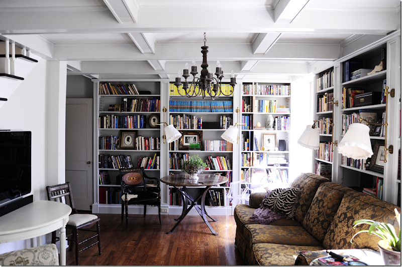
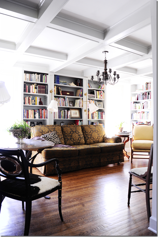
Past the living room is the library – Jen’s favorite space in her former house. This room saw many versions during their 8 years here, but a few years ago, The Engineer turned the room from a den into a library.

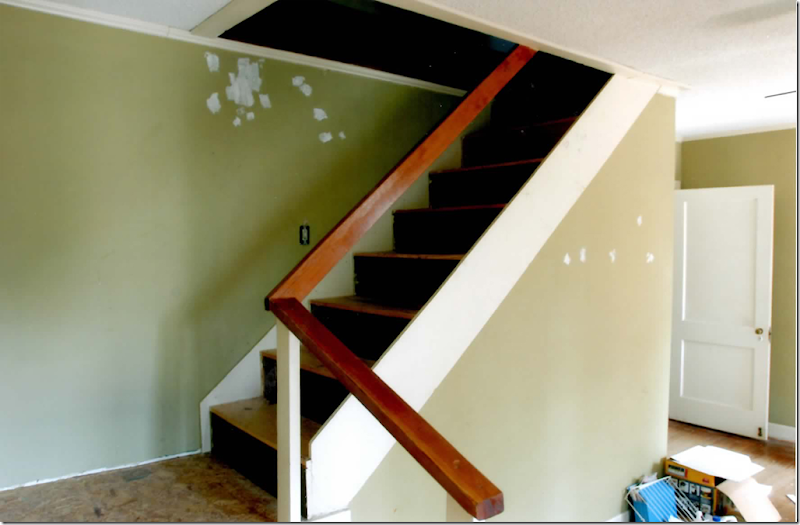
Here’s another before shot – showing the faux mantel.

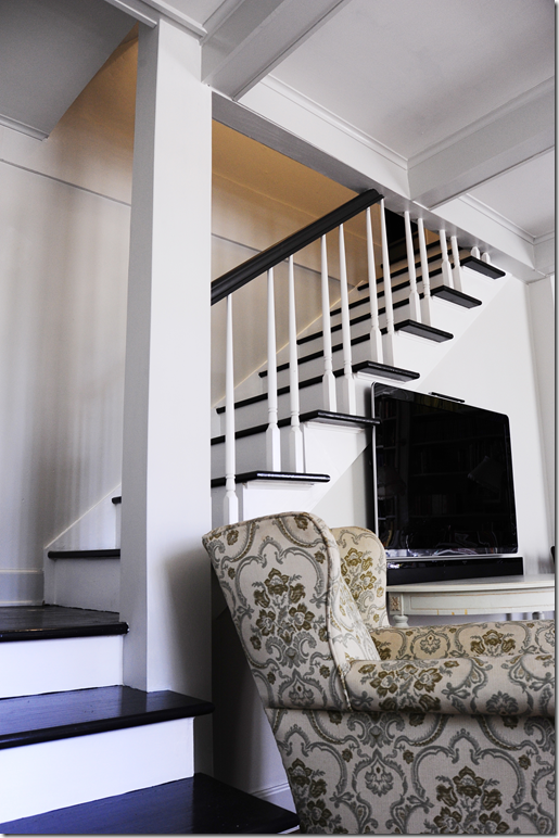
Today, the room is wall to wall bookcases. The ceiling is coffered – a result of sinking floors above. While repairing the damage, new support beams were placed and are hidden in the beautiful beams! To the left is the new staircase. The chandelier was another great find – she found it at an antique store for $25!!!

The bookcases are on three walls – the stairs are on the 4th wall.

The Engineer even included a few secret openings and compartments in the room.

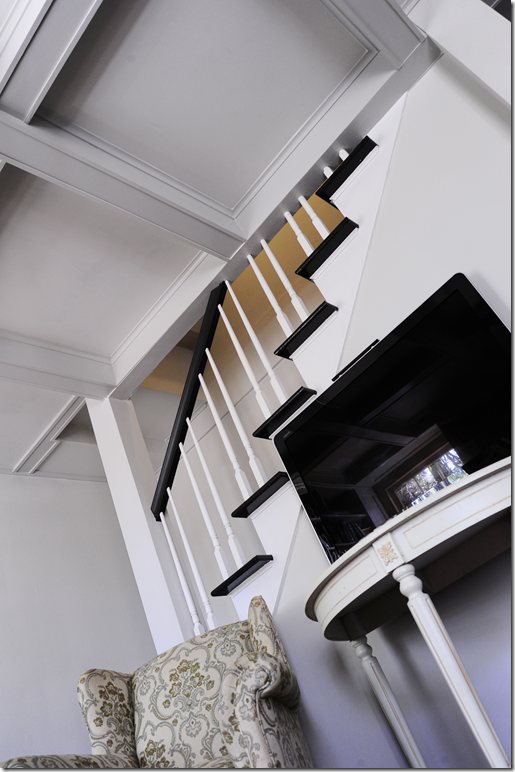
They lived with the stairs half finished for several years – but finally the job was completed and they are so pretty!!

Another view of the staircase.

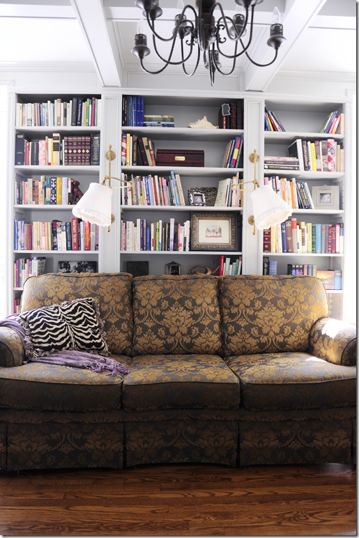
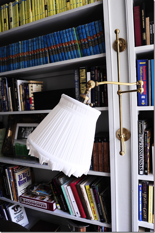
All the bookcases got two brass sconces. I spy the Hardy Boys and Nancy Drew! My favorite! We bought Elisabeth a set of Nancy Drew and she never read any of them and refused to listen when we tried to read them to her out loud. I’m afraid Nancy Drew wasn’t into fashion enough for her tastes.

A closeup of the detailed work that went into the shelves.

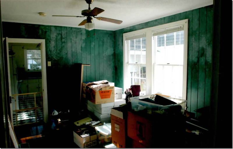
BEFORE: The breakfast room had green painted paneling. The kitchen beyond had it’s original cabinetry and a checkerboard vinyl floor.

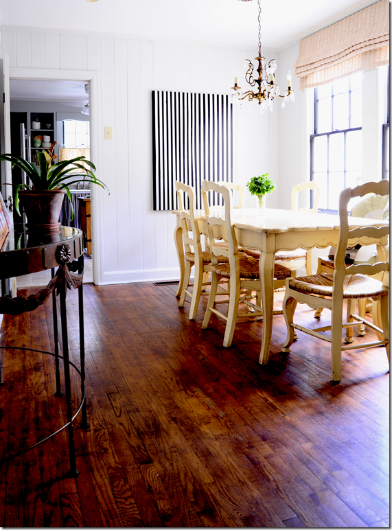
It’s hard to believe this is the same room!!! I love the collection of framed prints on the wall.

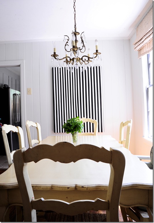
Another crystal chandelier hangs over the country French table. Jen and her husband refinished the hardwoods – and they are so pretty!!!

The black and white contemporary art work becomes the focal point.

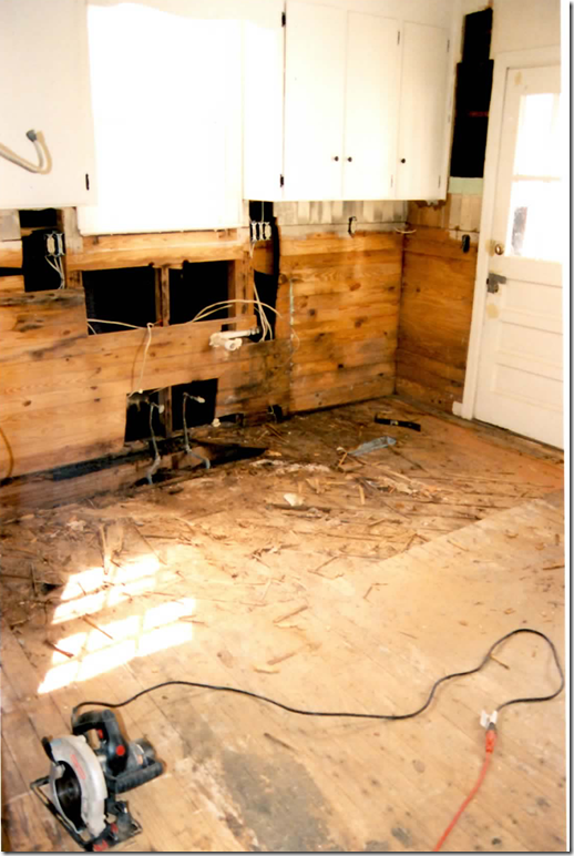
After the floor collapsed in front of the kitchen sink, the room was taken down to the studs. Now, there are several versions of the kitchen. The couple had big plans for a fabulous kitchen – down the road – but they ended up moving before that happened. In the meantime, they built a kitchen to tide them over – and I think it’s adorable. Before putting the house up for the sale – they changed the kitchen again in order to sell it. You can decide which version you prefer!

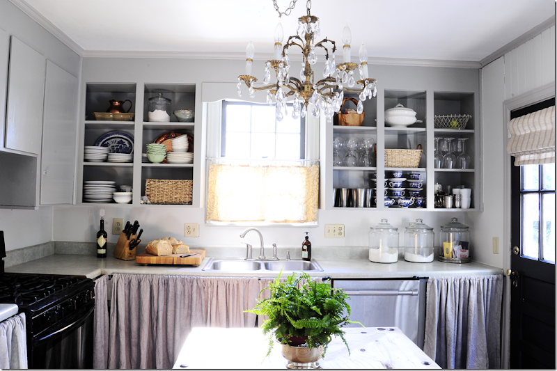
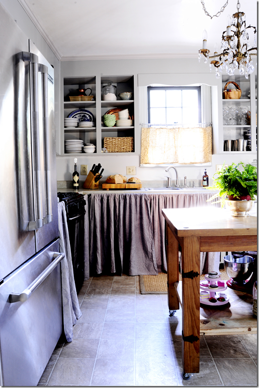
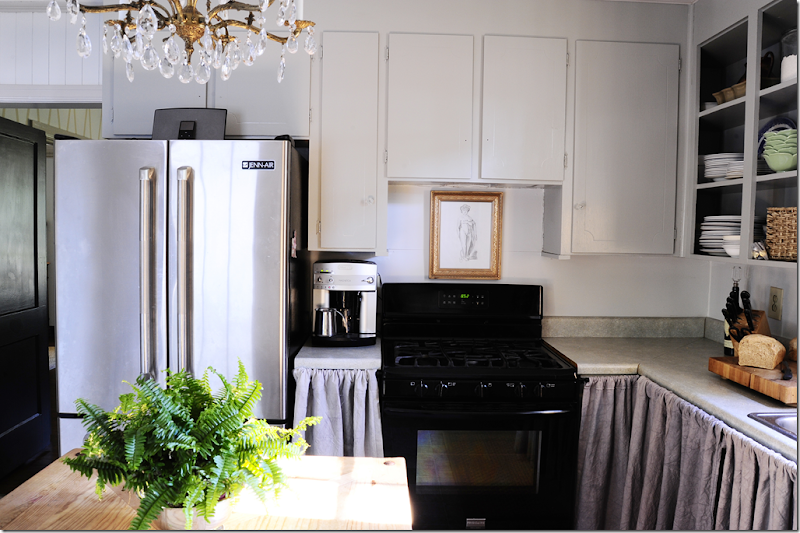
Here is what the kitchen looked like for many years – the cabinet frames were up, but the doors weren’t. Instead, linen curtains hid the lack of doors. And, as always – a crystal chandelier hangs above!

Mr. Engineer made the rolling center island.

These cabinets got simple doors – until the nicer doors were bought. Jen says she spends most of her daytime hours in this room and she really loved the way it looked. I do too – I think it’s a charming kitchen!

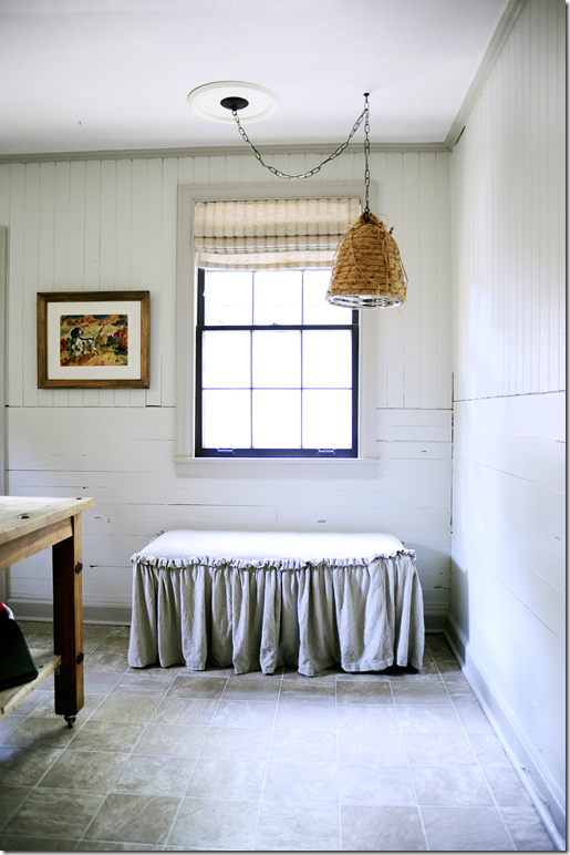
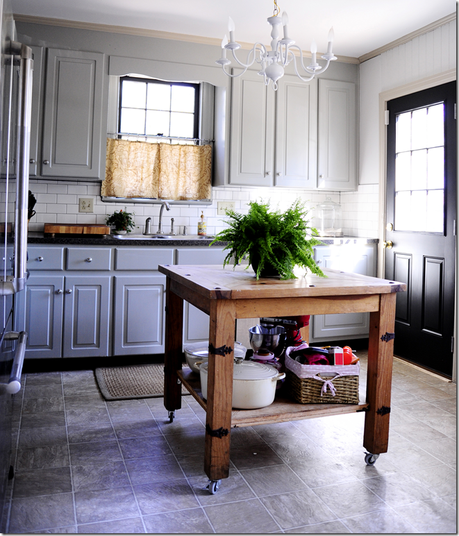
The opposite side of the kitchen. Jen made the bee hive fixture. Notice the paneling – you can really see it’s age here. Read the tutorial on the light fixture HERE. Once the family found out they were moving, they decided to finish the kitchen off in order to resell it. I still think they could have sold it just like this, but here’s what they added to it:

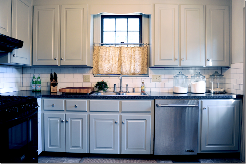
New doors cover the cabinets. New countertops were added – along with a subway tile backsplash.

The new additions do look nice and more finished, but I must confess I miss the older version with the open cabinets and linen skirts!!! Which version is your favorite?

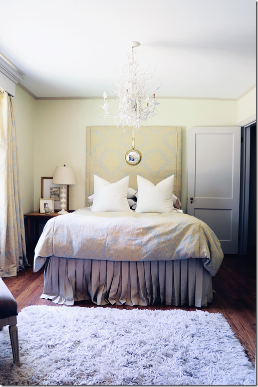
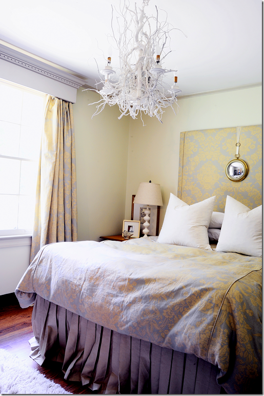
Two of the five bedrooms are downstairs. This bedroom was converted into a guest room, along with a temporary nursery for the baby. All the bedding was made by Jen! She made the headboard out of closet sliding doors that came from another bedroom.

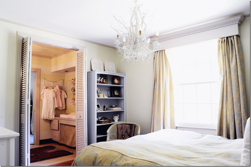
I love the fabric – it came from a friend’s leftover pile. All the curtains were also sewn by Jen. The mirror is a cute detail. And of course, she and Mr. Engineer made the stick chandelier. He also made and designed the beautiful cornice!! He is amazing.

Connecting to the room is the temporary nursery – space made from an extra closet. The baby would have moved upstairs if they would have stayed here.

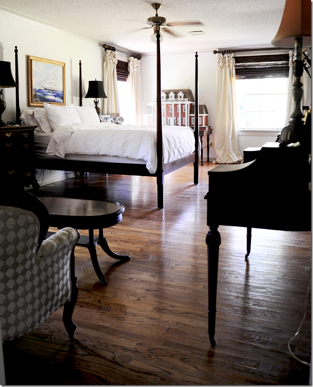
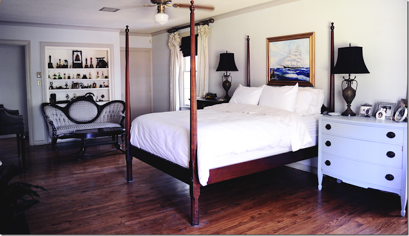
And finally, the master bedroom. When they moved in, there was dog soiled carpet in this room. They quickly ripped it out and replaced it with hardwoods that were stained to perfectly match existing hardwoods in the house. Notice the beautiful curtains in this room. AND notice the red brick dolls house!!! What does that remind you off? It’s amazing how much the doll house looks like their new house.

Pretty nightstand painted Swedish gray.

In the end, Jen says: “I loved this house! And I love that it was our little design laboratory. It represents our ideas and dreams and blood, sweat, and tears to make those ideas and dreams a reality. "Doing" that house was so much fun! We lived there 8.5 years and it was a great 8.5 years!”
Seeing what Jen and her husband did with their old house, I am so excited to watch the progress they make with their new red brick house!
Jen: A MILLION thank you’s for letting us take a tour of your former house and for being a part of your new home!!!

