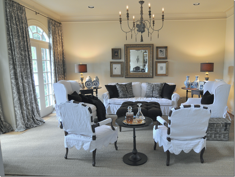
Late last year I showed this living room that I had redecorated for a client. Basically, we used what she had and just recovered it all in white slipcovers. We did buy the two new arm chairs and lamps – but mostly everything was already hers, which really helped keep costs down. The damask linen curtains were added to soften the room and add just a bit of pattern. Originally, the room was wallpapered in a red stripe and the fabrics were a mix of gold chenilles and Bennison florals. It had been almost decade since anything had been done to update the house, so we started with this room.
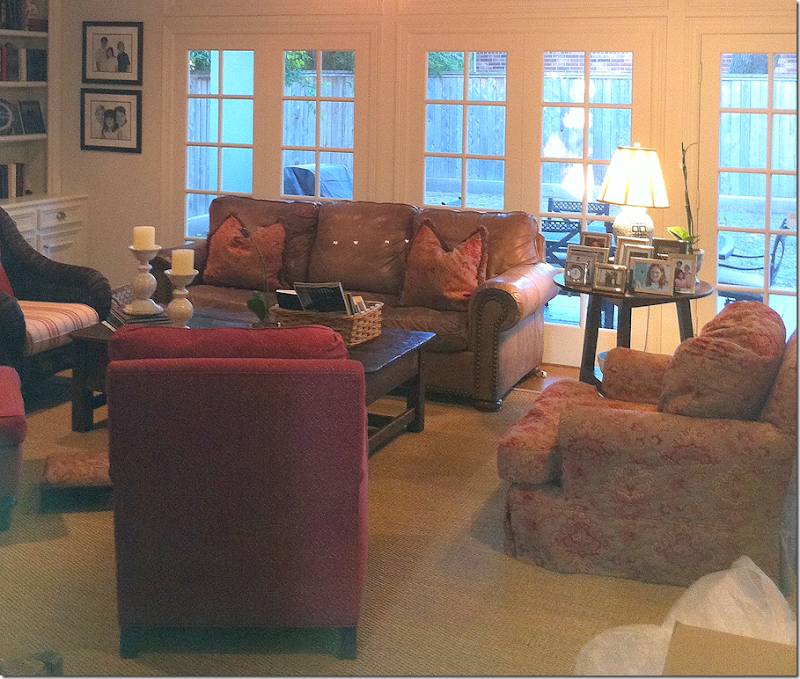
BEFORE: Next we tackled the back part of the house with the family room, breakfast room and kitchen. The family room was also done in reds and golds. The TV was over the fireplace with the leather sofa facing it. To get ready for the remodeling, we moved the TV to a side wall and moved the sofa in front of the windows. Again, we used much that was already existing except we did buy a new sofa and chair and a few tables.
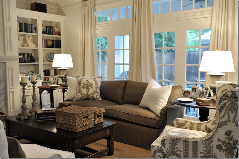
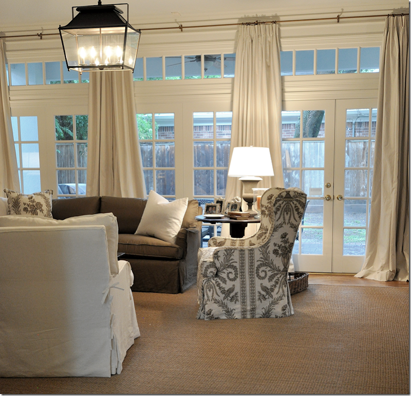
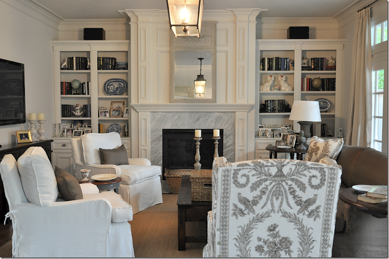
AFTER: First, we painted the walls in all three rooms a very light and soft gray. The colors in the room were chosen to blend with the living room – whites and browns. The sofa was slipcovered in a brown linen with white linen pillows. The arm chair was covered in a Vervain brown and white linen toile. The client had fallen in love with this toile and it was used as the starting point.
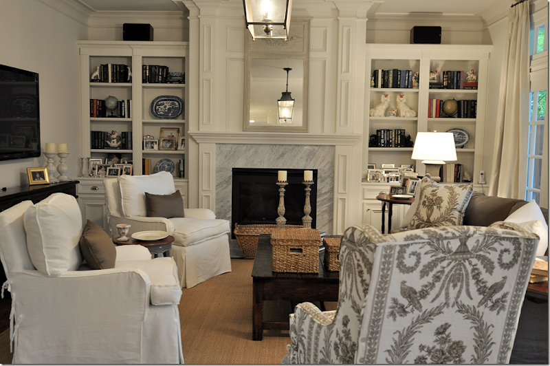
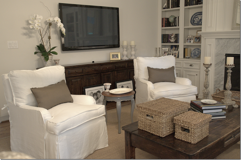
The TV was moved from above the fireplace to the left wall – where we added a long console under it to hide the cords and equipment. The two existing chairs were slipcovered in white linen and we added swivels underneath for easy TV watching.
We bought two lanterns from Pottery Barn and hung one here and one in the adjoining breakfast room. The curtains are a striped linen and were installed both here and in the breakfast room. The large arm chair and sofa came from Hien Lam Home on W. Alabama. The two urn lamp came from Ballard Designs. All furniture is slipcovered for easy cleaning. The white slips will be washed and the brown and toile linens will be dry cleaned.
The dated looking and drab brownish granite was removed from the fireplace and the kitchen counters. We used white marble here on the fireplace and changed the brass grill to a black matte one. The mirror came from Indulge.
Two lamps ordered for the console from Aidan Gray hadn’t arrived yet, but hopefully they will fit. The console is very shallow so our choices were quite limited. Baskets on the coffee table hide a myriad of TV clickers and magazines.
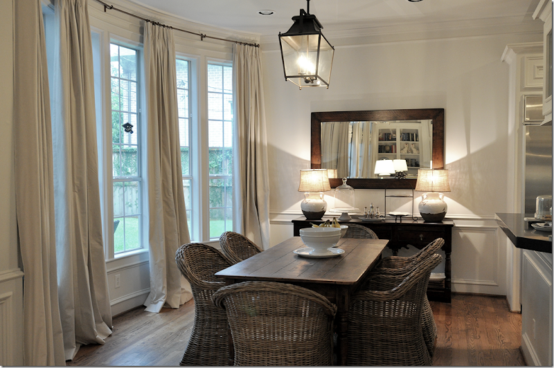
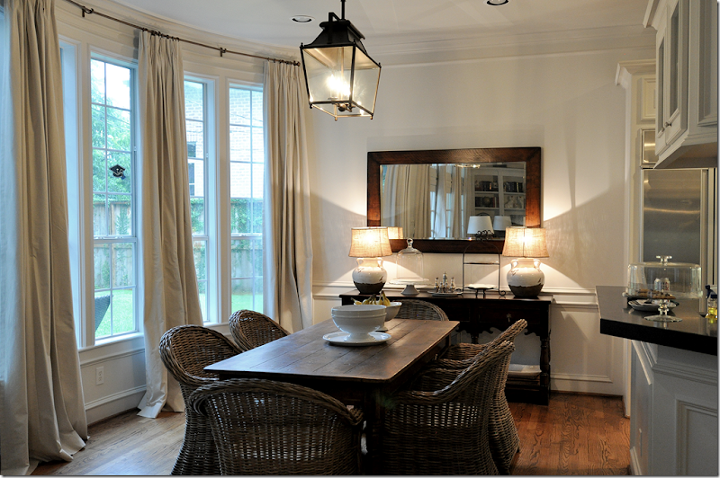
In the breakfast room, we added the curtains – four panels to fit in the long bay window with its six windows. The table was the client’s, but we changed out her country French chairs for Kooboos from World Market.
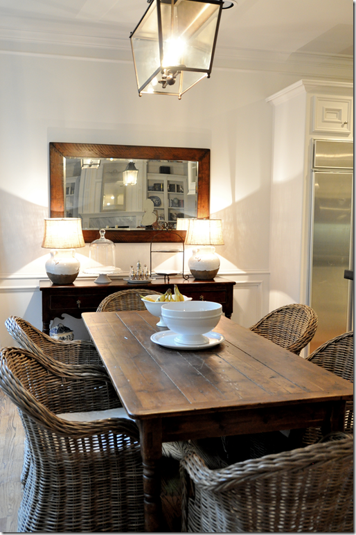
We moved out a washed pine armoire in exchange for a wood console and mirror. The lamps came from Pottery Barn. NOTE: the client hung the mirror horizontally – without me, which drives me insane. She won’t turn it vertically so I just pretend it’s not hanging the way it is. I’ve begged her to rehang it until I’m blue in the face, but she likes it this way. Grrr!!! Maybe she’ll change it now, but she doesn’t read the blog.
BTW – I went to World Market and they said they still get these Kooboo chairs in, but they sell so fast they don’t advertise them. You can put your name on a waiting list for them – or, so they said at the store in Houston on Richmond. Not sure about the validity of that – but it’s worth a try if you want to get these. Otherwise, it’s wholesale only for these chairs now.
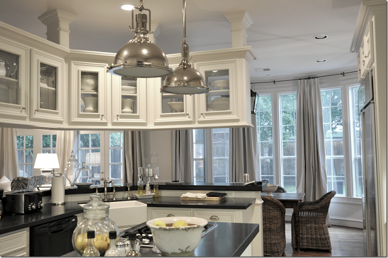
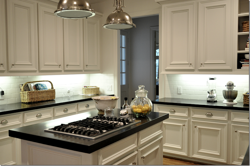
In the kitchen we changed out the dated brownish granite for a matte black granite, which I love! It’s so smooth – it feels like velvet. We added a creamy white subway tile and the two pendant lights from Restoration Hardware which are a steal (the only items there that ARE a steal!) – they are such a great look and the quality is fabulous for the price, especially. These are the medium sized pendants and they are really quitei large. We added a farm sink and new hardware and bin pulls. She still has to replace her dishwasher, but that’s next on the list.
The new subway tiles brighten up the kitchen so much – before it was the dark granite slab on the backsplash. New cabinet doors replaced the old ones that had been pretty beaten up. To keep costs down – no appliances were moved, everything stayed in the same place.
Finally, now that the living room, family room, kitchen and breakfast room are redone – she only needs to redo the dining room! I know that is not what the homeowner wants to hear, but it’s like dominos….once they start falling….
Coming up next time: I visited a townhouse decorated by Houston great Ginger Barber! Pretty???? Let’s just say, I wanted to burn my house down when I got home. Yes, it’s wonderful!


Wow, I get to be the first comment. You must have just posted this and it's way too early in the morning your time! It's almost noon here in Norway. I too love the Vervain toile. Do you remember the name of the grey that you painted the room? It is really beautiful. The house looks so much lighter and brighter with the new colors. I especially love the combination in the kitchen. Thanks for sharing, it looks beautiful.
ReplyDeleteI can't wait to see pictures of the Ginger Barber townhouse. I also wanted to mention, Houston is the sister city to my town here in Norway. It truly is a small world!
DeleteWow! I didn't know that - sisters!!!! i'll try to get the paint color for you.
DeleteI'm also interested in the gray paint color, as well as where you purchased the black granite countertops and subway tile in Houston. Nice job on the update, looks like a whole new house.
ReplyDeleteJoni, I would guess that this house was built in the early 1990's as it looks similar to our current house (we are the second owners and we bought it in 2004). Anyway, I am thinking of updating the kitchen before we sell and move. How much did it cost to change the countertops to black marble, the backsplash to subway tiles and put in a farm house sink? Thanks!
ReplyDeleteoh - wow. i don't know what it cost her - she paid the bills, i just ok the choices. i know we got a few bids and went with the lowest i think - but they were our first choice anyway. measure your countertops and call a fabricator to get an idea of what the counters cost.
DeleteHere is what we pay in California to redo counters, backsplash and farmhouse sink:
DeleteCountertops - $35 to $70 per square foot PLUS $10 to $20 per linear foot for special edging (anything other than ordinary squared off edges)
Subway Tiles - $1 each plus the cost of installation - this is something you can easily do yourself and save a bundle. Consider having the electrical outlets replaced with a power strip that mounts under the bottom of the cabinets. This will give an nice, unbroken look to the backsplash. $30 to $200 depending on the size of your kitchen.
Farmhouse sink - usually $600 to $1,000 or more depending on material: Fireclay, copper, porcelain, stone, granite composite, etc.) Check out on-line sites that sell sinks to get a range of prices. Overstock.com sometimes sells farmhouse sinks at a good price.
With a farmhouse sink, you will want new faucets, new garbage disposer and new sink strainer. Add $1,000 including the cost of the plumber. For a French look, I like Herbeau (VERY expensive) and Belle Foret. There is also a company out of Israel (HamatUsa)that makes a very nice line of French Styled Faucets.
Fabulous!! I have been meaning to ask...do you have a local upholsterer do all of your slipcovers? I have been looking for someone to do custom slipcovers for me in FL and can't seem to find anyone. Just curious if I was looking in the wrong place.
ReplyDeletemaybe ask Renee Finberg - she's in Boca raton. her blog is on the left on my blogroll. she might know.
DeleteHien Lam usually does all my slips, but this client has someone else that we used.
Renee, you have to be kidding, right?
DeleteGORGEOUS!!!!!!!!!!
ReplyDelete-linda,ny
What a transformation! So bright and fresh, love what you did!
ReplyDeleteDonna
thebeneblog.com
Looks great Joni. Just goes to show ya what can be done without a total redo. I love that toile but I'd be washing that every week! Hope the new lamps fit on the console! Waiting and tapping fingers for your Barber pics - :-) Beth
ReplyDeleteJoni, what a beautiful job - your client must be thrilled! I am amazed at the difference between the before and after in the living room. Sometimes there is no other option but to put the TV above the fireplace, but I much prefer it as you have placed it, on a side wall with a pretty piece of furniture.
ReplyDeleteYour styling of the bookshelves looks great too!
I share your pet peeve for mirrors hung horizontally. I also am not a big fan of horizontally oriented artwork. I like things to reach for the ceiling!
Love this post-
Holly
You must have also sacrificed a lot of potentially wonderful art in your home.
Deleteyes - me too! i like art to go to the ceilings, which is why i probalby like a set of intaglios or prints grouped together as opposed to one piece of art.
DeleteI'll take original artwork any day over fake intaglios or prints in a group. Did anyone ask Monet if he preferred vertical to horizontal? I didn't think so. What an ignorant comment that one only hangs vertical art.
DeleteBeautiful! Please share the paint color and the vervain fabric. Thanks for the heads up on the chairs, I am going to call my store first thing. The mirror looks fine, verticle is predictable and its nice to see a homeowner march to her own drum:) as you've said, a mirror needs to reflect something beautiful and there is more to see when its hung this way. bookshelf styling wonderful and those lanterns are to die for. have a great week.
ReplyDeletethe toile is Ducette, colorway 3.
Deletethanks!!!
thanks and I am an anon who waits till she gets home from her drudge job to comment:) I love the white slipcovers and seagrass, will never get tire of it and regret getting rid of my white slipcovered couch for a POS Ethan Allen couch in a fabric that has not held up to 2 and 4 legged kids. OOPs the LR needs a zebra to be finished IMHO. I still like the mirror hung horizontally even though per comments it shows my ignorance and lack of taste oh and the lighting choices haven't budged on those... I would probably hang the family room treameau mirror in the breakfast area and prop the other horizontally on the mantel....guess I should never quit my day job so I can save my pennies and hire a designer....but it would have to be someone like you who wouldn't let me get lost....my sister who has the luxury of staying at home compliments of her successful wealthy spent several hundred thousand dollars with her designer and whenever anyone comments positively on something it is usually something she added against her designer's plan.
DeleteI love the fabric on the den chair!! A great jobbbbbbbbbbb! What an amazing transformation!!!
ReplyDeleteJoni, You did such a great job. The rooms are so clean and soothing now. Thanks for sharing.
ReplyDeletewonderful transformation-! lots to learn from here. thanks and thanks for the tip on the koo boo chairs-! I'm going to ask for them at my local World Market. Joni - or anyone-why is it best to hang a mirror horizontally ? To draw the eye UP ?
ReplyDeleteyes, it draws the eye up and makes everything look taller. i think it's just a personal preference. it's not wrong or right, but it's one thing that makes me crazy. i just want it to go the other way!!!
DeleteYes, yes, yes to vertical! Much more elegant.
DeleteYou create the most gorgeous spaces! I am with you about the mirror, grr;0 i can not wait for your next post. In the meantime I will go back and pour over every detail of this post:))) thank you for sharing!
ReplyDeleteI forgot to mention how genius it was to add swivels to the chairs! Who knew?
ReplyDeleteyes!! i's great when the chairs face away from the tv - that way they can watch and not mess up your furniture arrangement! ahha!!!
DeleteBeautiful re-do. Simple, straight to the point and fresh!
ReplyDeleteOh Joni......your posts and interior transformations are just THE BEST! If only I could entice you across the Pond to transform my home! I too am tapping my fingers waiting to see what exquisiteness Ginger Barber has created! x
ReplyDeletei can't wait to show it either - it's just so pretty! and restful - quiet. beautiful.
Deletethank you, thank you, THANK YOU!! You have solved my dining room lighting issues!!!! I am so excited. Your blog is wonderful and I am certainly enjoying reading your bright ideas.
ReplyDeleteLove to know the paint color...sooooo very pretty. Do they have kids? All that white and cream....three boys and one sweet girl will have to move out before I can go that light all over! The kitchen makes me swoon. Great job.
ReplyDeleteall three kids are in college - but why worry about the white? just throw it in the washer like a pair of jeans, wash, dry, and put back on! it's so easy and practical. i'm at the point that i don't like to do regular upholstery anymore.
DeleteBravo Joni!! You have transformed this space into a light and fresh look; yet with enough dark's added in for drama and elegance!
ReplyDeleteToo funny that as soon as I saw the dining room, thought, why is the mirror hung horizontally...then read your comment!
xoxo
Karena
Art by Karena
hahah! yes Karen - wish you were my client!!!! she doesn't get it. i'm still working on her though. I got a tweet from her today that said "i do read the blog" that's all. kind of scared me! ahaha!
DeleteReally good Joni! Love it! The vertical mirror in the breakfast room looks fine to me, how about add a small sunburst mirror on top?
ReplyDeleteit would be cute over the mirror even if it was horizontal. great idea, t hanks.
Deletehorizaontal mirror i mean!
ReplyDeleteHi Joni~ ~ ~
ReplyDeleteI like the mirror just the way it is too. There are no rules just what you prefer. I have one above my sofa hung horizonally too and I love it. Love the new look so bright and clean looking. Just a comment on the curtins. I see so much of the tiny pooling on the floor and to me it just looks like a mistake. IMHO, If the curtins don't pool generously then they should just graze the floor and not pool at all. I would appreciate your comments on this.
these are about 3 inches on the floor - i like them that way, i just don't really care for those that skim the floor. again, it's personal. also i dont like a big puddle. i know that shorter is more in. but i just like a little fullness on the bottom.
DeleteSwooning over the toile! And I was admiring the lamps that are in the breakfast room before I read you have new ones on order. Surely she has a good new home for them?? Agree on the mirror - the height would be lovely. What material are the draperies made of? They look substantial without weighing things down
ReplyDeleteno, those lamps are staying. the new ones are for next to the tv. the curtains are just a linen ticking from pindler.
DeleteJoni, what a great transformation. It is nice to see what can be done without spending a hideous amount of money. I always learn so much from your posts, so I'm curious about the mirror, too. Why is it important to hang it vertically? Is it just a personal preference? Great idea for the swivels on the chairs and what a unique way to display family photographs.
ReplyDeleteshe loves picture frames and has a million of them. i just like the height of a vertical mirror or painting. it's just personal. i think the mirror looks weighted down here.
DeleteLove everything you did to this home.
ReplyDeleteJoni , just beautiful! I want to move right in, so inviting. Thanks also for the update on world market. I regret not buying one earlier. Will tryyour suggestion. Read your blog daily. Helps startmy day! Looking forward to next post
ReplyDeleteI'm drooling.What a great job.I love everything you do.I am in the midst of redecorating my living room and have bben stuck.This gives me some great ideas!
ReplyDeleteWhat a beautiful transformation. It is so light and airy, beautiful job Joni
ReplyDeleteHappy Monday,
Kathysue
Beautiful! What a transformation! Like the granite, is it honed? If yes, how do you keep that clean? I have honed black granite and it is a disaster if you don't keep it oiled.
ReplyDeleteLooking forward to the next post.
yes it's honed. hers has held up good - it's been a few months! not sure about it not holding up. but i guess she will keep it oiled. she's not finicky though.
DeleteI put black honed granite counter tops in my kitchen in 2004 and they still look great. I have never oiled them because I didn't know I was suppose to do that. I use a tiny bit of Bon Ami on the counter tops whenever I feel like the water marks are an eyesore - maybe every 4-6 weeks. Bon Ami is one of those miracle products. I use it on absolutely everything (including my hands to remove paint but I wouldn't recommend trying it if you have sensative skin) and it has never scratched.
DeleteGreat post. I'm happy to see that a lot of her existing pieces were kept and just brought up to date. Isn't that the reason we invest in good furniture in the first place -- so it withstands years of use? And putting the massive tv on the wall and not above the fireplace was a great move. Whoever started that trend of the tv above the fireplace was crazy. I can see a whole generation of tv watchers with kinks in their necks! Also, thanks for sharing your sources.
ReplyDeleteplus it ruins the look of a beautiful fireplace. and the neck! i hate high tvs - again, a personal preference!
DeleteLovely transformation! I was so pleased to see the chairs you added the swivels to -- a great idea that will allow me to transform existing chairs rather than purchase new ones. Where can you buy the hardware? My husband thanks you!!
ReplyDeletenot sure - but i'll beg if you google it - it will pop up. yes = it's a great idea. i've used them a lot lately!
DeleteWhat a great makeover! + look at the current cover of Elle Mag.,what about the mirror?. Whatever! You are the best, Joni. xxpeggybraswelldesign.com
ReplyDeleteomg - that mirror was MADE to hang only vertically! shock!!!!!! look at it again.
DeleteSigh.....I want you to come do my living room. I love everything you do....
ReplyDeleteDo you have a source you can share for Seagrass Rugs...I have been trying to do my own internet research and it is very confusing.
I really enjoy your blog. And your style.
Pam
i use Mark Anthony - the link is on my blog to the left - after the ads. anthony@marcanthonyrugs.com email him. he's great. or call Creative Flooring. they are great too!!!!! on bissonnet
DeleteOh what a great post! I so love a good before and after :) You did a terrific job brightening up your client's rooms - they are beautiful! what is the light gray paint on the family room walls? Thank you!
ReplyDeleteWell done, Joni! I'm interested in the gray paint color too. Where did you get the lanterns?
ReplyDeleteThanks.
Maureen
pottery barn lanterns - but i think they are discontinued. they have another one now. i'm getting the paint color for yall.
DeleteAnother GREAT redo! I love the idea of adding swivels to the chairs...and as always, everything is so tastefully done. Beautiful!
ReplyDeleteI love it!!! Great job; I'll remember you!
ReplyDeleteLove everything of this redo Joni!! Fabulous! It is a totally different house now!
ReplyDeleteThank you for the tour!
And I am looking forward to your post about the Ginger Barber's house!!!
Have a great start of this new week!
xx
Greet
Lovely transformation. I agree with you about the mirror. Horizontal mirrors don't seem to exude the elegance that a vertical one (as over the fireplace) does. I really liked the openness of the kitchen. I don't think the industrial looking lighting, however, was the best choice for this very traditional looking kitchen. It's bold and harsh where another style lighting that complements the lanterns would have looked better. So glad to see the leather sofa gone and the tv placed on another wall other than over the fireplace. The fireplace is too beautiful to be showcasing a flatscreen. The vertical mirror is lovely.
ReplyDeletewell, to each their own i guess because i love the lights! but you may have a point - too industrial. they do look good though. ha!!!! sssssh!!!
DeleteIt is beautiful!!
ReplyDeleteJoni, What a wonderful job you have done here. I love the idea of the swivel on the chairs. How smart you are! I think you are a problem solver. I love the coffee table, and the kitchen. I would love to cook in a kitchen like this. Everything is in close enough range to make it comfortable to reach for things while cooking. I like very much the white porcelain decorative items in the glass front cabinets. Your blog is still my favorite. Everyday, I go to your blog first and can't wait for the next one. Judy E.
ReplyDeleteLove it. Glad you moved the television. I don't know why, but I absolutely loathe televisions over fireplaces. First of all, that space should be reserved for beautiful art or mirrors, and not ugly televisions. Second of all, a television over the fireplace is just WAY TOO HIGH.
ReplyDeleteAs for the horizontal mirror, I think it looks fine, I actually like it, and I don't get what is wrong with it, other than your personal preference for a vertically hung mirror. I have a similar mirror, hung horizontally (hung over a bench) and the mirror was clearly and indisputably designed to be hung horizontally. Would you reject such a mirror as wrong in some way? Just curious.
Jean
Jean, I don't know!!! I just like them vertically. I think it looks more elegant and taller in the room and lifts everything up. not sure. it's a strong visceral reaction though. i just don't like them horizontally. I almost fainted when i saw how she hung it! it's totally personal.
DeleteWow - what a transformation - it looks fabulous. I love the fact that existing furniture was used when it was feasible. And I like the mirror hung horizontally.
ReplyDeleteLove the toile - especially how the design was positioned on the sides of the wingback chair. Hard to describe but the curvy leaves right next to the end of the arms add an architectural feel to what is essentially a flat surface. Most upholsterers would have centered the medallian on that side panel. The double stripe down the middle of the side panel is unexpected and a really nice design feature.
ReplyDeleteBy the way, part of the reason the "before" shot was so dated was the heavy mid-toned brown leather couch. A couch like that has never looked good in a room with such beautiful French doors and sophisticated woodwork. That type of couch should always be banished to the Man Cave!
yeah, i love how they did the chairs.
Deleteman cave for sure. it's going to her son's first apartment. major man cave!
Love Love Love it! I am thrilled when pieces that an owner already has are transformed in a design! This is such a wonderful transformation and inspiration to followers! Everyone is commenting on the mirror so.... I agree with you ( vertical) the room needs a vertical element other than the draperies.
ReplyDeleteJoni I just love seeing your work you did a wonderful transformation job. Aside from that horizontail mirror...good God!....;) I'm glad you moved the TV I hate, hate, hate seeing TVs hung above a fireplace. Absolutely gorgeous Joni!
ReplyDeleteXX
Debra~
Love how bright and fresh everything looks now. Just the perfect balance. Love what was done.
ReplyDeleteJoni, this is absolutely beautiful. Stunning!!!! Love!
ReplyDeleteJoni,
ReplyDeleteI'll keep it simple: you inspire me and I thank you for that!
Wishing you a really blessed week, sweetie!
xo
Luciane at HomeBunch.com
What a transformation! I love, love, love it! What paint did you use? And what fabric did you have the panels made in?
ReplyDeletepindler and pindler ticking stripe. i'm getting the paint color from the owner, i forgot the name!
DeleteWhat a gorgeous project, Joni! It's always amazing to see the transformations great designers can make even on a budget -- when clients listen to them about which things to keep and which things to spend the money on. As for the horizontal mirror -- could you Photoshop it to be vertical? ;-)
ReplyDeletePlease don't burn your house down; husbands get cranky about things like that -- but I'm looking forward to seeing this townhouse that had you itching for the kerosene and matches!
Love what you've done! I'm drapery challenged, and desperately need get drapes. I love what you've hung in the kitchen/dining area. Can someone please tell me where to get drapes and rods such as this, or what to call this look, also what fabric is this? Thanks. Karen ambianz@earthlink.net
ReplyDeletethe rods are from Antique Drapery Rods antiquedraperyrods.com the panels are custom made, not bought.
DeleteWhat a lovely redo, Joni. I agree about the mirror. First the ceilings are high and so is the adjoining kitchen cabinet. A vertical placement would be so much more in balance with the space and would bring the eye up as the curtains do. The toile is lovely chair and pillow...kudos to the homeowner for that.
ReplyDeleteBest...Victoria
Would love to see the before of the kitchen? Such great transformation!
ReplyDeleteHi Joni, Congratulations - fabulous! Love all aspects but putting castors on chairs to swivel is an idea I will borrow.
ReplyDeleteHave a great week, NB in Ontario, Canada
Joni-It's gorgeous! Your client must be so pleased. I love the gray and brown together - one of my favorite combinations. It's so fresh and light, yet grounded at the same time. Congratulations and thank you for sharing it.
ReplyDeleteabsolutely love the dining room; what an incredible transformation!
ReplyDeleteWith the Kooboo chairs, the eating area has taken on a more contemporary look. Therefore, I like the idea of the mirror hung horizonatally. However, I also agree with those who feel the space above the mirror is too empty. Perhaps you can talk your client into adding artwork or plates above the mirror to fill in the space. Transferware plates matching those in the family room would relate well in that space.
ReplyDeleteCharlotte, i swear i'm going to get her move the mirror right. she will. maybe.
DeleteSomehow, I have the impression that this client lives in your neighborhood. Maybe you could threaten to sneak in and hang a fancy sign above the mirror that says, "This mirror was NOT Joni's idea."
DeleteJudging by the wooden fence peeking through one of the windows, I would guess the same neighborhood. Those fences seem to be a staple in West University. If only they were painted to simply disappear rather than weather.
DeleteYes, I noticed the wooden fence and a backyard that looked quite barren. If they have lived there for at least 10 years (as Joni suggested in her post) I was surprised that they would have so little going on in the back. (However, perhaps they are in the process of re-doing the backyard.) I agree about painting the fence. When we have had wooden fences, we used Behr semi-transparent outdoor paint to match the wood trim on the house. It gives a more finished look, goes up quickly with a roller or sprayer and seems to last about 10 years.
DeleteThose fences are definitive throughout Texas, not just West University of Houston. Cedar fencing is typically left untreated to "silver" as it is referred to; staining or painting your fence immediately makes you stand out in a neighborhood here, not always in a good way. Even very high end neighborhoods have silver fences. They last easily 20 years.
Deleteyes, they have never finished their back yard. with three children in school and college, other things take priority. plus they aren't backyard people for some reason.
DeleteOMG LOVE, LOVE, LOVE!!! Especially the family room, what a transformation... love the sofa and the toile is to die for. The console would be so nice painted something like the color of weathered wood...mirror in breakfast room is better than you think. :)
ReplyDeleteJoni,
ReplyDeleteI want to cry that you can't live in North Carolina and help me with my house! Can you tell us the color gray you painted the walls? The home is beautiful!
Grow up. There have to be great designers in NC
DeleteWas that snide remark really necessary? I somehow doubt she meant that literally.
DeleteI like what you did here - good job! The rooms look so calm and inviting now. I too, usually hang everything vertical for height and drama -but, I think the homeowner is right about this one - it really works horizontally. Interesting...I was reading a post on Apartment Therapy about designs and trends that people cannot stand(it got like 430 comments!) - the color RED is evidently very much disliked. I like a touch of red - but I agree too much on the walls and furniture looks somehow agitated and dated now -the new design you did for this client looks so fresh! Thanks!
ReplyDeleteJoni, this is absolutely stunning, as are all your designs! I'm trying to dress similar windows in my own home. How do the white curtains wear? Are they silk or cotton or some blend? I'd hate to end up with dirty curtains! Any tricks? What about that gorgeous hardware? Is it a return rod or are those simple finials at the ends? Bravo, Sarah
ReplyDeleteit's plain linen - ticking from pindler and pindler. it comes in all colors and widths of stripes. i use it all the time. seems to wear well - but i always line and interline with blackout lining to protect the fabric and keep the sun from shining through - i think it looks more expensive that way, richer, i should say - more substantial. the hardware is antiquedraperyrods.com with a tiny ball finial but i may be changing to just a plain return. no finial. the simplier the better. one thing you can save money on i think.
DeleteVery pretty, but the bookshelves could use a few more globes. Just kidding!
ReplyDeletevery funny. actually we just used what she had and fixed it up a bit. i bought one globe and gifted her one from my collection! but you knew that.
DeleteOh my god! i barely recognized it!! it looks so good mom!!!!
ReplyDeleteawwww, thanks baby!!!! glad you like it! how's new hampshire?
DeleteStunning. I am just totally blown away. Almost passed out when I saw the breakfast nook, it's so gorgeous. Great job!
ReplyDeleteyou know, it does look cuter now. without the pine armoire. and the old chairs. she fought me on the those chairs but they made such a huge difference. i think.
DeleteJoni - What happened to the French chairs from the breakfast nook? I think I saw a peek of them in one of the photos. They looked interesting. Were they the wingbacks with caning on them? Are they now in the "furniture store" in the garage?
Deleteyes, she keeps moving them around the house!!!! they are probably going to her son's apartment.
DeleteGenius! If I didn't live in Michigan I would be parked out on your doorstep! If you do a post to answer the how to questions this post is provoking, could you mention if swivels can be added to IKEA Jennylund chairs and where I might purchase the swivels. Thanks so much for all your posts; I have learned so much from you and really enjoy your voice in your writing.
ReplyDeletei'm sure the swivels could be added to those chairs - but take it to an upholsterer and see what he says. these chairs had to be reconfigured just a bit to make the swivels fit. not sure what - but something had to be done to them.
DeleteLOVE this! I really appreciate how you incorporate items from retail stores in your work. It just shows that anyone can have a designer look on a budget. I disagree with one of the comments about light colored upholstery being a poor choice with kids. My boys are 2 and 6, and I prefer lighter upholstery. It can be cleaned and I don't have to worry about a colored fabric fading. I just cleaned a half chewed up Cheez-it off of our white armchair from Ballard last week. You would never know. ;-)
ReplyDeleteita!!! slipcovers are the best - you just wash it.. or if you have a treated fabric, stains should come right out.
DeleteThis is so pretty, love the pale gray and especially the breakfast room and family room. Nice job.
ReplyDeleteJoni,
ReplyDeleteJust wonderful! Love to know who did the slips on the white club chairs. Have two candidates that could use some new slipcovers.
And the toile is gorgeous. What a lucky homeowner.
Staying tuned for the Ginger Barber reveal. Can't wait.
So fresh and update! I love the lanterns. Great job, Joni!!!!! You've created a warm, wonderful and beautifully welcoming home.
ReplyDeleteWhat a transformation! Looks great! Would love to know the color of the grey walls.
ReplyDeleteJoni
ReplyDeleteYou amaze me! I don't know where to start! Love the flange & tie detailing on the two chairs. I love that Vervain toile as well. Love the black and white kitchen...I could go on and on...I couldn't find a thing wrong with any of the rooms. You truly are a master. Love the mixture of high and low
As always, a beautiful job by Joni! I continue to drool, stalk and adore your every post. Keep 'em coming Lady! Your biggest fan--A
ReplyDeleteThanks everyone SOOOOO much!!! you are way too kind. ok , waiting for the mean anons to show up. waiting...waiting...waiting... they should be off work soon. hahaha!!!! i can just hear it - white, boring, boring, slipcovers boring... just remember, this is exactly what she wanted. brown and white.
ReplyDeleteHate to disappoint, but I have already posted. It isn't AD worthy, but it's better than the usual fare coming out of Houston vis Cote de Texas. I realize that much is left in the hands and wallet of the client, but you have done a better job on this project than what you did in the living room for this client. At least, there is some personality here. Get rid of those ugly kitchen lights and you will have done a respectable job.
Delete"They must be getting off work soon". What do you think, Joni? Do you think your Anons are factory workers who come home, have a few beers and sit in front of their computers hoping to achieve a boring decor like white slips, seagrass, and all the other predictable elements that seem to define your work. The living room in this house continues to be boring as hell with too many chairs and lacking in variety and interest. Yes, we understand you love white, but please . . . could we add a bit of variety to all the four legged creatures we see sitting around the room. Chances are the client never uses the room because it doesn't draw her into it. You at least stepped up your game in the family room of this house, primarily thanks to the client who got you started on the right foot. Otherwise, we would have another all white room similar to your own.
DeleteI think Joni is just admitting that the people who have differing opinions actually have jobs; unlike the people who sit at home all day and have nothing better to do than suck up.. er I mean praise Joni. :)
DeleteCome on Joni... I just about fell asleep while looking through the pictures. I've seen this all before. Your rooms are starting to look like cheap flea markets. There is so much "stuff" covering every inch of every side table, coffee table, etc... that I can't imagine the homeowners could enjoy the space. My goodness, change it up every once-in-awhile.
Lighten up Mean Anon, Joni was clearly joking with "they must be getting off from work soon." You take yourself way too seriously and seem to have a chip on your shoulder about working/your job. Did it occur to you that people that praise Joni sincerely like her work and appreciate learning from her? They do not do it because they having "nothing better to do than suck up." Speaking of suck, perhaps you should take a long look in the mirror and ask yourself why you feel the need to be so mean and nasty. Expressing differing opinions is one thing, being just plain mean and nasty is another. Also, If you just about fell asleep looking through the pictures and you have seen it all before why do you keep coming back???
Delete@Nice anon, above....I was just wondering the same thing. Why read the blog if there's nothing there that you admire? I love color, a much different style in my house, but I like to see what others are doing, get ideas, learn something every time. No reason for me to be a sycophant....and I'm not. I don't know Joni and never praise if it's not sincere. Why would I? There is much to learn in this world of design and it's good to be exposed to different design styles. I always appreciate that Joni is generous about sharing resources and information. Rock on, Joni!
DeleteYou're here! I will say this - a lot of my clients are friends or friends of friends who come over and say - I want my room to look like your room, which is white. other people who call me say - they want white or linen slips and seagrass. they call me because they know that's my look - and they want it too. I don't force this on anyone. it's usually asked of me. i have a client right now that wants an ottoman file fabric - upholstered,not slipped. i do do other things. but, its true that many of my clients want a certain look. i'm just not that into brights and patterns. but i can certainly do it. for years i never got to decorate like i wanted to, now at least i do. that's really nice for me.
DeleteYes, what a transformation. It's beautiful and it feels so comfortable and inviting now. I've been looking at some swivel chairs from Lee Industries that are so similar to these. Had no idea you could add swivels to existing chairs -- can you tell us more about that? If the homeowner doesn't mind, can you share the names of the upholstery and drapery fabrics? Again, beautiful, Joni!
ReplyDeleteJoni, it's a DREAM! All the spaces are welcoming, delightful, cheerful and bright, you name it!!! Love the shot of the kitchen looking into the breakfast room. My favorites...the lighting fixtures. I am a chandelier nut!
ReplyDeleteYour blog is fabulous...love, love it.
Love it! Is the matte granite honed? Is maintenance the same as on polished granite? Love the palette, the prints, the swivel chairs, EVERYTHING!
ReplyDeleteDon't know how I missed all your comments -- I asked for fabric names before I saw them. Thanks for all the info!
ReplyDeleteSweet comment from Lizzy!
Do you know how much it cost to add the swivels to those chairs?
ReplyDeleteJoni, superb, as usual!!!! Can't find a good upholsterer in Dallas with a decent price that I can use for a slipcover contact - do you by chance know of one? And I, too, would love to know about swivel cost! Thanks for your help!
ReplyDeleteThe before picture wasn't great, but definitely better than the after.
ReplyDeleteThe after photo is much better! A breath of fresh air. Beautiful, Joni!
ReplyDeleteGreat post. Clear, crisp and full of good info. Thanks for your efforts I have already found it very useful, as I am heavily involved in sourcing good sites to read on.
ReplyDeleteThat is a jobe well done and another great post Joni. I LOVE it all! Well, I loathe a cooktop on the island but other than that it is perfection to my eyes. It's so bright yet you have the dark wood finishes on furniture pieces and the floor. Wonderful!
ReplyDeleteI promise, I am a "nice" anonymous :) The transformation is absolutely stunning! My own home is decorated in pale neutrals(ivory and beige) with dashes of dark brown and black. It is a timeless color combination and very soothing. In regard to the horizontal mirror, I agree with you totally--100%! I also find it cringe-inducing when I see a horizontal mirror hung over a buffet or sideboard in a dining room. That is just a personal preference. Hanging vertically makes the room appear taller and gives the area a more stately, elegant look. I guess I have visited too many historical homes or perused too many magazines and designer books. You have done an excellent job, Joni. Just the right combination of new mixed with timeless and classic. I love, love, love the curtains, btw. Have an excellent holiday! Ashley in Houston.
ReplyDeleteAmazing change Joni... it is totally updated and fresh... You have access to such fabulous furniture and soft furnishings... and you have a great eye... Thanks for showing, I always learn something and find new ideas... xv
ReplyDeleteJoni-
ReplyDeleteI am just going to copy and past a message on your wall, because every time I come here I am amazed at the fabulous transformations. You are just one talented lady!!
I love every thing here!
Happy 4th.
Teresa
xoxo
CONVERT YOUR CHAIRS INTO SWIVEL?
ReplyDeleteFor those of you who want to know, I found this link. It shows what you need and how to do it (or how to have an upholsterer do it for you):
http://honeyandfitz.blogspot.com/2011/06/converting-upholstered-chair-into.html#axzz1zZjPQxJg
Thanks for the info! (There is so much great inspiration on this blog).
DeleteLove the linen slipcovers on the chairs with the ties on the backside. Were the slipcovers custom made? All the rooms are just fabulous!
ReplyDeleteyes the slips were custom made, but i suspect it wouldn't be hard to add ties to ready made slips and make them look custom. just a thought.
DeleteI love what you have done! The rooms are so pretty and comfortable. If I still lived in Houston I would see if you were free THIS afternoon!
ReplyDeleteIt always tickles me when people get fixated on one thing.
Lauren
So, what are we fixated on today, Lauren? Horizontal mirrors? That's as good a start as any. We can't hold Joni responsible for this. The mirror is not that great no matter how you hang it, but certainly vertical was the way to go.
DeleteYou must be on the wrong website. You should be on FindATherapist.com.
DeleteLauren
You were on there so long Lauren that the site shut down. So again, I ask what are you fixated on today?
Deleteshe is fixated on ignoring you.
DeleteWondering what color gray paint you used on the walls. Beautiful work. I love how everything turned out.
ReplyDeleteWhat paint color was used on the kitchen cupboards? Looks like BM white dove. Exactly what I'm looking for. Look forward to
ReplyDeleteyour reply. Lovely Remodel.
Lovely! I really like the layout of the furniture. You always do so well with that. I'm using graph paper right now to layout my new living room. I'd love a post about how you plan out furniture arrangements/layout. Do you use graph paper for the furniture and the walls. How do you visualize what all of these things will look like before you order them? For example, light fixtures do you make a model of the dimension before you order it? I'm trying to figure out the planning process! You're great at it!
ReplyDeletesometimes i do plan it out - but sometimes you can just measure to make sure it works. but for sure, if you are new at it - put it on a graph paper, for sure. and sometimes you just can visualize everything before you see it in the space. for this client i am working with we order four pairs of lamps for this one area and none of them worked. that's never happened to me before, but it's an odd set up. but light fixtures - you just need to be sure the ceiling is high enough and the fixture is large enough. take the measurements and look at a fixture to tell how big or small it is going to be.
DeleteDon't you ever WANT to try using your imagination?
ReplyDeleteAnonymous, the more important question is don't you ever want to try using YOUR imagination!
DeleteWhat a beautiful, beautiful design Joni! Your clients must be so excited! The room feels so fresh and welcoming- a wonderful space.
ReplyDeletexojoan
p.s. tell Lizzy to come see me!!
Really lovely. I like how you moved the television and really showcase the Vervain fabric on the chair...so inviting. Beautiful spaces.
ReplyDeleteI just looked at the cover of Elle Decor.....with the mirror hung horizontally. It looks like a tray, not a mirror. To my eye,completely discordant. It would look great if it were vertical. IMO
ReplyDeletePS. I ABSOLUTELY agree about the mirror...you want to elevate the eye. (but it still is pretty)...And the kitchen lights are perfect.
ReplyDeleteHaving read your blog, you would like the kitchen lights.
DeleteNice update, but I'd still make one more change. Get rid of the cabinets suspended from the ceiling in the kitchen -- it'd open up the space so much more. Imagine an unimpeded view out of the tall windows in the breakfast area. I don't think the owner needs the storage space as the items in the cupboards look decorative.
ReplyDeleteAlso, where did you purchase the honed granite and subway tiles in Houston? Thanks.
Agree on the suspended cabinets. I have never see this done before. If storage is available for their contents, they would come down if they were mine.
Deletewe discussed that for sure, but in the end she decided against it - can't remember why.
Deletei honestly don't know where she ended up purchasing the granite and tile - she bought that on her own, i just approved the different choices.
Can anyone tell me what's up with the trend of writing without capital letters? I'm not trying to be snarky, I just don't get it. Without capitals, the tiny period is easily mistaken for a comma, and the whole post just becomes one long run-on sentence. The writing loses its cadence and flow, the little pauses which bring emphasis to the author's point of view. It also looks lazy and ... uneducated. Even impolite, as it's much harder reading.
ReplyDeleteFor example, which version of this post is easier to read (above or below)?
can anyone tell me what's up with the trend of writing without capital letters? i'm not trying to be snarky, i just don't get it. without capitals, the tiny period is easily mistaken for a comma, and the whole post just becomes one long run-on sentence. the writing loses its cadence and flow, the little pauses which bring emphasis to the author's point of view. it also looks lazy and ... uneducated. even impolite, as it's much harder reading.
I agree! As someone who makes her living as a writer, I hate the lower case trend. I don't know if it's supposed to look cool or if the people who write that way just can't be bothered clicking the Shift key when they're typing (I know it's sooooooo much extra work).
DeleteI believe it has to do with so many people reading/responding using tablets and phones. It is much more difficult to create a sensible sentence with appropriate punctuation on those devices. I agree with you, and I also dislike "u" for you, etc.
DeleteGet a job and do something useful with your life. Does anyone complain more than bored, middle-aged women?
Delete"Does anyone complain more than bored, middle-aged women?" Yep, dull, boring anonymouses of all ages!
DeleteIt takes 1.5 times as long to read a lower case posting as it does one properly punctuated (rereading to get the meaning). Who has that extra time to waste?
DeleteAnon. are you referring to Joni's style of writing? Have you noticed that her responses are rarely complete sentences nor does she use capital letters. She does use a lot of whites and neutrals, however, What a rut to be in. I wonder if her clients read the blog and realize that they have a knock off of a design she did last week, the week before and the week before that.
Delete"Does anyone complain more than bored, middle-aged women?" Yep, dull, boring anonymouses of all ages!
DeleteOr bored, old-aged women who can't handle that they are getting old.
"It takes 1.5 times as long to read a lower case posting as it does one properly punctuated (rereading to get the meaning). Who has that extra time to waste?"
DeleteApparently you do.
yep, i do that. i know. actually it's because i try to type as fast as i can to go through the emails and comments. they're are a lot of them and it's just goes faster without capitalizing. i know it's wrong, but kill me. hah! and yeah, smart phones and ipads are another reason, it's hell to use capitals with them. sorry!!!!!!!!!!!!!!
DeleteI LOVE the update. I especially like the family room. Great job! Great talent! Do you know the manufacturer of the sofa in the FR? Since I'm out in California, I don't think I can stop by Hien Lam Home:)
ReplyDeletewell, it's hien lam.
DeleteWow, you really outdid yourself. Very beautiful. Even though the brown colours are very different from the blue/cream/grey tones in the movie, a lot of this makeover reminds me of the house in "Something's Gotta Give". I think it might be the windows, curtains and bookshelves. Lovely.
ReplyDeleteThe kitchen reminds me of "Something's Gotta Give" too. I am a white kitchen nut and this one is going into my folder of favourite white kitchens.
ReplyDeleteHi...great job Joni! Since you did the remake in your family room I have been searching the net for those Pindler and Pindler white/gray drapes. Cannot find them! Could you help me with more info? A style number or a store where you ordered them? I'm out of USA and would have to order online...but can't find them. Also would love the paint color, altho where I live we only get Sherwin Williams or Glidden. Ugh. Maybe a good substitute? But the curtains are more important to me now...if you have the time, I would certainly appreciate it.
ReplyDeleteGreat work as always!
well, i'll have to research the number because pindler's website is the worst. it's just a ticking stripe - that actually duralee and robert allen sell the same ones. look on their web site at all linen - ticking stripe. i'll try to find the number.
DeleteThis room screams to me... I'm a "designer" and I have no confidence in picking colors so I'll just paint every room of every home white or gray. B...O...R...I...N...G!
ReplyDeleteI can't help but laugh and then moan when people ask for the exact name of a paint color that they see on this blog or other design blogs. As we have learned from several of Joni's posts over the last few months, paint colors vary depending on your monitor. Additionally, the photograph may not capture the correct colors. (I have this problem ALL the time when I take a photo with my cell phone.) And last of all, paint colors are affected by the quality of light in the room itself.
ReplyDeleteA good rule of thumb is:
1. First decide on a general color palate (white, gray, brown, yellow, green, blue, red or violet).
2. Choose flooring and countertops next because you have the most limited number of choices and patterns.
3. Choose fabrics and get samples of various combinations you might want to use.
4. Choose paint LAST! You have an infinite choice of colors AND the color on the walls will be modified by the flooring and fabric in the room.
I have a box of paint pigment tubes that I bought from my local paint store. (No doubt YOU can get them at art stores or most hardware stores that sell paint.) I buy a gallon of the color that is close to what I think I want. Then I mix my own little pots of paint and put them on the wall until I find the exact color I like. This saves time, frustration and gasoline running back and forth to find the right color. Then I take the little pot of that color to the paint store and have them mix up the paint for me. Custom colors cost no more than any other color. I have a 3 ring binder where I keep all my notes for paint colors, flooring, drapes, tile, grout color, door knobs, cabinet pulls, etc. so I know where to buy replacements in the future.
and we should care what you think because.....? You can laugh, moan, cry or wet your pants if you would like. Some people on here want to know the paint colors and couldn't care less what you think. Take your attitude and bad design and stick it where the sun doesn't shine.
DeleteDear Anon, I am sure you represent "some" people. That's fine. I simply offer information for those individuals who may wish to use their own eyes and their own judgement. How strange that should bother you.
DeleteThis is still a free country. If you do not like what I have to say, be an adult and kindly scroll on! :)
Ouch, anon. 10:18 and I thought I was the king of snark. I agree with the gist of your comment in that Charlotte often likes the sound of her own voice as it were with the ever so long and tortured comments on her decorating tips or her rush to research tables, chairs, paint, fabric, etc. Sometimes it's hard to know whose blog this really is but Joni seems to accommodate Charlotte so I have chosen to refer to Charlotte as "the intern". She means well, but seems to need a lot of attention. I really think Charlotte needs her own blog. She speaks to the rest of us as though we can't come up with our own filing system and then gives us some state of the art recommendation like a 3 ring binder. Well, who but a sheer genius could have thought of that?
DeleteIn the distant past, I was once a Snark. But then, I grew up.
DeleteReally??? We thought you were still playing "decorator".
Deletemy intern! charlotte! that's a great idea, but i do like to just get my paints from a chart. i do my walls last usually. this client though painted her walls early - we did the kitchen first. the walls were a little to white to me, but her husband didn't want them any darker. compromise. but right - usually the paint is last - unless you are using a color to tie it all together. like say - i want aqua walls. then after you have your fabrics, you would match a paint to them.
DeleteI really do not want to sound mean, but the room looks like a remake of your home.
ReplyDeleteHave we not moved on, yet?
No
Deleteding ding ding - you are correct sir! this client is a friend who comes over a lot and when we decided to do her room, she said i really want it to look like your room, exactly. so what should i say - NO, you can't have that!!!!! that's what she wanted!
DeleteAnd I bet there are hundreds of homes across American (and maybe even in Norway) that have the "Joni" look. If it makes people happy with their homes, huzzah!
DeleteLooks amazing!!!!
ReplyDeleteYOU ARE AMAZING JONI!
ReplyDeletelove this home and appreciate the transformations.
also adore your spirit, allowing bitter anon's to spew their venom, no wonder thy are anon's, easier to hide behind
xo
debra
This is an eye-opening must read about designing for looks vs for living:
ReplyDeletehttp://www.stylelist.com/kimberly-mulligan/home-renovation-_b_1606611.html
Excellent article. For someone who owns a home in The Hamptons and one in San Francisco, the decor left much to the imagination. Good advice, however.
DeleteSpecifically the design choices she regrets and why. Carrera marble, woven blinds and slipcovers made her list of 10 things she would never do again.
DeleteOh, Joni, I am writing my very first post. I have followed you for so long, and look forward to your wonderful decorating. I usually cannot control my blood pressure from "anonymous" but cannot wait to find out the color of the paint in this beautiful home. I hope we will soon learn the wall color in this house, so I will not have to endure the hate from the "anonymous"....I am sure that there is more than one "anonymous" I do not think one person could live with that much hate. I am sure glad that I do not live in those shoes! Keep up the good work. So many of us love you.
ReplyDeleteFinally - the paint color:
ReplyDeletePratt and lambert mirage gray