Bobby McAlpine, award winning, renowned architect, is one of my all time favorites. I think I love everything this man does, whether it’s designing a custom house, renovating an existing structure or just doing interior design - he is a unique talent, a true genius, and someone who was blessed to be born with great taste. Nothing he touches isn’t fabulous. His work is awe inspiring and jaw dropping. Even since he started popping up in Veranda years ago, I’ve been crazy for his aesthetic. He creates magic when he designs – his ceiling heights create rooms within rooms which he then will separate with just screens or doors that become moving walls, he mixes textures both rough and shiny to create an energy, he places fine antiques next to contemporary furniture, his rooflines are works of art – put together, his houses are fabulous and totally original. They are temples, places to worship the architecture not just to live in. Dramatic and overblown? Not really. He is truly that special of a man. And I don’t use the term genius lightly, I was subjected to his mind for one hour when he visited the Skirted Round Table. The three of us were stunned into silence, barely able to keep up his with the stream of consciousness he spewed. When the hour was over, we were shell shocked, and not feeling particularly very smart!
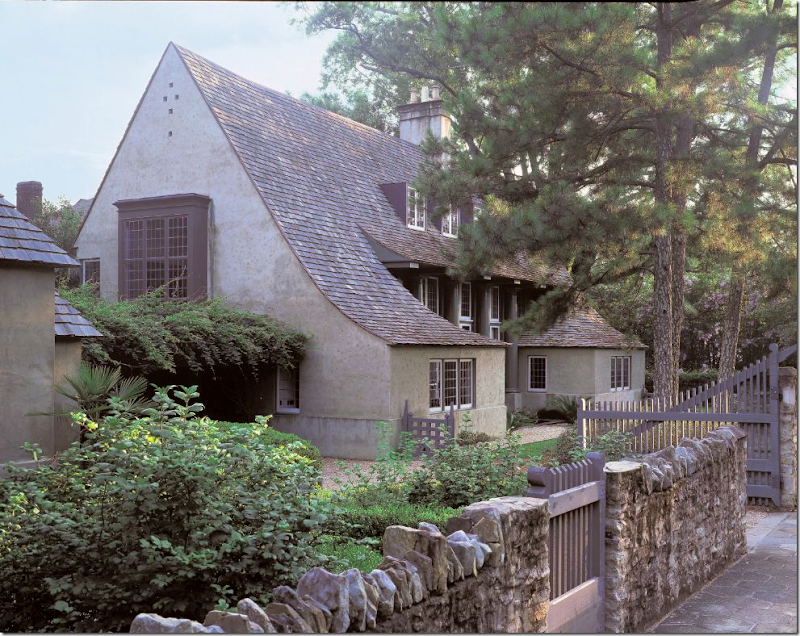
I’m sure you have a favorite McAlpine Tankersley design, that one house whose dog-earred clippings you’ve kept all these years. I have several choices, but my all time favorite will probably always be the house McAlpine designed for himself, years ago, in Birmingham:
That roofline, those windows, the two small rooms that jut out, the stone fence and wooden gates - was there ever a prettier or more romantic house? I wrote an extensive story on this house HERE.
I don’t know if McAlpine’s company has designed any houses before here in Houston, but this year McAlpine did design a house which was open to the public to benefit Habitat for Humanity in The Woodlands, a suburb north of town. You might have visited the house or seen it on another blog, but I recently saw the virtual tour of the house and wanted to share the beautiful pictures of this very special house. In truth, I wanted to immerse myself in the house and study it for hours – so what better excuse to do it but for the blog? The interiors were designed by another personal favorite Bellacasa from Houston. I found it interesting that Bellacasa was chosen to team up with Bobby because I’ve always felt they were influenced by his own interiors. Looking at the pictures, I almost forgot that Bobby didn’t design them himself instead of Bellacasa, which to me is the ultimate compliment.
So, enjoy the pictures! If you have seen the house before, take a second look today. I think it’s worth it.
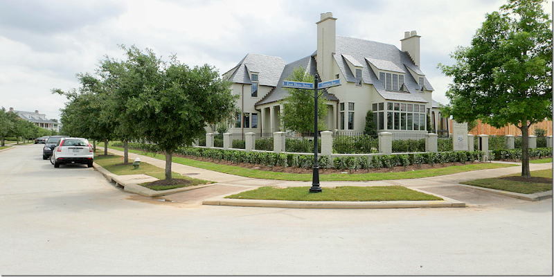
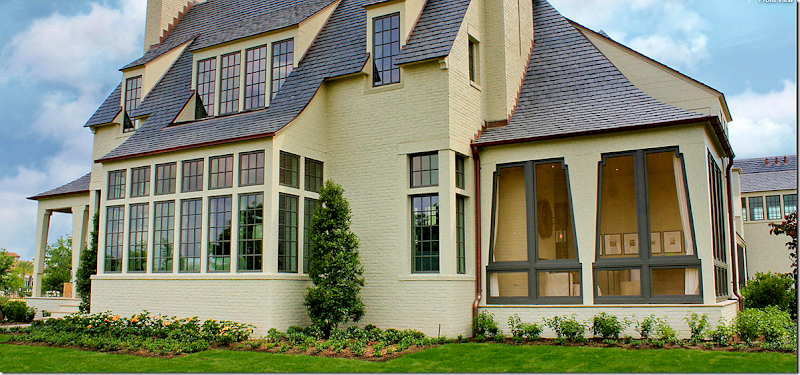
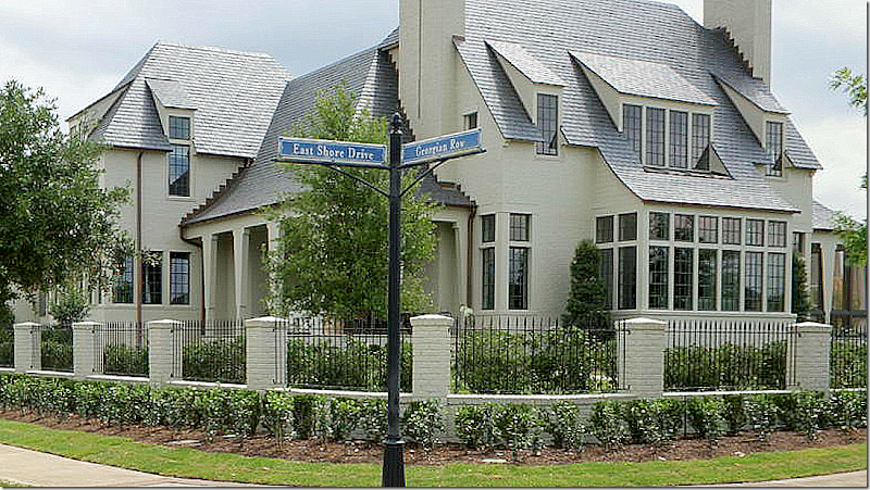
The house sits on a corner right across from the lake in The Woodlands. It’s obvious it’s a McAlpine house – the roofline, the symmetry, the bay windows give its creator away.
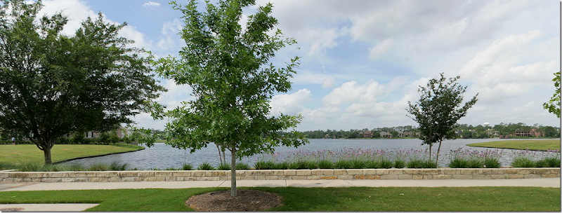
The sweeping lake view – right outside the front windows of the house.
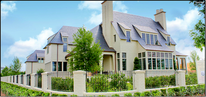
The front side of the house is perfectly symmetrical with the two fireplaces and porches on each side of the large bay window. Beautiful and classic details such as the slate roofline, copper gutters, the brick and iron gate, and black trimmed windows – all set the house apart. The house has 6 bedrooms, 5 full and 2 half baths with 4 woodburning fireplaces! That’s one detail I love – 4 fireplaces. Wow. It’s a total 8400 sq. ft. The front door is through the open porch on the left of the main bay of windows. The living room is at the front where the large bank of windows are.
The house is on a corner, with lake views. Here is a view of the right side with its screened in porch. Notice the way the beams are designed on the right side - they actually look like tied-back curtains.
Walking past the screened porch – is this view of the right side of the house. To the left – the high bank of windows is where the main staircase in the house is located.
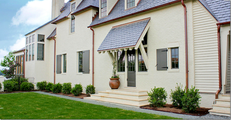
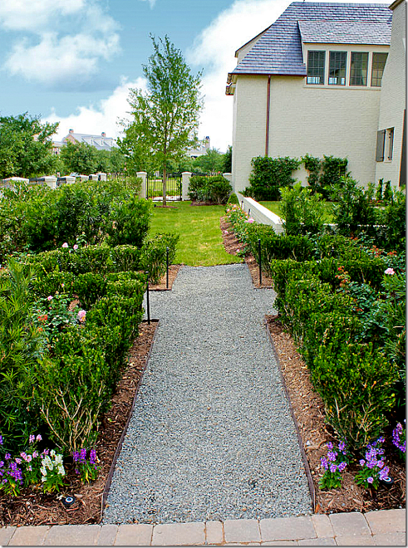
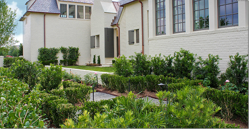
This view shows the other, the left, side of the house – that faces the street. This is a view of the landscaping, with its English garden look and gravel pathways.
And another look at the left side of the house, shows the shutters on the smaller windows. At the very left is one of the two garages, with a bedroom above it. The half brick wall creates a grass terrace off the side entrance.
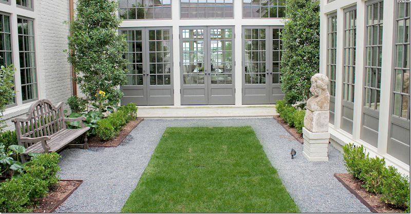
The design of the entire house is symmetrical. It’s in an elongated U-shape around a large, long central courtyard. This side of the courtyard shows the French doors that lead into the living room that faces the front of the house and the lake.
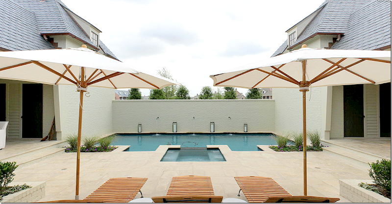
The opposite side of the courtyard ends at the rear of the house – with the swimming pool. Each side of the two wings are symmetrical – as seen here on the left and the right. The two garages flank the swimming pool (there are two 2 car garages on each end of the back of the house) To the left is one garage and to the right is the other garage. Each has a bedroom over it.
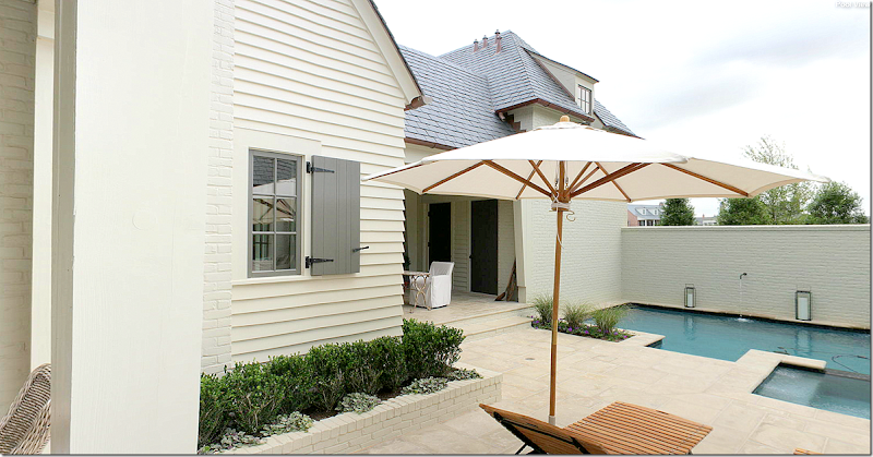
To understand how symmetrical this design really is - here you can see the left side of the swimming pool, with its small porch. The door leads to the left side garage. This side is identical to:
identical to the right side of the pool with its small covered porch. Through this door is the right side garage. Notice how the interior windows have the charming wood shutters.
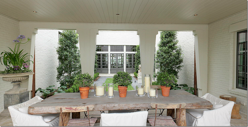
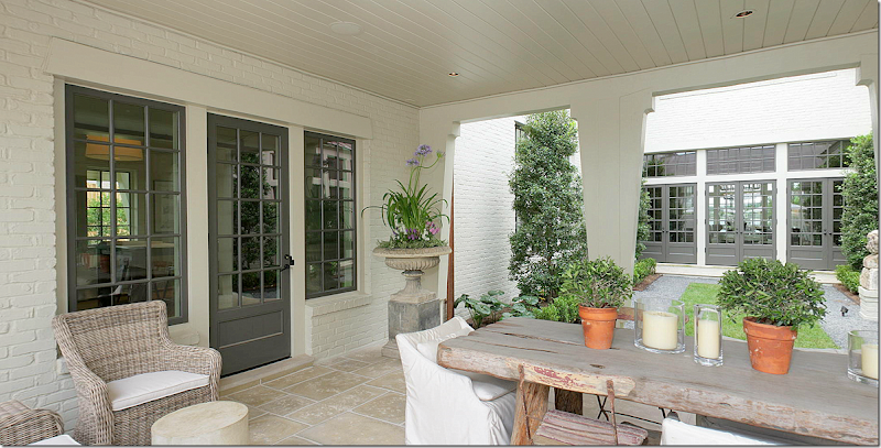
I love the way Bellcasa designed this area – that urn on the pedestal is so beautiful! The dining area of the courtyard is covered and sits directly in between the garden area and the swimming pool. The left side of the dining area is identical to the….
identical to the right side of the covered dining area. The courtyard has the same stone flooring as is in the interior of the house – creating the inside/outside feel of the courtyard. Notice too, that that the columns are cut in the same “curtain” design as the ones on both the front and screened in porches. The chairs are a mix of Kooboo wicker, white slipcovered and old French park chairs. The table is a large, Belgian styled rough luxe model. Love this setting!!!
Here is a close up of the courtyard. The three French doors lead into the living room. The windows to the right are the kitchen and the windows to the left are the family room. So pretty!
The slipped chair used in the courtyard is from McAlpine’s Lee Industry line HERE. Several pieces from McAlpine’s furniture line were used in the house.
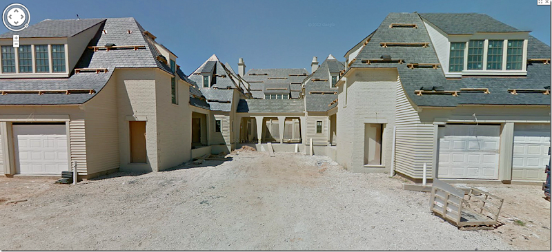
EEEK, what is this? Unfortunately, there is no picture of the back of the house and as you can, on Google Maps, the house was still under construction when this picture was taken. But I need to show it so you can fully understand the floor plan. Here you can see the garages – there are two 2 car garages – one on each wing of the U shape. The blank spot in the middle is where the swimming pool will go. Past that, you can see the covered porch area through the courtyard to the living room! You can really see the U shape of the house from this back view. There is no “back yard” – instead there are the two side yards and the courtyard in the middle.
And this view shows the house during construction, looking down. The front is on the left side overlooking the lake. You can plainly see the U shape of the house. In the middle is the courtyard, with the roof over the dining area in the center. Past it is the open area towards back where the swimming pool will be built – between the two garages. Understand? I hope so! I wish there was a floor plan!!!
Ready to go inside?
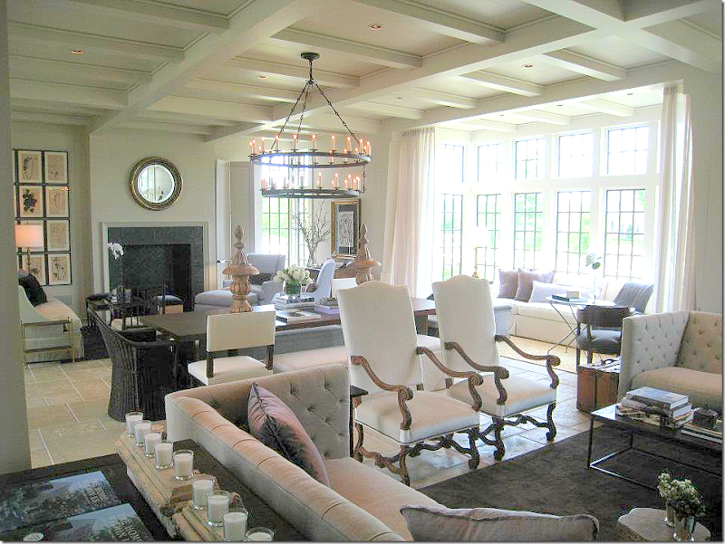
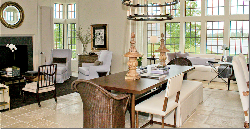
Entering through the front porch on the left, you come through the door into the great room – this is the room that overlooks the lake on one end, and the courtyard, at the other. As is the house – the room is symmetrical. There are two fireplaces – with seating areas on each side of the room and a huge table in between. Here is the seating area on the left side. This room serves as the main living area AND dining area. Through the brick arch on the right is the kitchen.
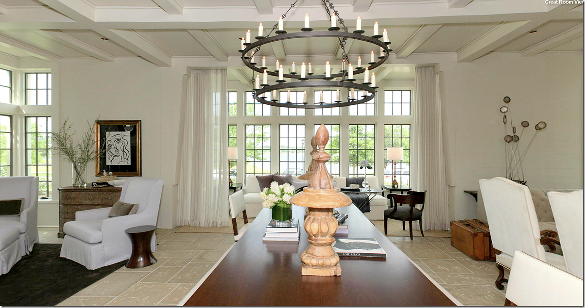
A look at the entire room – with the two seating areas and the dining table in between. At the far right is the bay window overlooking the lake with its own seating area. Hanging over the table is a large, double row iron chandelier.
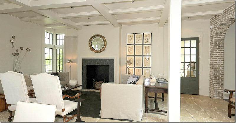
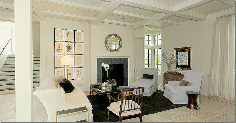
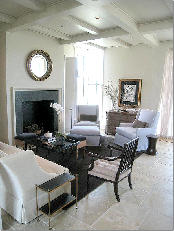
A larger view of the left side seating area with the fireplace. A set of herbiers hang together to make up one large piece of art while a round gilt mirror hangs over the fireplace. The two shelter arm sofas face each with two tall French styled chairs in between. Behind each sofa is a long desk. This one looks like an antique piece. To the left of the fireplace is a tall double screen. There’s another one on the other side of the room. McAlpine loves screens and uses them to divide rooms and also to create vignettes.
In this view of the left seating group – you can see the sofas are tufted. A bricklayer’s style coffee table sits atop a dark rug. Velvet pillows are in shades of deep and light lavender – a color that Bellacasa uses throughout the house.
This view shows the right side of the room, along with the center table. Two wicker chairs, two accent chairs, and two benches surround the table. This mixture of chairs and benches around the table is a look that McAlpine frequently uses.
This view shows the central table and the window that overlooks the lake. Notice how the unlined linen curtains are hung outside of the alcove, making that seating area more cozy and closed off. That is another trademark look of Bobby’s that Bellacasa used here in homage to him. To the left of the table is the second seating area.
The right side of the room – shows the identical fireplace with its matching set of herbiers and mirror. The seating arrangement is different though, with one sofa and two arms chairs and an accent chair. To the left is the main staircase. Beautiful wood accent chair. The two arm chairs are covered in the lightest of lavender.
Another view of this seating arrangement. Love the back vignette and the two antique stools that surround the coffee table. The two brown rugs anchor the light covered furniture and play against the lavender.
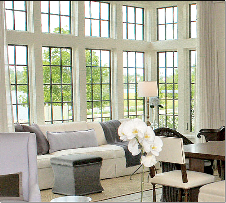
Looking from the right seating area over the dining area to the left seating area. My favorite part of the room is the bay window seating area, behind the sheer curtains. The chairs on this side are the light lavender as are the accent pillows in the bay window.
The bay window seating group has a long white sofa with a velvet ottoman used for a coffee table. Sisal rug sits underfoot. To the right you can just barely see the wood accent chair that makes up the rest of this grouping.
Opposite the front bay window overlooking the lake – are these three French doors that lead out to the courtyard and swimming pool. Outside, under the roof – you can see the eating area shown before.
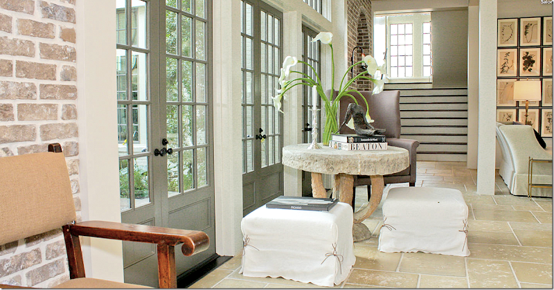
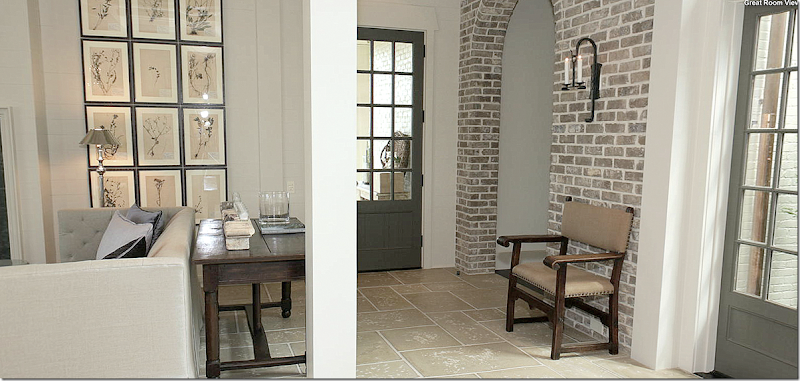
Another view of the 3 doors leading to the courtyard. Two slipped ottomans surround the concrete table, along with a wing chair. Again this arrangement is so Bobby! The staircase is in the back. Walls of brick with arches lead to other parts of the house. I love how Bellacasa chose to use so many design elements that Bobby is know for! It makes the interiors perfectly coordinate with the design of house!!!
And a closer view of the doors leading to the courtyard. Love the chair and concrete table.
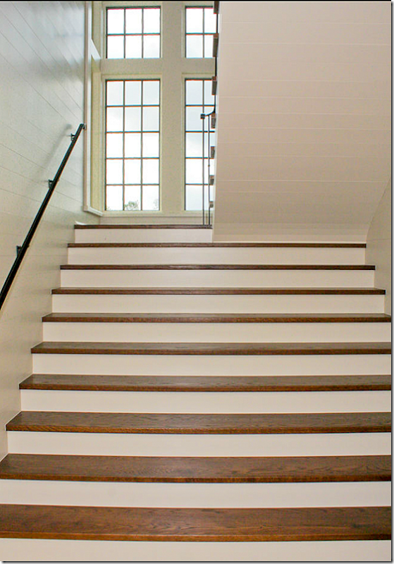
I love how McAlpine designed the stairs – they are double width on the first section – creating a grand look. Past the landing, the width becomes single – which you can see on the upper right. Notice the horizontal paneled walls.
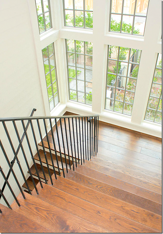
A view from the upper stairs – the window bay overlooks the right side of the house.
To the right of the stairs is the screen in porch, furnished in a Kooboo wicker sectional and an organic styled chair. Touches of the accent color lavender are brought out here from the living room to the porch. The porch is softened with sheer curtains that match those found in the living room.
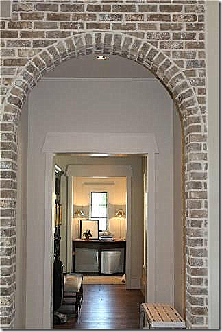
To reach the kitchen - you pass through this brick arch near the front door of the living room.
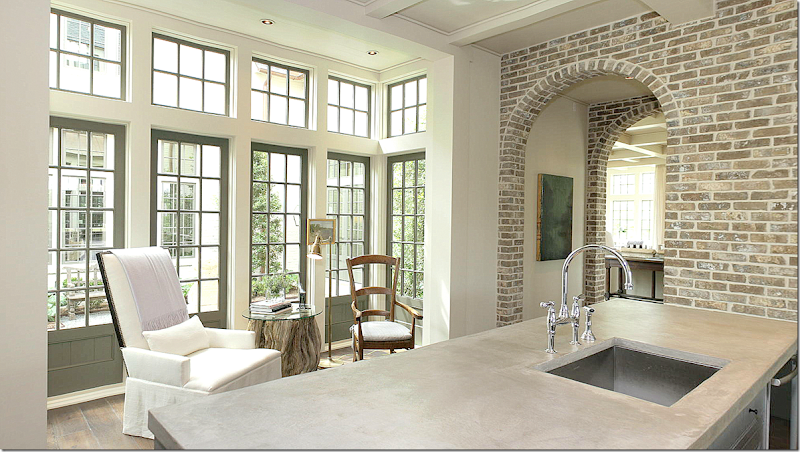
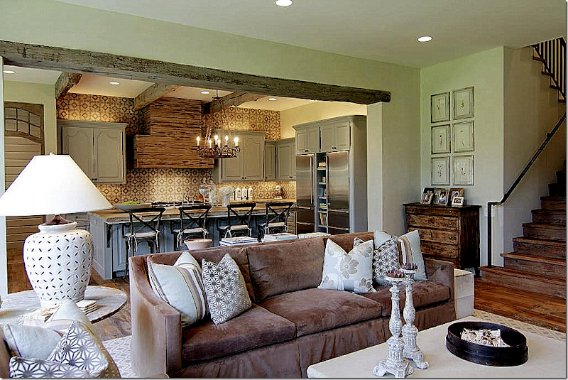
Walking from dthe living room (you can see it through the arch), past the double brick arches is the kitchen and breakfast room. A small seating area sits in the bay window that overlooks the courtyard. I love this vignette with the organic table, large contemporary chair mixed with an antique and a brass floor lamp. Hanging behind is a tiny painting. Wide planked wood floors run through this part of the house. The countertops are concrete.
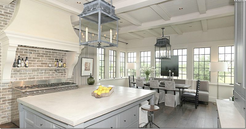
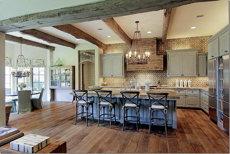
A larger view – shows the stove which sits alone under its wood hood. A large island is in the center of the room. The dark gray wood door leads to the pantry. Notice how the ceiling is the same as the ceiling in the living room – these details, repeated throughout, gives the house continuity.
This view shows the rest of the kitchen. The breakfast room overlooks the left side of the house – the street side. Two gorgeous lanterns light up this space. To the right is a gray painted cabinet. I love the way the stove is set alone in the space under its large hood. And notice how all the bay windows (two in this room alone) –bring a design continuity to the house. It’s all so balanced and symmetrical – which gives you a wonderful grounded feeling.
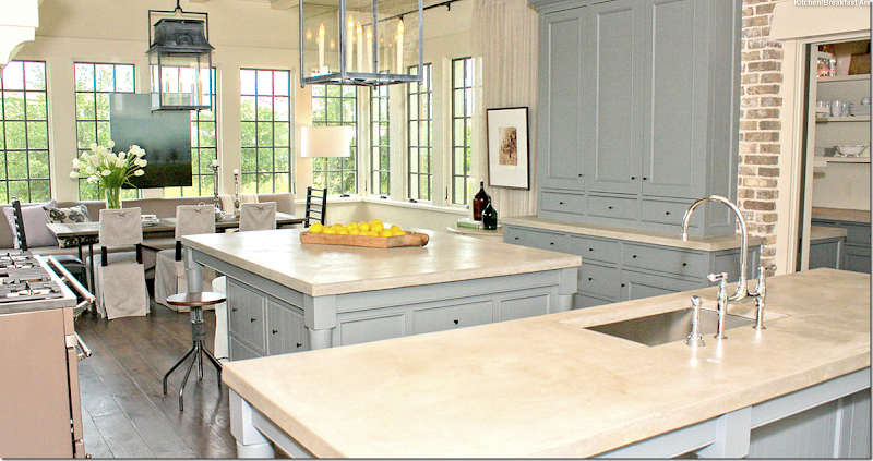
Here, you can see the butler’s pantry on the right through a sliding door. NOW, where is the refrigerator? Is is hidden in that gray cabinet? Is it in the butler’s pantry? Is it underneath the island – inside those cabinets? Where?
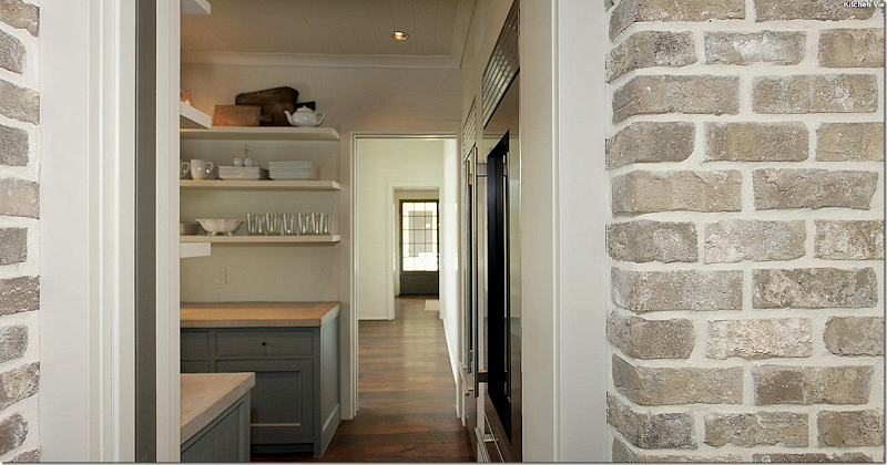
Actually, the large refrigerator and freezer are located in the butler’s pantry, behind the sliding door. In this view – you can see past the pantry into another room that leads out to the porch, then the garage. This room wasn’t on the tour, but I assume it’s either the game room or the “extra room.” Since there is no floor plan, I am just guessing here. If you toured the house – let me know which this is!
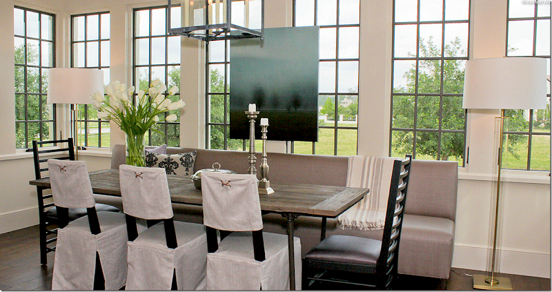
The breakfast area continues with the symmetrical feel – with a long banquette on one side of the brick layers styled table – along with three slipped chairs and two accent host chairs. Two tall contemporary lamps flank the setting – while a large painting hangs over the windows. So pretty!!!
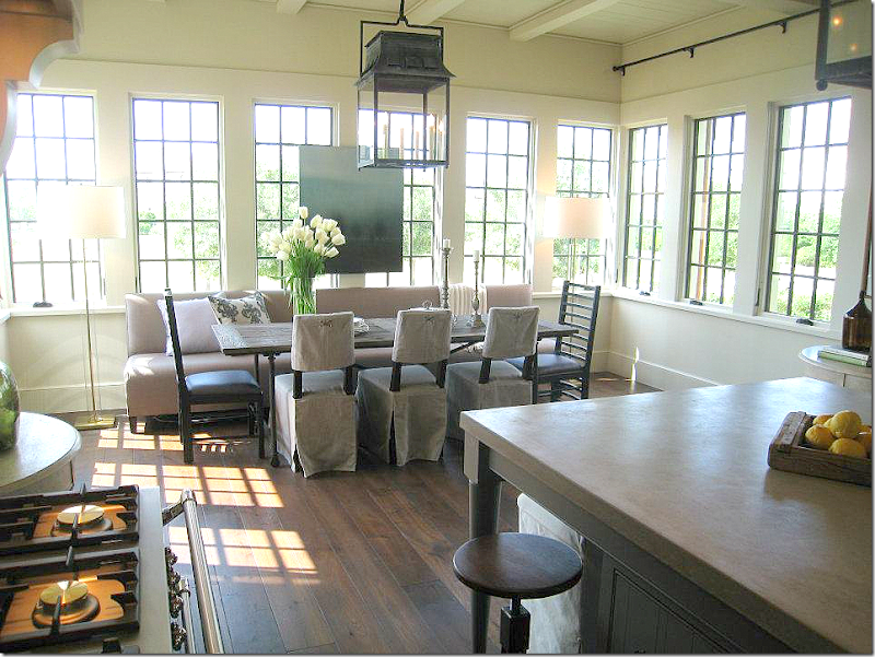
Another picture on a sunnier day.
And, the view of the sink and dishwasher – overlooking the sitting area into the courtyard. You can see through the courtyard into the room on the other side of it. Brick arches on both side of the kitchen provide the symmetry.
Now, if we go back to the living room – on the other side of the U – past the brick arches, we enter the den:
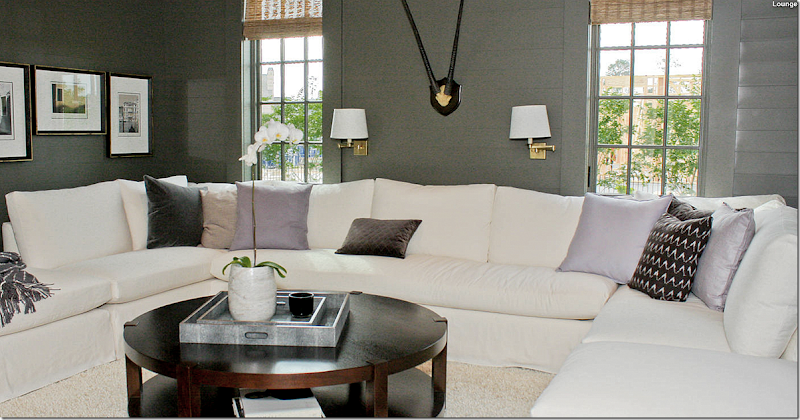
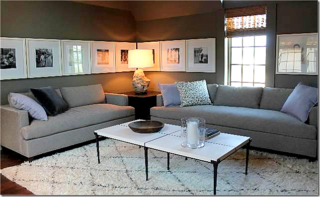
The den has a huge slipcovered sectional perfect for TV watching. The pillows are, again, an assortment of shades of lavender and purple. The horizontal paneled walls are painted dark gray, which offsets the white perfectly. This is the only picture of this room. It overlooks the right side of the house. And on the other side, it looks onto the courtyard. Now, since there is no floor plan, there is a little confusion. On the HAR web site, there is a dining room included in its inventory. I have no idea if this room is supposed to be the formal dining room – or is the room next to it? Bellacasa designed the living room to include the dining room, so perhaps this room is meant to be a dining room if the owners choose so? If you toured the house – let me know, ok? I am really curious!!
I did find this one picture of this room that wasn’t on the virtual tour, it might be the room next to the family room pictured above. More lavender pillows, a Moroccan rug, and a series of photographs were used here. I wonder what other rooms are missing from the tour?
And this small picture shows the hallway leading from the family room to the porch that goes to the garage. Notice the molding around the door – especially the top of the doors – such a great detail.
Ready to go upstairs?
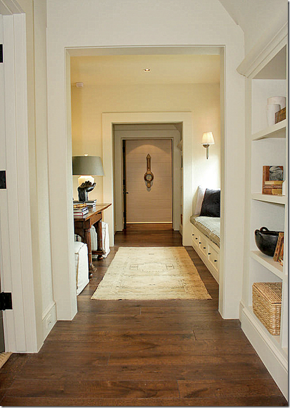
Coming off the main stairs – you reach this hallway, which overlooks the courtyard. The master suite is at the other end of this hall. Notice the antique barometer that hangs here.
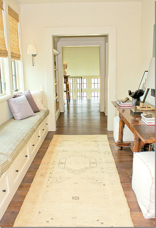
And looking the other direction, towards the stairs. I love the way Bellacasa decorated the house with a mixture of antique wood tables and chairs throughout - such as this console. And in the stairhall landing, notice the sculpture that sits on the pedestal. This would be a great place to read on a rainy day!!
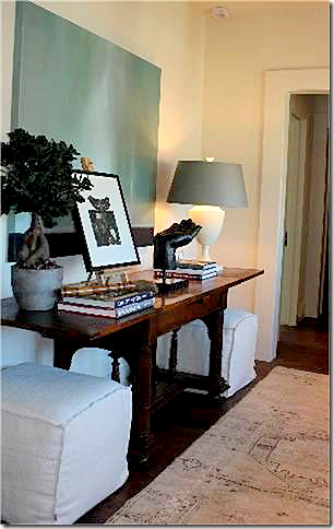
Here’s a view of the antique console with a lamp, sculpture, books, print and painting. Two slipped stools flank the console.
The master bedroom is located right over the kitchen – which is to the very left of this picture. The bank of windows in the front of the house hold the “boys bathroom."
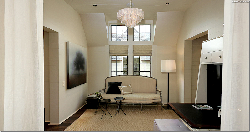
The master bedroom suite is divided into two areas. The sitting area is slightly smaller. This window overlooks the courtyard. Bellacasa used an antique sofa here, along with a new desk. The stool is in the soft lavender color. A seagrass patterned rug sits underfoot. Soft linen unlined curtains divides the bedroom from the sitting area – seen here at the left and right of the photograph. Matching fixtures hang in both areas.
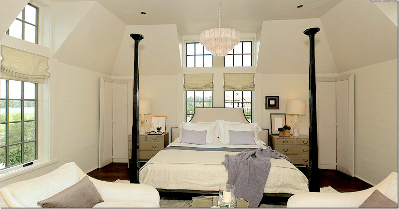
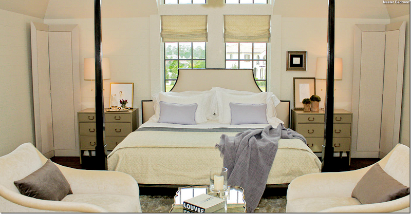
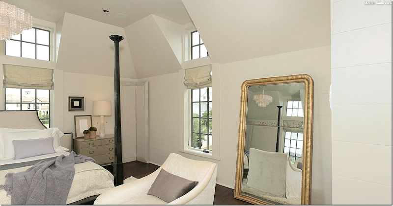
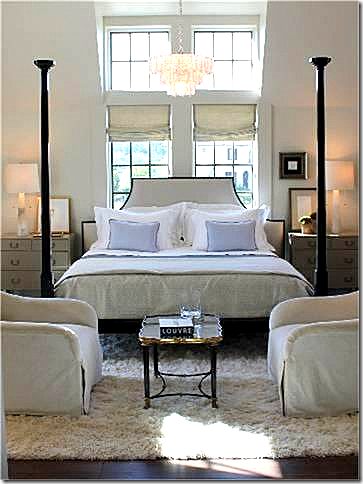
The bedroom – is furnished with furniture from Bobby McAlpine’s line for MacRae. In the corner are his famous screens that he uses in his designs. Two arm chairs sit in front of the bed.
Close up of the bed with the lavender accent pillows and throw. Mirror tray cocktail table. The bed fits the space under the dormer perfectly!
A large antique mirror reflects the sitting area.
This picture shows the chairs sitting on a white Flokati rug.
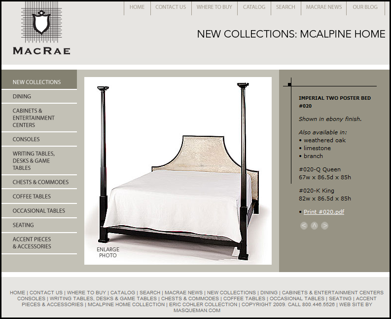
McAlpine bed used here – from MacRae
Similar to this McAlpine chair used here from Lee Industries.
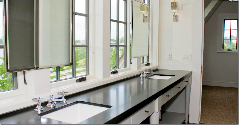
The boys bathroom overlooking the lake. Love the mirrors hanging in front of the windows. Pretty gray cabinet with black matte granite. Those are probably bedrooms that flank each side of the bathroom – wall to wall seagrass. There are no other pictures of any bathrooms or bedrooms! I want to see more!!!!!
And finally, I hope you’ve enjoyed this look at the Bobby McAlpine house built in my hometown as much as I did writing it. I had so much fun trying to figure out the floor plan just from looking at the pictures and I hope you did too!!!! The house is for sale and if you are interested in buying it – go HERE.
w
To order Bobby McAlpine’s beautiful book: The Home Within Us – just click on the title below:
Bobby McAlpine Comes Here!
TWO HOUSES FOR TWO STAGES OF LIFE
Are you just starting out in life, looking for that house when you first marry and have that first baby, or are you looking for the house to raise a growing family in, to live in through the empty nester years? When I was younger, I used to think of houses as something you lived in forever. But now, at 57, I’m realizing that houses are designed for certain stages in our lives. How lonely it must be for mom and dad in a big house when all the kids have moved on. How much space do 2 people really need? My house, at just under 3,000 sq ft., was really too small when Elisabeth started having friends over. Ben and I had nowhere to go except for our bedroom to hide out. But now that she is in college, we don’t find ourselves lost in a too big house. Still, one day, I suppose we’ll move to a townhouse or even later, a high rise.
What stage of house life are you in? Would a cozy bungalow be perfect for you, as a newly wed or an empty nester, or would you need a larger house, for all your children and guests who visit?
I found two houses for sale in Houston - one large, beautiful and custom designed for a big, growing family. The other is an older bungalow, perfect for a single person, or a family just starting out – or for an empty nester family. Both houses were decorated by designers, so the interiors are what initially caught my eye. But the more I thought about it – how better to show the difference for living at a certain stage in life? Enjoy!!
House #1
House #1 is a beautiful custom home in the wooded Memorial area of Houston. It was designed by Todd Rice and its interiors were decorated by Don Connelly, a well known Houston interior designer. Connelly also owns AREA, the fabulous décor shop on Kirby. AREA is one of the largest shops for furnishing the home – from the candles to the dining room table including the chandelier over it. They have everything and then some. It’s a wonderful mix of antiques and contemporary and it’s all beautifully laid out in Don’s vision. Connelly has been published numerous times in national magazines so it’s a thrill to see a house he designed that hasn’t been published (that I know of!)
The house is over 7,000 ft with five bedrooms, 5 baths and 3 half baths. The finishes are incredible, reclaimed floors, stone countertops, European mantel, and on and on. There are antique beams and the most incredible paneled dining room in Pecky Cypress.
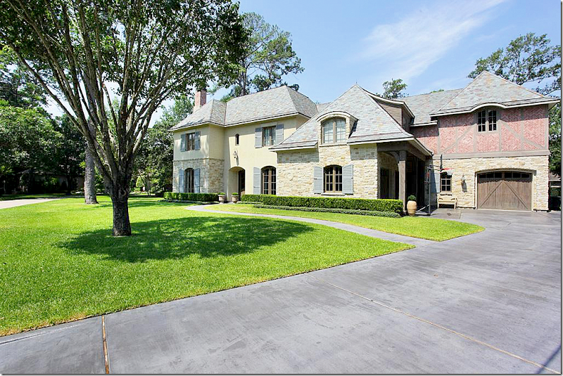
The award winning house built in 2007, is Country French design. The exterior is a mixture of stucco and stone, with a slate roof. The shutters are French blue, a color that Connelly uses throughout the house. This is probably my favorite style of house, so naturally I was drawn to it. The windows and doors are all mahogany, another luxe element used in building this custom house.
Here you can see the charming garage doors – with the French styled brick on the second floor. This section was designed to look like it was added on at a later time. So beautiful!!
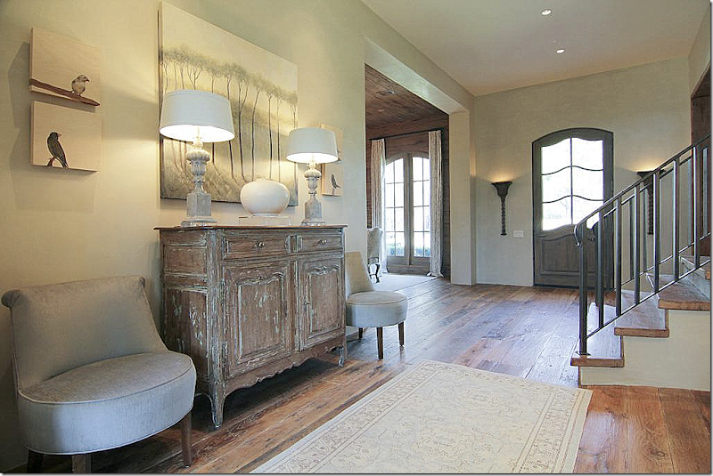
Inside, the foyer runs from the front door to the back door. Notice how Don mixed contemporary slipper chairs in a light blue silk with an antique French buffet. He also chose a large, contemporary vase to sit in between two urn lamps – along with a large contemporary canvas above it all. I love the front door. The arched top of the door is a design element seen throughout the house. And notice the beautiful reclaimed, wide planked floors – they run throughout the first floor.
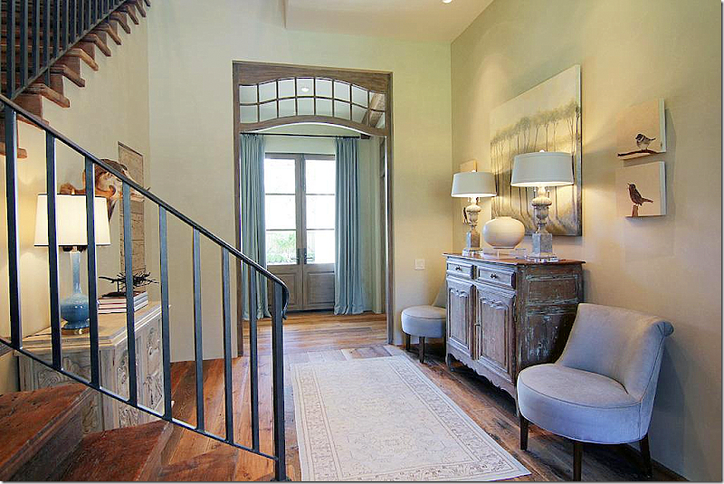
And looking the other direction towards the back door – divided off from the foyer with a beautiful mahogany transom and light blue portieres that cover the back door. Across from the French buffet vignette is a second vignette. I love the simple railing on the stairs – curvy, busy railings seem so fussy compared to this design. The walls are finished in a Venetian plaster – notice there is no molding, no crown or base, just beautiful plaster. At the end of the hall – past the transom - to the right is the family room and kitchen. To the left is the curtained window hall that leads to the master bedroom suite. Connelly is known for the mix of antique and contemporary – and this foyer shows off his expertise beautifully!
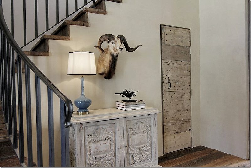
The second vignette off the stair lobby, with a beautiful French blue lamp. I love all the subtle touches of blue that Don added throughout. Notice the door that was made out of Pecky Cypress. Pecky what? Cypress grows in wet, swampy areas on the east coast and the Gulf of Mexico. When a fungus attacks the cypress, it creates this certain look that is seen when the wood is cut – known as Pecky Cypress. It is most popularly used as paneling in houses in Florida and Louisiana.
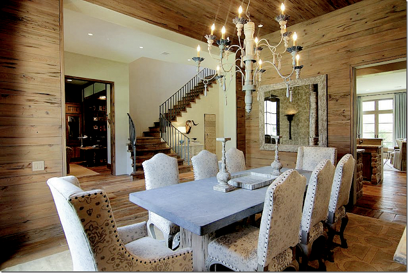
Off the foyer and to the right of the front door is the fabulous dining room – covered in Pecky Cypress. Even the ceiling is paneled. Notice the table – the base appears to be Pecky Cypress too. The top looks like zinc, but I’m not sure what material it is, it might be stone. Across the hall is the study and through the door on the right is the stone wet bar, and family room.
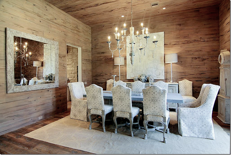
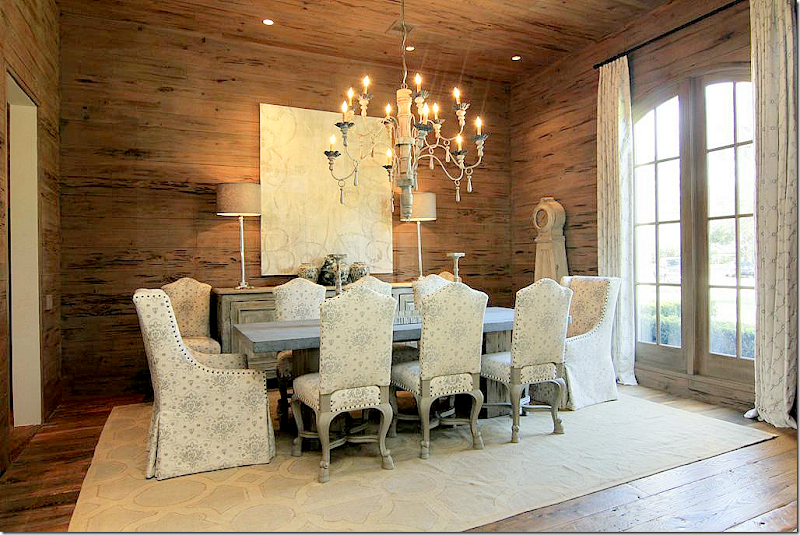
I love the chairs and the fabric used in the light blue and cream colorways. The chairs are a mixture of French with gray painted wood and a pair of host wing chairs. The nailheads on both are an important accent. Across the back is a tall painted buffet with a contemporary piece of art. Love the large wooden chandelier.
One last look – notice the light colored contemporary rug and the antique Swedish clock. For the curtains, Don chose another contemporary fabric.
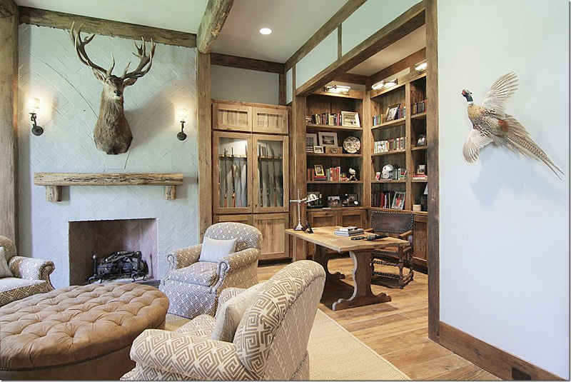
Across from the dining room is the study. A large, tufted ottoman anchors four comfortable chairs next to the painted white brick fireplace. Notice the Pecky Cypress mantel and beams. Love the desk! While the house is country French, I have no doubt that the owner is a Texan, who loves to hunt down by the Rio Grande river.
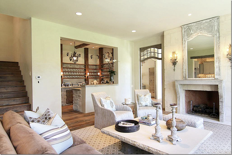
Through the transom off the entry hall (you can see the Pecky Cypress door in the foyer through the transom) is the wet bar, family room and kitchen. The reclaimed European mantel is stone with a painted trumeau above it. Notice the large stone coffee table and patterned rug. Here you can see the large, stone wet bar. Back stairs lead to the bedrooms.
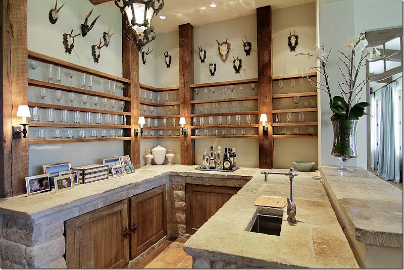
Close up of the wet bar. Notice the reclaimed stone countertops and how the cabinets are built into the stone frame. Great wood shelves wrap around the room. The sink is too cute!! On the right you can see the hall that leads to the master bedroom.
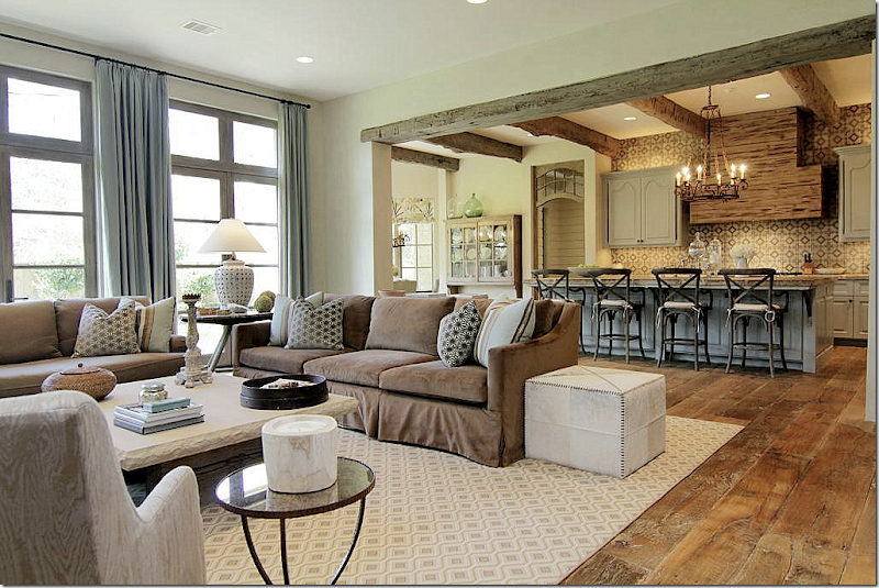
Another view of the family room – and the kitchen beyond it. Look how wonderful the floors are, reclaimed wide planked French oak! The curtains are the same soft blue which Don used throughout the house. Notice the Pecky Cypress beams and stove hood.
Another view of the family room and kitchen. I like how the refrigerator and freezer are broken up by bookshelves. It warms up what is usually a large bank of cold stainless.
The cabinets are painted a soft bluish gray – the tiles are hand painted, they make such a large design statement. Another arched transom leads to bricked lined hall at the back of the house and garage.
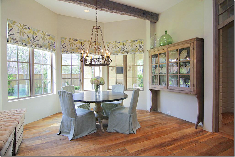
The breakfast room has a contemporary print in greens and blues. Zinc topped table with blue slipped chairs. I LOVE LOVE LOVE that shelf!!! So unusual. How perfect is it for that space??? Notice the tufted stools on the left – remember the last reader’s house had those too! I’ll wager they are both from Marburger Farms at Round Top. Outside this window you can see the back porch, with its lanterns and flatscreen, no other pictures though.
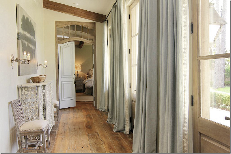
At the end of the foyer – to the left - is this hallway that overlooks a terrace lined in boxwoods that leads to the back yard. At the end here, through the arched transom is the master bedroom. These doors with the transoms are so beautiful and make such a huge statement. I love how Todd Rice paid attention to every single detail – and it shows. Notice the light blue curtains with their Greek Key trim. Across is a vignette with an antique French balcony made into a console and two antique chairs, along with a contemporary art work – a trademark vignette of Don Connelly’s.
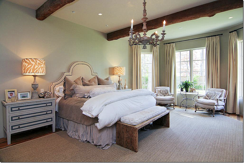
The bedroom has the light blue gray walls, along with a textured rug over the hardwoods. Notice the touch of exotic – the zebra striped lampshades really add a punch to the room. Antique beams.
Painted armoire hides the TV. Creamy curtains are so pretty against the wall color. The only pattern comes from pillows in the chairs and the lampshades. Beautiful chandelier – AREA has a great collection of unusual and original chandeliers.
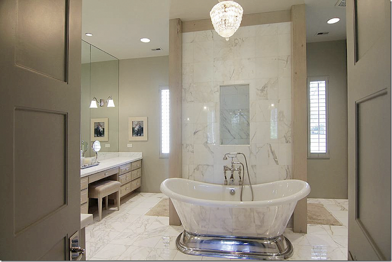
The master bathroom room is all Carrera marble and polished nickel. Gorgeous tub.
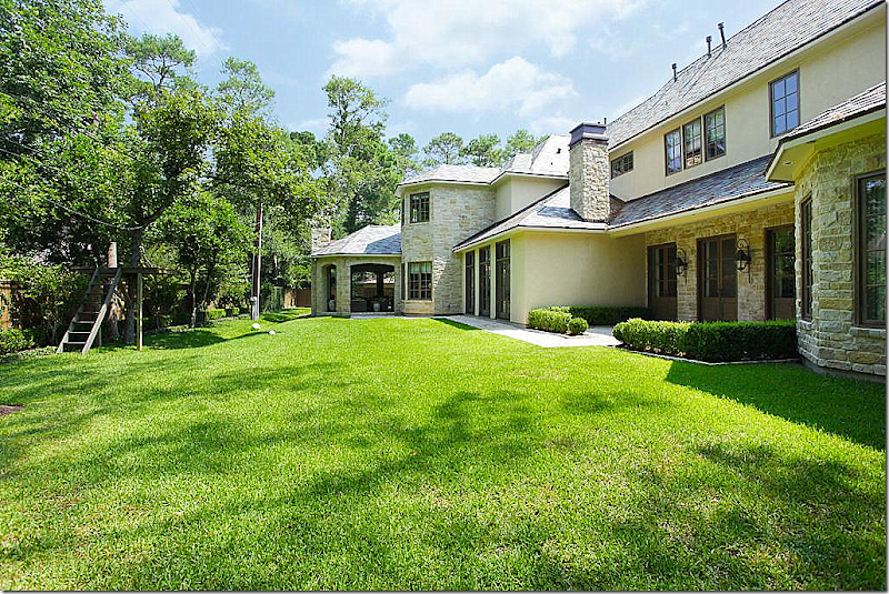
And finally, the back façade. You can see the covered porch to the left off the breakfast room. The family room doors are next and then the three French doors that line the master bedroom hall can be seen. A boxwood garden surrounds that terrace which will be great when the pool is built. At the end is the bay window in the master bedroom. I loved having a chance to see this design by Todd Rice and the interiors by Don Connelly. I hope you did too! It’s the perfect home for a young couple starting out with a growing family – they could live here 20 to 25 years and be very happy. But, is the house too big for empty nesters?
This house is option pending. To see more go HERE.
HOUSE #2
House #2 is also owned by a designer. It doesn’t list her name on the account, so I can’t say it here, but the homeowner comes from a family of designers. This house is located near downtown and is the opposite of the house above. It is an old cottage built in 1938 and is just under 2,000 sq ft. There are 3 bedrooms as well as another in the converted garage/guest house. The entire house was redone – new a/c, roof, wiring plumbing, insulation, and sheetrock. It’s absolutely adorable and I thought it was a perfect mix to show with House #1. Not all great houses have to be huge or custom designed. Sometimes, it’s the smallest of cozy homes that fill our souls with longing. This one did it for me. These two houses show two families at different stages and how each house fits their stage perfectly. This bungalow is perfect for the single person, the newly married – or the empty nester.
As with the other house, this one is also “Sale Pending” – more information HERE.
Located near downtown Houston, the 1938 bungalow has great curb appeal with its new gray paint and boxwood landscaping. No garage, but plenty of parking out front.
On the front porch, the ceiling has beadboard and there is a nice front door with windows that lets in the light. Some people that own bungalows like this will convert their front porch into interior living space. Just an idea.

Right away inside, it’s apparent someone with a great sense of style lives here. There’s a fireplace with a great mantel – an antique Louis Philippe mirror and sconces atop it. A tall slipped sofa divides the room in two. The zebra rug pops with pattern. Two contemporary chairs wear green patterned fabric pillows, as does a bench in front of the fireplace. The walls throughout the house are a stark white – with tall black baseboards and doors that add to the color scheme. I love the blinds – these open from the bottom, letting in light, but keeping out stalkers trying to look inside. (You know who you are - cruising around at dusk trying to look inside all the cute houses.)
The ceilings are 9 1/2 feet tall downstairs – a rarity in a bungalow of this age. Here you can see the dining room behind the living room – and the kitchen further along. I love how the ceiling has a glossy finish which adds a nice texture to the space and makes the ceilings appear even taller.
Here, a large built in coverts the dining room into a study. French cane chairs around a dark table sit underneath a beautiful wood and crystal chandelier.
At the back is another sitting area, this time with a linen slipcovered sectional perfect for a young family with babies. The blinds are just so pretty in this space. They add so much texture and create atmosphere at the same time. A contemporary light fixture tops it off. Notice the baseboards – a wide strip of black paint – which adds just a touch a drama to the white walls. This is another great idea – the strip of paint creates a wide baseboard where there really isn’t one, there is only a quarter round!
A checked tufted ottoman becomes the coffee table. There are three arched mirrors instead of just one mirror – flanked by two wood sconces. A painted buffet holds the flatscreen, while a large pine piece holds books and accessories.
The kitchen is just darling. Granite in gray and white, gray cabinets, and new stainless appliances. The cabinet above the refrigerator is pushed forward so that it looks like a built-in refrigerator, another great tip. Love all the cabinets without their doors – so pretty! Notice the feet on the bottom cabinets- a nice detail. The backsplash behind the cooktop is brick.
The bar area – opens onto the back yard. Great glass shelves with black iron brackets. Another pretty French door, painted black, is a nice touch with the tall, black baseboards – the black doors tie it all together.
Upstairs in the converted attic is the master bedroom. Here, the walls are again white, with the wide black strip of baseboards. The floor is wall to wall seagrass. The bedding is all in linens. Down a step is a sitting area. Attic rooms are so romantic because of all the eaves. It’s like sleeping in a tree house!
Great new master bath – with shower and tiny mosaic tiled floor. The same countertops found in the kitchen are found here. An antique table holds the towels. I love how the dark brown pops in the all white space.
The nursery has the same color scheme – white with black accents and pops of blue. SOOOO CUTE!!!! I love that crib!!!!! And here, romantic curtains hang from black rods over the shades. Beautiful crystal chandelier. The rug adds texture and pattern. Pretty white linens on the bed. A painted chest is converted into the changing table which is a great idea because changing tables aren’t used but for a few years and afterwards you have a pretty chest. Sooo dreamy!!! Just the perfect nursery. Hmmm….
The garage was converted into a guest house, where they added a wine refrigerator. Great suzani ottoman and nice buffet which holds the flatscreen.
And included in the guest house is another bathroom. Such a cute linen monogrammed shower curtain and I love the shelf that was faux painted for over the toilet.
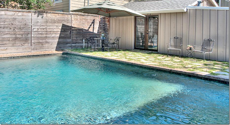
The back yard with the converted guest house and pool, which was completely resurfaced by the owners.
What a great house for a single person – or a young family just starting out. I assume the owners are probably moving to a somewhat bigger house, but I love the size of this house, it’s so cozy and warm. The guest house adds that needed flex space which could be a great hideaway to watch footballs games away from sleeping babies. I’ll make a guess that this couple may also be moving because of the pool. Once babies start crawling, you need to think about pool protection like gates. Is this house too small for more than a baby? Would 2 or three children be too crowded in this space?
Still, I wanted to show both these houses because they are so very different in square footage and style. One is 7000 sq ft and custom and the other is 2000 sq ft and a renovated bungalow. One is for those just starting out – or maybe empty nesters, the other is for a large, growing family. Are you at that stage in life that one of these houses would be what you are looking for? Or are you headed for a townhouse or highrise? Is your house right now somewhere you will be able to live when you move to that next stage of your life? Or will you be forced to move on when you outgrow your house or your house outgrows you??
Talking about that pool and the gates that have to put around a pool when you have a toddler reminded me of this darling gate that I saw used in a backyard. Instead of something really ugly that most people have, these homeowners transformed their backyard with their pool gate.
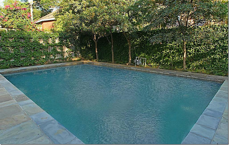
Take this house for example with a beautiful back yard – the baby gate around the pool is so unattractive and really takes away from the pretty swimming pool.
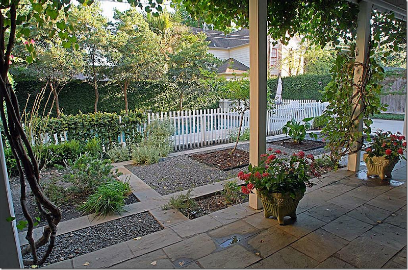
This beautiful pool needs a baby gate around it – but what the owners did to baby proof it is really so cute – look:
Instead of an ugly black gate, these owners put a white picket fence around their pool and suddenly the back yard looks like something out of South Hampton in New York, instead of Houston, Texas. So, so attractive and safe. They can even grow rose vines over the fence to soften it more.
(In fact, their entire house is definitely worth seeing – to look at it, go HERE.

