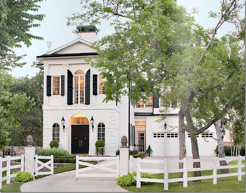
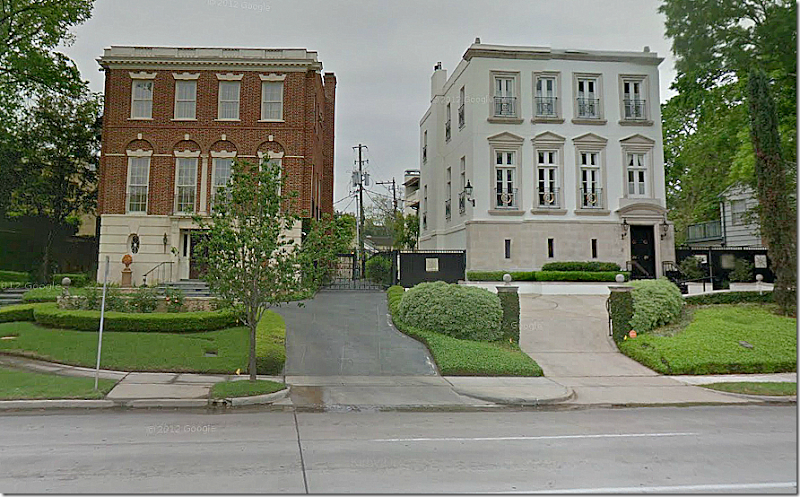
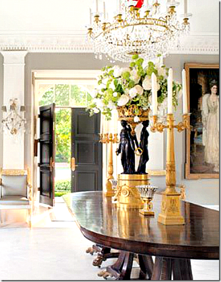
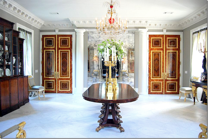
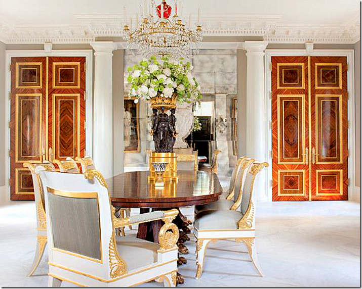
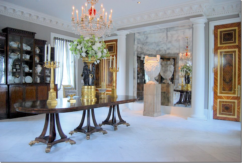
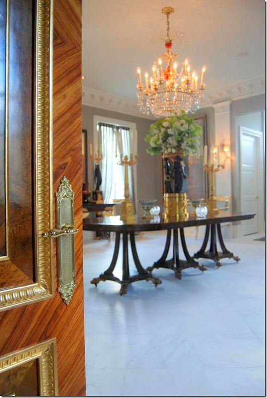
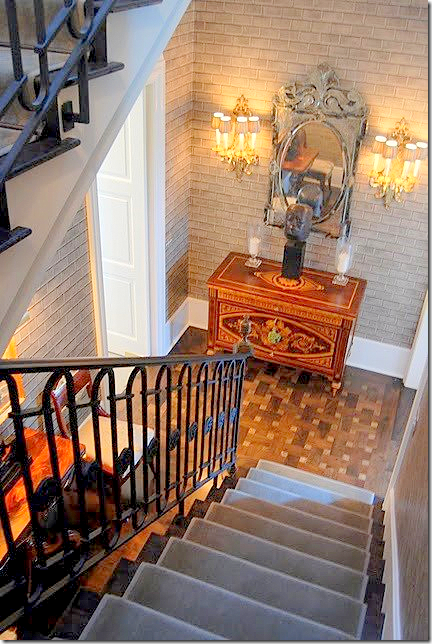
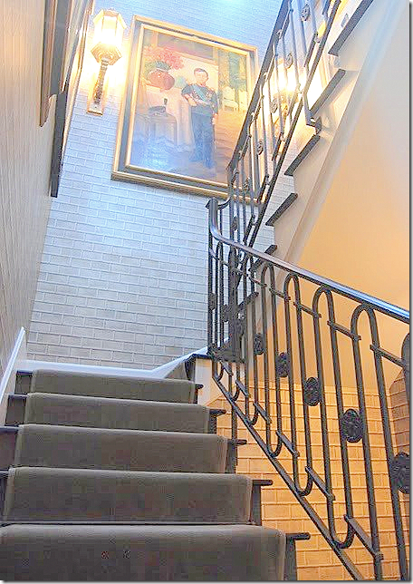
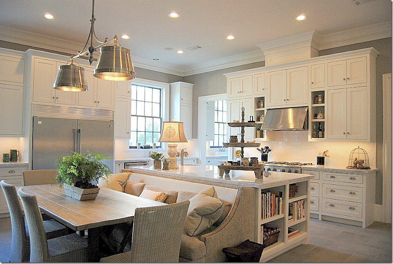
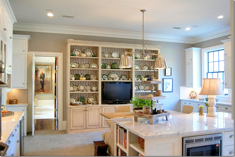
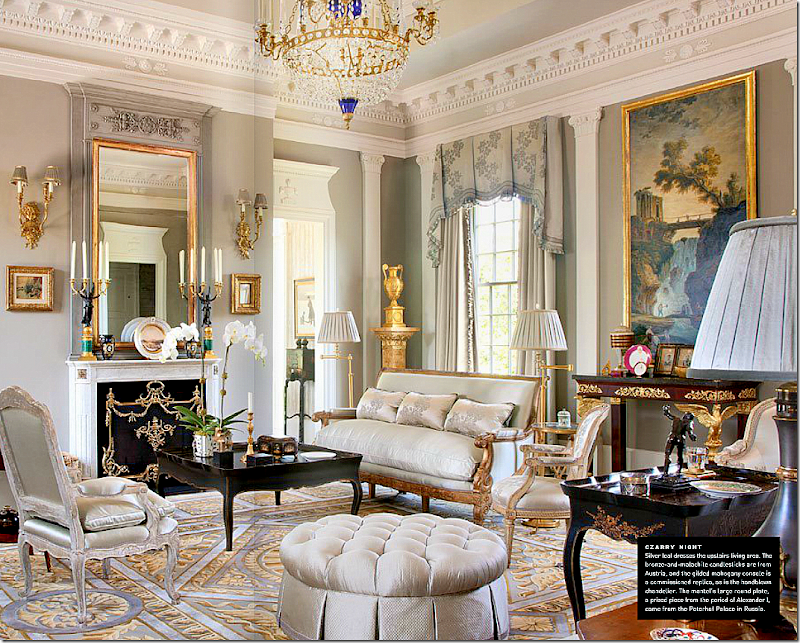
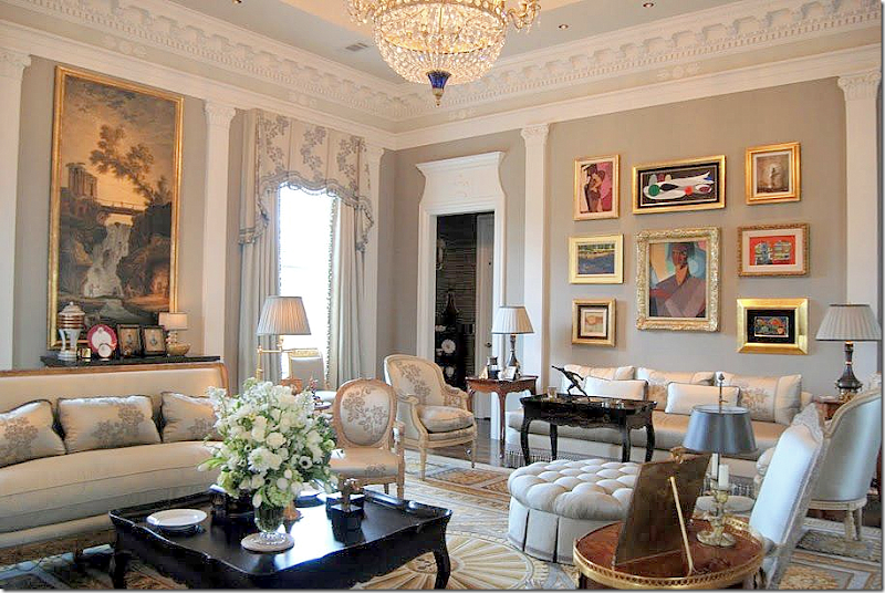
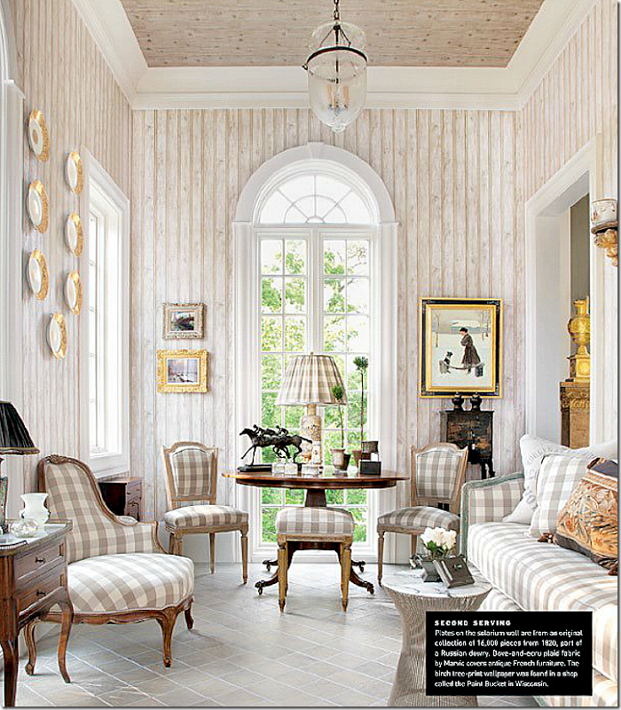
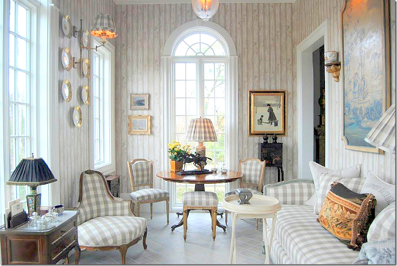
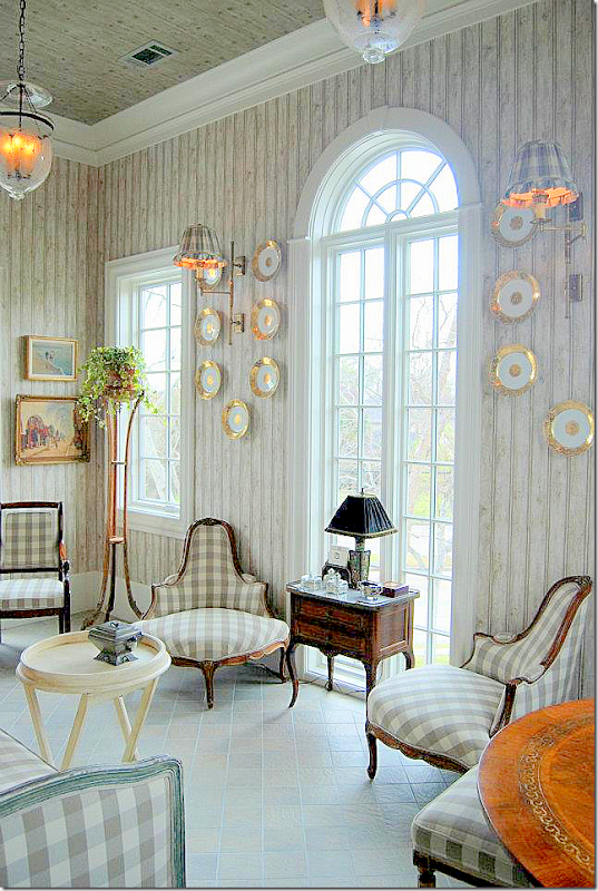
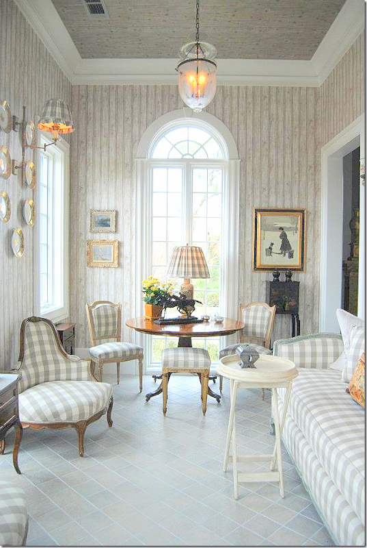
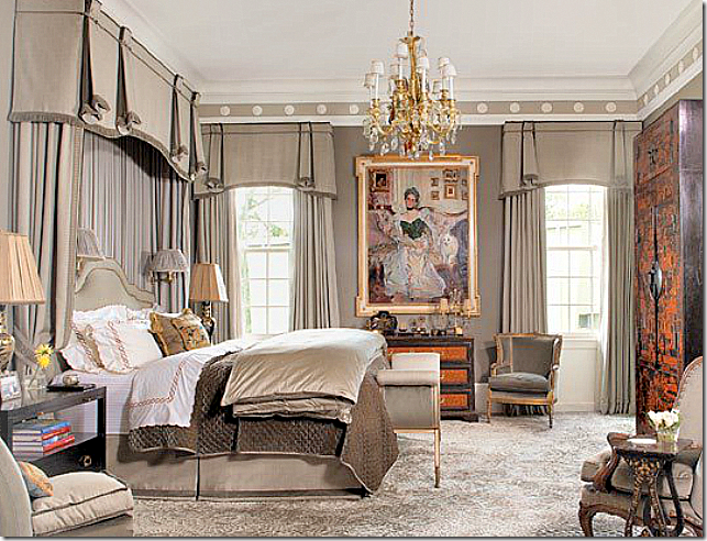
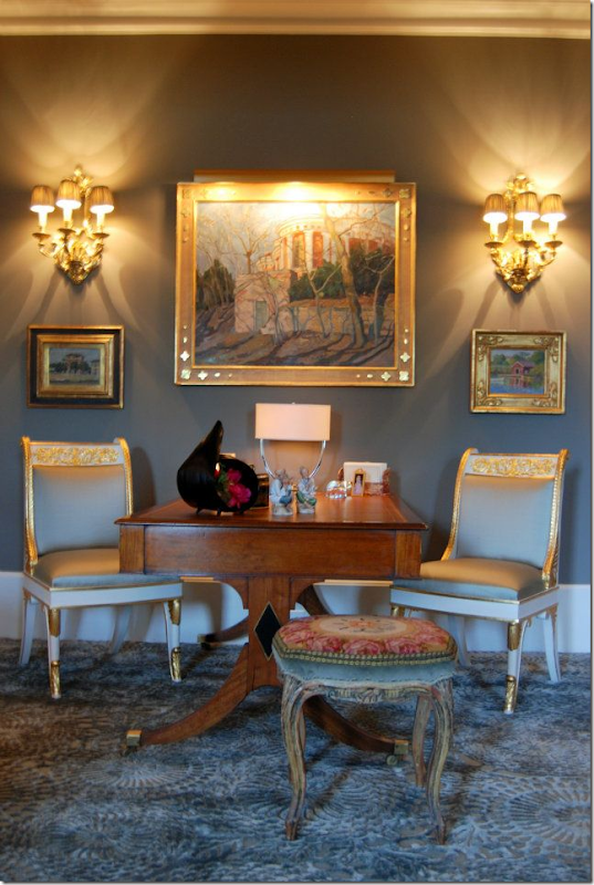
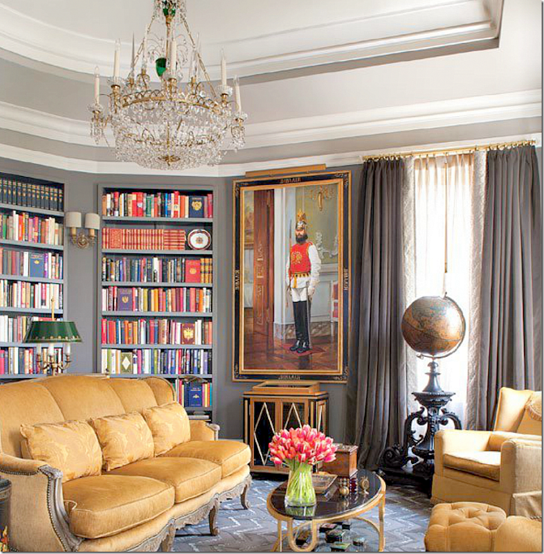
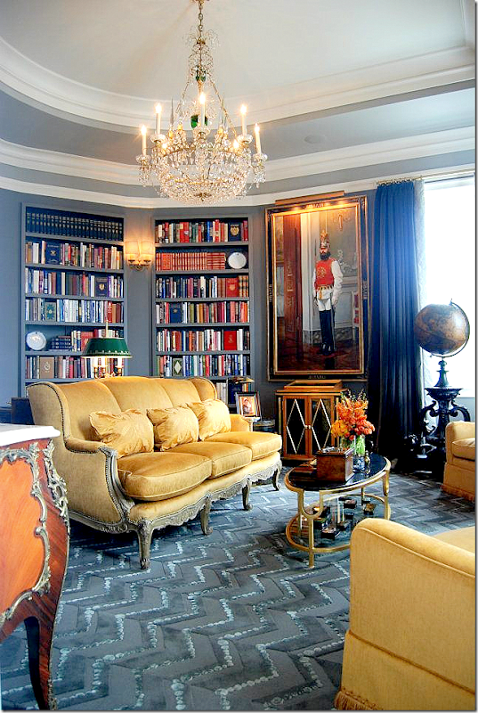
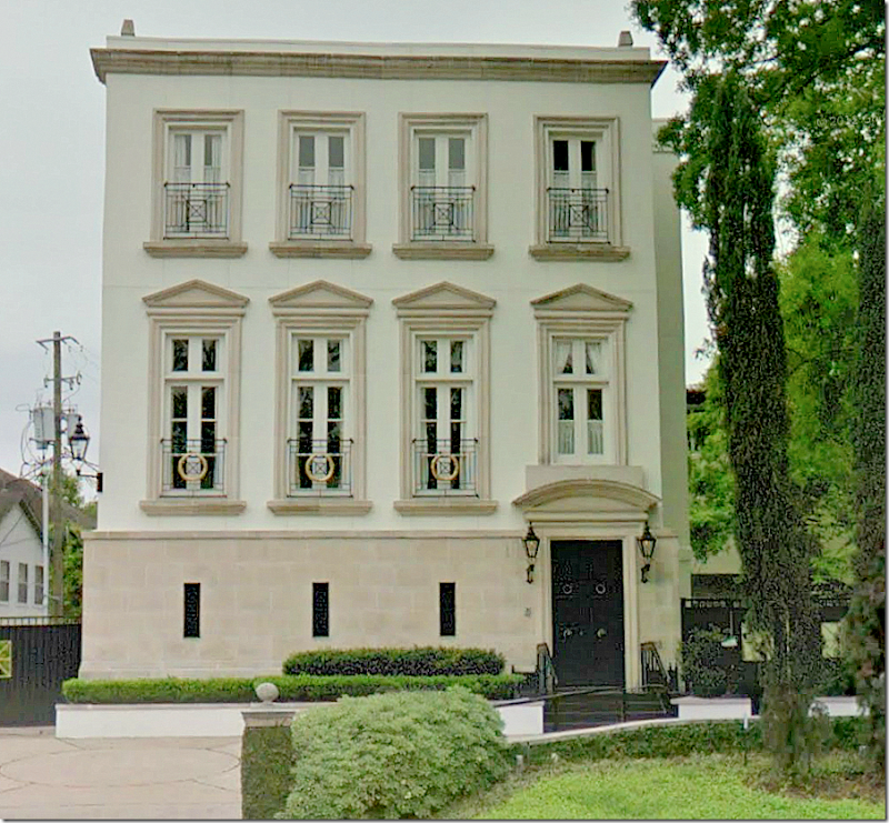
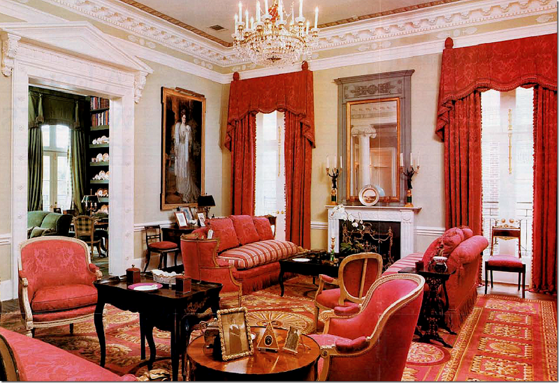
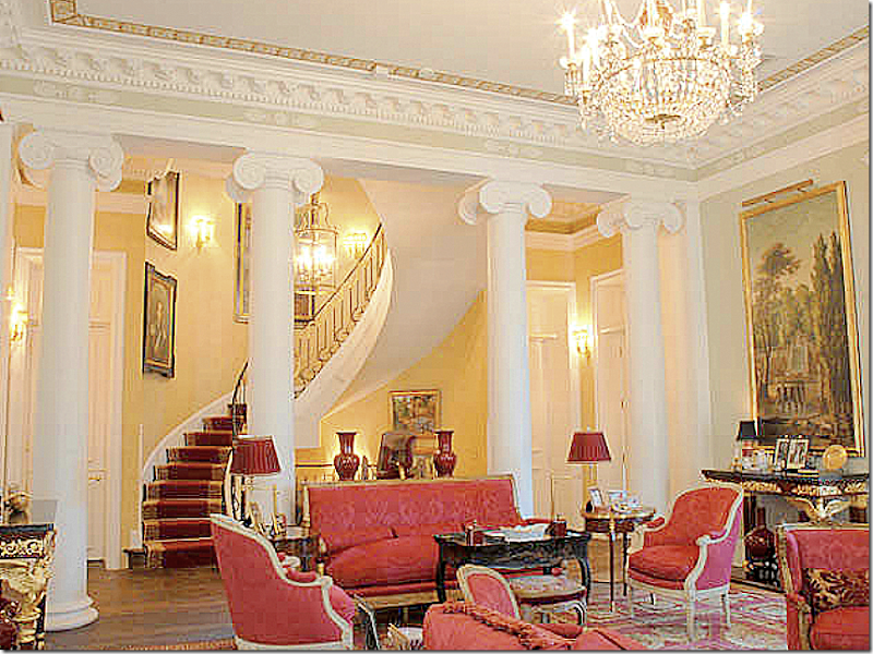
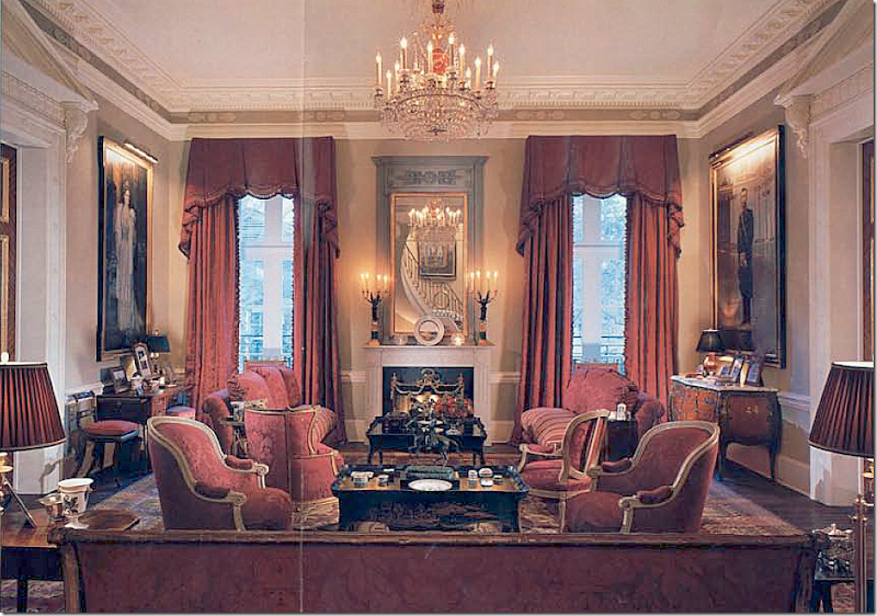
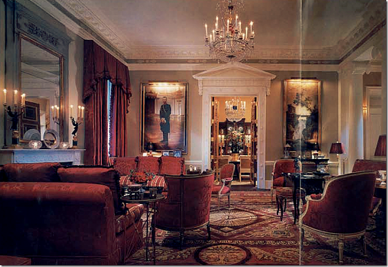
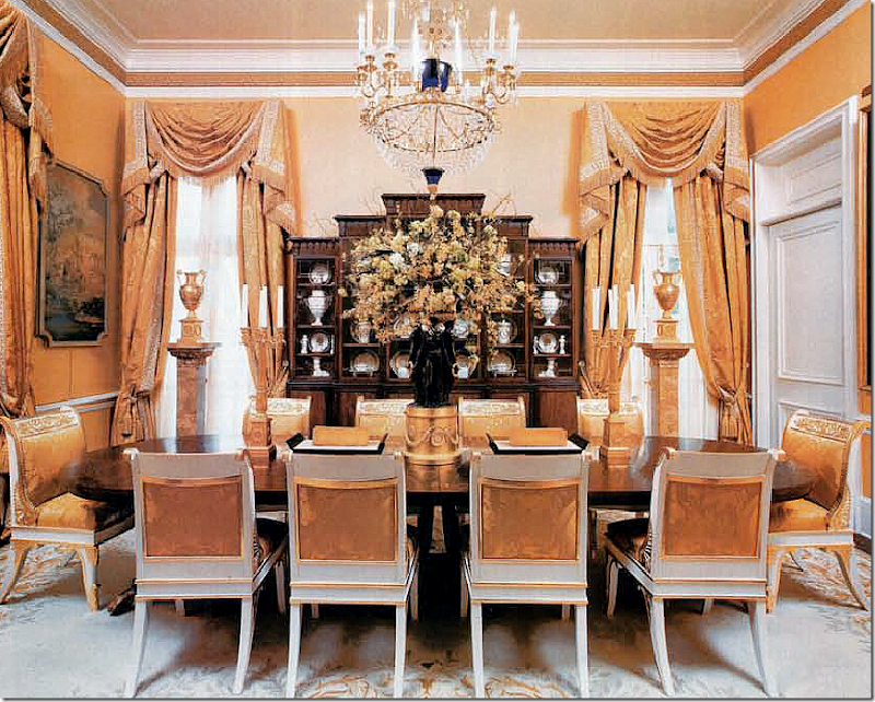
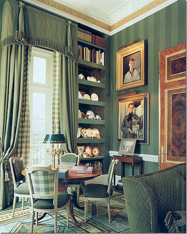
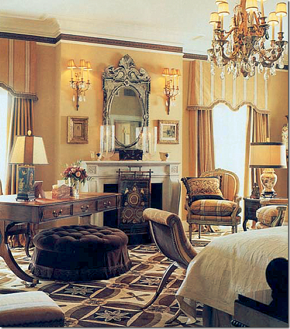
What? A house in Houston without seagrass or slipcovers and no shabby, faux antiques???? Seriously?The new Luxe magazine, Houston edition, has the most gorgeous cover. It stopped me cold and I ripped it open, looking for the house that this beautiful check-laden room belonged to. If you are from Houston, you might have seen the article – but if not, I want to share it with you. The cover is a room in this house, below, which is so wonderful I couldn’t stop staring at it!The Federal Style House near downtown Houston – could it be more charming or beautiful?The most interesting fact about the house is who owns it – the dynamic designing duo of interior designer Michael Siller and his partner, rug designer and CEO of Hokanson Carpets, Larry Hokanson. Once learning these two were behind this white Federal style beauty, I’m wasn’t surprised at all. This is just the latest in a series of houses that they’ve lived in – and each has been a very special treat. This Federal style house and their previous one, a Neoclassical style house, are both the work of San Francisco and NYC based architect John Ike of Ike, Kligerman Barkley Architects.The Summer Derby HouseThe Siller/Hokanson house is based on the 1794 Summer Derby House, built by Samuel McIntire, in Massachusetts. The Summer Derby house was moved in 1901 to Glen Magna Farms, which is today a popular wedding venue. Considered one of the finer examples of Federal style in the United States, the Summer Derby house is a National Historic Landmark. The resemblance to the Houston house is remarkable. If you look at the two houses, you can see that the corner urns are included in the Houston house, but the two large wooden figures of the shepherdess and the reaper were excluded. Other similar details are both houses are white with black accents and the arched window placements are the same as are the shutters and door. The main differences are the center window is much larger in the Houston house and the wing that juts out to the right side is unique to the Houston house. The fabulous picket fence and gate that surrounds the Houston property also sets it apart from the Summer Derby House.While the exterior of the house is a rare look for Houston, the interiors are too. Houston is known for its slipcovers, light linens, and painted antiques, but Michael Siller definitely marches to his own fabulous beat. His personal aesthetic is far from what I call the “Houston Look.” He has a love of fine antiques – the finest there are. He loves color and pattern and delicate silks. And most importantly, he and Hokanson have a particular affinity for anything Russian – Royal Russian, that is. This love of Imperial Russia all started when Hokanson read the best selling biography Nicholas and Alexandra. I can totally relate. I read the same book and became consumed with the mystery of the Princess Anastasia who was purported to have escaped the execution that killed her entire family, including her parents the Czar Nicholas and Czarina Alexandra. For years – almost her entire adult lifetime – the Polish Anna Anderson proclaimed she was the missing Anastasia. Some relatives of the European Royalty families, believed her story and visited their “cousin” sporadically during her long life. Unfortunately for Anna, DNA testing became available - and after her death, she was proven to be a fraud. The real Anastasia’s bones along with her brother, were eventually found – separate from the rest of their family – and DNA also proved this. One of the great mysteries of the Russian Revolution was cleared up, thanks to modern technology. The story of the of the Romanovs, the Russian royal family, with their untold riches, glorious palaces and opulent lifestyle, along with the misery of the hemophilia which struck the crown Prince, is a great romantic tale of epic proportions. Since I too fell under the spell of the Romanov’s tale, I can understand how Hokanson, and then Siller, got hooked on everything Russian. Most exciting though, the two were fortunate enough to take their obsession a little further than most of us.When designing their previous house – the Neoclassical one, Siller and Hokanson went to St. Petersburg’s State Hermitage Museum where they were interviewed for two days by curators in hopes of purchasing some reproductions of the royal furniture. The designing duo had a list of antiques from the Hermitage they wanted copied – but first they had to pass inspection to see if they and their house were worthy. The number of people who are in possession of these Russian reproductions is quite small, actually tiny, and includes European royalty. Siller and Hokanson, along with the plans for their house, passed the inspection and today are owners of exquisite furniture hand made and hand carved in the same exact manner and out of the same material as they were originally crafted. Besides these pricey reproductions, they have a large collection of Russian art work and antiques. They happily lived in their Russian inspired Neoclassical house for several years, before the bug to create a new house bit them. They spent several years with John Ike, fine tuning the plans for their new house – laboring over each and every tiny detail – and that house became the Federal style house seen in Luxe magazine.For this new house, Siller changed up his color scheme. Instead of the more vibrant reds, bright yellows and forest greens of their former house, there is now a sea of gray, platinum and silver which Siller feels updates the look of the period antiques. But, have no fear, despite being primarily gray, there is nothing Shabby Chic or Rough Luxe about this house. Instead it is a house that is the height of elegance and rarefied taste.Despite the changes in the color scheme, one design element didn’t change. Both houses that Ike designed for Siller and Hokanson are Piano Nobiles, with the main floor being on the second story. Additionally, both houses have intricate and extensive molding and classic detailing. One interesting note – when a prominent Houston couple toured Siller’s former house, they tried to buy it from him and Hokanson. At the time they wanted to stay put, so instead, Ike designed a Piano Nobile in the Georgian style, right next door – and Siller decorated it.The two houses designed by architect John Ike. The one on the right, the Neoclassical styled house, is Siller & Hokanson’s first collaboration with Ike. The house on the left was built a few years later – and Siller did the interiors for that house too. As you can see, their former has a much dressier façade than the one they live in today. Read about the Georgian house in Architectural Digest HERE.The Federal styled house is only two rooms deep. On the first floor there is the kitchen and guest room. On the main floor is the living room, with a solarium, and master bedroom. The dining room doubles as the grand entrance. Through a bridge – two studies are found over the garage – one for each man. The ceilings on the main floor are 15’ high which affords them wonderful views over the verdant landscape of their neighborhood.I have photographs of both this new house from Luxe, along with their former house which was seen in Architectural Digest. First, we’ll look at the new, Federal Style house. Ready to go inside?The Ground Floor:You enter through the double black doors into the large European styled lobby. The entrance double as the dining room. Flanking the front door are the large portraits of the Czarina Alexandra and the Czar Nicholas - not seen – commissioned from the Hermitage Museum.At the other end of the entrance hall are the two sets of doors from the Hermitage Museum. The doors are made of five different woods and were moved here from their previous house. Normally the chairs are placed around the walls rather than at the table. The chandelier is one of three from Russia. Notice the gorgeous moldings – they are incredible!Here the chairs are set at the table. Siller and Hokanson had 12 of these chairs made –based on one they saw in Russia that had been made for Alexander 1. The Hermitage put provisions on the reproductions – each piece had to be the same exact size and made of same materials as the originals. This way, the new pieces would be exact copies.The floors are white marble. Between the white columns is a wall of antiqued mirror. In front, is a carved stone urn. Notice the beautiful cabinet. What an entry hall! Behind the doors is the staircase and the kitchen and a guest room. The walls are a warm gray, with a yellow/green undertone as opposed to a cool gray with a blue undertone. I love the color against the white molding.A close up detail of the exquisite doors.Behind the wood doors is the stair hall which runs horizontally to the house. It’s hard to tell if it is lined with brick or that is wallpaper!On the wall is a portrait of the Russian Crown Prince Alexis who suffered terribly from hemophilia. This untreatable, at the time, disease ran through many of the European royal houses which were populated with the children and grandchildren of Queen Victoria who was a carrier.Past the stairhall is the kitchen. White marble and subway tiles, with European styled cabinets. The chairs are from Crate and Barrel, wow! Siller mixes high and low just like everybody! The light fixture is from Houston’s Visual Comfort aka Circa Lighting.Looking towards the other view. Through the door you can see the entry hall/dining room with the portrait of Czar Nicholas. Great lamp on the island.THE PIANO NOBILE LEVEL:The first room shown is the gray living room on the Piano Nobile floor. The gilt & wood console is one of the pieces made by the Hermitage Museum. The chandelier is another reproduction from Russia, one of three in the house. The plate on the mantel is from Alexander I!! Wow. I love the French trumeau and the oil painting over the console. All rugs are by Hokanson, of course. Love the gray silk curtains. Be sure to notice the molding – it is amazing, especially the architrave over the doors. You can see the check room through the doorway. I have to say, this living room is prettier than the Green Room in the White House.Looking towards the back of the room – the staircase and master bedroom are through the doors on either side of the sofa.Close up view of the living room, showing a collection of modern art.The living room is so elegant and serene. Beautiful!My absolute favorite room is the solarium! Taupe check from Marvic covers all the French antiques. The walls are papered in a birch tree print. The plates on the wall are from a set of 16,000 from 1820 – part of a Russian dowry!!! So beautiful!!! This room leads off the living room and is at the front of the house where all the beautiful arched windows are!On the day bed, I spy a pillow from Restoration Hardware – I know because I have it too. Aww, me and Michael are just so alike!!! (I wish!!!!)These two French corner slipper chairs are the cutest things I have EVER seen!!!! This is the front of the house – where the center arched window is. It overlooks the front yard and street.I would be right here, 24/7, with my laptop. Maybe my favorite room ever!!!The master bedroom on the second floor is taupe gray. Notice the medallions on the crown molding. The oriental chest on the right is beautiful! The portrait is of a Russian royal Princess.Another, brighter picture of the bedroom. The curtains are in such perfect proportion to the tall ceilings, as is the bed canopy. Siller is a master at details and execution.A vignette in the bedroom – with two of the Russian Hermitage chairs around an antique desk. Notice the beautiful frames on the paintings.Over the garage wing, each owner has his own study. Hokanson’s shown here is an octagon while Siller’s is in an ellipse shape. Notice that magnificent globe!!! The portrait is of a Russian guard. No pictures of Siller’s office, unfortunately. The chandelier is the third reproduction made by the Hermitage Museum. The golden color on the upholstery is inspired by the Russian palace.Of course, writing this story made me want to revisit the magazine stories about their previous Ike house – one was in Architectural Digest – and the other in Gloss. Also, I had the original pictures from the real estate sale which I showed on my blog – my first year - 2007.Google Map: Close up of the Neoclassical white house, the former house of Siller and Hokanson. It is a Piano Nobile, with the main floor on the second level. This house is certainly more formal than their current one. It also appears to be a lot larger.WOW!!!! The colors in this Neoclassical styled house are much brighter than in the new house with its grays and platinums. Here the living room, on the second level, is all red and gold. Though it resembles the Russian palaces, the elegance and fine antiques remind me more of the Red Room in the White House! Again, Hokanson rugs throughout. Do you notice any of the same pieces of furniture from their new house? The gray trumeau, the mantelscape, the chandelier, the chinoiserie tea table – are all the same, as are the French chairs and sofas. Notice the gorgeous molding in this room! How different it all looks in the gray silks. Which do you like better – the red version or the gray? BTW, Hokanson Carpets has designed a rug for the White House.Looking the other direction: here you can see the gorgeous architecture – the curving stair overlooks the living room separated from the hall by four massive columns. Isn’t this room gorgeous? Look how high the ceilings are! It’s so elegant. I will say – seeing the elegant staircase makes me miss one like this in the new house. This staircase curves through 3 levels. Just stunning.Looking from the stair lobby into the living room – this picture looks so much darker, but I do think the reds are more vibrant than they look here. You can see the stairs reflected in the trumeau over the fireplace. I bet this was an especially gorgeous room at night. Notice the two portraits of the Czar and Czarina which are now in the entry hall of the new house.Looking through to the dining room.The dining room has the commissioned reproduction chairs – upholstered in deep Russian royalty gold. The chandelier is one of the three made in Russia. This is one of my favorite rugs!The green check library. The portrait above is the Crown Prince Alexis.The other view of the study. That’s an old Russian uniform.The master bedroom is filled with French antique. I might prefer this version to the new house. I like the browns. Pretty ottoman.I hope you have enjoyed this look at the interiors of Michael Siller and the rugs of Larry Hokanson! It’s so nice to see a Houston house that isn’t just seagrass and slipcovers for a change!!!! The Luxe issue is now online if you want to read it HERE.Be sure to visit Michael J. Siller Interior’s web site HERE to read the various magazine articles and see more photographs from his portfolio. Also, be sure to visit his Facebook page – I found several pictures of the house there and there are lots more!!! HERE.To visit Hokanson Carpets – go HERE.To order the biography that inspired Sillers and Hokanson’s obsession with Russian Royalty – click on the title at the right, below:
This is Houston? No Seagrass? No Slipcovers?
Dear Miss Cote de Texas: Flatscreen Issues
Lady with Her Maidservant Holding a Letter, c. 1667
Oil on canvas, 89,5 x 78,1 cm. Frick Collection, New York
Half the fun of the Dear Miss Cote de Texas series is finding the art work to go with it. This choice is by Jan Vermeer and was painted in 1667.“The mistress' expression reveals the uncertainties of love that disrupt the serenity of ordered existence. The mistress' controlled demeanor and fashionable wardrobe seems to suggest that such fleeting doubts affect even those who are most secure and content in their lives. The maid, while offering the letter, responds to her mistress' gaze with a caring yet concerned look. With her slightly opened mouth and lowered eyelids, her expression is as restrained as her mistress', yet Vermeer created a visual dialogue between them that conveys the intense psychological impact of the letter's arrival."Here, the maid interrupts her writing and hands her a letter. Her hand on her chin represents surprise. This same yellow jacket with the ermine border is also seen in the painting ‘Lady Writing a Letter.’ To read more about this beautiful painting, go HERE.
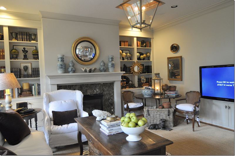
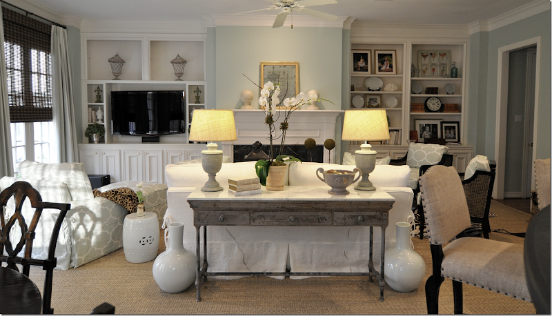
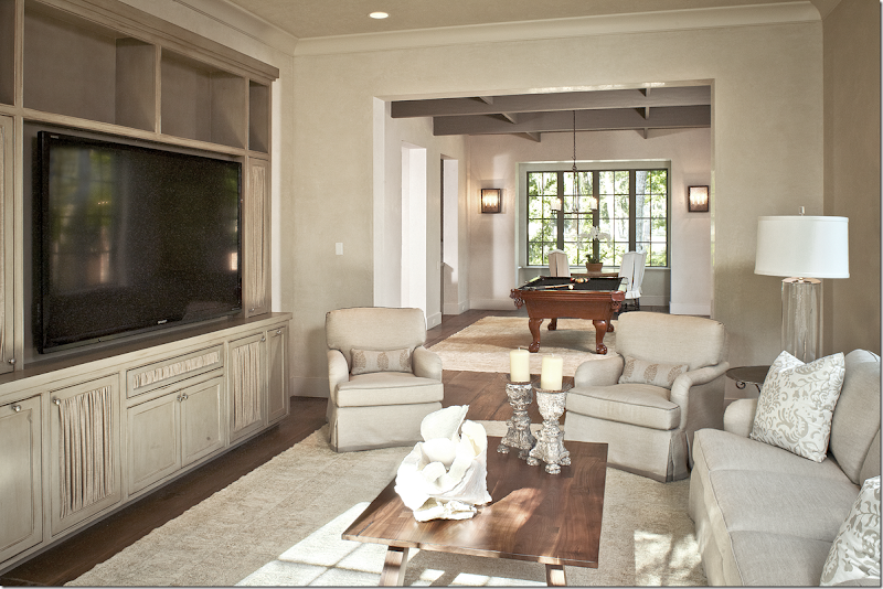
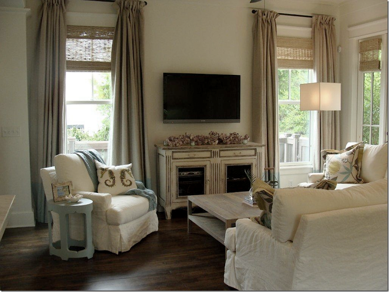
Today’s reader writes with questions about her issues with her flatscreen TV. I picked this topic because it is such a universal problem. Who doesn’t have at least one TV in their house? For years and years the TV presented great problems for the interior designer. As TVs got bigger and deeper – the space required to hold these monsters grew along with the screen size. Most everyone either had or wanted a TV cabinet – that huge brown piece of furniture which held the TV balanced in between countless shelves and drawers. Most were hideous – creating a large eyesore in the middle of a beautiful family room or bedroom. If you didn’t have a TV Cabinet, then you had a faux antique armoire. The problem with having an antique armoire was they had to be deep enough to hold these TVs and the antiques rarely were equipped for that depth or weight. When flatscreens came out, designers everywhere rejoiced. Finally, there was an end to those fugly TV cabinets! No longer were we concerned with a TV whose depth could measure 36” – we could now hang these flatscreens anywhere! It was so liberating. But, as with all things, eventually when the rejoicing died down, the issues with flatscreens became evident.Remember these? Uggg!!!!!Yes, you can hang flatscreens anywhere, but you still have cable boxes and DVD players to contend with. So, while the flatscreen is hanging – you have to find space for the electronics somewhere nearby. Wires were another issue. If you hung the flatscreen on the wall, the wires that connected to the electronics were visible. For that, you needed to hire an electrician to come and hide the wires inside the wall. And while the huge TV cabinets became passé – suddenly masses of smaller consoles were being made to sit under the flatscreen to hold the electronics and to ground that huge black hole hanging off the wall.Flatscreen TV consoles can be just as ugly as the old TV cabinets. This one is a faux Stickley version, which for some unknown reason is quite popular. At least these cabinets can be quite narrow – depth is no longer an issue.While many choose to hang the TV on the wall, others opt to put it over the fireplace mantel. It’s a solution of course – most flatscreens fit perfectly over mantels. But, it’s not my favorite solution. First, there is the issue of neck pain. TVs should be at eye level – otherwise you have to crank your neck up to watch it. And then there is the aesthetic issue. If the TV is on the mantel, you lose the valuable space to place a beautiful mirror or piece of art. You have no place to create a mantelscape – it’s such a waste of valuable design real estate. I try to avoid putting flatscreens on mantels at all costs.For instance, in this family room I just finished, the flatscreen was over the mantel. It took a while to convince the husband that it would be much better if it was moved. I’m not sure he is still convinced, but it looks so much without that big black box hanging down over the room. We did have to go through a few steps that added to the costs, but they weren’t that much. First, we had to hire a carpenter to finish out the molding over the mantel and close up the big hole that was left after the flatscreen was moved.Next, we bought a console to go under it. This console is less than 12” deep and it holds all the electronics. We bought the console at Nadeu in the Rice Village, so it hardly cost anything. We had an electrician install the TV here and hide the wires in the wall. Viola. Now, we could move the sofa from the middle of the room. We put swivels on the two chairs to make watching it easier. Lo and behold, the most expensive cost was the NEW flatscreen that hubby wanted if we were going to all this trouble. Naturally! Men and their toys!(I have someone I use in Houston that comes to the house and installs the TV and sells them and does it all – if you are interested, I’ll leave his name and number in the comment section.)My own family room has a similar layout. My client had seen my room arrangement and wanted her couch against the windows too - which is what started the entire process in her own family room. I would hate having a TV over my mantel! Again, I would have to float my sofa which would close off the room and then we would have to crank our necks up. Plus, I love what I have on my mantel!
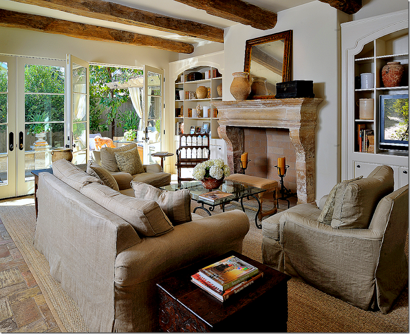
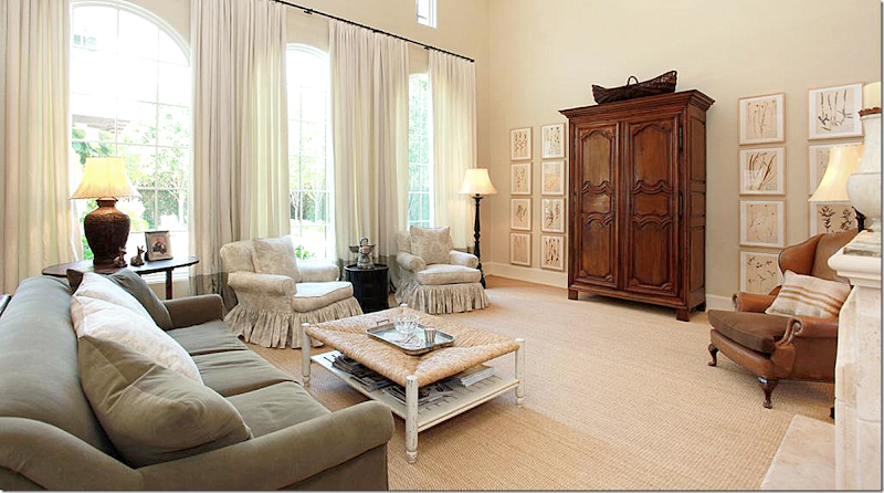
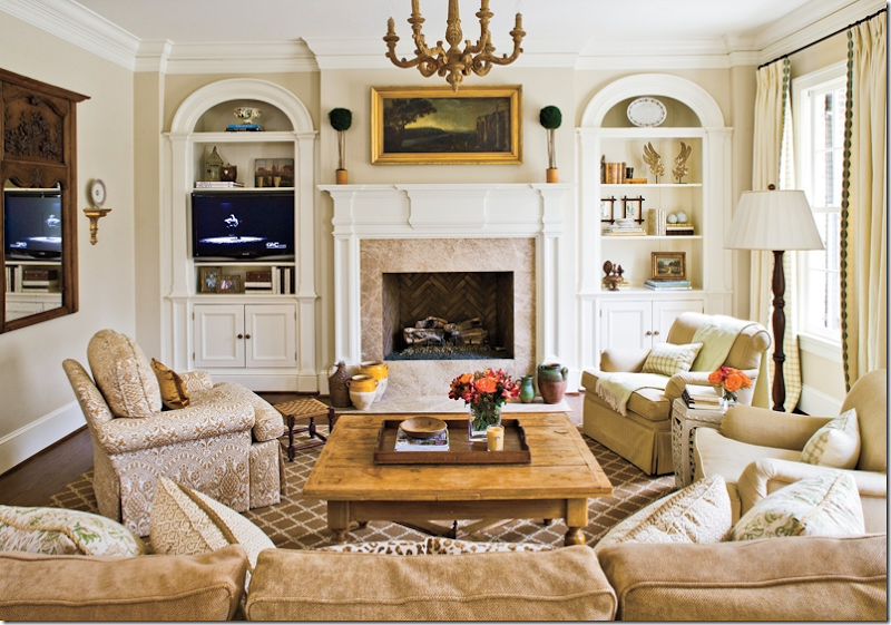
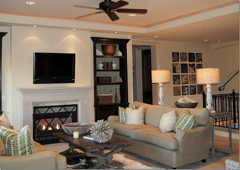
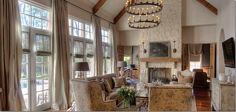
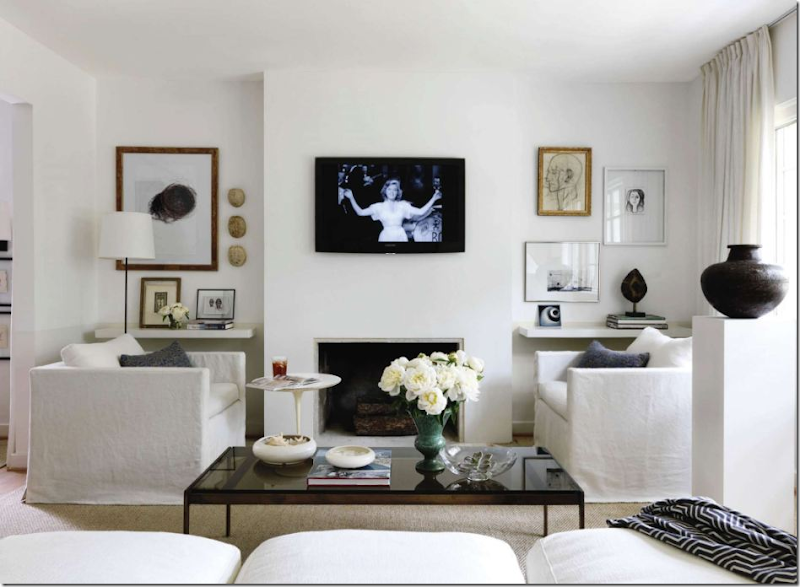
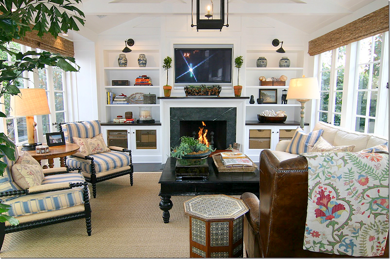
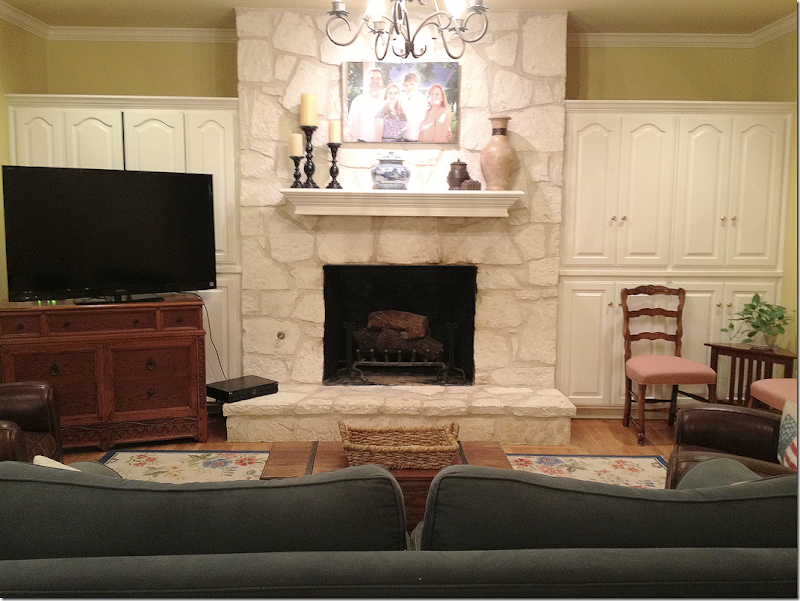
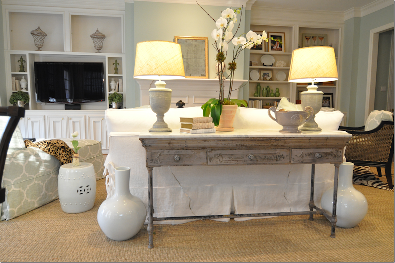
Instead, I have the flatscreen hang over the hole that once held our old, regular large TV. The cabinet underneath holds the electronics. Now, the TV is not the focal point of the room. You don’t even see it until you are completely inside the room.For this client, we had the same issue as with the first client – the TV was over the fireplace. Here we had a carpenter rework the bottom two shelves to hold the new flatscreen. I placed a club chair and ottoman directly in front of the TV for the husband to sit and enjoy his sports, but the flatscreen does swivel to the right so the entire room can watch it too. Again, the TV is not quite the focal point it would be if it was still over the mantel.For this client, Ginger Barber did the same thing – she chose to place the flatscreen on one side of the shelves. There is NO way Ginger would put a TV over that gorgeous antique mantle!!!! Again, here the TV is not a focal point – while the mantel is.Munger Interiors hid the TV in the closed cabinets – but notice how they softened the look – a row of shelves were added to display accessories!One point to consider. If you do place the TV on the shelves, you lose valuable decorating real estate space. But, notice how beautifully Munger Interiors decorated these painted shelves. For this reason, hanging the TV over the mantel seems to balance the shelves and it works in this instance. Confusing? I know! But, here, the TV does look better where it is, with the shelves so decorated and such a part of the color scheme.You can always just hide the TV like Sally Wheat did. Sally bought these beautiful old shutters and had James Farmer paint them. Her TV is hiding behind the set on the left (I think!)At the Pink Ribbon House this year, Julia Blailock designed this set of doors to hide the flatscreen behind and Segreto did the finishing paint job. I think these are beautiful and a great solution – the doors become part of the décor.There are still armoires that can hide flatscreens – the antique ones are much better equipped to house the flatscreens over the old, heavier TVs. This house in Houston placed a large antique armoire in the family room and centered it between a set of herbiers.Or, you can do what Carol Glasser did – hide the flatscreen behind a pair of installed antique armoire doors. This way you save precious floor space if the doors are attached to the wall. Ingenious!In this family room, Tami Owen had a shelving unit built in to hold a HUGE flatscreen. She cut out doors and added fabric for the electronics and speakers. Plus, the fabric softens the piece. With a TV this huge, you need something substantial to ground it.Interior designer Jenny Johnston bought an antique buffet to place under this flatscreen. The doors have screens that let the clicker reach the electronics. Some clickers can go work through solid doors though so this isn’t always necessary.This designer put the flatscreen on her shelves. It’s barely noticeable, but it is a smaller TV.At her vacation home, Cindy Hattersley installed a small flatscreen over the mantel, but notice how low the TV is – it’s not such a strain to the neck. And notice how pretty her green painted shelves are – she didn’t want to ruin the look with the flatscreen. This California house is available for vacation rentals! Just ask Cindy about it!Even big name designers like Bunny Williams have to deal with flatscreens. Usually you won’t see TVs in magazines like AD or Elle Décor. The photographer will take the picture showing the other view. This photo showing a TV is a rarity. Notice how the flatscreen is angled down – this prevents some of the neck strain. The client probably requested the flatscreen be placed here. Some people just prefer this arrangement.In this beautiful Houston house, the flatscreen goes on the side wall – above an antique buffet. Again, this allows the sofa to be against the window instead of floating in the middle of the room. And it preserves the pretty stone fireplace. You almost don’t even see the TV where it is placed.In this contemporary white room with black accents – the TV becomes a piece of art work. Strange I know, but it really seems like it is just another print hanging on the wall! It truly disappears for some reason!I love this room! It’s the house of a friend of blogger Classic Casual Home. Again, the owner chose to put the flatscreen over the mantel so that she could decorate the shelves. I love the way she decorated them too – leaving breathing room around the accessories so that they can show off. And I love the library lights above the shelves. Notice those gorgeous bobbin chairs! I just ordered two for a client and can’t wait until they come in! This room is so cozy and warm and inviting. Exactly what good interior design should be!So…let’s get to our reader’s TV problem, ok ? Here is her family room with her large TV:Our reader, Libby, has a beautiful stone fireplace and pretty cabinets that flank it. But, their new, huge flatscreen is the issue. Here’s what she has to say:Dear Miss Cote de Texas:
I have a question that's not about windows! I have a troublesome wall in my family room. I'd love to re-do my built-ins and mantle. The built ins fit a 29" TV - ha! They are also quite deep, over 2 feet deep. The current cabinets on both sides with smaller (shorter) cabinets on the bottom halves and open shelves on the top halves. We'd hang the giant TV in front of the left side cabinets, at about the height it is now (removing the dresser that currently holds it, of course)! But how do we handle the electronics? We need to be able to access our DVR and Blu-Ray player and use our remotes! And how do we handle the depth? I think two feet is too deep for open shelves, don't you? Should I take them all the way up to the ceiling or leave it open? And as long as we're replacing the built-ins, shouldn't we replace that mantle as well? I love the designer chicken wire look for the cabinet doors but will that age well? The trim paint is aged ivory all over the house - could I do something different with these or am I locked in? If I can do something different, how do I handle the transition?
This is actually quite a small room for a main family room - 14 x 17. It doesn't have any exterior windows and therefore tends to be dark. As The exterior of our home is stone as well - Texas Hill Country style. Please don't suggest we cover the stone!
As you can see, I'm still in the "yellow wall" phase (Concord Ivory, to be exact - fifth house I've painted this color - two in Atlanta and two in Sugar Land - but the light is different here in Alamo Heights - it looks almost yucky green in dark corners) and my hubby won the TV size argument and selected the upholstered pieces (how did that happen?). Blue couch has been a disappointment (sloppy and faded) but we need to keep it for a while. Leather chairs (one of which is a recliner) have been fantastic with our dogs. Am ready to replace the rug with seagrass (will that really be ok with my big dogs?).
I love your blog and would just DIE for personalized advice. I can handle the comments, anonymous and otherwise.
Please help!!
LIBBY
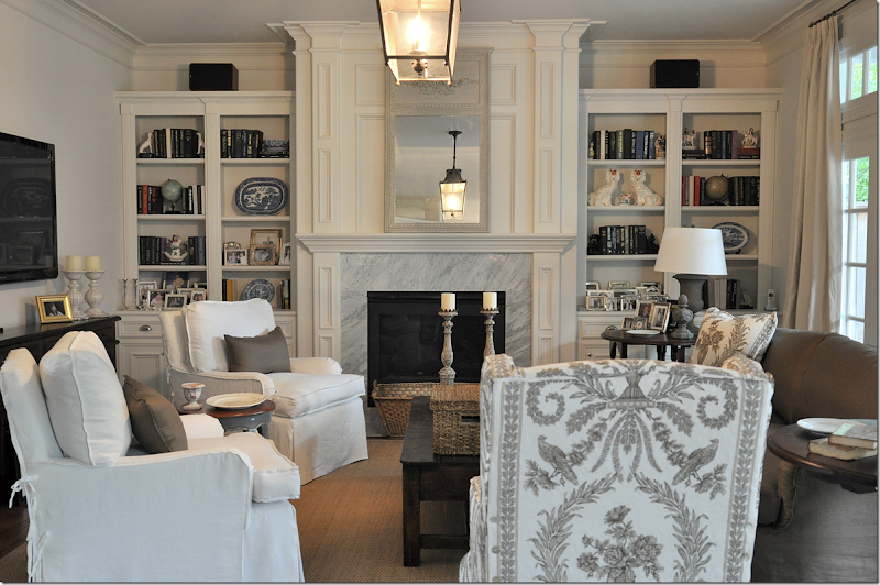
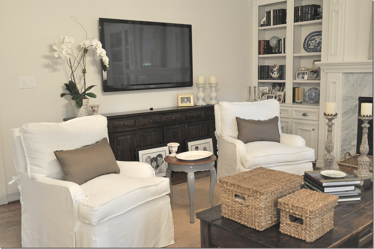
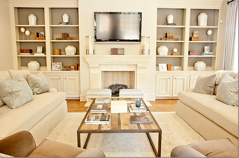
First off – I would suggest that yes, I would tear out the upper cabinets. Since the room is small and doesn’t have much else going on, the open shelving could be a good place for decorative objects, such as books and accessories. And yes, 2 ft is way too deep for shelves. The bottom cabinets should be 2’ deep, but the shelves should be only 12'’ deep. The TV will rest on top of the bottom cabinet and the shelves will be above it on that side. Be sure to run the shelves all the way up to the ceiling to balance out the size of the flatscreen. When choosing decorative items for the shelves – try to stay in the same color range. Such as, look for white ironstone to display along with dark, brown books. Or buy blue and white porcelains to display. This will help your shelves become part of the décor. Your mantel is fine – I wouldn’t put my money in a new mantel. It seems proportionate for your fireplace. And I would never suggest you replace your Texas limestone fireplace!! I love it – plus, it adds charm to the room and warmth. Keep it.As for the electronics, they would go in the cabinets right beneath the TV. Most clickers can penetrate through cabinet doors, but if not – then you could take the middle portion of the doors out and add the chicken wire – then put a gathered, neutral fabric, like linen, behind it. Again, this could add some needed charm to the room.As for the color of the shelves and cabinets – you could definitely keep the same trim color, which would be ideal. But, you could paint the back of the shelves a deeper shade than is on your walls. This will make the shelves pop and is an easy, inexpensive way to add a little pizzazz to the room! You don’t sound as if you plan to repaint your walls, so a deeper shade of the same color would be my first color choice.As for the seating arrangement – if the room is really that small, have you ever thought of having just four chairs with an ottoman in the middle? It’s hard for me to see if this would be feasible, but if so, maybe consider it. You could use your two leather chairs and mix in two white slipcovered ones. OR, think about getting the white slipcovered sofa from Ikea (it’s under $400) and mix it with the two leather chairs. Slipcovers are a dog’s best friend. And yes, I think seagrass would be fabulous in your room – especially if you do white or khaki slipcovers one day! Perhaps you could move that console piece to the wall behind the sofa or on the wall next to the door – put two tall lamps on it. I would then move the family portrait over there – and put a round, wood or rattan framed mirror on the fireplace. Consider buying or sewing slipped skirts for the two French chairs – they would hide the AC vent better!Several of the pictures above will be helpful to you, this one in particular:
:
For instance, this photo shows you how the shelves will look going up to the ceiling. You can see how the TV will look on top of the bottom cabinet. And notice, the doors are solid. No chicken wire was needed. You can buy clickers that penetrate through the doors.
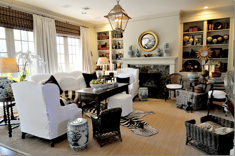
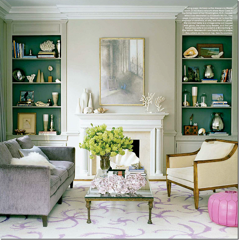
Painted bookshelves really make the room pop!This blogger Westhampton DIY HERE redid her family room - she painted the back of her shelves and notice how she got a great look on her shelves by covering her books with paper! Easy and inexpensive. Really pretty!And one more look at this room, your cabinets with painted shelves can look like this – and notice how the accessories are in the same color family. They make quite a decorative impact themselves!I hope this helps you and helps anyone else who is having flatscreen issues! If you still have a décor question – you know what to do – Ask Miss Cote de Texas:Write me at: mrballbox329@aol.com


