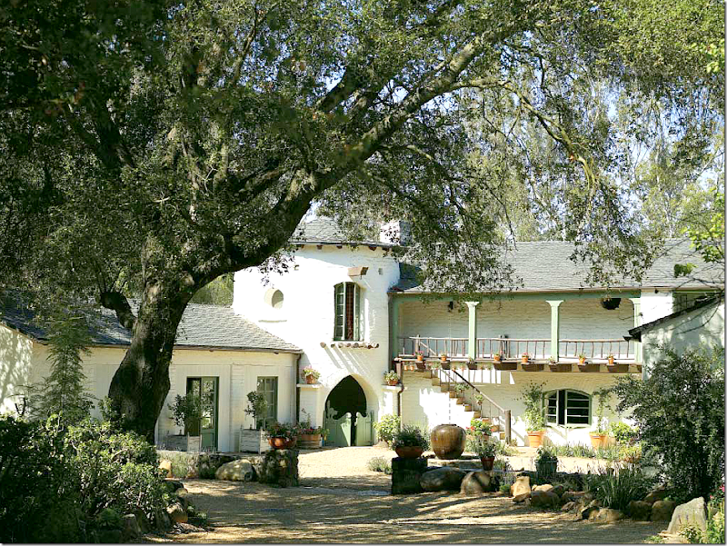
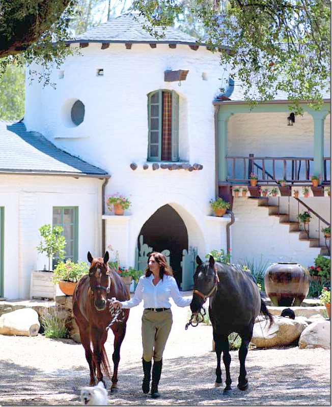
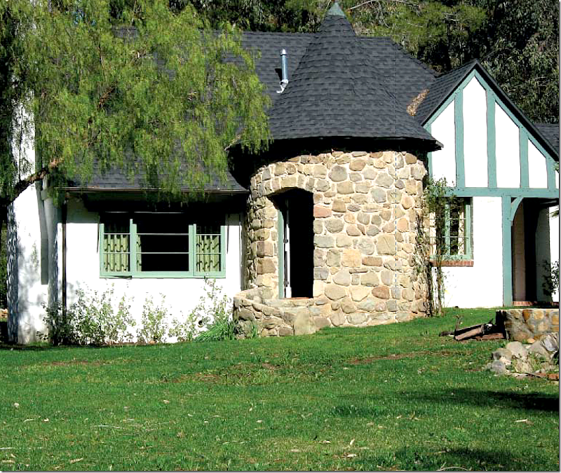
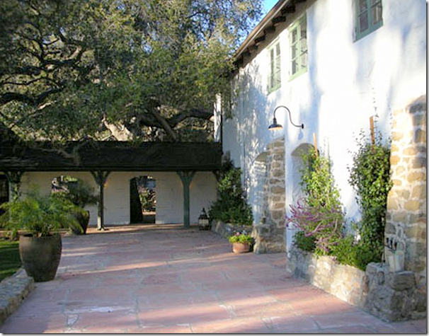
The Ranch at Ojai, restored by Kathryn Ireland, now home to blond actress Reese Witherspoon. The front courtyard sits inside the U shaped main building. At the corner is a round tower that leads to the back side of the property.
GET YOUR COFFEE READY – THIS IS A LONNNNGGGG ONE!
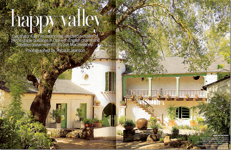
Ever since Kathryn Ireland, famous interior designer and star of Bravo’s Million Dollar Decorators, bought this 7 acre ranchette in Ojai, California, I’ve been obsessed with the property. Kathryn who lives in L.A. and also has a summer house in France, first saw this once rundown property in a real estate ad. Located just a hour 1/2 away from LA, she became consumed with the idea of saving the neglected ranch. At first, Kathryn thought all the place needed was some fresh paint, new kitchen appliances, and spruced up bathrooms; it wasn’t until after she had bought it, did she realize it actually needed a total renovation – quite an unexpected and expensive endeavor. The only way to pay for the restoration would be to sell her L.A. house and her property in France, whereupon, she and her 3 teenaged boys would all move to Ojai full time. This was the only scenario that made fiscal sense. But, as children will be, the 3 social teens refused to move from their friends in L.A., and Ireland realized she wouldn’t be able to afford the renovation. She had a Sophie’s choice to make and she decided to properly restore the ranch for the next owner. Ireland was terrified that if she didn’t fix it up, someone would come and bulldoze the entire place and build a new mac-mansion. In the end, Ireland’s restoration can only be called a true labor of love.
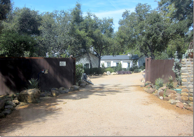
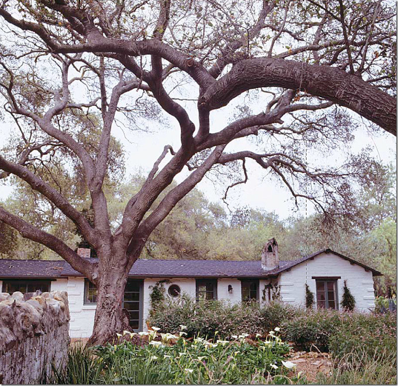
The property, hidden behind a dark fence, is located on a secluded, no-access street. Notice the address carved on the rock to the left.
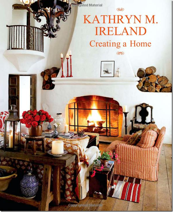
During the long months of renovation, media-savvy Ireland had the entire process photographed, and then some. Pictures of the ranch landed in several magazines. Additionally she wrote a book “Creating A Home” about the historic ranch, which is a real treat for the eyes. Ireland’s book is full of gorgeous photos of her romantic Californian ranch from a bygone era. At that time, Ireland had just launched a new collection to her fabric line and she used these fabrics to decorate the interiors, letting the ranch become a stage to showcase the fabrics.
When the book was first published, I wrote a long story about the property and it’s history HERE. I fell totally under its spell. I had spent my youthful summers at a rustic, western camp and had wonderful memories of those days. Somehow, the Ojai ranch reminded me of those carefree times. Living at this ranch was like owning your own summer camp with its horses and stables and all the little out-buildings spread about the property. Adding to the camp like atmosphere are the bedrooms – you have to walk outside the main house to reach the assorted guest suites – just like a camp bunk. Amazingly, even with all the changes Kathryn made, that western summer camp feel hasn’t changed at all. While there are a few additions like a swimming pool, all the various outbuildings still stand although their purpose is totally different. For instance, the original tool shed is now an outdoor kitchen near the pool, and the original gatekeeper’s house is a secluded and very private guest suite.
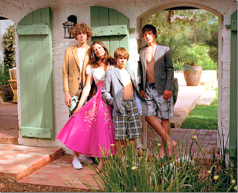
Kathryn Ireland and her 3 teenaged sons who refused to live at the ranch full-time.
By the time the book was released, Kathryn was long gone, having already sold the property. It seemed so sad that she would take on the enormous debt and responsibility to restore the ranch, spend all that time and energy creating it, and then when it was finally complete – be forced to sell it. But that was the promise she had made to herself. She was merely the savior of the ranch for the next owner, who in turn would become its caretaker. Word soon leaked out that perky actress Reese Witherspoon had purchased the property – Reese? With her two young children, it did seem the perfect hideaway from the paparazzi. Since that time, I’ve been patiently waiting all these years for a glimpse of what the property would look like under Reese’s ownership. Would she change it? Would she keep all the Ireland touches? Would she use the same fabrics from Kathryn’s new fabric collection?
When The Skirted Roundtable interviewed Kathryn Ireland, she had just sold her Ojai House. Kathryn was still sad over having to sell the house – you could hear the regret in her voice. She truly regretted it. But, she was excited to sell it to Reese Witherspoon who fell madly in love with the ranch. Kathryn told us that Reese bought it as is – and she kept all the furnishings that Kathryn had left with the house. While the house was sold furnished, all the accessories, the items that made the photoshoots look so good, were gone. Apparently that didn’t bother the newly divorced Reese who wanted the house asap – she moved in days after signing. Unfortunately for Kathryn, Reese eventually did hire another designer, Hollywood’s Kristen Buckingham, the wife of Lindsey who is internationally famous for being in the band Fleetwood Mac. Kristen Buckingham? According to Elle Décor, Kristen is a friend of Reese’s which is why she was picked for the job. You remember Buckingham. A few years ago she made a huge splash in Elle Decor when her own house was published.
Remember this living room in Elle Décor, March 2009? Yes, I thought you would. Buckingham’s house caused a huge commotion on the blogs – everyone loved this room and the pictures of her house went around the internet a million times or more!!
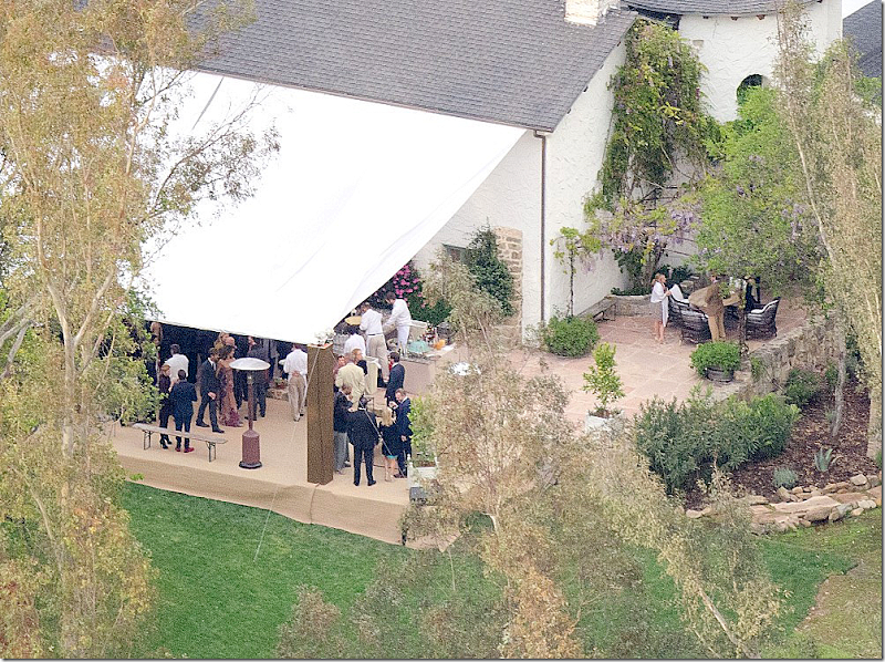
Since Reese has purchased the ranch, there have been hardly any photographs of it. When she remarried two years ago, she chose the ranch as the perfect setting for her nuptials. But only a few picture of the ranch were released – all taken from circling paparazzi helicopters. This month, Elle Décor changed all that - they have published photos of the ranch under Reese’s ownership, and I have to say – it’s gorgeous!!!!! She completely redecorated the main house and the bedrooms, along with adding even more beautiful landscaping. Wow! Was the wait ever worth it!!!!
Elle Décor put the pictures of the Ojai Ranch up on their web site a few weeks ago, but I refused to look at them. Instead, I’ve been impatiently waiting for the magazine to download on zinio and today – here it is! The interiors are so different than Ireland’s. They are much more sophisticated, much quieter, less colorful and just – well – pretty. Just like Reese. In the article Reese says that she loves the ranch and feels like it’s caretaker, rather than its owner. Just like Kathryn did. Reese grew up in Tennessee and wanted her children to have the same kind of upbringing she’d had – playing outside and getting dirty in the mud. They now have all kinds of animals on the ranch – horses, ponies, pigs, donkeys and four dogs. Just like summer camp.
I know everyone has probably already seen the new Elle Decor, but I want to compare how it is now to how it looked under Kathryn Ireland’s reign and even before and I just to obsess over it one more time!
Each area of the house will be shown – first Kathryn Ireland’s décor, followed by Reese Witherspoon’s décor by Kristen Buckingham.
Enjoy!
HISTORY OF THE RANCH:
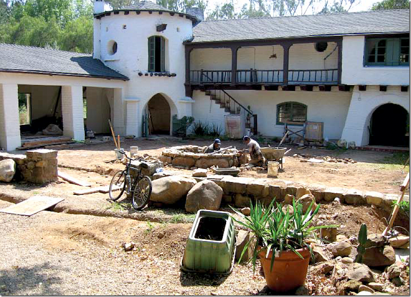
The main ranch house is u-shaped and built around a large courtyard. You enter through a low stone fence, past a fountain that Ireland installed. The wing to the left was once open animal stalls, while the two story building in the center was first built to house and milk the dairy cows!
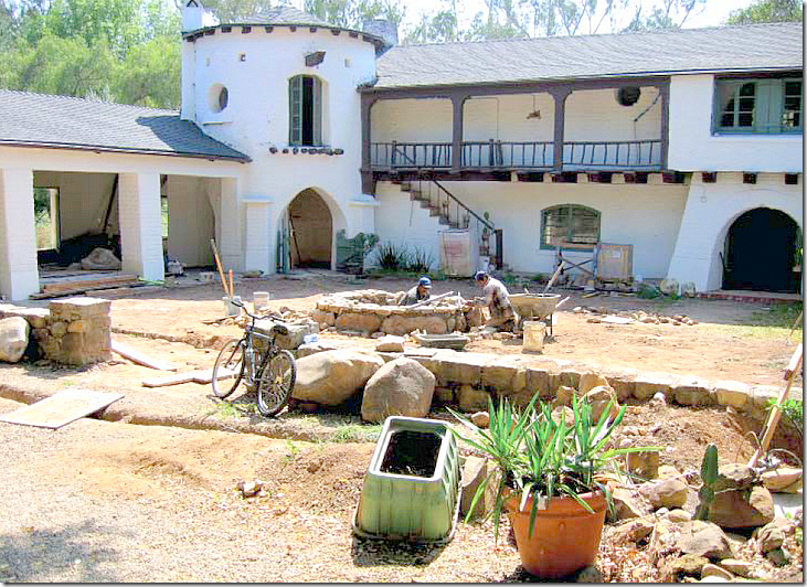
BEFORE: cleaning up the courtyard. Ireland laid gravel instead of flagstone in the enclosed area. Here you can see the small chimney in the round room above the rotunda – the stable boy’s quarters. If I lived here, I might turn that space into a library. At the very right on the bottom floor is the entry – arched double doors.
The rotunda at the corner of the main building. The stairs led up to both the upper floor of the rotunda and the mezzanine level inside the main building. Ireland is an avid horse rider which is one reason the ranch appealed to her – she envisioned riding her horses each morning before starting her day. Alas, it was not meant to be! Notice the upper windows in the second floor of the rotunda. This was once the stable boy’s room. Now it is a round room with a small fireplace. There is also a Juliet balcony that overlooks the main living room.
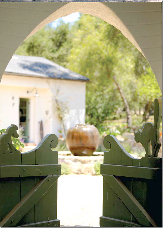
The wood gate leads to the rotunda. Notice the carved dog and cat on top! It is details like this gate that makes the ranch so utterly charming. The paint on much of the wood around the ranch had mellowed to a soft green/blue color which Ireland preserved.
TODAY: The U shaped gravel courtyard as it looks under Reese Witherspoon’s ownership. Lavender was planted around the fountain and stone walls to soften it. Flower pots go up the stairs. Additionally, Reese added jasmine, roses and Mexican sage. The fountain installed by Kathryn remains in the center. The arched doors on the right are the main doors to the living room. The kitchen wing is on the right, while a guest suite is located in the wing on the left.
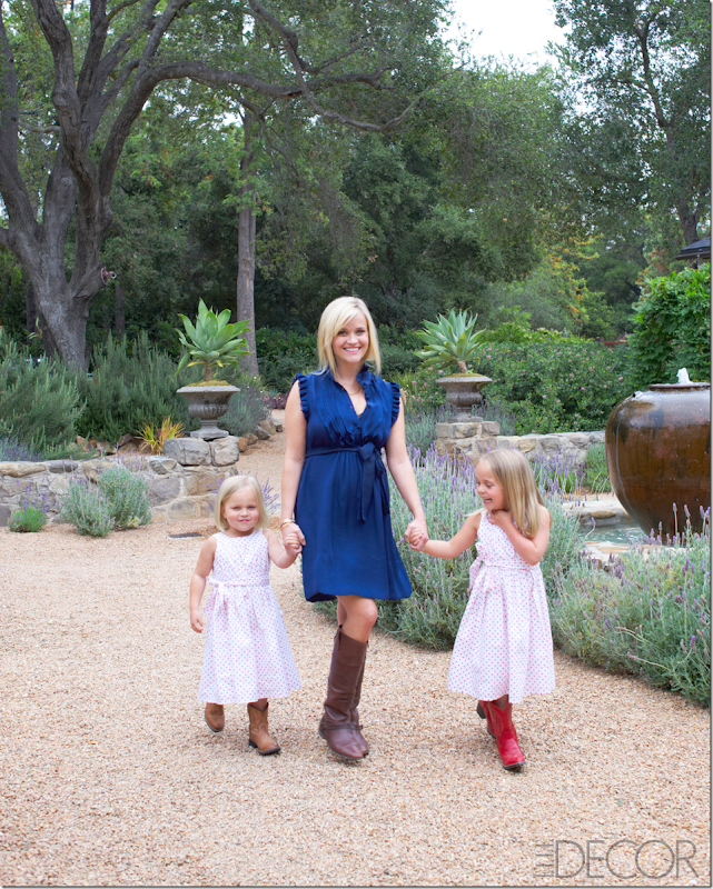
TODAY: Reese with her two nieces walks in the front courtyard, next to Ireland’s fountain. Reese is now pregnant with her third child. Notice the beautiful low river rock fence that surrounds the courtyard.
The entire ranch was first designed by a very young Wallace Neff in the 1920s for the Libbey Glass family of Ohio. The Spanish mission styled property was a dairy farm created to serve the Libbey’s nearby estate. Ten years later, a lawyer for the Ford Motor Company bought the ranch and hired architect Austen Pierpont to redesign all the barns and stalls – making it into a summer home. Throughout the years, the house has been owned by a few celebrated people. Ireland bought the house from Harold Ramis’s estranged wife after he had moved out. Witherspoon reportedly paid more than double what Ireland did, which probably made up for all the renovation costs.
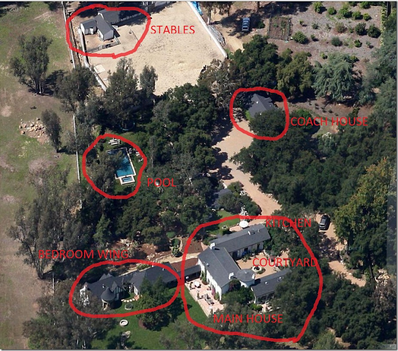
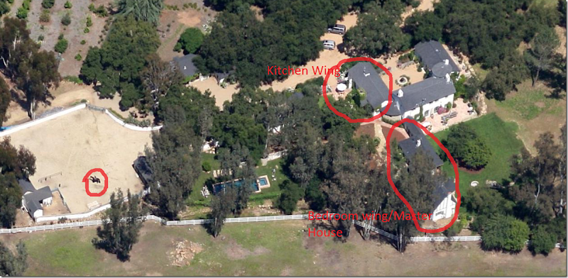
On Googlemaps you can see the layout of the ranch. The large courtyard is surrounded by the main building. The former carriage house is now the kitchen and family room. Off the back of the main house is the bedroom wing, reached only by going outside. The swimming pool is secluded behind stone walls. And behind that are the stables, which were designed by Pierpont for the second owners. There are riding trails that lead from the ranch to the hills – where over 60,000 acres of state land is available for horseback riding. Additionally, Ireland built bridle trails throughout the property for riding or walking. What a dream it must be!
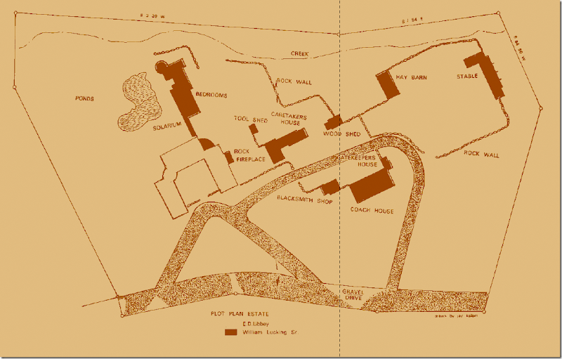
Pierpont’s plan for the extended buildings when he turned the former Libbey dairy farm into a summer home for the Lucking family. The main structure around the courtyard is shown on the left in white. All new buildings built by Pierpont are shown in black. Included in the new plans was a blacksmith shop where all the iron fixtures were made. Over the years the ponds had become mosquito havens, so Ireland had them filled in and replaced with a grass lawn.
The original plan by Wallace Neff. The main living room was once for the dairy cows. Upstairs was the hayloft. The carriage house to the right is now the kitchen and family room with its huge inglenook fireplace. And the stalls on the left became a guest suite.
KATHRYN IRELAND’S LIVING ROOM/MEZZAINE/ENTRY HALL:
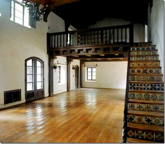
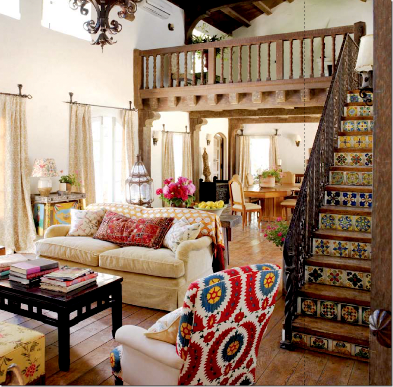
BEFORE: The barn that held the dairy and cow stalls was turned into the main living area. The Mexican tiles on the stairs are original, as is the large Basque chandelier that remained there under Kathryn’s ownership. Upstairs is the mezzanine level which was once a hayloft. Beautiful fireplaces are found on both levels.
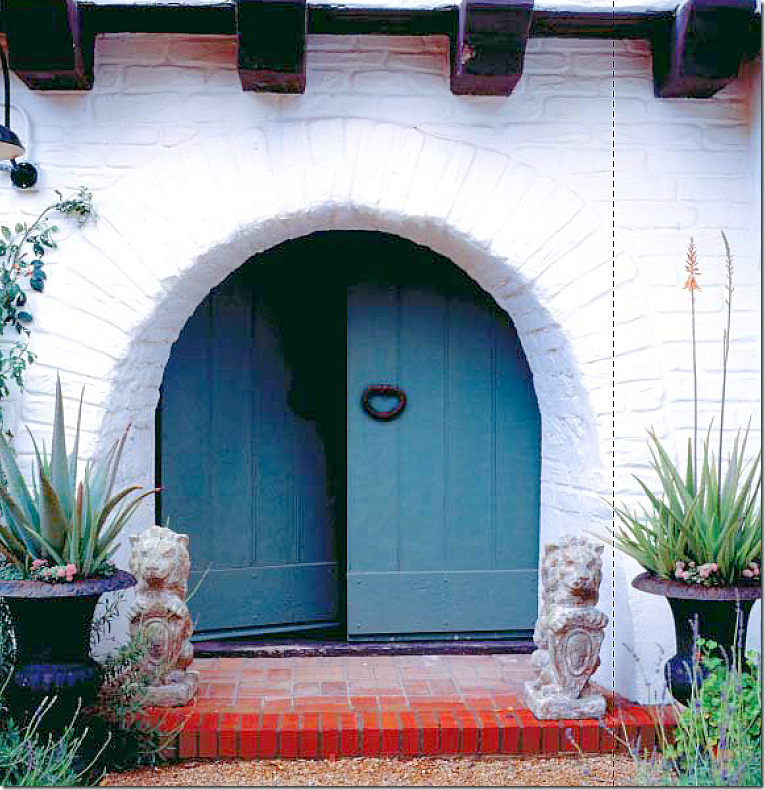
Off the courtyard are blue arched double doors that lead to the entry and main living area.
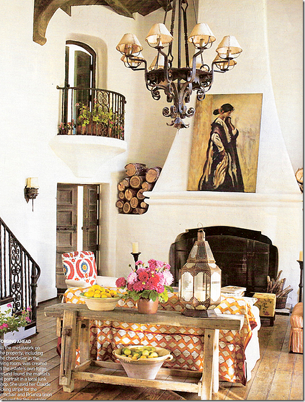
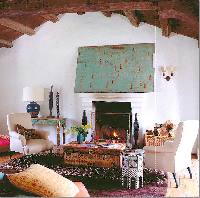
The living room under Kathryn’s stay. She found the large painting over the fireplace which fit it perfectly. Through the two doors is the rotunda. The Juliet balcony leads to the stable boy’s room.
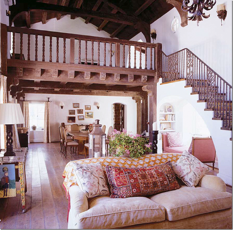
A roaring fire. The view from the minstrel’s gallery over the living room.
The stairs lead up to the former hayloft. The front door is under the mezzanine level to the right. The kitchen is reached through the open door at back. Ireland placed the dining room in what is really considered the entry hall. But, she didn’t have any other choice. Underneath the stairs is a nook, or stepped out window.
French doors overlook the terrace that runs along the back of the main house. Curtains are made of Ireland’s fabric.
The entry that doubles as the dining room. Ireland used two sets of chairs around the table. Notice the sconces – some of which are original to the house.
In the living room, under the stairs, is this window which faces the front courtyard. Ireland decorated this nook with a French antique daybed and Fortuny pillows. There are charming nooks and crannies all over the living spaces. Why don’t we still design nooks and crannies in our new houses?
The mezzanine level or former hayloft. It now has its own beautiful fireplace. You can reach this from the inside stairs or the outside stairs.
One last view of Kathryn Ireland’s living room. The chair in the front is Robert Kime, as is the fabric.
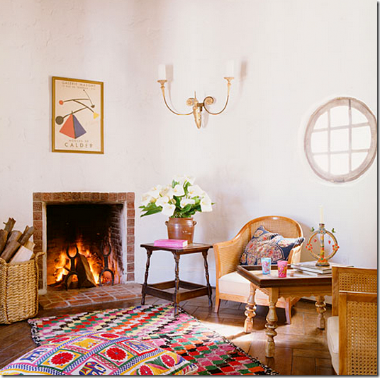
The stable boy’s room in the rotunda. Simply furnished with a darling fireplace. I love how the Calder print mimics the sconce. Yes, this would be an ideal library!
Ready to see Reese’s living room and compare it to Kathryn’s???
REESE’S LIVING ROOM/MEZZANINE/ENTRY HALL:
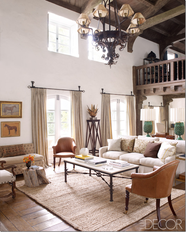
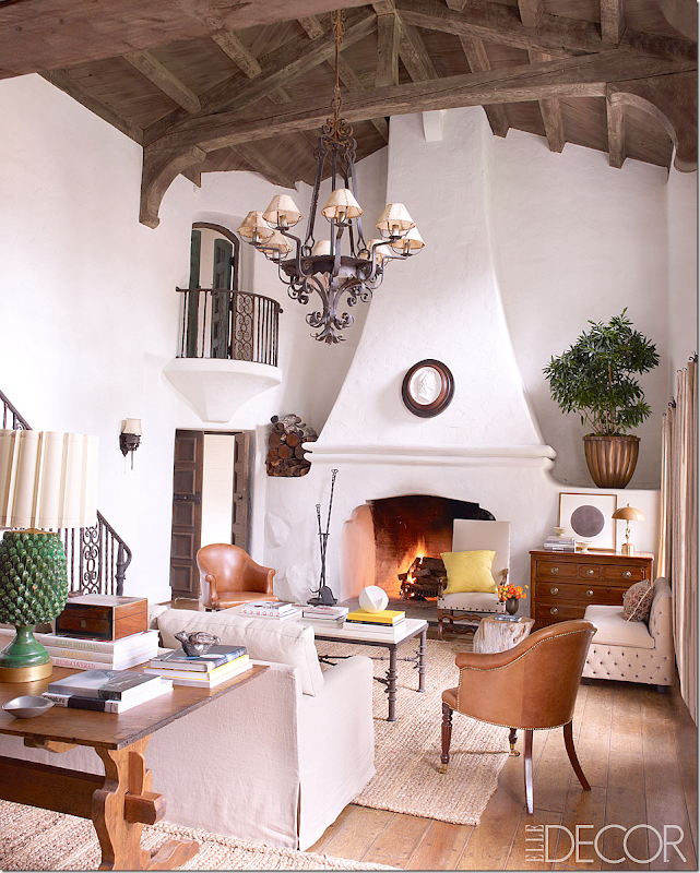
The great living room – under Reese, decorated by Kristen Buckingham. The colors are much more muted. There are no prints except for the pillows – just solids. I love the leather bergeres. And I adore the pedestal between the two windows. LOVE THAT! All the elements remained: the floors, the white plaster walls, the chandelier, the iron curtain rods. The only color is from the lamps. The design seems much more sophisticated under Reese. The jute rug? Pottery Barn!
Wow! It looks so beautiful from this angle! I love the plaque on the fireplace – love that much more than the large painting that was there under Ireland!! Do not love the potted plant at all - up high like that – it becomes a focal point. A potted plant up high? No. No. No. A large antique confit pot or urn would have so much better. I DO love the chest that balances out the unsymmetrical fireplace. Well, if we are going to be honest (I love being honest and not having to worry about hurting anyone’s feelings because I know Reese won’t read this!) – but I would have changed out that chandelier. I would love to see some type of antique crystal one there. Maybe. I just don’t like that fixture, in fact, I hate it. I do love the trestle desk behind the sofa though. OK, take away the plant and the chandelier and I’m madly in love!!!
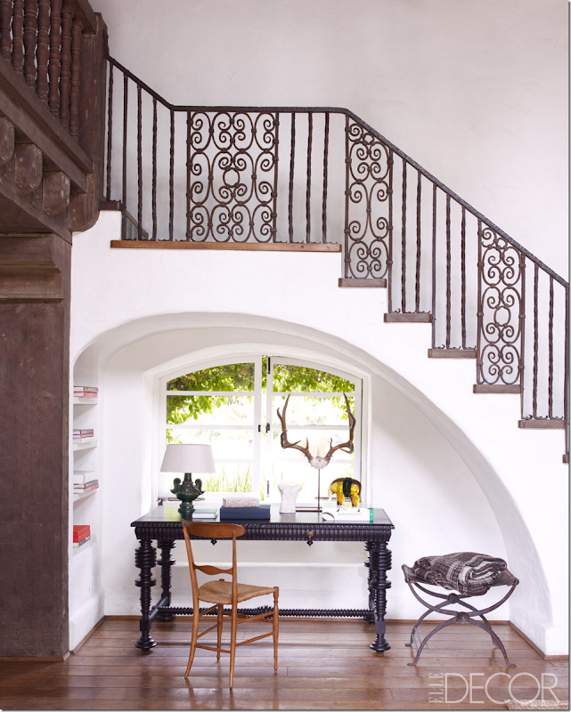
The nook where Kathryn had put a French settee now holds a black desk from Lars Bolander. Beautiful! It’s such a pretty nook with its arch under the staircase. I wonder why more people don’t do arched niches under staircases instead of closets where they store luggage? The arch is so perfect – it looks like it was drawn by the stoke of a brush. Horns alert!
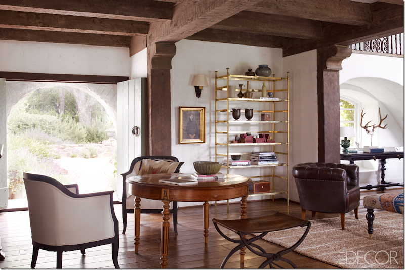
In the entry, where Kathryn made a dining room – Reese has a round table with two beautiful bergeres. Pile it high with books Reese! (I just love talking to Reese!) The brass étagère is a shock. But it does look eclectic and I don’t hate it, but I wouldn’t have put one there. Nice ottoman. Look at the front doors – there AREN’T arched after all! Just the brick surrounding the doors is arched. Hmm. Another surprise!
SOOOOO, honest – which living room do you prefer? The cozy, warm, antique filled, colorful space by Kathryn? Or the quiet, sophisticated space – slightly eclectic – by Reese???? My vote? Reese, hands down. No contest.
KATHRYN – THE CARRAIGE HOUSE, THE KITCHEN, THE FAMILY ROOM:
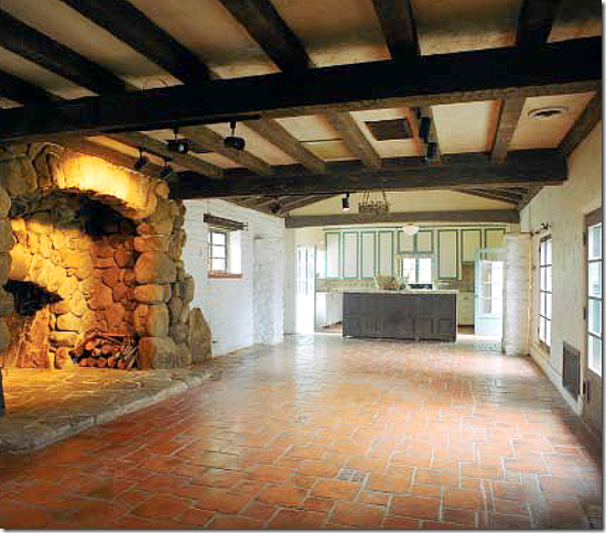
The carriage house had been converted into the kitchen and family room by Pierpont – its huge walk in river rock stone fireplace is astounding. The tile floors are original. This is how the kitchen looked when Kathryn took ownership.
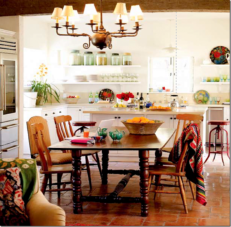
The kitchen newly decorated by Kathryn Ireland.
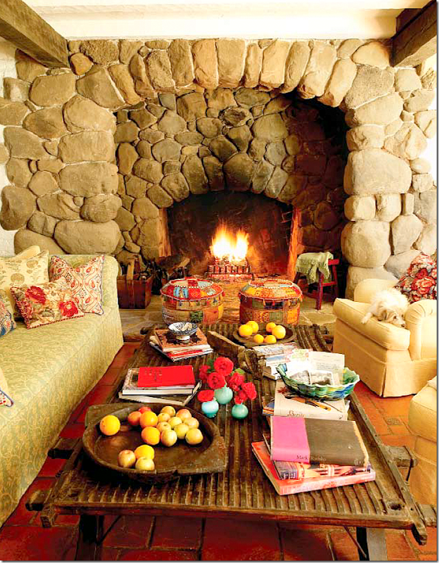
In the kitchen/family room, the massive inglenook fireplace made of river rock, used to be where the dining room table was set up! On a cold night, it would be wonderful to pull a chair up to the inglenook and sit closer to the fire.
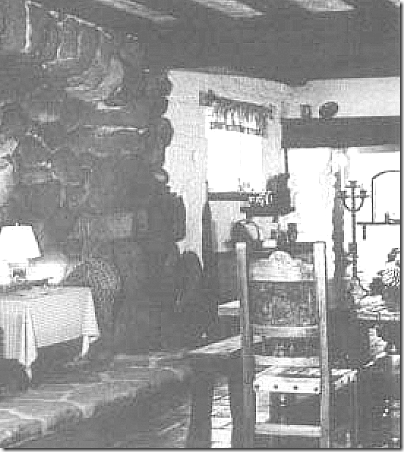
In this very old photo, you can see the dining table set up inside the inglenook!
REESE – THE CARRIAGE HOUSE/THE KITCHEN/THE FAMILY ROOM:
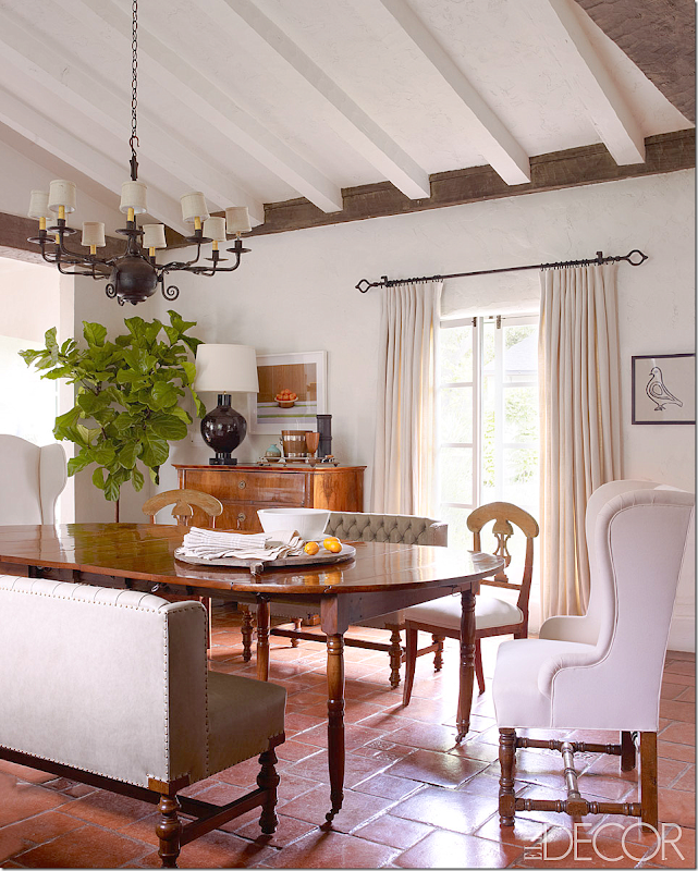
There is only one picture from the kitchen/family room. Reese set up her dining room – here – between the inglenook fireplace and the kitchen. You can see in Kathryn’s picture how the ceiling is high in this one area. They painted the wood beams a light color. It really does lighten the room. Also, it looks like the walls are less stark white – with maybe a little gray. The setting is gorgeous. Two custom benches and two 16th century Swedish chairs – Whoa!!! The table is Directoire and the chest is Biedermeier. In the article, Reese said they had 20 guests for Thanksgiving and they all ate in this room. I would LOVE to see the other side of this room, by the fireplace! And I would LOVE to see the kitchen! The chandelier that Kathryn installed remains.
OK – which do you like more? Kathryn’s dining room in the entry way or her breakfast room in the kitchen? OR do you prefer Reese’s dining room in the kitchen? Lots of choices!!! My choice? Reese again, no contest. This room is stunning, sophisticated, wonderful – total love.
MOVING ON:
Leaving the kitchen/family room – this stone enclosed area connects the kitchen wing to the living room and to the outside.
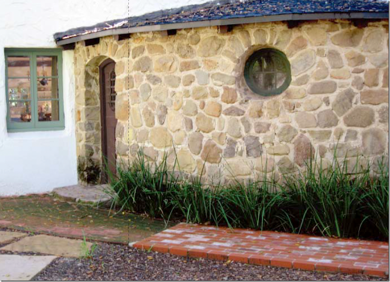
Here’s what the room above that links the kitchen to the living room looks like from the outside - it is made of the same river rock stone used on the fireplace.
KATHRYN’S GUEST ROOMS:
The Googlemap shows the kitchen wing and the guest rooms wing – both off the main living room. The master bedroom is in a small house after the row of guest rooms. Notice how the google satellite captured someone riding a horse at the stables! So weird!!!
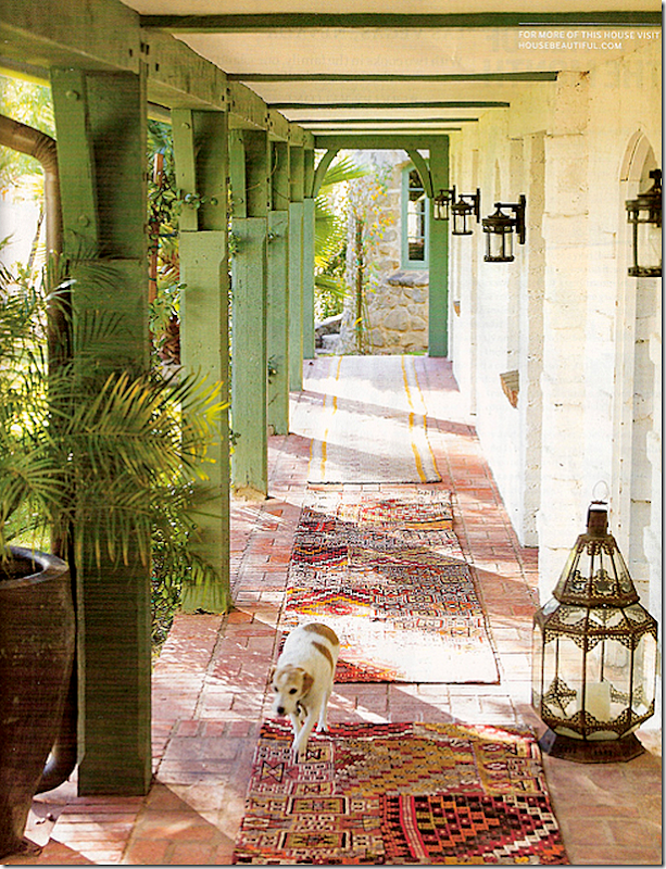
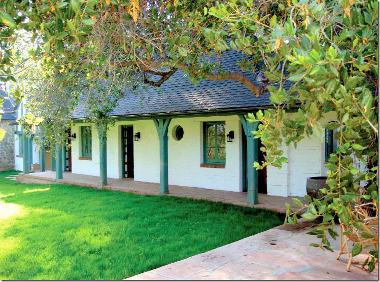
Leading from the back of the living room and its terrace is the guest rooms wing. At the end of this walk is a small house that where the master bedroom is. When Ireland bought the property, this was enclosed with glass. Ireland says it was stifling hot and musty so she removed the glass and returned the breezeway to its intended design. I love the way she has decorated this walkway with Moroccan lanterns and antique runners. Beautiful!!!
Another view of the guest rooms row, unstyled – at the very left is the master bedroom house.
BEFORE: With the plate glass closing up the breezeway along the guest rooms.
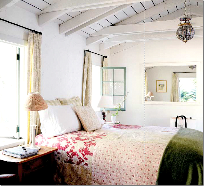
The guest rooms are simple without much architectural frills – except charm, like this raised wood plank ceiling. Each is decorated with fine linens and Kathryn’s fabrics.
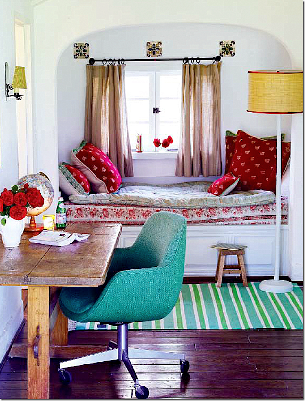
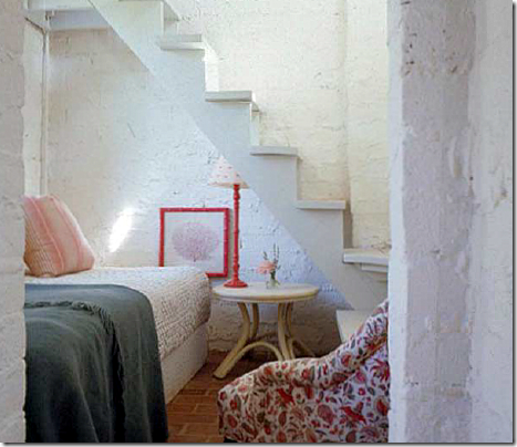
Two of the guest rooms have built in beds with charming casement and round windows. Love that chair!!!
In another guest room, this bed is made up in slightly different fabrics.
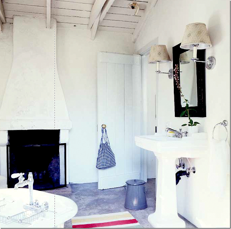
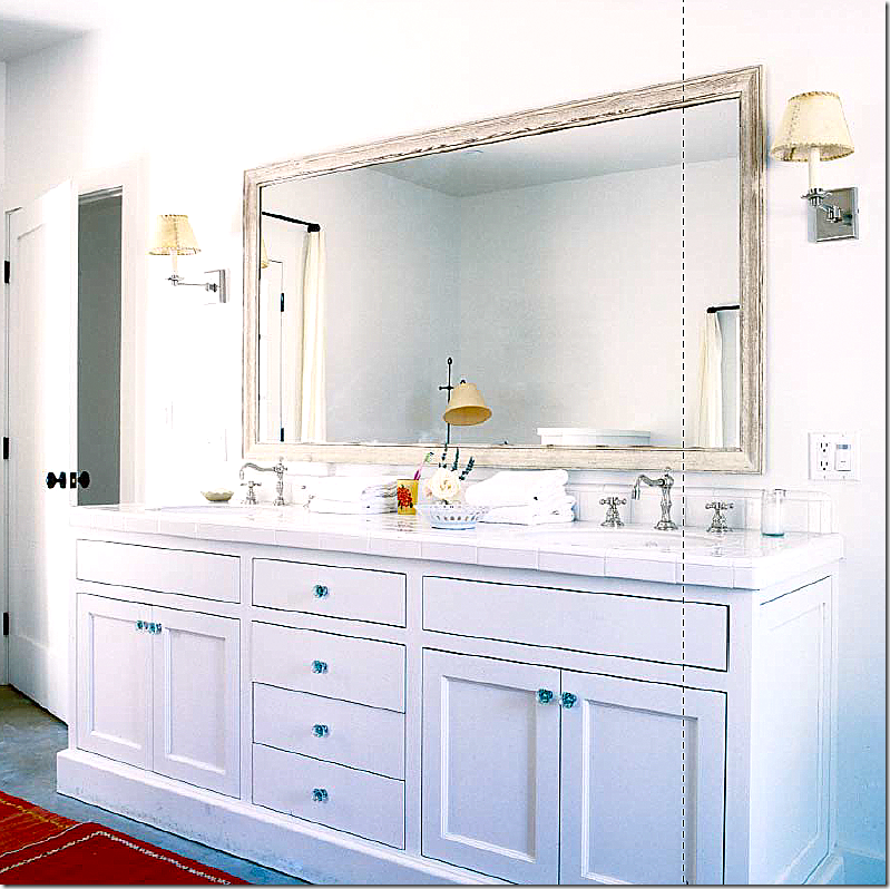
The bathroom in one of the guest rooms – notice the fireplace! That is a first, a fireplace in a bathroom. Love it! All the bathrooms are fabulous with their new vintage styled products that Kathryn installed.
REESE: GUEST BEDROOMS
I found this photo online of the ranch as it looks today, under Reese. This is the back pathway leading from the kitchen to the guest rooms. The huge kitchen fireplace is on the left – with ivy growing on it. The small house on the right, back, is the old tool shed, now the outdoor kitchen for the pool. The grounds were landscaped for Reese by Jay Griffith. The property is dotted with oaks and eucalyptus trees.
Reese’s son’s room is located in one of the guest rooms shown above. It is furnished so differently than it was with Kathryn. I love the chair with green leather!!! And cute linens. More horns – oh no!!!! And notice the cute shades on the chandelier and sconces.
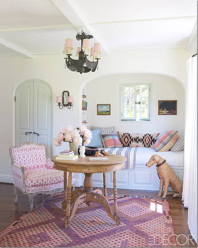
Reese’s daughter is in another guest room – is this to die for? A 1920’s Swedish table and darling French chair with a pink Ikat fabric. I LOVE THIS!!!!! Notice the charming arched door and casement window painted a soft, soft blue green.
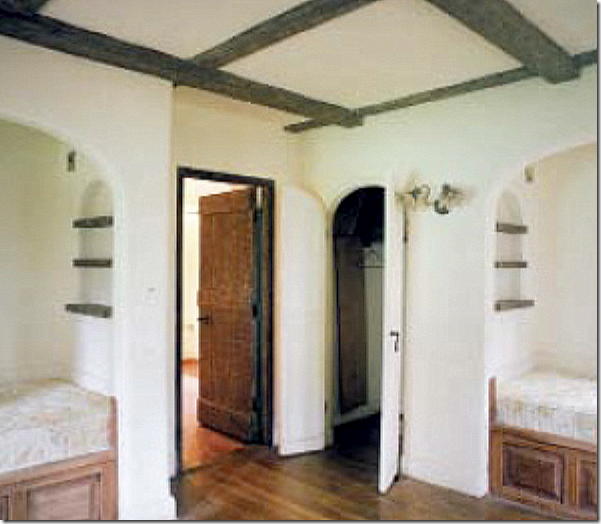
BEFORE: Here is a bad shot of Reese’s daughter’s room before. The wood panels beneath the beds were stained brown, the shelves were brown – as were the beams. The sconces have now been updated and the doors were painted. Still, the arched alcoves are so charming – as is the arched door. What a dreamy room for a little girl!! Wonder where the baby’s room will be???
Which guest rooms do you like best? Kathryn’s bright beds or Reese’s children’s room. Hands down – REESE!!!!
The master bedroom house – at the end of the guest room row.
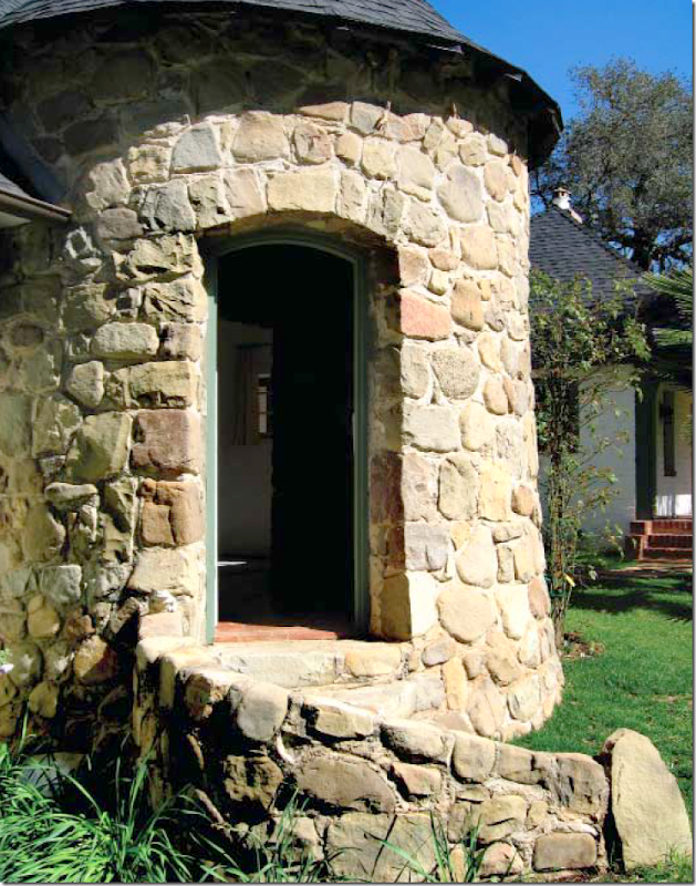
The entry is through a half rotunda of river rock.
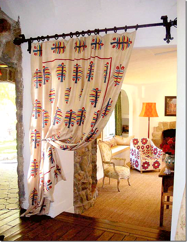
From the stone entry, the wood floor leads down a few steps to seagrass. A curtain provides privacy.
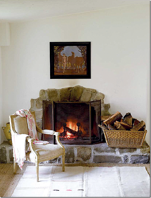
The fireplace is made out of the same river rock stone used on the exterior.
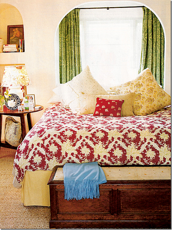
The bed is made up of all Kathryn’s fabrics. Notice the arched windows and the arched niche! More charming details. Too many to count!
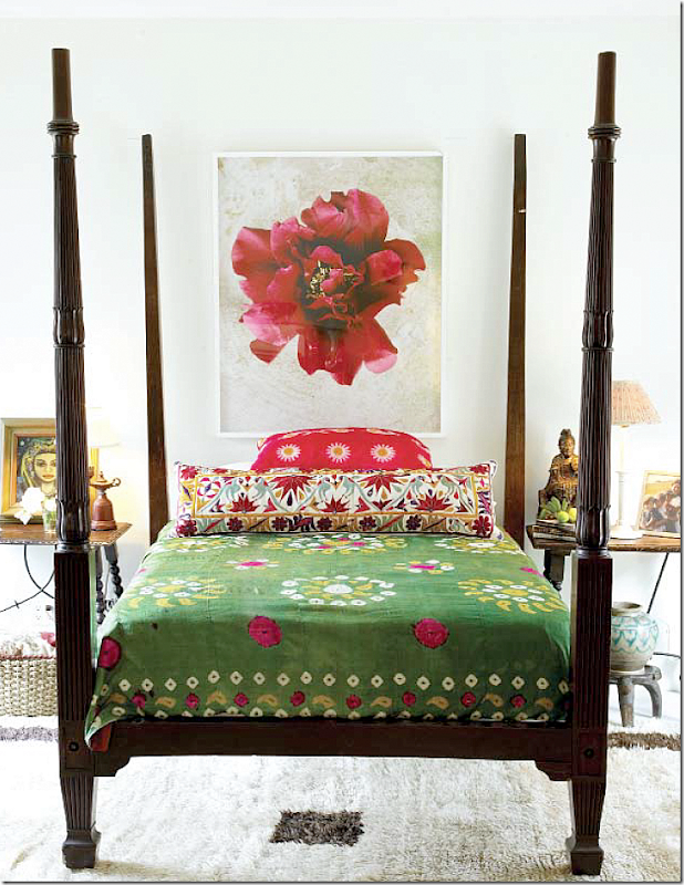
Here Kathryn dressed the bed in an antique suzani. It looks like a different room!
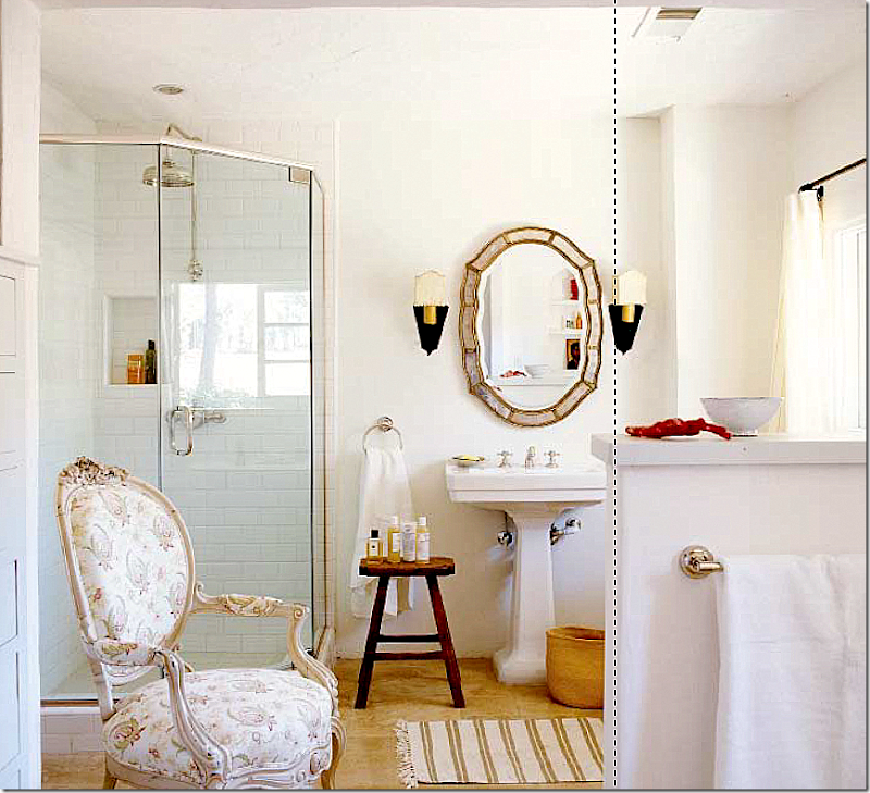
The new master bathroom with the chair wearing Ireland’s fabric. Love the sconces and the shower stall with the white subway tile. And such great faucets!
Unfortunately, there are no pictures of Reese’s master bedroom! I wonder if they will add on a little nursery to the master bedroom for the baby? I’m worrying about the little baby being all alone!
MORE GUEST ROOMS:
According to Kathryn Ireland, the most popular guest room is located in the former stables on the left side of the U shaped courtyard above. This area was completely empty, so Kathryn was able to design the guest room of her dreams. You can see today how charming the guest suite is – with French doors that open onto the courtyard. The door is flanked by wood Versailles planters.
The popular guest suite, the former stables, on the left as Kathryn found it.
Today, the guest suite is covered in fabrics by Kathryn. Antique tables flank the bed.
A tablescape in the guest room.
The completely new bathroom installed by Kathryn. There is also a footed tub in this room.
ANOTHER GUEST ROOM:
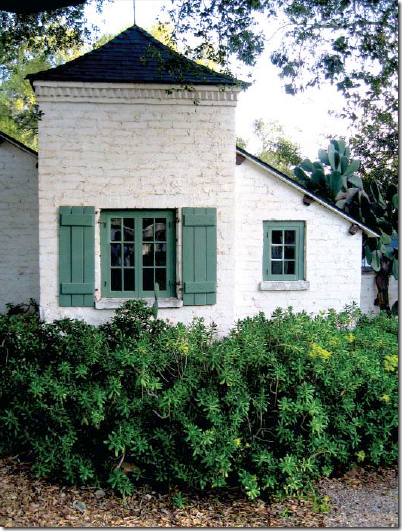
A view of the original Coach House or garage as it is today, under Reese. Vines grow over the wooden doors. To the left is the charming original Gatekeeper’s house. Today, this is a tiny guest room that is completely removed from the other bedrooms. Some guests ask for this room specifically for more privacy. Notice the gravel drive – so European.
The other side of the Gatekeeper’s house with its charming rooflines.
The Gatekeeper’s House has one small bedroom with a tiny loft. This isn’t credited in the book, but it probably is the private guest room. Looks like that cute chair was moved here for the photoshoot.
KATHRYN - BACK TERRACE OFF THE MAIN LIVING ROOM:
For the photoshoot, Kathryn accessorized the back terrace with vintage furniture and pillows made out of her fabrics. This gives the terrace a French feel to it. Very, very beautiful! Gorgeous in fact!0
But, what did the terrace look like when it wasn’t being photographed? Well…….
REESE:
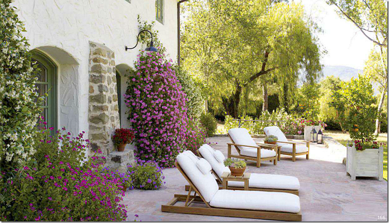
Reese decorated the back terrace with the Versailles wood planters and teak furniture with white cushions. The flowers are gorgeous – just beautiful. Winner? Reese, again, no contest!! The terrace which has the western view is so very, very pretty.
KATHRYN’S OUTSIDE DINING TERRACE:
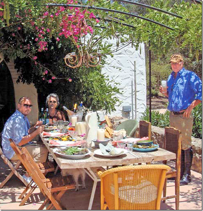
Off the back side of the main living area and on the other side of the rotunda, Kathryn created an outdoor eating area, under an iron pergola and a candalier. You can see the master bedroom house on the right.
And looking the other way, you can see the iron pergola and the arch that leads to the rotunda.
REESE’S OUTSIDE DINING TERRACE:
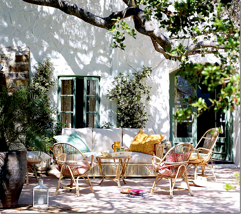
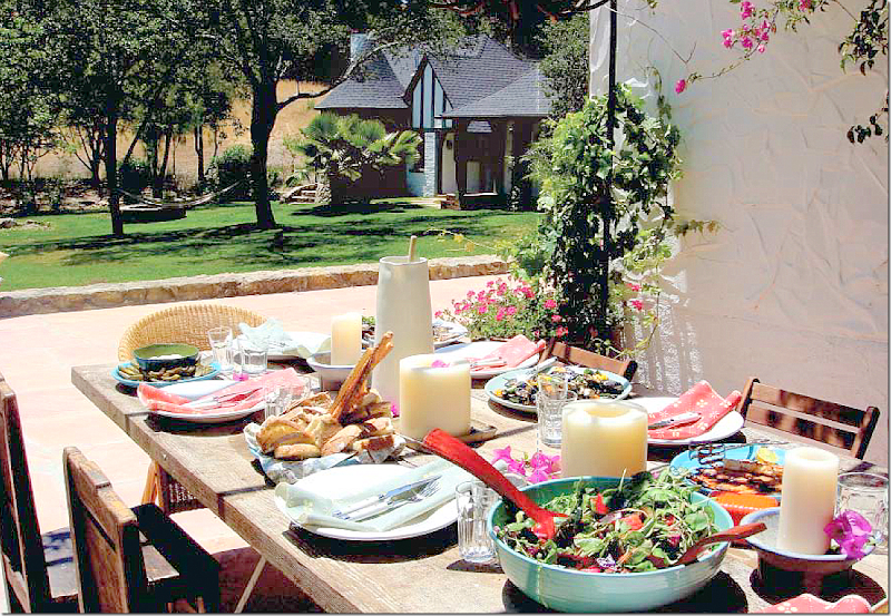
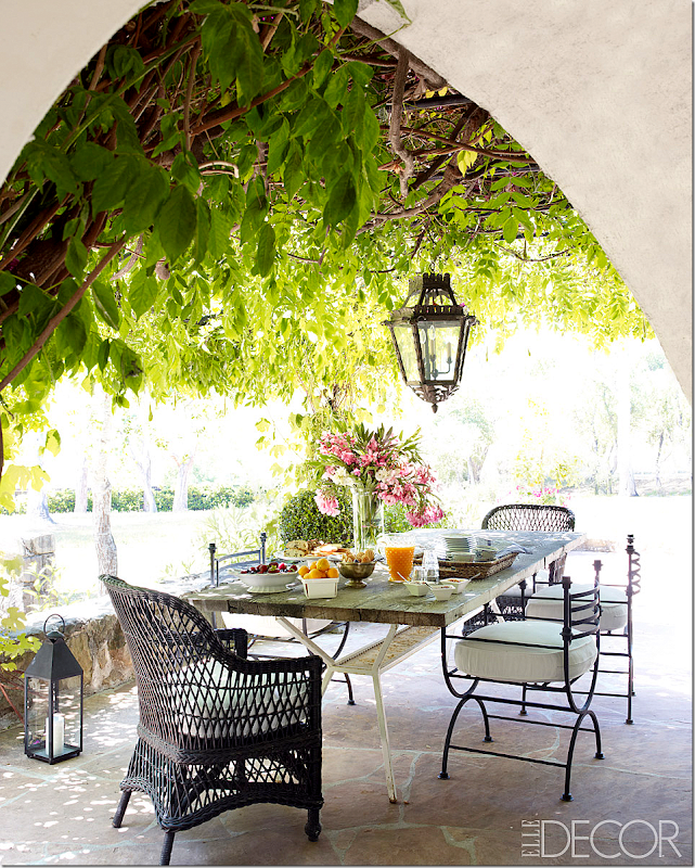
Compare Reese’s al fresco dining area with Kathryn’s. It looks like Reese kept the same table, but added new chairs, wicker and iron, and an antique lighted lantern. The winner? Reese! For sure!!! I love the choice of the chairs and the lantern. Has Kathryn won yet????
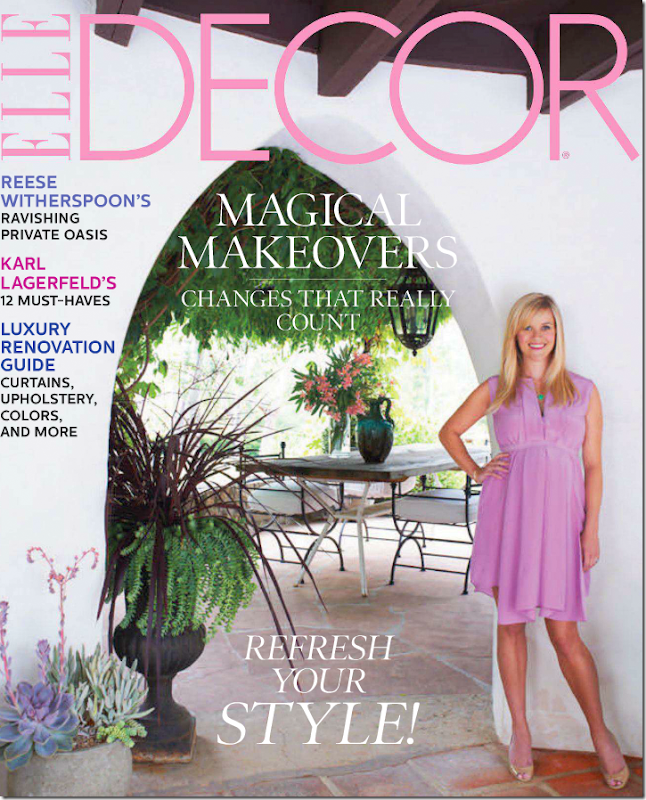
And Reese on the cover of Elle Decor standing in the rotunda where the outside dining terrace connects to it.
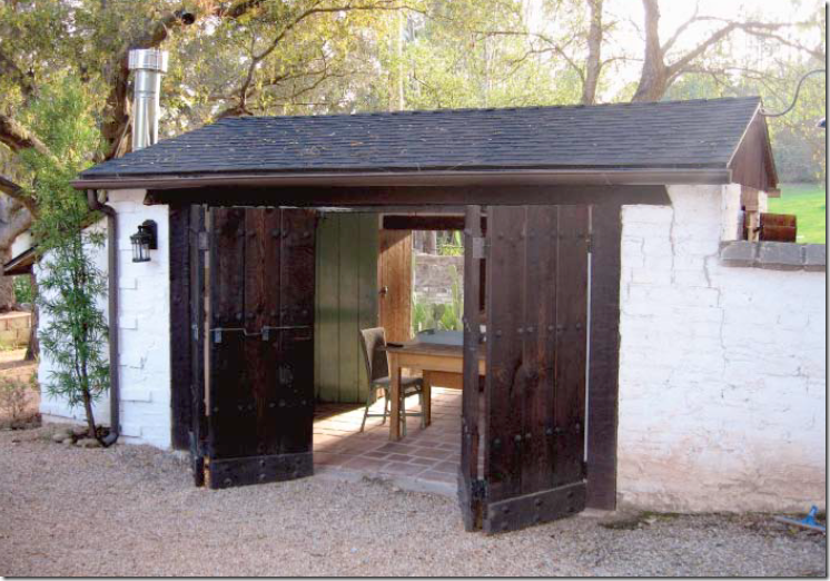
KATHRYN’S ORIGINAL BLACKSMITH’S SHOP, FORGE, OR FOUNDRY:
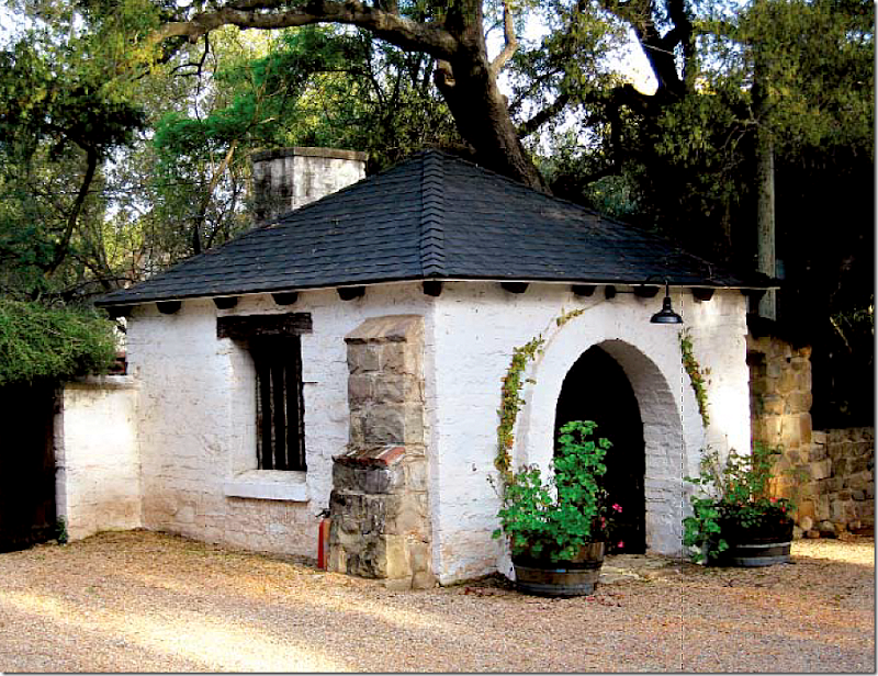
Theo original blacksmith shop that created all the iron fixtures and even nails on the property. Kathryn added wine barrels with plants.
REESE’S ORIGINAL BLACKSMITH’S SHOP, FORGE, OR FOUNDRY:
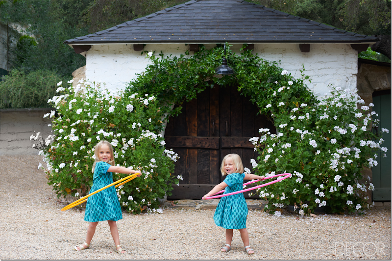
Reese’s precious nieces play in front of the forge or blacksmith’s shop. A vine planted by Kathryn has grown over the years and softened the wood doors. And the flowers in the wine barrels are beautiful today. Winner? Reese. hehe
OTHER OUTBUILDINGS ON THE PROPERTY:
Across the gravel road from the Forge, The Coach House and the Gatekeeper’s House is the large Caretaker’s House. I don’t think that Kathryn did anything to this house. The listing says there are 4 bedrooms and 3 1/2 baths – which wouldn’t include this house. Perhaps an actual caretaker does live here!
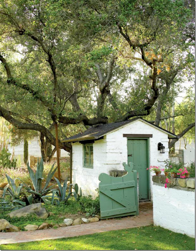
The old garden shed now houses electrical equipment. Notice the gate with a rooster on top of it.
The tractor shed is now an outdoor kitchen that serves the pool It also holds the pool equipment.
Kathryn installed the swimming pool in a secluded area next to the stables. Today, Reese has added picnic benches and a trampoline for her children.
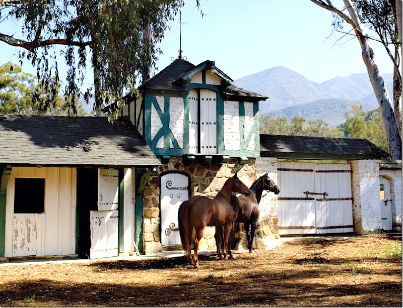
THE STABLES:
The stables were designed using a half-timber technique, associated with Tudor times and more recently, faux Tudor times. Still, this is so charming – as is the entire property!!!
Here’s the real estate ad for the ranch as it looked after Kathryn had emptied it of all its photoshopped trinkets. This was the listing that Reese first saw.
THE WEDDING:
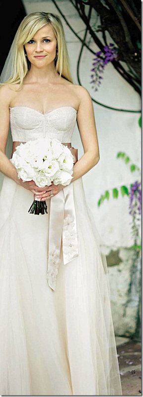
Reese married in a soft blush pink gown. Here she stands in the rotunda. The property was tented with 3 different tents. Not sure why they needed all those tents – the wedding was in April. Doesn’t she look adorable?
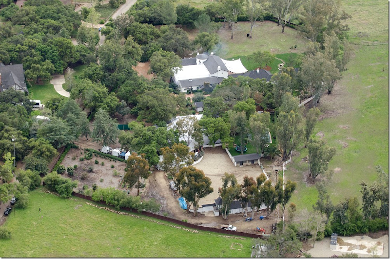
Here is the property seen at the wedding. In front of the stables is where the largest party tent was installed. Another tent completely covered the U shaped entry courtyard – perhaps that is where the ceremony was? And along the back terrace was another tent – where drinks and appetizers were served.
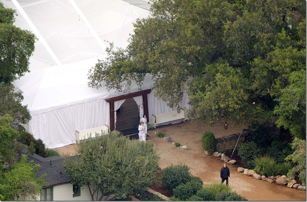
The main dinner tent was set up on the path in front of the stables and next to the pool. That’s the caretaker’s house on the left. Notice the lanterns in the trees and the benches flanking the door to the tent.
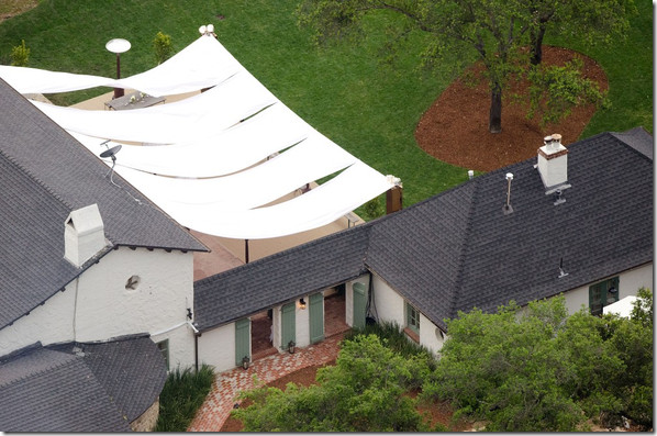
Here, servers work between the kitchen and the guest room wing – where the drinks tent was set up on the back terrace. It looks like Reese laid a new brick walkway here between the kitchen and the guest room. Wonder why that bed isn’t landscaped?
The same view – but showing the open air tent over the back terrace. The guest rooms or kids rooms are to the right, the main living room is on the left.
Additional space was added to the back terrace to make more room for guests.
The back terrace – with the outdoor eating area under the iron pergola. You can see the black wicker chairs and the wisteria – but it looks like there is a new table in place of Kathryn’s old table!!! The rotunda is right behind the al fresco dining area.
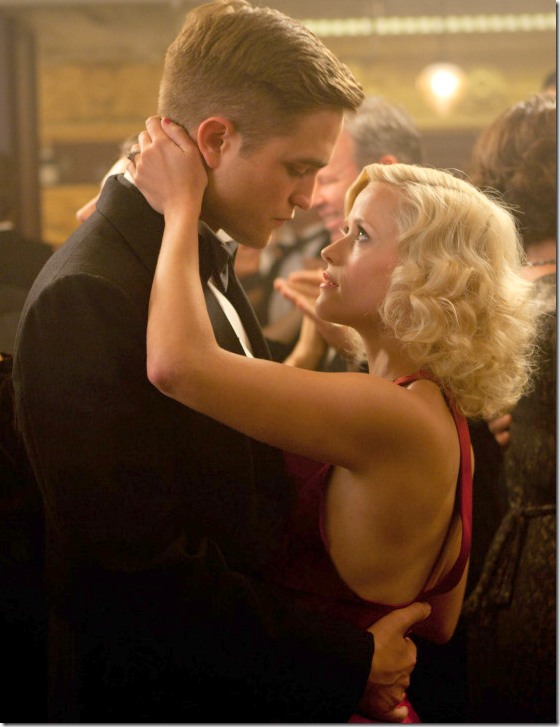
In case you have been living under a rock, the world’s most handsome man, Twilight’s Robert Pattinson who starred with Reese in Water for Elephants (great movie!!!) recently split with his girlfriend of 4 years after pictures of her cheating with her Snow White director were shown in US Magazine. Pattinson was blindsided by the split and in a state of shock that his Twilight co star was not faithful. AS WE ALL WERE, ROB!!! I have to confess, I was in a state of shock too. To escape the press, he stayed at Reese’s Ojai ranch. This proved to be very fortuitous for Elle Décor which had just published these pictures of the ranch. Every tabloid in the world was displaying and linking Elle Décor’s images of Pattinson’s hideaway. Whether the story is completely true or not, apparently, he did stay there for a day or two, which seems odd since Reese didn’t even invite him to her wedding – which happened a few weeks after filming for WFE was completed. It’s a small world folks, when the Twilight crowd reads Elle Décor!! Let’s just pray that Robert and Kristen get back together so everyone can go back to their lives prior. At least I’m not as upset as the Nutty Madame HERE. Almost, but not quite.
To read Kathryn Ireland’s book about the ranch – go to the left side of my blog under “I recommend” and click on the book!!
And to listen to Kathryn Ireland on The Skirted Roundtable talk about the Ojai ranch and lots of other things, go HERE.
Whew! I’m exhausted. This only took about 24 hours to write and research, but I loved every minute of it – I hope you did too!!
A HUGE thank you to Elle Décor for the gorgeous, huge photos you posted!!!!
So – who did you pick as the winner? Kathryn or Reese? Let me know!!!
REESE VERSUS KATHRYN– A KNOCKOUT DUEL!
Gorgeous Townhouse Revisited: Now For Sale
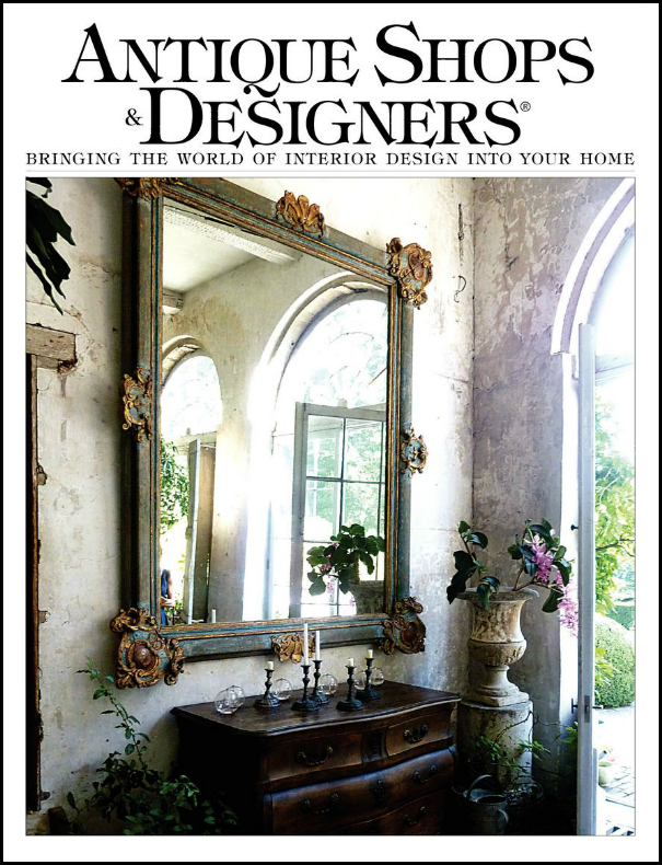
A few weeks ago, I wrote about the latest issue of Antique Shops & Designers magazine. The magazine profiled the wonderful townhouse of the beautiful and gracious Barbara Carlton of Shabby Slips – one of Houston’s prettiest antiques and décor shops. To read the magazine article, go HERE. To read the original Cote de Texas story, go HERE.
Barbara Carlton along with her daughter Renea Abbott opened Shabby Slips in 1992 and it continues to get better and better each year. A visit to the shop is such a treat to the eye. Everything is beyond gorgeous – it’s so hard to leave empty handed. Both Barbara and Renea are interior designers with similar aesthetics, but there are unique differences. Renea doesn’t do only white slipcovers any more, today she mixes in a lot of gray and black and gilt to her sophisticated designs. Barbara admits she still loves white and every place she has ever lived is designed around white linen. She grew up watching old western movies and says that also still influences her decor.
The magazine showcased Barbara’s latest home, a 1963 contemporary townhouse in tony Tanglewood. The photographs were beautiful, but as space in a magazine is limited, you couldn’t see as much of the house as you might have liked. Until now that is! A reader emailed me that she had toured a house for sale and thought I would love. She hadn’t read the story of the townhouse or didn’t connect it with the space she saw in person. I have to say that I love readers, especially those bearing tips like this! A quick note to the listing agent, Rosie Meyers and I was in business. The photographer, veteran TK Images (more about them below) sent over the luscious, huge, HiRes photos of the townhouse and here they are today.
I totally understand why the reader didn’t recognize the house – missing from the magazine due to space constraints are the focal points of the house- the soaring, high ceilinged stair hall and the two atriums, around which the house was designed. My jaw dropped at the stair hall. It is stunning.
The townhouse is just over 3220 sq ft., with 2 atriums, an elevator, and 2 bedrooms/2 1/2 bathrooms. As you will see, it has been completely updated while retaining the original mid-century modern feel.
Enjoy!!!
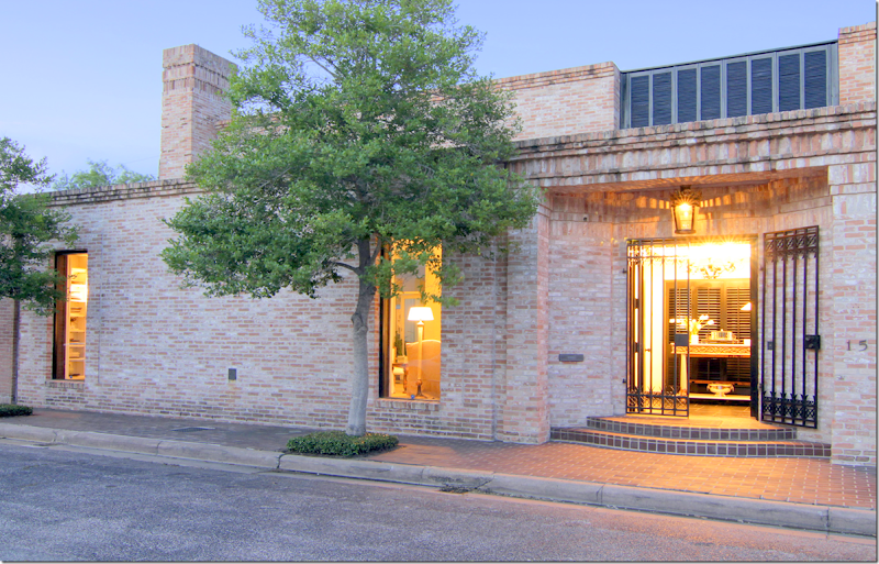
Located in a small gated community, a stone’s throw from the Galleria AND the home of a former United States President (beat that!) – the streamlined exterior says Mid Century Modern.
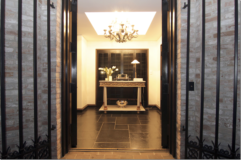
The black painted front doors open onto a space with black slate floors and black baseboards. The walls are all painted white throughout. The antique gilt and cream console rests in front of the black painted shutters – allowing the atrium beyond to be a surprise that unfolds as you walk further into the house.
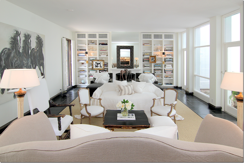
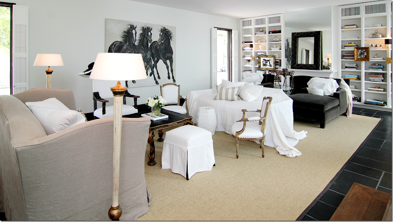
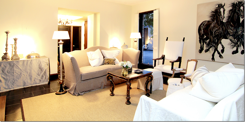
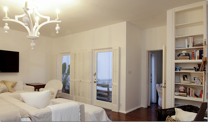
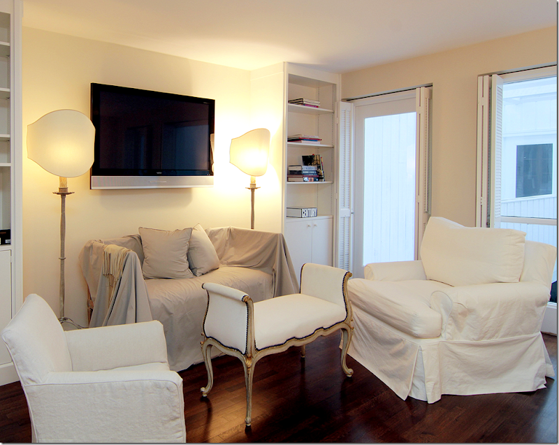
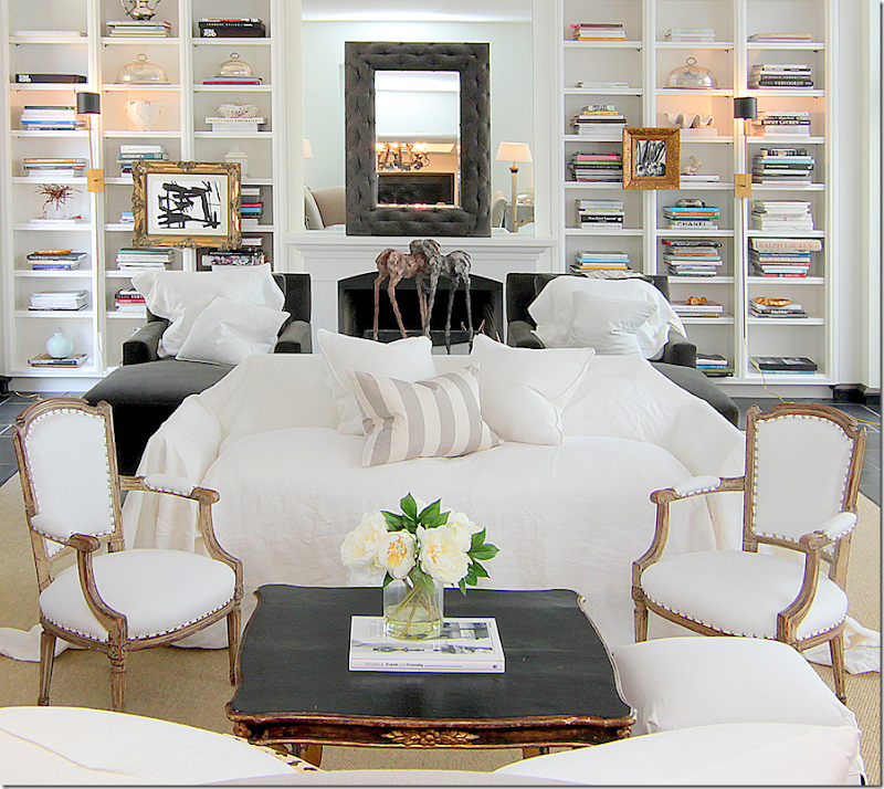
Directly to the left of the foyer is the large, main living room with its black slate floors. The room is large enough (28x18) for two seating areas. The two windows on the left overlook the street, while the row of windows and doors on the right lead to the brick floored atrium. Two sofas, one in linen, another with a white slip casually placed over it, face each other. Towards the back of the room is the fireplace, flanked by bookcases. There, two chaises upholstered in dark gray velvet sit next to each other. A large canvas of horses faces the first sitting area.
Can I say how much I LOVE the way this room looks? I love the mix of antique chairs, a large Spanish chair mixed with two smaller French armchairs. The silk stripe pillow is the only pattern in the room, which I love. Anchoring the two areas is a large seagrass rug. Notice the beautiful coffee table in black with gilt accents. Love!
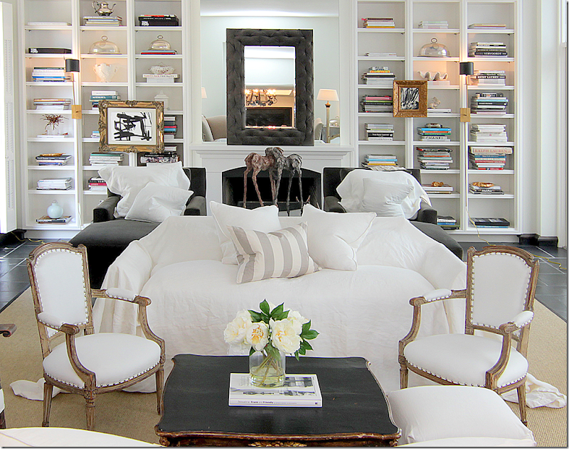
A close up view – Carlton says she puts loose slips on sofas and chairs at a whim. I love this look!!!
The linen sofa has a scalloped back and arms which creates interest when walking into the room. Here you can see the two chaises that flank the fireplace. Darling little slipped ottoman with black lining peeking out. And I love the two floor lamps. It’s amazing how the large painting of the horses creates movement in the room, isn’t it????
Looking the other way – you can see back into the foyer. To the left is the atrium, and then – you can see the stair hall off to the back left. This stairhall overlooks the second atrium – or the large one. Notice flanking the entrance to the room are two rectangular skirted tables in silk taffeta. On the gray velvet chaises are white linen pillows – Shabby Slips makes the MOST gorgeous pillows!! In between the chaises is a glass coffee table.
And a view of the fireplace with its mirrored mantel, with a second mirror on top of it – is that tufted velvet on the frame??? Gilt framed pictures hang from the bookshelves, while a large horse sculpture sits on the coffee table.
A night view of the first seating area, with the gorgeous coffee table. Notice how pretty the back and the arms of the linen sofa are. I love how Barbara puts the pillows in the middle of the sofa. Much better than having to move them when you sit down – they are already moved!! The silk velvet pillow pops the two white linen pillows.
Now, for the magazine shoot for Antique Shops & Designers, Carlton brought in two club chairs instead of the loose slipped sofa. Plus, she removed the two taffeta covered skirted tables.
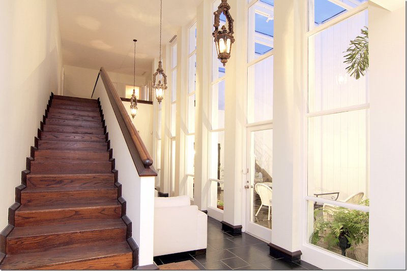
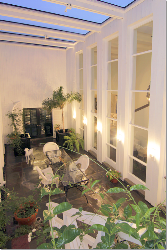
Leading off the living room is the stairhall, with the larger atrium on one side. Is this not GORGEOUS???!!!! OMG!! This room wasn’t seen in the magazine article due to space constraints and my eyes popped when I saw it! Those tall windows, 4 stacked to the ceiling, the antique lanterns, the gorgeous wood staircase – just stunning. Notice the black molding that connects the slate and wood with the white walls. And notice the beautiful railing. It doesn’t say who did the renovation, but they really did a fabulous job. The two bedrooms are both upstairs and there’s an elevator for easy access. Remember the shutters in the entry? They hide this fabulous atrium and stair hall so that it becomes a gift for the eyes that reveals itself the further inside the house you walk. The kitchen and dining room are on the other side of the house and look over both this atrium and the one in the living room. To reach the back rooms, the doors are at the end of this hall. This hall is wide enough to be another furnished space. Here, Carlton has put two arm chairs along the stair wall.
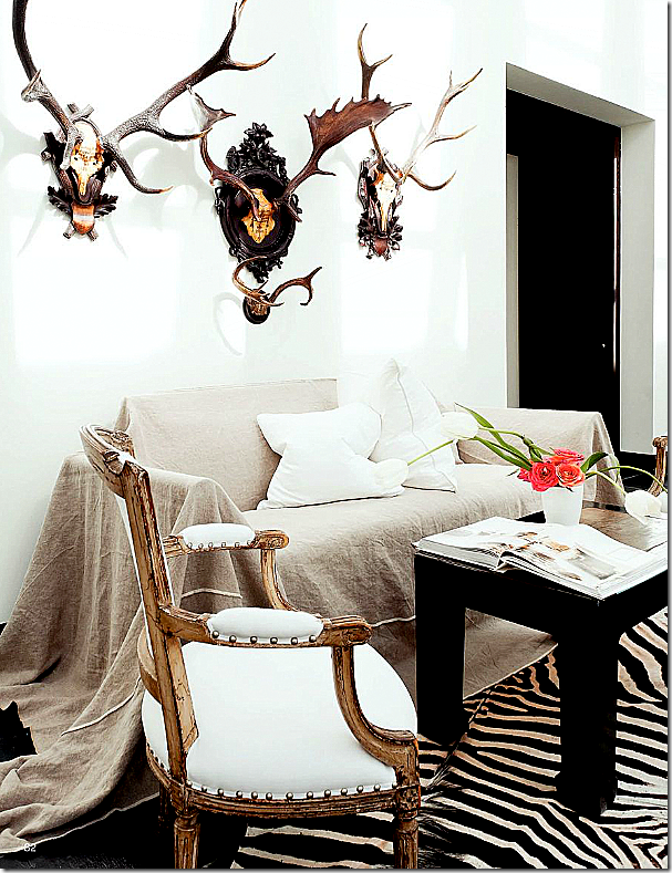
From the magazine Antique Shops & Designers – this photograph shows the stair hall as it was decorated for the shoot. In real life, Carlton actually keeps the two club chairs here – but I LOVE this look, especially with the French gilt chairs and the zebra! On the right is the entrance into the dining room.
Here is the kitchen and the breakfast room – with the doors overlooking the larger, front atrium. You can see through to the black shutters in the entrance hall. At the open door on the right is the stair hall.
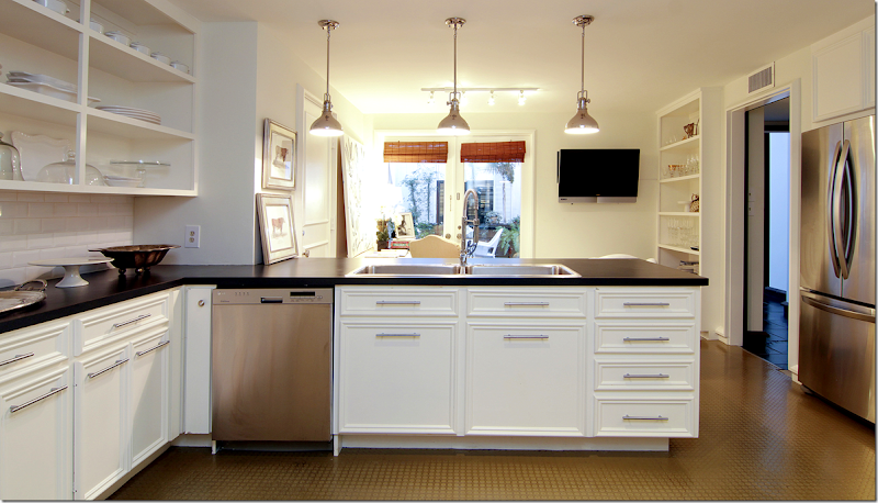
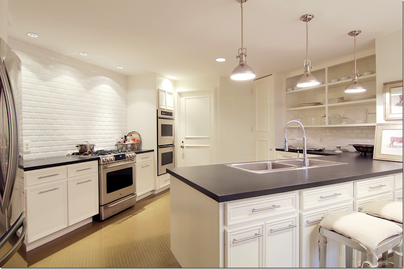
Looking the other direction into the kitchen. All overhead cabinets are gone. Three open shelves hold glasses and dishes. Notice the beautiful wall of white subway tile over the stove and oven. There are two more ovens to its side. Not sure what the counter is – it could be matte black granite, but not sure.
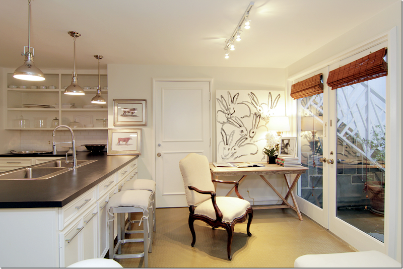
Carlton’s breakfast room doubles as her office. Love the photograph of Jackie Kennedy. And those bunnies! Too cute. Pretty French chair. The door leads to the slate floored atrium. Notice the stairs through the windows? Let’s look at the front atrium, ok?
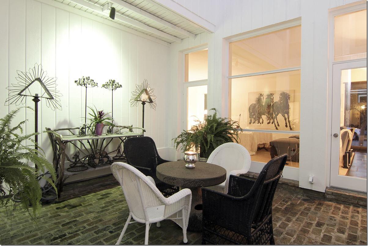
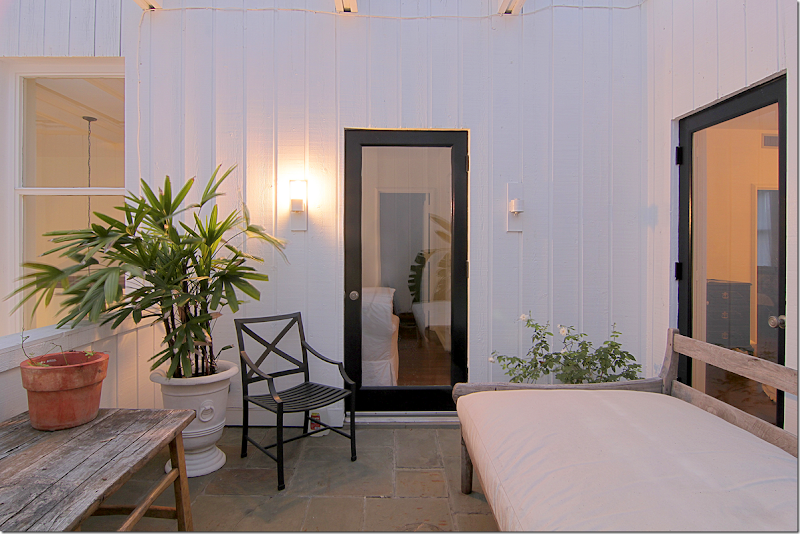
The front atrium serve as an outside dining area. You can see the black shutters which lead to the entry hall. To the right is the stairhall. On the wall inside – you can see the sitting room off the stairs. The sitting area measures 29x7 which allows for the two club chairs. Antique horns hang off the wall. In the atrium, Carlton has black slate floors which make the room seem outside/inside. White wicker and black iron continue the décor theme from the inside. If you had a party – you could throw open all the doors and let the crowd meander from the inside to out. You can see into the living room from the window.
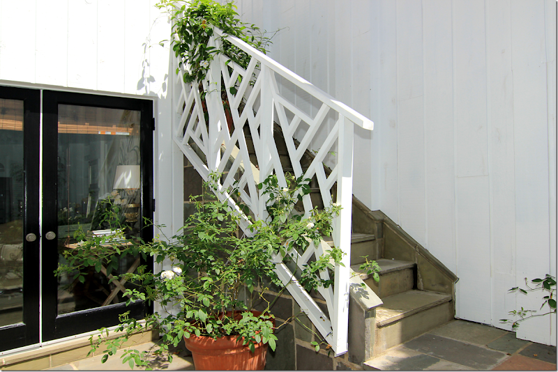
At the back of the atrium is the door that leads to the breakfast room and kitchen. Look at the Chippendale styled stair railings!!! GORGEOUS! The stairs lead to the balcony off the master bedroom.
Looking down from the balcony onto the front atrium. Here you can really see how beautiful the wall of windows is.
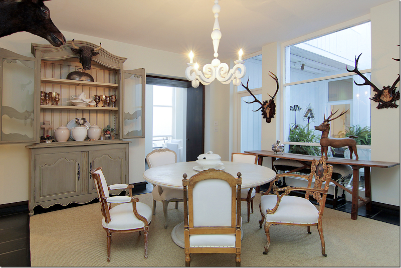
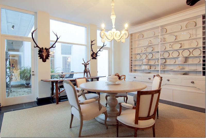
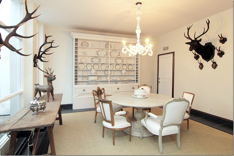
Off the end of the stair hall – the kitchen is to the right, and the dining room is to the left. Through the black doors (notice how the threshold on top of the doors is painted too) is the large dining room (17x15) – which sits across from the second, smaller atrium. This atrium is directly between the dining room and the living room. You can see the stair hall and the windows to the first atrium through the black doors. I love the antique armoire filled with Carlton’s silver collection. Notice how the chairs are all mixed around the dining table. No two are alike. One chair on the right – the gilt one – is beautiful!!
Along the atrium window is a console. Antique horns are on the walls. And along the back wall is this fabulous cabinet filled with white ironstone. The French plaster light fixture is the same one that Sally Wheat has in her dining room. Remember?
Along the wall are more horns. Notice how the floor molding continues up around the door.
The second, smaller atrium is set up with a faux bois table and black and white wicker – again, continuing the black and white décor scheme outside. The floor here is brick. Against the wall is a faux bois console.
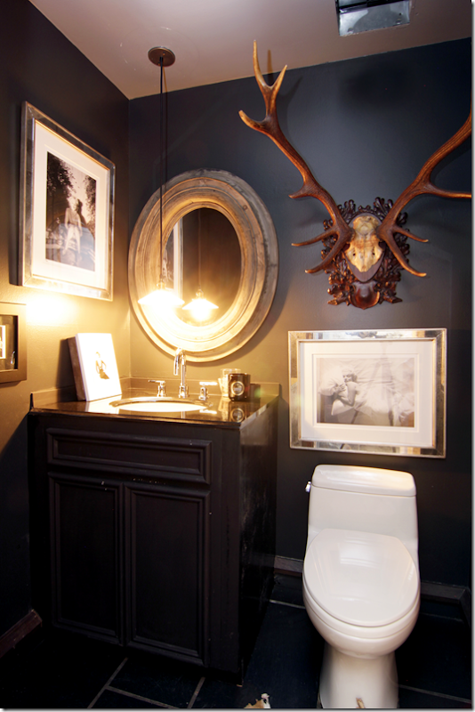
The powder room – I’m going to guess this is off the foyer, with its black painted walls and cabinet. Notice how Carlton hung the pendant low, over the sink. Horns mix with photographs of Marilyn.
Ready to go upstairs?
Any excuse to show the stair hall again! Here, the floor changes to hardwoods which run throughout the upstairs. There are two bedrooms and two baths upstairs.
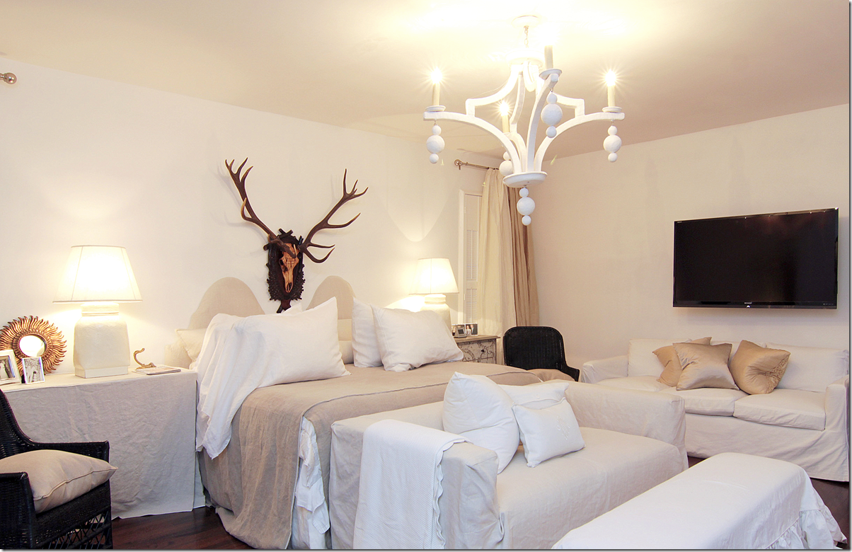
The master bedroom doubles as a sitting area for Carlton. Loose slips cover all the furniture. Another plaster lighting fixture similar to the one downstairs hangs here. Love the black wicker here. And again, more horns, which are a definite decorative element used throughout the house.
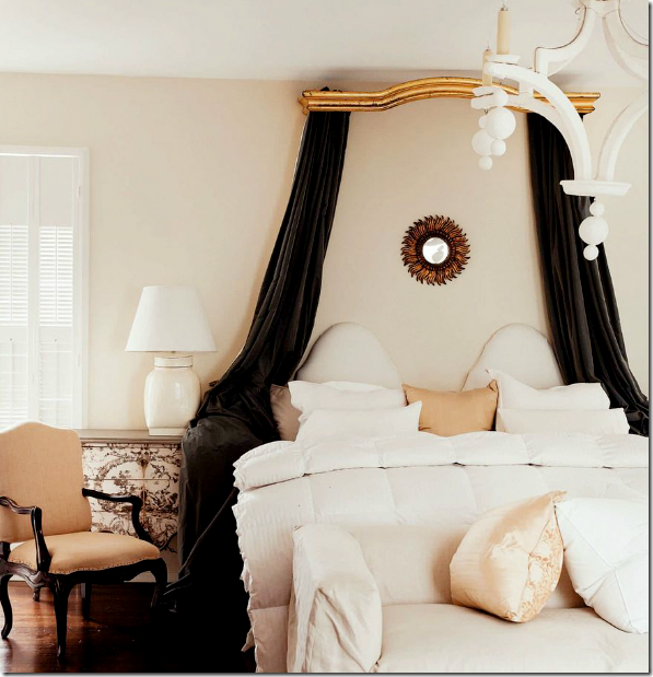
For the magazine photoshoot – an antique cornice was brought in, along with more dark, gray velvet. The nightstands were exchanged. It’s interesting to see how different a magazine photoshoot can be from how the owners really live. So much more attention is paid to the décor! I do really love this canopy though, and wished she had kept it!!! It adds a romantic touch to the room.
More built in shelves here. Through the glass you can see the outdoor balcony that overlooks the large atrium, which the Chippendale styled stairs lead to.
The master bedroom is over the kitchen area. Here you can see through this door the landing off the stairs. This balcony overlooks the large atrium. There’s a day bed out here and if I lived here – I would sleep here on nice nights!!!!
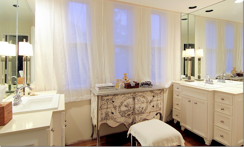
The master bath vanity area has his and her sinks in cabinets that look like furniture. Sheer curtains cover the windows, while a painted chest acts as a vanity. Cute!
A view into the bathroom with its tiny mosaic tiled floors – very mid century modern.
Whoa! I love this closet! First, I like how Carlton wears mostly black or white. Love the stole hanging. The mirror at the end is a great tool to make the large closet even larger. This door leads to the balcony over the smaller atrium. I wonder if this floor is original to the townhouse? Interesting.
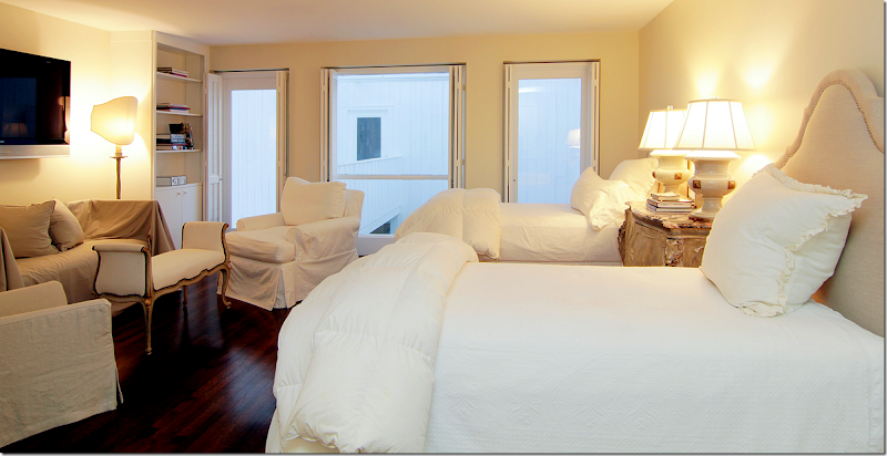
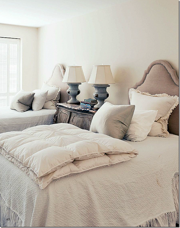
The guest room has twin beds and its own sitting area. Through the windows is the balcony that is over the smaller atrium.
For the magazine photoshoot – more attention was paid to the bed pillows, of course. Plus you can see the beautiful marble topped night table.
Twin bookshelves become an alcove for the bench. Love that white settee with gilt accents – beautiful!!! And those shades really made the lamps so important. What a difference they make over just a regular round shade. They look like sculptures now.
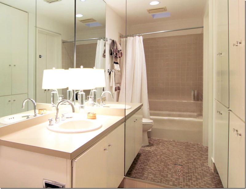
The guest room bath. This was probably updated some but the mid century feel was left. The cabinets look streamlined and original. Carlton probably just added the mirrors and new sink, countertops, and hardware.
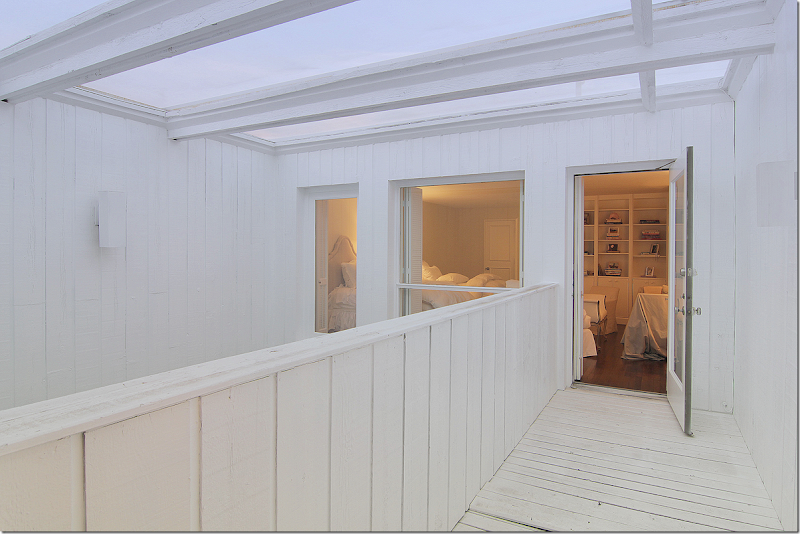
The balcony that leads from the guest room over the smaller atrium.
I hope you enjoyed this extended look at this wonderful townhouse since we only got a short look before! To read the story in Antique Shops & Designers, go HERE. To reach Rosie Meyers about this house or to see the listing, go HERE.
A huge thank you to TK Images for letting me use their beautiful hi-res images of this house! TK Images is quite a company. They take pictures of every kind – and they specialize in real estate photography. The owner, Julie Pistone Krampitz, was once a real estate agent herself and she truly understands the art of taking photographs of the house. TK Images has a team of photographers and editors who use wide angle lenses and lighting to take really great interior photographs. On their web site, they have a check list that shows what to do to get a house ready for a shoot.
Here is the list – which I think would be useful for anyone taking pictures of their house:
- Turn on all lights and lamps. Replace burned out light bulbs
- Turn off ceiling fans
- Check house for cleanliness
- Bathrooms - put away toiletries, toothbrush, toothpaste, towels, shampoo, soap
- Kitchen - remove dishes from counter, garbage from trash can, clutter, magnets from refrigerator, and pet bowls
- Remove clutter throughout the house
- Put away high chair, booster seats, toys, etc.
- Store all workout and medical equipment
- Make sure items stored under beds are not visible
- Put pets away, out of photography areas
- Have the yard mowed. Trim trees. Make sure leaves are blown.
- Put away all outside trash cans, recycle bins, water hoses, security signs
- If there is a security fence around pool and you do not want it seen in photo, please remove security fence before photo shoot. Remove pool equipment from pool
- If homeowner does not want child's name or personal photos shown, please take down before photo shoot
- Take down holiday items so photos are not dated
- For dusk shoot, please make sure there is a water hose at the property
While some items on the list may seem obvious, I can’t tell you the number of houses on HAR, and other real estate sites, that look TERRIBLE. Hooked on Houses often shows real estate listings that are so truly bad – they are funny. Why would anyone even look at some of these houses to buy? A professionally taken photoshoot for a real estate listing is vital.
TK Images have won awards for their image and it shows. It makes such a difference to show your house to its best advantage when either selling it or when showing it to an editor for publishing.
To go to TK Image’s web site, go HERE.
AND FINALLY – WOW. THAT’S ALL I WILL SAY!!
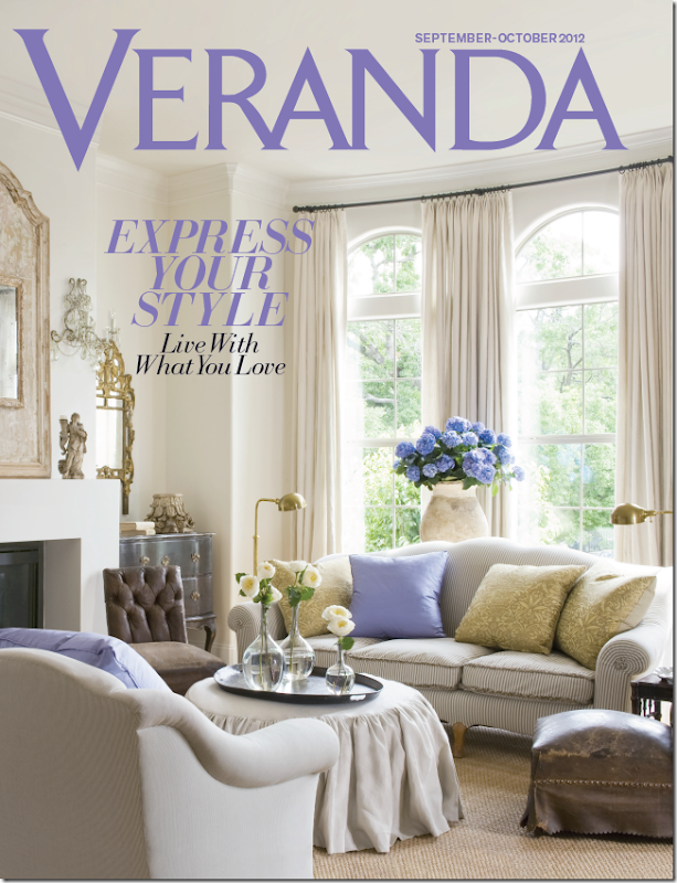
Well, ok, I’ll say a little more: A birdie sent me this preview cover of the new Veranda. OMG!!! I want to crawl in this picture and live in it for eternity, as long as I can have those hydrangeas, along with the purple title!!!
Can you guess whose house this is???
The issue will be out soon. Soon. Start looking for it in a week or two.
OK, I do have to brag, I have those same sconces. Hehe.














![[Witherspoon_OJPICS.jpg]](https://blogger.googleusercontent.com/img/b/R29vZ2xl/AVvXsEgRXzrcGS7TYwHYraJnn3BIleX-ZC4bcUBnM9SCdsb318s6GbSLSElj1i_9YI4Of7I9mTnjrMqTFYpY_kG_6VJgqYCQDI-26W71SPjEr-g9FE58q_iEH5oSO4zlnxE2aGGmr97Ddq_P40c/s1600/Witherspoon_OJPICS.jpg)
