As you know, we are having an Aidan Gray contest – looking for two houses to act as hosts for the new Aidan Gray catalogue. I received many wonderful entrants – from all over the United States. Since then, I arranged them according to states, and picked out 25 houses that I thought had the most potential and sent them off to Randal Weeks, the owner of Aidan Gray. Randal has had the finalists for a few weeks now while he and his wife Sally have been poring over the pictures. Yesterday he informed me he had made a decision, but didn’t tell me what it was!! So, I am just as anxious as all of you to find out who the two winners are!! Hopefully – we will know very, very soon.
In the meantime, I thought you might be interested in this story about Randal Weeks. I received an email from a reader who currently lives in the house that Randal and his wife used to live in – here, in Houston. Apparently 15 years ago, way before Aidan Gray was even a gleam in his eye, Randal was working for Bruce Hardwood Floors. He found a house for sale in north Houston that he thought would be the perfect place to raise his as-not-yet born children. The house, built in 1960, was an original Better Homes and Gardens house and had had only 1 owner. Those owners were currently living in a RV in the back yard because TWO years prior, a pipe had burst upstairs and flooded the house – destroying the first floor ceiling. Randal toured the house, and drew up a floor plan for the remodeling and addition, which he then presented to Sally who, of course, thought he was perhaps a little crazy.
They ended up buying the house and tore it down to the studs – putting in an entire new wing and back wall on the house. The water damage was extensive – when they ripped out the hardwood floors – the concrete underneath looked like it was moving. Instead, it was a million cockroaches that had taken up residence under the water logged floorboards. As Randal told me, “Gross!” After much hard work, some of which they did themselves, they moved in, planning to raise their children there. As luck would have it, just two years later, Randal was transferred to Dallas and none of his children spent a day in that house! Four years after that, Aidan Gray was born.
When Randal learned that I had current pictures of his former Houston house, he graciously sent me photographs from the original remodeling. The house, as it was then, was all original carpet, avocado appliances and countertops – “a real time warp.” Today, it’s hardly recognizable as the same house. It’s interesting to see what Randal did with the house, which was his first stab at designing, before he went on to start one of the most popular to–the-trade furniture companies.
So, today, let’s first take a look again at Randal and Sally’s house where they now live, as it looks in the Aidan Gray catalogues:
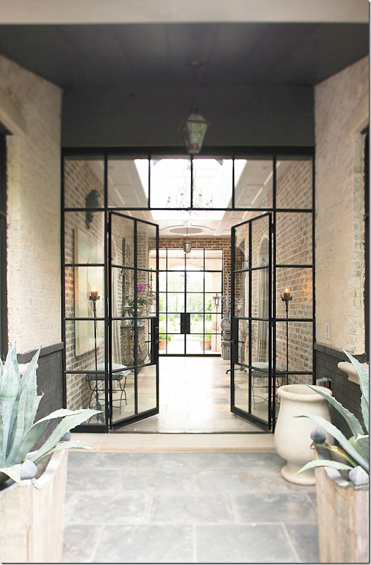
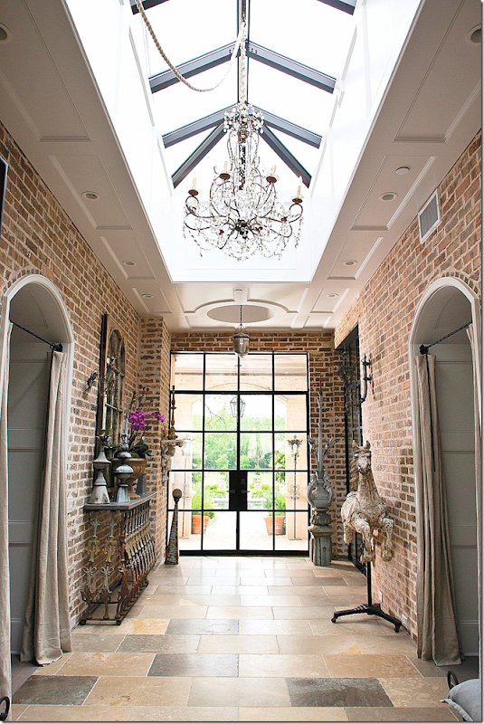
The entry – steel doors on both ends of the entry hall, with a large skylight overhead. The walls are beautifully bricked-lined.
I love how they used portieres to accent the arched doorways that lead off the entry hall.
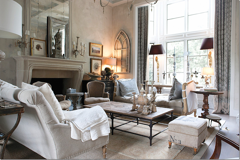
The living room has a high ceiling and a beautiful fireplace. I love the Aidan Gray day bed instead of a second sofa.
![[image121.png]](http://lh4.ggpht.com/-Rk5mRGgI30w/T5o5LJwl24I/AAAAAAABXg4/TATz8R3hBAg/s1600/image121.png)
The dining room – styled for the catalogue. Great table and chairs!
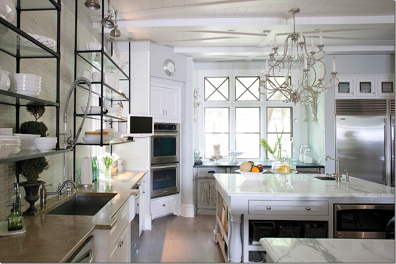
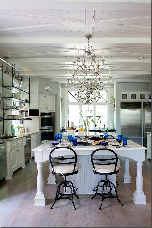
So many of y’all loved their kitchen when I last showed it. It has two large marble topped islands. The X motif is seen throughout the house, including on the ceiling beams and the transoms over the windows.
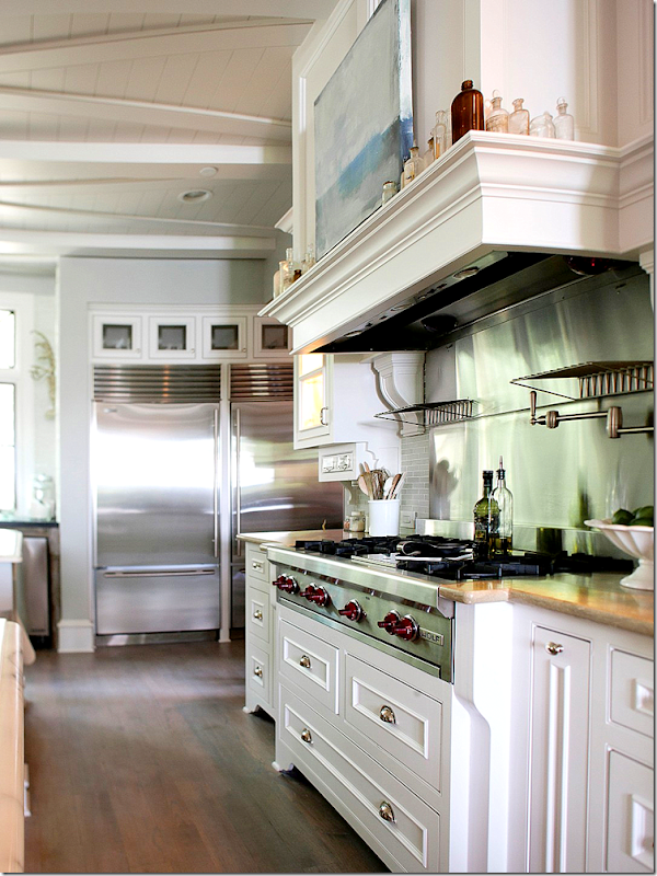
The cooktop with its mantel-like hood.
The kitchen has two large islands, each with an Aidan Gray crystal chandelier over it. Love the limed wood floors. Notice the ceiling beams.
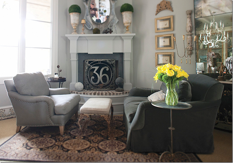
Love the fireplace screen!
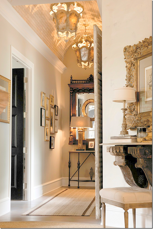
Down a hall with a barrel ceiling and lanterns.
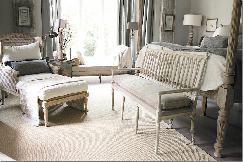
A peek at the master bedroom – filled with current Aidan Gray furniture. So pretty!
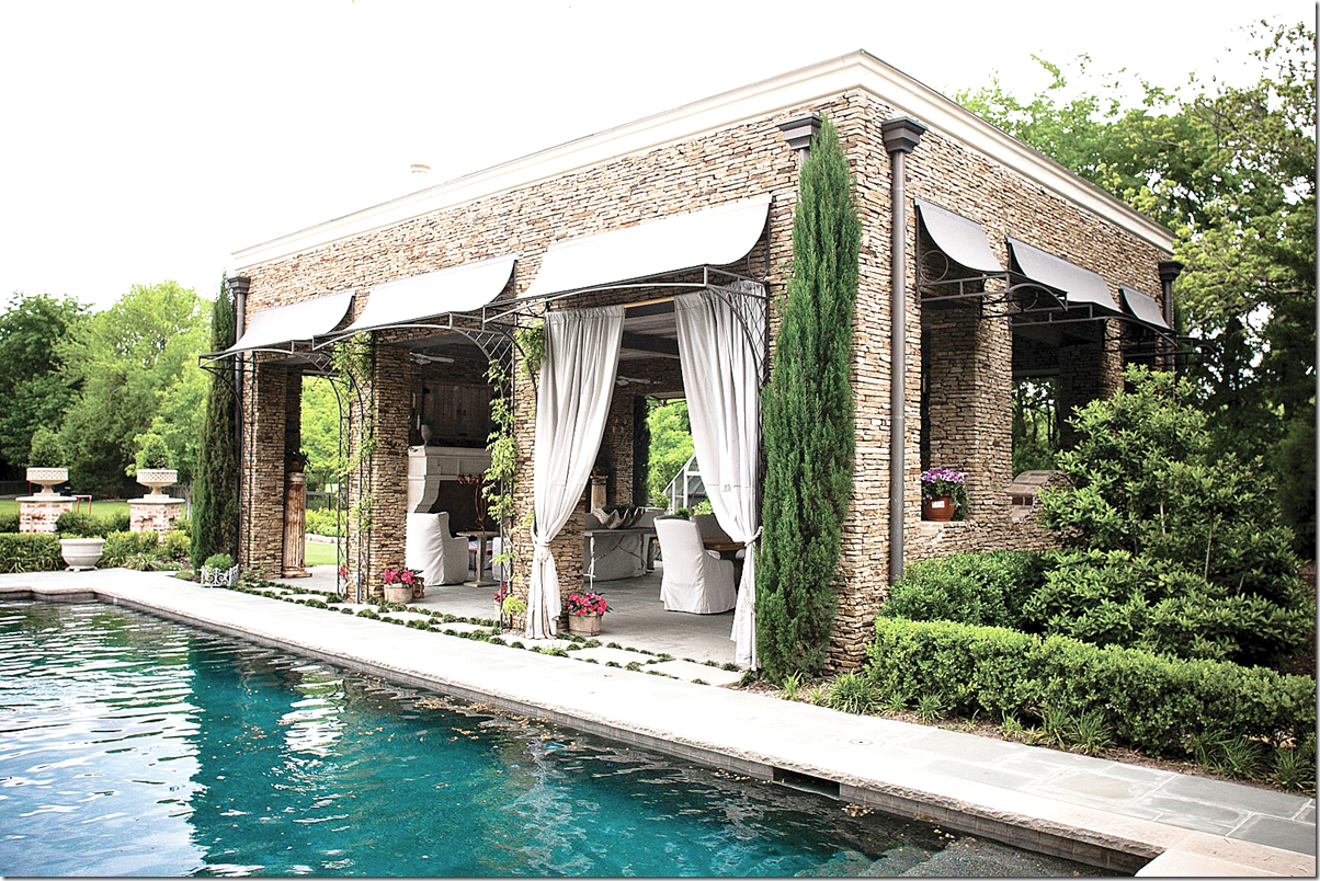
The gorgeous pool and stone house.
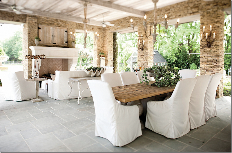
And inside the pool house – decorated as an outdoor dining and living room.
Now that we’ve seen what Randal’s style looks like today – let’s take a look back 15 years ago and see if we can find a touch of an early Aidan Gray look:
Here is the house as it was when Randal bought it. It was an original Better Homes and Gardens house. After a pipe burst, the house remained empty for two years, flooded out.
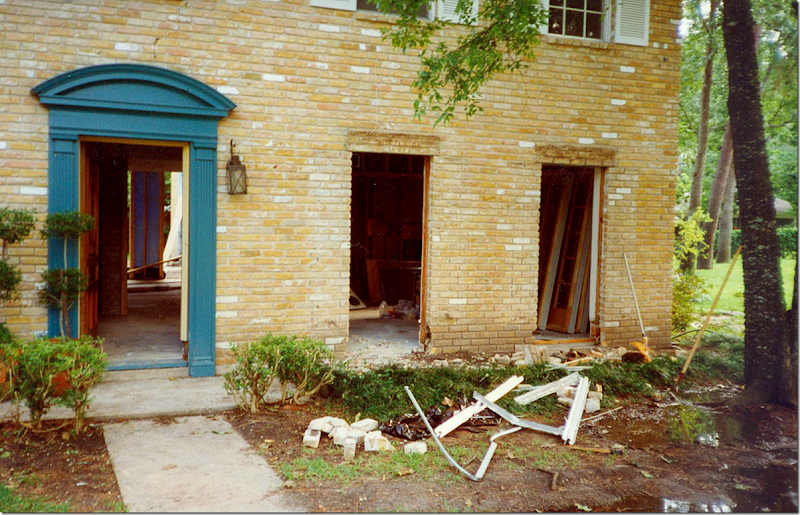
Green front door and yellow bricks. The room to the right of the front door was once a bedroom and bathroom. Randal opened up the wall between the bedroom and foyer and turned the bedroom into the dining room. To the left of the front door, the kitchen was also opened up to the foyer. Before – you had to walk all the way around the great room in the back of the house to reach the kitchen. Today’s owner says she can’t imagine how dark the foyer used to be before Randal made these two important changes.
BEFORE: The great room – at the back of the house. Once this floor was removed, millions of cockroaches made the foundation look like it was moving! The staircase remained where it is, as did the fireplace. The entire back wall was removed to expand the room by a few feet.
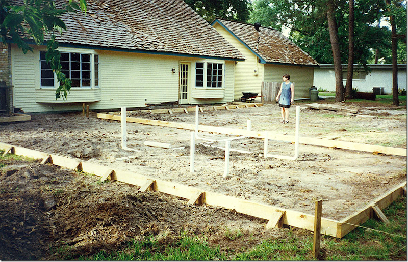
The back of the great room – with its two bay windows. To the right is the garage. Here you can see where the foundation was extended.
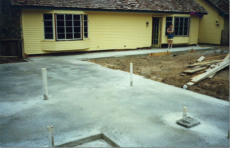
And the new foundation of the two story wing is poured, along with a few feet added to the great room.
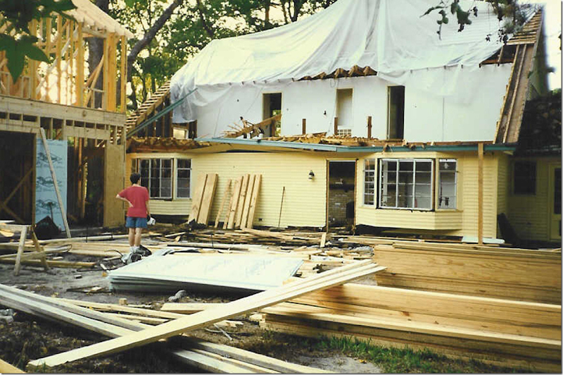
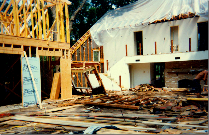
The extension goes up on the left side, while the ceiling is removed over the great room.
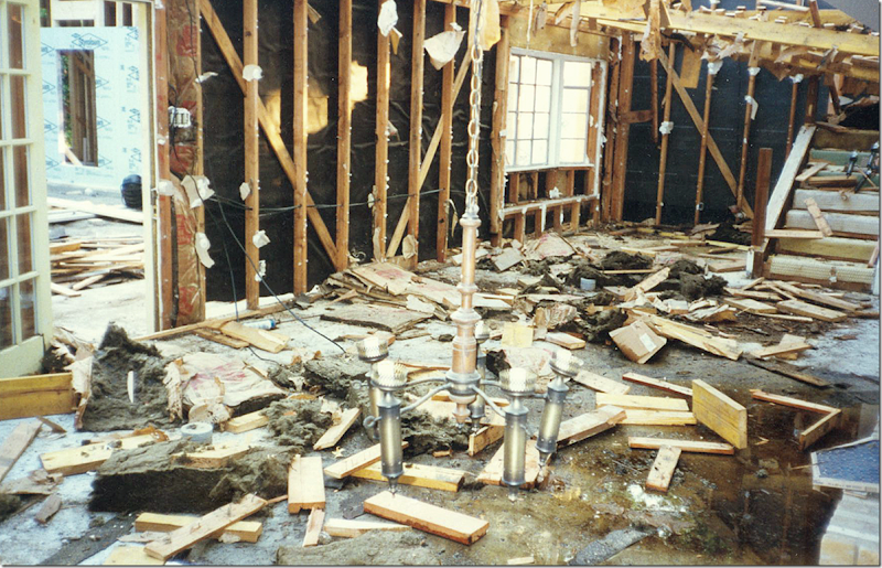
Inside the great room – after it was taken down to the studs and the floor removed, along with the water damaged ceiling.
Progress!! The new wing on the left is up, and here, the back of the house is removed. You can see the stairs and the fireplace, along with the balcony - totally exposed to the elements. Scary!!!!
New ceiling in the great room is up, along with the few feet that were added to the back of the room.
And, almost done! The new two-story wing on the left, and the closed up great room with its arched French doors, on the right.
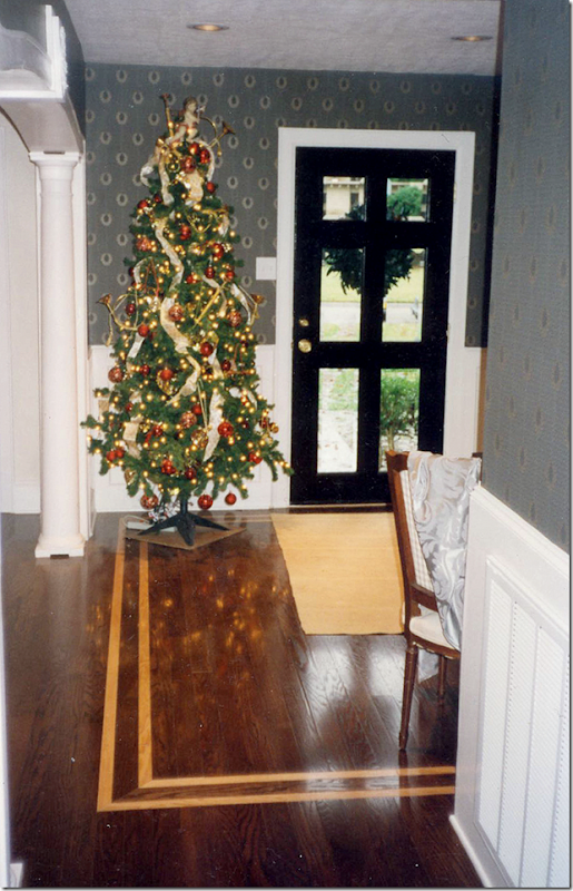
Here’s the new foyer as Randal designed it, with its new glass paned front door. On the left, the former bedroom is now a dining room – opened to the space with columns. Across the foyer is the kitchen.
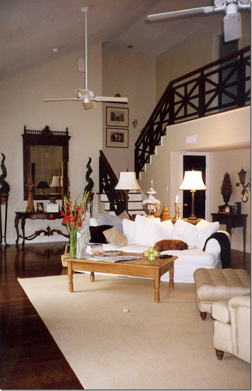
And the new great room! Fifteen years ago, and six years before Aidan Gray was started, I do see the beginnings of Randal’s style with the white slipcovered sofa. And notice on the staircase – Randal added an X motif, which is present in current house too!!
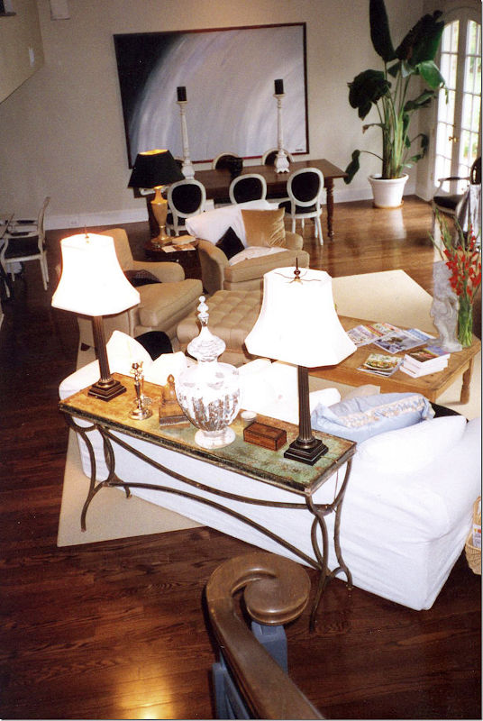
And looking the other way – the console table has an Aidan Gray look, as does the urn, for sure! Notice the French chairs – that is also certainly a current Aidan Gray look.
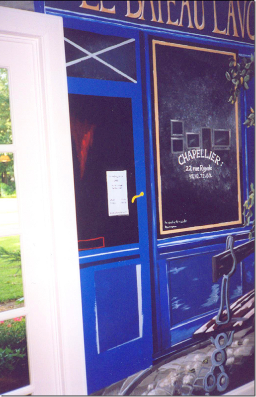
In the kitchen Randal and Sally painted a mural of a Parisian street on one wall. Notice the painted X-motif on the transom!
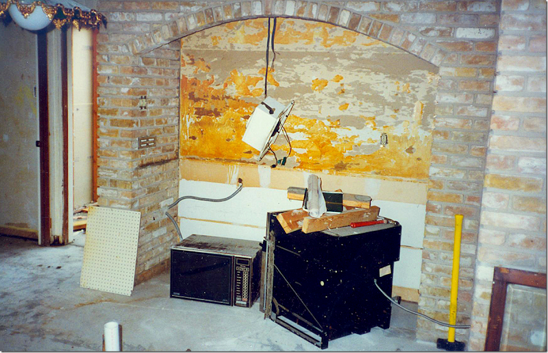
A before shot in the kitchen – the brick alcove which housed the stove.
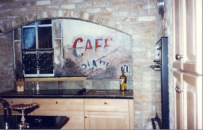
And after – another mural handpainted by Randal and Sally above the stove. Randal said that they were so house poor, they ate out of a toaster oven for months until they could afford to install the cabinets. Wait until you see what this arch looks like today!
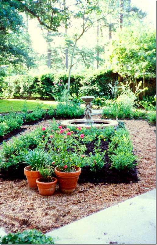
And in the back yard, they installed a fountain and gravel walkways.
And after: what the façade looked like after Randal and Sally remodeled. They painted the brick a taupe color, added the glass paned front door, along with new windows. So pretty!
As I told you, I received an email from a reader who told me Randal Weeks had lived in her house and had remodeled it before she bought it from him. Chris, the reader, had just recently updated her kitchen and thought the readers would like to see it. I asked her if I could show Randal the pictures of the house. Just as I thought, he was so excited to see his old house again. He couldn’t believe how good it looked. Randal then sent me the above pictures of his renovation, saying it brought back such great memories of the fun he and Sally had had transforming this house.
Here’s how it looks today:
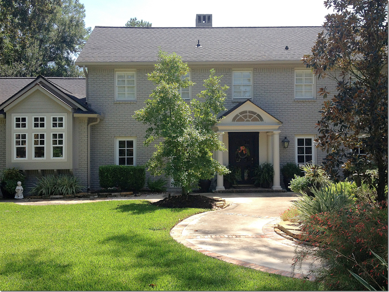
Totally different, again! A beautiful front drive and landscaping was installed, along with a new front porch and a bay window on the left side of the house.
The new owner, Chris, bought the house from Randal 13 years ago, when his wife was pregnant with her first child. Over the years she grew familiar with the name Aidan Gray but thought nothing of it, until she read in my blog that it was owned by Randal Weeks! She had no idea that the owner of Aidan Gray ever lived in Houston, much less in her own home!!! Such a small world. She told me that he had faux painted the kitchen (which we saw) and a few rooms upstairs, along with the nursery. Since Chris was also pregnant at the time she bought the house, the nursery was put to good use.
Chris wrote me: “When Randal first bought our house, it was a basic salt box style home built in the 60's, and he proceeded to add on and redo everything. He did a lot of the work himself, and our neighbors marveled at his work ethic and creativity. After reading his story and knowing all that he did to our home, it doesn't surprise me that he has become so successful.”
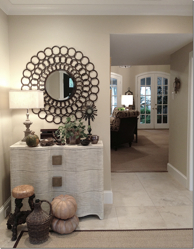
Here’s the foyer today. Remember when Randal designed it, it had dark hardwoods and wainscot paneling on the walls. Chris had it all removed and put down limestone on the floors. Not sure if it is, but that lamp could certainly be an Aidan Gray.
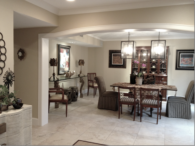
And to the right of the front door, in the former bedroom, is the dining room. Chris removed the columns that Randal installed. And she removed the hardwoods here too, replacing it with the limestone for a seamless look. The wainscot paneling was also removed, and she added the two large lanterns.
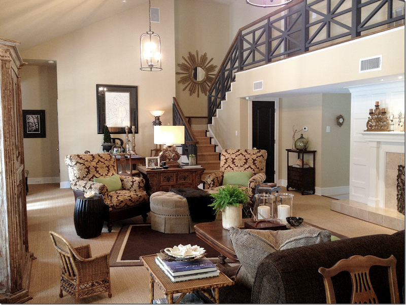
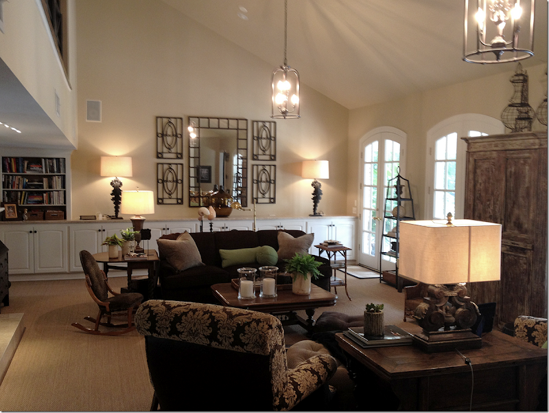
The great room today – so pretty!!! Chris installed wall to wall seagrass over the hardwoods to lighten up the room. She also installed the seagrass up the stairs. I love the railings with Randal’s X motif and am glad she kept those the same. The ceiling fans came down and were replaced with lanterns. The room is so warm and inviting. I love the way the doors are painted black – just a nice accent. Notice the armoire on the left wall. That is attached to the wall and was built and faux painted by Randal – years and years before Aidan Gray was even an idea in his mind! Chris loves that she has what is probably the original Aidan Gray piece of furniture, but it doesn’t hold a large flatscreen – remember, it was built 15 years ago. She would like to get a bigger TV, but is reluctant to part with her “original.”
And looking the other direction, Chris installed a row of cabinets and bookcases along the back wall. You can see the armoire better in this picture.
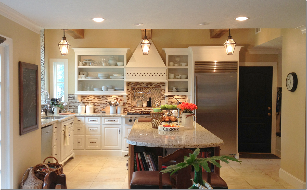
And here is Chris’s new kitchen. She added on some space and built a completely new kitchen with new cabinets, appliances and flooring. Since the kitchen is open off the foyer, the same stone was used throughout. She also raised the roof in the addition and added the three lanterns.
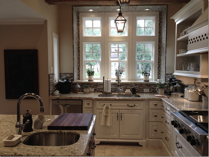
Remember the new bank of windows on the front façade, these are those windows. So beautiful!!!! Chris told me she was sorry to lose the hand painted murals that Randal and Sally had added to the kitchen, but they kept some of his art work upstairs.
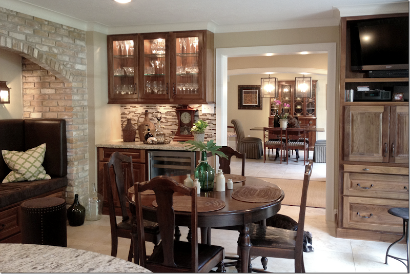
And looking the other direction – you can see how the kitchen leads off the foyer, across from the dining room. In the former kitchen space, there is now a breakfast room. And, remember the brick arch that housed the stove??
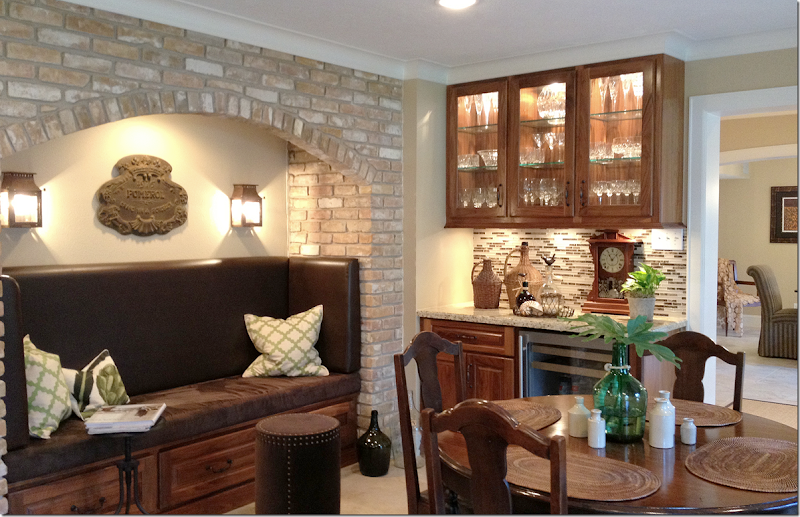
Chris turned the brick arch into a banquette. Great idea!! I love how she used the lanterns as sconces and I love the mini subway tile backsplash on the bar area.
Chris raised the ceiling over the new kitchen and added beams and lanterns – creating an architectural element in the room. And the new bay window with its side lights is really beautiful. It adds so much to the kitchen.
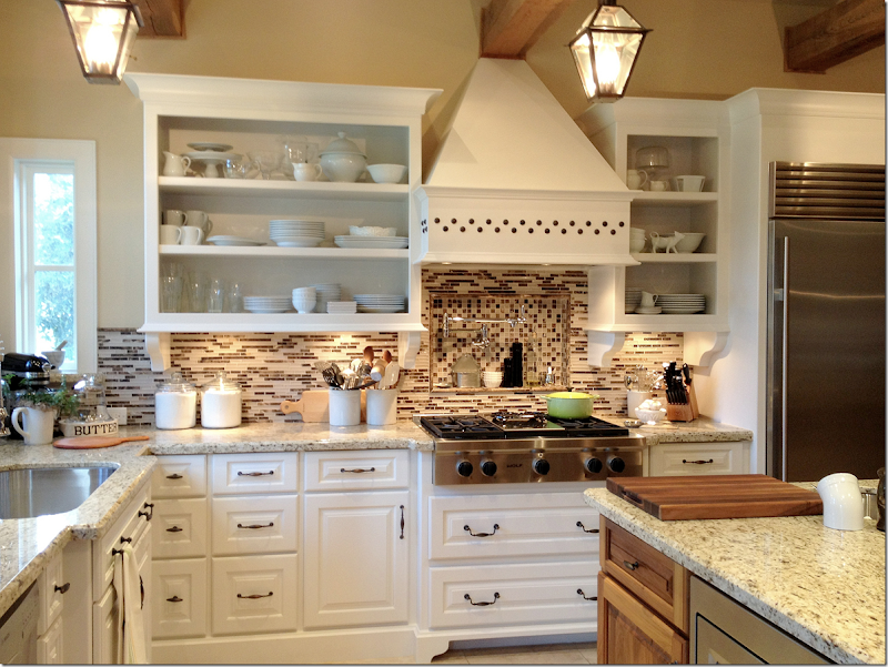
Notice the open cabinet shelves filled with white ironstone and dishes. Chris mixed stained cabinets with painted white ones. The granite picks up both the light and dark shades of the cabinets.
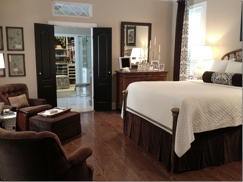
Here is the master bedroom with its antique bed – notice the charming X-motif transom above the bathroom doors. I am going to assume Randal installed that window, since he likes the X decorative element so much!!!
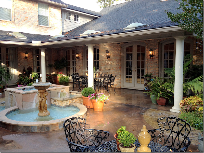
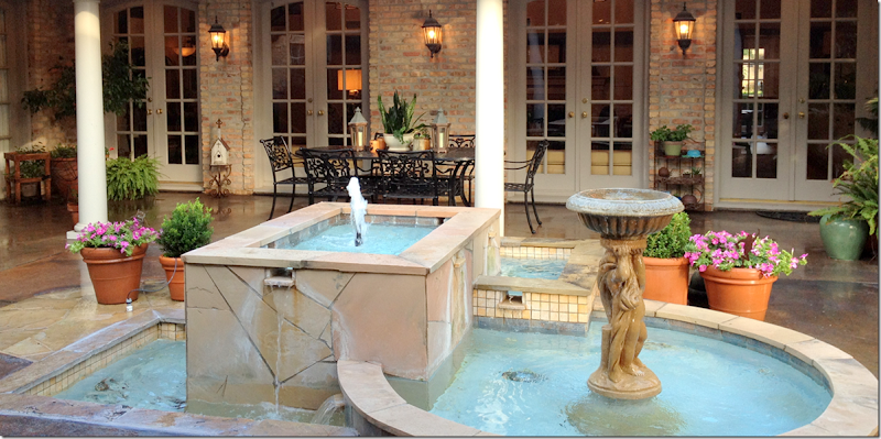
Here is the backyard today. Not sure if Randal or Chris added the covered porch along the great room. The new pond was built, incorporating Randal’s original fountain.
Here you can see the fountain – it’s on four different levels!
And finally – the outdoor pavilion that Chris added on the opposite side of the great room. It has a fireplace and a cute metal roof.
I hope you enjoyed this peek into the beginnings of Aidan Gray and how Chris took Randal’s designs and expanded on them! There certainly were glimpses into what was coming in future.
NEXT:
A few months ago, I was talking with Randal about lanterns. I love my two lanterns, which are reproductions, but I can’t find any others similar to them for a reasonable price. I told Randal that I thought if Aidan Gray made a lantern like mine that wasn’t expensive, they would sell a lot of them. (As if I really know anything about business.) But, to my surprise, Randal really did listen to my suggestion.
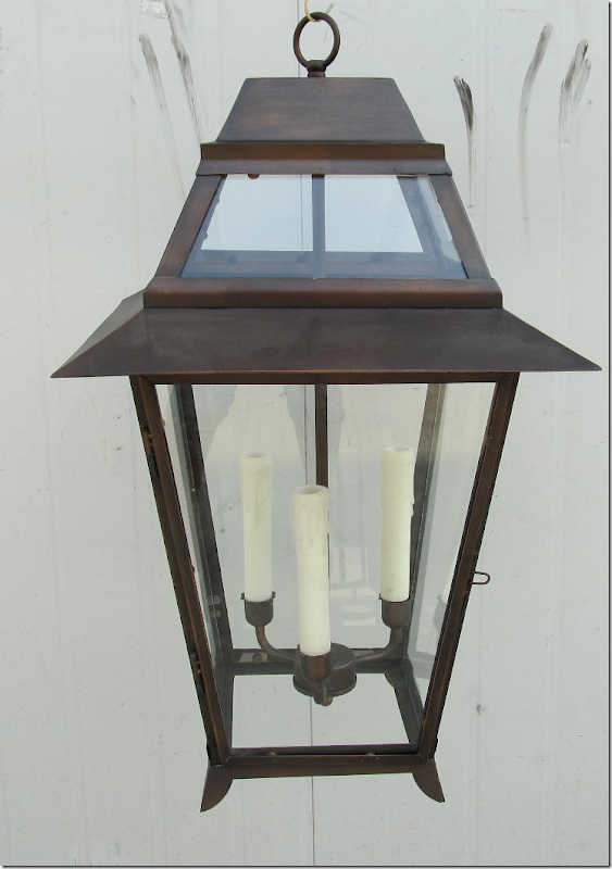
A few months later, I was shocked to get pictures of a prototype for a lantern that Aidan Gray was designing. They used the antique lantern on the left as a guide for the new lantern, on the right. Randal sent me several pictures, asking me what I thought of the design – as is. Wow. Looking great!
And, just a few weeks later, came a picture of the final product!! Love!!!! I hope it makes it into the next catalogue and I’ll be curious to see what the price is. All in all it looks like a winner to me – at least I hope so!!! What do you think?
And, a few changes around the house, AGAIN:
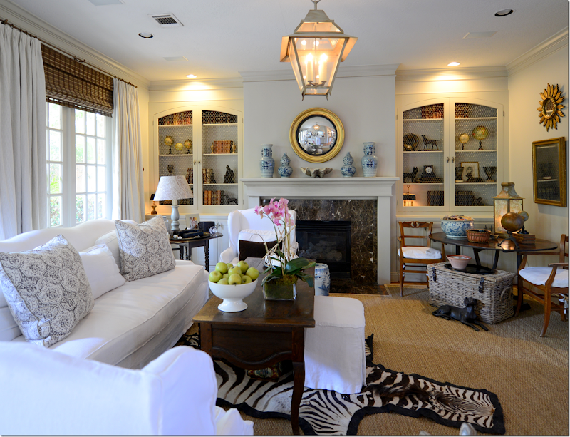
A few weeks ago I showed you my new cabinet doors that I had added to the family room shelves. Inside, the shelves were nailed in and not movable so Raul talked me into just leaving the shelves the way they were instead of raising or lowering them. But as you can see, the top shelf looked so short compared to the rest of the shelves. See – how there is hardly any space between the top shelf and the arch? I was really unhappy with the way it looked, but decided to do what I tell my clients to do – live with it for 48 hours and see what you think then. It usually takes the eye a few days to adjust to change. Well, after 48 hours, I was still bothered by it and Raul came back to lower the top two shelves on each side. It was a pain, because everything had to come out again and the shelves were then taken down and nailed back in and then repainted. But, it was worth it.
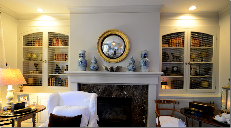
Here is how the shelves look today. Notice the top shelves have been moved down, as were the next shelves too. It looks so much more balanced, plus the arch looks better this way.
And here’s one more view of the new shelves. Lesson learned – do it right the first time and stick to your guns. Don’t let your contractor talk you out of what you really want, just because it will be easier. I am thrilled I went ahead and corrected it because I know it would have driven me crazy for the next few years. Now I don’t even notice it.
And, while Raul was here, he needed to repaint the bathroom doors black, so I thought I’d have him paint my bannisters black too. Of course I got my inspiration from the last reader’s kitchen with her pretty staircase HERE. My bannisters were brown before and now they look just a bit more richer. Of course my daughter said, well now you have to redo the floors. I know, I know. I’ve needed to that for five years but the thought of it makes me so nervous!!!
AND FINALLY:
A few years ago, I showed you this book, written by Dallasite – Jennifer Pickens, called Christmas at the White House.
The talented author, Jennifer Pickens, has just come out with a new book:
Pets at the White House!
Awww, the Kennedy children with their pony, Macaroni.
The book tells the stories of all kinds of pets that have called the White House home. With a forward by First Lady Barbara Bush, it includes a lot of pictures….
The Reagans’ with Rex, their Cavalier, King Charles Spaniel…..
And Barbara Bush with Millie and her puppies – English Springer Spaniels, just like our Georgie!
And of course, President Barak Obama with his gorgeous Portuguese Water Dog, Bo.
If you are from Houston, Jennifer will be in town this Tuesday October 30 at Berings for a book signing. Also, that morning, she will be St. Martins Episcopal Church at 10:30, speaking on Christmas. If you are able to attend, your presence will be very welcome!!! For exact times and addresses, please email: Nicole@ngo-pr.com for more information.
To purchase Jennifer’s two books from Amazon, simply double click on the pictures below:
Until next time!

