When I showed my newly renovated library a while ago, I hinted that there was something else involving Ballard Designs that was going into the space.
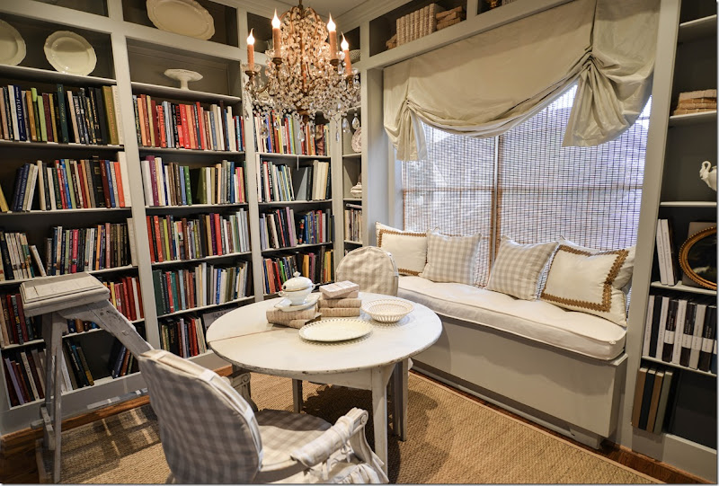
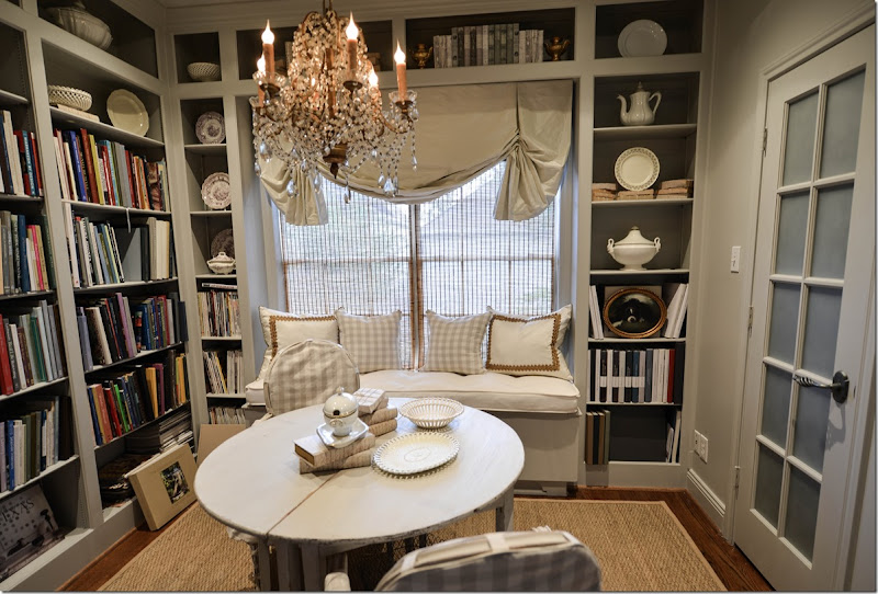
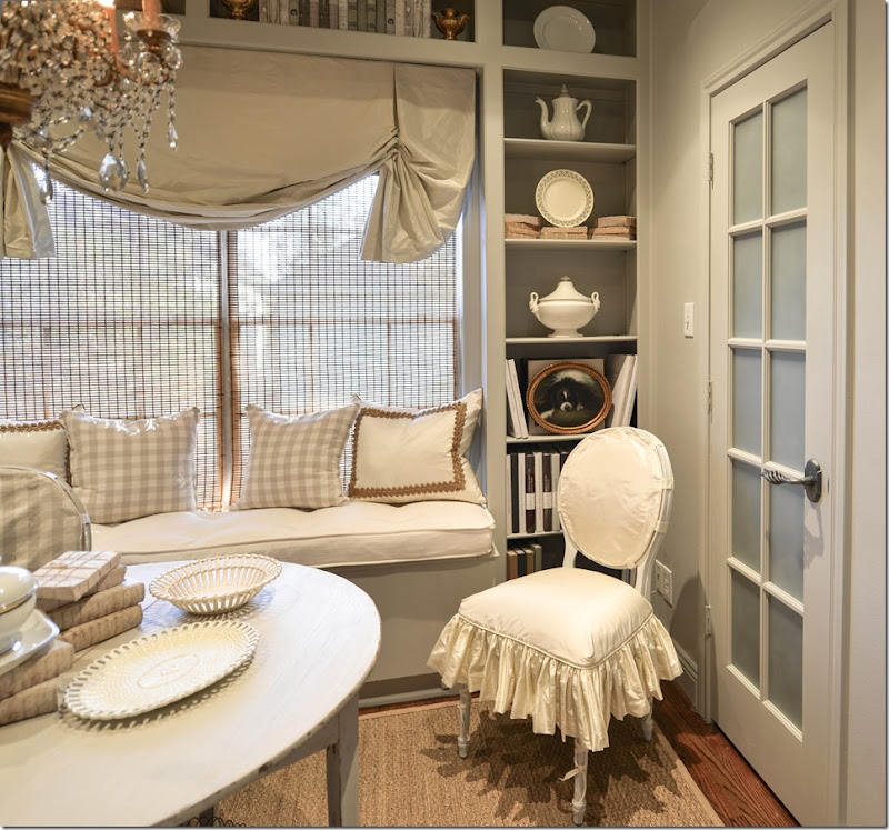
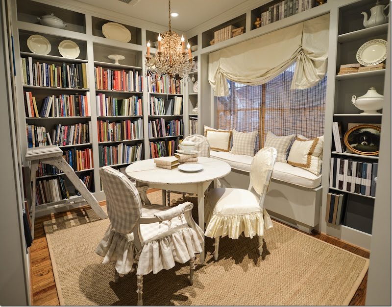
Here’s a picture of the space, with two painted Swedish chairs and a pair of demilune tables, along with a window seat.
And in another view.
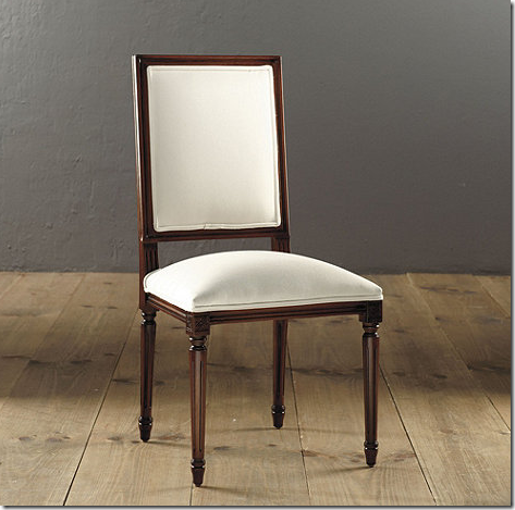
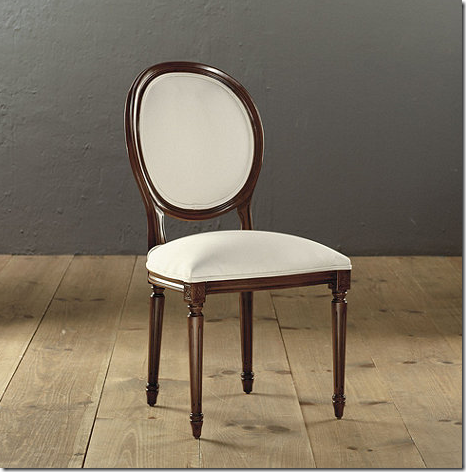
A few months ago, Ballard Designs contacted me and four other bloggers and invited us to enter the Louis Chair Challenge. Ballard would provide their Louis Chair and we were to decorate it in our own style, any way we wanted to. Ballard would paint the chair and upholster it with either their fabric, or our own fabric. I had just started on the library, so I was thrilled to be a part of the contest – knowing exactly where I would put the Ballard Louis chair! We had a choice of the Louis XVI oval back or Louis XVI square back:
The side chairs retail for $349 + depending on the fabric chosen. .
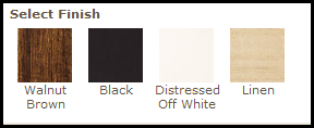
And they come in four finishes – walnut, black, off-white, and linen. These chairs are also available with arms and with nailheads in pewter or aged brass.
Ballard asked that we decorate the chair to fit our own style. And they asked that when we received the finished chairs, we take a picture of it and write a small story for their blog, Style Studio, explaining to their readers why we chose to do what we did with the Louis chair. Simple enough!
Of course I chose the oval back chair because I love curves in furniture. And of course, I chose to slipcover the chair, because that reflects my own personal style. But, after seeing all the other bloggers’ choices – I felt like I didn’t branch out enough and get creative enough!!! Always Monday morning quarterbacking!
My reasoning to slipcover the chair: I already had two very similar chairs in the room that were slipped in the checked fabric, so I chose to slip the chair in the silk taffeta that was on the windowshade so that the three chairs would blend together. I had Ballard paint the chair in the same gray that the room was painted in – but in a glossy finish. I asked them to upholster it in muslin and I would have the slipcover made by Hien Lam, as usual. My instructions to Hien Lam were to make as feminine a slipcover as they could, with a double ruffle on the seat, and ballet ties on the legs. Once the chair was finished, I snapped a few pictures of it and wrote a short paragraph for their blog! And, a few weeks ago, Ballard Designs showed all the bloggers’ chairs, along with their stories, which I would like to share with you today!!
It’s amazing how one simple chair can look so totally different with fabric and paint. I was in awe of the bloggers chairs. They showed a real talent for design – and they truly reflected each other’s individual styles.
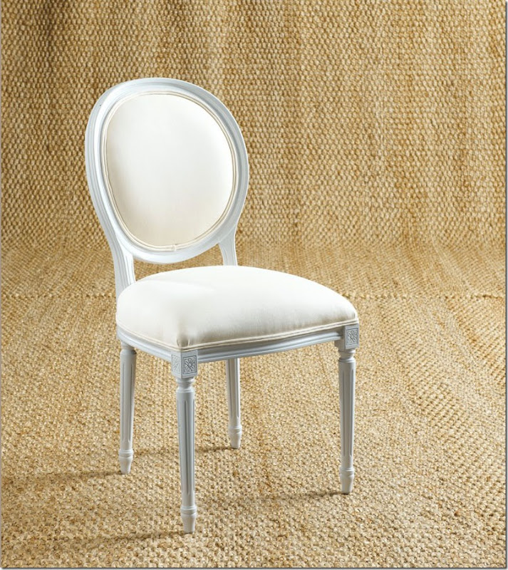
Here’s how my Louis chair came from Ballard. Painted in the same glossy gray as my walls and upholstered in plain cotton.
And afterwards, it wears a two piece slipcover with a double ruffle short skirt and ballet ties. I can keep it either here, by the window seat.
Or, I can pull it up to the table, if need be. Right now, I’ve been keeping it by the window seat.
I like it here – and I recently added a small pillow made exactly like the ones on the window seat with the gold trim. Here’s the paragraph I wrote for the Ballard Design blog:
My style is mostly casual. I mainly decorate with linens, velvets, taffeta and seagrass, and I use mostly slipcovers. So, of course, I wanted the chair to reflect my personal decor aesthetic.
First, I chose the round back chair because I love the curves of French furniture. I had the frame painted in a glossy gray paint, the same as the flat paint that is on my walls in the library. The chair is upholstered in a solid cream muslin. I had Hien Lam in Houston create a slipcover for the chair using two pieces. The round back is attached with a series of tabs, which allow the gray painted wood to show through. The seat is slipped in a short, double ruffle skirt for added femininity. Lastly, a bit of folly comes from the “ballerina” ties that run down all four legs of the chair.
When Ballard Designs contacted me about the Louis chair offer, I was thrilled and knew exactly where I would put the chair—in my new library! I recently redecorated my old office, turning it into a French/Swedish inspired library. It’s filled with shelves to hold all my design books in one place instead of scattered around my house. I painted the walls gray and added Swedish antiques. Along one side is a long window seat that sits under a silk taffeta shade.
In the library, the chair can either be pulled up to the table with the other two Swedish slip chairs, or it can sit in front of the bookcase. Either place, it looks wonderful and adds to the elegant sophistication of my ultra-feminine library.
Here’s a look at the other bloggers’ chair. To read the story at the Ballard Designs blog, Style Studio, go HERE.
The first blogger is CocoCozy:
And here is how CocoCozy’s Louis chair turned out! Sooo cute!!!
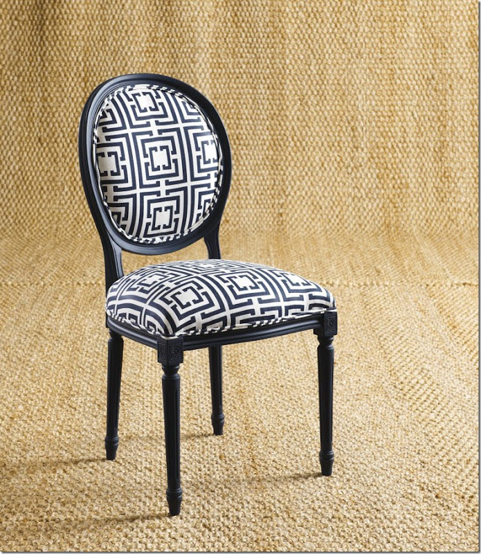
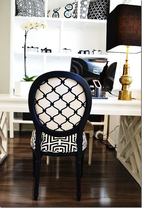
CocoCozy painted her chair matte navy and used two different fabrics from her own fabulous and chic fabric line! The chair went into her office. Adorable, right? Wow!!! It looks like it cost a fortune.
On the back, she used a different fabric. Soo cute!!
Here is what CocoCozy wrote about her chair design:
I would describe my chair’s style as “Modern Prep.” Navy is a classic preppy color—it is timeless, universal and exudes quiet sophistication. I know a glossy lacquer finish is very on-trend these days, but to be a bit off-trend and a bit more reserved, I decided on a matte finish. For the modern part, I went with graphic patterns in a crisp navy for upholstering the chair. I personalized the look by using fabric from my own collection: Logo on the front and Fence on the back. I thought the square pattern would contrast nicely with the curvy repeat pattern. I’m happy with the way it turned out!
I was inspired by my summer visits to Nantucket, a totally beautiful and completely preppy island off the coast of Massachusetts. Although I would not describe my personal fashion style as anything close to preppy, I love the vibe and feel on this little island haven. I also think the navy and white is very nautical, and last summer I spent quite a bit of time on boats and on the beaches in Nantucket.
Just last year, I moved COCOCOZY into a new office space in Beverly Hills. A very small, very tiny design office (did I mention the word small?) just a few blocks from the famed Rodeo Drive. I’m not done with office decorating yet, but with this chair I’m on the way. The chair is exactly what we needed in the tiny front office. It adds texture and interest to the mostly white office space. I like the way it works with our white lacquer fretwork table and the gleaming chandelier. Perfection!
To read more about the chair on CocoCozy’s web site, go HERE. And when you visit her web site, be sure to go shopping. Her fabrics and furniture are fabulous.
The next chair is courtesy of Erin Gates of the blog, Elements of Style.
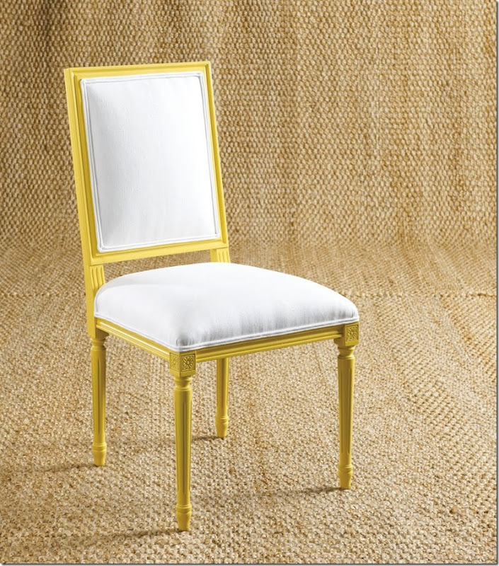
Eric chose the square back chair and had it painted a bright yellow. The fabric is white cotton.
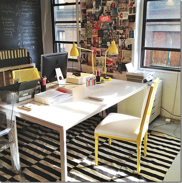
Erin placed her Louis chair in her office where the yellow and white is the perfect foil for all the black and white.
Here is what Erin wrote about her chair and why she chose it:
My Louis is traditional with a modern twist. I wanted a chair for the office that played off the yellow accents and the more modern Knoll chair my assistant has—but in a totally different style. I really think it showcases the variety of styles we decorate in. It sits at my desk and I love it!
Next up is Holly Street of the blog Things That Inspire:
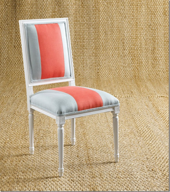
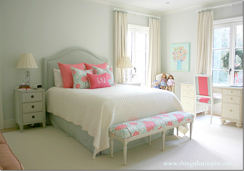
Holly’s chair was painted the same white as the trim in her daughter’s bedroom – where the chair now is.
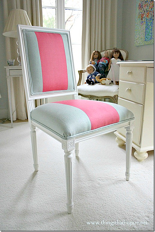
Here is the bedroom all in the aquas, whites, and hot pinks. Here you can see the back of the chair which also has a stripe!
And here is what Holly wrote about her chair design:
When Ballard contacted me about the Louis Chair Challenge, I immediately thought of the perfect place for the chair: my 12-year-old daughter’s room. Her room has been a work in progress for the past year, and we have gradually acquired many of the key furniture pieces in the room. However, we needed something that would inspire us to finish it, and the Ballard chair was the perfect thing both functionally, as her desk chair, and visually, to pull together the color scheme in the room.
The chair is both sweet and sophisticated—the perfect style for a girl on the cusp of her teenage years. The sweetness comes in the color scheme, aqua and a rosy coral, which are fun and youthful colors that look fresh and pretty together. The sophisticated aspect comes in the chic stripe, which is a great counterbalance to the floral pattern that is used in the pillows and on the bench.
The color inspiration was the fabric that was selected for the bed pillows and bench in her room. It’s a wonderful floral with the same aqua tones found in the wall and headboard and a vivid coral accent that provides the punch of color that my daughter requested. Keith Arnold of Suzanne Kasler Interiors (who worked on the interiors of the main floor of my house) came up with the design for the chair. The frame is painted in Benjamin Moore White Dove, the same color of the room trim, and an 8″ wide coral stripe in linen is set on a background of aqua linen. My daughter loves the chair! It pulls together the colors and style of the room beautifully and really ‘makes’ the room.
The blogger Habitually Chic was the fifth and final contestant in the Ballard Designs Louis Chair Challenge.
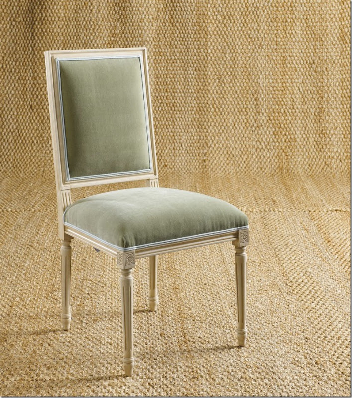
Heather of Habitually Chic chose a green velvet with the linen painted finish.
Ballard’s popular Apple Green Velvet was used on the chair.
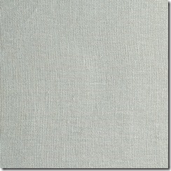
With Suzanne Kasler’s linen Mineral, used as the trim.
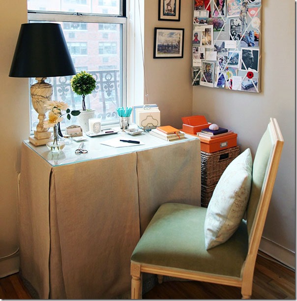
Heather of Habitually Chic didn’t write a story about her chair or her choices, so I’ll just make a supposition that this is her office at her apartment in NYC. The skirted table in linen makes a great desk – or side tables next to beds.
One chair: Five Designs – All Different! To read the story on Ballard Designs’ blog Style Studio, go HERE.
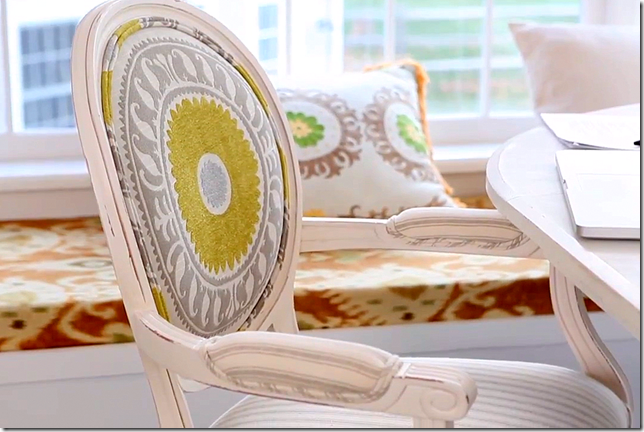
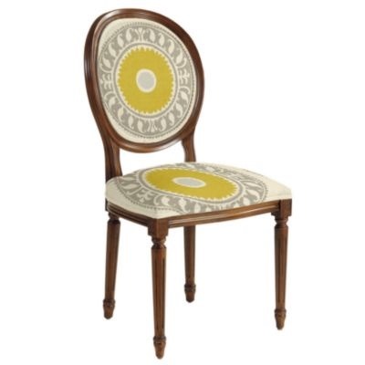
In another story on Ballard’s blog, the author Susanna Salk also designed a Louis Chair that is SOO cute! She used two fabrics – a gray ticking and a suzani.
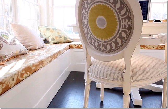
Susanna chose a suzani with a big medallion which she centered on the oval back of the chair – front and back.
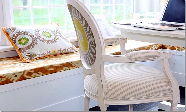
Next she chose a gray and white ticking stripe for the seat and arms. She bought some Ikat fabric by the yard from Ballards to make the window seat.
And now, she has a great office in the formerly unused corner of her bedroom! Love this chair!!!
Ballard showed the chair like this – but I think the way it was done with the white frame and the ticking stripe on the seat suits the chair so much better!!
To read this story, go HERE.
All these chairs reminded me of just how much I love the basic Louis chair. They make great dining room chairs and wonderful side chairs in living rooms and bedrooms. And with paint and few yards of fabric, they can make a huge statement in a room – or just be quietly elegant. But first, let’s take a history test – do you know how to tell the difference between a Louis XV and a Louis XVI chair? It’s really easy. Louis XV chairs have curves, Louis XVI chairs have straight lines.
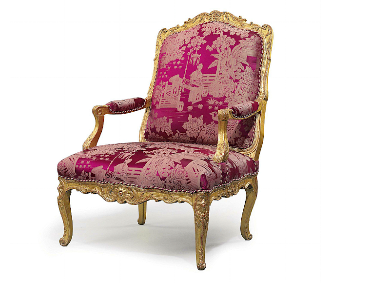
Louis XV Chairs – Rococo period is defined by curves and cabriole legs without stretchers. Think ultra feminine – straight lines are used only if needed for construction, otherwise all lines are curvy. Period Louis XV sold at Christie’s for $6,000.
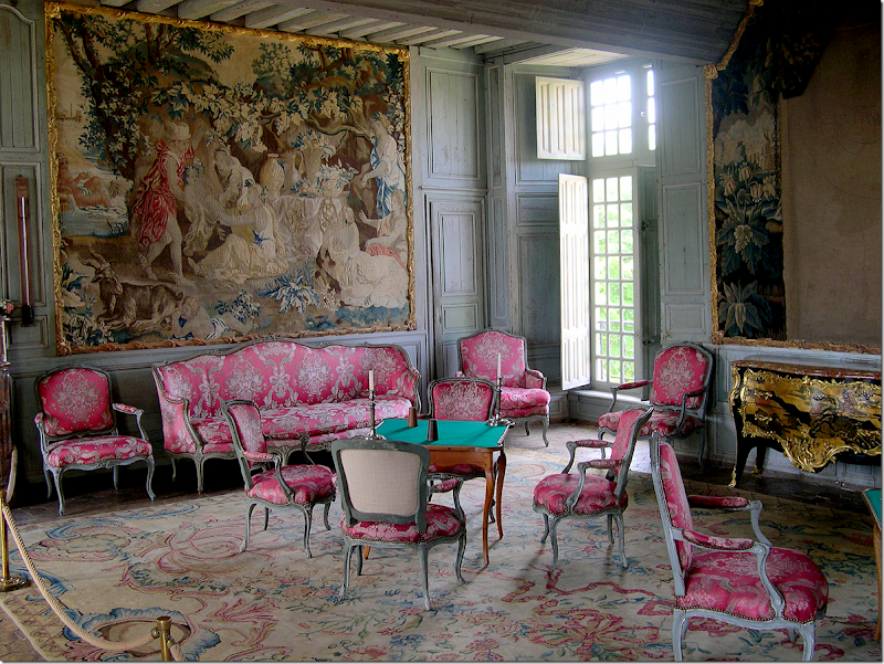
The Chateau de Talcy in France has a set of original Louis XV furniture – chairs and settees. Typical of Louis chairs – the front side is upholstered in a fine silk material, while the back of the chair is done in a less expensive, cotton plaid.
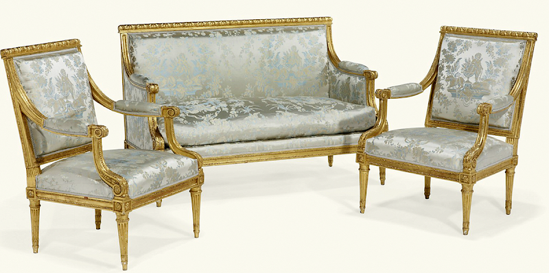
Louis XVI Chair – Neoclassical period is defined by straight lines and straight legs with rosettes where the legs meet the seat. The backs of Louis XVI chairs can be either square or oval. Think symmetry, columns, pediments, straight lines. Period set of Louis XVI – sold at Christie’s for $41,000.
.
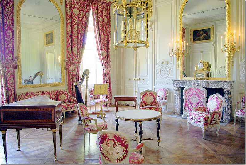
Petite Trianon with an assortment of Louis XV and Louis XVI chairs.
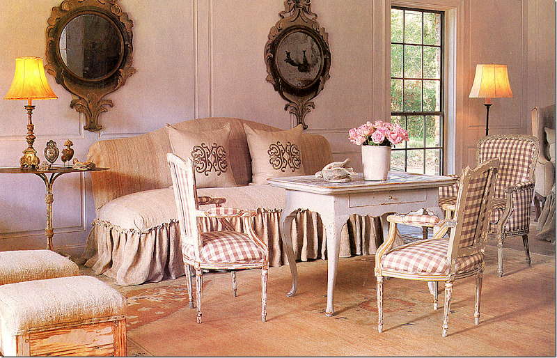
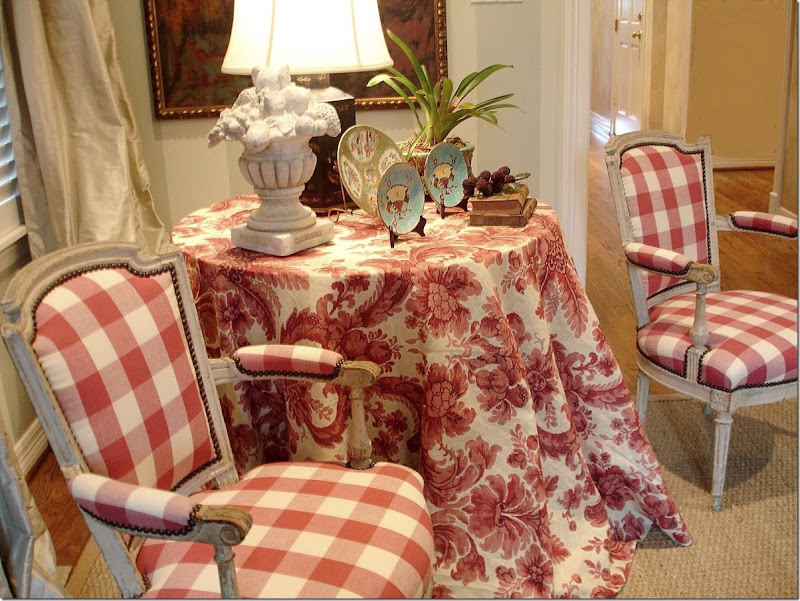
My favorite Louis chairs are like this – with a check linen fabric.
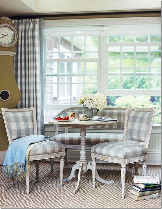
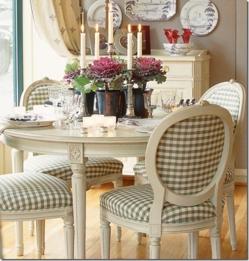
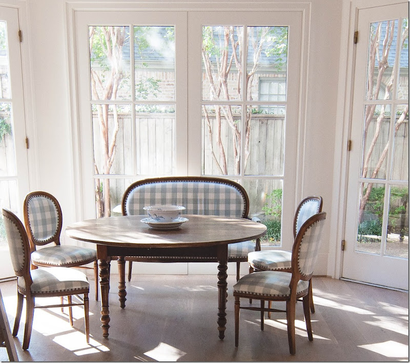
Louis XVI chairs with oval back in checks.
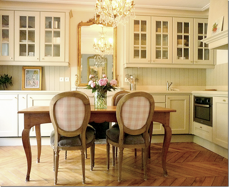
In this Parisian apartment – suede green seats with pink plaid backs. To rent this apartment, go HERE.
In this Houston house, a set of Louis XVI chairs and a settee sport aqua and cream checks and nailheads. LOVE!
Dan Carithers’ house – he put a blue and white check on the back with a striped fabric on the seat for an interesting combination.
Louis XVI chairs in checks. Ruth Gay and Pam Pierce Designs.
For this client, we used a rose check from Chelsea Editions – who else?
On the back of the chairs, I used a tiny check. I love when the backs are exposed like this. Makes them so interesting. We bought these chairs at Tara Shaw’s.
This contemporary Kelly Wearstler lime green fabric looks great on an antique Louis XVI chair.
Armless Louis slipper chairs are great in the living room since they are easy to pick up and move around as needed. Jansen chairs in blue silk.
A mirrored octagonal entry hall with a set of Louis chairs.
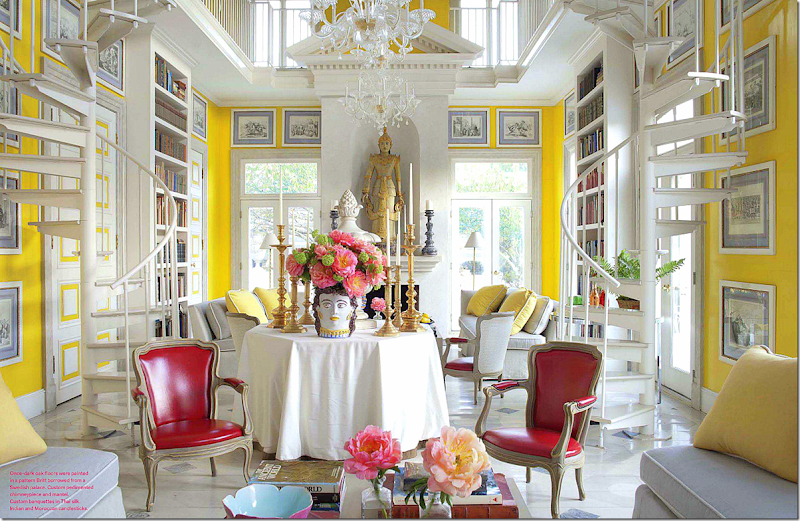
Louis chairs, like these Louis XV ones in red leather make perfect pairs to flank – here, there are two sets of chairs, each surrounding a skirted table which divides the room into two seating areas.
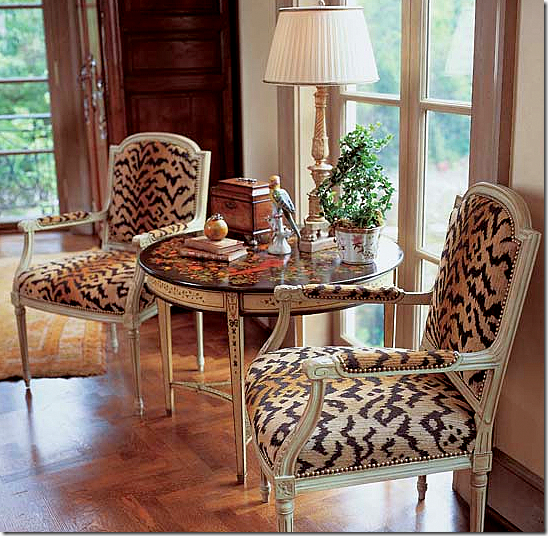
This pair of Louis XVI flank an antique table. The tiger pattern makes them look more contemporary.
Here, a set of Louis XV flank the sofa. Love that mirror!!
A pair of Louis XVI flanking a tea table – gorgeous! Thank you to Trouvais.
Louis XV chairs flanking a fireplace – another great use of Louis chairs.
And here again, flanking a fireplace are a set of Louis XVI dressed in Fortuny.
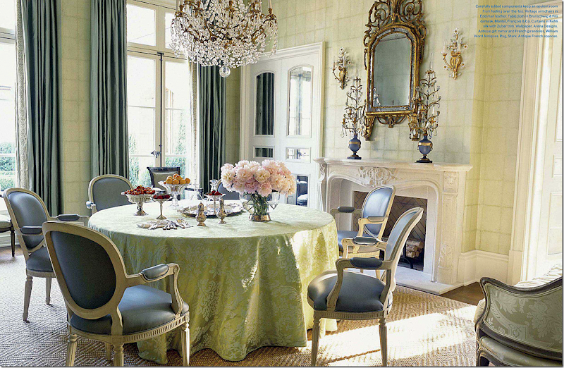
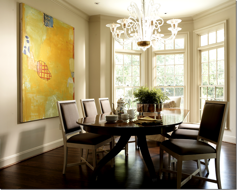
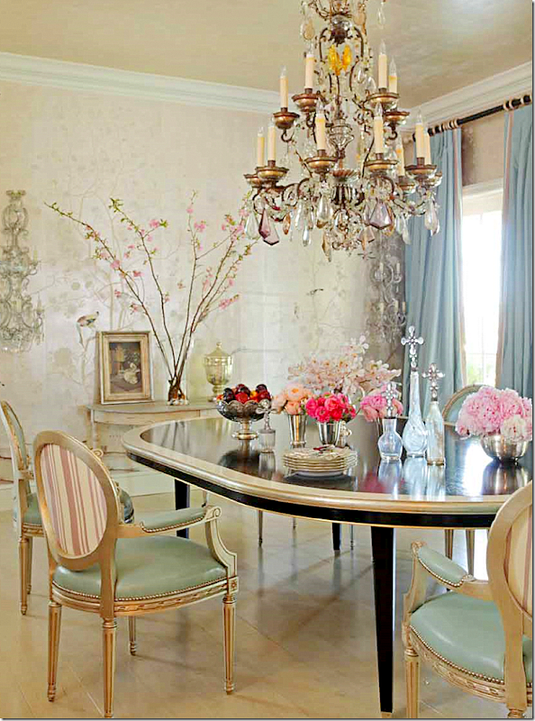
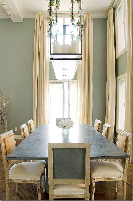
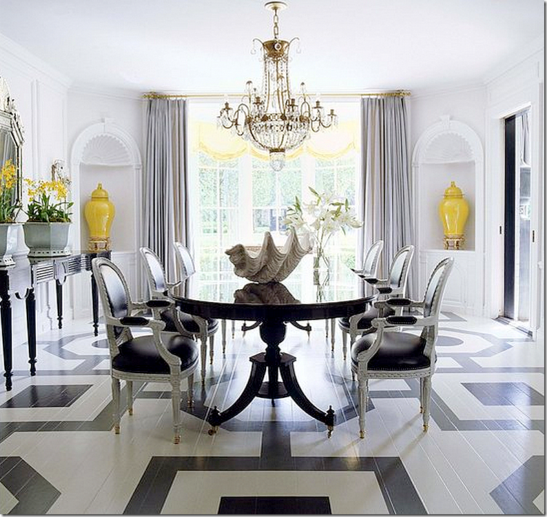
Louis chairs make great dining room chairs. In a French house, antique Louis XV chairs in light blue with nailheads. Beautiful.
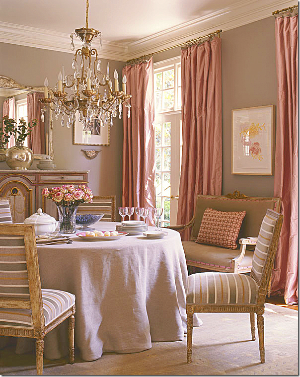
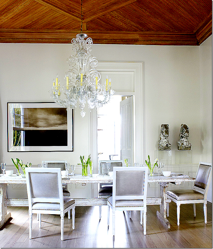
Antique French Louis XVI chairs with a contemporary stripe in Suzanne Kasler’s former dining room. So beautiful!
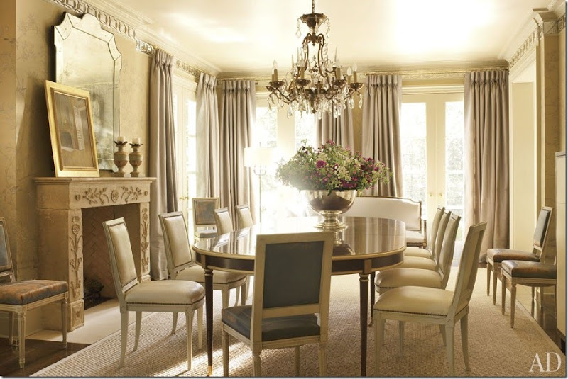
Today, Suzanne Kasler’s new dining room has a set of Louis XVI styled chairs in soft leather. The chandelier appears to be the only piece used again in her new house. Which dining room do you prefer? Then or now? Notice the blue leather chairs – those went to a client’s house.
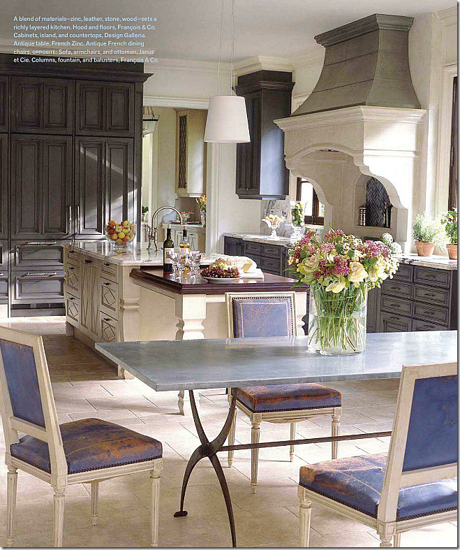
In Suzanne Kasler’s client’s house, the blue leather antique Louis XVI chairs are used in their kitchen.
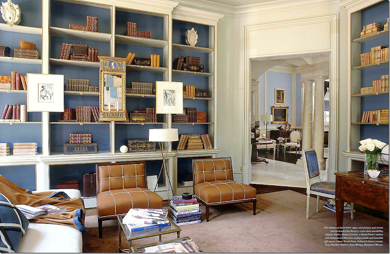
In the same client’s gorgeous library – one of the blue leather antique chairs is used at the desk. Most gorgeous library ever???? Maybe! And across into the living room, you can see another Louis chair. Some designers use this chair over and over again – and some never use it at all.
In the same house, Suzanne used blue leather on a set of vintage Louis XVI styled arm chairs. So pretty!
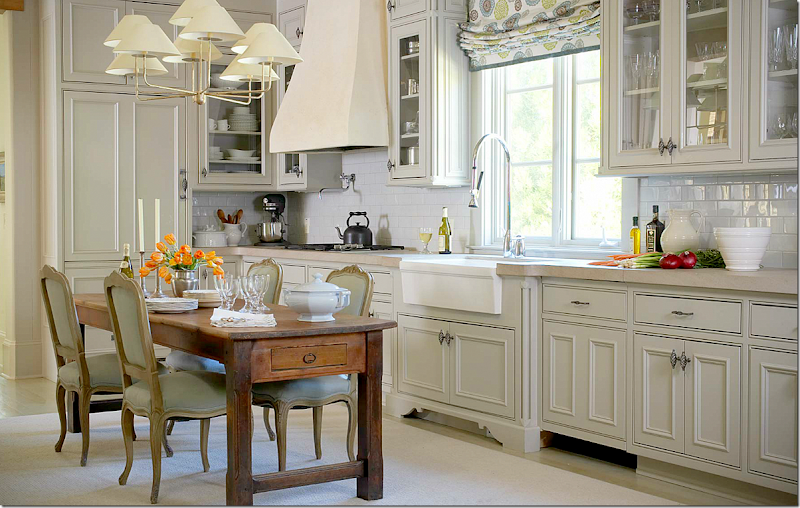
In another house designed by Suzanne Kasler, she used these Louis XV chairs around the island/table.
These antique French chairs are covered in a lilac linen. The backs were left exposed instead of covered which adds to their beauty. Pamela Pierce Designs.
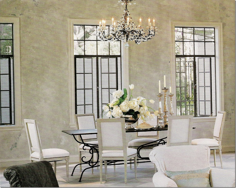
In this house designed by Babs Watkins, she used antique chairs with white fabric. Not sure what the fabric is – but this would be a good place to use leather or pleather to keep them clean.
In the same house, Babs Watkins used a set of dark stained arm chairs with more white fabric. Against the wall are additional chairs from the other room. This house designed by Babs Watkins is really such a pretty one.
Contemporary Louis styled chairs – the stretcher is an element that wouldn’t be present in an antique chair. Love the chandelier used here. Ashley Goforth Designs.
Martyn Lawrence Bullard used gilt Louis chairs with aqua leather and silk striped fabric on the back. Pretty combination.
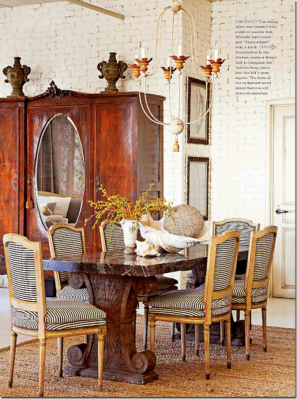
These antique chairs were left uncovered – muslin seats with upholstery nails, burlap seat backs.
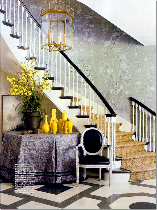
Mary McDonald used a set of arm chairs instead of side chairs and covered them in black leather.
In the same house, she pulled one of the dining room chairs into the foyer.
In New Orleans, Ann Holden used antique Louis XVI chairs with a metallic gray leather. If leather is out of your price range, be sure to look at the pleathers, they are a great, inexpensive substitute!
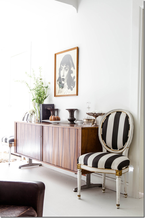
Black and white stripes give a contemporary edge to antique Louis XVI chairs.
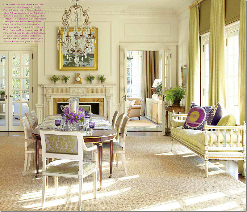
I love this dining room! Mixed with a Swedish daybed is a set of antique Louis XVI chairs in a green/gray damask. Notice they mixed in two oval back chairs with the square back ones.
Single Louis chairs, like this gorgeous painted antique Louis XVI make great accent chairs – in a bedroom.
Use a small gilt Louis XVI chair in the bath – as a towel holder! Eleanor Cummings
A single accent Louis chair at a desk. Gorgeous.
Contemporary styled Louis chairs with nailheads. Oly Studio made this raffia fabric look popular with their Hannah chairs.
The Oly Studio Hannah chair that started the popular nailhead/raffia look.
This popular image by Suzanne Kasler shows the Hanna chair in white and raffia with nailheads.
In this office, Ashley Goforth used two different contemporary styled Louis chairs – one with black leather and one with a black and white stripe.
Another contemporary look for the younger decorators. Love the modern next to the antique! HERE.
I tend to cover my Louis chairs with slipcovers – just like I did with the Ballard Designs challenge. I like the fact that you can clean the slipcovers which comes in handy with pets and children and clumsy adults. I think that I am really addicted to slipcovers. Once you have the ability to wash your upholstery – you get hooked on it. I might need a 12 step program to get over it because I really don’t see an end to slipcovering chairs and sofas. Nothing makes me happier than freshly washed slipcovers!!
These two Louis XVI chairs are probably the nicest chairs I have. I like to use the large scallop slip with the wide tabs on the back.
Are you a Louis chair lover, or do you tend to avoid them? They are definitely a feminine chair and may look out of place in a more masculine designed room. Louis XVI can better to use in a less feminine room since the lines are straight and not curved.
When I started this blog almost six years ago, reproduction Louis chairs weren’t easy to find. They had to be custom ordered usually from a wholesaler which isn’t the easiest thing for a non-designer to do. I can remember being so excited when I found sources for Louis chairs back then. Today – it’s all changed. There are the Ballard chairs, and Restoration Hardware makes great Louis chairs that start at $199!!! Between those two retailers, your Louis search is definitely easy. Wholesalers – Eloquence is wonderful – they sell reproductions and vintage chairs. I’ve bought a few chairs from them – including this vintage one:
From Eloquence – they have a great selection of reproduction and vintage chairs.
And finally, there is the Lone Ranger HERE – though his antiques and vintage chairs are from Sweden and not France – they have the same details and lines. You can buy from the Lone Ranger at antique fairs or online, like I do and I’ve never been disappointed. I’m a huge fan!! Plus, if you are looking for a Mora clock that won’t break the bank, check out his selection!!
Started with France and ended up in Sweden. How did that happen????
TAKE A LOUIS CHAIR CHALLENGE!
Advice From an Expert on Color
One of my favorite bloggers is Maria Killam who writes “Colour Me Happy.” Maria is a color expert who hails from Canada, hence her spelling of color with a “u!” Whenever I get an email from a reader questioning what color should she paint her front door to go with her brick, or something to that effect, I refer her to Maria, because I know her answer will be correct.
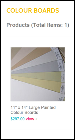
Colour Me Happy is a like a textbook of what to do and what not to do when decorating your house. She deals with all aspects of design, not just paint colors, but paint is her expertise. Last year Maria put together a selection of her fifty favorite Benjamin Moore paint colors and had them painted on very large 11”x14” sample boards. I have her kit and find it so helpful to use with clients. The large boards really give you a sense of what the color is going to look like when painted on the walls, and when you tape the boards up to look at them, you get a good sense of the undertones and how they will affect your space.Additionally, Maria has written an e-book entitled
The book explains how to choose one color over another and it explains the importance of undertones and why they matter so much when picking a paint color. Maria has used her system for 10 years and in the book, she explains it in easy to understand terms for the novice. The book can be downloaded as a PDF file, or to your Ipad or Kindle.Recently, Maria revised her book and added a large question and answer section based on emails she received from readers. To celebrate the newest edition of “How To Choose Paint Colors – It’s All in the Undertones” Maria has written a guest blog post today about color and natural fiber rugs, such as seagrass.
I hope you enjoy what Maria has written!!!Maria Kallam from Colour Me Happy writes:
Recently a reader emailed me this question, 'Do you consider natural fiber rugs to be neutral?' I thought about the answer to this question for a while. At first I thought maybe they could be like most hardwood floors which I do consider to be fundamentally neutral unless you have some wild 'look at me' stain on them. Also sometimes a natural fiber rug looks like it almost blends into the hardwood depending on what colour it is. However, you can't generally take a wood flooring and break it down into three beige undertones like you can with a sisal or seagrass rug. After all, a natural fiber rug does not read like a multi-toned wood floor. So that means that they cannot be considered neutral (maybe).
Here's another stack of sisal and seagrass rugs in varying shades of yellow and green beige except for the one on the bottom which is more taupy brown.
Next I'll identify the undertones in the following interiors and you can judge for yourself whether you think they are neutral or not?
In this image, a blue area rug is layered on top of the seagrass rug so you could probably choose any undertone for the rug underneath although this one in the green/yellow family relates really well to the undertones in the fireplace stone. Also the fireplace stone is visually the most important feature in the room as the furniture is all so quiet and neutral. source
Here the walls have a green beige undertone and the jute area rug has a pink beige undertone. Notice that the drapes and the pattern in the charcoal coloured chairs also pick up the pink undertone in the rug. sourceWould it look as cohesive if the area rug was suddenly gold?
The Reese Witherspoon ranch that Joni blogged about here has a pink beige jute area rug, however you can see that the same undertone is repeated in the drapes, the tufted settee placed directly beside the drapery on the left as well as the damask toss pillows on the sofa.
Here the seagrass area rug reads pink beige in this interior combined with mostly yellow beige furniture and walls.
In this living room designed by Jeffrey Bilhuber the seagrass area rug appears to have a pinker undertone than the pattern in the sofas, the chairs and ottoman. The room is so beautifully decorated and filled with so many interesting pieces to look at that the rug appears neutral here.
A space like a carpeted hallway without any furniture looks the best when you coordinate the colour with the walls like this one with the yellow beige sisal runner and yellow beige walls.
This chevron sisal rug has a green undertone and it's repeated in a very pale shade in the wall colour which looks like it could be a blue/green shade. Note that if the area rug was a yellow/gold beige or pink beige it would look odd if the neutral wall colour was not repeated.
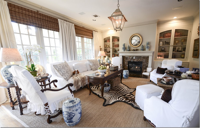
In this living room decorated by Joni, she repeated the green beige of the seagrass on the walls and with all the brown and white slipcovered furniture.
(and in a note by Joni: the ceiling will be stained in a week or two to a more grayish color, instead of the pink wood tones it is now.)
Here is Joni's family room with green beige seagrass and the same undertone is repeated in the wall colour and woven wood shades.
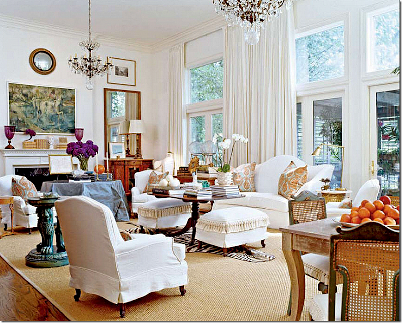
This interior which Joni compared to all others in her Top 10 Design Elements series, has yellow beige seagrass with all the white slipcovers. Notice that the accent pillows and fringe on the ottomans all pick up on the area rug with the same yellow/gold tones.
Bottom line, any item in a solid colour that is darker than white or cream is no longer neutral in most interiors. As soon as you're calling it beige or grey (neutral) instead of orange or blue (a colour) there's an undertone that you need to choose to work with or ignore if it works to do that.
JONI: I have something to add to the discussion of textured rugs and color! Of course! When seagrass is new, or young, it is often very green. As it ages, the green fades and it becomes more golden. So, don’t get nervous if you buy a new seagrass and it looks really green. One day soon, you will look at it, and will be much lighter and brighter.
Here are the 3 choices for downloading Maria’s book:
Maria’s book is the definitive book on how to choose paint colors. It was written specifically for everyone who wants to pick the right paint colors for their home and increase their confidence when doing so. Imagine after reading this book, you’ll be ready to…
Look at any home through new eyes,
develop a paint color plan and
pick the colors that will make your space sing.
Maria’s book cost $29.99, but for the next week, she has reduced the price to $19.99 for Cote de Texas readers. When ordering, put TEXAS in the code to receive your discount.
Order HERE.
And to order Maria’s Color Boards – 50 large paint samples, go HERE:
A huge thanks to Maria for this lesson in color and textured rugs!!! To read Maria’s blog, Colour Me Happy, go HERE.
AND IN VERY EXCITING NEWS:
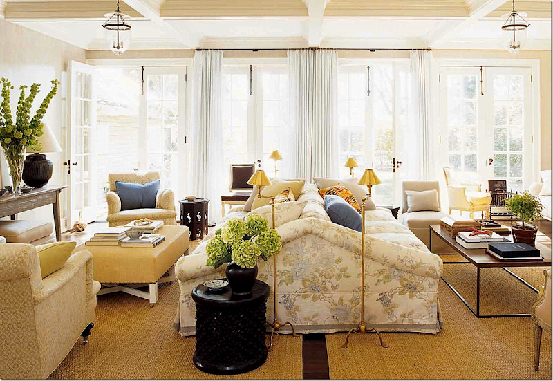
Houston Interior designer Sally Wheat, whose beautiful living room is pictured above, is going to be hosting a sale on One King’s Lane!
Sally sells her vintage finds and furniture on her web site HERE and at Memorial Interiors and Antiques HERE.Her One Kings Lane sale will be on Tuesday Jan. 22, 10:00 am CST. Be sure to mark your calendars !!!
The Milieu Mini-Mag
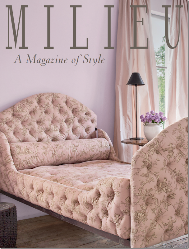
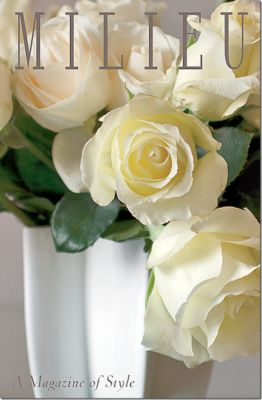
Could you just DIE from this cover? The gorgeousness of it?????
I told you a few weeks ago about a new magazine coming out soon – “Milieu.” The brain-child of interior design great Pamela Pierce, Milieu is set to be on the stands this fall. It’s been so exciting to watch the magazine come to life, started from an idea to become the real thing which you can hold in your hands.
Recently Pierce talked with me about her goals for Milieu. She spoke about quality design magazines of old. In those earlier days, a photo spread might be as long as 18 pages, with full sized photographs of such wonderful quality that the images leapt off the pages. Today, décor magazines show smaller pictures, rarely, if ever, giving a full two pages to one image. And, a photoshoot might be only 8 or 10 pages – 18 is unheard of now.
Then, there are the editorial descriptions that are written obtrusively over the photographs with dark and bold fonts, hiding the image behind the words.
Another concern is the quality of the paper. Speciality decor magazines once used the finest paper, so heavy and thick when the page was turned. But no longer, it’s a luxury that’s gone by the wayside. What a shame.
Pierce knows all this. She’s been featured many times in design magazines and she knows firsthand the differences in today’s magazines. When planning Milieu, she strove to bring back the lushness of the photography, the thickness of the paper, and the more in-depth stories with clean, single and double page photographs.
Milieu will contain wonderful photographs of interior design and gardens found in the United States and Europe. Additionally, there will be features stories on other subjects, such as jewelry and art. The operative word is quality in design, quality in product.
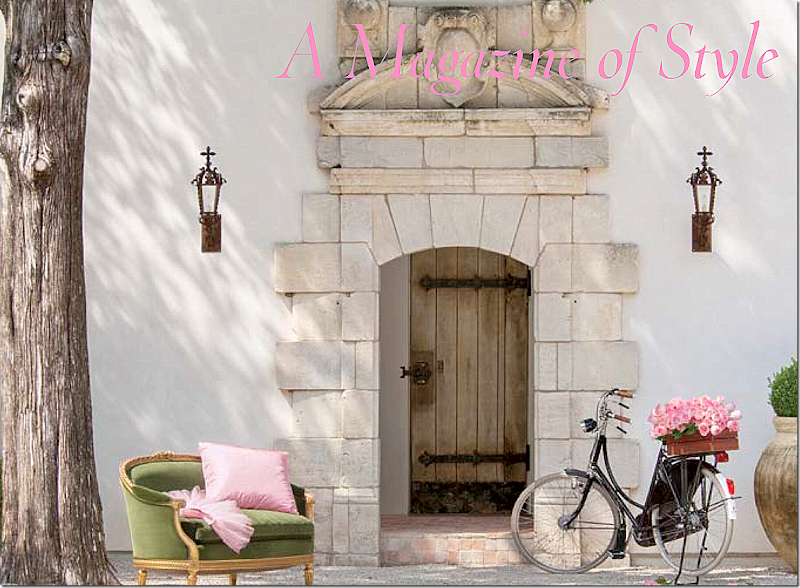
While the first issue is slated to debut this fall, Milieu has produced a “mini-mag” which is a small issue used to introduce the magazine to potential advertisers. Pierce is proud of the mini-mag and has graciously allowed me to show some of its images since it won’t be published.
One aim of Milieu is to always show houses that haven’t been published before. How many times have you paid for a magazine and then found that you’ve seen the house before? Milieu will show only fresh, never-before-seen images – which can be really hard in this day of web sites and pinterest and instragram. So, while some of the photos in the mini-mag have been on the internet, this will not be the case with the magazine. It’s a lofty goal, but one that Pierce will strive to accomplish.
Today, I am thrilled to share with you some of the photographs from the Milieu’s mini-mag! I hope you will enjoy them as much as I did!
1. The Schatte Residence:
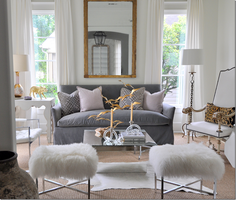
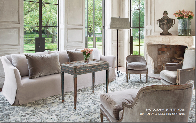
This gorgeous house in the museum district is the home of Andrew and Annette Schatte. Annette is a well know antique dealer. Here, in the living room, the sofa is Belgian inspired and the rug was custom made with silk and metallic threads. Standing, is a iron floor lamp with a rectangular shade, a trademark of Pam Pierce.
The house is stunning and its position across from the Museum of Fine Arts is even more impressive. It is made of stucco and was built with antique architectural elements in a blend of the classic and the contemporary. Notice the wonderful stone mantel and the paneling. And also be sure to notice the steel doors and windows that overlook the fountains on Montrose.
In the powder room, notice the gorgeous antique doors, painted a soft French blue. An antique stone sink is set into the wall where a single faucet looks so chic. Hanging above is a Louis XVI gilt mirror.
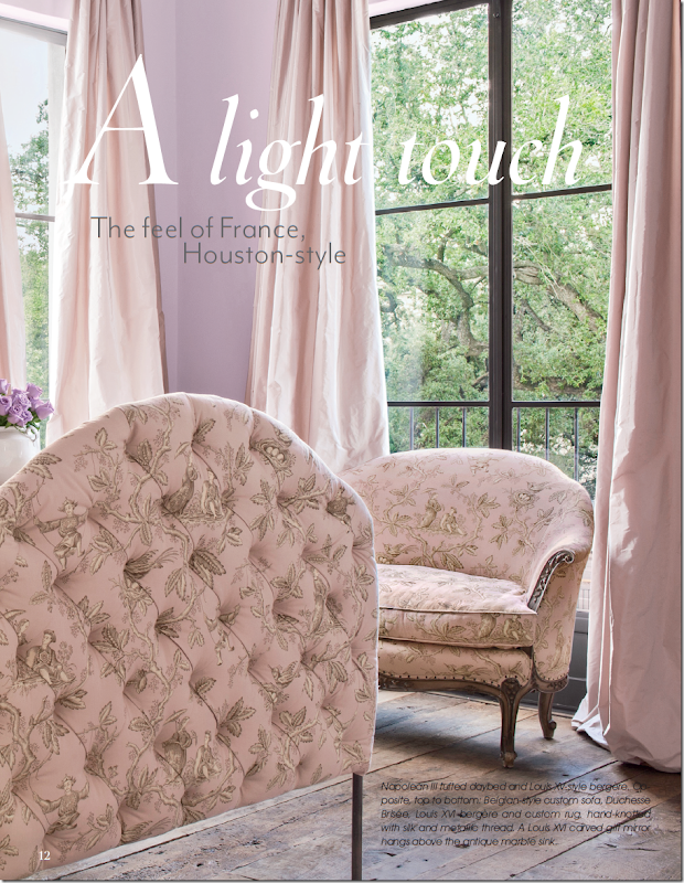
And another photograph from the guest bedroom, with the Napolean III tufted bed and a Louis XV style bergere, wearing my favorite oriental toile fabric! The curtains are a blush silk taffeta that are simply gorgeous. Also, notice the wood floors.
The homeowner, Annette Schatte first became known to design lovers when her former house on North Boulevard was decorated by Babs Watkins and photographed for Veranda. I always say that that photoshoot of the North Boulevard house was one of two houses by Watkins that were the start of the “Houston Look.” Schatte has a beautiful eye for design and antiques. She teamed up with Watkins to open an antique shop – Watkins Schatte - that became THE place to buy one of a kind antiques from Europe. Schatte later opened her own shop further down on Bissonnet, where she continued importing the finest pieces, introducing Houston to the light and painted woods that are now so popular. She sold her shop to Margaret Naeve, and today she offers her antiques at 2620 and on the internet HERE.
The Jane Moore House:
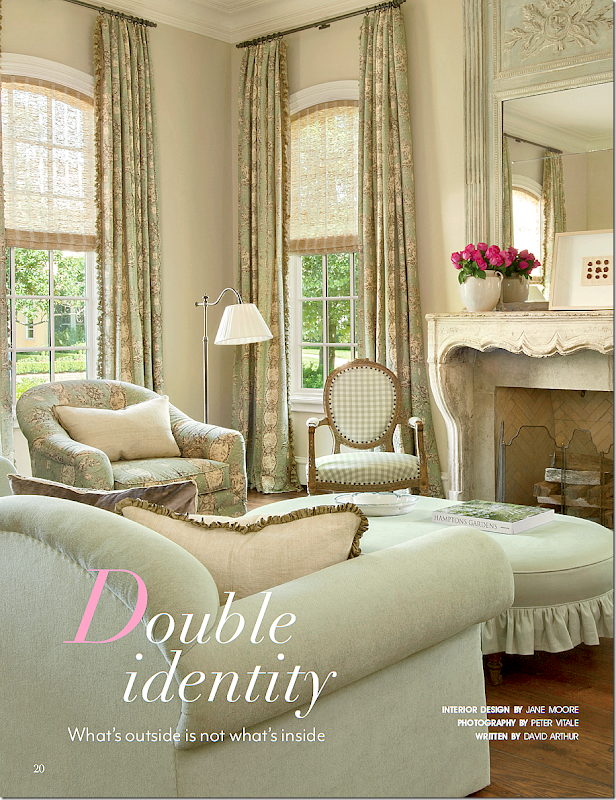
The second house is located in River Oaks and was designed by Jane Moore, whose own townhouse was recently featured in Veranda. This house has a classic Georgian exterior, but the interiors are a mix of French and Swedish design. The living room has a beautiful antique stone mantel with lovely toile and check fabrics in green and khaki. The trumeau is so pretty!
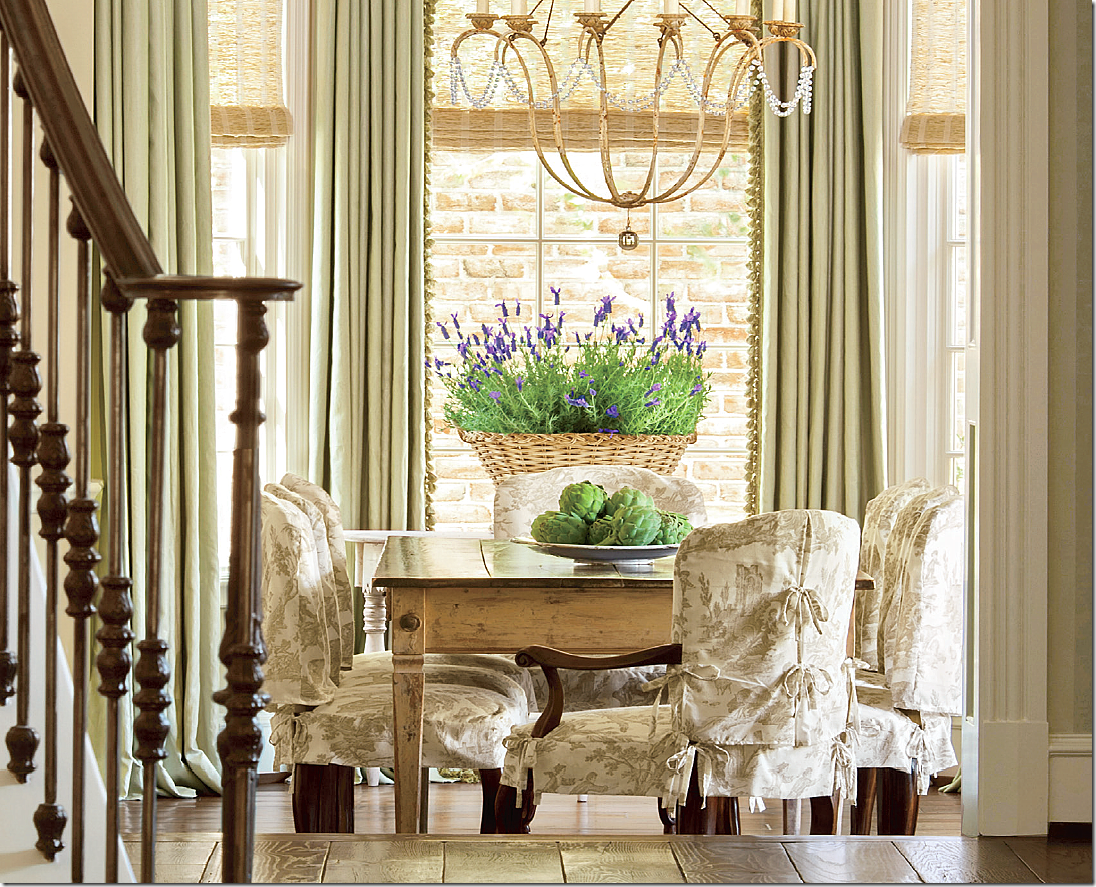
The dining room was made more casual with chair slipcovers made of linen toile. The ties are such a charming touch.
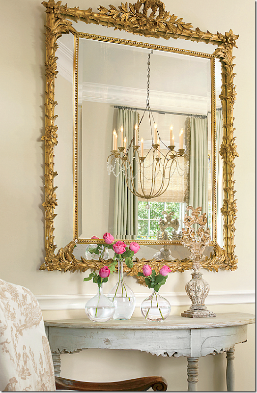
The dining room chandelier is reflected in the mirror above an antique Swedish demi lune. I love Jane’s aesthetic so much. Such beautiful photography by Peter Vitale.
Santa Fe House:
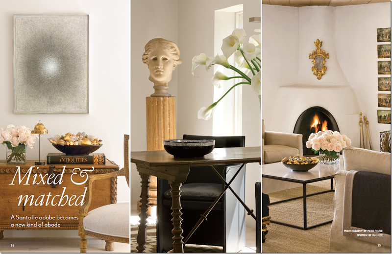
The third main feature of the Milieu mini-mag is a renovated Santa Fe house. Here, in a two page spread, three vignettes of the family room are shown. The house is a mix of contemporary pieces, such as the coffee table and art work, and fine antiques, such as the Spanish desk.
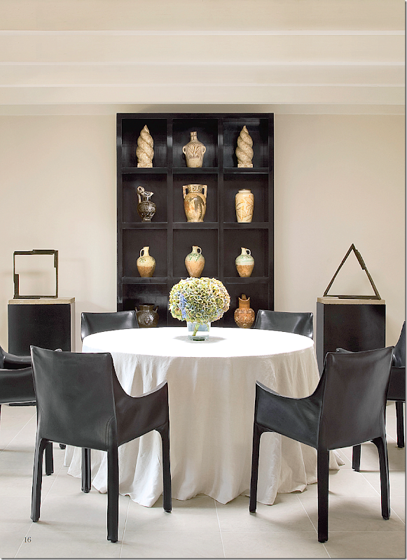
The dining room is an eclectic space, with a linen covered skirted table and modern sculptures.
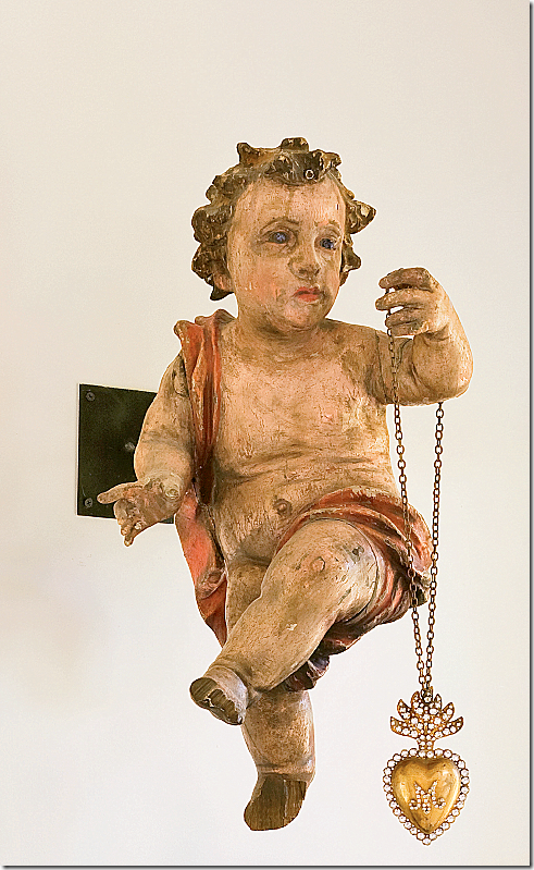
Hanging on the dining room wall is an antique cherub with a dangling necklace.
I hope you have enjoyed this small glimpse of the Milieu mini-mag. I don’t know about you, but I can hardly wait for the first issue this fall! If the magazine is anything like the mini-mag, it will be incredible!!!
For questions about advertising rates, please go HERE.
And, for information about subscriptions, please go HERE!

