OK. Ready for some fun? Well, it’s fun for me! I thought while the Final Four was going down, I would host The Final Three. I searched HAR (Houston Assc of Realtors) for about three days looking for three houses that were really enticing. Searched for three days – over and over again – looking at the same houses until I thought my eyes would fall out. And whew!!! What a bunch of stinkers are for sale right now! I mean, seriously, does anyone hire an interior designer in Houston?
Usually there are a plethora of interesting houses decorated to the nines, up for sale – but not now. What is going on???? If you are looking for a house in Houston right now, good luck!
I finally found three houses that are really interesting to play along. You know the drill. Look at each house and decide which one is your favorite. Come back and leave a comment telling us which you liked, or didn’t like. Be nice though – please!!
I tried to find three very different looks to choose from. One house is Mid Century Modern Chic. The second is European Minimal and the third is Masculine Classic. Care to guess which is my favorite?
Also, at the end of today’s story – I’m going to preview a HUGE contest that is going down SOON!!! So be sure to read to the finish!
OK – Ready to play?
HOUSE #1 Mid Century Modern Chic
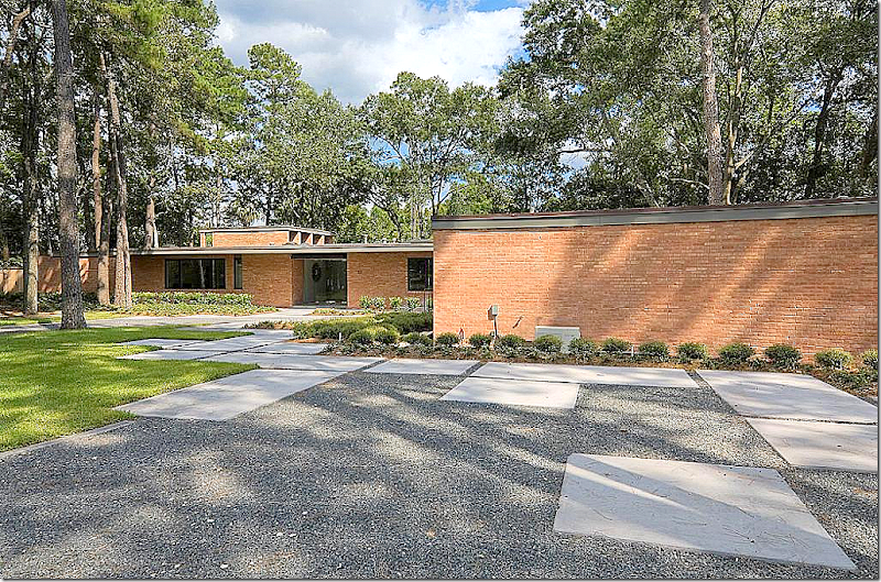
The first house is a mid-century modern which was extensively renovated by the current owners. It is located on the bayou – Houston’s only “view.” Trust me – a house on the bayou is a real treat in pancake flat H-town.
I know I rarely show mid century modern, but at this point – if you can’t beat ‘em, join ‘em. A bit of a joke, but the Millennium set really likes this style. And if all mid century modern looked like this house, I would love it too.
The house was built in 1960 – an almost true mid century modern. Flat roofed – the landscape is minimal, with large blocks for walking placed on top of dark gray gravel.
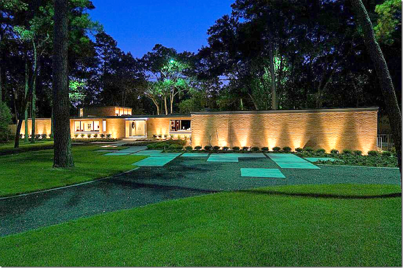
The same view – at night.
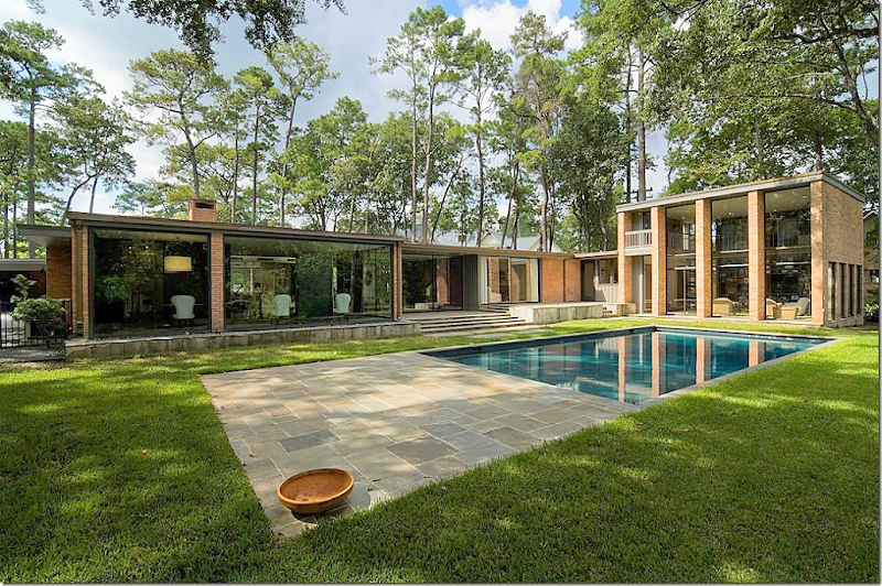
And, the back of the house – L shaped around the swimming pool. The large two story family room was – I believe – added on at a later date. The living room and dining room are seen at the very left. The bedrooms are at the right – before the right angle at the family room.
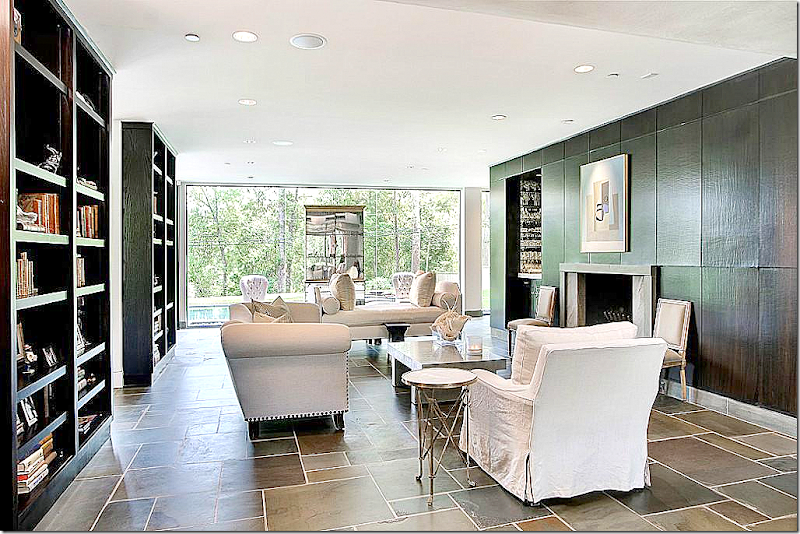
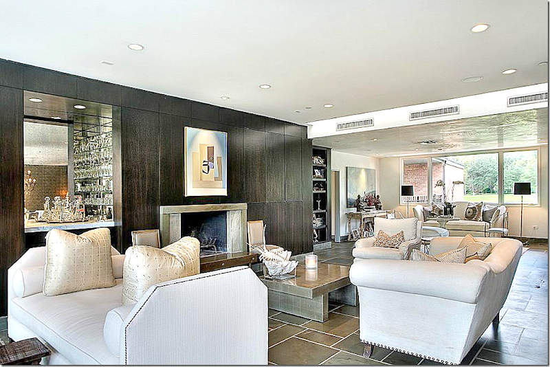
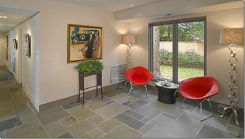
Inside – the large living room overlooks the back yard pool, and further back, the bayou. Here, bluestone covers the floors. The paneling is stained black. On the right is the fireplace and wet bar. Behind the bar is the breakfast area, while the main dining room is to the left of the living room.
The view towards the other direction – the front of yard. There is another sitting area in this part of the room.
The front sitting area. While the house is mid century – the furnishings are a mix of antique and classic.
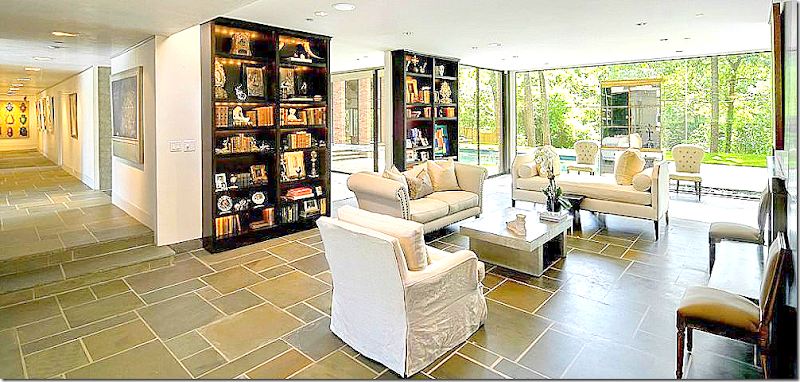
The living room – with the bookcases lit. Towards the left is the main gallery hall that leads to the bedrooms and the two story family room. The dining room is past the two bookcases.
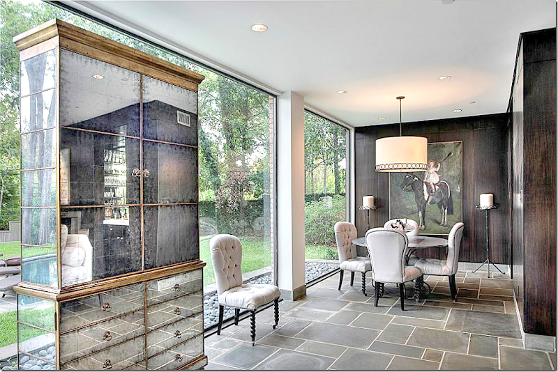
The smaller breakfast room, past the wet bar.
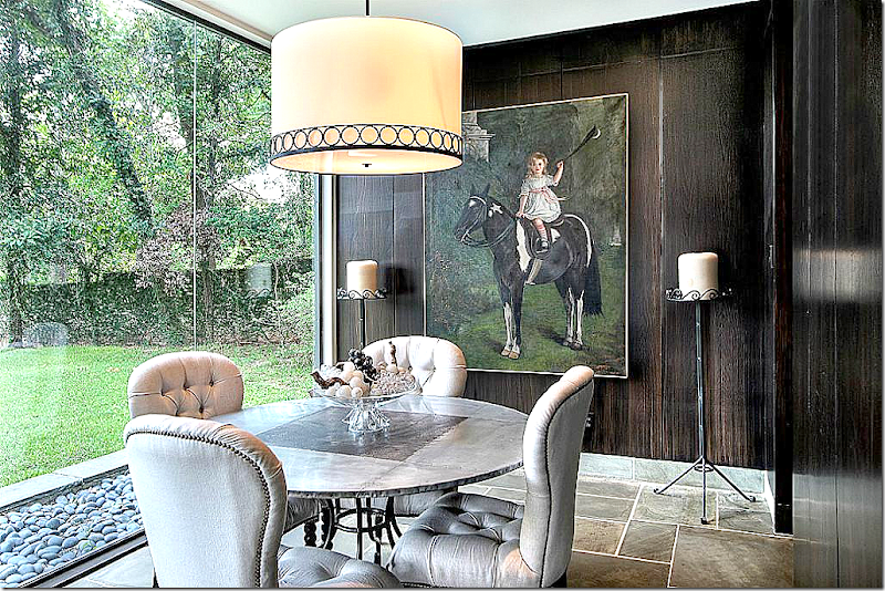
Closer view of the zinc top table, tufted chairs – and the fabulous painting! Love that so much. Through the door at the right is the kitchen. Notice the river rocks that flank the house on the outside – instead of bushes.
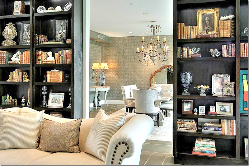
A glimpse of the dining room through the shelves.
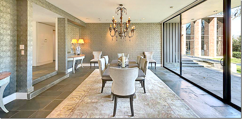
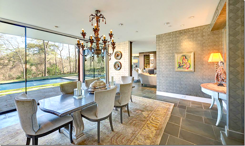
The sunken dining room with contemporary wallpaper. Swedish styled demilunes are used on either side of the gallery hall opening. Beautiful light fixture. Through the window you can see the two story family room.
The view into the living room.
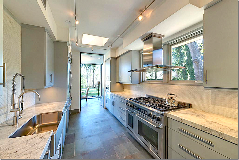
The totally renovated galley kitchen with wonderful appliances. Through the door is the breakfast area in the living room.
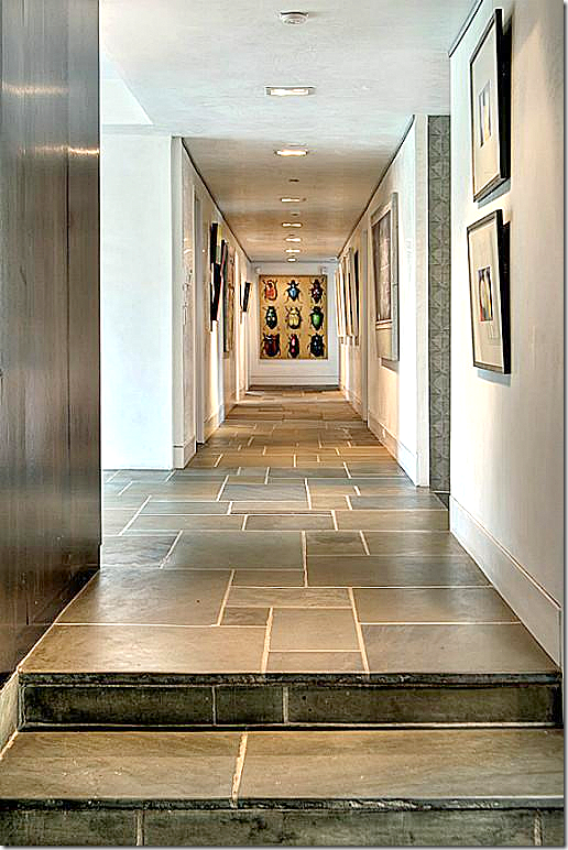
The gallery hall – that leads to the family room. The master bedroom is on the right at the end of the hall.
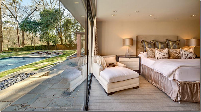
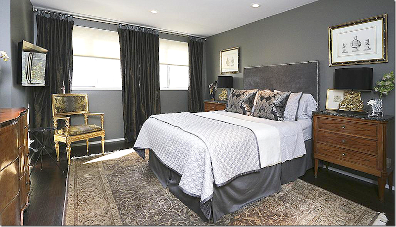
And – here is the master bedroom, in sophisticated colors and furnishings. It overlooks the pool and bayou.
A closer view of the bedroom view.
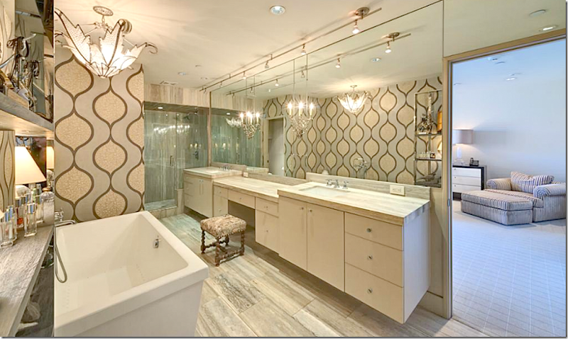
The master bathroom – totally renovated. Notice the light fixture over the vanities.
A guest room with wallpaper and a wonderful light fixture.
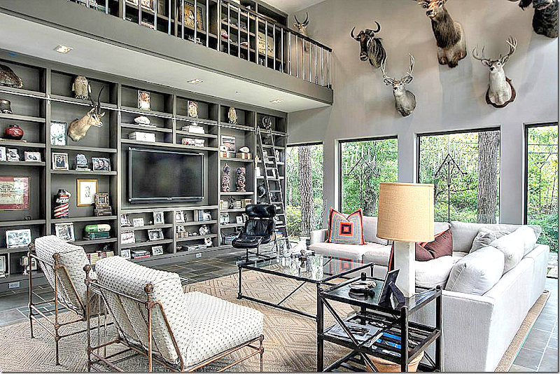
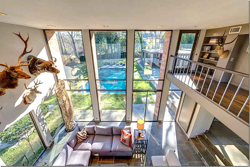
The two story family room – decorated with trophies from hunting trips.
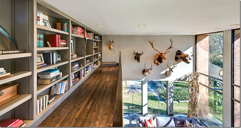
The view of the shelves – and the gallery upstairs that surrounds it. The room is painted the same as the rest of the house – and the shelves are black also – for design continuity.
The view of the swimming pool. At the right are the stairs that lead off from the gallery hall.
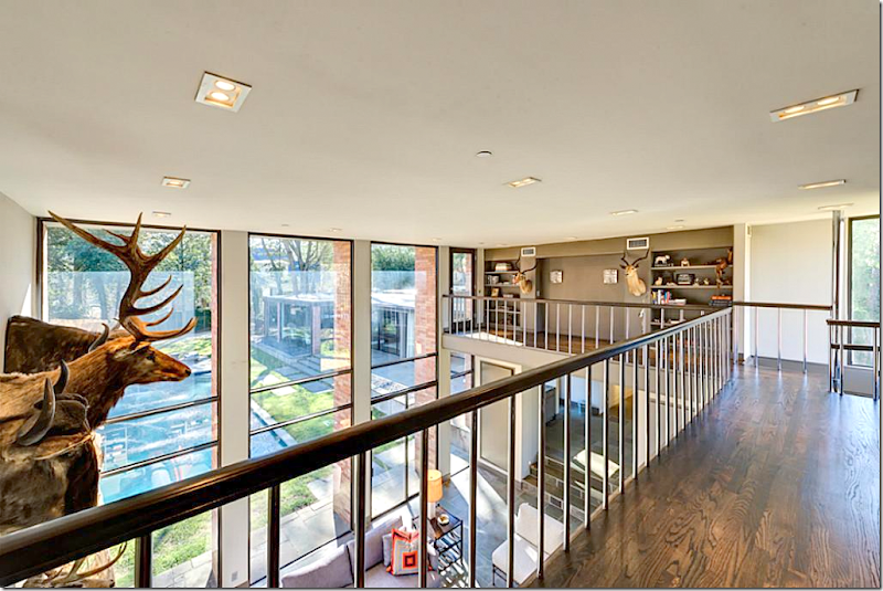
View of the shelves and landing on the second level.
One other view of the landing.
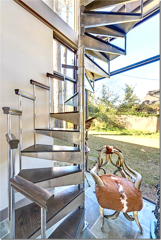
The spiral stairs that lead to the gallery – made of the same wood as the shelves and steel.
A guest bathroom.
A seating area – at the end of the gallery hall by the family room.
And, there it is – House #1 – Mid Century Modern Chic
Now on to
House #2 – European Minimal:
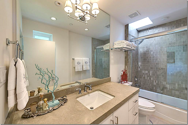
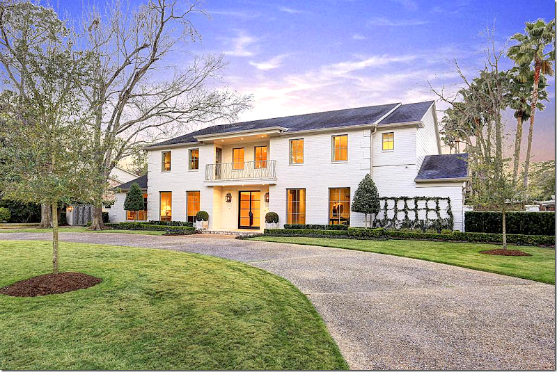
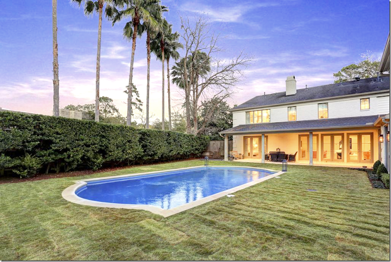
European Minimal is a large house, completely and totally renovated two years ago. The house was originally orange brick, but it is newly painted trendy white, with a new steel front door and new windows all over, including a new balcony railing over the front door. The house has new European styled landscaping – minimal box and gravel.
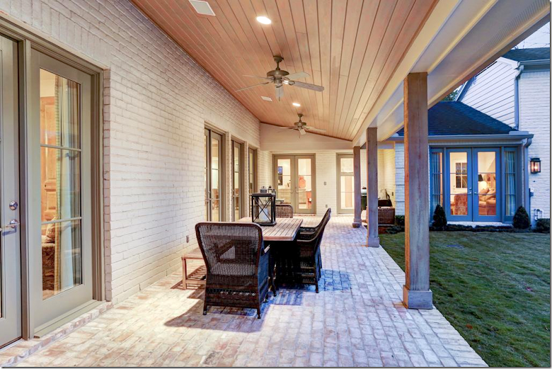
New brick porch out back and all new French doors.
European styled pool – with no tile surround.
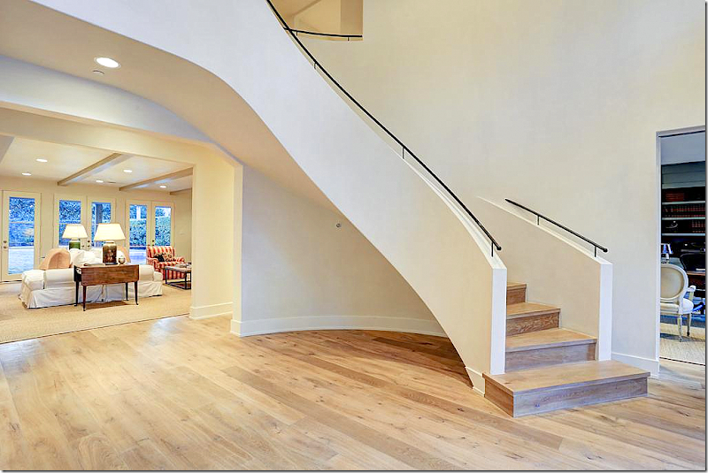
The walls are white, the floor is bleached. The new staircase looks like a modern sculpture. The large entry has a living and dining room to the left, a study to the right, and the family room to the back.
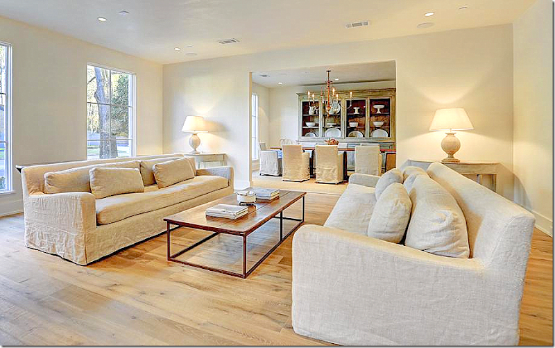
Simple overscaled slipped in linen sofas with a decidedly Axel Vervoordt styling to them. Simple demilunes, painted – with lamps adding the decorative accents. European minimal styling at its best.
The look is quiet, serene, calming. The shapes and finishes become the stars and the focal points, rather than paintings and accessories.
All trim has been removed from the house – crown and around the windows and doorways. Everything was taken down to the basics.
I don’t know who decorated this house, but I can guess the finalists.
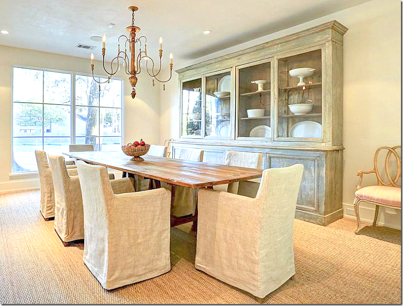
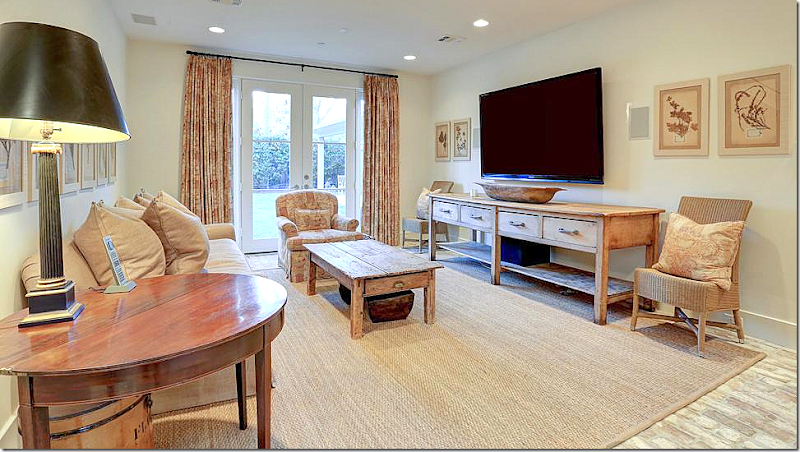
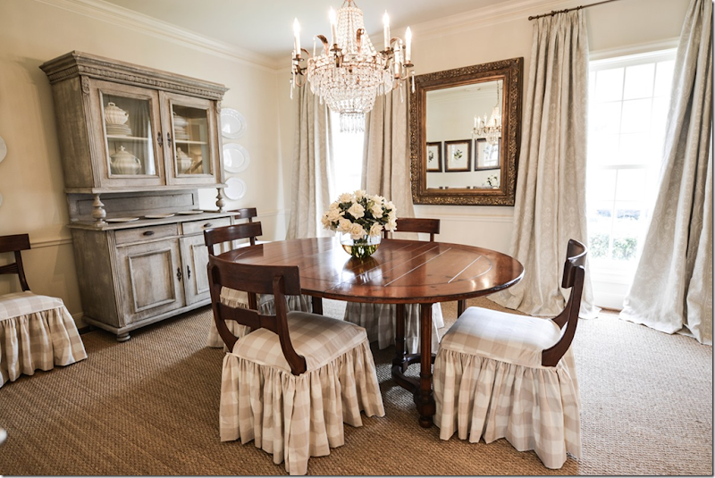
Simple elegance – slipped linen chairs, rustic table, a gorgeous china cabinet filled with creamware. And then … I love the touch of the fancy chairs with pink sink fabric.
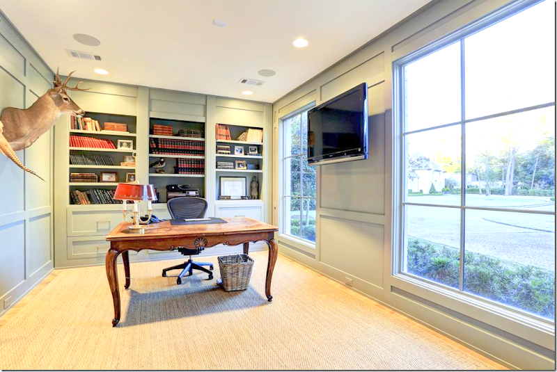
To the right of the entry way is the office – painted a soft aqua. Simple with a few trophies on the wall.
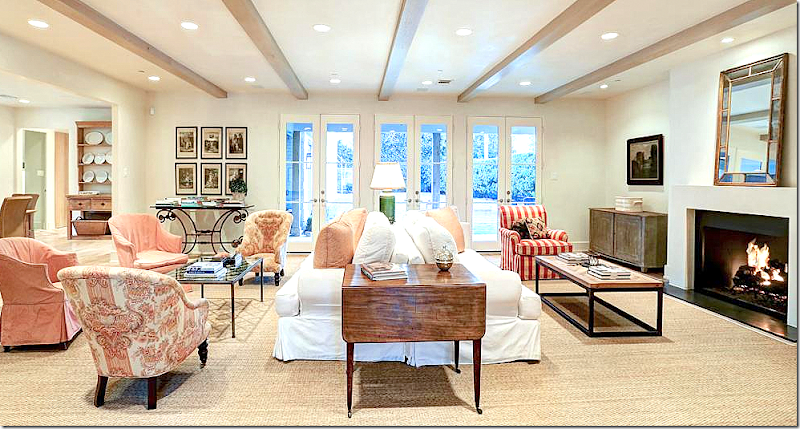
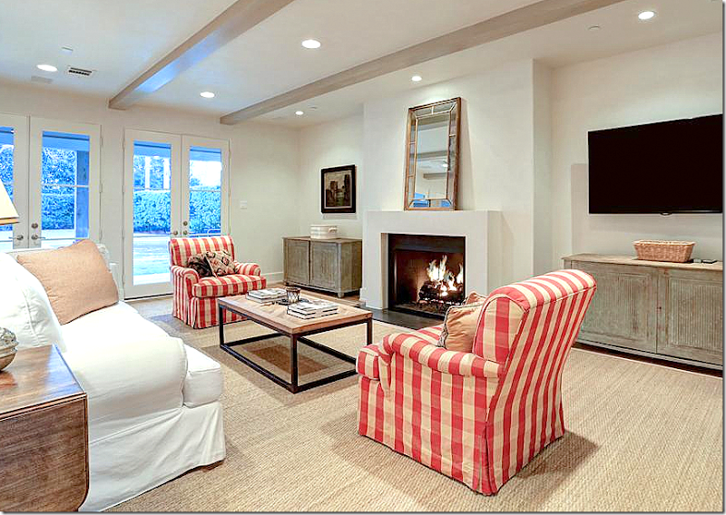
The family room is my favorite – with pink and red toiles and linens and checks. The back to back sofas in white make a large room smaller and cozier. The fireplace was redone with a sculpted mantel. I love the two antique chairs in the pink toile. I just love this room!
And here is another view – showing the kitchen. In this room – a few dark antiques were mixed in, along with prints and oils.
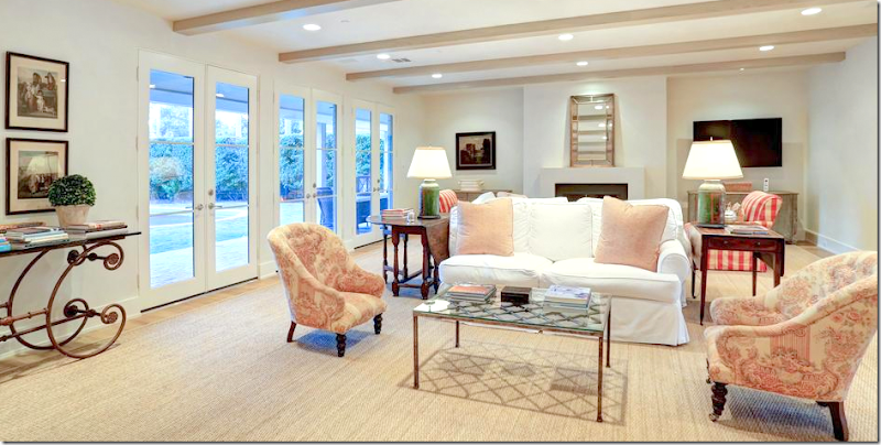
Painted Swedish cabinets provide just a touch of subdued color. Large, custom cut seagrass adds texture and more soothing color.
Looking the other way. Notice the lamps with their green color.
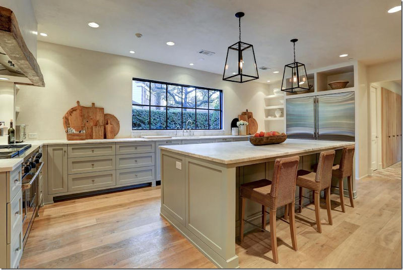
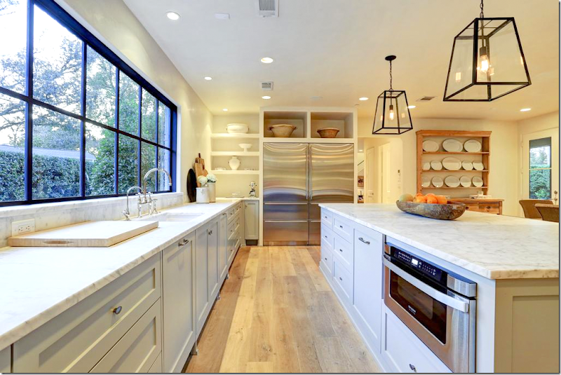
The kitchen area is totally new – completely renovated. It’s open with all lower cabinets only – all painted a soft aqua. The light woods blend in with the rattan chairs. Love the white platters.
Looking towards the family room. Love the wood beam over the range. Marble counters.
Trendy antique breadboards – the newest must have accessory in the kitchen. The kitchen is simple, but chic and luxurious and very European/Belgian in feel.
Double refrigerator. Love the large shelves above it. Perfection.
This built in cabinet is so pretty - simple Shaker cabinets, padded feet, marble counters – and a pretty collection of creamware.
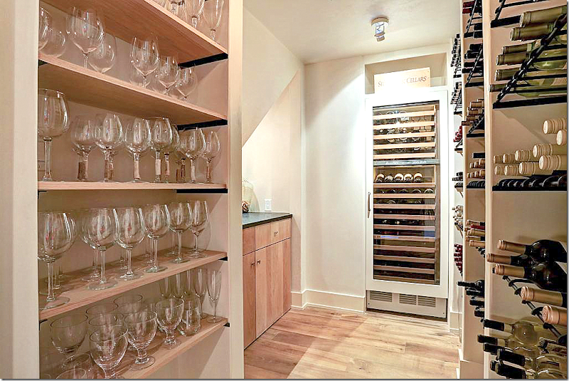
Even the wine cellar is simple, but elegant. No gaudy faux Italian iron gates. Just pretty wood shelves and plain glassware.
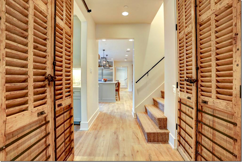
Past the kitchen - antique shutter pantry doors, seagrass stairs.
Beautiful brick floors, whitewashed – in the back study. Pink toile linen mixes with pine furniture and herb prints.
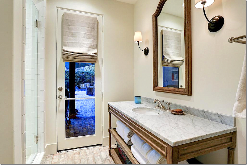
At the back is the pool bathroom. I suspect there was brick flooring in orange that they painted white. Maybe. Regardless, I love the brick floor for a change – I even think it would have been beautiful in the family room and kitchen too. Antique styled console with marble.
Upstairs – this feminine bedroom in blue and white toile with benches. Mirrored nightstand and trendy crystal fixture add some sparkle. Soothing green walls.
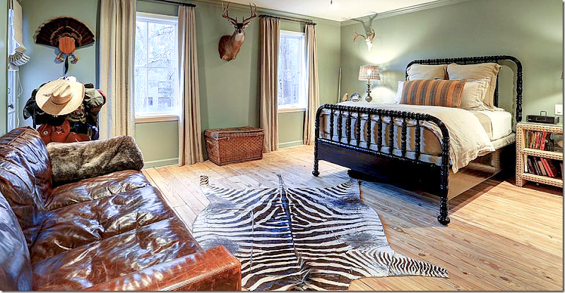
A boy’s room with leather sofa and zebra and wood floors.
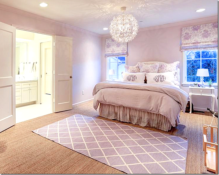
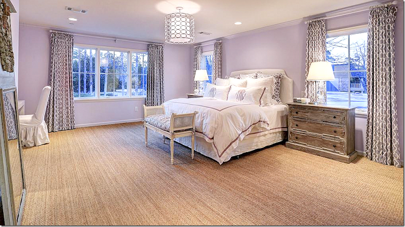
This girl’s room is perfect in lilac!!!
And one other girl’s room in lilac.
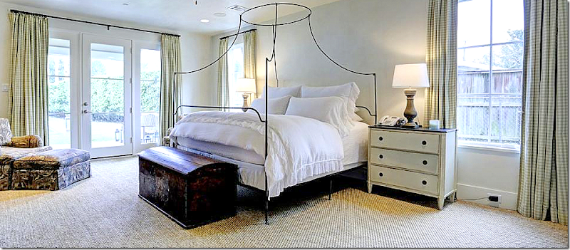
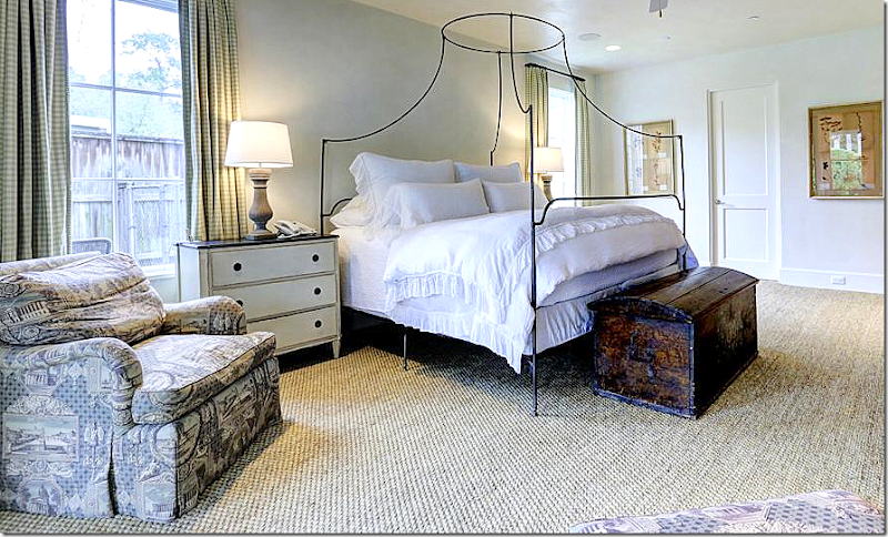
The master is on the ground floor – with Swedish nightstands and green check fabric with purple toile chairs.
Love the canopy bed and the antique chest. Love this!
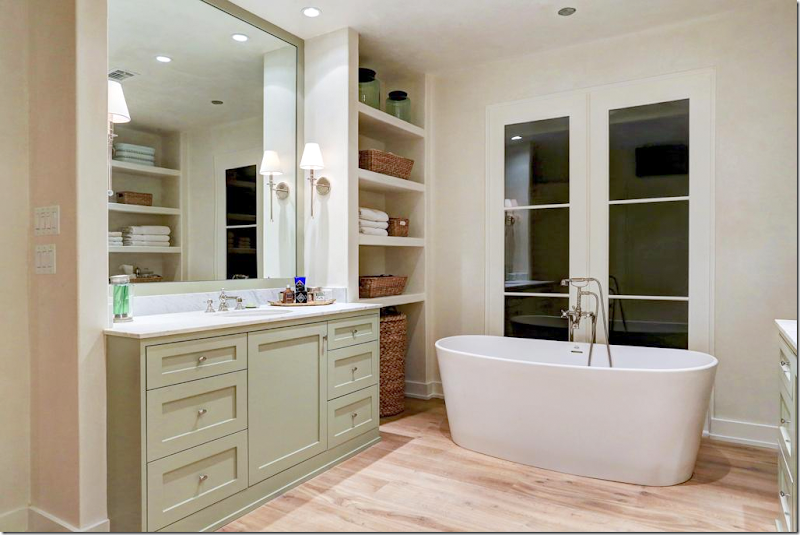
The master bath has two vanities – with a bath and shower between them. Wood floors.
And the other side. Showing the same simple Shaker cabinetry, painted in light green – offset by white walls.
So – there is House #2 European Minimal
And on to House #3 – Masculine Classic
First, you may remember a few years ago I showed a modern townhouse in one of Houston’s first Townhouse developments. It was owned by Shabby Slip’s Barbara Carlton and it was a fabulous mix of white slipcovers and antiques.
The complex is Mid Century Modern with flat roofs and clean lines. It is highly sought after by those in the know – and a reading of its inhabitants is like a who’s who’s of talented and chic Houstonians. House #3 is in that same complex. Also, there is another townhouse for sale in the same complex designed by Chandos Interiors that is also beautiful HERE.
House #3 – Masculine Classic
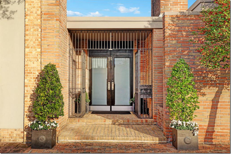
Masculine Classic – Zinc planters greet guests at the frosted glass double front doors.
You walk into the foyer with its white stone floors – paired with dark walls which look almost like eggplant, a gorgeous shade of deep gray/purple. The townhouse is filled with exquisite antiques and art work.
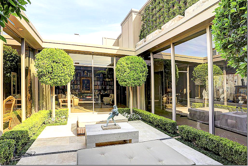
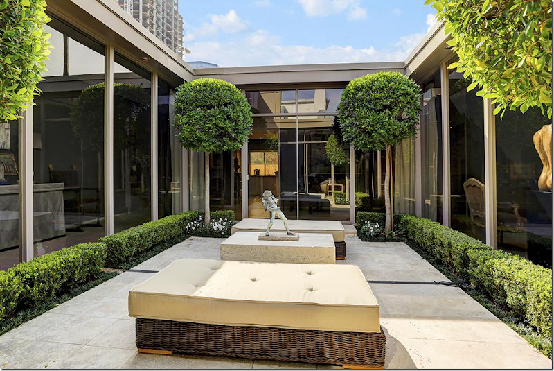
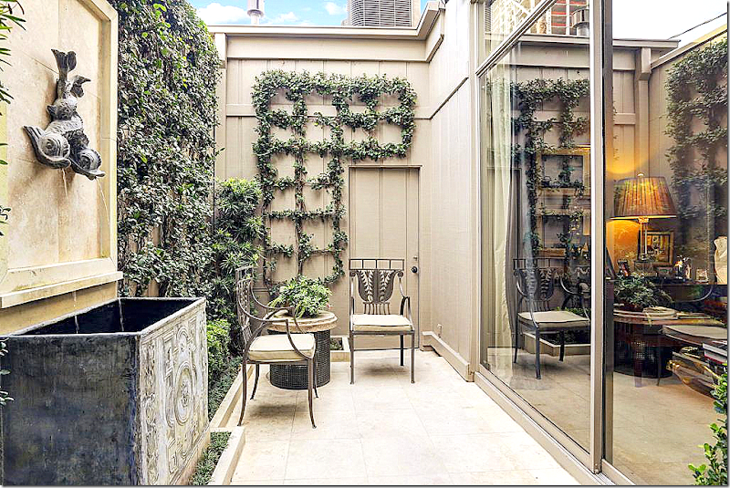
The 1 1/2 story townhouse is built around a large rectangular shaped atrium. The owner, a prominent designer, used simple box and vines and Ficus to landscape the focal point of his house. The living room can be seen at the left and the library is straight ahead.
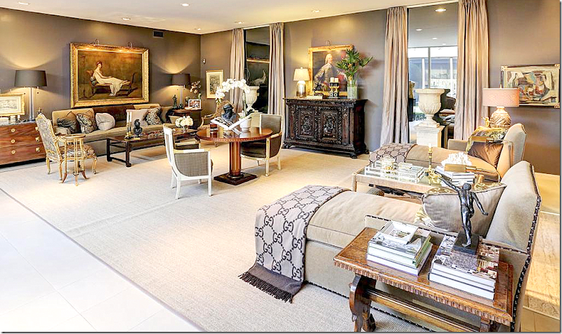
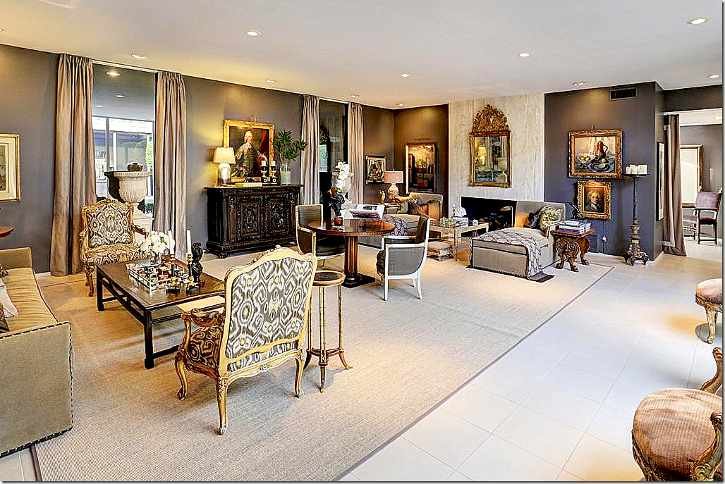
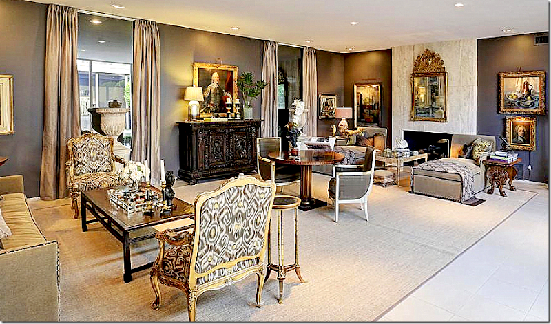
The living room is a long space – with an antique center table dividing it into two seating groups. One grouping has a sofa and chairs, while the other has two chaises. Instead of a long windowless wall, the designer installed mirrors that act like faux windows – he then flanked them with curtains. The mirrors help provide symmetry and break up the expanse of wall space. In front of the window are two large white urns.
The townhouse has a John Saladino look to it and I wouldn’t be surprised if the owner was a big fan of his, like me! Maybe that’s why I am so attracted to this house?
Looking the other direction towards the two chaises and the fireplace. You can see the foyer to the right of the living room – divided by porteries. I love this space – it’s so sophisticated and classic with its French antique chairs in Ikat fabric, along with all the fine accessories and furniture.
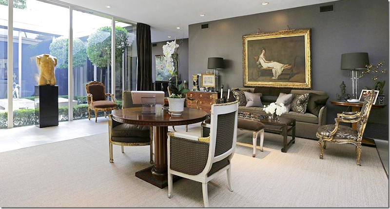
This view of the sofa and center table shows the atrium behind a large nude sculpture flanked by two French antique chairs. I love the oil above the sofa.
Here’s a closeup of the couch with its Oriental coffee table and beautiful chest – notice its feet! There’s a wonderful antique clock on top of the chest.
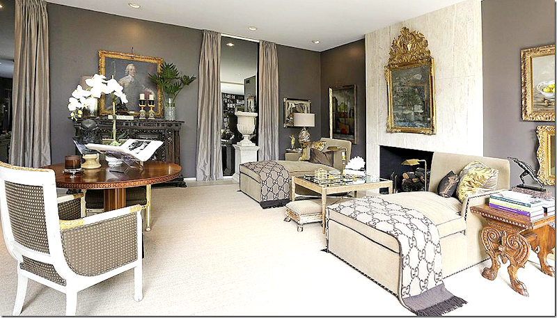
Close up of the twin chaises with their Gucci throws. Notice the beautiful antique mirror on the marble mantel.
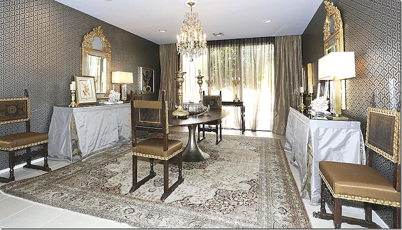
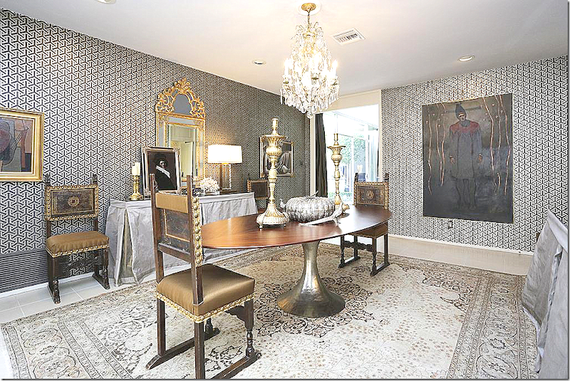
Past the living room is the dining room with its contemporary Saarinen table over an area rug. Matching silk covered consoles are such a great idea – love the mirrors.
Here you can see the wallpaper better. Through the doorway is the hall that leads to the living room.
Past the dining room, seen ahead is the hallway with the black piano. You can see the living room to the right of the dining room.
And across from the piano hall is this hall with a skirted console and a purple velvet covered chair. At the end of this hall is the stairway that leads to bedrooms.
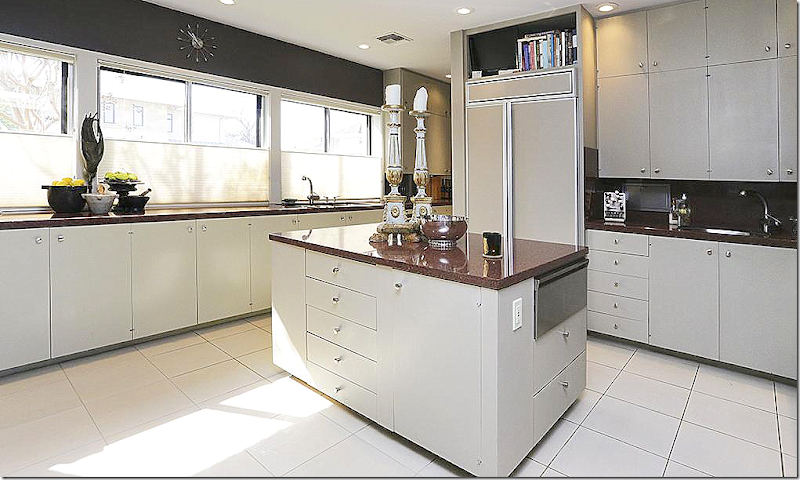
The kitchen is contemporary with granite counters.
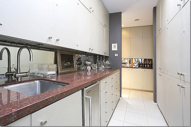
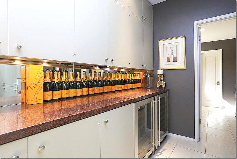
Wonderful space in the butler’s pantry.
In the wine room – someone loves champagne!!!
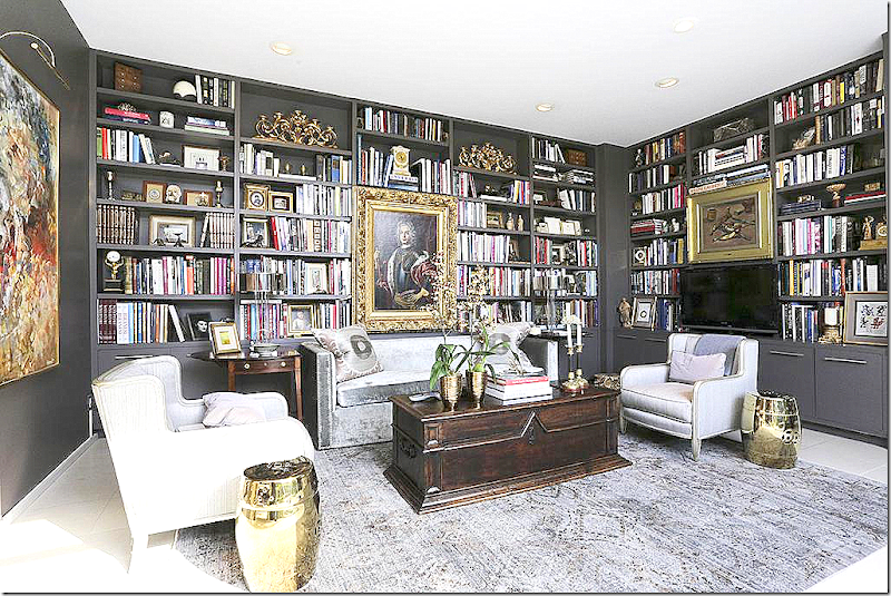
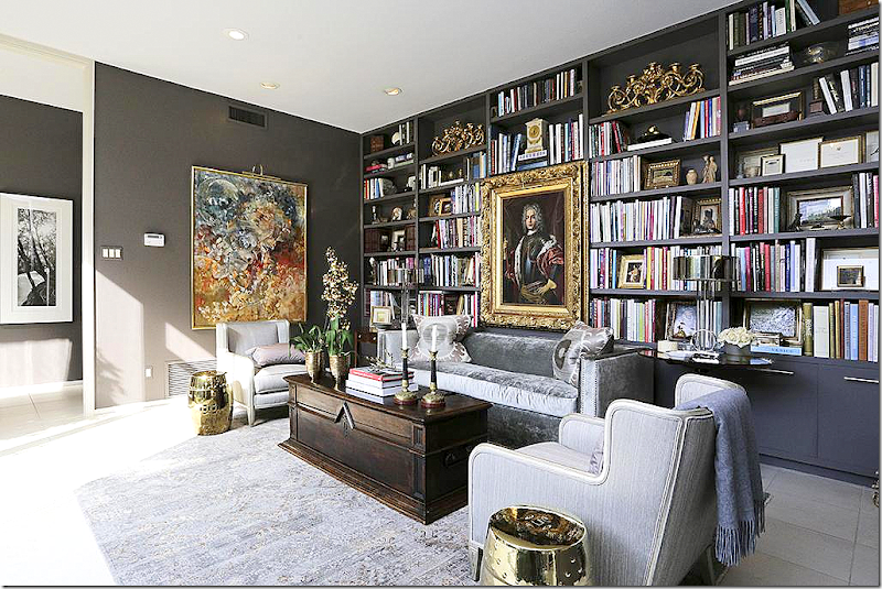
And – next to the foyer – is the library. What a space!
A mix of classic and contemporary art work and a collection of new and old in the shelves. This is such a lovely space. The foyer is off to the left.
Another view of the interior atrium.
The powder room with the same beautiful wall color found throughout.
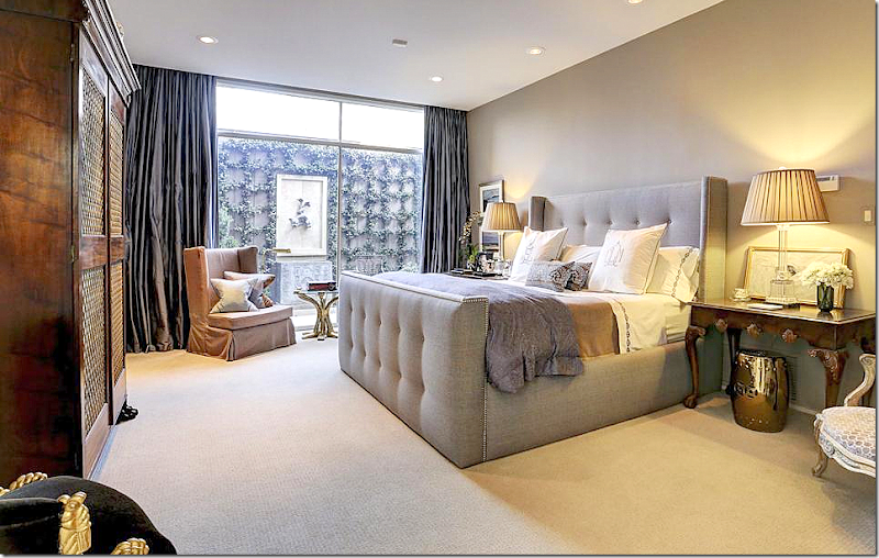
One of the downstairs bedroom. This looks out on an enclosed courtyard.
A view of the courtyard with the zinc fountain – love!!!
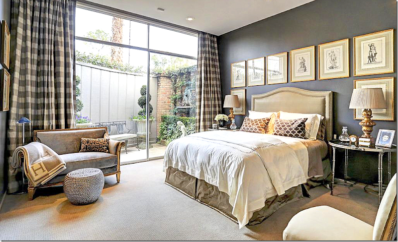
Another bedroom off another courtyard – with the dark walls. I love the set of prints on the walls. This is such a great element to use instead of one piece of art. Pretty fabrics and lamps. I love this room!
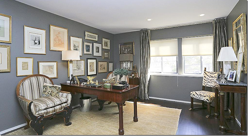
Upstairs is a study – again with the dark walls and now, dark floors. Beautiful gallery wall – and love the tiger velvet chair in the corner.
And a beautiful guest room upstairs with antique chests and again, wonderful lamps!
So, now you have to choose. Which is your favorite, House #1 - Mid Century Modern Chic with its Modern design and contemporary touches? Or, do you prefer House #2 - European Minimal with its Belgian sparseness? Or, is your favorite #3 - Masculine Classic, the cluttered, filled to the brim townhouse with the John Saladino inspired classic design?
Let me know your favorite, or if none of them suits you at all! I’m sure you’ve figured out my favorite is #2 – European Minimal. Most interesting - all three houses are sale pending right now. No surprise, since these were the prettiest houses for sale in Houston right now!
NOW – For some exciting contest news:
I have a BIG announcement coming, a BIG contest!!!
If you are in the market for curtains and are thinking about buying hardware for those curtains – or if you would like to update your hardware (hint, hint) – think about taking a picture of where those curtains are going to go. Think and dream about Antique Drapery Rod, HERE.
We are going to be giving away a LOT of drapery hardware to a LOT of lucky readers. More information will be coming soon.
Final Three–Your Choice of Styles
Two For Tuesday
First, today, I want to introduce you to a new Cote de Texas sponsor:
Maison & Co.
Maison & Co. is an importer of fine French, Swedish and European antiques. Besides antiques, they also have a selection of new merchandise like furniture, accessories and lighting.
You can go directly to their web site to see all their merchandise – or you can go to their shop on 1st Dibs HERE.
I picked some of my favorite items from Maison & Co:
Like these Swedish antiques. That secretary is beautiful. I am such a sucker for Swedish pieces. The simple lines are great with both classic and contemporary designs.
I love this cherub.
Alabaster grapes – you can never have too many! A few in a large white bowl is an effective centerpiece.
Both Swedish and French antiques.
Such a pretty Swedish clock – painted green – whoa!!!
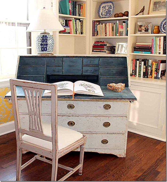
I asked Maison & Co. to show some photographs of clients with their pieces that they bought. I thought it might give you an idea of how their furniture looks in a home. They sold this Swedish desk and chair to a client. I love how the inside is painted blue. This would also look great in a more contemporary styled room painted dark navy!
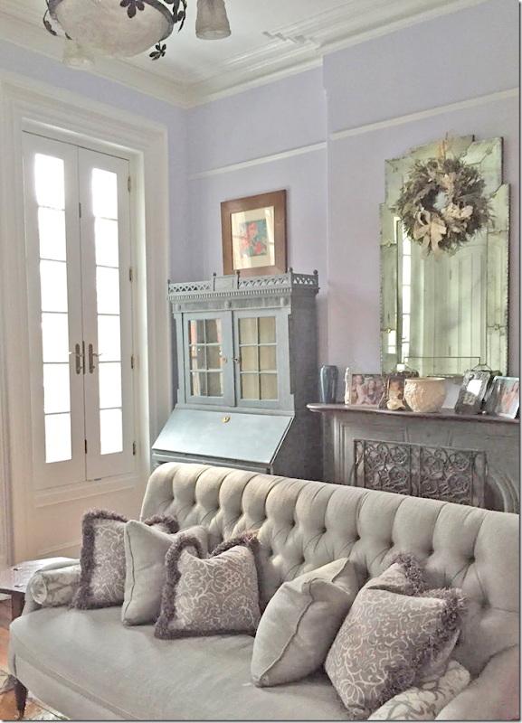
This owner mixed an antique desk painted blue – in a room with lilac walls. OK – that sofa is to die for! Beautiful tufting.
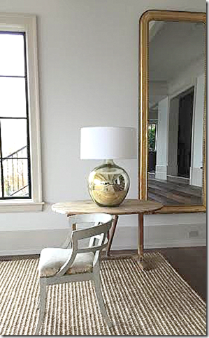
A mix of antiques with a contemporary lamp. I love the Swedish chair next to the modern lamp. Really pretty. It shows that you can mix the old and the new to create interest and contrast.
To visit Maison & Co. go to their web site HERE.
Welcome aboard Maison & Co!!!!
AND:
I have a new book recommendation today.
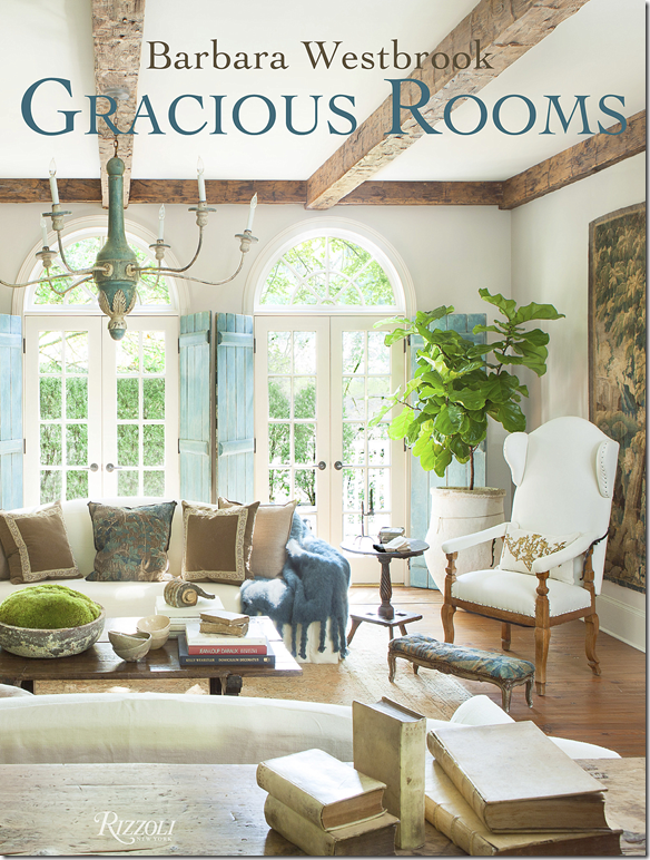
Atlanta based designer Barbara Westbrook’s book just came out. Westbrook is one of those gracious designers – who creates pretty homes, classic rooms, and beautiful spaces. In fact, her book is named: Gracious Rooms – which is the perfect title. Westbrook is the exact type of designer that I love - her interiors are warm, comfortable and welcoming – my favorite three adjectives. Her rooms are casual – but sophisticated at the same time. She uses a mix of antiques and linens – textures and soothing colors. There aren’t many contemporary looks here – instead there are timeless looks, elegant and feminine.
Westbrook worked on her book for two years – it’s a compilation of her 20 years in the business. It’s a beautiful book – just as pretty as all her rooms are.
It’s big – a full sized coffee table book, not one of those shrunken books that are becoming more popular. (Why?) Instead, the book is luscious, with thick pages, and full sized glorious photographs.
But, it’s not all pictures – there is a lot to learn here and read. It’s a keeper – a book that will stay on your table for a long time.
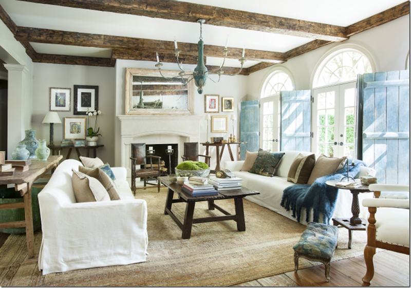
My first exposure to Westbrook was this cover story – I still love this house so much. It’s just perfection!!! I love the mix of the casual slips with the tapestry pillows and antiques. I love the shutters – inside instead of outside. Love this room!!!
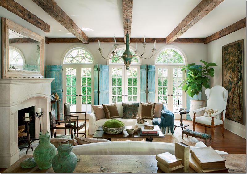
Another view of this beautiful room. I love that antique wing chair! Fabulous!!!! And I love the tapestry on the wall. I would never leave this room!!!!
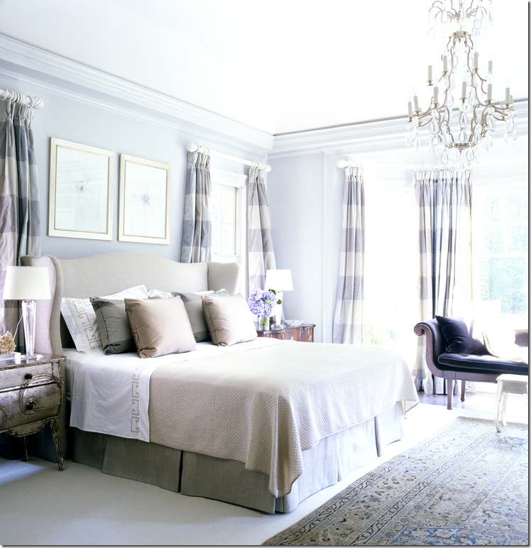
Another favorite is this bedroom – with its mix of new and old. Lilac is really such a beautiful color.
And another view from across the bed. Beautiful silk curtains – they make the room. So pretty!
The book has page after page of beautiful interiors. Love this breakfast room and that French sign which becomes the focal point.
Besides working on her book, Westbrook has also created a new web site. There is an exciting feature called Workbook with in depth stories. It’s worth reading HERE.
To order Gracious Rooms by Barbara Westbrook – just click below:
Best Prices For Furniture AND Milieu Magazine
I wanted to take a minute of your time to introduce a Sponsor – Best Prices For Furniture.They have been a sponsor for a while – but after talking with them, I realized I had never explained to you what they actually do. So, countrymen, lend me your ears & eyes for a moment!
Today – decorating without a designer is common. The internet, catalogues, stores like Pottery Barn and Restoration Hardware, blogs, and magazines – have turned the design business completely around. No longer are homeowners forced to only shop at design centers with decorators.
But, the problem with not hiring a designer remains getting discounts that only designers receive.
Best Prices For Furniture offers you an easy way to get quotes from different dealers – and then compare prices – all without leaving your chair.
Once you make your decision on what you are interested in buying – the individual dealer then passes on their discount to you and provides white-glove, in-home delivery. No more needing to have furniture first shipped to a receiver, making you pay double delivery charges.
And Best Prices for Furniture has partnered with wonderful companies. So many are my favorites – and I suppose yours too.
There are over 100 dealers that have partnered with Best Prices. I picked out a few companies to show you the range of choices you get when you work with Best Prices.
Here are my favorites:Artistica
Bassett Furniture:
Oly Studio:
Palecek
Ralph Lauren:
Ralph Lauren – what can I say? The best!
Visual Comfort:
Thomas and Gray
Love this zebra bench!
Universal:
To go to Best Prices for Furniture – go HERE.
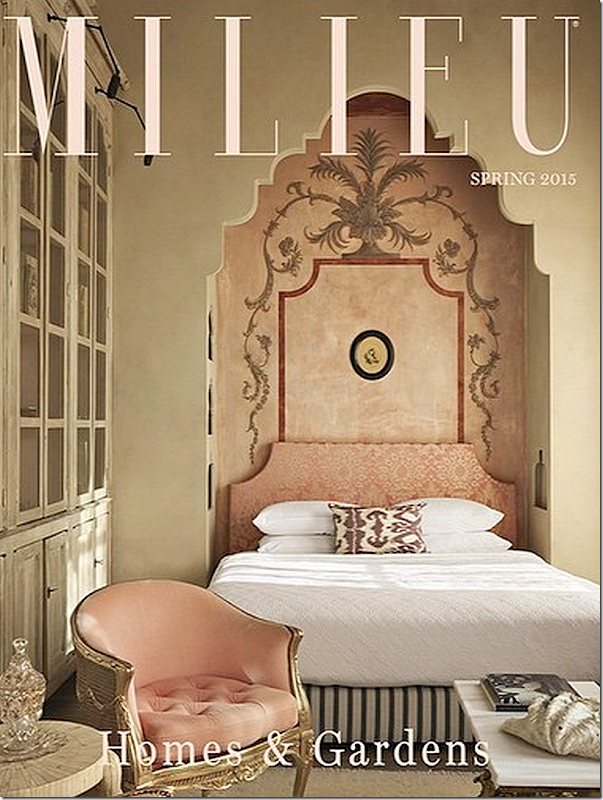
As always, Milieu continues to be a first class magazine. Each issue has been a jewel.

