COTE DE TEXAS
5,Jul2008

Cote d'Azur and Other Dreamy Beaches

31 comments

hosl03_NH

I'm dreaming of the beach and beach houses and apparently a lot of you are too, judging by the response to the Wheat's summer home.  This lead to me wonder:  how do the world's greatest interior designers decorate a summer home?   First up, let's look at Nicholas Haslam.  Though he has turned the reins of his design business over to Paulo Moschino, he took on this job of renovating an empty, decaying beach home on the Cote d'Azur for a couple who are previous clients.  The large cream villa is their main house, the smaller ocher stuccoed home was next door.  After eyeing it as it stood empty for many years, the house came on the market and the clients purchased it to use a guest house for family and visiting friends.  The house came partially furnished along with a stash of Vogue's from previous decades.  Both Haslam and the owner perused the fashion magazines for ideas for the soon to be refurbished guest house.   Tops on their list for the guest house was that its design evoke the charm and elegance of the South of France from days gone by.    I think they succeeded in their goal.   And while you are admiring the house, just imagine the the luxury of not one, but two homes on Saint-Jean-Cap-Ferrat,France!


 House #1

That's Villa Corrine, the "guest house" to the left of the ivory stone main house. The gardens of the two estates were melded into one after the neighboring property was purchased.


The grounds terrace down to the Mediterranean Sea.

hosl04_NH

The entry hall with newly laid stone floor.   The stone floors leads into the main area with its parquet wood floor.


hosl05_NH

Haslam insisted the salon recall the glamour of days past at the South of France.  He installed silvered lace panels on the walls which were in turn coated with mica.  Haslam says the effect is greatest in the morning sun and during the night's candlelight.  A simple linen slip covers a console table and a Manuel Canovas fabric is on the chair.  Be sure notice the red piping on the black and white chair.


hosl06_NH

This is my favorite room in the house - of course!  The chairs are covered in simple linen slips with dressmaker details.  The wood walls were whitewashed and the tops of the walls were painted to resemble tile, which is such a great idea to incorporate into your own home!!  The clock is just beautiful and is the focal point of the room. Note too the French carved doors.


  hosl07_NH

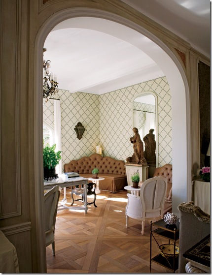
Haslam used the great interior designer Elsie De Wolfe as inspiration for the trellised wallpapered garden room.  The chandelier is original to the house.

    hosl08_NH

The garden room looks out onto the terrace. 

hosl09_NH

I love how Haslam used simple fabrics throughout. Here, again, linen slips cover the side tables and bench.  The headboard and curtain fabrics are from Lee Jofa.  The rug is Moroccan.

hosl10_NH

The vestibule to the bedroom has hand blocked red and white striped wallpaper. Haslam said since the adjoining bedroom is all white, he wanted a pop of color leading into it.

hosl11_NH

This antique painted French daybed came with the house.   Haslam upholstered it in white matelasse.

House #2

arsl01_montoya

Next up, is a beach house designed by Juan Montoya.   You may remember from last week, Mr. Montoya is not considered an Interior Designer by the state of Florida and the ASID and was sent a cease and desist letter by the state.  Maybe if they could see these pictures, they would change their minds?   This beach house is located on Punta Cana in the Dominica Republic in an enclave filled with VIPs, including Oscar de la Renta who put this beach on the international jet set's map.  The house itself was designed by Montoya who also had all the furniture built to his specifications in the D.R.  The entire structure is made of local stone, wood and stucco.  Furnished in the British Colonial fashion, Montoya used dark woods and white fabrics.  The home is open to the ocean which is visible from each room.  Notice the gorgeous wood framed doors leading into the house, above.

 arsl02_montoya

Not only did Montoya design the house and its furnishings, he also designed the landscape.  Here in an interior courtyard, the fountains were built to resemble Spain’s Alhambra.   Notice the x design of the balcony repeats the x design in the shown in the doors.

 arsl03_montoya

The living room has six sets of french doors opening to the outside.  All have the x design motif which is repeated throughout the house.  Massive upholstered furniture is slipcovered in white.

arsl04_montoya

The dining room can seat up to 16 people.  Beams were added for atmosphere.

 arsl06_montoya

The Anglo-Indian style furniture was all designed by Montoya and built on the island.  There are five guest rooms.  The x crossed windows have shutters with the x motif, again, to control the light.

arsl07_montoya

One of two master suites with a large wraparound terrace that overlooks the ocean and pool area.

House #3

hosl01_white

This pavilion styled beach house is located on Mustique, the Caribbean island made famous by Princess Margaret, Mick Jaggar, Tommy Hilfiger and David Bowie - to name a few!  The island has only 80 homes on it and not much else - no bars or restaurants - which insure there is no noisy touristy traffic to bother the upper crust of society who live here, albeit part-time.  The designer of this home is London based, Grant White, who hails from South Africa.  For this home, White paid homage to Oliver Messel, the famous English set designer, turned Mustique interior designer to the stars.  Grant gave the house a strong West Indian colonial feel to it, more "austere and rugged" than "pretty" as some of Messel's designs tended to be.  

hosl02_white

The owners insisted White use antiques and quality accessories even though this is a beach house, after all.  The console is 18th century.  The whales are 19th century museum models.  An antique window on the back wall had its glass replaced with mirrors.  The ceilings were all limed to give them a white washed effect.   I love this room and would be quite happy here each summer!

Here is a close up view of the main living area.

hosl03_white

In the dining pavilion, White used a 19th century Ceylonese table. The floor is made of native shell.

 hosl04_white

The main veranda is used day and night and is the most popular room in the house.

The master bedroom has floors of shell.  The walls are concrete, not coral that is typically used on Mustique.  Fabrics are from Jane Churchill.

This guest room has ethereal bed hangings with wooden angel wings!  Notice the seahorse lamp.


These houses are just a small selection of designer beach houses around the world.  While there was no expense spared in all these homes, there are ideas we can take and incorporate into our own, much more modest houses.  All these homes were first published in Architectural Digest, a magazine that some find too extravagant and over-the-top to relate to.  Yet, it is precisely by looking at the best that money can buy, that we can learn from these top designers and emulate them on a smaller scale. 


For instance, the large round, antique window with mirrored glass shown in the house above is something that anyone can copy and claim their own.  And what a wonderful idea that is!  Another good idea is the large vertical prints on each side of the sofa, also, in the above house.  The placement of these prints is an unusual, yet effective focal point that can be copied by anyone for a lot less money.   All it would take is a picture and a trip to Kinkos, followed by framing at an affordable place like Michaels.    I especially liked the painting of the blue and white tiles in the first house.  With a stencil and blue and white paint, a person with a tight budget can have Portuguese tiled walls ala Michael Smith!  Another element present in many of these houses are indoor lanterns.  While antique lanterns from France can be costly, there are many lanterns for the outside that resemble the pricier antiques that can be brought inside to the foyer or family room for the same dramatic effect.   Do you see any elements here that you would like to incorporate into your home?  Is so, please share your ideas!

2,Jul2008

Beach House, Bolivar Style

52 comments


sallywheat 047

Remember this? 


sallywheat 096


Or, remember this?   Remember how much you all loved this house?  Remember how you left 84 comments almost overnight?   Well, just in case you don't remember, or if you want to relive the beauty, read the story of how I Stalked the Wheats HERE.


Sally Wheat, the owner of that beautiful Belgian style home in West University,  loves decorating so much that she couldn't stop at fixing up  just one house.  No, of course she couldn't!  Why should she when she also owns a gorgeous beach home that needs her special touch?   Across the bay and a ferry ride away from Galveston, Texas, Sally and her family live here all summer long.


air2a


The Bolivar Peninsula is a sleepy coast off the Gulf of Mexico, with miles and miles of undeveloped shoreline.  From this picture you can see what I mean - the beach stretches undisturbed on both sides of this ecologically sensitive development called The Biscayne.   Sally's beach house is a three story, white, clapboard style home, built to look as if it was from another era in time rather than the 21st century. 


Since Sally's beach house is over an hour away from Houston, I hadn't had a chance to stalk it yet, though I was itching for an opportunity to.     After much pleading and prodding, Sally, worried that you, the reader, would be tired of all things Wheat, finally agreed to take pictures of her summer hideaway for us to enjoy.     I am thrilled she did, and hope you are too!   Thanks again Sally!    Enjoy this tour of the Wheat's Beach House:


                                  DSC00648  

In accordance with Texas hurricane codes, the main living area is on the second floor.  Wrap around porches extend the living space and provide a great perch to watch the ocean from.  Though not quite beachfront, they have a clear view of the coast and their back yard is on a lake.  Behind the lake is a nature preserve, where no development will ever be allowed to encroach upon.

                  DSC00619 

The lake with a visitor!   Not to worry, the residents had him removed to another area of Bolivar, far, far away.  The lake is stocked with fish which provides plenty of meals for the lucky residents.     


   DSC00639

The main living area soars over two stories.  Slipcovered sofas and chairs in khaki linen make cleanup easy.    Sally accessorized the room with Moroccan styled end tables.

  DSC00602  

  A view of the living room looking up towards the second floor.

  DSC00582


And looking back down.   Slipcovered sofas make great resting places for pets and children.  When soiled, just remove the slips and toss them in the washing machine.  Dry for a short time, and then still slightly damp, place the slips back on the sofa.  No need to iron, especially if you are a fan of Rachel Ashwell.


DSC00600

Opposite the slipcovered sofa is the built-in bookcases.  I love her two Chippendale inspired white chairs.   Black and white family photos lead up the stairwell.   Antique French bottles stack on top of the built-in.

DSC00629

Looking from the living room to the dining area and kitchen - all in one big area.  Sally mixed a large, rustic table with contemporary chairs.

    DSC00634

 The kitchen has clapboard walls and island, concrete countertops and stainless appliances.  I love how Sally uses the antique wine bottle holder for coffee cups!  Notice her stainless pendant lamps and bar stools.  The view out back is of the nature preserve.  Hard to believe this is just one hour outside of Houston.

DSC00596

 Across from the dining table, a plate wall inspired by Kelly Wearstler.    An antique bench is set below it. 

DSC00631

 Computer desk and contemporary print chair liven up a corner of the dining area.   I could be very happy right here just blogging away with a Starbucks!  FYI, the closest Starbucks to Port Bolivar is across the ferry to the Strand on Galveston Island.    It would be worth the trip, except on Sunday afternoons when the ferry is busy with beachgoers heading back to Houston.

DSC00606

 Hallway vignette.  I love how the sunburst mirror looks like it was made out of gray driftwood.

DSC00604

 The master bedroom is a bright, sunny yellow with black and gray accents.      I love the way the walls are paneled throughout the house, it adds to the cottage feel of the beach house.  Rather than furnish the home to match it's clapboard style, Sally has chosen contemporary fabrics and furniture with antique accents added for their texture and warmth.

DSC00566

 This guest room is painted blue instead of the bright white which runs throughout the rest of the house.


DSC00584

 Another guest room in black and white and yellow.


  DSC00583

 No beach house is complete without a kid's bunk room.  


  DSC00611  

Sharks and surfboards - only in a beach house!


DSC00563


And last, a glimpse into the bathroom, filled with Sally's touches. 


  For more information on The Biscayne at Bolivar Peninsula, Texas, go here.

30,Jun2008

New Home Exteriors (I'll spare you the interiors)

67 comments

A few weeks ago I showed you some of my favorite houses in my neighborhood along the route I take each morning to Starbucks.  These houses  weren't my only favorites in West University, just the ones I drive by each day.  I could have shown you a lot more homes than I did.   Most, if not all, were new builds - stuccos mainly, French inspired, clean lined with beautiful windows.   The houses were as a whole very attractive, but be clear, not all the homes in my neighborhood are.    Lately, I've noticed a trend in the speculative new house market.  A trend where the builder plays architect and the house's curb appeal suffers immensely from this.

In my small world that I travel each day, I drive through a few different neighborhoods:  mine - West University; River Oaks - the best that Houston has to offer, classic homes, and gorgeous mansions  from the 30s and the 40s; and Bellaire, another small town nearby, encircled , like West U, completely by Houston.   And just like my small town, Bellaire has undergone a resurgence , fueled by young professionals moving in and tearing down the small ranch houses that once populated it.  Bellaire has large lots and more custom houses than West U does, giving it a diverse appearance and less of a Georgian cookie cutter look.   But lately, this diversity has come with a price.

Each year, Bellaire builders compete in a Showcase of Homes where they try to out build each other with more and better amenities, more square footage, more details, more windows - more of everything and anything to win the Best of Show.  The builder is the star here, architects are rarely if ever mentioned.  I don't blame them, I wouldn't want to claim one of these "show" houses myself.  Is it truly harder to design an attractive house?  Is it more difficult to design a home with inviting curb appeal?   I don't think so.  I think it actually must be harder to design one of these detailed overloaded showcase style houses.  Does anyone find these showcase homes attractive?  I know they do sell, but to whom?    Only to people with no design sense at all, or to people who believe that more is better?

Below are a few speculative homes on the market in Bellaire today.  Each is contrasted with a similar home in another neighborhood.   Make no mistake, these houses are creeping with increased frequency into every neighborhood at an alarming rate.   It's just that there seems to be an abundant crop of them in this particular neighborhood.


Spec House #1:   Stucco and stone, I'm not sure exactly what style this is.  Is it Mediterranean or French, contemporary or Tuscan?    Take your pick, there are elements here of each style.  The front loading garage is the focal point.  Can someone please explain the two windows lowered on the stone at the front of the garage?  Are they lowered for children or dogs to peer out of them?    And why are there two faux windows on each side of them?     I count  FIVE  lanterns on the garage alone.  The house itself is barely noticeable, it's so pushed to the back of the garage.  The front door is encased in a square stone facade, again, why?  Two turrets of different heights flank the front door.  The stone work is placed with no regard to design.   The left turret has a stone base, the right turret has a stone facade with bands of colored stucco at its base.  The windows are contemporary, while the house is not.  And why are there three faux windows with a small gable above the right turret on the second floor?   There is nothing, absolutely nothing attractive about this house.  If someone buys it, it will be a miracle.


Contrast Spec House #1 with this home.  Both are large stucco homes with front loading garages. This house is accented with brick instead of stone.  Notice how the garage is placed far back - so far back it is barely noticeable as opposed to House #1 where the garage is the focal point.   The windows above this garage are simple and balance out the arched drive through.  Here, windows flank the chimney in a symmetrically pleasing pattern.  The gable highlights the arched front door and the charming small window next to it.  This home has a cozy, European feel to it.  It's facade is simple without any superfluous detailing.  Which would you prefer?  Where would you be happier, here or House #1?


Spec House #2:  In Bellaire, many of the old houses have significant foundation problems caused by its shifting soil.  To remedy this, care must be taken with how the foundation is built.  Instead of going to the extra expense of adequate foundations, spec builders elevate the houses to avoid the soil problems.  But, since the garage doesn't need to be elevated, the houses become bi level.  Here, you can see the actual house is higher than the garage which causes a strange, uneven appearance to houses constructed this way.   Unfortunately, this way is becoming the norm in the spec housing market here.  This house, again, has a questionable style.  Is it Tuscan?  Again, there is no symmetry.   The two turrets are of different sizes. The plethora of windows are unsettling.  There is no rhythm to their placement.  Does any house need so many differently sized windows?   On the right turret a small window in encased in travertine for some reason.  Above it is a balcony leading to nowhere.  The color of the stucco is unappealing.  There's too much going on with this design, there's no obvious focal point.  It's actually an unpleasant experience for me looking at this home - it's over stimulating.  Is it unpleasant for you too?


By contrast this French styled home has a turret that is barely noticeable.  It serves as an accent rather than the in-your-face turrets of the above Bellaire houses.  The straight facade of this house is pleasing to the eye.  The creamy stucco lends an elegant appearance as opposed to the deep khaki colored stucco house #2.   Here the windows are simple and symmetrical.  There are no windows added that are not needed.  The wood shutters lend just a touch of texture to the smooth stucco.  The single lantern is more effective than a multitude of them.  This architect chose one style and stuck with it, therefore the house appears more honest in its design.  This house is beautiful and it's curb appeal is undeniable.


Spec House #3:   Is this a Beaux Arts styled home?  The house itself looks like an after thought stuck onto the prominent garage.  Rustic wood garage doors belong on another home, not this dressy stuccoed one.  While there is no real turret, the builder could not resist adding the top of a turret here.  It looks the top of a percolator coffeepot stuck on the roof, giving the home a comical appearance.  The windows are a mix of traditional and modern.  The three odd shaped windows to the left of the door are not lined up with each other.  The left one appears to be floating on its own.  The front stairs lead to the grass instead of a walkway.  And, lastly, the iron balconies are typical of showcase homes where the more swirled the wrought iron, the better.  I call this the Coffeepot House.


Similar to House #3, this is a far more beautiful version.   The turret is substantial, yet elegant due to the proper placement of its windows and its proportion to the rest of the house.  The top band of small windows are traditional in keeping with the style of house.  The large window above the garage balances the turret on the left.  The arches of the porte cochere repeat the arch of the front door. Elegant in its white stucco, with black framed windows, this home shows that a front loading garage, designed correctly, can actually be an asset.  I love the stuccoed fence creating a front courtyard.    Very pretty, very simple, less is more - indeed!


Spec House #4:  Stucco home  with, again, a mishmash of windows.  Instead of a tall turret, this builder settled for a short one.  This house could have been saved with a little architectural direction.  If the two balconies were the same instead of dissimilar, if they flanked the front door, instead of were side by side, there would be some symmetry to this house.  Instead, it's a mess.  Is it too much effort to design something with symmetry?  Is it easier to just stick windows wherever the builder wants rather than where they are needed?  Why would there be two balconies side by side that are different?  And please tell me what are those stucco squares on each side of the balcony above the garage?????


This home, similar to House #4, shows again, how pleasing white stucco is over  tan or muddy colored stucco.  Again, the windows are purposeful and simple.  Here the single balcony over the front window balances each other.  The iron railing is simple, not over designed.  The arched door is set inside a stucco arch with a single, effective lantern.  Gray painted wood detailing adds an accent touch keeping the house from being plain.  Again, simple elegance over excess wins every time.


Spec House #5:   This house is a total mess.    Again, I am not sure what style this is supposed to represent.   Any clues?    The white louvered garage door is a nice touch, which is totally wasted on this house.  And its  white color makes no sense - it appears unpainted.  Again, there is no symmetry to the window placement.  Look for instance at the unmatched windows on either side of the front door, second floor.  And why is there a cinderblock looking fence between the door and the garage?  What IS that?    Most confounding of all are the dark stuccoed shapes next to the front door and over the garage.  What are THOSE?  What are they supposed to do?  Add more detail, as if this mess needed more detail?


By contrast, this similar home in white stucco with gray wood trim, again highlights how important color choices are.  Simple elegance, again proving less is more.  Instead of stucco accents like on House #5, this architect placed a pergola atop the garage where vines will one day soften it.  The garage door is wooden and arched and mimics the arch of the front door and the front window.  The simple balcony over the garage is arched, it's iron railings are plain, yet pleasing to the eye.  Compare this balcony to the one above the garage of House #5.  Is there any comparison?  And again, it proves with the deft hand of a competent architect, a front loading garage doesn't have to be an eyesore.  Is it really harder to design something pretty?   I particularly like this home and can envision it filled with Belgian styled furniture painted in tones of grays and whites. 


Spec House #6:  Finally a style I recognize:  Country French.   This home has the potential to be passably attractive, but the details stop it short.  The stucco is a nice color and the stone is an authentic touch, but why would the builder put a section of stone over the right garage in a pie shape?  Mystifying.  Again, the turret is too much.  The windows in the turret are contemporary rather than traditional.  There are too many gables and roof pitches here.    So, while the house has some curb appeal, it's just too too much:  too many windows, too many gables, not enough symmetry, no obvious focal point.


By contrast, this is a country home well designed by an accomplished architect, Houstonian Kurt Aichler.    The windows are symmetrically placed.  The small charming window next to the front door is repeated above it.  The facade has a pleasing movement to it that allows the eye to move from one end to the next.   A brick section is on the left side, followed by a wood plank section, followed by another brick section, and ending with another wood plank section with a screened-in porch above it.  This house exudes country home charm.  Attention was placed to the smallest of detail without any overload.  Notice the charming fence to the left of house with its wooden gate.  Which country house do you prefer, the French styled spec house #6 or this one, designed by a thoughtful architect?


Spec House #7:  Close, but not quite enough to give this house curb appeal.  The builder added a third garage to this house, but no turret!  At least we can thank him for that!   But the garage to the right looks like an after thought, a tower with its own gable that is uneven.   Squeezed in next to the garage tower is a balcony that looks like it was added so that the builder could advertise:  "iron balcony!"  The other garage also has an uneven gable and an odd assortment of windows on the second floor.   The driveway is attractive, but the poorly thought out details overweigh what is good here.


By contrast, note how perfectly placed these gables on this French styled home are.  And also, note the straight roof line behind the right gable. This minor details gives the gables an appearance of depth.   Drawn perfectly by an architect and executed by the builder, the gables are meaningful and architecturally correct, not added just for effect.  Notice too, how perfectly the balcony fits over the front door.  It's delicate iron railing is beautiful.  The shape of the small arched window next to the front door is repeated in the larger front window.  Wood shutters are in light green - a nice touch against the white stucco.  Notice too this thoughtful detail:  the gables are white stucco while the straight facade behind the gables is a darker shade that further highlights the perception of depth in the gables.  A section of white stucco comes up a third of the way on the left side of the house.  This house is beautiful and elegant.  Not a single detail  or accent is wrong.  Notably this house underscores the importance an qualified architect plays in a house's design.  This is a lesson that builders who build just to compete in a Showcase need to learn and learn quickly before they destroy the beauty of our neighborhoods.


Things to ponder:   Do you live in a neighborhood or are you lucky enough to live in a house where architects  rather than builders played a significant role?  Is your house a builder's spec version or an architectural gem?  Is it really harder to design a beautiful house than an ugly one?   Do you agree that simplicity in a home's exterior is preferable to an abundance of details and windows?  Is less really more?