COTE DE TEXAS: Search results for cindy hattersley
Showing posts sorted by relevance for query cindy hattersley. Sort by date Show all posts

Dear Miss Cote de Texas: Flatscreen Issues

131 comments


Lady with Her Maidservant Holding a Letter, c. 1667
Oil on canvas, 89,5 x 78,1 cm. Frick Collection, New York

Half the fun of the Dear Miss Cote de Texas series is finding the art work to go with it.   This choice is by Jan Vermeer and was painted in 1667. 
“The mistress' expression reveals the uncertainties of love that disrupt the serenity of ordered existence. The mistress' controlled demeanor and fashionable wardrobe seems to suggest that such fleeting doubts affect even those who are most secure and content in their lives. The maid, while offering the letter, responds to her mistress' gaze with a caring yet concerned look. With her slightly opened mouth and lowered eyelids, her expression is as restrained as her mistress', yet Vermeer created a visual dialogue between them that conveys the intense psychological impact of the letter's arrival."
Here, the maid interrupts her writing and hands her a letter.  Her hand on her chin represents surprise.  This same yellow jacket with the ermine border is also seen in the painting ‘Lady Writing a Letter.’   To read more about this beautiful painting, go HERE.

Today’s reader writes with questions about her issues with her flatscreen TV.   I picked this topic because it is such a universal problem.  Who doesn’t have at least one TV in their house?  For years and years the TV presented great problems for the interior designer.   As TVs got bigger and deeper – the space required to hold these monsters grew along with the screen size.  Most everyone either had or wanted a TV cabinet – that huge brown piece of furniture which held the TV balanced in between countless shelves and drawers.   Most were hideous – creating a large eyesore in the middle of a beautiful family room or bedroom.  If you didn’t have a TV Cabinet, then you had a faux antique armoire.  The problem with having an antique armoire was they had to be deep enough to hold these TVs and the antiques  rarely were equipped for that depth or weight.  When flatscreens came out, designers everywhere rejoiced.  Finally, there was an end to those fugly TV cabinets!  No longer were we concerned with a TV whose depth could measure 36” – we could now hang these flatscreens anywhere!  It was so liberating.   But, as with all things, eventually when the rejoicing died down, the issues with flatscreens became evident. 

Remember these?  Uggg!!!!! 
Yes, you can hang flatscreens anywhere, but you still have cable boxes and DVD players to contend with.  So, while the flatscreen is hanging – you have to find space for the electronics somewhere nearby.  Wires were another issue.  If you hung the flatscreen on the wall, the wires that connected to the electronics were visible.  For that, you needed to hire an electrician to come and hide the wires inside the wall.   And while the huge TV cabinets became passé – suddenly masses of smaller consoles were being made to sit under the flatscreen to hold the electronics and to ground that huge black hole hanging off the wall.


Flatscreen TV consoles can be just as ugly as the old TV cabinets.  This one is a faux Stickley version, which for some unknown reason is quite popular.  At least these cabinets can be quite narrow – depth is no longer an issue. 
While many choose to hang the TV on the wall, others opt to put it over the fireplace mantel.  It’s a solution of course – most flatscreens fit perfectly over mantels.  But, it’s not my favorite solution.  First, there is the issue of neck pain.  TVs should be at eye level – otherwise you have to crank your neck up to watch it.  And then there is the aesthetic issue.  If the TV is on the mantel,  you lose the valuable space to place a beautiful mirror or piece of art.  You have no place to create a mantelscape – it’s such a waste of valuable design real estate.  I try to avoid putting flatscreens on mantels at all costs. 


image
For instance, in this family room I just finished, the flatscreen was over the mantel.  It took a while to convince the husband that it would be much better if it was moved.  I’m not sure he is still convinced, but it looks so much without that big black box hanging down over the room.  We did have to go through a few steps that added to the costs, but they weren’t that much.  First, we had to hire a carpenter to finish out the molding over the  mantel and close up the big hole that was left after the flatscreen was moved. 

image
Next, we bought a console to go under it.  This console is less than 12” deep and it holds all the electronics.   We bought the console at Nadeu in the Rice Village,  so it hardly cost anything.    We had an electrician install the TV here and hide the wires in the wall.  Viola.  Now, we could move the sofa from the middle of the room.  We put swivels on the two chairs to make watching it easier.  Lo and behold, the most expensive cost was the NEW flatscreen that hubby wanted if we were going to all this trouble.  Naturally!  Men and their toys!
(I have someone I use in Houston that comes to the house and installs the TV and sells them and does it all – if you are interested, I’ll leave his name and number in the comment section.)


My own family room has a similar layout.  My client had seen my room arraimagengement and wanted her couch against the windows too  - which is what started the entire process in her own family room.  I would hate having a TV over my mantel!   Again, I would have to float my sofa which would close off the room and then we would have to crank our necks up.  Plus, I love what I have on my mantel!


image
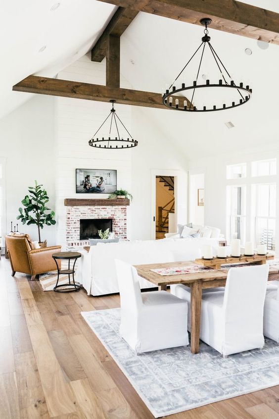
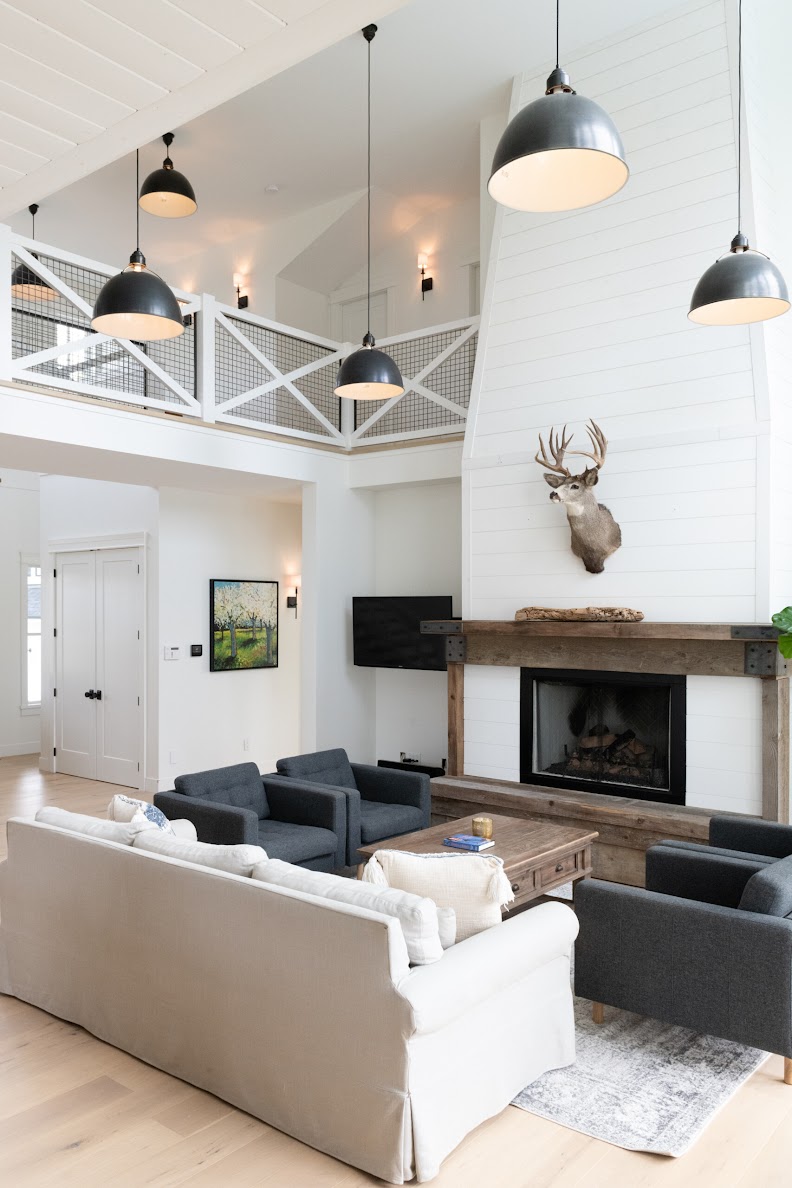
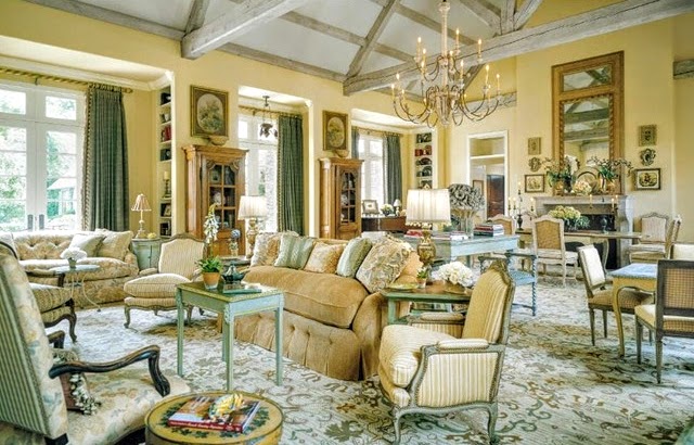
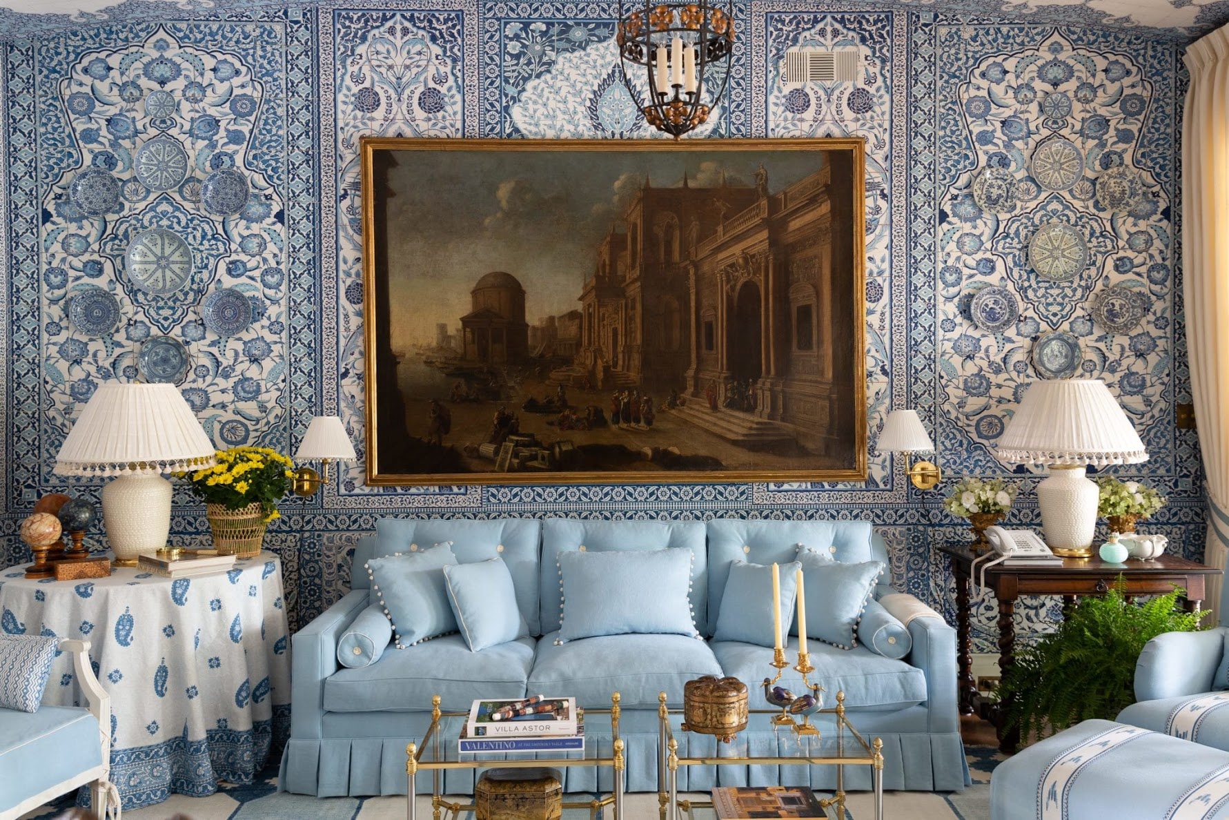
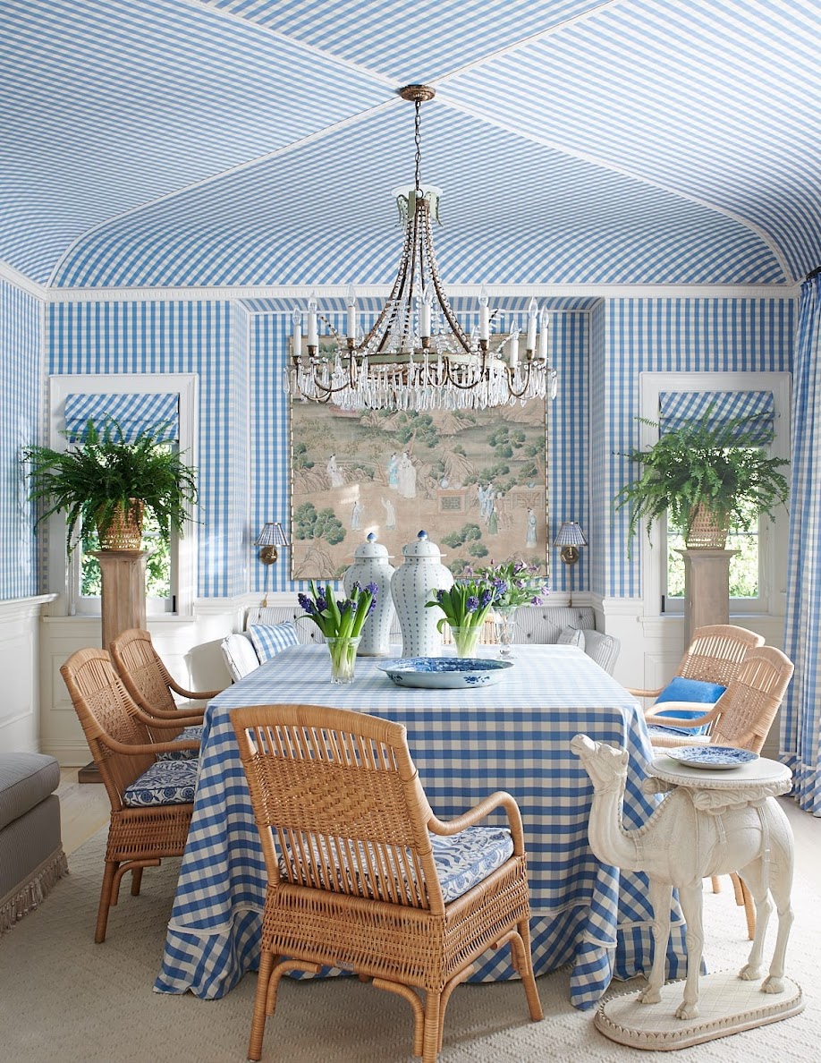
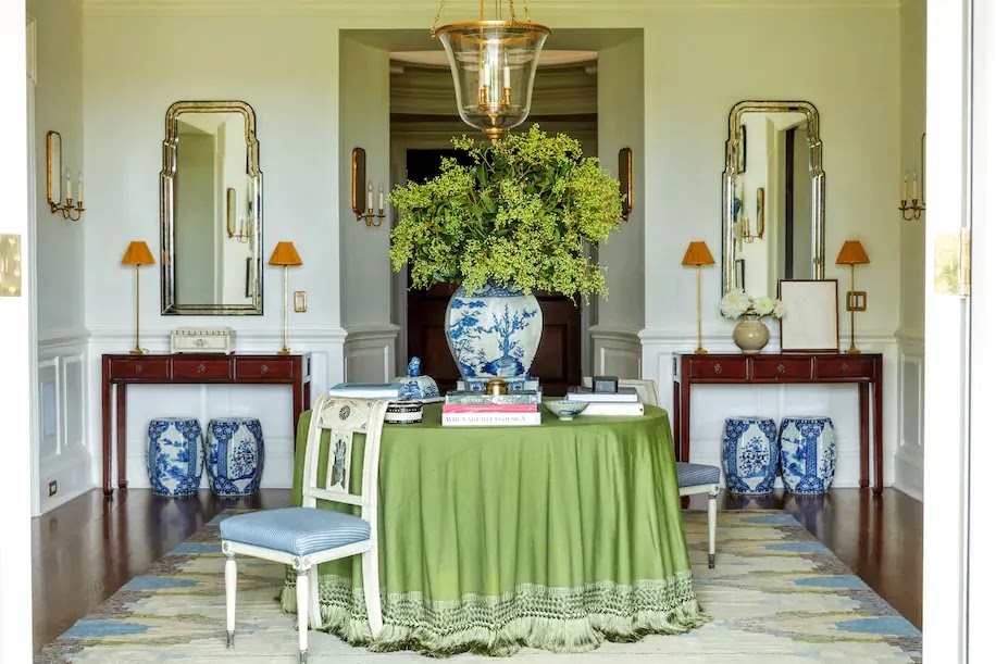
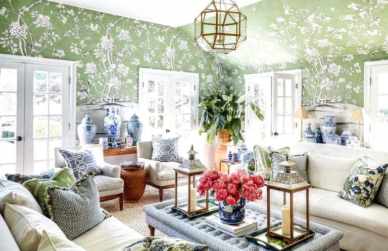
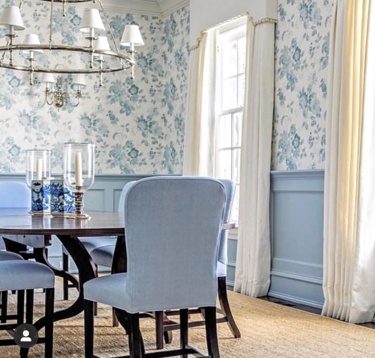
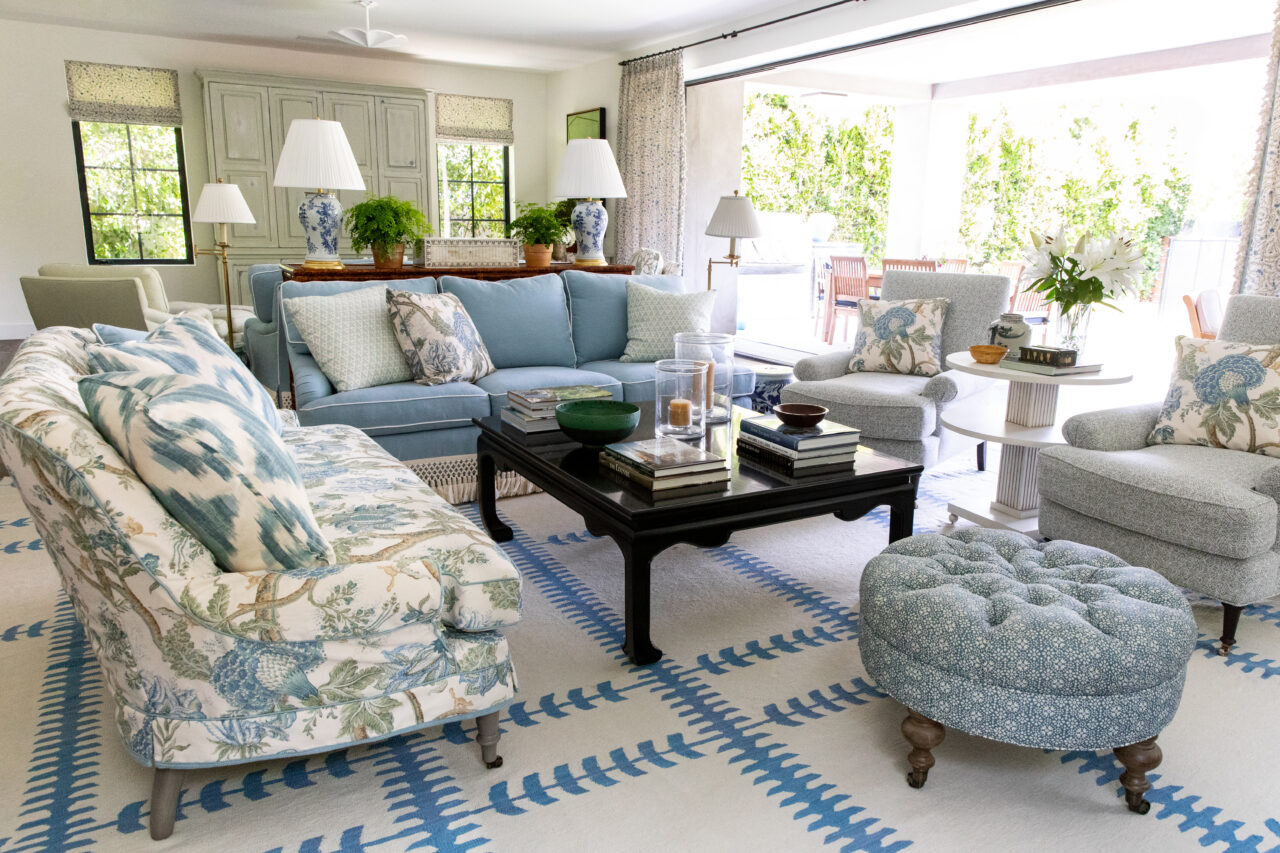
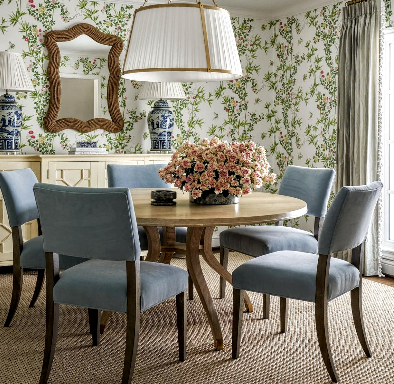
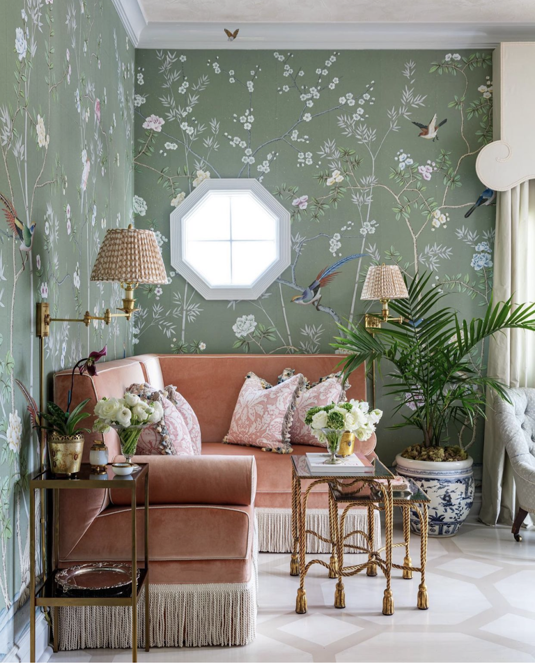
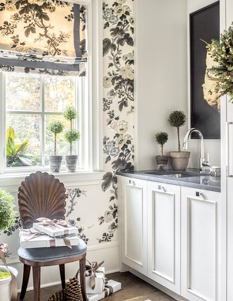
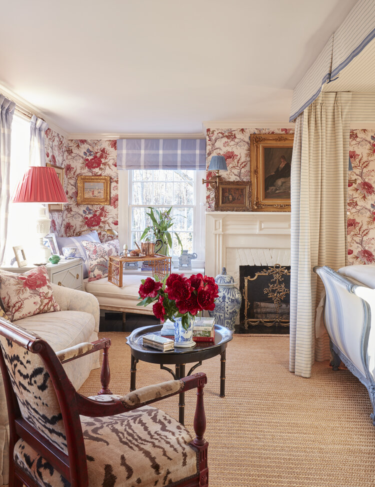
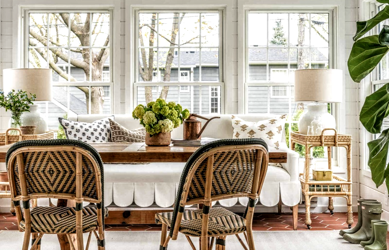
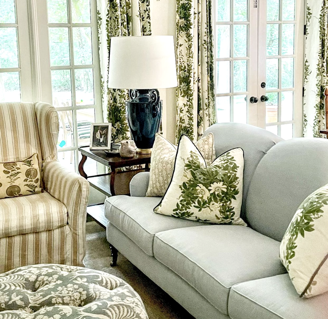
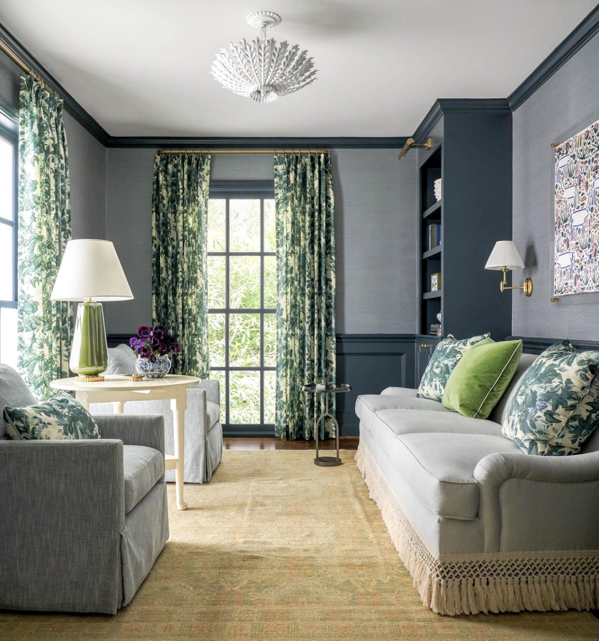
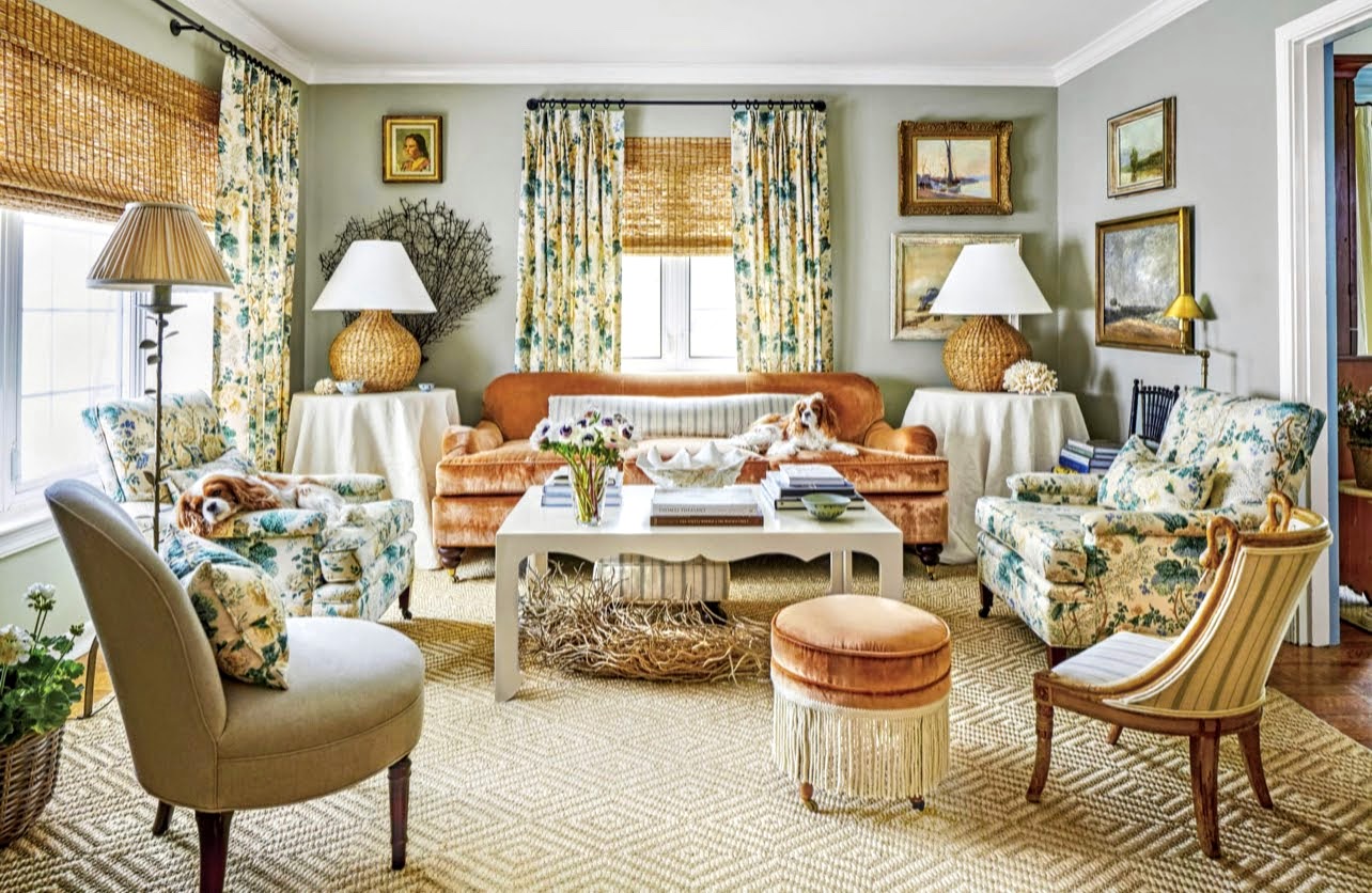
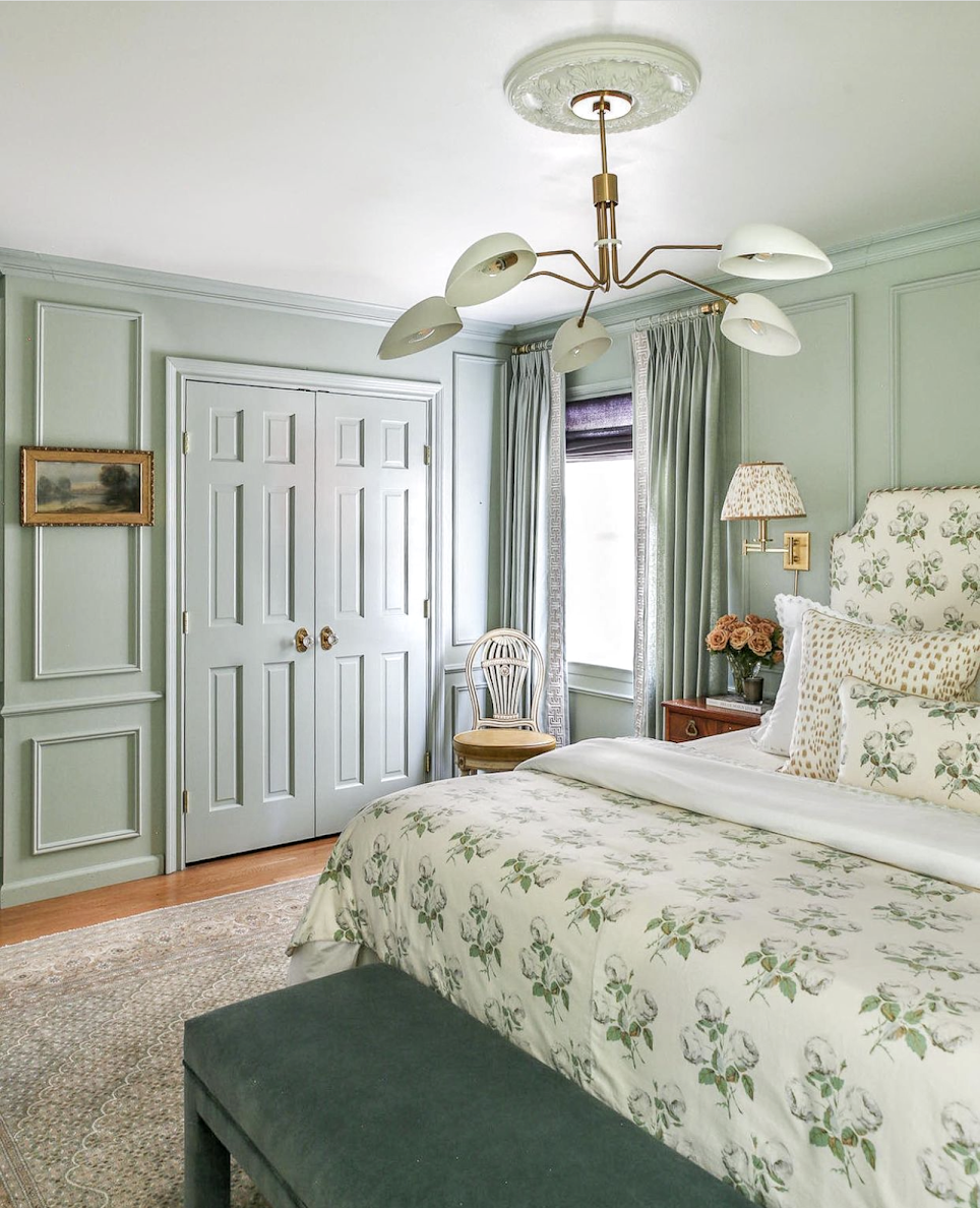
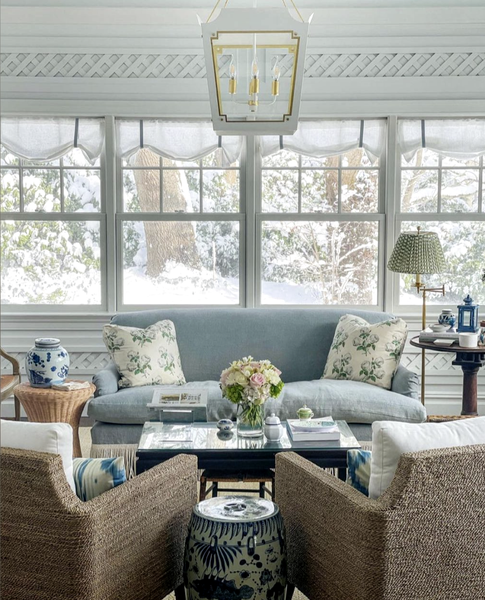
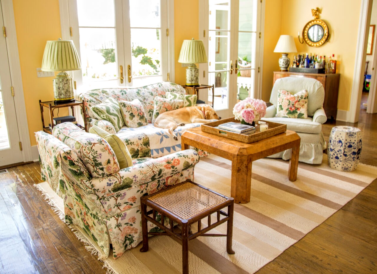
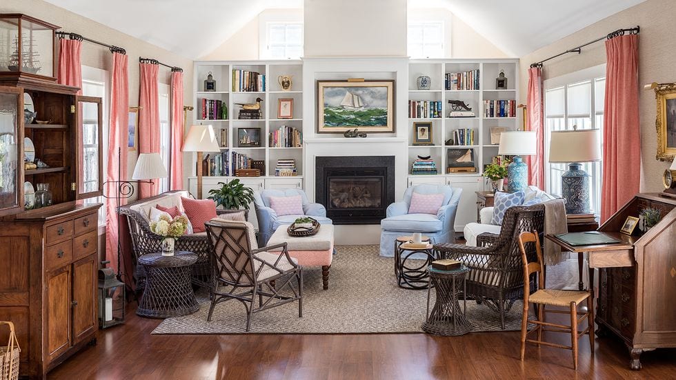
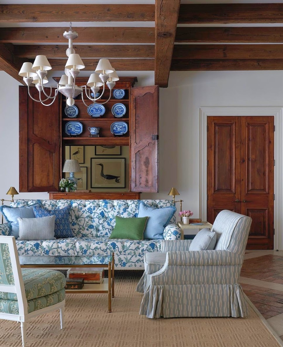
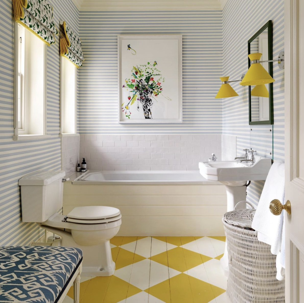
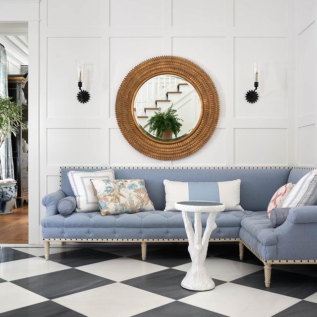
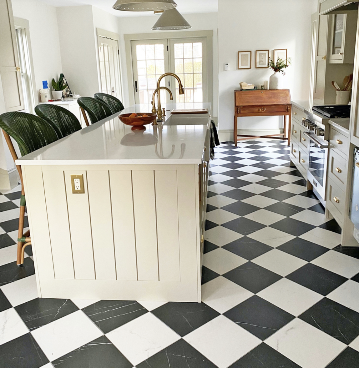
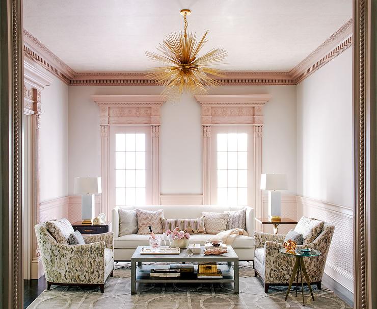
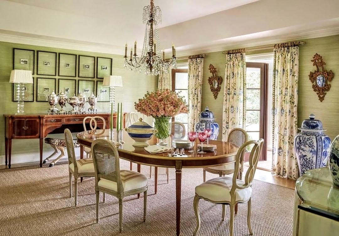
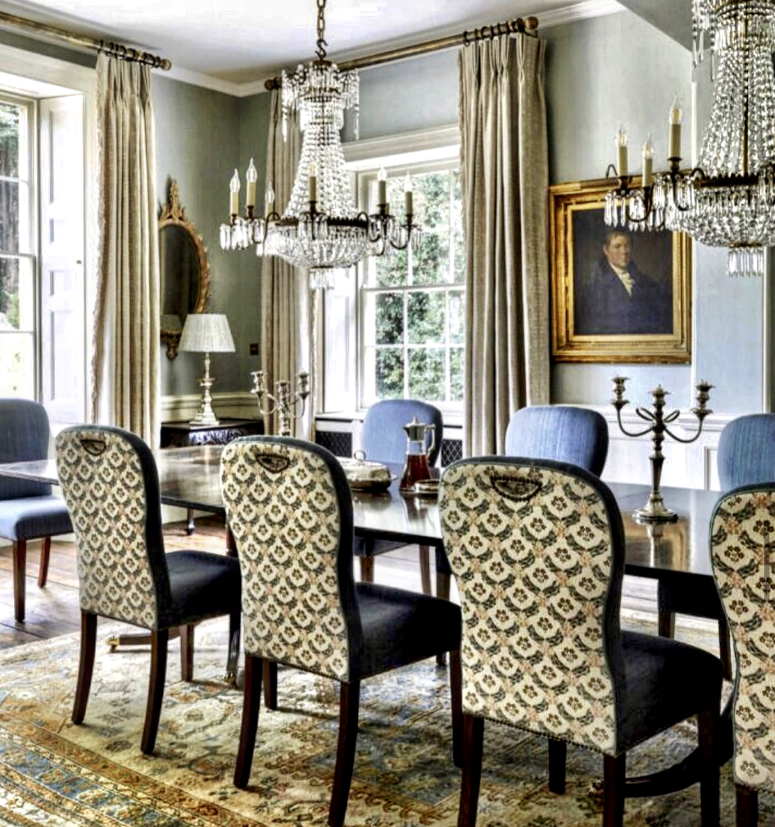
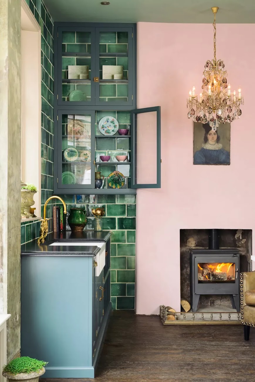
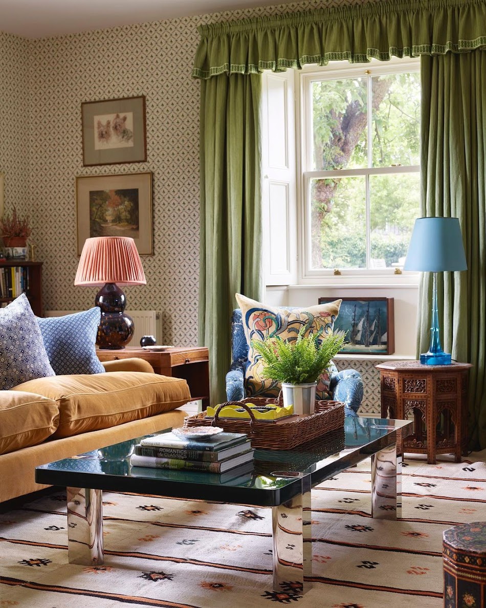
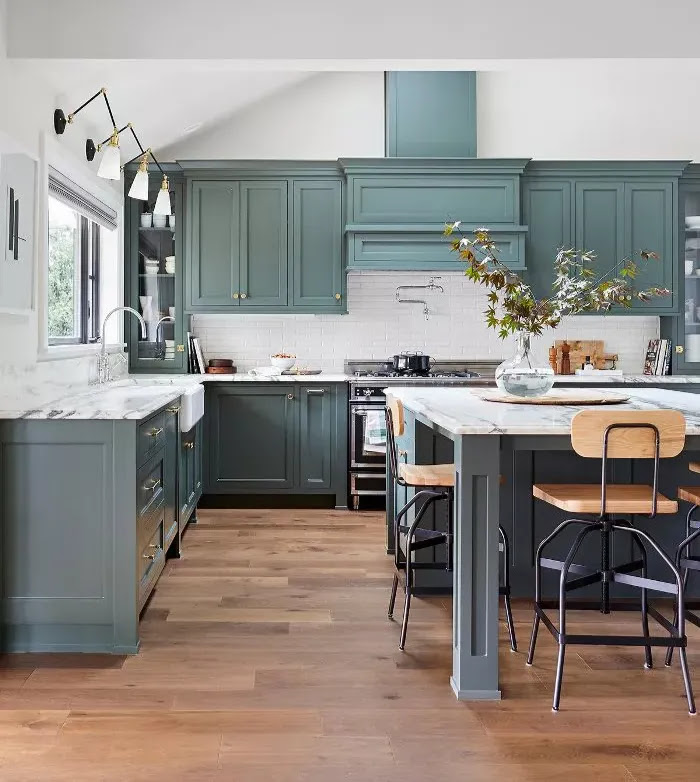
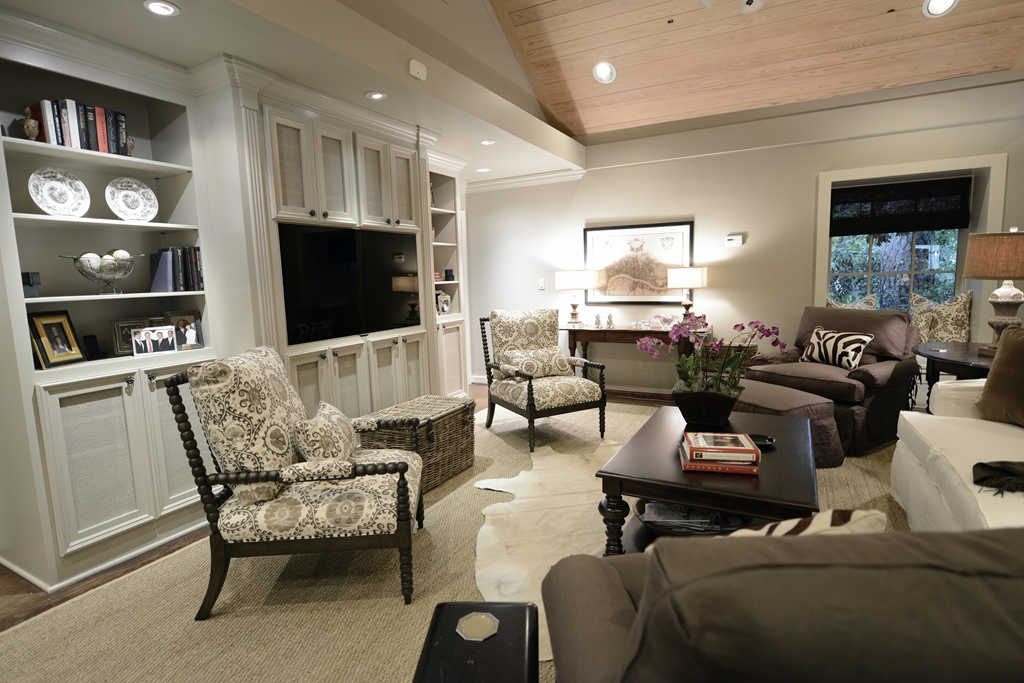
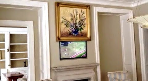
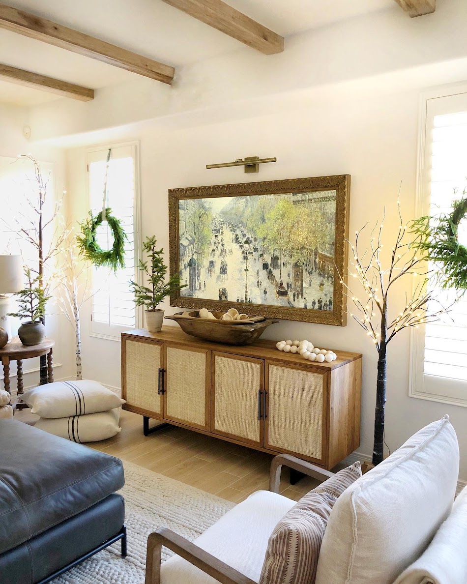
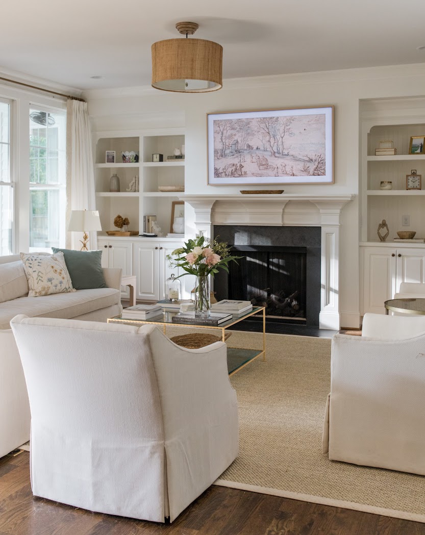
Instead, I have the flatscreen hang over the hole that once held our old, regular large TV.  The cabinet underneath holds the electronics.  Now, the TV is not the focal point of the room.  You don’t even see it until you are completely inside the room. 

image
For this client, we had the same issue as with the first client – the TV was over the fireplace.  Here we had a carpenter rework the bottom two shelves to hold the new flatscreen.  I placed a club chair and ottoman directly in front of the TV for the husband to sit and enjoy his sports, but the flatscreen does swivel to the right so the entire room can watch it too.   Again, the TV is not quite the focal point it would be if it was still over the mantel.

image
For this client, Ginger Barber did the same thing – she chose to place the flatscreen on one side of the shelves.  There is NO way Ginger would put a TV over that gorgeous antique mantle!!!!  Again, here the TV is not a focal point – while the mantel is.


image
Munger Interiors hid the TV in the closed cabinets – but notice how they softened the look – a row of shelves were added to display accessories! 

image
One point to consider.   If you do place the TV on the shelves, you lose valuable decorating real estate space.  But, notice how beautifully Munger Interiors decorated these painted shelves.  For this reason, hanging the TV over the mantel seems to balance the shelves and it works in this instance.  Confusing?  I know!   But, here, the TV does look better where it is, with the shelves so decorated and such a part of the color scheme.


image
You can always just hide the TV like Sally Wheat did.  Sally bought these beautiful old shutters and had James Farmer paint them.  Her TV is hiding behind the set on the left (I think!)


image
At the Pink Ribbon House this year, Julia Blailock designed this set of doors to hide the flatscreen behind and Segreto did the finishing paint job.  I think these are beautiful and a great solution – the doors become part of the décor.


image
There are still armoires that can hide flatscreens – the antique ones are much better equipped to house the flatscreens over the old, heavier TVs.  This house in Houston placed a large antique armoire in the family room and centered it between a set of herbiers. 


image
Or, you can do what Carol Glasser did – hide the flatscreen behind a pair of installed antique armoire doors.  This way you save precious floor space if the doors are attached to the wall.  Ingenious!


image
In this family room,  Tami Owen had a shelving unit built in to hold a HUGE flatscreen.  She cut out doors and added fabric for the electronics and speakers.  Plus, the fabric softens the piece.   With a TV this huge, you need something substantial to ground it.


image
Interior designer Jenny Johnston bought an antique buffet to place under this flatscreen.  The doors have screens that let the clicker reach the electronics.  Some clickers can go work through solid doors though so this isn’t always necessary. 


image
This designer put the flatscreen on her shelves.  It’s barely noticeable, but it is a smaller TV.


image
At her vacation home, Cindy Hattersley installed a small flatscreen over the mantel, but notice how low the TV is – it’s not such a strain to the neck.   And notice how pretty her green painted shelves are – she didn’t want to ruin the look with the flatscreen.   This California house is available for vacation rentals!  Just ask Cindy about it!


image
Even big name designers like Bunny Williams have to deal with flatscreens.  Usually you won’t see TVs in magazines like AD or Elle Décor.  The photographer will take the picture showing the other view.  This photo showing a TV is a rarity.  Notice how the flatscreen is angled down – this prevents some of the neck strain.   The client probably requested the flatscreen be placed here.  Some people just prefer this arrangement. 

image
In this beautiful Houston house, the flatscreen goes on the side wall – above an antique buffet.  Again, this allows the sofa to be against the window instead of floating in the middle of the room.  And it preserves the pretty stone fireplace.  You almost don’t even see the TV where it is placed.


image
In this contemporary white room with black accents – the TV becomes a piece of art work.   Strange I know, but it really seems like it is just another print hanging on the wall!  It truly disappears for some reason!

image
I love this room!  It’s the house of a friend of blogger Classic Casual Home.  Again, the owner chose to put the flatscreen over the mantel so that she could decorate the shelves.   I love the way she decorated them too – leaving breathing room around the accessories so that they can show off.  And I love the library lights above the shelves.    Notice those gorgeous bobbin chairs!  I just ordered two for a client and can’t wait until they come in!  This room is so cozy and warm and inviting.  Exactly what good interior design should be!

So…let’s get to our reader’s TV problem, ok ?  Here is her family room with her large TV: 

image
Our reader, Libby, has a beautiful stone fireplace and pretty cabinets that flank it.  But, their new, huge flatscreen is the issue.  Here’s what she has to say:
Dear Miss Cote de Texas:
I have a question that's not about windows!   I have a troublesome wall in my family room. I'd love to re-do my built-ins and mantle. The built ins fit a 29" TV - ha! They are also quite deep, over 2 feet deep. The current cabinets on both sides with smaller (shorter) cabinets on the bottom halves and open shelves on the top halves. We'd hang the giant TV in front of the left side cabinets, at about the height it is now (removing the dresser that currently holds it, of course)! But how do we handle the electronics? We need to be able to access our DVR and Blu-Ray player and use our remotes! And how do we handle the depth? I think two feet is too deep for open shelves, don't you? Should I take them all the way up to the ceiling or leave it open? And as long as we're replacing the built-ins, shouldn't we replace that mantle as well? I love the designer chicken wire look for the cabinet doors  but will that age well? The trim paint is aged ivory all over the house - could I do something different with these or am I locked in? If I can do something different, how do I handle the transition?
This is actually quite a small room for a main family room - 14 x 17. It doesn't have any exterior windows and therefore tends to be dark. As  The exterior of our home is stone as well - Texas Hill Country style. Please don't suggest we cover the stone!
As you can see, I'm still in the "yellow wall" phase (Concord Ivory, to be exact - fifth house I've painted this color - two in Atlanta and two in Sugar Land - but the light is different here in Alamo Heights - it looks almost yucky green in dark corners) and my hubby won the TV size argument and selected the upholstered pieces (how did that happen?). Blue couch has been a disappointment (sloppy and faded) but we need to keep it for a while. Leather chairs (one of which is a recliner) have been fantastic with our dogs. Am ready to replace the rug with seagrass (will that really be ok with my big dogs?).
I love your blog and would just DIE for personalized advice. I can handle the comments, anonymous and otherwise.
Please help!! 
LIBBY

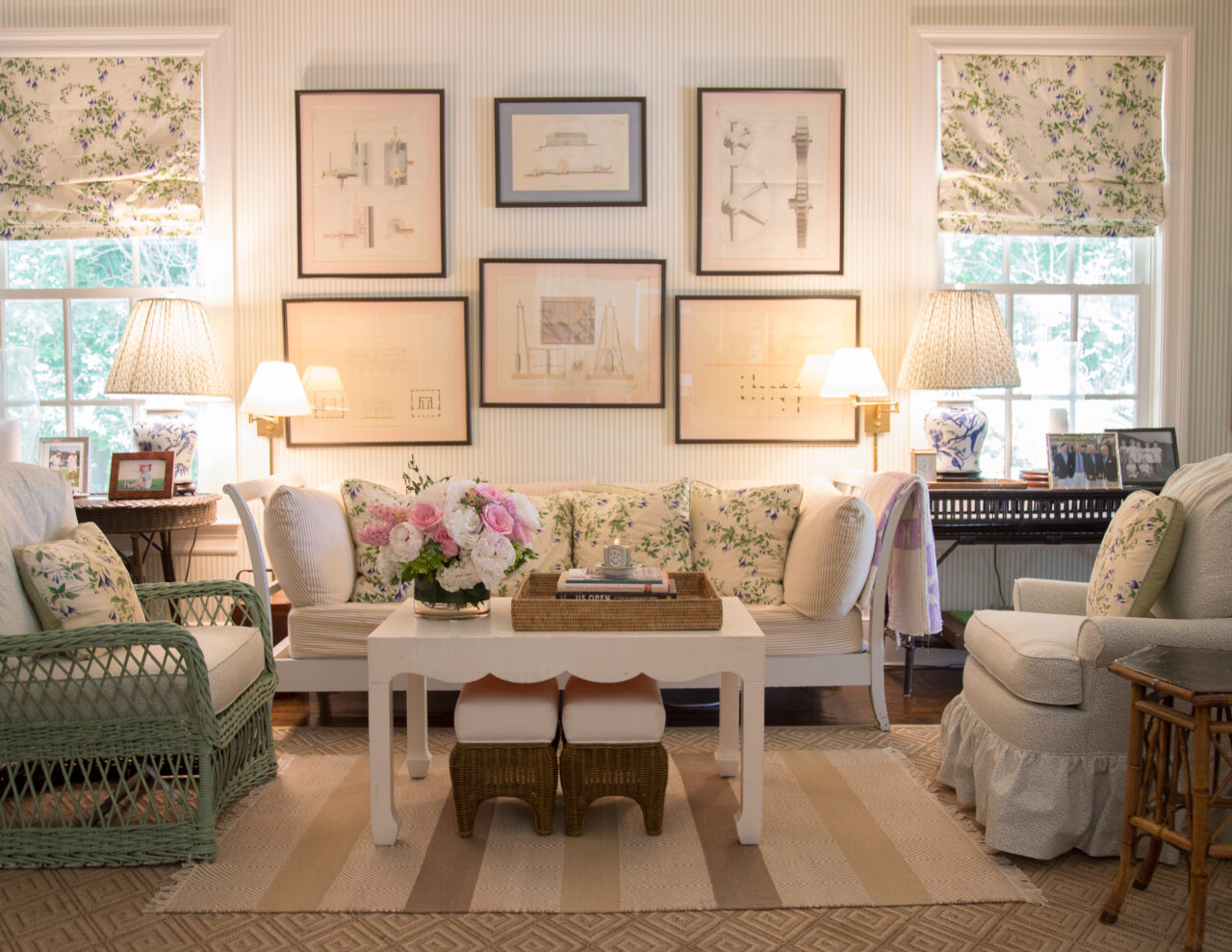
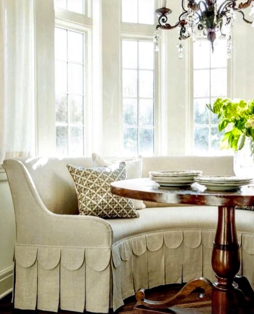
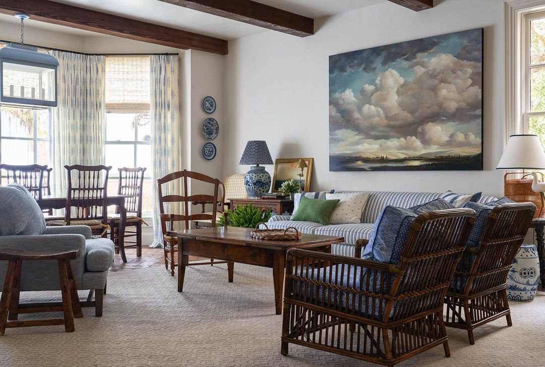
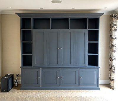
First off – I would suggest that yes, I would tear out the upper cabinets.  Since the room is small and doesn’t have much else going on, the open shelving could be a good place for decorative objects, such as books and accessories.   And yes, 2 ft  is way too deep for shelves.   The bottom cabinets should be 2’ deep, but the shelves should be only 12'’ deep.  The TV will rest on top of the bottom cabinet and the shelves will be above it on that side.   Be sure to run the shelves all the way up to the ceiling to balance out the size of the flatscreen.   When  choosing decorative items for the shelves – try to stay in the same color range.  Such as,  look for white ironstone to display along with dark, brown books.  Or buy blue and white porcelains to display.   This will help your shelves become part of the décor.   Your mantel is fine – I wouldn’t put my money in a new mantel.   It seems proportionate for your fireplace.  And I would never suggest you replace your Texas limestone fireplace!!  I love it – plus, it adds charm to the room and warmth.  Keep it.
As for the electronics, they would go in the cabinets right beneath the TV.  Most clickers can penetrate through cabinet doors, but if not – then you could take the middle portion of the doors out and add the chicken wire – then put a gathered, neutral fabric, like linen, behind it.   Again, this could add some needed charm to the room.
As for the color of the shelves and cabinets – you could definitely keep the same trim color, which would be ideal.  But, you could paint the back of the shelves a deeper shade than is on your walls.  This will make the shelves pop and is an easy, inexpensive way to add a little pizzazz to the room!  You don’t sound as if you plan to repaint your walls, so a deeper shade of the same color would be my first color choice. 
As for the seating arrangement – if the room is really that small, have you ever thought of having just four chairs with an ottoman in the middle?  It’s hard for me to see if this would be feasible, but if so, maybe consider it.   You could use your two leather chairs and mix in two white slipcovered ones.   OR, think about getting the white slipcovered sofa from Ikea (it’s under $400) and mix it with the two leather chairs. Slipcovers are a dog’s best friend.   And yes, I think seagrass would be fabulous in your room – especially if you do white or khaki slipcovers one day!   Perhaps you could move that console piece to the wall behind the sofa or on the wall next to the door – put two tall lamps on it.  I would then move the family portrait over there  – and put a round, wood or rattan framed mirror on the fireplace.  Consider buying or sewing slipped skirts for the two French chairs – they would hide the AC vent better! 
Several of the pictures above will be helpful to you, this one in particular:

:
image
For instance, this photo shows you how the shelves will look going up to the ceiling.  You can see how the TV will look on  top of the bottom cabinet.  And notice, the doors are solid.   No chicken wire was needed.  You can buy clickers that penetrate through the doors.

image
Painted bookshelves really make the room pop!

This blogger Westhampton DIY HERE redid her family room  - she painted the back of her shelves and notice how she got a great look on her shelves by covering her books with paper!   Easy and inexpensive.  Really pretty!

image
And one more look at this room,  your cabinets with painted shelves can look like this – and notice how the accessories are in the same color family.  They make quite a decorative impact themselves!
I hope this helps you and helps anyone else who is having flatscreen issues!   If you still have a décor question – you know what to do – Ask Miss Cote de Texas:
Write me at:  mrballbox329@aol.com

2022 Trends from Cote de Texas

35 comments


I am joining the following bloggers to talk about new trends.  Their blog links will be at the end of this story.  Please enjoy and thanks for all your support!

Joni

Well, I know I said I was not going to do Trend Stories anymore.  But, I just can’t help it.  There is so much new in the design world that it’s exciting to talk about it all. 

These trends are about what I see on Instagram – not in magazines such as Architectural Digest and Elle Décor.  Just Instagram.  I think its the best barometer of what is going on with everyone – real people and designers both.    Most if not all of these photos came from Instagram, some via magazines.

Let’s face it.  Instagram has become the magazine of today, except it’s a daily magazine with thousands of interesting stories from all over the world.

Daily on Instagram, we are all treated to views inside each others homes.  Granted, many people with fabulous interiors posting on Instagram are either designers or had a designer.  But I personally also love following the DIYer, before and after, done by non professionals.

So what is trending hot and what is trending not.

For the past five or ten years, we have seen the meteoric rise of the Modern Farmhouse.

The Modern Farmhouse of Instagram:   white furniture with caramel leathers, light oak floors and veneers, white washed brick, shiplap (still), washed and muted rugs, black accents for high contrast, large light fixtures, white curtains, and usually a wooden sign or two.

For years, DIYers were influenced by Joanna and Chip Gaines and they spawned maybe a million all white farmhouses all across America. With the aid of Instagram’s color filters – these modern farmhouse interiors have started to look a bit alike. It’s become hard to tell one house from another.  And thus, the death knell for this trend is ringing.


A lot of the Modern Farmhouse popularity is driven by its owners.  They are young couples with young children, many trying to save money by doing a lot of the labor themselves.  That’s why you see the veneer floors that are relatively easy to install, the shiplap, the board & batten walls, along with mantel updates with beams and imaginative staircases. 

This bathroom uses all the details of the Modern Farmhouse look in one small room:  the high contrast between black and white with the light wood accents.  The industrial lighting.  Painted white brick as opposed to shiplap.

  Looking at this room, there is no doubt at all when it was designed.  Sometime between 2015-2020.

As a genre, I think the modern farmhouse ala the Gaines influence is on its way out.  It’s time for a change:

Can the Modern Farmhouse be updated????

Why, yes!   Here is a perfect update to the all white farmhouses.  Using many of the same elements, this looks fresh and new and ready for the new decade. 


If you are young, just starting out, or your children have just left the nest – what is next for you?

Judging from Instagram, if you live in the south, you are embracing the pretty Grand Millennial look.


I think the explosion of Pretty came about because some were just tired of the white modern farmhouse and the minimal contemporary designs.  

Pretty was the alternative and on Instagram, at least on my scrolls, it has become hugely popular.

     If you are reading this, you aren’t surprised that I am drawn to Pretty or the Grand Millennial design.   You know, the look your grandmother loved. 

Pretty has been around since the 17th century.   We just go into hiding every decade or so.  Ssssh…don’t tell that to the Grand Millennials who think they discovered curtains and fringe. 

For the older décor devotees,  following the ultra Elle Décor modern and the stripped down Modern Farmhouse,  we have sorely missed the late great Dan Carithers and Mario Buatta and Charles Faudree.

A Charles Faudree Living Room

These three designers were huge influencers for the Grand Millennial of yesterday, but the young designers of today might not have even heard of that trio.


Cathy Kincaid design.

But there are those designers still practicing – and influencing young designers with their pretty interiors:


A Bunny Williams Bedroom

Bunny Williams, Suzanne Rheinstein, Charlotte Moss, Cathy Kinkaid, Kathryn Ireland, amongst others are all great influencers for the Grand Millennials.


Suzanne Rheinstein design.  

Besides all the grand dames name above,  there is the fabulous Mark Sikes, and his Instagram famous blue and white interiors.

I really think that Mark did more than anyone to create this resurgence of the pretty blue & white décor, now known as Grand Millennial decorating.

I love the way Mark mixed this dark antique painting with the light blue décor.  The dark anchors the pretty.  

Stunning.


Mark’s newest dining room décor at his house in LA.  Whoa.  I have to say I just love this man’s style!!

Sikes does PRETTY interiors in just the perfect way that is trending now.

But – there are hundreds, probably thousands of talented designers working locally and starring on Instagram who also do pretty interiors.  There is nothing more exciting than “discovering” a new talent on Instagram, only to find everyone you follow already follows your “discovery!”

These Instagram stars now fill up our telephone screens instead of how magazines once filled up our mailboxes. 

Being published in a magazine may not be as important as getting those thousands of “likes” and “followers” that comes with Instagram fame.

The world has changed so much in the past decade and so has the business of design. 

And so, with all these rapid changes, perhaps that is why the Pretty décor excited so many of us.  I don’t know about you, but I find the Grand Millennial décor to die for.

These young designers may no longer make me turn that magazine page quickly, but they are making me roll my scroll.

Let’s first start with some trends of the Grand Millennial décor and how to update your own décor to make it just a bit prettier:


Sarah Bartholomew.  Blue and White porcelain, trim on skirted table, symmetry, patterned flat rug.


Brittany Bromley – gorgeous.  Just beautiful!!!  A Grand Millennial dream with mural wallpaper, blue & white porcelains, trendy fabrics.

Can’t imagine sitting in here watching TV.  Gorgeous!

Lee Ann Thornton Design – blue & white décor with trendy wallpaper and fancy curtain treatments.

Becky Nielsen.  Blue & White décor with trendy ikat and chintz fabrics.

Katie Davis.  Blue & white décor.  Wallpaper.

Mark Sikes – living and dining room blue and white with trending fabric lampshades.

And for a surprise a pop of green.

Grand Millennial PRETTY in lilac.  Bviz pillow.


Guest room by Webb Design.  LOL!!!   From my old house.  Elisabeth’s former boyfriend lived in this room one summer.

TREND:  murals and wallpapers are still trending off the charts.

Kipling House Interiors

Brunschwig and Fils wallpaper.

Gavin Houghton Design.  Love the green paint and the wallpaper mixed with the oil painting.  So wonderful!  LOVE!!


Katie Davis.  Wallpaper.  Contemporary chairs and table keep the room from being overly sweet. 


De Gournay wallpaper.  Trendy banquette with trim.


Wallpaper in every room, including bars, laundry rooms, and closets.

Brittany Bromley.  Red wallpaper mixed with blues.    Notice the red and light blue lampshades.  This trend of anything but white lampshades is really attractive.

Pretty Grand Millennial bedroom with aqua wallpaper.

Salvesen Graham design.  Wallpaper in a bedroom.  Fabric lampshade.

Charming wallpaper in a bathroom.

DeGournay wallpaper in a shower!   Not sure how this was accomplished, but what a pretty idea!  


TREND:  Nothing speaks Grand Millennial more than Scallops:

Penny Morrison has influenced a generation of designers – here her trendy scalloped built-ins served as more inspiration.


Salvesen Graham design.  Scallops galore.  Notice two other trends:   The English style cabinetry with series of air holes in the doors.  And another trend – bright yellow.


Kipling House Interiors.  Scalloped upholstery.


Anna Louise Wolfe design:  Scallop chairs.

Julia Amory design – scalloped tea table with trendy Colefax & Fowler fabric.


So cute!

Katie Davis Design.  Love this use of scallops.

Chrissie Home and Design.  This scalloped console table comes in many sizes.  But this small size is sold out everywhere. 

Elements of Style:  Scallop curtain in this darling nursery. 

Similar curtains at Ballards HERE


Serena and Lily HERE

TREND:  Fancy Curtains are a hallmark of grannie chic.  But, these curtains aren’t curtains of old, they have a more modern twist.

Anna Louise Wolfe design.  These curtains use a scallop pelmet and blue trim.  Wood furniture and wallpaper with the blue décor makes this a perfect Grand Millennial design.  Anna Louise Wolfe has wonderfully beautiful grannie chic designs!!!

Michael Smith’s Malaison fabric curtains.  Laura Elaine Interiors


Lee Ann Thornton design.  Beautiful fancy curtains with trendy scallop design and trendy wallpaper, of course.

Katie Davis.  Library.  Blues with greens.  Beautiful curtains. Sofa Trim.

TRENDY FABRICS:   Grand Millennials tend to use the same classic fabrics.  And speaking of fabrics, F. Schumacher is riding the tide.  Their fabrics are beyond gorgeous and they have embraced the Instagram in such a positive way, especially with their wonderful video interviews.  Tori!!!

Hanna Seabrook’s design.  Pretty curtains using one of the most trendy fabric:  Lee Jofa’s Althea.


Instagram favorite: A Glass of Bovino and the classic Colefax & Fowler Bowood.


More Bowood.


Julia Amory design – another use of Althea.  


TRENDY:  Dark Wood Furniture.  Suddenly, Swedish and painted furniture is being replaced with English and French and American wood furniture.

Dark wood pieces are a surprise here in a granny chic room.

 r

Amy Berry.  This might be my favorite room of them all.  What an amazing armoire.  Is it built into the wall?  Wow.  I just LOVE this!!!! 

Laura Elaine Interiors – trendy antique wood chest, blue and white décor, wallpaper.  

Leah OConnell design.  Warm wood furniture mixed with wallpaper, curtains, and blue and white décor.

Amy Berry.  Another beautiful use of dark wood mixed with blue and white.  It’s such a pretty combination.  And notice the pop of green and the lampshade covered in fabric. 

Katie Rosenfeld & Co. used a piece of Americana brown furniture as a vanity in her bathroom.


TRENDY DETAIL:  Trim on the sofa, chairs and tables:

Kipling House Interiors

Lee Ann Thornton design – trim on sofa with blue and white décor.

Trim on sofa.  Schuyler Samperton Fabric.  Wow.  Love this fabric!

More trendy yellow on skirted table.


TRIM:  Checkerboard Floors

Salvesen  Graham design.  This shows two trends, checkerboard floor and bright yellow.

HillaryT Interiors.  I love the light blue mixed with the black and white.

Elements of Style associate Molly’s new kitchen and floor.  I love the brown desk mixed in here.

TRENDS:  Light fixtures

For years, the crazier the light fixture, the better.  But it seems that trend is being left behind in favor of more classical design.  I love this room, but I just don’t care for the fixture. 

A beautiful Granny chic room with a traditional chandelier.

Here, two chandeliers are used in this dining room.

Julie Neill  who designs the most wonderful light fixtures shows how a contemporary one looks great in an antique filled room at her house.

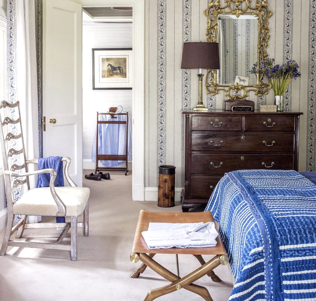
https://www.julieneill.com/
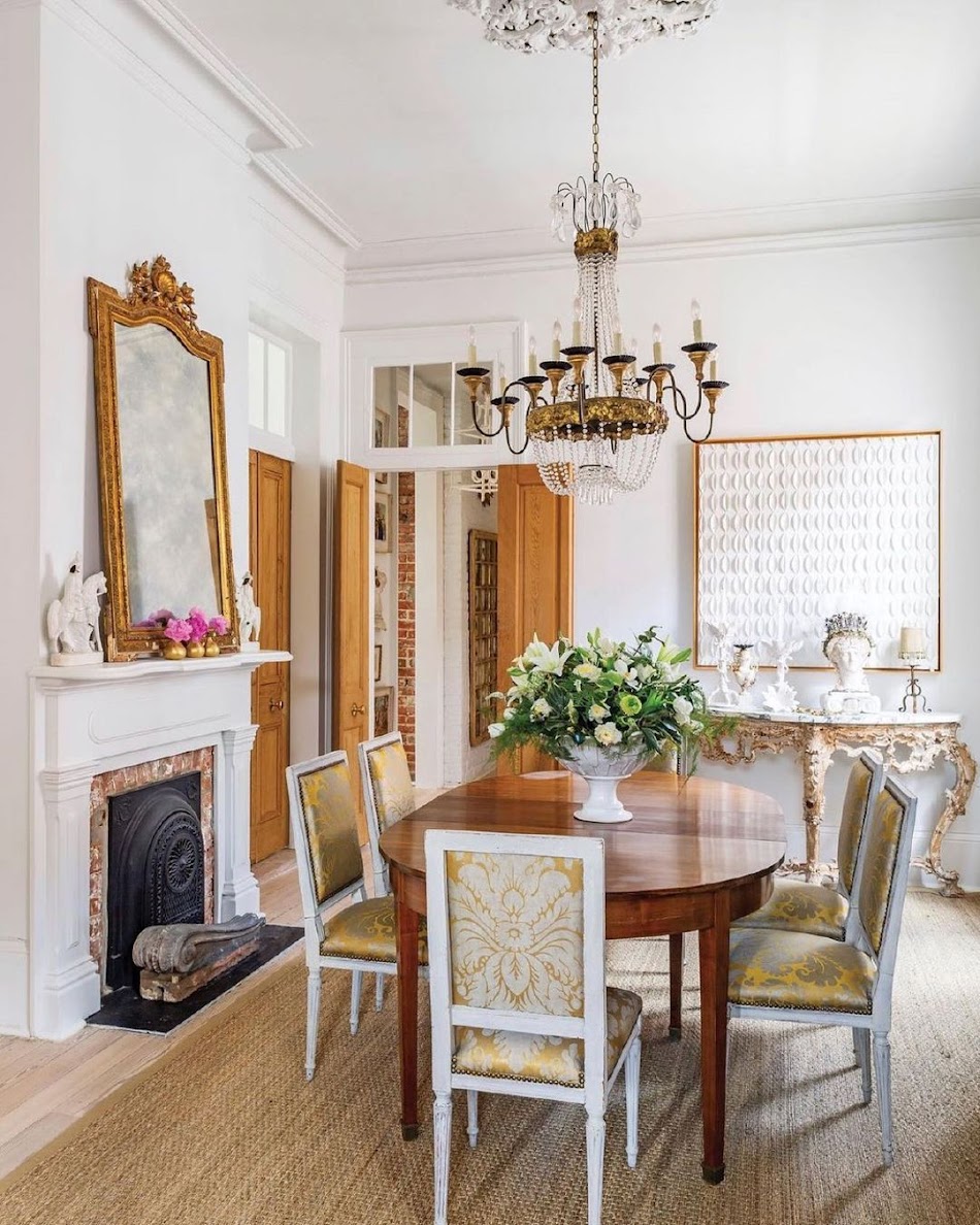
Or, you can choose a more traditional one from Julie.  LOVE her house!!!!!

OK.  OK.  I can’t resist.  One more fixture from Julie Neill. 

Love the pink and green mixed with a chandelier.


Pretty as can be!

TRENDY PENDANTS– Pointed pendants are trending as are more vintage looking pendants.

Chris Loves Julia’s new kitchen has the most fabulous vintage looking pendants.

Circa Lighting has the style in different sizes and colors.  I just love this look.  HERE.

Katie Rosenfeld – these vintage looking pendants are to die for!  Right on trend for years to come.  Here’s the link for the light.

And here is a very very inexpensive dupe HERE


The pointed pendant trend started with the plaster DeVol fixture.


Dupes - Ballards enamel pendants HERE


Vintage inspiration Here


TREND:  Fabric Lampshades:

  A plain white shade looks plain now.

Michael Smith with his designed shade.  That lamp!!! Gorgeous!  I love how the fabric doesn’t match the blue and white.

Next, we will look at a trend that is the opposite of Grand Millennial.

TREND:   A cozy, warm, colorful décor

This look is a more sophisticated boho look and it’s taking off in a trending fashion.  It’s the antithesis of the Grand Millennial look with either bright pops of color or more muted, dark colors.  The look is cozy and warm and it’s an undecorated anti matchy-matchy look.  More popular in England and the north, it is gaining popularity in California and now the south.

The Queen of the Cozy Look has to be Katie Rosenfeld.  Her work is incredible and she is hugely popular.  Can I be best friends with her?  She looks like she is so much fun!!


Romanek Studio Projects.  From L.A.  Interesting mix of curves and textures, woods and velvets. 


Another Katie.  Always mixed in with brown Americana furniture.


Rita Konig is another leader of the cozy warm décor.  Someone needs to make up a name for this grown up boho look!

Amy Berry.  Brown and more brown.

TREND:  Grandfather Chic Kitchens:

Grandfather Chic kitchens are typically either green or blue.  Hardware – brass with live finish.  Green looks great with brass and soapstone or matte black granite counters.  Notice the pointed antique style pendant.


Blue with countertop hutch and vintage pendants.

Another green kitchen with caramel colored wood tones. 

Another waning  factor that was once THE kitchen trend – dramatic waterfall edges don’t go in old fashioned, warm kitchens.   I’m seeing less and less of waterfall edges.   And another waning trend – remember when countertops were faux three inches deep?  Today a one inch countertop is much more authentic looking and is a must in either a Grand Millennial or Grandfather Chic kitchen.

  Old fashion countertop with drying grooves.  Live finish brass.   Take a good, hard look at the faucet before you decide you have to have this trend.   Rustic oven hood.

Black cabinets mixed with marble and brass countertops.  DeVol pendant. 


And finally, the LAST TREND:

The flat screen Samsung Frame TV.  

The frame TV is experiencing an explosion and I can’t wait to talk Mr. Slippersocksman into buying one for us.  If I had a dime for everyone that has ordered this TV lately, I’d be a wealthy woman.  Anyone want to give me that dime???????  LOL.

Let’s take a stroll down memory lane.  Remember when everyone had an armoire or a cabinet where they hid the TV?   Just a few years ago, designers had to hide a three foot monster in some kind of cabinet or TV stand where it wouldn’t be the focal point of the family room.   My fellow interior decorators, how many cabinets did you design to hide that behemoth TV?

Here’s one of my TV cabinets designed for a client ten years ago.

An entire generation of young designers will never know the dread of hiding a huge TV.

The flatscreen changed design in a massive way.  Suddenly, we had an actual flat TV that could hang on the wall or over the mantel.  It was revolutionary.

Well, now Samsung has come out with an even better solution – a completely flat screen with a frame around it that looks like a piece of art instead of a black void.  Amazing.

The old days.  A huge cabinet built just to hide a huge TV.

Then, the era of trying to hide the flatscreen behind art.   Now, this just looks horrible!!!

Today, we have the Samsung completely flat frame TV:

The famous Instagram couple – Deb & Danielle have the frame TV.  Beautiful!

If you don’t follow Deb&Danielle, you should.  They are adorable.


Another frame TV.  There has even been an improvement on the original frame with a new screen that makes the art look even more like real art.

Grandfather Chic frame TV.

OK.  If I say Grandfather Chic enough times, maybe it will become a true label?

TV art work.

Go HERE for a tutorial from this blogger.  Everything you need to know.


An example of the different frames.

And now, on to 2022.  Hopefully a better year for all of us in this world.  Please God!!!

Look at what I found while writing this article.  A photo of the late, great, Charles Faudree with Instagram favorite The Leslie Jordan.

The links for all these bloggers is right below this photograph.  Thank you for stopping by to visit their blogs, I know they all appreciate it!!!


CINDY HATTERSLEY DESIGN

CLASSIC CASUAL HOME

MOST LOVELY THINGS

CARLA ASTON

LAUREL BERN

SHERRY HART