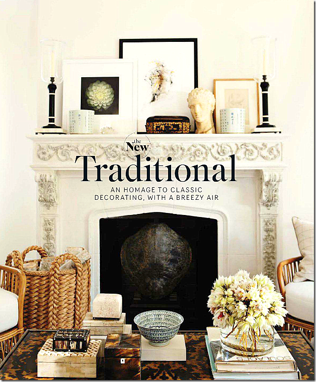
The cover of the new December-January issue of House Beautiful really caught my eye – I felt like I was looking at a more contemporary, more luxurious version of my own home. These days, I rarely find a house I truly like in the magazines. Like I said a few weeks ago, I don’t understand all the mix-matched interiors that are such a rage today, nor do I prefer loud, bright colors and prints. It’s no wonder why this cover appealed to me! I was eager to see who the designer was whose work spoke to me so personally. So many of the elements used in this room are things I use in my own designs and in my own home. It turns out the interior designers are Mark Sikes and Michael Griffin and they are the owners of the beautiful 1920s house located in Los Angeles. Both Mark and Michael were visual merchandisers and now are branching out into interior design. Their house is a nod to a return to classic decorating – minimalism isn’t their thing – at all. I can relate to that. Although I admire the less is more look in magazines, living that way is another story. I like to collect, to buy, to add, to subtract. I like to change things around, bringing in new designs and fabrics, and pillows every few years or so – I get bored with one look for too long, even if it is classic. I have a feeling Mark and Michael feel the same exact way – judging by the amount of “stuff” they have accumulated.
Mark Sikes performed the magazine’s interview – so it’s hard to tell how much of this design is his and how much is Michael’s and what is both of them. Since Mark took the credit during the interview, I’m going to refer to him.
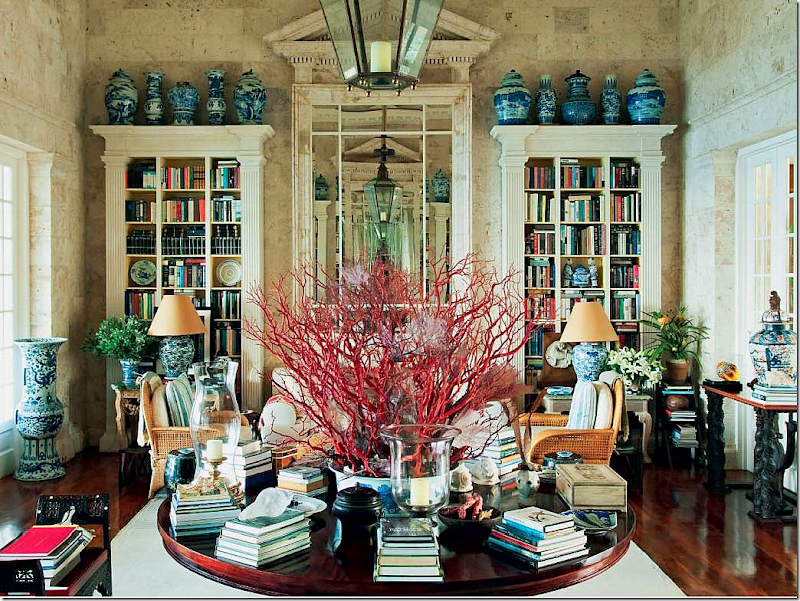
Oscar de la Renta’s Punta Cana beach house – the main living area.
Oscar de la Renta’s Punta Cana beach house is a big influence on Mark Sikes – and me too. The beach house is filled with blue and white jars and vases and bowls. The round center table, sitting under a lantern, divides the main living area – and acts a a foyer of sorts. It is piled high with books and candles and shells. Mirrors act as art. Minimalism? Not here! Does it look like Oscar likes to shop for his house? Yes! And so does Mark and Michael, and guess who! Minimalism means you have to constantly edit, edit, edit. I do like to edit a bit – but, I would rather add than edit.
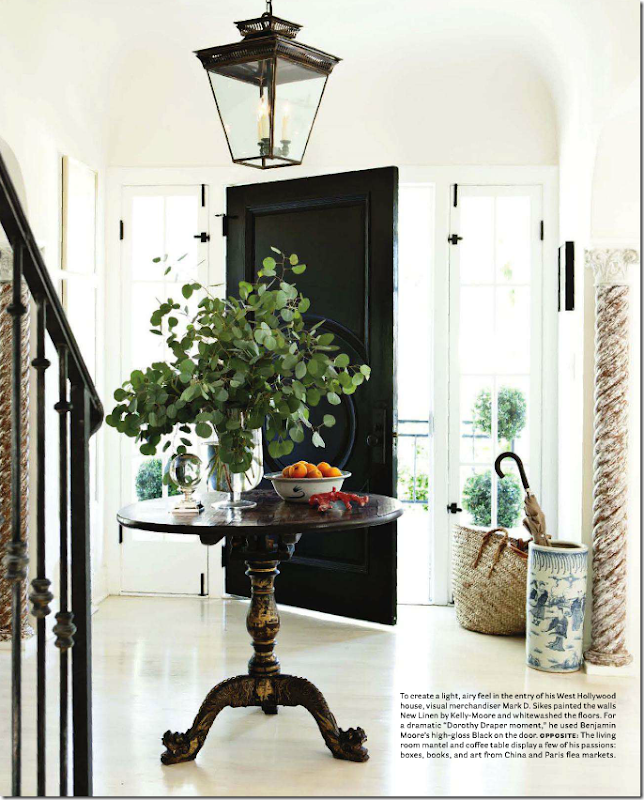
Sikes and Griffin’s Foyer
The House Beautiful story begins with Sikes and Griffin’s entry hall which features a round antique chinoiserie table sitting underneath a black lantern. So many elements in this room look familiar to me – the black door, the lantern, the blue and white. I love black accents in a home – and so does Sikes. I’ve painted all my doors black, a trick I use to make builders grade doors look more important. Like Sikes, I use lanterns as much as I can and I too have a round table in my foyer. One main difference though, is Sikes and Griffin’s walls and floors are white, I have gray walls and hardwoods. But, our aesthetic is the same – one day I want to paint my floors - I just don’t want to move out for three weeks!
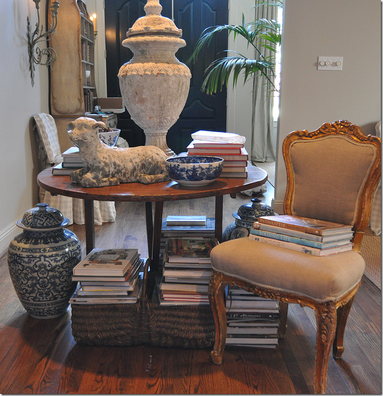
My Entry Hall
My entry hall with a round center antique wine table, piled with books and blue and white porcelains. My front door is painted black, as are all of my interior doors. I love touches of gilt – not too much, but just a accent here and there. Does this look as nice as Mark Sike’s house? No. His house is much more architecturally interesting than my house. There is no comparison between the two. But, I love how so many of their design elements are found in my house too! If I was just starting out decorating this house, I would use Sikes’ house as a reference while furnishing it. As it is, now I will use their house for new ideas.
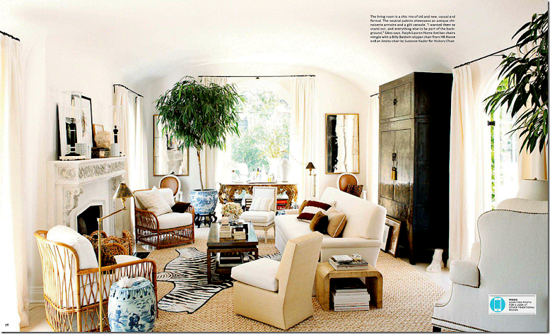
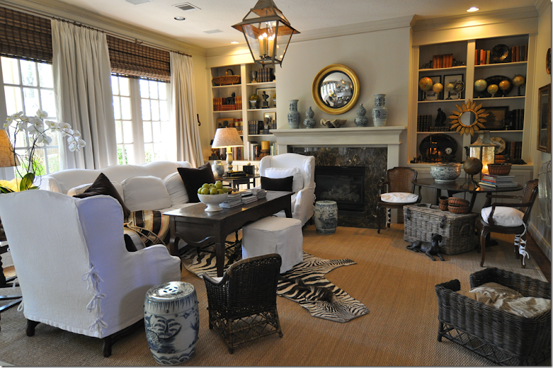
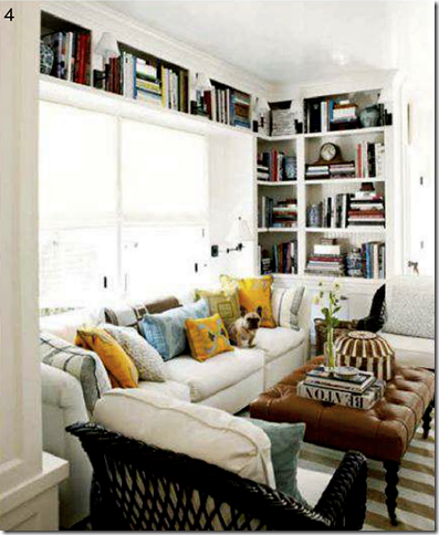
Sikes and Griffin’s living room. Boy can I relate to this! A textured rug anchors the room. Here, Mark used Abaca – I prefer seagrass or apple matting (although I have yet to have a client request it!) A zebra skin is layered over the rug – check. Blue and white garden seat used as a side table – check (I use two in my family room.) White upholstery – check. Mirrors as art – check. Blue and white planter with greenery – check. Books and magazines everywhere – check. Baskets – check. Brown velvet pillows – check.
Across from the fireplace – chinoiserie box – check. Tortoise shells and boxes – no check (can’t afford it!!!!) Bust – check.
In the interview Mark says “I love that refined, lived in look. I want everything to be pretty, but I want people to be able to relax and enjoy it.”
“The key thing is accessorizing.” They collect: blue and white Chinese porcelain, boxes, silver objects, coral, ikats, vintage Hermes ashtrays, Astier de Villatte, books, magazines – they have a 20 year magazine collection.”
I collect: blue and white Chinese porcelain, baskets, silver objects, coral, suzanis, crystal, blue opaline, altar fruit, creamware and white ironstone, Masonware, books, globes, & mirrors.
My Family Room
The zebra layered over the seagrass, the blue and white garden stools and the blue and white vases on the mantel, the white fabric, the brown velvet pillows, the baskets, the books, curtains, the lantern – all design elements that Sikes and Griffin also used in their house.
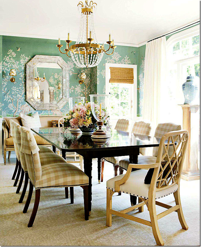
Sikes and Griffin Dining Room
Gorgeous! Their dining room is a study in contrasts. Contrast the beautiful but pricey hand painted Gracie wallpaper with the lowly, country cotton check on the chairs. Mark says – “It’s the mix - masculine and feminine, rough and soft, light and dark, high and low that makes a room feel great.”
When I turned the page and saw this dining room, I just laughed. Last year I put up a handpainted wallpaper in my bedroom – in this color! While their dining room more resembles my bedroom – it’s the décor elements found in each room that show we have a close design aesthetic. The chandelier – his is the Paris Flea Market fixture from Circa Lighting. I have the same chandelier, but an antique French one, bought at Tara Shaw. Again, the high and low – if you love that shape in a lighting fixture and don’t want to spend the money on an antique, the Circa fixture is a great alternative. While Sikes spent a small fortune on his Gracie wallpaper, mine was much more cost effective, bought from Jardins en Fleur at a considerable savings over Gracie Studio.
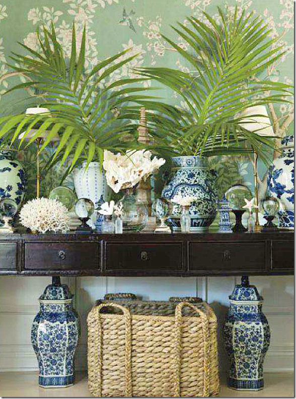
In the dining room, a console holds this wonderful tablescape – baskets, coral, blue and white porcelains piled up high. Sikes says: “One of our rules is – nothing should have nothing on it. When I see an empty table, I shudder.” THAT!
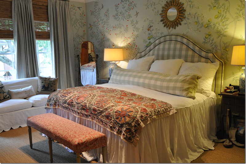
My Bedroom
My bedroom most resembles Sikes and Griffin’s dining room with the handpainted wallpaper in green. We both used big checks – while I mixed mine with a smaller one too. Blue and white vases that I turned into lamps. I collect Suzanis – not Ikats like Sikes. And we both layer rattan shades with curtains. Sikes used the same white linen at his windows throughout – I use different fabrics in different rooms.
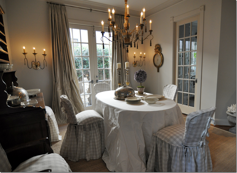
My Dining Room
While my bedroom looks more like their dining room, my own dining room has checked fabric on the chairs. Their dining room is more English in feel, while mine is more French. But – it’s the mixture of the high and low, the dressy and the casual – that’s a shared aesthetic. Mixing casual checked fabrics with fancy silk taffetas is the important detail. Mixing causal seagrass with fancy chandeliers and sconces keeps the room from taking itself too seriously – thereby putting all at ease, allowing those visiting to feel comfortable and relaxed. Here I used an Italian wood chandelier – but a crystal one like Sikes would also be appropriate, as would a wonderful antique lantern – all rusty and neglected.
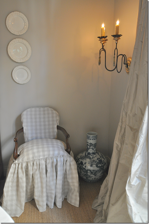
In both corners of my dining room – extra large blue and white vases sit on the floors. These came from OKA in England.
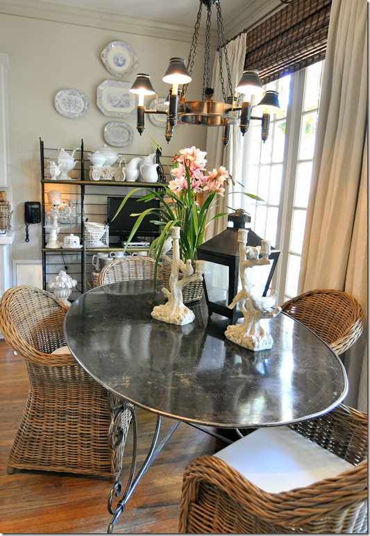
Sikes and Griffin Kitchen, Breakfast Room and Family Room
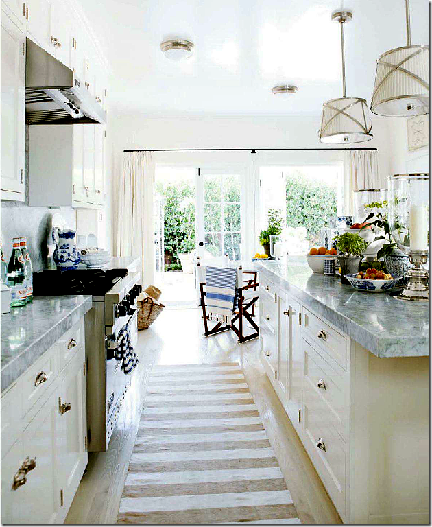
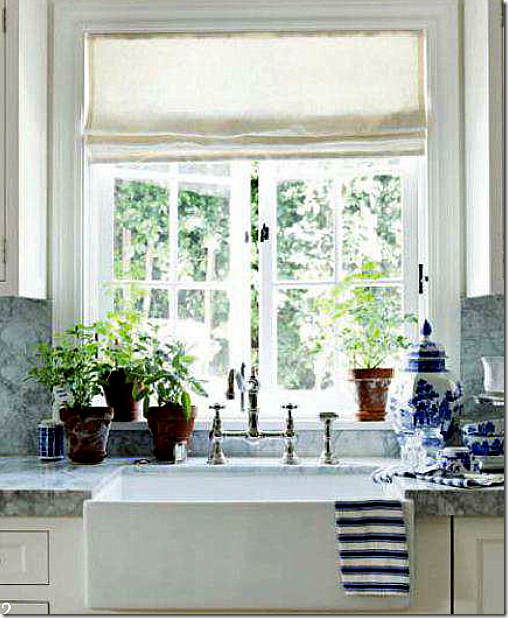
Our all white kitchens aren’t that similar – Sikes and Griffin are lucky to have beadboard and wonderful appliances, something I didn’t want to spend a lot of money on. They chose the grayer Carrara marble, while I chose Calacutta Ora. BUT, we both chose the same straight edge on our countertops and we both chose 3x thickness - and we both ran our countertops up to the backsplash. Their breakfast room connects to the kitchen, like mine, and a row of French doors opens to the outside – like mine.
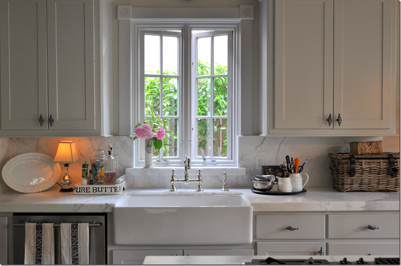
Their sink area is very similar to mine – a farm sink with a beautiful casement window above it. It looks like we have the exact same fixture – in polished nickel. Even the accent – a stripe towel – is alike. Weird, I know.
My Kitchen
My casement window, farm sink and fixture – looks just the same. My marble countertops with their straight edge is like theirs – and so is the marble backsplash.
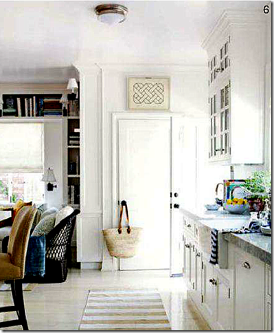
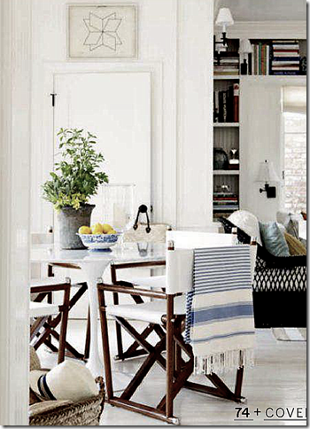
Sikes and Griffin’s Kitchen, Breakfast and Family Room
Striped rugs are a constant throughout the house.
One major differences in our aesthetics, is Sikes and Griffin mix in contemporary pieces, like their iconic breakfast table. That’s one thing I really don’t do. And, their house has a more masculine feel to it than mine, which would be expected. Another difference, is much of their furniture and fabrics are very fine – lots of George Smith, Williams Sonoma, John Rosselli, Peter Dunham, Raoul Textiles, Madeline Weinrib, Carolina Irving, and Rogers and Goffigon – fancy names for luxe products. I tend to go more low end, by fiscal necessity.
The family room, with white upholstery and wicker chairs.
Other than neglectful, what words would Mark hate to hear his house described as? He answers: “trendy, decorated, uncomfortable, done.”
Well, I do like trendy things – especially accessories. But decorated and done – I totally understand that. I like to change things around the house too much to have it decorated in one set way. I like my house to be fluid, a moving act.
My Breakfast Room
Like Sikes and Griffin’s – my breakfast room sits before a bank of French doors that leads to the outside courtyard. I like that when one comes through the front door – you can see all the back into the courtyard. I wish it were a straight hall that takes your eye there, but it isn’t – one thing I would change if I could. Vistas are so important in floorplans, a lesson I hadn’t learned when we moved here 18 years ago!!!
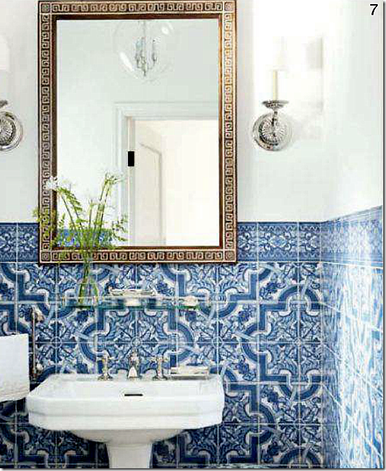
Sikes and Griffin’s Powder Room
Their powder room is exquisite – no other word for it. The walls are done in Portuguese tile. Stunning! No, I have NOTHING like this – though I would die to have it!!!
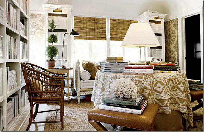
The Upstairs Library – Off the Guest Room
The library holds a 20 year collection of magazines. My favorite fabric – Peter Dunham’s Samarkand lines the walls. A French day bed takes the place of a sofa and a skirted table is covered in books and ikat. More coral, more greenery. The rug is apple matting – a great alternative to seagrass when you want more texture.
My Living Room
In my living room – my chandelier is a match for Sikes and Griffin’s dining room chandelier. Where they mix in modern seating, I tend to keep my chairs French. Here, I used a French daybed instead of a sofa, just as they did in their library.
Like Sikes and Griffin, I collect coral and have it placed throughout. In the corner is a blue and white planter holding a large green bush – just as in their living room. Besides the differences in contemporary seating, most of my lighting is more traditional than theirs.
Sikes and Griffin’s Master Bedroom
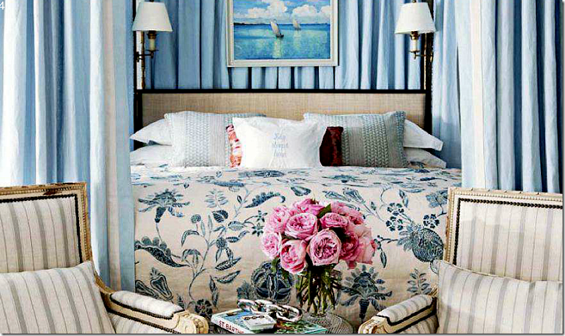
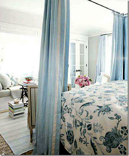
Sikes and Griffin’s master bedroom is a study in blue and white – Carolina Irving fabric makes up the coverlet. Here, French chairs and flowery fabrics make the room more feminine than the rest of the house. So beautiful! I love how he placed two French chairs in front of the bed – another idea I want to copy!!
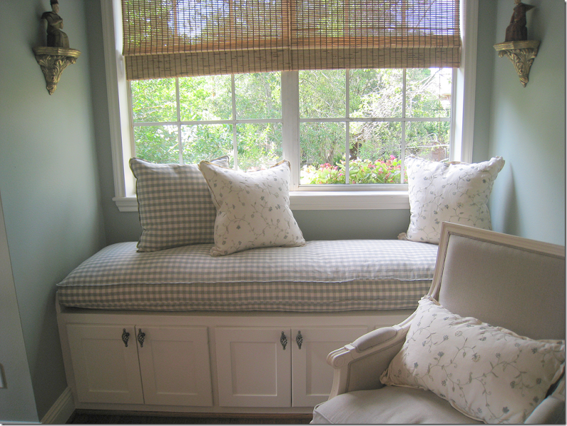
A Dash and Albert striped rug is layered over the apple matting. Ikat covered pillows on the window seat.
When asked what he wears – Mark says blazers, blue shirts and white jeans. He says he has over 50 pairs of white jeans. ok. Now I can REALLY relate! In the summer, I wear only white linen – shirts and pants, and in the winter I wear black – pants and sweaters. I don’t think I have one item in my closet that is patterned. It’s all plain and simple and easy. I probably have 10 pairs of the same exact white linen pant. Same for the blak pants. I find one style I like and wear it over and over. So boring!!! Around the house – I wear white sweats in the summer and black sweats in the winter!! I swear!! Mark says he looks like the décor in his house and in the summer – I do too. In the winter – I match my black doors.
My Daughter's Room
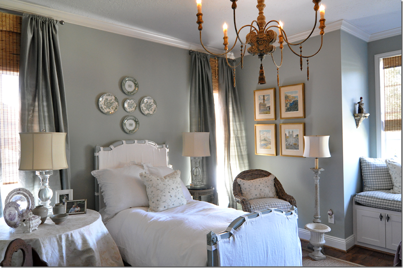
For years I lived with a blue and white master bedroom – with a blue and white print similar to Sikes and Griffin’s bedroom. Once I remodeled my room, I missed the blue and white so I did Elisabeth’s room in those soothing colors. I love blue and white bedrooms – soft blue is probably my favorite color. I think each house should have at least one blue and white bedroom! One day I’ll have a living room in that color. Elisabeth’s chandelier has the same basic shape as the others, but hers is a low budget fixture – found on Amazon!!!
Sikes and Griffin’s Guest Room
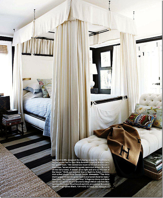
Sikes and Griffin’s guest room is painted dark in a homage to Billy Baldwin and British Colonialism. Very masculine and very English. One thing I am noticing is all the striped rugs they use – something that I adore and what to do too. I have a blue and white striped rug that might look good in my bedroom, layered over the seagrass. I really love that look and think I’m going to be copying it. In this room, I love the two chintz pillows that bring femininity to the room. Beautiful room!!
Sikes and Griffin’s Guest Bathroom
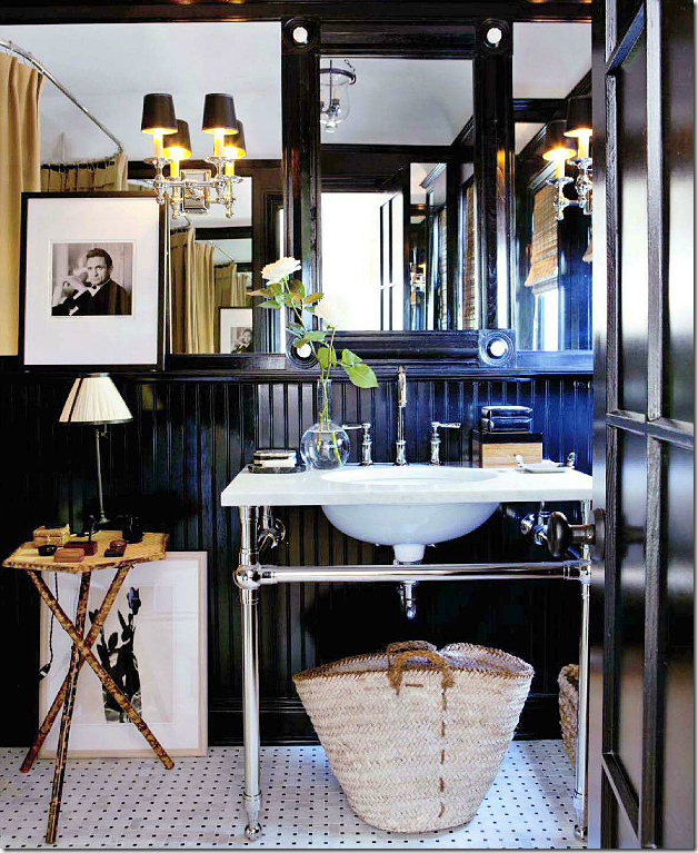
The guest bath is gorgeous – painted beadboard, wonderful sink. And notice the gold shower curtain.
When asked what Mark avoids like the plague, he names recliners, matched sets of furniture and chairs sitting across from sofas. He prefers to float his furniture arrangements. What can I say? I hate recliners and matched sets of furniture too, natch!
My Guest Room
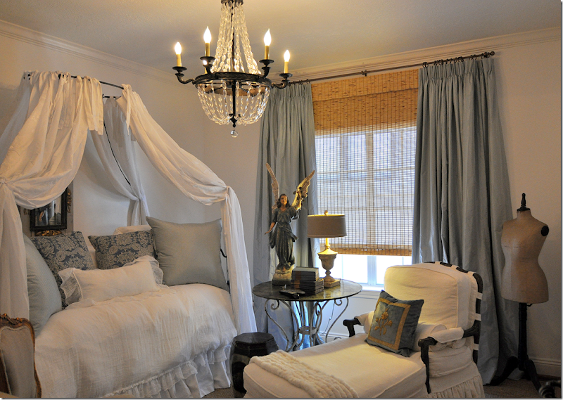
My guest room is nothing like Sikes and Griffin, but I did notice similar design elements we both used: their bed is slipped in white – just like mine. A skirted table matches their skirted table in the library and the French chair is the same as theirs in their Master bedroom. My guest room is a reflection of my love of French design – while theirs is a love of British Colonialism. Masculine vs. feminine. I can’t help but think a striped rug would look great in here – just like theirs.
One other similarity – my window seat matches the window seat in their master bedroom.
Sikes and Griffin’s Exterior Views
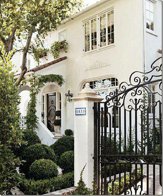
Sikes and Griffin’s house is a 1920s white stucco. They designed the iron gates. Their garden is green, with lots of creeping vines and box, just exactly what I love. This house is so gorgeous – notice the arched front porch with the barrel tiled roof. The window boxes above it are so romantic. What I wouldn’t give to be able to own an old restored house like this. It’s just perfect.
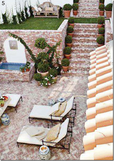
Their backyard is two tiered, with a fountain, a brick terrace and stairs - and on the upper level, a teak bench. Blue and white garden stools are used for side tables.
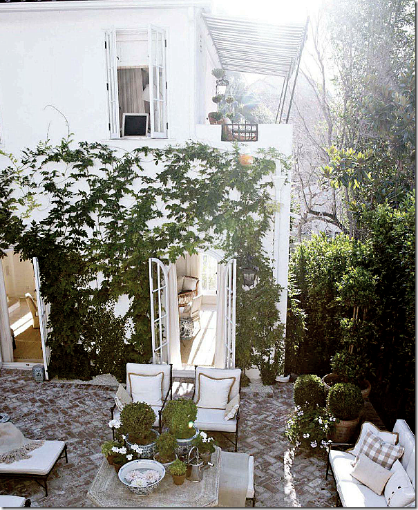
The terrace off the living room. To die for! Look at those arched French doors. And notice the balcony with the striped awning. Mark says when the doors and windows are open, the backyard becomes part of the inside living space. Gorgeous.
My Courtyard
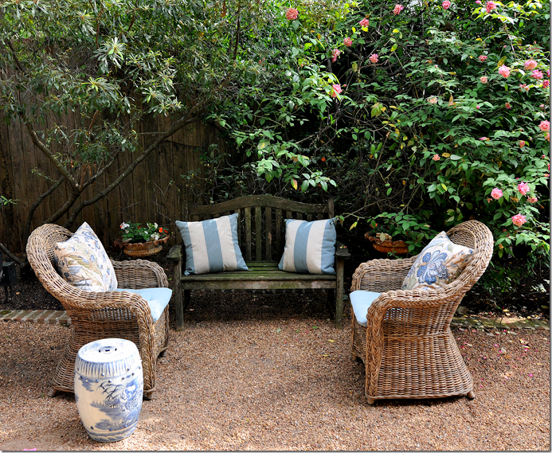
My own backyard is really a small courtyard with a brick patio and gravel “rooms.” Here, my bench reminds me of their bench. And the blue and white garden stool is similar too.
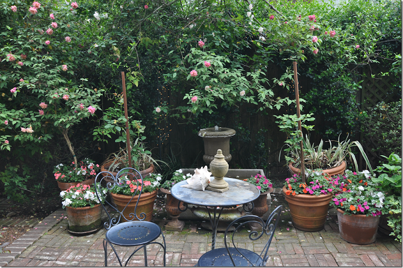
Off my brick patio is a fountain – like theirs. The back of my house also has French doors, which we often leave open. I mostly blog outside – my table is my office.
Seeing the cover of the new House Beautiful really felt familiar to me. It felt like “home.” I immediately opened the issue and studied this house – and then went to share it with Ben. While, Mark Sikes and Michael Griffin’s house is much finer than mine and their furnishings are more English than mine, there was a real sense that we had very similar aesthetics – though theirs is more masculine to my more feminine one. The connection I felt with this house doesn’t happen often. Most houses in magazines don’t move me – or I don’t share any aesthetic with the designer, none. I love when I do find something that speaks to me. I keep thinking that this is how I felt when I first Jill Brinson’s house. There wasn’t anything about her house that I didn’t love.
I started thinking – well, maybe I’m exaggerating here. Maybe this house is too dissimilar and to even imply otherwise is really stretching it. I mean - I know the differences! So, I went back to the magazine and to this month’s Elle Décor to see if there were other houses or designers that I felt we had similar likes and dislikes. Nope, not a one.
When was the last time that you felt a kinship with a designer? When did you last see a house in a magazine that felt like “home” to you? That you said – yes, I collect that too. Yes, I like that fabric too. Yes!
Mark Sikes writes a wonderful blog about things he loves. Needless to say, most of his favorite interiors are ones that I agree with – and many I have shown here, too. To read his delightful and entertaining blog, go HERE.
All photographs from House Beautiful are by Amy Neunsinger. You may recognize her name from her collaboration with Rachel Ashwell’s books.
Finding Personal Inspiration
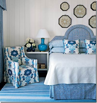
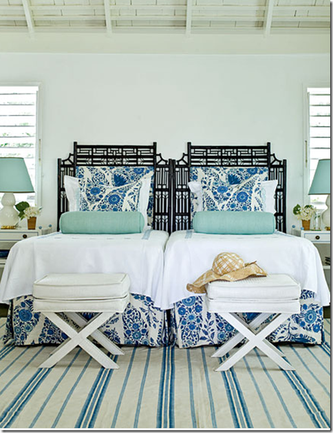
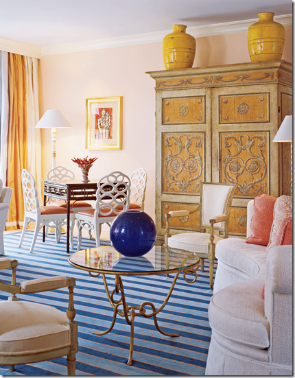
Blue & White Striped Rugs
Sometimes several disparate items converge into one theme, without planning: a blogger’s bedroom, a wedding venue, a new EBay purchase. The one thing that connects the three is a blue and white striped rug.
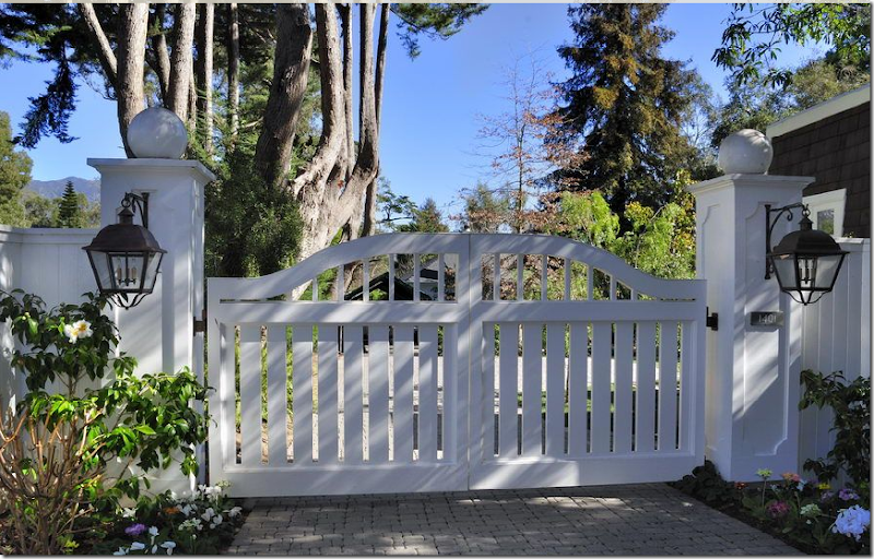
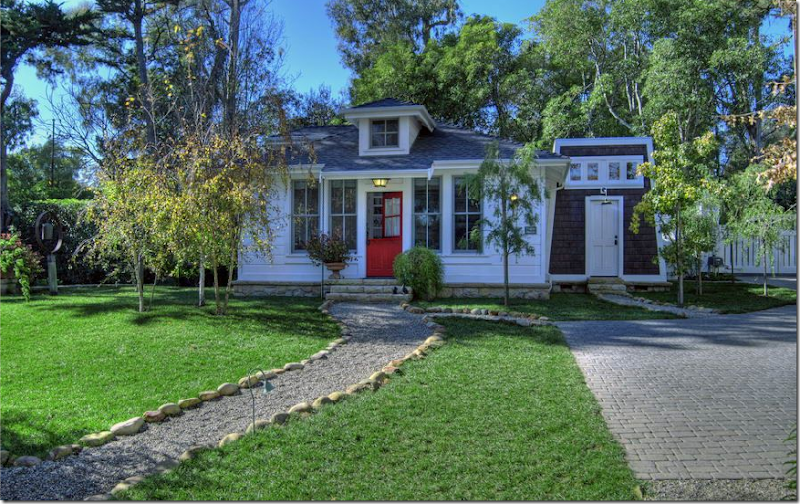
A Californian wedding venue: the property comes with a main house and a smaller, one room cottage. You drive through these wooden gates to enter the property.
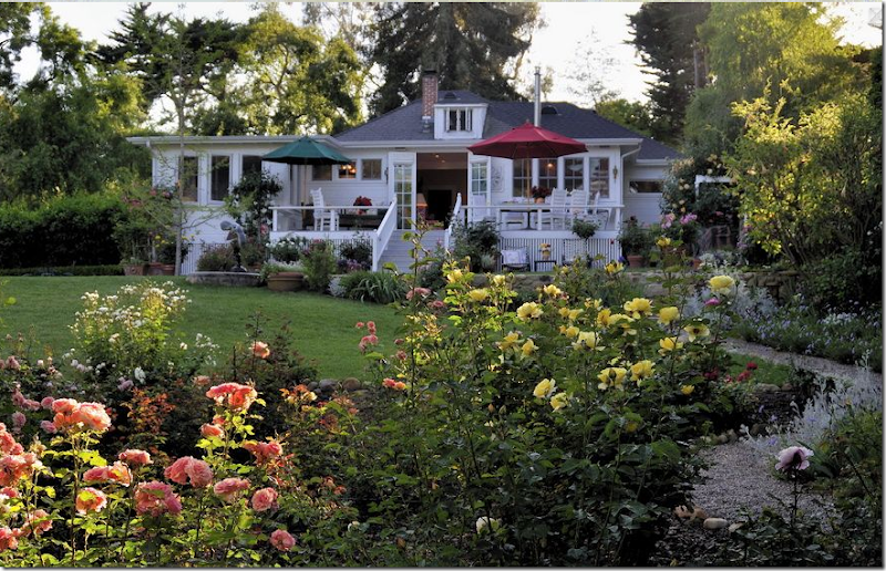
The main house. Paths of gravel lead out to the yard.
The smaller, one room cottage is used for the bride and groom to dress in, or to stay in before and after the ceremony.
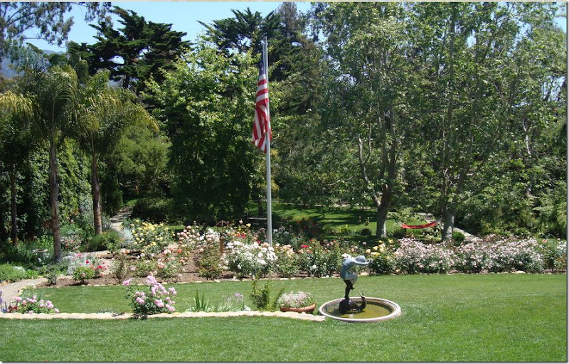
The acreage terraces down past the rose garden.
The property is filled with streams and surrounded by mountains. Why is California so pretty?
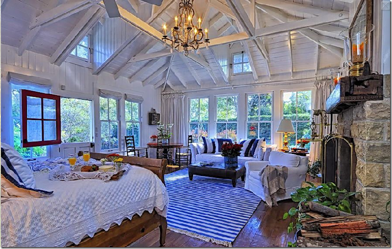 The one room cottage that sits on the property is charming. With its beamed wood ceiling, paned windows, Dutch door, crystal chandelier and rock fireplace – who wouldn’t want to stay here on a honeymoon night? But what catches my eye first, as always, is the blue and white striped dhurrie rug. It attracts my eye like Bella to her Edward (!) Is there something – that when you see it in a room – makes you stop and look and like the room just a little more than you might have otherwise?
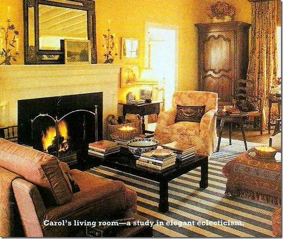
This room, Houston interior designer Carol Glasser’s former living room, had such an effect on me, almost 20 years ago. A very, very old version of her oft changed decor, this one with the blue and white dhurrie has remained a personal favorite. Classic English Country Manor decor, Glasser’s inspiration no doubt came from exactly that country. Maybe a decorative book with a photo of a room in some pile of bricks, a rundown summer house in Gloucestershire or Derbyshire might have provided that initial inspiration. Or maybe, she saw a pictorial in an old World of Interiors or British House and Garden. Or, it could have been borne from a visit oversees, which Glasser took many of. But, have no doubt, she wasn’t inspired by anyone in Houston. The rug in Glasser’s house eventually was sent to Santa Fe where it was used in a house that Mary Emmerling and Glasser styled for the book “Mary Emmerling’s Quick Decorating.”
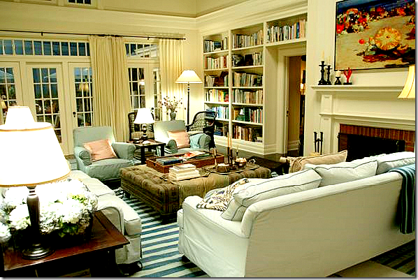 This living room from Something’s Gotta Give introduced a new generation to the seduction of blue and white dhurries. Surely, never again will the dhurrie ever be as trendy or wonderful as it is here, in this Hampton’s beach house. Beth Rubio who designed this room, brought in a lot of classic English Country Manor styling to the beach house, with its books and cluttered feel, it’s dark wicker and slipcovers, the large ottoman coffee table, and wonderful white moldings and dark wood furniture. But that subtly was lost on most devotees. To them the blue and white rug read beach, and beach only.
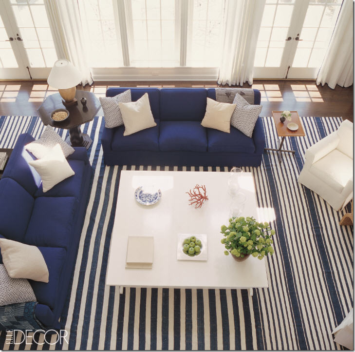 Victoria Hagan took the striped dhurrie, using a deeper indigo blue, and created a stunning, slightly contemporary, beach house. Elle Decor Magazine.
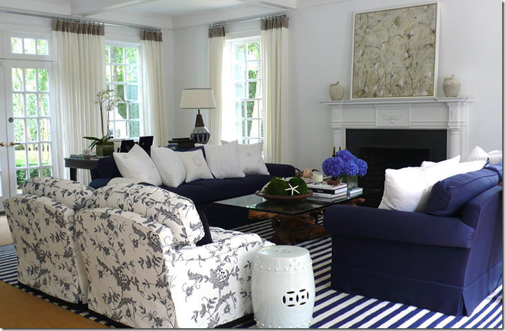 David Lawrence’s beach house uses the same indigo blues, dark sofas and white pillows, but with the floral linen, his decor looks less contemporary than Hagan’s.
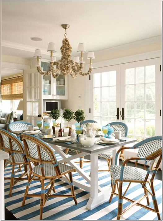
Ashley Whittaker brought the striped rug into the dining room. Again, going for a beach house look, she added a shell chandelier and a zinc topped table.
Phoebe Howard used this striped rug in a beach house bedroom.
I really like this rug – with its wide bands of cream. I like how the designer mixed turquoise blue with the darker blues. Again, beachy.
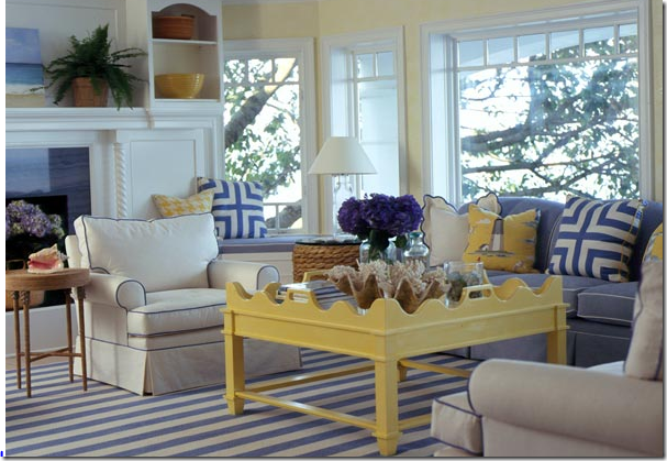
I imagine this homeowner was directly inspired by Something’s Gotta Give, judging by the piping in the upholstery. Yellow? Not my personal preference, I would have rather seen dark or painted wood.
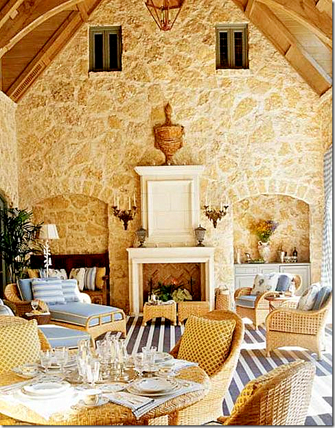 Cathy Kinkaid designed this beautiful loggia for a Southern Accents showhouse. She mixed the indigo with the sky blues.
Thomas Britt used a dhurrie mixed with a Hollywood Glam vibe in this beach condo.
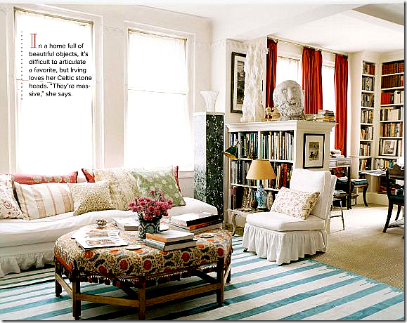
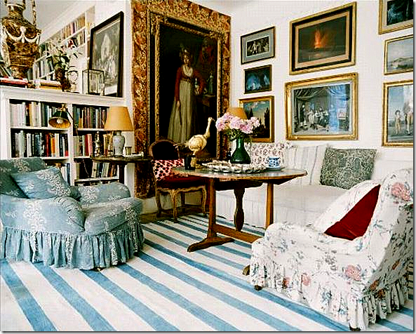
Enough of blue and white dhurrie rugs and the beach house! This apartment in NY owned by Carolina Irving is so wonderfully styled – it stars the striped rug layered over sisal. Of course, this look is not beachy, thank God! Instead this apartment shares much with Glasser’s house, though a decade or two divides them. Both Irving and Glasser used the blue and white dhurries in a more classic way – strictly English Country Manor. Irving’s apartment, though in the big city, looks more as if it is inside a summer home outside of London. Lonny Magazine.
Carolina Irving again, Lonny Magazine. The woman exudes more style in one second than most do in a lifetime. Her apartment is so wonderful, a cluttered collection of books and artwork – oils and prints cover all the walls. Each table is an antique and the upholstery is slipcovered in an old fashioned way, loose and ruffled. The soft blue and white dhurrie is so beautiful here, it’s hard to visualize the apartment working as well without the rug. There is nothing trendy here – it could stay as it is today and remain fresh years and years from now, which is exactly why the rug is perfect in this decor. Dhurries have been made in India for centuries. They were brought back to England during their long reign over that country and became popular due to their versatility and low cost. Most often, the dhurries were layered over the sisals and mattings popular in England. There are mentions of these classic rugs in English decorative books dating back from the late 1800’s.
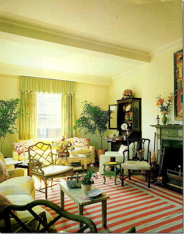
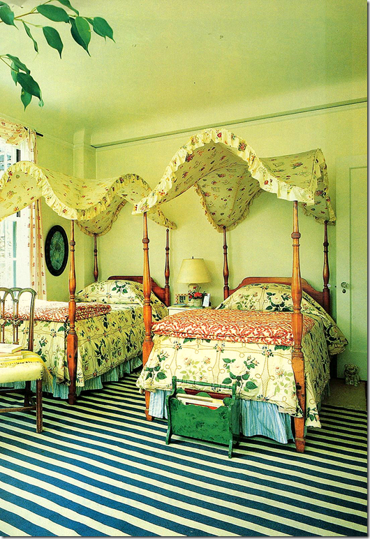
The daughter of Sister Parish, Apple Bartlett’s apartment was photographed in 1984. Again, her apartment is a jumble of styles – a mix of antiques and accessories which today still looks remarkably fresh.
Bartlett’s bedroom is pure Sister, and uniquely American in its styling. Special thanks to Mrs. Blandings for the vintage photographs.
Today, Apple Bartlett’s house pictured in Architectural Digest. The striped dhurrie still plays a role. What a beautiful wall color!
The trendy alternative to blue and white stripes are the black and white dhurries. Used to distance decors from the beachy look associated with the blue and whites, the black stripes seem more sophisticated. Nate Berkus, Elle Decor Magazine.
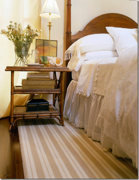
The striped dhurries can be used in a more contemporary setting, as seen here in Nate Berkus’ office. Though the blue and white stripes are a personal favorite, the brown and tan stripes are a close second.
Another dhurrie, striped in multi colors, used in a traditional decor. Such a pretty room!
Ginger Barber has long used striped dhurries of all colors. Here in a Houston showhouse, she used khaki and white stripes that read as a neutral.
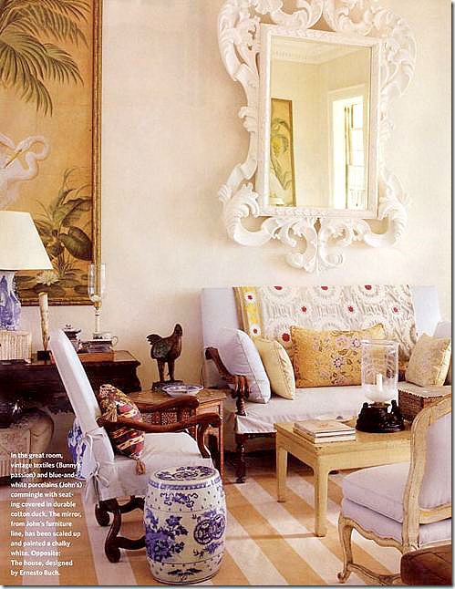 Bunny Williams’ tan and cream stripes in her beach house in the Dominican Republic. So beautiful!!!
I’m not sure there is a room with a striped dhurrie in it that I wouldn’t like!
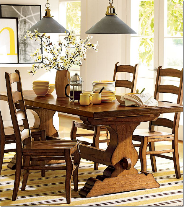
Even the major decor stores like Pottery Barn have jumped on the striped dhurrie bandwagon.
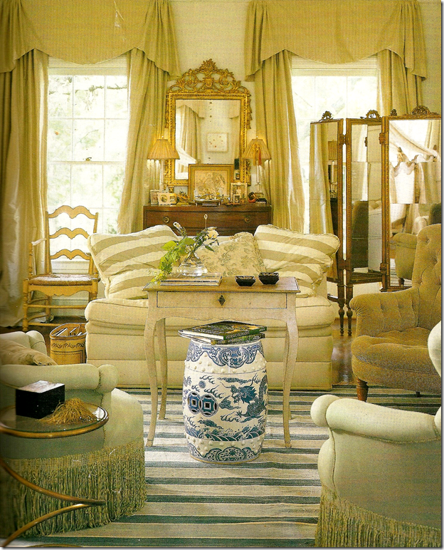
But, the soft blue and white dhurrie is still the prettiest, without a doubt. Here is definitive proof that the look does not have to beachy. Instead, a more dressy decor – pricey French and English antiques - are the perfect match for the lowly, inexpensive dhurrie. Gorgeous!
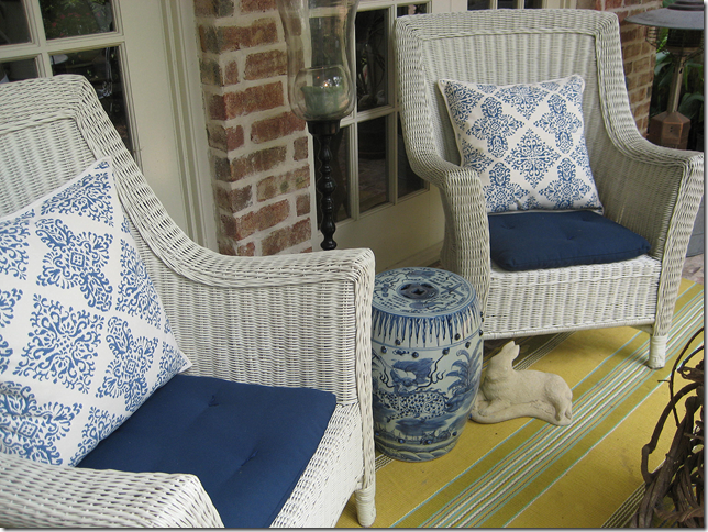
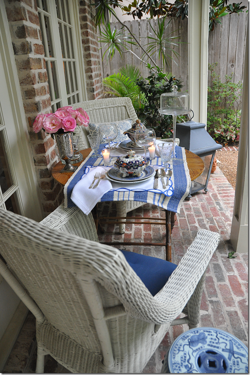
I’ve been wanting a blue and white dhurrie for years, truly ever since I saw Carol Glasser’s living room. Instead, a few Dash and Albert rugs used on my porch helped tide me over.
You can see I really do like blue and white which probably explains collecting transferware for 15 years.
After the huge popularity of the decor in Something’s Gotta Give, the Aspen Rug Company made up some rugs based on the movie. Recently, they sold a few on EBay at a discounted price where I finally got my long awaited blue and white dhurrie, though I have no place for it now. One day it will go in either my family room or bedroom, or in a client’s house! It will never go out of style, so I can wait to design a room around it. The price was just to good to pass up.
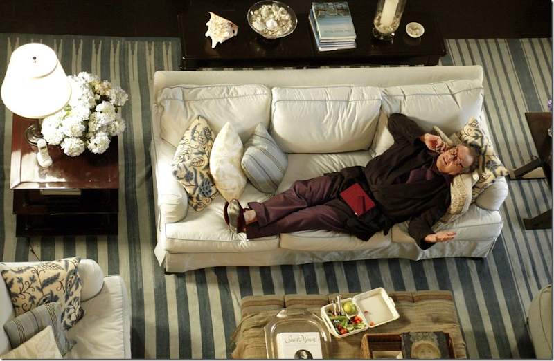
I love this picture from the movie – maybe because you can really see the pillow fabric and the trim on the slipcovers. Recently, the blogger Hamptons Hostess emailed me with some interesting information. A few years ago, she went to a charity auction in the Hamptons, of course, where some items from the movie were staged together in one room – receiving lots of attention as you can imagine. Below, the Hamptons Hostess shows us what she bought for her beach house - in the Hamptons, of course!
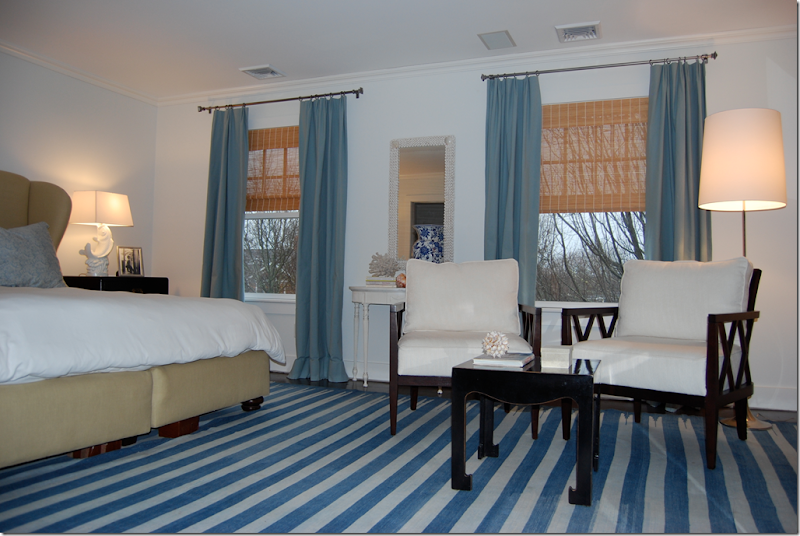
Here, is the Hamptons Hostess’ bedroom with the blue and white dhurrie ala Something’s Gotta Give! Hamptons Hostess told me she had recently painted her bedroom when she bid on the rug, knowing how perfect it would look – and it does! So pretty.
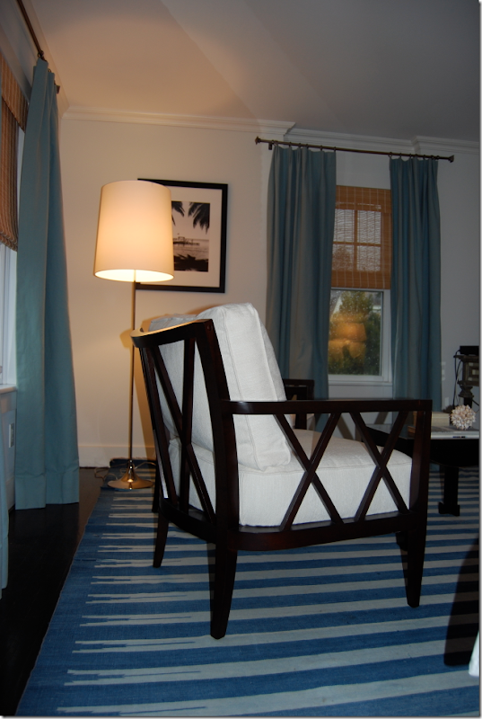
Another view, showing the seating area – I love these chairs and the window treatments. I would love to see the rest of the Hamptons Hostess’ house! Besides blogging, she does interior design.
In this rare picture from Something’s Gotta Give, you can see the master bedroom. Sitting next to the Oly Studios chair is a pricey Rose Tarlow table. I never realized that there is a tan and white striped dhurrie in here! Did you? Such a pretty room.
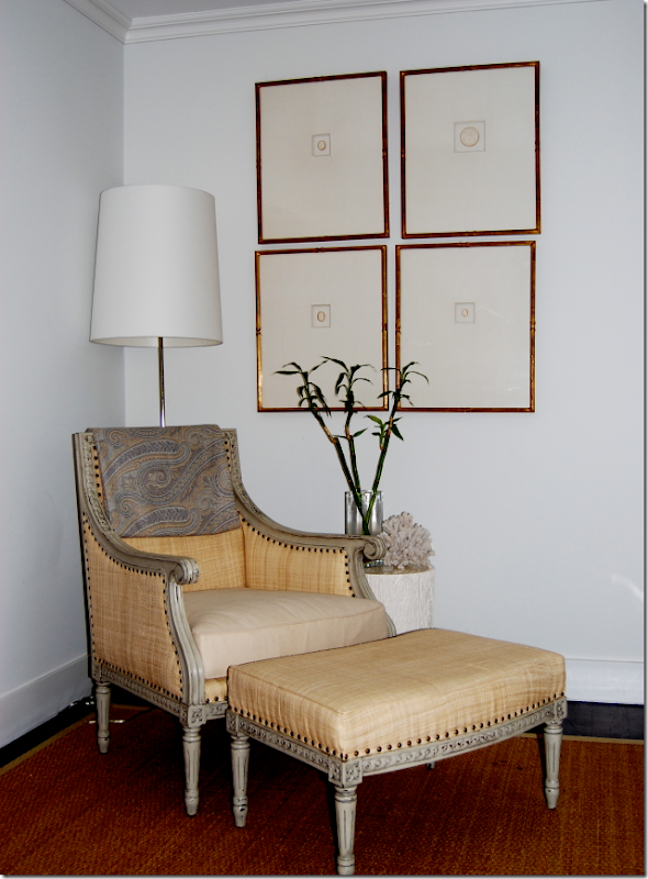 And, again, at the charity auction, The Hamptons Hostess bought the Oly Studios chair seen in the master bedroom, above. The intaglios were also bought at the charity auction, but neither the Hostess or myself can say where they were in the original movie. To visit her blog, go to Hampton Hostess.
A huge thank you to the Hostess for generously sharing her house with us!!!
To read more about dhurries, please read the Style Saloniste’s fabulous interview with the even more fabulous Madeline Weinrib HERE.
AND SPECIAL NOTICE TO TEXANS: Remember, this Sunday is the Urban Market!!! Yeah!!!!! For all this information, go here!!!
 Seen at the Urban Market last year – some Texas bloggers: left to right, Materials Girl, Lauren, La Dolce Vita, the beautiful Paloma, Cote de Texas, MOI, Starbucks, Paloma, and Under a Paper Moon, Courtney. Hopefully – we’ll see you there!!!
