The cover of the new December-January issue of House Beautiful really caught my eye – I felt like I was looking at a more contemporary, more luxurious version of my own home. These days, I rarely find a house I truly like in the magazines. Like I said a few weeks ago, I don’t understand all the mix-matched interiors that are such a rage today, nor do I prefer loud, bright colors and prints. It’s no wonder why this cover appealed to me! I was eager to see who the designer was whose work spoke to me so personally. So many of the elements used in this room are things I use in my own designs and in my own home. It turns out the interior designers are Mark Sikes and Michael Griffin and they are the owners of the beautiful 1920s house located in Los Angeles. Both Mark and Michael were visual merchandisers and now are branching out into interior design. Their house is a nod to a return to classic decorating – minimalism isn’t their thing – at all. I can relate to that. Although I admire the less is more look in magazines, living that way is another story. I like to collect, to buy, to add, to subtract. I like to change things around, bringing in new designs and fabrics, and pillows every few years or so – I get bored with one look for too long, even if it is classic. I have a feeling Mark and Michael feel the same exact way – judging by the amount of “stuff” they have accumulated.
Mark Sikes performed the magazine’s interview – so it’s hard to tell how much of this design is his and how much is Michael’s and what is both of them. Since Mark took the credit during the interview, I’m going to refer to him.
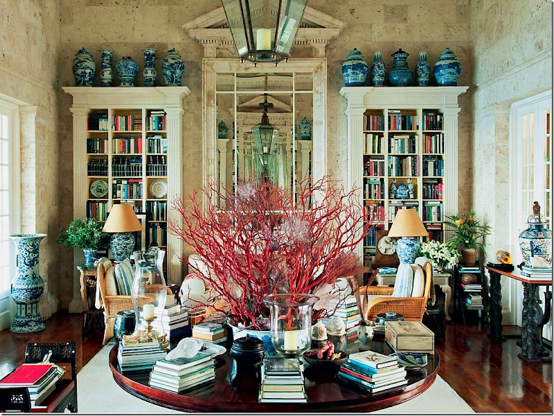
Oscar de la Renta’s Punta Cana beach house – the main living area.
Oscar de la Renta’s Punta Cana beach house is a big influence on Mark Sikes – and me too. The beach house is filled with blue and white jars and vases and bowls. The round center table, sitting under a lantern, divides the main living area – and acts a a foyer of sorts. It is piled high with books and candles and shells. Mirrors act as art. Minimalism? Not here! Does it look like Oscar likes to shop for his house? Yes! And so does Mark and Michael, and guess who! Minimalism means you have to constantly edit, edit, edit. I do like to edit a bit – but, I would rather add than edit.
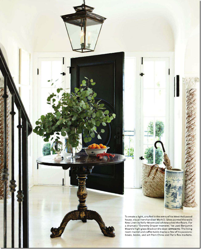
Sikes and Griffin’s Foyer
The House Beautiful story begins with Sikes and Griffin’s entry hall which features a round antique chinoiserie table sitting underneath a black lantern. So many elements in this room look familiar to me – the black door, the lantern, the blue and white. I love black accents in a home – and so does Sikes. I’ve painted all my doors black, a trick I use to make builders grade doors look more important. Like Sikes, I use lanterns as much as I can and I too have a round table in my foyer. One main difference though, is Sikes and Griffin’s walls and floors are white, I have gray walls and hardwoods. But, our aesthetic is the same – one day I want to paint my floors - I just don’t want to move out for three weeks!
My Entry Hall
My entry hall with a round center antique wine table, piled with books and blue and white porcelains. My front door is painted black, as are all of my interior doors. I love touches of gilt – not too much, but just a accent here and there. Does this look as nice as Mark Sike’s house? No. His house is much more architecturally interesting than my house. There is no comparison between the two. But, I love how so many of their design elements are found in my house too! If I was just starting out decorating this house, I would use Sikes’ house as a reference while furnishing it. As it is, now I will use their house for new ideas.
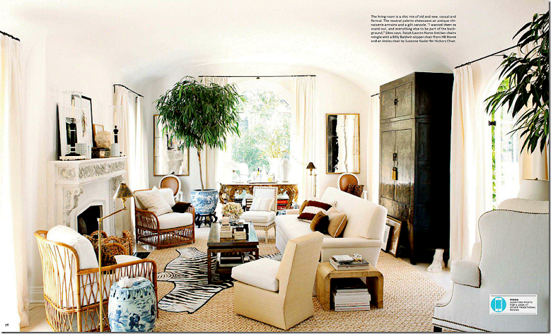
Sikes and Griffin’s living room. Boy can I relate to this! A textured rug anchors the room. Here, Mark used Abaca – I prefer seagrass or apple matting (although I have yet to have a client request it!) A zebra skin is layered over the rug – check. Blue and white garden seat used as a side table – check (I use two in my family room.) White upholstery – check. Mirrors as art – check. Blue and white planter with greenery – check. Books and magazines everywhere – check. Baskets – check. Brown velvet pillows – check.
Across from the fireplace – chinoiserie box – check. Tortoise shells and boxes – no check (can’t afford it!!!!) Bust – check.
In the interview Mark says “I love that refined, lived in look. I want everything to be pretty, but I want people to be able to relax and enjoy it.”
“The key thing is accessorizing.” They collect: blue and white Chinese porcelain, boxes, silver objects, coral, ikats, vintage Hermes ashtrays, Astier de Villatte, books, magazines – they have a 20 year magazine collection.”
I collect: blue and white Chinese porcelain, baskets, silver objects, coral, suzanis, crystal, blue opaline, altar fruit, creamware and white ironstone, Masonware, books, globes, & mirrors.
My Family Room
The zebra layered over the seagrass, the blue and white garden stools and the blue and white vases on the mantel, the white fabric, the brown velvet pillows, the baskets, the books, curtains, the lantern – all design elements that Sikes and Griffin also used in their house.
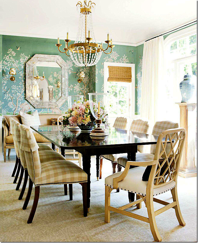
Sikes and Griffin Dining Room
Gorgeous! Their dining room is a study in contrasts. Contrast the beautiful but pricey hand painted Gracie wallpaper with the lowly, country cotton check on the chairs. Mark says – “It’s the mix - masculine and feminine, rough and soft, light and dark, high and low that makes a room feel great.”
When I turned the page and saw this dining room, I just laughed. Last year I put up a handpainted wallpaper in my bedroom – in this color! While their dining room more resembles my bedroom – it’s the décor elements found in each room that show we have a close design aesthetic. The chandelier – his is the Paris Flea Market fixture from Circa Lighting. I have the same chandelier, but an antique French one, bought at Tara Shaw. Again, the high and low – if you love that shape in a lighting fixture and don’t want to spend the money on an antique, the Circa fixture is a great alternative. While Sikes spent a small fortune on his Gracie wallpaper, mine was much more cost effective, bought from Jardins en Fleur at a considerable savings over Gracie Studio.
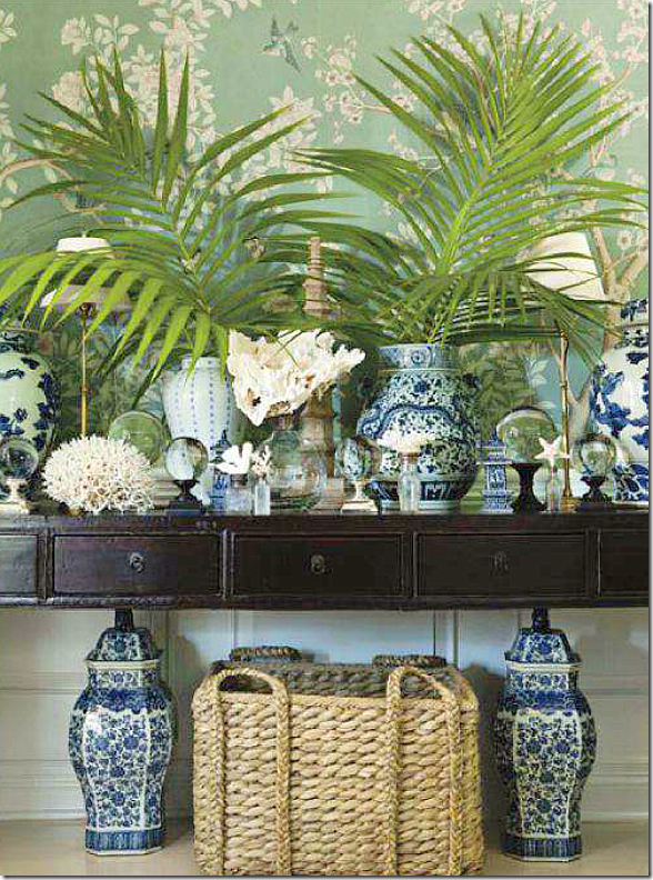
In the dining room, a console holds this wonderful tablescape – baskets, coral, blue and white porcelains piled up high. Sikes says: “One of our rules is – nothing should have nothing on it. When I see an empty table, I shudder.” THAT!
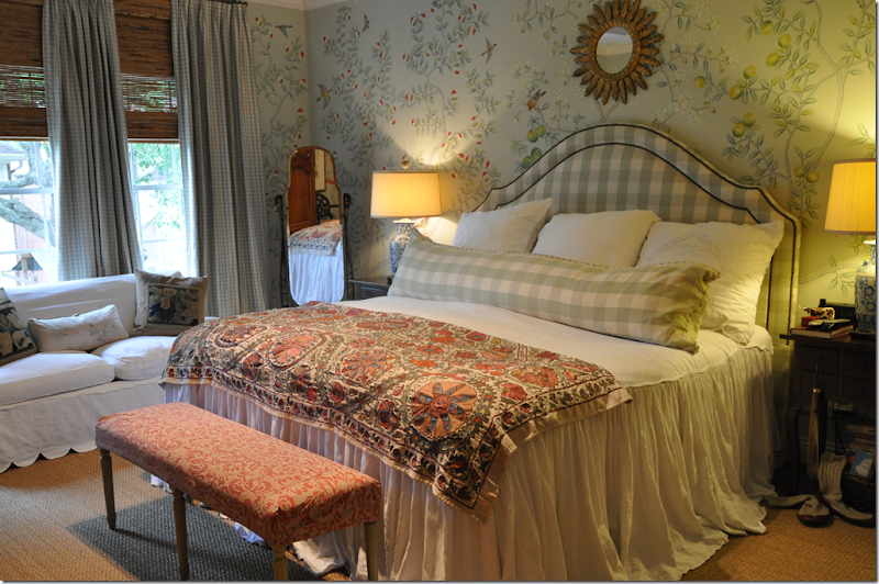
My Bedroom
My bedroom most resembles Sikes and Griffin’s dining room with the handpainted wallpaper in green. We both used big checks – while I mixed mine with a smaller one too. Blue and white vases that I turned into lamps. I collect Suzanis – not Ikats like Sikes. And we both layer rattan shades with curtains. Sikes used the same white linen at his windows throughout – I use different fabrics in different rooms.
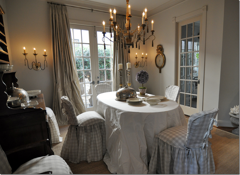
My Dining Room
While my bedroom looks more like their dining room, my own dining room has checked fabric on the chairs. Their dining room is more English in feel, while mine is more French. But – it’s the mixture of the high and low, the dressy and the casual – that’s a shared aesthetic. Mixing casual checked fabrics with fancy silk taffetas is the important detail. Mixing causal seagrass with fancy chandeliers and sconces keeps the room from taking itself too seriously – thereby putting all at ease, allowing those visiting to feel comfortable and relaxed. Here I used an Italian wood chandelier – but a crystal one like Sikes would also be appropriate, as would a wonderful antique lantern – all rusty and neglected.
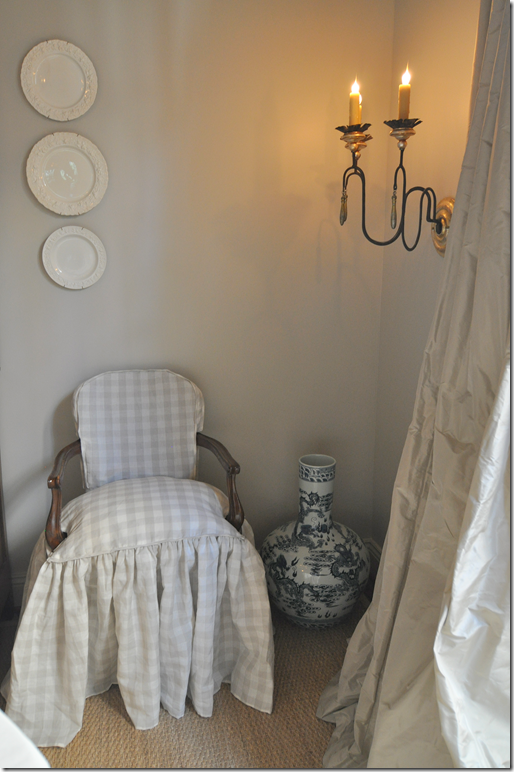
In both corners of my dining room – extra large blue and white vases sit on the floors. These came from OKA in England.
Sikes and Griffin Kitchen, Breakfast Room and Family Room
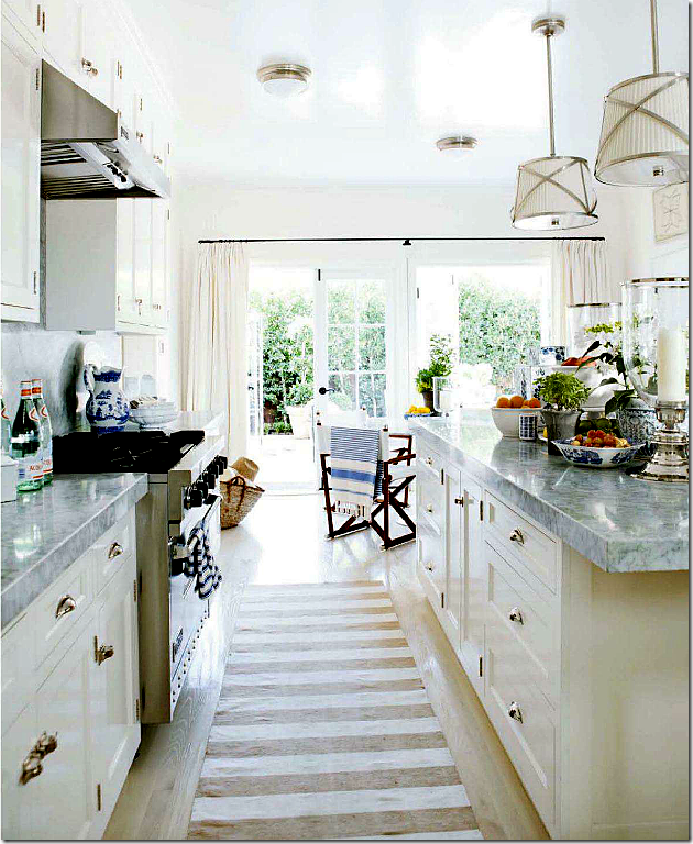
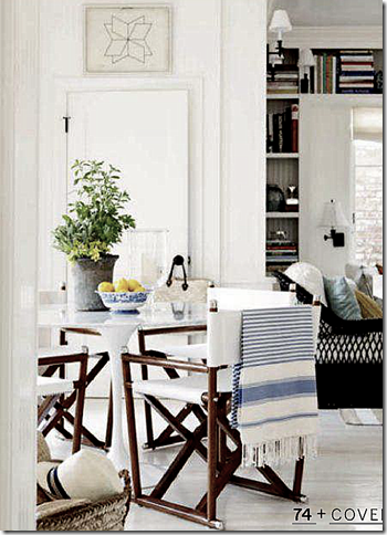
Our all white kitchens aren’t that similar – Sikes and Griffin are lucky to have beadboard and wonderful appliances, something I didn’t want to spend a lot of money on. They chose the grayer Carrara marble, while I chose Calacutta Ora. BUT, we both chose the same straight edge on our countertops and we both chose 3x thickness - and we both ran our countertops up to the backsplash. Their breakfast room connects to the kitchen, like mine, and a row of French doors opens to the outside – like mine.
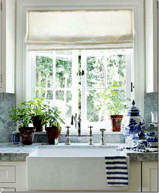
Their sink area is very similar to mine – a farm sink with a beautiful casement window above it. It looks like we have the exact same fixture – in polished nickel. Even the accent – a stripe towel – is alike. Weird, I know.
My Kitchen
My casement window, farm sink and fixture – looks just the same. My marble countertops with their straight edge is like theirs – and so is the marble backsplash.
Sikes and Griffin’s Kitchen, Breakfast and Family Room
Striped rugs are a constant throughout the house.
One major differences in our aesthetics, is Sikes and Griffin mix in contemporary pieces, like their iconic breakfast table. That’s one thing I really don’t do. And, their house has a more masculine feel to it than mine, which would be expected. Another difference, is much of their furniture and fabrics are very fine – lots of George Smith, Williams Sonoma, John Rosselli, Peter Dunham, Raoul Textiles, Madeline Weinrib, Carolina Irving, and Rogers and Goffigon – fancy names for luxe products. I tend to go more low end, by fiscal necessity.
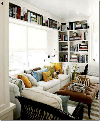
The family room, with white upholstery and wicker chairs.
Other than neglectful, what words would Mark hate to hear his house described as? He answers: “trendy, decorated, uncomfortable, done.”
Well, I do like trendy things – especially accessories. But decorated and done – I totally understand that. I like to change things around the house too much to have it decorated in one set way. I like my house to be fluid, a moving act.
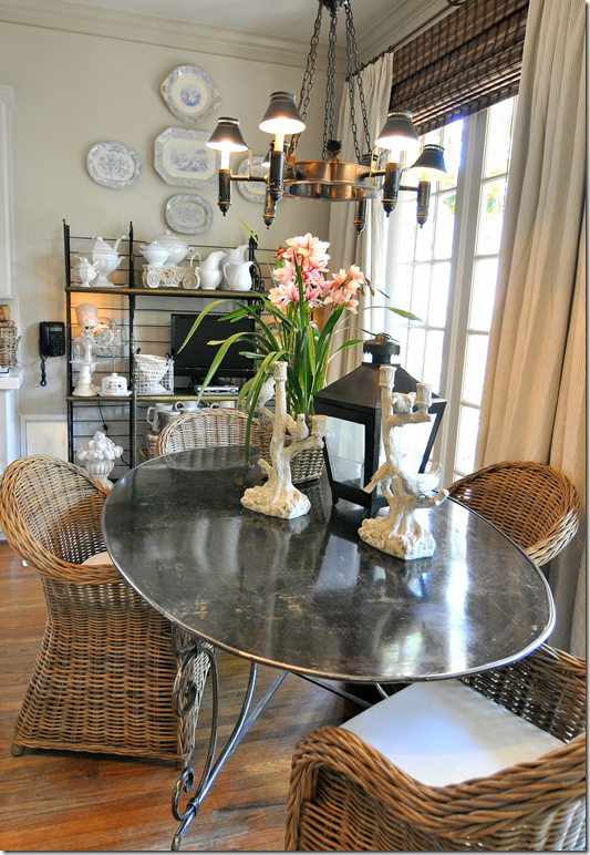
My Breakfast Room
Like Sikes and Griffin’s – my breakfast room sits before a bank of French doors that leads to the outside courtyard. I like that when one comes through the front door – you can see all the back into the courtyard. I wish it were a straight hall that takes your eye there, but it isn’t – one thing I would change if I could. Vistas are so important in floorplans, a lesson I hadn’t learned when we moved here 18 years ago!!!
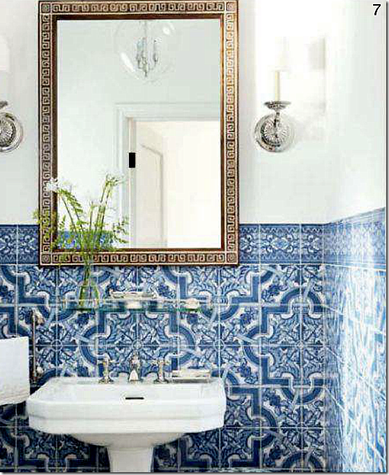
Sikes and Griffin’s Powder Room
Their powder room is exquisite – no other word for it. The walls are done in Portuguese tile. Stunning! No, I have NOTHING like this – though I would die to have it!!!
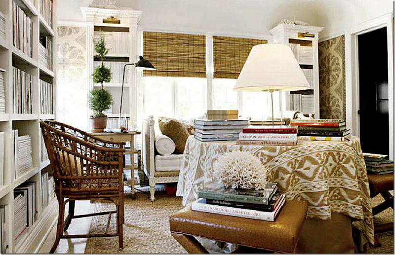
The Upstairs Library – Off the Guest Room
The library holds a 20 year collection of magazines. My favorite fabric – Peter Dunham’s Samarkand lines the walls. A French day bed takes the place of a sofa and a skirted table is covered in books and ikat. More coral, more greenery. The rug is apple matting – a great alternative to seagrass when you want more texture.
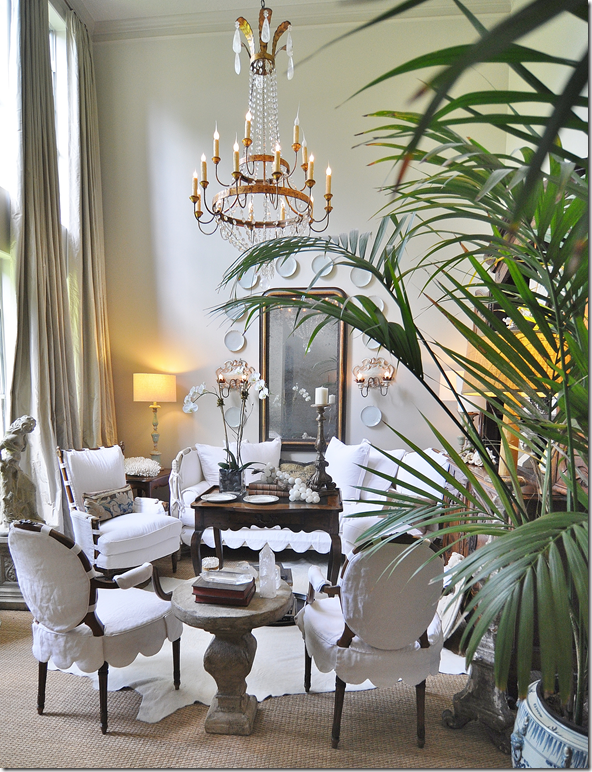
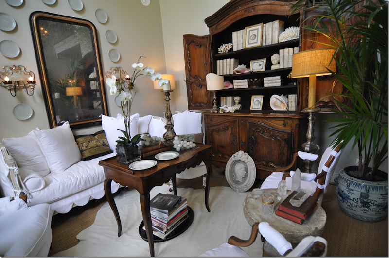
My Living Room
In my living room – my chandelier is a match for Sikes and Griffin’s dining room chandelier. Where they mix in modern seating, I tend to keep my chairs French. Here, I used a French daybed instead of a sofa, just as they did in their library.
Like Sikes and Griffin, I collect coral and have it placed throughout. In the corner is a blue and white planter holding a large green bush – just as in their living room. Besides the differences in contemporary seating, most of my lighting is more traditional than theirs.
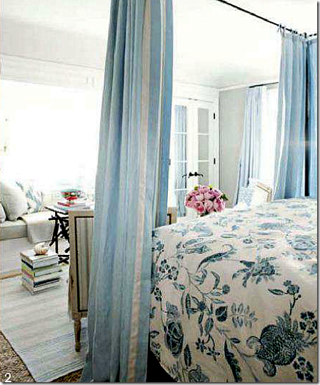
Sikes and Griffin’s Master Bedroom
Sikes and Griffin’s master bedroom is a study in blue and white – Carolina Irving fabric makes up the coverlet. Here, French chairs and flowery fabrics make the room more feminine than the rest of the house. So beautiful! I love how he placed two French chairs in front of the bed – another idea I want to copy!!
A Dash and Albert striped rug is layered over the apple matting. Ikat covered pillows on the window seat.
When asked what he wears – Mark says blazers, blue shirts and white jeans. He says he has over 50 pairs of white jeans. ok. Now I can REALLY relate! In the summer, I wear only white linen – shirts and pants, and in the winter I wear black – pants and sweaters. I don’t think I have one item in my closet that is patterned. It’s all plain and simple and easy. I probably have 10 pairs of the same exact white linen pant. Same for the blak pants. I find one style I like and wear it over and over. So boring!!! Around the house – I wear white sweats in the summer and black sweats in the winter!! I swear!! Mark says he looks like the décor in his house and in the summer – I do too. In the winter – I match my black doors.
My Daughter's Room
For years I lived with a blue and white master bedroom – with a blue and white print similar to Sikes and Griffin’s bedroom. Once I remodeled my room, I missed the blue and white so I did Elisabeth’s room in those soothing colors. I love blue and white bedrooms – soft blue is probably my favorite color. I think each house should have at least one blue and white bedroom! One day I’ll have a living room in that color. Elisabeth’s chandelier has the same basic shape as the others, but hers is a low budget fixture – found on Amazon!!!
Sikes and Griffin’s Guest Room
Sikes and Griffin’s guest room is painted dark in a homage to Billy Baldwin and British Colonialism. Very masculine and very English. One thing I am noticing is all the striped rugs they use – something that I adore and what to do too. I have a blue and white striped rug that might look good in my bedroom, layered over the seagrass. I really love that look and think I’m going to be copying it. In this room, I love the two chintz pillows that bring femininity to the room. Beautiful room!!
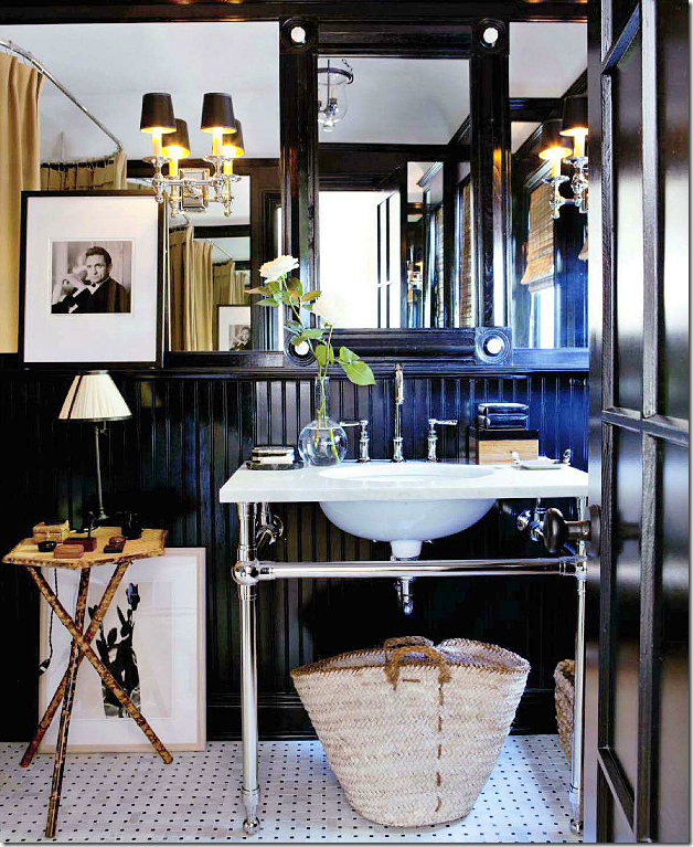
Sikes and Griffin’s Guest Bathroom
The guest bath is gorgeous – painted beadboard, wonderful sink. And notice the gold shower curtain.
When asked what Mark avoids like the plague, he names recliners, matched sets of furniture and chairs sitting across from sofas. He prefers to float his furniture arrangements. What can I say? I hate recliners and matched sets of furniture too, natch!
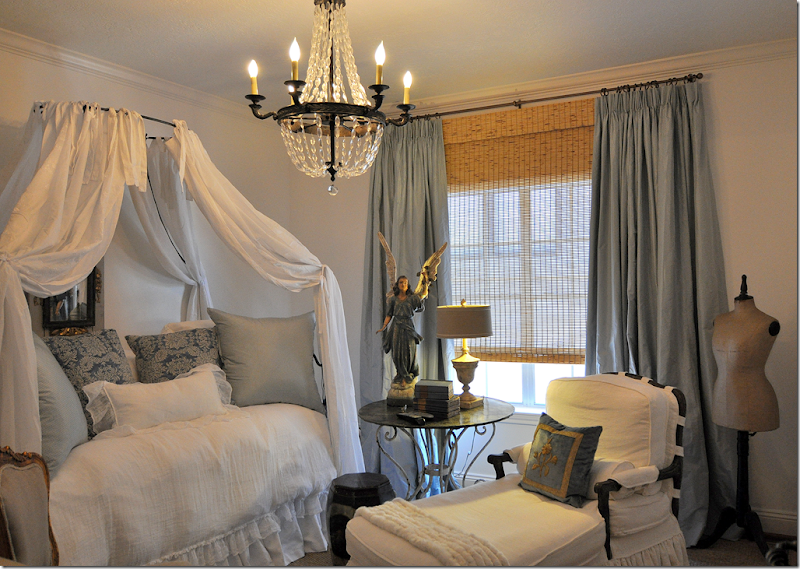
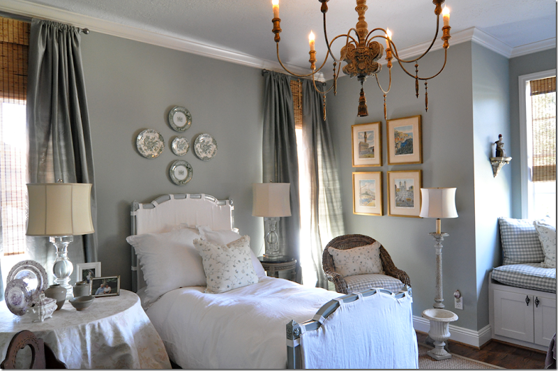
My Guest Room
My guest room is nothing like Sikes and Griffin, but I did notice similar design elements we both used: their bed is slipped in white – just like mine. A skirted table matches their skirted table in the library and the French chair is the same as theirs in their Master bedroom. My guest room is a reflection of my love of French design – while theirs is a love of British Colonialism. Masculine vs. feminine. I can’t help but think a striped rug would look great in here – just like theirs.
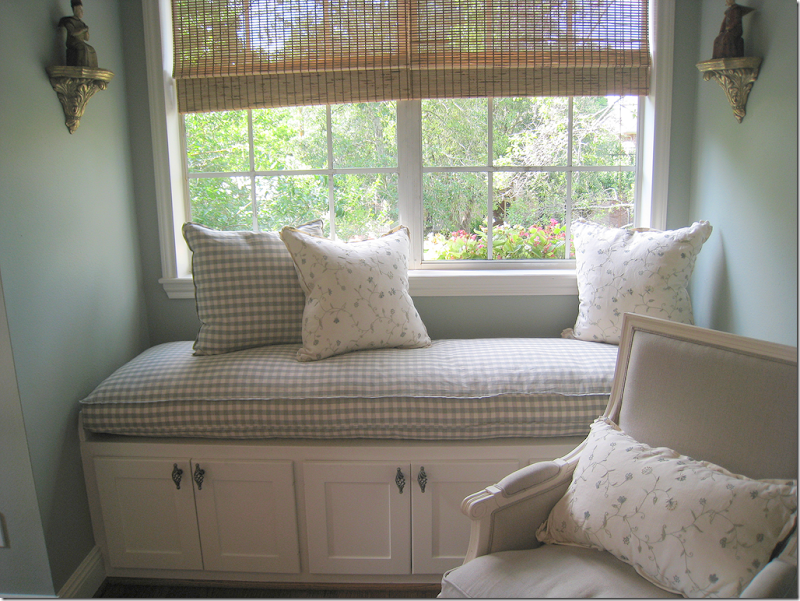
One other similarity – my window seat matches the window seat in their master bedroom.
Sikes and Griffin’s Exterior Views
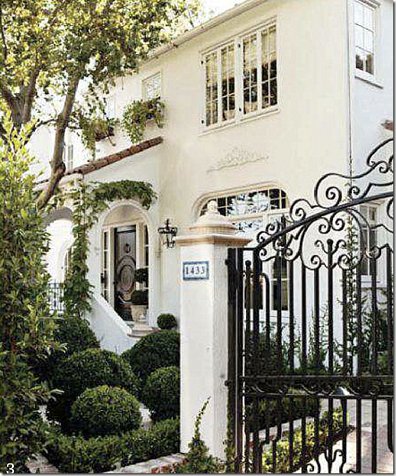
Sikes and Griffin’s house is a 1920s white stucco. They designed the iron gates. Their garden is green, with lots of creeping vines and box, just exactly what I love. This house is so gorgeous – notice the arched front porch with the barrel tiled roof. The window boxes above it are so romantic. What I wouldn’t give to be able to own an old restored house like this. It’s just perfect.
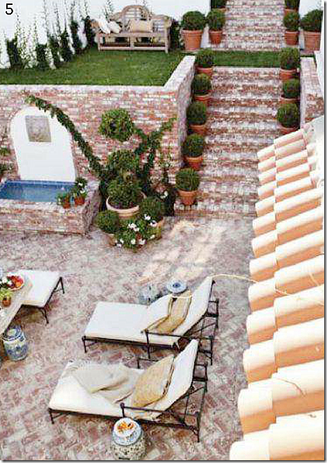
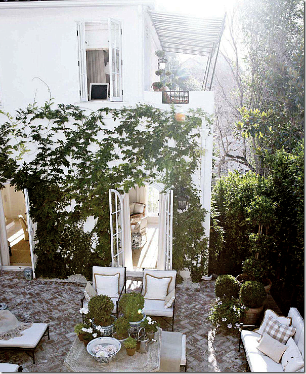
Their backyard is two tiered, with a fountain, a brick terrace and stairs - and on the upper level, a teak bench. Blue and white garden stools are used for side tables.
The terrace off the living room. To die for! Look at those arched French doors. And notice the balcony with the striped awning. Mark says when the doors and windows are open, the backyard becomes part of the inside living space. Gorgeous.
My Courtyard
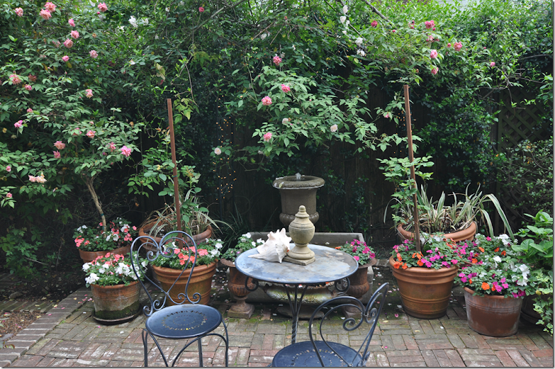
My own backyard is really a small courtyard with a brick patio and gravel “rooms.” Here, my bench reminds me of their bench. And the blue and white garden stool is similar too.
Off my brick patio is a fountain – like theirs. The back of my house also has French doors, which we often leave open. I mostly blog outside – my table is my office.
Seeing the cover of the new House Beautiful really felt familiar to me. It felt like “home.” I immediately opened the issue and studied this house – and then went to share it with Ben. While, Mark Sikes and Michael Griffin’s house is much finer than mine and their furnishings are more English than mine, there was a real sense that we had very similar aesthetics – though theirs is more masculine to my more feminine one. The connection I felt with this house doesn’t happen often. Most houses in magazines don’t move me – or I don’t share any aesthetic with the designer, none. I love when I do find something that speaks to me. I keep thinking that this is how I felt when I first Jill Brinson’s house. There wasn’t anything about her house that I didn’t love.
I started thinking – well, maybe I’m exaggerating here. Maybe this house is too dissimilar and to even imply otherwise is really stretching it. I mean - I know the differences! So, I went back to the magazine and to this month’s Elle Décor to see if there were other houses or designers that I felt we had similar likes and dislikes. Nope, not a one.
When was the last time that you felt a kinship with a designer? When did you last see a house in a magazine that felt like “home” to you? That you said – yes, I collect that too. Yes, I like that fabric too. Yes!
Mark Sikes writes a wonderful blog about things he loves. Needless to say, most of his favorite interiors are ones that I agree with – and many I have shown here, too. To read his delightful and entertaining blog, go HERE.
All photographs from House Beautiful are by Amy Neunsinger. You may recognize her name from her collaboration with Rachel Ashwell’s books.
Finding Personal Inspiration
Subscribe to:
Post Comments
(
Atom
)











do you know.....
ReplyDeletethis is the brightest visual of my day.
joni
you do THE BEST POST!!!!
xx
WOW. What a fabulous post. I especially loved seeing the photos of your home-GORGOEUS. I haven't ched in with your blog in a while-its looking terrific as always. Glad to find Mark Sikes blog.
ReplyDeleteHoly crap! I have to come back later, too much to absorb in one visit. I've the bedroom and bathroom.
ReplyDeleteIs it just me or do I see Windsor Smith influences too? The foyer, the bedroom, and isn't that the same dining room wallpaper?
I felt exactly the same way when I saw this house in the magazine. I have spent several nights devouring the details Sikes and Sullivan's design. I plan to use this as a template for future purchases--I agree with you--absolute, friggin' geniuses.
ReplyDeleteJoni, I think I most loved the exterior of their home and gardens (although the inside is exquisite, as well). Your taste is pretty incredible and I always love seeing photos of your home- I am especially in love with your guest room and Elizabeth's room. So extraordinary- one would feel a very special guest or daughter!
ReplyDeleteanother thourough post, I don't know how you have time to write them! Loved this house as well and have been enjoying his blog for the past week. Wonder how I never saw it before?
ReplyDeleteWell I got this magazine and read right through the article admiring certain things...but you highlight each thing I should pay attention to, and I love that. I really prefer most of your rooms probably because it is more feminine and also french. The only room I don't like more than theirs is the master bedroom, and perhaps the courtyard. Otherwise, your house is my pick all day long. Thanks again for a great post. Oh yeah, and I won the book from SRT on the finishes by Segreto and it was delivered today!! yaay!
ReplyDeleteWhat a great post....you both have beautiful homes. I hope you pass your post along to them; I'm sure they'd be amused by the similarities as well.
ReplyDeleteI loved this cover. Loved it! Like all my other magazines, I haven't had time to actually look at it, but the cover oh the cover. Your breakdowns are so great! I don't know how to do plants in my house, but if I did, this is exactly what I would do. So casual yet fabulous...comfortably formal, I like to say.
ReplyDeleteTwo gorgeous homes all in one post. Sensory overload, amazing how many similiarities there were, each with its own flavor but both so beautifully done. Both homes that you can see enjoying and cozying up in, without compromising on
ReplyDelete"the pretty factor'. Well done!
Yes, I loved that house, too. Lots of design principles there, but the results are refreshing, unique and unpredictable.
ReplyDeleteThis was so fun and INSPIRING Joni! I've been thinking about some of these very things all day long as I have been redoing some things at my house, even before I read your post. I get tired of so much of the design I see (even some of the things I did recently I'm already undoing, trying to get back to what I really love). I'm so inspired with all the photos and your thoughts today. You are so detailed I love absorbing every word with every photo!!! :-)
ReplyDeleteGreat job Joni!!
Joni, I think this means you are ready for the pages of HB! Newell? Are you listening?? I devoured this issue over Thanksgiving break and I too just loved this cover story. Love the comparisons! ~Jen
ReplyDeleteLove this post! This house was the best in HB in a long time. I love the use of wicker/rattan chairs with that fabulous gold console table. That table would be too much for me if they used furniture that wasn't so simple. All the rooms are so light and bright. Every room looks so comfortable and relaxing. I can see the similarity to your own home.
ReplyDeleteGreat post, great house. of course I love their baskets all over the place!
ReplyDeleteI love seeing the comparisons! Beautiful, beautiful homes! Both of them!
ReplyDeleteGrins!
Pamm
Hi Joni, Beautiful Post. But there is no reason why you have to die for the blue Portuguese tiles. I will show you how to paint your own.
ReplyDeleteI really like the modern touches they added. I like the tension between classical elements like their Rococo table and the simple line of others like the tulip table. I hate to say it Joni, but their house was really not my bag, except the guest room.
ReplyDeleteHi Joni, a wonderful post - I read this article in bed last night and actually it is very funny because I thought of you as I was looking at some of their rooms - things seemed familiar to me. That is surreal. I think when I see certain looks (white and seagrass and chinoiserie and stripes/checks, the layered zebra, and a certain gray Frenchy palette) I will think of you. Your house and style is a distinct look to me because it is uncommon where I am from but I like it so much as an overall look. I did not see your slipcovers in their rooms...
ReplyDeleteYou know, thinking back, I think it was the tablescapes that reminded me first of you - your living room with its round tables piled with beautiful things. I got the Joni vibe.
I have not had a designer resonate with me in a long while. I have much plainer tastes than you, more New York apartment - graceful, classical, white and dark - so sometimes I will see a Phoebe Howard house I could live in. Or that Daryll Carter book I loved but found a little too spare. Or Mariette Himes Gomez (I know she bores you) sometimes gets it just right for me. A couple of rooms in Thomas O'Brien's books resonated with me. Usually it is just elements, not whole houses. I would say Phoebe & Jim Howard have got it close to my heart a few times (antiques, good architecture, not too busy).
:)
Great post! So interesting to see your style filtered through a more contemporary/male filter. xo Terri
hi- thanks for the story about our house and the house beautiful cover! it's really rewarding to have others appreciate your work! thank you!
ReplyDeleteplease check out my blog for everything chic. glamorous and stylish!!! lots of fun having a blog - isn't it?
http://www.markdsikes.com/
i'm also on twitter and Facebook
my best
MDS
hi again- i just read the article in more detail- your house is lovely, love the comparisons- beautiful job- nice blog- very chic!!
ReplyDeleteSo funny, I stayed up last night reading, no devouring everything about that house. The interview, the details of their home and finding so much inspiration. I can see why you feel a kinship to Mark Sikes and Michael Griffin. There is definitely some similarities with their style and your own. I guess I too feel a kinship. Certainly with the stacks of books everywhere, the brick patio staged like a living room, and the marble countertops! This HB issue is a keeper! ~Delores
ReplyDeleteJoni.....I am right there with you on this one! I LOVE this house and have already scanned the cover to send to two of my clients for different reasons. I thought the house looked very Michael S. Smith, especially the bathroom with the Portuguese tiles. I could live here too....even with all of the white....the dog would just have to GO! (Just kidding....I would have to figure that one out).
ReplyDeleteOOOOoo, I just noticed Mark left a blog address! I am off to check it out. Thanks again Joni!
Joni I definitely can see the similarities. It is so nice to get excited about someone's work that you can relate too!! I love the format in which you wrote this post, very well written and I think you articulated beautifully how you felt, I really enjoyed it! Kathysue
ReplyDeleteWow! Now this is some tour! They are very similar, Joni.
ReplyDeleteTwo beautiful homes. Just got lost in your post.
Teresa
xoxo
What a great post ... I was so inspired I'm going to be up all night rearranging! Thanks for this pre-holiday inspiration. Loved it.
ReplyDeleteAnd a sincere thanks for the time you take to do such great posts.
Gail
Highland UT
You know why I love your blog... the depth you put into your posts. Seriously, you draw me in... and I never ever read your post just once... usually at least 3 times to take it all in. I am not worthy, lol
ReplyDeletethanks for another great post! I fell in LOVE with the cover of the magazine as soon as I pulled it out of the mailbox! so soothing and chic. love how you deconstruct different spaces, i'm learning a lot...! i really liked the restoration hardware ad right inside the front of this issue, too...
ReplyDeleteGreat post Joni, and you're spot on - your homes are very similar indeed. I'm newly subscribed to House Beautiful, but haven't felt such a connection to a home until this one - I think it's much more suited to the Aussie style of decorating that some they've featured recently. I live in Queensland, with a warm, tropical climate, so anything fresh and airy really appeals to me. Throw in a generous dollop of blue and white (which feature heavily in my paintings as well), and I'm hooked. Personally, I love India Hick's island home - perfection on a stick. And any of Ralph Lauren's blue and white rooms - gorgeous. Fabulous post Joni, thank you! K
ReplyDeleteI thoroughly enjoyed this post Joni!
ReplyDeleteJoni, This is uncanny! I just bought the HB, today and have yet to open it! Fabulous post!
ReplyDeleteAs I cannot find this on your blog site, I must ask. What can you tell me about your drapery/curtain rods in your family room? I love the scale and rings.
I am with you...I am a hunter-gatherer! And I, too, get bored and must make changes. It's a lovely addiction I caught when I was VERY young! lol
As I must make room for more acquisitions, I am going to open an Etsy shop soon!
I love this post and both homes! Pretty NEVER goes out of style!
ReplyDeleteAn idea for a Joni post. I love checked fabrics used in a sophisticated way. I have used checks in our home for over 20 years. I do not think of them as American country but French country, because of the rest of the furnishings and accessories in the rooms they are used in. Would you consider writing a post on this? I remember the yummy post you did on striped rugs.
I love the comparisons between your home and Sikes and Griffin’s home and they’re both beautiful. Emulating somebody else’s taste is fine but you don’t want to copy and you took what you loved of their designs and have it in your home. Funny that you had your design before even seeing theirs. I’m head over heals in love with their dining room it’s stunning. Fabulous post as always and as always I’ve spent an hour pouring over the photos!
ReplyDeleteThanks for the great post! I've got it bookmarked because I know it's one I'm going to come back to again and again. It is crazy how similar your decorating styles are - both of your homes are amazing!
ReplyDeleteKris
drivenbydecor.blogspot.com
I must say, I enjoyed seeing all the photos of your home as much as the House Beautiful. Your guest bedroom is fabulous. Too beautiful to want to leave - how long do you plan on having guests?
ReplyDeleteJoni, your home is truly wonderful! You are such a talent!! Lorie
ReplyDeleteYour house has never looked more beautiful. I LOVE your bedroom and this opportunity to see it again. Is your upholstered headboard custom made, or is it from a particular furniture source?
ReplyDeleteL.O.V.E. It!!! That powder room with the blue tile, the master, the guest bath! And you are not too shabby yourself! I'll be doing a post on Spanish tile, similar to that Portuguese in their powder, you'll die! Thanks for sharing the article and your house!
ReplyDeleteI love Dana Wolter's home and her interior designs. If I lived in Birmingham she would be my new BFF!
ReplyDeleteShe can do no wrong.
I never have seen your window seat before, love it. I think this home was their best feature in 2011. Your comparison is wonderfully fun to read. You have a beautiful home. I like your choice of marble in the kitchen better, more restful to the eye. My favorite rooms of theirs are the entry and upstairs library.
ReplyDeleteLooking at your bedroom pic I think I can tell which side of the bed is Mr. Slippersock's. In all sincerity (although it was probably unintentional) it's the sweetest styling I've ever seen!
Fantastique! I, too, am an "adder." And...the "validation"...isn't that what makes "blogs" so much fun! franki
ReplyDeleteYes, a beautiful home. I was drawn to that cover and knew it would be a good one too. I like the relaxed atmosphere, casual elegance. Your home is really beautiful, Joni. Love seeing your comparisons!
ReplyDeleteOodles of great taste all around!gorgeous , I never tire of seeing your home:))))
ReplyDeleteI love your house-especially your kitchen, dining room & living room.
ReplyDeleteJoni--YOU are the designer that I have been most inspired by lately. I love-love-love your taste-!
Like you, I also collect blue and white Chinese porcelain, baskets & silver objects. In addition, I collect shells, driftwood & beach glass.
In my kitchen, I have the same birdcage knobs you do. I also have some sea grass. I want more seagrass and you've inspired me to do plates on the wall the way you do and I have to have those koo boo chairs!
Thanks tons for yet another wonderful & inspiring post!
I love all the"new" photos of your house. Seeing the rooms from these angles really tells a great story.
ReplyDeleteI hope one day to see your home in HB!
I know you would love that.
xo xo
Your house is so beautiful Joni! I love when you analyze magazine layouts it's so much fun. I settled down with a cup of coffee to read this post!
ReplyDeletexoxo
maria
I love the woman who lives in that beautiful home in Houston !! Joni, your living room has been in my head since you showed it to us a few weeks ago...divine. xx's & Happy Holidays
ReplyDeleteHi, Joni,
ReplyDeleteI devoured this article in House Beautiful. I love everything about the style of the house, the gardens and their interiors. I also love blue and white -- have had a picture in my file of Oscar's Punta Cana living room for ages -- Calacatta Oro counters, French and English antiques and chandeliers, lots and lots of books, blue opaline boxes and coral. Your home is very similar in style to theirs and so is mine, for that matter. Part of the kinship could be that many years ago I was a visual merchandiser.
I love their home and I love yours. Thanks for all the information and comparison you shared in yet another fascinating post.
Best...Victoria
Joni,
ReplyDeleteI don't know if I am the only one to point this out, but do you not think it is possible that they received some of their design inspiration from you?
I'm just sayin......
When my House Beautiful came I felt the same way! So glad you took this apart + compared your fab. home, style of design with theirs. Must hurry over to Mark's Blog now before I open my shop. Grand Post, Joni
ReplyDeletePS Your home is wonderful. xxpeggybraswelldesign.com
I do love the house featured in House beautiful, but I am a pattern lover! Your home is beautiful but I would yearn for pattern!
ReplyDeleteJoni,
ReplyDeleteI can definitely see the similarities and to be honest, I love some of your features better (is that okay to say out loud?;-)
The funny thing is that I breezed through this months issue of HB, slightly disappointed that there weren't many Christmas images. I saw on a blog site some of the rooms of the Sikes house and went back and spent time drooling over each of the beautifully detailed rooms.
Karen
Isn't it wonderful to find a kindred spirit, whether in decorating or any other connection? Joni, your home is beautiful, feminine, and filled with things you love. I just have two questions:
ReplyDelete1. Does your husband really live there?
2. How do you dust coral?
I would love more pictures of your black doors. I'm not brave enough to try it without more of a visual.
ReplyDeleteGreat post! Two great houses! Is it just me, or does anyone else get a sense of dread when they see armless chairs? (Please don't seat me there..please don't seat ME there....)
ReplyDeleteI've read through this about four times and I get the impression that you're unhappy with your place vis-a-vis Sikes'. Although I agree with the differences in English vs. French, I think yours is just a nice. One can't underestimate the impact of styling and professional photos so I think you're brave placing your own photos next to the ones from the magazine. When my place was shot, I'm not sure I would immediately recognize it if I were shown the photos. A few flowers and good lighting makes makes a world of difference.
ReplyDeleteI'm totally in love with their house although the master bedroom is a big disconnect for me from the rest of the house. That bedroom looks like it would be more at home in your house. Overall, extremely impressive though; I'm glad you highlighted it.
TWO gorgeous homes; I love yours! Great post; thanks! Beth
ReplyDeleteBoth homes are exquisite. I love your details: the lamb on the entry hall table, the breakfast room table, and PLEASE tell me what color you have on the walls of your guest bedroom!
ReplyDeleteMaybe they used your home as inspiration. After all - your beautiful home has been in cyberspace a long time.
ReplyDeleteSincerely,
Debra F.
from NC
You guys are design soul mates. Such pretty style.
ReplyDeleteThis comment has been removed by the author.
ReplyDeleteAs a bibliophile, I appreciate seeing rooms with piles of books without losing their aesthetic. To me books add soul to a room. The idea of an empty table is only attractive to me once in a while and I usually resist it. I must admit, I am partial to exteriors so I really loved both outdoor areas. Thank you Joni for sharing such an inspiring post.
ReplyDeleteTrinidad
WOW. What a fabulous post. I especially loved seeing the photos of your home-GORGOEUS. I haven't ched in with your blog in a while-its looking terrific as always. Glad to find Mark Sikes blog.
ReplyDeleteThank you so much for sharing these guys and their home with us! Like you have mentioned, there is so much here to absorb and inspire...and to be honest, I know that I echo many other comments here that the contrast of your home's french and feminine take on the same elements, actually doubles the inspiration and ideas that we can take away...I could move right into either of these homes, and as a designer, I see ENDLESS opportunities for inspiration...
ReplyDeleteCheers!
Meredith
Joni, I had my copy of House Beautful sitting, unopened, in front of me last night, thinking there probably wasn't much to look at inside. I too have been disappointed with all the decor magazines this year. As you said, not much in them that I could relate too or would find inspiration from. Tonight, I will take the time to enjoy looking at this beautiful home. And, I will appreciate even more, all the interesting design elements and details that you have now brought to our attentions. Thank you!
ReplyDeleteCindy D.
two of my favorite homes in one post! YAY!!!
ReplyDeleteDear Joni,
ReplyDeleteHow many ways are there to say you are the greatest blogger of all time!! I just cannot get over how interesting and fun your posts are! This is just another example of a post with a strong point of view clearly and enthusiastically expressed with beautiful, illustrative photographs!! Why do so many bloggers just put up a picture? What does that do for the reader? What you do is point things out to your reader that many of us would never see without your guidance. I also love that you have opinions and aren't afraid to express them! That point of view and your fun personality shine through all of your posts and makes my heart literally skip a beat when I see that you have a new post up. Just want you to know how much this reader enjoys Cote de Texas and appreciates all of the work that goes into it!!
THANK YOU!!!!
I found you through a photo credit on another blog...oh my gosh...your house is amazing. I've looked back several times and need to again. I love your entry with your round antique wine table, the stacks and stacks of books. Love that your interior doors are all painted black...your kitchen and that courtyard...so beautiful! I'm leaving feeling very inspired!
ReplyDeleteannie
Joni, I have read your blog for years and I am always amazed on how much I learn from you! I find your blog one of my favs for inspiration and yes, kinship (along with V&L, Things That Inspire, For the Love of a House, A Country Farmhouse). My all time fav entry you wrote about is the one on the Something's Gotta Give house; I am so grateful to your detailed writing that has mentored me in turning my house into my own inspired home!
ReplyDeleteAbsolutely loved this entry (5 stars).
NB in Ontario, Canada
Joni you know I always love it when you show your home and decor!! I love it all.
ReplyDeleteThe Sikes Master is a dream room though. I could easily take everything there and bring it home to Leawood!
Please Come and enter the 1st of Twelve Days of Holiday giveaways from Dovecote Decor! It is stunning!
xoxo
Karena
Art by Karena
Two amazing homes. I could live in either one. I love the way you made the comparisons. So similar it's uncanny.
ReplyDeleteI absolutely love your guest room--it must be hard for you to get those lucky ducks staying over to leave! I also collect blue and white vases which I use in my foyer--they are classic and look good with nearly every flower! Have a lovely weekend. Barbara
ReplyDeleteThis is such a FUN post! It was fun to see some parts of your house that I haven't seen ina while--and some never. Beautiful as always.
ReplyDeleteThose are two excellent homes. I personally find alot of inspiration at houzz.com It helps to see other peoples work to let the ideas grow.
ReplyDeleteOooh great and amazing post!!
ReplyDeleteLove the daughters room!! Just perfect!! :)
I LOVE your home and decorating style. I know you relate to and love the designers and layout in House Beautiful, but really...YOUR home should be there! Also, I love (can't get enough love:) those white slipcovers. I imagine they are all custom made. I've been trying to come up with ideas on lightening up my (very) small space, and that would do the trick! I'm in N. Carolina, a single mom who downsized from a larger home to a small condo after my divorce. Still can't get accustomed to the change.:) I've taken away some of your decorating ideas...now if only I can squeeeeeze them into this space!
ReplyDeleteI too loved that article in House Beautiful - the entry and library are my favorite rooms!
ReplyDeleteI don't know if I've seen your entry from the point of view of facing the front door - I love it. I had to keep going back and forth to see if it was from a magazine! Your rooms flow so beautifully - so elegant!!
Have a great weekend!
Sue
What a fabulous post. You have such talent Joni. I loved seeing the similarities between your design and theirs.
ReplyDeleteAnd I must say that I LOVE LOVE LOVE your guest room. May I come rest there sometime when my kids are driving me CRAZY? I think I can handle the commute:) It looks so peaceful and quiet and elegant.
Wow! Interesting comparison of two beautiful houses, although I can honestly say yours appeals more to my taste. The pale antique blues and whites together are the epitomy of French. Your guest room and daughter's room are just lovely. I would love to decorate my own French cottage with these tones, but alas with animals and a 2 and 6 year old, I may have to stick with darker more stain-friendly colours for a few more years yet!
ReplyDeleteI am new to your blog, but the highlight are the gorgeous pictures of your home. I spent a year in Houston and now live in Connecticut. I see Shabby Slips in your background! Love the whole French feeling and all the white slip covers. I too also loved this home in House Beautiful but I must say, yours is even more my style!
ReplyDeleteJoni, I love your write ups, and this was a fantastic operation in comparing and contrasting and analyzing. You think so much like I do! Terrific post!
ReplyDeleteThis was one of my favorite houses I've seen in a really long time. I felt that way with Jill Brinson's house, Windsor Smith's house, Betsy Brown's (featured yrs ago) and also the Belgian House HB also featured years ago. (You know the one with the slate entry floors and massive sculptural round table with the crazy legs?)
ReplyDeleteAnyway, I totally see you in this house & loved reading the comparisons. Your house looks amazing!!!
Happy 2012 & xoxo,
lauren
Love full all the rooms feel!
ReplyDeleteJoni, I love the post. Only two other famous homes resonated with me as much as this one. I loved the SGG movie home and one by designer Kim Woods.
ReplyDeleteThank you for breaking down all of the design elements.
Do you have any idea what the source of the blue and white throw on the back of the kitchen chair?
I liked your kitchen with the farmhouse sink with the windows above, polished nickel faucet and full height marble backsplash. It feels so inviting.
ReplyDelete