COTE DE TEXAS: Search results for magazines
Showing posts sorted by relevance for query magazines. Sort by date Show all posts

Scooping the Magazines

105 comments


The new October Veranda is out, beautiful– as it always is - full of drool-worthy houses that are totally out of my price range – just like I like it.  But on closer inspection,  the October Veranda looks familiar, very, very familiar.   Why?  Might it be because two of its feature stories have already been seen here on Cote de Texas.   What?   I’m kidding, right?    Nope.   What’s going on with Veranda today?  Why the recycling of old stories?


image

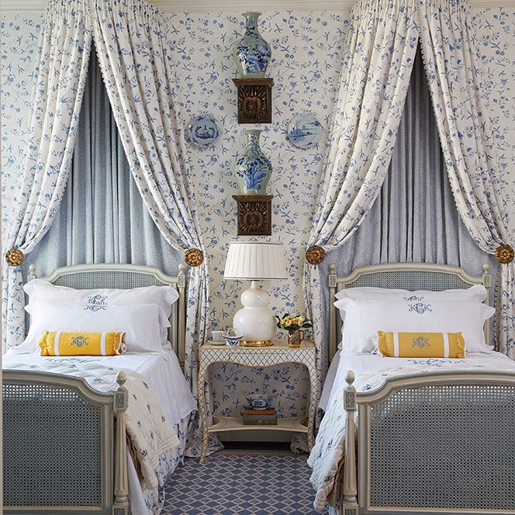
“OY Suzani!!” story from Cote de Texas March, 2009 – seen in this month’s Veranda.


Veranda and the late Southern Accents were always the cream de le cream.    They were the two magazines that I would circle the Barnes and Noble parking lot  for - waiting on the Thursday delivery truck to bring the newest issues.   Over the years, so much has changed, but thankfully, much, like an old friendship, has stayed the same. 


image A favorite Southern Accents cover – maybe my favorite one ever.   This cover inspired a rash of lilac colorways that were added to fabric houses.


Of course Southern Accents is now gone, a victim of the bad economy and scarcity of ads; readership was never the issue.   For me, the death knell started when I first noticed the paper they were using.  Instead of the usual nice and thick variety, SA switched to thinner and lighter paper.  You know, the exact same kind of  lifeless paper that Southern Living uses.  Cheap.   The beginning of the end.   When it was announced they were closing their doors, I was sad for days – I say this with no exaggeration.   Southern Accents had been such a large part of my life, it was a design bible.   Each month I would rush to see if any favorite Houston designers had made it in the issue.  This was before the internet and design blogging, and the ability to follow designers portfolios was nearly impossible.   Magazines alone made it possible to see what designers were up to;  magazines gave you a glimpse into their current aesthetic.   It was a family affair.   Many issues my mother, or my aunt or my sister would call and we would discuss it, house by house.  If it was an rare “bad” issue, we would warn each other:  “got the new SA, don’t bother.   It’s TERRIBLE this month!”   Or, “go get your issue and turn to page 140.   I just love that!”   You see, these magazines mattered to a lot of us.    Back then, they didn’t publish each month and the wait for a new issue was torture.  At least SA came more often than Veranda, sometimes it seemed as if the new Veranda would never arrive.   But it did and still does, while SA is gone forever.


 image All In The Family:  This beautiful house was editor Lisa Newsom’s son’s.  Another classic cover and story. 


Over the years Veranda quietly changed.   Their southern-only editorial material went international.    The shift was subtle.   I hadn’t even realized that change was intentional – I always assumed  the non-southern houses were the second homes of rich and famous Dixie-ites.   And yes, Veranda’s paper quality suffered too, just like SA’s.  Pick up an old Veranda and feel the difference, it was almost like reading a design book, certainly not some rag you could pick up at the grocery store.   Which brings up another difference – Veranda was never found in a grocery store or a drug store.   It was special, a jewel that didn’t mingle with Track & Road or True Romance.   You had to seek it out to find it.  But that’s no longer true either since Hearst bought the magazine in 2002.    Veranda even went digital a few months ago and finally rolled out a viable web site.  Will wonders ever cease?


Ay.   Was there ever a prettier cover?  Simple perfection in a Belgian country mansion owned by that country’s top fashion designer.


Despite all the changes at Veranda, the magazine basically looked the same.   It never changed drastically, it just tweaked things here and there.    It may think it’s now an international magazine, but its roots are southern and always will be.   A few months ago founder and editor Lisa Newsom quietly stepped down, replaced by former domino alum Dara Caponigro.   Gulp.    domino and Veranda?     The blog gossip was brutal.  It wasn’t personal against the new editor who is universally respected, it’s just we didn’t want OUR Veranda to become the “how to get this look for less” magazine for Kappas and Pi Phis.    So far, so good.    I haven’t noticed Dara’s impact yet, but I’m sure it is coming and will probably be good.  She knows what she is doing.   Young and talented, maybe she is what the magazine needs – fresh blood and all.    I just hope she knows what to do with a Pam Pierce or a Carol Glasser house, the importance of them and others like them.   The verdict is out.

Which brings me back to this issue – why all the old features?    Much of this month’s Veranda is very old, recycled news for Cote de Texas readers and bloggers in general.      On the Skirted Roundtable, then House Beautiful editor Stephen Drucker told us (listen HERE) that  he liked to run features as soon as they were photographed.  He didn’t believe in holding onto stories longer than a few months, a year - tops.    It’s unfair to the designer, he said, because if you run work they completed four or five years ago, it doesn’t really reflect their current style.   Five years is an eternity in the design business.   


image 
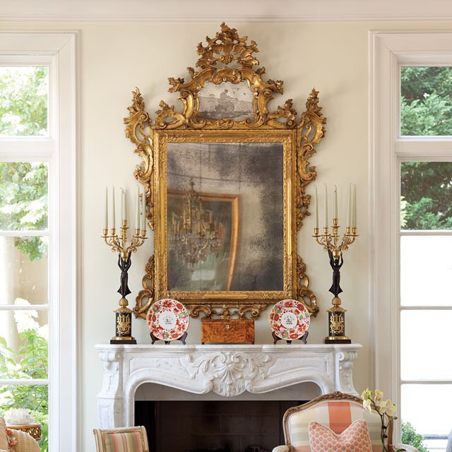
A Houston legend:  Kay O’Toole’s former highrise apartment.


So, what happened this month at Veranda?   I KNOW I shouldn’t be writing this.  I should keep my mouth shut and be a good little blogger.   I don’t like to go negative here, and I rarely do,  but, I’ve gotten numerous emails from readers about this, questioning it.    Making editors unhappy isn’t in the best interest of bloggers. 

On the last Skirted Roundtable (Listen HERE), we discussed the importance of blogging to magazines, again.  Yet again!   I said and I do strongly feel this, that a few years ago the magazine editors seemed apprehensive of bloggers potential power and they courted us.    Today, they are no longer threatened and shouldn’t be.    Blogs and magazines work hand in hand.  Blogs need magazines, not the other way around and editors know this now.   We aren’t a threat, we never were.   We’re more like free advertisers, valuable advertisers for sure, but still free.    

Digital magazines like Rue and Lonny pose much more of a threat than bloggers like me or  “My Pretty House” do.    Still, as Margaret Russell told us on the Skirted Roundtable (OK, enough with the Skirted Roundtable already!!) popular bloggers might reach 50,000 readers a month.  Magazines reach over 200,000.    That statement alone put us in our place, fast.    Reflecting on Russell’s views, I’ve taken myself much less serious.   I’m not a magazine, I’m not a writer, nor am I a photographer.   I’m just a woman sitting in her sweat pants with holes in them pontificating from my backyard about what I like.     Trust me, there’s no one quaking in their boots about this.   


image 
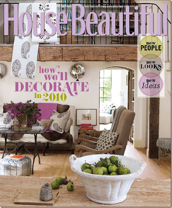
October’s House Beautiful:   Is it an ad or an editorial statement?  Who paid for it and why?


Still, it was a shock when I read a two page ad/editorial in the new House Beautiful defending magazines against the internet by asking “Will the internet kill magazines?  Did instant coffee kill coffee?”   Two pages with no hint as to who wrote it, who paid for it and why.   According to the ad, readership is up, especially in the younger, most important demographic.    Magazines, the ad says, do what the internet doesn’t:   “neither obsessed with immediacy nor trapped by the daily news cycle, magazines promote deeper connections.  They create relationships.”   Yep.   I agree with that.   I live that.    But two pages to make a point?  Someone sounds awfully defensive.    And speaking of immediacy and daily news cycles, how old should a project be before a magazine deems it too old to run?   Why hold onto stories when you risk the chance of the pictures leaking out to the internet months and years before you finally go with it? 


Capture3

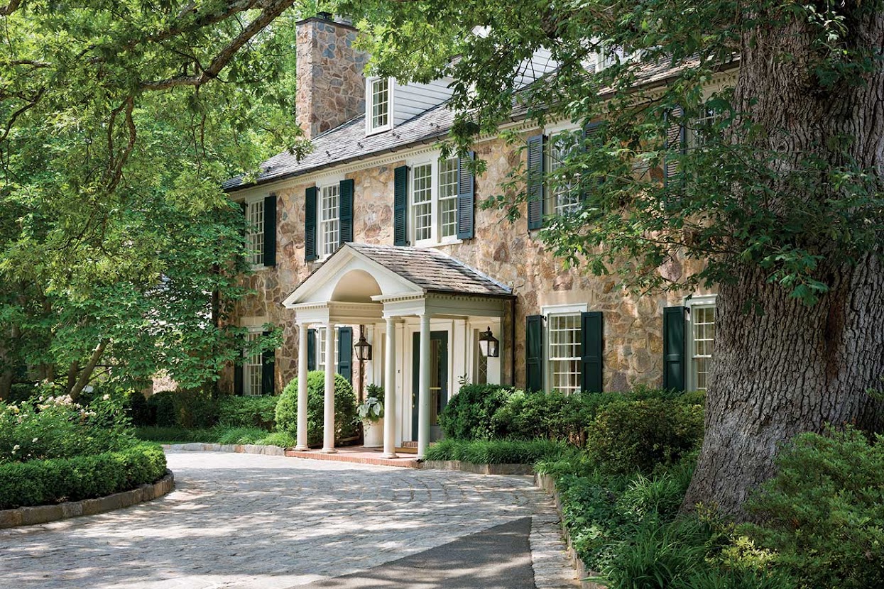
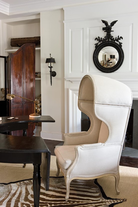
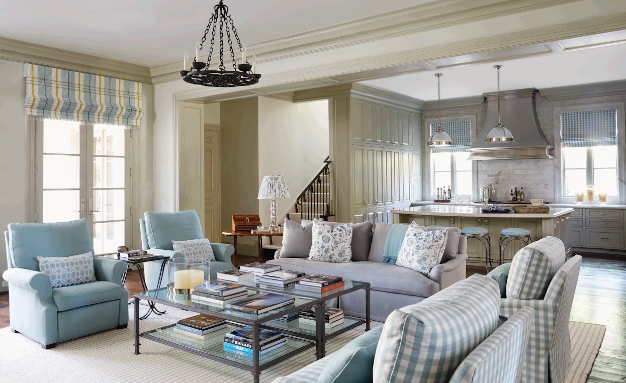
J. Randall Powers gorgeous townhouse project in this month’s Veranda.   This project has long been one of my favorite of Powers.  Photo from PaperCity who ran this story years ago.  Additionally, pictures of the townhouse showed up on real estate web sites when it was put up for sale. 


So, buy the new Veranda, I did.  As usual, the photography is gorgeous.   Their pictures cover both pages in many instances and there are some wonderful designers featured this month.    Although if you are short on cash, you might just want to read this story of mine “Oy Suzani” – from   March, 2009 (HERE.)   It’s the same spec house from Mary McDonald shown in this month’s Veranda.   Pictures of this house have shown up all over the internet this past year.   Or, to read about the Randy Powers house also featured this month, see my own article called “Chinoiserie Central at Piano Nobile”  HERE.  This gorgeous townhouse by Powers was actually first shown years ago in PaperCity, a Houston magazine.   I know Powers is thrilled to have his work seen in Veranda, no doubt, but I can’t help wondering if he would have rather had a more current example of his work shown.   Probably.      Then, there is the profile on Timothy Whealon, that wonderful young interior designer, which showcases a house that has already been featured all over the blogs.   The bloggers  took their pictures from Whealon’s own web site.      I’m sure Veranda would have preferred Whealon not post those pictures until their story was published, but how many years could they expect him to hold off?  One, two, three years?    Once a photograph turns up on the internet, it goes viral, it spreads from blog to web site to blog, over and over like a nasty cold, until no one can actually say where the original picture came from.   And yes, I know, copyright issues and the internet are much debated, heated topics best left for another time. 

Finally, there’s the Veranda story about Edith Head – yawn.  Please don’t tell me that Veranda is going to take up Architectural Digest’s mantel and  showcase Hollywood ad nauseam.   Now that Margaret Russell is heading up AD, maybe their Hollywood adulation will end.  Hopefully.  But really, Edith Head in Veranda?  Seriously? 


image 
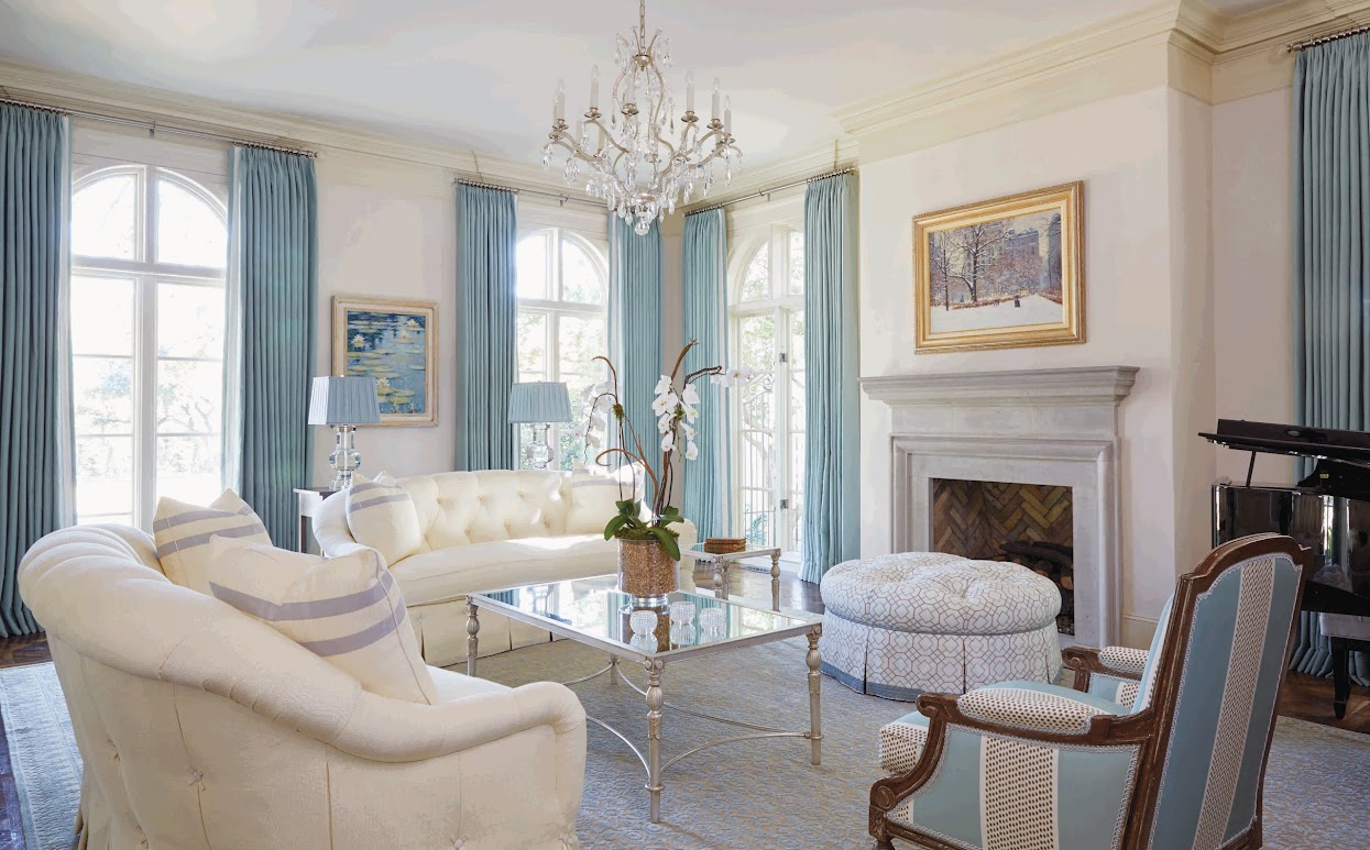
October’s House Beautiful:   gorgeous new decor – eye candy to inspire, to lust for, to dream about.   Interiors like this by Daniel Sachs are why House Beautiful is at the top of their game.    


I know times are tough for the magazines.  And like I said, I probably should  just kept my mouth shut and hope that maybe soon we’ll be getting current stories from Veranda never seen before, of projects just completed.    I can’t recall ever seeing a house in House Beautiful that was first shown all over the blogs.   I could be wrong about that, but that magazine always looks fresh and current.    And it is always a a surprise, a visual feast.   This month’s cover story shook me to my core, leaving me to question, again, my own aesthetic.   The heavily ethnic, Indian and English inspired interiors by Daniel Sachs left me speechless.    Bland Belgian-who????  There are so few quality magazines left, so few design magazines of any kind left, and I want to be surprised, I want to be speechless, I want to be inspired.   I want to get my magazine and have my mouth fall open and just stare and gape and read and reread and scan in the pictures and talk about them here on the blog or on the Skirted (ok ok ok – I won’t say it again).  


Jill Brinson’s Atlanta house was the subject of much adoring blog buzz.


The last time that truly happened for me was House Beautiful’s cover story of Jill Brinson’s house HERE.   GAWD.    It inspired me, it awed me, it made me green with envy in a very good way.   It provoked discussion and blog buzz.    I want that from my magazines.   Every time, every issue.   Too much to ask for?   Probably.  Yes.  Too much.    I’ll settle for once a year. 

SOUTHERN HOME– A GIVEAWAY!!!!

361 comments


One note:  Randal Weeks informed me that now that Spring Market is finally over – they are going to judge the Aidan Gray contest!   Yeah!!!!   Hopefully it won’t take that long, but as soon as I have the list of winners, I will post them.


While we are waiting for those results – I am thrilled to announce another fabulous giveaway today!!!


Over the past ten years, the state of magazines have been on a roller coaster ride.  When I started blogging, each Thursday I would go to the book store and stock up on all the brand new design magazines.  Sometimes my arms would ache from all the magazines I carried home! 


After that peak, the industry went through a bit of a slump – there were fewer advertisers and some titles that we all loved like old family friends were shuttered for good.  This dark phase lasted a few years until the industry started turning around.  Some old magazines like “domino” made a comeback and new titles like “Milieu” were successfully launched.


One of my favorite new magazines is “Southern Home.”

Have you seen this one?  It was founded in 2015 and is published by Hoffman Media whose other titles include Southern Lady, Victoria,, Cottage Journal, Celebrate, and Taste of the South, among others.


I have to tell you – Southern Home is truly a wonderful magazine!  It’s worth buying both to read and to look at the images!  It’s so thick!!  Southern Home comes out every other month and in each issue they spotlight ten to twelve houses!!!   That is an amazing statistic!   How many magazines show just three houses or five at most?   


And, the houses in Southern Home are all from the south, of course.   Each type of design is featured - from classic to French to contemporary – so you get a nice range of styles.


And, each house photographed in Southern Home is special – there aren’t any throw-aways.  You know what I mean.  Most magazines always have a house or two that you just pass over quickly.  Not in Southern Home.  It’s amazing because each house is wonderful and you will SLOWLY turn the page.  I promise.  No rushing through this magazine!!!


  I know I am partial to southern design so I’m a little biased about their choices of houses.  If you enjoy the homes I show on my blog,  I’m sure you will love Southern Home.


AND….I’m excited to share the following news about Southern Home magazine:


Southern Home is now available on ZINIO.com!  That means you can  subscribe digitally to the magazine.  No more paper, you just read it online.   I love ZINIO.  I read all my magazines online and I no longer have to deal with old issues building up in the corner!  Freedom!! 


If you prefer to read Southern Home on the computer, here is the link HERE.  You can buy just the current issue, or an old issue, or you can subscribe yearly.


If you like to read magazines the good old fashioned way, Southern Home has been kind enough to extend a discount for each year subscription!!!!!


Click HERE to get the discounted year subscription including a FREE issue!!!


And there is more….


Southern Home is giving away FIVE one-year subscriptions to FIVE lucky Cote de Texas readers.


That’s FIVE winners!!


FIVE!!!


In order to enter to win the subscription, all you have to do is go to the Southern Home Facebook page HERE and “Like” it.


Then come back here and leave me a comment with your EMAIL address so that if you win, I can notify you.


That’s all!!!


Here’s a huge thank you to Lynn Terry and the group at Southern Home Magazine!!!!!

I’m off to read my new issue!!!

SKIRTED ROUNDTABLE INTERVIEW WITH DARA CAPONIGRO:

27 comments


The Skirted  Roundtable

It’s no secret that one of my favorite magazines is Veranda – the one magazine that really gets my heart racing when the new issue arrives.  For years, Veranda has been such a large part of my design life – Houston designers are frequently featured, as is the southern décor aesthetic that I love so much.  When the editor and founder, Lisa Newsom, retired, I confess that I wasn’t thrilled when they picked the new editor – she came from domino magazine, the hip bible of the younger set.  I didn’t understand how they could choose a domino alum to head up the elegant and gracious Veranda.  What I didn’t realize then was that the new editor, Dara Caponigro, had a much more varied career than just domino.  She had worked long stints at House Beautiful and Elle Décor, two magazines having more in common with Veranda than domino.  It took me a few months to get over Newsom’s departure (what a brat I was!) but Dara has more than proven herself.  Under her leadership and discerning eye, Veranda has remained a first rate magazine – showing gorgeous homes from around the world.  It rarely disappoints.  


ShoppingVeranda-Headshot2

As can be expected – when I heard Dara was coming on The Skirted Roundtable, I was beyond thrilled to get a chance to talk with her about Veranda and the state of magazines in general.  We’ve talked with other editors before and they offer a unique view of the product that we all love so much – magazines. 


image

This month’s issue of Veranda – the cover features beautiful slipcovered antique Swedish chairs from Lief.


Dara is a remarkable woman.  She graduated magna cum laude from Barnard College, no less – along with being elected to Phi Beta Kappa.  She definitely has the smarts which is why she has been able to reach the top, along with putting in a lot of hard work along the way.  I can’t imagine how difficult (and fun) her job must be!   Dara says she travels quite a bit for her job and with this year’s 25th anniversary celebrations, she is really busy holding events around the country.


image

In the new issue, this softly muted room by Darryl Carter caught my eye.  I love how asymmetrical it is – yet it looks so balanced by the unusual placement of furniture. Notice how the black lamp is balanced by the dark tapestry.


Along with everything Dara discussed, I was most interested in learning how they choose houses for publication.  Once you’ve been turned down for an issue, they don’t revisit your application.  If you want another chance – you have to resubmit for another month’s consideration.  That surprised me.  Another interesting thing was how different photoshoots are today.  Back in the day – the magazines would come with boxes of accessories and furniture to “redesign” the room.  That doesn’t happen today.  


image

This room by Kathleen Clements also has an asymmetrical layout – solved by placed of the furniture.  The sculpture and pedestal balance out the fireplace – and the single chair also grounds that side.  Two chairs flanking the fireplace would never have worked.  And notice how the sculpture on the left is balanced by the one on the mantel.   Notice also how the entire room is off balanced – and the dark curtains on the left weigh down that side – if not, it would appear even more uneven.


Of course Dara talked about the gorgeous new book by former editor Lisa Newsom:  Houses of Veranda.  I’ve written about the book – and will reiterate, it’s gorgeous!!  Meghan and Linda didn’t have the book prior to the interview – and when they got their copies, they were stunned by how beautiful it is.  It’s been a stellar year for wonderful design books, I must say.   

The good news is that Dara’s so positive about the future, especially concerning social media and blogging – she’s really excited about Veranda’s Facebook page, for example, which surprised me.  And Veranda is redesigning their web site – hopefully they will be including archives of their photographs just like their sister Heart publication – Vogue.  Gawd – I HOPE so!!!!!!!!!!  Can you imagine having the ability to see online each photograph from every Veranda ever published?????!  Wow.   Dara’s positive attitude towards bloggers was also surprising.  She wanted our opinions and had nary a negative word to say about the medium that some fear threaten the magazines.  Not me.  I’ve said it before, but without magazines, there wouldn’t be the plethora of blogs out there.  We need them more than they need us. 


image

The new Veranda book is filled with your favorite houses from over the years. 


houses of veranda living room

One of my favorite spreads in the new Veranda book – the house seen on the cover – with its gorgeous aged boiserie.


I hope you will take a few minutes to listen to the new interview on The Skirted Roundtable. It’s a good one this time – the sound is great (for once!) and the guest is an incredible woman.

To listen, go to www.skirtedroundtable.blogspot.com – and click on the green bar at the end of the post!

Enjoy!


To order The Houses of Veranda from Amazon, just click on the title below:


Another One Bites The Dust

94 comments


image 

Meredith Corporation announced today that Country Home magazine’s last issue will be this March.  Stunning.  Country Home, with its modern take on the country and cottage lifestyle was a very popular magazine with a readership of over 8 million.   Today Meredith claimed a poor advertising climate forced their hand.   What wasn’t said was that the writing has been on the wall since  Editor Carol Sheehan, author of the popular book “Living with Dogs” left the magazine last year.  Sheehan started at Country Home in 1997, but since her departure the quality has suffered.  While at the helm, Sheehan recruited her friend, author Mary Emmerling to join her at Country Home, and this duo was formidable.  But Emmerling quietly disappeared shortly after Sheehan and the magazine couldn’t survive both their absences.  LuAnne Brandsen took over for Sheehan and after a rocky start, the magazine was finally getting back on tract, but it couldn’t have been easy for her with the two looming ghosts of giants Sheehan and Emmerling.   Brandsen persevered and the last few issues have been some of her best ones.   What a shame.  


  image The latest issue of Country Home featured this beautiful kitchen.


This freefall of discontinued magazines is getting a little scary.  Cottage Living and O Home are two of the latest to shut their doors.   Vogue Living is gone now, too.   House and Garden, finished.   Who’s next?   Along with announcing the death of Country Home, Meredith said 350 employees are getting pink slips.  They predicted that this is not the end – that other magazines are rumored to soon follow.  Hopefully – they won’t be other design titles.


image

It wasn’t your mother’s country at  Country Home – it was a hybrid of Americana, English and French, with a little Swedish thrown in.

Magazines need to get with the digital explosion.   Lately, I’ve been subscribing to as many magazines digitally as are offered.  But, it’s still slim pickings.  Meredith should place their inventory for sale online – it might help.  Digital magazines are green, they save paper, shelf space, gasoline, printing expenses,  distribution expenses and landfills – how more 2000 can you get?  One other advantage to reading digitally is that all references are clickable to their websites – a  huge timesaver.  Digital magazines are the future, so why hasn’t Meredith signed on? 

All I can say is House Beautiful, Veranda, Southern Accents, and Elle Decor better be safe!  


image

And,  in a bit of blogging business and shameless self promotion, I want to thank Terry Sapienza for naming Cote de  Texas to the Washington Post’s Blog Watch:  Top Ten Clicks for 2008!  Thanks Terry so very much!  I am flattered and honored to be named alongside such a great group. 

To read The Washington Post article, please go here.

Pink/Repink: Dishing on House Beautiful

147 comments


windsor

Did the cover of the new House Beautiful look familiar to you? 


hb

Maybe it’s because just one year ago, the House Beautiful cover story was the same – Windsor Smith’s new house?


5346239

The 2009 story of Windsor Smith’s new house featured her gorgeous pink sitting room with its collection of wonderful chairs.  Who could ever forget a room like this?        Almost everyone in the design blogosphere was head over heels in love with Windsor’s house, and especially this pink room.  I can’t tell you the number of blogs that talked about that cover story of Windsor’s house. So, why in heaven’s name would House Beautiful repeat that room on their latest cover?   What is going on over at House Beautiful with its new editor in chief?  

To tell you the truth, I was confused  when I first saw the magazine this month.  I thought, are they featuring Windsor’s house again?   Or, wait, maybe another magazine featured it last year, maybe I’m mistaken???   This cover certainly had me doubting my recall.  Surely, one magazine wouldn’t repeat the same cover story twice in one year?     Who at House Beautiful thought it was a good idea to confuse their readers?   If you carefully read the cover, you notice it does proclaim:  “ten rooms we couldn’t forget” – well, neither could we.


HB

As it turns out House Beautiful’s new issue is all about the color pink, since Pantone has named Honeysuckle Pink as the color of the year.  In the Pink cover story, page after page of previously run photographs were shown again (yawn) to illustrate the color pink (double yawn.)   For instance, this picture above is repeated from a previously run story.  Remember how the blogs oohed and awed over this stairway?   Until someone noticed what a terrible paint job the stairs got.   So, here we go again – staring at the awful paint job. 


KASLER

And House Beautiful runs this picture of a Suzanne Kasler dining room- yes, again.   Jeez.   How many blogs have shown this picture on Pink Breast Cancer Awareness Month?   Hundreds?    Thanks House Beautiful for running it one more time.  


cotedsud

If House Beautiful wants to talk about the color pink – give us something new and fresh, like this photograph from this month’s Cote Sud.   Now, THIS gorgeous photograph made me stop and stare.  I certainly didn’t have to wonder where I had seen this photo before – because I hadn’t!   It’s totally original and fabulous.  


bettylou1

 Even House Beautiful’s Bathroom of the Month has been seen before – its Betty Lou Phillips master bath, straight off the pages of her latest book.    God forbid, they go photograph a bathroom we haven’t seen before.  


TRACERY

            Let’s make nice.   I did love that House Beautiful showed this gorgeous all gray and white house by Tracery Interiors.    To tie this all gray and white house in with the Pink theme, they added pink flowers everywhere.  Poof!   Now, it’s a pink house!    OK, this house is gorgeous, as were the others shown this month.


hb3

To be fair, the houses featured this month in House Beautiful are beautiful.  The Tracery house above, is, spectacular.  And this one with the pink curtains by Ruthie Sommers is fab too.   Gorgeous entrance hall.


hb1

Why all this talk about House Beautiful?    Because on the newest Skirted Roundtable, we discussed all of this and more.  One topic we talk about is the Picks Section found in most magazines, online and at the newsstand.  Does anyone read these types of stories?   Seriously – does ANYONE read these pages filled with all kinds of little things to buy?    Picks have become a large and must-have  part of the  new online magazines, Rue, High Gloss, and Lonny.  Why?????   Is it even possible to publish a design magazine without a Picks page?  Someone should try.


VERANDA 

On the Skirted Roundtable, we don’t just crucify House Beautiful.    Veranda was back at it again, recycling a house we’ve all seen before, ad nauseum.  The gorgeous Belgian house owned by antiquarians Brigitte and Alain Garnier that has been seen in countless international magazines and all over the blogosphere,  is this month’s cover story.  People, PLEASE, give us something new for our money.    I will say this,  if you have never seen the above house before, it’s worth the issue price – it’s gorgeous.  But, if you’ve seen it before and before and before, you’re out of luck.  Of course, the current Veranda does have many other houses worth seeing.   If Veranda could ever just give us all new content, we would be on the band wagon, shouting it from the rooftops.    Despite all the unfortunate repeats, I am loving the direction of the new Veranda.    The magazine is evolving and growing.   It’s leaving its southern roots behind and is looking more and more Elle Décor edgy each month.    Whether you like that or not is personal preference.    All I want is to be surprised each month by something new and original.


country;ovomg

Country Living gets it right.  Never have I seen a recycled house or story in this magazine.  For years Country Living was the Cinderella to the better produced Country Home.    Today, I can barely remember Country Home.   Each month, Country Living consistently give us what we didn’t we wanted.   March’s issue has columns on both Dave Matthews AND Lucinda Williams.  WOW.  Someone at Country Living has good taste in music.   This month, they give us new houses, new stories, new features and none have been seen before in the magazine or the blogosphere.  It can be done.


lonny

Lonny – the premier online magazine – FREE. 


While we are dishing out lots of money for magazines each month –  more and more fabulous FREE online magazines with fresh, original content are vying for our attention.   It makes you wonder - who’s going to win this battle.  Is it even a battle?   Can the FREE Rue, Lonny, High Gloss and all the other online magazines take over the business, stealing the paying readership?    The content of these online magazines certainly rivals the paper versions.   Do you think Hearst, et al, has discussed Lonny at a board meeting?  Do they care?  Are they worried?  Do you think that IBM discussed those snarky teenagers who started a little business in their garage called Microsoft and Apple?   Are High Gloss and Rue the Microsoft and Apple of the magazine world?

Join us for this week’s Skirted Roundtable HERE where Linda, Megan and I discuss all this – House Beautiful’s Pink issue with all the repeats, Veranda’s status, Town and Country tidbits, along with online magazine gossip. 


And now, for something totally different:   Budget Buying News:

target

Target must have hired a new photostylist.  I can’t remember ever seeing such a beautiful ad from them!  This new line looks so cute!!!


target1

And another new ad from Target.  Too bad they don’t sell that sofa!  They could make a million on that item.


Listen to The Skirted Roundtable vs. Pink/Repink HERE.

The Milieu Mini-Mag

52 comments


image

Could you just DIE from this cover?  The gorgeousness of it????? 

I told you a few weeks ago about a new magazine coming out soon – “Milieu.” The brain-child of interior design great Pamela Pierce, Milieu is set to be on the stands this fall.  It’s been so exciting to watch the magazine come to life, started from an idea to become the real thing which you can hold in your hands.

Recently Pierce talked with me about her goals for Milieu.  She spoke about  quality design magazines of old.  In those earlier days, a photo spread might be as long as 18 pages, with full sized photographs of such wonderful quality that the images leapt off the pages.  Today, décor magazines show smaller pictures, rarely, if ever, giving a full two pages to one image.  And, a photoshoot might be only 8 or 10 pages – 18 is unheard of now.  

Then, there are the editorial descriptions that are written obtrusively over the photographs with dark and bold fonts, hiding the image behind the words. 

Another concern is the quality of the paper.  Speciality decor magazines once used the finest paper, so heavy and thick when the page was turned.  But no longer, it’s a luxury that’s gone by the wayside.  What a shame.

Pierce knows all this.  She’s been featured many times in design magazines and she knows firsthand the differences in today’s magazines.   When planning Milieu, she strove to bring back the lushness of the photography, the thickness of the paper, and the more in-depth stories with clean, single and double page photographs.


image

Milieu will contain wonderful photographs of interior design and gardens found in the United States and Europe.   Additionally, there will be features stories on other subjects, such as jewelry and art.  The operative word is quality in design, quality in product.

While the first issue is slated to debut this fall, Milieu has produced a “mini-mag” which is a small issue used to introduce the magazine to potential advertisers.  Pierce is proud of the mini-mag and has graciously allowed me to show some of its images since it won’t be published. 


image

One aim of Milieu is to always show houses that haven’t been published before.  How many times have you paid for a magazine and then found that you’ve seen the house before?  Milieu will show only fresh, never-before-seen images  – which can be really hard in this day of web sites and pinterest and instragram.   So, while some of the photos in the mini-mag have been on the internet, this will not be the case with the magazine. It’s a lofty goal, but one that Pierce will strive to accomplish.

Today, I am thrilled to share with you some of the photographs from the Milieu’s mini-mag!  I hope you will enjoy them as much as I did!

1.  The Schatte Residence:

image

This gorgeous house in the museum district is the home of Andrew and Annette Schatte.  Annette is a well know antique dealer.   Here, in the living room, the sofa is Belgian inspired and the rug was custom made with silk and  metallic threads.   Standing, is a iron floor lamp with a rectangular shade, a trademark of Pam Pierce.

  The house  is stunning and its position across from the Museum of Fine Arts is even more impressive.  It is made of stucco and was built with antique architectural elements in a blend of the classic and the contemporary.   Notice the wonderful stone mantel and the paneling.   And also be sure to notice the steel doors and windows that overlook the fountains on Montrose. 

image

In the powder room, notice the gorgeous antique doors, painted a soft French blue.  An antique stone sink is set into the wall where a single faucet looks so chic.  Hanging above is a Louis XVI gilt mirror.


image

And another photograph from the guest bedroom, with the Napolean III tufted bed and a Louis XV style bergere, wearing my favorite oriental toile fabric!   The curtains are a blush silk taffeta that are simply gorgeous.   Also, notice the wood floors.

The homeowner, Annette Schatte first became known to design lovers when her former house on North Boulevard was decorated by Babs Watkins and photographed for Veranda.  I always say that that photoshoot of the North Boulevard house was one of two houses by Watkins that were the start of the “Houston Look.”  Schatte has a beautiful eye for design and antiques.  She teamed up with Watkins to open an antique shop – Watkins Schatte - that became THE place to buy one of a kind antiques from Europe.  Schatte later opened her own shop further down on Bissonnet, where she continued importing the finest pieces, introducing Houston to the light and painted woods that are now so popular.  She sold her shop to Margaret Naeve, and today she offers her antiques at 2620 and on the internet HERE.

 The Jane Moore House:

image

The second house is located in River Oaks and was designed by Jane Moore, whose own townhouse was recently featured in Veranda.  This house has a classic Georgian exterior, but the interiors are a mix of French and Swedish design.  The living room has a beautiful antique stone mantel with lovely toile and check fabrics in green and khaki.  The trumeau is so pretty!


image

The dining room was made more casual with chair slipcovers made of linen toile.  The ties are such a charming touch. 


image

The dining room chandelier is reflected in the mirror above an antique Swedish demi lune.  I love Jane’s aesthetic so much.   Such beautiful photography by Peter Vitale.


Santa Fe House:

image

The third main feature of the Milieu mini-mag is a renovated Santa Fe house.   Here, in a two page spread, three vignettes of the family room are shown.   The house is a mix of contemporary pieces, such as the coffee table and art work, and fine antiques, such as the Spanish desk.


image

The dining room is an eclectic space, with a linen covered skirted table and modern sculptures. 


image

Hanging on the dining room wall is an antique cherub with a dangling necklace.


image

I hope you have enjoyed this small glimpse of the Milieu mini-mag.   I don’t know about you, but I can hardly wait for the first issue this fall!  If the magazine is anything like the mini-mag, it will be incredible!!!

For questions about advertising rates, please go HERE.

And,  for information about subscriptions, please go HERE!


Lots of News and an Invitation!!!

34 comments


image

With so many of my favorite magazines no longer publishing – think  Country Home, domino, House and Garden, Vogue Living, Western Interiors, to name just five off the top of my head, the ones left standing have become so much more important.   The other day, at the store, I was just staring at the magazine rack – how empty it seemed!   I used to leave a bookstore with armfuls of magazines, but now with such a smaller selection, along with the ever expanding digital field, I’m lucky to find two or three issues to take home.  Sad.   But, what an opportunity this is for those magazines still standing!  With a narrower playing field, the readers will be getting the creme de le creme.    Each issue should be chock full of the prettiest houses out there, along with all the latest design news.


image

For example, the July/August issue of Metropolitan Home looks positively delectable.   It features two houses from Texas – the one pictured above is a Lake/Flato designed ranch in the Hill Country – our version of Provence.  Nice!!!!     I can’t wait to see more of this house.    Photograph by  Colleen Duffley for Met Home.


image

Another Met Home story is about a couple in California with a compound of canvas covered casas!  Say that one fast.   How charming is this?


image 

And, Jamie Drake’s East Hampton garden is featured too – a must see for sure.    More stories include:   a weekend house by Amy Lau, one of the blogosphere’s hottest designers,  and a farmhouse inspired by Doug Larson’s Swedish roots.    


image


Another much anticipated summer magazine is the July/August issue of Elle Decor.   The design blogosphere’s favorite movie star, Mrs. Blandings, has written an article all about her home town, Kansas City.    Mrs. Blandings reports, here,  that she is thrilled to have been asked to be a part of the Elle Decor team for this issue and we are just as thrilled for her!   Magazines and design blogs have a unique relationship  - we each benefit from the other’s presence and the more we can work together, the better it is for both of us, don’t you think?


image Mrs. Blandings, aka Patricia Shakelford, in front of her favorite fabric in her charming living room.


And, be sure to tune into the current Skirted Roundtable where Mrs. Blandings holds court as our first guest host!   You can listen to the delightful Mrs. B. -  here.   


image


AND – Stop The Presses!!!!!!!     The Skirted Roundtable is convening tonight with another guest host – the charming and ever gracious, Ms. Karen Carroll, Editor in Chief of everyone’s favorite design magazine, Southern Accents!!!   We couldn’t be more thrilled to have Karen join us to discuss interior design.    Southern Accents is truly an inspiration to me and my design business and I know Cote de Texas readers love the magazine as much as I do.  So, plan to spend a while with Linda, Megan, and myself – later on this week – when we bring, Karen Carroll to The Skirted Roundtable!    For a preview of  the “real” Ms. Carroll, check out the Miss Gracious Living blog, the official blog of Southern Accents, where Ms. Carroll is one of its contributors.


image


And, when you check out the Southern Accent’s blog, find out who was recently named the latest “Miss Gracious Living.”   As you may remember, Moi was the first to hold the title, here,  which I reluctantly had to pass on.  sob.    The new title holder is none other than our favorite blogger from Pigtown - Baltimore, Meg Fairfax Fielding!!!!   Read all about Meg here and visit her blog, Pigtown Design, here.  Congratulations Meg, wear your crown with dignity and grace, like all of us before you have!   You have much to live up to, so - good luck!!!!


image Pigtown Design, written by the new Miss Gracious Living, Meg Fairfax Fielding.


image

BeeLine Home by Bunny Williams.


And last, but certainly not least – a special invitation for Houstonians and Dallasites – Interior Design GREAT – Ms. Bunny Williams is coming to the Lone Star State!  HOWDY!!!!    On the heels of the debut of her new furniture line, BeeLine Home by Bunny Williams, Ms. Williams will be visiting Mecox this week.   You can meet Ms. Williams, have her sign her books for you, and mingle with all the important people in design, like me!!!


The schedule is:

Dallas:         Mecox Gardens, 4532 Cole Ave,  on Tuesday June 9th from 6-8 pm.

Houston:   Mecox Gardens, Highland Village on Wednesday, June 10th from 6:30 – 8:30 pm.

I’m planning to be there to see the entire BeeLine on display – and hopefully, you’ll join me!!


image

Ms. Bunny Williams,  one of the best interior designers out there – and author of one of my favorite design books An Affair With a House.

imageThe best of the best:  An Affair With A House!