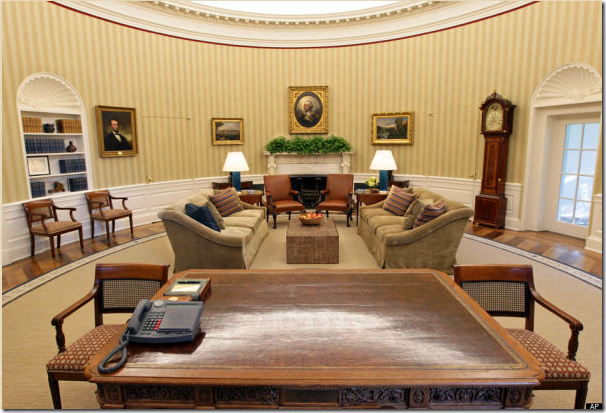
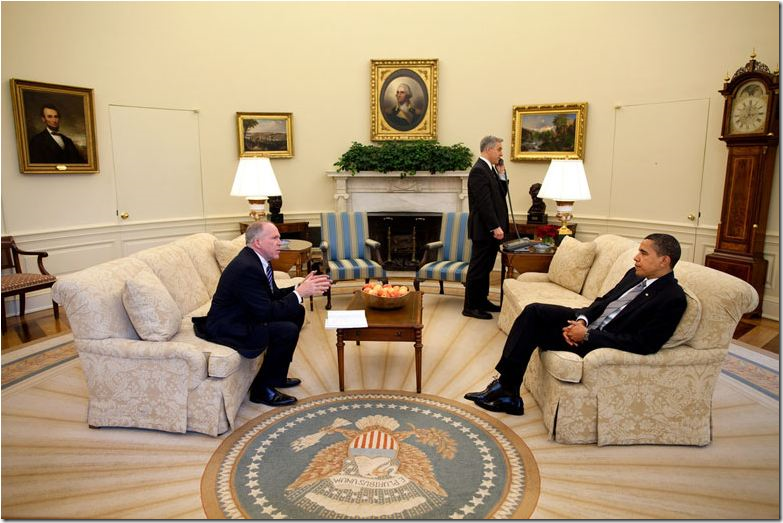
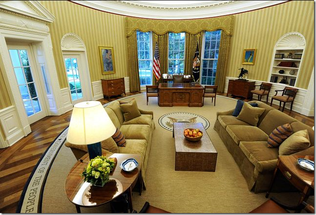
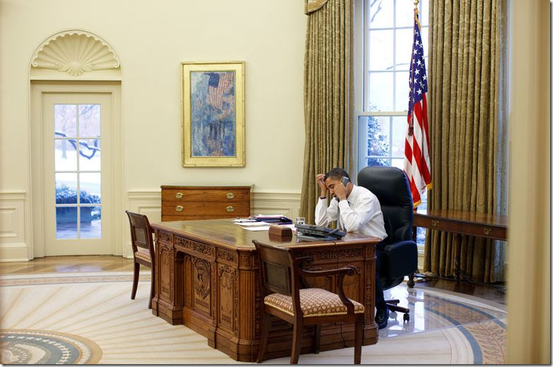
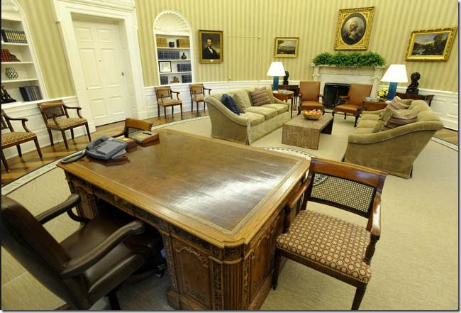
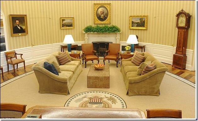
 The newly designed White House Oval Office was announced this Tuesday. The biggest decorative changes are the addition of the gold striped wallpaper and the new wheat colored rug. Michael S. Smith is rumored to have been the interior designer responsible for the changes. The portrait of George Washington remains where George W. Bush had him – right above the marble fireplace. The new design for Obama is less formal, less elegant than it was under Bush.
We finally got a SMALL glimpse of what uber-talented Michael S. Smith has been doing for the Obamas at the White House. With much blog excitement, Smith was hired as their interior designer before the big move in. Rumors of a $100,000 budget caused most to scoff at the reality of using Smith and staying within such an impossibly small budget. Unfortunately, not one picture of his work on the private quarters has been leaked to the press. But, on Tuesday, the announcement came that the President’s Oval Office was recently redecorated while he was on vacation and pictures are flooding the internet. The White House did not disclose the designer, but it is widely assumed to be Smith – especially after his good friend, Architectural Digest editor, Margaret Russell commented on the decor. At first glimpse, the redecorating is a bit of a disappointment. Gone is George Bush’s magnificent sunburst rug and the elegant cream walls and upholstery. The beautiful Bush rug has been replaced with a rather bland, wheat colored rug – sporting a band of famous quotations around its perimeter. While the quotes are inspiring – the former sunburst rug was especially fitting for the office since it enhanced the wagon wheel pattern of the wood floor. Through the years, the floor in the Oval Office has changed from cork to linoleum to a wagon wheel patterned pine and oak floor installed by Ronald Reagan. George W. Bush replaced the Oval Office floor with new hardwoods, but kept the same Reagan pattern. His oval rug beautifully offset the floor’s pattern and showed it to its advantage. Unfortunately, Obama’s rug looks somewhat plain when compared to the Bush rug, which Laura Bush designed as a symbol of optimism. Of course, Smith had a choice – either go with a striped wallpaper and a plain rug, or go with a striped rug and plain walls. He made his choice and the newly installed wallpaper is the most striking aspects of the new design.
There is one big difference between the decor of the Bush and Obama offices. The Bush Oval Office was elegant and dressy with all its creamy damask fabrics and ivory walls. Obama’s decor looks more upscale family room with its comfy chenille like upholstery on the sofas and leather on the armchairs. Some say it looks more like a hotel lobby than a presidential office.
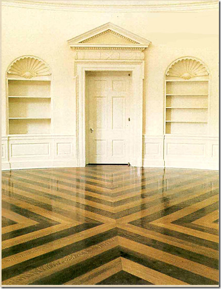
How would YOU decorate a room with a busy floor like this?
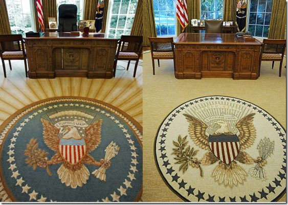
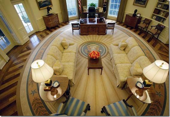
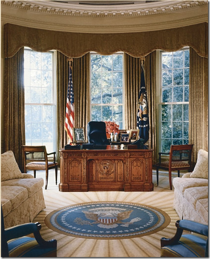
Here you can the Bush rug in all its glory. The seal has spokes leading out from it. Notice how the spokes repeat the design element of the hardwood floor. The rug is smaller than Obama’s. This smaller size allows a large border of the wood floor to show. The Bush rug remains one of the prettiest of Oval Office rugs to date. Obama did keep on using the office as Bush left it for 18 months, but the decor was replaced this week.
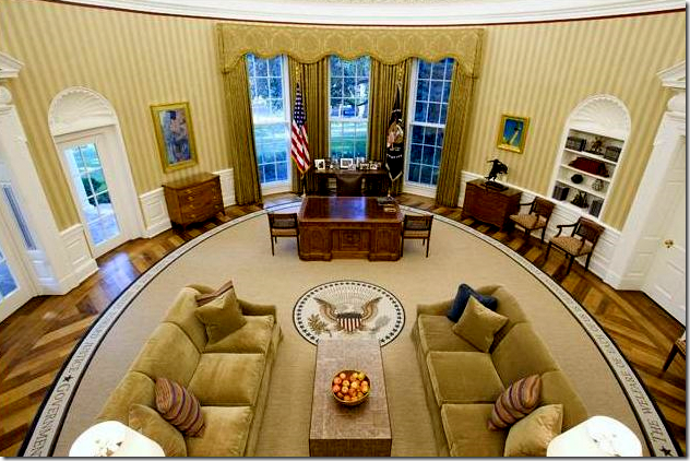
The quotes on Obama’s rug (on the right, above) are sewn around the perimeter of the rug and are non-partisan. Two are from democratic presidents, two from republican presidents and one is from a non-politician, the Reverend Martin L. King, Jr.
The quotes are:
"The Only Thing We Have to Fear Is Fear Itself” —President Franklin D. Roosevelt
“The Arc of the Moral Universe Is Long, But It Bends Towards Justice” —Martin Luther King Jr.
“Government of the People, By the People, For the People” —President Abraham Lincoln
“No Problem of Human Destiny Is Beyond Human Beings” —President John F. Kennedy
“The Welfare of Each of Us Is Dependent Fundamentally Upon the Welfare of All of Us” —President Theodore Roosevelt
Obama’s newly decorated Oval Office with its warm, family room feel.
Reviews of the new design have been mixed, but Margaret Russell, a personal friend of Michael Smith, called it: “Very American and very appropriate.” Russell's favorite addition is the rug: "It just seems right for this time." Margaret, I love you, but I could not agree less about the rug. Russell’s replacement at Elle Decor, Michael Boodro, weighed in with this: "These sofas look like you could have a lot of long talks. They're good for diplomacy. And that coffee table — it looks sturdier. You could put your feet up. I mean, I'm not sure anyone ever gets too comfortable in the Oval Office, other than the president, but this looks like an effort to put people at ease." Yes exactly. Comfy. Certainly not elegant. But shouldn’t the President’s office be elegant? Bush had a policy of never entering his office with a suit jacket on. He expected his staff to follow his lead, which they did. On weekends, if someone came in shirt sleeves, they were made to wait outside the door, not allowed to enter the office of the President. Obama has relaxed this policy – he appears without his jacket on occasion. Perhaps he is just a less formal man than Bush and wants his office to appear more relaxed than it did under Bush.
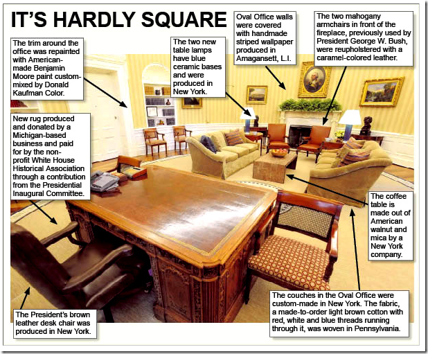
Whoever did design the office made sure that everything was made in the good old US of A. Updates to the Oval Office include, the rug, made by the Scott Group out of Grand Rapids, Michigan, the gold and beige wallpaper, produced in Amagansett, NY and the new coffee table made of American walnut. The two sofas, custom made in New York, wear darker, plain upholstery with red, white and blue threads running through it. This fabric was woven in Pennsylvania. The sofas are said to be “fluffier” – no doubt extra down cushions were insisted upon by the designer. There are several striped pillows, plus one in navy that picks up the new lamps’ color. Obama’s new brown leather desk chair was also made in New York.
Two arm chairs stayed, but were recovered in a caramel leather. Other smaller caned, arm chairs also stayed untouched – including the fabric. Perhaps the biggest item that remained the same are the curtains – a damask fabric. The famous Resolute desk used by so many presidents also remains in the office, as does the painting of George Washington.
Small details that changed before the major remodeling included the addition of a bust of Martin L. King, which replaced one of Winston Churchill. Obama also hung a a copy of the Emancipation Proclamation, borrowed from the Smithsonian Museum, until it was moved to the Lincoln bedroom. I love how the President has included touches of his ethnic heritage in the White House.
Of course, taxpayers did not pay for the refurbishing. The funds came from the nonprofit White House Historical Association.
A graphic showing the changes in detail.
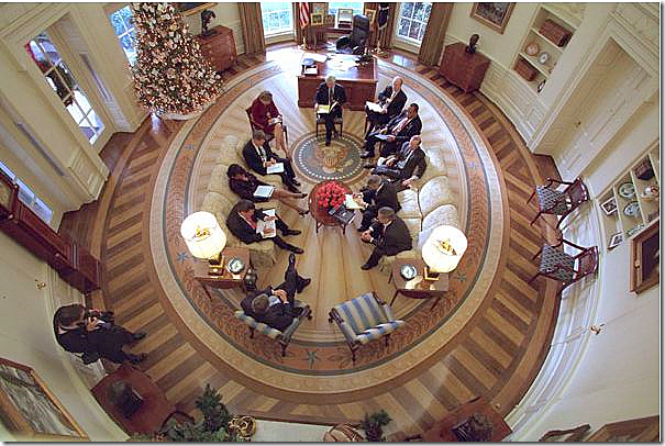
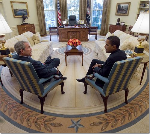 When Obama took over the office, he said that he liked the rug and was in no hurry to change it. But, most Presidents do choose their own Oval Office rug and Obama is no different. Here, at an initial meeting between Bush and Obama, you can see the blue striped chairs that add just a touch of color to the otherwise cream and ivory office.
NOW AND THEN – BEFORE AND AFTER:
BEFORE: George W. Bush’s Oval Office – elegant and sophisticated in creams, ivories and touches of light blues. The Bushes liked to have fresh flowers on the coffee table.
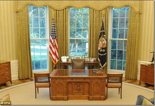
AFTER: Barak Obama’s Oval Office: Golds and caramel OR is the color scheme browns and wheats? The color scheme of the Oval Office looks remarkably different in photographs. Here the office appears to be very gold toned. In this photograph, the color of the rug seems “off,” – it should be a warmer tone. The Obamas also replaced the coffee table flowers with a bowl of fresh apples.
BEFORE: Looking at the other side of the room – towards the fireplace. The sofas in both offices appear very similar, except for the arms. Both have tight backs and three seat cushions. Bush’s damask is very pretty and subdued.
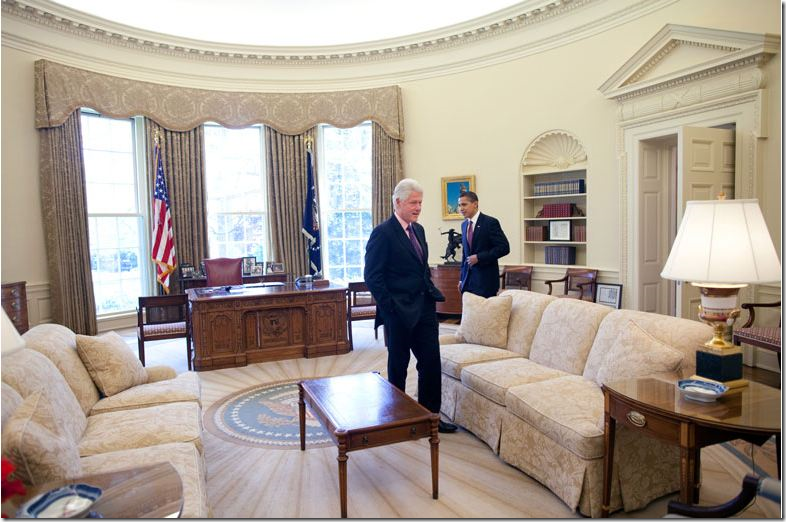
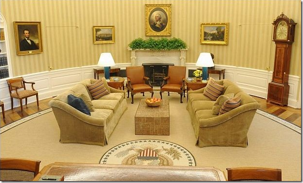 AFTER: Obama’s office: Another photograph showing the office in the gold and caramel tone. Here the rug looks warmer and it appears to match well. The sofas have a beautiful curved arm with the fabric draping in a waterfall. The coffee table and the lamps are surprisingly modern! I am really not liking the coffee table AT ALL! Sorry! The modern touch seems oddly out of place here and lends a hotel lobby look to the room.
BEFORE: Bush’s curtains and the Resolute desk.
AFTER: Obama’s curtains and the Resolute desk. I am assuming these are the exact same curtains. Yet, they seem so much more gold in this photograph. They blend perfectly with the sofas and the wallpaper. Below are photographs showing Obama’s office looking much less gold.
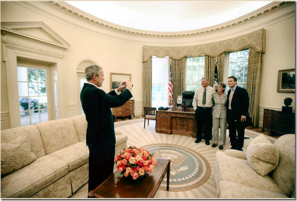 BUSH: Bush’s office, all creams and ivories and light blues – so elegant! Although, I must say, I wish someone would paint the ceiling a deeper shade! It’s so old fashioned white-white. Notice the curtains looking very taupe in this photograph.
 AFTER: In this photograph, the curtains look exactly the same color as they do in the Bush Oval Office shown above. SO, judging by the exact color match of the curtain fabric, I am assuming THIS is the correct color scheme of the Obama Oval Office – more brown and toffee toned, much less gold toned as seen in other photos. Notice the beautiful back of the sofas. The office looks well designed in this photograph – the color scheme is more subdued, the rug looks wonderfully warm, the office looks masculine and welcoming.
BEFORE: The Oval Office as it was under George W. Bush. Notice that the coffee table and end tables look like bad hotel furniture. Beautiful lamps.
AFTER: The same view – in this photograph the office has the gold tone again. Notice how large the quotes on the rug are – you can easily read them. And notice while the new modern coffee table was added – the two end table were reused. The modern blue lamps bring out the blues in the pillow and the rug.
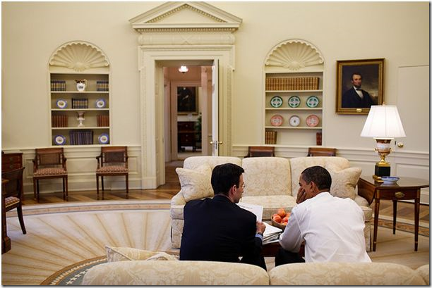 BEFORE: A rare view through the hall door. The shelves are so pretty shown from this angle.
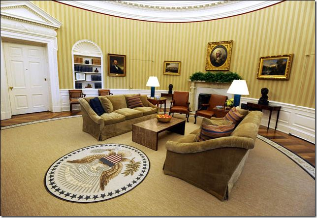
AFTER: More gold toned photographs. In this picture, the office looks so inviting and warm.
THE RESOLUTE DESK AND CHAIR:
BUSH: In this early photograph, Obama is still using Bush’s God awful desk chair! Abomination!!! Makes me wonder where the ceiling fan is???
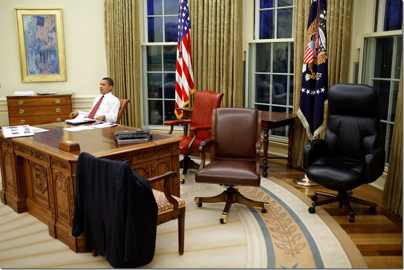 Here he tries out different, more traditional chairs.
AFTER: A dark brown leather traditional desk chair now sits behind the Resolute desk.
A photograph from Wednesday showing Obama at work in the newly decorated office. His office chair is especially attractive compared with Bush’s modern chair.
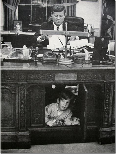
The famous photograph of President John F. Kennedy with his son John F. Kennedy, Jr. peering through the trap door of the Resolute desk. This desk was made from wood taken from the ship HMS Resolute and was given to President Rutherford Hayes by Queen Victoria of England in 1880. Most Presidents since Kennedy have chosen to use the Resolute desk.
Stanley Tretick took the original photograph of John Kennedy with his son, John F. Kennedy, Jr. peering through the trap door of the Resolute desk. The photo became a symbol of the President’s youthfulness – the Kennedy children were the first toddler White House residents in a long time. When Caroline Kennedy visited President Obama, she noted he was using the same desk as her father had. Obama bent down and tried to go through the trap door, but alas, no one had the key to open it up. Notice that the fabric on the side chairs is a famous Scalamandre pattern. (I actually once used this same exact fabric in the same colorway for a client of mine!)
RECENT OVAL OFFICES THROUGH THE YEARS:
.The Oval Office was designed by architect Nathan C. Wyeth during the time of President William Howard Taft in 1909. It was damaged by fire in 1929 and rebuilt by President Herbert C. Hoover, and later enlarged to the Oval office known today by Eric Gulfer under President Franklin D. Roosevelt.
President D.D. Eisenhower’s Oval Office was rather plain and inspired by the times, the 1950’s. The curtains were used from Truman through Kennedy.
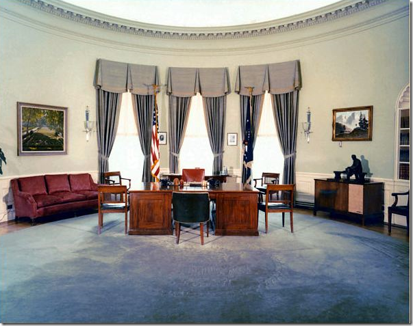
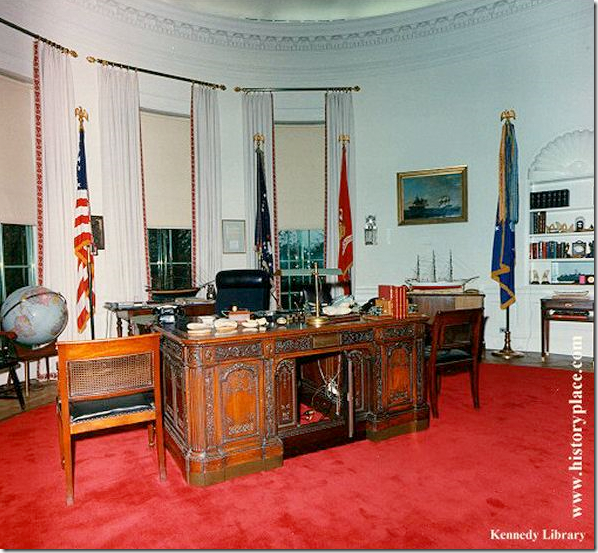 While the Kennedy’s were on their fateful trip to Dallas, his office was finally remodeled. The Resolute desk is shown here, as is the vivid red rug. Notice the chic curtains with the rods and the trim! Amazing! He never used his finished office. Later, Lyndon B. Johnson changed out the rug and the trim on the curtains to blue.
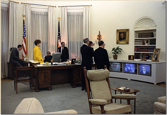 Hard to see in this picture, but the trim on the curtains was blue during Johnson and Richard M. Nixon’s time. That TV is such a crack up! This was back when the three major networks really mattered, because that was all there was to watch!
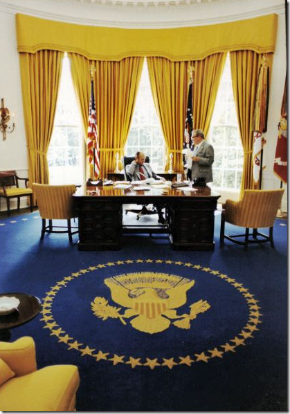 Nixon changed his Oval Office to this decor and Gerald Ford used it for a while.
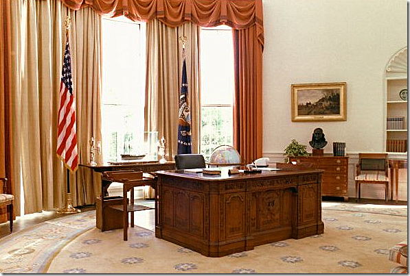 Gerald Ford changed his decor to this and the ever frugal Jimmy Carter kept it, as is. This might be a favorite decor of mine, but the peaches and blues seem so unpresidential. That rug is so cute, certainly not for a president!
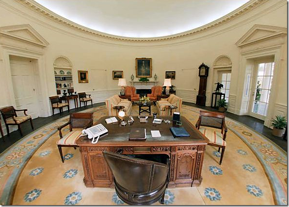 Ronald Reagan used the Ford decor early in his term.
 Eventually Reagan changed to this decor, including his own sunburst style area rug. He also changed the floor from linoleum to wood in the famous wagon wheel pattern.
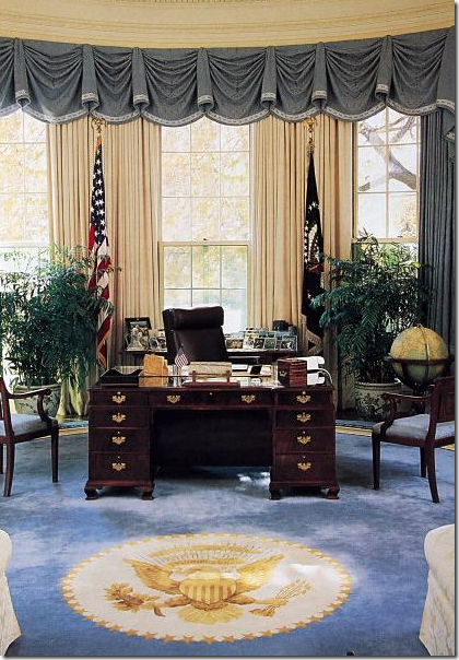 George H.W. Bush’s Oval Office is similar to his son’s in the colors they used. His desk looks so small compared to the Resolute desk.
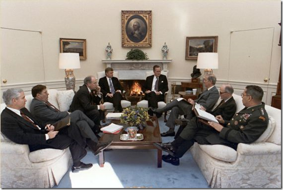 George H.W. Bush – similar decor to his son’s, George W., decor?
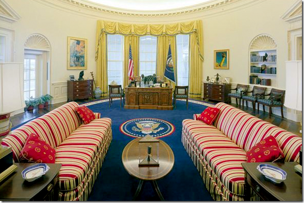 The absolute worst ever: The Clinton Oval Office. In the NY Times, Maureen Dowd called this the “Belle Watling” era. OMG! That is so hysterical and soooo true. Indeed. Red, White and Blue + Yellow = ugly. This is so unpresidential. Indeed the entire White House decorated under the Clintons was atrocious. I won’t name the decorator, I’m sure she’s done much better work in her career. She must cringe when she sees Bush and Obama’s elegant offices.
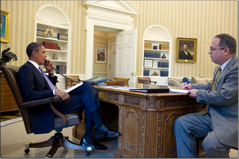
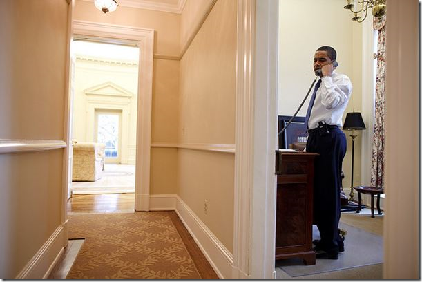 And speaking of the devil, Bill Clinton, here Obama answers the phone in his “private” study off the Oval Office (seen through the door way in the center.) I wonder if this is the private office where Clinton showed Monica how to “smoke” his cigar. OY! OK, OK, I actually liked the man as President. Whew! Back to design – notice the runner in the hall – like it!
Whose Oval Office do YOU like better? George W. Bush or Barak Obama? And TRY to keep politics out of your decision, if possible. My choice goes against my own politics.
Most of the vintage photographs came from HERE. The luscious current photographs of the Oval Office came from The White House on Flickr.com.
