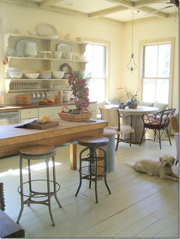
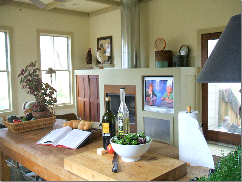
This latest kitchen in the Readers Kitchens Series is located in Hudson, in upstate New York. When the homeowner forwarded me these pictures, I emailed her back asking for the “before” pictures of this renovation. Imagine my shock when she said it was new construction! Wow, the kitchen really has that old house look. Apparently the owners live in a 1930s bungalow and when the time came to remodel the kitchen, they opted to build an entirely new space. But, who wants a brand new, white marble and granite temple when you live in an older, more casual house? The homeowner actually designs kitchens in her area, so she knew exactly what she wanted. In this design she tried to use as many vintage and antique items, along with salvaged materials that she could. Enjoy!
I love the painted wood planks used in the addition. They really set the tone that this is a casual room – not a slick, modern kitchen. In the middle is an old, wood island that acts as the focal point. Be sure not to miss the ceiling – a grid of darker painted beams that create a mass of interesting squares.
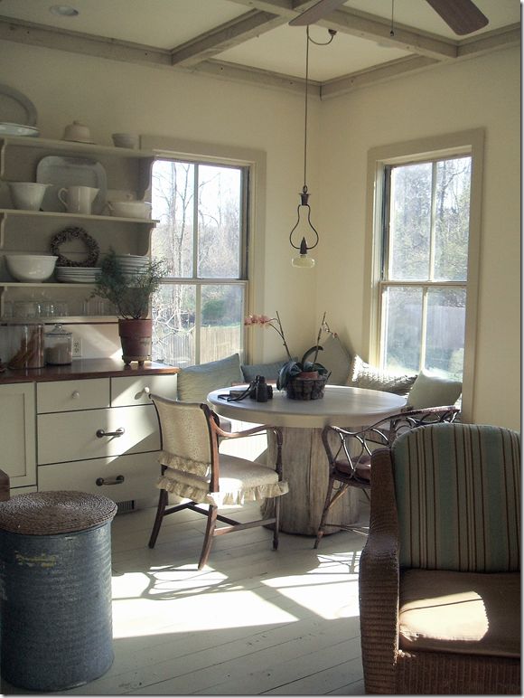
The corner becomes a banquette for the breakfast table, with its rustic wood base. Notice the charming light fixture that hangs above the table. I love how the sun streams through the windows here. And, don’t miss the recycling bin – an old metal can topped with a round, straw mat.
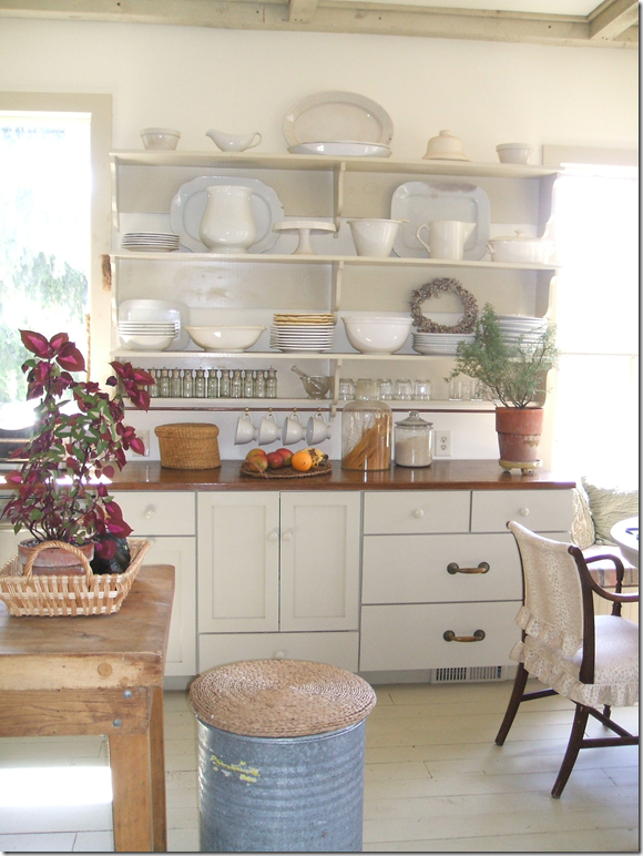
The countertops are wood. Instead of upper cabinets, a series of shelves holds all the dinnerware. Notice the mixture of hardware, two heavy brass handles are mixed with smaller round white ones.
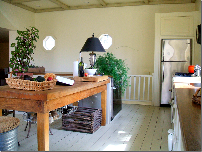
Along one side of the kitchen, a railing overlooks a stairwell, while two octagon shaped windows break up a blank wall. The appliances are found mostly on one side, while an extra oven is built into the end of the island. The refrigerator uses the fool-the-eye trick of appearing built in by bringing the cabinet above it all the way out.
And finally, looking at the opposite wall, a fireplace is built in, along with a television. The chimney becomes an architectural element in this clever design. It’s truly hard to believe this is new construction! It is as seamless an addition that I’ve ever seen. I think this kitchen has an important lesson – just because you can build it new, doesn’t mean you have to build a monument to yourself. This homeowner chose to build a kitchen that is truly keeping in with the style and age of the house.
To contact the homeowner for design work in the upstate NY area, please email her at dsrd@mhcable.com
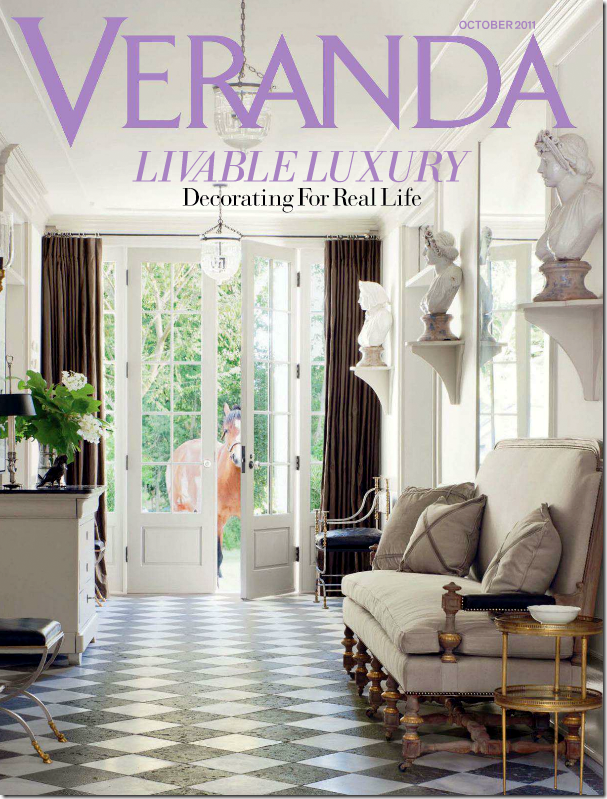
Next: The comment section on the last blog story, Pamela Pierce Does It Again, was more interesting than the story, something that happens a lot! I love reading your comments and it is always interesting to see where you are coming from. This week, a lot of you commented on the new Veranda magazine. I have really been enjoying Veranda lately, especially with the new editor, whom I really didn’t think I would like! Instead, I’ve found that I have enjoyed the direction she has taken. I do have to agree with you though, that this month was not a stellar issue. Many of you said you got your issue and tossed it out after one quick look. At the time I hadn’t received my Veranda yet, but I have now.
Well – there were a few houses I enjoyed, the Swedish one for example. But I have to say, if you are looking for a replacement for Southern Accents – this issue isn’t it. This month, Veranda looks more like Elle Décor and I can’t understand why. I find it strange because other issues have not been like this. So, I’m going to just say this was not their best and wait until the new one comes. Because what else is there? I’ve gotten where I can barely tolerate Elle Décor – I just don’t understand it anymore. House Beautiful has never really recovered after Stephen Drucker left. The biggest turnaround has been Architectural Digest since Margaret Russell landed there. I’ve found that this is one magazine I really enjoy. Mostly though, I wait for Lonny and Rue – the two biggest online magazines. They are more interesting and filled with more décor than most of the printed ones. Hopefully, now that the economy seems to be heading slowly upward, more advertisers will return to magazines and we will have something to look at again.
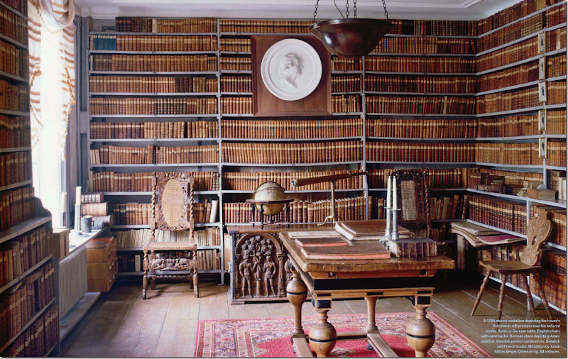
This library was my favorite image from this month’s Veranda. I would die to have a room like this!
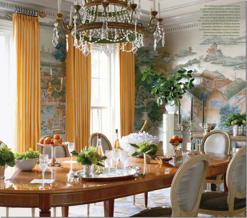
I liked the dining room of this house and thought the styling was pretty. The yellow curtains were a pleasant surprise.
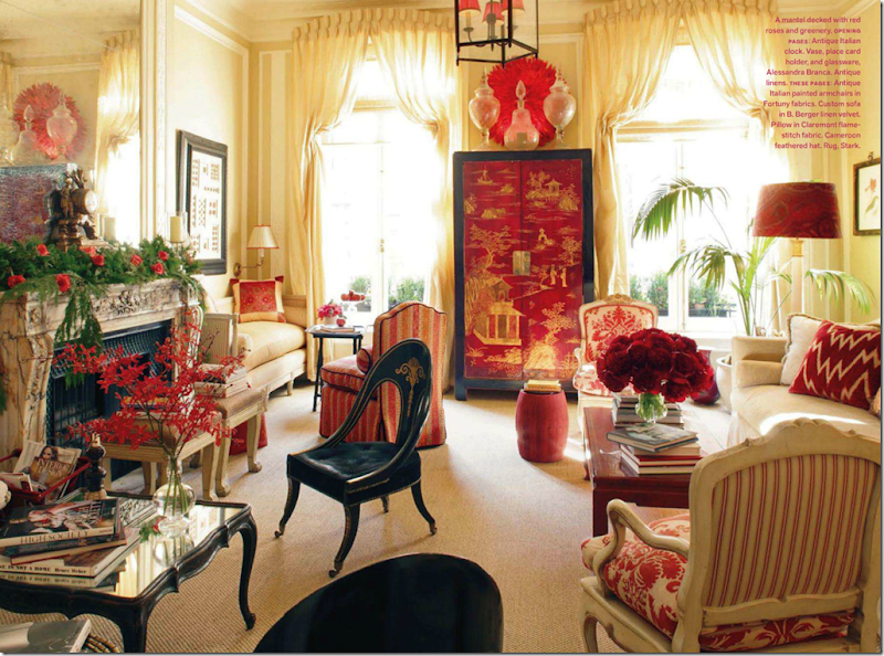
No one loves Alessandra Branca more than me, but really – how many times are we going to see her NYC apartment? I was shocked that it was shown in this month’s Veranda. Why??? This is probably the 3rd or 4th time this apartment has been published.
Last month’s issue was a keeper for me. The Windsor Smith house shown on the cover – drool worthy.
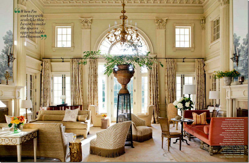
I know we can’t see an entire issue of dreamy houses like this Barry Dixon one, but I do think each issue should have at least one like this – totally decorated to the nines. Where else can you get ideas?
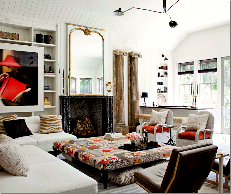
Windsor has become one of my favorite designers – I’m crazy for her style. That ottoman!! Gorgeous!
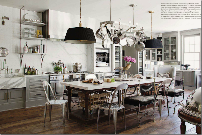
I’m not sure anyone does a better kitchen than Windsor. This one is beyond incredible! The walls of marble, the silver accents, the pendants, the island table topped with more marble, the refrigerator columns flanking the door, the marble sink – how does she think of all this? Amazing!!!!!
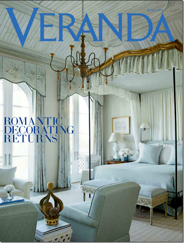
As long as Veranda can come out with issues like this one in April, I’m willing to forgive issues like the newest one. April’s issue was one of the prettiest in memory. It was called “Romantic Decorating Returns” – why would anyone want their house to not be romantic, beautiful and endearing? Who wants a house that isn’t romantic??? I don’t get that.
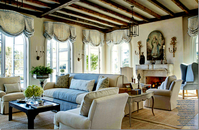
This house by Jim Howard was beyonod beautiful. But is there anything that he or his wife does that isn’t?
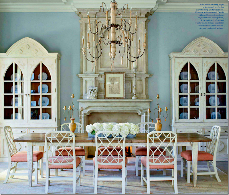
I love the dining room in blue with touches of peach.
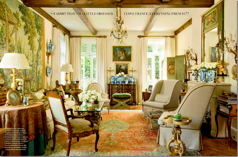
This house by Peggy Stone was reminiscent of Southern Accents and older Verandas. Can’t we get more of this each month? It’s what we want, isn’t it? I just hope Veranda realizes its readers don’t want another Elle Décor – we want Veranda, like it always was.
And finally, I have a favor to ask of you today. My niece’s friend Annie (who is also a reader) is trying to win a contest that will pay for her and her fiancé Tyler’s entire wedding! Wouldn’t that be nice??? Tyler and Annie are looking for votes and asked if you could be so kind and vote for them.
The website Entwined is hosting the contest for a wedding worth over $100,000. Can you imagine? What a dream come true. The wedding will take place in Blanco, a tiny town in the Hill Country outside of Austin, Texas. Out of all the entrants, 11 were chosen as finalists and Tyler and Annie are amongst them. If they win, they have pledged to donate $3,000 to the Houston Humane Society – as they are huge animal lovers.
If you have the time and don’t mind – I know they would so much appreciate your vote!
To vote for Tyler and Annie, just go HERE
And a huge thank you to the homeowner who so graciously allowed us a peek into her new kitchen addition! If you have a kitchen you want to show off – just email me the pictures at mrballbox329@aol.com. Hopefully, I’ll be running this series for a few more months!
READERS KITCHENS SERIES #6 AND THIS MONTH’S VERANDA
Pamela Pierce Does It Again
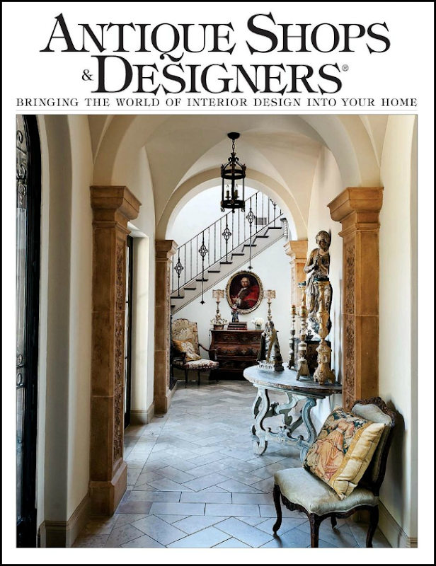
The new issue of Antiques Shops and Designers is out – and if you live in Houston, I’m sure you’ve seen it already, but I wanted to discuss a feature story in the new issue. As always, the issue is online – which I love. The magazine is always great with wonderful articles and even better advertisements from local designers. Lately, I’ve been in a bit of a malaise – I look at all the design magazines, printed and online, and hardly anything seems to strike me. I’m not really sold on all the bright interiors that the younger decorators love so much. And I don’t get all the interiors where everything is so mismatched. Maybe it’s my age. Mostly when I look at magazines these days, it’s just one boring house after another – or it’s decorating that I just don’t understand. I don’t’ know if I’m being picky now that I am older, or if the quality of interiors aren’t what they used to be. Only a very few magazines really grab my attention. So, when this new issue came, I flipped it open – and almost started foaming at the mouth over the very first house. Seriously. I didn’t make it past this house for days. I left my issue open out on the kitchen island and just looked at it each time I passed by. Sick, I know. But this house really, really moved me. I’m almost embarrassed to tell you whose it is, because I feel like an obsessed fan girl – just loving everything she does. So, care to guess? No? OK, it’s Pamela Pierce.
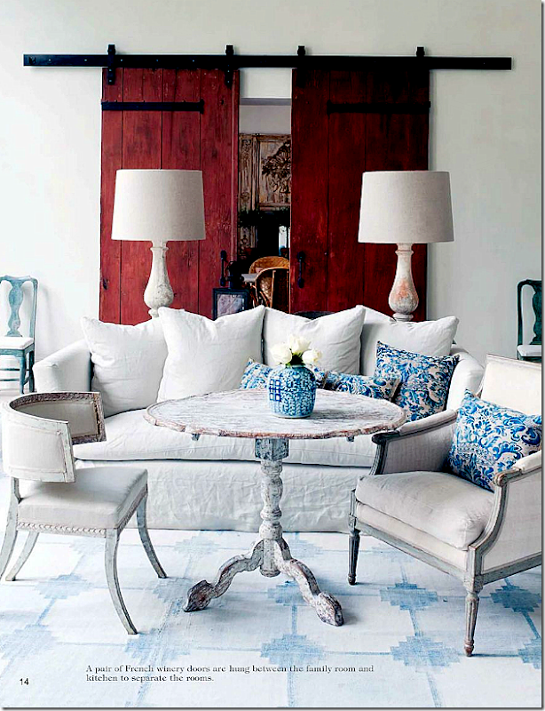
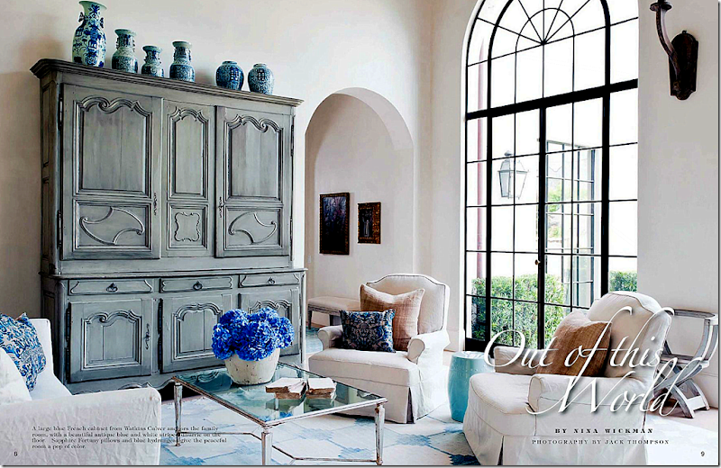
Whoa. I could just crawl in this picture and move right in. I’m not alone in being overwhelmed by this house – the writer, Nina Wickman, had a similar experience. Nina writes “We have all heard about near death experiences and I think I just had one. I went into a house that made me think I had died and gone to heaven.” Glad to know I’m not the only idiot around here. Nina – I can totally relate! The owners recently built this house – moving from a much larger one. They hired Pamela Pierce to do the interiors, while Robert Dame is the architect, and Dan Parker is the builder. The house is done in white, with touches of blue, red, and lilac. Some things came from their former house, repurposed, and others were bought for this house. The walls and ceiling are the famous Segreto plaster (is there any beautiful house Leslie hasn’t done?) and the floors are limestone. The windows are steel. This room pictured above is the family room – done in white with a faded antique blue and white dhurri rug. The only pattern comes from the blue and white Fortuny pillows, which also add an understated elegance. The blue painted French cabinet, with a collection of Oriental vases atop it, comes from Watkins Culver. I love the all white room – I can only imagine how gorgeous the sophisticated stucco wall treatment looks.
But, what do you do when the homeowner tells you that red is her favorite color????
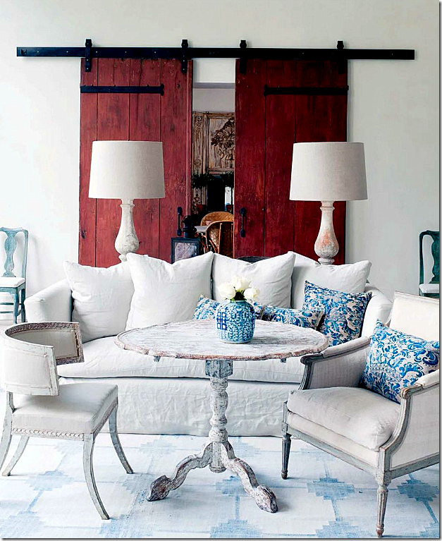
You shop around until you find a pair of oversized doors from a French winery – painted oxblood red. Stunning. Absolutely stunning and genius. Fall over dead gorgeous. When you look at this – it’s like you are inside an antique Oxblood vase – paired with Oriental blue and white plates. I can’t imagine how this came to be – was Pierce scared? Was she worried? Or did she forge ahead and know it would look as jaw dropping fabulous as it does? How was she so sure it would look this absolutely amazing? Add Swedish antique chairs and tables to the mix, along with a pair of white washed wood balustrade lamps with perfect white shades. That table! Is there a prettier, crustier table anywhere????? And finally, flank a pair of blue painted chairs next to the winery doors. I imagine there’s a fireplace here somewhere – I wish there was another picture or two to see, but beggars can’t be greedy. Do you understand now why I couldn’t get past this house to finish the magazine? I might just have to blow it up and frame it to get over it.
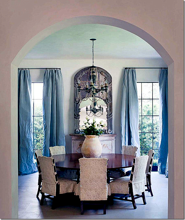
The dining room is reached through a tall arched doorway. A large round table is set with chairs slipped in Rose Tarlow fabric. The silk taffeta curtains carry the blue into this room from the family room. The chandelier looks almost delicate with beading hanging in arches. A mirror over a painted piece reflects it all.
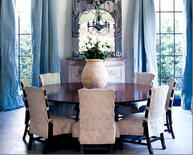
.A closer view for your enjoyment. And there is the French pot filled with white roses, of course.
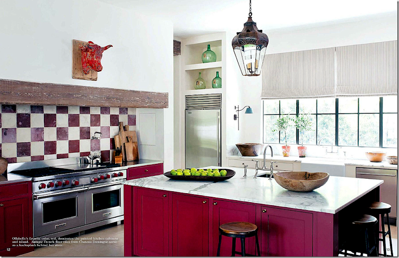
Through the winery doors is the kitchen – done in the homeowner’s favorite color. The backsplash is antique French floor tiles from Chateau Domingue. Shades made out of ticking cover the windows. Notice the lights on the side of the sink. A wonderful lantern hangs above the marble topped island, while an antique cow’s head is above the wood mantel. Pierce knew exactly how much red to use – on the island and the stove cabinets. The others are white. How did she know that too much red would be too much?
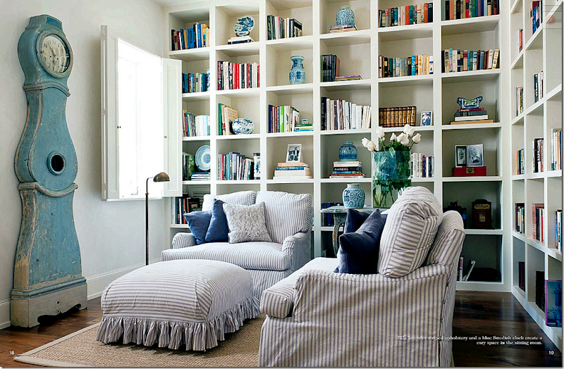
The study has comfortable seating, slipped in lilac and white ticking. The ottoman is just darling, with its ruffled hem. Pierce always has best slipcovers, ever. The shelves hold a collection of blue and white porcelains. And watching over it all is a blue painted Swedish antique Mora clock.
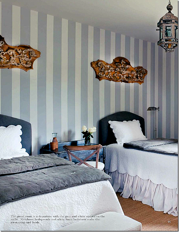
A guest room is done in bluish gray and white strips, with gray and white bedding. The wall hangings add a touch of whimsy.
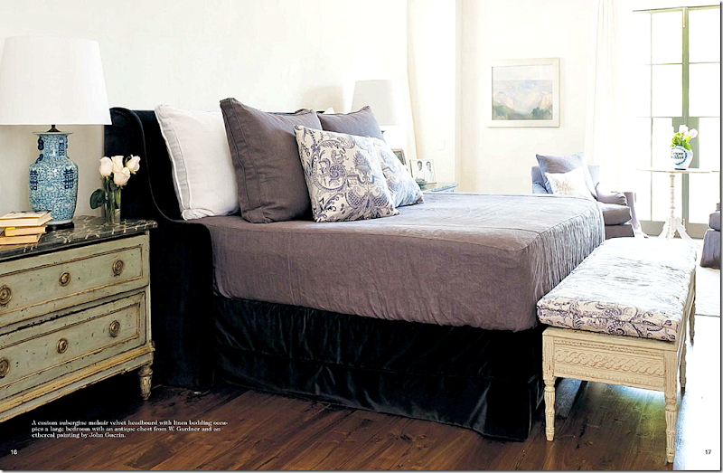
The master bedroom has a custom mohair velvet headboard in aubergine. Fortuny fabric adds the only pattern here, as it does elsewhere in the house.
Using heavy doors in that house isn’t a first for Pierce. In another house, shown in Veranda, she used these doors off the foyer – not Peking Red, these are more Persimmon – but are just as stunning. Still, the red color is a surprise and is extremely successful in this mostly neutral house.
White rooms with touches of blue and red aren’t unique. The trick is to not make it look like a star spangled banner interior. Several popular designers frequently use red and blue and white together. Lynn Van Kersting mixed Oxblood with blue and white oriental porcelains in this creamy white room.
Mary McDonald uses red mixed with blue a lot. Here, red curtains are flanked with huge blue and white pots.
Allesandra Branca often mixes blue in with her reds. She is famous for decorating with vibrant reds.
Pamela Pierce is known for more sedate interiors – often almost minimalistic. Fabrics are textures, not patterns. And antique furniture is the focal point.
I wish there were more pictures from this room. Eventually I did move on from this story – and finished the magazine. There are other beautiful houses in it – and wonderful stories about artisans and designers to read. If you live in Houston, pick one up, if not – read Antique Shops and Designers online, HERE.
Can you get the look of Pierce’s room on a budget? Maybe. Sort of. She used almost all pricey antiques in this room, but there are some ways you could get the look at a more reasonable price. First, paint the room a white – a cool white, not one with yellow undertones. If you have a wood floor – consider painting it white or a light bluish gray. The object is to get the feel of the room – and that feel is mostly white. Another idea for the floor would be to cover the wood with custom cut seagrass and then layer the dhurri rug over it.
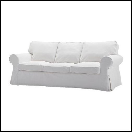
The easiest way to start is with the upholstery. Ikea’s white slipcovered sofa is just $399. Now, you could always upgrade the slipcover with beautiful white linen. Bemz makes linen slips for Ikea’s sofa HERE. I must admit that linen is more refined than denim or cotton – it looks so much richer.
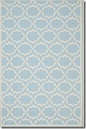
Copying the antique dhurri rug is hard, but not impossible. Pottery Barn sells this dhurri.
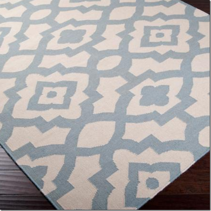
Overstock.com had this dhurri – which is nice – but really, the background should be white with blue, not the other way around.
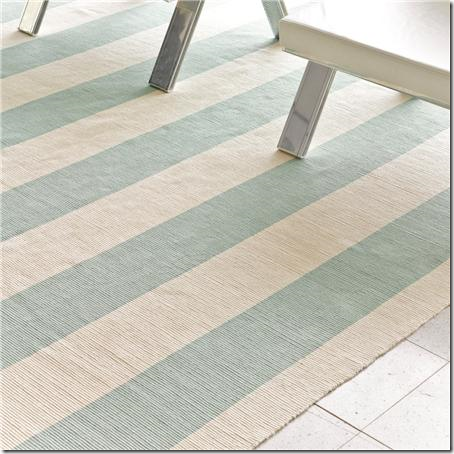
Shades of Light sells this white with blue dhurri, which might be a good substitute.
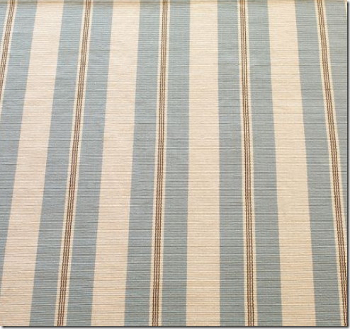
And Shades of Light sells this one too. The stripes might be too beachy for the look, but google dhurris – there are a lot on the market.
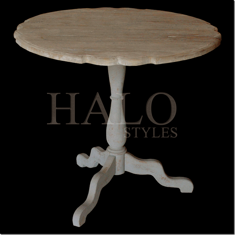
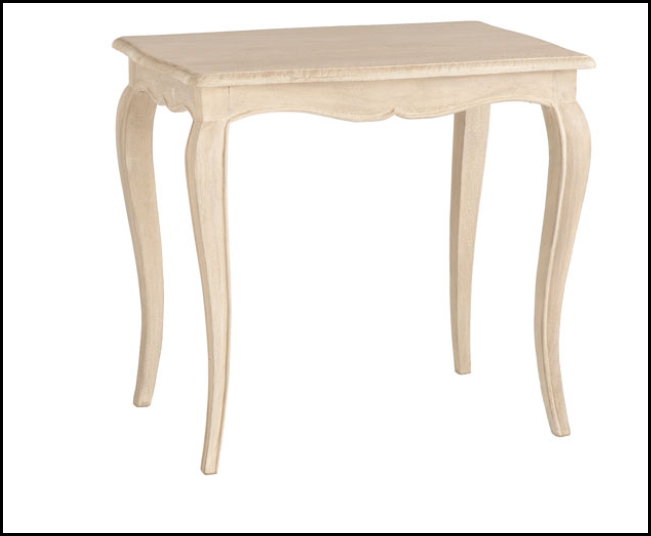
The gorgeous Swedish coffee table was harder to source. I found this white washed one at HaloStyles.com – which is a wholesale company. I would probably add more white paint to this to make it look closer to Pam’s table. It should be crusty with layers of paint to get the same look.
Not the right shape, but Wisteria has this Swedish inspired table which is very reasonable. Again, it would have to have white paint added to it.
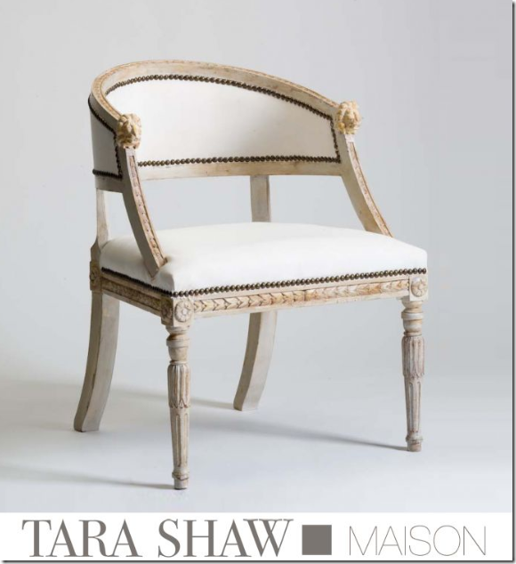
The Swedish barrel chair was hard to source. The Tara Shaw reproduction was the only one I could find – it is not cheap, but it would be worth the money if you wanted to achieve the same look. An antique Swedish barrel chair is so very expensive – this copy would be worth it. To be more authentic, the larger decorative nail heads could be removed for plain nails.
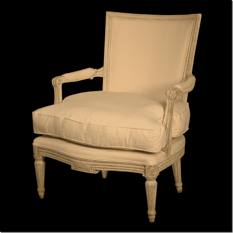
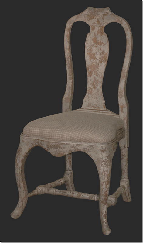
For the side chair, Halo Styles has this Swedish chair that would be a good copy.
Wisteria has this, while different, would fit in with the décor.
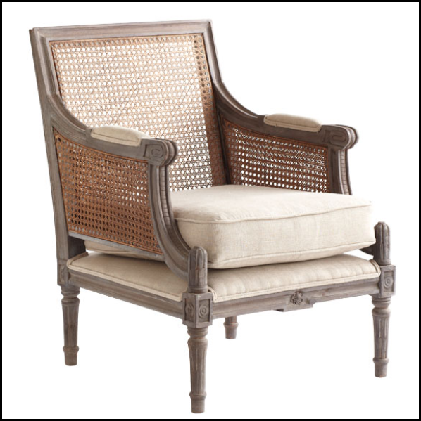
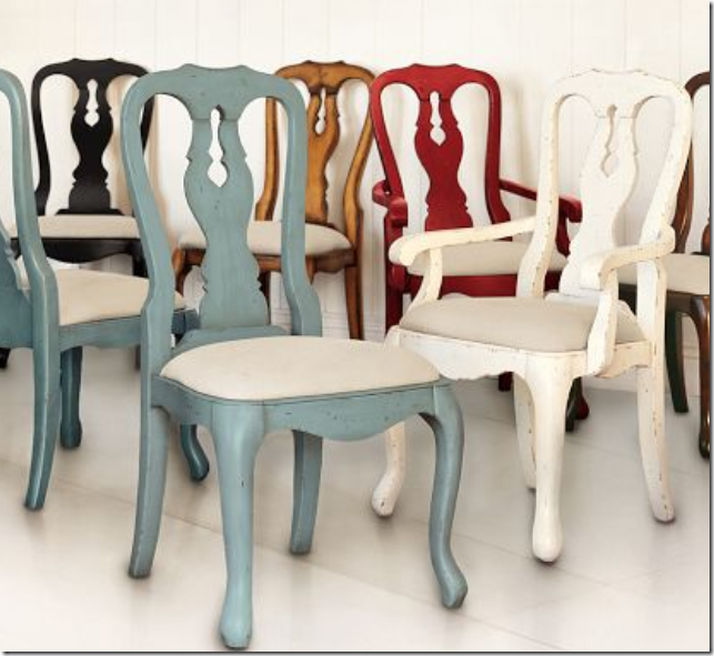
For the two chairs flanking the red doors – Halo Styles has this beautiful chair – not blue, but you could paint it or just leave it white.
Or, Pottery Barn has these copies.
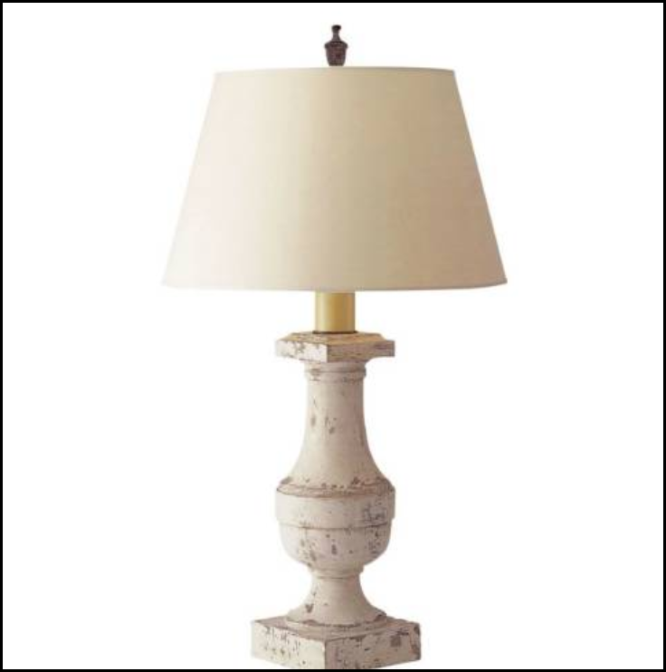
Visual Comfort sells these balustrade lamps which would be great – but I would get a round, white paper shade instead of this shape.
Copying the armoire from Watkins Culver is hard. But, you could always find one like this at Ballard Design. It comes in this blue painted finish.
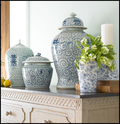
Blue and white porcelains are probably the easiest thing to find. This set is from Wisteria. I actually have it myself and for the money, it’s great. You could buy two sets of 3 and mix them up to make a mass of color.
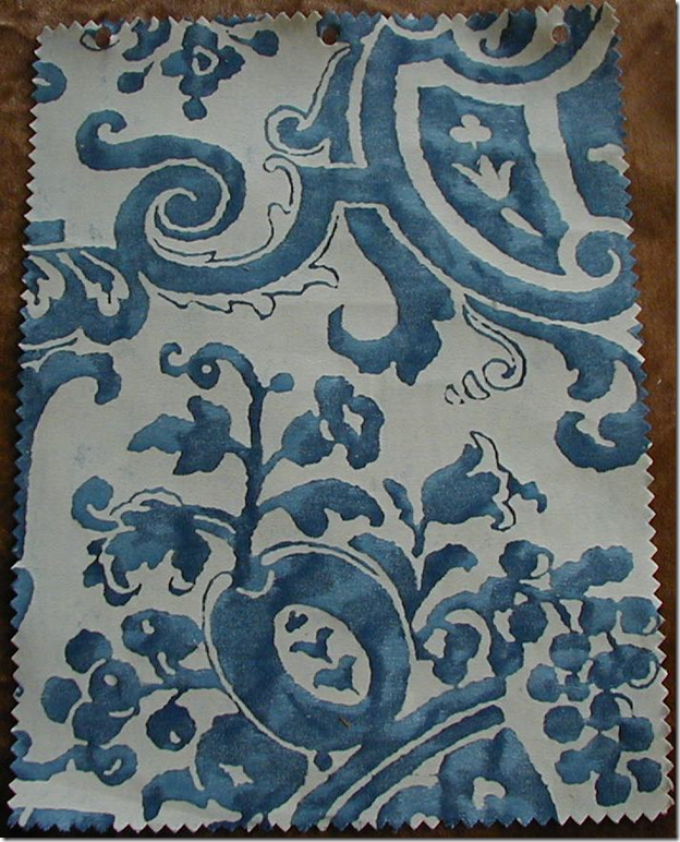
Another hard item to copy is the Fortuny pillows. There are a few companies that make copies of Fortuny, Brunschwig and Fils for one. And you could search Ebay and Google for someone who sells original Fortuny. Myself, I wouldn’t skimp on this design element. It’s too important. You could buy one or two yards of the fabric and make just two pillows. With one yard, you could cover the front with the Fortuny and the back with white or blue linen. The problem is though, I’m sure there is a limit on yardage of Fortuny! Still, this is something I wouldn’t copy.
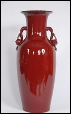
The red in the room is another hugely important element. Copying the barn doors is probably not realistic, but it could be done. You could always go simple and buy a few oxblood vases. The deep blue-red is the important element, there can’t be any orange in the color. Another idea would be to buy red silk taffeta and make a pair of portieres to flank a doorway into the room.
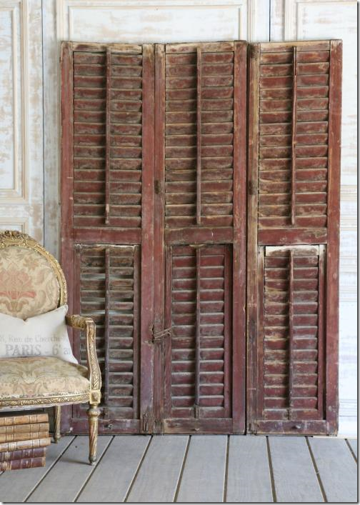
Or, you could always buy old shutters like these – and paint them in the proper red tone – placing these next to a doorway or around a fireplace.
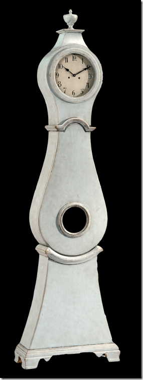
Lastly, though the Mora clock was in the study, I couldn’t resist. This copy from Halo Styles would be perfect in the room in place of the armoire, especially if space is an issue. And the price is much much less than an antique.
So, there it is! While it doesn’t have the fabulous antiques, I do think you can get a family room with the feeling of Pam Pierce’s gorgeous room. I’m sure she wouldn’t agree and is probably vomiting right now if she is reading this!!! I’m sorry Pam – I can’t help myself!!! Like I said, I can’t remember seeing a room this year that has made me so crazy with lust!! Actually, not sure I have ever seen a room Pam has done that I haven’t been crazy about. I need a shrink.
To read all about this house and many other gorgeous ones, be sure to get the new issue of Antique Shops and Designers – or read it online HERE.

