A few years I showed a house in Dallas that was in Veranda and was subsequently pinned a million times, a sure sign of how much people loved it. The house was designed by Lisa Luby Ryan who owns Vintage Living in Dallas and who does interior design all over the United States. Ryan has been featured in numerous design magazines – and her own house has been shown multiple times, with each new decoration she undertakes. I love Lisa’s style, but I especially love her ability to take a nicely designed room that is just a bit dated – and bring it into the new century, making it all that much better.
This house shown today was a very small ranch that was in need of an overhaul. Lisa came in and completely redid the house and then decorated it with her wonderful aesthetic of bleached woods, slipcovers, linens, gilt, antiques, and quietly edited vignettes.
Recently I learned that the house was for sale on Sotheby’s website! Wow! What a great opportunity for someone to scoop up a Lisa Luby Ryan design. I thought we could take a second look at the house today, with its new real estate photographs since the only pictures seen before from her web site were so small.
So, here are the beautiful photos of this popular house, finally seen in large and glorious sizes – ready to save and salivate over!!
Enjoy!
The Sothebys listing is HERE.
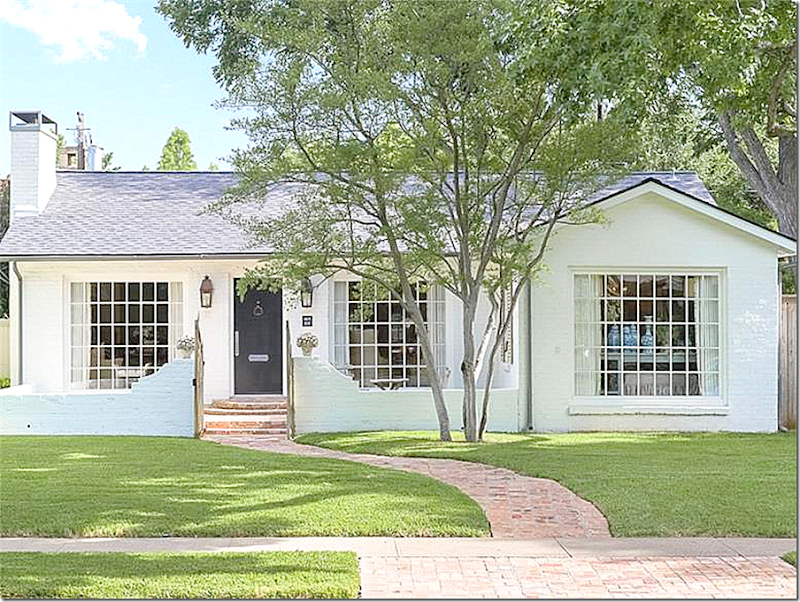
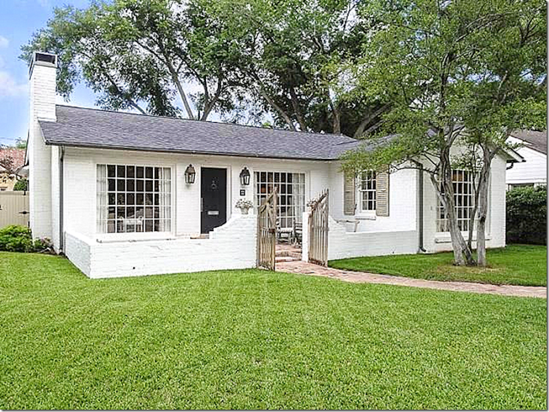
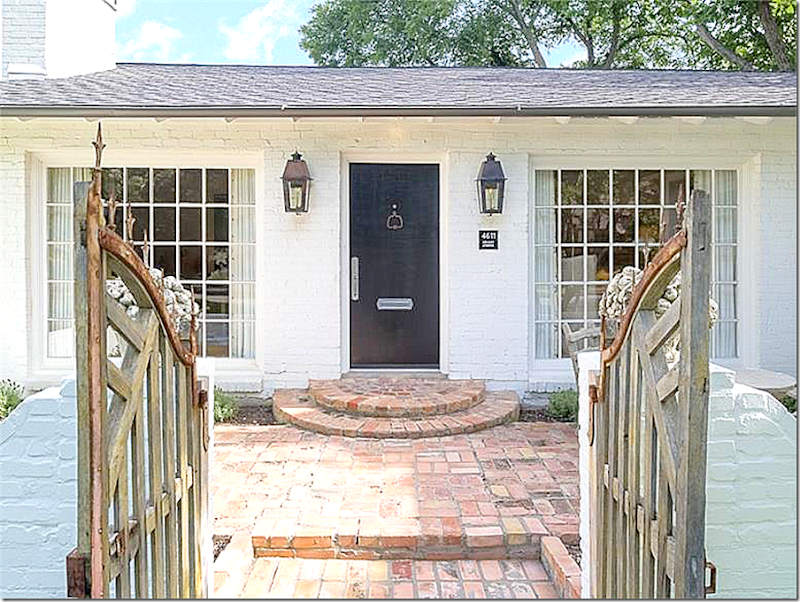
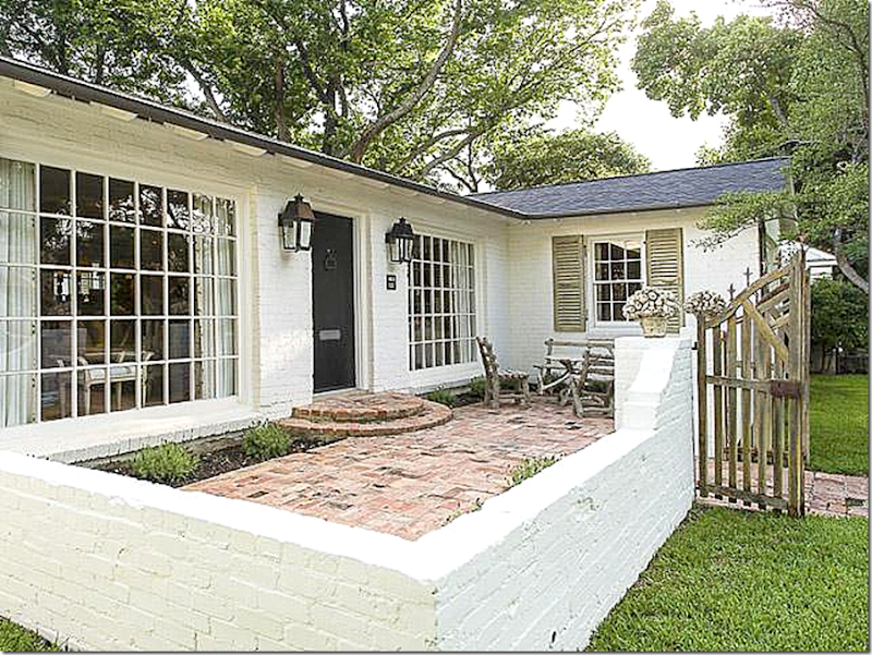
The house is small – a true cottage at just 161o sq. ft. It used to be 2 bedrooms/2 baths, but the owners turned a bedroom into a large dining room – which I suppose could be changed back. Since there is now only one bedroom, it is perfect for newlyweds, singles, and empty nesters. I love the front courtyard inside the low brick fence.
The dining room at the very right. The living room is at both windows on each side of the front door.
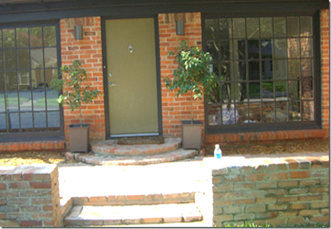
And here is the house as it was before: red brick, green door, contemporary lanterns, no front gate and black painted windows.
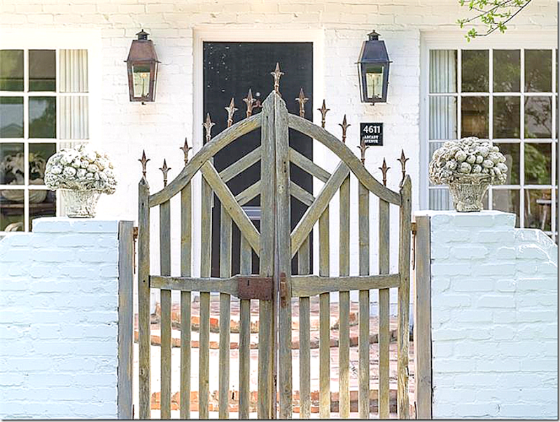
How charming is this wooden gate with metal decorative elements on top? Love!
And inside the brick courtyard.
A view inside the courtyard.
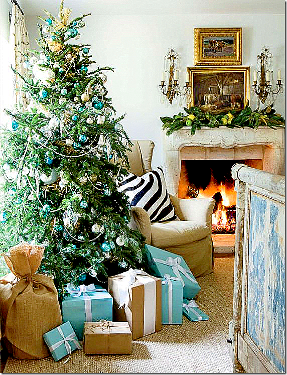
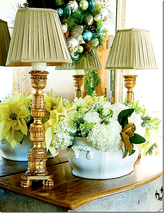
The house was shown a few years ago in Veranda – for their Christmas issue. Here is a glimpse into the left side of the double living room. The few pictures in this Christmas pictorial proved so popular - everyone seemed to love this house.
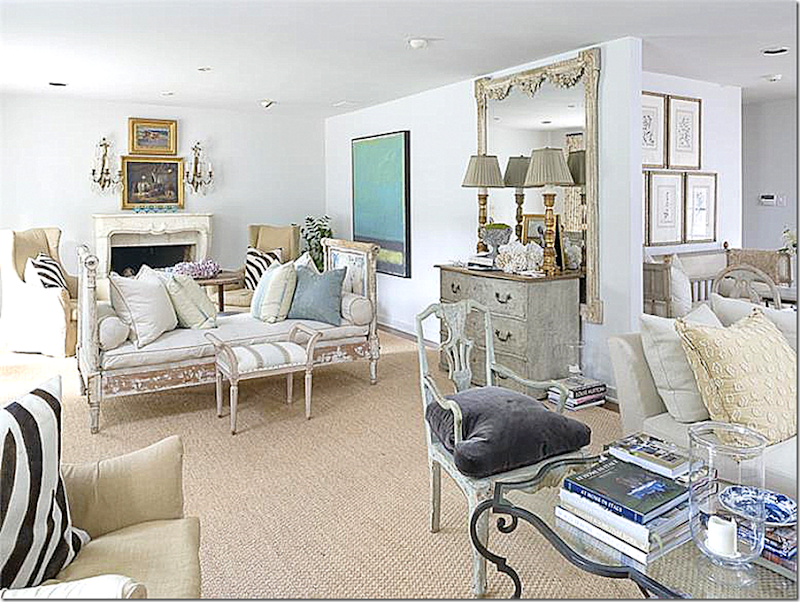
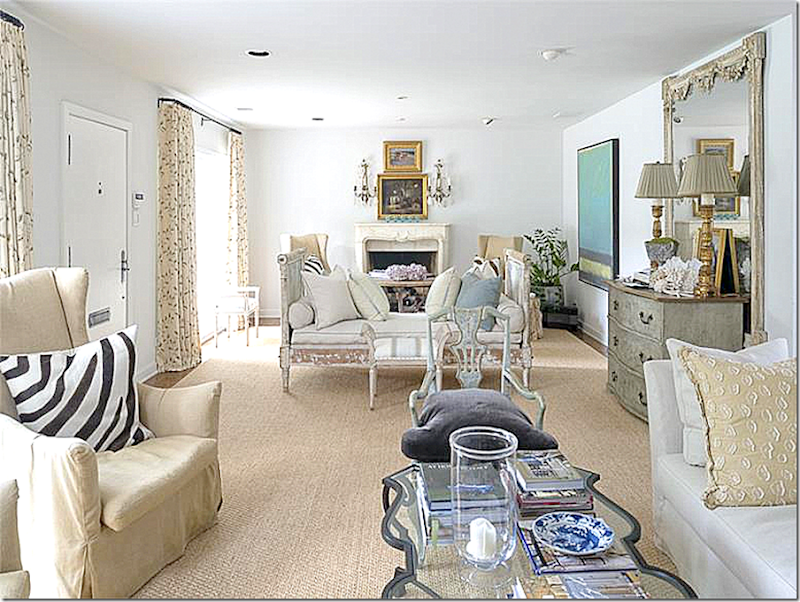
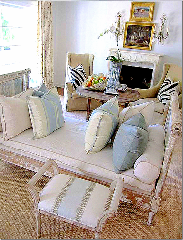
And – here you can see the antique daybed which divides the living room into two different seating areas. In the middle – the opening leads to the kitchen and the bedroom and back yard beyond it.
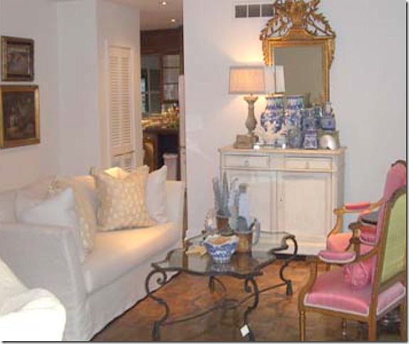
Along the wall – the mirror and chest are what you see when you enter the house. Notice the contemporary art work next to the mirror.
Here’s a close up of the chest and mirror with the two lamps against the back wall – decorated for Christmas. Normally it is decorated with a few shells.
Here you can see the patterned curtains against the windows. Lisa used the same fabric for the living room and dining room windows. Since the house is so small – different fabrics would have been too distracting. On the hardwood floors – she laid seagrass which adds a textural element to the room, along with a soothing khaki color.
Lisa used mostly new upholstered pieces in this long room – but she added in a few key antiques which become focal points: the daybed and the chest along with the mirror above it.
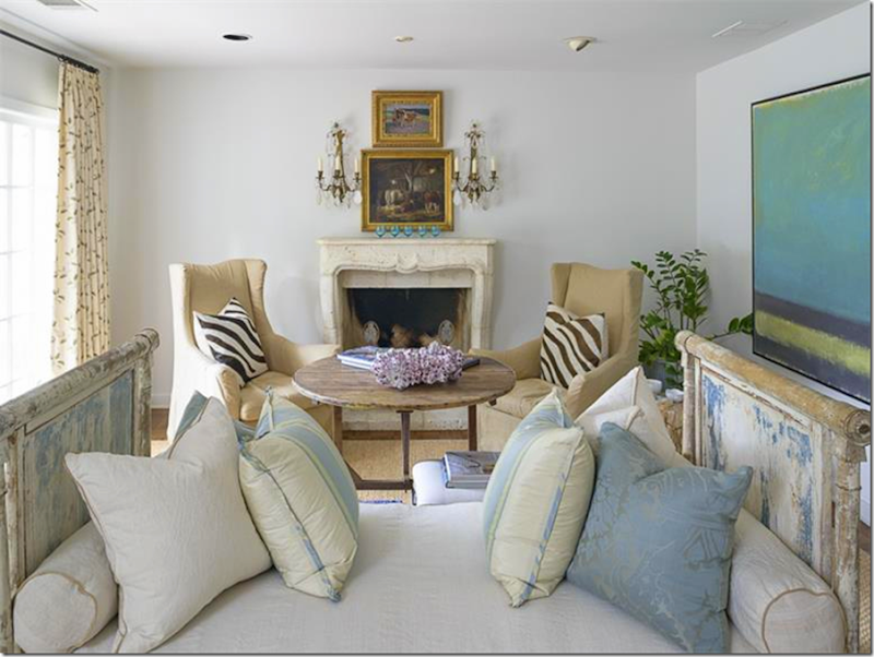
The fireplace mantel was replaced by Lisa – and this stone French mantel was added, along with two paintings and crystal sconces.
She added a smaller bench next to the antique day bed. A taller antique wine table acts as a coffee table. Love this side of the room so much!
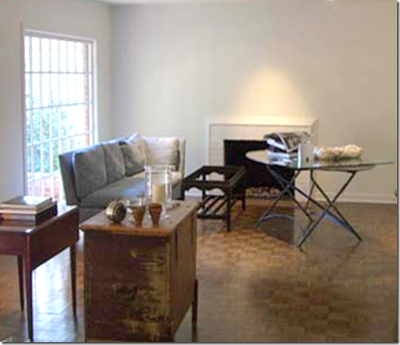
BEFORE: And here is how the room looked with the more contemporary fireplace mantel. Such a difference!!
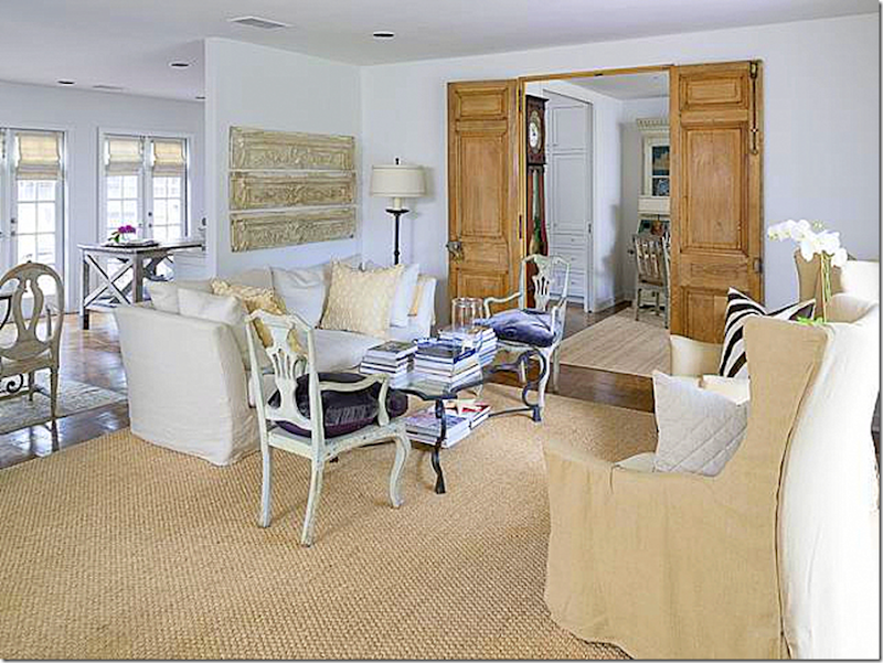
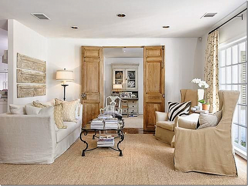
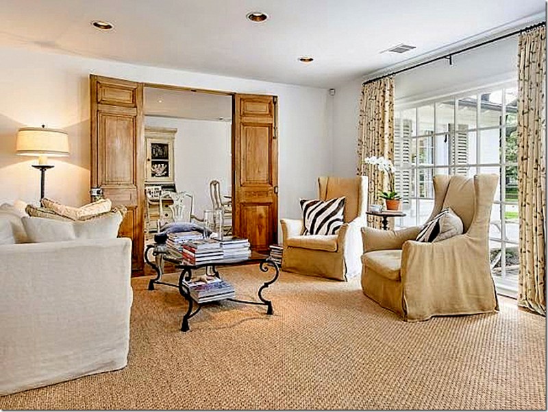
Here is the other side of the living room which leads to the kitchen and the dining room. Lisa added antique doors to the newly opened doorway that now leads to the dining room, which used to be a bedroom.
Before: here you can see that the doorway was once on the left side of the wall before Lisa moved it to the center of the wall. You can also see that Lisa reused their sofa and coffee table and the two paintings on the back wall.
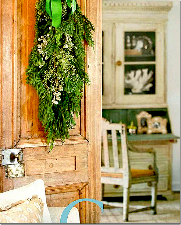
A closeup of the antique door, with its original hardware, decorated for Christmas. The Swedish desk is in the dining room.
The view into the dining room – looks directly onto the antique Swedish desk. The two doors add so much to the design of the house. Let’s face it – there is no architectural interest in this cottage – but by adding the doors – Lisa has created it.
The view into the front courtyard. Again – the zebra print pillows here are repeated in the same slipped chairs that flank the fireplace.
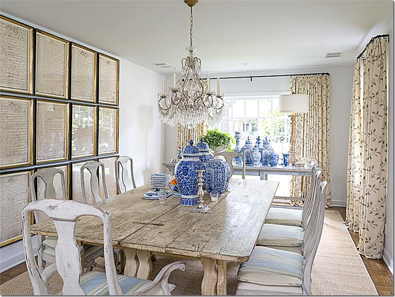
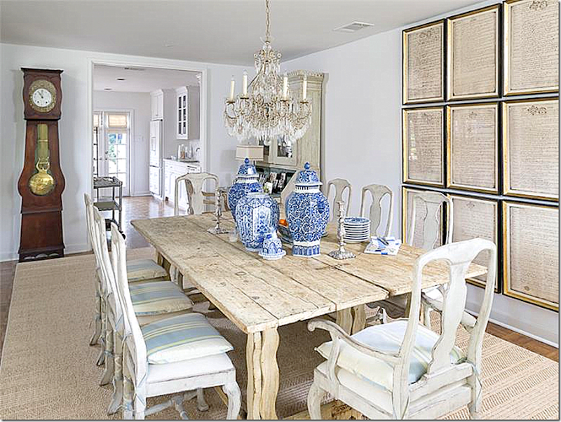
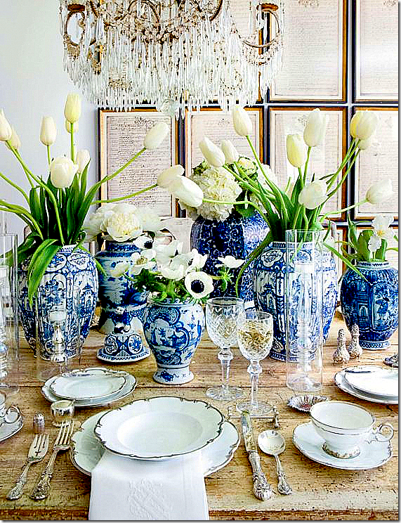
The dining room is such a stunner. Antique styled Swedish chairs stand around a wood table. Piles of blue and white porcelain make a great décorative element. The same curtain fabric is here as is in the living room. The seat cushion fabric is repeated in the pillows in the living room.
Lisa loves to use old documents – framed and hung as one element. Again, this decorative touch makes up for the missing architectural elements in the room. Love that!!! Through the opening is the kitchen which leads to the backyard.
The table, set for Christmas. The photograph is so pretty – just barely showing the chandelier crystals and the documents.
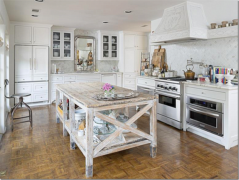
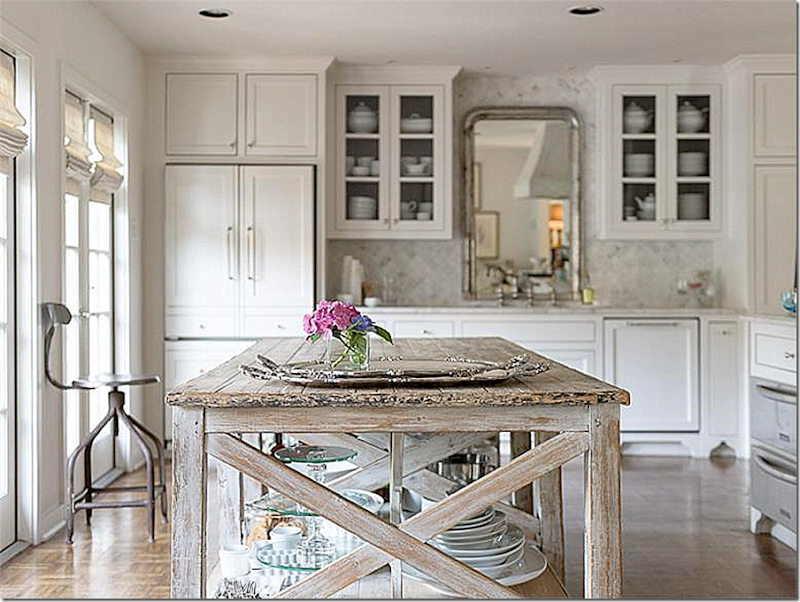
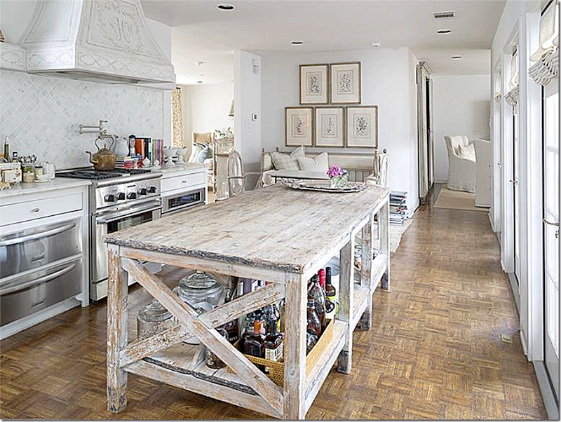
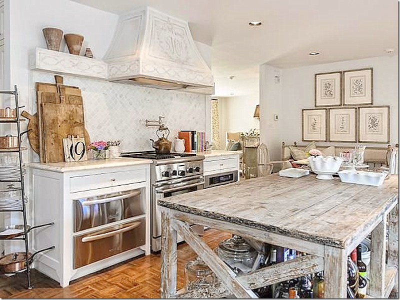
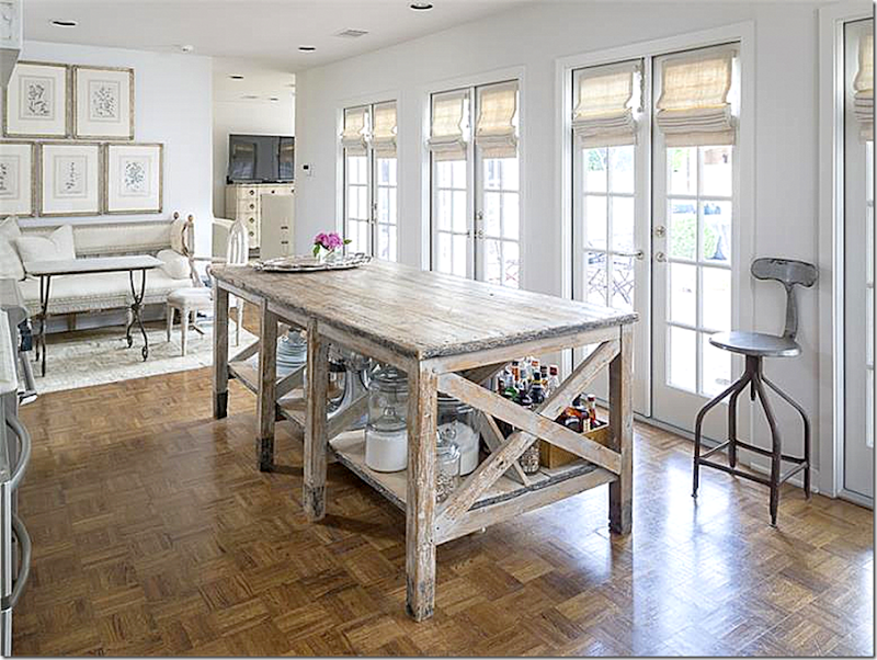
The kitchen was totally redone. A large island – which is an antique table – sets the tone – and ties the dining room in with the décor found here.
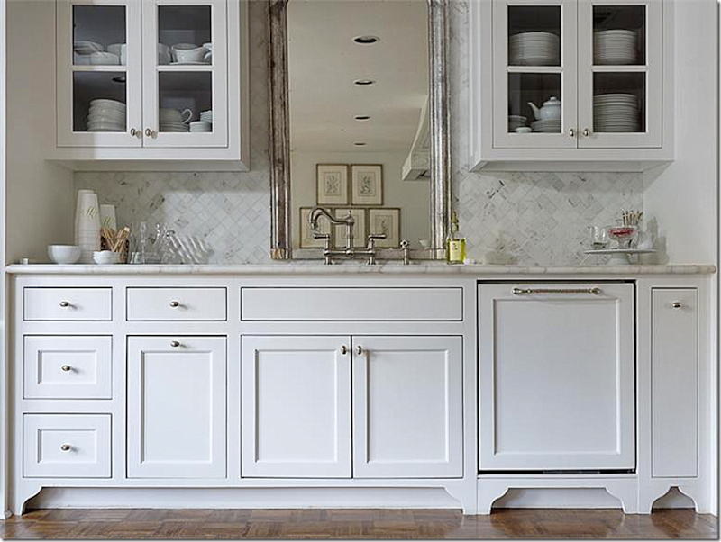
An antique mirror sits behind the sink which is flanked by the refrigerator and cabinets.
Another view of the island and the back sink wall.
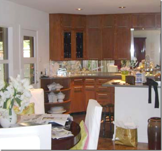
Before – the same view shows the dark wood cabinets and the former doors that lead to the backyard. All are now replaced.
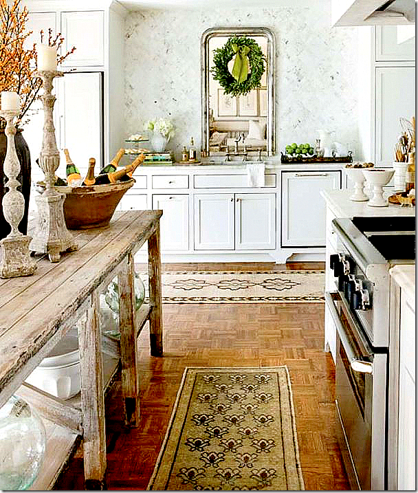
Close up of the sink – with its white marble backsplash and mirror.
Looking the other direction – you can see the breakfast area and to the right, the master bedroom.
The backsplash of the stove is also the white marble. Love this view.
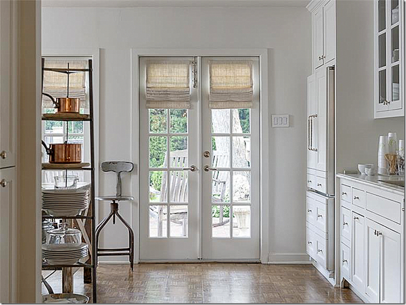
The newly replaced French doors that overlook the back terrace.
BEFORE: there was a large window and doors, which Lisa had replaced with the row of French doors. Also, there was a roof over the terrace which was removed to let in more light.
BEFORE: The breakfast area with the former door on the wall that is now removed.
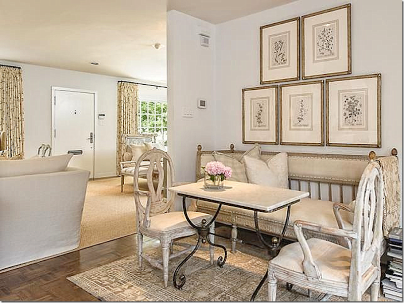
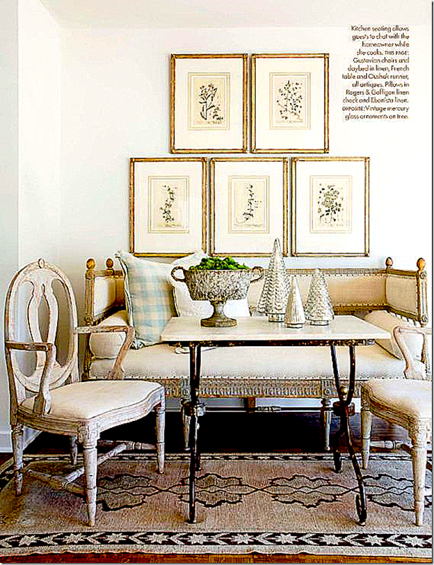
Now, the same area as above – is open to the living room. Love the Swedish bench and chairs, along with the set of prints above it.
And decorated for Christmas in Veranda. My favorite vignette in the house – with the antique Swedish sofa and chairs. LOVE!!!!! Again, the set of prints is hung to make one big statement.
The view from the kitchen to the back yard.
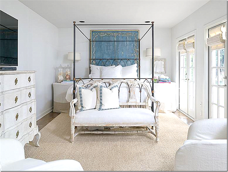
I wonder if this bedroom was actually once the garage? Off the kitchen, a new row of French doors overlook the back yard. More antique pieces mix with a slightly contemporary styled bed. Two skirted tables flank it. Behind it, a painted screen adds the color.
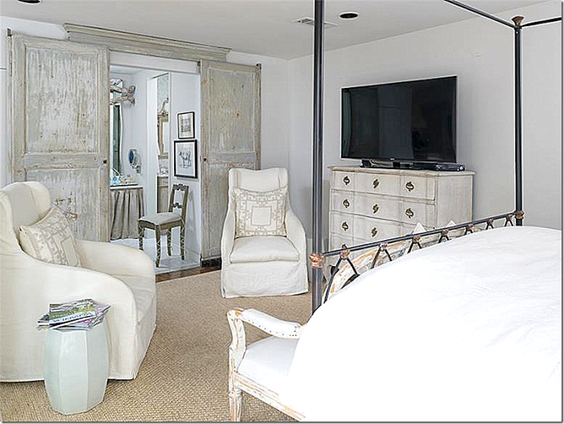
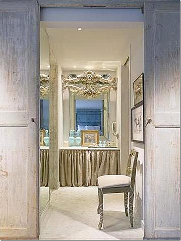
The view into the bathroom – again, two antique doors add an architectural element.
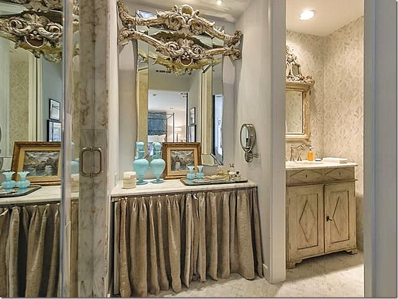
The vanity in the bathroom, with an added decorative element on the mirror.
A view of the sink vanity to the right – another Swedish antique.
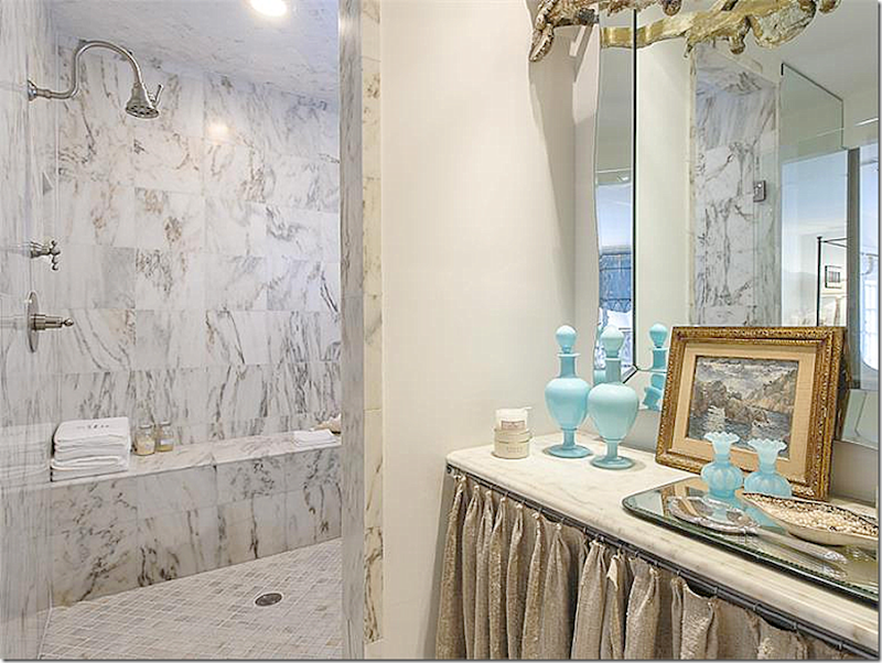
And to the left, the new large marble shower.
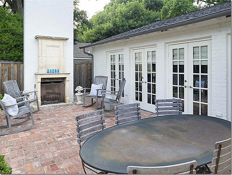
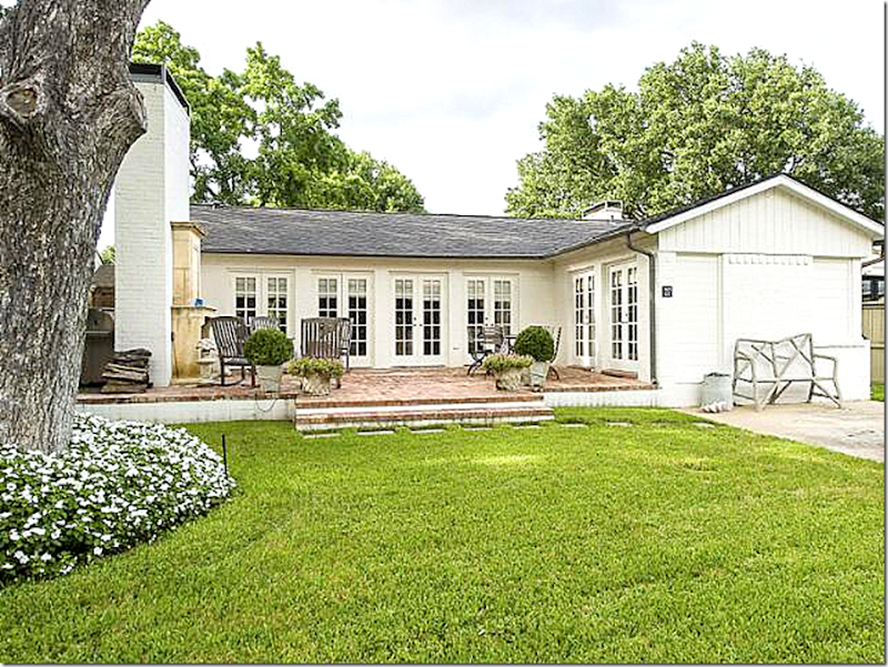
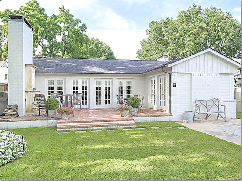
Here, off the kitchen – the brick terrace with a new fireplace. The backyard becomes an extra room in this small house.
And here, another view of the backyard. The master bedroom is to the right. It looks like it might have once been the garage.
To see more photos of this Dallas house, visit the charming blog – Trisha Troutz HERE. To visit the listing, go HERE.
The cost of this darling house? $879,000.
To visit Lisa Luby Ryan’s web site and to see more before and after photographs of the house, go HERE.
Remember this horse ranch in Malibu that I showed a few weeks ago HERE? Designed by Stephen Giannetti of Velvet and Linen fame and Madeline Stuart, it was quite a piece of property – acres and acres of land overlooking the Pacific Ocean.
It didn’t stay for sell for too long – the talented and very popular singer/songwriter Lady Gaga is now its proud owner!
Yikes!!!
AND finally,
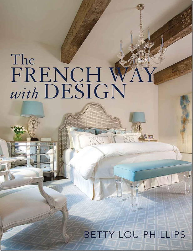
The famed Texan interior designer and author, Betty Lou Phillips, has a new book out! Wow! I can’t even begin to guess which number this one is. She has written so many wonderful books – each one is better than the last. This newest book showcases the work of Pam Pierce and another great Houston decorator, Nicole Zarr, as well as designs by Betty Lou Phillips, of course. The cover shows a bedroom in a house designed by Zarr. You may remember I showed some of her fabulous work HERE.
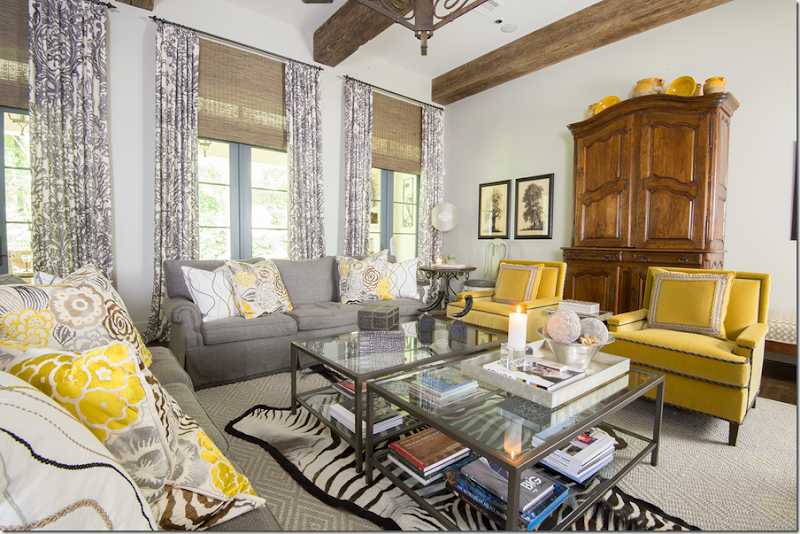
Besides the bedroom shown on the cover, other rooms of the house designed by Nicole Zarr are shown inside, including this beautiful family room.
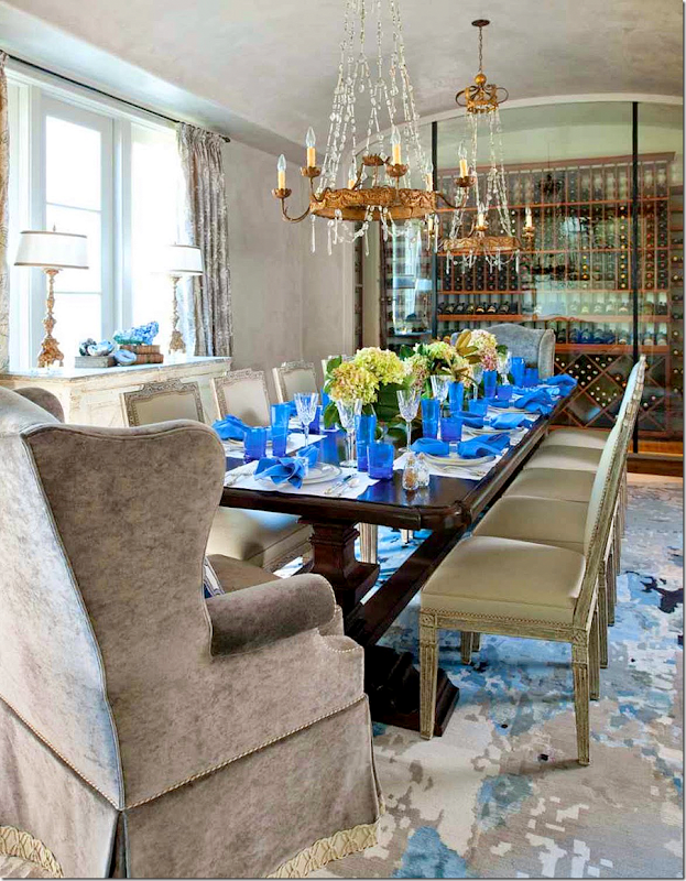
The dining room in Zarr’s house has a wonderful wine cellar through glass.
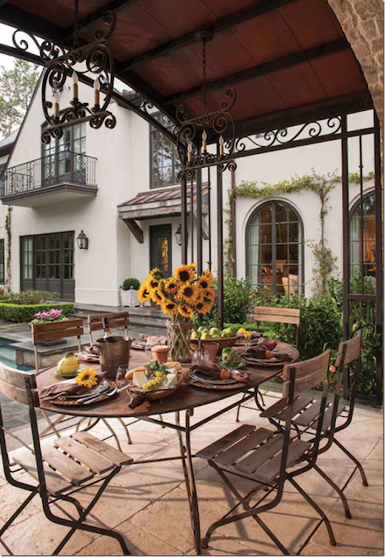
The charming backyard at the Zarr designed house.
AND Betty Lou Phillips, along with Nicole Zarr will be at Joyce Horn Antiques for a book signing this Tuesday, 1 pm to 3 pm!
See the invitation below for all the details. If you plan to be in Houston, come by and get your book signed by these two talented designers.

If you can’t make the book signing – but still want to order this beautiful book, just click on the picture below to do so!!

