It’s hard to believe that fall will be here this Saturday! The weather has definitely changed in Houston – nights are a little cooler, and so are the days. But, we have a long way to go until we drag out our sweaters. I had to wear dark fall clothes to a family luncheon on Monday and thought I was going to die of heat stroke!
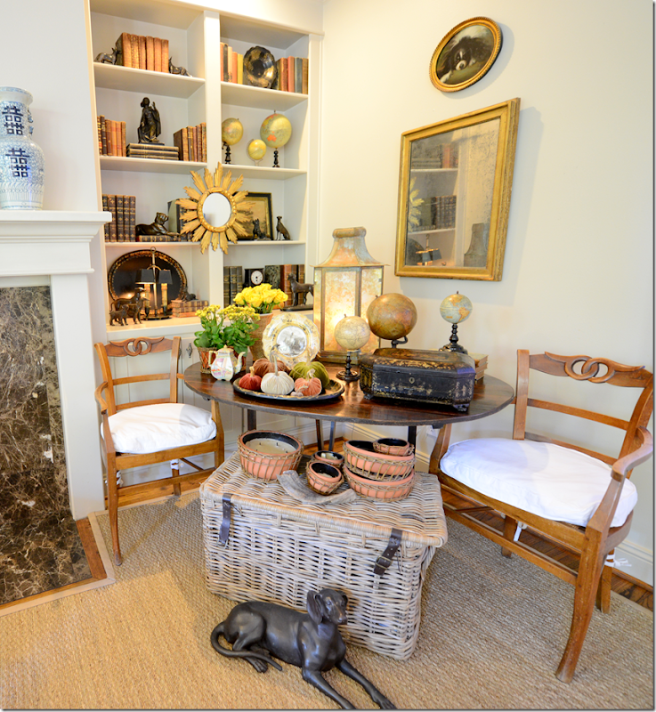
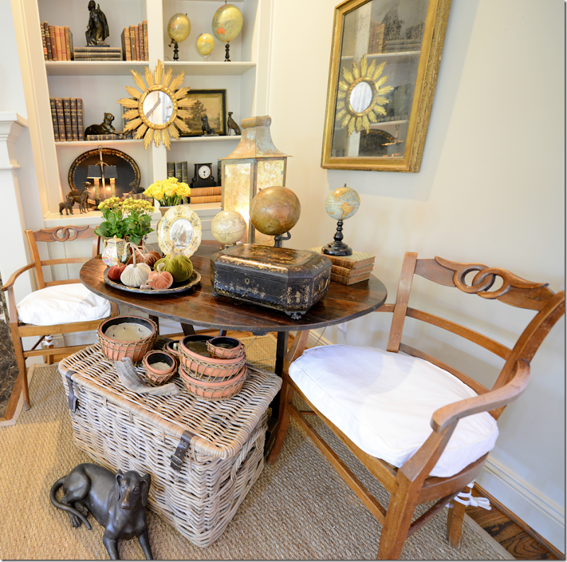
Still, I was inspired to do a little fall decorating and changed out some things on my wine table.
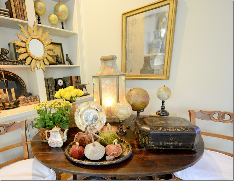
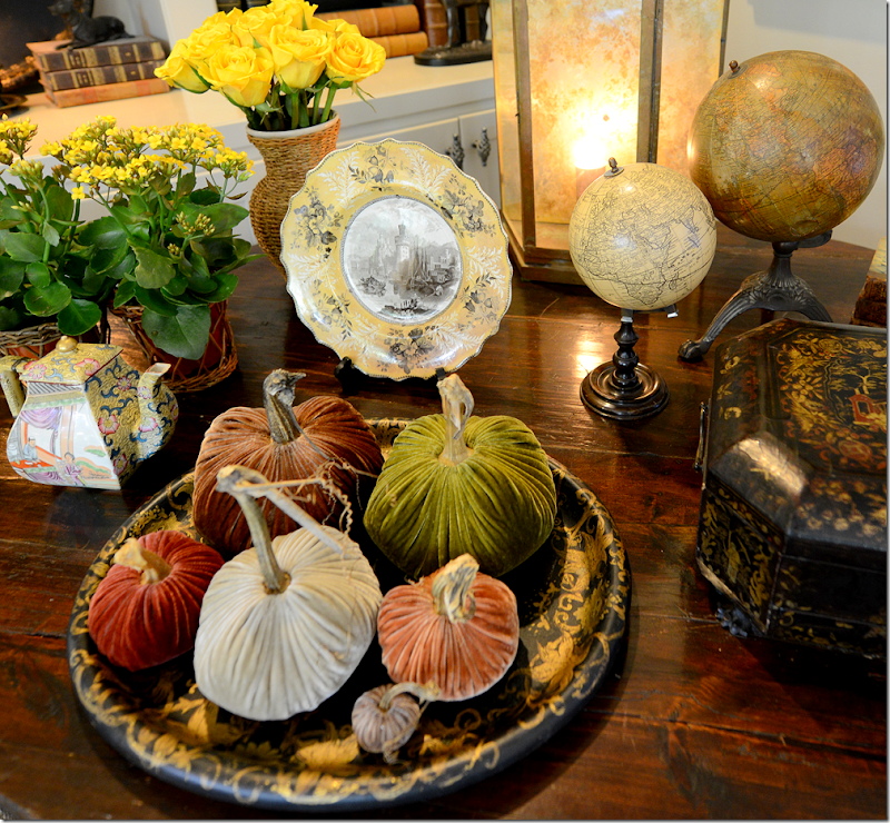
I bought some yellow roses and flowers and put them in straw vases and put away my big blue and white bowl full of snapshots.
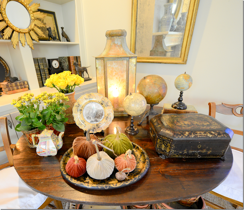
And I pulled out this old black tray with gold trim and filled it with velvet pumpkins!
Aren’t they gorgeous? This is a set of velvet pumpkins from the new Cote de Texas sponsor – Love Feast. There are six pumpkins to the set – from extra large to teeny tiny. The quality is amazing – and the stems look real. That’s because they are real. And this is our giveaway – the set of six velvet pumpkins!!!
At the Love Feast online shop, you can buy large sets or smaller sets or even single pumpkins. The set to be given away is called the Love Feast Collection. It includes six pumpkins in: Sage, Acorn, Mushroom, Sangria, Spice and the baby – is in Stone.
If you have a more contemporary house in shades of grays or aquas, the Turquoise Collection may be your first choice.
The Ranch Collection has pumpkins in deeper earthy hues.
The Harvest Collection has true fall colors.
OK, OK, the Snow White Collection is my personal favorite. I may have to order these, they are so gorgeous. You have to see the pumpkins in person to appreciate the quality of the craftsmanship. Even Ben was raving about them. Honestly.
Besides pumpkins Love Feast sells these darling mushrooms, which would be great for Thanksgiving and Christmas table settings.
And there are these nests of darling acorns. Mix and match the sets. Stick a card in this and it would be a great place setting.
The Cozy Nest Collection includes the pumpkins mixed with an acorn nest.
Or you might want just one huge pumpkin to make a statement.
The Love Feast shop sells other things, like this wood heart necklace.
And they have an assortment of trendy signs.
And they sell these cute turquoise earrings – a must if you are going to the Round Top antique fair this October!
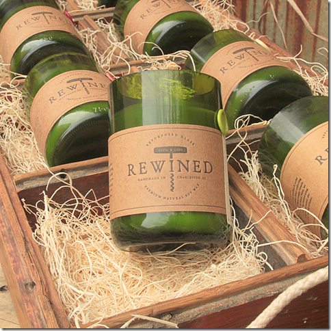
I especially love these wine bottle candles.
How to enter the contest:
First, go the Love Feast shop HERE.
Look around and find your favorite item in the shop.
Come back here to the blog and leave me a comment telling me what your favorite item is.
That’s it!
The contest lasts until this Saturday at 11:59 pm.
The giveaway will be the six pumpkins in the Love Feast Collection as seen here:
Good luck! And a huge thank you to Love Feast for their generous giveaway!!!
FALL DECORATING & A BEAUTIFUL GIVEAWAY!
WEBB DESIGN: A Redesigned Family Room
This is an old story that I had to put back on the blog. From 2012. Wow. Ten years ago!
Here’s a new family room project I just completed. First, the before pictures:
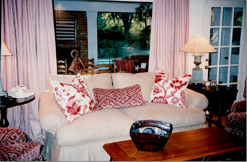
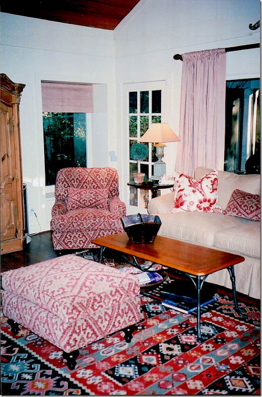
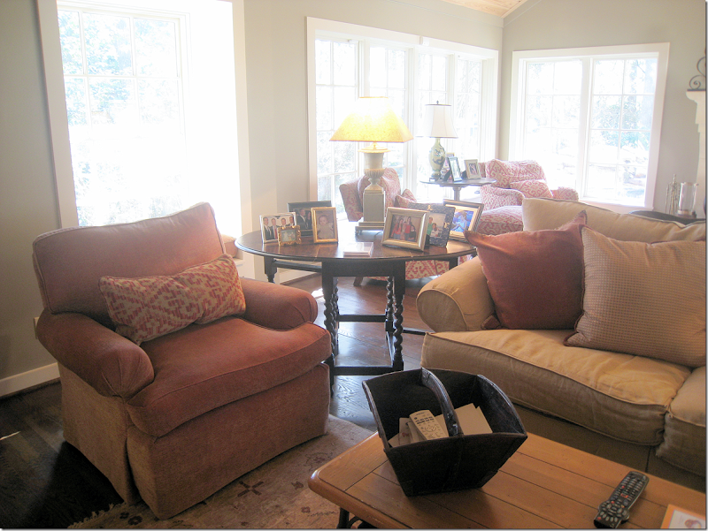
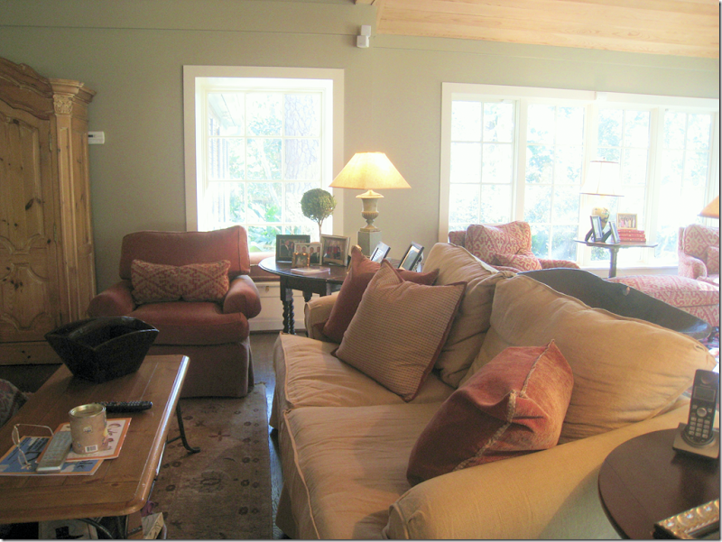
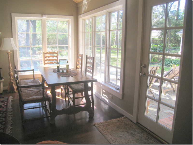
BEFORE: These pictures are really old – they aren’t even digital!! My associate Monica, of Custom Creations by Monica took these and scanned them to me today. About 12 years ago, I designed this room – with a linen slipcover and an English printed fabric. The sofa was the clients and the coffee table was theirs, too. I added the gate leg table and the English arm chairs, along with those great urn lamps that James Farmer made for me. The curtains were a red and white ticking. Behind this room – was a large screened in porch – with its own brick fireplace. Out in the porch – we did wicker furniture with Ralph Lauren fabrics and a Spanish styled breakfast table that the owner had had growing up.
I added a kilim rug and those chairs covered in a soft chenille. The pine armoire was another piece that the owner had had since he was young. Looking at these pictures really brings back memories from so many years ago! Monica and I were laughing tonight – because, to find these pictures, she had to go throw ten photo albums of old design work we have done together. Monica has worked with me on every single job I have ever done – since my first one! We got the giggles because she said all my 0ld work was always toiles. She used to call me the Toile Lady. All the pictures were of rooms done in either red toile, or blue and white toile, or yellow and red toile. So, seeing this really takes me back.
About five years after I had completed this room - the owners tore down the wall between the family room and the screened in porch and made it into one large room. At that time, they also gutted their kitchen and installed a new one and added on a large master suite – across the courtyard from this room. The master suite is the same size as this space for symmetry. I did their bedroom suite at that time – seven years ago. When the time came to furnish the new family room, the owners didn’t have much enthusiasm to really redecorate it. So, we did a quick fix:
BEFORE: We got rid of all the red because the walls were now a green that matched the adjoining kitchen walls. I added two new chairs in a rust colored chenille, along with a few new pillows, and a new darker slip on the couch. We also added a muted rug on this side of the room.
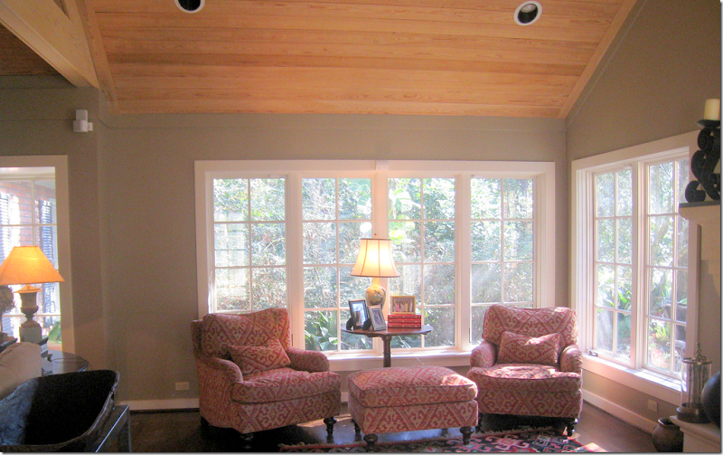
I moved the other chairs into the new section and that was about all we did. The owners didn’t want any curtains and they loved having only a few small rugs that showed off their new wood floors.
The table, from the owner’s childhood that was in the screen porch area, was moved here in a space near the windows that was designed for it.
And, on the other side of the former screened in porch are these chairs and the kilim that were moved over here.
Seven Years Later:
I was thrilled to get a call from the owners telling me that they were now ready to do a complete update in the family room. I was excited to get a chance to design the room from the start instead of having to piggy-back off an old design. This time the owners were much more amenable to redoing the entire room – and replacing some of the furniture that had come from his childhood home. They also were more open to things they weren’t too keen on before – such as shades and curtains and one rug instead of two. In fact, they were very easy to work with. The best kind of clients!!!
So, this is what I came up with:
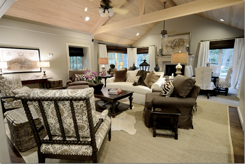
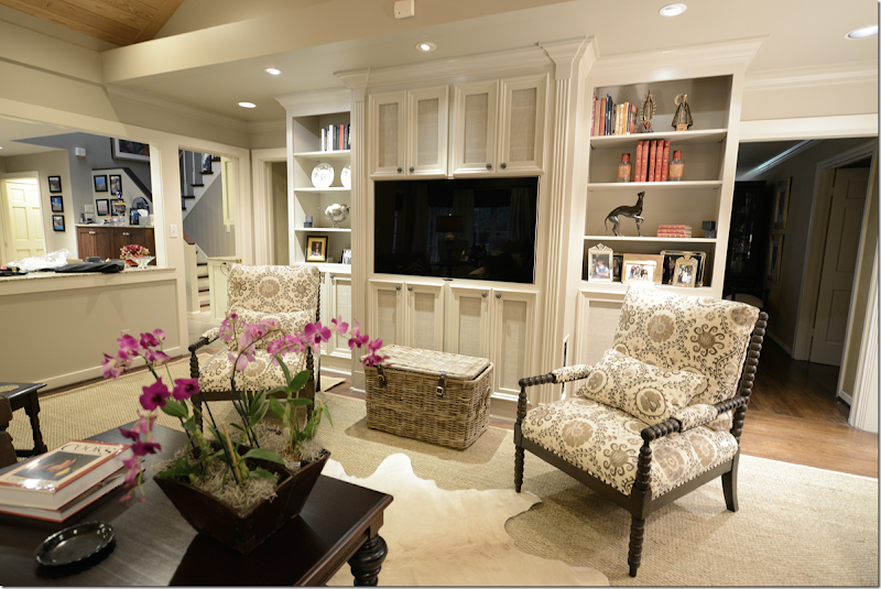
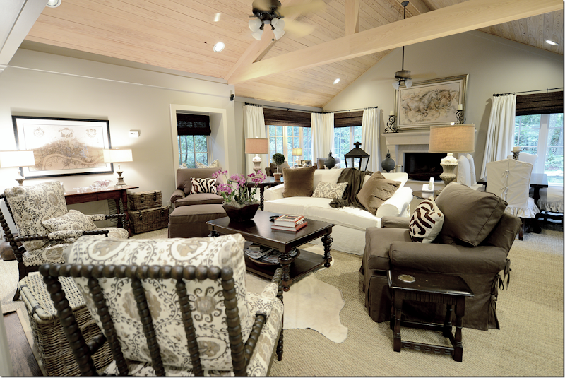
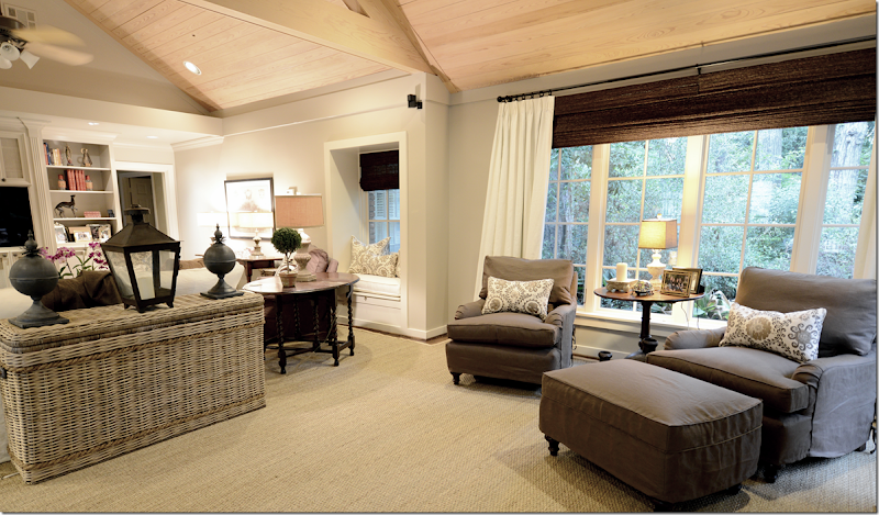
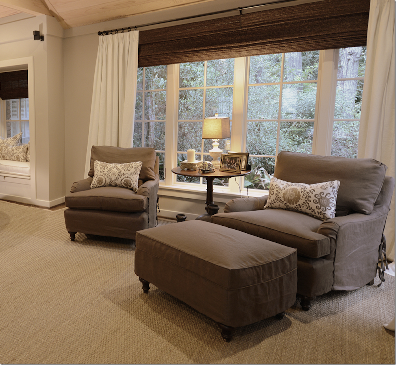
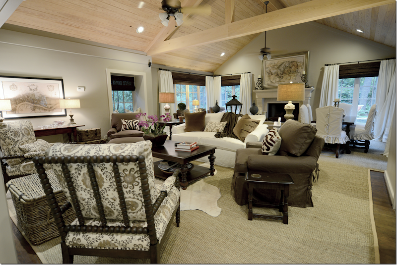
First, we lightened the walls – taking the green to a more grayish side (Sherwin Williams #7037.) Then, I added the large seagrass that extends throughout the two areas – making it seem more like one space instead of two. We kept all four club chairs and sofa, just updated them with linen slipcovers. And we added curtains and shades which really made the large room much more cozy and warm. Since the room was so large, I wanted a lot of contrast, a ying and yang energy so that the room would be more lively than sedate and quiet.
We bought two new Bobbin chairs – from CFC and covered them in Oxus, the Carlton V fabric – in the gray colorway. This fabric was our starting off point and everything else came after this fabric was chosen. Since the background of the Carlton V is rather creamy and not white, the sofa and curtain fabrics are more ivory than stark white to blend with the print. We ordered a new coffee table from Noir. And against the back wall, we got rid of the repro pine armoire and added a wood console instead, which really made that area come alive. Before, it was a dead spot with the dullish armoire. I also had the shelving unit repainted – soon Leslie from Segreto will faux it, along with the ceiling. More about that later in the story.
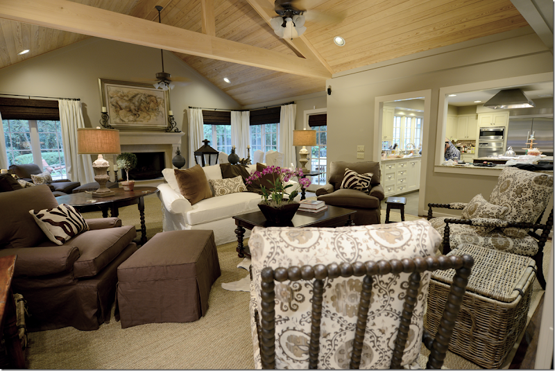
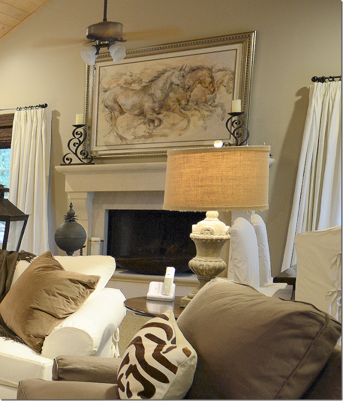
From this view, you can see into the kitchen – which was totally gutted and redone when this room was enlarged 7 years ago. I can see Monica’s behind in there! (She is going to be so furious with me!) And here you can see the beautiful fireplace mantel that was added during the renovation. The painting is of running horses – from the owner’s collection - and is in tones of browns and beiges and grays which determined the color scheme for the room.
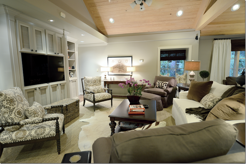
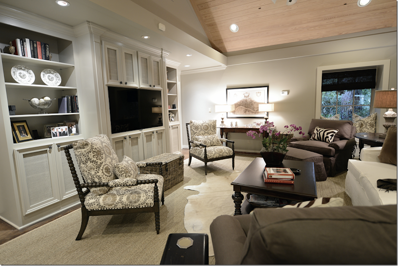
When flatscreens first came out, I designed this bookshelf for the owners. Originally this wall was the back of the fireplace that is in the living room, which is on the other side of the family room. This wall was brick and it stuck far out in the middle with sheetrock on both sides of it. There wasn’t a fireplace – it was just the back of it. The house is rather old, an original ranch from the late 40s, and I think that this family room was probably built as an addition a long time ago – therefore, the back of the fireplace was once on the outside of the house. So, we built the bookcase to hide that – the middle section is really very shallow. The speakers and equipment are hidden inside the cabinets – which are screened instead of solid to let the air and sound come through. At the time we thought they had the biggest flatscreen they would ever want, but you know how that goes, and recently they bought a new one. We reworked the middle section to make it fit in perfectly. Well, Raul reworked it!
I added the creamy cow skin rug to break up the large expanse of seagrass. And I bought them the set of 3 baskets from Artesia Collections to hide all the flotsam and jetsam that was previously hidden in the armoire. Plus, now the largest basket serves as a drinks table for the two Bobbin chairs. I am so in love with Bobbin chairs ! They are light enough that if someone wants to watch tv, they can just pick it up and turn around, but that probably will rarely happen. I put the orchid in the Chinese rice bucket, but this will usually house all the clickers. Not sure why I didn’t turn on the living room lights or clear off Monica’s things on the counter, but I was a little tired at the time I took these pictures. The installation lasted from 8:30 – 4:00 pm, mostly because they fabricated the rug on site.
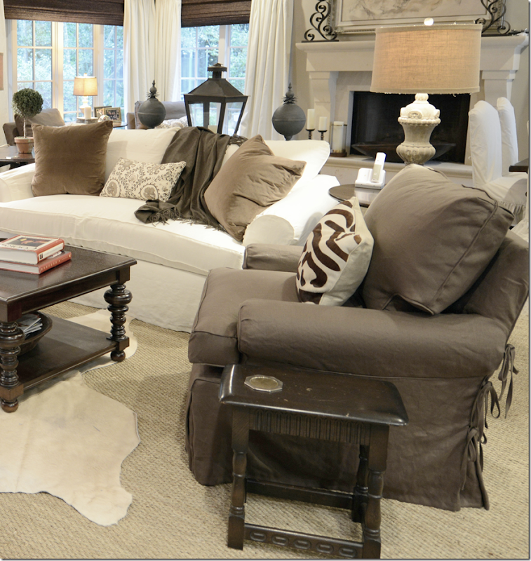
All the lamps are new and all came from Aidan Gray. I added the two zebra lumbars from Mecox Gardens and the two pillows on the sofa are velvet. All fabric besides the Carlton V is from Pindler. We needed bolts and bolts of fabric, so Pindler’s friendly price points were very welcomed.
Hien Lam reworked the sofa – updating it with one bottom cushion and two back cushions only. Plus, they made all the slipcovers.
I didn’t get a good shot of the fireplace – but here you can sort of see it. I’m not sure where they got the painting from – who the artist is – but it fits the mood of the room perfectly. The candlesticks on the mantel are theirs too.
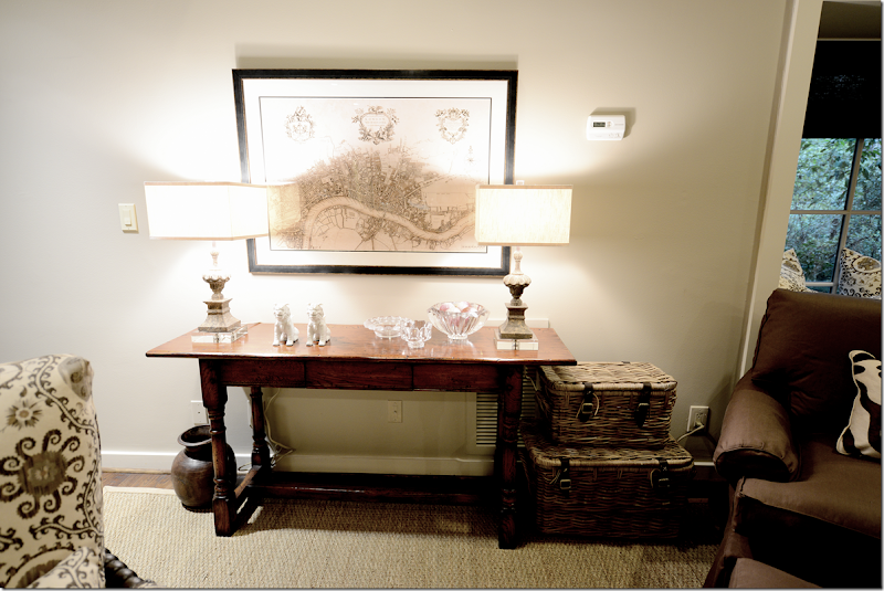
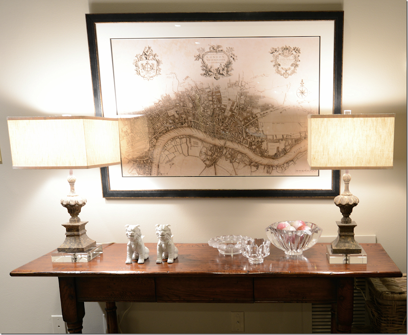
I replaced the pine armoire with this console table from Hien Lam Home. And I bought this reproduction of the antique map of London from All Posters. I also bought the one of Paris and wanted to stack them, but there was this beam in the way, and everyone vetoed the second print! Everyone included Monica, James – my helper, and the seagrass installers = all design mavens.
Here’s a close up of the Aidan Gray lamps – these are really pretty with the acrylic bases and finials. And the box shaped shades lend a slight contemporary touch. BTW, the Aidan Gray house search continues. We will probably be announcing the winner in about two weeks or so. We are going over all the entrants now. So – you still have a few days to enter – but hurry!!!!
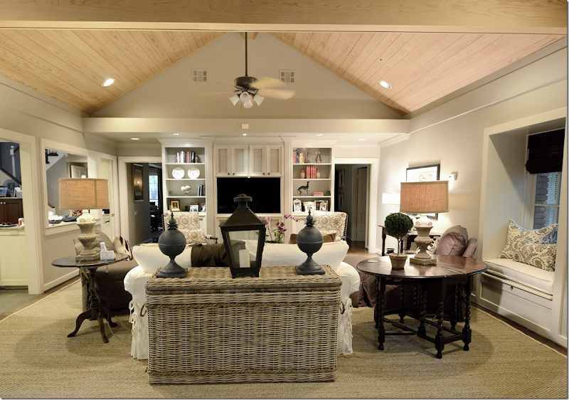
And looking from the back of the sofa. I added a new console which is actually a huge basket from Artesia. On the right, is a small window seat. I love these lamp shades made of burlap which brings out the color of the seagrass. And, I added the lantern and the zinc balls on the console.
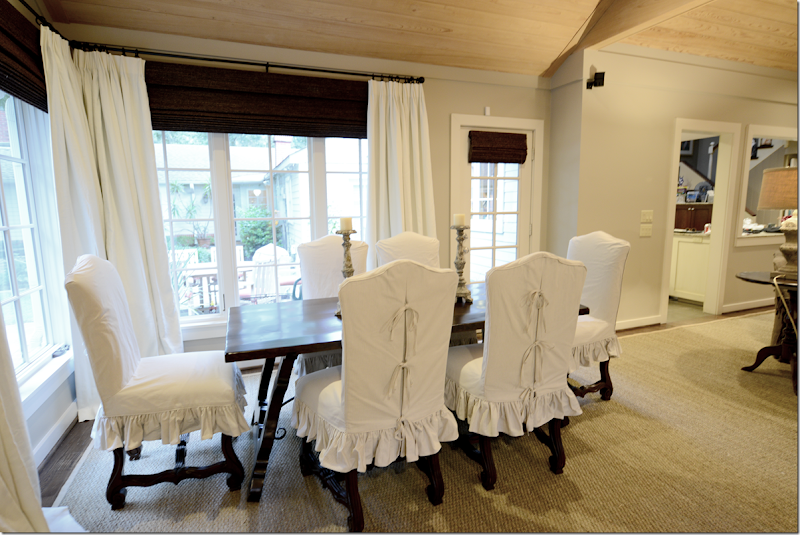
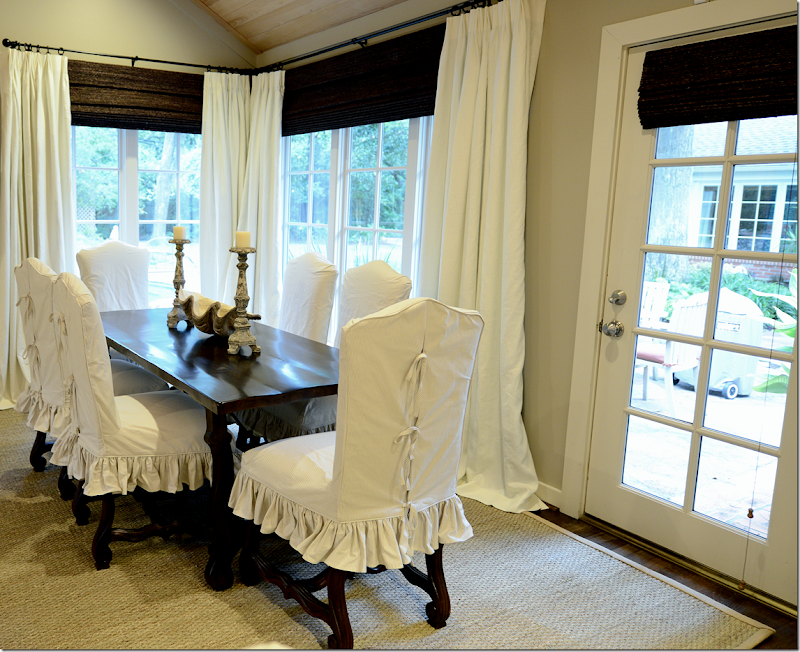
The owners childhood dining table had Spanish styling and was actually quite pretty. So, I had it restained a dark, rich brown. Before it was a light color that looked faded from years in the sun. The old chairs had seen better days, so we bought these French chairs from Hien Lam and stained them dark – and slipped them in a ticking stripe. I chose the dark window shades to go with all the brown linen and dark woods and the curtains really pop against them. They will probably never be lowered, so not much light or view is blocked – since the shades are actually only covering the dead space between the window and the rods.
There was only one hitch in the project when the lady of the house called to say she didn’t want or need the shades. I was stunned. “No, no, you have to have them. The whole room was designed around the shades. No. I insist. Please!!!” I was literally begging her. I think she was surprised since I usually don’t insist on anything that strongly. But, thankfully she changed her mind and I quickly ordered them.
And looking from the main seating area to the breakfast area. I added the candlesticks from Aidan Gray and the large clam shell.
Across from the breakfast area, are the two club chairs with an English arm and carved legs. I discussed doing a back to back sofa here, but with the dining area, there just wasn’t enough room. Then we discussed moving the breakfast table in the middle in front of the fireplace, but that would leave two big holes on each side. Then I thought that maybe I would add an antique chaise or bench along each side, or even a Mies chaise with the dining table in the middle. At this point, the owner looked at me like I was crazy. I also thought about four chairs instead of two, in a circle, but in the end – it was just too much and I left it the way the architect intended it with the breakfast table in the right bay and the chairs in the left.
Their backyard is really large and beautiful – the house is in wooded Memorial – and it was once considered way out west Houston, but now it’s rather close in. There is even an old stables in the back. Now, they have a beautiful pool with a fountain – so the views out these windows are fabulous. Of course, I didn’t take any pictures of it! I forgot! What can I say – I’m not a professional photographer! But, – did you notice this is the debut of my new camera – the Nikon D800 that I was on the wait list for six months for? The camera takes extra wide shots which is great for interior photographs. So - an improvement? Or is it back to school, pronto?
OK, back to design. One thing I like in this room is the contrast between the dark brown linen and the ivory curtains and the dark shades. The print is just enough pattern without overwhelming the room or dating it too quickly. IMO! Which is why I was really so dead set on ordering the blinds. I think they made a big difference in the room.
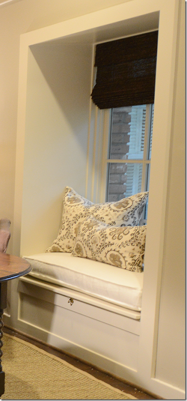
And this is the window seat that remains from the when the room used to end right here. Monica facilitated the down cushion and pillows, of course. And all the curtains, too.
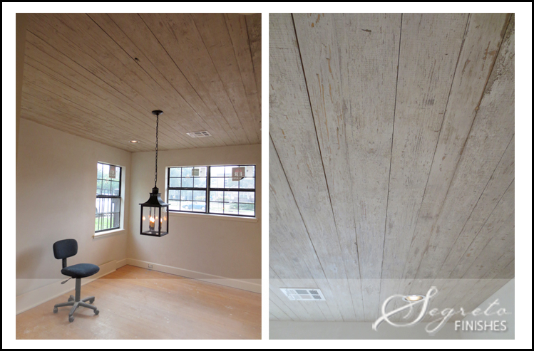
In the end – there is only the ceiling left. While at first I did love that the seagrass balanced out the light wood ceiling, I saw something that Leslie of Segreto had down on the ceiling at her new office. After we met with Leslie, she agreed that the ceiling would look fabulous treated the same way.
Leslie has just remodeled a tear down into her new beautiful offices. You HAVE to see how cute it is HERE. And, here is a picture of her new office’s ceiling which is the treatment we want to do on this ceiling.
Here is the treatment for the ceiling, it looks like rustic barn wood and has a grayish tone. We are set to do it in a few months. The ceiling is so gorgeous! It will really tone down the yellow color of the wood and will be much softer looking!
So, that’s it! Thanks for looking at all the pictures.
A Personal Family Story !
Briargrove – Houston’s hot neighborhood for newlyweds.
It seems like every time I hear about a young couple buying a new house, it’s in the Briargrove neighborhood. I’m not sure why all the newlyweds that I seem to know are moving there, but, as always, once a few claim stakes, friends will follow.
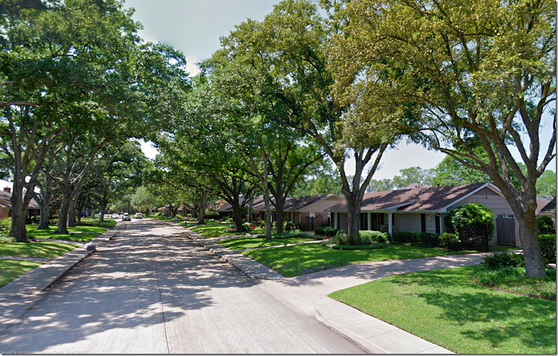
The neighborhood is close in – right outside the loop - with neat, nicely landscaped lots and plenty of curb appeal. Most houses are one story ranchburgers which were built in the early 60s. But like every appealing neighborhood, the smaller houses are slowly being torn down, replaced by larger 1 1/2 story houses. Still, the older houses are charming with front porches and large oak trees that shade the front lawns.
The houses are typically 2,000 to 3,00o sq. ft. and many have been added on to by extending the back family room. The younger set tends to turn the living rooms into the dining room and the former dining rooms become offices or playrooms. The neighborhood is relatively small with only 1,400 houses. Briargrove Elementary is a big draw – it’s one of Houston’s finest public schools. But, going public becomes a problem at the high school level, so families with older children either move out or go to a private school. Despite the high school issue, the neighborhood could not be hotter.
One of my nephews moved into the neighborhood about four years ago and recently his newlywed brother, Jeffrey and his bride Brooke, bought a house right down the street. Luckily it came with a swimming pool for both the brothers’ families to enjoy. The house they bought was in good shape and had been the home of an older art-collecting, single man (something of an anomaly in this neighborhood where families with young children are pushing out all the empty nesters.)
Although the house was quite nice, my new niece had a lot of changes in mind when she signed on the dotted line. Recently I stopped by to take pictures so you could see the before and afters and hopefully get some ideas if you are remodeling and updating a home.
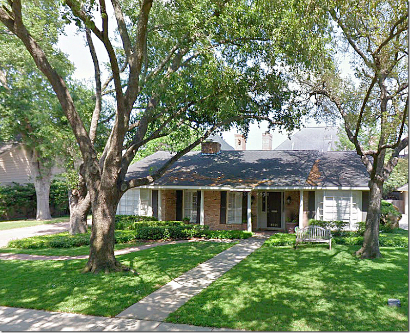
I didn’t get a picture of the outside for some reason, so this is how it looked on the realtor’s web site. It is a typical Briargrove house with 3 bedrooms, 2 baths and just over 2,000 sq. ft. Since there are no children yet, this house should be perfect for them for years and years unless they end up having more than 3 children – then things might get a little tight! The neighborhood is known for its towering Live Oak trees. They are lucky to have three in the front yard.
And here is how it looks on Google Maps. So cute!!
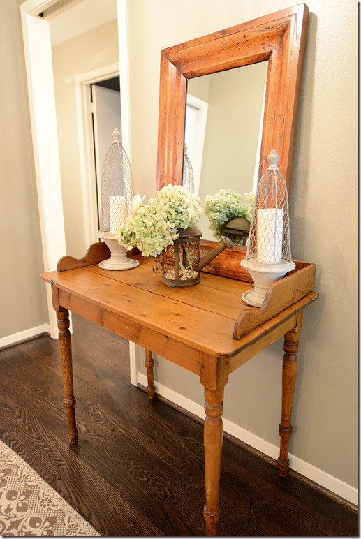
When you enter the front door, Brooke has placed an antique pine table and mirror along with a pair of candles on each side. The dining room is to the left and the family room is straight ahead.
BEFORE: This is how the dining room looked with the previous owners. He had installed wall to wall seagrass and art lights for his collection, along with a crystal chandelier. Brooke pulled up all the seagrass because it really was showing its age and needed to be replaced. The former dining room – through the opening - was an office.
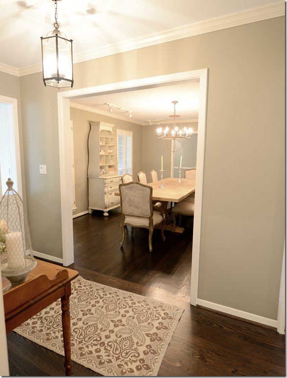
AFTER: And here is a glimpse into the dining room from the entry hall. You can see the lantern they installed in the entrance.
The view from the dining room into the entry hall. Once Brooke and Jeffrey pulled up the seagrass, they installed hardwoods in here to match the hardwoods throughout the house – and then they stained all of it a much darker brown. The walls were painted a light gray throughout, but in the dining room they painted it just a bit darker for effect.
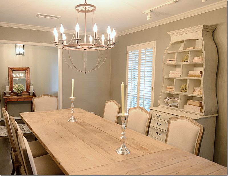
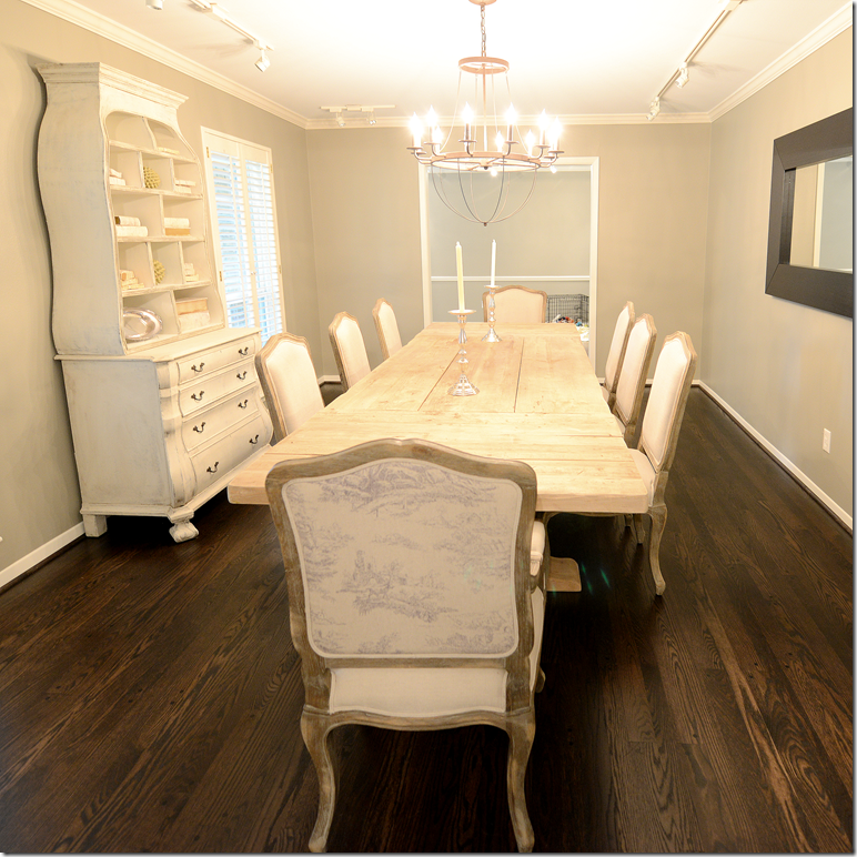
And looking the other direction towards the former dining room. That room will become a study, and then later a playroom – after they install French doors between the two rooms. The fabulous Belgian styled table came from Restoration Hardware and the French chairs with a faded toile on the back came from Zentique. Brooke ordered the chandelier from Ballard Designs.
Though the back of the chairs have a faded toile print, the front is upholstered in linen.
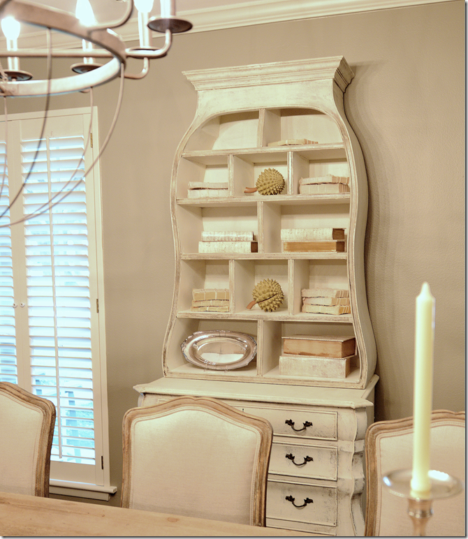
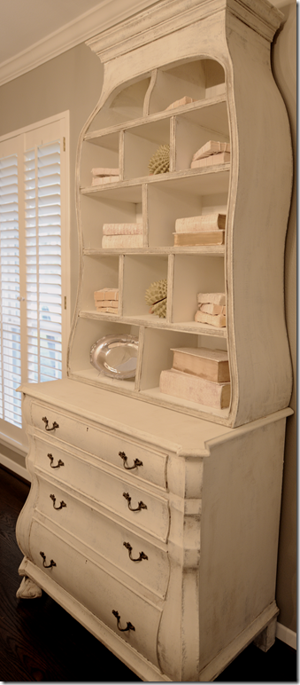
And against the wall is this chest which has been newly painted and fauxed by the great Mr. James Farmer (jfarmer762@yahoo.com or at 713-398-7657.) Inside, Brooke put Tara Shaw’s white books and some string tied books. So cute!
BEFORE: Here is how the former owner had the family room. This side is the original family room and the other side on the left is an addition.
BEFORE: And here is how the former owner had the addition decorated.
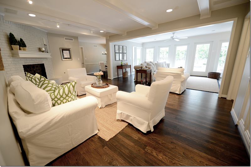
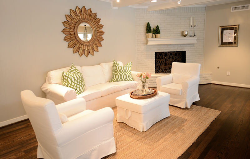
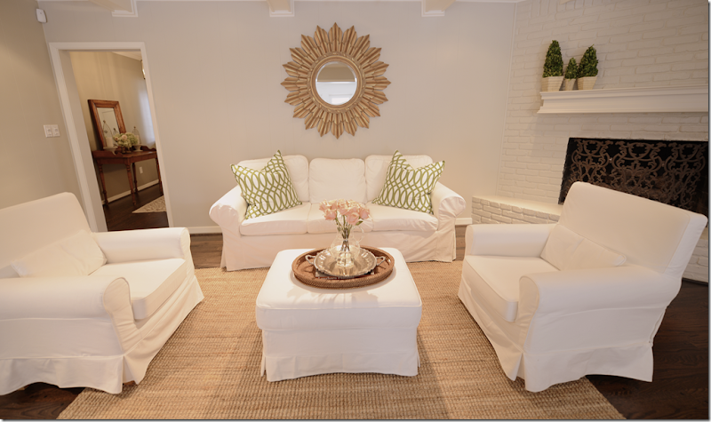
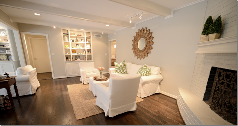
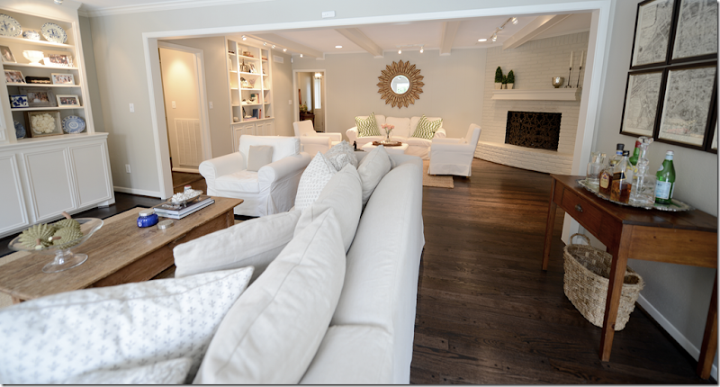
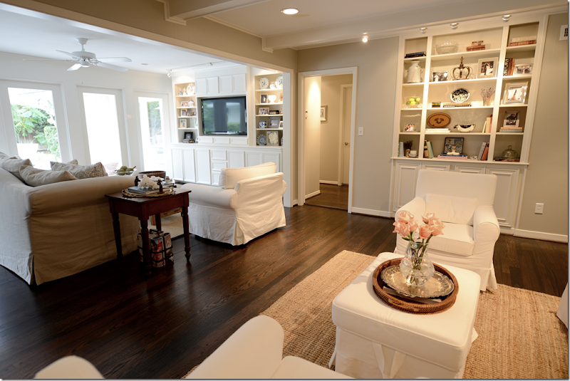
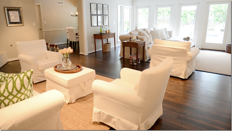
AFTER: Brooke and Jeffrey painted the walls a soft gray (Benjamin Moore Revere Pewter) and the brick fireplace was painted the same color as the walls. Then, they darkened the hardwoods to a much richer, deeper brown. This side of the family room was furnished with the Ikea slipcovered sofa and chairs in white, while the other side has a linen covered sofa.
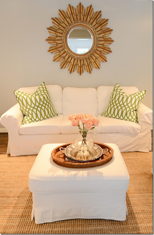
Brooke got the two trellis pillows in green from Z Gallerie to add some pops of color. The mirror came from Ballard Designs. When the newlyweds moved into the house, they didn’t have enough furniture for both sides of the room. So, the Ikea slipcovered furniture was a perfect choice for right now. It is inexpensive enough that it is easy on the pockets of newlyweds, plus it looks stylish. The slips are perfect for babies and puppies - just take them off and wash. One day they might replace the Ikea sofa with a new one, but for now and the near future, it’s the right choice. I still stay this is the BEST bargain in furniture out there!
And looking straight on – here you can see into the entry hall. Brooke was lucky the former owner left them a pretty fireplace screen.
Brooke always tries to keep a few roses in her Juliska vase, which she puts on a silver tray layered over a wicker one.
And looking towards the book shelves in the family room. Through the door is the bedroom hall – which also got new hardwoods laid.
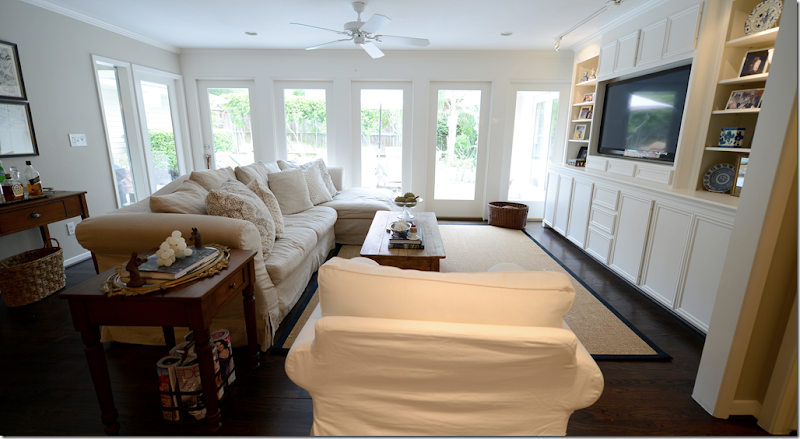
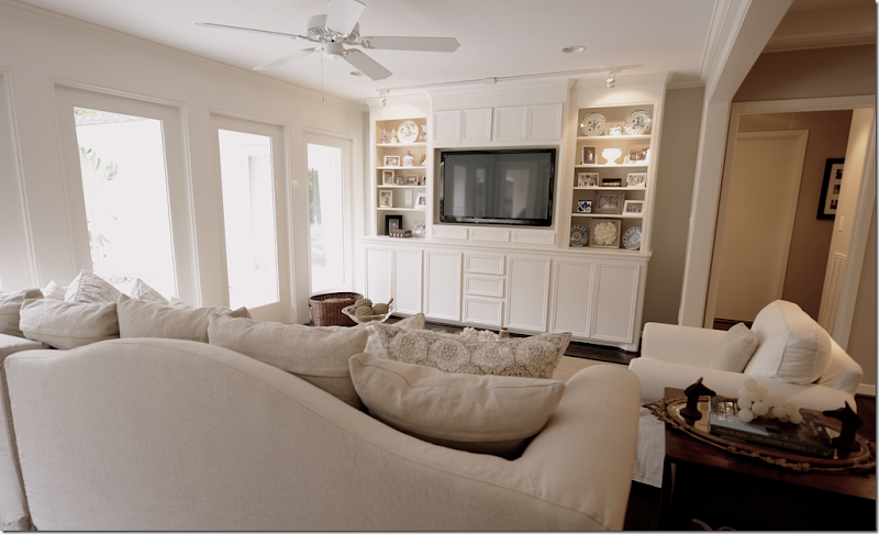
Here’s the addition of the family room – Brooke and Jeffrey added a large built in to house the flatscreen and books.
On this side of the room, they have a linen slipcovered sectional from Halo Styles with gray Les Indiennes pillows in two different sizes from Neal&Co. An Irish antique dining table that has been cut down is used as a coffee table. And that’s Tucker sitting on the sofa! Remember I told you how their puppy Riley got sick and had to be put down? Well, a few months later they adopted Riley’s litter mate and brother – Tucker. And he is soooo sweet! Look at that face! Wait, let me get a close up for you.
Tucker! We can’t wait for this weekend when we get to babysit him for 3 whole days!!!
And here you can see the built-in. Notice how the back of the sectional has a cute arch.
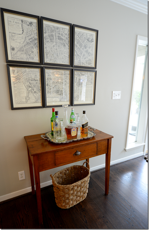
Behind the sofa, Brook added the antique map of Paris that came divided and framed from One Kings Lane. Underneath is their bar, set up on a wood table.
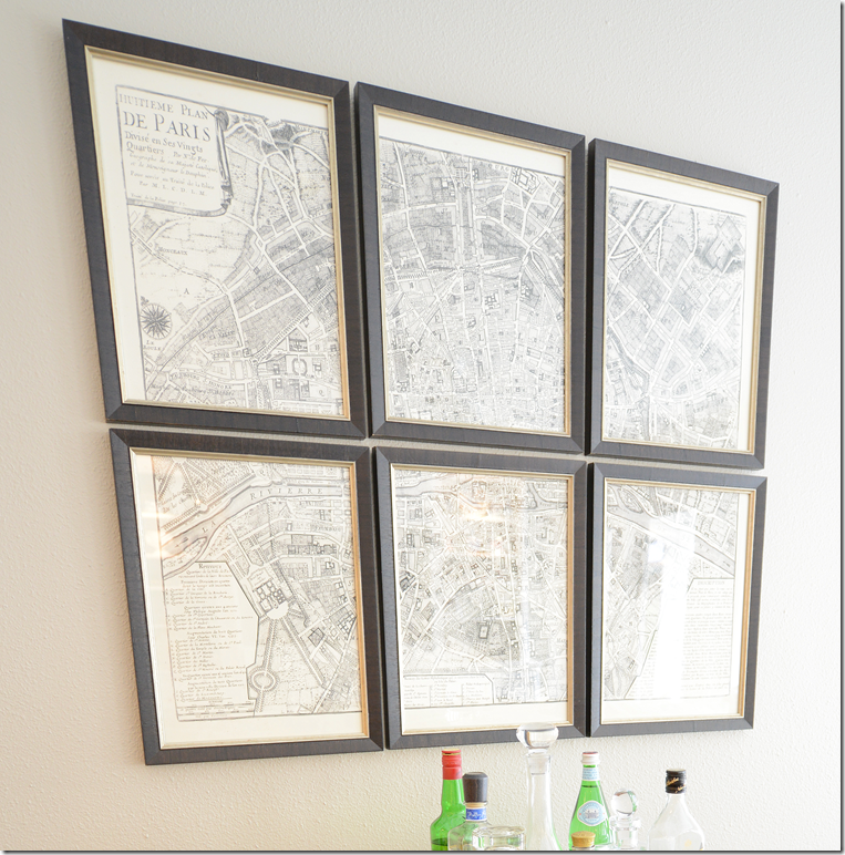
Here’s a closeup of the map of Paris – love this!
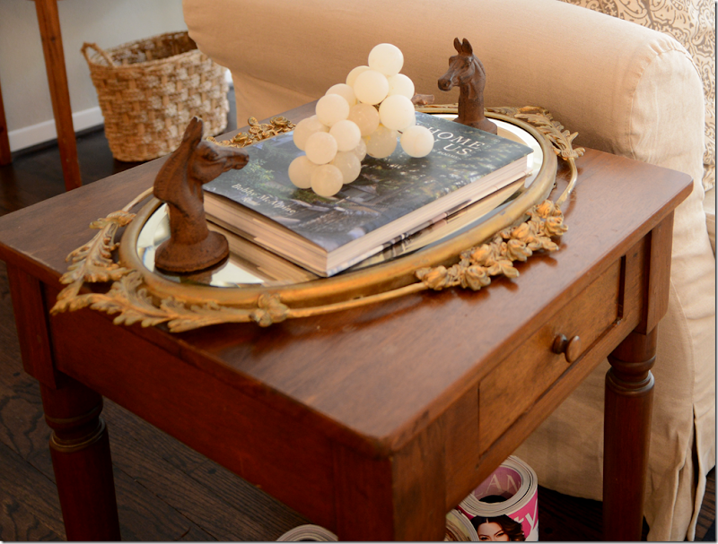
Cute tablescape with a mirrored tray and vintage white alabaster grapes! I spy Bobby McAlpine’s book.
And looking from the addition back into the family room. The layout of the house is really nice – it’s all so open. They can have a lot of people over with these two seating areas. And you can see how pretty the dark hardwoods came out. Before, they were more of a honey tone, and now with the gray walls, the dark woods look so much better.
Raul, my painter and construction man, built the new shelves in the addition – he tried to match them to these shelves that were already in the house and he did a great job. It’s hard to remember those new shelves weren’t always there! Brooke has plans to get bamboo or textured shades for the windows. When you move in, there are so many things to do and buy, you have to prioritize some things and the window treatments are one of those. Not everything has to be done all at once – what’s the fun in that anyway???
BEFORE: Here is the breakfast room when the bachelor lived here. Thankfully he left this great iron light fixture.
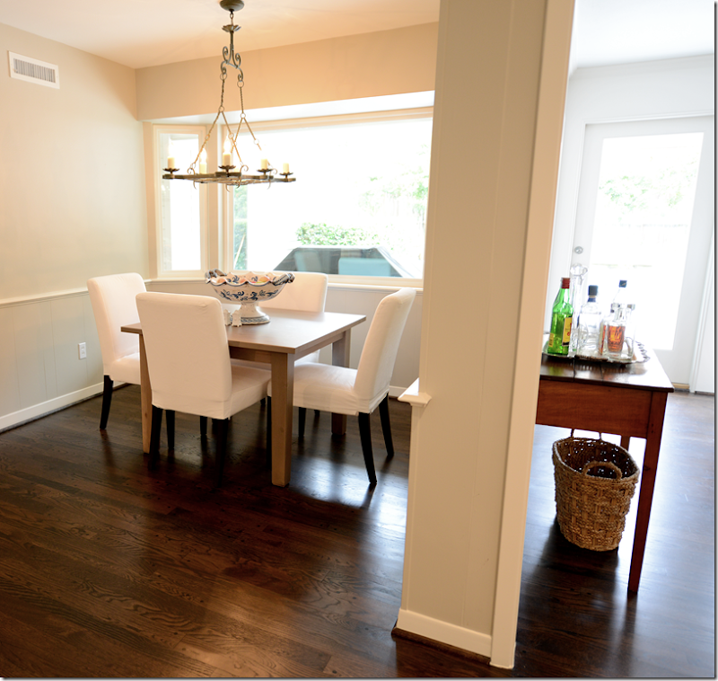
AFTER: The breakfast room is past the family room – Brooke and Jeffrey bought the table and chairs at Ikea for their rented townhouse – and it fits perfectly here. Brooke wants to eventually get a round table, but I think this looks great. The chairs are slipped which makes for easy clean ups.
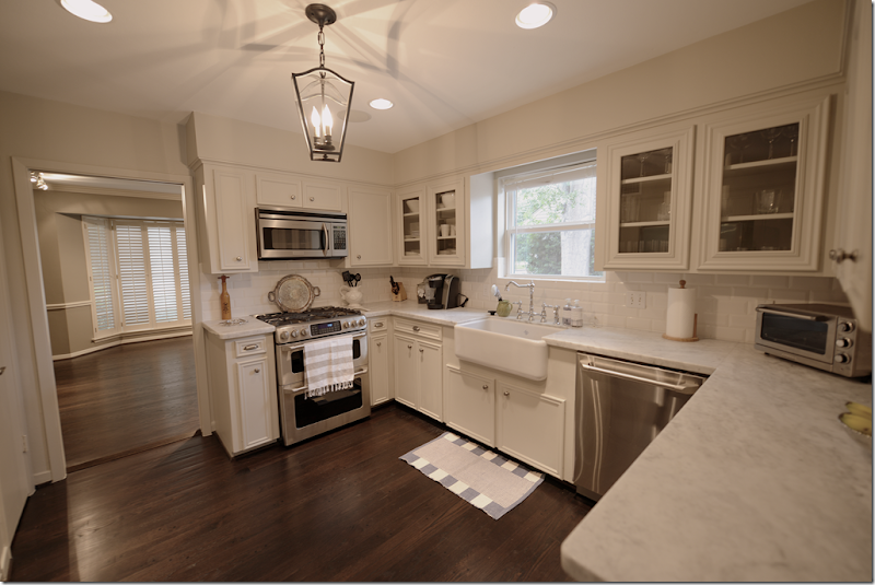
BEFORE: The kitchen as it was when they bought it. This room was probably the most updated – but luckily they had white subway tile as a backsplash to work with.
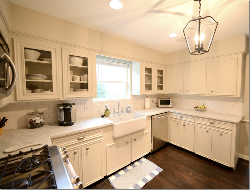
First, the tile floor was replaced with the dark hardwoods, which made a huge difference. Next, Carrara marble replaced the Formica countertops. The Carrara was chosen instead of the Calacutta Ora at a very, very substantial savings. And it really looks great. The honed marble came from Colors of the Rainbow. Next Brooke added a farm sink and a bridge faucet she bought online, along with all new hardware, also at a great savings. She really looked for ways to stretch her budget by buying online. And finally – new appliances in stainless were added.
Other changes were the overhead cabinets got glass doors – Raul just cut out the wood centers and inserted the glass. Brooke added a lantern she bought online which replaced the large fluorescent fixture that used to be there – another huge change. One splurge was the farm sink from Shaw, but then she saved on her fixtures by getting the polished chrome finish instead of polished nickel. You really can’t even tell the difference. The shade for the window is ordered, but hasn’t come in yet. And through the door is the soon to be study and one day playroom – which was once the dining room.
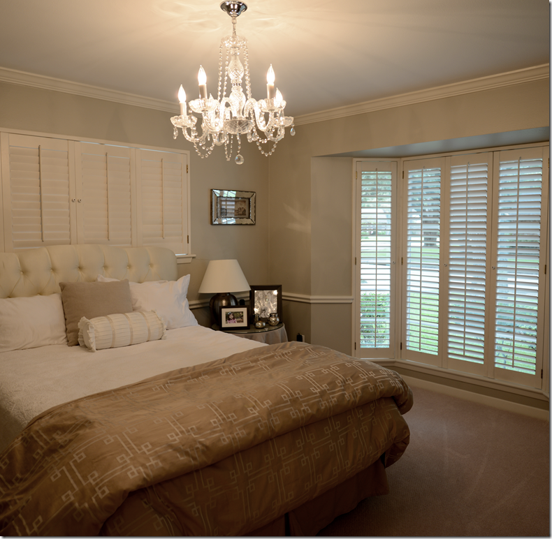
The front room is used as a guest bedroom now. There’s a cute tufted headboard and a crystal chandelier that Brooke ordered on line. The bedrooms all had wall to wall seagrass that truly needed to be replaced – which they did with a flat pile neutral carpet. This aunt begged them to put in hardwoods in the bedrooms too – but her nephew wanted it soft under his feet when he woke up! MEN!!!!!
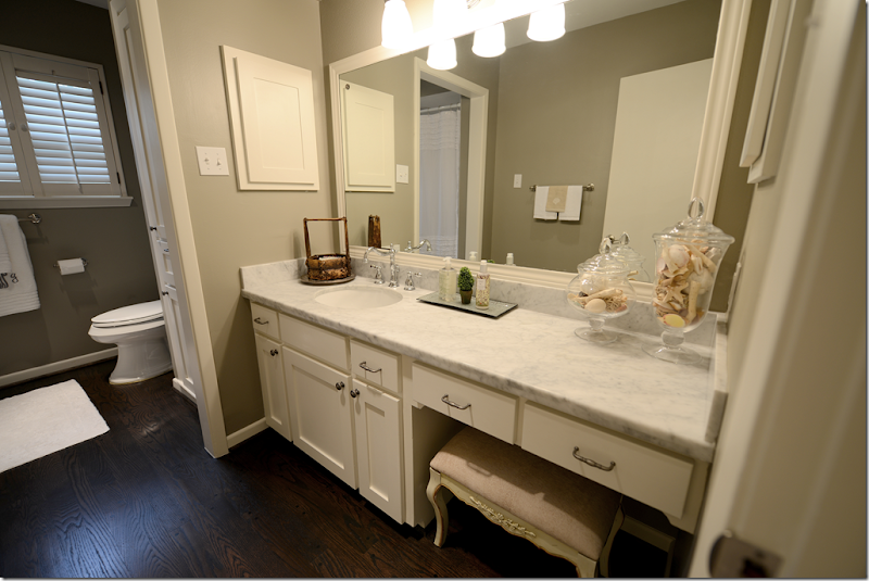
BEFORE: The bathroom before had all green tile that was original to the house. While I love this particular wall paper, it just didn’t go with the gray paint and hardwoods in the house.
AFTER: What a difference! The tile was all removed – the dark hardwoods went down on the floor and the same honed Carrara marble was put on the vanity, along with a new sink and faucet. The walls were painted a dark gray – the same as found in the dining room.
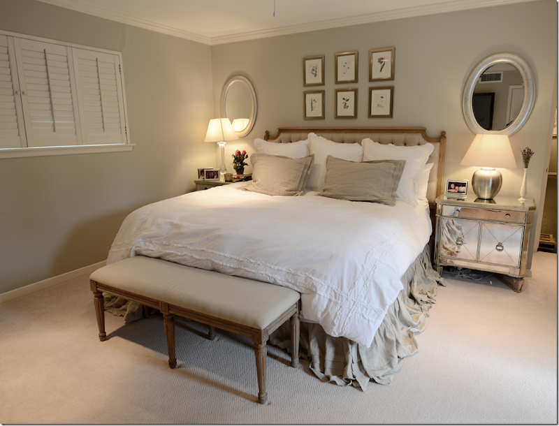
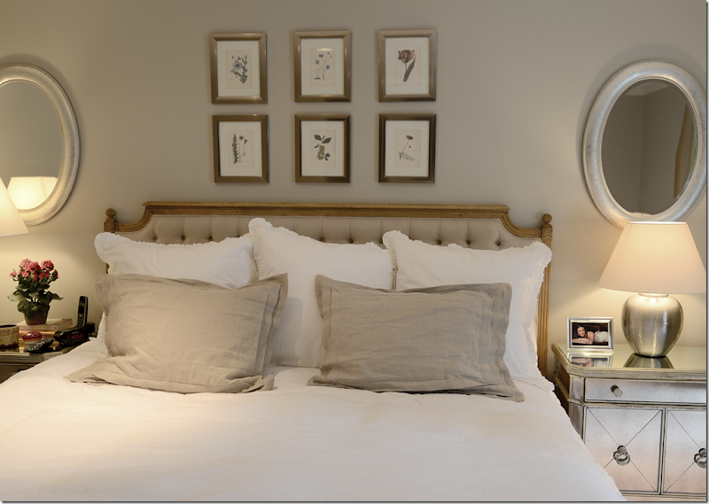
And here is the master bedroom. They got the headboard from Zentique and the night stands from Z Gallerie. The bench came from an online source and it matches the headboard perfectly.
The bedding is white and linen and the two mirrors balance it all out! I didn’t take a picture of their bathroom because it wasn’t changed – luckily it had a nice light gray tile that actually matched the new décor perfectly.
And, I also forgot to take a picture of the back yard, so this is from the real estate ad. They are so lucky that they have this great pool which is a huge plus for Houston’s summers! Next on the list is new outdoor furniture, but Jeffrey got sticker shock while shopping for it. It’s crazy how outdoor furniture can be more expensive than indoor furniture!! Hmm. I wonder if Ikea sells outdoor furniture? I need to look into that.
I hope you’ve enjoyed seeing my nephew and niece’s new house and learning a little bit about their neighborhood – Briargrove.
To search available houses in Briargrove – go to www.har.com – put in the search engine Briargrove AND zip code 77057. Currently, there are just 24 houses for sale – ranging from $375,000 to $1,400,000 for a brand new 5,000 sq ft. spec house.
AND, to read Brooke’s darling fashion blog – Style Wise - go HERE.
We have a winner in the Vero Linen contest! The contest was a great success, so as a thank you for all the entrants, Vero Linen is offering Cote de Texas readers 20% off any order over $300 that is placeddd before September 17th – midnight.
Please use the promo code verocote20 as the code.
After you make your selections, when you are ready to check out – enter the code at the bottom of the shopping cart and then click the update button. This will ensure you get the 20% off.
To visit the Vero Linen site – go HERE.
AND, coming up next, we will have another great giveaway – think coffee tables!!!

