The family room then.
A few months ago I showed you a project I was working on – The Tanglewood House. The clients were living in an older house in one of the nicest neighborhoods in Houston. The debate was whether to tear down the house and rebuild on their lot OR completely gut and remodel. In the end they compromised and did a smaller remodeling job than originally planned, with their sights set on perhaps rebuilding sometimes in the future. I was first contacted by the client, a reader of Cote de Texas, to help pick out finishes for phase one – a gut job of their master bathroom. Out of the space, a new master bathroom was created, along with a new powder room. As work went on, the job got larger, as is always the case. First we would do a minor redecorating of the master bedroom, along with a minor redecorating of the family room. Much work was also to be done outside. In the end – a new roof was put on, outdated dormer windows were replaced, the facade was painted, new shutters were built, new landscaping was installed along with new gates, and on and on. Inside, all the doors were replaced and painted black to give them some presence, and new hardware was purchased. Most of the inside of the house was painted. Plans to restain all the wood floors were put on hold until this summer.
In the family room – we purchased all new furniture, covered with pricey fabrics. Also, a large built in was designed to hide two computer desks for the children. We added woven shades and curtains at the French doors, along with a large seagrass rug. All new accessories were purchased to fill the many added shelves. In short, the minor redecorating job had turned major – as is always the case. The clients’ initial budget was increased too many times to count. When the family room was completed, the clients were very pleased with the results. The furniture arrangement worked perfectly for their TV watching and the new computer desks were functional and in use, day and night. Extra meals were eaten on the gate leg table that doubled as a work space. All in all – everything was wonderful. Except for one thing – well, two things exactly: the living room and the dining room. Both rooms were still as dated as the family room had once been, and with that room now looking so fresh, the front rooms looked even more tired by comparison. Added to this was the fact that I had robbed the living room of two club chairs to be used in the master bedroom redo.
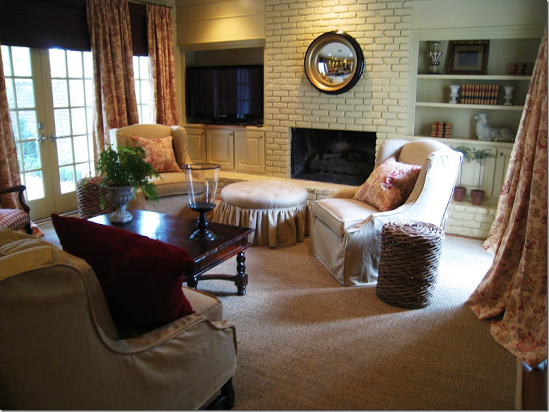 The two new arm chairs swivel for easy TV watching in the family room.
My client, the wife, knew that something had to be done to freshen up the front rooms and quickly – the eldest son was graduating and out-of-town family was arriving for a weekend of celebration. In the middle of April, she asked me – could we possibly redo the two rooms, by graduation day in four weeks? And could we keep to a strict budget – pretend we were on some HGTV Makeover Show where an entire house is transformed for $500 in 24 hours? Sure – no problem!!!
Actually, I liked the challenge. I knew if we worked fast, used what she already owned, picked out reasonably priced fabrics, paid a rush fee to the upholsterer, and bribed Monica – my partner who facilitates all the soft goods – that we might possibly be able to transform the two rooms in a few weeks time, bringing them more in line with the already updated family room. Miracles do happen, don’t they? Here is what we had to work with:
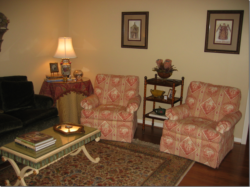
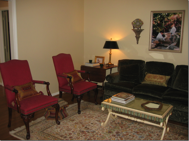 Living Room Before: There was a nice sofa, in a green velvet and two English styled chairs.
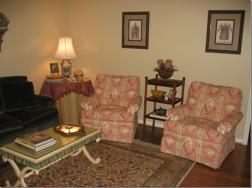
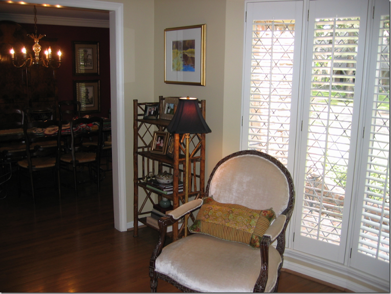 Facing the sofa was a pair of French styled chairs covered in velvet. A bay window – with shutters – lets in the only light in the room and to top that – it’s a northern exposure, which means the room sits in a dark shadow 24/7.
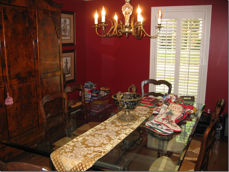 The dining room was painted red, so chic ten years ago. The table was beautiful – a metal, baker’s table style base with a glass top paired with typical French rush seat chairs. There was a gorgeous antique armoire in the dining room that stored all the china. The small window, like the adjoining living room, had plantation shutters and, again, a northern exposure.
The plan: everything would be slipcovered. The floors in both rooms would get large, custom cut seagrass rugs to unify them. Both rooms would be painted in a rich, dark caramel color that would blend with the family room. The three cushioned sofa would be remade with one bottom cushion and two back cushions only. Curtains would be fashioned alike for both rooms to tie them together. A new, larger dining room light fixture would be purchased. A mirror from the old master bathroom would be painted antique gold. A collection of antique egg prints would be framed. All the small accessories, lamps, tables, and what-nots would be sold. There was one end table and one trunk that we would re-use. The only piece of furniture we would buy would be a new coffee table and we would add a larger skirted table.
Since everything was getting slipcovers except for the two red English chairs, keeping fabric costs down was imperative. White linen can be one of the most expensive or cheapest fabrics you can buy, depending on where it’s made. And white linen is also one of the best looking fabrics there is. I found some at Glicks for $16. a yard! Pindler and Pindler came through with an Ikat and a printed cotton for just pennies more. In fact, the fabrics were so inexpensive, yet still trendy and up to date – they were the deciding factor in getting the green light for the entire project. The amount of yardage needed was large and if we had chosen something in the price range of even $25 a yard – the whole redecorating job would probably not have taken place. By choosing great looking, yet inexpensive fabrics, the price tag was very reasonable.
And so, my client and I tallied up all the expenses, the guesstimates and estimates of what is was going to take to totally transform these two rooms. She presented her husband with the figures and we waited for his final approval, knowing that the deadline of the graduation festivities was fast approaching. About a week later, I got the phone call that all was ok-ed by the “big boss” (thank you Mr. P.!!!!) and I ordered all the fabric to be shipped overnight. Here is what the two rooms look like, just a few weeks later:
NOTE: open your browser to full screen to see the photos at proper size. Thanks!!!!
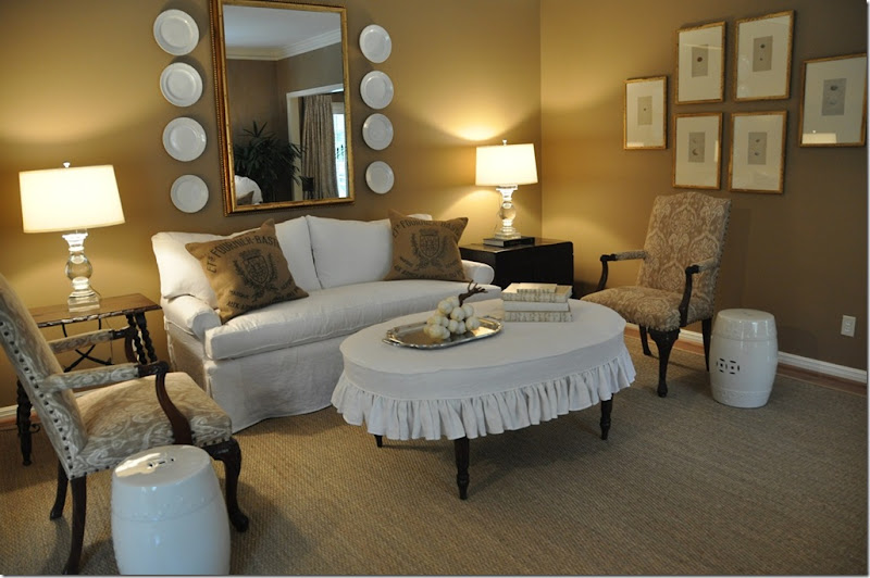
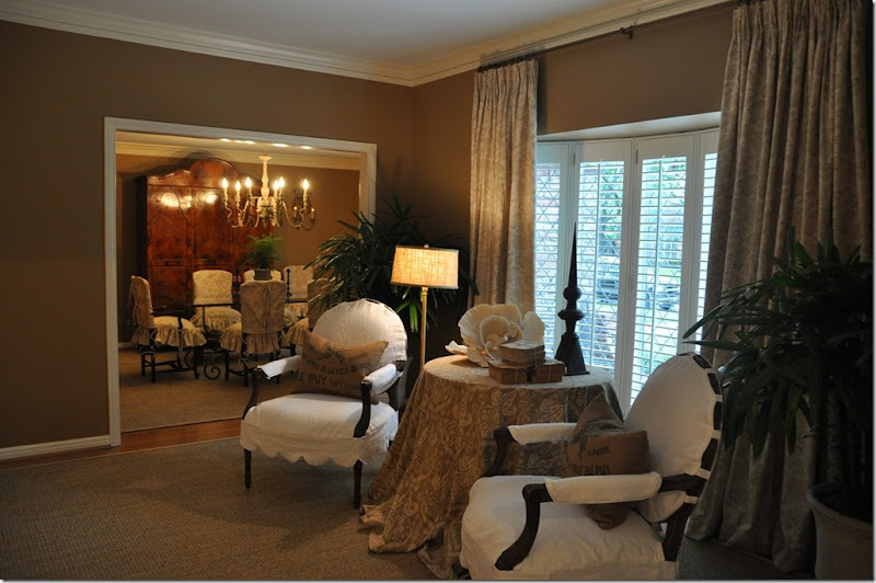
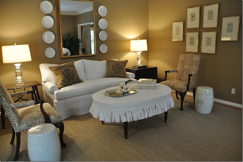
The living room today.
The green velvet sofa was upholstered in muslin, then slipped in white linen. The three cushions became one bottom and two backs for a trendier, more up-to-date look. The red English-styled chairs were upholstered in the Pindler and Pindler Ikat fabric with an exaggerated nail-head detailing. A large mirror was repainted in an antiqued Italian gold and surrounded by white ironstone, picked up at The Gray Door at the Urban Market. White garden stools from Wisteria double as side tables. The oval coffee table, the only piece of furniture bought for the room, was slipped in the white linen. A large seagrass rug was custom cut a few inches from the walls, which were painted a rich caramel color. For side tables, we used an existing Spanish styled, dark walnut stained table, and an Oriental, black trunk on a frame. The crystal lamps are from Restoration Hardware.
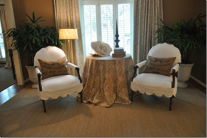
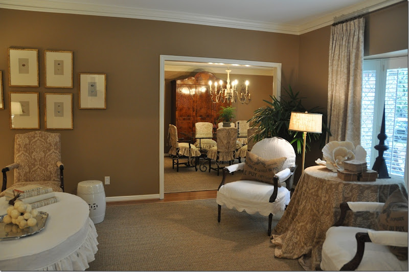
Facing the sofa is a large skirted table, topped by the Ikat fabric. The two French styled chairs were slipped with a large scalloped detailing in the white linen. The other Pindler and Pindler fabric, a cotton print, was used for the curtains. Two large urns from The Garden Gate were planted with palms that thrive in low light interiors.


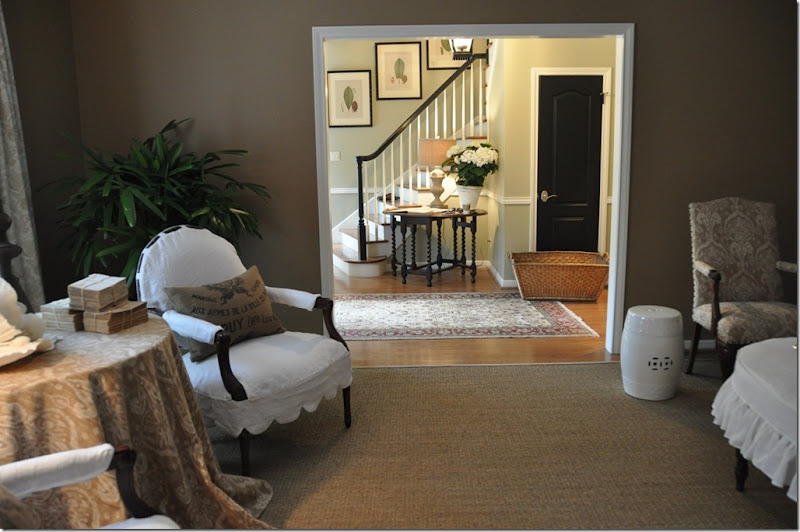 The view facing the entry hall. In the entry hall, we painted the banister black to match all the new doors which were also painted black. An antique gate-leg table was placed there along with four botanicals moved from the master bedroom, now with new ivory mats and newly painted black frames.
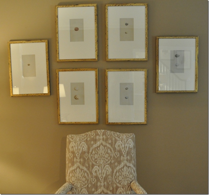
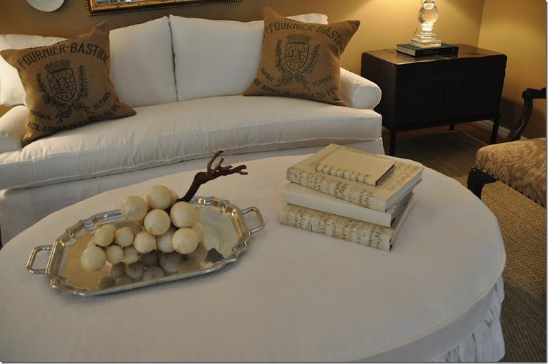
Accessory Details:
Old alabaster grapes and books covered in music paper accessorize the coffee table. The piece de resistance of the entire room, to me, is the serendipity of the burlap feed bags. The feed bags were originally purchased on Ebay and made into pillows for my own house. I decided the pillows didn’t look good on my sofa, so they went into the no-man’s land of my garage. For my client’s living room, I had ordered pillows made out of the Ikat fabric. On the way to the installation, at the last minute, I grabbed the feed bag pillows just in case they might look good in the living room. Once the white slipcovered furniture arrived, there was no question in my mind that the feed bag pillows would look spectacular – and in the end, they actually “make the room.” The Ikat pillows? The upholsterer forgot to make them. Sometimes things work out in ways you never planned or ever imagined! I would like to say these pillows were specified from day one, and perhaps I should!
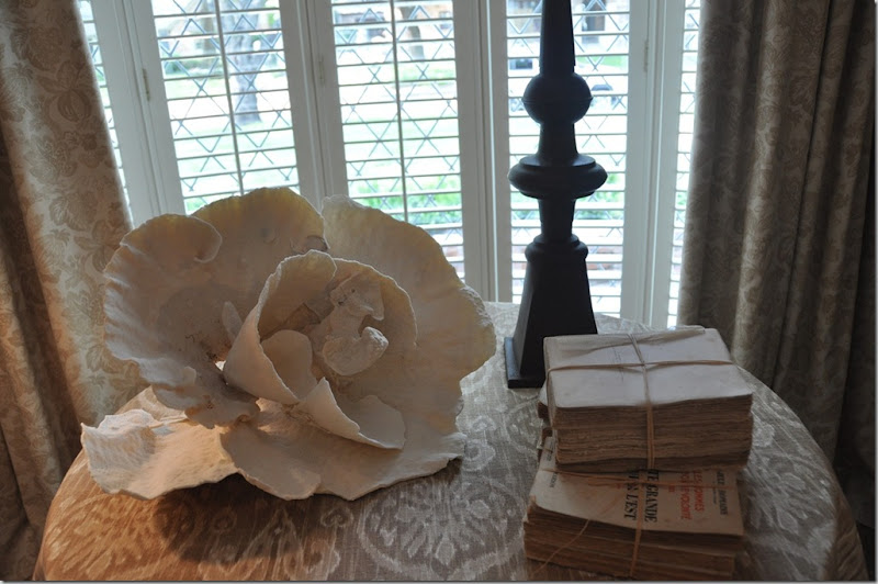
On the skirted table, I used a coral rose I had bought for the client at Urban Market, along with some trendy antique spine-less books from Antiques and Interiors on Dunlavy. At Olivine, I picked up the metal finial in a rusty finish.
Since the two rooms are connected, it was important that they flow visually. To achieve this continuity – the walls in both rooms were painted the same caramel color and both rooms have seagrass matting. Also, the curtains in both rooms are identical.
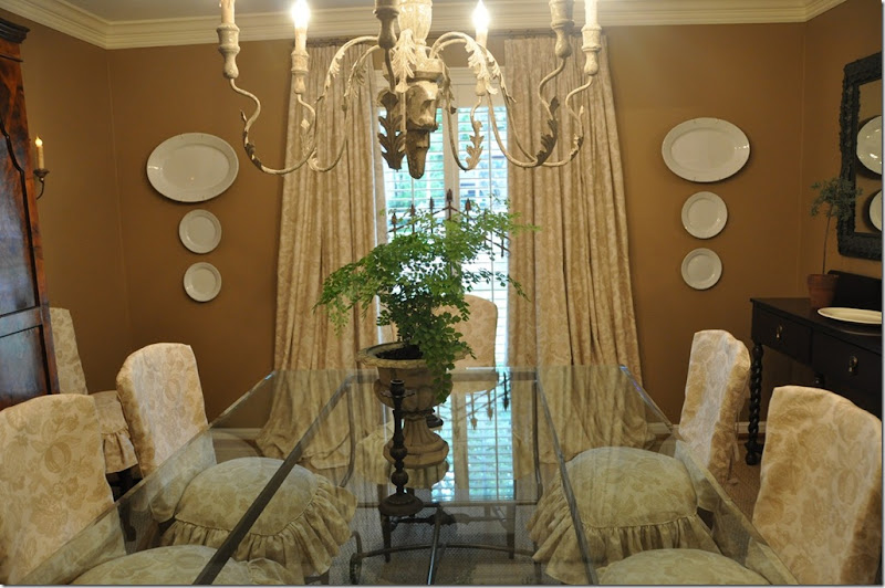
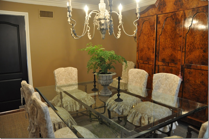
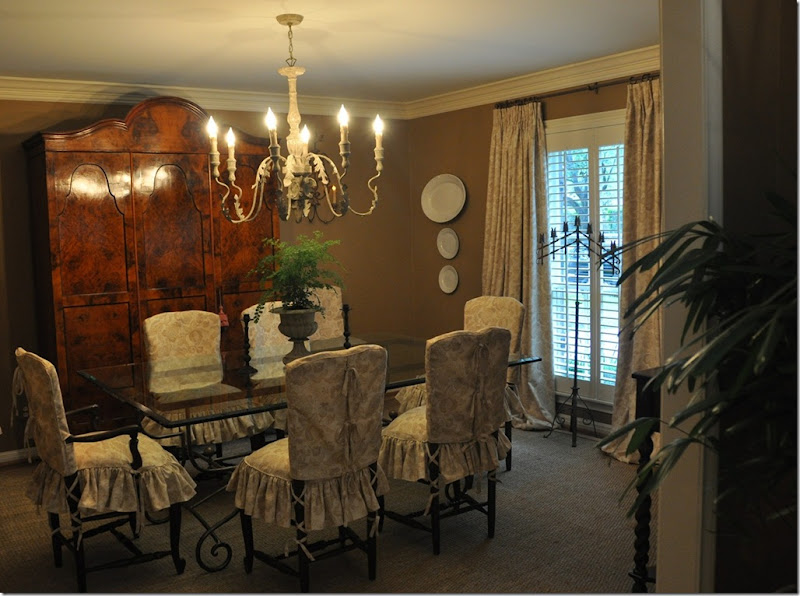 The Pindler and Pindler print was used for both the curtains and chair slips. The large chandelier comes from Aidan Gray. The gorgeous burled wood armoire is the focal point in the room.
Facing the window. The curtains, made identically to the living room, help to connect the two rooms together visually and also soften the room. By hanging the curtains right under the molding and out past the window’s sides – the window actually appears larger. Additional ironstone plates and platters purchased from The Gray Door at Urban Market pop against the deep caramel walls and further tie the living room and dining room together.
And the view to the butler’s pantry, onto the kitchen.
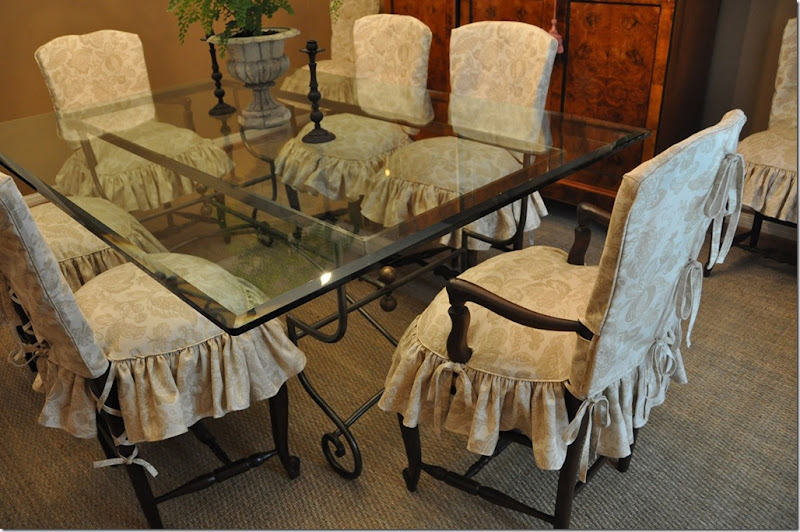
A close up of the slip covers. The slips come in two pieces. The top piece has ties that run down the middle of the chair’s back. The bottom piece has a down cushion built into it to make the chairs more shapely and luxurious looking. A skirt with double ruffles is attached to the cushion. Ballet slipper ties run down the back legs for extra detailing. The client and I have discussed one day replacing the glass top with a piece of stone – yes/no/maybe?
Let’s take one more look back at where we started four weeks ago:
The living room with an area rug, green velvet sofa and red chairs. Certainly nice – certainly pretty, but ready for an update after a decade’s time.
Once the club chairs moved to the bedroom, the living room needed a change.
A few weeks later, the same room with the same furniture and just a few new accessories and rug.
The dining room – painted red, with a too small chandelier, no curtains and bare dining room chairs. Again – very nice, very pretty, but ready for a freshening up.
The dining room today – flowing into the living room – creating a cohesive look between the two rooms. The dining room’s slipped chairs soften all the hard edges, making the room warmer and cozier. The larger chandelier is more in scale with the armoire and the curtains add additional softness to the room.
I hope you’ve enjoyed reading Chapter II of The Tanglewood Redo. And I hope I have shown you how much change can be accomplished with a little paint and a little (well – a lot) of fabric. Another important key to successful redecorating is editing. These rooms were filled with numerous small tables, lamps, art work, and accessories – all built up over the years. By clearing it all out and using just a few key pieces, what is left became more visually attractive. And, most important to remember when redecorating - you don’t always have to start all over. Consider what you have and how you can reuse it. Just by making slipcovers and reupholstering two chairs – we were able to achieve a totally different look.
Look for this house’s master bedroom and bathroom, and powder room remodeling in the next few weeks! To read the original Tanglewood Redo story, please go here.




I love it!
ReplyDeleteYou are extremely talented.
I have never seen ballet slipper ties on chair legs before, I really like it.
I am looking forward to the next instalment.
BTW, I am hooked on the Skirted Round Table and a Texan accent. Thank you for all your hard work.
Joni
ReplyDeleteWhat a great job! Love the result. So fresh. I will share with my daughter who has a drapery and slipcover business.
Marion from Kentucky
Oh Joni!!! Bravo!!!!! You did an outstanding job on this home....I love everything you did. I can't wait to see the master bed and bath.
ReplyDeleteIt's stunning, Joni! Absolutely stunning! You did an amazing job. I love it ALL. I don't even know where to start, but let me try... love the Ikat fabric by Pindler, the burlap feedbags, the slipcovers, the prints, the door painted black, the seagrass rugs, the coral on the table, the chandelier, the color palette, etc., etc. Very smart design. Very chic. Love it!
ReplyDeleteXO,
Sheila :-)
I am speechless, this transformation is absolutely stunning Joni! Oh la la...
ReplyDeleteDear Joni,
ReplyDeleteEven though you are very talented, to me this house looks characterless, unpersonal, boring and uninspired. More like a furniture showroom then a real home. Those nice dining chairs, totally ruined by awful slipcovers! And that horrible spidery chandelier....
Don't forget that the best interiors are the ones that have "organically grown" over the years. Timeless elegance is so much better then following fashion trends.
I wonder what will happen to this interior in 10 years, but am convinced that it will look outdated and old fashioned.
Look at interiors by designers like John Fowler, Nicholas Haslam, David Hicks, Albert Hadley, Sister Parish, Elsie de Wolfe, David Mlinaric or naturals like the Dowager Duchess of Devonshire. They all possessed a natural talent (and great taste!) to create timeless interiors. And these super talents may be expensive to hire, but their work will last, at least longer then 10 years!
I love it, very pretty. Who is this a**hole Dave guy?
ReplyDeleteWOW..... what a transformation. You work miracles lady. I love that Pindler and Pindler fabric. The wall color is perfect.
ReplyDeleteI'm in awe.
- Suzanne
I'm sorry but I really don't think the painted brick came out well.
ReplyDeleteAmazing! I'm in love with it! The dining room is gorgeous!
ReplyDeleteI love it! I love the tip regarding the sofa cushion -replace multiple cushions with one large cushion. What a difference! I think the dining table would be beautiful with a stone top in the future. Very inspiring!
ReplyDeleteWho wants a stale, 10 year old interior? Dave might, but obviously your clients wanted change. A familiar and welcome theme these days eh? As we know, tastes vary, and this charming look will no doubt be a big hit with your clients, their guests, and YOUR readers.
ReplyDeleteYou go girl!
Libby
Joni, what a spectacular redo. I always love how you're so thorough with your posts, so anyone can follow what you've done. Great job!
ReplyDeleteWow, Joni, Brava!
ReplyDeleteI love the caramel wallcolor, slipcovers, seagrass, feedbag pillows- all so serene and stylish.
A five star "WOW"!!!!! Thank you, Joni!
ReplyDeleteand THAT is a beautiful transformation :-)
ReplyDeleteBeautiful work, and done in little time on a tight budget to boot!
ReplyDeleteAs I was scrolling down past the photo of the newly designed dining room, I thought to myself "that table really would be great with a stone top..." Then, I saw you wrote what I was thinking.
Looking forward to future posts from this lovely home.
-Suzanne
Joni, what a beautiful home. You're an inspiration. I can't get past the the ominous weather report on the TV in the first photo, it looks as if Hurricane Joni is barreling across the Gulf and heading for Houston!
ReplyDeleteTo die for!!! Moving with the times yet classic.
ReplyDeleteVictoria
Thanks Joni,
ReplyDeleteI remember reading Part 1 Tanglewood. I think that in the timeframe that you were working under you created a fresh, modern space that unified the existing family room. The personal feel of a room will evolve, but the basis for that evolution was achieved here. Thanks for sharing, what a good move on the pillows.... a good designer can see the vision in something and take a chance, the grainsack pillows are great. I am sure that the Graduation party was a success and so was the transformation.
Leslie
It looks fabulous, Joni!
ReplyDeleteLove the transformation, despite what Dave said! What is the caramel wall color? I would like to change a dark chocolate living room to this warm tone. Love your work - thanks for sharing.
ReplyDeleteWow! I love your design challenge.
ReplyDeleteHmm...I wonder what else is in that no-man's land of your garage.
Joni - If you did all of that for $500 your hired!!! When can you start?
ReplyDeleteWhat a fresh looking transformation. I love all the light colors and the accessories are stunning. Great job. Hugs, Marty
ReplyDeleteJoni,
ReplyDeleteThe rooms are beautiful! I love the soapstone idea for the table,but a wood top made out of old beams could be really cool also. I am still Anonymous because I am new to this blogging and have been finishing up several remodels.
I am going to try and put a blog page together in June as I am taking the month off.
Tina
Thank you for sharing, Joni! What a difference. I love the new "atmosphere"- refreshing, welcoming, and no longer disjointed. Some other high points- love the new painted railing, I'm going to use the way you hung the six egg prints 2 over 2 with the two on the side as opposed to three over three, the Pindler & Pindler fabrics (so hard for me to find a patterned fabric that complements a muted or white linen- going to their site after leaving this comment), and, of course, your seagrass rugs. Keep sharing!
ReplyDeleteLiz in Upstate NY
Your workroom must have been going 24/7 to get all that done. Love the feed sack pillows - and you're right - sometimes, things work out better when unexpected! I would second Tina - a reclaimed wooden table top would be an interesting juxtaposition with the burled wood armoire - which is to die for!
ReplyDeleteWhat a wonderful transformation! Can't wait to see the rest of their home. The rooms look a lot more up to date and fresh...would you share the paint color- it's gorgeous!
ReplyDeleteSeriously Joni, I LOVE it! Fabulous job. It feels so pulled together. Great flow! You really accomplished a beautiful look with great price point fabrics!!!
ReplyDeleteOh, Dear Joni - you're the best. How beautiful you've made this home! I'm kinda partial to this because the layout of the living room looks a bit like mine connected to the entry with the staircase. I love all of the crisp white slipcovers! The dining room slipclovered chairs and precious! Well, elegant! :)
ReplyDeleteBe a sweetie,
Shelia ;)
* G' morning, Joni! Hope your holiday weekend was FAB!~~~~~~ My comments HERE, are made keeping DAVE's comments IN MIND:
ReplyDeletePERSONALLY, I L*I*K*E a "change"~~~ if I wanted to get or be "trendy", I would probably do so, B*U*T, keeping in mind the financial investment for "trendy" SHOULD EQAL "MINIMAL", so as not to "waste" $ or feel "guilty" father down the line (when I tired of it)~~~
Just like people/personalities/ minds can get "STALE" withOUT an infusion of new ideas/knowledge/open thoughts/CHANGE, I believe a HOME can get just as stale, for just the same reasons~~~
Life if short~~~ we say it everyday, but it's really SO TRUE! I say ENJOY whatever you can, HOW you can, and if others like it, that's FUN n' GREAT (and yes, makes us feel good!)~~~ and they can join in! If NOT, THAT'S OK TOO! NOBODY'S building the PARTHENON HERE... in fact, difference of opinion is one of the reasons the world SPINS AROUND!!!!!!!!!
Kudos on a charming update for these folks!
Warmest hugs,
Linda in AZ *
(P.S. Travertine might look lovely, eventually, for a change/update on the DR table. All our FLOORS are travertine and they're just rather "nice"!!! XO
Joni this is absolutely fabulous! You are the best of the best.
ReplyDeleteNiiice! Fresh and clean and uncluttered. I'll bet they adore it!
ReplyDeleteLooking forward to seeing the rest of the house!
Alabaster grapes - how unusual!
ReplyDeleteThanks for sharing
Pure magic, Joni, pure magic! I know it was a lot of hard work for all of you, but OH MY! How lovely! I am sure the homeowner just pinches herself to make sure she isn't dreaming! Can't wait to see the future rooms when they are complete! Thank you for sharing!
ReplyDeleteVickie
This comment has been removed by the author.
ReplyDeletei love seeing a transformation on a small budget. it makes me hopeful that i can do something similar. those fabrics are beautiful... are the pindler prints available to the trade only?
ReplyDeletegreat work!
Love it all!!! I especially LOVE the alabaster grapes... did you find those at the Urban Market? I saw some and didn't want to fork over $250. What are good prices for these... do you have a source?
ReplyDeleteGreat job and since your client is my neighbor... I can't wait for an "insider" tour! Congrats!!!
Congratulations Joni! It looks fabulous - and I'm sure that the homeowner is very pleased ... I would be! Gorgeous, perfection!
ReplyDeleteJoni,
ReplyDeleteOf course you would show the burlap trend like it should be used!! Loved this so much, the white plates are so great and the slips in the dining room are looking very 'Something's gotta give!"
Beautiful job, and as always I enjoy your posts with my coffee in the morning!
xo
Maria
this is fabulous!!!! I WANT TO MOVE IN!!!! I love, absolutely LOVE the chandelier!!! Can you please share the paint color and sheen---I am ready to go paint my living room!!
ReplyDeleteYou love seagrass, and I love the look. how well does it clean, and how does it feel to the feet? do you just have to give up a bit of comfort to get "the look"?
I am ordering those Restoration hardware lamps TODAY, and putting the one I made from vintage bases on ebay.
Grreat idea about redoing the cusions on the outdated sofas---I can do that to mine---yea!! I have khaki walls and biegy sofas from 16 yrs ago. It wouldn't take much to get this look. My adjoining DR needs to be change from cinnabar to a caramel!
And, I cqn use your Tajet roman shade in the adjoining sunporch---Joni, you are so inspiring.
thanks SO MUCH for doing this blog!!! I live in Midland, where we have few resources.
thank you--thank you!!!
Kathy (Jewell) Wommack
Wow, I love it! You're good, girl!!
ReplyDeleteSally W.
Looks fantastic. You're a magician!
ReplyDeleteUnbelievable! That those two rooms came together in only 4 weeks (or less)--definitely an act of God and positive thinking. And they really flow and are so peaceful. Thanks for sharing, definitely motivates me.
ReplyDeleteAbsolutely beautiful!! You're a very talented decorator. Your clients should be so happy with the results. Love the colorscheme you used and the slipcovers everywhere. Love the grain sack pillows in the living room too. They MAKE the room!! This redo should be in a magazine.
ReplyDeleteJoni,
ReplyDeleteYou have made them an utterly charming home that has beautiful flow. I would love to do a live walk through. You are so talented.
Gorgeous redo, Joni! You are amazing!
ReplyDeleteI love the detail you put into your posts!
STUNNING transformation, Joni! I'm not sure how anything that is slipcovered can be ruined, considering that all you have to do is take the slipcover off, or redo in another fabric! What could be more practical?! AND the bones are classic -- not trendy. The house is absolutely beautiful! BRAVO!
ReplyDeleteKerry
Beautiful job, Joni. The continuity of colors and patterns really brightened and opened up those two rooms. And those caramel colored walls - besides being warma and inviting - are the best thing you could have done to showcase that gorgeous armoire. I'm sure your clients are beyond impressed and delighted! (and just wait until their graduation guests get a look at their fancy new digs!!)
ReplyDeleteFabulous! What a transformation...in record time too! (Now I want to paint all my walls carmel.)
ReplyDeletefabulouse job! Yes the burlap pillows DO make the room complete!
ReplyDeleteWow such an amazing transformation! I love it! I love your style and I love how you incorporate the old and the new! Absolutely beautiful!
ReplyDeleteOMG, Joni this is fabulous. You need to start a business where we can send you pictures of our rooms and you tell us what to do. (or come to Dallas)
ReplyDeleteYou know, you're killing me...Dying to redecorate...3 kids in private school and college...grrrr.
Love it!
Joni - it's so fresh and pretty - I bet the owner is thrilled. You need to put your feet up! What a whirlwind.
ReplyDeleteThis was so much fun seeing the end result, and it is fabulous! Can't wait to see other rooms that you will work your Magic on to the Tanglewood Redo. Call me strange but I like the glass top dining room table. I know that stone is the norm for that base, and I could see a wood top on it, but with the size of the French chairs and the armoire and wanting to see the base, I think the glass top is perfect and keeps the room from being too heavy. Great job Joni!
ReplyDeleteJoy
Joni -- it looks amazing! Less is more, more, more!!
ReplyDeleteIt looks so nice and fresh! I really like the way you tied the slipcovers to the chairs, thats so pretty. I love those glass lamps too! Great job! I'm really looking forward to seeing the bedroom and bathrooms!
ReplyDeleteI love seeing transformations like this -- real homes with real budgets. You have great talent! The room is so calm and refeshing -- it looks fabulous!!
ReplyDeleteYour accents are superb along with the choice of color and fabric...I'm in love! Jenn
ReplyDeletejoni,
ReplyDeletethis is such an magnificent RE-DO!!
you better be careful...
the lady ( client) may be so appreciative, that she might try and kiss you inappropriately. LOL
xx you are the best
Joni, pardon my french but "DAM YOUR GOOD GIRL"! What a refreshing, change. All the rooms are fresh, stylish and unpretentious while still being warm and inviting. And unlike Dave, I feel that they are indeed timeless. While nothing like your fabulous transformation, this may have helped me summon the courage to share the changes I made with your talented and kind advice - if I can ever figure out how to download the pics! Your clients are lucky to have such a talented designer!
ReplyDeleteWhat a beautiful change! The rooms look so fresh and updated now. Nice work!
ReplyDeletePure perfection!
ReplyDeleteLayla
The Lettered Cottage
It looks great!
ReplyDeleteI love all the white slipcovers, and contrary to Dave's comment above I think the french chairs look great! Plus,isn't the point of a slipcover that you can easily change it later when you're tired of it or it is worn?!?
So pretty, and so inspiring!
I'm sure the graduation party guests will be oohing and ahhing like crazy!
LINDA'S/MOM - would you please email me??? thanks!!
ReplyDeleteJoni
Breathtaking Joni!!! Literally. The weight, the tightness of the spaces has been alleviated under your talent. Brava!!!
ReplyDeleteThe detail of skirting the table was genius & Simon Pearce lamps...never go wrong with those.
Once again brava!!!!
Totally gorgeous transformation. I cannot wait to see the other rooms when finished! And thanks for the nice comment on my blog! Deborah
ReplyDeleteJoni, I ABSOLUTELY LOVE IT!! I can't get over the transformation and I can't believe how quickly it all took place!! I just love the feeling- so fresh & classic & restrained and I also can't get over all the gorgeous accessories. Such a beautiful job and I'm sure your clients are beyond thrilled.
ReplyDeleteAlso, thanks for the sweet email- I am just now getting back online & will write more later on!
xoxo,
lauren
ps- love the idea of the stone replacing the glass eventually- would add some more "natural" which works perfectly with all your beautiful linen!!!
xoxo
Now that is how the pros do it ! Joni , it is great!!! Updated, on a budget and beautiful. I loved reading about the whole project. Thanks for sharing with us.
ReplyDeleteI have nothing to add but more praise (are you tired of it yet?).
ReplyDeleteI love that you're showing that you didn't have to gut and renovate the entire house. They had a perfectly fine, just outdated house.
It's beautiful now. I cannot wait to see the rest. (Please tell me you're helping them with the kitchen, too.)
Joni,
ReplyDeleteI LOVE your work! I especially love the fabrics you chose for the slip covers; also, your decision to paint the interior doors all black is fabulous - it really adds an extra something without being jarring. Just beautiful.
Joni, I had to come back over and ogle this house again! Oh, how I love it!!! You did a FABULOUS job, and I love it even more the second time I've seen it! And those grapes! I forgot to mention them in my first post, but I was so excited about everything else I mentioned. And the books! And the garden urn! And the garden seats! NEAT! NEAT! NEAT!
ReplyDeleteThat Ikat fabric just sets me free! And if I had seen those burlap feedsacks on eBay before you did, girl, I would be owning them right now! LOL! The lamps are stunning, too. Love them. Are they plexi or crystal??? I will have to go back and check.
You outdid yourself, Joni, and I know your clients must be thrilled! I sure would be. Would they like to trade houses??? They can do ours over from the ground up, and Mr. Magpie and I can just move into theirs with everything done and live there happily ever after. :-)
XO,
Sheila
Joni-
ReplyDeleteBeautiful work! I love your style!
Michelle
Joni-
ReplyDeleteBeautiful work! I love your style!
Michelle
The owners were going to tear THIS home down? Are you kidding me? I've been searching high and low for a home like this in my area. What a shame that would've been.
ReplyDeleteIt looks great by the way:)
Joni- It all looks so great! I love how you took out the mantel over the fireplace as well. Such a small detail that made a big difference. Great work.
ReplyDeleteFresh, stylish, modern, a great transformation. Looking forward to see the other rooms.
ReplyDeleteWhat a beautiful redo, Joni!
ReplyDeleteThank you thank you thank you to everyone who left a comment except Dave of course! haha!!!!!!!!
ReplyDeleteY'all are ALWAYS soooo supportive of me - it's mind boggling.
thank you from the bottom of my heart.
PAINT COLOR:
ReplyDeleteBENJAMIN MOORE - SCARECROW
I am sooo about using what people have because most have "stuff". You did a great job...how on earth did you get all of the upholstering and fab plus a painter for $500? Whew...(tell me you didn't go a wee bit over budget). Fab-u-lous!
ReplyDeleteBlessings...
xo
Love, love, love the room. Could you please tell me where you got the pillows and the rugs?
ReplyDeleteThanks,
Ann
ann_stone_2000@yahoo.com
Way to go! You've done it again. So fresh and cool.
ReplyDeleteNow, spill the beans, did you stay in budget?
It looks great, Joni!
Loving the black doors - I may just be tempted......also like the black bannister - I'm thinking white rails and black bannister for my house (I am also thinking I am crazy).
ReplyDeleteAlso love that Ikat fabric - wouldn't have immediately picked it as an Ikat - not as in your face as most you see. Question - why not a few pops of red for continuity with the family room? Glad you used the area rug in the hall - I like that rug!Also like the wrapped books - I've been thinking of doing this with my books - I have so much scrapbook paper that I could use to cover them and make them look pretty with. So many great ideas Joni!
You have done an amazing job maintaining the feel of an old home while updating it! It is warm and gracious-the way a home should be. Great job and great post!
ReplyDeleteJoni,
ReplyDeleteI love the way you remodeled it. You did a fantastic job and I love the way you kept things from their former interior and give them a new life !!
What a amazing transformation! I love how you took her existing anchor pieces and updated them, much more practical and realistic for most people than starting completely from scratch.
ReplyDeleteMy favorites are the beautiful English chairs - love that fabric - and the spineless books. How cool are those?
You have such great taste and vision, Joni. Your client must be tickled pink with her new rooms.
I am not sure why I did not see this post until now! Absolutely love it - and it is so appropriate for these times, taking what you have and transforming it, rather than going out and getting all new.
ReplyDeleteSo many ideas to take away from this - I was just telling my sister how tired I am of my kitchen chairs (very similar to the ones in this dining room), and I never even thought about having them slipcovered. I also love the chandelier you picked - is this the one that you said would look great over my kitchen table?
Great, great post. Your clients' home is looking incredible.
P.S. - you should open an online store for your decor 'extras'!
Joni,
ReplyDeleteI love it! Just beautiful! Great job.
Margaret, Virginia
I always LOVE when you show your own designs! This home is so beautiful, I can't imagine how delighted the homeowners are now! Are you going to show us the master anytime? Would love to see it!
ReplyDeleteI have some questions about the seagrass carpets. Do you always stop them a few inches from the edge of the room? Do you ever buy ones that are not custom cut? I am considering one for my living room which is 18 by 20 and the carpet I like is actually jute and is 13 by 10. Do you recommend that? Have you ever used jute? Thank you!!
ReplyDeleteI have such fun studying the details of your blog and enjoy your lovely dry sense of humor. I drool over your pictures and actually bought the book "My French Life" on your recommendation and I am having such a good time reading this book.
Unbelievable. You are a master. I am so impressed. Thanks for all you share with us. I learn so much from you. I love the egg prints with gold frames - you mentioned them to me in a comment about my gold frames. Now that I see your clients pictures, Perhaps I need larger white mattes?
ReplyDeleteBethany
Joni,
ReplyDeleteLove everything in Tanglewood I and II. Is Scarecrow in the LR and DR? Is it a satin finish?
Also, What color is all of the white woodwork throughout the rooms and also the color of the FR walls
I love reading your blogs and learning so much from you
Joni, Another breathtaking post. The white slips lightend the mood that might have prevailed with the darker walls. I'm especially drawn to those with ruffles, scallops, or ties.
ReplyDeleteI admire your talent to make the 2 rooms coordinate with each other, reuse so many of the owner's pieces, and have rooms that look elegant but also could be kid-friendly - just wash those slips.
I'd replace the glass table top, but would respect the owner's wishes if it's sentimental to her.
wow, the transformation is just stunning! wonderful. i love it! and yes, the burlap feed sacks make it!
ReplyDeleteOHHHH mYYYYY Joni, i LOVE it..i think it is my fave thing i have seen you do..i really like it..love the feed back pillows, i wanted some at Round Top so bad this year..love the store about how they made it to the room too;
ReplyDeleteyou are great and your slipcover person is too! GOOD JOB and thanks for sharing!
and dont you just love Glick..i do!
I am in SHOCK that these are even the same rooms. You have an amazing talent. I am madly in love with the new design... I am SO wishing I had been the lucky one to accidentally inherit those feed bag pillows, so great! I want my formal living and dining room to look just like this. You're the best!
ReplyDeleteJoni what a magnificent job you did and I am sure that the homeowner is overly pleased. I know I would be.
ReplyDeleteAs I am partial to the Dining Room Chairs, was there a reason why you decided on completely slip covering them? As I think the style of the backs are so marvelous in design, I am wondering if it wud had been possible just to have upholstered them so the wood could still be exposed. (Inserts) No means am I critizing what was done, but that is just the way 'my wheels turn'. :)
Thanks for the reveal as it is absolutely surperb! -Brenda-
That "coral rose" is fabulous. Is it coral? Is that the name for it, or are you calling it that because it looks like a rose? (Just trying to figure it out so I can try to find one.) Wonderful job!
ReplyDeleteP.S: I forgot to ask another question but I see 'Style' is curious too. I know there are various types of Coral (Mushroom, Fox etc.). IF it is a real piece, I took would like to know where to find one too. (Thanks Joni).
ReplyDeleteJoni, congratulations, it looks stunning, and I know how it feels if you have the pressure to work it fast! It is so well done and I love the grain sack pillows, they are the cherries on the sundae!
ReplyDeleteYeah!
XX Victoria
MRS BEN: email me !!!!!!!!!
ReplyDeleteThe coral - I bought mine at The Gray Door in Houston. I call it a coral rose because it looks like a rose and yes it is real coral!
There is a wholesale shell place outside of South Padre Island, tx that is fabulous. But I don't know the name. Here is the url for the wholesale shell place - they don't show coral rose, but you might call and ask them.
http://www.usshell.com/about-us.aspx
Joni,
ReplyDeleteAwesome job!
Dave, you mentioned: John Fowler, Nicholas Haslam, David Hicks, Albert Hadley, Sister Parish, Elsie de Wolfe, David Mlinaric or naturals like the Dowager Duchess of Devonshire. They all possessed a natural talent (and great taste!) to create timeless interiors. And these super talents may be expensive to hire, but their work will last, at least longer then 10 years!"
Did you miss the point? These people were not ready to hire a designer to create a room that would be timeless and look fresh in 10 years. They were looking to redo 2 rooms in a matter of days for $500.
My husband only makes $140,000 a year plus bonus most years. I can not afford to create rooms that will look timeless in 10 years since we are looking to move overseas in 3 years.
See, what would be the point? However, if you or one of these designers would be willing to head up to North Chicago and redo 2 of my rooms in a timeless fashion for $500, I bet Joni would be MORE than happy to post them.
mandamc02@yahoo.com
Absolutely beautiful! Tell us more about the Aidan Gray chandelier. Very expensive?? I love it!!
ReplyDeleteYou're amazing! But the thing is, budget or not, this makeover is gorgeous. It's not that it looks really good for having a budget-- it's that it is stunning, period. Would you have done something much different w/o the restraints of a budget? I love it the way it is and wouldn't think you could really do better. Thanks for sharing. Your work creates the best posts of all!!!
I already passed on my rave reviews of these rooms in a previous comment, but have a question. Is there some kind of a rule for how far a chandelier should sit from a table?
ReplyDeleteJoni,
ReplyDeleteAlot of these people actually believe you did all of that work for 500.00, that was just a medifore, right? If not I will be contacting your workroom and sending things down from Dallas.
I picked up a window box seat cushion and a valance from my workroom this week and the labor alone was 298.00 and they are reasonable!
Tina
metaphor
ReplyDeleteJoni,
ReplyDeleteI loved seeing where the alabaster grapes and old books covered in white ended up....they look fabulous on that covered table.
I don't know how you accomplished all that on such a modest budget, but it looks amazing.
Bonnie
What a beautiful re-do! The lighter color palette looks so fresh!
ReplyDeleteHi Joni, it's me again. I could not resist and came back to take one more look at the dining room. Simply beautiful! I'm so in love with it that I'm going to make some chair covers for my dining room chairs. Gorgeous!! Fabulous!!
ReplyDeleteJoni,
ReplyDeleteAbsolutely beautiful! I'm amazed at the transformation.
Jackie Sharbrough
And could we keep to a strict budget – pretend we were on some HGTV Makeover Show where an entire house is transformed for $500 in 24 hours? Sure – no problem!!!
ReplyDeleteok - see the word "PRETEND" $500 in 24 hours? This was a joke!!!!!!! Seriously - I do NOT want to mislead anyone. I mean labor costs alone - ok - for one slipcover on the dining room chairs was $350. I also said - I bought the fabric for $16/yrd - but a sofa needs at least 20 yrds!!! I really thought it was obvious this didn't cost $500. I mean - I guess it COULD if you did all the labor - the sewing of the slips, the curtains, the paint yourself - but that would take longer than 4 weeks.
OK? I apologize if you misunderstood, but this room though on a budget, did cost more than $500.
chandelier - usually around 30" more of less depending on the height of the room and the size of the fixture - but 30 inches is the usual amount!
ReplyDeletethe aidan gray is very reasonable even for retail but i get it wholesale - i think it is around 800 wholesale???? not sure exactly maybe less!!!!
ReplyDeletewould i do it differently without a budget? yes - i would have picked finer fabrics probably! I love the fabrics we chose - but i have a softness for Bennison fabrics, Kime, etc. I might have changed out the chairs for antiques? put a chandelier in the living area. taken out the shutters. used an antique mirror. but still, I adore that room just like it is!!!! so it's hard for me to think what i would change!!!! i would keep the same design, maybe just upgrade the fabrics and chairs.
Susan - yes - I always use custom cut seagrass when the room has curves and is bigger than a standard rug size. my living room - for instance - i can use one from pottery barn because it fits!
ReplyDeletebut _ I think seagrass looks good a few inches from the walls and follows around the fireplace and all the curves of a room.
I have never used jute. not sure about it. i am a huge fan of seagrass - it is almost indestructible. why mess with perfection????
The color scheme is great- it really opens up the house and lightens everything up.
ReplyDeleteHowever, the ruffles and scalloped edges of the upholstery look, well, ridiculous. The lines of the house and details of the rooms are very rectilinear and modern, but the details of the furniture are trying to evoke some kind of chateau-feeling and just look silly and misplaced. The whole picture needs to be considered in design.
I am an architect, so I know that we work for clients who may want a certain look or feel, but I also know we have to sometimes tell them no and steer them in other directions when what they request is just ridiculous.
Ok, let me stop the hyperventalating and lusting.
ReplyDeleteIt is absolutely gorgeous!
But $500? Really? Or is that just the supplies and the upholster fees, and your fee, etc. were added on.
Beautiful work! Bravo!
I notice that Dave Lazoe has placed Nicholas Haslam right up there with Mr Fowler, Mr Hicks and Mr Mlinaric. That's going a bit far. Haslam may indeed live in what was once John Fowler's Hunting Lodge, but there the connection ends~as anyone can see from a look at the Hunting Lodge interiors today.
ReplyDeleteThis was so fun, I love your posts Joni. Look at you, your blog is amazing (STILL!)!! I am still out here reading, just quietly savoring your posts! But I wanted to pop in and let you know I still love your taste and your detailed posts. I learn so much!
ReplyDeleteThat anon who said they don't like the scallops and ruffles? I REALIZE I'm no architect, but the scallops MAKE it. I LOVE the surprising little details like that. Yes, I realized you were being funny re. the $500 budget. But I think the point to really take from this is that small details can make a big difference in a room. You pared down all the knick-knacks to a few things that really sing (alabaster grapes on a silver tray). Put your money into fine slipcover details (WITH scallops!) and spend less on the fabric itself. Change the paint color, find an amazing chandelier... It inspires me to wait and do one thing at a time (even $800 for a chandelier is a lot to me right now!) as I can. Instead of settling for a chandelier that works, I will save for one I love, get new chairs or have slipcovers made when I can, eventually the details will add up and turn my dining room into a room I love...
ReplyDeleteYou are so inspiring!!!
Joni this is truly beautiful!!!
ReplyDeleteJoni, I absolutely love this makeover. It gives the house such a relaxed and elegant flow. I'm sure the client was so excited to have it done before the big day. My question is, what exact color did you put on the walls? I am about to paint my bedroom and am considering going with the same color in my kitchen which is down the hall. Do you think that this color would also work in a southern exposure?
ReplyDeleteJoni - So fresh & charming; pretty colors & nice detail that I would guess reflects much of your clients style sensibility, which is what it's about. I really enjoyed seeing all you did & your commentary!
ReplyDeleteAs a decorator (I'm not allowed to call myself a "designer" because I don't have the required letters to put behind it) I do lots of things that my clients want that I may not choose if the choice was mine alone, because THEY are paying ME. I always am honest & direct if I feel they need to go in another direction, but it's a collaboration, after all; I have yet to meet a client looking for a nazi decorator (or one who thinks their ideas are "ridiculous").
Joni, this is gorgeous! I am so excited to get to see some more of your work! I love ALL of the updates. I'm going to look back through this post again, so I'll be sure I take it all in. laurie
ReplyDeleteJoni...I just read every word of this post and it was facinating...loved hearing all the steps and how everything was pulled together. You did a beautiful job...I know your client must have been thrilled and couldn't wait for the graduation celebration. My favorite has to be the dining room chairs...love the ruffles and the look. Beautiful! Susan
ReplyDeleteP.S. You might want to link this post on Sunday night for Metamorphosis Monday...it would be perfect!
What a beautiful job, Joni! I'm loving the dining room chairs too, but the draperies are a close second. I think I see your clients grinnin' all the way here in Dallas!
ReplyDeleteThe end result is simply amazing! You did a great job as usual. My favorite part are the french chairs and covered round table. I need to make a tablecloth like that. I also wish I had resources like you seem to have. They're probably here somewhere, but I'd have to drive 2-3 hours just to get to one. That is seriously prohibitive. Thanks so much for the inspiration.
ReplyDeleteYou did a stunning job! As you are definitely the "Slipcover Queen", I have a question. When doing white slipcovers, what weight of fabric really works the best? I love the linen but know it will not be practical in my house! If you do cotton slipcovers, is a heavier fabric better? Your slipcovers always looks fabulous so any advice is appreciated!
ReplyDeleteI would use a white demin if you want a heavy fabric - much better than plain cotton - hope this helps!
ReplyDeleteJoni, this is another double WOW from you! I love it all. Great update and how gorgeous it is now. I would love to know the budget on something like this, cause I'm curious that way. :)
ReplyDeleteWow!!! What an amazing transformation!!! Great job! I love that caramel color - I painted my guest bath in it when we moved in and get lots of compliments on it.
ReplyDeleteTwo things:
1) Jute is nasty - stick with seagrass. Jute is hairy, and is like a sponge which soaks up anything that's spilled. Blech.
2) I need to learn how to sew well and open up a workshop myself!! Evidently in Dallas, I could make a decent living! ;-)
HOLY COW! That doesn't even look like the same house. The dining room is stunning - that armoire really shows up now - and that chandelier is gorgeous! The colors are so soothing - the lace up backs on the chairs -- I really LOVE that room!!!
ReplyDeletexo Isa
Love the swivel slipcovered chairs in front of the fireplace, where can I order them?
ReplyDeleteLove the room!!
WOW!
ReplyDeleteThat's a feather in your cap!
Love it all : )
Dee
Nancy- Your comment that the house is:
ReplyDeleteThe lines of the house and details of the rooms are very rectilinear and modern
MODERN????????????? Actually the facade of the house is FRENCH, the furniture is FRENCH, so yes, chateau would be an apt description of what someone who knows about design would be aiming for. There is absolutely nothing modern about this house at all. All the furniture in her dining room - her table, her chairs are country French, hence the design of the slips. I added the scallop trim to the other French chairs to take attention from their proportion which is a little "off." The edge of the coffee table was gathered for contrast as that side of the room's furniture has severe and clean lined edges.
You may not like it and obviously you don't, but that doesn't give you the right to call me or my clients "ridiculous." They aren't "ridiculous" - they are lovely people, with lovely manners. If you would like to email me, I would be glad to explain all my design choices to you.
Hi Joni :)
ReplyDeleteI am drooling over this whole house! You did an amazing job!! I could never tear it down looking at it EVER! LOL
Do you mind if I take some of these pics for my private files? I won't post them without permission, but this is kind of what I'm going for eventually and I want to use them for inspiration.
I'm in love with it!
rue
I am a 32 year old stay-at-home mum and am an avid follower of your blog for quite some time. You have been an inspiration. I admire your uplifting good spirit and refined classic good taste.
ReplyDeleteAlthough you are undoubtedly gifted and naturally elegant, your Tanglewood redo was absolutely and utterly disappointing... this is so Laura Ashley, so bland!
Ugh!
I felt almost depressed after viewing the pictures of the new Tanglewood: all this washed out look in white, just no personality.
Where do I even start?
- the ruffled coffee table looks appalling,
- both the garden chinese stools and plates on the wall (in white!! look so cheap),
- the pillows' feed bag fabric is so not nice,
the beige / white / ruffled look doesn't work: it's a bad makeover overall.
I just could go on and on... Joni, this redo is beneath your talent.
Irene
Find all kinds of Dining Room Furniture India at theurbandecor.com.Some of the best designs you will find online.
ReplyDeleteSimply stunning!!
ReplyDeleteJoni,
ReplyDeleteBravo for a job so beautifully done! This is crisp and fresh yet calm and peaceful. Definitely spaces that would be a pleasure to spend time in.
Cathy
Fabulous... did you really do all that for $500!!! incredible... what a transformation.
ReplyDeleteWhat a transformation; absolutely stunning!! I know I'm a little late to this party but I've been thinking about painting my staircase's railing/balusters black, and the spindles white (all of which are currently a plain, honey oak). This has given me the inspiration (and more importantly, confidence!) to move ahead -- thank you!
ReplyDeleteP.S. LOVED the Suzanne Kasler interview on the Roundtable last week.
Just love this transformation! Please could you tell me the color of the diningroom along with the name of the black you used on the stairs? I can not ever find the right black. Thank you so much:) I am definately saving your blog to my favs!
ReplyDeleteKerryKay
I love the feedsack pillows, too! They're the perfect size. Would you mind telling us what size they are? I have a very petite French antique sofa, and I'd love to give it some slightly over-sized pillows like these.
ReplyDeleteLove your blog and style so much.
I found this blog while searching for Benjamin Moore caramel paint colors.... how beautiful your work is on this home. I am definitely saving your blog as inspiration. Would you be willing to share what caramel paint color/brand you used in liv/dining room?
ReplyDeleteJacquelyn