 As you know, if you read Cote de Texas, I have been working on the Tanglewood House. What started as a simple job to pick out marble tile for a bathroom ended up as a rather large redecorating job for a good portion of the house. Today, we finally finished up everything after working together for about six months. When I first met my client, she was someone who read my blog and from there had called me to help with her bathroom remodeling. When I left her house today, probably not to return for quite a while, it was a sad occasion. You see, my client and I have become friends over this experience – something that usually happens when you work together with someone, day in and day out. Of course not all clients end up as friends, that’s for sure. With some, when the job is over, you run for the door and pray they never call you again! But with most, the ending is bitter sweet. We were talking about this and my client said – it’s like when you have a baby – your OB/GYN doctor becomes such a major part of your life and after the baby is born, you rarely see him/her again. Exactly! Redoing a house IS a lot like giving birth. All the planning and preparations for that one day when the installation happens – an event akin to labor itself – and then it’s all over, except for tallying up the final bill. So, leaving today was sad for me. I know it’s not going to be the same between us – and that really upsets me! My client is so sweet and nice and fun, I’m going to miss her and her family and Mimi!!!!! Awwwww – MIMI!!!!! – the cutest little Cavalier King Charles puppy you’ve ever seen. Mimi – you can come visit me when I’m still in my glasses and pajamas any time you want to, ok??????
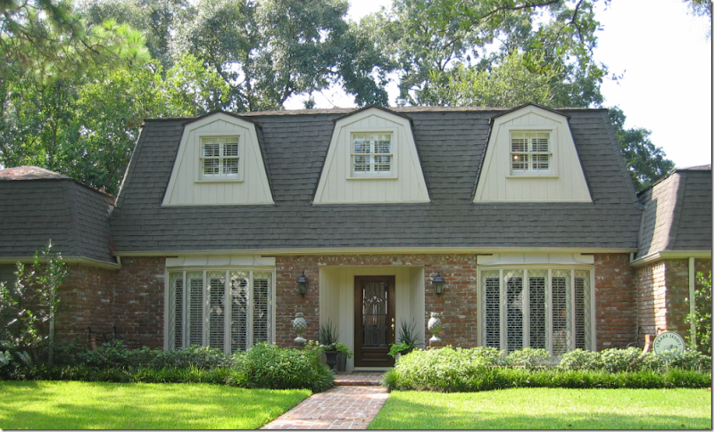
BEFORE: The Tanglewood House facade.
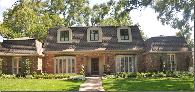
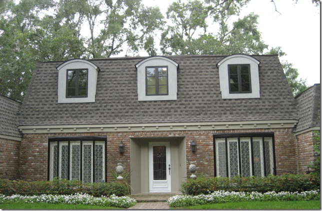
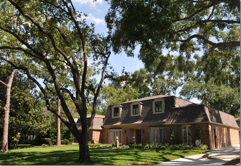
The old dormers were removed and replaced with more up-to-date windows. A new roof was put on and French styled plank wood shutters (designed by my client!) were added to the far left and right windows. Fresh new landscaping went in. Working with clients is a matter of give and take – some battles are lost along the way, some won. For instance, I really thought the roof should have gotten darker shingles, but I lost that one. And I fought hard to have the brick painted a beige color instead of the varied red color. I lost that one too! I also recommended the bow windows be replaced with something more updated – but agree the cost wasn’t worth the change it would bring. One recommendation I made – to paint the bow windows’ trim in the same dark color as the dormer windows - turned into a fiasco and was a huge mistake. The bow windows with the dark painted trim stood out and looked so exaggerated, it was relief when they were repainted to a less attention-grabbing taupe. I certainly am not a designer who isn’t willing to admit a mistake – which the window trim paint clearly was. Thankfully my clients agreed with me that I had royally screwed up. You will too:
In the middle of painting – the trim on the bow windows was tested. Yikes!!!!!! The horror!!!!!! The horror!!!!!!
OMG!!! So much better!
A side note – comments about the Tanglewood House left by you, the reader, have been almost 100 percent positive and that is something I am most thankful and most grateful for. As always – you are so kind and supportive, it boggles my mind! Of course, the three negative comments I DID get, ended up being the only ones that stuck in my mind! It’s not so much my feelings that get hurt, but I hate that the clients have to read them – especially when the negativity is really a troll aiming at me, personally. But, one negative comment bears repeating – just in case you missed it! An architect berated my choice of ruffled and scalloped slipcovers because the house’s lines and detailing, she said, was clearly modern – and my design would have been better suited for a chateau. That comment made me laugh. Does this house look modern to you? With its mansard roof, it clearly is a French styled house, or chateau – exactly why the slipcovers made sense!
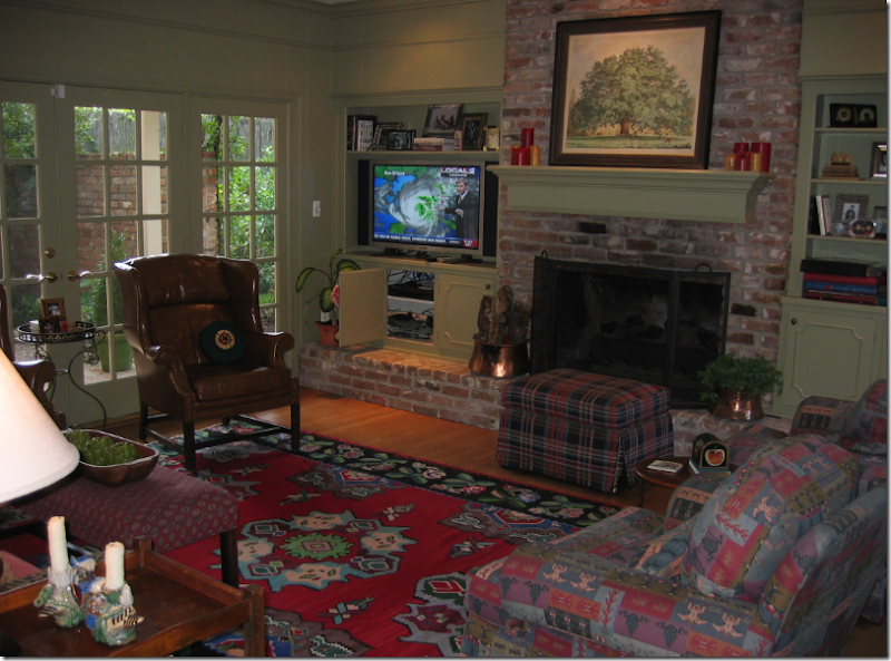
BEFORE: It started like this – the Family Room.
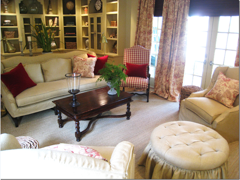
And after.
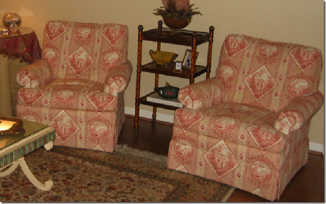
BEFORE: The Living Room looked like this until a few weeks ago. These chairs, completely remade, ended up in the Master Bedroom.
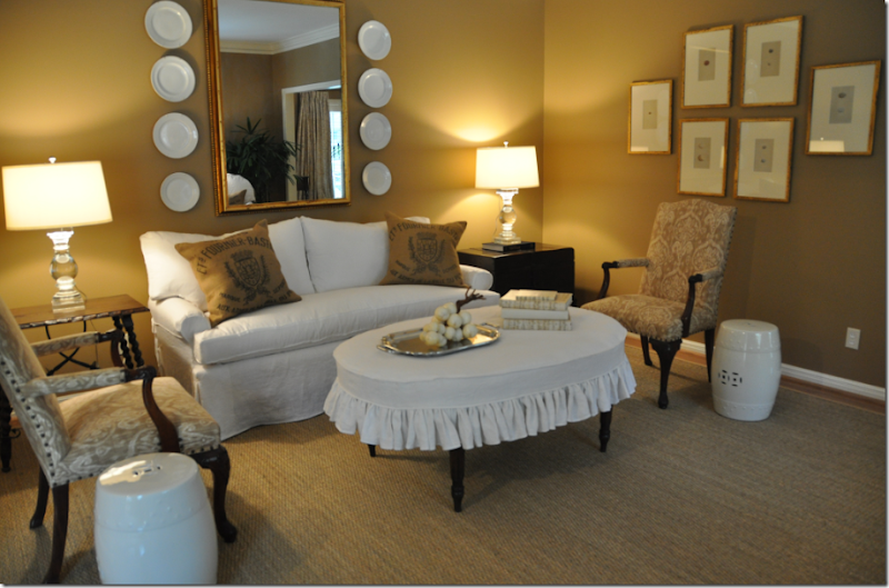
AFTER: The Living Room today.
AFTER: The Living Room.
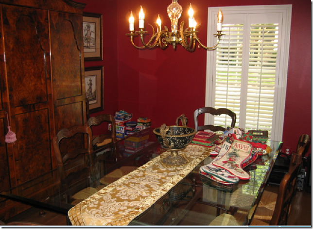
BEFORE: The Dining Room
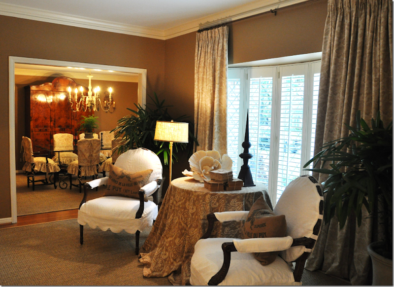
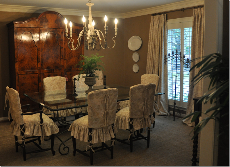
AFTER: The Dining Room
The last room to be finished is the master bedroom suite. First the bathroom had to be tackled. The master bathroom connected to the powder room – which was an unacceptable arrangement for the clients. From the combined large space, a separate master bathroom was created along with a separate, small powder room. The construction was a huge mess and it took a few months to finish, but in the end – it was mission accomplished.
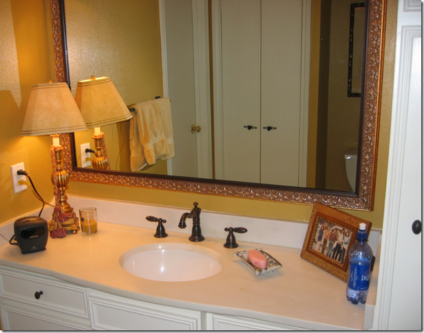
BEFORE: The Master Bathroom was a series of small rooms that contained the tub and toilet area and led to the powder room area out in the foyer hall. During construction, two separate rooms were created – a master bathroom and a powder room in the foyer hall. This mirror was antiqued and is now hanging the living room!
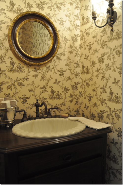
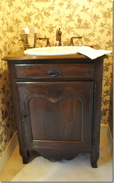
AFTER: The Powder Room is now a very small, but totally functional and private space for guests. The wallpaper is Colefax and Fowler Chinese Toile in brown and cream. We hung two double light sconces from Festoni and a mirror that was the client’s own. This round mirror is just the perfect size – and the gilding gives off a slightly dressy vibe. The floor is Creme de Marfil marble.
The sink is ivory colored and scalloped – a nice, extra detailing.
The sink was set into this French styled cabinet custom made by J. Tribble. The cabinet is wonderful – notice the authentic hinge hardware on the door. In such a tiny space, the sink becomes very important – and I think this was the perfect choice - understated, casual, and so good looking!!! Rather than mess up the walls with towel holders, my client put a few rolled guest towels in a small pewter bucket.
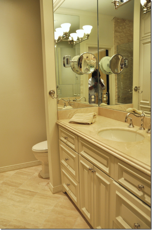
AFTER: The Master Bathroom – again, a rather small space, the clients chose to have one sink to gain countertop room. A cosmetic mirror was installed on the space-stretching mirrored walls to keep the sink area clear. Besides using mirrors to make the space appear larger, the color choices were kept monochromatic – another . Creamy marble was used for the countertops and floors. Before, the bathroom was a series of small rooms behind closed doors. Now it is all open, again helping to make the room appear larger. The toilet area is hidden behind the wall to the left of the vanity and the shower is across from the vanity. And yes, I know, I look like a total nerd in the mirror!!
The shower is large and luxurious. It is lined in a cream colored mini subway tile and to further streamline the edges, a frameless door was chosen. Inside the shower, we installed a regular shower head and a rain shower head.
BEFORE: The Master Bedroom.
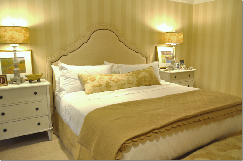
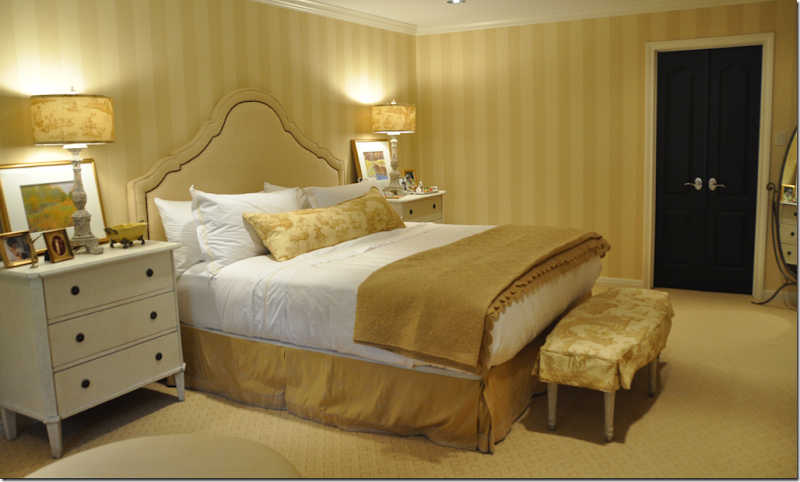
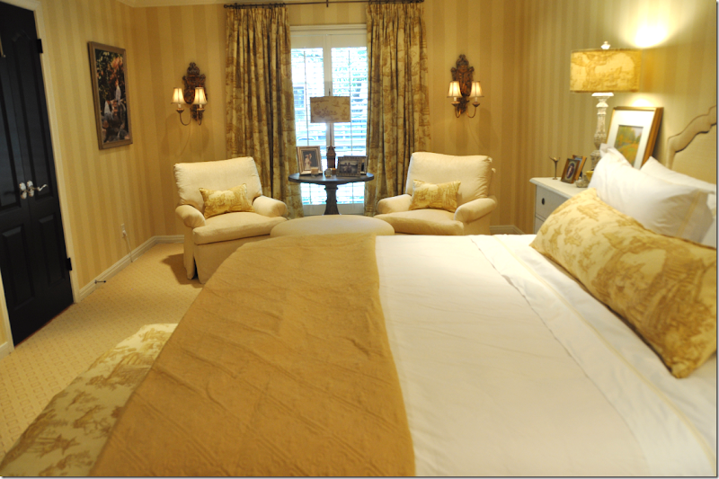
Once the messy master bathroom remodeling was completed, we started on redecorating the master bedroom suite. The client wanted to keep her bedding which she had recently purchased – so we chose a soft golden yellow as the color scheme. First, we took down the botanicals, and along with a fourth one, reframed and rematted them to hang in the stairwell. We wallpapered and replaced the carpet, bought a new ceiling fan (!!!!), added recessed lighting, and a flat screen TV was purchased to hang on the wall in front of the bed. The nightstands were not matching, nor were the lamps – so these were also replaced. Additionally, there was no headboard, so we added one in a shape the client had seen in a magazine.
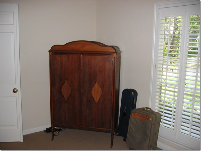
BEFORE: The bedroom is long and narrow, which allows for a nice sitting area on one side. The furniture was an accumulation of Grandmother’s goodies, which will now come in handy for college apartments!
BEFORE: Like the dining room and living room, there is one window in the master bedroom – facing north – which makes the room rather dark. The sunny golden yellow color scheme helps to brighten it up, as does the newly installed recessed lighting. Granny’s armoire held the TV – which made watching from the bed awkward. Now, the flat screen hangs on the wall directly in front of the bed – much better!
BEFORE: We took the two toile chairs in the living room and had them reworked and recovered in a soft chenille. To update the chairs – we had new cushions made, with no welting – just seams. The fabric was softly pleated on the rolled arms and a “dressmaker” skirt was added instead of the more “granny” short skirt.
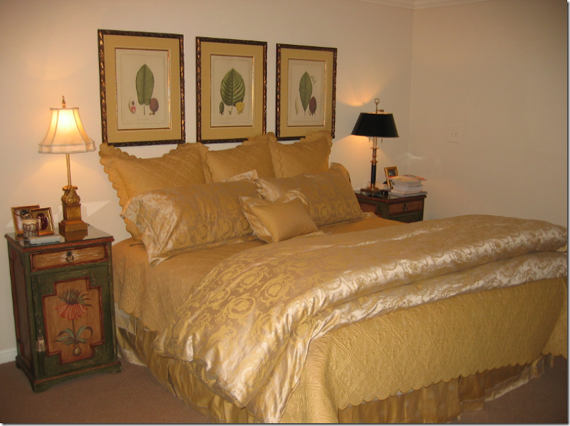
AFTER: The Master Bedroom.
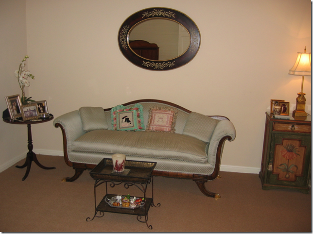
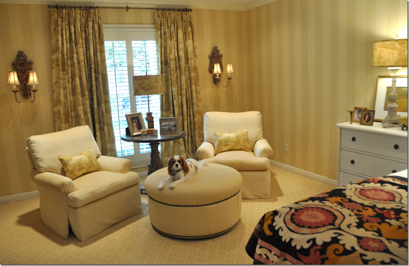
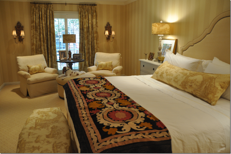
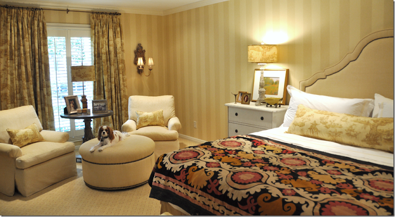
MIMI!!!!! This shows the sitting area in the master bedroom suite. To get the “bones” of the room freshened up – we wallpapered it in a muted two-toned golden yellow stripe – the stripe was chosen to visually raise the low ceiling. The beige berber carpet was replaced with a patterned, flat weave rug in the same color tone. We painted all the doors black for accent. There is only one small window in the room – with plantation shutters – so we added curtains fashioned out of a toile linen. To make the window appear larger, the curtains were hung a foot past the moldings on each side and we raised the rod to the ceiling. Each panel consists of two widths of fabric, lined in blackout to create weight for proper draping, and finally, the hem rests 3 inches on the floor. This formula is one I use for curtains over and over again and it really seems to work in most situations. We installed wood sconces to flank the window to further widen the long, but narrow room. All three lampshades in the room were made out of the toile fabric - a detail which adds a nice finishing touch. The round table between the chairs came from Aidan Gray and the round ottoman is upholstered in a raffia fabric, with nailhead trim, which is duplicated on the new headboard.
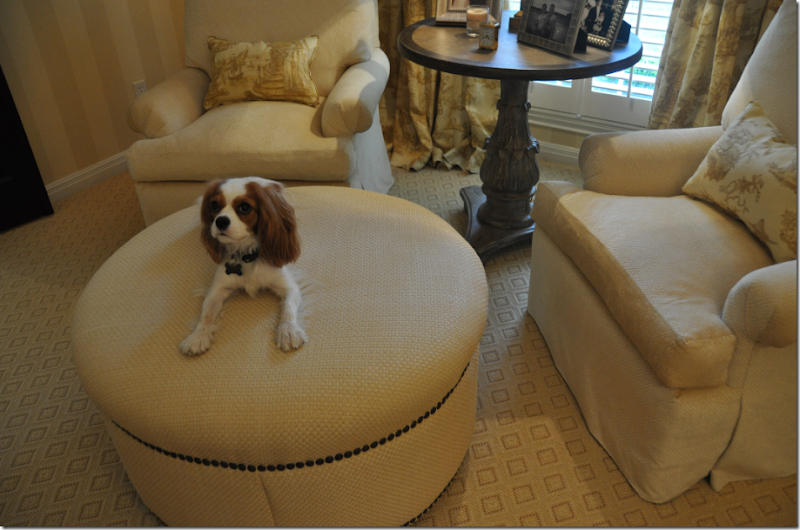
Close up of the sitting area. Note: The ottoman and table were both chosen in round shapes to soften all the square lines in the room.
MIMI!!!!! Such a good girl!!!! Here you can really see the pattern in the carpet and the raffia fabric on the ottoman. Also – notice how the chairs were updated with no welting, pleated arms, and dressmaker skirts which softly flow from the deck – without the need for a short skirt.
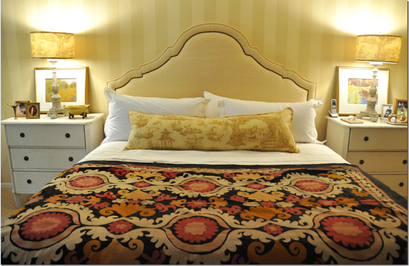
The headboard was designed to be flat, instead of the more padded upholstered headboards of the 90s. The nailhead trim further updates it. We purchased matching reproduction Swedish nightstands from Halo Styles and lamps from Aidan Gray. My client wanted to reuse her bedding, but I felt using all of it was too much gold and visually heavy. To lighten the bedding, we purchased a set of “hotel” sheets from Restoration Hardware, trimmed in gold. Now the white sheets and shams pop the gold bedding and headboard. A large lumbar pillow was made from the toile fabric. The three Euro shams in the gold were put away. And, I prefer the flat, scalloped matelasse to the more poufy duvet.
The slipcovered bench at the foot of the bed is from the Swedish line at Halo Styles.
Another bedding option she has, is this antique suzani. The golds and creams are great matches, and the black picks up the color of the doors.
Which do you prefer, the suzani?
Or the matelasse?
It’s a discussion in progress, as are all very important decisions! I’m not sure which one I prefer myself.
So, this is it for the Tanglewood House – I’ve hope you have enjoyed the series, as much as I have enjoyed designing the interiors!! Go here to read Part I and here to read Part II. Now, say goodnight Mimi!!
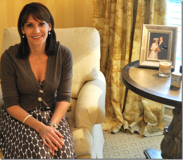
Oh, wait, someone else wants to say goodnight too! Now, don’t get excited, but she’s a Hollywood Star and I’ve kept my client’s identity a secret until now – didn’t want the Papparazzi to get wind of this.
Meet my client, my friend, the great Ms. Sandra Bullock! Well, she IS a dead ringer for her, isn’t she??????
Please, don’t kill me for this!!!!! ;)






So beautiful! Great job. Is it possible for you to tell if that is the creme de marfil marble also in the master bath? Thank you!
ReplyDeleteI am said architect you mentioned, and I want to say that the master bedroom is beautiful - the soft palette blends very well and the colors are muted and lovely, but still rich. The bathrooms are nice, too, I especially love the vignette of the rustic cabinet with the wallpaper - gorgeous! On the bed I prefer the suzani - it is a nice pop of color in that room, but not too contemporary - without a touch of color, the room may get too washed out.
ReplyDeleteSorry, but I stand by my comment about the interior living and dining rooms, especially when I see them with these gorgeous vignettes. First of all, the comment was made about the interior with no knowledge of the exterior. The exterior is very traditional, however, the taupe walls and white trim are very contemporary and sharp, and the rest of the house is more muted, yet rich and romantic, far more appropriate for the style of the house and the architecture, and the romantic, French-inspired furniture that was placed in those rooms. I don't think the ruffled slipcovers go with the sharp-glass covered dining table or the Ikea-esque bright white platters on the walls. Those rooms don't sing like the others do. It is tricky and not easy to mix traditional and contemporary (or any styles) and it is not working there.
I apologize if any criticism bothers you, but frankly, you're putting yourself on the web for the world to see, and the design world is wrought with criticism. In this profession, criticism should not be taken personally (unless of course someone is being personally insulting, then that's just crap), but should help us make better products for our clients, and make us better designers.
Your client loves it, I love the matelasse & forget the rest. Their criticism is always directed outward because inward they're afraid to look.
ReplyDeleteNancy - hi!!!! So - you read my comment, huh? haha!!!!! Yeah, it IS hard to take criticism - who doesn't feel that way? But also- it hurts for the client, who eagerly reads all the comments here. Yes, I am on the web, and Yes, I do put it out there for the world to see and judge, but I don't moderate comments. So many bloggers do moderate comments - when they get a negative one, it is deleted and no on ever gets to see it. So - allowing the negative comments to end up on the blog is a choice that I make in order to keep my blog honest. But, it still hurts - I wear no coat of armor.
ReplyDeleteAnyway - back to your discussion about the living room - I suppose you might call it modern to have the caramel walls and the white furniture, I just call it = trying to make something exciting out of an architecturally bland space. After we picked out the fabrics - I thought the whole scheme would be so washed out unless something dramatic happened, and that's why I did the dark walls. But if you look at the original room, you will see, there's not much happening in that space, aesthetically. Just four walls basically. And that's where the slips come in. If a client wants slipcovers - the problem becomes - how to make them interesting and attractive. You dont WANT them to look to like tailored upholstery, they are slip covers. so = you embellish them - you add scallops (Which I adore) or ruffles or buttons, or long ties, etc. etc. And again, I am a more feminine designer who absolutely hates contemporary design, so our two styles don't mix. Lastly, the client came to me because she knew my look, had seen my house, and wanted those scallops and slips for her own house. And she got what she wanted. I can't tell you how plesed and happy they are! So your comment telling me that they made a ridiculous choice and I should have talked them out of it - was very hurtful and frankly insulting to them and to me. Water under the bridge.
And - don't forget either the parameters of the job. I had to work with the furniture they had, it had to be done quickly and cheaply. Given a chance to buy new furniture, the rooms would look totally different. The dining room table is what it is - but the glass will be replaced with a piece of stone sometime soon. And I stand my choice of slips in the there. I think they are fabulous! haha!! And Ikea???? Those plates are all handpicked antique ironstone from England!!!! I could have put anything on the walls, but I wanted the white to pop - I wanted the round circles, as a shape, and I wanted ironstone so it wouldn't be perfect - they are stained in real life, and def. not a new set of dishes from Ikea when you see them. I think the ironstone helps "make the room" myself.
Nancy = you obviously love modern design and I wouldn't judge you for that. Myself, I would rather die than live a day in a contemporary house. I grew up in one, so I know!!! On the other hand, you would probably go into diabetic shock if you had to live with all my curtains and skirts, and slips, and blue and white porcelains, and transferware, and checks and tickings.
So - let's just agree to disagree. So glad you do find something to like about Cote de Texas!
take care and have a great weekend.
Cote- you are so well spoken and more class a woman could not have. I am beguiled by your patience and humbleness. You do put yourself on the web as the "said architect" has stated however I'm sure you do not do so to be second guessed as blogging is more of a past time instead of a resume.
ReplyDeleteFar be it from me to critique on who knows more about decor; however, to my rounda'bout knowledge-- there really is no right or wrong in decorating and design. That's what makes it artistic. It's whatever your vision is and your clients' appreciation for that vision want it to be.
I personally think you are a genius and love your refreshing tone of combining things that don't always "go". Anyone could stick perfectly in the contemporary lines of contemporary style- but aaack! why would they even visit here?
Thanks for all you do and the Tanglewilde home is unbelieavable, perfect, beautiful, outstanding, and i freakin' love it!
I think the house looks FABulous! I've really enjoyed the makeover and the solutions provided to your client. The home is so warm and inviting.
ReplyDeleteRegarding the bedroom, why not bring out the suzani for winter, the matelasse for summer?
Joni
ReplyDeleteGreat job! I particularly like the bathrooms and bedroom. The change in the slipcovers and the height of the curtains are so pleasing. Love the raffia. As far as the bedcovers are concerned I like both. Nice to have a change from time to time. Thanks for the interesting post.
Marion
Dear Joni,
ReplyDeleteWhat you have achieved is incredible - it is hard to believe that Tanglewood is the same home and I can well imagine just how delighted your clients are. To bring a job in on budget and to use existing furnishings is not an easy task and you have transformed their home into a beautiful and elegant space.
As for the Suzani - I love it and would use it depending on the season. I change my bedding for winter and summer as I love to snug things up when it is colder, so that is what I would do - use both but at different times of the year.
Bravo Joni, a triumph...enjoy the weekend, xv.....
Take a bow, Joni! Job well done!!! Bravo!!!! Beautiful!!!
ReplyDeleteWell done, Joni. Turned out just lovely.
ReplyDeleteI'm not Nancy, the architect, but Nancy, the Instructional Technology teacher. I absolutely love everything that you did--the rooms have such a serene feeling! I have fallen in love with the powder room--divine!
ReplyDeleteI think I like the matelasse on the end of the bed the best.
Thanks to you and your client for sharing,
Nancy Williams
Amazing and beautiful transformation...your clients are lucky people! The rooms are warm and inviting. Uninvited criticism is not warranted...taste and style is individual and subjective. Your designs are elegant but livable...my personal favorite! Thank you for sharing this with us!
ReplyDeletewell, here's my 2 cents worth: the powder room wallpaper and the Louis 15 cabinet are so beautiful; would that I could afford such a treatment - I would opt for a mirror just a trifle bigger but that is a mere detail. The bedroom: lovely, lovely, but I am dying for some color, some shriek of hot pink, turquoise, teal - just something; again can be added when mood strikes! Dining room:
ReplyDeletewow - her lady luncheon guests will be drooling with envy - yes, adorable doggie. Overall: a bangup job - and architecture?? well, let's face it - the house is a hybrid of styles to begin with and one thing about the serene backdrop: the beautiful client becomes the star, the pop of color the clothes she will wear and ultimately that is an end goal in itself. Congrats!
I have loved the whole house! Can you please come to London and do mine? Say room and board in exchange for design?! ;)
ReplyDeleteI really appreciate you showing us the bay window trim "mistake" -- It is SO comforting to know that even great designers like yourself don't always get it right on the first try. It gives the rest of us courage to experiment a little more and to be "okay" if we don't figure it all out the first time around. The taupe trim is lovely. The whole home is beautiful (a great update) and I think your point is well-made that the end result of any design is a collaboration between you and the client with the client's preferences always coming first. Personally I think Ms. Bullock has made lovely choices with your help, but it sounds like your armchair architect works on model homes where there's no client giving input -- every designer's dream, right? LOL
ReplyDeleteHi Joni! I think you've done a amazing job! The Tanglewood's home is looking so bautiful and charming. Needless to say I'm a big fan of the re-do. The bathroom is gorgeous! Their bedroom is a dream bedroom... love the metelasse on the bed, love the colors and the striped walls. Oh! That give so much inspiration... Love it! Thank you! Vanessa
ReplyDeleteJoni- I think you have worked magic on this home! I'm sure your client (who is adorable btw!) is thrilled. So many things to love, but especially LOVE the round raffia ottoman with the nail head detail, and the headboard!
ReplyDeleteI like the option of having a choice with the bedding, depending on the season, or just the client's whim!
Lovely job Joni.
Joni, it is obvious there are so many glaring mistakes in this house, such as the... um well there is the... oh yeah in the... wait I remember, IT ISN'T MY HOUSE. That is the one and only mistake I see, that this perfect redo didn't happen at my house. I curse the owner, not only is she beautiful, her house is a show stopper but her worst offense to me is she is your friend. Thank you for sharing your work it is a real joy to see the total outcome of your project. xo, MB
ReplyDeleteJoni,
ReplyDeleteThank you so much for posting this today - what a wonderful surprise to wake up and have another great post! You made my day!
Anyway, the house looks amazing! My personal favorites are the family room, - love, love love it - and the dining room. Those slips are amazing and I really like the glass table top (which is funny because usually I don't like glass tops - too many in my own past.) But, I think it looks great in her room. Back to the family room - the sofa is to die for! Actually, the whole room is. I hope she is extremely happy - It looks awesome!
Thank you for all you do - you provide us with so much to dream about - I almost feel like I owe you for all that you bring to us!
Best Wishes,
Angie
Joni, I love that you have helped your client work with what she has and that you and your client were willing to share the photos with your blog friends around the world. Most of us want to, or have to use our basic furniture purchases in trying to redecorate and you have done an incredible job doing just that. You transformed the bedroom into a warm and luxurious space. Personally I love the matelasse but it is nice to be able to quickly make a new look for the room.
ReplyDeleteJoni, this home and your work for it is just beautiful. I especially like the choice of colors and it all flows together easily. Also, I prefer the matelasse in the master bedroom to the suzani. I look forward to seeing more of your work here! Deborah
ReplyDeleteJoni (and Sandra B.)
ReplyDeleteI love what you've created! This house is so pretty and warm with alot of wonderful detailing. You both shoud be thrilled and so proud of a job well done!!
xx-Gina
You are obviously a talented and skilled designer. Thanks for sharing your portfolio. My personal favorite is the sitting arrangement in the bedroom. Yummy! I vote for the suzani, otherwise the room can go the way of a hotel room, albeit a beautiful hotel room!
ReplyDeleteMy comment regarding the comments..Joni is a big girl and can take the heat obviously. I feel compelled to defend the architect. She has a relevant perspective and while it was clearly critical, the tone wasn't disrespectful.
I especially love the master bedroom and think the suzani really adds that special something.
ReplyDeleteThe client and her puppy are totally adorable....as are you.
oh wow.....i've looked at the pictures 3-4 times already. i love this bathroom and bedroom. i would never leave! at first, when i was reading i thought this is going to be too much yellow/gold, but no, it was just perfect. love, love, love the seating area and headboard.....man, this took my breath away. i hope you'll continue to show more transformations of your clients homes
ReplyDeleteJoni, you have done an absolutely beautiful job on this house! The living & dining rooms are my favorites. Don't take stock in the few negative comments you received. They are the know-it- alls and some jealousy going on with these people. I love, love your blog & truly enjoy viewing your work & words! Keep up the great work!
ReplyDeleteGreat job Joni! Your client now has a home that's a cohesive whole, it suits her architecture, it makes her happy and you're proud of the result. At the end of the day that's all that matters.
ReplyDeleteBrava too on your handling of not just the original criticism, but also the author of said criticism. I applaud your decision to have unmoderated comments on your blog, that's a level of exposure I won't assume, and I understand why you do. It's a testament to your character, frankly.
Like a lot of designers, I do a daily walk with my own self doubts and like most functioning adults, I've learned over time to quiet those voices in my head. Every once in a while though, someone will say something that comes across like a poke in the eye and smarts for days afterward. It's funny, I can handle someone in my life behaving that way better than I can an anonymous stranger on the Internet.
I can relate to your experience here and you handles it the same way you handled this job, with grace and aplomb. You Joni, are an inspiration, and that's coming from a die hard modernist!
Wow,beautiful again. I loooove that round ottoman!!!!! Might have to show that to one of my clients! It all looks amazing, love the suzani. And especially that precious angel-face puppy!
ReplyDeleteSally W.
What a wonderful home you made for your clinets. I just knew something special was going to happen today, and this, the ending to "The Tanglewood Home" was it.
ReplyDeleteJoni, I love, love, love everything you did here to this older home of Houston. The master bedroom is fabulous, the selections you made, outstanding. The re-work of the chopped up Master bath and powder room, ( I do remember those when your guest had to use part of the master bath) you did a wonderful job. That powder room is one that I would (if I lived there) have to keep going in just to look at it. In the master bath, what a great shower, love the tile work. Your attention to detail in all of these rooms of the re-making of the Tanglewood home are ones to remember. You are truly blessed with Talent, clients that love what you do, and readers that can't wait for your next installment to Cote De Texas.
One of your many fans,
Joy
Hey Joni - What a great post on so many levels. Once again I wish were still your sister in law. I would be right there (as in doing drive bys with coffee!) cheering you on. You are talented and brave. You give your clients your talent, your great eye, and your heart. Of course, no one is ever going to agree with everything you do, and really , at the end of the day, the question is, "Have you served your client to the best of your ability?"
ReplyDeleteThe re-do is wonderful and being one who loves many styles and often can't figure out exactly what my aesthetic is, I admire your self awareness and commitment to your style and what you love.
Absolutely beautiful job on your part and congrats to your client who is very fortunate to have read Cote de Texas and found YOU!
Joni,
ReplyDeleteYou did an outstanding job! I absolutely love it and think it translates perfectly. It's such a beautiful family space.
Have a GREAT weekend!
xx
Kara
Oh Joni...it is perfection no matter what anyone says. Do take a bow! You are quite a classy lady responding the way you did...I woud tell her to take a hike!!!
ReplyDeleteLove you and your work!
It is so great to see the outside of the house - so often we see the inside of homes but never get to see what the home looks like, and as you know, I love the exterior of homes as much as the interior! You have told me in the past that many of the renovation candidates that I have looked at in Atlanta remind you of homes in Houston, and this home would be right at home in certain areas of Atlanta - charming neighborhoods developed in the 50s and 60s, with great lots and great bones. Very few of these homes are torn down, because the cost of land is so high, and it makes more sense to renovate rather than tear down.
ReplyDeleteI loved the master bedroom the most out of any rooms in the house. It was great to see the GJ Styles/Halo pieces - I know that you were wondering how they would look in real life, and they look great! I prefer the matalesse (sp?) on the bed - the room is so nice and soothing and monochromatic, and the suzani is jarring to me. But, I have never been a fan of suzanis (I don't think I have ever posted one on my blog!).
Great job!
So is simply saying you don't like something "criticism?" I would hope a reader saying he/she doesn't like something wouldn't upset the client. I mean, who cares if some reader doesn't like something? Either way, I should have remembered "if you have nothing nice to say, don't say anything at all." Sorry.
ReplyDeleteWhat a fantastic transformation, Joni. Love how you took a charming home and "lightened" everything. Have a great weekend!
ReplyDeleteThese rooms are beautiful, relaxed and French. I adore the scallops on the slips, the black doors in the Master and the shower in the master bath. I agree, your client chose you as she has seen your look and wants it. Giving her something modern would not have been good client relations. It is a tragedy that our interiors today are created devoid of architectural interest by builders who are frankly, following the dollar. Who can blame them? They have to make a profit, so architectural interest falls by the wayside. I think the house is very traditional and a classic example of the region. Having come from Oklahoma, now living in a 'burb of DC, I keep trying to find a house that is characteristic of the style I loved and left behind. But, it doesn't exist as the DC area has it's own characteristic style. Brava Joni, you have a lucky client indeed! Oh, and I like the suzani and the matelasse.
ReplyDeleteAmazing commentary--I only made it through a few. But I would not hire "Nancy" as an architect or designer. She clearly doesn't understand Southern or French style and the importance of an embracing space. As for knowledge of stone ware or antique china--must be minimal. I, personally, do not like ruffles or puddling drapes--but they have their place. As I watch current and emerging trends, it is clear that this design will remain current for a long time. Besides, isn't the entire and only point to make the client very happy and inform/educate along the way.
ReplyDeleteLove this post.
my daughter just opened an inspiration file on the computer for me. the pic of the living room is the first pic put into this file. I will try and come close to what you have done with a true budget of $500. (you did have to find the humor in that) the houses I love the most are really "homes". Tanglewood is a home in every aspect. I just wish it were my home.
ReplyDeleteJoni,
ReplyDeleteI would have thought the same thing, that the windows below should be repeated in the same colour as above, interesting that it truly did not work. Wow, good lesson for all of us. We all love
and appreciate the designers that show what went wrong (because it happens to anyone that is constantly reaching beyond their comfort zone, past what we know for sure) so thanks for sharing that!! Is that a computer generated black window trim or did they all actually get painted and then have to go back? Just curious.
Also regarding the negative comments, I always wonder why you don't delete them (and it's amazing how those are the ones that stick in our heads, i hate that) but I thought the reason you left them is because it creates even more dialogue with people commenting on the comments, etc. A good strategy in the end, but if it bothers you, why not just delete??
Beautiful job you did on this house! Thanks for sharing it with us!
By the way I think the matlasse is better, the other one becomes the most important piece in the room visually because it's so strong. (just my opinion)
ReplyDeleteJoni, nice job.It really feels so light and pulled together. I've learned a lot from this post!
ReplyDeleteI just read the comments (which were fascinating) and got my answer as to why you keep the comments!!
ReplyDeleteIt's what makes your blog even more interesting too!
xo
Maria
ps. By the way, anytime you want a colour expert as a guest on the roundtable, let me know :)
The Tanglewood home turned out just lovely! You do fabulous work.
ReplyDeleteI vote for the suzani at the end of the bed. It gives the room a nice pop of color.
Wow, so beautiful, Joni -- all of it! I love the powder room. Mine is of similar size and now I know that I can actually do something with it. The master bedroom... again, what a transformation! With and without the suzani, it's gorgeous. Didn't you say they were orginally planning on tearing down the house and rebuilding? I bet they're thrilled to death that they hired you instead. It IS a brand new home!
ReplyDeleteBeautiful job, Joni. And I love that while you hear other people's comments you stick by your own design tastes. I think this house has turned out stunning and I would happily live there.
ReplyDeleteOddly, as much as I love solid fabrics, on this one I love the suzani.
Joni, the rooms and facade look just beautiful. You did a magnificent job and your client has great taste also! I especially love the powder room, adore that Colefax & Fowler wallpaper - so regal! And the master bath - I love the small subway tile in the shower. But, it is all gorgeous. The master bedroom is lovely and it is all so pretty and tranquil and restful.
ReplyDeleteMimi is a star - what a doll. I can see how you will miss her and her beautiful owner.
Love and hugs and a big congrats! Terri
Joni,
ReplyDeleteEverything about this house is wonderful!!! I think the flow of all of the rooms is great and can't wait to try some of these ideas myself.
I think the matelasse is perfect for spring/summer and the suzani would be best for fall/winter.
Could you please share the paint colors that you haven't yet listed in Tanglewood I and Tanglewood II. I'd love to know what they are.
Jeannie
You go girl! Your comment reminded me of Dixie Carter on Designing Women. Remember that show? Love all your new pics. Great job as always.
ReplyDeleteJoni, Love,love,love this house,I can see that you achieved the look that you and your client were going for. Whether one could live with the same look or not, they have to appreciate it for what it is,"GOOD DESIGN". When a designer of any kind looks at a project ONLY from their perspective it limits new possibilities. A truly GOOD designer will be able to appreciate good design whether it is their style or not. Bravo for a wonderfully designed home for your client. Keep doing what you do,because you do it so WELL, Kathysue
ReplyDeleteI second the motion that Maria Killam would be a fab addition to the skirted roundtable!
ReplyDeleteI love everything you did with this house, you made it a home for Ms. B and her sweet Mimi...
You do not see it in this blog but I want to mention the fireplace transformation, I love the no mantel look and that you painted out the brick...it takes skill to get clients to do that! And the black doors, if you remember I commented on that before...it is just a wonderful thing to do in most homes...
I love the matlasse for summer...the suzani for winter...
The only thing I would change in the master is the base of the lamps, my opinion they should be black for a pop of contrast on the off white nightstands...
Leaving all the comments in the blog, makes for interesting reading...sometimes people forget designers have clients...and they have wants and loves that we need to add to their homes...I love all the feminine touches in the dining room and livingroom...great rooms, light the candles Ms B and have a party!
Hi Joni,
ReplyDeleteThe tranformation is so lovely and I particularly love the wall color in the dining/living areas. I have a similar color in my family room and a lighter shade of venetian plaster throughout my other living areas and kitchen. I have been heavily influenced and love the white wall trend, but because I already suffer from multiple personalilities when it comes to design my family would absolutely have me committed if I started changing the wall color!!!
In the master bedroom, I think the matelasse provides a cohesive look. However, I LOVE the Suzani and think it really adds BLING to the room, but would blend better if something in the reddish color (it looks like red) were added to the sitting area.
You rock Joni! I love your blog and your design style and wish you lived in Nashville or I lived back in Houston. By any chance, do you provide any online consultation?
Have a super weekend!!!
Nola
Oh my, I am so envious right now of the home you did that it is almost a sin!! It is just stunning. Truly a gift to be able to live in such beauty.
ReplyDeleteYou are so talanted. LOVE it.
Jennifer
Just lovely! The powder room is wonderful, as is the master bath. Love the elegance and warmth of the master bedroom. Cute doggie!
ReplyDeleteGee I need a bathroom remodled...can you travel to California?!?
Suzanne
I think I like the matelasse better...I Really love the built ins in the family room and I LOVE the bedroom, it looks so nice and calming! I'll have to save these pictures as inspiration for our new master...we are buying our first place so I finally get to do all the rooms the way we'll like it! Thanks for wonderful inspiration!
ReplyDeleteP.S. Mimi is Gorgeous!!..just too cute lol
ReplyDeleteI think I enjoyed this re-do almost as much as your clients (O:
ReplyDeleteJoni,
ReplyDeleteI clipped 2 photos to Evernote(just like clipping magazines!) first, the side mirror in the Mbth...that could work for our bth. 2nd the suzani on the bed, I love the contrast of the subtle colors of the mbdrm with the graphic-"ness" of the suzani.
A pleasure to see an entire project of yours, w before and afters. I look forward to more.
Laura
Love the Living Room and Master Bedroom. Absolutely love the soothing palate and compatibility of all the rooms. I personally prefer the Matelasse, but wouldn't object to dragging the suzani out in winter with some complimentary pillows. You handled Nancy's comments beautifully. I find it much more challenging and rewarding to incorporate some of the owner's own furniture and accessories rather than buying all new. It is after all their home! Bravo! Well Done! Cindy
ReplyDeleteI'm so thankful that there is such diversity among interior designers, as well as between common folk. As many have expressed, art is such a subjective issue and highly personal. What is a pig's ear to one person becomes a silk purse to another. Consequently, when expressing ones likes and dislikes it is best to proceed with much caution and to lay it out in loving words because we humans (no matter how mature we think we've become) find it rather difficult to handle criticism. Even when served with sugar and spice and all things nice, criticism can be stinging in its application. Many times it depends on ones personality and temperament as to how well criticism is received and processed. Funny but when reflecting upon artistic trends (especially paintings by older traditionalists or purists throughout the ages) one sees initial non acceptance and scalding critiques of those artists and their techniques; however, as time passes, many of those trend setting artists equal or surpass the very individuals that critiqued them.
ReplyDeleteLife is quite funny, isn’t it? Most likely that is a reminder to us not to take it too seriously!!!!
Joni... BRAVO!! I love love love what you've done. The color scheme is perfect for the small spaces and I really love that you were able to incorporate some of your clients existing peices and accessories. you did a great job!
ReplyDeleteWhat a beautiful home! I really love the colors you chose. The Master Bedroom is my favorite. You really did a terrific job! By the way Mimi is the cutest puppy.
ReplyDeleteHi Joni!
ReplyDeleteLove the end result! My vote is definitely for the suzani! The thing about critics is that they so often love to criticize, because they can't DO! Your work is simply divine girlfriend!
Beautiful job Joni! The rooms are beautiful and "liveable"; I love that you have reinvented SB's own pieces and purchased new pieces that the "real world" can afford! As for the architect...well, the fact that she thought the ironstone was from IKEA says it all! Melanie
ReplyDeleteJoni,
ReplyDeleteAn absolutely beautiful job! All I can say is "Wow"!
Jackie
www.TheUrbanMarketHouston.com
Hi Joni, I love your blog and the Tanglewood project has been my fave thing you've shared with us. I have to say I adored all of it... except for the dining room chair covers!!
ReplyDeleteI thought the white platters on the dining room walls were truly lovely & I loved how you turned the family room into a chic, contemporary space, and retained the practical elements of design, allowing the boys to still use their computers.
I don't know why the dining room chairs upset me - too fussy for my tastes i think? I don't know! But I thought Nancy the architect made some good points, and I think it's VITAL that you continue to allow unmoderated comments - that is a true blog. If a blogger moderates comments, she doesn't write a blog - she publishes 'fanmail' - you, Joni, are a true blogger!!
I love how you worked within a budget and how you constantly recycled items over and over again, giving the client value for money. This house is a true testament to your vision as a designer, congratulations!
PS - I forgot to say - I LOVE THE BLACK DOORS!!!
Joni - what a wonderful job! And it's so nice that you share all your helpful tips and details. As for the architect's comments ... an architect is not an interior designer. And that's all I'll say.
ReplyDelete–Lana
Joni the house looks so wonderful! The powder w/ the tiny mirror is such a great touch. I love the exterior also.
ReplyDeleteGREAT JOB!
Most definitely the suzani. It's a punch of something different and helps the door not look out of place.
ReplyDeleteHi Joni!
ReplyDeleteAMAZING!! I just adore what you did with this gorgeous home. Actually you give me inspiration to go for the dreams I have for my own home even though my husband and I are both teachers. We live in a modest home in a suburb of Dallas. I love the magic you do with a home and help the owner feel like a queen. I sure would hate to feel that I had to design my home according to the 70's ranch home style so indicative of our neighborhood. YOU ARE WONDERFULLY TALENTED!! FANTASTIC JOB!! Thank you from all of us that work little by little to make our dreams come true and our homes our little castles!! Love ya!!
Joni from Dallas
Hi Joni,
ReplyDeleteHi Joni, Like Megan, I feel like I've learned so much from all your posts on the Tanglewood home. It truly turned out beautifully! It was delightful getting to meet the owner at the end....she is as lovely as the home you've created for her and her family! And Mimi is adorable...makes me want a Cavelier King Charles doggie. :-)
Susan
Just beautiful!!!!!!!!! I love everything about it. Suzani for winter (if there really is much of a winter in Texas, that is...) and matelasse for spring/summer! You really pulled this house into something magnificent. You should call Better Homes and Gardens back for a photo shoot of this project. And it was fascinating for me to see the little details that made such a change on the exterior. I am in love with your many slipcover transformations. But tell me, WHAT is that gorgeous Greek key fabric in the bedroom? I just love it! Thanks for sharing. I'll come back to this over and over again!!!
ReplyDeleteJoni,
ReplyDeleteA successful designer is one that can take a client's budget and the items they own and create something wonderful. You have attained that with the Tanglewood house.
I love your style and your selections for this house. It certainly doesn't appear that you had to "make do" with anything. You have created a fantastic base for this client to build upon in the many years to come. Keep doin' what ya do! As far as the "Ikea plate" comment, enough said!
Hi Joni~
ReplyDeleteBravo on creating the perfect solutions for a home with your client. It's not a show house, it's a home, with the needs and wishes of lady and her family. Of course she is a happy as her pretty picture.
Donna
Beautiful job Joni. Of course! You're simply amazing at what you do!
ReplyDeleteI hope you keep both spreads.
ReplyDeleteI'm thinking about designer / client relationships this week. Two things grab me.
This moved me: "When I left her house today, probably not to return for quite a while, it was a sad occasion"
My architect friend Carl told me long ago about attachments he has with projects. You live it every day, often for years. You are more responsible for the results than the clients.
Then it's finished. The clients tell you to close the door behind you on your way out. You go cold turkey.
The second thing is more fun, more expensive, more satisfying for the client. It's the "If you give a mouse a cookie" effect. A simple design consultation becomes a serious renovation.
Congratulations to designer and owners.
I love, love, love it! I'm looking into redoing out bedroom and take great direction from the inspiration you've provided.
ReplyDeleteI love the Suzani, but he monochromatic is good for the warm humid months the gulf provides--and so abundantly does it provide!
Thank you so much for sharing and I love your blog,
Julianna
Great job Joni. How exciting to see the before and after , I love the master! Of course you know I want a Suzanni like this!
ReplyDeleteThanks everyone for all the support and great comments. I can't tell you how much it means to me. Makes everything all worth it. Y'all are the best!
ReplyDeleteJust a thought or two - it probably may be awhile before I post my own work again. I only post that work that I think is what Cote de Texas readers would like. Truthfully, a lot of my projects are more client driven - and thereful are not necessarily my personal taste. What made the Tanglewood House unique for me was that my client and I saw eye to eye on everything and we shared the same taste. That's a real rarity in this business. It made the job more like playing - not work. It was a great job to get, to tell you the truth - wonderful cients, great fun. I just wish there were more clients out there that loved slipcovers and seagrass!!!!!!
ALSO=about criticism. yeah, it stings, a lot. I've said that before. But to tell you the truth - I don't moderate so that the commenting can be more honest. if I only allowed the positive comments -the "great job" comments, and erased the negative ones, I would feel like a fraud. I think sometimes the reason why the anon criticism cuts so deep is because it is said with such truth from the person - and that hurts. I know that a lot of the positive comments are, well, - not exactly truthful. People who sign their name have too good of manners to be rude or mean, so they say nice things. But an anon - boy, he can speak his mind! I would just feel like the biggest phony in the world if l let only the nice, sweet comments to come through and not the negative ones. Even though they are sooooooooooooooooo embarassing!!!!!!! Yes!!! So, that's the story on the moderating. Feel free to be truthful, just don't be mean to be mean or rude to hurt. Just be truthful, that's all.
As always - thank you for all the comments. They truly are mind-boggling.
Tried to email you back from the other comment but it bounced back so....
ReplyDeleteLaura Ashley????
Theres no cabbage rose polished cotton chintz, coordinating pencil cup or ruffled lampshade to be seen.
New glasses or meds.....
Great job, Joni! I'm not Nancy the architect, either, just an admirer of all things decor! I think it is silly to require that everything "fit" into some sort of definition. Keep doing what you are doing by making things interesting! I love mixing new with old, this style with that stle, sharp with soft. Life is too short to be worried about fitting in to a category.
ReplyDeleteLove the powder room, the master bathroom shower tile, and the chair re-do in the bedroom. Great tips! Nancy
There's lots I love but one that jumps out at me is the dining room. If you'd done nothing but paint the walls it would have been enough because it allowed the GORGEOUS piece of furniture against the wall (don't know what it's called) to stand out whereas it was lost before. Also love the "new' chairs. And, and, and....
ReplyDeleteAnn
What a beautiful home that you & your client have created. As I am in the middle of a renovation, I both recognize & appreciate the work & the fun!
ReplyDeleteI hope that you will continue to post your work. I, too, have saved pictures from this home & regularly take them to my own designer. He is now familiar with Cote de Texas! Because of you (& the Tanglwood home), I have mustered the courage to paint my fireplace, skirt a chair or two & will likely paint my own living room the same color as this LR/DR!
Many thanks for your beautiful work. I, too, wish that I could work with you. I know that we would make a great team (tho I don't have a Mimi)!
Your work and your blog, start my day on an upbeat note. Keep up the amazing work!
Joni!
ReplyDeleteI love it all. I like the Suzani... it adds that not-too-perfect spin that every room needs, thus making it more perfect. Makes perfect sense right? ;) Items that fall into that category are always A) hardest to find and B) hardest to sell the client on. You've done a great job!
Thanks for sharing.. love the carpet in the master! Mimi and her mommy are lucky to have you!!!
XO
erika
Joni; What can I really state that others have not? But have to throw in my two cents & say I adore your work. I don't agree with "Nancy the Architect" @ all. I don't believe that taupe walls & wh. trim constitute only a modern room. I learned a while back that just because the a person is an "architect", does not mean you may fond of their work (my youngest brother is an architect). He & I are not even on the same playing field. I am a fan of the suzani! Wow! The whole home is stupendous. The skirted ottoman/coffee table is one of my favorites, along with the powder rooms wallpaper. The masterbath's shower tile, I covet!
ReplyDeleteThe homes exterior was a terrific transformation & I applaud you for laughing at yourself when you made a choice you didn't love with the bow windows! You are terrific!
Mimi- oh Mimi, what a star in that room! Now I will be stalking Tanglewood in my spare time, wanting to see the real McCoy! Kuddos to you Joni xxxdeb (out here in Katy)
1. My mother taught me that if you cannot say anything nice, then just keep it to yourself.
ReplyDelete2. I think that you shouldn't allow anonymous comments. Perhaps it would prevent people from making self-righteous, preachy comments on someone else's blog. They should get their own blog for those types of comments and thoughts.
3. Most importantly, love your work. Wish you lived in TN where I could use you as I love seagrass and slipcovers. I am sure that part of your reason for keeping this blog is to showcase your talent and inspire others in the decorating of their home. For 99.9% of your readers, you do just that so please remember that. And when you think about the negative comments, just remember how unhappy people who rain on someone else's sunshine must be.
I love the taupe paint used on the outside of the house. If you don't mind, what color name and brand is it? I am thinking that would look great for the trim on the outside of my home and a cream color for the body. What color of cream do you advise to paint the brick exterior of the home?
ReplyDeleteBRAVO...wonderful I love it all....
ReplyDeleteI vote for the suzani...but both look nice :)
Great job,
Kathy :)
It all looks beautiful and as long as your client loves her house that is ALL that matters!
ReplyDeleteIn regards to the Suzani vs the matelasse, I like them both and would frequently switch it out depending on my mood or even the season.....It's nice to have 2 choices.
You did a wonderful job, 5 stars all the way. However after seeing your last comment on my blog I am going to have to re-think our whole relationship...lol How on this earth could you like coordinating books?????
ReplyDeleteThis home is simply gorgeous. You've done a fabulous job, and I just know that your client is LOVING her new rooms.
ReplyDeleteI completely disagree with that architect's assessment. I see absolutely NOTHING contemporary about this house. I think all of your choices are not only appropriate, but actually enhance the traditional feel of the house. The exterior gives a hint of what's to come on the inside, and what you've accomplished certainly doesn't disappoint.
what a lovely home! The bedroom looks so relaxing and peaceful. I love the suzani.
ReplyDeleteI do not care for the suzani on the bed. I do like all the new lamps, and the vine tables. I like the quieter, more sophisticated colors, and the new dormers were magic.
ReplyDeleteI can see what’s bad, and see some of the same solutions, but I cannot so well describe why the new solutions are better, and that is why your blog is so good, particularly on the macmansions post you did a while back. Would you please add a link to it, even it was not one of the most popular posts?
I urge any of your readers to make sure their decorators/designers can read drawings well. My decorator saved my lots of money changing some windows on my architect’s plans, well before anything was final.
Those pesky architects! Sometimes they can be bombastic, but we can’t live without them. I did appreciate Nancy’s explanation. But that is kind of what you pay for, at the same time. No body wants an architect who says “lemme think about it, I haven’t formed an opinion just yet.”
I hope your beautiful client will get the stone top for the dining table soon (honed). I love the photo in the family room (before) with the TV on the weather channel. Thanks again for the constant flow of information and intertainment.
Hi Joni, love the house (and the slipcovers!) Your clients must be thrilled with their "new" house. Would it be possible for you to tell me where you found the wine jugs that you used in the family room bookshelves. That room turned out fabulous. ALso, I love the raffia that you used on the ottoman and headboard...can you tell me where I can find it. I'm redoing my master bedroom and would love to do a bench in the raffia. Thanks so much!
ReplyDeleteLove it, Joni. As always. Great story, great photos.
ReplyDeleteI *for some reason* am picturing a wood top on that table...kind of french. It would add depth and would fit a budget better than stone.
Sandra is a lucky girl!
I think you did a wonderful job. It is always a challenge to incorporate so many of a client's former pieces, and still acheive a totally new look, and I think you did that masterfully.
ReplyDeleteDon't you love those J. Tribble sink cabinets? I recently used a gothic one with the new Cole and Sons wallpaper with all the bare trees... think it's called Woods...and both I and my client absolutely loved it!1
She's adorable, her dog is adorable, her house is adorable, and her designer is adorable! Oh, Joni! GREAT job! And I love, love, love the bedroom! Oh, it is the icing on the cake. I want one, too!!!
ReplyDeleteXO,
Sheila :-)
"You dont WANT them to look to like tailored upholstery, they are slip covers"
ReplyDeleteI question that very narrow definition of "proper" slip covers. Tailored slip covers to me look adult and smart. The ones with the scallops and frilly doo-dads look little-girlish. They remind me of a schoolgirl's notebook doodled up with ponies and Barbies.
Hi Joni,
ReplyDeleteI absolutelt love your blog. You are always so informative and honest. We designers make mistakes and it's so refreshing to here about others mistakes sometimes!! There is something about being a designer that opens you up to critisism more than other professions. Everyone has an opinion on how it could be better!! It can really hurt because most of the time you have put your heart and soul into the project. That said I especially loved the master bedroom. So tranquil and cozy!! I also have a room with limited windows and I recently saw a few photos with mirrors over the bedside tables with lamps in front. It looked pretty fabulous. Just a thought.
Great job and thanks so much for sharing.
Love your blog- I am passing along the " One Lovely Blog Award" to you today. Check my blog for the picture to attach to the face of your blog.
ReplyDeleteTo accept it you can blog about 15 blogs that you appreciate and enjoy…
Carol Ann x
Here's my $.02... If the client's happy and got what she wants, it doesn't really matter what anyone else think. She's the one who has to live in the house, not any of us. We have to remember that not everyone has the same detailed design eye that a decorator, designer or architect has. They know what they like and how they want their house to look. In the end, that's what counts.
ReplyDeleteAnd, Joni, I think you did a terrific job... really!
What a beautiful home! (The owner isn't too bad herself ;)
ReplyDeleteI've loved reading about this transformation. It is always soooo much fun when your client shares your style! I have to ask, where did you find that suzani? I've been looking everywhere for one with those exact colors - it's fabulous!
ReplyDeleteYou have a fabulous eye for decor and I LOVE everything! I REALLY like how each room is different then the last, but yet the flow is wonderful. So many little touches that make it look more personal and not cookie cutter. Like I said, I LOVE it all and would love to live in that house. Thanks for sharing.
ReplyDeleteAnother Anon just wanting to chime in that your colors - white, khaki, and black - are classic! And all the rooms have been rearranged to beautifully balanced harmony as well as comfort. Plus, I LOVED that you included photos of the exterior window trim color you rejected, because that allows us see the process. Thanks for printing opposing viewpoints, too, because it does make interesting reading. Your blog is great. Thanks.
ReplyDeleteJoni, everything turned out so beautifully! My favorites are the powder room and the master shower, though I think everything looks great.
ReplyDeleteI vote for the matelasse on the bed as I think it lets the pretty toile lumbar pillow and lampshades stand out more (that really was my vote anyway, but I was especially glad to see that it was the opposite of Nancy the architect's choice).
My hat is ever off to you!
This house now is very classy and fresh! I would keep the Suzani for Winter and the Matelasse' for Summer. Re: Comments, they should not be negative or positive "per se" but constructive. It is good to show all kind of comments and you are right it shows honesty. I do moderate mine but only to reject the ones that put only their URL without even bothering to comment! It happened a few times.
ReplyDeleteJoni,
ReplyDeleteLove love love the job you did on this house. What lucky clients to get to live and enjoy life in such lovely surroundings!
-Linda, NY
Yes, if you can not write anything nice then do not write anything.
ReplyDeleteTo ask for professional advice is great - to know that professionals do not always agree is important - to have a home that reflects you, gives you comfort and makes you smile is the best home of all.
Does your client smile? If she does than smile with her and pat yourself on the back for a job well done.
ops, a typo! then smile - not than smile.
ReplyDeleteWow I can't believe the number of comments you have received on this post (and I just don't have the time to read them all)! But I guess actually I can believe it because your work is phenomenal! You really transformed this home, which was lovely to begin with, into amazing.
ReplyDeleteCongratulations on a job well done! I am sure your client is thrilled!!!
Tricia - Avolli
Hi Toni,
ReplyDeleteMillion thanks that you had a time to peeked at my room §:-)
It's a big honour for me coz I heard you're so popular Interior Decorator.
I love Interior Decorators who can come and visit us, special me "trying hard" *wink
I just wish you can look at my lil lounge so, it will have an extreme make-over. "I wish"---
Hope you had a blissful w/end and week ahead.
xoxo,
//chie
Really a lovely redo--sorry to have a negative comment. The beautiful little French sink cabinet would have been just as charming and much more practical with a marble top and an undercounter sink--keeping the French theme--and adding a surface that can stand up to water spots.
ReplyDeleteWow - I can't believe I just read all those comments!!
ReplyDeleteAnd now mine: Brava, my friend! Great job.
Prefer the matelasse, but like the idea of switching seasonally.
Thanks for posting your window trim "mistake". Great lesson for all.
Re: anon comments - I agree with keeping them open. While it opens you to harsh critiques, it also opens up the floor to constructive criticism or comments from people who wouldn't otherwise comment. There is nothing wrong with constructive criticism as long as it's respectful in tone and offers a solution. In the case of a finished client project, however, it does become moot.
Joni, What an amazing job? Your client seems happy with it and in the end that's all that matters. Great color choices. I love your house and your work. Congratulations on another job well done.
ReplyDeleteI loved every installment of the Tanglewood redo. It has been sooo inspiring to me.
ReplyDeleteNow in my dreams of when I win the lottery - part of my dream is that I hire you as my interior designer! :)
Keep doing what you are doing! :)
Stacie
What a great job Joni. I love the serenity. Congratulations.
ReplyDeletejoni, thanks for sharing the rest of the house with us. love the niches in the master shower. love the powder room console and small round mirror. and i vote for the antique suzani. gives the room a pop. i'm itching to paint all my interior doors black. i've had them black before in my atlanta townhome and they add such character. and that mimi... i'm a sucker for orange floppy ears. pam
ReplyDeleteI think that the furnishings completely and positively accentuate the style of the architecture.
ReplyDeleteMy own current home on the outside is a red tiled Spanish/ Tuscan horror. (It is Arizona, after all.:) I chose to keep my lucious French antiques because I like them and Mr. Decor has promised that we will not live here forever.
Do they go? No, and I don't care.
That said, a beautiful "Goodnight Mimi." I would so take her home.
Slipcovers and Seagrass are me. We should meet.
ReplyDeleteWhat did you do with the Family room fireplace wall... can we see? My home is so much like this.
Oh My Gosh! What's not to love about the Tanglewood house - inside and out. It is absolutely stunning. You are an inspirations to so many of us...keep up the good work.
ReplyDeleteDear Joni, I have read all the comments, and all I have to say is this: what a lovely job, your client surely had her input and there are so many ways to do it right...
ReplyDeleteOpinions can be hurtful, but you know, in the end if the client is happy - you are happy! You all seem obviously very satisfied with the results.
I think the outside goes perfectly with the new sophisticated inside, traditional with a french twist...
Congratulations!
Really beautiful, Joni... the whole project. My favorites are the powder room's (fantastic wallpaper) and the master with the suzani on the bed. It was lovely and serene in the first batch of pics but I'm a sucker for a pop of red!
ReplyDeleteThanks so much for sharing... and for being brave enough to show your mistakes too! I'm sure it seemed like the logical thing to do, but those dark windows were truly awful! I'll remember that lesson.
Oh, and I'm totally stealing VictoriaArt's "traditional with a french twist". It's my new favorite style! A purist I am not!
Not that you need any more comments Joni but I just have to say you have done an amazing job with this home - it looks stunning! Tracey xx
ReplyDelete.....and what a beautiful ending to the final Chapter!
ReplyDelete-Brenda-
Wow!! Did this turn out great!!
ReplyDeleteI LOVE the living room and the bedroom is so gorgeous!! I love your signature black door, too. I love the dressers on either side of the bed - so functional and they look great. I think I prefer the matelasse but the colors on the suzani are perfect so either is a great choice. Or both (to change it up).
Great, great job, Joni!
Wow, I think the living room and the mpowder room and new master suite {love the suzani!!} are all lovely! And I read a few comments- those plates are so NOT Ikea, but whatever. I don't see the modern bent in there- just French with a bit of a twist, which makes things more interesting. What a drastic change in the family room, too- they must be thrilled. Parts of it remind me of your house! Great job!
ReplyDeleteJoni, another wonderful job for this client! I have LOVED seeing this home come together under your touch. I didn't read all the comments, but saw the top one & loved your reply back. Yes, negative comments are hurtful, there's just no getting around that. You have a great attitude!
ReplyDeleteJoni, You are probably not going to believe this, but I am NOT one of those "nice" people who leaves a nice comment even if the post is not something she likes. If I don't like it, I usually know that soon after I get to the blog, and I exit without leaving a comment. If I don't like a blogger's style, I don't go to their blog. Unless a blogger asks for opinions, I do not understand the point of leaving a comment to let them know that I don't like what they posted. I guess I've belabored that point long enough. Tanglewood is so perfectly beautiful, if I looked at it all night, and I practicaly did, I wouldn't be able to find anything I didn't like about it. In addition, your client and Mimi are just too cute! I really think your client is prettier than S.B.! Sandra doesn't read your blog, does she?!! I guess I'm pushing your comments to a very long 130, so I'd better quit writing a book! laurie
ReplyDeleteOOOPS! I forgot something. I can't believe I'm saying this, but I adore the Suzani on the bed! laurie
ReplyDeleteJoni! I looooove these posts! The small powder bath turned out amazing with those sconces, the wallpaper, and the furniture-styled sink. I just love it! The biggest transformation though was the bedroom---wow! I love the toile especially. I do not care for the suzani at all---it's too jarring in that room and soaks up the eyeball. Plus, it's too trendy. The yellow matelesse is much more calming and serene, and allows the eye to take in all the elements of the room.
ReplyDeleteThat client of yours is a doll---I think I would like her too. :)
Gorgeous before & after photos. And that puppy is on my love list this week!
ReplyDeleteJoni- there are no words to describe how beautiful this before and after are! Seriously, just stunning- I love every, single, detail in her home. The ruffles on the couch are great, don’t let anyone tell you otherwise. I love the suzani option for the best, gives it a little flair and something not expected when you see it in that room.
ReplyDeleteBeautiful, beautiful work yet again...then again I didn’t expect anything less from you :)
Another beautiful transformation! I think you mentioned earlier that moving was still an option for the homeowners, though I do not see how/why they would want to leave now! It's really, really great and I'm storing all of your tips about the curtains and the chairs, etc into my brain for future reference.
ReplyDeleteIt would be impossible to choose between the suzani and the matelasse. Personally, I love options so I would LOVE to have both in my arsenal. Though with such GREAT options, I would probably find myself switching daily.
I think you have done a fine job in creating a fresh, updated feel to this home ... and really, as long as the client loves it and feels comfortable living in it, then it's ok to break the "rules" :)
ReplyDeleteGorgeous! The homeowner must be thrilled with your work.
ReplyDeleteI love the new chandelier in the dining room. Would you be willing to share the name of the manufacturer and the stock number, please.
I also vote for a change of the bed covering during winter and summer.
Adeline
Joni,
ReplyDeleteI am in love with it all! You are a talent and I always learn so much from your blogs! I have to laugh, as this bedroom and bathroom is so similar to my own! Dying to know, what color did you paint the bath vanity? I recently struggled to high heavens on selecting just the righ cream for a client using crema marfil... either it was too gray or too pink!
Beautiful as always!!!!!
xo
Mon Ami Joni,
ReplyDeleteThe transformation of this home, exterior and interior, is remarkable...fabulous. You truly worked wonders considering the time constraints mentioned.It is refreshing to see a home whose rooms are so inviting with an understated clear design approach. The dining room is especially lovely and inviting with the skirted ladies surrounding the glass top table-which I must say is a keeper as the glass top allows the breathtaking armoire to stand proud.I love every inch of what you've created and admire the talents you posess-not only in design but as an ambassodor of goodwill. You unselfishly provide us readers with glimpses of the most marvelous french designs and I am so very thankful for your generousity and spirit of sharing.
Regards,
Lisa
Beautiful...beautiful job! I love everything you did here. You have brought this home completely up to date.
ReplyDeleteWow! Your work is absolutely stunning! It looks like a completely new home. I especially love the colors in the master. They're not too warm and relaxing. It's designers like you that inspire me to be a great designer one day also.
ReplyDeleteI love Tanglewood, I run through there on my lunch breaks! I love what you did with the house, 100% improvement!
ReplyDeleteHi Joni,
ReplyDeleteI would love to follow up with Angela's question about the paint color with the crema marfil. It is perfect! I have looked everywhere for the right color and would love to know what was used here. beautiful job!
Thank you!